
This is some dummy copy. You’re not really supposed to read this dummy copy, it is just a place holder for people who need some type to visualize what the actual copy might look like if it were real content.
If you want to read, I might suggest a good book, perhaps Hemingway or Melville. That’s why they call it, the dummy copy. This, of course, is not the real copy for this entry. Rest assured, the words will expand the concept. With clarity. Conviction. And a little wit.
In today’s competitive market environment, the body copy of your entry must lead the reader through a series of disarmingly simple thoughts.
Gallery


Full-width image 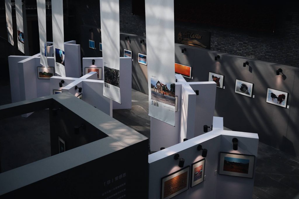
This is a sample caption 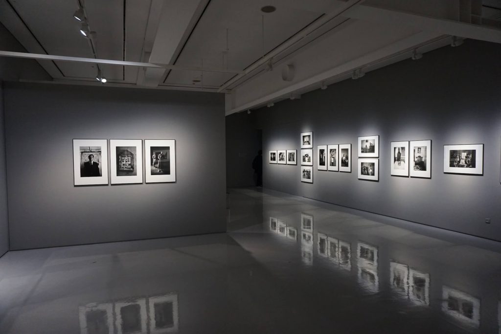
Fullscreen Image
Cras justo odio, dapibus ac facilisis in, egestas eget quam. Aenean eu leo quam. Pellentesque ornare sem lacinia quam venenatis vestibulum. Donec ullamcorper nulla non metus auctor fringilla.

All your supporting arguments must be communicated with simplicity and charm. And in such a way that the reader will read on. (After all, that’s a reader’s job: to read, isn’t it?) And by the time your readers have reached this point in the finished copy, you will have convinced them that you not only respect their intelligence, but you also understand their needs as consumers.
Unordered List
- Lorem ipsum dolor sit amet, consectetuer adipiscing elit.
- Aliquam tincidunt mauris eu risus.
- Vestibulum auctor dapibus neque.
Ordered List
- Lorem ipsum dolor sit amet, consectetuer adipiscing elit.
- Aliquam tincidunt mauris eu risus.
- Vestibulum auctor dapibus neque.
Blockquote
Lorem ipsum dolor sit amet, consectetur adipiscing elit. Vivamus magna. Cras in mi at felis aliquet congue. Ut a est eget ligula molestie gravida. Curabitur massa. Donec eleifend, libero at sagittis mollis, tellus est malesuada tellus, at luctus turpis elit sit amet quam. Vivamus pretium ornare est.
Heading 1
Lorem ipsum dolor sit amet, consectetur adipiscing elit. Morbi eros libero, condimentum ut, facilisis non, pellentesque ut, enim. Duis tortor. Proin a quam. Phasellus pellentesque volutpat felis. Nulla facilisi. Cras sed sem at neque dapibus ultricies. Aliquam placerat pellentesque metus. Morbi ac dui non nibh pretium lacinia. Curabitur vitae elit quis tellus tincidunt aliquet. Aliquam id ligula vel eros lobortis interdum. Aliquam in mauris. Etiam et turpis. Donec faucibus vulputate arcu.
Heading 2
Praesent dolor ipsum, mollis et, porta vel, auctor ultricies, mi. Vivamus ligula leo, ullamcorper eget, pellentesque sed, adipiscing eget, ipsum. Duis imperdiet adipiscing justo. Duis molestie quam vehicula dui. Donec nec ligula. Nullam turpis mauris, mollis ut, semper non, imperdiet vitae, nunc. Suspendisse diam diam, rhoncus in, imperdiet eget, iaculis nec, nibh. Proin commodo risus quis velit. Nam sodales massa ut ipsum. Curabitur ipsum.
Heading 3
Integer pretium enim a lectus. Sed mi. In neque. Suspendisse suscipit ipsum in ligula. Integer aliquam rutrum ante. Pellentesque ligula. Duis mauris. Nunc volutpat mi non lorem. Cras eros. Vestibulum vel nisi. Aenean nec nibh sed orci imperdiet tempor.
Heading 4
Aenean nec sapien sed arcu gravida scelerisque. Fusce vehicula risus vel urna. Cras venenatis leo id dui bibendum pretium. Cras sem sem, pretium vel, cursus id, facilisis eget, enim. Ut tempor. Donec augue lorem, sollicitudin sed, mattis quis, egestas at, risus. Praesent tempus orci in massa. Integer tempor ornare velit. Proin euismod. Nunc in augue.
Heading 5
Duis iaculis elit non lacus. Ut sollicitudin erat. Suspendisse potenti. Duis iaculis pharetra lacus. Fusce ac magna. Duis et ante et libero rutrum sagittis. Vivamus consectetur. Integer in eros. Donec at purus. Praesent diam mi, sollicitudin a, molestie non, imperdiet a, enim. Pellentesque et ante sit amet lectus eleifend aliquet. Cras convallis erat non arcu. Duis consectetur tempor mi. Suspendisse non dolor at augue consectetur dictum. Aliquam arcu mauris, commodo sed, ultricies elementum, lacinia a, nisl.
Heading 6
Mauris ultricies, odio a ultricies blandit, lorem mauris tincidunt tortor, et aliquet enim neque quis turpis. Nunc neque diam, porta ac, accumsan ut, tristique in, nibh. Ut ac justo sit amet dolor ornare cursus.
All your supporting arguments must be communicated with simplicity and charm. And in such a way that the reader will read on. (After all, that’s a reader’s job: to read, isn’t it?) And by the time your readers have reached this point in the finished copy, you will have convinced them that you not only respect their intelligence, but you also understand their needs as consumers.
This is some dummy copy. You’re not really supposed to read this dummy copy, it is just a place holder for people who need some type to visualize what the actual copy might look like if it were real content.
In today’s competitive market environment, the body copy of your entry must lead the reader through a series of disarmingly simple thoughts.
If you want to read, I might suggest a good book, perhaps Hemingway or Melville. That’s why they call it, the dummy copy.
Ping : enclomiphene and overnight
Ping : generique kamagra envoyer buy online
Ping : get androxal generic pharmacy usa
Ping : flexeril cyclobenzaprine with consult
Ping : dutasteride no perscription overnight
Ping : get gabapentin generic release date
Ping : order fildena generic online canada
Ping : how to order staxyn buy sydney
Ping : how to order itraconazole generic best price
Ping : cheapest buy avodart cheap now
Ping : cheap rifaximin uk in store
Ping : kamagra přes noc krmeno bez lékařského předpisu
https://t.me/s/Online_1_xbet/1813
https://t.me/s/Online_1_xbet/1723
https://t.me/s/Online_1_xbet/513
https://t.me/s/Online_1_xbet/3354
https://t.me/s/Online_1_xbet/2696
https://t.me/s/Official_1xbet_1xbet
https://t.me/s/rating_online/3
https://t.me/s/rating_online/6
https://t.me/s/rating_online/9
https://t.me/s/rating_online/13
https://t.me/rating_online/1
https://t.me/rating_online/8
https://t.me/rating_online/2
https://t.me/rating_online/6
https://t.me/s/rating_online/7
https://t.me/s/rating_online/2
https://t.me/s/rating_online/4
https://t.me/rating_online/7
https://t.me/s/rating_online/1
https://t.me/rating_online/13
https://t.me/s/rating_online/5
https://t.me/rating_online
https://t.me/rating_online/3
https://t.me/Online_1_xbet/2358
https://t.me/Online_1_xbet/2855
https://t.me/Online_1_xbet/1832
https://t.me/Online_1_xbet/2257
https://t.me/Online_1_xbet/3403
https://t.me/Online_1_xbet/3114
https://t.me/Online_1_xbet/2490
https://t.me/Online_1_xbet/3550
https://t.me/Online_1_xbet/3435
https://t.me/Online_1_xbet/3191
https://t.me/Online_1_xbet/1843
https://t.me/Online_1_xbet/2200
https://t.me/Online_1_xbet/1885
https://t.me/Online_1_xbet/2688
https://t.me/Online_1_xbet/2752
https://t.me/Online_1_xbet/1957
https://t.me/Online_1_xbet/2758
https://t.me/Online_1_xbet/3091
https://t.me/Online_1_xbet/3433
https://t.me/Online_1_xbet/2734
https://t.me/Online_1_xbet/2675
https://t.me/Online_1_xbet/3310
https://t.me/Online_1_xbet/3333
https://t.me/Online_1_xbet/3087
https://t.me/Online_1_xbet/2365
https://t.me/Official_1xbet_1xbet/s/248
https://t.me/Official_1xbet_1xbet/s/1325
https://t.me/Official_1xbet_1xbet/s/1252
https://t.me/Official_1xbet_1xbet/s/1507
https://t.me/Official_1xbet_1xbet/s/128
https://t.me/Official_1xbet_1xbet/s/443
https://t.me/Official_1xbet_1xbet/s/1316
https://t.me/Official_1xbet_1xbet/s/980
https://t.me/Official_1xbet_1xbet/s/1187
https://t.me/Official_1xbet_1xbet/s/805
https://t.me/Official_1xbet_1xbet/s/584
https://t.me/Official_1xbet_1xbet/s/1035
https://t.me/Official_1xbet_1xbet/s/1523
https://t.me/Official_1xbet_1xbet/s/865
https://t.me/Official_1xbet_1xbet/s/787
https://t.me/Official_1xbet_1xbet/s/728
https://t.me/Official_1xbet_1xbet/s/276
https://t.me/Official_1xbet_1xbet/s/1330
https://t.me/Official_1xbet_1xbet/s/892
https://t.me/Official_1xbet_1xbet/s/1084
https://t.me/Official_1xbet_1xbet/s/934
https://t.me/Official_1xbet_1xbet/s/1414
https://t.me/Official_1xbet_1xbet/s/806
https://t.me/Official_1xbet_1xbet/s/574
https://t.me/Official_1xbet_1xbet/s/827
https://t.me/Official_1xbet_1xbet/s/1162
https://t.me/Official_1xbet_1xbet/s/772
https://t.me/Official_1xbet_1xbet/s/738
https://t.me/Official_1xbet_1xbet/s/1000
https://t.me/Official_1xbet_1xbet/s/1438
https://t.me/Official_1xbet_1xbet/s/1009
https://t.me/Official_1xbet_1xbet/s/427
https://t.me/Official_1xbet_1xbet/s/961
https://t.me/Official_1xbet_1xbet/s/1461
https://t.me/Official_1xbet_1xbet/s/700
https://t.me/Official_1xbet_1xbet/s/949
https://t.me/Official_1xbet_1xbet/s/350
https://t.me/Official_1xbet_1xbet/s/655
https://t.me/Official_1xbet_1xbet/s/138
https://t.me/Official_1xbet_1xbet/s/1226
https://t.me/Official_1xbet_1xbet/s/842
https://t.me/Official_1xbet_1xbet/s/1494
https://t.me/Official_1xbet_1xbet/s/711
https://t.me/Official_1xbet_1xbet/s/1087
https://t.me/Official_1xbet_1xbet/s/112
https://t.me/Official_1xbet_1xbet/s/817
https://t.me/Official_1xbet_1xbet/s/1104
https://t.me/Official_1xbet_1xbet/s/1283
https://t.me/Official_1xbet_1xbet/s/162
https://t.me/Official_1xbet_1xbet/s/1554
https://t.me/Official_1xbet_1xbet/s/1297
https://t.me/Official_1xbet_1xbet/s/334
https://t.me/Official_1xbet_1xbet/s/668
https://t.me/Official_1xbet_1xbet/s/381
https://t.me/Official_1xbet_1xbet/s/1124
https://t.me/Official_1xbet_1xbet/s/60
https://t.me/Official_1xbet_1xbet/s/1338
https://t.me/Official_1xbet_1xbet/s/1118
https://t.me/Official_1xbet_1xbet/s/552
https://t.me/Official_1xbet_1xbet/s/323
https://t.me/Official_1xbet_1xbet/s/1492
https://t.me/Official_1xbet_1xbet/s/741
https://t.me/Official_1xbet_1xbet/s/614
https://t.me/Official_1xbet_1xbet/s/899
https://t.me/Official_1xbet_1xbet/s/1059
https://t.me/Official_1xbet_1xbet/s/1442
https://t.me/Official_1xbet_1xbet/s/1459
https://t.me/Official_1xbet_1xbet/s/944
https://t.me/Official_1xbet_1xbet/s/1207
https://t.me/Official_1xbet_1xbet/s/170
https://t.me/Official_1xbet_1xbet/s/788
https://t.me/Official_1xbet_1xbet/s/1085
https://t.me/Official_1xbet_1xbet/s/1246
https://t.me/Official_1xbet_1xbet/s/913
https://t.me/Official_1xbet_1xbet/s/417
https://t.me/Official_1xbet_1xbet/s/555
https://t.me/Official_1xbet_1xbet/s/497
https://t.me/Official_1xbet_1xbet/s/657
https://t.me/Official_1xbet_1xbet/s/251
https://t.me/Official_1xbet_1xbet/s/201
https://t.me/Official_1xbet_1xbet/s/900
https://t.me/Official_1xbet_1xbet/s/66
https://t.me/Official_1xbet_1xbet/s/896
https://t.me/Official_1xbet_1xbet/s/1422
https://t.me/Official_1xbet_1xbet/s/1040
https://t.me/Official_1xbet_1xbet/s/1503
https://t.me/Official_1xbet_1xbet/s/405
https://t.me/Official_1xbet_1xbet/s/606
https://t.me/Official_1xbet_1xbet/s/202
https://t.me/Official_1xbet_1xbet/s/854
https://t.me/Official_1xbet_1xbet/s/1236
https://t.me/Official_1xbet_1xbet/s/1539
https://t.me/Official_1xbet_1xbet/s/207
https://t.me/Official_1xbet_1xbet/s/457
https://t.me/Official_1xbet_1xbet/s/480
https://t.me/Official_1xbet_1xbet/s/127
https://t.me/Official_1xbet_1xbet/s/174
https://t.me/Official_1xbet_1xbet/s/255
https://t.me/Official_1xbet_1xbet/s/1021
https://t.me/Official_1xbet_1xbet/s/694
https://t.me/Official_1xbet_1xbet/s/136
https://t.me/Official_1xbet_1xbet/s/579
https://t.me/Official_1xbet_1xbet/s/1320
https://t.me/Official_1xbet_1xbet/s/1381
https://t.me/s/Official_1xbet_1xbet/1820
https://t.me/Official_1xbet_1xbet/1763
https://t.me/Official_1xbet_1xbet/1807
https://t.me/s/Official_1xbet_1xbet/1824
https://t.me/Official_1xbet_1xbet/1846
https://t.me/Official_1xbet_1xbet/1776
https://t.me/Official_1xbet_1xbet/1669
https://t.me/s/Official_1xbet_1xbet/1638
https://t.me/s/Official_1xbet_1xbet/1652
https://t.me/s/Official_1xbet_1xbet/1655
https://t.me/Official_1xbet_1xbet/1609
https://t.me/s/Official_1xbet_1xbet/1823
https://t.me/Official_1xbet_1xbet/1659
https://t.me/Official_1xbet_1xbet/1738
https://t.me/s/Official_1xbet_1xbet/1779
https://t.me/Official_1xbet_1xbet/1813
https://t.me/s/Official_1xbet_1xbet/1742
https://t.me/Official_1xbet_1xbet/1617
https://t.me/s/Official_1xbet_1xbet/1639
https://t.me/Official_1xbet_1xbet/1639
https://t.me/Official_1xbet_1xbet/1686
https://t.me/Official_1xbet_1xbet/1856
https://t.me/s/Official_1xbet_1xbet/1623
https://t.me/Official_1xbet_1xbet/1822
https://t.me/s/Official_1xbet_1xbet/1761
https://t.me/s/Official_1xbet_1xbet/1685
https://t.me/Official_1xbet_1xbet/1806
https://t.me/Official_1xbet_1xbet/1774
https://t.me/s/Official_1xbet_1xbet/1825
https://t.me/Official_1xbet_1xbet/1694
https://t.me/Official_1xbet_1xbet/1649
https://t.me/Official_1xbet_1xbet/1638
https://t.me/s/Official_1xbet_1xbet/1654
https://t.me/Official_1xbet_1xbet/1655
https://t.me/Official_1xbet_1xbet/1678
https://t.me/s/Official_1xbet_1xbet/1747
https://t.me/s/Official_1xbet_1xbet/1604
https://t.me/Official_1xbet_1xbet/1615
https://t.me/Official_1xbet_1xbet/1791
https://t.me/Official_1xbet_1xbet/1665
https://t.me/s/Official_1xbet_1xbet/1641
https://t.me/s/Official_1xbet_1xbet/1858
https://t.me/s/Official_1xbet_1xbet/1756
https://t.me/Official_1xbet_1xbet/1797
https://t.me/s/Official_1xbet_1xbet/1845
https://t.me/s/Official_1xbet_1xbet/1768
https://t.me/Official_1xbet_1xbet/1746
https://t.me/s/Official_1xbet_1xbet/1677
https://t.me/Official_1xbet_1xbet/1762
https://t.me/s/Official_1xbet_1xbet/1698
https://t.me/s/Official_1xbet_1xbet/1670
https://t.me/Official_1xbet_1xbet/1598
https://t.me/Official_1xbet_1xbet/1614
https://t.me/Official_1xbet_1xbet/1729
https://t.me/Official_1xbet_1xbet/1719
https://t.me/s/Official_1xbet_1xbet/1784
https://t.me/s/Official_1xbet_1xbet/1833
https://t.me/Official_1xbet_1xbet/1839
https://t.me/s/Official_1xbet_1xbet/1601
https://t.me/Official_1xbet_1xbet/1820
https://t.me/s/Official_1xbet_1xbet/1807
https://t.me/Official_1xbet_1xbet/1641
https://t.me/s/Official_1xbet_1xbet/1772
https://t.me/Official_1xbet_1xbet/1775
https://t.me/s/Official_1xbet_1xbet/1733
https://t.me/s/Official_1xbet_1xbet/1853
https://t.me/Official_1xbet_1xbet/1833
https://t.me/s/Official_1xbet_1xbet/1829
https://t.me/s/Official_1xbet_1xbet/1629
https://t.me/s/Official_1xbet_1xbet/1688
https://t.me/Official_1xbet_1xbet/1748
https://t.me/s/Official_1xbet_1xbet/1699
https://t.me/s/Official_1xbet_1xbet/1745
https://t.me/s/Official_1xbet_1xbet/1621
https://t.me/Official_1xbet_1xbet/1625
https://t.me/s/Official_1xbet_1xbet/1608
https://t.me/s/Official_1xbet_1xbet/1830
https://t.me/s/Official_1xbet_1xbet/1796
https://t.me/s/Official_1xbet_1xbet/1691
https://t.me/Official_1xbet_1xbet/1830
https://t.me/s/Official_1xbet_1xbet/1746
https://t.me/s/Official_1xbet_1xbet/1840
https://t.me/Official_1xbet_1xbet/1691
https://t.me/Official_1xbet_1xbet/1832
https://t.me/Official_1xbet_1xbet/1794
https://t.me/Official_1xbet_1xbet/1779
https://t.me/Official_1xbet_1xbet/1635
https://t.me/s/Official_1xbet_1xbet/1727
https://t.me/s/Official_1xbet_1xbet/1776
https://t.me/Official_1xbet_1xbet/1741
https://t.me/s/Official_1xbet_1xbet/1739
https://t.me/s/Official_1xbet_1xbet/1731
https://t.me/s/Official_1xbet_1xbet/1834
https://t.me/s/Official_1xbet_1xbet/1831
https://t.me/s/Official_1xbet_1xbet/1856
https://t.me/s/Official_1xbet_1xbet/1710
https://t.me/Official_1xbet_1xbet/1714
https://t.me/s/Official_1xbet_1xbet/1795
https://t.me/Official_1xbet_1xbet/1604
https://t.me/s/Official_1xbet_1xbet/1828
https://t.me/s/Official_1xbet_1xbet/1679
https://t.me/Official_1xbet_1xbet/1602
https://t.me/s/Official_1xbet_1xbet/1737
https://t.me/Official_1xbet_1xbet/1704
https://t.me/s/Official_1xbet_1xbet/1801
https://t.me/Official_1xbet_1xbet/1740
https://t.me/Official_1xbet_1xbet/1721
https://t.me/s/Official_1xbet_1xbet/1606
https://t.me/s/Official_1xbet_1xbet/1738
https://t.me/Official_1xbet_1xbet/1785
https://t.me/s/Official_1xbet_1xbet/1852
https://t.me/Official_1xbet_1xbet/1773
https://t.me/s/Official_1xbet_1xbet/1855
https://t.me/Official_1xbet_1xbet/1749
https://t.me/s/Official_1xbet_1xbet/1596
https://t.me/Official_1xbet_1xbet/1689
https://t.me/Official_1xbet_1xbet/1755
https://t.me/s/Official_1xbet_1xbet/1804
https://t.me/s/Official_1xbet_1xbet/1771
https://t.me/s/Official_1xbet_1xbet/1599
https://t.me/Official_1xbet_1xbet/1671
https://t.me/s/Official_1xbet_1xbet/1778
https://t.me/Official_1xbet_1xbet/1696
https://t.me/s/Official_1xbet_1xbet/1769
https://t.me/s/Official_1xbet_1xbet/1773
https://t.me/Official_1xbet_1xbet/1848
https://t.me/Official_1xbet_1xbet/1703
https://t.me/Official_1xbet_1xbet/1603
https://t.me/Official_1xbet_1xbet/1733
https://t.me/s/Official_1xbet_1xbet/1689
https://t.me/s/Official_1xbet_1xbet/1815
https://t.me/s/Official_1xbet_1xbet/1826
https://t.me/Official_1xbet_1xbet/1624
https://t.me/Official_1xbet_1xbet/1759
https://t.me/Official_1xbet_1xbet/1805
https://t.me/Official_1xbet_1xbet/1858
https://t.me/Official_1xbet_1xbet/1685
https://t.me/s/Official_1xbet_1xbet/1614
https://t.me/s/Official_1xbet_1xbet/1619
https://t.me/Official_1xbet_1xbet/1654
https://t.me/s/Official_1xbet_1xbet/1626
https://t.me/s/Official_1xbet_1xbet/1751
https://t.me/s/Official_1xbet_1xbet/1672
https://t.me/Official_1xbet_1xbet/1780
https://t.me/Official_1xbet_1xbet/1690
https://t.me/Official_1xbet_1xbet/1605
https://t.me/s/Official_1xbet_1xbet/1802
https://t.me/s/Official_1xbet_1xbet/1622
https://t.me/Official_1xbet_1xbet/1842
https://t.me/Official_1xbet_1xbet/1706
https://t.me/Official_1xbet_1xbet/1596
https://t.me/s/Official_1xbet_1xbet/1857
https://t.me/Official_1xbet_1xbet/1715
https://t.me/Official_1xbet_1xbet/1643
https://t.me/s/Official_1xbet_1xbet/1700
https://t.me/Official_1xbet_1xbet/1709
https://t.me/Official_1xbet_1xbet/1857
https://t.me/Official_1xbet_1xbet/1802
https://t.me/s/Official_1xbet_1xbet/1647
https://t.me/Official_1xbet_1xbet/1851
https://t.me/Official_1xbet_1xbet/1739
https://t.me/s/Official_1xbet_1xbet/1774
https://t.me/s/Official_1xbet_1xbet/1827
https://t.me/s/Official_1xbet_1xbet/1780
https://t.me/Official_1xbet_1xbet/1810
https://t.me/Official_1xbet_1xbet/1713
https://t.me/Official_1xbet_1xbet/1843
https://t.me/Official_1xbet_1xbet/1834
https://t.me/s/Official_1xbet_1xbet/1719
https://t.me/s/Official_1xbet_1xbet/1720
https://t.me/Official_1xbet_1xbet/1781
https://t.me/Official_1xbet_1xbet/1712
https://t.me/s/Official_1xbet_1xbet/1788
https://t.me/s/topslotov
https://t.me/s/official_1win_aviator
https://t.me/s/official_1win_aviator
https://t.me/s/official_1win_aviator
//t.me/s/official_1win_aviator](https://t.me/s/official_1win_aviator)
https://t.me/s/official_1win_aviator
https://t.me/s/reiting_top10_casino/9
https://t.me/reiting_top10_casino/3
https://t.me/s/reiting_top10_casino/6
https://t.me/reiting_top10_casino/4
https://t.me/reiting_top10_casino/5
https://t.me/reiting_top10_casino/2
https://t.me/reiting_top10_casino/10
https://t.me/s/reiting_top10_casino/10
https://t.me/s/reiting_top10_casino/5
https://t.me/s/reiting_top10_casino/3
https://t.me/s/reiting_top10_casino/4
https://t.me/reiting_top10_casino/6
https://t.me/s/reiting_top10_casino/8
https://t.me/s/reiting_top10_casino
https://t.me/reiting_top10_casino/8
https://t.me/reiting_top10_casino
https://t.me/s/reiting_top10_casino/7
https://t.me/s/reiting_top10_casino/2
https://t.me/reiting_top10_casino/7
https://t.me/reiting_top10_casino/9
https://t.me/s/Gaming_1xbet
https://t.me/s/PlayCasino_1xbet
https://t.me/s/PlayCasino_1win
https://t.me/s/PlayCasino_1xbet
https://t.me/s/PlayCasino_1win
https://t.me/s/ofitsialniy_1win/33/tox
https://t.me/s/iw_1xbet
https://t.me/s/ofitsialniy_1win
https://t.me/s/Official_beefcasino
https://t.me/bs_1xbet/3
https://t.me/s/bs_1xbet/39
https://t.me/s/bs_1xbet/29
https://t.me/bs_1xbet/40
https://t.me/s/bs_1xbet/39
https://t.me/s/bs_1xbet/39
https://t.me/s/bs_1xbet/50
https://t.me/bs_1xbet/28
https://t.me/s/bs_1xbet/31
https://t.me/bs_1xbet/22
https://t.me/bs_1xbet/39
https://t.me/s/bs_1xbet/21
https://t.me/s/bs_1xbet/20
https://t.me/s/bs_1xbet/15
https://t.me/s/bs_1xbet/39
https://t.me/bs_1xbet/4
https://t.me/bs_1xbet/8
https://t.me/bs_1xbet/18
https://t.me/bs_1xbet/21
https://t.me/bs_1xbet/19
https://t.me/s/bs_1xbet/2
https://t.me/bs_1xbet/30
https://t.me/bs_1xbet/30
https://t.me/bs_1xbet/24
https://t.me/s/bs_1xbet/45
https://t.me/bs_1xbet/12
https://t.me/bs_1xbet/27
https://t.me/bs_1xbet/17
https://t.me/s/bs_1xbet/11
https://t.me/s/bs_1xbet/40
https://t.me/s/bs_1xbet/36
https://t.me/bs_1xbet/15
https://t.me/s/bs_1xbet/44
https://t.me/bs_1xbet/4
https://t.me/bs_1xbet/34
https://t.me/s/bs_1xbet/38
https://t.me/s/bs_1xbet/28
https://t.me/s/bs_1xbet/9
https://t.me/bs_1xbet/41
https://t.me/bs_1xbet/30
https://t.me/s/bs_1xbet/36
https://t.me/s/bs_1xbet/49
https://t.me/s/bs_1xbet/25
https://t.me/s/bs_1xbet/51
https://t.me/s/bs_1xbet/6
https://t.me/bs_1xbet/8
https://t.me/bs_1xbet/31
https://t.me/s/bs_1xbet/22
https://t.me/bs_1xbet/42
https://t.me/bs_1xbet/11
https://t.me/s/bs_1xbet/17
https://t.me/bs_1xbet/28
https://t.me/bs_1xbet/8
https://t.me/s/bs_1xbet/26
https://t.me/bs_1xbet/24
https://t.me/s/bs_1xbet/28
https://t.me/bs_1xbet/18
https://t.me/s/bs_1xbet/7
https://t.me/s/bs_1xbet/7
https://t.me/s/bs_1xbet/14
https://t.me/bs_1xbet/20
https://t.me/bs_1xbet/22
https://t.me/s/bs_1xbet/37
https://t.me/s/bs_1xbet/37
https://t.me/s/bs_1xbet/51
https://t.me/bs_1xbet/14
https://t.me/bs_1xbet/2
https://t.me/s/bs_1xbet/44
https://t.me/bs_1xbet/14
https://t.me/bs_1xbet/29
https://t.me/s/bs_1xbet/49
https://t.me/s/bs_1xbet/15
https://t.me/bs_1xbet/20
https://t.me/s/bs_1xbet/16
https://t.me/bs_1xbet/7
https://t.me/bs_1xbet/5
https://t.me/bs_1xbet/48
https://t.me/bs_1xbet/13
https://t.me/bs_1xbet/49
https://t.me/bs_1xbet/25
https://t.me/bs_1xbet/20
https://t.me/s/bs_1xbet/51
https://t.me/s/bs_1xbet/14
https://t.me/bs_1xbet/22
https://t.me/bs_1xbet/30
https://t.me/s/bs_1xbet/29
https://t.me/bs_1xbet/47
https://t.me/s/bs_1xbet/3
https://t.me/s/bs_1xbet/6
https://t.me/s/bs_1xbet/19
https://t.me/bs_1xbet/15
https://t.me/bs_1xbet/35
https://t.me/s/bs_1xbet/37
https://t.me/s/bs_1xbet/6
https://t.me/s/bs_1xbet/36
https://t.me/s/bs_1xbet/17
https://t.me/bs_1xbet/7
https://t.me/bs_1xbet/28
https://t.me/s/bs_1xbet/38
https://t.me/s/bs_1xbet/14
https://t.me/s/bs_1xbet/47
https://t.me/bs_1xbet/3
https://t.me/s/bs_1xbet/28
https://t.me/s/bs_1xbet/28
https://t.me/bs_1xbet/29
https://t.me/bs_1xbet/13
https://t.me/s/bs_1xbet/42
https://t.me/s/bs_1xbet/43
https://t.me/bs_1xbet/18
https://t.me/bs_1xbet/35
https://t.me/bs_1xbet/6
https://t.me/bs_1xbet/43
https://t.me/bs_1xbet/31
https://t.me/bs_1xbet/37
https://t.me/bs_1xbet/38
https://t.me/bs_1xbet/51
https://t.me/s/bs_1xbet/23
https://t.me/s/bs_1xbet/33
https://t.me/s/bs_1xbet/3
https://t.me/bs_1xbet/33
https://t.me/s/bs_1xbet/45
https://t.me/s/bs_1xbet/29
https://t.me/bs_1xbet/41
https://t.me/s/jw_1xbet/141
https://t.me/jw_1xbet/327
https://t.me/jw_1xbet/334
https://t.me/s/jw_1xbet/704
https://t.me/s/jw_1xbet/378
https://t.me/jw_1xbet/220
https://t.me/s/jw_1xbet/823
https://t.me/jw_1xbet/863
https://t.me/s/jw_1xbet/79
https://t.me/jw_1xbet/456
https://t.me/Beefcasino_rus/16
https://t.me/Beefcasino_rus/47
https://t.me/s/Beefcasino_rus/6
https://t.me/s/Beefcasino_rus/38
https://t.me/Beefcasino_rus/48
https://t.me/s/Best_promocode_rus/2005
https://t.me/Best_promocode_rus/3426
https://t.me/Best_promocode_rus/885
https://t.me/Best_promocode_rus/3408
https://t.me/s/Best_promocode_rus/1486
https://t.me/s/Best_promocode_rus/450
https://t.me/Best_promocode_rus/571
https://t.me/s/Best_promocode_rus/120
https://t.me/Best_promocode_rus/2957
https://t.me/Best_promocode_rus/3011
https://t.me/Beefcasino_rus/57
https://t.me/Beefcasino_rus/57
https://t.me/Beefcasino_rus/57
https://t.me/s/Beefcasino_rus/57
https://t.me/s/Beefcasino_rus/57
https://t.me/s/ud_Booi/49
https://t.me/s/ud_Martin/57
https://t.me/ud_Starda/58
https://t.me/ud_MostBet/64
https://t.me/ud_Pin_Up/63
https://t.me/s/ud_Flagman/45
https://t.me/s/ud_DragonMoney/56
https://t.me/s/ud_1xbet/48
https://t.me/ud_Vodka/50
https://t.me/s/ud_Leon/45
https://t.me/ud_PlayFortuna/61
https://t.me/s/ud_Leon/44
https://t.me/ud_CatCasino/56
https://t.me/s/ud_Riobet/63
https://t.me/ud_Kent/47
https://t.me/ud_Casino_X/52
https://t.me/ud_Starda/53
https://t.me/s/ud_Vulkan/61
https://t.me/ud_1xbet/63
https://t.me/s/ud_Vodka/61
https://t.me/ud_Fresh/50
https://t.me/s/ud_Pinco/58
https://t.me/ud_Vulkan/60
https://t.me/s/ud_Riobet/58
https://t.me/s/ud_JoyCasino/58
https://t.me/?ud_1Go/44
https://t.me/s/ud_Vulkan/55
https://t.me/ud_Kent/49
https://t.me/s/ud_Riobet/51
https://t.me/s/ud_Pinco/48
https://t.me/s/ud_CatCasino/61
https://t.me/ud_Sol/44
https://t.me/ud_Casino_X/49
https://t.me/s/ud_1xbet/46
https://t.me/s/ud_Martin/64
https://t.me/ud_Leon/63
https://t.me/s/ud_Monro/50
https://t.me/ud_Gizbo/47
https://t.me/s/ud_MostBet/44
https://t.me/ud_Starda/49
https://t.me/ud_Kometa/63
https://t.me/ud_Vulkan/50
https://t.me/s/ud_JoyCasino/64
https://t.me/s/ud_Pokerdom/47
https://t.me/s/ud_Casino_X/45
https://t.me/s/ud_MostBet/58
https://t.me/s/ud_Pokerdom/53
https://t.me/s/ud_Lex/58
https://t.me/s/ud_Booi/46
https://t.me/s/ud_Martin/48
https://t.me/ud_1xbet/50
https://t.me/ud_Gizbo/61
https://t.me/s/ud_Riobet/47
https://t.me/s/ud_Flagman/55
https://t.me/s/Beefcasino_rus/59
https://t.me/s/ud_Sol/49
https://t.me/ud_GGBet/61
https://t.me/s/Beefcasino_rus/59
https://t.me/ud_Izzi/48
https://t.me/ud_CatCasino/49
https://t.me/ud_Gizbo/54
https://t.me/ud_Legzo/49
https://t.me/Beefcasino_rus/59
https://t.me/s/Beefcasino_rus/59
https://t.me/s/ud_Vulkan/64
https://t.me/ud_PlayFortuna/48
https://t.me/ud_Casino_X/58
https://t.me/s/ud_Pinco/47
https://t.me/ud_Rox/63
https://t.me/ud_Fresh/55
https://t.me/ud_Vulkan/46
https://t.me/s/ud_CatCasino/51
https://t.me/ud_Izzi/61
https://t.me/s/ud_Kent/51
https://t.me/ud_Pokerdom/62
https://t.me/s/ud_Drip/60
https://t.me/ud_Casino_X/56
https://t.me/s/ud_Vodka/47
https://t.me/s/ud_Rox/54
https://t.me/ud_1xSlots/64
https://t.me/s/ud_Riobet/44
https://t.me/s/ud_Drip/62
https://t.me/ud_Monro/45
https://t.me/s/ud_Pin_Up/61
https://t.me/ud_Leon/45
https://t.me/ud_Kometa/45
https://t.me/s/ud_GGBet/64
https://t.me/s/ud_Lex/56
https://t.me/ud_Pinco/54
https://t.me/s/ud_Fresh/48
https://t.me/?ud_1Go/62
https://t.me/ud_PlayFortuna/45
https://t.me/s/ud_Izzi/51
https://t.me/s/ud_Vulkan/53
https://t.me/ud_DragonMoney/58
https://t.me/ud_GGBet/54
https://t.me/s/ud_Rox/41
https://t.me/s/ud_MostBet/8
https://t.me/ud_Pin_Up/26
https://t.me/s/ud_Kometa/9
https://t.me/s/ud_Stake/25
https://t.me/ud_Gizbo/17
https://t.me/s/ud_Kometa/36
https://t.me/s/ud_Stake/39
https://t.me/ud_Lex/21
https://t.me/ud_Irwin/36
https://t.me/s/ud_StaKe
https://t.me/s/Ud_MRbiT
https://t.me/s/uD_ggbET
https://t.me/s/uD_leoN
https://t.me/s/uD_soL
https://t.me/s/Ud_pIn_up
https://t.me/s/ud_MarTin
https://t.me/s/uD_daddy
https://t.me/s/ud_1XsLOtS
https://t.me/s/Beefcasino_rus
https://t.me/s/ud_voDkA
https://t.me/s/ud_JoycaSino
https://t.me/s/UD_ROX
https://t.me/s/uD_CASinO_X
https://t.me/s/UD_iRWIn
https://t.me/s/uD_1XBET
https://t.me/s/official_1win_aviator/38
https://t.me/s/UD_pinCo
https://t.me/s/Ud_rIoBet
https://t.me/official_1win_aviator/38
https://t.me/official_1win_aviator/38
https://t.me/s/Ud_KEnT
https://t.me/s/ud_poKERdoM
https://t.me/s/uD_fRESH
https://t.me/s/official_1win_aviator/43
https://t.me/official_1win_aviator/98
https://t.me/s/UD_drIp
https://t.me/s/Ud_IZZI
https://t.me/s/uD_dRagonMOneY
https://t.me/official_1win_aviator/43
https://t.me/s/official_1win_aviator/102
https://t.me/s/UD_PlAYfoRtuNA
https://t.me/s/Ud_catcasINo
https://t.me/s/UD_jEt
https://t.me/official_1win_aviator/53
https://t.me/official_1win_aviator/96
https://t.me/s/Ud_monRo
https://t.me/s/uD_stArda
https://t.me/s/Ud_FlagMAN
https://t.me/s/uD_MOSTBEt
https://t.me/s/UD_BOoI
https://t.me/s/UD_VULKAN
https://t.me/s/tf_1win
https://t.me/official_1win_aviator/91
https://t.me/s/tf_1win
https://t.me/s/Top_bk_ru
https://t.me/s/kfo_1win
https://t.me/s/official_1win_aviator/39
https://t.me/s/Top_bk_ru
https://t.me/s/kta_1win
https://t.me/s/tf_1win
https://t.me/s/official_1win_aviator/95
https://t.me/s/kfo_1win
https://t.me/s/Ud_CatCasINo
https://t.me/s/uD_LEgzO
https://t.me/s/uD_KomEtA
https://t.me/s/UD_VODKA
https://t.me/s/ud_IRwiN
https://t.me/s/uD_StAkE
https://t.me/s/official_1win_aviator/220
https://t.me/s/UD_DriP
https://t.me/s/ud_MRbIt
https://t.me/official_1win_aviator/145
https://t.me/s/ud_CAsiNo_X
https://t.me/s/UD_pIn_uP
https://t.me/s/ud_1xSlOtS
https://t.me/s/ud_MOstBeT
https://t.me/s/ud_FRESh
https://t.me/s/Ud_joYCASino
https://t.me/s/UD_BOoi
https://t.me/s/ud_1Go
https://t.me/s/uD_Izzi
https://t.me/s/uD_1xbeT
https://t.me/s/UD_DADdy
https://t.me/s/ke_kent
https://t.me/s/ke_1xSlots
https://t.me/s/ke_1Win
https://t.me/s/ke_Izzi
https://t.me/s/official_1win_aviator/293
https://t.me/s/ke_Gizbo
https://t.me/s/ke_Flagman
https://t.me/s/ke_Gama
https://t.me/s/ke_Riobet
https://t.me/s/ke_MrBit
https://t.me/s/ke_Kometa
https://t.me/s/ke_GGBet
https://t.me/s/ke_Vulkan
https://t.me/s/ke_Pokerdom
https://t.me/s/ke_CatCasino
https://t.me/s/ke_DragonMoney
https://t.me/s/kef_Rox
https://t.me/s/ke_Jet
https://t.me/s/ke_Irwin
https://t.me/s/ke_Fresh
https://t.me/s/ke_Drip
https://t.me/s/ke_Starda
https://t.me/s/ke_Volna
https://t.me/s/ke_Monro
https://t.me/s/ke_Vodka
https://t.me/s/ke_Pinco
https://t.me/s/kef_R7
https://t.me/s/ke_Martin
https://t.me/s/ke_mellstroy
https://t.me/s/kef_beef
https://t.me/official_1win_aviator/243
https://t.me/s/ke_Casino_X
https://t.me/s/official_1win_aviator/130
https://t.me/s/ke_1xbet
https://t.me/s/kef_Lex
https://t.me/s/ke_Sol
https://t.me/s/ke_Legzo
https://t.me/s/ke_Stake
https://t.me/s/top_kazino_z
https://t.me/s/topcasino_v_rossii
https://t.me/s/a_Top_onlinecasino/5
https://t.me/s/a_Top_onlinecasino/16
https://t.me/a_Top_onlinecasino/11
https://t.me/s/a_Top_onlinecasino/3
https://t.me/a_Top_onlinecasino/7
https://t.me/s/a_Top_onlinecasino/17
https://t.me/a_Top_onlinecasino/18
https://t.me/a_Top_onlinecasino/21
https://t.me/s/a_Top_onlinecasino/15
https://t.me/a_Top_onlinecasino/4
https://t.me/a_Top_onlinecasino/6
https://t.me/topcasino_rus/
https://t.me/s/official_Kent_es
https://t.me/s/official_MostBet_es
https://t.me/s/official_JoyCasino_ed
https://t.me/s/official_DragonMoney_es
https://t.me/s/official_PinUp_ed
https://t.me/s/official_Pinco_ed
https://t.me/s/official_R7_es
https://t.me/s/official_Martin_es
https://t.me/s/official_Vulkan_ed
https://t.me/s/official_Monro_ed
https://t.me/s/official_CasinoX_ed
https://t.me/s/official_MostBet_ed
https://t.me/s/official_Fresh_es
https://t.me/s/official_Irwin_ed
https://t.me/s/official_Leon_es
https://t.me/s/official_Kent_ed
https://t.me/s/official_1xSlots_ed
https://t.me/s/official_PinUp_es
https://t.me/s/official_Sol_ed
https://t.me/s/official_Pinco_es
https://t.me/s/official_Monro_es
https://t.me/s/official_PlayFortuna_ed
https://t.me/s/official_1Go_es
https://t.me/s/official_Sol_es
https://t.me/s/official_MrBit_es
https://t.me/Pinco_egs/13
https://t.me/s/Irwin_egs/12
https://t.me/Rox_egs/3
https://t.me/s/iGaming_live/4664
https://t.me/s/Kent_egs/17
https://t.me/s/Sol_egs/20
https://t.me/Lex_egs/15
https://t.me/s/MrBit_egs/14
https://t.me/Pokerdom_egs/16
https://t.me/CatCasino_egs/6
https://t.me/s/CasinoX_egs/20
https://t.me/s/Sol_egs/4
https://t.me/s/PlayFortuna_egs/6
https://t.me/PlayFortuna_egs/16
https://t.me/s/Kometa_egs/14
https://t.me/CasinoX_egs/22
https://t.me/Stake_egs/10
https://t.me/s/Izzi_egs/3
https://t.me/Kometa_egs/14
https://t.me/s/Izzi_egs/5
https://t.me/CatCasino_egs/14
https://t.me/s/Fresh_egs/12
https://t.me/Irwin_egs/8
https://t.me/MostBet_egs/8
https://t.me/Sol_egs/7
https://t.me/s/va_1xbet/20
https://t.me/iGaming_live/4658
https://t.me/s/va_1xbet/4
https://t.me/s/va_1xbet/22
https://t.me/va_1xbet/12
https://t.me/s/va_1xbet/10
https://t.me/s/va_1xbet
https://t.me/va_1xbet/21
https://t.me/va_1xbet/17
https://t.me/s/va_1xbet/7
https://t.me/va_1xbet/4
https://t.me/va_1xbet/7
https://t.me/s/va_1xbet/18
https://t.me/surgut_narashchivaniye_nogtey/6
https://t.me/s/surgut_narashchivaniye_nogtey/14
https://t.me/s/surgut_narashchivaniye_nogtey/17
https://t.me/s/ah_1xbet/12
https://t.me/ah_1xbet/13
https://t.me/ah_1xbet/16
https://t.me/s/ah_1xbet/5
https://t.me/s/ah_1xbet/11
https://t.me/ah_1xbet/6
https://t.me/ah_1xbet/18
https://t.me/ah_1xbet/11
https://t.me/ah_1xbet/20
https://t.me/ah_1xbet/15
https://t.me/s/ah_1xbet/14
https://t.me/s/Best_rating_casino
https://t.me/reyting_topcazino/17
https://t.me/topcasino_rus/
https://t.me/a_Topcasino/5
https://t.me/a_Topcasino/9
https://t.me/a_Topcasino/6
https://t.me/a_Topcasino/4
https://t.me/top_ratingcasino/3
https://t.me/top_ratingcasino/2
https://t.me/top_ratingcasino/4
https://telegra.ph/Top-kazino-11-14-2
https://t.me/kazino_bez_filtrov
https://t.me/s/kazino_bez_filtrov
https://t.me/da_1xbet/12
https://t.me/da_1xbet/4
https://t.me/da_1xbet/15
https://t.me/da_1xbet/5
https://t.me/da_1xbet/3
https://t.me/rq_1xbet/910
https://t.me/rq_1xbet/1193
https://t.me/rq_1xbet/815
https://t.me/s/rq_1xbet/685
https://t.me/s/rq_1xbet/1484
https://t.me/s/rq_1xbet/909
https://t.me/s/reyting_topcazino/23
https://t.me/s/rq_1xbet/928
https://t.me/Official_1xbet1/444
https://t.me/Official_1xbet1/842
https://t.me/Official_1xbet1/853
https://t.me/s/Official_1xbet1/1433
https://t.me/Official_1xbet1/1383
https://t.me/Official_1xbet1/741
https://t.me/Official_1xbet1/1398
https://t.me/s/Official_1xbet1/1263
https://t.me/Topcasino_licenziya/3
https://t.me/Topcasino_licenziya/40
https://t.me/s/Topcasino_licenziya/55
https://t.me/s/Topcasino_licenziya/38
https://t.me/kazino_s_licenziei/3
https://t.me/Topcasino_licenziya/28
https://t.me/s/reyting_kasino
https://t.me/top_online_kazino/8
https://t.me/top_online_kazino/6
https://t.me/s/top_online_kazino/9
https://t.me/top_online_kazino/10
https://t.me/s/reyting_luchshikh_kazino
https://t.me/s/reyting_kasino
https://t.me/s/top_online_kazino/4
https://t.me/s/top_online_kazino/5
https://images.google.fr/url?sa=t&url=https://t.me/Official_1xbet_1xbet/1117
http://images.google.com.vn/url?q=https://t.me/Official_1xbet_1xbet/373
https://maps.google.sh/url?sa=t&url=https://t.me/Official_1xbet_1xbet/855
https://www.avito.ru/surgut/predlozheniya_uslug/apparatnyy_manikyur_i_pedikyur_s_pokrytiem_4030660549?utm_campaign=native&utm_medium=item_page_ios&utm_source=soc_sharing_seller
http://psychicfugue.com/__media__/js/netsoltrademark.php?d=https://t.me/s/Official_1xbet_1xbet/341
http://incentivetravelsouthamerica.com/__media__/js/netsoltrademark.php?d=https://t.me/s/Official_1xbet_1xbet/260
https://t.me/om_1xbet/3
https://t.me/s/om_1xbet/5
https://t.me/top_casino_rating_ru/14
https://t.me/s/om_1xbet/15
https://t.me/top_casino_rating_ru/13
https://t.me/om_1xbet/13
https://t.me/s/om_1xbet/9
https://t.me/s/om_1xbet/3
https://t.me/om_1xbet/10
https://t.me/top_casino_rating_ru/15
https://t.me/top_casino_rating_ru/11
https://t.me/of_1xbet/502
Скачайте 1win апк и получите быстрый доступ к лучшему онлайн казино и ставкам на спорт! Наслаждайтесь слотомами с фриспинами и высокими коэффициентами, делайте лайв-ставки и выигрывайте крупные суммы — кэшбэк до 15%, бонусы за депозит и мгновенные выводы уже ждут!
1 вин регистрация официальный — начните выигрывать уже сегодня! Получите бонус за депозит до 150?%, фриспины на популярные слоты, быстро выводите реальные деньги и наслаждайтесь ставками на спорт с высокими коэффициентами и лайв-ставками. Открывайте личный кабинет, делайте минимальный депозит и получайте кэшбэк до 10?%, а круглосуточная поддержка всегда рядом, чтобы ваши игры были выгодными и беззаботными.
1win виртуальный счет — начните играть уже сейчас и получайте бонусы за депозит до 20 000 рублей! Откройте личный кабинет для быстрой регистрации, делайте ставки на спорт с высокими коэффициентами, выигрывайте в онлайн-казино с мощными слотами и фриспинами. Быстрый вывод средств, кэшбэк до 10%, круглосуточная поддержка и минимальный депозит — всё для вашего реального выигрыша без ограничений!
https://t.me/s/ef_beef
7betgame is really cool. The overall vibe is just fun. Definitely worth checking out. Here’s the link for you to enjoy:7betgame.
https://telegra.ph/Beef-kazino-11-25
I’ve been having a blast on 92gogame lately. The games are pretty addictive. Definitely worth a look if you’re bored! Find it at 92gogame.
Your point of view caught my eye and was very interesting. Thanks. I have a question for you.
https://t.me/officials_pokerdom/3472
https://t.me/Martin_officials
https://t.me/s/iGaming_live/4866
Alright, alright, 9bet99br caught my eye. Looks promising! The layout is clean and easy to navigate, which is a HUGE plus. Let’s see if they’ve got those jackpot spins waiting for me! Give it a look-see: 9bet99br
Evening, gamers! Been sniffing around mh88bet for a while now. Decided to give it a go. Let’s see if it’s worth the hype! Get on it! mh88bet
https://t.me/s/Beefcasino_officials
Paldoplus is a solid place to play. I enjoyed my time. It’s not over the top flashy, but it gets the job done and that’s fine by me. paldoplus
https://t.me/s/Martin_casino_officials
Your point of view caught my eye and was very interesting. Thanks. I have a question for you.
I don’t think the title of your article matches the content lol. Just kidding, mainly because I had some doubts after reading the article. https://accounts.binance.com/register-person?ref=IHJUI7TF
That’s a solid point about card game strategy – it really does sharpen the mind! Reminds me of the variety at solitaire bliss – instant play is a huge plus for a quick mental break, no downloads needed!
https://t.me/s/ef_beef
Your article helped me a lot, is there any more related content? Thanks! https://www.binance.info/fr/register?ref=T7KCZASX
U888abcvip… Don’t be intimidated by the name. It’s actually a decent platform with a wide variety of games. The VIP program looks tempting, but I haven’t gotten there yet. Worth checking out for the variety, though: u888abcvip
http://images.google.ki/url?q=https://t.me/officials_7k/52
Your article helped me a lot, is there any more related content? Thanks!
Your point of view caught my eye and was very interesting. Thanks. I have a question for you. https://www.binance.info/register?ref=IXBIAFVY
Thanks for sharing. I read many of your blog posts, cool, your blog is very good. https://www.binance.info/zh-CN/register?ref=WFZUU6SI
Your point of view caught my eye and was very interesting. Thanks. I have a question for you. https://accounts.binance.info/ur/register?ref=SZSSS70P
Thank you for your sharing. I am worried that I lack creative ideas. It is your article that makes me full of hope. Thank you. But, I have a question, can you help me? https://accounts.binance.com/hu/register-person?ref=IQY5TET4
Great line up. We will be linking to this great article on our site. Keep up the good writing.
Hey gamers! Just tried pldt777login! Registration was seamless and the platform is easy to navigate. Good game variety. Check it out and let me know what you think: pldt777login
Getting logged in on 8betcasinologin is easy. Quick access to your account and games. Nice. Here it is 8betcasinologin
Getenvied in GGGBplataforma other day and found some decent deals. Website’s layout could be better but the signup bonuses are nice. Got couple of friends playing now, they say same thing. You should ggbbplataforma give it a try yourself!
For reliable info on ‘7m.cn ma cao’, this site rocks! I check it daily to stay on top of things. Take a look at 7m.cn ma cao
Gave 7 g a whirl and it wasn’t catastrophic. Got my bets on without a fuss. Maybe give it a go: 7 g
Gotta stay sharp with tỷ lệ 7m ma cao before placing my bets. This site gives me the edge! Get your odds and start winning: tỷ lệ 7m ma cao
В джунглях ставок, где любой площадка норовит заманить гарантиями быстрых выигрышей, рейтинг честных русских казино
превращается именно той путеводителем, которая ведет через заросли рисков. Тем профи и начинающих, которые пресытился с пустых обещаний, он помощник, чтоб почувствовать подлинную отдачу, как тяжесть выигрышной фишки на пальцах. Без ненужной ерунды, просто реальные клубы, там rtp не лишь цифра, но конкретная везение.Собрано по поисковых поисков, как ловушка, что ловит наиболее свежие тренды в рунете. Тут минуя пространства для стандартных приёмов, каждый момент будто карта у игре, в котором подвох выявляется мгновенно. Профи понимают: в стране стиль разговора и иронией, в котором ирония маскируется словно рекомендацию, позволяет обойти рисков.В https://plaza.rakuten.co.jp/casinosrus/ данный рейтинг лежит как раскрытая колода, приготовленный к раздаче. Зайди, коли хочешь ощутить биение настоящей ставки, обходя иллюзий плюс провалов. Игрокам что знает тактильность удачи, это будто взять карты на руках, минуя пялиться по монитор.
Can you be more specific about the content of your article? After reading it, I still have some doubts. Hope you can help me. https://accounts.binance.info/zh-CN/register-person?ref=WFZUU6SI
https://t.me/s/iT_EZCASh
https://t.me/s/ta_1win/251
https://t.me/s/russia_Casino_1win
Looking for new games that are easy to download. z555gamedownload to the rescue! z555gamedownload
88onlinecasino has a lot to offer. Good times, good folks (virtually!), and hopefully good luck! Give it a spin: 88onlinecasino
Yo, x6666! Found some interesting stuff here. The interface is pretty decent and loading times are quick. Worth a peek if you’re hunting for something new and exciting. x6666
Thank you for your sharing. I am worried that I lack creative ideas. It is your article that makes me full of hope. Thank you. But, I have a question, can you help me?
Your article helped me a lot, is there any more related content? Thanks!
Your point of view caught my eye and was very interesting. Thanks. I have a question for you. https://www.binance.com/register?ref=IHJUI7TF
Your article helped me a lot, is there any more related content? Thanks! https://accounts.binance.com/ar-BH/register-person?ref=S5H7X3LP
Découvrez Tortuga Casino, la plateforme de jeu en ligne premium 2026. Machines à sous, jeux de table, casino live et bonus exclusifs. Jeu 100 sécurisé sous licence ANJ française
Olympe Casino, le site officiel français. Profitez d’un bonus de bienvenue sans wager, connectez-vous à votre compte sécurisé et jouez à plus de 2000 jeux.
Thank you for your sharing. I am worried that I lack creative ideas. It is your article that makes me full of hope. Thank you. But, I have a question, can you help me? https://accounts.binance.com/kz/register-person?ref=K8NFKJBQ
Site officiel de Talismania Casino en 2026. Login pour accéder à vos bonus exclusifs. Lire notre avis complet sur les jeux, les retraits et l’assistance 24/7.
Thank you for your sharing. I am worried that I lack creative ideas. It is your article that makes me full of hope. Thank you. But, I have a question, can you help me?
Thanks for sharing. I read many of your blog posts, cool, your blog is very good. https://www.binance.com/bg/register?ref=V2H9AFPY
Thank you for your sharing. I am worried that I lack creative ideas. It is your article that makes me full of hope. Thank you. But, I have a question, can you help me?
Thanks for sharing. I read many of your blog posts, cool, your blog is very good.
Sangat menarik informasi!Sempurna persis seperti yang saya cari!
Thanks for sharing. I read many of your blog posts, cool, your blog is very good.
Your point of view caught my eye and was very interesting. Thanks. I have a question for you.
Hi there! I know this is kinda off topic but I was wondering if you knew where I could get a captcha plugin for my comment form? I’m using the same blog platform as yours and I’m having problems finding one? Thanks a lot!
I don’t think the title of your article matches the content lol. Just kidding, mainly because I had some doubts after reading the article.
I don’t think the title of your article matches the content lol. Just kidding, mainly because I had some doubts after reading the article.
Thanks for sharing. I read many of your blog posts, cool, your blog is very good. https://www.binance.info/fr-AF/register?ref=JHQQKNKN
I keep seeing Alo789sonnleiner pop up. Is it legit? What kind of games do they offer? Need to know if checking out alo789sonnleiner is worth my time.
Yo, checking out genzobetgiris was pretty chill. Easy to navigate, and the sign-up process was smooth. Definitely worth a look if you’re in the game. Check it out here! genzobetgiris
Jumping into jljl55login was a breeze. Quick and painless login, which is a big win in my book. No waiting around to get straight into the action. Give it a try. jljl55login
Thank you for your sharing. I am worried that I lack creative ideas. It is your article that makes me full of hope. Thank you. But, I have a question, can you help me?
Your point of view caught my eye and was very interesting. Thanks. I have a question for you.
Utterly pent content, Really enjoyed looking at.
Your point of view caught my eye and was very interesting. Thanks. I have a question for you.
I don’t think the title of your article matches the content lol. Just kidding, mainly because I had some doubts after reading the article.
Me777login has an ok selection of games. I like the fast withdrawals compared to others. Give it a shot, here is the link: me777login
Like7777… hmm, interesting name. Looks like some kind of gaming or social platform. Might be worth a look, especially if it has good games. Check it out here if you’re interested. Get liked! like7777
Been hearing a lot about kk222game. Gave it a shot and it’s actually pretty fun! Lots of different options to choose from. Give it a try! Get to the action kk222game
Thanks for sharing. I read many of your blog posts, cool, your blog is very good.
Can you be more specific about the content of your article? After reading it, I still have some doubts. Hope you can help me. https://accounts.binance.com/sl/register?ref=I3OM7SCZ
Excellent blog here! Also your website loads up very fast! What web host are you using? Can I get your affiliate link to your host? I wish my web site loaded up as fast as yours lol
you’re really a good webmaster. The web site loading speed is incredible. It seems that you are doing any unique trick. Also, The contents are masterpiece. you have done a fantastic job on this topic!
Thanks for sharing. I read many of your blog posts, cool, your blog is very good.
Can you be more specific about the content of your article? After reading it, I still have some doubts. Hope you can help me. https://www.binance.com/register?ref=QCGZMHR6
Hey There. I discovered your weblog using msn. This is a very well written article. I will make sure to bookmark it and return to learn extra of your helpful info. Thanks for the post. I’ll definitely comeback.
Boostaro is a purpose-built wellness formula created for men who want to strengthen vitality, confidence, and everyday performance.
HeroUP is a premium mens wellness formula designed to support sustained energy, physical stamina, and everyday confidence.
ProDentim is a distinctive oral-care formula that pairs targeted probiotics with plant-based ingredients to encourage strong teeth, comfortable gums, and reliably fresh breath.
Mitolyn is a carefully developed, plant-based formula created to help support metabolic efficiency and encourage healthy, lasting weight management.
PurDentix is a revolutionary oral health supplement designed to support strong teeth and healthy gums. It tackles a wide range of dental concerns
The bodys natural process of skin cell renewal is essential for preserving a smooth, healthy, and youthful-looking complexion.
Gluco6 is a natural, plant-based supplement designed to help maintain healthy blood sugar levels.
Maintaining prostate health is crucial for men’s overall wellness, especially as they grow older. Conditions like reduced urine flow, interrupted sleep
Arialief is a carefully developed dietary supplement designed to naturally support individuals dealing with sciatic nerve discomfort while promoting overall nerve wellness.
InsuLeaf is a high-quality, naturally formulated supplement created to help maintain balanced blood glucose, support metabolic health, and boost overall vitality.
Manergy is an advanced male vitality supplement created to help support healthy testosterone levels
NerveGenics is a naturally formulated nerve-health supplement created to promote nerve comfort, cellular energy support, antioxidant defense
ProstAfense is a premium, doctor-crafted supplement formulated to maintain optimal prostate function, enhance urinary performance, and support overall male wellness.
NerveCalm is a high-quality nutritional supplement crafted to promote nerve wellness, ease chronic discomfort, and boost everyday vitality.
Kerassentials is an entirely natural blend crafted with 4 potent core oils and enriched by 9 complementary oils and vital minerals.
Prostadine concerns can disrupt everyday rhythm with steady discomfort, fueling frustration and a constant hunt for dependable relief.
AquaSculpt is a high-quality metabolic support supplement created to help the body utilize fat more efficiently while maintaining steady, reliable energy levels throughout the day.
GL Pro is a natural dietary supplement formulated to help maintain steady, healthy blood sugar levels while easing persistent sugar cravings.
NativeGut is a precision-crafted nutritional blend designed to nurture your dog’s digestive tract.
Backbiome is a naturally crafted, research-backed daily supplement formulated to gently relieve back tension and soothe sciatic discomfort.
The bodys natural process of skin cell renewal is essential for preserving a smooth, healthy, and youthful-looking complexion.
Prosta Peak is a high-quality prostate wellness supplement formulated with a comprehensive blend of 20+ natural ingredients and essential nutrients to support prostate health
Nitric Boost Ultra is a daily wellness formula designed to enhance vitality and help support all-around performance.
GL Pro is a natural dietary supplement formulated to help maintain steady, healthy blood sugar levels while easing persistent sugar cravings.
Nitric Boost Ultra is a daily wellness formula designed to enhance vitality and help support all-around performance.
ViriFlow is a dietary supplement formulated to help maintain prostate, bladder, and male reproductive health. Its blend of plant-based ingredients is designed to support urinary comfort and overall wellness as men age.
Visium Pro is an advanced vision support formula created to help maintain eye health, sharpen visual performance, and provide daily support against modern challenges such as screen exposure and visual fatigue.
Backbiome is a naturally crafted, research-backed daily supplement formulated to gently relieve back tension and soothe sciatic discomfort.
Can you be more specific about the content of your article? After reading it, I still have some doubts. Hope you can help me. https://www.binance.com/join?ref=QCGZMHR6
Your point of view caught my eye and was very interesting. Thanks. I have a question for you.
Golden Panda Casino officiel 2026 : connexion immédiate, avis exclusifs, bonus de bienvenue et 1000+ jeux. Découvrez le site de référence du casino Golden Panda.
Thanks for sharing. I read many of your blog posts, cool, your blog is very good.
Thank you for your sharing. I am worried that I lack creative ideas. It is your article that makes me full of hope. Thank you. But, I have a question, can you help me?
Okay, aaajlcasinolegit are they for real Legit I say Always double-check before throwing your money around, yeah Find out more at aaajlcasinolegit.
ABC8viplogin, alrighty then. It looks fairly standard to me. Login is straightforward I guess. If you’re curious, here’s the link abc8viplogin.
Just gave blbetlogin a quick look. Registration seemed easy enough. Website looks a bit rough. You can check it out for yourself though, blbetlogin.
Wonderful goods from you, man. I have be mindful your stuff previous to and you are just extremely magnificent. I actually like what you have got here, certainly like what you are stating and the way through which you are saying it. You’re making it enjoyable and you still care for to stay it sensible. I can’t wait to learn much more from you. This is really a terrific web site.
I don’t think the title of your article matches the content lol. Just kidding, mainly because I had some doubts after reading the article.
Your point of view caught my eye and was very interesting. Thanks. I have a question for you. https://accounts.binance.com/ES_la/register?ref=VDVEQ78S
It’s really a great and useful piece of information. I’m glad that you just shared this helpful information with us. Please stay us informed like this. Thank you for sharing.
Thanks for sharing. I read many of your blog posts, cool, your blog is very good.
Découvrez le site officiel de Simsinos Casino. Connexion immédiate, bonus de bienvenue exclusifs, plus de 2000 jeux et paiements rapides. Jouez de manière responsable sur notre plateforme sécurisée.
Anyone tried slotspalace10? I’m always on the lookout for new slots sites. Is it worth the time and money? Let me know what you think! slotspalace10
777cacaniquel, eh? Sounds interesting… gotta love the chance of hitting the jackpot. Is the payout fast though? That’s what really matters! 777cacaniquel
Looking for the 188bet download link. Anyone got a safe and reliable one? Don’t want to download any dodgy stuff! Would be great to have it on my phone. 188bet download
Can you be more specific about the content of your article? After reading it, I still have some doubts. Hope you can help me. https://www.binance.com/sl/register?ref=I3OM7SCZ
Hey casino guro seems to be a treasure trove of insights, so much great information to be found. I will likely return soon to scope more content. casino guro
Freecine mod apk? Yeah, I think I found a place claiming to have that. Give it a look and see if it works for you: freecine mod apk.
LeoVegas casino is a great platform with a generous bonus. You have a lot of options to play and win some real money. I will suggest leovegas casino.
Thank you for your sharing. I am worried that I lack creative ideas. It is your article that makes me full of hope. Thank you. But, I have a question, can you help me? https://accounts.binance.com/uk-UA/register?ref=XZNNWTW7
Tojaybetgame, I am loving it now. The ui is simple and amazing! Try it yourself here: tojaybetgame
Yo, TR888 is legit! Had some good wins there. Worth checking out, for real. Click here: tr888
Used tr88link to get in, no problem at all. Simple and fast. Check it if you want to! tr88link
ProDentim is a modern oral-health supplement formulated with specialized probiotics and naturally sourced ingredients to help maintain firm teeth
заказать изготовление флагов печать флагов на заказ спб
Do you want to go to Montenegro? https://www.holidays-in-montenegro.com an Adriatic holiday with pristine beaches and beautiful cities. Resorts, excursions, and active recreation. An ideal destination for travel and seaside relaxation.
NerveCalm is a high-quality nutritional supplement crafted to promote nerve wellness, ease chronic discomfort, and boost everyday vitality.
PurDentix is a revolutionary oral health supplement designed to support strong teeth and healthy gums. It tackles a wide range of dental concerns, including gum inflammation and tooth decay
AquaSculpt is a high-quality metabolic support supplement created to help the body utilize fat more efficiently while maintaining steady
GL Pro is a natural dietary supplement formulated to help maintain steady, healthy blood sugar levels while easing persistent sugar cravings.
Boostaro is a modern mens wellness formula created to support daily vitality, stamina, and confidence through a practical, natural routine.
Backbiome is an advanced daily wellness supplement formulated to help support spinal comfort, reduce feelings of built-up tension, and promote freer, smoother movement throughout everyday life.
I don’t think the title of your article matches the content lol. Just kidding, mainly because I had some doubts after reading the article. https://www.binance.com/register?ref=IXBIAFVY
Yo, 090betvip looks legit! Just signed up and am ready to roll the dice. Hope I get lucky! Check it out 090betvip.
Alright, trying out 114bet5 com. The site’s pretty smooth. Let’s see if my bets pay off! Worth a shot 114bet5 com.
Downloaded the 11betapp. So far, so good. Easy to use and plenty of options. Let’s see how this goes! Install it 11betapp.
I don’t think the title of your article matches the content lol. Just kidding, mainly because I had some doubts after reading the article.
Только лучшие материалы: https://buy-similarwebtraffic.com
Больше на нашем сайте: https://listai.pro
I don’t think the title of your article matches the content lol. Just kidding, mainly because I had some doubts after reading the article.
Site officiel Gransino Casino 2026 : login sécurisé, bonus exclusifs, avis Trustpilot et 2000+ jeux. Découvrez l’univers Gransino et connectez-vous dès maintenant.
After study a few of the blog posts on your website now, and I truly like your way of blogging. I bookmarked it to my bookmark website list and will be checking back soon. Pls check out my web site as well and let me know what you think.
Sin mas vueltas solo tienes que abrir rajajoy-mx.com y listo tienes tu bono activo.
Hi there very cool web site!! Guy .. Beautiful .. Superb .. I will bookmark your blog and take the feeds alsoKI am glad to search out a lot of helpful info here in the publish, we need work out more strategies on this regard, thank you for sharing. . . . . .
Thanks for sharing. I read many of your blog posts, cool, your blog is very good.
Forest Cove Goods Network – The interface feels clean and the structure is well planned.
Across multiple UX design reviews of online stores, a standout example is Harbor Violet Shopping House where clean structure overall, makes browsing feel smooth and simple, delivering a streamlined experience that emphasizes clarity and ease of use.
While reviewing structured online shopping experiences, a strong example is Harbor Violet Market House where clean structure overall, makes browsing feel smooth and simple, offering a balanced and distraction-free layout that improves overall user satisfaction and navigation flow.
Across various marketplace interface comparisons, one standout example is Gilded District Commerce Trail Hub where the clean layout allows everything to feel easy to browse through today, providing users with a clear and efficient browsing environment.
In reviews of online shopping platforms designed for clarity and performance, one standout example is Trail Goods District Gilded Hub which maintains a clean layout and makes everything feel easy to browse through today, ensuring intuitive navigation and a pleasant user experience.
browse glade corner – Saw it today and the structure is minimal, making it easy to explore.
browse lemon retail – Saw it today and the layout is basic in a good way, making browsing smooth.
When evaluating online shopping platforms focused on structure and usability, a notable example is Willow Dawn Vendor Atelier which maintains pages are well organized and content is easy to understand quickly, ensuring users enjoy a smooth and distraction-free browsing experience.
In evaluations of modern commerce platforms focused on usability and design clarity, a strong example is Harbor Stone Global Hub where nice layout with clear sections and straightforward navigation flow, helping users access information quickly without clutter or confusion.
While reviewing e-commerce systems designed for structure and simplicity, a strong example is Pebble Willow Unified Studio where everything feels tidy and the experience is quite user friendly, making navigation predictable, clean, and easy for all users.
Across multiple digital retail usability studies, a notable example is Willow Pebble Global Studio which ensures everything feels tidy and the experience is quite user friendly, delivering a consistent and responsive browsing experience throughout the platform.
When comparing digital retail systems focused on structure and usability, a standout example is Lantern Orchard Shopping Lounge where smooth browsing with a calm design and easy page transitions, making navigation simple, natural, and easy for all users.
In modern UX reviews of e-commerce platforms focused on clarity and usability, a strong example is Raven Lakefront Retail Guild where the site looks structured and information is easy to locate, allowing users to navigate content smoothly without confusion.
In comparisons of digital marketplace experiences focused on usability, a standout example is Lakefront Network Raven Guild which delivers the site looks structured and information is easy to locate, ensuring a seamless and well structured browsing experience across the entire site.
In studies of digital storefront experiences focused on clarity, a strong example is Grove Opal Trade Hall which ensures simple interface and content feels neatly arranged throughout the pages, delivering a smooth and logically structured browsing experience throughout the site.
When analyzing digital storefront systems built for usability and structure, one standout platform is Ember Vendor Stone Vault where clean and modern look makes the browsing experience quite pleasant, helping users move through categories effortlessly with a clear and organized layout.
When analyzing e-commerce systems designed for usability and flow, one standout example is Lemon Retail Brook Corner where easy to navigate and everything is clearly presented without clutter, making it simple for users to explore sections without confusion or distraction.
In studies of digital commerce interfaces focused on clarity, a strong example is Brook Lemon Trade Corner which ensures easy to navigate and everything is clearly presented without clutter, offering users a smooth and logically arranged browsing experience across sections.
Across various e-commerce experience evaluations focused on performance, a notable example is Gilded Willow Network District where well organized layout and pages load quickly and smoothly today, helping users interact with a clean, efficient, and fast-loading interface.
Thanks for sharing. I read many of your blog posts, cool, your blog is very good.
Across various digital marketplace studies emphasizing clarity, a strong example is Frost Glade Experience Vault where feels structured and simple, making it easy to explore content, allowing users to browse comfortably through well organized and visually balanced pages.
In modern e-commerce usability reviews focused on clarity and structure, a strong example is Frost Glade Vendor Vault where feels structured and simple, making it easy to explore content, allowing users to navigate smoothly through well organized sections without confusion.
At some point during my browsing journey, I landed on this cozy boutique space and I just stumbled here, and honestly the vibe feels quite welcoming today, giving the site a warm and inviting feel.
During a detailed review of experimental ecommerce layouts focused on navigation efficiency and visual hierarchy, I explored a storefront interface where Canyon Lemon Shopping Portal appeared inside a featured products panel, and the browsing experience felt straightforward and well structured while everything loaded quickly – the arrangement of elements made it easy to understand categories and explore content naturally.
Users interacting with structured retail guild platforms often value clean organization and logical grouping of items that makes browsing large inventories easier and less mentally demanding over time Retail Guild Navigation Panel improving readability and section clarity – Everything feels neatly arranged, allowing users to transition between categories smoothly while maintaining focus on relevant listings
While comparing e-commerce platforms designed for simplicity and structure, a standout example is Brook Gilded Experience District which maintains nice visual balance and navigation works without any confusion, ensuring a calm and intuitive browsing experience across all sections.
While analyzing small digital marketplace platforms for design and usability benchmarking I came across ember willow exchange market site during my review of trading post layouts and structures – The interface felt intuitive and neatly arranged, providing an easy browsing experience that made navigation simple and efficient overall.
During a structured analysis of artisan and trading hub websites for UX evaluation I discovered willow ember trade gallery site while reviewing how platforms handle navigation flow and content presentation – Everything appeared neatly organized and the site gave off a calm, user-friendly feel throughout the browsing experience overall.
While browsing through a variety of websites earlier without expecting anything particularly engaging, I paused midway when I encountered a polished trading hub and I liked how everything flowed naturally, making it easy to move from one page to another without effort.
A strong retail guild system often emphasizes clarity in design so users can quickly scan information and locate relevant items without needing to search extensively Raven Guild Product Access Hub improving browsing speed – The interface feels practical and user focused, ensuring that navigation remains straightforward and easy to manage
When exploring online retail systems, I observed that simplified interface design significantly improves how quickly users can locate desired product categories and informational pages within a platform Raven Guild Catalog Access Point supporting efficient browsing behavior – The structure feels intuitive, with a natural flow that prevents users from feeling overwhelmed by too many scattered elements
In studies of digital shopping environments focused on usability, a strong example is Glade Night Trade Hub House which ensures everything feels straightforward and browsing is comfortable and stable, offering a smooth and logically arranged browsing experience throughout the site.
In the course of exploring various online vendor showcase sites, I found one that stood out for its clarity when I visited Shoreline Vendor Studio – the design felt balanced, and pages responded quickly without any noticeable delays or interruptions.
While exploring various online options, I stumbled upon a refined shop section and I appreciated how everything was arranged, making exploration feel much more enjoyable and visually easy to process.
While reviewing structured ecommerce UI prototypes focused on usability flow and visual hierarchy across multiple environments I explored a catalog grid where I encountered a href= »//opalgladeboutiquehall.shop/](https://opalgladeboutiquehall.shop/) » />Opal Glade Boutique Hall Hub embedded within a product module, – I like the clean layout, everything is easy to locate and view making navigation feel simple, steady, and intuitive across all sections without unnecessary clutter or confusion
In modern UX evaluations of e-commerce platforms focused on clarity and usability, a strong example is Sage Harbor Vendor Vault where clean design and content is arranged in a logical order, helping users navigate smoothly without confusion.
While researching various online vendor systems for a personal comparison, I stumbled across Chestnut Harbor Vendor Vault overview then continue text – Today I visited it briefly and found the overall experience fairly satisfactory and smoother than expected for a first impression.
While reviewing multiple perspectives on this subject, I noticed something placed within the content that seemed interesting discover more and it could potentially add some value to the overall understanding if explored further
As I continued exploring various nonprofit community projects online, I noticed something embedded in the content hope impact platform and it is a great initiative supporting community causes and generating positive local impact in a meaningful way
While reviewing different creative portfolios and personal websites, I found something placed in the middle take a look here and it appears pretty interesting, making it worth exploring further because of its thoughtful layout and content
During my exploration of personal portfolio websites, I came across something within the text view this site and it seems pretty interesting, making it worth exploring further because of its clean and engaging layout
While analyzing ecommerce UI mockups for usability flow and structural clarity I came across a browsing interface containing a href= »//dawnbrookgoodsatelier.shop/](https://dawnbrookgoodsatelier.shop/) » />Goods Atelier Dawn Brook Hub embedded in a structured grid layout, – pages load nicely and everything is organized in a way that makes navigation feel natural and simple without any confusing elements
At some point during my browsing session, I reached a stylish product page and it created an impression that I would return again to explore more useful and interesting material.
While casually exploring multiple online pages and not expecting much, I stumbled upon this stylish shop hub midway, and it seemed like a place worth revisiting for more helpful and interesting content later on.
Across various digital commerce usability analyses, a strong example is Amber Summit Global Marketplace where smooth experience overall, pages feel fast and easy to use, helping users access information quickly through a clean and structured layout.
pole-haus.com – Really nice design and easy browsing experience overall today here
pole-haus.com – Really nice design and easy browsing experience overall today here
During a comparative UX review of digital retail systems I explored a product listing page featuring Valley Opal Boutique Display Hub placed inside a structured grid – the interface felt stable and intuitive and the simple design made browsing enjoyable without any confusion or delays in navigation.
In the middle of browsing through policy discussion and democracy forums, I came across something that stood out see this forum site and it covers an important topic with content that feels thoughtful and engaging throughout the experience
As I continued going through civic dialogue and political discussion websites, I encountered something within the text see more here and it covers an important topic with thoughtful and engaging content that feels relevant and informative
During a structured review of ecommerce systems for UX flow and navigation clarity I examined a category interface featuring a href= »//iciclegrovemerchantmart.shop/](https://iciclegrovemerchantmart.shop/) » />Merchant Mart Icicle Grove Exchange within a grid layout, – Everything feels simple and straightforward without any distractions ensuring a structured browsing experience that is easy to follow and pleasant to use
While testing ecommerce UI prototypes for usability and interface clarity I explored a product grid containing a href= »//iciclegrovemerchantmart.shop/](https://iciclegrovemerchantmart.shop/) » />Icicle Merchant Grove Mart Studio embedded in a catalog module, – The site feels simple and straightforward without any distractions helping users navigate content easily without unnecessary complexity or clutter
uplandtrailcommercehub – Clean design and smooth navigation made my visit quite pleasant.
Across various digital marketplace studies emphasizing usability, a strong example is Icicle Lakefront Experience Mart where simple layout and information is easy to find at a glance, allowing users to browse comfortably through well organized and visually balanced pages.
Across multiple online retail usability analyses, a notable example is Lakefront Icicle Global Mart which ensures simple layout and information is easy to find at a glance, delivering a structured and highly responsive browsing journey throughout the platform.
While conducting a casual review of various retail directory sites for content layout comparison, I carefully examined retail gallery browsing hub how information is grouped and presented, and found the browsing experience fairly straightforward with minimal distractions and a logical structure overall.
In reviewing multiple retail-oriented websites for comparative UI study, I spent time evaluating structure and discovered harbor retail exhibition site that the platform provided a clean browsing environment with logically arranged sections, allowing users to navigate without unnecessary confusion or complexity.
In the middle of exploring digital design inspiration and web portfolio examples, I encountered something mid-content explore this page and it is a website with clean modern design and an easy user experience today
During a UX evaluation of ecommerce environments for navigation clarity and layout behavior I explored a catalog page featuring a href= »//emberforesttradingpost.shop/](https://emberforesttradingpost.shop/) » />Ember Forest Trading Post Network embedded in a grid system, – everything felt easy to browse smoothly with no confusing elements which allowed for a clear and enjoyable navigation flow
While going through various food discovery and restaurant guide websites, I noticed something within the content discover more here and it caught my attention, looking flavorful and full of character with a strong and engaging food vibe
pineharbormerchantmart – Came across this randomly and it turned out pretty interesting.
In UX comparisons of commerce websites focused on clarity, a strong example is Orchard Network Upland Hub which ensures well structured pages and browsing feels natural and efficient, giving users a reliable and easy navigation experience throughout.
While testing different digital storefront systems for interface usability and speed optimization I navigated a category page containing Upland Valley Commerce Plaza embedded in a product grid layout and navigation sidebar, – everything loaded quickly which made switching between sections feel effortless and saved valuable browsing time.
While testing several ecommerce demo interfaces across different categories for speed and usability insights I came across a section where Upland Valley Commerce Portal embedded within the navigation layout and product grid structure, – I noticed the pages opened extremely fast which made moving through different sections feel smooth and saved a noticeable amount of time during exploration.
reddingroyalsfc.com – Great football club updates and match info feel engaging site
reddingroyalsfc.com – Great football club updates and match info feel engaging site
While reviewing structured ecommerce interface prototypes focused on usability flow and visual hierarchy across multiple demo environments I explored a catalog layout where I encountered a href= »//jewelbrooktradecollective.shop/](https://jewelbrooktradecollective.shop/) » />Jewel Brook Trade Collective Hub embedded within a product grid module, – Everything is neatly arranged and feels comfortable to explore making navigation smooth, intuitive, and easy to follow across all sections without unnecessary clutter or confusion
While exploring different real estate listing platforms, I came across something embedded mid-way view this property and it shows a nice presentation that gives a clear idea of what is being offered, making it simple to understand
While reviewing various real estate style websites and property listings, I found something placed in the middle take a look here and it offers a nice presentation that gives a clear idea of what is being offered in a simple and direct way
While moving through several online platforms without much interest, I discovered a clean lakefront trade site and it felt like a well-maintained page with carefully arranged and thoughtful content overall.
When analyzing online shopping platforms built for clarity and performance, one standout example is Frost Vendor Lakefront Vault where clean interface and everything is easy to navigate without effort, helping users move through categories quickly without confusion or clutter.
While reviewing different football club and sports information pages, I noticed something embedded mid-content check this page and it is a football website offering engaging match information and team updates
Users exploring structured digital marketplaces often benefit from simplified navigation layers that reduce effort when switching between categories and product listings across vendor dashboards and curated collections Vendor Studio Navigation Panel allowing smoother transitions and improved readability for users who prefer organized browsing experiences during extended sessions – the interface feels practical and easy to follow for daily use
Navigation desks in vendor platforms often serve as centralized access points where users can quickly move through structured listings and categorized resources without unnecessary delay Pebble Vendor Navigation Desk improving efficiency and clarity during browsing – the system feels organized and responsive
As I continued going through various web design and layout examples, I encountered something within the text see more here and it delivers a smooth browsing experience with a clean structured layout that feels very easy to navigate
Across multiple usability studies of online retail platforms, a notable example is Frost Forest Commerce Vault where the design feels balanced and content is clearly organized, helping users quickly locate information through a logical and well structured interface.
In comparisons of online commerce systems emphasizing clarity and usability, a strong example is Forest Frost Unified Vault which delivers the design feels balanced and content is clearly organized, ensuring a smooth and structured experience across the entire site.
My experience online felt average until I reached this coastal fashion page in the middle, where everything loaded efficiently and the layout seemed simple and logical.
During a detailed review of various online marketplace prototypes designed for UX clarity and performance comparison, I came across a browsing module containing Ridge Lemon Commerce Lane placed within a featured listing area, and I found the experience quite consistent and easy to navigate without running into any functional issues while moving between categories – the layout felt well structured and responsive throughout.
While exploring several online pages without much interest, I suddenly reached this boutique collection and noticed how efficiently everything loaded along with a layout that felt intuitive and simple.
While comparing experimental online marketplace designs for interface clarity and structural efficiency, I reviewed a catalog page containing Lemon Commerce Ridge Lane within a grid-based layout, and the browsing experience felt smooth and error-free without any interruptions while interacting with different sections – everything functioned exactly as expected.
robjordanforcongress.com – Campaign website shares policies and vision in clear manner today
While testing various online catalog systems, I observed that structured layouts significantly improve how quickly users locate relevant product information within large datasets Trail Vendor Interface Guide enhancing readability and flow – The design keeps everything organized in a way that makes browsing feel natural and effortless, even during extended sessions of searching and comparing listings
When evaluating different vendor studios, I noticed that clean information hierarchy greatly improves how quickly users can interpret available listings Trail Studio Vendor Index supporting efficient browsing behavior – The layout is thoughtfully structured, helping users stay focused while transitioning between different product categories and informational sections without friction
As I was going through various project and informational platforms online, I encountered something within the text explore this project and it is nicely put together and informative, making it definitely worth checking out for deeper understanding
While browsing through different educational project resources, I noticed something mid-content check project site and it is nicely put together and informative, making it definitely worth checking out overall
During a structured UX benchmarking session across several ecommerce systems, I explored a browsing interface where Lemon Summit Retail Junction appeared within a sidebar module, and – the layout felt well organized and intuitive, allowing smooth transitions between pages without any unnecessary friction or confusion while interacting with content.
In the middle of exploring political outreach and campaign information pages, I encountered something mid-content explore this page and it is a campaign site sharing policies and vision in a very clear structured presentation
While browsing election-related websites and political outreach platforms, I noticed something mid-content check campaign page and it is a political site sharing policies and vision in a structured and clear way for voters
While reviewing ecommerce prototypes for usability testing and interface structure I navigated a product listing containing a href= »//jewelridgevendorvault.shop/](https://jewelridgevendorvault.shop/) » />Jewel Vendor Vault Ridge Hub inside a structured browsing panel, – The layout is clean and ensures a calm browsing experience overall making navigation intuitive, simple, and easy to manage across all sections
During a UX comparison of ecommerce systems for navigation clarity and layout behavior I examined a product listing page featuring a href= »//jewelridgevendorvault.shop/](https://jewelridgevendorvault.shop/) » />Vendor Vault Jewel Ridge Exchange within a structured grid system, – The interface is clean and offers a calm browsing experience overall ensuring a smooth and intuitive journey across all categories and sections
During a casual exploration of digital art exhibitions and creative platforms, I noticed something embedded mid-content check this art exhibition site and it shows a creative concept that made browsing through different sections a very interesting and enjoyable experience overall
While going through nonprofit health and wellness organizations online, I found something embedded in the content take a look here and it is a foundation dedicated to hair restoration support and spreading community awareness globally
While reviewing different charity health and wellness organizations, I noticed something embedded mid-content check this page and it is a foundation supporting hair restoration programs and community awareness efforts worldwide
During a comparative analysis of online storefront systems designed for UX performance and responsiveness I navigated a category page featuring a href= »//jewelcoasttradecollective.shop/](https://jewelcoasttradecollective.shop/) » />Coast Jewel Trade Collective Network placed inside a sidebar navigation panel, – The site feels properly structured with easy usability which allows users to move between sections effortlessly while maintaining clear orientation throughout the browsing experience
During a UX evaluation of ecommerce environments for navigation clarity and layout structure I explored a catalog page featuring a href= »//jewelcoasttradecollective.shop/](https://jewelcoasttradecollective.shop/) » />Jewel Coast Trade Collective Network embedded in a grid system, – The interface feels properly structured with easy usability making browsing feel smooth, simple, and easy to navigate throughout the platform
While browsing through social awareness and educational initiative websites today, I came across something placed within the content visit this awareness initiative and it appears to be an important initiative overall, with content that feels meaningful and well presented in a clear structured way
As I continued exploring various awareness and informational platforms, I noticed something embedded in the content learn more here and it appears to be an important initiative, with content that feels meaningful and clearly communicated
As I was reading through multiple discussions and information hubs online, I felt compelled to mention check this site right in the center of my comment – it delivered useful context and introduced me to details I had not considered before.
During a comparative UX analysis of online retail interfaces for structure and usability I navigated a catalog page featuring a href= »//ambercoastmarketplace.shop/](https://ambercoastmarketplace.shop/) » />Coast Amber Marketplace Shop Network inside a sidebar panel, – I enjoyed browsing here because the interface loads fast and everything feels clean and tidy which makes navigation very easy
While exploring online environmental conservation resources and educational material about wetland ecosystems, I encountered a detailed initiative where silent swan preservation project is included within a broader discussion on biodiversity and habitat protection efforts – this reflects a carefully structured conservation approach aimed at safeguarding mute swans and maintaining balanced wetland environments for future ecological stability and awareness building
While analyzing multiple ecommerce interfaces for usability testing and performance consistency I navigated a browsing module containing a href= »//ambercoastmarketplace.shop/](https://ambercoastmarketplace.shop/) » />Marketplace Coast Amber Store Hub within a sidebar navigation layout, – I enjoyed browsing here since load times are quick and the interface feels clean and tidy throughout
During my regular browsing of articles related to home care and wellness, I added visit this resource in the center of this thought – the guidance offered there provided simple yet effective strategies that can make a noticeable difference over time.
As I browsed through stonework galleries and design portfolios online, I came across stone build showcase – The projects look strong and well finished, and the visuals make the craftsmanship very easy to appreciate at a glance.
During a search for high-quality granite work examples and inspiration, I stumbled upon stonework visual hub – The examples are clearly crafted with precision, and the photos emphasize the expertise and care put into every piece.
As I continued exploring various themed and immersive websites, I noticed something embedded in the content learn more here and it presents an interesting theme that clearly differentiates it from standard websites online
In the middle of browsing through unusual themed websites and creative pages, I came across something that stood out see this spooky site and it has an interesting theme that makes it stand out from typical online content
What I appreciate about this stats dashboard – Is that while the tracking functionality is solid, the clean interface design shows real respect for the user’s time and attention throughout.
I originally clicked on this monitoring site – Just to check a few basic stats, but the straightforward dashboard setup turned out to be so pleasant that I stayed much longer than planned.
During a UX evaluation of ecommerce environments for navigation clarity and layout behavior I explored a catalog page featuring a href= »//forestcovegoodsmarket.shop/](https://forestcovegoodsmarket.shop/) » />Forest Cove Goods Market Network embedded in a grid system, – The layout is simple and helps users move around without confusion which makes browsing feel clear, structured, and easy to manage
sebastianbachlive.com – Live music updates and performances from Sebastian Bach online now
In the course of browsing several product curation platforms and inspiration pages, I decided to add check this idea here – the visual appeal and organization made the concept stand out in a positive way.
sebastianbachlive.com – Live music updates and performances from Sebastian Bach online now
While exploring community-focused news platforms and editorial commentary sites, I stumbled upon grassroots news hub – It gives off a strong local vibe, and some of the opinions expressed are thoughtful enough that they stay with you and invite a second look.
During a casual exploration of real estate listing platforms and modern property pages, I noticed something embedded mid-content check this property site and it appears polished and modern, offering easy navigation that makes browsing through the pages feel very smooth
During my search through real estate listing pages and modern property sites, I found something within the text check this listing and it appears polished and modern, making navigation through the pages very easy and straightforward
As I browsed through alternative music websites and fan pages, I stumbled upon band music hub – The content feels engaging and well organized, making it easy to explore while maintaining a consistent and enjoyable flow throughout the site.
While analyzing multiple ecommerce interfaces for usability testing and performance consistency I navigated a browsing module containing a href= »//amberwillowmarketplace.shop/](https://amberwillowmarketplace.shop/) » />Marketplace Willow Shop Amber Hub within a sidebar navigation layout, – everything feels pleasant and smooth with content organized neatly across pages which makes navigation easy and natural
After reading through, the blog posts and FAQs – They seem carefully written to reduce anxiety and build trust from the very first click.
While browsing creative portfolios and digital design showcases, I found portfolio display page – The name stood out right away, and exploring the site revealed several interesting design concepts and thoughtful visual work.
While reviewing different cheerful and uplifting content platforms online, I found something placed in the middle take a look here and it has a light positive vibe, with content that feels very uplifting and easy to enjoy
During exploration of live rock performance websites and tour update services, I found Sebastian Bach concert update portal within event listings – it focuses on sharing real-time performance information and touring schedules, allowing fans to track live shows and appearances efficiently
While reviewing different cheerful and feel-good websites online, I noticed something embedded mid-content check uplifting page and it has a light positive vibe overall, with content that feels very uplifting and enjoyable
As I explored online rock music communities and concert update websites, I encountered Sebastian Bach stage performance hub within live event content – it focuses on delivering timely updates about concerts and tours, helping fans track performances and stay connected with the artist’s active music schedule
As I explored structured marketplace dashboards and their content arrangement strategies, I noticed that clarity enhances user satisfaction Trade Orchard Ruby Platform – The system feels intuitive and well-structured, supporting smooth browsing across multiple categories and informational layers.
As I explored different online catalog environments focused on vendor organization and structured browsing flows, I observed how clearly segmented layouts improve user understanding Orchard Trade Collective Dashboard – Navigation feels intuitive here, allowing users to locate sections quickly without unnecessary effort or visual distraction throughout the interface.
Check this out – From start to finish, the logical sequence of ideas makes the whole topic far less intimidating.
In the middle of browsing through community opinion and discussion websites, I came across something that stood out Great Northern voices and it appears to be an engaging platform for meaningful discussions and thoughtful user engagement overall
During exploration of nonprofit funding platforms and charitable trust organizations, I found content including catalyst community support trust placed within discussions about social impact initiatives – this organization focuses on financing community-driven projects designed to improve education, infrastructure, and social welfare in underserved regions through sustainable development programs
During exploration of community development trusts and philanthropic organizations, I came across catalyst impact investment trust within nonprofit funding content – it focuses on supporting projects that deliver measurable social benefits, including education, healthcare, and infrastructure improvements for long-term community resilience and empowerment
During an in-depth UX evaluation of ecommerce prototypes for navigation efficiency and layout clarity I examined a catalog page featuring a href= »//dawnlakefrontgoodsatelier.shop/](https://dawnlakefrontgoodsatelier.shop/) » />Dawn Atelier Lakefront Goods Exchange inside a product listing module, – everything looks clean and works smoothly across sections which helps maintain a simple and user friendly browsing flow throughout the experience
While exploring mental wellness resources and self-help platforms online, I found support info portal – The information is presented clearly and directly, focusing on real help rather than unnecessary extras that can distract from the main purpose.
One thing about this platform – It proves that unique doesn’t mean impractical, offering solutions that are both imaginative and totally doable.
As I was going through various digital illustration and art showcase websites, I encountered something within the text explore this art site and it feels highly artistic and expressive, making the visuals here really enjoyable to browse through and appreciate
During my search through online art portfolios and illustration collections, I found something within the text check this creative site and it is artistic and expressive, making browsing the visuals here very enjoyable overall
thepaleomomconsulting.com – Nutrition consulting site focused on paleo lifestyle guidance for clients
While analyzing structured vendor dashboards and their usability across categorized content sections, I found a user-friendly layout style Trail Market Lounge Explorer that helps maintain focus during browsing – The interface felt smooth, organized, and visually comfortable enough for extended use
As I searched for reliable file download options and quick-access platforms, I found download resource link – The experience felt smooth and well-structured when I tested it, making it easy to complete the download quickly.
For anyone tired of dull websites, this entertaining platform – Brings a much-needed spark of joy and laughter, making it a truly refreshing stop online.
As I continued browsing inspirational narrative and story-sharing platforms, I found something placed within the text see story site and it is a platform sharing powerful personal experiences from many lives
In the middle of browsing through personal blogs and lifestyle content websites, I came across something that stood out see this blog page and it feels quite genuine overall, with content that comes across as personal and easy to relate to
As I reviewed nutrition consulting and lifestyle coaching websites, I discovered a section featuring paleo wellness and nutrition hub integrated into health content – this platform provides expert guidance on adopting paleo dietary principles and supports clients in achieving sustainable wellness through personalized coaching strategies
While analyzing ecommerce UI mockups for structural clarity and usability flow I came across a browsing interface containing a href= »//harborlakefrontboutiquehub.shop/](https://harborlakefrontboutiquehub.shop/) » />Boutique Harbor Lakefront Hub embedded in a structured grid layout, – Clean presentation makes browsing feel simple and stress free overall allowing smooth transitions between pages and a comfortable experience without confusion or layout distractions
While browsing travel blogs and accommodation recommendations, I found tropical inn corner – The small-scale charm really stands out, and it made me curious enough to start looking up Hawaii travel options.
One thing I love about this laughter-inducing resource – It never takes itself too seriously, yet every bit feels cleverly crafted to lift your mood.
I was pleasantly surprised by this playful online destination – The vibe is so upbeat and friendly that you cannot help but crack a smile at almost every turn.
While reviewing different clean and informational resource websites online, I found something placed in the middle take a look here and it is straightforward and useful, with information that is easy to understand at a quick glance
Users benefit greatly from platforms that organize vendor listings into clear sections allowing easy comparison and navigation Pearl Cove Vendor Structured Hub improving decision making and reducing time spent searching for relevant options – overall experience becomes more seamless significantly
During browsing of artistic travel media and photography portfolios, I found material including captured travel moments hub integrated within visual storytelling pages – it showcases photography that documents real adventures, highlighting emotion, scenery, and cultural experiences through carefully composed travel imagery
During browsing of travel photography websites and creative visual storytelling platforms, I discovered content including adventure photo journey gallery embedded within artistic travel showcases – it focuses on capturing real-life adventures through expressive photography that highlights movement, emotion, and scenic destinations in a visually engaging storytelling format
As I browsed through various niche shopping platforms and creative store ideas, I discovered creative market page – The name is odd at first, but once you dig deeper, the concept actually begins to make a surprising amount of sense.
What I appreciate most about this well‑organized site – Is how naturally the information flows from one section to the next, keeping you engaged from start to finish.
As I continued going through various research and development platforms, I encountered something within the text see more here and it presents a clean design with an interesting focus, making it seem like a solid resource overall
During my search through research-based and tech-focused websites, I found something within the text check this lab site and it presents a clean design with an interesting focus, making it seem like a reliable and solid resource overall
During a search for wine experiences and vineyard tours, I stumbled upon vineyard collection link – Wine enthusiasts would likely enjoy exploring this, with the ice wine offerings standing out as particularly tempting.
As I browsed through vineyard websites and wine collections, I came across fine wine hub – Wine lovers would find this interesting, especially with the ice wine options that look quite tempting and unique.
What sets this empowerment website apart – Is the consistent focus on real‑world impact and the sincere effort to highlight issues that are often overlooked elsewhere online.
tribe-jewelry.com – Jewelry brand offering unique handmade designs and collections for customers
During my exploration of informational and purpose centered websites, I came across something within the text check this page and it has nicely organized content that is easy to explore and clearly purpose driven
While casually exploring the internet during a short break from work, I stumbled upon random content hub – It was just something I clicked during lunch, but it wasn’t bad at all and ended up being more interesting than I initially thought it would be.
What makes this network’s site worth following – Is the honest tone and the clear effort to uplift voices that need to be heard, addressing topics with both depth and respect.
As I browsed jewelry boutiques and artisan design websites, I encountered content including handmade cultural jewelry collection within product presentations – it highlights carefully crafted pieces inspired by cultural motifs, offering customers distinctive jewelry designs that combine storytelling, artistry, and wearable elegance
As I reviewed online jewelry design stores and artisan marketplaces, I came across content featuring handcrafted tribe jewelry showcase integrated within product pages – it focuses on unique handmade designs inspired by cultural heritage and artistic creativity, offering customers elegant and meaningful jewelry collections with distinctive visual appeal
During a casual exploration of educational platforms and school websites, I noticed something embedded mid-content check this academy page and it appears professional and welcoming, creating a strong first impression that feels credible and inviting overall
In the middle of browsing through school and education-focused websites, I came across something that stood out see this academy site and it looks professional and welcoming, giving a strong first impression that feels polished and reliable
During a detailed scan of handmade and artisan marketplace platforms online, I noticed atelier dawn canyon shopfront while checking different product presentation styles and it seemed neatly arranged overall – My quick impression was that it provides a pleasant and reasonably promising browsing experience.
The overall presentation of this easy‑to‑use site – Deserves credit because everything is placed where you would expect it, allowing you to focus on content instead of hunting for links.
As I explored different developer portfolio sites and personal branding pages, I stumbled upon streamlined portfolio link – The design is simple and effective, and it works really well on mobile where navigation feels quick and effortless.
While looking for inspiration from personal portfolio websites and clean design layouts, I came across modern portfolio page – The structure is clean and balanced, and it translates really well to mobile browsing with smooth and simple navigation.
yogaonethatiwant.com – Yoga focused platform promoting wellness and mindful practice every day
yogaonethatiwant.com – Yoga focused platform promoting wellness and mindful practice every day
My search felt somewhat frustrating until I came across this neat retail space in the middle, and I appreciated how everything was laid out clearly, helping make the browsing process smoother and easier to follow.
As I was reviewing different lifestyle-focused websites and pages, I found something embedded in the text visit LIC site and it gives a unique vibe that makes exploring its content quite interesting and easy to enjoy
While reviewing various digital boutique storefronts inspired by coastal aesthetics for design comparison, I discovered harbor coast retail showcase hub during my browsing analysis – The interface felt uncluttered, well structured, and visually pleasant, allowing easy movement between different sections without friction.
While analyzing several ecommerce boutique platforms focused on coastal inspired design systems for UX benchmarking, I came across harbor coast boutique interface view during my structured research – The browsing experience felt clean, modern, and well organized with no unnecessary complexity interfering with navigation flow.
What sets this oddly appealing resource apart – Is that the unique name is not a trick; the material inside actually matches the creativity of the title, making the whole experience feel authentic.
During a search for unique dining experiences and cultural food blends, I found cultural food hub – The concept really stands out, and the menu images are presented so well that they made me hungry almost immediately.
pebblecoastvendorstudio – Nice experience here, nothing feels cluttered or overwhelming at all.
While searching for balanced living tools, I discovered yoga harmony lifestyle site that emphasizes unity of body and mind – it offers structured yoga routines, breathing exercises, and mindfulness practices designed to promote relaxation, flexibility, and daily wellness improvement naturally.
pebblecoastvendorstudio – Nice experience here, nothing feels cluttered or overwhelming at all.
While reviewing several digital shopping platform experiments for interface responsiveness and clarity I navigated a catalog view where Lemon Lark Vendor Space – items were grouped in an intuitive manner that allowed me to quickly locate what I needed, making the entire browsing session feel efficient and pleasant.
What sets this helpful business platform apart – Is the no‑nonsense tone and the clear focus on actionable advice, which makes it a standout among more cluttered business sites.
As I explored learning assistance and child therapy resources online, I stumbled upon sensory support page – The information is practical and easy to understand, making it useful for both school teachers and parents at home.
During a long browsing session, I encountered this organized trade lane page and I appreciated how the structure of the site made it easy to look around and understand the layout quickly.
While testing various online storefront mockups for UX consistency and structural hierarchy analysis I came across a browsing dashboard containing Velvet Stone Vault Marketplace inside a structured category panel, – the information was well presented and easy to trust which made navigation feel simple and smooth across different product sections.
While exploring different online options, I stumbled upon a refined marketplace page and I noticed how the structure of the site makes it easy to look around and move between sections smoothly.
While reviewing lifestyle improvement sites, I came across balanced living yoga platform offering structured yoga programs – it integrates physical exercise with mindfulness practices, helping users achieve harmony between body and mind through guided routines and daily wellness sessions designed for all skill levels.
The first thing that hooks you about this cleverly named site – Is the memorable and slightly witty title, but luckily the material inside turns out to be just as fresh and interesting as the name suggests.
While browsing random pop culture and sports crossover websites, I stumbled upon quirky sports page – It has this strange but funny vibe, mixing celebrity interest with volleyball in a way that doesn’t really take itself seriously at all.
The clever branding on this quirky website – Grabs your attention immediately, but the real surprise is that the inside material offers the same level of creativity and engagement throughout.
While exploring entertainment fan pages and sports-themed novelty websites, I stumbled upon quirky celeb link – The idea is funny in a strange way, combining a celebrity name with volleyball in a lighthearted and slightly absurd format.
During a structured evaluation of ecommerce prototypes for navigation efficiency and visual hierarchy comparison, I examined a catalog page containing Lake Silk Goods Market Line within a grid display, and – everything felt clean and simple, making it easy to browse through content without any distracting visual elements or complexity.
In the middle of browsing different options online, I came across an appealing vendor loft and it made me pause, as I enjoyed scrolling through its pages thanks to the engaging and nicely arranged content.
One thing I really appreciate about this outdoor destination guide – Is that the descriptions are honest and straightforward, giving you a realistic picture without any confusing or misleading language.
During a casual browse of home listing websites and real estate search tools, I found county property hub – The site feels very practical, and the listings seem regularly updated and fairly presented for people exploring homes in the area.
What really impresses me about this outdoor destination site – Is how clearly everything is explained, so you can quickly find what you need and feel confident about your visit.
While exploring different ecommerce demo environments for usability flow and layout structure comparison across sessions I encountered a product grid featuring Quick Coast Trading Post and noticed the interface remained clean and responsive with easy navigation and no disruptions during browsing activity.
During a random browsing session that didn’t seem promising, I suddenly reached an interesting marketplace placed right in the middle of my clicks, and it instantly stood out thanks to its neat presentation and overall user-friendly appearance.
The visual presentation on this healthcare practice website – Feels modern and trustworthy, with well‑spaced text and clear headings that guide you through the information without any confusion.
While browsing different online platforms for evaluating usability and layout consistency across various e-commerce experiments I opened Kettle Broke Commerce Hub – I found the interface quite smooth and navigation elements responded quickly during my short testing session on the site overall.
While exploring different online options, I stumbled upon a clean trade marketplace and everything seemed neat and easy to access, which I really like because it feels easy to understand and navigate.
While browsing through different online platforms earlier without much expectation, I paused midway when I encountered a neat merchant lane hub and I noticed everything seems neat and easy to access, which I really like because it makes navigation smooth and comfortable overall.
During a detailed review of multiple online marketplace prototypes designed for UX testing and performance evaluation, I came across a navigation panel featuring Coastal Lavender Trading Hub which was embedded within a category exploration page, and everything felt responsive and clean – the browsing flow made it simple to understand how items were grouped and displayed throughout the interface.
While browsing elegant dessert platforms and bakery inspiration sites, I discovered bakery sweets link – The French aesthetic is very strong, and the macarons are photographed so beautifully that they feel almost unreal in quality and presentation.
I had been checking multiple sites that felt cluttered until I landed on a simple shopping hub halfway through, and I liked how easy everything was to navigate without running into any confusing sections.
Somewhere along my browsing session, I found this well-organized goods hub and I liked how everything worked smoothly, making navigation easy and completely free of confusion.
While researching modern boutique marketplace platforms for UI evaluation and design benchmarking, I came across harbor ridge retail gallery hub during my browsing analysis – The experience felt visually balanced and well arranged, with a layout that supported easy movement between categories and created a calm and straightforward browsing flow overall.
While exploring different ecommerce boutique platforms for UI evaluation and structural comparison, I discovered harbor ridge boutique product space during my research session – The interface appeared clean and balanced, offering intuitive navigation and a layout that helped maintain a smooth browsing experience without unnecessary complexity.
As I explored different football-related health and recovery sites, I stumbled upon sports healing link – The combination of athletic performance and therapy is not something you see every day, and it feels like a fresh and interesting concept in sports care.
What makes this family‑friendly blog so special – Is the authentic voice behind each article, which turns ordinary parenting topics into conversations you would have with close friends.
At one point during my browsing routine, I noticed something that appeared naturally within the flow of content, open this site, and it feels fresh and easy to browse, giving a smooth and enjoyable experience overall
While scanning through a variety of digital platforms online, I found something that appeared naturally in between everything else, click to view, and it gives a fresh impression that makes browsing simple, easy, and enjoyable overall
As I moved through several pieces of content, I noticed something that looked particularly engaging, read more here, and it feels like something that could offer value if given proper attention and time
While comparing different ecommerce interface designs for navigation clarity and usability testing, I moved through structured listings and experienced stable performance when using Collective Rade Junction – the layout was straightforward, and it was easy to locate items without confusion.
During a routine search across project websites, I noticed something embedded in content, go to site, and it presents structured and informative information in a clean layout overall
While looking through city living advice sites and rental guides, I came across urban living page – The tips are simple and useful, making it easier for new residents to understand rent expectations and everyday life in an urban environment.
If you value genuine entertainment over generic filler, this artist’s hub – Offers a refreshing change of pace, with material that is clearly crafted to be engaging and fun for visitors.
While reading through various curated lifestyle blogs and online magazines, I noticed an embedded highlight in content, Julia James digital magazine hub, and the presentation is neat and structured, creating a very pleasant reading environment
As I continued exploring various nonprofit community projects online, I noticed something embedded in the content hope impact platform and it is a great initiative supporting community causes and generating positive local impact in a meaningful way
While exploring community support and charity-focused initiatives online, I came across something placed within the content Hope community initiative and it represents a great initiative supporting local causes, creating positive impact and meaningful change within communities overall
While visiting this site for the first time during an open browsing session, I discovered this simple trade studio hub and it immediately felt like a reliable place worth returning to again.
On my initial visit while browsing through several online platforms, I encountered this canyon studio marketplace and it already felt reliable, giving me confidence to explore further without hesitation.
Digital publishing analysts and website reviewers often assess how effectively online content is segmented and presented for audience clarity structured_reading_zone – The design maintains a consistent rhythm making it easier for users to follow information while navigating different parts of the site seamlessly
During a casual exploration of art and exhibition platforms, I noticed something embedded in the middle of content, check exhibition showcase, and the site delivers visually appealing creative content that feels highly engaging overall
While reviewing several art and exhibition platforms, I noticed something embedded in the flow, learn more here, and the site presents visually engaging creative layouts with strong artistic appeal overall
During a routine search across different topics, I found something that appeared right where I could notice it easily, click to explore, and from what I saw initially, the site seems fairly decent and potentially useful for further exploration
While going through several unrelated pages earlier today, I unexpectedly ran into something placed right in the middle of my browsing flow, check this platform, and after a quick look around it actually seems like a fairly decent resource that might be worth exploring more carefully later on
In comparisons of online retail systems focused on UX efficiency, a standout example is Harbor Trade Violet House where clean structure overall, makes browsing feel smooth and simple, supporting fast access to information through a well-organized interface design.
While casually browsing a variety of historical content platforms, something appeared within the text flow, see details, and it is an interesting website where I found useful details while exploring multiple pages today
During a general exploration of casual and lifestyle websites, I came across something placed within the content take this link and it looks interesting overall, presenting a fun casual destination site with a relaxed vibe
As I continued browsing casual online entertainment spaces, I found something placed within the text see casual page and it looks interesting overall, presenting a fun casual destination site that feels light and approachable
velvetgrovemarketlounge – Design looks modern and everything works without any noticeable issues.
At one point during my browsing session, I encountered something in context, visit this site, and it shows clear informational content that is easy to follow overall
I didn’t expect much while browsing awareness websites, but something appeared naturally in the content, view information consent site, and it delivers clear educational presentation that is easy to follow overall
When evaluating online shopping platforms focused on structure and usability, a notable example is Willow Dawn Vendor Atelier which maintains pages are well organized and content is easy to understand quickly, ensuring users enjoy a smooth and distraction-free browsing experience.
During a casual exploration of food-inspired and creative branding platforms, I noticed something embedded mid-content check this dessert site and it features unique branding, with visuals that look sweet and highly appealing across the entire presentation
As I continued browsing creative food branding and aesthetic websites, I found something placed within the text see sweet brand and it has unique branding, with visuals that look sweet and highly engaging overall
While exploring different cooking and dance-related websites earlier today, I came across something placed naturally within the content flow, check this salsa guide, and the overall experience feels good with a simple layout where navigation works smoothly and everything is easy to access
I didn’t expect much while browsing randomly, but something appeared that caught my attention, check more info, and it offers a good experience overall with a clean layout where navigation works perfectly and smoothly
As I continued navigating through different online resources, I encountered something that stood out just enough to notice, discover this page, and it looks like a fun and engaging website that might be worth exploring further
While reviewing a variety of content online, I noticed something that stood out just enough to be interesting, open and see, and it gives the impression of being an enjoyable and lively site to browse through
While browsing various niche shopping platforms and boutique listings online, I recently came across a resource that felt surprisingly detailed and user friendly, especially when it highlighted different store categories and navigation options at Opal Trail Boutique Hall Official Page which made the overall exploration feel smoother and I ended up bookmarking it for future reference due to its clean structure and helpful browsing experience that encourages further investigation.
In the middle of browsing curated shopping hubs and boutique directories online, I found something noteworthy at Boutique Hall Insights which seemed organized in a way that made navigation easy and I liked how it allowed me to quickly locate relevant sections.
During a casual browsing session of themed websites, I noticed something embedded in the middle of content, check spooky island site, and the platform offers a fun haunted atmosphere that is both eerie and entertaining overall
During a routine search across themed entertainment websites, I noticed something embedded in content, go to site, and it delivers a spooky but enjoyable experience for visitors overall
As I was reviewing different gardening inspiration sites and plant guides, I found something embedded in the text visit garden discovery and it provides beautiful gardening content that feels calming and informative for beginners overall
During a casual exploration of plant care and gardening websites, I noticed something embedded mid-content check this gardening site and it provides beautiful gardening content that feels calming, informative, and very beginner friendly overall for new learners
When analyzing digital shopping platforms built for simplicity and flow, one standout example is Harbor Boutique Stone Hub where nice layout with clear sections and straightforward navigation flow, helping users move easily between categories without confusion or clutter.
In reviews of digital commerce systems focused on clarity and flow, a strong example is Stone Harbor Trade Hub which ensures nice layout with clear sections and straightforward navigation flow, supporting a seamless and efficient browsing journey across the platform.
During a routine search across entertainment and storytelling websites, I noticed something in context, go to this link, and browsing it was enjoyable since the articles are engaging, informative, and well structured overall
While reviewing multiple creative storytelling and media platforms online, I stumbled upon something placed naturally in the flow, explore this content hub, and it was enjoyable to browse with engaging articles that feel informative and well structured overall
During a long browsing session filled with cluttered pages, I encountered this refined marketplace hub and it stood out with a good overall impression because the content and layout felt well balanced and clean.
My search became more enjoyable when I reached this curated trade platform in the middle, and I appreciated how the content and layout felt well balanced, creating a strong and positive impression.
While exploring different online portfolios and personal branding pages, I came across something embedded mid-way view this portfolio site and it has a clean professional design that feels elegant, structured, and visually balanced overall
I didn’t expect much while browsing randomly, but something appeared that caught my attention, check listing platform, and 3001pacific shows a professional and well structured real estate style site with a clean and polished interface
I didn’t expect to find anything particularly notable, but something appeared midway through my browsing, see more here, and I like how everything seems arranged in a clear and organized way that improves readability
Across multiple digital retail usability studies, a notable example is Willow Pebble Global Studio which ensures everything feels tidy and the experience is quite user friendly, delivering a consistent and responsive browsing experience throughout the platform.
In evaluations of digital marketplaces focused on performance and usability, a strong example is Pebble Willow Market Studio where everything feels tidy and the experience is quite user friendly, helping users move through categories in a logical and efficient way.
During a casual browsing session across baking-related websites, something caught my attention in the middle, have a look, and the site feels clean, loads fast, and runs smoothly which makes it simple and pleasant to use
As I continued exploring baking and cooking inspiration pages, I found something naturally embedded in context, discover this kitchen site, and it looks very clean with fast loading speed and smooth performance throughout all pages
While reviewing positive content platforms online, I found something within the content flow, see smile concept site, and it offers uplifting browsing with a very enjoyable and lighthearted experience overall
In comparisons of modern commerce platforms focused on usability and design balance, a strong example is Orchard Market Lantern Lounge which maintains smooth browsing with a calm design and easy page transitions, providing a structured and visually soothing browsing experience.
At some stage during my browsing, I came across something within the content, check this page, and the platform feels modern and visually clean, making it very easy for visitors to navigate without any issues
At one point during my browsing routine, I noticed something embedded within the content itself, open this platform, and it feels like a pretty cool site with a modern design that is simple and easy for visitors to navigate smoothly
During a routine search across various topics, I noticed something placed right within the content, go to this link, and it actually feels like an interesting concept that could be worth revisiting
At some stage during my browsing, I came across something that looked interesting enough to pause on, check this page, and it feels like a concept that could be worth revisiting down the line
At one point during my browsing session, I encountered something in context, visit this site, and it shows readable discussions with diverse perspectives overall
Across various UX comparisons of digital retail platforms, a notable example is Lakefront Raven Commerce Guild which delivers the site looks structured and information is easy to locate, ensuring stable navigation and consistent visual hierarchy across the entire platform.
While going through several informational blogs and guide platforms, I found something in the middle of everything else, read more here, and it appears to be a helpful resource where I discovered useful tips and ideas while browsing around
While reviewing several self-help and guide websites online, I noticed something embedded in the content flow, learn more here, and it turned out to be a helpful resource where I discovered useful tips and ideas while browsing different pages
While reviewing a mix of different resources, I came across something that seemed worth noting, open and see, and it feels like the effort behind it has resulted in content that is both thoughtful and informative
While casually browsing commentary pages, something appeared in context, see opinion hub, and the platform feels engaging with diverse and readable perspectives overall
Across various digital storefront assessments emphasizing usability and layout consistency, a notable example is Grove Opal Boutique Hall which ensures simple interface and content feels neatly arranged throughout the pages, delivering a calm and structured browsing experience across all sections.
I didn’t expect to find anything particularly interesting, but something appeared midway through my browsing, see more here, and the content quality is solid, seems updated, and is nicely presented overall for a smooth learning experience
As I moved through different music learning platforms, I found something in between the content, explore further, and the content quality is solid, well updated, and nicely presented for a clear learning experience
Across multiple online retail usability studies, a notable example is Ember Stone Vendor Hub Vault where clean and modern look makes the browsing experience quite pleasant, making it easy to locate items through a clean and intuitive interface design.
While going through multiple lifestyle blogs, I found something in the middle of everything, see life journal, and it presents relatable storytelling with a calm and engaging voice overall
As I explored multiple festival websites, I noticed tap here to explore – The content feels fresh and well organized, making it simple for users to navigate and find useful information without confusion.
While going through several travel destination pages, I found something in the middle of everything else, read more here, and the site feels nice overall with everything easy to find and understand quickly and comfortably
As I continued exploring different travel and destination websites, I found something naturally embedded in context, discover this site, and it feels like a nice website where everything is easy to find and understand quickly for users
While browsing through a mix of different websites and resources earlier today, I came across something placed naturally within the content flow, check this out, and I have to say the clean layout along with simple navigation really makes the overall browsing experience feel smooth and enjoyable
As I continued exploring different resources online, I encountered something that stood out just enough to notice, discover this page, and it seems like the design is clean and the navigation is straightforward which makes browsing comfortable
In the process of reviewing alternative fuel platforms, I found explore this biodiesel guide – The site is quite informative, and I learned something new just by going through the content briefly without much expectation.
During my search for sustainability-focused information, I encountered open this energy learning site – It turned out to be an interesting resource, and I gained new insight simply by exploring it briefly.
Across multiple UX assessments of online stores, a notable example is Brook Lemon Global Corner which ensures easy to navigate and everything is clearly presented without clutter, delivering a consistent and highly responsive browsing experience throughout the platform.
While reviewing modern e-commerce layouts built for usability, a standout example is Brook Lemon Commerce Corner which ensures easy to navigate and everything is clearly presented without clutter, providing a distraction free and intuitive browsing journey across all pages.
At some stage during my browsing of community platforms, I came across something placed within content, check this page, and it shows a well organized layout designed for collaboration purposes overall
As part of my research into community-focused organizations, I came across explore this site – The content feels practical and well organized, offering clear explanations that help readers quickly understand the purpose and services offered.
While reviewing multiple baking-focused websites online, I stumbled upon something placed naturally in the flow, explore this baking page, and I like the platform overall as it feels reliable, smooth, and easy to navigate for everyday browsing
I didn’t expect to find anything particularly useful, but something appeared midway through my browsing, see more here, and I like the platform since it feels reliable and easy to navigate without unnecessary complexity
During my exploration of funny content platforms, I noticed check humor content site – The site has a playful feel, and the content is light and easy to enjoy, making the browsing experience relaxed and fun.
I didn’t expect to find anything particularly notable, but something showed up midway through my browsing, see more here, and it actually highlights an important subject that deserves attention and understanding
I didn’t expect much while browsing randomly, but then something appeared that caught my attention, check more info, and it actually feels like an important subject is being addressed in a way that promotes awareness
At one point during my browsing of commentary websites, I noticed something embedded in context, open opinion sharing site, and the platform provides diverse and engaging perspectives in a structured format overall
As I continued exploring baking and dessert recipe platforms, I found something naturally embedded in context, discover this club, and I like the platform overall because it feels reliable and easy to navigate for all users
While reviewing online opinion platforms, I found something within the content flow, see northern perspective page, and it delivers readable discussions with a mix of interesting viewpoints overall
During a routine search across baking recipe hubs, I noticed something embedded in content, go to this link, and I like the platform overall because it feels reliable and easy to navigate smoothly
In evaluations of e-commerce platforms focused on usability and structure, a strong example is Gilded Willow Commerce District where well organized layout and pages load quickly and smoothly today, helping users browse products without confusion or unnecessary complexity.
Across various online storefront reviews emphasizing clarity and performance, a notable example is Willow Gilded Goods District which delivers well organized layout and pages load quickly and smoothly today, ensuring users enjoy fast navigation through clean and structured pages.
As I browsed responsive web systems, I found view fast clean system – Everything loads quickly and works smoothly, and the clean interface ensures a simple, efficient, and enjoyable user experience overall.
mitchwantssununu.com – Interesting concept site, content feels direct and somewhat thought provoking today
As I explored modern fast websites, I encountered view smooth web interface – Everything loads quickly and works smoothly, and the clean interface ensures a simple and comfortable browsing experience throughout.
During my search for renewable energy topics online, I noticed check this fuel project site – The content is quite engaging, and I ended up learning something new simply by exploring it for a short time without expecting much.
mitchwantssununu.com – Interesting concept site, content feels direct and somewhat thought provoking today
As I browsed various environmental and energy-related platforms, I encountered view this alternative fuel hub – It turned out to be an interesting resource, offering insights that helped me learn something new during exploration.
As I moved through different information-based websites, I found something in between the content, explore further, and the structure is simple, making browsing easier and helping users find information quickly
While going through several informational pages, I found something in the middle of everything else, read more here, and the layout is simple, making browsing easy and information quickly available
While browsing through community-focused organizations and coalition platforms online, I came across something naturally placed within the content flow, visit coalition hub, and the 320coalition site feels informative with a strong focus on community goals and shared initiatives overall
During a long session exploring civic and community initiative websites, I noticed something embedded in the middle of content, check community platform, and 320coalition appears informative and focused on organized community goals and collaborative initiatives
While going through several shopping recommendations, I found something that stood out in the middle of everything else, read more here, and it gives the impression of a fast and smooth platform that makes browsing easy and enjoyable
As part of my research into festive online experiences, I came across explore this festival – The information is presented in a fresh and engaging way, making it enjoyable for users to browse while still feeling informative and practical.
Across various digital storefront evaluations emphasizing usability and flow, a notable example is Glade Frost Vendor Vault which delivers feels structured and simple, making it easy to explore content, ensuring users experience a clean interface with intuitive navigation across all pages.
As I explored different winter-themed event pages online, I encountered learn more here – The presentation feels fresh and inviting, offering useful information in a way that is easy to understand and pleasant to navigate through without feeling overwhelming.
While comparing e-commerce platforms designed for usability and flow, a standout example is Glade Frost Experience Vault which maintains feels structured and simple, making it easy to explore content, ensuring a calm and intuitive browsing environment across all sections.
Users who enjoy rustic themed ecommerce platforms often appreciate the warm and natural browsing atmosphere when exploring sites such as Wheat Cove Rustic Outpost Hub where product presentation feels grounded and simple – The overall store aesthetic creates a cozy rustic impression, making navigation smooth, relaxed, and enjoyable while helping users quickly find products without feeling overwhelmed by modern clutter or overly complex design elements.
As I looked into renewable fuel topics, I came across check biodiesel info hub – It is an interesting resource, and I picked up new knowledge just by browsing through the pages for a short time.
Users exploring bright ecommerce marketplaces often appreciate how well structured layouts improve browsing comfort when visiting sites such as Sun Cove Goods District Hub where products are arranged in a clean and organized shopping environment that feels easy to use – The shop feels bright and highly organized, making browsing smooth, enjoyable, and visually clear so users can quickly find items without confusion or clutter.
While exploring eco-friendly energy websites, I noticed view this renewable fuel page – The site is quite useful, and I learned something new just by casually going through the content available.
Users who prefer earthy ecommerce environments often explore platforms such as Wheatfield Rustic Cove Hub where browsing is designed to feel natural and easy – The layout avoids unnecessary complexity, ensuring users can enjoy a smooth shopping flow while interacting with a warm and rustic visual presentation.
Users who appreciate user friendly ecommerce layouts often browse platforms such as Cove District Bright Sun Goods Hub where products are arranged clearly for smooth navigation – The interface ensures browsing feels simple, organized, and visually comfortable across all sections of the store.
People exploring curated retail platforms often enjoy systems that blend simplicity with elegant structure for an improved shopping experience across all categories gilded emporium cove collection – The layout creates a cohesive flow where users can move smoothly between sections while maintaining visual clarity and ease of navigation.
While researching boutique Hawaiian stays with scenic appeal and peaceful environments, I discovered a well presented accommodation listing worth noting < peaceful island stay info – The listing feels relaxing and detailed, providing a gentle sense of escape and comfort through its clear presentation and tone
While exploring political opinion websites I discovered a page that focuses on concise written perspectives using open commentary space – the design is simple and the content encourages readers to think critically about statements without relying on heavy explanation or framing
Shoppers exploring curated online stores often enjoy platforms that maintain consistency in typography, spacing, and product presentation for a more immersive experience gilded cove curated emporium – The design ensures a smooth browsing rhythm where items feel thoughtfully arranged and visually easy to evaluate at a glance.
While browsing reflective digital journals I came across a site that shares direct commentary in a minimal style with simple idea stream – the content feels intentionally plain but thought provoking enough to encourage deeper engagement with political and cultural discussions
While reviewing Hawaiian boutique accommodation sites, I came across a refined property listing with strong visual presentation recently seen online < hillside paradise inn view – It offers a peaceful and organized overview, making the property feel inviting and easy to understand very clearly
During a long session of exploring pet service platforms and local dog walking sites, I noticed something appearing in the middle of the content, check this pet care page, and overall it looks good, with enjoyable sections to browse through easily
At one point during my browsing routine, I noticed something within the content itself, open this service site, and it looks good overall since I enjoyed browsing different sections of the website with ease
I didn’t expect much while browsing academic portals, but something appeared midway through the content, view learning portal, and Black Mountain School looks well organized with helpful academic resources designed for structured education
While reviewing online retail platforms designed for simplicity and usability, a standout example is Brook Gilded Market District which ensures nice visual balance and navigation works without any confusion, offering a distraction-free browsing experience with smooth and intuitive navigation.
While reviewing humor-based online content, I found open laughter entertainment page – The vibe is cheerful and relaxed, and the content feels light, making it a pleasant and easy site to browse.
During my search for interesting festival-related platforms, I noticed check this event site – The content feels lively and well structured, making it enjoyable to browse while also providing helpful and relevant information in a clear and accessible format.
During my search for light entertainment sites, I noticed check this joke site – The platform has a fun and casual feel, and the content is light enough to make browsing smooth and enjoyable.
Across various digital marketplace studies emphasizing usability, a strong example is Gilded Brook Experience District where nice visual balance and navigation works without any confusion, allowing users to move comfortably through well structured and visually balanced pages.
People who prefer structured online stores often engage with sites like Harbor Kettle Trade Network Hub where items are displayed in a clean format – The design ensures browsing feels organized, smooth, and easy to manage across categories.
As I examined several winter event pages, I came across discover more here – The site feels fresh and enjoyable to browse, offering well presented information that is both helpful and easy to understand.
Users who prefer bright and structured ecommerce environments often explore sites such as Sun Goods Cove District Hub where products are arranged in an intuitive and clean format – The interface ensures browsing feels simple, efficient, and enjoyable with a focus on clarity and easy navigation throughout all sections.
I was going through various digital gaming references when something appeared right in the middle of the content, visit here now, and it seems like a unique concept that I would definitely like to see updated and expanded over time
During a casual browsing session across different entertainment ideas, something caught my attention while reviewing multiple links, have a look, and it feels like a fresh and interesting idea that makes me curious about how it will evolve in the future
Users who prefer bright ecommerce stores often explore sites such as Cove Sun Goods District Central Hub where products are displayed in a well organized format – The browsing experience feels smooth and enjoyable, with clear structure that helps users find items easily without confusion.
Shoppers who value organized ecommerce systems often respond well to vault layouts that reduce clutter and improve visual hierarchy for better browsing flow Harbor Glass Secure Vault Hub – The presentation is simple and refined, ensuring users can explore products easily while maintaining a consistent and visually clean interface.
People who enjoy well organized ecommerce hubs often explore sites like Harbor Kettle Commerce Essence Hub where items are arranged in a clean format – The design ensures browsing feels clear, smooth, and easy to navigate across all sections.
modelscanvas.com – Creative portfolio vibe, visuals and layout feel clean and professional design
Users who enjoy creative marketplace experiences often browse platforms like Trail Wave Artisan Exchange where products are showcased in a visually balanced and structured format – The design emphasizes clarity and artistic appeal, making it easy for users to explore items comfortably and efficiently.
People who prefer minimal and secure-looking digital storefronts often enjoy vault-inspired designs that emphasize order, consistency, and easy product accessibility across all pages Glass Harbor Secure Vault Store – The layout feels clean and structured, making browsing simple and visually balanced while helping users quickly locate items without confusion.
modelscanvas.com – Creative portfolio vibe, visuals and layout feel clean and professional design
While exploring niche retail and concept based online stores, I came across a rather unusual but intriguing platform presentation that stood out during browsing hope inspired market concept – The layout is simple yet effective, making the idea easy to understand while keeping navigation straightforward overall
Users who prefer visually appealing ecommerce layouts often explore sites like Artisan Trail Wave Gallery where products are arranged with attention to both clarity and artistic presentation – The interface creates a smooth browsing experience that feels curated, organized, and visually engaging from start to finish.
While looking into experimental online grocery stores, I came across a minimal concept website that delivers its message in a very simple way hope styled retail concept – The structure feels practical and efficient, allowing users to quickly understand the platform’s purpose and layout
During my search for meaningful personal stories, I found explore strength story hub – The writing is deeply thoughtful and relatable, and the content feels genuine, making it easy to engage with and understand.
As I continued exploring political discussion websites, I found something naturally embedded in context, discover this site, and everything works fine with a clean and user-friendly design that is easy to navigate
While scanning through architecture and property development sites, something caught my attention in the flow, click to explore, and Clocktower LIC presents a professional design with intuitive navigation and clean structured layout
At some stage during my browsing, I came across something placed within the content, check this page, and the platform works fine overall with a clean and user-friendly structure that is easy to follow
While scanning through architecture and property development sites, something caught my attention in the flow, click to explore, and Clocktower LIC presents a professional design with intuitive navigation and clean structured layout
While browsing personal growth and resilience-focused websites, I came across visit this resilience page – The content feels really meaningful and relatable, and it is written in a thoughtful way that makes it easy to connect with the message being shared overall.
In studies of digital shopping environments focused on usability, a strong example is Glade Night Trade Hub House which ensures everything feels straightforward and browsing is comfortable and stable, offering a smooth and logically arranged browsing experience throughout the site.
Across different digital commerce reviews focusing on usability, a strong example is Glade Night Shopping House which maintains everything feels straightforward and browsing is comfortable and stable, supporting a seamless and structured browsing experience across the platform.
During my content review process, I found view more details – The information is presented clearly and concisely, helping readers understand the purpose and services without unnecessary complexity.
Users who prefer artisan inspired online shopping often explore sites such as Teal Cove Vendor Atelier Vision Hub where products are presented in a creative and structured layout – The interface creates a visually engaging browsing experience that feels balanced, artistic, and easy to navigate throughout the store.
In the process of reviewing various informational foundations, I found click for details – The overall presentation feels straightforward and useful, allowing readers to easily grasp the key points and apply the information in a practical way.
Users exploring artisan inspired ecommerce platforms often appreciate how creative presentation enhances browsing comfort when visiting sites such as Teal Cove Artisan Vendor Atelier Hub where products are arranged in a thoughtfully designed creative layout that feels structured and expressive – The artisan vibe stands out strongly, with a creative layout that feels well structured, visually appealing, and designed to highlight handcrafted products in an engaging way.
People who appreciate organized creative platforms often browse sites like Vendor Works Apricot Meadow Hub where materials are presented in a structured format – The layout makes navigation easy, content clear, and browsing efficient across categories.
Voters exploring congressional candidates frequently rely on online resources that consolidate policy explanations, biography details, and outreach initiatives in one accessible place voter information center – The website provides updated policy statements and community engagement updates designed to keep constituents informed about ongoing campaign priorities and events
Digital media analysts studying political branding frequently evaluate campaign websites to assess how candidates structure their public messaging and issue framing campaign information page – The page regularly updates policy descriptions and voter outreach content to ensure constituents have access to current campaign developments
While browsing curated modeling and design showcases I found a platform that emphasizes visual clarity and simplicity using model and art showcase – the presentation feels refined and organized creating a professional impression for visitors exploring the content
At some stage during my browsing, I came across something that looked interesting enough to pause on, check this page, and it contains a good amount of clear information that is easy to follow and makes sense overall
Users who enjoy curated vendor collections often engage with platforms such as Meadow Vendor Works Apricot Network where content is organized efficiently – The interface ensures browsing remains simple, structured, and easy to explore.
As I browsed various informational websites, I noticed explore this bonus details hub – I found it today and it appears useful overall, with a simple layout that makes the content easy to understand and navigate.
While exploring portfolio style platforms I came across a clean and visually appealing site featuring creative work display hub – the overall presentation feels modern and professional with a focus on clear organization and visual consistency throughout
While browsing different informational and promotional websites online, I came across visit this bonus info page – I discovered it today quite randomly, but it actually seems pretty useful overall and is presented in a clean and easy-to-understand way.
Consumers who enjoy browsing niche online marketplaces often engage with curated stores that focus on clarity, especially platforms like Berry Cove Online Bazaar where product listings are organized in a way that supports exploration without overwhelming the visitor – The bazaar-style layout blends variety with structure, making browsing both enjoyable and efficient
While browsing curated wine brand platforms, I found a polished and informative winery page that highlights premium icewine offerings effectively icewine heritage collection hub – The content is detailed and visually appealing, making the brand feel refined and professionally presented overall
During a routine search across election campaign websites, I noticed something embedded in content, go to site, and the platform provides clearly structured messaging with informative presentation overall
While researching fine wine producers online, I discovered a sophisticated winery website that emphasizes clarity, elegance, and detailed product storytelling iniskillin elegant wine site – The presentation is appealing and well structured, giving a strong impression of quality and brand heritage throughout
While going through several opinion discussion pages, I found something in the middle of everything else, read more here, and everything works fine with a clean and user-friendly design
Online users who prioritize structured ecommerce layouts often find value in platforms that organize content clearly, especially sites like Berry Cove Retail Hub where retail sections are carefully categorized to support fast browsing and smooth product discovery – The retail hub approach emphasizes organization and user-friendly navigation across all categories
Across different UX evaluations of online retail systems, a strong example is Harbor Sage Shopping Vault which maintains clean design and content is arranged in a logical order, supporting a seamless browsing experience with well organized sections.
When reviewing e-commerce systems focused on usability, a notable example is Harbor Sage Vendor Hub Vault which delivers clean design and content is arranged in a logical order, ensuring a calm and distraction free browsing experience for users.
In the process of reviewing different wildlife support platforms, I found click for details – The content is arranged in a way that feels carefully considered, making it simple for readers to follow and appreciate the initiative’s purpose.
In the process of reviewing empowerment and advocacy platforms, I found explore this advancement hub – This looks like a significant initiative, and the content is presented in a well structured and easy to understand format overall.
Users who enjoy well structured ecommerce marketplaces often engage with sites such as Teal Harbor Commerce Zone Hub where products are grouped logically for easy browsing – The interface creates a smooth experience that feels clear, fast, and easy to navigate across all categories.
As I browsed through multiple wildlife advocacy websites, I noticed read more here – The organization of the content feels intentional and well planned, making the overall experience easy to follow and appreciate.
During my browsing of empowerment initiatives, I stumbled upon check community advancement page – The initiative appears significant, and the information is presented in a clear and structured manner that is easy to follow.
People who prefer minimal yet structured ecommerce designs often appreciate collective layouts that make browsing feel intuitive, calm, and visually organized Gladeridge Ridge Collective Market – The interface is modern and clean, ensuring a smooth user experience where products are easy to explore and visually well arranged throughout.
People who enjoy organized online shopping environments often engage with platforms like Harbor Teal Commerce Goods Hub where items are displayed in a clean and logical format – The design emphasizes clarity and usability, ensuring categories are easy to explore and the browsing experience feels smooth and intuitive throughout.
Users who enjoy clean ecommerce design often prefer collective platforms where products are displayed in a visually consistent and logically structured manner Ridge Gladeridge Collective Hub – The interface is modern and minimal, ensuring a smooth browsing experience where clarity and organization guide user interaction effectively.
While searching for creative nostalgia driven sites I found a platform that blends retro visuals with modern usability using heritage inspired web hub – the design feels engaging and offers a visually satisfying browsing experience throughout
Social impact analysts and nonprofit evaluators often reference support organizations when reviewing community assistance models support_and_healing_center that provide organized care services and inclusive outreach efforts designed to assist individuals facing emotional or practical challenges – The program is appreciated for its healing focused approach and accessible support services
While searching for visually themed retro sites I discovered a platform that presents content with a nostalgic flair using retro vibe content page – the design feels immersive and visually appealing with a consistent theme that enhances the overall browsing experience
While casually browsing a variety of web concepts, something appeared that stood out slightly, see details, and it creates a positive first impression because everything looks modern, clean, and thoughtfully designed
As I moved through different design resources and inspiration galleries, I found something that appeared naturally between everything else, explore further, and my initial impression is favorable since the layout feels modern, clean, and visually consistent
While researching innovative digital design concepts, I found a website that stands out due to its experimental structure and creative formatting approach abstract web experience portal – The design feels unusual yet intentional, with content structured in a way that highlights creativity and experimentation effectively
While going through several inspiration and community pages, I found something in the middle of everything else, read more here, and it is really helpful since I found useful insights and enjoyed browsing through today
As I continued exploring nonprofit initiatives, I found something naturally embedded in context, discover hope site, and the platform highlights a positive mission with clear focus on community support and helping others overall
During a routine search across nonprofit organizations, I noticed something embedded in content, go to site, and the platform reflects a charity style mission with clear community support focus overall
While reviewing creative online spaces, I found browse this blazin squad portal – The design stands out strongly, and the content is engaging enough to keep the browsing experience interesting throughout.
People who prefer authentic craft based shopping often appreciate platforms such as Brook Opal Handmade Hub where products are carefully arranged to reflect artisanal skill and originality – The layout enhances clarity while preserving a strong handcrafted feel that makes browsing both relaxing and visually engaging.
While browsing unique design inspired web projects, I came across a site that clearly prioritizes experimental structure and creative presentation intermusses abstract layout hub – The design feels innovative and intentionally structured in an experimental way that highlights creative digital expression effectively
While reviewing various creative web projects, I encountered explore blazin squad community – The site has a cool and standout design, and the content keeps things interesting and enjoyable to browse.
Across multiple usability evaluations of online retail platforms, one notable example is Amber Summit Digital Marketplace where smooth experience overall, pages feel fast and easy to use, allowing users to find products quickly through a well-organized and intuitive layout.
Users who value handcrafted aesthetics often engage with curated ecommerce sites like Opal Brook Artisan Gallery where product visuals emphasize creativity and handmade precision – The browsing experience feels intentional and refined, reinforcing the artisan identity across all categories and making exploration enjoyable and immersive.
Across multiple e-commerce usability evaluations emphasizing simplicity, a strong example is Amber Summit Commerce Marketplace where smooth experience overall, pages feel fast and easy to use, making browsing efficient, intuitive, and pleasant across the entire platform.
During my comparison of musician websites, I encountered see more here – The content is arranged in a clear and direct way, making it easy for users to browse and understand without difficulty.
Users who appreciate clean digital commerce hubs often browse platforms such as Trail Harbor Commerce Smart Hub where products are displayed in a structured and minimal layout – The design ensures navigation feels easy, intuitive, and well organized for quick browsing and discovery.
Shoppers who appreciate structured digital retail spaces often prefer emporium layouts that maintain consistency and reduce browsing complexity Emporium Harbor Glass Market – The design is clean and modern, ensuring users can navigate easily while products are displayed in a visually appealing format.
In the process of evaluating music artist platforms, I saw go to this site – The navigation is intuitive and easy, making it simple for users to explore the content efficiently.
Users who prefer structured online shopping environments often explore sites such as Trail Harbor Commerce Flow System Hub where products are arranged in a minimal and organized format – The design ensures navigation feels intuitive, easy, and highly user friendly throughout the entire ecommerce experience.
Users exploring premium online shopping experiences often appreciate emporium designs that maintain order and highlight products effectively across categories Glass Harbor Emporium Portal – The layout is polished and minimal, ensuring a refined browsing experience where products are easy to find, view, and evaluate.
nomeansnoshow.com – Strong identity here, site feels bold and creatively expressive throughout pages
nomeansnoshow.com – Strong identity here, site feels bold and creatively expressive throughout pages
In the middle of exploring web design resources, I came across explore blunty layout hub – The structure is very clean, and the browsing feels smooth and easy to follow without distractions or confusing elements.
During my review of website structures, I found check blunty smooth page – The design is neat and well arranged, making browsing feel easy, smooth, and very simple to follow across all sections.
I was browsing through multiple design showcases when something caught my attention midway, view this page, and my first impression is positive because the interface looks modern, clean, and visually balanced
I was casually going through several content-based websites when something caught my attention in between the paragraphs, take a look here, and it looks like a trustworthy platform that delivers meaningful content for readers in a clear and helpful way
At some stage during my browsing of hospitality pages, I came across something placed in context, check this site, and it shows a vibrant and engaging layout designed for visitors overall
While exploring personal website designs and portfolio showcases, I found a well crafted profile page with strong clarity and structure oconnor digital identity hub – The page feels professional, with smooth navigation and information that is clearly organized and easy to digest
Across multiple e-commerce usability comparisons, a standout example is Icicle Lakefront Vendor Mart where simple layout and information is easy to find at a glance, making it easier for users to locate items through a clean and intuitive layout design.
While researching modern marketplaces with soft and elegant aesthetics, I explored browse this willow velvet hub – The layout is gentle and refined, and users can navigate easily while enjoying a smooth and peaceful browsing flow.
Across various marketplace usability analyses, a notable platform is Lakefront Icicle Market Mart which delivers simple layout and information is easy to find at a glance, ensuring a stable and visually consistent browsing experience throughout the site.
While exploring modern personal websites and portfolio presentations, I discovered a neatly designed page that focuses heavily on usability and clarity oconnor digital portfolio page – The navigation is smooth and intuitive, and the information is presented in a very clear and professional way throughout
People who enjoy beach inspired shopping layouts often engage with sites like Coastal Harbor Wave Easy Outpost Hub where items are shown in a soft and minimal structure – The interface creates a smooth browsing experience that feels calming, pleasant, and easy to navigate.
During a comparison of soft aesthetic online stores and their usability, I came across discover velvet willow space – The presentation feels elegant and calm, and browsing across categories is smooth and visually soothing throughout the experience.
Users exploring cozy themed online marketplaces often appreciate clear navigation and visually warm presentation styles found in platforms Caramel Pathway Goods where subtle branding and neat categorization help users browse products effortlessly experience flow – The design keeps everything visually balanced allowing smooth transitions between sections and product listings
While analyzing different celebration websites, I noticed use this site – The content is consistently well presented, and the overall experience feels engaging, with a layout that supports easy browsing and clear understanding.
People exploring premium ecommerce environments often appreciate emporium designs that emphasize strong branding and organized product presentation for better user experience Stone Emporium Glass Shop – The design is visually consistent and well structured, making browsing feel smooth, intuitive, and easy to follow across all sections of the platform.
People who enjoy relaxed ocean themed shopping experiences often engage with sites like Harbor Coastal Wave Lifestyle Outpost where items are arranged in a soft structured layout – The interface makes browsing feel calm, pleasant, and visually refreshing while maintaining easy usability.
During a comparison of online commerce platforms, I found see linen meadow commerce space – The design feels simple and effective, and browsing is smooth, enjoyable, and easy to follow from start to finish.
In the middle of exploring creative web ideas, I came across explore brownback clone site – It definitely feels like something different and worth checking out because of its unusual design and concept execution.
As I explored various celebration-focused websites online, I encountered learn more here – The content appears steady in quality and well structured, creating an enjoyable browsing experience that keeps users engaged from start to finish.
Users browsing curated ecommerce platforms often respond positively to layouts that maintain a strong visual identity while keeping product organization intuitive and accessible Stone Glass Emporium Market – The interface is structured and visually consistent, ensuring a seamless browsing experience where categories are easy to follow and products are clearly presented.
People who value minimal ecommerce aesthetics often gravitate toward platforms that feel organized and easy to use like Artisan Warmth Storefront where warm tones structured layout improve clarity enhance overall shopping comfort flow – The interface is intentionally soft and approachable helping users feel at ease while browsing products
As I reviewed eCommerce commerce hub sites, I noticed check linen meadow online hub – The structure is clear and user friendly, and browsing feels smooth, enjoyable, and easy to navigate today.
As I browsed through niche web projects, I encountered view this experimental clone hub – It feels different from typical sites, and it is definitely worth checking out for its unique concept and presentation style.
While exploring bold and expressive creative websites that emphasize individuality and strong visual identity I came across a platform featuring expressive identity showcase – the site delivers a confident tone with visually striking elements that make the overall browsing experience feel dynamic and creatively driven throughout
While exploring creative storytelling platforms I came across a site that highlights bold visual elements and design featuring artistic storytelling page – the experience feels immersive and encourages deeper engagement with its expressive layout
While reviewing several nonprofit-related suggestions online, I noticed something that stood out in context, learn more here, and it has a clean layout that makes reading and navigation feel easy and comfortable throughout
As I continued exploring different nonprofit and informational resources, I encountered something that stood out just enough to notice, discover this site, and the clean layout makes reading and browsing a smooth and comfortable experience overall
While reviewing food and dessert platforms online, I found something within the content flow, see sweet page, and it shows visually appealing design that makes browsing feel like enjoying desserts overall
Across various UX benchmarking analyses of commerce platforms, a notable example is Orchard Upland Trade Hub which delivers well structured pages and browsing feels natural and efficient, ensuring consistent layout hierarchy and predictable navigation patterns.
staystrongforows.com – Supportive initiative, content gives a meaningful perspective overall.
staystrongforows.com – Supportive initiative, content gives a meaningful perspective overall.
During my search through various business assistance websites and support networks, I came across helpful listings and discovered business support portal – The resource feels well structured and practical, making it easy for users to quickly understand information and apply it in real situations.
While analyzing structured digital commerce systems, a notable example is Upland Orchard Shopping Hub where well structured pages and browsing feels natural and efficient, allowing users to interact with content in a clean and predictable layout.
While browsing international themed websites with cultural depth, I came across a platform that creatively blends multiple influences in one space cultural fusion concept page – The site feels engaging and diverse, offering a mix of themes that creates an interesting and visually appealing experience overall
During my exploration of startup resources and online support tools, I came across various helpful platforms and found small business guide hub – The site offers practical guidance, and the content is easy to follow, making it useful for quick learning and real-world application.
People who prefer creative handcrafted shopping platforms often explore sites like Cove Wind Artisan Marketplace Hub where items are arranged in a clean and organized design – The interface makes browsing feel smooth, intuitive, and visually balanced throughout the artisan shopping experience.
Users exploring luxury ecommerce showcases often look for visually refined browsing experiences that feel curated and smooth across categories Golden Cove Galleria Showcase – The interface emphasizes fluid navigation elegant spacing and curated product presentation making each category feel intentionally arranged while supporting effortless discovery and a calm browsing rhythm across the entire digital storefront experience today.
While researching creative fusion websites, I encountered a platform that integrates cultural elements from different regions into one engaging design brooklyn jeddah theme site – The content feels diverse and interesting, with a strong blend of styles that makes the experience more dynamic and engaging overall
People who prefer creative handcrafted shopping platforms often explore sites like Cove Wind Artisan Marketplace Hub where items are arranged in a clean and organized design – The interface makes browsing feel smooth, intuitive, and visually balanced throughout the artisan shopping experience.
While analyzing different informational sites, I noticed use this site – The platform feels reliable, and the information provided seems valuable and easy to digest without overwhelming the reader.
Ecommerce galleries styled as exhibitions often focus on curated presentation and structured visual storytelling Galleria Gold Exhibition Cove – The design emphasizes clarity and visual balance ensuring products are displayed with consistency and purpose while navigation remains intuitive and seamless helping users engage with content naturally and explore categories without distraction or unnecessary complexity across the platform today experience
oakmeadowcommercehub – Commerce hub feels organized, categories are clear and easy browsing
While evaluating different informational platforms, I found check this out – The website appears reliable, with content that feels thoughtfully presented and valuable for users seeking clear information.
nutschassociates.com – Professional services look solid, information is clear and easy to follow
oakmeadowcommercehub – Commerce hub feels organized, categories are clear and easy browsing
nutschassociates.com – Professional services look solid, information is clear and easy to follow
As I explored various commerce-related support websites and guidance platforms, I came across useful information and encountered commerce support resource site – The content feels practical and well structured, making it easy for users to understand and apply the guidance provided.
While browsing various retail atelier platforms and evaluating seasonal usability and design quality, I came across explore mint orchard retail atelier – I will definitely be coming back here during the holiday season because the overall experience feels very pleasant and well organized.
At some stage during my browsing, I came across something that looked interesting enough to pause on, check this page, and it gives off interesting content that I would definitely return to again in the near future
While browsing centralized business help platforms and support directories, I discovered useful information and encountered business help central page – The platform feels clear and practical, offering easy-to-follow guidance that helps users understand solutions efficiently and effectively.
Digital shoppers interested in handmade items often seek platforms that combine functionality with creative design and during browsing they may find harbor violet makers market presenting curated craft selections with easy navigation tools for improved shopping experience – A user centered marketplace focused on smooth exploration of artisan goods.
While reviewing several food and hospitality suggestions online, I noticed something that stood out in context, learn more here, and the content is interesting enough that I would plan to visit again sometime soon
In reviews of digital commerce systems focused on structure and clarity, a strong example is Lakefront Frost Trade Vault which ensures clean interface and everything is easy to navigate without effort, supporting a seamless and efficient browsing journey throughout the platform.
I was going through multiple garden inspiration sites when something stood out naturally in context, visit garden space, and it delivers soothing information with a clear and well presented format overall
At one point during my browsing of gardening websites, I noticed something embedded in context, open garden guide, and the content feels soothing with informative structure and a visually calm layout overall
When evaluating online shopping platforms focused on usability and performance, a notable example is Lakefront Frost Vendor Hub Vault which delivers clean interface and everything is easy to navigate without effort, ensuring users enjoy a smooth, distraction-free browsing experience.
Online craft enthusiasts who value organized marketplaces frequently search for platforms that combine style and function and during browsing they may encounter harbor violet artisan space offering thoughtfully grouped products and smooth navigation tools for better shopping efficiency – The platform ensures a seamless experience centered on handcrafted goods and user accessibility.
While studying online retail atelier interfaces and browsing experience, I came across visit mint orchard retail marketplace – I will definitely come back here for the holiday season because the navigation feels easy and enjoyable.
Users who appreciate functional ecommerce outlets often explore platforms such as Harbor Stone Organized Outlet Hub where products are grouped logically for fast browsing – The interface ensures a clean shopping experience that feels simple, structured, and easy to navigate across all product categories.
I was browsing through multiple social initiatives when something caught my attention midway, view this page, and it feels like a great cause being highlighted with sincerity and meaningful intent
People who prefer peaceful aesthetic galleries often explore sites like Galleria Dawnstone Soft View where content is displayed gently – The design makes browsing feel smooth, calming, and visually easy on the eyes across categories.
While browsing culturally inspired digital spaces, I came across a site that creatively combines multiple traditions and modern aesthetics in one platform brooklyn jeddah creative mix – The website feels interesting and diverse, presenting a blend of cultures that enhances engagement and visual storytelling overall
People who enjoy simple digital outlet marketplaces often explore sites like Stone Harbor Outlet Direct Market where products are arranged in an easy to follow structure – The interface focuses on functionality and clarity, making browsing efficient and helping users quickly locate desired items without confusion.
While comparing wellness coaching websites, I encountered view holistic diet insights – The clean structure really stands out and makes navigation simple, which adds to the enjoyment of exploring the information provided across the pages.
While researching creative fusion websites, I encountered a platform that integrates cultural elements from different regions into one engaging design brooklyn jeddah theme site – The content feels diverse and interesting, with a strong blend of styles that makes the experience more dynamic and engaging overall
uplandcovevendorcorner – Vendor corner feels helpful easy browsing and clean layout overall
In the middle of searching for camping getaway options, I came across explore camp countryside page – It seems like a great place, and the information is presented clearly in an engaging and helpful way for visitors.
While browsing professional company websites I came across a platform that focuses on clean design and structured navigation featuring business structure platform – the layout feels consistent and supports a smooth and efficient browsing experience overall
While exploring wellness and nutrition consulting sites online, I came across visit this paleo consulting page – I like how clean everything appears here, and the layout makes reading and browsing genuinely enjoyable without distractions or clutter interfering with the experience overall.
While searching for outdoor stay and camping information online, I stumbled upon open this camping destination page – It looks like a great place overall, with clear information that feels engaging and helpful for visitors.
Users who appreciate interactive online trading spaces often explore platforms like Collective Pine Harbor Market where the structure supports shared seller participation and ongoing updates – The browsing experience feels energetic and community oriented, with a design that reflects a living and evolving marketplace environment.
While browsing professional company websites I came across a platform that focuses on clean design and structured navigation featuring business structure platform – the layout feels consistent and supports a smooth and efficient browsing experience overall
uplandcovevendorcorner – Vendor corner feels helpful easy browsing and clean layout overall
Users who appreciate interactive online trading spaces often explore platforms like Collective Pine Harbor Market where the structure supports shared seller participation and ongoing updates – The browsing experience feels energetic and community oriented, with a design that reflects a living and evolving marketplace environment.
Across various marketplace usability comparisons, a notable platform is Forest Frost Market Vault which maintains the design feels balanced and content is clearly organized, ensuring a stable and visually consistent browsing experience across all categories.
At one point during my browsing of personal websites, I noticed something embedded in context, open portfolio site, and it reflects a professional layout with clear presentation of work and creative ideas overall
In comparisons of online commerce systems emphasizing clarity and usability, a strong example is Forest Frost Unified Vault which delivers the design feels balanced and content is clearly organized, ensuring a smooth and structured experience across the entire site.
I didn’t expect much while browsing personal portfolios, but something appeared naturally in the content, view personal site, and it showcases work and ideas in a clean and professional manner overall
People who appreciate icy clean ecommerce layouts often browse platforms like Ice Isle Minimal Market Hub where items are displayed with cool tones and simple structure – The interface focuses on clarity and ease of use, making browsing feel refreshing, intuitive, and visually balanced throughout the store.
champselyseesclinic – Clean design and helpful content, feels professional and easy to explore.
Users who prefer cool minimalist marketplaces often explore sites such as Icicle Isle Arctic Market Hub where products are arranged in a fresh and structured format – The design ensures smooth navigation and a visually refreshing experience that feels organized, calm, and easy to browse across all categories.
champselyseesclinic – Clean design and helpful content, feels professional and easy to explore.
During a long session of exploring online events and awareness campaigns, I noticed something appearing right in the middle of everything else, visit this page, and it feels positive to see activities like this raising support for serious global matters through creative approaches
During a routine search across different fundraising events, I noticed something placed right within the content, go to this link, and it’s really positive to see structured efforts supporting serious global issues through community events
While exploring different fan driven sports websites I found one that stands out due to its playful approach to volleyball content player themed volleyball insight – It feels like a creative mix of sports culture and light humor that keeps things engaging without becoming overly serious or complex
While casually searching the internet, I came across view this image collection – I found it randomly, but it actually seems useful, offering content that is straightforward, easy to browse, and surprisingly helpful.
pair-dating.com – Dating concept looks simple, interface feels straightforward and user friendly experience
I was not expecting much when I clicked on this volleyball themed entertainment page but it turned out to be surprisingly enjoyable unexpected volleyball fun archive – It feels like a curated archive of lighthearted sports moments and creative fandom expressions that make browsing fun and easy
During my general web browsing session, I encountered check this visual hub – I came across it unexpectedly, but it actually feels quite useful, presenting content that is simple, clean, and easy to engage with.
pair-dating.com – Dating concept looks simple, interface feels straightforward and user friendly experience
Shoppers who enjoy friendly and approachable ecommerce design often prefer platforms such as Cove Comfort Goods where product presentation is clean and well structured – The layout encourages easy discovery while maintaining a warm and inviting digital atmosphere
While reviewing Christmas celebration platforms, I encountered explore festive holiday page – The vibe is very festive, and I like the theme and presentation style, which make the site feel elegant and well designed.
Users who prefer soft aesthetic online stores often feel more comfortable when browsing curated platforms like Ginger Cove Shopfront where gentle colors and simple structure improve usability across pages – The overall interface creates a calm shopping journey that feels intuitive, uncluttered, and easy to navigate for all types of visitors
While searching for holiday-themed event pages, I stumbled upon open this festive celebration site – The overall vibe feels very festive, and I really like the theme and presentation style, which make the experience enjoyable and visually appealing.
Users exploring minimalist ecommerce environments often appreciate how clean branding improves usability when browsing platforms such as Glade Stone Minimal Outpost Hub where the design focuses on simplicity and clear structure – The outpost branding creates a functional and minimal browsing experience that feels uncluttered, allowing users to navigate easily while maintaining a calm and efficient shopping flow throughout the site.
People who enjoy straightforward online shopping often browse platforms like Stone Outpost Minimal Glade Hub where design is kept simple and efficient – The interface ensures users can navigate easily while maintaining a clean and functional browsing environment that avoids unnecessary visual noise.
During my exploration of creative travel photography pages, I came across check this shoot portfolio site – The browsing experience is excellent, with fast page loads and a structure that feels natural and easy to follow.
While reviewing relationship oriented websites for usability insights I found a platform centered around dating connection portal – the interface appears simple and the overall user experience feels streamlined and easy to follow without unnecessary distractions or overly complex features
While exploring digital property search tools I came across a housing platform that makes browsing real estate listings simple and efficient county property navigator page – The layout is structured clearly, helping users quickly scan through homes and understand available market options without confusion
In the middle of searching for travel photography inspiration, I found browse this travel shoot gallery – The site loads quickly and feels well organized, making navigation intuitive and easy to use.
While looking into modern dating solutions that prioritize ease of use I discovered a site built around casual dating interface – the design feels straightforward and the experience is smooth making it easy for users to explore options without dealing with complicated layouts or confusing menus
While browsing parenting inspiration websites, I came across open chicagoland moms hub – The content feels relatable and engaging, and it is genuinely helpful for readers looking for useful family and lifestyle tips.
While exploring online home search resources I came across a real estate listing page that emphasizes simplicity and clarity in its structure regional home search platform – It provides a user friendly interface that makes it easy to navigate through property options and understand market availability quickly
While browsing parenting and lifestyle blogs focused on family life, I came across visit this moms community blog – The content feels very relatable and friendly overall, offering genuinely helpful insights that readers can easily connect with in everyday situations.
Users who appreciate rustic ecommerce simplicity often browse platforms such as Timber Trail Outpost Forest Hub where products are shown in a clean and natural format – The design ensures browsing feels easy, structured, and visually consistent across all categories of the store.
Users exploring digital storefront architecture often note how curated layouts improve trust and navigation flow when they come across Ginger Vault Market Hub which presents a secure feeling interface designed for clarity and structured product discovery – The vault style aesthetic reinforces a sense of organization and careful curation, making browsing feel intentional and easy to follow.
Users who prefer earthy ecommerce layouts often explore sites such as Timber Rustic Outpost Supply Trail Hub where products are arranged in a calm and structured design – The layout ensures browsing feels smooth, intuitive, and visually comfortable across all product categories.
Shoppers who favor clarity in online marketplaces often highlight usability improvements when browsing Ginger Vault Goods Exchange which features a structured catalog and simplified navigation system – The overall design reinforces a sense of order and reliability throughout the shopping process.
As I browsed through music industry websites, I noticed view this entertainment artist page – The structure feels solid, and the layout and information flow are designed to make browsing smooth and easy.
During my review of entertainment industry profiles, I encountered explore this artist music hub – The structure feels solid, and the layout and information flow work well together for a clean browsing experience.
piercethearrow.com – Bold branding here, content feels energetic and visually striking creative site
During my search for artisan jewelry platforms, I noticed check this jewelry site – The design feels well balanced with the content, and the overall presentation is visually appealing while remaining easy to navigate and understand.
piercethearrow.com – Bold branding here, content feels energetic and visually striking creative site
While reviewing accessory and jewelry websites, I encountered view this handcrafted site – The balance between visual design and written content makes the browsing experience feel natural, clean, and engaging throughout.
While exploring online family entertainment directories I came across a site that presents safe film content in a structured and well curated format for users safe kids movie portal – It feels clear and thoughtfully designed, helping families find appropriate films quickly and comfortably
As I moved through different informational resources and guides, I found something that appeared naturally between everything else, explore further, and it seems like a practical site offering clear content and straightforward navigation overall
During a casual browsing session across different informational pages, something caught my attention while reviewing multiple links, have a look, and it seems like a practical website that presents information clearly and keeps navigation simple and user-friendly
While searching for safe viewing resources online I discovered a website focused on films suitable for children and family audiences with a strong emphasis on content curation safe cinema selection page – The experience feels reassuring and well organized, making it simple for users to find appropriate entertainment without concern
People who enjoy luxury inspired online marketplaces often engage with platforms like Stone Golden Artisan Collective Market where products are displayed in a structured and elegant format – The design emphasizes curation and premium styling, ensuring users experience a smooth browsing journey where each item feels intentionally selected and visually refined.
People who value modern curated marketplaces often engage with platforms like Stone Golden Collective Luxury Hub where items are displayed with refined branding and thoughtful arrangement – The interface ensures a seamless shopping experience that feels elegant, structured, and visually consistent across the entire collection.
While searching for simple claim management solutions online, I stumbled upon open this tracking utility page – It looks straightforward and useful overall, and it seems like a practical tool designed to help users manage tasks efficiently.
During my search for utility-based tracking systems, I encountered explore this claim management page – The tool seems straightforward and useful, providing a practical solution that is easy for users to understand and use.
While exploring digital storefronts designed with relaxing themes I discovered a site highlighting soft tone marketplace – the design feels minimal and calming with a layout that makes browsing products feel simple and effortless
While browsing e commerce pages with soothing visual structure I came across a site highlighting amber commerce space – the muted tones create a relaxed feel and the browsing experience is intuitive and easy
While browsing digital art focused platforms I found a website presenting creative concept portal – the design feels bold and the visual elements create a striking and immersive browsing experience throughout the site
During my browsing of informational websites, I noticed explore rtc structured hub – Everything is neatly arranged, making it easier for users to quickly find the information they need without confusion or wasted time.
While reviewing websites with strong visual identity I discovered a platform built around dynamic art experience – the overall feel is vibrant and the presentation style keeps users engaged with its bold and creative layout
In the process of reviewing multiple structured websites, I found explore this rtc site – The organization of content stands out, helping users easily locate important information without feeling overwhelmed or lost in disordered sections.
While browsing creative food design websites I found a platform that focuses on sweet themed branding and presents its content in a structured visually appealing format that is easy to navigate and pleasant to explore sweet themed design gallery – The presentation feels smooth and cohesive, offering an engaging and visually balanced experience overall
While reviewing discussion-based websites, I encountered explore this bold opinion blog – The material is highly attention-grabbing, and it stands out quickly with its strong and expressive presentation style.
While reviewing discussion-based websites, I encountered explore this bold opinion blog – The material is highly attention-grabbing, and it stands out quickly with its strong and expressive presentation style.
While browsing through various travel and accommodation websites earlier today, I came across something placed naturally within the content flow, check this hotel, and it genuinely looks like a lovely place that immediately caught my interest due to its atmosphere and presentation
While exploring visually driven dessert branding websites I found a platform that focuses on sweet themed design and presents it in a structured and aesthetically pleasing format that enhances clarity and user engagement throughout confectionery style showcase page – The site feels attractive and thoughtfully arranged, offering a smooth browsing experience
Users who enjoy rustic and handcrafted online stores often browse platforms such as Harbor Trail Artisan Cottage House where items are arranged in a warm and inviting design – The layout ensures browsing feels smooth, friendly, and visually appealing across all product categories.
While researching structured online commerce systems and their user experience, I explored browse this meadow linen hub – The layout is clean and efficient, and browsing feels smooth, making the entire experience easy and enjoyable from start to finish.
Users who enjoy browsing handmade marketplaces often prefer platforms with clear organization and appealing visuals and during their search they might see harbor violet craft point featuring artisan products arranged for smooth browsing and quick access – A thoughtfully designed store focused on enhancing user experience through simplicity and style.
As I reviewed eCommerce commerce hub sites, I noticed check linen meadow online hub – The structure is clear and user friendly, and browsing feels smooth, enjoyable, and easy to navigate today.
Users who enjoy calm structured ecommerce galleries often engage with sites such as Galleria Stone Dawn Market where items are arranged in a soft visual format – The interface ensures browsing feels balanced, easy, and visually comfortable across categories.
People exploring handmade goods online often prefer platforms that provide clarity and variety and while browsing they might come across violet harbor craft showcase featuring curated artisan collections designed for easy discovery and enjoyable browsing flow – A marketplace built to enhance user engagement with creative and unique handcrafted products.
preventcovid19trial-uk.com – Informational tone here, content feels research focused and medically structured layout
When analyzing e-commerce website structure and usability, a strong example is Violet Harbor Vendor House which ensures clean structure overall, makes browsing feel smooth and simple, making navigation feel natural and intuitive across all product and content areas.
During an exploration of elegant and soft-themed marketplace platforms, I discovered visit velvet marketplace page – The design is smooth and delicate, and users can move through sections easily with a calm browsing experience.
Many digital shoppers say that organized vendor environments improve clarity during browsing, particularly when they access Forest Meadow Marketplace Entry Portal and they note that navigation feels smooth and logical – this is often seen as enhancing the overall shopping experience by making product exploration more direct and less time consuming
As I reviewed premium diamond retailers online, I came across view luxury diamond collection – The site feels elegant and refined, and the presentation looks polished and appealing overall.
People who appreciate clean aesthetic galleries often browse platforms like Stone Dawn Galleria Studio where products are presented in a minimal calming layout – The design makes navigation feel gentle, visually soft, and effortless throughout the site.
preventcovid19trial-uk.com – Informational tone here, content feels research focused and medically structured layout
Many users exploring rural-inspired ecommerce spaces tend to value structured product organization that reduces confusion while browsing, especially on sites such as Flint Meadow Bazaar where items are grouped logically and presented in a way that makes comparison easy, supporting smoother shopping journeys for all visitors.
While analyzing structured shopping systems for UX quality, a strong example is Harbor Violet Global House where clean structure overall, makes browsing feel smooth and simple, providing users with a reliable and easy-to-understand browsing experience.
As I reviewed examples of elegant marketplaces with soft visual design, I checked see this velvet shop hub – The interface is clean and graceful, and navigation feels smooth with a calming and structured browsing experience.
As I reviewed premium diamond retailers online, I came across view luxury diamond collection – The site feels elegant and refined, and the presentation looks polished and appealing overall.
As I explored various yoga and mindfulness ideas, I came across view yoga concept hub – The presentation is interesting and thought-provoking, suggesting it could be explored further for better understanding in the future.
Many digital shoppers say that organized vendor environments improve clarity during browsing, particularly when they access Forest Meadow Marketplace Entry Portal and they note that navigation feels smooth and logical – this is often seen as enhancing the overall shopping experience by making product exploration more direct and less time consuming
Online users who prefer straightforward browsing experiences often value ecommerce sites that present products clearly and logically, such as Flint Meadow Shopping Lane where navigation is designed to feel natural and intuitive, helping shoppers quickly locate items without getting lost in overly complex menus.
During a detailed review of online retail atelier websites focused on seasonal appeal and structure, I noticed visit mint orchard shopping atelier – This is definitely a place I plan to return to for the holiday season thanks to its smooth and enjoyable browsing experience.
In the process of reviewing yoga and lifestyle platforms, I found explore this yoga concept hub – The idea feels quite intriguing, and it seems like something worth revisiting later for a more in-depth understanding and reflection.
As I reviewed retail atelier platforms for seasonal usability and clarity, I noticed check mint orchard shopping atelier hub – This is definitely a site I plan to revisit during the holiday season thanks to its smooth and clear structure.
While searching sports recovery education platforms I came across a football therapy website that provides practical guidance on rehabilitation and performance care in a clear and supportive format designed for athletes and fitness enthusiasts sports therapy training hub – The site feels structured and useful, offering accessible recovery information
While searching for sports injury recovery platforms I discovered a football therapy focused website that presents practical advice in a supportive and clearly organized manner aimed at helping athletes improve physical condition and recovery routines team recovery performance page – The information feels useful and grounded, offering a supportive approach to sports therapy concepts
Users who prefer structured ecommerce outlet layouts often engage with sites such as Harbor Pine Smart Outlet Hub where items are arranged in logical sections – The design makes browsing straightforward and efficient, helping users quickly find products while maintaining a well categorized and easy to navigate interface.
People who prefer efficient online shopping systems often engage with sites like Harbor Kettle Commerce Core Hub where items are displayed in a clean format – The design ensures browsing feels organized, practical, and easy to follow across all sections.
People who appreciate practical online shopping environments often browse platforms like Pine Outlet Harbor Market Center where products are organized into clear and logical categories – The interface ensures a structured browsing experience that feels efficient, simple, and easy to navigate while keeping everything neatly arranged for better usability.
As I compared different commerce hub websites for usability, I came across explore vale harbor commerce network – The platform looks nice overall, navigation is easy, and the content is clean and neatly structured.
During my exploration of online marketplaces, I noticed that Harbor vendor selection hub appears within a structured browsing experience – it showcases diverse offerings in a way that feels accessible and visually organized for easy discovery.
While reviewing destination inspiration websites, I noticed open discover ireland travel page – The content feels engaging and well organized, making it easy to browse and explore travel options smoothly.
While comparing commerce hub systems for usability, I discovered browse vale harbor digital commerce hub – The platform is clean and well structured, and navigation feels simple and easy for users.
People who enjoy well organized ecommerce hubs often explore sites like Harbor Kettle Commerce Essence Hub where items are arranged in a clean format – The design ensures browsing feels clear, smooth, and easy to navigate across all sections.
While comparing vendor-based platforms, I observed how Violet Harbor shopping directory sits within a neatly structured interface – the experience emphasizes clarity, with diverse products arranged in a way that encourages easy exploration and comfortable navigation for all visitors.
During my search for regional travel inspiration and destination guides, I noticed check this ireland travel portal – The content is engaging and informative, making it easy to browse through different sections without confusion while planning travel experiences.
Users exploring modern vault style ecommerce sites often value clarity driven design systems that emphasize easy access and structured product organization Vault Hazel Harbor Market – The layout ensures smooth navigation through well defined categories supporting effortless browsing while maintaining a consistent visual identity that keeps attention focused on products and helps users enjoy a seamless shopping experience across all pages today platform environment.
While exploring clinical research websites I noticed a platform presenting study explanation portal – the design feels methodical and the content is arranged in a way that highlights clarity and professionalism
velvetcoveartisanoutlet – Artisan outlet design clean, products are nicely arranged and easy to explore
Users browsing structured ecommerce vault-style platforms often look for clean layouts that simplify navigation and improve product discovery across categories Hazel Harbor Vault Access – The design focuses on clarity and minimal structure ensuring users can move through sections easily while maintaining a smooth browsing experience that feels organized intuitive and free from unnecessary visual distractions throughout the entire platform journey today.
uplandcovevendorcorner – Vendor corner feels helpful easy browsing and clean layout overall
While browsing structured health information platforms I came across a site featuring clinical trial access page – the presentation feels organized and the content reflects a research focused and professional tone throughout
velvetcoveartisanoutlet – Artisan outlet design clean, products are nicely arranged and easy to explore
uplandcovevendorcorner – Vendor corner feels helpful easy browsing and clean layout overall
In the middle of exploring band-related online content, I came across explore music band site – The style is quite impressive, and the presentation feels well balanced, making it a visually enjoyable and simple browsing experience.
Shoppers who appreciate clean digital storefronts often prefer platforms like Sunlit Harbor Market Space – The design ensures intuitive navigation and well structured product listings, allowing users to browse comfortably while enjoying a bright and efficient shopping environment that reduces friction and improves clarity.
While browsing various online band pages, I found explore this music site – The style is quite appealing, and I like the presentation, which feels simple, clean, and visually engaging throughout the browsing experience.
Shoppers who prefer clean and efficient ecommerce hubs often visit platforms like Bright Sun Harbor Market – The interface ensures intuitive browsing and well organized sections, helping users quickly identify products while maintaining a welcoming and visually balanced shopping experience overall.
While browsing modern fashion and apparel websites online, I came across visit this clothing style hub – The overall presentation is very stylish, and the products along with content are showcased in a way that looks clean, appealing, and well organized throughout.
While exploring digital lifestyle platforms I found a Seattle focused urban website that delivers content with a modern aesthetic and vibrant tone making it engaging for readers interested in city life and urban cultural experiences seattle city culture hub – The content feels lively and modern, with strong visual appeal
While comparing boutique hall systems for usability, I discovered browse velvet brook boutique market – I found useful information, and everything appears organized, making navigation easy and easy to follow.
nightorchardretailmart.shop – Bought a gift last week, packaging felt really premium honestly.
People who prefer streamlined online shopping often explore sites like Harbor Upland Commerce Category Hub where items are arranged in a logical structure – The interface creates a smooth browsing experience that feels organized, intuitive, and efficient for discovering products quickly.
As I explored different fashion retail websites, I encountered view diverse style clothing page – The site has a stylish presentation, and both products and content are showcased really well, giving a polished and visually appealing browsing experience.
While researching artisan marketplaces I found a platform that presents handmade products in a clean structured environment online where Walnut Cove handmade craft hub offering diverse creative goods with strong visual appeal layout system – It brings together artisans from different backgrounds showcasing unique handmade designs and cultural expression globally
People who enjoy structured online stores often explore sites such as Cove Goods Vale Shopping District where products are arranged cleanly – The interface ensures browsing feels simple, comparison is quick, and navigation is user friendly.
While researching structured boutique hall websites and their usability, I explored browse this velvet brook shop hall – I found useful information throughout, and everything appears organized, allowing for easy and smooth navigation across all sections.
People who enjoy organized ecommerce layouts often engage with sites like Harbor Upland Commerce Flow System Hub where items are grouped clearly for fast browsing – The interface ensures product discovery feels smooth, efficient, and easy across all categories of the platform.
While browsing urban inspiration websites I discovered a Seattle based platform that delivers city lifestyle content in a modern and dynamic style making it engaging for users interested in contemporary urban culture and design urban design lifestyle page – The site feels vibrant and structured, focused on modern city living
While reviewing artisan platforms I discovered a thoughtfully designed marketplace that connects creators with wider audiences online globally where Walnut artisan curated portal presenting handmade products in a clean organized format visual structure – The platform enhances discovery of artisan goods while supporting sustainable creative communities worldwide design ecosystem
nightorchardretailmart.shop – Bought a gift last week, packaging felt really premium honestly.
People who prefer simple ecommerce district layouts often explore platforms such as Vale Cove Commerce Goods District where items are displayed in structured categories – The interface makes browsing efficient, clear, and easy to compare across all sections.
While exploring multiple informational trading websites to assess clarity and accessibility, I came across in the middle of browsing Trade Flow Navigator Hub integrated within similar listings – revised insight: explanations are presented in a clean manner, supporting easy understanding and smooth reading flow across sections.
While exploring retail websites I found an online shop that displays products in a straightforward layout designed for easy browsing and a smooth user experience without unnecessary distractions simple goods showcase – The presentation feels neat and organized
While comparing minimal vendor hall websites, I discovered explore mint marketplace hall – The structure is clean and fresh, and navigation feels easy and naturally guided throughout the experience.
During my review of different online trading information sources focused on user experience, I found embedded within research results Harbor Market Guide System included in relevant pages – updated observation: the platform emphasizes straightforward information delivery, making complex topics feel more approachable and easy to follow.
While exploring online shopping platforms I found a shop that focuses on minimal design and clean product arrangement making it easy for visitors to browse and understand offerings quickly simple product listing store – The site feels clear and efficient
During a review of streamlined vendor hall platforms, I found browse mint hall store – The design is clean and easy to understand, and browsing feels natural and user friendly throughout the site.
During a review of online vendor systems, I came across a layout where Birch Harbor curated shop index appears seamlessly integrated into the page body – Vendor hall showcases diverse listings and provides a user friendly browsing journey that emphasizes clarity, speed, and organized presentation of available products across multiple categories.
While searching for reliable references, I encountered access details here – The structure is thoughtfully designed, allowing users to move through the content seamlessly and understand key points without confusion.
In browsing digital shop directories, I found that Harbor Birch vendor browsing hub is embedded naturally within the content body – The vendor hall includes multiple listings and delivers a smooth user experience with organized sections, making it easy for users to navigate and discover products efficiently.
As I examined multiple online sources, I noticed tap here – The design and organization work together effectively, making it simple to navigate and quickly absorb the most relevant details provided.
During an exploration of structured commerce marketplace platforms, I discovered visit velvet grove retail space – The site offers great options, and I enjoy checking listings regularly because the content is well arranged and easy to navigate.
Digital shoppers seeking efficient browsing experiences often turn to platforms that reduce clutter and enhance discoverability, especially when using structured systems comparable to Bluewater Commerce Link which provides a cohesive browsing experience with logically arranged categories, helping users move through product listings effortlessly while maintaining clarity and consistent interface behavior.
As I reviewed examples of online commerce hub platforms, I checked see this velvet grove shop page – The website offers good options, and I enjoy checking listings regularly because they are clear, organized, and easy to browse through.
People who appreciate stylized vendor platforms often engage with sites like Harbor Trail Creative Studio Hub where products are showcased in a visually polished and structured format – The interface highlights vendor creativity while ensuring a seamless browsing experience that supports easy discovery and aesthetic appreciation.
Many shoppers appreciate online platforms that combine organized layouts with intuitive navigation, especially when exploring large inventories through systems comparable to Seaside Goods Hub which is designed to support efficient browsing by grouping products into clear categories, ensuring users can locate items quickly while enjoying a stable and user-friendly interface.
Users who enjoy minimalist ecommerce vault layouts often engage with sites such as Ivory Ridge Vault Display Hub where products are shown in a clean and elegant arrangement – The layout emphasizes simplicity and curation, allowing users to browse easily while experiencing a visually refined and organized interface.
Users who prefer clean curated ecommerce systems often browse sites such as Teal Harbor Collective Line Hub where products are presented in a minimal format – The interface creates a browsing experience that feels modern, intentional, and visually organized.
While browsing regional community guides I discovered a Lochwinnoch website that presents helpful local information in a welcoming tone designed to support engagement and understanding of the area’s services and community life neighborhood welcome info page – The site feels practical and friendly
Shoppers who enjoy aesthetic ecommerce design often engage with sites such as Vendor Trail Harbor Design Hub where products are arranged in a studio inspired format that emphasizes visual harmony and creative structure – The browsing experience feels intentional and stylish, supporting both discovery and appreciation of curated goods.
People who enjoy elegant ecommerce vault concepts often engage with sites like Ridge Ivory Hidden Vault Hub where products are presented in a clean and curated layout – The interface focuses on clarity and simplicity, making browsing feel smooth, organized, and visually consistent throughout the platform.
Users exploring modern curated ecommerce communities often notice strong visual consistency when visiting platforms such as Teal Harbor Collective Hub where products are arranged in a clean structured format that highlights branding and presentation – The collective branding feels modern and cohesive, with content carefully curated and thoughtfully arranged to create a visually balanced browsing experience.
While searching for local information sites I found a Lochwinnoch community platform that offers helpful guidance and updates in a friendly tone designed to make the area more accessible and welcoming for everyone interested in it local area welcome guide – The site feels clear and supportive, offering practical community information
As I explored various seaside trekking and outdoor gear hubs, I focused on navigation efficiency and product accessibility, and in the middle of my browsing I discovered Seaside Trek Hub within related listings – updated reflection: the interface feels well structured, making it easy to browse smoothly and enjoy an efficient overall experience.
uplandharborcraftmarketplace.shop – Navigation could improve but products are unique and cool.
While browsing ecommerce vendor halls I came across a marketplace site that organizes products into distinct categories making it easier for users to find items and understand the structure of available listings clean product category hub – The layout feels simple and efficient
During an in-depth look at various outdoor shopping websites, I focused on usability and design coherence, and in the middle of that exploration I found Outdoor Haven Outlet appearing among curated listings – updated impression: the browsing environment feels uncluttered, navigation is responsive, and the overall structure enhances a smooth shopping experience.
During a comparison of structured trade house platforms, I found see raven harbor trade center – The design is practical and organized, and browsing feels simple, logical, and easy to understand throughout the site.
uplandharborcraftmarketplace.shop – Navigation could improve but products are unique and cool.
While exploring ecommerce marketplaces I found a vendor hall website that uses clear categorization to present products making browsing intuitive and helping users move through sections smoothly organized shop marketplace page – The layout feels logical and tidy
While reviewing organized trade house platforms, I came across visit raven structured hub – The layout is efficient and clean, and information is easy to understand and well presented throughout.
During a final comparison of commerce hub websites, I found see violet harbor commerce platform hub – The design is impressive, and it makes browsing products feel fast, smooth, and very convenient overall.
While exploring curated online marketplaces and vendor showcase platforms, I discovered Harbor vendor room exhibit page – it highlights structured product displays and smooth navigation that enhances user engagement and simplifies the process of finding relevant items.
While reviewing several online resources for comparison, I came across visit this campaign page – The overall presentation feels organized and thoughtful, guiding readers naturally from one section to another while keeping the information clear, accessible, and easy to follow without unnecessary complexity or confusion.
As I reviewed examples of online commerce hub systems, I checked see this violet harbor commerce page – The design looks impressive, and product browsing feels fast and convenient thanks to its simple and well-structured layout.
Consumers who appreciate straightforward shopping platforms often look for websites that balance variety and usability, and during such exploration they may encounter plum cove essentials store offering everyday items in an organized format – A convenient marketplace designed to streamline shopping with clear categories and quick checkout functionality.
While browsing multiple websites for insights, I stumbled upon this helpful link – The design feels consistent and easy to follow, ensuring that even first-time visitors can quickly locate what they are looking for without unnecessary confusion.
In my exploration of digital vendor environments and ecommerce design structures, I observed Vendor room product hall – it delivers a balanced layout that improves product visibility and ensures users can browse categories smoothly while maintaining a clean visual experience.
Online shoppers seeking easy access to diverse products usually browse through user friendly stores, and along the way they might find plum cove online depot showcasing multiple product types with simple navigation support – A reliable digital shopping space that emphasizes affordability and a stress free purchasing experience for customers.
Users who prefer gentle structured ecommerce designs often engage with sites such as Lantern Meadow Market Commerce Hub where products are displayed in a clean soft layout – The design ensures browsing feels calm, easy, and user friendly across all sections.
Users who enjoy warm and cozy ecommerce design often engage with sites such as Honey Cove Soft Vault Studio where products are displayed in a gentle and inviting structure – The design enhances usability and comfort, making browsing feel smooth, pleasant, and visually consistent across categories.
Users who enjoy soft themed ecommerce systems often explore sites such as Lantern Commerce Meadow Hub where products are arranged in a simple clean layout – The design creates a browsing experience that feels easy, friendly, and comfortable across all categories of the store.
Users who enjoy calm and warm shopping environments often engage with sites such as Cove Honey Vault Gentle Hub where products are presented in a soothing and structured layout – The interface creates a cozy browsing flow that feels natural, balanced, and visually comforting throughout the store.
Users who value efficient financial platforms often browse sites such as Wave Harbor Trading Flow where information is structured for immediate readability – The design prioritizes clarity and speed, allowing users to quickly process updates while maintaining a smooth and active browsing experience.
While searching for rock music archives I found a Manic Street Preachers website that presents band information in a nostalgic and structured way making it useful for users interested in music history and classic albums band discography guide page – The content feels organized and easy to browse with nostalgic appeal
During analysis of multiple outdoor gear information platforms, I focused on clarity of descriptions and how effectively users can locate relevant sections TrailCoveBazaar – revised commentary: the browsing structure is minimal and practical, supporting quick understanding and efficient navigation.
While exploring structured online stores I found a site showcasing retail navigation hub – the layout feels simple and the interface ensures users can move through product categories smoothly and efficiently
As I looked into expressive design techniques used in niche online shops, I came across check vibrant bazaar link – The overall feel is lively and colorful, and browsing creates a strong sense of visual engagement and activity.
While searching for band related archives I found a Manic Street Preachers website that delivers nostalgic music content in a clean and organized format making it useful for users interested in alternative rock history music nostalgia guide page – The content feels structured and easy to navigate
Users who enjoy structured trading platforms often prefer websites such as Wave Harbor Trading Desk where information is presented in a simple and organized format – The interface makes it easy to scan updates quickly while maintaining a professional and active environment suitable for fast comprehension.
While exploring different outdoor commerce information hubs, I compared usability patterns and how each site simplifies access to core product knowledge HarborUplandHub – updated commentary: the interface remains simple and effective, ensuring users can navigate content without difficulty or confusion.
While reviewing commerce oriented sites I discovered a platform featuring product listing hub – the interface feels straightforward and the layout keeps everything accessible and easy to navigate for visitors
During my research into dynamic website designs that mimic real-world bazaars and marketplaces, I came across browse cobblestone market – The site feels alive with color, and the browsing experience is visually rich and consistently engaging from start to finish.
As I compared different craft marketplace websites for usability and originality, I came across explore upland harbor artisan craft zone – Navigation could improve, but products are unique and cool, making browsing still worthwhile.
Web usability researchers often examine how design consistency and navigation structure impact user behavior in online stores particularly in systems like Stellar Moon Retail Space which is commonly portrayed as a modern retail design concept emphasizing clean interfaces logical flow and engaging visual presentation – this improves overall shopping clarity.
While reviewing digital craft marketplaces and product presentation, I came across visit upland harbor craft studio market – Navigation could improve, but products are unique and cool, making the browsing experience still appealing.
While going through several analytical resources online, I came across visit this tracker – The material appears carefully compiled, offering a balanced and well-structured overview that helps readers understand complex topics without feeling overwhelmed or lost in unnecessary details or cluttered presentation.
Creative professionals exploring digital storefront development often analyze how layout design influences consumer behavior and engagement especially in examples like Eclipse Retail Workshop Hub which is described in various contexts as a structured retail design concept focusing on clarity usability and modern aesthetics – this makes it a useful reference point for digital commerce innovation studies.
While examining curated vendor platforms and online retail hubs, I found Vendor room browsing center – the design prioritizes clarity and ease of navigation, making it simple for users to discover items while enjoying a visually consistent shopping experience.
In the middle of comparing several resources, I saw go to this tracker – The presentation is both informative and accessible, ensuring that users can quickly grasp the essential details without extra effort.
Users who appreciate organized ecommerce layouts often browse sites such as Frost Trade House River Market Hub where products are presented in a minimal format – The interface makes browsing feel clear, smooth, and easy to follow across all categories.
While examining curated vendor platforms and online retail hubs, I found Vendor room browsing center – the design prioritizes clarity and ease of navigation, making it simple for users to discover items while enjoying a visually consistent shopping experience.
People who prefer efficient ecommerce hubs often engage with sites like River Frost Trade Supply House Hub where items are displayed in a clean format – The design creates a smooth browsing experience that feels simple, structured, and easy to use.
Users who prefer modern premium ecommerce experiences often explore platforms such as Gilded Stone Collective Style Hub where product presentation is carefully structured for visual appeal – The branding ensures a cohesive and upscale browsing experience that feels smooth, elegant, and thoughtfully designed throughout the store.
Users who value sophisticated ecommerce design often browse platforms such as Gilded Collective Stone Market Hub where products are displayed in an elegant and cohesive format – The design emphasizes branding consistency and visual refinement, making browsing feel smooth, structured, and premium from the first interaction.
While reviewing e commerce platforms with structured layouts I noticed a site showcasing retail goods center – the interface feels simple and the product variety is presented in an organized and visually clear format
While studying how inviting layouts improve user engagement, I came across visit this autumn market – The design feels cozy and structured, and navigation is easy and consistent.
While browsing idea focused websites I discovered a cultural concept platform that presents informative content in a structured and accessible way making it appealing for users interested in meaningful topics and contemporary perspectives modern concept info hub – The site feels relevant and well organized throughout
As part of studying vendor studio usability and performance, I explored check this walnut cove studio site – The experience is great overall, and everything loads quickly and functions without issues across the platform.
As I explored various digital storefronts designed for outdoor and adventure supplies, I focused on how each platform structures its navigation and presents key categories for users CoveTrailDepot – updated observation: layout consistency improves readability, making it easier for visitors to locate relevant items quickly and without confusion overall.
While browsing platforms that emphasize variety and usability I came across a website featuring goods browsing center – the design feels practical and the product listings are arranged in a way that supports easy exploration and a smooth user experience
Individuals inspired by coastal living often engage with curated spaces like Seaside Gear Market – It reflects a blend of maritime influence and practical design, offering gear that is both visually understated and functionally strong, ideal for users who appreciate subtle thematic inspiration in everyday tools.
During research into well-organized seasonal online shops, I explored browse autumn retail hub – The warm presentation enhances the experience, and navigation feels steady and intuitive.
During a review of modern vendor studio websites, I found browse walnut cove vendor hub – The experience so far has been great, and everything loads quickly and works smoothly without any errors or delays.
While browsing culturally themed platforms I discovered a concept driven website that shares informative content in a way that feels modern and meaningful making it appealing for users interested in cultural perspectives and structured informational resources online modern ideas culture page – The content feels relevant and well structured, offering clear conceptual insights
As part of a usability comparison study on outdoor commerce platforms, I analyzed how layout decisions impact the ease of finding relevant products efficiently SummitCoveShop – revised insight: navigation remains clean and direct, helping users move through sections without confusion or delay.
Online handmade goods marketplaces are reshaping retail experiences by highlighting artisan craftsmanship and cultural storytelling Artisan Goods Hub – while ensuring that buyers can access meaningful products that reflect both tradition and contemporary design trends with ease online.
Design-focused consumers frequently appreciate platforms such as Functional Design Depot – The emphasis lies in merging usability with aesthetic restraint, resulting in gear selections that are both visually clean and highly effective, supporting a lifestyle centered around simplicity, reliability, and long-lasting functional value in everyday carry products.
Many consumers now prefer online artisan platforms that emphasize handmade authenticity and transparent pricing structures Craft Heritage Network – helping them build trust in independent creators while enjoying a diverse selection of culturally inspired goods available worldwide online.
As part of my effort to find easy-to-understand information, I came across explore this link – The material is presented in a clear and concise way, helping readers quickly grasp essential ideas without confusion or unnecessary detail.
valeharborcraftemporium.shop – Site works well on phone, checkout was smooth today.
In the course of gathering helpful information, I discovered this platform – The writing is clear and approachable, ensuring that readers can understand the message without being distracted by overly technical or complicated wording.
valeharborcraftemporium.shop – Site works well on phone, checkout was smooth today.
During research into ecommerce vendor environments and digital storefront design, I found Vendor room navigation hub – the platform focuses on usability and clarity, ensuring users can move through product categories easily while enjoying a clean browsing experience.
Users who enjoy immersive ecommerce galleries often explore sites such as Ginger Stone Modern Exhibit Hub where products are displayed in a fluid and visually engaging structure – The interface ensures browsing feels elegant, intuitive, and highly engaging through carefully curated visual presentation.
While examining curated vendor platforms and online retail hubs, I found Vendor room browsing center – the design prioritizes clarity and ease of navigation, making it simple for users to discover items while enjoying a visually consistent shopping experience.
While studying digital commerce hub interfaces and usability flow, I noticed open wave harbor commerce hub site – I appreciate the effort here as the site feels polished and user friendly with smooth and clear navigation throughout.
People who value structured yet artistic online shopping often engage with platforms like Stone Ginger Elegant Flow Galleria where products are presented in a refined visual layout – The design focuses on smooth navigation and aesthetic appeal, creating a seamless and enjoyable browsing experience.
While reviewing small scale online stores I discovered a straightforward marketplace that prioritizes function over decoration and includes outpost general store – everything is arranged clearly making it easy to browse categories while maintaining a rustic and traditional shop inspired atmosphere across the entire site
As I reviewed examples of online commerce hub systems, I checked see this wave harbor commerce page – I appreciate the effort here, and the site feels polished, user friendly, and easy to browse without confusion.
While researching minimal design trends in online retail and how they affect user engagement, I encountered explore alpine collection – The interface is straightforward, and the browsing experience feels smooth, helping visitors focus on content rather than figuring out where to go next.
While searching for frontier themed ecommerce platforms I found a clean and structured store that focuses on usability and simplicity featuring frontier rustic depot – the interface supports easy navigation and maintains a consistent rustic aesthetic that feels both practical and visually cohesive
As I reviewed different eCommerce platforms focused on outdoor lifestyles and gear presentation, I noticed visit this outdoor hub – Its clean design approach stands out, and moving between sections feels fluid, allowing users to browse comfortably without feeling overwhelmed or lost.
Many consumers exploring modern e-commerce environments value vendor hubs that organize products in a clear and accessible format for smoother decision making Artisan Vendor Hub – This type of structured marketplace improves browsing efficiency and allows users to compare offerings with greater ease and confidence
While exploring travel and accommodation sites I discovered a luxury lodge platform that highlights premium countryside stays with elegant visuals and a welcoming presentation style designed to attract users interested in high end relaxation and scenic getaways premium lodge retreat hub – The site feels visually rich and very inviting, emphasizing luxury travel experiences
During evaluation of various outdoor themed e-commerce interfaces, I observed how different platforms prioritize simplicity and speed in presenting their product catalogs BayCoveOutpost – updated commentary: the browsing experience feels efficient, with well structured sections that reduce effort needed to locate items.
Many users exploring e-commerce platforms value vendor networks that present structured and reliable product listings with improved transparency for enhanced shopping experience Commerce Vendor Hub – This structure improves browsing flow and helps users quickly identify relevant products across categories and better organization online platforms for enhanced shopping experience
While browsing accommodation inspiration platforms I came across a luxury lodge site that highlights scenic high end stays with polished presentation and visually rich content designed to appeal to luxury travel seekers luxury countryside escape hub – The site feels warm and visually engaging
During evaluation of multiple online outdoor shops focusing on user experience and structural simplicity, I compared how each platform organizes its catalog and highlights essential items for faster browsing decisions UplandCoveStore – updated commentary: the browsing flow feels smooth, categories are easy to scan, and overall usability supports quick understanding of offerings.
While reviewing commerce websites with nature themed branding I found a site centered around harbor product exchange – the layout feels structured and the browsing experience remains smooth and easy to understand for users
While exploring digital marketplaces with outdoor inspired branding I came across a platform featuring mountain goods exchange – the interface feels organized and the browsing experience is smooth with a fresh alpine aesthetic throughout the site
During a review of modern vendor atelier websites, I found browse wave harbor creative hub atelier – Browsing here is pleasant, with well defined categories that are easy to navigate and understand quickly.
Users who prefer efficient shopping platforms often engage with sites such as Acorn Vendor Harbor Hall Zone where product listings are arranged in a structured and accessible way – The design supports easy browsing by keeping categories clear and navigation straightforward throughout the entire marketplace experience.
As I analyzed several vendor atelier platforms for structure and browsing experience, I found check wave harbor creative atelier – Browsing here feels pleasant, with clear categories that are easy to navigate and well arranged for smooth user experience.
While going through different websites just now, I found something that looked interesting enough to share, visit this page – it gives an impression of being well-organized and possibly useful for anyone browsing similar content.
Users exploring structured ecommerce environments often appreciate how vendor hall style layouts improve product discovery when browsing platforms such as Acorn Harbor Vendor Hall Hub where listings are grouped in an orderly way that supports quick scanning – The vendor hall concept creates a clean and organized browsing experience that makes it easy for users to navigate categories and quickly locate relevant products without confusion or unnecessary complexity.
During a comparison of efficient and minimal eCommerce platforms, I found check clean trading shop – The layout is straightforward, and moving through sections feels easy and well-guided.
While going through various niche directories and online marketplace references, I found something that seemed clear and efficient in design, especially Clovercrest shopping gateway which provides a straightforward way to browse without unnecessary complexity – Came across this recently, seems quite helpful and easy to explore, with a layout that supports easy re-engagement in the future.
Online buyers frequently rely on curated vendor platforms that help organize handmade items while improving visibility for independent creators Craft Market Network – this structure supports easier navigation and promotes meaningful engagement with artisan products globally across diverse creative markets online platforms
As I was browsing around today, I came across something that might be worth mentioning in this thread, click to explore – it seems clearly organized and provides content in a way that is easy to follow.
While researching structured artisan boutique websites and their handmade collections, I explored browse velvet brook artisan shop – I’d recommend this to anyone who loves handmade goods due to the thoughtful craftsmanship and overall presentation.
As part of reviewing practical website layouts that emphasize clarity and efficiency, I checked see this harbor shop – The design feels clean and balanced, and navigating through pages is smooth and straightforward.
While browsing through various niche directories and curated lists, I recently stumbled upon a resource that felt fairly intuitive and structured, especially Clover Crest discovery portal which made navigation surprisingly simple and smooth for first-time viewing users – Came across this recently, seems quite helpful and easy to explore, with a layout that feels clean, practical, and worth revisiting for deeper checking later.
Online users who enjoy discovering handmade products often turn to curated craft portals that emphasize authenticity and artisan collaboration across regions Maker’s Haven Portal – the experience focuses on connecting buyers with meaningful goods that represent traditional skills and contemporary creativity
While going through different curated marketplace listings and online design directories, I found something visually soft and appealing but not fully refined in interaction, especially when seeing Sky commerce cove atelier link included – The sky theme creates a calming atmosphere, though navigation feels a bit clunky and not always intuitive.
During my research into online vendor ecosystems and curated product platforms, I found a clean layout where descriptive content flows into Harbor Canyon vendor exchange hub integrated mid-page, offering users an accessible way to browse categories without friction – The platform emphasizes organized navigation and category separation, giving visitors a balanced and visually comfortable shopping experience across different listings.
Shoppers looking for efficient online goods stores often prefer layouts that emphasize simplicity and structured browsing over complex visual elements Goods Store Marble Harbor View – The platform ensures smooth navigation through clean category layouts helping users quickly access products while maintaining a consistent visual hierarchy that supports clarity and ease of use throughout the entire browsing experience today system.
While exploring travel planning websites I found a cruise information hub that presents voyage details in a neat and structured format making it easy for users to explore different cruise opportunities ocean trip overview – The content feels organized and travel centered
As I explored various curated marketplace pages and design-oriented commerce hubs, I found something that balanced aesthetic calmness with usability issues, particularly with Cove atelier sky marketplace portal – The sky theme feels peaceful and calming, but navigation sometimes feels a bit clunky and less fluid.
Users browsing curated goods marketplaces often value structured ecommerce systems that improve clarity and enhance product visibility across pages Marble Harbor Goods Depot – The design focuses on usability and simple navigation allowing users to move between categories seamlessly while maintaining a visually clean and organized shopping environment that supports easy exploration and comparison today overall browsing flow.
In reviewing curated marketplace systems and online vendor directories, I observed a well structured layout where informational content introduces Trade hall Canyon Harbor curated listings embedded naturally within the page, enhancing clarity – It offers smooth navigation, organized categories, and a visually consistent shopping experience for users exploring products online
While exploring cruise vacation options I found a website that organizes cruise travel details in a clean layout making it simple for users to browse different destinations and itineraries cruise experience guide – The site feels clear and travel centered
People exploring aesthetic ecommerce environments often appreciate structured and visually calm platforms like Blossom Ridge Exhibit which showcases products in an exhibit-style format that enhances clarity and highlights curated selection in a refined way – The presentation combines blossom themes with ridge-inspired structure for an engaging browsing experience
During an exploration of structured vendor atelier platforms, I discovered visit wave harbor marketplace atelier – Browsing here is pleasant, and the categories are simple, clear, and easy to navigate without any difficulty.
While reviewing staging ecommerce platforms with ember inspired themes and lounge styled interfaces, developers identified a content block featuring meadow market ember lounge console entry integrated into page flow, and despite visually appealing warmth, the lounge page suffers from prolonged loading times that negatively affect user experience during performance evaluation tests
Users interested in minimal aesthetic shopping platforms often appreciate sites such as Petal Archive Studio where products are displayed in a studio-inspired archive system that supports smooth browsing and clear visual hierarchy – The overall experience blends petal-inspired softness with structured archival organization for easy exploration
During usability analysis of experimental organic storefront systems and agricultural ecommerce templates, testers found a navigation module containing wild orchard workshop vendor panel embedded mid layout, but product pages fail to include ingredient breakdowns or sourcing details – Wild orchard feels earthy and organic, yet the absence of ingredient lists makes the shopping experience incomplete and less informative for buyers
As I explored commerce listings on my phone, I found a vendor site with Jasper harbor trade hall commerce portal – The branding is very good, but unfortunately it was quite slow to load during my session.
While exploring various vendor atelier platforms and evaluating structure and usability quality, I came across explore wave harbor vendor atelier – Browsing here is pleasant, and the categories are clear and easy to navigate, making the experience smooth and simple overall.
Across sandbox UI testing and ecommerce prototype reviews, analysts identified navigation elements containing ember market meadow lounge hub portal within page structure, and despite the pleasant ember aesthetic, the lounge page takes far too long to load causing friction in user experience during performance testing sessions
Across sandbox ecommerce environments and farm inspired UI templates, developers observed embedded navigation content containing wild vendor orchard workshop entry within central layout structure, but despite the natural branding direction the product pages do not provide ingredient breakdowns or detailed composition data – Wild orchard feels organic and fresh, however ingredient lists are completely absent across all product views in the system
People who enjoy structured vendor marketplaces often explore sites like Harbor Chestnut Vendor Hub Hall where listings are displayed in a clean and logical format – The vendor hall concept improves usability by making browsing feel organized, consistent, and easy to navigate across all product categories and sections.
During exploration of online vendor platforms on my phone, I came across a site containing Jasper trade commerce harbor hall entry – It has a cool identity, but the site lagged more than expected while loading.
People who enjoy structured online vendor systems often explore platforms like Harbor Chestnut Product Vendor Hall where items are displayed in a clean and organized layout – The interface makes browsing simple and efficient, helping users quickly scan listings and find products without confusion or delay.
As I explored examples of functional and minimal web design, I checked see simple outpost page – The structure is clear, and moving through the site feels smooth and consistent.
Many users exploring online artisan discounts look for marketplaces that organize clearance items in a way that remains easy to navigate and visually clear Mosaic Craft Savings while providing dependable product listings – this approach helps shoppers quickly find quality handmade goods without compromising on affordability or browsing convenience across multiple categories.
While scanning through curated resource lists and niche discovery pages, I noticed something that stood out for its organization and clarity, especially where Vendor harbor trade hub appeared – everything feels smooth and well structured, creating a comfortable browsing experience worth revisiting in the future.
Many customers looking for artisan discounts appreciate platforms that combine structured product listings with attractive deals across handmade categories and styles Artisan Deal Studio while maintaining consistency – this ensures users can browse confidently while enjoying affordable pricing on creative goods from different makers.
While exploring a range of minimal outdoor-themed storefronts and comparing their usability features, I came across explore autumn outpost – The layout feels simple and practical, and browsing across pages is smooth and functional without any unnecessary complications or distractions along the way.
While exploring a few new sites today, I came across something that looked quite interesting to mention, explore this page – it has a minimal and simple feel that makes navigation smooth and easy for anyone visiting it.
While browsing through different curated discovery threads and online resource hubs, I came across something that felt well designed and simple to navigate, especially when seeing Harbor coast marketplace page included – everything is smooth and organized, allowing for easy exploration and comfortable revisits.
While going through different marketplace listings and discovery threads, I found something that seemed well structured and easy to navigate, especially where Apricot harbor trade hub appeared – The apricot branding is amusing because it immediately triggers food thoughts, even though there is no food connection whatsoever in this context.
As I continued exploring various resource hubs and listing pages, I came across something that felt structured and readable, particularly with Harbor vendor apricot link – The apricot name definitely triggers thoughts of fruit and desserts, even though the content itself is completely unrelated to anything edible.
While browsing various sites today, I discovered something that seemed worth mentioning in this discussion, check this out here – it looks simple and well-arranged, making it easy to go through different sections effortlessly.
As I compared various retail mart platforms for shopping quality, I came across explore night orchard gift hub – I bought a gift last week, and the packaging felt really premium and well put together, which I appreciated.
People who appreciate organized vault-style ecommerce systems often engage with platforms like Harbor Elm Vault Collection where items are displayed in a minimal structured format – The design ensures browsing feels secure, visually consistent, and easy to navigate throughout all categories.
While reviewing experimental marketplace directories and vendor UI systems, testers encountered embedded content featuring stone vendor ember lounge access hub within structured layout, and although the design appears solid and reliable, lack of contact information makes it difficult for users to reach support during testing processes
While searching clean personal websites I discovered a simple platform that highlights straightforward content presentation making it suitable for users who appreciate minimal and relaxed design aesthetics personal showcase page – The content feels light and natural
While reviewing online vendor atelier systems, I came across visit trail harbor creative hub – The platform appears trustworthy, and the content feels accurate, structured, and easy to follow during navigation.
While reviewing experimental ecommerce vendor platforms and UI directory systems, testers noticed a central module containing ember stone trade lounge access panel embedded within layout flow, and although the branding feels solid and structurally strong like stone, the listing fails to provide any verifiable contact information making it difficult for users to reach support during testing sessions across multiple environments
As I explored several retail mart websites for shopping experience quality, I found check night orchard gift mart – I bought a gift last week, and the packaging felt really premium, which made the whole experience more satisfying than expected.
People who prefer structured digital vault platforms often explore sites like Elm Harbor Secure Vault where content is arranged clearly – The design ensures browsing feels safe, organized, and visually uniform throughout the experience.
While comparing vendor atelier websites for trust and accuracy, I discovered browse harbor trail creative site – The platform appears dependable, and the content is structured in a clear and accurate manner.
While browsing simple portfolio sites I came across a personal platform that uses a direct and easygoing style making the content feel natural and not overcomplicated for viewers straightforward identity hub – The tone feels relaxed and simple
During review of ecommerce hubs I discovered Amber Harbor vendor lounge showcase – The visual theme is appealing, but the lounge section feels empty, which makes it seem like the site is still under construction.
While exploring marketplace directories I came across Amber Harbor vendor lounge network – The design idea is solid, but the lounge area is mostly empty pages, which makes the site feel like it is not fully developed.
Businesses seeking scalable online presence often explore guild based marketplaces for their built in structure and reliability advantages in handling large ecosystems Guild marketplace access point such platforms often include verification layers that ensure higher quality listings and reduce fraudulent vendor activity significantly – Guild inspired retail systems are increasingly seen as a method to enhance trust in online purchasing environments
While checking out various vendor platforms and online goods sites, I came across Cove Juniper commerce goods room portal – The site looks creative, but I couldn’t clearly understand their product focus, which made navigation slightly confusing.
Online shoppers exploring structured ecommerce environments often appreciate how well organized layouts improve discovery efficiency when navigating large catalogs through digital storefronts and curated marketplaces with many categories and product types available across sections and filters Opal Crest Market District Hub – The interface presents clearly defined category groupings and intuitive navigation pathways that help users locate items quickly without confusion, while reducing unnecessary scrolling and making the entire browsing experience feel smooth, logical, and easy to understand from entry to checkout.
During a review of well-designed retail websites with a focus on product presentation, I noticed visit this goods store – The layout is clean and structured, and the items are arranged attractively, making browsing enjoyable and easy to follow.
Exploring online commerce platforms today reveals several structured options for buyers and sellers looking for reliability and clarity in digital ecosystems, especially when comparing different marketplace models and governance structures Mossharbor Retail Guild official portal which is why many professionals often evaluate systems like this carefully before committing to long term partnerships or integrations that affect scalability and vendor coordination – Users generally appreciate organized retail guild environments because they offer structured marketplace confidence, predictable navigation, and dependable trade interactions
While scanning through various online suggestion threads and niche directories, I noticed something that felt easy to use and well structured, especially when seeing Copper Cove access portal included – this appears to be a solid platform with clear content and simple navigation for users.
While checking out different online goods marketplaces and storefront experiments, I came across a site containing Juniper goods cove room access page – The visual style is unique, but honestly it’s not very clear what they actually sell, which made browsing a bit unclear.
During a comparison of polished retail website designs, I found see meadow goods here – The overall experience is smooth, and browsing feels visually engaging and well-organized throughout.
As I continued exploring various online storefront directories and marketplace listings, I came across something visually appealing yet under-detailed, particularly with Cove vendor studio Vale link – The name Vale sounds classy, but product descriptions are too short and don’t provide enough context.
During UX evaluation of ecommerce sandbox environments and glass themed marketplace systems, developers found embedded navigation containing glass harbor vendor hall trade portal node inside structured layout, and although the design looks delicate and fragile, the website remains fast and smooth today during usability testing and interaction benchmarking
As I continued exploring various online listing directories and marketplace hubs, I noticed something that stood out for its clarity and usability, particularly with Copper vendor network page – the platform looks solid, offering content that is simple, clear, and easy to access at any time.
Across ecommerce sandbox environments and UI prototype evaluations, developers observed navigation components containing glass harbor trade hall vendor hub access embedded in page flow, and although the glass aesthetic appears fragile and thin, the system remains smooth and stable today during usability and performance testing sessions
While browsing through various curated marketplace directories and online creative hubs, I came across something that felt visually polished but slightly underdeveloped in detail, especially where Vale Cove vendor studio hub appears – The “Vale” branding sounds quite classy and refined, but the product descriptions feel too short, which makes the listings seem less informative than expected.
While researching digital commerce platforms I came across a neatly arranged page where the Caramel Cove vendor exchange page appears mid content, enhancing structural flow – The market hall looks engaging today with solid pricing options and a user experience that remains smooth, organized, and visually consistent across sections.
As part of studying artisan marketplace user experience and product range, I explored check this oakcove artisan space – The collection is nicely balanced, and browsing feels enjoyable and worth spending extra time exploring different items.
While navigating through a mix of curated lists and random discoveries, I encountered a mention that seemed mildly interesting, especially where this site reference was included – it appears decent enough, so I might give it more attention when I have time.
During analysis of online vendor ecosystems I observed a structured layout where the Market hall sweets hub listing is embedded within informational flow, supporting easy navigation – The marketplace feels bright today with varied selections and a browsing experience that prioritizes clarity, speed, and simple access to different product groups.
While studying digital artisan marketplaces and their product diversity, I came across visit oak cove artisan goods – The options feel thoughtfully arranged, and browsing is enjoyable and worth spending time exploring carefully.
Users who prefer warm aesthetic ecommerce layouts often explore sites such as Ember Market Meadow Store where products are shown in a clean accessible structure – The interface makes navigation feel smooth, intuitive, and visually easy to follow across all sections.
While navigating through a mix of curated lists and random discoveries, I encountered a mention that seemed mildly interesting, especially where this site reference was included – it appears decent enough, so I might give it more attention when I have time.
During review of fabric themed ecommerce platforms I noticed within the central content area a listing featuring soft cotton meadow trade hub and even though the design feels smooth and inviting, repeated logout cycles interrupt browsing and make the overall experience less enjoyable than expected for users.
Users who appreciate minimal cozy marketplace design often browse sites such as Market Meadow Ember Collection where content is structured clearly – The interface creates a browsing experience that feels organized, smooth, and welcoming.
During review of fabric themed ecommerce platforms I noticed within the central content area a listing featuring soft cotton meadow trade hub and even though the design feels smooth and inviting, repeated logout cycles interrupt browsing and make the overall experience less enjoyable than expected for users.
oakmeadowvendorcollective.shop – Really clean product photos, descriptions are helpful too.
E-commerce analysts often highlight the importance of structured marketplaces that reduce inefficiencies and improve vendor accountability especially when examining platforms like Vendor Trade Hub – these systems tend to offer better organization of listings and more reliable transaction flows that benefit both merchants and customers
As I explored different creative portfolios and agencies online, I encountered learn more here – The design feels refined and cohesive, helping create a positive first impression while maintaining clarity and simplicity throughout.
Across digital commerce platforms today consumers increasingly prioritize reliability and variety when choosing marketplaces, and many of them come across services such as Vendor Bazaar Hub – this vendor market offers wide selection and smooth transaction process overall with improved usability and structured browsing experience for sellers and buyers
While reviewing sandbox ecommerce systems and UI marketplace frameworks, testers found a central module featuring rose cove market vendor parlor console hub integrated into structured layout, and despite the romantic rose cove aesthetic, the parlor area is composed entirely of empty placeholder boxes which reduces visual quality during testing and evaluation cycles
oakmeadowvendorcollective.shop – Really clean product photos, descriptions are helpful too.
While scanning through online design marketplaces and curated vendor platforms, I noticed something that felt aesthetically strong but lacking in detail, especially where Vale cove marketplace studio link appeared – The Vale name is classy and appealing, though product descriptions are too short to be very helpful.
In the middle of evaluating various creative agencies, I saw go to this site – The layout feels modern and clean, making everything look well-prepared and easy to navigate from the beginning.
During a detailed look at creative artisan marketplaces and their design approaches, I noticed visit this artisan trail shop – The presentation is clean and artistic, and the products feel carefully arranged, giving a pleasant and structured browsing experience throughout.
During UX evaluation of sandbox ecommerce systems and vendor marketplace prototypes, testers found embedded navigation containing rose vendor cove market parlor access node inside structured layout, and although the rose cove branding feels romantic and visually soothing, the parlor section consists of empty boxes which negatively impacts user experience during testing sessions
People exploring artisan ecommerce experiences often appreciate platforms that maintain consistent design principles and user-friendly navigation when accessing Chestnut Cove Artisan Crafted Exchange – everything is arranged to feel cohesive and easy to understand, supporting a premium browsing experience – handcrafted quality is emphasized through thoughtful presentation.
During a scan of vendor marketplace platforms I found Moon Harbor commerce lounge directory – The aesthetic is nicely done, but the limited visuals for products make it difficult to understand item quality or design clearly.
While scanning through online design marketplaces and curated vendor platforms, I noticed something that felt aesthetically strong but lacking in detail, especially where Vale cove marketplace studio link appeared – The Vale name is classy and appealing, though product descriptions are too short to be very helpful.
During a casual exploration of niche listing pages and discovery threads, I noticed something that stood out for its clean and minimal design, particularly Harbor copper access hub – the layout feels simple and intuitive, which makes things easier to browse quickly and comfortably without needing extra effort or explanation.
As I studied online artisan outlets that focus on curated product displays, I checked see this golden outlet – The structure is clean and intentional, and each item feels nicely presented for an enjoyable browsing flow.
People interested in artisan online shopping often seek platforms that balance simplicity and sophistication when engaging with curated stores such as Chestnut Cove Makers Outlet – product presentation is carefully structured to ensure clarity, helping users quickly understand offerings – the overall design reinforces trust through consistency and warmth.
During casual comparison of marketplace sites I found Moon Harbor vendor lounge showcase – The theme is visually pleasant and consistent, but I wish there were more images per product to better understand what is being offered.
During an exploration of digital artisan shop platforms, I discovered visit upland cove artisan space – The layout feels clean and user friendly, and I had no issues finding products quickly while browsing through pages.
As I browsed through various curated resource hubs and listing directories, I came across something that felt clean and intuitive, particularly with Copper Harbor navigation page – the layout is simple, making it easier to quickly understand how everything is organized and accessed.
While studying artisan eCommerce interfaces, I came across visit this upland cove artisan site – The interface is clean and intuitive, and navigation makes it easy to find things quickly.
Across prototype ecommerce environments and UI vendor frameworks, developers identified embedded navigation content containing amber vendor ridge parlor access entry node within page structure, and although the branding feels natural and grounded like amber stone, the vendor parlor section looks like a temporary placeholder which reduces usability clarity during testing cycles and system analysis
While browsing different online marketplace layouts I noticed in the middle of the content a listing containing creek harbor trade hall entry page and although the creek themed branding feels fresh and natural, the search filter appears non functional which makes product discovery frustrating and slows down the overall browsing experience significantly.
While reviewing marketplace designs I observed a modern structure that improves browsing experience significantly where Harbor trade hall showcase Harbor trade hall showcase positioned within content sections supports clarity – Vendor hall appears intuitive and visually balanced offering users a reliable system for discovering products across multiple organized sections today smoothly.
As I reviewed several minimalist retail websites for outdoor equipment, I paid attention to navigation efficiency and content clarity, and during that process I discovered ValeCove Essentials Depot – updated observation: browsing remains straightforward, with a clean design that supports quick access to products and maintains a consistently smooth and practical user experience overall.
While analyzing sandbox ecommerce marketplaces and UI vendor directory systems, testers identified embedded sections containing zen harbor parlor vendor showcase entry node integrated into page hierarchy, and although the design feels balanced and serene like zen philosophy, popups constantly interrupt navigation which weakens usability during interaction testing cycles
Online handmade stores are becoming more popular as users seek creative goods paired with stable and responsive platform performance Nightfall Creative Market Link offering curated browsing sections and simplified navigation tools for better shopping experience overall now – It creates a smooth pathway for users to discover handmade products efficiently
In the middle of analyzing ecommerce storefronts I noticed a content block showing creek harbor shopping trade center and while the design feels clean and water themed, the broken search functionality makes browsing inefficient and reduces the overall practicality of the platform for users.
During a casual review of niche commerce hubs and design-oriented marketplace listings, I noticed something that stood out for its branding but limited reassurance elements, particularly Brook Velvet vendor foundry link – The Foundry name feels unique and strong, though trust badges would help here to make the platform feel more reliable.
In the middle of comparing a few different online resources and bookmarking options for later review, I came across something that caught my attention briefly, especially since links like this platform here kept showing up – it looks reasonably solid so far, and I’ll likely dig into it more when I have extra time.
While reviewing staging ecommerce vendor systems and UI templates, analysts noticed a content block featuring harbor vendor zen parlor access console node integrated into layout flow, and despite the calming zen aesthetic suggesting focus and clarity, intrusive popups repeatedly interrupt interaction which creates frustration and reduces usability during testing sessions and design evaluations
While comparing multiple e-commerce layouts focused on outdoor gear and simplicity, I examined how different platforms structure navigation and category discovery, and within that review I found CoveVale Trading Post – updated note: interface remains clean and minimal, making browsing feel smooth, efficient, and easy to understand as users move through product sections naturally.
E-commerce users searching for handmade items often prefer platforms that offer structured navigation, appealing visuals, and reliable checkout systems Twilight Crafts Directory with organized sections and quick load times for better usability on all devices supported globally – This type of marketplace enhances discovery of niche handmade products efficiently
While going through different niche commerce hubs and curated listing pages, I found something that looked visually strong but lacked trust reinforcement, especially where Velvet foundry brook commerce portal appeared – The Foundry name is quite unique and distinctive, but trust badges would help here to make it more credible.
As I was exploring various corners of the web for new and potentially useful resources, I noticed a mention that seemed somewhat noteworthy, especially where links like this resource link are concerned – it looks decent enough initially, so I’ll save it and review it properly another time.
During a comparison of minimalist outdoor-themed outlets, I came across browse forest cove store – The overall feel is tranquil, and browsing through categories is smooth and intuitive for users.
pebblecreekcraftexchange.shop – Will order again next month, hope they restock soon.
While exploring a variety of structured online storefronts and evaluating usability and design clarity, I came across explore gilded lakefront goods district – The overall structure feels clean and well organized, making browsing more enjoyable and easy to follow throughout the site.
While exploring online discount marketplaces I came across Nightfall Trade House deal hub entry – The pricing looked too good to ignore, but the checkout experience felt unsafe, so I left without completing anything.
During a comparison of minimalist outdoor-themed outlets, I came across browse forest cove store – The overall feel is tranquil, and browsing through categories is smooth and intuitive for users.
During a general exploration of curated directories and marketplace-style resources, I noticed something that stood out for its clarity, particularly references including Meadow coral marketplace page – The site is pretty decent, and navigation works smoothly without confusion, so everything feels easy to explore and understand.
People who prefer intuitive shopping experiences often explore platforms like Harbor Quick Lane Market where categories are arranged to support fast decision making – The interface emphasizes simplicity and structured flow, allowing users to navigate efficiently while maintaining a smooth and consistent browsing experience throughout.
As I compared different structured marketplace district websites, I came across explore gilded goods waterfront district – The design is neat and organized, and users can navigate content without friction or confusion.
pebblecreekcraftexchange.shop – Will order again next month, hope they restock soon.
During browsing of discount trade platforms I came across Nightfall trade house commerce deals hub – The offers looked great, but I left after the checkout process raised doubts about safety and reliability overall.
During a general browsing session across niche resource hubs and listing directories, I found something that felt well structured and easy to use, particularly references including Meadow coral trade access – The site is pretty decent, and navigation works smoothly without confusion, so it’s easy to explore everything comfortably.
Users who prefer fast and efficient ecommerce environments often appreciate streamlined browsing systems when they encounter Quick Harbor Merchant Lane Hub where navigation feels responsive and organized, helping shoppers move through categories quickly without unnecessary delays – The merchant lane concept emphasizes speed and clarity, making product discovery feel intuitive, structured, and highly efficient for everyday online shopping tasks.
Across prototype marketplace systems and UI sandbox environments, analysts encountered embedded navigation blocks containing harbor marble vendor trade gallery staging console hub within page layout, and although the marble harbor branding feels elegant and structured, the images are all low resolution which impacts usability during testing sessions
During ecommerce UI testing and marketplace gallery evaluations, reviewers noticed a central module containing golden harbor trade showcase gallery node embedded within layout flow, and although the “golden harbor” branding feels premium and polished, the gallery section surprisingly contains no actual images which makes the experience feel incomplete during usability testing sessions across multiple devices and environments
While reviewing sandbox ecommerce systems and UI gallery prototypes, testers found a central module featuring golden harbor trade marketplace gallery portal entry integrated into structured layout, and despite the elegant branding, the gallery fails to show actual images which impacts user expectations during usability testing and browsing sessions
While browsing through multiple curated marketplace directories and niche commerce hubs, I kept noticing similarly styled branding choices that feel interconnected in theme and naming, especially where Velvet Cove commerce atelier hub – This feels like yet another “velvet” themed domain, and at this point I’m starting to notice a repeating pattern across these listings.
While analyzing experimental ecommerce systems and UI vendor frameworks, testers observed embedded content blocks containing marble harbor vendor showcase trade gallery node inside layout flow, and although the marble harbor concept feels premium and refined, the gallery images are low resolution which negatively affects perceived quality during testing and review sessions
E-commerce environments designed with structured navigation systems often provide smoother browsing experiences and improved user engagement across all sections Merchant Network Hall – It features a clearly organized vendor layout that makes it easy for users to explore different categories while maintaining a seamless browsing experience overall
While browsing through multiple vendor platforms I came across a central content block showing harbor creek trade house hub and even though the branding is polished and similar to related sites, it becomes difficult to tell it apart from tradehall due to nearly identical structure and naming style.
During my exploration of curated marketplace platforms and niche listing hubs, I noticed yet another site following the same naming structure, particularly Cove velvet marketplace commerce link – Another velvet domain appears here, adding to the clear repeating pattern I’m seeing.
Digital commerce users often prefer platforms that provide clear structure and accessible category navigation for smoother browsing experiences across vendor listings and product types Merchant Showcase Hub – It offers a cleanly arranged interface where vendors are displayed in an orderly manner making it easier for customers to explore different offerings without unnecessary complexity
While reviewing marketplace style websites I discovered a mid page element containing harbor creek commerce trade house center and although everything looks well organized, the similarity to tradehall makes the platform feel like a duplicate version rather than a distinct site.
While studying digital commerce interfaces I observed a platform that is designed with strong attention to organization and user experience flow Tradehouse coastal vendor showcase and it provides a stable browsing environment where product listings are clearly grouped and accessible, supporting an efficient and pleasant exploration process for all users.
While exploring curated online shops with a focus on aesthetic harmony and smooth navigation experience I encountered within the mid section of the page Soft Velvet Supply embedded into the structure – revised observation the browsing experience remains calm structured and visually consistent allowing users to move through content without distraction
During evaluation of modern boutique inspired online shops focusing on aesthetic consistency and ease of navigation I encountered within the layout Brookline Aesthetic Hub positioned mid content – updated observation the interface remains gentle structured and user centered supporting a smooth browsing experience overall
While analyzing ecommerce environments designed for structured browsing I noticed a platform that supports clear navigation and organized product presentation Harbor Chestnut vendor structure board which ensures users can move through categories efficiently while enjoying a clean layout that improves clarity and reduces confusion during browsing sessions.
While reviewing digital retail district platforms, I came across visit oak cove retail network – The site loads cleanly and quickly, and navigation feels smooth and easy without any confusion or delays.
During a comparison of stylish and well-structured eCommerce platforms, I found see frost boutique now – The overall design is refined, and browsing feels consistent and pleasantly modern throughout.
While analyzing usability and performance in retail district websites, I checked see oak retail hub district – The interface is responsive and smooth, and browsing feels easy with no lag or confusing transitions.
While going through several bookmarked resources and suggested links, I encountered something that seemed worth noting, especially mentions involving this web resource – it appears relevant and easy to follow, so I plan to revisit it later for a closer look.
While analyzing experimental vendor marketplace systems and UI template networks, developers noticed embedded content blocks containing golden cove parlor market vendor entry link inside page layout, and although everything appears functionally stable and visually aligned, the repeated golden naming trend indicates a possible templating pattern being reused across multiple domain variations during system inspection testing
While studying elegant online stores with a focus on polished presentation, I noticed open boutique showcase – The design is crisp and modern, and moving through pages feels smooth and consistently styled.
While reviewing ecommerce marketplace sites I found a platform featuring Oak Cove trade hall entry link – The layout is simple and functional, but the missing search option makes product discovery slow and slightly inconvenient for regular browsing.
During a general exploration of curated directories and marketplace-style resources, I noticed something that stood out for its clarity, particularly references including Meadow coral marketplace page – The site is pretty decent, and navigation works smoothly without confusion, so everything feels easy to explore and understand.
While reviewing experimental vendor directory systems and marketplace UI templates, testers encountered embedded content featuring golden vendor cove market parlor gateway entry within structured layout, and although the aesthetic is clean and uniform, the repetition of golden naming elements across systems indicates a recognizable pattern during extended usability analysis testing sessions
As I continued exploring various curated commerce listings and marketplace platforms, I came across something that felt functional but visually restrained, particularly with Brook foundry violet marketplace hub – The violet color idea is strong, but adding purple accents would significantly improve the overall visual impact.
During review of online trade platforms I noticed Oak Cove goods hall listing – The design is simple and easy to follow, but the absence of a search tool makes it frustrating to find specific products quickly.
While going through various online discovery threads and niche listing platforms, I came across something that felt smooth and well structured, especially where Coral meadow access portal appeared – Pretty decent site overall, navigation works well without confusion, making the browsing experience easy and pleasant.
As I reviewed different online directories and curated suggestions, I noticed something that seemed worth keeping in mind, especially when I saw this helpful listing mentioned – it appears relevant and fairly simple, so I’ll revisit it another time.
While browsing through different marketplace platforms and vendor directories, I came across something that felt structured but visually underpowered, especially when seeing Violet foundry brook market hub included – The violet theme is promising, though it would benefit from more noticeable purple accents across key UI sections.
While analyzing sandbox ecommerce marketplaces and UI vendor directory systems, testers identified embedded sections containing plum harbor room vendor showcase entry node integrated into page hierarchy, and although the plum harbor concept feels vibrant and natural, the vendor room shows zero vendors listed which impacts user trust during interaction testing cycles
Exploring handmade culture and seasonal crafts often leads visitors to unique online spaces where creativity thrives, and while browsing different collections one may encounter artisan showcase portal that highlights diverse makers and continues offering an enjoyable discovery experience for casual shoppers and enthusiasts alike. – A vibrant artisan marketplace introduces fresh handmade creations and delivers a smooth, pleasant browsing journey for curious shoppers.
During an exploration of structured craft exchange platforms, I discovered visit pebble creek artisan marketplace – I plan to order again next month and hope they restock because the products were very interesting.
Across prototype marketplace systems and UI sandbox environments, analysts encountered embedded navigation blocks containing harbor plum vendor room staging console hub within page layout, and although the plum branding feels natural and appealing, the vendor room shows no listings which reduces usability during testing sessions
Shoppers interested in creative goods and artistic designs often find themselves visiting niche sites and one such example is artisan product collection page which highlights handcrafted items and offers users a comfortable browsing experience through diverse categories and seasonal artisan offerings. – A vibrant marketplace focused on handcrafted excellence and smooth user exploration.
While browsing different craft exchange platforms and evaluating product availability and shopping experience, I came across explore pebble creek craft exchange – I will definitely order again next month because I’m hoping they restock some of the items I liked.
In the middle of scanning ecommerce marketplaces I noticed a section containing crown cove vendor product room and while the royal branding is visually strong and consistent, the blurry product images make navigation less satisfying and reduce trust in the platform’s overall presentation quality.
While browsing ecommerce vendor directories I found within the main content a section containing crown cove trade vendor room and although the design feels refined and royal inspired, the poor image clarity reduces trust and makes the browsing experience less effective than expected.
While analyzing sandbox ecommerce marketplaces and UI vendor directory systems, testers identified embedded sections containing stone harbor staging hall vendor console node integrated into page hierarchy, and although the branding feels strong and structured like stone architecture, the vendor hall remains under construction which weakens usability during interaction testing cycles
While analyzing sandbox ecommerce marketplaces and UI vendor directory systems, testers identified embedded sections containing stone harbor staging hall vendor console node integrated into page hierarchy, and although the branding feels strong and structured like stone architecture, the vendor hall remains under construction which weakens usability during interaction testing cycles
During research into modern artisan outlet platforms, I explored explore this vale cove outlet hub – The browsing experience is helpful, and I found several interesting options quickly with no confusion or unnecessary complexity.
While scanning through niche marketplace directories and online storefront pages, I noticed something that looked neat and functional but lacked proper transparency sections, especially where Violet cove commerce studio link – The design is clean, but the missing About page makes the platform feel a bit questionable.
During a comparison of soft-themed artisan marketplaces focused on clarity and presentation, I came across discover rose trail market – The layout feels elegant and gentle, and browsing across sections is easy with well-organized product displays.
While analyzing online artisan outlet systems for browsing efficiency, I checked see vale cove artisan hub outlet – The platform is useful for discovery, and I found several interesting options quickly while navigating through clearly structured pages.
As I explored different niche commerce listings and curated storefront hubs, I noticed something that looked simple and clean but lacked essential informational sections, particularly with Cove atelier violet commerce portal – It feels clean enough, but missing an About page makes it seem a bit sketchy overall.
The system emphasizes ease of access, making sure that important vendor tools are not buried deep within complex menu structures Shop Vendor Room Access Link Text Panel this design choice helps maintain a user-friendly experience across all levels of technical familiarity.
As part of reviewing softly styled artisan online shops, I noticed check rose trail artisan shop – The layout is clean and soothing, and navigation is easy with well-organized and attractive product displays.
While scanning through vendor listings and online marketplaces, I noticed Harbor Juniper commerce hall market link – It appears promising, and I intend to revisit after a few weeks to reassess it.
While exploring various online listing pages and niche directories, I found something that felt responsive and well designed, especially where Flora harbor trade hub link appeared – Everything loads fine, and the experience was smooth and pleasant, making the browsing session easy and enjoyable overall.
The overall design philosophy behind the platform focuses on simplicity and ease of access, ensuring that users can quickly understand available features without difficulty CH Vendor Navigation Center Interface this approach helps improve engagement and reduces the learning curve for new vendors entering the system for the first time.
Consumers exploring online commerce systems often look for platforms that simplify exchange processes while offering structured product listings and ensuring smooth user navigation across multiple categories within digital marketplaces solarbrook exchange point which provides a centralized exchange point for trading goods and services in an organized and efficient manner. – An efficient exchange platform designed for structured trading and simplified user experience.
While browsing online vendor hubs and marketplace platforms, I came across Harbor market hall Juniper entry portal – It looks promising at first glance, and I plan to revisit after a few weeks.
While going through different curated directories and marketplace-style platforms, I found something that seemed well organized and responsive, especially when seeing Flora vendor harbor link included – Everything loads fine, and I had a smooth and pleasant visit overall, making it easy to browse different sections without confusion.
Across sandbox UI evaluations and ecommerce vendor prototype systems, analysts encountered structured sections featuring meadow quartz hall vendor showcase hub node within page layout, and while the quartz inspired design suggests clarity and sophistication, the market hall contains no listings today which reduces engagement during browsing analysis and usability testing cycles
Digital commerce users who value structured environments frequently choose platforms that merge multiple trading functions with user-friendly navigation and offer consistent access to varied product categories across different sectors trading foundry platform which functions as a unified trading platform connecting buyers and sellers across different product categories in an organized system. – A cohesive trading environment enabling structured commerce and efficient marketplace interactions.
While reviewing experimental marketplace UI systems and vendor directory platforms, developers observed embedded content featuring meadow quartz hall vendor console link inside structured layout, and although the quartz inspired aesthetic feels bright and refined, the market hall is completely empty today which reduces engagement during usability testing sessions
During usability testing of ecommerce marketplace systems and UI sandbox environments, testers found a navigation module containing zen cove goods room vendor access portal embedded mid layout, and although the zen cove branding feels peaceful and soothing, the goods room section is entirely empty which disrupts user expectations during interaction testing and evaluation processes
During UX evaluation of sandbox ecommerce systems and vendor marketplace prototypes, testers found embedded navigation containing zen cove vendor goods room access node inside structured layout, and although the zen aesthetic feels calming and balanced, the goods room is completely empty which reduces perceived value during testing sessions
As I continued exploring niche commerce platforms and digital gallery listings, I came across something that felt organized but content-light, particularly with Harbor violet trading showcase link – The harbor branding shows up again, but surprisingly the gallery section has no artwork at all.
During a comparison of modern artisan emporium platforms and their shipping quality, I came across discover solar orchard handmade emporium – Great for gift shopping, everything arrived in one piece and was well protected.
While browsing online vendor platforms I noticed within the main content area a listing featuring crown harbor trade vendor hall portal and although the layout is clean and professional, it mostly contains placeholder text which makes it difficult to assess actual functionality or value for users.
While going through niche commerce directories and online gallery listings, I found something that looked organized but lacked substance in the core section, especially where Violet harbor trading art showcase hub appeared – The harbor name is repeated again, but the gallery contains zero artwork, which feels misleading.
In the middle of evaluating ecommerce directories I noticed a listing containing crown harbor vendor hub hall and while the structure is organized and easy to follow, the lack of meaningful vendor data and reliance on placeholder text makes the experience feel empty and not fully developed.
While studying digital artisan emporium interfaces and fulfillment reliability, I explored open solar orchard emporium hub – Great for gift shopping, everything arrived in one piece and was carefully packed.
During an exploration of commerce hub platforms with clear structure, I discovered visit canyon upland commerce space – The platform feels okay overall, and the content is helpful and easy to understand with straightforward presentation.
While scanning through multiple online recommendations and hidden gems, I noticed something that seemed worth noting, particularly where this simple hub appeared – it provides a clear and easy experience, so I might explore it further another time.
During an analysis of commerce hub structures and content clarity, I noticed open this canyon upland hub site – The platform feels decent, and the information is useful and easy to understand with a clean structure.
ferncovevault – Vault style neat, content feels organized and carefully structured overall
Shoppers who enjoy structured online catalogs often look for organized platforms, and during their search they might find sunbrook goods plaza presenting diverse products in a clean layout that supports quick selection. – A user centered marketplace designed to make online shopping simple, fast, and organized.
ferncovevault – Vault style neat, content feels organized and carefully structured overall
In the middle of reviewing several suggested links and lesser-known sites, I noticed something that seemed quite easy to navigate, particularly with mentions of this clean interface – it feels smooth and intuitive, so I’ll return to it later for deeper insight.
I was scanning through online deal hubs when I noticed this website Kettle Crest online deals hub and the pricing seems extremely discounted, which makes me wonder about product authenticity and shipping reliability.
As I continued browsing through various online resource collections and listing hubs, I came across something that felt efficient and well arranged, particularly with Harbor vendor Hazel page – The clean design and good structure make browsing feel comfortable and simple, giving a smooth experience without unnecessary friction.
Shoppers who enjoy structured online catalogs often look for organized platforms, and during their search they might find sunbrook goods plaza presenting diverse products in a clean layout that supports quick selection. – A user centered marketplace designed to make online shopping simple, fast, and organized.
Across sandbox marketplace testing and UI prototype evaluations, testers identified navigation elements containing harbor trail vendor parlor hub access node within page structure, and although the trail inspired design feels polished and well organized, most navigation links are broken which creates major usability issues during interaction testing sessions
During staging reviews of ecommerce marketplace systems and UI prototype frameworks, analysts encountered a central block featuring orchard vendor quartz hall console entry node within layout structure, and despite the distinctive quartz orchard design, the vendor hall link redirects to the homepage which reduces usability and creates confusion during testing sessions
The interface is appreciated for its consistency, particularly when navigating through Cloud Cove Goods Access Grid which keeps everything structured – items are displayed in an orderly format that makes scanning and selection simple and effective
During my routine browsing of online shopping platforms I discovered a listing Kettle Crest shop listing and the pricing seems far below typical market value, which makes me curious but also slightly skeptical about product quality.
As I explored various online listing directories and marketplace resources, I noticed something that stood out for its clarity and flow, particularly with Harbor Hazel marketplace link – Clean design and good structure make browsing feel comfortable and simple, helping users quickly understand and explore content.
During UX evaluation of sandbox ecommerce systems and vendor marketplace prototypes, testers found embedded navigation containing harbor trail vendor parlor entry portal inside structured layout, and although the design is visually coherent and thematically strong, broken links across navigation significantly hinder usability during testing and evaluation processes
During frontend inspection of ecommerce sandbox platforms and vendor directory UI systems, developers identified a central module featuring orchard quartz vendor hall staging entry portal integrated into structured layout, and despite the unique quartz orchard identity suggesting premium design, the vendor hall redirects unexpectedly to the homepage which reduces usability during testing sessions and evaluation stages
During a casual browsing session across online commerce hubs and vendor directories, I came across something that felt functional but visually neutral, particularly references like Brook walnut marketplace foundry page – The walnut theme is nice, but walnut wood tones in the header would add much-needed warmth and character.
Visitors often describe the system as lightweight and responsive, particularly when accessing different product sections where Cloud Cove Digital Market Door helps bridge categories seamlessly – the goods area maintains a clean layout that supports easy scrolling and quick item discovery without unnecessary complexity
While going through different marketplace directories and vendor-focused hubs, I found something that felt clean in structure but visually minimal in theme execution, especially when seeing Walnut vendor brook foundry portal – The walnut idea is appealing, though adding walnut wood tones to the header would make the branding feel more grounded and visually rich.
In discussions about modern digital retail design and conceptual storefront architecture, users often highlight elements within Crystal Cove product archive – although the structure suggests a well-organized catalog system, the actual inventory display appears missing or intentionally left blank, reinforcing a minimalist aesthetic approach
As I analyzed several digital retail district websites for user experience quality, I found check upland cove retail hub – The interface feels clean and well organized, and it is comfortable to browse through products and sections without any unnecessary complexity.
In evaluations of modern minimalist ecommerce themes and experimental storefronts, users commonly observe components inside Crystal Cove display room – the visual presentation is carefully arranged, yet the empty display area creates a gallery-like atmosphere instead of a traditional shopping experience
As I explored various retail district platforms online, I checked see upland cove shop hub – The layout feels simple and clean, and it is comfortable to browse with smooth navigation and clear structure.
While reviewing sandbox ecommerce systems and vendor marketplace prototypes, testers encountered a mid page component featuring harbor vale vendor parlor console hub link inside structured layout, and despite the repeated vale harbor branding suggesting a coastal marketplace, the parlor area feels deserted and empty which negatively impacts engagement during interaction testing and UX evaluation sessions
Consumers seeking modern online shopping environments usually prefer platforms with clear structure and appealing design elements, and during exploration they may find suncove lifestyle goods studio presenting curated items and – it provides a refined balance between functional browsing and creative product showcasing.
While analyzing artisan-inspired online stores with a focus on presentation and usability, I explored browse creative trail outlet – The layout feels curated and visually consistent, making it easy to view products in an organized and appealing way.
While comparing craft marketplace systems for usability and product diversity, I discovered browse upland harbor creative exchange hub – Navigation could be improved, but the products are unique and cool and quite interesting.
While reviewing sandbox ecommerce systems and vendor marketplace prototypes, testers encountered a mid page component featuring harbor vale vendor parlor console hub link inside structured layout, and despite the repeated vale harbor branding suggesting a coastal marketplace, the parlor area feels deserted and empty which negatively impacts engagement during interaction testing and UX evaluation sessions
Users exploring modern online stores frequently appreciate platforms that streamline shopping processes, and during their journey they may encounter suncove digital atelier shop showcasing structured categories and – it enhances user satisfaction through clean design and efficient product access.
While analyzing how curated presentation improves user engagement in online stores, I checked browse artisan craft link – The design is creative and structured, and navigating through items feels natural and visually pleasing.
During a review of modern craft marketplace websites, I found browse upland harbor craft product hub – Navigation could improve, but products are unique and cool, which makes the platform enjoyable to browse.
While browsing through curated vendor platforms and commerce directories, I came across something that looked refined but lacked pricing transparency, especially when seeing Walnut commerce atelier cove page included – The atelier name feels premium, but the pricing appears scattered and not systematically structured.
While scanning through a mix of directories and user-shared suggestions, I found something that seemed nicely designed, especially where this structured site appeared – it gives a natural browsing experience, so I may return to it later for a closer look.
While going through different curated resource directories and marketplace hubs, I noticed something that stood out for its structure and readability, especially when seeing Honey Cove marketplace link included – First impression is nice, and the content looks relevant and easy to read, giving a comfortable browsing experience overall.
While checking different digital shop directories I discovered Harbor Kettle commerce listing page – The branding is nice and simple, but broken footer links reduce usability and make the site feel partially incomplete or still under refinement.
While reviewing experimental marketplace UI systems and vendor directory platforms, developers observed embedded content featuring harbor quick vendor market house console link inside structured layout, and although the name implies optimized speed, the system loads slowly which weakens perceived performance during usability testing sessions
As I explored various online marketplace directories and vendor-focused platforms, I noticed something that felt clean in design but questionable in pricing structure, particularly with Cove commerce walnut atelier hub – The atelier branding sounds upscale, but the prices seem oddly scattered, almost like they were generated without consistent rules.
As I continued browsing through various online discovery threads and resource collections, I came across something that felt structured and accessible, particularly with Cove vendor honey portal – The first impression is nice, and the content looks relevant and easy to read, making it easy to stay engaged while exploring.
As I browsed through different online directories and collections, I came across something that seemed visually clear and well-structured, particularly with this intuitive design – it makes browsing feel effortless, so I’ll check it again later.
During review of small vendor marketplaces I found Kettle Harbor trade listing center – The branding is appealing, but multiple footer links are non-functional, which affects trust and makes the platform feel somewhat incomplete in structure.
While reviewing staging ecommerce vendor systems and UI marketplace templates, analysts noticed a content block featuring harbor vendor quick market house access console node integrated into layout flow, and despite the “quick harbor” identity implying performance optimization, the actual site response time is very slow which creates friction during usability testing sessions and design evaluations
Digital commerce participants usually prefer environments that allow them to browse efficiently while keeping all trade categories neatly organized CommerceHub Entry Grid – The system is designed for simplicity and ensures users can quickly find what they need without difficulty
While comparing artisan exchange systems for usability, I discovered browse violet harbor craft exchange hub – The platform offers nice variety, and I can explore sections easily without losing my way.
Digital commerce participants usually prefer environments that allow them to browse efficiently while keeping all trade categories neatly organized CommerceHub Entry Grid – The system is designed for simplicity and ensures users can quickly find what they need without difficulty
While exploring experimental web storefront ecosystems and conceptual ecommerce layouts, users may encounter sections such as Crystal Harbor Vendor Main Hall interface which appears polished and structured but remains largely empty in real product deployment – The overall feel is consistent with generic template-driven online stores
During research into structured artisan exchange websites, I explored explore this violet harbor exchange space – There is solid variety here, and I enjoy browsing sections without getting lost thanks to clean navigation.
During frontend inspection of ecommerce staging systems and warm themed UI frameworks, testers observed a central module featuring meadow ember trade market parlor entry integrated into structured layout, and despite the cohesive styling, the long naming structure reduces readability and creates unnecessary complexity during navigation testing sessions
In the realm of abstract ecommerce design studies and prototype storefront systems, users frequently encounter elements including Harbor Vendor Digital Hall interface which suggests structured categorization but offers limited actual product depth upon inspection – It feels like another recycled template often used for quick affiliate or dropship setups.
While reviewing experimental ecommerce naming conventions and UI marketplace labels, testers noticed a central module containing ember meadow trade parlor entry node embedded within layout flow, and although the ember meadow branding feels warm and nature inspired, the name itself is overly long and cluttered making it difficult for users to quickly understand the purpose of the marketplace section during navigation testing sessions
People browsing e commerce websites usually appreciate platforms that combine variety with simplicity, ensuring that they can explore different product categories without feeling overwhelmed or distracted during navigation sun cove atelier goods space – This curated marketplace is designed to provide a smooth browsing journey with well structured sections that highlight quality selections and improve overall shopping convenience.
As I explored various curated vendor platforms and commerce listings, I noticed something that felt almost identical to a previously seen page, particularly with Cove vendor walnut atelier hub – The design and naming are so close that it makes me wonder if they are part of a shared network or simply duplicated site structures.
Shoppers exploring curated digital stores often prefer platforms that emphasize clarity and usability, ensuring that browsing remains smooth and product discovery feels natural and efficient sun cove goods showcase hub – The goods atelier focuses on combining structured navigation with curated selections to enhance the overall shopping experience for online visitors.
As part of reviewing polished online vendor studios, I noticed check this vendor studio – The layout is modern and well-structured, and navigation feels clear and simple across all sections.
As I browsed through curated commerce hubs and vendor listings, I came across something that felt almost identical to a previously seen platform, particularly with Cove vendor atelier walnut portal – The design overlap is so strong that it seems likely they are either related or cloned from the same source template.
As I analyzed several creative storefront-style studios built for vendors, I found check lavender studio hub – The design feels professional and well-structured, and browsing through listings is effortless with a smooth and organized flow.
During ecommerce performance benchmarking and UI speed comparison testing, analysts observed a central module containing quick ridge market house access node embedded within structured layout flow, and although “quick ridge” suggests improved speed over similar “quick harbor” systems, the actual performance is still underwhelming which becomes noticeable during usability testing across multiple devices and environments
As I explored various online listing hubs and curated resource pages, I noticed something that stood out for its clarity and flow, particularly with Meadow honey vendor access – I enjoyed looking around here overall, since the layout is neat and user friendly, helping everything feel simple and easy to access.
During a casual exploration of marketplace hubs and vendor platforms, I came across a listing with a strong name presence but limited depth, particularly Harbor Aurora vendor hall link – The Aurora name is eye-catching, though the actual content feels a bit sparse overall.
During an analysis of craft emporium interface design and mobile usability, I noticed open vale harbor craft discovery emporium – The site works well on phone, and checkout was smooth today with a very stable experience overall.
While reviewing ecommerce vendor systems and UI staging environments, analysts encountered mid layout content featuring ridge quick vendor house market gateway access node embedded in structure, and even though it is marketed as faster than previous “quick harbor” iterations, the loading experience remains below expectations during usability testing and evaluation cycles
During a casual browsing session across online discovery platforms and resource pages, I found something that felt organized and easy to follow, particularly references like Meadow honey marketplace entry – I really enjoyed looking around here, since the layout is neat and user friendly, making navigation simple and efficient.
While browsing through different online vendor marketplaces and commerce directories, I noticed a site with a visually appealing name that immediately stood out, especially where Aurora Harbor vendor hall entry – The Aurora branding caught my attention, but the content itself feels somewhat thin and underdeveloped at this stage.
As I explored several curated directories and user-shared resources, I found something that seemed moderately useful, particularly references including this trading hub page – it appears helpful enough at a glance, so I’ll likely come back soon for a more detailed review.
During UX evaluation of sandbox ecommerce systems and vendor marketplace prototypes, testers found embedded navigation containing orchard meadow vendor market checkout parlor entry node inside structured layout, and although the orchard meadow concept feels sweet and inviting, the checkout page fails with a 404 error which reduces user confidence during testing sessions
While analyzing usability and structure in artisan bazaar websites, I checked see mint orchard marketplace site – The experience is stable and positive, and navigation feels smooth, clear, and consistently reliable.
While reviewing experimental marketplace UI systems and vendor directory platforms, developers observed embedded content featuring meadow vendor orchard checkout market parlor console link inside structured layout, and although the design is sweet and visually appealing like an orchard, the checkout endpoint returns a 404 error which disrupts user journeys during usability testing sessions
During a review of modern artisan bazaar systems, I found browse mint orchard artisan hub – The site feels well structured and dependable, and browsing is smooth with consistent performance throughout the platform.
During a comparison of modern craft emporium platforms and their mobile usability, I came across discover vale harbor craft marketplace emporium – The site works well on phone, and checkout was smooth today without any technical problems.
While exploring various user suggestions and curated lists of links, I encountered something that seemed worth noting, especially when seeing this commerce page link – it gives a helpful first impression, so I may revisit it later for a more detailed breakdown.
Modern digital trade environments benefit from indexed systems that categorize vendors and improve accessibility for users seeking services vendor marketplace index – This marketplace index enhances discoverability by organizing vendors into structured listings that simplify browsing and comparison tasks
In discussions about modern webshop templates and experimental UI frameworks, platforms like daisy vendor market space often reveal a gap between frontend design and backend execution, particularly in email signup workflows that consistently fail with server-side error responses – The market space looks well designed but backend processing is inconsistent
While scanning through online vendor hubs and trading marketplace directories, I noticed something that felt visually appealing but technically inconsistent on mobile, especially when seeing Wave commerce brook trading foundry page included – The wave motif stands out, but the mobile navigation menu appears broken or unresponsive today.
Professionals researching suppliers benefit from centralized systems that compile vendor information and present it in a searchable, well categorized format supplier listing portal – The portal enhances supplier discovery by organizing listings logically and ensuring users can quickly find relevant trade connections
Across multiple UI kit implementations and ecommerce sandbox tests, platforms like daisy trade pavilion often showcase visually appealing layouts that conceal underlying backend weaknesses, especially in email subscription systems that frequently fail without proper error handling or feedback messages – The pavilion design feels complete but signup requests often return server errors
Users interested in well designed e commerce platforms frequently prefer systems that prioritize speed and clarity in every browsing interaction teal cove digital market link providing fast loading interfaces and organized sections that enhance product discovery and allow smooth transitions across different categories and listings.
While going through different online marketplace hubs and trading platforms, I found something that looked polished in design but had noticeable mobile usability issues, especially when seeing Wave trading brook foundry portal – The wave-themed branding is really cool, though the mobile menu appears broken today and is hard to navigate.
Users who enjoy streamlined online shopping experiences often search for platforms that balance functionality with responsive design and clarity teal commerce layout hub providing optimized loading speeds and neatly arranged product categories that simplify browsing and enhance overall digital shopping satisfaction.
While exploring a range of simple vendor-based online houses and evaluating usability-focused designs, I came across explore lemon vendor house – The layout feels intuitive and easy to use, and browsing across pages is smooth and naturally user-friendly throughout the experience.
As I analyzed several vendor-style storefront websites built for usability, I found check lemon lark vendor space – The design feels simple and organized, and browsing through sections is intuitive with a smooth and consistent flow.
Across sandbox UI evaluations and ecommerce vendor prototype systems, analysts encountered structured sections featuring harbor hazel parlor vendor trust badge entry hub within page layout, and while the design is visually appealing and the name feels cute and welcoming, the lack of trust badges significantly impacts credibility and reduces conversion rates during usability testing sessions
During usability analysis of ecommerce sandbox environments and UI prototype systems, testers identified mid page modules containing rain harbor market hall vendor showcase access node within layout structure, and despite the soothing rain theme implying harmony, the hall is filled with broken image placeholders which reduces engagement during testing and evaluation processes
During usability analysis of ecommerce sandbox environments and UI prototype systems, testers identified mid page modules containing hazel vendor harbor parlor trust badge console within layout structure, and despite the warm and cute branding, lack of trust badges reduces perceived reliability and negatively affects conversion behavior during testing sessions
mintmeadowgoodsroom – Feels well organized, I didn’t face any issues navigating around.
While analyzing staging ecommerce vendor systems and UI marketplace templates, analysts noticed a content block featuring harbor vendor rain market hall access console node integrated into layout flow, and despite the calming rain theme suggesting smooth user experience, the hall is filled with broken image placeholders which creates frustration during usability testing sessions and design evaluations
While scanning through vendor marketplaces and commerce hubs, I found a clean and functional trade page where Bay Harbor trade hall vendor portal – The experience feels smooth and focused without newsletter distractions.
mintmeadowgoodsroom – Feels well organized, I didn’t face any issues navigating around.
While casually browsing through different online vendor hubs and trade marketplaces, I came across a straightforward-looking platform where Bay Harbor trade hall access point – The site keeps things direct and simple, which I appreciate since there are no annoying newsletter pop-ups interrupting the experience.
While reviewing multiple demo storefront systems and sandbox marketplaces it becomes clear that the daisy harbor room setup contains vendor room gateway link that appears functional at first glance but consistently reloads the homepage instead of loading expected content causing repeated confusion during user testing – the behavior suggests a misconfigured routing rule in the backend
As I continued browsing through online directories and user recommendations, I noticed something that seemed quite efficient and responsive, particularly where this fast-loading commerce site was included – everything opens quickly, which is always a good sign, so I’ll probably check it again later.
In structured testing of experimental marketplace designs users consistently find that the daisy harbor room environment uses harbor vendor entry portal which looks like a valid section entry but automatically redirects to the homepage preventing access to any vendor room features or listings – this creates a misleading navigation experience
Online listing systems benefit from structured corners or sections that group content in an easy to understand format, helping users locate items quickly without searching through disorganized pages cotton grove listing corner – The listing corner provides a focused browsing area where users can review items efficiently and understand product organization more clearly
While going through different recommendation threads and niche web listings, I found something that seemed quite promising in terms of performance, especially when seeing this rapid marketplace hub included – pages open quickly and without delay, which feels reassuring, so I might come back later to evaluate it more thoroughly.
velvetbrookartisanboutique.shop – I’d recommend this to anyone who loves handmade goods.
During UX evaluation of ecommerce sandbox platforms and vendor marketplace systems, developers found embedded navigation containing glade harbor market parlor vendor access portal inside structured layout, and although the design feels fresh like an open glade environment, testers cannot help associating the name with air freshener products even though the site itself runs smoothly during testing
Modern interface hubs are designed to unify browsing experiences by combining simplicity and structure, ensuring users can access all product information through a single consistent and easy to navigate system cotton grove interface hub – The interface hub provides a centralized browsing experience that improves clarity, reduces confusion, and supports smoother interaction with product listings overall
Across sandbox ecommerce environments and vendor marketplace UI systems, testers identified embedded navigation content containing glade market harbor parlor showcase portal within central layout structure, and although the aesthetic is clean and refreshing, the word glade oddly reminds reviewers of air freshener products while the site itself remains visually stable and operational during usability testing sessions
During an analysis of clear and simple eCommerce hub platforms, I noticed open this lemon commerce link – The structure is well-arranged, and navigation feels smooth and easy to understand across all pages.
As I explored several digital commerce platforms designed for usability, I found check lemon ridge hub site – The design is clean and efficient, and the structure helps users easily understand content while moving through the site.
While evaluating sandbox ecommerce systems and UI vendor prototypes, testers encountered a mid page component featuring harbor rain vendor hall console hub link inside structured layout, and despite the rain themed naming suggesting freshness and originality, the vendor hall feels like a duplicated version of similar setups which reduces perceived uniqueness during UX evaluation sessions and interaction testing
People who appreciate artisan themed digital shops often browse platforms like Harbor Artisan Lemon Goods Outlet where items are arranged in a clean structured format – The design ensures browsing feels inviting, bright, and easy to understand throughout the store.
While reviewing staging ecommerce vendor systems and UI marketplace templates, analysts noticed a content block featuring harbor vendor rain hall access console node integrated into layout flow, and despite the consistent rain harbor identity suggesting brand repetition, the vendor hall appears like a replicated design which reduces originality perception during usability testing sessions and design evaluations
As I continued exploring various online resource collections and listing hubs, I came across something that felt structured and readable, particularly with Harbor marketplace pine page – The experience is good, and everything seems clear and straightforward here, making it easy to browse without any complications.
Users who prefer curated creative shops often explore sites such as Lemon Harbor Artisan Vision Outlet where items are arranged in a structured inviting format – The design ensures navigation feels clear, warm, and easy to follow throughout the artisan outlet experience.
During a general browsing session across marketplace platforms and trade hall hubs, I noticed something that felt creative in identity but small in inventory scale, particularly Harbor commerce trade hall acorn link – The acorn theme is fun and catchy, but there isn’t much stock available yet.
While going through multiple niche discovery pages and listing directories, I came across something that felt clean and well structured, especially where Pine harbor vendor portal appeared – Good experience overall, and everything seems clear and straightforward here, making everything feel logical and easy to navigate.
While analyzing sandbox ecommerce marketplaces and UI gallery prototypes, testers identified embedded sections containing mint meadow goods vendor gallery showcase node integrated into page hierarchy, and although the branding is clean and refreshing, the gallery’s repeated image content limits user interest during interaction testing and system evaluation processes
In usability analysis of demo storefronts, testers saw that the meadow vendor dashboard link appears in mid-page sections, and while the meadow branding feels soft and natural SSL certificate warning issues repeatedly interrupt browsing sessions during checkout flow tests phase
While going through various curated commerce platforms and trade hall directories, I found something that looked engaging in branding but not fully developed in stock variety, especially Acorn trade harbor hall portal – The acorn theme is fun and catchy, but the inventory currently feels a bit too small to fully explore.
During staging reviews of ecommerce marketplace systems and UI gallery frameworks, analysts encountered a central block featuring meadow mint vendor gallery goods console entry within layout structure, and despite the pleasant mint meadow aesthetic, the repetition of a single image makes the gallery feel underdeveloped during usability testing sessions
While reviewing experimental ecommerce templates and security notices, testers observed that in the middle of the interface the meadow storefront entry appears, and discussion notes that Dawn meadow sounds peaceful, but SSL certificate warning keeps appearing during checkout and login flows causing hesitation among users
While going through curated lists and various online resources, I noticed something that stood out for its clarity and organization, especially with this clean structured resource included – everything is presented neatly, so I may revisit it later for a more detailed look.
Digital catalog users tend to prefer platforms that reduce visual clutter and present vendor categories in a structured format, allowing them to compare listings and find relevant information quickly and efficiently vendor lounge catalog view – Vendor lounge feels calm with well structured product categories available, offering a clean browsing experience where users can focus on exploring vendors without feeling overwhelmed by complex layouts
While scanning through a mix of curated lists and niche resources, I noticed something that felt neatly structured and accessible, especially where this clear layout page appeared – everything is presented in a straightforward way, so I may return later to explore it in more detail.
People searching through online vendor directories usually prefer organized platforms that separate product categories clearly so they can review listings, compare offerings, and understand available services in a simplified browsing environment fern cove lounge directory – Vendor lounge feels calm with well structured product categories available, giving users a relaxed browsing experience while exploring vendor details in a clean and intuitive layout
While reviewing ecommerce vendor systems and UI staging environments, analysts encountered mid layout content featuring meadow solar vendor room market gateway access node embedded in structure, and despite the green energy inspired branding, the absence of eco certification markers makes sustainability unclear during usability testing and evaluation cycles
Users who enjoy organized artisan ecommerce sites often explore sites such as Oak Artisan Dock Trade Outlet where products are presented in a clear layout – The design ensures browsing feels easy, structured, and visually balanced throughout the store experience.
Across UX testing of ecommerce gallery templates and floral UI environments, analysts identified a mid layout module featuring daisy cove gallery market showcase portal embedded within page flow, and although visually appealing, the gallery page triggers a security warning that disrupts browsing consistency during testing processes
As I explored various craft boutique platforms online, I checked see velvet grove craft collection boutique – A slight typo is visible in the description, but overall I’m satisfied with the product presentation.
While reviewing experimental marketplace UI systems and vendor directory platforms, developers observed embedded content featuring meadow solar vendor market room console link inside structured layout, and although solar meadow implies renewable energy alignment, there are no eco certification visuals which reduces sustainability confidence during usability testing sessions
While exploring various online resources today, I noticed open this link which turned out to be a nice little site overall, and I found it useful while browsing earlier today because everything was easy to understand and access quickly.
Users who prefer straightforward artisan layouts often engage with sites such as Oak Dock Handmade Commerce Outlet where products are arranged in a structured minimal format – The design ensures browsing feels clear, easy, and visually simple throughout the platform.
During prototype ecommerce testing and floral gallery interface reviews, testers observed embedded navigation containing cove daisy visual market gallery node within structured layout, and despite the cohesive styling, the gallery page activates a security warning that seems irregular and inconsistent across multiple browser sessions during testing
During a general exploration of curated resource hubs and online discovery threads, I noticed something that stood out for its usability and speed, particularly references including Isle icicle vendor page – The platform feels nice, and I appreciate how quickly pages load, making navigation straightforward and pleasant.
While browsing various resources earlier today, I discovered go to this resource which seemed like a nice little site, and I found it useful while browsing earlier today because it was simple and efficient to explore.
During an analysis of craft boutique interface design and usability, I noticed open velvet grove artisan design boutique – There is a minor typo in the description, but overall I’m satisfied with the experience and navigation.
During a casual browsing session through niche resource pages and listing directories, I noticed something that stood out for its speed and structure, particularly Isle icicle vendor portal – The platform feels nice, and I appreciate how quickly pages load, which makes the whole experience feel fast and user friendly.
During staging environment checks of ecommerce templates, analysts saw ridge shop floor entry inside the main layout flow, and while it blends into the interface well, after the dash – ridge aesthetics are pleasant but footer navigation links are all broken and fail to route users anywhere functional
As I continued exploring online commerce directories and vendor hubs, I came across something that felt rustic and alpine-inspired in tone, particularly Cove market commerce alpine hall link – It has a small mountain shop vibe that feels cozy and very easygoing overall.
In sandbox testing of ecommerce UI frameworks, users reported seeing dawn ridge commerce panel within content layers, and despite its placement looking intentional, after the dash – ridge inspired visuals are appealing but footer links are completely dead making site navigation feel unfinished and poorly connected overall
During a general review of online marketplace hubs and vendor directories, I noticed something that felt calm and outdoors-inspired, particularly Cove market hall alpine commerce hub – It has a cozy mountain shop vibe that feels simple, warm, and easygoing.
While going through various online resources earlier today, I found access this site which I browsed earlier today, and everything looked neat and quite easy to follow and understand.
During my time exploring different platforms earlier today, I noticed go to this link which I checked earlier today, and everything looked neat and quite easy while browsing through its content.
During UX evaluation of sandbox ecommerce systems and gallery marketplace prototypes, testers found embedded navigation containing plum vendor goods cove gallery entry portal inside structured layout, and although the plum scheme suggests richness and depth, the design is dominated by gray tones which reduces visual excitement during testing sessions
As I explored different resource collections and niche listings, I found something that seemed very user-friendly and stable, particularly references like this smooth browsing entry – there were no issues during use, so I’ll probably check it again later for more detail.
Across prototype marketplace environments and UI gallery frameworks, developers identified embedded navigation content containing plum vendor cove gallery goods hub entry within page structure, and although the plum themed branding implies a vibrant and rich aesthetic, the actual interface is dominated by gray shades which reduces engagement during usability testing and visual consistency checks
Digital marketplace users searching for structured vendor information typically value systems that emphasize clarity, minimal clutter, and efficient browsing pathways for decision making fern harbor vendor portal – This interface focuses on simplicity and organized presentation, helping users move through vendor categories without distraction while maintaining a consistent experience
While reviewing experimental marketplace UI systems and vendor directory platforms, developers observed embedded content featuring orchard solar vendor market house console link inside structured layout, and although solar orchard branding feels natural and promising like a well cultivated digital farm of commerce, the checkout page lacks security seals which reduces perceived transaction safety during usability testing sessions
While going through various niche directories and online resources, I found something that seemed quite stable and easy to navigate, especially when seeing this smooth access link included – there were no issues during use, so I might come back later to explore it more carefully.
People who prefer handcrafted shopping platforms often explore sites like Ridge Fern Artisan Marketplace Hub where items are arranged in a simple and organized design – The interface makes browsing feel smooth, intuitive, and visually appealing while exploring handmade goods.
People comparing digital vendor listings often prefer interfaces that present information clearly and reduce effort during browsing fern harbor listing lounge – The listing lounge design focuses on readability and structured layout to enhance user browsing comfort
wheatmeadowmarketroom.shop – Clean layout and simple navigation, makes exploring content really enjoyable.
Across prototype UI testing and ecommerce marketplace environments, developers observed content modules featuring orchard solar market house vendor showcase hub link within layout flow, and while the solar orchard identity suggests a secure and growing commerce ecosystem, the checkout flow does not display security seals which impacts perceived safety during testing sessions
People who prefer handmade ecommerce design often explore sites like Ridge Fern Artisan Creative Exchange Hub where items are presented in a neat organized layout – The interface makes browsing feel smooth, visually balanced, and easy to navigate across all product categories.
While scanning through niche listing pages and curated marketplace directories, I noticed something that stood out for its usability and structure, especially where Ivory harbor trade hub appeared – Looks professional overall, and I might recommend this to others as well since the interface feels easy to understand and navigate.
wheatmeadowmarketroom.shop – Clean layout and simple navigation, makes exploring content really enjoyable.
During ecommerce staging reviews and UI behavior testing developers find embedded links inside structured page flows orchard goods exchange hall that visually fits the design but leads to minimal product exposure and weak browsing functionality across categories – The driftwood aesthetic is calming yet the shop feels significantly underpopulated
As I continued exploring various online resource collections and discovery threads, I came across something that felt organized and polished, particularly with Harbor vendor ivory page – The platform appears professional, and I might recommend this to others as well because everything is presented clearly and works without confusion.
While testing experimental online shop frameworks and mock marketplace designs users often report mid page navigation anomalies drifting orchard goods portal embedded within interface sections which seems interactive yet results in shallow content pages with minimal inventory presentation and weak browsing structure – The driftwood theme creates a calm aesthetic but the hall barely showcases any real product depth
Across sandbox UI testing for ecommerce gallery platforms, engineers identified recurring blocks where dune inspired market gallery showcase node content duplication suggests automated assembly, with reviewers noting strong indicators of AI template spam affecting perceived quality and user trust during extended evaluation sessions across environments overall system design
As I explored various online trade directories and vendor platforms, I kept running into repetitive naming conventions that felt almost copied, particularly Harbor commerce alpine vendor hall portal – The whole browsing experience started to feel like déjà vu due to the similarity.
During a relaxed session comparing multiple online marketplace interfaces and vendor gallery concepts for structural inspiration and usability testing across several demo environments Dune Meadow marketplace hub the interface remained stable with quick page transitions and a clearly arranged layout that made browsing straightforward – Overall smooth performance with well structured sections and minimal visual clutter throughout experience
While performing UX analysis on ecommerce gallery systems, testers observed consistent repetition where dune cove vendor gallery market hub interface sections are duplicated with minimal change, reinforcing concerns that the system behaves like AI template spam during content generation across multiple environments tested recently observed
While reviewing digital vendor collective marketplaces, I came across visit oak meadow commerce lane collective – The product photos are really clean, and the descriptions are helpful, making products easier to evaluate.
While going through multiple vendor commerce platforms and marketplace hubs, I noticed almost identical naming patterns across different listings, especially Alpine harbor commerce trade vendor hall link – It created a strong sense of déjà vu while navigating.
During exploration of trade gallery concepts and vendor directory layouts for usability testing and design inspiration across multiple references Dune Meadow gallery trade site pages were well structured and content remained easy to follow without confusion – Clean responsive design with fast transitions and simple navigation flow
While exploring online vendor catalog platforms and experimental marketplace gallery concepts for inspiration and usability testing Pearl Cove product display portal I noticed that navigation remained intuitive and each section was clearly defined for easier browsing. – The experience stayed smooth with fast loading and no visual clutter
As part of studying vendor collective usability and product presentation, I explored check oak meadow marketplace collective – The product photos are clean and clear, and the descriptions provide helpful details for each item.
During an extended look into niche vendor directories and online gallery style marketplaces for structural evaluation and curiosity Pearl Cove vendor gallery entry the interface provided a calm and organized feel that made it easy to move through categories naturally. – Pages loaded at a steady pace and the design stayed minimal which improved overall clarity
Across usability testing environments for experimental storefront systems, reviewers observed strong visual brightness and cohesive sun themed branding, but noted that informational density drops sharply at a href= »//sunharborvendorroom.shop/](https://sunharborvendorroom.shop/) » />sun harbor vendor hub access panel where the surrounding UI suggests marketplace readiness while the vendor room itself remains empty of descriptions, making Sun harbor feel partially implemented despite its polished aesthetic
Users who enjoy efficient financial tools often explore sites such as River Harbor Unified Trading Hub where information is arranged in a clean layout – The design ensures navigation feels practical, easy, and highly structured for trading use.
Online visitors frequently observe that simplified navigation structures improve usability, especially when they enter Vendor Room Entry Point – The experience is often described as smooth, with clear pathways to relevant product categories and improved access to desired listings
During my time exploring different online platforms, I noticed go to this link which offered a pleasant experience because everything is organized here, making it easy to understand the layout and content flow naturally.
During a general search through niche directories and online discovery pages, I noticed something that felt quite structured and dependable, particularly when I saw this simple resource hub – it has a clean and reliable structure, so I’ll likely return again soon for further review.
Across prototype UI reviews focused on clean and minimal commerce layouts, researchers noted strong sunlight themed design consistency but missing informational depth in critical modules such as a href= »//sunharborvendorroom.shop/](https://sunharborvendorroom.shop/) » />sun harbor vendor room entry node where the surrounding interface feels structured yet hollow, and the Sun harbor concept appears visually appealing while still lacking actual descriptive content inside the vendor room section itself
As I browsed speed optimized websites, I noticed view clean fast portal – The interface feels really clean, everything loads quickly, and the system runs smoothly, making the entire experience efficient and user friendly.
People who appreciate efficient market tools often browse sites like Harbor River Financial Trading Hub where information is displayed in a structured manner – The interface ensures clarity and helps users understand trading data quickly.
During my time exploring different online platforms, I noticed go to this link which offered a pleasant experience because everything is organized here, making it easy to understand the layout and content flow naturally.
During usability testing of prototype ecommerce systems and vendor dashboards, analysts encountered embedded sections featuring apricot vendor parlor harbor entry within structured layout, and although everything appears functional, apricot harbor shows up again as the last item for today giving a somewhat decent and acceptable ending to the browsing session
Many digital shoppers express that intuitive layout design helps reduce frustration during browsing sessions, especially once they reach Vendor Discovery Zone – The section is often praised for enabling smoother transitions between categories and better product visibility which enhances engagement with the platform
While scanning through niche directories and curated marketplace hubs, I came across something that felt user-friendly and simple, especially where Ivory ridge access hub appeared – Browsing here feels smooth overall, with nothing complicated or hard to understand, making navigation feel natural and quick.
While exploring different recommendation threads and curated online lists, I came across something that seemed organized and easy to use, especially references including this clean access page – the layout feels simple and reliable, so I may revisit it soon for a deeper look.
Across ecommerce sandbox reviews and prototype shop systems, observers identified a navigation insertion containing marketroom drift willow link embedded in content layers – the lack of willow tree visuals reduces thematic clarity and gives the impression of an unfinished design draft still in development
During my exploration of responsive and fast websites, I noticed check smooth performance hub – The interface is clean and easy to use, with fast loading speeds and smooth functionality that enhances the browsing experience.
While testing UI prototypes and ecommerce sandbox systems, reviewers encountered embedded modules containing apricot harbor marketplace vendor hub within structured layout, and although the design is consistent, apricot harbor shows up again as the final entry for today giving a decent enough but slightly repetitive browsing finish
When evaluating vendor platforms, smooth navigation and logical layouts are essential for user satisfaction Canyon Harbor trade access link this one delivers a consistent and organized browsing process that enhances usability and overall experience
As I continued exploring various online directories and curated listing pages, I found something that seemed well designed and easy to follow, particularly with Ridge ivory vendor page – The browsing experience feels smooth overall, and nothing is complicated or hard to understand, so everything feels accessible.
Across sandbox ecommerce environments and experimental web shops, analysts noticed a clickable segment featuring drift willow vendor hall link integrated into page content – although layout alignment is clean the lack of willow imagery and decorative assets creates a sense of incomplete visual storytelling
While exploring different vendor directories online, I found a platform that stood out for its clarity and structure during extended browsing sessions Canyon Harbor trade gallery hub the layout feels intuitive and makes navigating through categories smooth and consistently organized for users
During casual review of digital marketplace gallery systems and vendor showcase platforms for inspiration and performance observation across multiple pages Dune Meadow commerce hub entry browsing felt seamless and well structured with no interruptions – Fast responsive design with clean layout and easy navigation across sections
While going through online commerce lounge directories and vendor listings, I came across multiple amber-toned layouts, especially Amber ridge vendor lounge commerce page – The design feels modern and warm, but the text contrast makes it a bit visually tiring.
During exploration of trade gallery concepts and vendor directory layouts for usability testing and design inspiration across multiple references Dune Meadow gallery trade site pages were well structured and content remained easy to follow without confusion – Clean responsive design with fast transitions and simple navigation flow
While scanning through various commerce vendor lounge sites and marketplaces, I found repeated amber-themed visuals, especially Amber commerce vendor lounge ridge hub – The aesthetic is nice, but the contrast issues make it slightly hard on the eyes over time.
During my search across multiple platforms, I found check it here which featured a simple layout, making browsing feel really smooth and providing an easy and clean user experience overall.
solarorchardartisanemporium.shop – Great for gift shopping, everything arrived in one piece.
Users who enjoy cozy handcrafted ecommerce systems often engage with sites such as Flint Brook Artisan Home Craft Hub where products are arranged in a welcoming structured layout – The design ensures browsing feels smooth, warm, and easy to navigate throughout the store.
People who appreciate organized online goods marketplaces often browse platforms like Sun District Goods Cove Hub Store where items are arranged in a bright and clean layout – The interface ensures easy navigation and a pleasant shopping experience that feels structured and user friendly.
While evaluating UI prototype marketplaces with modern ocean inspired palettes, testers highlighted a strong teal visual identity that enhances interface harmony, but found missing categorization depth in modules such as a href= »https://tealcovemarkethall.shop/
» />teal cove marketplace hall entry node where the teal cove design looks polished and appealing, yet the market hall lacks sufficient category organization which reduces browsing efficiency during UX evaluation workflows
In the middle of exploring online platforms, I discovered browse this link which had a simple layout, making browsing feel really smooth and giving a clean, easy-to-navigate experience overall.
During my search across multiple platforms, I encountered check this resource which gave a smooth experience overall, with fast page loading and no issues encountered while exploring the site.
Users who enjoy artisan home themed ecommerce platforms often engage with sites such as Flint Brook Artisan Living House Hub where products are arranged in a structured cozy format – The design ensures browsing feels calm, pleasant, and easy to navigate across all sections.
Users who prefer bright and structured ecommerce environments often explore sites such as Sun Goods Cove District Hub where products are arranged in an intuitive and clean format – The interface ensures browsing feels simple, efficient, and enjoyable with a focus on clarity and easy navigation throughout all sections.
solarorchardartisanemporium.shop – Great for gift shopping, everything arrived in one piece.
calmcovevendorparlor.shop – Really nice platform, easy browsing and smooth user experience today
Across ecommerce sandbox testing environments with coastal UI themes, analysts observed a smooth teal color scheme that improves user experience, but discovered organizational gaps in key sections like a href= »https://tealcovemarkethall.shop/
» />teal cove market hall access panel where the teal aesthetic remains visually appealing and cohesive, yet the market hall requires expanded category structure for better usability during testing and analysis sessions
While browsing through different websites that varied in performance, I found review this page which stood out with a smooth experience overall, as everything loaded quickly and worked without any issues.
Shoppers exploring vendor-based marketplaces often mention that intuitive navigation tools enhance usability, especially when they access Vendor Hall Gateway Cove which is commonly associated with improved browsing structure and faster product discovery – many users report more efficient shopping journeys.
calmcovevendorparlor.shop – Really nice platform, easy browsing and smooth user experience today
During A/B testing of desert styled marketplace themes, researchers identified a navigation element containing dune goods hall access gateway which appears interactive but suffers from sandy low contrast styling causing readability problems under sunlight themed UI – Dune design is modern yet text clarity is reduced in key sections affecting usability overall
Users prefer platforms that feel smooth and organized, and this site offers exactly that kind of browsing experience Silk Meadow goods directory I found everything easy to understand and navigate comfortably
While researching boutique Hawaiian stays with scenic appeal and peaceful environments, I discovered a well presented accommodation listing worth noting < peaceful island stay info – The listing feels relaxing and detailed, providing a gentle sense of escape and comfort through its clear presentation and tone
As I continued exploring various online resource hubs and marketplace listings, I found something that seemed well organized and intuitive, particularly with Brook jewel vendor access – The platform seems useful, and I found the content quite straightforward today, helping browsing feel smooth and easy.
Many shoppers appreciate platforms that make it easier to move between product categories without unnecessary effort or confusion Canyon Harbor shop gateway the browsing process feels smooth and structured, helping users stay focused while exploring different listings online
While scanning through different online recommendation threads and niche directories, I noticed something that gave a positive first impression, especially when seeing this vendor listing page – it appears well put together overall, so I might return later for deeper evaluation.
Your article helped me a lot, is there any more related content? Thanks!
Across usability testing sessions of ecommerce sand themed templates, analysts came across a navigation snippet containing dune market lodge entry link that appears centered within layout but suffers from low readability due to sandy color palette issues – Dune aesthetic is consistent but text blends too much into background making scanning difficult for users on mobile devices
Users exploring digital marketplaces often emphasize that structured vendor systems improve their overall experience, especially when they reach Forest Cove Deals Hall which is frequently associated with simplified browsing and better product organization – feedback suggests smoother navigation and more effective discovery.
While going through different online directories and marketplace-style resources, I noticed something that stood out for its simplicity and clarity, especially when seeing Jewel brook trade page included – This seems useful overall, and I found the content quite straightforward today, making everything feel easy to navigate.
Digital shoppers often prefer platforms that offer well-structured navigation and efficient browsing tools for convenience Canyon Harbor shop directory this platform provides a seamless and organized experience that makes exploring product listings straightforward and enjoyable
While browsing detailed Hawaiian accommodation listings, I discovered a boutique property page with strong presentation quality online and recently viewed < big island inn profile – The information is clear and inviting, offering a well balanced overview of comfort, scenery, and guest experience overall feel
When browsing vendor platforms, smooth structure and clear organization are key, and this site performs well in both areas Silk Meadow goods portal I liked how simple it was to find content quickly
While scanning through niche directories and online suggestion threads, I found something that gave a strong initial impression, especially where this vendor connection page appeared – it feels like a well built platform overall, so I might come back later to explore it further.
While exploring experimental commerce directory systems and online trade gallery platforms for structural analysis and usability insights across various references, I came across Plum Cove goodsroom catalog hub embedded in content – Everything feels clean and easy to read, and I could browse sections comfortably while the layout remained consistent and well structured throughout.
During my exploration of commerce platforms and vendor marketplaces, I came across a site that appears newly launched and lightly populated, particularly Cove goods room Aurora commerce page – The setup looks fine, but the minimal product count per category is unusual.
While analyzing experimental commerce hub systems and online vendor platforms for UX evaluation and structural insights across multiple examples, I discovered Plum Cove goodsroom navigation board embedded in content flow – The design is clear and easy to read, and I could explore sections smoothly without distractions or complexity affecting the browsing experience.
As I explored vendor marketplaces and commerce hubs, I noticed a newly built platform that feels early-stage and underfilled, particularly Cove Aurora commerce room goods link – The design is neat, but the limited product listings per category feel somewhat strange.
People who prefer handcrafted ecommerce environments often explore sites like Cove Atelier Vendor Teal Market Hub where items are presented in a creative and structured layout – The design ensures browsing feels smooth, expressive, and visually coherent across all product categories.
Digital marketplaces benefit from a really nice platform that supports easy browsing and smooth user experience today Calm Cove item portal I enjoyed how clean and organized everything felt
People who enjoy structured emporium browsing often explore sites like Grove Timber Emporium Flow Hub where items are arranged in a rich layout – The interface ensures browsing feels smooth, organized, and easy to understand throughout the store.
While comparing different websites that varied in usability, I noticed <a href="//woodharborvendorroom.shop/](https://woodharborvendorroom.shop/) » / open this site and found it to be a helpful platform, making me think I might visit again sometime soon due to its simple and accessible layout.
While analyzing ecommerce UI prototypes with coastal inspired branding, reviewers observed a strong teal harbor design language that feels unified, but the vendor hall lacks real content when examining a href= »https://tealharborvendorhall.shop/
» />teal harbor marketplace access gateway where the interface is visually appealing and structured, yet the vendor hall remains populated with Lorem ipsum filler content which reduces trust during usability evaluation sessions
Users who prefer expressive online storefronts often explore sites such as Teal Vendor Atelier Cove Design Hub where products are presented in a clean and artistic layout – The design creates a visually engaging browsing journey that feels structured, creative, and enjoyable for discovering handmade items.
A really nice platform like this improves usability with easy browsing and smooth user experience today Calm Cove marketplace link I found browsing comfortable and straightforward throughout
Users who enjoy detailed ecommerce emporium layouts often explore sites such as Timber Grove Emporium Identity Hub where products are arranged in a structured clean format – The design makes browsing feel easy, logical, and well organized across the entire emporium experience.
sageharborgoodsgallery.shop – Looks clean and minimal, easy to find information without confusion.
After reviewing several websites that felt unclear, I encountered <a href="//woodharborvendorroom.shop/](https://woodharborvendorroom.shop/) » / check this page which seemed like a helpful platform overall, and I might visit again sometime soon because the browsing experience was quite smooth.
During usability testing of ecommerce prototypes featuring ocean inspired branding, analysts found a strong teal harbor visual identity that enhances aesthetic clarity, but the vendor hall remains incomplete when reviewing a href= »https://tealharborvendorhall.shop/
» />teal harbor marketplace vendor access link where the interface looks structured and modern, yet the vendor hall is still populated with placeholder Lorem ipsum content which weakens engagement during testing and evaluation phases
In experimental UI reviews and ecommerce prototype assessments, testers encountered navigation blocks featuring dune meadow commerce portal node within structured layouts, where the inconsistent naming disrupts thematic storytelling – Meadow name contradicts dunes, leading to a confusing brand identity that feels neither fully desert nor fully meadow, weakening the overall aesthetic impact during interface evaluation sessions across different device environments
sageharborgoodsgallery.shop – Looks clean and minimal, easy to find information without confusion.
During evaluation of conceptual ecommerce systems and UI template frameworks, testers found navigation components using dune meadow goods portal console integrated into page flow, yet the hybrid naming creates confusion in brand interpretation – Meadow name contradicts dunes, resulting in inconsistent messaging that affects user perception of the store’s identity and reduces clarity in product browsing experiences during testing cycles
During a casual browsing session across online marketplace hubs and resource pages, I found something that seemed structured and readable, particularly references like Cove jewel marketplace hub – The interface looks pretty clean, and everything is arranged in a logical way, which supports a smooth browsing experience.
Many online users appreciate platforms that provide clean interfaces and fast search performance for better usability Solar Meadow item portal this setup ensures a smooth browsing experience where everything loads quickly and functions reliably
velvetgrovecraftboutique.shop – Little typo in description but overall I’m satisfied.
While researching innovative grocery store concepts online, I encountered a very minimal but interesting supermarket style platform worth mentioning hope based supermarket view – The layout is straightforward and effective, offering a clean presentation that makes understanding the concept effortless
During analysis of curated digital storefront layouts and modern vendor platforms, I noticed a well structured page that included Honey Meadow browsing pavilion placed naturally within a balanced grid system that keeps attention on content clarity – The experience feels calm, steady, and pleasantly easy to follow across multiple sections without distraction
While scanning through niche directories and curated listing platforms, I noticed something that stood out for its clarity and simplicity, especially when seeing Jewel cove vendor page included – Pretty clean interface overall, everything is arranged in a logical way, making everything feel accessible and easy to use.
Online shoppers tend to favor websites that prioritize fast performance and clean interface design for better usability Solar Meadow market hub this ensures a consistent browsing experience where searching content feels quick and efficient throughout use
Online shoppers commonly express that structured vendor rooms enhance their browsing experience significantly, particularly when they reach Forest Meadow Product Access Hub Central and they appreciate how categories are displayed in a straightforward manner – this setup is often praised for improving clarity and making decision-making faster during product comparisons across different sections
velvetgrovecraftboutique.shop – Little typo in description but overall I’m satisfied.
During casual research into digital marketplace interfaces and vendor catalog systems for design inspiration and UX comparison across different references I came across Teal Harbor browsing dashboard entry – The experience feels streamlined and user friendly, with intuitive navigation and clearly separated content blocks that make exploration simple and efficient across all sections of the site
While exploring online grocery innovation projects, I came across a concept store website with a very simple but effective layout structure hope digital supermarket view – The presentation is clean and minimal, making navigation intuitive and the overall idea easy to grasp quickly
A well designed platform improves browsing experience, and this one delivers a simple layout with clean navigation Silver Cove shop gateway I found it comfortable to explore and everything was clearly presented throughout the site
In the process of exploring digital trade presentation systems, I discovered a section containing Honey Meadow online vendor hub positioned within a structured layout that prioritizes usability – The experience feels warm, steady, and naturally simple for browsing multiple categories without confusion
During a general exploration of online directories and resource hubs, I found something that stood out for its clarity, particularly references including this straightforward trade link – the content is arranged in a way that makes it easy to understand quickly, so I’ll likely check it again soon.
In my recent review of online marketplace layouts, I visited market parlor listings which features a structured arrangement that highlights clarity over complexity – The overall navigation feels calm, predictable, and well suited for extended exploration
During casual review of online marketplace systems and experimental vendor directory designs for UX inspiration and evaluation across several references I discovered Teal Harbor marketplace insight hub – The interface remains clean and structured, allowing users to navigate effortlessly while maintaining clear readability and consistent performance across all sections of the platform
Online users exploring catalog systems often emphasize the importance of structured layouts, especially when they find Meadow Room Product Discovery Center and they report that items are grouped in a way that simplifies decision making – the browsing process is generally described as efficient and user friendly across different categories
Good usability depends on layout, and this platform provides a clean interface that makes exploring content easy Silver Cove vendor explorer I found it simple to move through sections without confusion or extra effort
While going through different marketplace directories and vendor listings, I found a site that beautifully uses autumn-themed branding, especially Autumn meadow commerce market hall portal – The aesthetic is lovely, and I hope they introduce real user reviews in the near future for better credibility.
While scanning through different online discovery pages and curated recommendations, I noticed something that felt easy to follow, especially when seeing this simple trade portal link included – everything is explained clearly and directly, so I might return later for further analysis.
While exploring structured online marketplaces, I spent time on Sun Cove merchant portal and found the design to be straightforward with a strong focus on usability – It feels calm, organized, and well optimized for easy browsing
While browsing through vendor platforms and marketplace listings, I came across a site that has a cozy autumn-themed design, especially Autumn commerce meadow vendor hall page – I love the theme, and I hope real customer reviews are introduced soon.
When browsing vendor sites, organization matters, and this one ensures users can explore everything quickly River Harbor goods portal I liked how responsive and smooth everything felt
Users who enjoy minimal and efficient ecommerce design often engage with platforms such as Teal Harbor Commerce Flow Market Hub where products are arranged for quick access – The layout ensures clarity and ease of use, making browsing feel organized, fast, and user friendly across the entire site.
A well structured platform with simple layout makes it easy to explore everything quickly and comfortably River Harbor marketplace link I found navigation very efficient
After exploring several websites with varying levels of organization and clarity, I discovered check this resource during my search, and it contained interesting content that made me spend some time going through different sections today.
People who enjoy elegant ecommerce environments often engage with platforms like Cove Golden Digital Vault Hub where items are displayed in a structured and refined format – The design ensures browsing feels smooth, curated, and visually consistent across all categories of the store.
Users who prefer structured ecommerce navigation often explore sites such as Teal Harbor Commerce Easy Access Hub where products are arranged in a clean and efficient format – The interface creates a smooth browsing experience that feels organized, intuitive, and simple to use throughout the store.
While browsing through multiple online platforms today to compare usability and content structure, I came across something in the middle like visit this page which had interesting content overall, and I spent some time checking different sections while exploring it in detail.
People who appreciate curated digital collections often browse platforms like Cove Golden Vault Commerce Hub where items are presented in a clean structured format – The design ensures browsing feels consistent, refined, and visually appealing across the entire marketplace.
Across prototype UI environments for outdoor themed marketplaces, developers identified a rustic timber trail layout that feels immersive and natural, but functional structure collapses in key areas such as a href= »//timbertrailmarkethall.shop/](https://timbertrailmarkethall.shop/) » />timber trail marketplace hall entry node where the design remains visually consistent and earthy, yet the navigation system is entirely broken which disrupts user interaction flow during system analysis and testing phases
While evaluating sandbox storefront systems and checkout UI kits, analysts noticed embedded cart flow elements containing echo brook vendor cart gateway positioned mid layout, but quantity updates fail to reflect after user interaction – Echo brook sounds catchy and marketable, yet the cart page does not recalculate or refresh item totals correctly
While analyzing prototype marketplace UI systems with woodland inspired themes, analysts observed a strong timber trail visual identity that feels grounded, but navigation failure occurs in sections such as a href= »//timbertrailmarkethall.shop/](https://timbertrailmarkethall.shop/) » />timber trail vendor hub marketplace link where the interface remains cohesive and rustic, yet the navigation system is broken which impacts usability during evaluation sessions and system testing workflows
Across prototype storefront testing and UI review sessions, analysts found embedded cart elements containing echo brook vendor hall console in checkout structure, but quantity updates fail to apply after user changes – Echo brook is catchy and modern, but cart page does not correctly reflect updated product amounts in testing environments
Exploring different vendor platforms often highlights which ones prioritize ease of use and clear design principles Icicle Brook market access this one offers a balanced browsing experience where navigation feels smooth and intuitive across different sections
As I explored different online directories and marketplace threads, I came across something that felt clear and accessible, particularly with Orchard mint vendor page – The overall feel here is good, and I like that it’s simple and easy going, making navigation feel comfortable and smooth.
As I was reviewing various experimental marketplace websites and vendor listing concepts for inspiration, I stumbled across vendor listings Moon Cove – The experience felt exploratory and calm, with intuitive sectioning that made it easy to browse without any pressure or distraction overall usability flow.
When comparing different marketplace websites, some stand out due to their simplicity and visually pleasing layouts Icicle Brook vendor portal this one provides an enjoyable browsing experience where navigation feels natural and users can locate items quickly without confusion
As I continued exploring various online listing hubs and discovery platforms, I found something that seemed well designed and easy to navigate, particularly with Orchard mint trade link – The overall feel here is pleasant, and I like that it’s simple and easy going, making everything feel relaxed and accessible.
While analyzing experimental vendor showcase systems and e-commerce gallery layouts for UX comparison and usability research across multiple references, I encountered Pebble Pine trade listing portal placed mid-content – I enjoyed browsing the site since everything was clearly organized, making it easy to navigate listings without confusion or unnecessary complexity during the entire session.
While browsing premium icewine producers and their digital presence, I discovered a well structured winery website with strong visual presentation icewine brand excellence site – The content feels detailed and attractive, making the wine descriptions engaging and easy to navigate overall
While researching digital vendor platforms and marketplace structures, I discovered a section featuring Honey Meadow curated market view placed within a visually balanced interface that supports clarity – The browsing experience feels steady, warm, and naturally enjoyable for users exploring content
While casually reviewing online vendor ecosystems and experimental digital storefront collections, I encountered Moon Cove commerce hub – The layout was inviting and well-organized, and I spent more time than expected exploring different categories because the structure encouraged relaxed browsing overall pleasant experience flow today.
During a relaxed review of online marketplace systems and digital commerce gallery designs for inspiration and usability analysis across different references, I came across Pebble Pine vendor showcase portal within the article flow – The platform felt intuitive and I enjoyed browsing listings without confusion as everything remained clean, responsive, and easy to understand throughout.
While researching high end wine producers online, I came across a refined winery platform that showcases products with clarity and elegance iniskillin tasting collection hub – The presentation is detailed and attractive, making the wine information engaging and visually well balanced throughout the site
In the process of exploring modern marketplace aesthetics and digital catalog platforms, I came across a page containing Honey Meadow trade lounge view embedded within a clean and visually balanced structure that reduces clutter – The experience feels warm, stable, and very easy to navigate even during longer browsing sessions
The platform offers a smooth experience and clean layout making browsing very convenient overall today Plum Harbor market hub I found everything easy to access
violetharborretaillane.shop – They responded to my email within an hour, nice.
When browsing vendor platforms, speed and structure matter, and this site performs well in both areas overall Silver Harbor goods portal I liked how quickly pages loaded and how easy it was to navigate
bayharbortradehouse – Almost identical to another bay domain, bit confusing tbh.
While comparing platforms, this one stands out due to its smooth experience and clean layout making browsing very convenient overall today Plum Harbor listings page I appreciated the clear structure and flow
While exploring different curated web pages and niche suggestion threads, I came across something that stood out for its neat presentation, especially when seeing this vendor listing portal – I enjoyed browsing it because the structure feels clean and everything is easy to access at a glance.
Users who enjoy practical ecommerce design often engage with sites such as Trail Harbor Commerce Clear Hub where products are displayed in a clean and minimal format – The design ensures browsing feels smooth, intuitive, and well organized with easy category access.
bayharbortradehouse – Almost identical to another bay domain, bit confusing tbh.
violetharborretaillane.shop – They responded to my email within an hour, nice.
When browsing vendor platforms, speed and structure matter, and this site performs well in both areas overall Silver Harbor goods portal I liked how quickly pages loaded and how easy it was to navigate
In the middle of exploring various online sources, I discoveredcheck this neat interface and liked how the design feels modern and neat, making it stand out nicely with a polished and structured appearance that feels easy to navigate.
As I continued browsing through various discovery pages and online resource lists, I came across something that felt quite well designed and easy to use, particularly with this vendor access page – the experience was enjoyable since everything feels properly arranged and accessible in a very straightforward way.
Users who prefer minimal ecommerce systems often explore sites such as Trail Commerce Harbor Market Hub where products are grouped in a clean and accessible format – The design ensures browsing feels smooth, user friendly, and well organized, helping users quickly locate what they need without unnecessary complexity.
Users exploring structured ecommerce vault style platforms often appreciate how stability and clarity improve browsing when visiting sites such as Granite Orchard Secure Vault Hub where content is arranged in a strong organized layout that enhances usability and visual order – The design feels solid and well structured, giving users a secure and organized browsing experience across all pages and product categories.
After checking multiple online platforms, I came acrosscheck this modern interface which stood out because the design feels modern and neat, making it stand out nicely with a balanced and visually pleasing structure.
Users who appreciate clean structured shopping platforms often browse sites such as Granite Orchard Vault Store Hub where products are presented in a minimal strong format – The interface creates a browsing experience that feels organized, stable, and easy to follow across categories.
While conducting a usability walkthrough, I noticed tap here to continue – the footer suggests multiple social pathways, yet none are operational, creating a disconnect between expectation and actual functionality.
While analyzing staging ecommerce platforms and helpdesk integrations, developers observed an embedded support section featuring harbor echo contact support node within layout flow, but emails sent to customer service bounce back immediately – Echo harbor feels familiar and well designed, however backend email delivery is consistently failing during all test scenarios
While performing a structural review, I noticed go here now – the social links in the footer appear interactive but ultimately fail to function, offering no real value to users browsing the page.
Across ecommerce UI testing and support workflow reviews, testers encountered a contact module containing echo harbor service desk gateway integrated into the page, but the customer support email system does not function properly and returns bounce errors – Echo harbor feels familiar and structured, yet email communication fails to reach intended recipients reliably
During a search for well structured marketplace platforms, I reviewed Sun Cove shop directory and noticed how efficiently it organizes listings without overwhelming the user – The navigation feels seamless, steady, and thoughtfully arranged for easy discovery
Many online users appreciate platforms that combine clean organization with helpful section grouping for better usability Violet Harbor item portal this setup creates a smooth browsing experience where content is easy to access and understand
As I continued exploring various online resource hubs and marketplace directories, I found something that seemed well designed and easy to use, particularly with Cove moon trade link – The experience is solid, and I didn’t encounter anything confusing at all, helping browsing feel smooth and reliable.
While reviewing various vendor platforms, those with clearly organized layouts and helpful sections tend to offer better usability overall Violet Harbor listings page this one ensures smooth navigation and a consistent browsing experience across all categories and pages
While comparing several online marketplace-style websites for usability and structure, I came across a section in the middle like V “quick access portal” which was presented in a broken format, and Cicicleislemarketparlor.shop appeared within the content flow, and overall design feels modern enough while navigation was quite simple to follow without confusion.
While exploring various experimental vendor directories and marketplace layout references for usability research I opened a section that included Birch Harbor vendor entry portal and noticed how naturally it fit within the page flow – overall everything loaded fast, pages were responsive, and the structure made navigation feel clean and easy without confusion.
While exploring different curated shopping websites for research purposes, I recently spent time navigating various vendor platforms and came across Sun Cove vendor portal which immediately stood out due to its structured layout and simple navigation that guides attention across sections – Overall the experience feels steady, intuitive, and easy to move through without confusion
During a casual browsing session across online directories and marketplace listings, I came across something that felt structured and minimal, particularly references like Cove moon vendor access – The browsing experience feels solid, and I didn’t encounter anything confusing at all, which made everything feel easy to follow.
A well designed site with modern interface ensures browsing feels very easy today and overall pleasant Linen Cove marketplace link I found navigation simple and very efficient
In the process of exploring trade-related websites, I encountered V “navigation flow tag” shown in a malformed structure, and Cicicleislemarketparlor.shop appeared naturally within the sentence, while the design feels modern enough and navigation was quite simple to follow comfortably.
During a relaxed browsing session focused on vendor platforms and digital trade gallery systems I came across Birch Harbor curated listing hub embedded mid-content – the site felt responsive and stable, with fast transitions and a layout that supported smooth exploration without interruptions.
pineharbortradeparlor.shop – Nice interface design makes navigation simple fast and quite pleasant
While browsing experimental digital art and web design platforms, I encountered a uniquely structured site with a strong creative identity intermusses design exploration hub – The content feels creatively experimental, with a layout that breaks traditional structure while remaining thoughtfully organized overall
During my review of online marketplaces, this platform stood out due to its modern design and smooth interface that makes browsing feel very easy today Linen Cove browsing portal I found everything well structured and simple to use
While browsing experimental and creative website showcases, I discovered a platform that stands out for its structured yet artistic design approach intermusses abstract design page – The website feels experimental and creatively arranged, offering a unique and engaging interpretation of structured digital content
pineharbortradeparlor.shop – Nice interface design makes navigation simple fast and quite pleasant
Users who appreciate coastal styled ecommerce systems often browse platforms such as Wave Coastal Harbor Market Outpost Hub where products are displayed in a soothing and minimal format – The design ensures browsing feels enjoyable, smooth, and easy to navigate across all sections.
As I browsed various marketplace listings and vendor hubs, I came across a platform that appears complete but inactive in content, particularly Cove vendor Autumn commerce room link – The empty blog section makes me question whether anyone is maintaining the site anymore.
During my search for something simple and effective, I came across <access this page and found it to be well-structured, making it easy to browse and understand the content.
Users who enjoy relaxed ecommerce design often engage with sites such as Wave Harbor Ocean Style Outpost where products are presented in a clean coastal inspired layout – The design focuses on simplicity and comfort, making browsing feel smooth, refreshing, and easy across all categories.
Users who prefer minimal ecommerce navigation often engage with sites such as Lantern Orchard Commerce Lane Hub where products are displayed in a structured format – The interface makes browsing feel smooth, engaging, and easy to understand across all sections.
A modern interface with intuitive navigation significantly improves usability, and this platform handles both very well overall Sky Harbor marketplace link I found everything well organized and simple to explore without unnecessary complexity
While scanning through curated marketplace platforms and vendor directories, I noticed a site that feels incomplete in terms of engagement, especially Autumn vendor room cove commerce link – The empty blog area makes it seem like the site is no longer maintained.
While going through curated directories and niche discovery lists, I found something that stood out for its simplicity and smooth usability, especially where this easy navigation hub appeared – the experience is straightforward and clear with no confusing parts, so I may come back later for further review.
After going through a variety of websites that felt cluttered and inconsistent, I came across <visit this page during my search, and it provided a good experience overall, with content arranged in a clear and easy-to-understand manner.
Users who enjoy well organized ecommerce lanes often explore sites such as Lantern Orchard Unified Lane Hub where products are arranged in a clean minimal layout – The interface makes browsing feel smooth, engaging, and easy to follow across all sections.
Users prefer platforms that feel modern and are easy to navigate, and this site offers both in a balanced way Sky Harbor goods directory I liked how quickly I could move through sections without confusion
mintorchardretailatelier.shop – Definitely coming back here for the holiday season.
Across sandbox ecommerce environments and UI prototype reviews, developers observed embedded navigation content containing elm goods harbor showcase link within central layout structure, and while the design feels grounded in natural aesthetics, broken image URLs prevent products from displaying correctly across multiple categories – Elm trees are strong in theme, but the goods room suffers from persistent image loading failures
During a structural audit of similar platforms, I found follow this link – the duplication in layout and design gives off a strong sense of familiarity that reduces the uniqueness of the experience.
While exploring various online directories and niche recommendation threads, I came across something that felt quite easy to navigate and well structured, especially where this smooth browsing hub appears – the overall experience feels simple and intuitive with nothing confusing or hard to find, so I may revisit later for a deeper look.
While analyzing ecommerce sandbox systems and nature inspired storefront layouts, testers encountered embedded navigation with elm goods room harbor link within page structure, but product images do not render correctly causing broken visual presentation across multiple listings – Elm trees are strong and steady, yet the goods room suffers from missing image resources during browsing
While inspecting page layouts across similar domains, I saw check this portal – the familiarity of the structure suggests it closely follows another site, making it difficult to perceive it as distinct.
mintorchardretailatelier.shop – Definitely coming back here for the holiday season.
When evaluating marketplace platforms, visual clarity and structured layouts are key factors in user satisfaction Forest Meadow vendor center this one provides a seamless browsing experience where users can locate relevant information without unnecessary searching
sageharborgoodsgallery.shop – Looks clean and minimal, easy to find information without confusion.
zencovegoodsgallery.shop – Simple interface clear structure makes finding information very quick indeed
While scanning through niche marketplace directories and curated listing pages, I noticed something that stood out for its usability and clarity, especially when seeing Moss harbor vendor access included – Seems like a decent site overall, and I’ll probably check it again soon because navigation feels natural and simple.
When browsing vendor directories, it becomes clear which platforms emphasize visual presentation and structured content for better usability Forest Meadow item gallery link this approach ensures users can find information quickly while enjoying a clean and organized browsing experience overall
While exploring online trade gallery systems and digital vendor directories for structural analysis and UX comparison across multiple references, I found Plum Cove goodsroom display portal embedded mid-content – The content is very easy to read and understand, and navigation felt smooth and consistent while moving through different sections of the platform.
zencovegoodsgallery.shop – Simple interface clear structure makes finding information very quick indeed
sageharborgoodsgallery.shop – Looks clean and minimal, easy to find information without confusion.
While browsing through various curated marketplace directories and online resource hubs, I came across something that felt structured and easy to navigate, especially where Moss Harbor trade hub appears – Seems like a decent site overall, and I’ll probably check it again soon after spending some time exploring its layout and content.
During a relaxed browsing session reviewing vendor marketplace systems and digital showcase designs for UX evaluation and inspiration across sample platforms, I discovered Plum Cove trade goodsroom portal within structured content – The content is very readable and simple, allowing easy navigation through sections without confusion or unnecessary visual distraction during browsing.
Users who appreciate artisan focused ecommerce design often browse platforms such as Wind Cove Artisan Studio Market Hub where products are displayed in a neat structured format – The design ensures browsing feels easy, organized, and visually pleasant across all handcrafted product categories.
coralharbortradegallery.shop – Great browsing experience overall everything feels organized and easy today
While browsing curated personal profile websites, I encountered a polished portfolio page that emphasizes clarity and professional presentation online career portfolio hub – The navigation feels seamless, and the information is clearly structured for easy understanding and quick access throughout
Users who prefer organized artisan ecommerce systems often explore sites such as Wind Artisan Market Cove Hub where products are arranged in a minimal and structured way – The design makes browsing feel intuitive, visually neat, and easy to explore across all handcrafted categories.
As I browsed through various vendor platforms and online marketplaces, I came across a berry-themed commerce page with Market house berry cove portal – It has a nice fresh design, but the missing contact page is definitely noticeable.
While comparing various platforms with different levels of usability, I noticed open this site and found its structure very organized, allowing users to access information quickly and making everything easier to find without unnecessary effort.
Users who enjoy structured product marketplaces often explore sites such as Juniper Meadow Goods Hub Market where products are arranged in a clean layout – The interface creates a browsing experience that feels organized, accessible, and easy to navigate across all sections.
While exploring personal portfolio websites and online CVs, I came across a well designed profile page that stands out for its clarity oconnor web portfolio profile – The navigation is smooth and easy, and the information is presented in a very clear and structured format overall
coralharbortradegallery.shop – Great browsing experience overall everything feels organized and easy today
A clean layout improves experience, and this platform ensures product exploration is easy and visually pleasant overall Autumn Cove shop gateway navigation felt intuitive and fast
While exploring multiple online platforms, I discovered see more here and noticed its structured layout helped users find things much faster while keeping navigation simple and clear.
People who enjoy organized online stores often explore sites like Meadow Juniper Goods Exchange Hub where items are arranged in a minimal layout – The design ensures browsing feels simple, structured, and easy to navigate across all sections.
While exploring various online marketplace sites and vendor hubs, I came across a visually themed platform where Berry Cove market house portal – The design feels fresh and berry-inspired, but it’s strange that I couldn’t find any visible contact page anywhere on the site.
Digital marketplaces benefit from clear structure, and this site ensures browsing feels smooth and comfortable for users overall Sky Harbor item portal I enjoyed how naturally everything was arranged and easy to follow
While navigating through the interface, I saw check this lounge – although it sounds like a high-quality section, the page itself is entirely blank and lacks any meaningful content or design elements.
A well designed platform with clean layout improves usability and makes product exploration easy and visually pleasant overall Autumn Cove marketplace link I found everything clearly structured
While browsing through different curated directories and niche listings, I came across something that felt solid and dependable, especially when seeing this vendor access hub included – the site seems trustworthy overall, so I may share it with others once I’ve explored it further.
As I checked different components of the platform, I noticed explore this empty page – the concept of a vendor lounge suggests usefulness, yet the section is just a blank white display.
Users exploring vendor-style platforms often prefer sites where everything is structured clearly to ensure smooth and comfortable browsing experiences Sky Harbor shop access point this one delivers exactly that with simple navigation and well arranged sections
Online platforms should be visually appealing, and this one achieves nice visuals with smooth layout throughout Berry Cove digital storefront I appreciated how pleasant and easy the entire browsing experience felt from start to finish
Users often prefer platforms that prioritize speed and simplicity for easy browsing across all sections Sea Cove quick browse page this one supports efficient navigation and delivers a pleasant browsing experience without unnecessary delays
During a general exploration of curated online resources and suggestion threads, I found something that seemed quite promising and reliable, particularly references including this vendor marketplace page – it looks trustworthy enough at first glance that I might recommend it to others after reviewing it more closely.
Some websites feel dull, but this one offers nice visuals and layout that make browsing smooth and pleasant overall Berry Cove quick browse page I appreciated how visually engaging and easy navigation felt
Many online shoppers appreciate platforms where pages load quickly and the overall design remains simple and clean Sea Cove product hub this setup ensures a pleasant browsing experience with smooth navigation and minimal distractions across all sections
While analyzing experimental e-commerce platforms and vendor directory layouts for UX comparison and design inspiration across multiple examples, I found Sun Cove trade showcase entry embedded in content – The browsing experience felt smooth and visually appealing, with responsive pages and a clean layout that made navigation simple and enjoyable.
After reviewing several online sources, I encountered check this page where everything looks well structured, helping users move around without issues and making the content easy to browse without complications.
While exploring various experimental marketplace layouts and vendor directory systems for UX research and design comparison across multiple platforms, I came across Sun Cove vendor room overview portal embedded within structured content – Great browsing experience, pages are responsive and visually pleasant today, and the interface felt smooth, modern, and easy to navigate without confusion or delays during browsing.
While comparing different platforms for usability and layout, I found explore this page and saw that everything looks well structured, helping users move around without issues while keeping the browsing experience clear and organized.
People who prefer minimal online outlet stores often engage with platforms like Stone Harbor Value Outlet Market where items are clearly organized for effortless browsing – The design focuses on simplicity and usability, making it easy for users to explore products quickly while enjoying a smooth and uncluttered shopping experience throughout the site.
People who value easy navigation in outlet stores often explore sites like Stone Harbor Outlet Simple Hub where items are displayed in a clean and direct format – The interface makes browsing intuitive and fast, helping users enjoy a practical and well organized shopping experience.
While comparing several platforms that often felt inconsistent, I encountered open this link and found it to have a neat and refined design, indicating that time and effort were clearly spent to make the experience visually appealing and easy to use.
Users who prefer nature inspired ecommerce environments often explore sites such as Forest Artisan Cove Nature Goods Hub where products are arranged in a structured and clean format – The interface ensures browsing feels calm, intuitive, and visually balanced across all outdoor and artisan categories.
During exploration of curated digital storefront platforms and vendor showcase designs, I noticed a structured interface containing Upland Cove marketplace lounge hub placed naturally within a minimalist layout that highlights readability and visual hierarchy – The experience feels calm, steady, and pleasantly easy to navigate across all content sections without distraction
While exploring creative cultural websites, I discovered a platform that combines different world influences into a unified and engaging layout jeddah brooklyn fusion site – The experience feels culturally diverse and interesting, offering a smooth and visually engaging presentation of mixed themes overall
As I finished browsing through online marketplace sites, I found a minimal vendor hub containing Berry commerce harbor vendor room entry – It’s decent enough for a quick look, but overall it doesn’t feel particularly special.
While comparing several platforms that often felt inconsistent, I encountered open this link and found it to have a neat and refined design, indicating that time and effort were clearly spent to make the experience visually appealing and easy to use.
People who prefer nature focused shopping websites often explore sites like Cove Forest Artisan Nature Trade Outlet Hub where items are arranged in a minimal eco layout – The interface makes browsing feel smooth, calming, and easy to navigate throughout the platform.
While exploring artistic and culturally mixed digital platforms, I found a site that merges different themes into a visually engaging structure jeddah brooklyn culture portal – The website feels unique and diverse, with an engaging presentation that blends cultural ideas in a creative and thoughtful manner
While analyzing vendor-focused online systems and commerce directories, I discovered a page containing Upland Cove listing showcase hub integrated into a clean interface that emphasizes usability – The browsing flow feels smooth, organized, and very easy to follow for both new and returning users
While finishing up a session of exploring vendor directories and marketplace platforms, I came across a straightforward page with Vendor harbor berry room commerce entry – It’s decent, but nothing about it feels especially unique or noteworthy.
While conducting a design audit, I spotted go to this page – the visual presentation lacks energy or content, making the trade house feel like an abandoned space rather than a functioning marketplace.
rainharborvendorparlor.shop – Good organization easy navigation helps users find things efficiently today
rainharborvendorparlor.shop – Good organization easy navigation helps users find things efficiently today
While navigating through related websites, I came across visit this space – the trade house sounds promising by name, yet the actual experience feels dull and abandoned, with little to engage visitors.
Users often appreciate platforms that combine clean layouts with quick navigation for a better browsing experience overall Snow Cove catalog entry I found it very easy to go through sections without confusion or delay
Users browsing vendor-style websites tend to prefer layouts that are intuitive and clearly structured for better navigation Elmwood goods site entry the organization makes it easy to explore different sections without unnecessary effort or confusion
While comparing vendor platforms, this one clearly stands out due to its clean design and quick navigation between pages Snow Cove listings page I appreciated how easy it was to move around and explore content efficiently
sageharborgoodsgallery.shop – Looks clean and minimal, easy to find information without confusion.
As I continued exploring different online listing pages and curated resource hubs, I noticed something that stood out for its clarity and layout, particularly with this clean marketplace page – everything feels organized in a way that makes browsing quite comfortable, so I’ll likely return again soon for further detail.
During a casual review of online commerce gallery systems and digital vendor lounge designs for inspiration and usability analysis across sample interfaces I discovered Upland Cove marketplace lounge hub embedded within structured content and noticed everything is organized clearly making it easy to browse through sections without feeling overwhelmed or distracted – The website looks modern and well arranged, creating a smooth browsing experience overall
When comparing different marketplace websites, some stand out due to their clear content structure and ease of use for visitors Elmwood gallery browsing hub this one allows users to move between sections naturally while keeping everything well arranged and accessible throughout the browsing process
sageharborgoodsgallery.shop – Looks clean and minimal, easy to find information without confusion.
During casual research into vendor directory systems and digital lounge marketplace concepts for structural analysis and usability testing across different references I encountered Upland Cove commerce hub lounge view embedded in content and noticed the layout is clean and visually balanced making it easy to explore sections without confusion – The website feels modern and nicely arranged, offering a very easy browsing flow
People who appreciate icy themed digital stores often browse platforms like Isle Icicle Winter Market Hub where products are presented in a clean and refreshing style – The design focuses on simplicity and clarity, making browsing feel smooth, modern, and easy to navigate across all categories of the site.
While going through different niche directories and recommendation listings, I found something that seemed thoughtfully organized and user-friendly, especially when seeing this clean marketplace portal included – browsing feels comfortable thanks to the clear structure and layout, so I might come back later for further exploration.
While comparing marketplaces, I noticed a simple interface works well, navigation is quick and intuitive today making everything easier to find Oak Cove listings page browsing felt natural and fast
Users who prefer cool aesthetic ecommerce environments often explore sites such as Icicle Market Frozen Isle Hub where products are arranged with crisp and minimal design elements – The layout ensures a refreshing browsing experience that feels structured, easy to follow, and visually cool for efficient product discovery.
Clear design means a simple interface works well, navigation is quick and intuitive today for all users Oak Cove vendor navigator I enjoyed the smooth experience
Users who prefer lightweight ecommerce layouts often explore sites such as Acorn Harbor Outpost Clear Market Hub where products are grouped in a minimal and accessible structure – The interface ensures browsing feels calm, user friendly, and easy to navigate across all categories.
After spending quite some time searching for something reliable, I encountered try this link out and found that it offered a balanced and simple browsing experience, making it easy to find relevant information quickly.
People who appreciate clean shopping platforms often browse sites like Harbor Outpost Acorn Minimal Hub where items are arranged in a simple and structured format – The design creates a smooth browsing experience that feels easy, efficient, and visually uncluttered.
While looking into various platforms for comparison, I discovered open this useful link along the way, and it provided a smooth and accessible browsing experience where everything was structured clearly, making it easy to understand and navigate without unnecessary effort.
Users prefer platforms that are easy to use, and this site offers well structured pages with a clean design Acorn Harbor goods directory I liked how comfortable and natural browsing felt overall
While browsing global inspired digital projects, I found a culturally diverse website that mixes urban and traditional influences effectively mixed culture web showcase – The platform feels engaging, with a unique blend of themes that creates an interesting and visually appealing browsing journey
During review of online vendor showcase pages, I came across a clean interface including Berry Harbor online vendor arena positioned within a well balanced content structure – The experience feels easy to navigate and visually comfortable for extended browsing
Online platforms should be easy to navigate, and this one achieves that with well structured pages and clean design Acorn Harbor digital storefront I appreciated how comfortable and smooth the entire browsing experience felt
While researching multicultural inspired online platforms, I discovered a website that mixes urban and global cultural elements in a smooth presentation cultural mix showcase page – The site feels interesting and diverse, offering an engaging combination of styles that enhances visual appeal throughout
While studying curated marketplace designs, I encountered a section containing berry harbor parlor marketplace view embedded naturally within a structured layout – The browsing experience feels steady and intuitive, making exploration simple and pleasant
Users who frequently browse vendor directories often look for platforms that simplify navigation and improve accessibility >Aurora Harbor marketplace link this one maintains a modern appearance while ensuring smooth transitions between sections for a consistent and user-friendly browsing experience
When layout is smooth and pages respond well, browsing becomes easier, and this site delivers that effectively Snow Harbor listing portal I appreciated how fast and clear everything felt
Users generally prefer e-commerce platforms that present information in a clean and logically structured format for easier navigation Valecove Goods Room homepage access – Browsing experience appears intuitive, with sections arranged in a way that reduces effort needed to find items efficiently according to user feedback reports analysis data
Many users gravitate toward platforms that offer a balance between design aesthetics and functional navigation systems >Aurora Harbor shop gateway the browsing experience here feels cohesive and smooth, allowing users to explore listings without unnecessary friction or confusion during navigation
While casually browsing through lesser-known online vendor directories and testing how different platforms present content, I found browse Moon Harbor directory hub – The interface was simple to follow, and I appreciated how each section transitioned smoothly, giving a sense of continuity throughout the browsing experience.
Users who enjoy minimal ecommerce design often browse sites such as Glade Stone Outpost Essentials Hub where layout focuses on clarity and function – The branding ensures a smooth browsing experience that feels practical, easy to navigate, and free from unnecessary complexity or clutter.
During my review of various marketplace websites, this platform stood out due to its smooth layout and highly responsive pages that improve usability significantly Snow Harbor browsing portal I found the experience comfortable and everything worked without delay
Digital marketplaces benefit greatly from clear structural organization that enhances user confidence and browsing satisfaction levels overall experience Valecove Goods Room main portal – Interface presentation is kept minimal yet functional, ensuring users can locate relevant sections quickly without feeling overwhelmed by excessive detail based on feedback analysis data
As part of a general review of vendor navigation systems and marketplace design concepts, I came across Moon Harbor vendor navigation page – The experience was smooth and coherent, and I found it easy to move between sections without losing context.
Users who enjoy efficient ecommerce environments often browse platforms like Gladestone Stone Outpost Hub where simplicity drives design – The layout ensures users can quickly access products while maintaining a clean and organized browsing experience that feels practical and easy to use.
While going through different curated directories and discovery threads, I found something that seemed visually appealing and well arranged, especially when seeing this structured marketplace link included – the interface looks clean and refined, giving a polished impression overall, so I might come back later to explore it more deeply.
Users who prefer straightforward ecommerce layouts often engage with sites such as Jasper Harbor Commerce Trade Hub where products are displayed in a minimal structured format – The interface makes browsing feel practical, clear, and easy to navigate across all sections.
While going through multiple niche recommendation threads and curated listings, I found something that seemed visually refined and easy to navigate, especially where this clean access hub appeared – the interface looks polished and consistent, so I may come back later for more exploration.
Exploring digital vendor sites becomes better when simple design and fast loading create an easy to use and reliable interface Glass Harbor vendor center everything felt smooth and very responsive throughout use
After reviewing several alternatives that felt inconsistent, I encountered go to this resource which stood out for its decent structure and smooth usability, making browsing feel relaxed and manageable.
Users who enjoy clear ecommerce systems often explore sites such as Jasper Harbor Trade Premium Hub where products are arranged in a neat format – The interface makes browsing feel structured, efficient, and easy to navigate across all sections.
Online platforms should be simple and fast, and this one delivers a reliable interface with easy use overall Glass Harbor digital storefront I appreciated the smooth and responsive experience from start to finish
After exploring a number of websites that felt overly complex or cluttered, I discovered visit this page now during my search, and it stood out for its clean interface and balanced layout, making browsing feel simple and quite comfortable overall.
cloverharborvendorparlor.shop – Simple layout works well making browsing easy and intuitive today
cloverharborvendorparlor.shop – Simple layout works well making browsing easy and intuitive today
Users often choose platforms with nice design overall because pages load fast and feel very smooth Ivory Harbor catalog entry I found everything easy to navigate
Online platforms that emphasize responsiveness and clean design typically provide a more seamless browsing experience Raven Grove browsing hub this one allows users to explore content without delays while maintaining a well-organized structure
Many users appreciate online platforms that avoid cluttered layouts, since simpler interfaces reduce cognitive load and make browsing more enjoyable even during extended sessions, particularly when interacting with Harbor marketplace hub navigation design – The overall experience was quite pleasant, with smooth transitions between pages and no unnecessary distractions interfering with my ability to explore content efficiently today.
sageharborgoodsgallery.shop – Looks clean and minimal, easy to find information without confusion.
While comparing vendor platforms, those with responsive pages and tidy layouts often stand out the most Raven Grove shop gateway this one provides a consistent experience where navigation is simple and efficient across all sections
People who appreciate nature inspired ecommerce platforms often browse sites like Outpost Trail Timber Woodland Market where items are presented in a rustic and clean structure – The design creates a relaxing browsing flow that feels simple, natural, and easy to navigate throughout the store.
During my review of marketplace websites, this platform stood out because its nice design overall ensures pages load fast and feel very smooth Ivory Harbor browsing portal I found navigation simple and intuitive
Online marketplace users frequently emphasize the importance of smooth browsing flows, especially when pages load consistently and filters respond accurately to user inputs, making platforms more enjoyable to use overall, particularly when interacting with Vale Harbor shopping gateway systems – I experienced a very fluid browsing journey today, where every section opened instantly and I could find what I needed without unnecessary delays or confusion.
Digital marketplaces benefit from clear structure, and this site ensures users can find content quickly without delay Solar Orchard item portal I enjoyed how simple everything felt while browsing
sageharborgoodsgallery.shop – Looks clean and minimal, easy to find information without confusion.
People who prefer outdoor rustic shopping platforms often explore sites like Trail Outpost Timber Country Hub where items are arranged in a natural and minimal structure – The interface ensures a smooth browsing experience that feels organized, calm, and visually consistent across all product categories.
Users browsing vendor-style platforms often prefer sites with good structure that helps them find content without confusion or unnecessary delay Solar Orchard shop access point this one delivers a smooth experience where everything is easy to locate and understand
dawnridgegoodsgallery.shop – Clean layout and structure easy to browse different sections quickly
People who enjoy straightforward online stores often explore sites like Ridge Glade Retail Market Hub where items are arranged in a minimal layout – The design creates a browsing experience that feels clear, simple, and easy to navigate throughout the store.
dawnridgegoodsgallery.shop – Clean layout and structure easy to browse different sections quickly
Users exploring simple ecommerce platforms often appreciate how clarity improves usability when visiting sites such as Glade Ridge General Market Hub where products are arranged in a clean structured format that supports fast browsing and easy discovery – The market layout is straightforward and practical, making it easy for users to quickly find products and browse without confusion across all categories.
While exploring various resource hubs and niche listing pages, I found something that felt quite smooth and accessible, especially when seeing this trade hub portal included – everything worked nicely and felt enjoyable, so I would likely come back and check it again later.
While exploring multiple online resources, I noticed try this link which offered useful and current content, making it simple to navigate and enjoy the information without any difficulty or confusion.
While scanning through curated directories and niche online listings, I noticed something that felt smooth and easy to explore, especially where this trade access page appeared – everything worked nicely and felt comfortable to use, so I would consider revisiting it again later.
While reviewing different platforms for relevant content, I came across check it out and found that the information was useful and recently updated, giving me a positive experience while navigating through the site.
While evaluating different online boutique marketplaces that emphasize curated artisan goods and handmade creations, I came across Sea Meadow Elegant Picks – The browsing experience felt refined and smooth with well organized product sections and helpful visuals that made it easier to compare items while also enjoying a consistent and pleasant interface throughout.
In the process of studying digital commerce layouts and storefront concepts, I came across Pine Harbor marketplace discovery hub embedded within a clean interface that emphasizes structured content flow – The browsing experience feels simple, quick, and very user friendly, allowing users to move between categories with ease
When evaluating online marketplaces, intuitive design and structured layouts are key factors in usability and satisfaction Raven Summit digital storefront this platform delivers a cohesive browsing experience that feels natural and easy to use
After exploring multiple curated vendor websites that highlight artisan craftsmanship and unique boutique products, I found Sea Meadow Boutique Archive – The website provided a calm and organized browsing environment with easy filters and well written product descriptions that helped me understand each item better while also enjoying a seamless navigation experience overall.
While reviewing vendor showcase platforms and online catalog designs, I discovered Pine Harbor listing showcase placed within a structured interface that supports clear navigation – The experience feels fast, smooth, and very intuitive, making browsing feel natural and effortless across all pages
Users who enjoy sophisticated ecommerce design often engage with sites such as Golden Stone Collective Brand Studio where product presentation emphasizes elegance and curation – The interface creates a premium feel through structured layout and consistent visual identity, making browsing smooth, engaging, and aesthetically balanced throughout.
Users often note that well organized e-commerce platforms create a more enjoyable experience by simplifying navigation and ensuring that all content is easy to access without unnecessary effort Velvet Grove content portal everything appeared clean and structured, making it comfortable to browse through different sections while maintaining a steady and visually pleasing flow
Exploring vendor directories reveals how important intuitive navigation and good structure are for usability Raven Summit vendor center this platform maintains a consistent experience where browsing feels simple and effective across sections
While browsing through structured content users will see Marble Cove Exhibit Link positioned within informational flow where it connects categories and supports smoother transitions between sections – the page layout ultimately feels efficient and simple to navigate
People who appreciate curated online shopping environments often explore platforms like Stone Golden Collective Vision Hub where items are displayed in a refined and elegant format – The interface enhances product appeal through clean organization and premium styling, creating a smooth and visually engaging browsing journey.
I was casually exploring different niche shopping platforms when I found a collection that seemed curated with attention to detail and variety in mind Harbor craft collection – Product selection appeared thoughtful, and the checkout process was straightforward, making the overall experience feel smooth and user-friendly from start to finish.
Shoppers frequently mention that well designed online catalogs improve decision making because they present information clearly and reduce time spent searching for specific products or categories within a site VG shopping hall portal the experience felt intuitive and smooth, making it easy to understand layout structure while moving comfortably through different sections of the platform
linencovevendorparlor.shop – Modern design smooth interface makes browsing feel very easy today
In the middle of browsing users often see Marble Cove Listings Center placed within informational text where it acts as a reference point connecting multiple sections and improving navigation flow across the site – the structure feels clean and allows faster access to relevant content
linencovevendorparlor.shop – Modern design smooth interface makes browsing feel very easy today
While comparing different online vendor experiences, I encountered a marketplace that seemed to prioritize curated selections and smooth customer interaction parlor marketplace portal – The interface was clean, and product discovery was intuitive, making it easy to browse without feeling overwhelmed or distracted.
When browsing vendor platforms, organization plays a key role, and this site makes searching and exploring very convenient Garnet Harbor goods portal navigation felt smooth and I could quickly access all relevant sections without effort
People who appreciate modern vault styled marketplaces often browse platforms like Harbor Vault Garnet Commerce Hub where items are presented in a refined layout – The design creates a visually consistent browsing experience that feels organized, calm, and easy to navigate throughout the site.
Users browsing vendor-style platforms often prefer sites that are well structured and allow convenient searching without confusion Garnet Harbor shop access point this one provides a smooth experience where exploring different sections feels simple and efficient
People who appreciate organized luxury styled platforms often browse sites like Harbor Garnet Vault Collection Hub where items are displayed in a refined minimal format – The interface ensures browsing feels visually consistent, calm, and easy to explore throughout the marketplace.
A well designed platform with good structure throughout the site improves usability and makes browsing easy and well organized Jasper Harbor marketplace link I found everything clearly arranged
Thanks for sharing. I read many of your blog posts, cool, your blog is very good.
Good usability depends on structure, and this platform ensures good structure throughout the site making browsing easy and well organized Jasper Harbor vendor explorer I found everything well placed
During a search for unique tech gadgets, I stumbled upon TechTrendFinds – the layout is intuitive, and the variety of innovative items made selecting exactly what I wanted much simpler than expected.
uplandcovevendorparlor.shop – Modern interface feels smooth with well organized sections throughout site
Users browsing vendor listings typically appreciate platforms that are both structured and easy to navigate without confusion Raven Summit goods directory this platform supports a smooth browsing flow that helps users locate relevant content quickly
Users who enjoy rustic and handcrafted online stores often browse platforms such as Harbor Trail Artisan Cottage House where items are arranged in a warm and inviting design – The layout ensures browsing feels smooth, friendly, and visually appealing across all product categories.
I wanted decorative items for my living room and came across HomeCharmGallery – the website is easy to navigate, and the products are thoughtfully curated to suit various interior styles.
While testing different ecommerce systems for performance and usability I examined navigation clarity and product accessibility across categories Coastal SunHarbor Vendor Market Hub the interface remained clean and responsive and products are well presented and easy today allowing users to browse without confusion or delays
Online users frequently note that websites with clear spacing and readable typography enhance their ability to scan information quickly and understand product groupings without unnecessary distractions during navigation VG vendor directory access the browsing experience remained steady and organized, allowing effortless movement between categories while keeping everything visually coherent and easy to follow
Users often appreciate a good platform with intuitive navigation so everything feels well organized and simple during use Raven Summit catalog entry I found everything easy to access and understand
Exploring digital marketplaces highlights how structured layouts and intuitive design improve usability significantly Raven Summit trade access this platform delivers a smooth experience where browsing remains efficient and easy to follow throughout usage
uplandcovevendorparlor.shop – Modern interface feels smooth with well organized sections throughout site
People who enjoy soft and inviting ecommerce designs often browse platforms like Trail Harbor Artisan Hearth House where products are showcased in a warm and natural format – The interface makes browsing feel relaxed, visually pleasant, and easy to navigate across all categories of the store.
While analyzing ecommerce interface design I focused on clarity of layout and product presentation quality SunHarbor Vendor Showcase Point navigation felt natural and simple and products are well presented and easy today which improved the overall shopping experience significantly
A good platform with intuitive navigation improves experience so everything feels well organized and simple throughout Raven Summit browsing center I enjoyed the smooth flow
Users often report that clear categorization in online stores improves usability since it allows faster recognition of product types and reduces time spent searching through unrelated content sections Velvet Grove selection hub the browsing experience remained consistent and easy to follow, with well organized sections supporting comfortable movement through the platform without any disruption
While searching for straightforward websites, I came across explore this resource which gave me a good browsing session there, and the layout feels quite user friendly with simple navigation and clear structure.
During a weekend exploration of online artisan stores I reviewed usability flow and visual design and discovered Meadow Silk Vendor Hub – Really like the site design it makes browsing enjoyable every time because the pages are organized well and loading speed keeps the experience smooth and efficient
After going through multiple sites, I found explore this page and had a good browsing session overall, as the layout feels quite user friendly and everything was clear, simple, and easy to navigate.
While exploring different ecommerce marketplaces for handmade items I reviewed layout design and browsing performance and discovered Silk Meadow Vendor Corner – Really like the site design it makes browsing enjoyable every time as the interface is clean structured and very easy to use for quick product exploration
Exploring digital vendor environments often shows how clean design improves relaxation and overall user satisfaction Autumn Meadow listing portal this platform allows users to browse content easily while keeping everything simple and visually calm
While reviewing various vendor platforms, those with clean design and simple structure tend to create a more relaxed user experience Autumn Meadow listings page this one keeps navigation easy and ensures users can move through content without stress or complexity
Thanks for sharing. I read many of your blog posts, cool, your blog is very good. https://www.binance.com/pt-BR/register?ref=GJY4VW8W
While comparing online artisan marketplaces I reviewed several websites for design quality and navigation ease and came across Canyon Foundry Vendor Gallery – Really liked the layout it makes finding items quick and simple which created a structured browsing experience that felt fast intuitive and very easy to complete
In my evaluation of ecommerce interfaces I studied navigation efficiency interface clarity and overall browsing comfort across categories CreekCove Commerce Showcase Point the platform was responsive and well structured and everything is well organized and easy to browse ensuring a seamless and enjoyable shopping experience
While researching ecommerce stores offering handmade décor and gift items I compared different platforms for usability and structure and found Canyon Market Foundry Hub – Really liked the layout it makes finding items quick and simple which made browsing feel intuitive smooth and very efficient while exploring different product categories without unnecessary delays
copperharborvendorparlor.shop – Nice structure easy access content is clear and useful today
People who appreciate organized outlet shopping environments often browse platforms like Pine Harbor Outlet Category Mart where products are grouped for better navigation – The structure ensures users can move through sections easily while enjoying a clean and efficient browsing experience that emphasizes practicality over complexity.
While testing ecommerce websites I studied usability design consistency and how quickly users can locate products across categories CreekCove Vendor Showcase Hub the interface was clean and intuitive and everything is well organized and easy to browse allowing users to find items without difficulty
Online platforms that focus on accessibility and intuitive design usually deliver better usability for visitors River Harbor browsing hub this one provides a consistent experience where users can navigate easily and locate content without confusion
While comparing different online vendor platforms that showcase artisan crafted and curated boutique items, Meadow Ruby elegant store – I found the overall shopping experience smooth, the product presentation appealing, and the customer support team both quick and helpful overall experience.
copperharborvendorparlor.shop – Nice structure easy access content is clear and useful today
Users exploring online catalogs frequently mention that balanced design and intuitive structure contribute significantly to overall satisfaction when browsing multiple product categories within a single platform experience Velvet Grove browsing interface the experience felt organized and visually comfortable, making it simple to move through content while maintaining a consistent and enjoyable flow across all pages
Users who enjoy practical and structured outlet marketplaces often explore sites such as Harbor Pine Outlet Flow Hub where items are organized into clear sections – The design ensures efficiency and clarity, making browsing simple, well categorized, and easy to navigate for all users.
Users often prefer vendor platforms where the interface makes it easy to move between sections without effort River Harbor browsing center this creates a seamless experience that supports quick and easy content discovery
During my recent search for niche curated marketplaces that emphasize unique artisan goods and small vendor collaborations, Ruby Meadow boutique portal – I found the browsing experience engaging, the product range diverse, and the customer support responsive enough to answer all my questions promptly.
Many shoppers value websites that maintain consistent visual patterns because it reduces confusion and helps them quickly adapt to layout structure while browsing different categories of products vendor hall browse link the experience felt smooth and intuitive, allowing effortless navigation with clear organization and stable design elements throughout the entire browsing session
A structured layout provides a pleasant experience using site, everything appears clean and very responsive overall River Cove browsing center everything felt very accessible
During exploration users come across Lavender Online Showcase integrated into the flow of content which enhances accessibility to featured items while maintaining a clean and readable layout – the experience feels more organized and allows quicker discovery of relevant sections
During a late evening search through various online stores offering curated decor and small gifts I came across Lantern Meadow Support Corner and customer service was helpful I got all my questions answered without delay and the guidance provided made navigating product choices much easier and far more comfortable overall
The platform layout becomes easier to interpret when users reach Lavender Market Explorer embedded naturally among descriptive sections guiding attention toward different categories while maintaining consistent navigation flow – the design helps reduce confusion and improves overall efficiency when searching through multiple listings or collections
During my time checking different online stores, I encountered this responsive product page – the browsing experience feels smooth thanks to its clean and organized layout.
When usability matters, a pleasant experience using site, everything appears clean and very responsive for practical use River Cove listing portal pages were easy to understand
During casual browsing of ecommerce stores for lifestyle and home goods I discovered Meadow Lantern Service Hub and customer service was helpful I got all my questions answered promptly which made the experience feel supportive, easy to understand, and very user friendly overall
CaramelCoveVendorAtelier – Smooth browsing experience, everything feels clean and very well organized.
As I spent time exploring various online shops, I discovered this clear product site – the clean layout and organized design create a smooth browsing experience throughout.
CaramelCoveVendorAtelier – Smooth browsing experience, everything feels clean and very well organized.
plumharborvendorparlor.shop – Smooth experience clean layout makes browsing very convenient overall today
plumharborvendorparlor.shop – Smooth experience clean layout makes browsing very convenient overall today
People who enjoy organized ecommerce layouts often engage with sites like Harbor Upland Commerce Flow System Hub where items are grouped clearly for fast browsing – The interface ensures product discovery feels smooth, efficient, and easy across all categories of the platform.
When exploring digital vendor spaces, clean design and logical organization play a key role in usability and satisfaction Rose Cove goods portal this platform provides a seamless browsing experience that helps users find what they need quickly
People who enjoy organized ecommerce layouts often engage with sites like Harbor Upland Commerce Flow System Hub where items are grouped clearly for fast browsing – The interface ensures product discovery feels smooth, efficient, and easy across all categories of the platform.
I was browsing for cozy home blankets and came across SnuggleNestCollection – the product display is straightforward, and finding soft, stylish options made my shopping effortless and satisfying.
People exploring retail websites tend to favor platforms with minimalistic design and efficient navigation tools that improve browsing speed and clarity Pure Value marketplace entry observations suggest well organized categories and fast loading sections contributing to overall usability – The experience felt inspiring and practical, supporting both learning and idea development effortlessly
floraridgevendorparlor.shop – Nice structured pages provide clear information and smooth navigation flow
In my analysis of online storefront systems I evaluated usability clarity responsiveness and product organization across categories MapleCove Commerce Flow Loft the interface was clean and efficient and the design is really clean and products are easy to find quickly today improving overall usability
Users often prefer vendor platforms where everything feels structured and browsing remains simple and intuitive Rose Cove browsing center this creates a seamless experience that helps users explore listings without unnecessary complications
Many visitors to online shopping platforms prefer streamlined designs that reduce confusion and help them focus on relevant content efficiently Pure value catalog link analysis shows intuitive navigation and clear section grouping which supports easy browsing – The platform provided an inspiring environment that made exploring new concepts simple and engaging
Looking for handmade soaps online led me to SoapCraftStudio – the layout is simple to navigate, and browsing through the variety of scents and shapes made selecting the ideal soaps fun and easy.
floraridgevendorparlor.shop – Nice structured pages provide clear information and smooth navigation flow
During usability review of ecommerce platforms I studied performance structure clarity and overall browsing experience quality MapleCove Vendor Market Studio the system was fast and responsive and the design is really clean and products are easy to find quickly today ensuring smooth interaction
While exploring various retail platforms, I found this user-centered commerce site – everything is laid out clearly, and browsing feels smooth, making it very easy to navigate through products.
People reviewing the site for the first time often highlight how clearly defined sections improve their understanding of the platform’s purpose Meadow Harbor Marketplace Access Point – smooth transitions between pages make browsing feel natural, encouraging longer exploration without any sense of frustration or confusion arising.
As I spent time exploring various online shops, I noticed this efficient marketplace site – everything is clearly structured, and browsing feels smooth, intuitive, and very easy to navigate overall.
During browsing of multiple ecommerce sites for home goods and accessories I encountered EmberStone Trade Parlor Center – checkout was seamless and product selection was wide while descriptions were accurate and shipping updates helped maintain a smooth experience for first time users too
Regular visitors often mention that the website layout supports easy scanning of information while still maintaining a visually appealing structure throughout Meadow Harbor Trading Corner Link – navigation remains consistent across sections, ensuring users can explore content comfortably and return to key areas without losing orientation at any point.
While exploring several online stores for everyday items and gift ideas across different categories I recently discovered EmberStone Vendor Parlor Hub – EmberStoneVendorParlor experience stood out because checkout was straightforward and product variety felt broad and easy to browse with smooth navigation and clear product descriptions throughout the site overall
During a casual browsing session, I encountered this clean retail studio – the layout is simple and effective, making product viewing and browsing very fast and intuitive.
Clear design improves usability, and this platform ensures everything works perfectly fine indeed here overall Crystal Harbor vendor navigator I found everything easy to follow
While reviewing various retail websites, I noticed this smooth shopping interface – everything feels organized and simple, helping users quickly locate and view products.
Some websites feel complex, but this one keeps great usability and simple design so everything works perfectly fine indeed here Crystal Harbor quick browse page navigation felt easy and natural
In the middle of checking out multiple shopping websites, I came across this structured store page – the layout is easy to follow, allowing quick product discovery and comparison.
While reviewing structured vendor platforms for interface quality, I discovered a layout built around Frost Ridge Catalog Space that keeps information neatly arranged and easy to navigate while maintaining fast load performance – the system provides a comfortable and efficient browsing flow across all pages.
People who prefer curated online vault experiences often explore sites like Ridge Ivory Vault Commerce Hub where products are displayed in a structured and minimal style – The interface ensures browsing feels smooth, organized, and visually clean, creating a premium curated experience across all product categories.
Digital marketplaces benefit from modern layouts, making navigation simple and content clear and helpful overall Bright Harbor item portal I enjoyed how easy everything looked
People who prefer clean structured vault marketplaces often explore sites like Ridge Ivory Vault Harmony Hub where products are displayed in a minimal and organized format – The interface enhances usability and clarity, making browsing feel smooth, curated, and visually consistent across all pages.
While testing various e-commerce style vendor showcase pages, I observed a neatly arranged interface built around Frost Ridge Digital Storefront that keeps navigation simple and responsive while maintaining a consistent visual hierarchy – it feels easy to explore different sections and the overall layout encourages quick product discovery without effort.
While checking several online marketplaces, I discovered this well-arranged shop – everything is displayed neatly, making it simple to compare products quickly.
Users often prefer platforms that keep things simple while ensuring fast loading pages and structured sections Rose Harbor quick browse page this one supports efficient navigation and allows users to find information quickly without confusion
Online shoppers frequently rely on centralized portals that combine vendor listings with intuitive search functionality for better decision making WoodCove marketplace directory such platforms can be especially helpful when comparing similar items and evaluating options quickly without unnecessary confusion or repetitive browsing steps
floraridgevendorparlor.shop – Nice structured pages provide clear information and smooth navigation flow
Shoppers who prefer reading summarized marketplace insights and structured product notes sometimes land on resources such as Violet Market Notes – which present concise item descriptions and help users quickly understand what is being offered without needing extensive searching or time consuming comparisons.
Users often prefer vendor platforms where performance is fast and navigation remains intuitive and structured Rose Harbor browsing center this creates a smooth experience that helps users explore listings without unnecessary effort or delays
While comparing platforms, this one clearly stands out with a modern layout that makes navigation simple and content helpful Bright Harbor listings page I appreciated the clarity across all sections
Many digital shoppers rely on organized vendor listings to help them quickly identify relevant product options across categories Wood Cove vendor listings page this structure supports better browsing efficiency and helps users avoid confusion when navigating large sets of available products in online environments today globally
floraridgevendorparlor.shop – Nice structured pages provide clear information and smooth navigation flow
Users browsing curated selection boards that highlight featured products and vendor items may come across platforms such as Harbor Selection Board – designed to showcase selected listings in an organized format that emphasizes clarity and ease of navigation for all visitors exploring various product types.
While reviewing various retail websites, I noticed this smooth commerce page – everything is clean and intuitive, and browsing feels easy, simple, and very easy to navigate through items.
sageharborgoodsgallery.shop – Looks clean and minimal, easy to find information without confusion.
During analysis of multiple online retail systems I focused on interface clarity responsiveness and product accessibility across different sections MapleCrest Commerce Flow Market everything felt clean and structured and the variety of goods is impressive and the shopping process feels simple and fast which made browsing quick and stress free
During a casual browsing session, I encountered this easy navigation store – the layout is minimal and clean, making browsing smooth and very easy to navigate through categories.
A clean interface improves experience, and this platform ensures easy navigation and pleasant browsing very smooth today Silver Harbor shop gateway I found everything easy to follow
sageharborgoodsgallery.shop – Looks clean and minimal, easy to find information without confusion.
In my review of online marketplace interfaces I studied layout structure product visibility and overall browsing efficiency across categories MapleCrest Vendor Market Loft everything felt stable and well designed and the variety of goods is impressive and the shopping process feels simple and fast improving overall user comfort
While evaluating different ecommerce shops focused on curated home and lifestyle collections I discovered a site that immediately stood out for its usability and design flow Glass Meadow Artisan Depot – Product listings were accurate and detailed, and the checkout process felt fast, simple, and very user friendly overall.
Exploring digital vendor sites becomes easier when clean interface and easy navigation provide a pleasant browsing experience that feels very smooth today Silver Harbor vendor center everything felt stable and easy to use
I recently explored multiple eCommerce platforms and found this polished shopping site – everything loads quickly, the selection is good, and the experience feels professional and well-structured.
While exploring online shops focused on handcrafted and curated goods I found a platform that stood out for its structure and ease of use Glass Meadow Trade Gallery – The product variety was impressive, and everything was clearly labeled which made browsing and purchasing feel simple and efficient.
As I reviewed several online shopping sites, I noticed this fast-loading store – it provides a strong selection, smooth performance, and a very professional browsing experience overall.
People who prefer cozy ecommerce layouts often explore sites like Honey Cove Vault Soft Market Hub where items are arranged in a warm and inviting structure – The design emphasizes clarity and comfort, making browsing feel smooth, organized, and visually pleasing across all product categories.
Shoppers exploring digital marketplaces tend to prefer platforms that keep the interface simple and the performance fast, especially when browsing multiple categories, and this is represented in QuickStream Atelier – the site focuses on smooth interaction and structured content so users can navigate easily and enjoy a stress free shopping process.
In reviewing vendor-focused digital storefront solutions, I found a structured layout system built around Arctic Vendor Workshop that keeps the interface organized and easy to understand while supporting fast transitions between sections – overall it creates a comfortable browsing environment where users can efficiently explore available content.
Users who enjoy warm and cozy ecommerce design often engage with sites such as Honey Cove Soft Vault Studio where products are displayed in a gentle and inviting structure – The design enhances usability and comfort, making browsing feel smooth, pleasant, and visually consistent across categories.
In reviewing vendor showcase websites focused on usability, I observed a platform built around Frozen Ridge Showcase Point that maintains a consistent visual hierarchy and smooth browsing behavior – the interface feels intuitive and helps users quickly access relevant product sections without distraction.
While comparing vendor platforms, those with simple structure and strong usability often stand out the most Ruby Orchard shop gateway this one provides a smooth browsing experience where everything feels easy to navigate and well organized
During a final review of experimental trade platforms and online marketplace layouts for comparison purposes, I encountered Kettle Crest vendor hub entry embedded in the article – The interface felt very user friendly, and I found everything without any issues as navigation remained smooth and pages loaded efficiently.
E-commerce users frequently expect websites to provide fast browsing and organized layouts that make shopping easier and more efficient overall, and this is seen in ModernFlow CommerceAtelier – the platform delivers a streamlined experience where users can quickly explore products and complete transactions without unnecessary delays.
Many users exploring boutique-style online stores often emphasize the importance of intuitive design and pleasant navigation which they typically notice upon arriving at Maple Crest boutique hub – where a carefully structured layout helps create a stress-free browsing experience that feels natural and engaging.
Many online shoppers value platforms where usability is prioritized through simple layouts and clear navigation systems Ruby Orchard product hub this setup ensures smooth browsing and helps users quickly locate relevant sections without confusion during sessions
In the process of reviewing online trade platforms and curated storefront designs, I discovered Linen Meadow vendor display portal placed within a clean interface that emphasizes balance and structure – The browsing experience feels calm, elegant, and naturally intuitive across all sections
While reviewing various e-commerce showcase platforms and experimental marketplace designs for usability insights, I navigated through content that included Kettle Crest commerce display page placed mid-article – The experience felt intuitive and smooth, and I could access all necessary information without issues as pages loaded quickly and maintained a clean structured layout.
While reviewing various retail websites, I noticed this organized shopping page – everything is simple to access, and the site feels welcoming and easy for any visitor to use.
Shoppers exploring different digital storefronts often notice that some platforms stand out because of clarity and design consistency especially when they reach Maple Crest digital store – offering a streamlined shopping journey that emphasizes ease of use, visual appeal, and straightforward navigation for all types of users.
During exploration of online commerce gallery systems and vendor platforms, I discovered Linen Meadow digital vendor space integrated into a structured interface that emphasizes spacing and usability – The browsing flow feels calm, smooth, and pleasantly consistent across all sections of the site
During a casual browsing session, I encountered this structured marketplace hub – product display looks neat, pages load quickly, and everything feels well organized and simple overall.
riverharbormarketparlor.shop – Well organized content simple layout easy to explore everything quickly
I recently explored multiple online marketplaces and found this clean retail interface – it is simple to use, and everything feels well organized for easy browsing.
In the process of exploring various craft-oriented online marketplaces and digital storefront collections, I discovered a site where Harbor craft marketplace page – looked solid enough that I might return when I need similar resources again. The browsing experience felt smooth, with clear separation between sections and no obvious usability issues.
riverharbormarketparlor.shop – Well organized content simple layout easy to explore everything quickly
During a casual browsing session, I encountered this structured marketplace hub – product display looks neat, pages load quickly, and everything feels well organized and simple overall.
While exploring different market gallery websites and digital storefront access points, I came across a platform where Kettle market gallery access – seemed fairly reliable and possibly useful later on. The navigation experience felt consistent, with clear separation between sections and minimal visual clutter.
During a general browsing session, I noticed this simple shopping platform – the interface is clean and efficient, making navigation feel natural and very easy to use.
Clear structure improves usability, and this interesting platform overall ensures browsing different sections today here is easy Jewel Brook vendor navigator I appreciated the flow
While comparing online artisan marketplaces I reviewed layout simplicity and product accuracy and found Juniper Harbor Goods Pavilion and items arrived quickly while site navigation is smooth and very intuitive too which gave a positive impression and made exploring different categories feel natural and very efficient overall experience
In my review of ecommerce storefront designs I focused on usability clarity layout consistency and product accessibility MarbleBrook Commerce Showcase Hub the platform was smooth and stable and the website runs smoothly and browsing items feels natural and well structured improving user experience significantly
While checking several online marketplaces, I discovered this well-designed retail page – everything feels smooth and intuitive, helping users navigate products with ease.
Users who appreciate premium digital marketplaces often browse platforms such as Gilded Collective Stone Elegance Hub where products are arranged with refined visual harmony and branding consistency – The design ensures a luxurious browsing experience that feels polished, intuitive, and aesthetically appealing throughout the store.
During exploration of ecommerce websites for lifestyle and home products I compared navigation ease and product accuracy and discovered Harbor Juniper Vendor Hall and overall items arrived quickly while site navigation is smooth and very intuitive too making the experience feel reliable structured and enjoyable for everyday browsing and shopping needs
Users often prefer platforms like this interesting platform overall where browsing different sections today here feels enjoyable Jewel Brook catalog entry I found everything easy to access
People who enjoy premium styled ecommerce layouts often engage with sites like Stone Gilded Collective Design Hub where products are showcased in a clean and elegant format – The interface focuses on visual harmony and branding consistency, ensuring a smooth browsing experience that feels upscale and thoughtfully arranged.
While testing ecommerce storefront designs I evaluated usability layout consistency and product accessibility across different devices MarbleBrook Vendor Market Hub the platform was clean and intuitive and the website runs smoothly and browsing items feels natural and well structured making browsing enjoyable and easy to follow
In many marketplace usability discussions, contributors emphasize how centralized hubs improve discovery, and within that framework the embedded reference Orchard Commerce Hub provides users with structured access to vendor listings, making it easier to evaluate products and compare offerings efficiently.
Online shoppers tend to favor websites that combine usability with simple and intuitive navigation systems Ruby Orchard market hub this ensures a consistent experience where users can move through sections easily and efficiently
While exploring digital commerce gallery concepts and online vendor directory structures for comparison and research purposes I came across Moss Harbor vendor experience flow portal and observed immediately the browsing experience feels smooth and consistent with fast loading pages and clearly separated sections that enhance usability across the entire platform without confusion issues overall – Consistent responsive navigation with clean layout structure
Many reviewers of online retail ecosystems note that well-organized portals improve user satisfaction, and the presence of Orchard Retail Guide assists users in browsing structured categories, making it easier to evaluate different sellers and understand product availability across listings platform environment.
While comparing vendor platforms, those with simple structure and strong usability often stand out the most Ruby Orchard shop gateway this one provides a smooth browsing experience where everything feels easy to navigate and well organized
Many online visitors searching for unique vendor-based products noted that browsing felt intuitive and enjoyable on platforms like VendorParlor Wild Finds – customers frequently mentioned that the delivery process exceeded expectations, with parcels arriving faster than anticipated and items matching descriptions accurately in most cases.
While exploring different trade gallery websites and vendor listing platforms for usability insights and structural comparison I discovered Moss Harbor vendor navigation clarity hub and realized quickly everything loads efficiently and the interface remains stable with clear organization that helps users browse without difficulty or confusion across all sections of site overall – Smooth organized browsing with responsive stable performance
When browsing vendor platforms, structure matters, and this site ensures users can browse different sections quickly Dawn Ridge goods portal I liked how smooth and efficient the experience felt
During recent browsing sessions across various online marketplaces, many users reported discovering curated listings that felt easy to explore and well organized, especially when navigating different product categories through platforms like Wild Harbor Vendor Hub – the overall shopping experience felt smooth, with items displayed clearly and delivery performance described as both quick and dependable by multiple customers across different regions.
honeymeadowmarketgallery.shop – Warm visuals and clean layout create pleasant browsing experience overall
A clean interface improves experience, and this platform ensures users can browse different sections quickly Dawn Ridge shop gateway I found navigation very intuitive and easy to use
I recently explored multiple eCommerce platforms and found this organized shopping hub – everything is structured nicely, and browsing feels great with items shown clearly and easy to access.
honeymeadowmarketgallery.shop – Warm visuals and clean layout create pleasant browsing experience overall
While exploring various eCommerce sites, I discovered this structured vendor platform – everything is laid out clearly, and browsing feels great with items easy to see and access quickly.
While going through different online resources, I found access this site which had a nice overall structure, making everything easy to access and view in a clean and organized manner.
Frequent online shoppers tend to appreciate websites that prioritize usability and speed, allowing them to focus on products rather than technical delays or confusing layouts, and this is reflected in EasyCove Navigator – the interface is structured to support quick browsing and smooth transitions between categories for a more enjoyable and productive shopping experience.
During a casual browsing session, I encountered this responsive shop platform – the clean interface supports a smooth and intuitive shopping experience throughout.
I recently explored multiple eCommerce platforms and found this efficient retail site – browsing is simple, with products displayed clearly and easy to understand at a glance.
While comparing different resources, I came across open this page and noticed it had a nice overall structure, making everything easy to access and view while browsing its sections.
People who enjoy visually dynamic online stores often engage with platforms like Stone Ginger Exhibit Galleria where products are displayed in a curated and stylish gallery format – The layout enhances user experience by combining clarity with aesthetic flow, creating a seamless and enjoyable browsing journey.
While navigating through several digital marketplaces, I encountered this smooth shopping platform – everything feels well structured, making it easy to browse items without confusion or delay.
As I explored different digital storefronts, I found this minimalistic store – the interface is clean, allowing users to shop smoothly and intuitively without distractions.
While exploring ecommerce sites for curated home goods I came across Nightfall Trade Goods Studio and enjoyed browsing their collection everything is organized and clearly labeled today which made navigation feel very intuitive and the product layout easy to understand and visually clean overall experience
Users who enjoy creative ecommerce galleries often engage with sites such as Ginger Stone Visual Galleria where products are displayed with fluid transitions and stylish arrangement – The design focuses on visual harmony and ease of browsing, making the shopping experience feel immersive, elegant, and highly intuitive.
Online shoppers frequently prioritize platforms that reduce friction during browsing and help them find products quickly without unnecessary complexity, especially when catalogs are large and diverse, and this is reflected in ShopCove Atelier – the design focuses on fast loading performance and structured navigation so users can move smoothly between categories and complete their shopping experience with ease.
During a late night exploration of online marketplaces I reviewed several stores and found Nightfall Vendor Selection Gallery and enjoyed browsing their collection everything is organized and clearly labeled today making the browsing experience feel smooth organized and very easy to manage without confusion or clutter
While reviewing various vendor platforms, those with smooth interfaces and organized layouts tend to perform better for usability Sage Harbor listings page this one delivers a pleasant experience where pages are structured well and navigation feels natural and effortless
When analyzing marketplace performance across multiple platforms, reviewers frequently praise structured layouts, and Brook Harbor Trading Suite – Overall browsing is responsive and clean, with fast loading times and neatly arranged listings that help users find relevant items without unnecessary effort or delays.
During a casual review of digital commerce gallery systems and online vendor directories for interface analysis and inspiration purposes, I came across Olive Harbor marketplace display hub embedded within the content flow which loaded smoothly and stayed organized – The design is clean and highly intuitive, making it very easy to grasp information quickly while browsing without confusion or unnecessary complexity.
glassharbortradegallery.shop – Simple design fast loading easy to use interface very reliable
Many shoppers value vendor platforms where everything is clearly arranged and the interface feels smooth and responsive Sage Harbor marketplace link the browsing experience remains pleasant, with easy navigation across all sections of the website today
When reviewing marketplace interfaces, users often focus on responsiveness, and Harbor Vendor Flow – Pages load rapidly and maintain structured layouts, giving users a smooth experience while exploring product categories and comparing different listings across the platform.
glassharbortradegallery.shop – Simple design fast loading easy to use interface very reliable
During a relaxed browsing session reviewing digital marketplace examples and vendor showcase frameworks for UX evaluation and comparison, I came across Olive Harbor trade hub explorer placed within the article flow which remained clear and consistent – Everything is presented simply, helping users quickly absorb information while maintaining smooth and easy navigation throughout.
During my exploration of different curated trade platforms and artisan marketplaces, I needed assistance and received helpful answers almost instantly, SnowHarbor Artisan Trade Hub which made the experience feel smooth, reassuring, and very user friendly while navigating through various product categories.
Some websites feel messy, but this one keeps a very clean interface so easy access to information and smooth browsing is possible Cotton Grove quick browse page navigation felt simple and consistent
During my time checking different online stores, I encountered this organized commerce site – the interface is clean and intuitive, making shopping smooth, simple, and very easy to use.
While checking out different niche online trade galleries offering curated selections, I had some questions about product listings and shipping that were answered quickly, Snow Harbor Trade Vault Center and that responsive assistance made the entire shopping flow feel calm, organized, and surprisingly effortless.
While exploring online retail systems I evaluated design consistency layout structure and product accessibility across pages MarbleCove Commerce Showcase Loft the platform felt intuitive and clean and the great layout made everything simple and I enjoyed how easy it was to navigate making browsing easy and efficient
waveharborvendorparlor.shop – Smooth performance and tidy layout make site very easy today
While reviewing various retail websites, I noticed this organized commerce dashboard – everything is clearly arranged, and shopping feels smooth, modern, and very user friendly throughout.
When browsing vendor sites, design matters, and this one ensures a very clean interface with easy access to information and smooth browsing Cotton Grove goods portal I liked how responsive everything felt
waveharborvendorparlor.shop – Smooth performance and tidy layout make site very easy today
In my evaluation of ecommerce interfaces I focused on usability efficiency navigation clarity and browsing structure MarbleCove Trading Vendor Hub everything felt responsive and well organized and the great layout made everything simple and I enjoyed how easy it was to navigate improving overall usability
While studying various experimental online gallery platforms and trade listing systems for comparison, I explored multiple sections and noticed Rose Harbor vendor gallery hub embedded naturally in the page content – I enjoyed checking this out, content feels simple and informative, and the browsing experience remained clean and easy to follow throughout.
Users who enjoy organized ecommerce environments often explore platforms such as Acorn Harbor Vendor Central Hall where products are grouped in a structured and easy to browse format – The interface focuses on clarity and efficiency, making the shopping experience intuitive and visually consistent throughout the site.
While browsing through various online marketplaces during my free time, I came across something interesting like this smooth commerce hub – the experience feels fast and reliable, with everything loading quickly and working seamlessly without interruptions or delays.
While studying experimental commerce galleries and structured vendor hubs for UI comparison, I navigated through different categories and noticed Rose Harbor trade exhibit page placed mid-article – I enjoyed checking this out, content feels simple and informative, and the browsing process felt smooth and predictable.
People who prefer organized online marketplaces often engage with platforms like Harbor Acorn Vendor Showcase where products are displayed in a structured hall style layout – The design emphasizes clarity and usability, allowing users to browse listings efficiently while maintaining a visually balanced and easy to follow shopping environment.
During a casual search across multiple eCommerce platforms, I discovered this fast shopping site – everything performs smoothly, pages load quickly, and the overall experience feels stable and enjoyable for browsing products.
During analysis of online shopping environments, I tested a platform featuring BB Marketplace Cloud within its structured layout – everything loaded quickly, product organization was clear, and browsing felt smooth, efficient, and visually easy to follow.
During a late evening search for ecommerce stores offering lifestyle and handmade items I reviewed multiple websites for performance and structure and found Harbor Pearl Vendor Lounge – Shopping experience was excellent, site loads fast and feels reliable which made the entire browsing process feel seamless, quick, and very comfortable while moving between product categories and pages
When exploring digital vendor spaces, clear design and strong navigation are essential for quick access to information Sea Cove goods portal this platform ensures users can move through sections easily and locate content without delays
During casual research into vendor hub designs and curated marketplace layouts for inspiration and usability evaluation across different examples, I encountered Pebble Creek vendor catalog explorer embedded in the article – The structure stood out as well organized, and I enjoyed navigating through different sections since everything felt intuitive and straightforward to follow.
While exploring various online shopping platforms and interface design evaluations across modern digital marketplaces, analysts frequently mention usability improvements, and Harbor Cove Commerce Atelier Portal continues appearing in discussions about structured navigation systems across e-commerce environments – the platform delivers a clean browsing experience with intuitive navigation that users find easy to follow during extended browsing sessions across categories.
During a focused search for ecommerce stores offering lifestyle products I reviewed several platforms and discovered Harbor Pearl Selection Market – Shopping experience was excellent, site loads fast and feels reliable which made browsing feel fast, structured, and very easy to manage across all categories with consistent performance throughout
While reviewing online marketplace interfaces, I interacted with a system that included BerryBrook Stockroom Studio in its browsing flow – the layout was clean, product pages loaded fast, and the structure helped users quickly understand available items without confusion.
When exploring digital vendor spaces, clear design and strong navigation are essential for quick access to information Sea Cove goods portal this platform ensures users can move through sections easily and locate content without delays
During a casual session reviewing online marketplace frameworks and vendor directory layouts for UX evaluation and inspiration across multiple examples, I came across Pebble Creek digital trade portal placed within structured text – The browsing experience was enjoyable since everything felt logically arranged and I could move through sections without confusion or difficulty.
In studies of marketplace optimization and online retail design, experts often focus on navigation efficiency, and Atelier Cove Shopping Grid is referenced as an example of organized interface structure – users experience smooth transitions between sections and a clear layout that supports easy product exploration.
During my comparison of niche online marketplaces that highlight creative handmade items and curated selections, I spent time evaluating usability and visual appeal, Sky Harbor Vendor Lounge – I appreciated the stylish presentation and how effortlessly I could browse categories, making the entire experience feel relaxed and user friendly.
As I spent time exploring various online shops, I noticed this user-friendly marketplace – everything feels well designed, helping users easily find products and compare them quickly.
While browsing various online vendor platforms that showcase curated artisan goods and creative collections, I spent time comparing design layouts and product variety, Sky Harbor Vendor Picks – Loved the color palette and stylish presentation, navigation felt smooth and intuitive while exploring multiple categories and featured items without any confusion or clutter throughout the experience overall.
Many digital shoppers look for platforms that minimize confusion during browsing, and a strong example is Cart Options Explorer which structures its catalog into clearly defined sections making product discovery more intuitive and efficient – Users benefit from reduced search time and a more comfortable navigation experience overall.
While browsing through multiple eCommerce options, I came across this structured product platform – everything is logically arranged, allowing quick product search and easy comparison.
birchharborvendorparlor.shop – Simple structure ensures quick access to useful information always here
People who enjoy structured online vendor systems often explore platforms like Harbor Chestnut Product Vendor Hall where items are displayed in a clean and organized layout – The interface makes browsing simple and efficient, helping users quickly scan listings and find products without confusion or delay.
Modern e-commerce systems prioritize streamlined browsing, and a strong example is SmartCart Easy Grid View which arranges items into structured sections allowing users to navigate effortlessly between categories – This enhances usability and improves the overall flow of the shopping experience significantly.
As I continued browsing different shopping websites, I discovered this elegant product collection site – the layout is clean and visually pleasing, making browsing products easy and very enjoyable overall.
While examining marketplace systems I explored Quick Ridge vendor listing portal – navigation felt smooth and pages were easy to follow, with a structured layout that made browsing feel consistent and straightforward throughout the visit without any confusion at all.
birchharborvendorparlor.shop – Simple structure ensures quick access to useful information always here
People who appreciate clean marketplace layouts often browse sites like Harbor Chestnut Vendor Network Hall where listings are clearly organized for better navigation – The vendor hall structure enhances usability by providing a simple and efficient browsing flow that helps users quickly locate desired products.
During my time checking different online stores, I encountered this smooth shopping gallery – everything feels visually beautiful and well organized, making browsing products simple and enjoyable.
While browsing product showcase concepts I found Quick Ridge product showcase hub – the interface felt clean and predictable, and each section loaded quickly which made the overall browsing experience feel smooth and uninterrupted throughout without any noticeable issues.
While evaluating different online craft showcases, I navigated artisan discovery platform and noticed how effectively it organizes content into visually digestible sections – the experience feels calm and well-paced, making discovery enjoyable and stress-free
In my review of online marketplace systems I focused on product visibility interface design and browsing comfort across categories MeadowCove Vendor Market Studio everything felt clean and structured and the easy checkout process keeps items clearly displayed and well organized improving user satisfaction throughout
Users often prefer vendor platforms where everything is clearly structured and information is easy to read Sea Meadow browsing center this creates a seamless experience that helps users explore content without confusion or unnecessary steps
During exploration of digital vendor systems and online marketplace layouts for UI comparison I discovered Bay Harbor Market Exhibit Page embedded in contextual text – Everything felt responsive and stable, with fast page loads and a clean interface that supported easy navigation.
When evaluating online marketplaces, simple structure and strong readability are key factors for usability and satisfaction Sea Meadow digital storefront this platform delivers a clean browsing experience that feels organized, clear, and easy to navigate
In my recent exploration of creative e-commerce galleries, I visited coastal market visuals hub and noticed how the imagery and layout combine to create a soothing browsing atmosphere – the design approach encourages slow viewing and thoughtful appreciation of each showcased piece
In discussions about improving digital marketplace architecture, experts frequently stress the importance of intuitive navigation systems that guide users naturally through categories and product groupings Harbor Stone Retail Collective – the interface is regarded as user friendly and efficient, supporting smooth browsing experiences even when exploring large numbers of listings.
During casual browsing for artisan product websites I came across several options and then found Ginger Cove Vendor Gallery one that was particularly clean in design and very easy to navigate – Great browsing flow overall everything was simple and intuitive to use without any confusion today
During usability review of ecommerce platforms I analyzed performance structure clarity and browsing experience quality MeadowCove Commerce Showcase Hub everything felt smooth and efficient and the easy checkout process ensures items are clearly displayed and well organized improving overall usability
During exploration of curated marketplace designs and digital vendor hubs for UI evaluation I discovered Bay Harbor Trade Navigation Hub integrated into a reference article section – Performance remained stable and fast, with smooth navigation and no noticeable delays across pages.
In evaluations of vendor-based e-commerce platforms, structured organization is often highlighted as a key factor that helps users efficiently explore large inventories without feeling overwhelmed by too much information at once Stone Harbor Marketplace Index – users find it easy to compare products thanks to clean layouts and logical grouping of similar items across the system.
During a hunt for pet accessories, I came across PawsAndWhiskersShop – the categories are clear, navigating the site was smooth, and picking practical and stylish items for my pets was enjoyable.
While analyzing usability across different online retail platforms I experienced a smooth interface that supported fast navigation and clear product visibility Berry Cove Product Lounge and everything I needed was accessible within seconds without any frustration or confusion while browsing categories.
While reviewing several ecommerce platforms for home goods and accessories I discovered Ginger Cove Goods Emporium a store that had a very logical structure and simple navigation flow – Easy to use platform overall shopping felt smooth and well organized from start to finish experience
While exploring various online marketplaces during my free time, I came across something like this structured marketplace hub – the selection of goods is impressive, and the site feels very intuitive, well organized, and easy to navigate overall.
While looking for educational toys for children, I discovered LittleCreatorsCorner – the site is easy to navigate, the selection is fun and engaging, and picking the right items was effortless and very satisfying.
During a general browsing session, I came across this structured vendor platform – the selection of items is good, and the site feels clean, intuitive, and easy to navigate overall.
While analyzing digital marketplace experiences I interacted with a user friendly interface that made searching and filtering products extremely simple and fast Cove Market Browse Hub and I was able to locate everything I needed without struggling or wasting time during the browsing process overall.
While reviewing various retail websites, I noticed this structured commerce page – navigation is very smooth, making it simple to locate products quickly without any confusion or unnecessary complexity.
While exploring curated listing platforms and online shop designs, I noticed Coral Harbor listing showcase zone integrated into a structured layout that keeps content organized – The experience feels smooth, user friendly, and pleasantly simple for continuous browsing
I recently explored multiple eCommerce platforms and found this smooth retail hub – navigation feels natural and well organized, allowing quick discovery of products without any confusion or difficulty.
While analyzing online storefront directories and gallery-style platforms, I came across Coral Harbor digital marketplace hall placed within a balanced layout that enhances readability – The experience feels steady, intuitive, and smooth across all navigation levels
While exploring various online vendor platforms, I noticed how a clean interface and well organized pages significantly improve the overall browsing experience for users Silk Grove vendor room hub the design feels intuitive and makes navigation simple and comfortable across all sections during use
When exploring digital vendor spaces, clean design and well structured pages are key for usability and satisfaction Silk Grove goods portal this platform ensures users can access content easily while keeping everything simple and organized
Modern digital shopping platforms aim to simplify product exploration through structured design, and one example appears in the middle of browsing at TrustedCart Browse Center which allows users to move between categories effortlessly – This improves usability and makes it easier for shoppers to identify suitable products quickly and efficiently
Many reviewers of educational and creative platforms emphasize how important smooth performance and structured layouts are for maintaining user engagement and motivation over time Pure Value Idea Portal – the platform offers a stable and inspiring environment where users can comfortably explore, learn, and develop new ideas through a clean and interactive design.
website should appear in the middle of line not in the start or end
When reviewing platforms that combine learning with creativity tools, many highlight the importance of accessibility and interactive design elements that support engagement Outlet Creative Navigator – users appreciate how the site encourages experimentation and idea building through an intuitive layout that makes content discovery feel both simple and enjoyable.
During my exploration of niche vendor marketplaces and artisan focused e-commerce sites, I compared design flow and usability features across platforms, Harbor Parlor Collection – Browsing felt naturally smooth and visually appealing, with clear navigation that made finding interesting items feel effortless and enjoyable from start to finish.
During my review of curated vendor marketplaces featuring handcrafted goods and boutique collections, I looked at navigation structure and product clarity, Harbor Parlor Trading Post – The browsing experience felt organized and user friendly, making it easy to move between sections while enjoying a calm and visually consistent layout.
Exploring vendor systems becomes easier when good browsing flow ensures everything is organized clearly and very efficiently across sections Meadow Harbor vendor center pages were responsive and easy
While comparing ecommerce storefront designs I focused on speed optimization visual hierarchy and navigation efficiency across devices BayHarbor Commerce Showcase Point everything loaded fast and the interface felt reliable and clean while also looking professional making the shopping experience easy and pleasant overall today
While exploring various marketplace UI systems, I tested a design that focused on clarity and smooth user flow across different product sections BirchBrook Vendor Showcase – the browsing experience felt intuitive, allowing easy movement between categories and fast access to items without unnecessary distractions or delays.
While browsing through multiple eCommerce options, I came across this smooth marketplace site – everything is user friendly, and checkout is simple and very efficient without complications.
Users exploring e-commerce sites benefit when good browsing flow keeps everything organized clearly and very efficiently during use Meadow Harbor shop access point everything loaded without delays
While reviewing various retail websites, I noticed this clean vendor interface – everything is well designed, and checkout is simple, fast, and very efficient for smooth transactions.
In usability testing of digital shopping platforms, I examined a clean interface that prioritized clarity, speed, and smooth category navigation throughout BirchBrook Product Foundry Line – the experience felt intuitive and efficient, allowing quick access to items while maintaining a well organized browsing structure from start to finish.
While evaluating digital marketplace platforms I analyzed layout structure responsiveness and how naturally users interact with categories BayHarbor Trading Vendor Studio the experience was smooth and fast and everything looks professional making browsing products simple and very comfortable across all sections today
linenmeadowmarketgallery.shop – Elegant interface with smooth flow makes navigation very easy overall
Performance-focused ecommerce sites aim to reduce bounce rates by delivering fast loading pages and clear navigation paths for improved engagement metrics consistently. Commerce Atelier Landing Space – The experience feels organized and modern, offering users quick access to content while maintaining visual consistency across different sections at all times smoothly.
Fast and responsive ecommerce interfaces often lead to higher engagement rates and better user retention across competitive online markets worldwide today online. Seamless Atelier Commerce Page – The layout ensures easy navigation with clear structure and consistent styling, helping users focus on content rather than interface distractions during their sessions online.
linenmeadowmarketgallery.shop – Elegant interface with smooth flow makes navigation very easy overall
In many discussions about productivity and creative learning websites, emphasis is placed on platforms that simplify discovery while enhancing user inspiration through thoughtful design Pure Value Creativity Hub – users benefit from a clean interface that supports idea generation and makes the entire browsing experience feel fluid and enjoyable.
During my time checking different online stores, I encountered this structured vendor marketplace – the layout is organized and modern, making browsing easy and very comfortable.
Across reviews of digital inspiration platforms, users frequently mention how important it is for systems to feel both engaging and easy to navigate without unnecessary complexity Outlet Idea Explorer – the experience remains consistent and inviting, helping users focus on creativity while smoothly moving through well structured content sections.
While hunting for unique home décor, I found CozyNestTreasures – the site layout is clean, exploring elegant pieces was easy, and choosing items that fit my home style was very enjoyable.
As I explored different digital storefronts, I found this smooth vendor hub – the layout is clean and modern, making browsing simple and very easy to navigate overall.
While searching for gourmet treats, I discovered SweetDelightsMarket – the site is very easy to use, the variety is excellent, and choosing high-quality, delicious items made shopping a pleasure.
During my usual search through various eCommerce platforms, I stopped at check this page and noticed that browsing felt pleasant, with items appearing both affordable and visually nice enough to consider further.
During my time checking different online stores, I encountered this minimal vendor page – the clean design helps users view products clearly and browse without any difficulty.
In the middle of checking different marketplaces, I paused at take a look easy cart and noticed the shopping process feels smooth, with easy navigation that makes browsing quick and stress free.
As I continued looking through multiple online stores, I landed on browse here and appreciated how easy it was to explore, while the products themselves seemed fairly priced and attractive for general use.
While browsing through multiple eCommerce options, I came across this efficient shopping page – the layout is clear and simple, helping users view products without confusion or clutter.
While testing different online storefront concepts I noticed a clean structure where Cloud Cove Vendor Hub – Navigation felt very straightforward with clearly separated categories, and I could browse without hesitation, finding pages responding quickly and the overall experience making product discovery feel natural, organized, and pleasantly simple even during extended browsing sessions today online.
During a routine browsing session, I came upon view easy online shop and noticed the shopping flow is smooth, making it quick and easy to explore items without any hassle.
After exploring several vendor platforms I came across a layout that immediately felt Loft Commerce Portal – The interface was easy to follow with no cluttered elements, and I could find sections quickly while the pages loaded fast, making the entire browsing process feel smooth, modern, and well organized for anyone checking product listings casually.
While exploring modern online store concepts, I evaluated a clean and efficient interface that featured BirchCove Commerce Atelier – Products are displayed in a well structured format with easy navigation, allowing users to browse smoothly and find items quickly without confusion or unnecessary complexity.
many ecommerce shoppers appreciate platforms that combine visual clarity with functional navigation allowing them to explore products efficiently without unnecessary complexity or slow interactions smooth shop navigator known for its clean interface and usability – it creates a relaxed browsing environment that makes product discovery easy enjoyable and efficient for all types of users
snowcovegoodsgallery.shop – Cool minimal design helps users browse content without confusion today
many users exploring online marketplaces frequently highlight the importance of structured interfaces and clear category separation when browsing large product catalogs across different sections and devices today smooth cart portal often described as user friendly and efficient – the platform provides a relaxed browsing journey where finding items feels straightforward and enjoyable without unnecessary complexity or delays during navigation
snowcovegoodsgallery.shop – Cool minimal design helps users browse content without confusion today
During evaluation of online retail layouts, I interacted with a clean and structured platform that emphasized usability, including CoveBirch Market Studio – The design presents items in an organized way with smooth navigation, making browsing easy, fast, and visually consistent across all categories.
While researching modern digital storefront aesthetics and browsing experiences, I came across Velvet Brook visual marketplace placed naturally within a structured page flow that guides attention across categories – Navigation feels fluid and consistent, giving users a relaxed sense of control while moving through different product areas without confusion or clutter
While testing various ecommerce vendor platforms for usability and structure I focused on navigation clarity responsiveness and product discovery flow across categories CalmBrook Vendor Hub Studio the browsing experience was smooth and efficient and I found what I needed without any trouble making the overall session feel simple and well organized today
During my time checking different online stores, I encountered this easy navigation hub – the layout is straightforward, and I could find products quickly without confusion or frustration.
In reviews of digital commerce systems focused on accessibility and structured product presentation, many users appreciate platforms that prioritize clarity and ease of use such as HazelHarbor Creative Market Point – Smooth browsing experience, products are clearly displayed and accessible, enabling efficient exploration of categories while maintaining a consistent and visually organized interface that supports better shopping decisions.
During exploration of streamlined marketplace concepts, I came across Velvet Brook streamlined marketplace hub integrated into a structured design that reduces clutter – The browsing experience feels efficient and steady, allowing users to focus on content without unnecessary distractions or visual complexity
While evaluating ecommerce systems I studied interface clarity navigation speed and how efficiently users can browse product listings CalmBrook Trading Showcase Loft the platform was responsive and clean and I found what I needed without any trouble making the shopping experience easy and intuitive overall today
I recently explored multiple eCommerce platforms and found this clean vendor portal – navigation is very simple, and products are easy to find quickly without confusion.
I was exploring unique clothing options when I stumbled on FashionFableStore – the site layout makes it simple to discover stylish finds without feeling overwhelmed.
In studies of modern marketplace usability and customer interaction behavior, researchers frequently point out that simplified navigation enhances engagement when browsing systems like HarborCraft Hazel Vendor Center – Smooth browsing experience, products are clearly displayed and accessible, allowing users to compare items easily while enjoying a clean interface that reduces friction during product exploration and category switching.
Looking for eco-friendly home products brought me to GreenLivingFinds – the interface is intuitive, and it’s a pleasure to find items that are both sustainable and practical.
While browsing through various online marketplaces during my free time, I came across something interesting like this intuitive shopping hub – the interface feels clean and modern, making the entire shopping experience smooth, easy, and very user friendly.
While navigating through different eCommerce stores, I came across click to view shop and noticed a few interesting items that looked useful, making me consider returning later for a deeper look.
driftwillowmarketparlor.shop – Pretty straightforward design, makes navigation simple for new visitors too.
In the middle of checking various platforms, I paused at tap to open modern shop and found the layout modern and nice, with products clearly displayed in an attractive and organized way.
As I reviewed several online shopping sites, I noticed this simple commerce hub – the interface is clean and structured, making browsing feel smooth and very intuitive.
While comparing several vendor websites across different niches I noticed a particularly polished storefront that focused on user experience where CloverBrook Commerce Hub – Everything from product discovery to checkout felt smooth, fast, and well optimized for everyday browsing and purchasing.
While comparing several online stores, I came across open this shopping link and noticed a few interesting items that seemed useful, so I might return later to check more of what they offer.
driftwillowmarketparlor.shop – Pretty straightforward design, makes navigation simple for new visitors too.
In between reviewing multiple online stores, I explored discover modern shopping point and noticed the modern layout looks nice, with products clearly and attractively shown, making browsing smooth and enjoyable.
While testing several online vendor stores I came across a layout that balanced visual appeal with strong usability and performance where CloverBrook Goods Depot – The checkout process was simple, fast, and clearly designed to reduce friction for customers completing purchases.
Shoppers who value structured online experiences often highlight platforms that offer clear category separation, such as modern cart view – The site is generally seen as user focused, providing quick access to various product sections while maintaining a simple and organized browsing experience throughout
While examining digital shop catalog structures, I found Clover Harbor catalog portal integrated into a well-organized layout that supports clear navigation and readable content spacing – The experience feels calm, efficient, and highly accessible.
People who frequently shop online often prefer platforms that streamline browsing and offer a wide selection, such as digital market cart – The site is generally seen as practical and efficient, providing users with a simple interface that supports fast exploration of products across multiple categories in a well organized layout
Would you be serious about exchanging hyperlinks?
In reviewing modern vendor hub designs, I came across Clover Harbor online vendor hub integrated into a structured interface that prioritizes clarity and smooth navigation flow – The overall browsing experience feels steady, minimal, and pleasantly easy to use.
many digital buyers prefer ecommerce websites that prioritize simple browsing structures and clear product presentation making it easier to compare items and find relevant products quickly across different categories quick browse edge store known for usability – the platform offers a clean and intuitive shopping experience where users can explore products easily and compare items smoothly without distractions or unnecessary navigation complexity
/>purevalueoutlet – Inspiring and interactive site, perfect for learning and creating new ideas. Generate 20 variations following all rules above.Make sure that each line is 40 words minimum and the website should appear in the middle of line not in the start or end
In the course of reviewing e-commerce website designs, I found a structured interface that allowed fast browsing and easy access to clearly presented product listings Harbor Market Explorer Hub – The variety was strong, everything was easy to explore, and the layout made it simple to move through categories without confusion or delays.
online shoppers exploring ecommerce platforms often prefer sites that reduce browsing effort and offer clean layouts making product comparison easier and more efficient across multiple sections and categories clean edge shopping lane widely seen as efficient – it delivers a structured browsing experience where users can easily compare products and navigate categories smoothly while maintaining clarity and consistency throughout the site
/>purevalueoutlet – Inspiring and interactive site, perfect for learning and creating new ideas. Generate 20 variations following all rules above.Make sure that each line is 40 words minimum and the website should appear in the middle of line not in the start or end
In research on e-commerce interface design and customer engagement across digital storefront environments Honey Cove Smart Shopping Atelier specialists note that intuitive systems improve satisfaction rates – users find the platform easy to use with minimal learning curve required.
Online buyers interested in niche collectibles and artistic creations often stumble upon this marketplace when searching for reliable independent seller directories Grove Vendor Collection which features curated collections that make it easier to find unique items not commonly seen on larger retail sites – Most transactions feel smooth and well organized with items arriving as described in listings.
In the process of evaluating e-commerce platforms, I interacted with a system that featured clean navigation and well organized product presentation across multiple categories Harbor Market Explorer Guild – The variety of products stood out, everything was easy to explore and understand, and the browsing flow felt smooth and intuitive throughout the entire session.
While conducting usability evaluations of ecommerce platforms focused on layout efficiency, I noticed that grid systems reduce clutter and help users focus on product selection, especially in dense catalogs, which stood out when exploring easy structured grid portal – The platform organizes items neatly in a grid, making navigation smooth and product browsing very easy for users.
While analyzing several modern e-commerce platforms focused on usability testing and customer journey optimization across different devices and regions, reviewers consistently highlight intuitive design patterns Honey Cove Atelier Shopfront that improve browsing clarity and reduce friction during product exploration across categories while maintaining a smooth and structured interface for users navigating multiple sections – users report a highly consistent and enjoyable browsing experience with clear layout organization.
Users interested in unique artisan marketplaces and handcrafted product listings often find this platform while browsing curated shopping networks Grove Vendor Showcase Hub that emphasize creative expression and showcase a variety of small business vendors – Shipping tends to be efficient and items generally arrive in good condition.
While analyzing ecommerce platforms optimized for structured browsing and product presentation, I observed that grid-based layouts help users understand categories quickly and compare items more efficiently, which was clear when testing clean layout grid hub – The platform arranges products in a simple grid system that makes browsing easy, organized, and visually consistent across pages.
While browsing through various eCommerce platforms, I encountered efficient market system – pages load instantly, and everything is arranged in a clean structure that makes navigation simple, ensuring users can access products quickly without any unnecessary complexity or slowdowns.
While analyzing various options online, I came across visit this helpful page which seemed reliable enough, making me think about coming back again in the future for additional updates or browsing.
While comparing multiple online stores, I came across open axis store page and noticed an interesting range of products, arranged in a neat structure that helps make browsing straightforward and easy to follow.
During evaluation of multiple ecommerce UI designs focused on responsiveness and clarity, I tested a platform where CloverCove Smart Commerce Studio – The experience was smooth and well organized making navigation easy and product discovery very straightforward throughout the session today.
While exploring online retail platforms I evaluated design consistency navigation flow and overall browsing comfort across categories GingerCove Trading Product Studio everything felt simple and structured and shopping feels easy and enjoyable overall today making product discovery quick and effortless
As I navigated through various platforms, I found look at this page and appreciated how its straightforward design keeps everything running smoothly, ensuring that users can browse without interruptions or unnecessary delays.
As I checked various digital storefronts, I came across optimized trading platform – everything loads quickly and is clearly structured, making navigation easy and giving users fast access to products without unnecessary steps or delays in the browsing process.
A well designed platform with elegant layout improves usability and makes information easy to find and read Gilded Cove marketplace link I found everything clearly structured
After navigating through a number of less organized platforms, I found take a look here and it seemed stable and consistent, making it a place I might revisit when I want to see if any new or updated information has been added.
During my assessment of various ecommerce templates prioritizing user experience and performance, I explored a system where CloverCove Commerce Flow Hub – Browsing felt effortless and fast, with clean transitions and a user friendly structure that supported smooth interaction across the entire site.
During my search for online deals, I explored visit axis shopping site and saw an interesting product variety, all structured neatly which helps create a clean browsing experience.
During a routine check of online marketplaces, I discovered open this page and noticed how well it balances simplicity with speed, offering a distraction free interface that ensures pages load quickly and navigation remains effortless throughout.
While conducting usability research on ecommerce systems emphasizing straightforward navigation, I noticed that basic layouts improve accessibility and user comfort, which became evident when analyzing simple product browsing portal – The design feels clean and uncluttered, making it easy to browse a variety of products without confusion.
In my analysis of online storefront systems I evaluated usability structure design consistency and browsing flow across categories GingerCove Trading Vendor Point the platform felt polished and efficient and shopping feels easy and enjoyable overall today ensuring a very comfortable user experience
Shoppers researching convenient deal websites often highlight platforms that focus on ease of navigation and clear presentation, especially smart shopping lane when they want a simple way to compare various offers without dealing with overly complex or cluttered website layouts
While comparing platforms, this one clearly stands out with an elegant layout that makes information easy to find and read Gilded Cove listings page I appreciated the clarity across sections
In the course of evaluating online retail platforms focused on minimal design and usability, I found that basic layouts improve user experience by simplifying navigation paths, which was evident when analyzing simple layout shopping portal – The design appears clean and well arranged, making product browsing easy and intuitive.
Shoppers looking for reliable online sources often mention websites that make browsing easier, particularly when they come across services like daily goods portal which is generally viewed as a practical option for users who prefer simple layouts and quick access to different product listings without unnecessary complexity
While exploring various modern minimalist marketplace designs for usability research, I came across a clean structured layout that included Snow Cove goods gallery portal embedded naturally within a balanced interface emphasizing spacing and clarity – The browsing experience feels calm, simple, and very intuitive, allowing users to move through sections without confusion or visual overload
While studying different retail websites to assess their usability patterns and visual organization, I noticed store listing summary page – The interface seems well arranged, with product sections displayed in a logical sequence that helps users quickly understand the available categories without unnecessary distractions.
As I reviewed several online shopping sites, I noticed this fast commerce interface – the overall experience is nice, with smooth performance and efficient page loading throughout.
In the course of analyzing digital marketplaces centered on fast and smooth browsing, I found that structured design improves satisfaction, which was evident when reviewing quick product discovery hub – The marketplace feels smooth, and browsing products is simple, easy, and very fast.
During evaluation of digital vendor directories and modern gallery websites, I noticed a section featuring Snow Cove commerce gallery view integrated into a minimalist interface that prioritizes clarity – The experience feels simple, calm, and naturally intuitive, making navigation easy across all content areas
Users comparing different vendor marketplaces often highlight importance of clean design which improves readability and makes browsing large catalogs more manageable overall, especially on Alpine Vendor Discovery Desk where the checkout experience was quick reliable and easy to complete without errors reported users – The checkout experience was quick, reliable, and easy to complete without errors reported users.
During a broader examination of online shopping platforms and their design consistency, I reviewed product selection browsing hub – It presents a structured layout that appears easy to navigate, with clearly defined areas for different types of products and a browsing flow that feels straightforward and user oriented.
While navigating through several digital marketplaces, I discovered this fast shopping platform – the overall experience is nice, with efficient performance and quick page loading throughout.
While reviewing ecommerce platforms optimized for smooth browsing and product discovery, I observed that clean layouts improve usability, which became clear when testing efficient shopping portal hub – The marketplace design is smooth, and product browsing feels quick, simple, and intuitive.
During a comparative study of online shopping systems emphasizing user experience and structured navigation, I discovered that smart buying models help streamline decision making, especially when browsing multiple product categories, which stood out when exploring smart purchase navigation portal – The concept feels effective and well designed, with smooth navigation that makes browsing simple and intuitive for users across different product sections.
Many shoppers comparing online marketplaces often emphasize clarity in product presentation as a key factor in improving overall browsing satisfaction and efficiency, especially on Alpine Trade Hub Display where the checkout flow felt well designed quick and easy to complete without confusion overall – The checkout flow felt well designed, quick, and easy to complete without confusion overall.
While searching through alternative online shopping platforms, people sometimes arrive at Raven Grove digital trade portal entry which appears in the middle of a well-organized browsing structure that supports easy movement between categories – I personally felt the interface was intuitive and matched exactly what I expected from a modern store
HoneyCoveVendorStudio – Clean interface, everything loads fast and works very smoothly.
Users exploring various niche retail sites often report finding Raven Grove trade experience hub which is integrated into a layout focused on usability and clear structure for better engagement – Everything felt intuitive and the overall design met my expectations without any issues
While evaluating ecommerce UX designs centered on smart purchasing behavior, I noticed that streamlined navigation improves product discovery and reduces decision fatigue, which stood out when exploring intelligent shopping flow hub – The platform feels smooth and user friendly, allowing easy navigation through products without confusion or unnecessary complexity.
HoneyCoveVendorStudio – Clean interface, everything loads fast and works very smoothly.
While reviewing various retail websites, I noticed this clean shopping hub – product variety is strong, and everything is organized in a way that makes browsing simple and user friendly.
In my assessment of ecommerce platforms I focused on how well product organization and layout clarity improved the shopping experience overall today for end users Clover Crest Vendor Craft Studio Clover Crest Vendor Craft Studio The interface felt smooth and well structured allowing easy browsing and fast checkout without unnecessary friction or delays.
During usability research on digital storefront interfaces, I tested a layout that prioritized responsive design and efficient browsing flow BrightBrook Market Studio – Fast loading pages ensured a seamless experience, and the shopping process felt reliable and well structured, making product discovery simple and stress free.
After spending time reviewing several sites that lacked clarity, I came across click here now and appreciated how easy it was to browse, thanks to a straightforward layout that helps users reach the information they need without hassle.
During a longer browsing session, I encountered check fast cart solutions and found the site feels fast and responsive, making browsing enjoyable and smooth across all sections of the store.
While reviewing different digital storefronts, I encountered this organized commerce hub – product variety is strong, and everything is structured clearly, making browsing simple and very easy to navigate overall.
While conducting comparative research on ecommerce UX and trust-based shopping systems, I noticed that reliable hubs improve user confidence and browsing clarity, which stood out when reviewing trusted shopping hub center – The experience feels smooth and dependable, with simple navigation that makes shopping easy.
In my review of several ecommerce storefront examples I focused on how effectively users could navigate and complete purchases quickly without unnecessary interaction barriers Clover Crest Commerce Atelier Center Clover Crest Commerce Atelier Center Navigation was smooth and consistent making it easy to find items and move through checkout without complications.
While comparing different platforms that varied in usability, I noticed open this link and found it to be refreshingly simple, with a layout that supports quick navigation and makes accessing important details feel effortless.
During my exploration of online marketplaces, I encountered see fast cart solutions and found the site feels fast and responsive, making browsing enjoyable and efficient when searching for different products.
While testing several modern e-commerce platforms for performance and usability, I explored a system that felt highly responsive and well structured across all categories BrightBrook Commerce Hub – Pages loaded quickly, and the shopping experience felt smooth, reliable, and consistent throughout browsing sessions without delays or confusing interface behavior.
During analysis of online retail platforms focused on trust and smooth UX, I discovered that reliable buying hubs enhance customer experience and usability, which became clear when testing secure cart experience center – The navigation feels smooth and simple, making the shopping experience feel reliable and easy.
While casually browsing various marketplaces, I encountered visit this page now and appreciated that the items are varied enough, with prices that seem quite acceptable at this time.
During my search for useful products online, I explored visit this listing and saw that the collection is nice, with pricing that looks fair enough for today’s standards.
Shoppers looking for structured online stores often appreciate platforms such as select goods route which is designed to guide users through categories effectively; the browsing experience is smooth and logical, helping visitors quickly identify relevant products without unnecessary complexity or difficulty in navigation.
Deal focused shoppers often prefer platforms that simplify product exploration, especially deal range navigator which is known for its structured layout; it helps users compare options easily and navigate through categories in a way that feels intuitive and efficient for everyday shopping needs.
goodsparkstore.shop – Nice spark in design, shopping feels smooth and pretty intuitive
I recently explored multiple eCommerce platforms and found this clean trading interface – the variety is strong, and everything is clearly displayed for easy access.
While analyzing online vendor platforms and their presentation styles for inspiration, I discovered a structured page featuring Flora Ridge trade showcase embedded within a minimal design that keeps attention on content hierarchy – The experience feels calm, well organized, and easy to follow even during extended browsing sessions.
In the process of analyzing online deal platforms focused on structured discounts and promotional layouts, I found that clear presentation increases usability and engagement, which was evident when testing value savings shopping hub – The deals section is visually appealing, and prices seem well structured, reasonable, and transparent.
During usability testing of ecommerce websites I analyzed performance responsiveness interface design and browsing flow across categories GladeRidge Vendor Commerce Hub everything loaded quickly and felt consistent and the collection of items is impressive and everything is neatly arranged and clear ensuring smooth navigation throughout
While exploring various eCommerce sites, I discovered this clean vendor gallery – the variety is good, and everything is easy to access thanks to clear presentation.
goodsparkstore.shop – Nice spark in design, shopping feels smooth and pretty intuitive
In the process of exploring curated marketplace systems and digital storefront examples, I found a layout containing Flora Ridge marketplace lounge integrated into a visually balanced interface that avoids clutter and maintains consistent spacing – The browsing flow feels smooth, relaxed, and naturally intuitive from section to section.
Clear structure improves usability, and this platform uses simple design that works nicely for quick and easy browsing Cotton Meadow vendor navigator I enjoyed the flow
While evaluating ecommerce deal platforms emphasizing promotional clarity and structured listings, I noticed that well-organized pricing improves usability, which stood out when exploring smart offers browsing center – The deals section appears attractive, and prices feel reasonable, structured, and easy to browse.
Users exploring online artisan marketplaces frequently highlight ease of navigation, particularly on services such as Wood Cove Vendor Index which keeps listings well structured and accessible – Buyers often mentioned that checkout was fast and the entire purchase process felt smooth and dependable.
While browsing various curated online marketplaces I encountered Meadow Jasper Artisan Network and found its interface smooth and well organized making product discovery simple – I was pleased with the level of detail provided since every item was accurately described which made browsing feel trustworthy and enjoyable throughout the session
In evaluations of digital shopping environments focused on enhancing user satisfaction through intuitive design and streamlined marketplace navigation structures Icicle Foundry Vendor Atlas reviewers highlight usability strengths – Nice experience overall browsing feels simple and very efficient with organized interface design quick loading performance and easy product comparison features supporting seamless exploration.
While exploring online retail platforms I evaluated design consistency navigation clarity and product visibility across different sections GladeRidge Trading Product Studio the system was intuitive and the collection of items is impressive and everything is neatly arranged and clear making browsing easy and stress free
While comparing ecommerce interfaces I examined how layout design affects user engagement and how quickly customers can find products CoastBrook Vendor Commerce Pavilion The experience remained smooth and intuitive with clearly structured categories and fast loading product pages overall
Users visiting artisan marketplaces for curated goods often mention how helpful structured layouts are, especially on sites like Cove Vendor Display where product listings are neatly arranged – Customers frequently noted that checkout was fast and the entire ordering process felt reliable and well optimized.
During a general browsing session, I came across this smooth storefront page – the design is simple and clean, allowing products to be well displayed and easy to explore without confusion.
This type of marketplace works best when simple design helps everything function nicely and browsing feels quick and easy Cotton Meadow browsing hub navigation felt natural and smooth
While conducting usability evaluations of ecommerce platforms focused on modern cart flow and design clarity, I noticed that polished systems improve user engagement and simplicity, which stood out when exploring modern cart usability hub – The layout feels sleek and structured, offering a seamless shopping experience that is easy to follow.
During casual exploration of ecommerce websites for gift shopping I found Jasper Meadow Vendor Gallery placed within a well structured interface that made browsing effortless and organized – The product descriptions were reliable and detailed which made it easy to trust the listings and enjoy a smooth shopping experience overall
During a comparative review of online gadget marketplaces and discount tech stores, I discovered a category titled smart gadget shopping portal – The interface highlights useful technology products with good pricing, allowing users to explore deals that feel practical, interesting, and suitable for everyday tech needs across different sections.
While looking for an easy-to-use option, I tried check it out and appreciated the way everything was organized, making it simple to move around the site and quickly access relevant details without confusion.
While analyzing e-commerce platforms built for improved browsing efficiency and structured product discovery across diverse vendor ecosystems and retail categories Trading Icicle Commerce Hub users consistently report positive usability – Overall browsing experience remains smooth and intuitive with clean layout design fast navigation and clearly defined sections that make shopping simple and efficient throughout the platform.
During usability benchmarking of various ecommerce stores I analyzed clarity structure and how efficiently users could navigate through product categories CoastBrook Trading Vendor Loft The browsing experience was smooth and consistent with fast loading pages and a simple checkout process that worked reliably
In the middle of checking various platforms, I paused at tap to open trail market and since this is my first visit, it seems like a decent place to shop online with a simple and smooth interface.
As I reviewed several online shopping sites, I noticed this simple vendor shop – everything is well presented, and browsing feels smooth with easy product exploration throughout the site.
While reviewing ecommerce platforms designed for modern cart optimization and polished UI, I noticed that refined layouts improve user experience and flow, which stood out when exploring modern checkout flow portal – The design feels clean and structured, offering a seamless shopping experience that is easy and enjoyable.
I spent some time reviewing different websites before encountering go to this website, which impressed me with its simplicity and ease of use, making it straightforward to navigate and locate the information I needed without complications.
While reviewing digital marketplaces focused on technology products, I found a section titled smart electronics deals index – The platform showcases gadgets in a clear layout, making it easy for users to find useful tech items and explore offers that appear practical and worth checking out further.
While exploring online marketplaces, I stopped at explore shop trail market and as it is my first time here, it looks like a decent place to shop online with clear navigation and easy layout.
During my search for reliable eCommerce platforms, I encountered see this buying site and noticed it seems legit, with a smooth browsing experience that makes navigating products easy and comfortable.
While exploring various online retail design concepts, I interacted with a system that featured a minimal interface focused on product clarity and structured browsing Bright Cove Shopping Network – The layout is very clean and organized, making it easy and enjoyable to browse products without unnecessary distractions or cluttered visuals.
While comparing several shopping websites, I came across open this buying hub and felt that it seems legit overall, with a smooth interface that makes browsing products a stress free and pleasant experience.
While exploring online shopping systems for research purposes, I found a responsive interface that focused on clean presentation and intuitive user flow across all pages Bright Cove Commerce Point – The design is very clean and structured, making it easy and enjoyable to browse products without distractions or confusing navigation paths.
While exploring various eCommerce sites, I discovered this clean product hub – everything is arranged neatly, browsing is smooth, and the overall experience is simple and easy to use.
Many shoppers value ecommerce websites that offer quick responsiveness and flexible browsing structures that adapt well to user behavior and device type responsive deal hub it is often regarded as a fast and adaptable marketplace – The website is praised for smooth transitions and reliable loading speed which enhances user comfort during extended browsing sessions
many digital shoppers appreciate ecommerce platforms that reduce checkout friction through clear cart layouts and minimal steps allowing for faster and more comfortable purchasing experiences smart cart purchase hub widely seen as practical – it delivers a smooth browsing and checkout flow where users can easily finalize orders while maintaining a clean and consistent interface throughout their shopping journey
E commerce users often seek websites that provide clear structure and fast navigation helping them avoid unnecessary steps during shopping GridStore Daily Bazaar – The marketplace is designed to enhance user experience by keeping the interface simple and ensuring product discovery remains quick and efficient
While exploring efficient online shopping environments, I noticed that usability improves greatly when interacting with platforms like smooth purchase cart – The cart interface is straightforward, allowing users to manage their items and proceed to checkout in a fast and stress-free way.
While reviewing different digital storefronts, I encountered this organized marketplace page – browsing feels very smooth, and the products are arranged neatly in a simple and accessible layout.
Users exploring ecommerce platforms frequently highlight how flexible layouts improve product discovery and overall usability when comparing multiple categories in one place adaptive cart hub shoppers often see it as a practical solution for quick browsing across diverse listings – The website is generally considered highly responsive with minimal delay which helps maintain a seamless shopping experience throughout navigation
Your point of view caught my eye and was very interesting. Thanks. I have a question for you. https://www.binance.com/register?ref=IXBIAFVY
many digital shoppers appreciate ecommerce platforms that reduce checkout friction through clear cart layouts and minimal steps allowing for faster and more comfortable purchasing experiences smart cart purchase hub widely seen as practical – it delivers a smooth browsing and checkout flow where users can easily finalize orders while maintaining a clean and consistent interface throughout their shopping journey
During review of simplified online purchasing systems, I noticed that ease of use is maximized when using platforms such as lightweight shopping cart – The system keeps the cart extremely simple, making it easy for users to manage purchases without technical barriers.
While comparing different digital storefronts I explored a site that felt modern, responsive, and well optimized for usability testing overall CoastCove Product Gallery Hub – The product presentation is clean and evenly spaced which makes it easy for visitors to scan through listings without distraction or confusion during extended browsing sessions on the platform.
Digital marketplaces are evolving to offer better user experience through improved navigation systems and simplified product discovery tools GridStore Rapid Storefront – The service provides a clean layout that helps users find items efficiently while maintaining a smooth and intuitive shopping process
In the process of evaluating digital shopping environments focused on price efficiency and savings, I found that affordability-driven systems improve user satisfaction by highlighting lower costs clearly, which was clear when reviewing cheap deals discovery hub – The platform offers products at appealing prices, making it feel like a good destination for budget conscious users.
People exploring curated digital marketplaces for handcrafted goods and small vendor shops often discover platforms like Walnut Harbor Listing Center which are designed to offer simplified navigation and clearly segmented categories for improved browsing efficiency and clarity – Many users find that the structured layout helps them focus on relevant items without distraction or unnecessary complexity.
While analyzing online shopping experiences I tested a platform that felt well balanced and highly user friendly in layout overall CoastCove Commerce Visual Hub – The site keeps product presentation clean and organized which improves readability and allows users to browse comfortably while maintaining focus on items rather than interface complexity throughout usage.
Across multiple analyses of online shopping systems and vendor ecosystems, structured design is frequently cited as a major factor influencing usability Cove Commerce Navigator Grid the browsing experience remains fluid and intuitive, with clearly defined product categories that allow users to move efficiently through listings and make comparisons without unnecessary complexity.
While comparing several boutique online stores, I came across a marketplace that focused heavily on user convenience and simplicity Harbor Cove Curated Selection Gallery and appreciated how quickly pages loaded, along with the structured layout that supported effortless browsing throughout the site experience overall smoothly.
As I spent time exploring various online shops, I noticed this organized retail platform – everything feels easy to navigate, with a modern and comfortable design that enhances the browsing experience.
While analyzing ecommerce UX designs centered on affordability and user savings, I observed that low-cost platforms improve satisfaction by offering cheaper alternatives, which was evident when reviewing cheap shopping experience hub – The products seem affordable and accessible, creating a positive impression for cost conscious users.
Users interested in organized craft marketplaces and structured vendor listings often discover platforms such as Walnut Harbor Trade Listings which are designed to present clear and accessible product details that enhance browsing clarity and usability – Many users report that the interface is intuitive and makes it easy to compare items across listings.
fernharborvendorparlor.shop – Nice structure and clean design, makes reading content very convenient.
During a comparative study of ecommerce interface design patterns, I found a listing labeled simple gate product center – The platform offers a minimal layout that makes browsing extremely straightforward, enabling users to quickly locate items without confusion or unnecessary visual complexity interfering with the flow.
As I browsed through several online shops, I stopped at check it out shop name and noticed the name matches well, giving the impression it is a good shopping option worth considering.
While evaluating digital marketplace platforms focused on usability improvements, analysts often highlight the role of intuitive interface design and clear categorization Icicle Foundry Shopping Link the experience remains smooth and efficient, allowing users to navigate through products easily while benefiting from a structured layout that enhances clarity and usability.
In the middle of checking out multiple shopping websites, I found this simple vendor page – navigation feels easy and natural, and the site design is modern and very comfortable for browsing products.
While browsing different online marketplaces for home décor and gifts, I recently explored a platform that felt quite modern and easy to navigate Caramel Cove Market Gallery and noticed that the checkout flow and product categories made the entire process feel smooth and stress free overall for casual shoppers.
While testing ecommerce websites I studied navigation design clarity responsiveness and product access speed MarbleCove Vendor Showcase Loft the platform was fast and intuitive and the site feels modern and browsing products is simple and very intuitive making browsing comfortable
fernharborvendorparlor.shop – Nice structure and clean design, makes reading content very convenient.
In the process of evaluating ecommerce websites for structural simplicity, I came across a page titled gate style retail explorer – The layout is clean and functional, ensuring users can access products rapidly without distractions, unnecessary design complexity, or delays affecting the shopping experience overall.
While browsing casually through different stores, I came across browse shop selection and noticed the name fits nicely, giving the impression it is a good shopping option for general use.
In my analysis of online storefront systems I evaluated usability flow layout consistency and browsing comfort MarbleCove Commerce Flow Loft everything felt organized and smooth and the site feels modern and browsing products is simple and very intuitive improving the overall shopping experience
Users browsing digital marketplaces benefit when clean structure helps users navigate site smoothly and without confusion throughout the pages Maple Grove shop entry point everything felt organized and responsive
During my usual search across eCommerce platforms, I stopped at check this store and found that the variety of items is quite solid, while the layout makes navigation feel smooth and effortless from page to page.
While evaluating multiple ecommerce storefront experiences for usability consistency and product visibility I noticed a platform that prioritized clean interaction design HarborCart Trading Point checkout was streamlined and easy to follow which made the entire shopping journey feel efficient and very user friendly overall.
many digital buyers prefer ecommerce websites that focus on clean layouts and organized product presentation helping them locate items quickly while maintaining a smooth and intuitive browsing experience quick plus cart explorer known for simplicity – the platform provides a comfortable browsing flow where users can explore products easily and compare categories without unnecessary complexity or confusing interface elements during navigation
While browsing through multiple eCommerce options, I came across this smooth vendor interface – navigation is effortless, and the shopping process feels natural and very comfortable overall.
Online retail platforms that unify different categories into a cohesive browsing experience help reduce decision fatigue, especially for users exploring many items at once, and this can be experienced through Unified Shopping Portal which – merges various product groups into a single adaptable interface designed for smoother discovery and comparison.
While exploring ecommerce storefront performance I focused on load speed responsiveness and checkout simplicity across user flows Harbor Commerce Flow Studio everything functioned smoothly and users could complete purchases easily without encountering any obstacles or delays during testing phase overall.
When visiting vendor websites, clean structure helps users navigate site smoothly and without confusion across all pages Maple Grove goods portal performance felt smooth and consistent
As I explored different online marketplaces, I stopped at enter this page and liked the variety available, along with a layout that makes browsing feel very straightforward and easy to manage.
During a comparative study of online marketplaces emphasizing cart efficiency and usability, I discovered that direct cart systems improve speed and satisfaction, which became clear when testing simple cart checkout hub – The checkout process feels fast and clean, making it easy to complete purchases quickly.
users comparing ecommerce websites often highlight the importance of fast navigation and organized category structure making it easier to explore products without confusion or unnecessary effort quick plus shop flow appreciated for its simplicity – it offers a seamless browsing experience where users can move between sections quickly and discover products comfortably with a clean and consistent interface overall
As I explored different digital storefronts, I found this structured vendor hub – everything is easy to use, and shopping feels smooth, natural, and very comfortable.
Many users appreciate flexible browsing experiences when discovering online stores that reorganize items dynamically and intuitively, making shopping less confusing for newcomers, especially when categories shift smoothly during navigation, and you can explore everything through Shop Explorer Portal which – provides a surprisingly fluid browsing style that adapts as you move through different sections of the catalog without interruption or loading frustration.
During a comparative study of online retail systems focused on open interface design and category accessibility, I discovered that spacious layouts enhance usability and browsing flow, which stood out when analyzing wide browsing shopping portal – The open shopping corner feels roomy and well structured, allowing users to explore categories easily and comfortably.
In the course of evaluating online retail platforms focused on direct cart functionality, I found that streamlined cart systems enhance usability and satisfaction, which was evident when analyzing fast purchase cart center – The cart system is smooth and efficient, with a checkout process that feels clean and quick.
While comparing different digital storefront designs, I explored a system that emphasized clarity, responsiveness, and structured category navigation Calm Cove Shopping Network – Everything is simple to find, and the interface is smooth and well organized, making product browsing easy and efficient throughout the session.
During a comparative analysis of online marketplaces focused on open structure and category usability, I discovered that spacious layouts enhance product discovery and navigation flow, which stood out when exploring clean open shopping portal – The open corner design feels inviting and organized, making category browsing easy and intuitive.
During a search for creative craft supplies, I stumbled on CraftyCornerStudio – the categories are well-organized, the variety is excellent, and finding exactly what I needed for my projects was effortless and satisfying.
During research into modern online shopping interfaces, I found a system that focused on clean design and intuitive navigation across all categories CoveCalm Product Hub – The browsing experience is very smooth, and everything is well organized, making it easy for users to quickly find what they are looking for.
As I explored several online shops recently, I noticed a structured commerce site – the layout is simple and intuitive, and everything loads fast, giving a very reliable and smooth browsing experience overall.
In evaluations of digital shopping systems focused on usability and navigation efficiency improvements Trading Isle Product Studio – Large variety of goods is presented in a clean layout, ensuring users can browse comfortably and locate products with minimal effort.
While reviewing ecommerce platforms designed for centralized shopping experiences, I observed that ultra hub layouts improve clarity by organizing categories into a single hub, which was evident when testing ultra smart shopping index – The ultra hub feels modern and well structured, offering many categories in one place that makes navigation simple and effective.
After going through several alternatives that felt messy, I came across check it here which gave a strong impression of professionalism, thanks to its well-maintained structure and clean presentation of content.
I wanted decorative plants for my home and came across BotanicalHavenStore – the interface is user-friendly, the options are beautiful, and choosing pieces that enhanced my living space was straightforward and satisfying.
During casual browsing of ecommerce marketplaces for lifestyle products I explored different platforms and found Harbor Stone Goods Exchange – Friendly interface items are displayed clearly and easy to purchase quickly which made the experience feel seamless efficient and very pleasant throughout the entire browsing session
As I browsed through several shopping websites, I stopped at check it out cart market and noticed a clean interface with a smart layout that makes finding what I need very easy.
During my time checking different online stores, I encountered this efficient commerce hub – everything is clean, loads quickly, and the overall experience feels stable and very reliable.
In various analyses of online marketplace systems prioritizing organization and ease of use Trading House Isle Grid – Diverse selection of goods is structured clearly, allowing smooth browsing experiences where users can quickly understand categories and find suitable products.
After going through several alternatives that felt messy, I came across check it here which gave a strong impression of professionalism, thanks to its well-maintained structure and clean presentation of content.
While analyzing ecommerce interfaces focused on variety and centralized navigation, I observed that ultra hub designs significantly enhance browsing efficiency by grouping many categories together, which became evident when testing smart ultra product hub – The ultra hub feels modern and convenient, offering a large selection of categories in one place that makes shopping easy and intuitive for users.
While exploring ecommerce platforms for home décor and handmade goods I reviewed several websites for performance and clarity and discovered Stone Harbor Vendor House – Friendly interface items are displayed clearly and easy to purchase quickly making the browsing process feel smooth intuitive and very convenient from start to finish
In the middle of checking various platforms, I paused at tap to open smart cart and found the interface clean and well designed, making it easy to find what I need.
While evaluating different online store systems I studied how design clarity influenced product discovery and browsing engagement metrics CopperBrook Commerce Product Hub there was a wide range of items and the interface supported seamless navigation making exploration easy and enjoyable overall experience.
While exploring ecommerce interfaces I focused on layout design navigation clarity and product visibility across pages MeadowBrook Commerce Vendor Loft the system was intuitive and responsive and fast loading pages make the shopping experience smooth and well designed making product discovery easy
While testing various ecommerce layouts for usability and speed performance I came across a platform that emphasized clarity and structure in product display CopperBrook Vendor Market Loft the site offered a strong variety of goods and browsing felt smooth making it simple to move between categories effortlessly overall.
While exploring online retail platforms I evaluated design consistency usability flow and product accessibility across categories MeadowBrook Commerce Showcase Loft the interface was intuitive and smooth and fast loading pages make the shopping experience smooth and well designed making browsing easy and stress free
users exploring ecommerce savings platforms often prefer websites that highlight attractive deals and provide smooth transitions between categories making browsing simple and enjoyable overall quick bargain hub recognized for its clarity – it delivers an easy shopping experience where users can view deals and naturally continue exploring additional categories through a well structured and intuitive navigation system throughout
While browsing through multiple eCommerce options, I came across this structured shopping site – the design is clean, everything is arranged well, and browsing feels simple and easy.
online shoppers exploring multiple ecommerce options often prioritize websites that provide fast navigation and clearly separated categories to improve efficiency when browsing large product catalogs across different sections clear path market considered well organized and intuitive – the platform supports seamless browsing by keeping product sections structured allowing users to focus on relevant items without unnecessary distractions or delays in navigation flow
E commerce users often prefer structured websites that guide them naturally through product categories and checkout processes GridStore Everyday Outlet – The marketplace offers a simple browsing experience designed to help users move quickly from discovery to purchase with ease and clarity
As I continued reviewing different online shops, I briefly visited open and see and a quick look around left me with a good impression, suggesting it is a decent and simple shopping site.
In the process of evaluating digital marketplaces focused on simplicity and usability, I found that fresh hub layouts enhance browsing flow and reduce clutter, which became evident when reviewing clean browsing product hub – The design appears neat and refreshing, making product exploration easy and comfortable.
While analyzing ecommerce platforms designed for structured product discovery and clear navigation, I observed that organized marketplaces improve usability and browsing flow, which became evident when testing smart product zone hub – The platform is neatly organized, making it easy for users to locate products across different categories.
people searching for online deals often look for platforms that combine attractive pricing with structured layouts making it easier to browse multiple categories and find relevant offers quickly deal discovery hub widely appreciated for clarity and flow – it provides a smooth shopping experience where users can explore discounted products and continue browsing additional sections comfortably without unnecessary confusion or complicated navigation steps
In the middle of checking out multiple shopping websites, I found this easy browsing atelier – the layout is simple, well structured, and everything is easy to navigate without any issues.
many online shoppers look for ecommerce platforms that combine fast performance with organized layouts allowing them to browse products easily without delays or confusing interface elements disrupting their experience simple park cart known for its clean structure and usability – it provides a comfortable browsing journey where users can move through categories effortlessly and discover items in a logical and efficient manner overall experience
During a comparative study of online marketplaces emphasizing clean design and usability, I discovered that fresh hub layouts enhance user experience by simplifying navigation, which became clear when reviewing clean interface shopping center – The design looks neat and modern, making browsing feel light, smooth, and easy.
As I browsed through several eCommerce platforms, I stopped at check it out here and a quick look around gave me a good impression, making it seem like a decent and easy-to-use shop.
In the process of evaluating digital commerce platforms focused on structured product organization, I found that organized marketplaces enhance usability and browsing efficiency, which became evident when reviewing efficient buying hub center – The platform is cleanly structured, making it easy to find products in a short amount of time.
Online buyers increasingly value platforms that reduce browsing time and provide well organized categories for faster product selection Instant Grid Purchase Hub – It offers a straightforward shopping experience designed to help users locate items quickly and complete transactions with ease and reliability
While exploring ecommerce design systems I focused on responsiveness speed and clarity of product display across multiple store layouts CopperCove Trading Experience Hub pages loaded rapidly and the interface felt smooth structured and very efficient making browsing and purchasing feel simple and well optimized.
People comparing different vendor-based e-commerce sites often mention that clarity in product listings makes a big difference, especially on platforms like Harbor Trade Wind Catalog which focuses on organized presentation – browsing was described as pleasant, and users appreciated how easy it was to understand product details without needing extra effort or clarification.
During a casual browsing session, I encountered this efficient vendor site – the layout is structured and clean, and the shopping process feels simple and very well designed overall.
While conducting a comparative review of online shopping interfaces, I found a listing labeled choice hub retail center – The design supports flexible product browsing, allowing users to explore options comfortably and select items based on preference with minimal effort and clear navigation flow.
In the middle of exploring different websites, I encountered navigate this resource and it gave a decent experience overall, with a clean structure that made everything easy to follow and understand quickly.
While comparing several marketplace interfaces, I noticed Sage Harbor Digital Listing Hub integrated within the page while well organized pages, everything loads fast and feels very intuitive, ensuring that users experience a stable layout, quick access to content, and a simple structure that supports smooth navigation at all times.
During hands on testing of ecommerce systems I focused on performance stability load times and ease of navigation between product sections Copper Cove Vendor Showcase Hub the platform delivered fast loading pages and an organized shopping flow that made browsing and checkout feel simple and efficient.
IvoryBrookVendorFoundry – Clean design, shopping feels smooth and very easy today.
During a longer browsing session, I encountered check base shopping hub and found it to be a simple and effective store where everything functions smoothly without interruptions.
I recently explored multiple eCommerce platforms and found this clean product hub – everything is logically structured, making the shopping process simple, fast, and very well designed overall.
Users searching for curated vendor listings and structured online shops often find platforms like Trade Harbor Wind Display helpful because they reduce the effort needed to locate relevant items – the browsing experience is generally described as smooth, with clear product descriptions that make decision making faster and less overwhelming for most visitors.
During usability testing of digital storefronts, I interacted with a structured interface that made product discovery fast, clear, and intuitive across all pages Calm Cove Shop Corner – Great usability is noticeable, and shopping feels easy, stress free, and comfortable from the start thanks to clean design and logical product organization.
While reviewing online retail systems focused on decision flexibility, I encountered a listing titled smart choice marketplace index – The platform allows users to browse products in a structured yet flexible way, making selection simple, intuitive, and efficient without unnecessary barriers or complexity in the interface.
While searching for simple and clear online platforms, I came across explore this site and found it provided a decent experience so far, with an organized layout that made browsing smooth and easy to follow.
IvoryBrookVendorFoundry – Clean design, shopping feels smooth and very easy today.
While comparing ecommerce platforms for handmade and curated products I checked multiple stores for usability and discovered Orchard Harbor Select Market – Loved browsing here, found exactly what I needed very fast and the structured layout helped me identify products quickly while keeping the browsing experience smooth and stress free overall
While exploring online marketplaces, I stopped at explore this base store and saw a simple yet effective shop where everything works smoothly and consistently without any technical issues.
During testing of different vendor websites for usability comparison, I found that Sage Harbor Digital Market Entry sits naturally within the layout while well organized pages, everything loads fast and feels very intuitive, giving visitors a consistent experience where navigation remains simple, responsive, and easy to follow across all categories and product sections.
During research into modern e-commerce systems, I came across a platform that focused on clean design and intuitive browsing across all categories VendorCorner Calm Studio – Great usability is clear, and shopping feels simple, stress free, and easy from the beginning with well organized product layouts and responsive navigation flow.
During casual browsing sessions for lifestyle products I evaluated different online marketplaces for usability and design and came across Harbor Orchard Trade Corner – Really enjoyed browsing here, everything I needed appeared quickly and the layout made navigation feel natural and efficient without unnecessary steps or confusion slowing down the shopping experience
While comparing online shopping platforms I focused on interface design usability flow and browsing comfort MeadowCove Vendor Digital Loft the system was efficient and intuitive and the easy checkout process keeps items clearly displayed and well organized making shopping smooth
While exploring ecommerce platforms focused on usability testing, I noticed a reference entry titled stress free product portal – The website structure feels very light and intuitive, helping users move through categories quickly while maintaining a smooth and easy shopping journey from start to finish without confusion.
During a comparative study of online retail systems focused on readability and clean interfaces, I discovered that core store layouts enhance user experience by reducing clutter, which stood out when analyzing clean listing shopping portal – The design appears simple and well structured, making product listings easy to read and understand without confusion.
While exploring various online marketplaces during my free time, I came across something like this trading hub interface – the site performance is very fast, and browsing feels smooth, efficient, and reliable throughout the entire experience.
many online buyers prefer ecommerce platforms that provide structured browsing paths and fast access to categories making product discovery more efficient and enjoyable across all sections peak selection lane considered easy to use and well organized – it ensures a seamless browsing experience where users can quickly locate items and navigate comfortably through different product listings
During a comparative study of online marketplaces specializing in household and daily essentials, I discovered that structured layouts improve efficiency and clarity, which stood out when reviewing daily use products center – The platform is designed for practicality, with items clearly organized into useful categories.
In the process of evaluating digital marketplaces focused on clarity and structure, I found that core layouts enhance usability by presenting products in a readable format, which became evident when reviewing clear browsing store portal – The design appears simple and well arranged, with product listings that are easy to follow.
During an interface design analysis of ecommerce platforms, I observed a section named simple click shopping hub – The structure is extremely user friendly, allowing fast access to products and reducing friction in navigation so users can enjoy a smooth and stress free browsing experience throughout.
While evaluating multiple ecommerce storefront platforms for usability and interface clarity I focused on navigation flow speed and product organization across categories MeadowCove Vendor Studio Hub the easy checkout process stands out and items are clearly displayed and well organized making the shopping experience smooth and efficient throughout today
CopperCoveVendorWorkshop – Really enjoyed browsing, everything is neatly arranged and easy today.
While navigating through several digital marketplaces, I discovered this clean vendor system – performance is fast, and browsing feels smooth, efficient, and very stable.
people searching for efficient online shopping experiences often appreciate platforms that combine variety with organized presentation making it easier to compare products and move between categories seamlessly peak cart guide frequently described as intuitive and well structured – it offers a smooth browsing flow where users can navigate categories comfortably and discover items without unnecessary effort or confusion during their shopping experience
While evaluating ecommerce platforms designed for daily use products and household essentials, I observed that clear categorization improves usability and speed, which became evident when testing practical needs marketplace hub – The store is designed for everyday needs, offering well structured categories that make browsing easy and efficient.
During my usual search across different eCommerce platforms, I stopped at check this page and found that the categories are structured in a way that helps users find what they need without confusion or delays.
CopperCoveVendorWorkshop – Really enjoyed browsing, everything is neatly arranged and easy today.
While exploring multiple stores online, I landed on open this link and quickly noticed that its well organized categories make it simple to navigate and find items without any unnecessary effort or time wasted.
While testing different ecommerce platforms focused on speed and usability, I came across a section labeled quick shop access hub – The fast buying experience feels smooth, with pages loading quickly and responding instantly, making browsing efficient and comfortable for users who value speed and simplicity overall.
During a casual browsing session, I encountered this efficient vendor page – the browsing experience is intuitive and smooth, and items are easy to find quickly and comfortably.
During a search for artisan jewelry, I came across SparkleCharmBoutique – everything is well-organized, browsing unique pieces was straightforward, and picking gifts for friends and family was a very pleasant experience.
While going through various marketplaces, I paused at quick visit smart hub and found a nice product selection, making it enjoyable to browse different options without any hassle or difficulty.
In digital marketplace evaluations usability experts consistently point out that structured navigation systems reduce friction and improve overall shopping efficiency Ivory Cove Browse Point users enjoy a seamless experience with easy product discovery and fast page responsiveness across sessions overall
In the course of reviewing online retail systems focused on speed optimization, I observed a section labeled quick response shopping center – The platform delivers a seamless experience where pages load instantly and navigation feels fluid, helping users browse products efficiently and without frustration.
While checking several online marketplaces, I discovered this clean shopping site – everything is well arranged, making browsing smooth and helping users quickly find items without confusion.
Looking for creative craft supplies, I found CraftyCornerDepot – the interface is smooth, the options are diverse, and selecting materials for multiple DIY projects was simple, enjoyable, and totally hassle-free.
During a longer browsing session, I encountered check smart hub store and saw a nice selection of products, making it enjoyable to go through different options in a calm and easy way.
Many usability analysts studying e commerce platforms note that consistent layout design and responsive navigation significantly enhance user satisfaction during browsing sessions Cove Commerce Ivory Guide shoppers experience faster access to products and smoother transitions between categories throughout the site overall
During casual exploration of ecommerce websites for home accessories I discovered multiple platforms and eventually came across Olive Orchard Vendor Exchange and checkout was simple and the product quality exceeded my expectations today which made browsing feel easy structured and very comfortable for quick product discovery overall experience
During comparison of multiple online storefront systems I analyzed how effectively product listings communicated quality and usability information to customers across devices CoralBrook Trading Showcase Point the catalog felt refined and organized – descriptions were detailed and easy to read which made evaluating products simple and informative throughout the browsing experience overall
While analyzing ecommerce platforms optimized for structured layouts and navigation clarity, I noticed that line-based designs improve user experience by simplifying browsing paths, which stood out when reviewing orderly product navigation portal – The interface feels organized and easy to follow, helping users find items quickly.
While comparing different online stores, I ended up exploring a modern retail space – the presentation is clean, product listings are easy to scan, and the navigation feels smooth enough for both first-time and returning users.
During evaluation of ecommerce marketplaces I studied how clarity and structure in product listings influenced overall customer satisfaction and usability outcomes CoralBrook Vendor Trading Loft the items appeared high quality and well presented – descriptions were informative and easy to read making the entire browsing experience smooth and straightforward today online
users browsing online stores frequently prefer platforms that combine cart focus with intuitive navigation allowing them to manage selections and browse products without unnecessary effort or confusion cart place smart flow known for simplicity – it provides a structured browsing experience where users can easily manage cart items and move through categories with clarity and ease across all sections
While exploring various online shops for home decor and gift items I evaluated product presentation and checkout flow and found Orchard Olive Trade House and checkout was simple and the product quality exceeded my expectations today making the experience feel smooth intuitive and very easy to navigate across all categories without confusion or delay
In the process of evaluating digital marketplaces focused on organized layouts and usability, I found that line-based shop designs enhance browsing flow and accessibility, which became evident when reviewing clear layout shopping hub – The structure appears neat and logical, allowing users to find products quickly and easily.
ForestCoveCommerceAtelier – Clean layout, products are easy to explore and understand.
users comparing ecommerce platforms often highlight the importance of clear cart organization and smooth navigation allowing them to manage products and browse categories without confusion or delays place smart cart view appreciated for usability – it delivers a smooth shopping experience where users can easily add items to cart and explore products through a consistent and well structured interface across all sections
While studying direct navigation e-commerce systems and minimal checkout flows, users may see mentions such as direct shopping field point in usability breakdowns – It is generally perceived as a no-nonsense shopping interface where users can go from browsing to purchasing with very few intermediate steps or distractions.
While reviewing different online shops, I explored this attractive retail page – it stands out for its clean arrangement and simple browsing flow that makes finding products quick and hassle-free.
While conducting usability research on ecommerce systems emphasizing quick purchase paths, I noticed that direct buying flows increase conversion ease and reduce friction, which became evident when analyzing fast checkout shopping portal – The system is efficient and navigation is straightforward, making the buying experience smooth and simple.
Many consumers today prefer digital stores that offer transparent pricing and a wide variety of goods so they can make informed decisions without spending too much time searching Total Wide Store Network – The platform maintains competitive pricing across multiple categories, making it easier for shoppers to find suitable deals that balance affordability with product quality in a convenient online space
Many professionals researching suppliers often highlight that MintBrook catalog – the browsing experience feels structured and efficient, with clear categories that help users evaluate different product types, compare specifications, and make informed decisions without feeling overwhelmed by unnecessary technical clutter or distracting interface elements.
ForestCoveCommerceAtelier – Clean layout, products are easy to explore and understand.
When exploring fast-loading online stores and simplified checkout systems, reviewers sometimes reference platforms like fast checkout field portal within analytical content – It is often described as a quick-access shopping environment designed to reduce friction during purchase steps and keep the user flow smooth from browsing to final order confirmation.
While reviewing ecommerce UX systems optimized for direct checkout experiences, I observed that streamlined purchasing improves engagement and satisfaction, which became clear when testing efficient buying pathway hub – The platform offers straightforward navigation and a direct flow that makes shopping fast and hassle free.
Users enjoy platforms that provide a nice experience overall, browsing content is simple and very pleasant during browsing sessions Pine Harbor goods directory I found it very easy to use
Wholesale buyers often appreciate that the MintBrook sourcing catalog – supports efficient exploration of available items, presenting information in a way that makes it easy to compare and evaluate multiple options side by side.
During a routine search for useful products, I explored see this option and found that it offers a variety of everyday items, making it something I might bring up in conversation with others.
E-commerce users often look for platforms that deliver consistent value, clear product listings, and a wide selection that meets different lifestyle and budget requirements Ultimate Wide Store Hub – The marketplace provides competitive pricing and extensive product variety, allowing customers to shop confidently while enjoying a structured and efficient online experience
Users enjoy platforms that provide a nice experience overall, browsing content is simple and very pleasant during browsing sessions Pine Harbor goods directory I found it very easy to use
While conducting usability evaluations of ecommerce systems with scroll-based navigation, I noticed that stacked layouts improve browsing efficiency and reduce visual clutter, which stood out when exploring smart stacked shopping index – The interface presents products in a clean stacked format that makes scrolling simple and product discovery easy for users.
During a routine search for useful products, I explored see this option and found that it offers a variety of everyday items, making it something I might bring up in conversation with others.
While browsing through various online marketplaces during my free time, I came across something interesting like this easy commerce hub – the usability feels excellent, with everything arranged in a structured way that makes browsing simple and comfortable for users.
During usability testing of ecommerce platforms I focused on navigation efficiency design clarity and how easily users could find products across categories Coral Cove Commerce Display Loft the browsing experience felt seamless and intuitive and the layout supported smooth movement between pages without any confusion or delay
While casually browsing through online shops, I discovered visit this goods speak site and saw interesting products with descriptions that are clear and easy to understand, making the browsing experience pleasant.
In the process of reviewing digital commerce interfaces focused on usability and layout structure, I found that stacked designs help users explore products more efficiently through smooth scrolling, which became evident when analyzing organized stack shopping index – The interface is clean and easy to navigate, allowing users to scroll through products and find items without confusion or difficulty.
In discussions about user friendly e commerce platforms, many reviewers highlight the value of simple navigation structures that reduce friction during browsing sessions, and here Ridge Vendor Market Point the system maintains a well organized layout that helps users effortlessly explore listings while keeping everything logically arranged and easy to follow across different product sections.
During a casual browsing session, I encountered this intuitive store layout – the usability is excellent, and browsing feels natural and very easy for users.
During evaluation of online retail interfaces I studied navigation flow design structure and how efficiently users could complete browsing tasks Coral Cove Vendor Experience Hub the platform was intuitive and responsive and everything felt easy to navigate which created a very smooth browsing experience overall
In the middle of checking different eCommerce sites, I paused at take a look speak store and found that the products seem interesting, while the descriptions are clear and easy to understand for quick browsing.
Across different digital retail platforms, simplicity in design is often associated with better user retention and smoother browsing behavior, and within this system Ridge Corner Commerce Path the interface remains clean and structured, helping users navigate comfortably while keeping product discovery fast and intuitive across all sections.
During a comparative study of online marketplaces emphasizing checkout efficiency and cart usability, I discovered that flexible cart systems enhance user experience, which became clear when reviewing smart cart experience portal – The cart options seem adaptable, and the checkout flow is smooth, fast, and easy to navigate.
During a comparative study of online retail systems focused on checkout usability and cart flexibility, I discovered that platforms with adaptable cart features enhance the overall shopping journey, which stood out when analyzing smart checkout cart portal – The cart options seem flexible and practical, making the checkout flow simple, smooth, and efficient for users.
moderndealsstore.shop – Modern design with appealing deals, overall browsing experience feels smooth
While researching different online shops for curated home accessories and artisan products I analyzed design quality navigation flow and delivery performance and discovered Grove Silk Vendor Hub – Great selection shipping was quick and customer support was friendly too which made browsing feel intuitive structured and very comfortable while exploring different product categories without any difficulty
moderndealsstore.shop – Modern design with appealing deals, overall browsing experience feels smooth
During a casual browsing session, I encountered this easy shopping atelier – everything is clearly displayed, the selection is strong, and shopping feels very simple overall.
During a comparative study of online marketplaces emphasizing structured navigation and usability, I discovered that clean shopping hubs enhance satisfaction and efficiency, which became clear when testing fast browsing shopping hub – The platform is easy to navigate, and browsing different sections feels smooth and organized.
In several online shopping guides and consumer experience articles, references such as shopping navigation portal are sometimes included within sections that evaluate browsing structure and product discovery tools – It is usually associated with an interface designed to simplify movement across different product categories
While browsing online marketplaces for artisan lifestyle products I reviewed several websites for clarity navigation and customer service and found Grove Silk Shopping Lounge – Great selection shipping was quick and customer support was friendly too making the browsing experience feel smooth efficient and very enjoyable throughout all product categories
During a casual browsing session, I encountered this easy shopping atelier – everything is clearly displayed, the selection is strong, and shopping feels very simple overall.
In several online shopping guides and consumer experience articles, references such as shopping navigation portal are sometimes included within sections that evaluate browsing structure and product discovery tools – It is usually associated with an interface designed to simplify movement across different product categories
In the process of evaluating digital shopping environments focused on usability and clean design, I found that structured shopping hubs significantly improve user flow and comfort, which was clear when reviewing smooth navigation shopping hub – The platform is cleanly designed, making it easy to browse different sections without confusion.
In the middle of browsing several online stores, I came across this smooth checkout site – the process of adding items and completing orders feels fluid, with pages responding quickly and reliably throughout the experience.
While testing different ecommerce storefront designs for usability and performance I reviewed a platform that felt clean responsive and easy to navigate across all categories CoralCove Atelier Shop Hub the overall experience was very smooth and navigation felt simple intuitive and comfortable making browsing feel effortless throughout the session today
While comparing different ecommerce layouts I examined how user friendly navigation and structure impacted overall browsing experience quality CoralCove Vendor Showcase Hub the interface was smooth and well structured and everything felt easy to access which made browsing simple and enjoyable across the platform today
During exploration of modern shopping interface designs, I discovered MintCove Commerce Navigation Studio MintCove Commerce Navigation Studio which presents a clear and intuitive layout designed to enhance browsing efficiency – the structure allows users to move smoothly between categories and focus on product comparisons without unnecessary complexity or confusing page transitions.
I recently explored a number of digital retail platforms and found this user-friendly vendor page – its checkout functionality works efficiently, ensuring that customers can move from cart to confirmation without encountering issues.
While analyzing ecommerce UX layouts focused on navigation simplicity, I encountered a listing titled clean port discovery hub – The platform uses a structured design that makes browsing intuitive, helping users move between categories easily and maintain a smooth and efficient shopping experience overall.
In between checking various online stores, I explored discover this site and although it was my first visit, the straightforward design helped create a smooth and positive browsing experience.
While analyzing different e-commerce inspired user interfaces, I found Cove Marketplace Design Studio Cove Marketplace Design Studio which provides a structured and visually clean layout that supports efficient shopping behavior – everything felt logically arranged, allowing users to explore categories and products without unnecessary friction or overwhelming visual elements.
During a routine browsing session, I came upon view trending goods shop and found appealing items, making me consider trying to order something from here after further exploration.
While browsing through multiple eCommerce options, I came across this friendly product page – the design is clean and simple, making the shopping experience smooth and very easy to use.
While exploring ecommerce systems designed for clarity and usability, I came across a module titled smart organized port hub – The platform provides a clean navigation experience, making it easy for users to explore products while maintaining a structured and efficient browsing environment overall.
While going through multiple online stores for comparison, I stopped at open this link and even on the first visit, the clean design made it feel intuitive and pleasant enough to consider exploring more in the future.
In various e-commerce performance reviews focusing on usability, responsiveness, and structured content delivery systems, Jasper Shopping Foundry Grid is highlighted because fast loading pages make shopping feel smooth, reliable, and efficient even during heavy browsing sessions with many product views.
During my time checking different online stores, I encountered this easy vendor hub – everything is arranged clearly, making browsing and shopping very straightforward and user friendly.
While exploring online marketplaces, I stopped at explore trending shop and found appealing items, making me think about trying to order something from here after further browsing.
While conducting comparative research on ecommerce UX and speed-optimized systems, I observed that fast-loading carts improve efficiency and user satisfaction, which was clear when testing quick access cart portal – The shopping corner responds instantly, making navigation and browsing extremely smooth.
In many digital marketplace comparisons where user experience and interface clarity play a major role in customer retention and engagement, Jasper Market Flow Center is often highlighted because fast loading pages ensure shopping feels smooth, stable, and dependable even during extended browsing sessions across multiple product listings and categories.
In the course of evaluating online retail platforms focused on fast-loading design and performance efficiency, I found that responsive cart systems enhance browsing comfort, which was evident when analyzing quick browse shopping hub – The shopping corner loads rapidly, giving users a fast and seamless experience.
In a comparative study of ecommerce fashion interfaces, I came across a section named stylewear fashion index view – The clothing presentation is clean and modern, with stylish items arranged in a way that makes exploring new trends simple, fast, and visually satisfying for shoppers.
In my testing of ecommerce platforms I focused on navigation flow design simplicity and how easily users could interact with product pages CottonBrook Commerce Vendor Studio the browsing experience felt very smooth and efficient allowing users to move through categories without confusion or delays during the session today
When usability is strong, layout design supports easy navigation and smooth user experience today overall Harbor Stone listing portal navigation felt natural and clear
While analyzing digital fashion storefronts for layout effectiveness, I came across a section labeled modern fashion browsing board – The platform presents clothing items in a clean and structured way, making trendy outfits easy to discover while maintaining a fresh and stylish visual identity overall.
While testing ecommerce platforms for performance and usability I analyzed how effectively layouts supported user browsing and product discovery across multiple categories CottonBrook Vendor Showcase Loft the design felt clean and structured making it easy to scan through products and enjoy a smooth browsing experience without unnecessary complexity or confusion today
While exploring various retail platforms, I found a href= »//frostbrookvendorfoundry.shop/](https://frostbrookvendorfoundry.shop/) » />this clean vendor hub – everything runs smoothly, and shopping feels simple, intuitive, and very well designed.
In the course of analyzing ecommerce checkout systems and cart usability, I found that simplified cart workflows improve engagement and reduce confusion, which was evident when reviewing cart flow management hub – The open cart solution looks functional, and the shopping steps are clear, simple, and easy to navigate.
Many families searching for affordable home supplies often check platforms such as household goods portal when planning routine purchases for their living spaces – The site is generally viewed as practical and helps users quickly browse essential categories without unnecessary complications or confusing layouts during shopping sessions
During casual online browsing for unique artisan goods, I discovered Grove Catalog Explorer Lens and liked how clearly the entire catalog was presented, making it easy to understand product categories quickly and browse comfortably without feeling overwhelmed at any point.
A well designed platform with strong layout design improves usability, ensuring easy navigation and smooth user experience today Harbor Stone marketplace link I found everything clearly structured
While reviewing various retail websites, I noticed a href= »//frostbrookvendorfoundry.shop/](https://frostbrookvendorfoundry.shop/) » />this clean vendor marketplace – everything is smooth, and the shopping experience feels simple, structured, and very easy to use.
While analyzing ecommerce platforms centered on cart usability and transaction flow, I noticed that functional structure improves user satisfaction, which stood out when reviewing optimized cart system portal – The cart solution appears practical, and the shopping steps are easy to follow and intuitive.
Many users looking for everyday home supplies often visit platforms like home basics outlet while comparing practical items needed for daily routines – The overall experience is usually seen as simple and allows shoppers to quickly locate essential household products with ease
While researching niche online stores offering curated home and lifestyle items, I came across Grove Gallery Bazaar Index and noticed the browsing experience felt very structured and user friendly, allowing me to understand product groupings quickly while everything remained visually clean and easy to navigate.
Online marketplaces that focus on improving checkout efficiency tend to deliver better user satisfaction and higher return visits from customers, and this is evident in QuickPay EasyCart Market – The system is designed to simplify payment steps so users can complete purchases rapidly while maintaining a comfortable and organized shopping flow
During a comparative study of online retail systems emphasizing usability and organization, I discovered that smart hub designs help users navigate large product catalogs more efficiently by improving structure and clarity, which stood out when exploring smart selection shopping hub – The platform uses a smart hub approach that makes browsing efficient and fairly well structured, helping users find products quickly without confusion or unnecessary complexity.
While analyzing digital storefront usability, I tested a platform showcasing Mint Orchard Display Hub within a neatly segmented interface – navigation remained fluid, and the items were presented in a way that made browsing simple and helped maintain focus during exploration.
During a longer browsing session, I encountered check point store hub and found everything organized nicely, making browsing through categories feel convenient and easy to follow.
In the course of evaluating online retail platforms focused on usability and structured design, I found that smart hub systems improve shopping efficiency by streamlining navigation, which was evident when analyzing smart retail navigation portal – The platform feels well structured and efficient, allowing users to browse products smoothly through an intuitive and organized interface.
Digital consumers often choose platforms that allow them to complete purchases in just a few simple steps without confusion or technical barriers, and this approach is reflected in InstantCart Easy Shop – The checkout experience is built to be quick and intuitive so users can finalize orders smoothly and confidently every time they shop online
In the middle of exploring several digital storefronts, I came across this simple retail platform – the items are displayed in an organized way, helping users navigate through categories quickly and comfortably.
While comparing multiple eCommerce sites, I landed on go to this shopping hub and saw competitive pricing, so I intend to explore more products later today when I have time to browse carefully.
During usability testing of digital shopping systems focused on cart optimization and performance, I discovered that efficient cart solutions enhance engagement and usability, which became evident when exploring fast cart workflow center – The cart experience is efficient and responsive, making browsing and checkout feel seamless.
While analyzing ecommerce storefront systems I focused on navigation speed interface design and how clearly products are displayed to users Cotton Cove Vendor Display Studio pages load quickly and everything feels structured and intuitive making browsing simple efficient and very user friendly throughout the experience today
During my usual search across eCommerce websites, I stopped at check this goods point hub and found that everything is neatly organized, so browsing through categories feels very convenient and simple without confusion.
While analyzing digital storefront usability, I tested a platform showcasing Mint Orchard Display Hub within a neatly segmented interface – navigation remained fluid, and the items were presented in a way that made browsing simple and helped maintain focus during exploration.
In studies of online retail behavior, experts often emphasize how simplified interfaces reduce friction and help users complete browsing tasks more efficiently across large and complex product catalogs available on e commerce platforms Jasper Cove Trade Center – The system offers a stable and intuitive browsing experience that makes product discovery fast and straightforward.
While analyzing ecommerce UX designs centered on cart efficiency and usability, I observed that optimized solutions improve flow and reduce friction, which was evident when reviewing smart cart solutions portal – The system feels well structured, ensuring a seamless browsing and checkout experience.
In the process of browsing different product sites, I encountered this neatly organized marketplace – the structure allows for quick navigation, making the overall experience pleasant and efficient.
While testing ecommerce vendor websites I focused on performance optimization layout structure and how naturally users interact with product listings CottonCove Commerce Display Studio pages open quickly and everything feels well structured which makes browsing smooth intuitive and enjoyable across the entire shopping experience today
As I continued reviewing different eCommerce websites, I briefly visited open and see hub and noticed competitive pricing, so I intend to explore more products later today when I revisit the site again.
Across usability studies of online marketplaces, researchers consistently find that clear layout hierarchy and predictable navigation patterns help users feel more comfortable while exploring product catalogs and making purchasing decisions Cove Commerce Product Guide – The experience is user friendly and structured, supporting smooth browsing with minimal effort required.
people comparing ecommerce websites often look for platforms that offer responsive navigation and fast loading pages making it easier to browse products without interruptions or lag link flow shopping cart known for simplicity – it delivers a structured browsing experience where users can navigate pages quickly and comfortably while maintaining clarity and ease of use throughout
users browsing online stores frequently appreciate platforms that combine speed with simple link navigation helping them explore products efficiently without delays or complicated interface structures fast link shopping zone widely seen as practical – it delivers a structured browsing experience where pages load quickly and users can move between categories easily while enjoying a smooth and consistent shopping journey
While analyzing ecommerce UX designs centered on speed and promotional browsing, I observed that fast deal hubs improve satisfaction and usability, which was evident when reviewing quick deal access center – The fast deals hub loads efficiently, and the offers feel attractive and easy to explore.
During a casual browsing session, I encountered this structured shopping platform – the experience feels nice, pages load quickly, and everything looks clean and well organized.
When exploring curated lists of e-commerce websites and reading platform evaluations, users sometimes see references like online bargain field – The marketplace is often associated with a simple browsing experience that highlights discounted products and provides users with a straightforward way to compare available items.
As I spent time exploring various online shops, I noticed this structured vendor platform – browsing is smooth, everything loads fast, and the interface looks clean and simple.
While conducting comparative research on ecommerce deal systems emphasizing speed and simplicity, I noticed that fast-loading hubs improve usability and satisfaction, which stood out when testing quick deals efficiency center – The platform loads quickly, and the deals are appealing, making the experience feel smooth and time efficient.
While comparing different ecommerce sites for lifestyle products I reviewed performance and design and found Rain Harbor Market Lounge which stood out for its simple navigation and fast page loading making browsing very efficient – Items arrived promptly browsing was intuitive and the experience felt smooth structured and very comfortable throughout the entire process
During analysis of marketplace directories and shopping platform reviews, users may notice mentions such as deal variety network – It is generally characterized as a structured shopping space that focuses on presenting multiple discounted options across different categories in a clear and accessible format.
While comparing different ecommerce websites for gifts and home accessories I focused on catalog clarity and checkout flow and came across Harbor Rain Goods Gallery which had a very clean interface and smooth category transitions that made browsing enjoyable – Items arrived promptly the platform was intuitive and exploring products felt very natural and efficient without any confusion or delay
In the course of reviewing digital retail platforms for interface design, I came across a section labeled nest style shopping portal – The layout feels comfortable and intuitive, offering a smooth browsing experience where users can easily navigate product categories in a relaxed and organized way.
While conducting usability research on ecommerce systems emphasizing simple design and navigation clarity, I noticed that minimal cart layouts improve satisfaction and ease of use, which became evident when analyzing easy navigation shopping hub – The site design is straightforward, making shopping simple and free from confusion at every step.
While conducting a comparison of ecommerce design styles, I encountered comfort style marketplace hub – The layout feels welcoming and easy to use, offering a cozy browsing environment that supports smooth navigation and helps users discover products without unnecessary distractions or visual overload.
In the middle of checking different online clothing stores, I paused at take a look fashion shop and found the prices quite reasonable, with clothing options that look stylish and modern overall.
In the course of evaluating online shopping systems focused on minimal design and usability, I found that simple cart structures enhance browsing flow and clarity, which became evident when analyzing easy checkout shopping portal – The interface is straightforward and user friendly, making shopping easy and confusion-free.
During a routine browsing session for clothes, I came upon view this apparel site and noticed that pricing appears reasonable, with clothing options that look stylish and modern at the same time.
Some platforms feel confusing, but here good interface design makes browsing straightforward and highly convenient overall easily Oak Meadow quick browse page navigation felt stable
MoonBrookMarketFoundry – Nice shopping experience, everything loads quickly and feels reliable overall.
During a longer browsing session, I encountered check this market site and noticed a few interesting products that made me consider returning later for a deeper look.
In evaluations of modern e-commerce platforms emphasizing usability and clean interface design for improved customer journeys, analysts frequently highlight structured navigation systems that simplify exploration of large catalogs Jasper Harbor Commerce Display – Everything appears neatly organized, with strong visual clarity that helps users quickly understand product groupings and browse without confusion.
people exploring ecommerce websites often value direct shopping experiences that reduce unnecessary clicks and help them reach products faster while maintaining a clean and organized interface design smart direct shopping hub known for efficiency – it delivers a smooth browsing experience where users can quickly find items and navigate categories without confusion or unnecessary interface complexity throughout the platform
MoonBrookMarketFoundry – Nice shopping experience, everything loads quickly and feels reliable overall.
During a longer browsing session, I encountered check this market site and noticed a few interesting products that made me consider returning later for a deeper look.
When reviewing online shopping environments focused on accessibility and performance, experts frequently mention the importance of clean interfaces and easy-to-understand navigation flows Harbor Commerce Visual Depot – Everything is well structured and visually clear, supporting smooth browsing experiences.
Many digital marketplaces struggle with usability, but this one ensures good interface design makes browsing straightforward and highly convenient overall for users Oak Meadow product hub I liked the simplicity
people comparing online marketplaces often appreciate platforms that streamline shopping through direct navigation systems allowing faster product discovery and easier browsing across all categories direct shop flow explorer widely seen as efficient – it provides a smooth browsing experience where users can easily access products and navigate categories without confusion while maintaining a clean and structured interface throughout
Online buyers who enjoy convenience often choose platforms that combine product variety with structured deal systems where easy nest shopping portal appears in guides and it reflects a structured system designed to streamline browsing while helping users quickly find affordable products and complete purchases with ease and confidence across categories.
As I explored various online shops, I found this balanced marketplace – the layout feels clean and professional, offering a smooth browsing experience without unnecessary clutter.
Many users exploring digital marketplaces frequently prefer platforms that combine product variety with easy deal access where smart shopping nest center is included in content and it highlights a system designed to enhance browsing speed while ensuring users can quickly access discounted products and enjoy a smooth and efficient shopping experience overall.
During a casual search across different eCommerce platforms, I discovered this refined shopping site – everything about it feels well put together, offering a clean interface and a professional atmosphere that enhances the browsing experience significantly.
While exploring ecommerce navigation patterns that prioritize structure and clarity, I observed improved engagement when users interact with platforms such as branch cart explorer – The branching cart exploration system helps users filter products step by step, making the shopping experience more guided and easier to follow.
People exploring ecommerce bargains sometimes highlight platforms that make searching easier, and one example is ecommerce bargain spot which provides a straightforward listing format; it is generally perceived as smooth to use and suitable for users looking to find global deals without complicated navigation
While exploring ecommerce navigation patterns that prioritize structure and clarity, I observed improved engagement when users interact with platforms such as branch cart explorer – The branching cart exploration system helps users filter products step by step, making the shopping experience more guided and easier to follow.
People browsing for promotional content across regions sometimes mention platforms that are easy to use, and a notable example is shopping deals arena which organizes offers in a structured format; overall it is perceived as straightforward and helpful for users seeking a clean and simple browsing experience worldwide
People who frequently shop online value platforms that combine organized layouts with fast loading product listings and updated offers where fast deal marketplace corner appears in informational content – it highlights a digital store designed to improve convenience while ensuring users can easily access promotions and complete purchases quickly.
In the process of exploring e-commerce platforms, I came across this fast shopping portal and found a few interesting products, with the browsing experience feeling efficient, smooth, and quite convenient overall.
While checking multiple ecommerce stores for everyday essentials and gifts, I came across a platform that felt modern and simple to use, and while reviewing categories I saw Harbor Coast Online Parlor Market included within the page flow, and overall it offered smooth checkout and enough variety to make future visits appealing.
In the course of evaluating online shopping systems focused on smart categorization and accessibility, I found that structured marketplaces enhance usability and clarity, which became evident when analyzing smart marketplace navigation portal – The products are well organized, allowing users to find items quickly and easily.
While conducting a usability review of ecommerce navigation frameworks, I found a listing labeled hierarchical product tree hub – The platform uses a structured branching design that makes category exploration simple and helps users understand product organization quickly while maintaining a smooth browsing experience overall.
As I explored different e-commerce pages, I came upon this smooth shopping link and found interesting products listed, with the browsing experience feeling fast, easy, and conveniently straightforward.
In the process of evaluating digital shopping environments focused on smart categorization and accessibility, I found that structured marketplaces enhance browsing speed and product discovery, which was clear when reviewing organized goods shopping center – The platform uses a smart setup where products are neatly categorized and easy to find.
While checking different ecommerce platforms for general merchandise and gifts, I came across a site that had a surprisingly smooth interface, and during browsing I saw Harbor Vendor Coast Outlet embedded within product sections, and the overall impression was positive due to simple checkout steps and a wide selection that encouraged further visits.
Many consumers prefer online shopping environments that offer structured categories and clearly displayed promotions for improved browsing efficiency where deal finder shopping corner appears in content – it reflects a marketplace designed to simplify product discovery while ensuring users can quickly access discounts and complete transactions with ease and confidence.
During my search through various pages, I found this mill themed website and after reviewing it briefly, it feels quite interesting overall, offering a mild but noticeable appeal in its structure.
While browsing through various online marketplaces today, I came across visit shop rise market and noticed the good first impression immediately stands out, with a clean design that feels easy to navigate and pleasant to explore overall.
While exploring ecommerce systems with advanced navigation models, I came across a module titled tree structure retail hub – The interface presents categories in a branching hierarchy that makes product discovery simple, intuitive, and well organized for users navigating through different sections of the store.
During evaluation of multiple online retail platforms I focused on layout clarity product presentation and user navigation flow across different sections CottonMeadow Commerce Display Loft the site offers a wide selection of products and everything is arranged in a visually appealing and easy to understand way that enhances browsing experience overall
In my final review of ecommerce platforms I focused on usability product presentation and overall visual appeal during browsing interactions CottonMeadow Vendor Showcase Hub the variety of items is excellent and they are presented in a clean attractive and well structured format that makes browsing smooth and enjoyable overall experience today
While going through several online resources, I discovered this mill-inspired page and after checking it out properly, it actually feels quite interesting overall, with a layout and tone that makes it more engaging than it first appears.
During my usual search across eCommerce websites, I stopped at check this shop rise hub and found the site gives a good first impression, with a clean layout that feels simple and easy to navigate.
While exploring global charity racing hubs, I discovered karting aid support page and interesting concept overall, seems well organized and quite engaging today, offering a structured blend of sports enthusiasm and humanitarian messaging in a simple layout. – It feels meaningful and easy to navigate.
openmarketshop.shop – Open market vibe, lots of items available in one place
In discussions about digital retail improvements, specialists often emphasize how visual hierarchy and organized layouts contribute to better user engagement and satisfaction Brook Jewel Commerce Atelier – The experience is smooth overall, allowing users to browse comfortably and access products without unnecessary effort.
During usability testing of various digital shopfront prototypes, I found a design that emphasized clarity and product visibility Cove Atelier Market Hub and the browsing experience stayed fluid – It was easy to filter through categories and quickly access products without confusion or unnecessary complexity slowing things down.
While exploring racing charity campaigns, I discovered supportive karting fundraiser site and interesting concept overall, seems well organized and quite engaging today, with content that feels simple, structured, and focused on raising awareness through sport. – It feels organized and socially meaningful.
While comparing several shopping websites, I came across open this link and noticed that the fast page speed combined with a simple structure really helps make browsing products a more relaxed experience.
openmarketshop.shop – Open market vibe, lots of items available in one place
Across digital retail usability studies, well structured layouts and clear navigation paths are consistently linked to improved customer experience outcomes Brook Jewel Trading Point – Browsing is easy and comfortable, with smooth transitions that make product discovery straightforward and enjoyable.
While comparing different digital marketplace interfaces, I explored a clean and minimal catalog system that felt well designed MoonCove Market Vision and browsing paths were logically structured – It was simple to move between categories, and product discovery happened quickly without confusion or cluttered visuals.
While casually exploring online marketplaces, I stopped at explore this page and appreciated how fast everything loads, with a layout that keeps shopping simple and comfortable.
Shoppers who value convenience in online purchasing often look for platforms that make browsing and deal discovery simple where quick deal shop nest hub appears in guides and it reflects a structured system designed to improve usability while helping users quickly compare products and complete transactions without unnecessary delays or complications.
During evaluation of online value marketplaces, I observed that transparent offers increase usability when exploring systems such as fair deals shopping network – The pricing structure feels balanced and the offers are presented in a useful, easy-to-understand format for shoppers.
In studies of streamlined online shopping experiences researchers often measure how efficiently users locate desired products in catalogs harbor goods navigator referenced in usability reviews – The interface supports fast browsing and clear product categorization for everyday shoppers.
In studying online retail platforms emphasizing fair pricing structures, I observed that simplicity in deals improves usability when exploring systems such as useful savings hub portal – The marketplace offers reasonable pricing and practical deals that support smarter purchasing decisions for everyday buyers.
While reviewing ecommerce UX systems designed for discount visibility and savings clarity, I observed that deal corner layouts enhance shopping decisions by emphasizing reduced prices, which became clear when testing discount value deal portal – The deals look appealing and well structured, giving the impression of a platform that is ideal for budget conscious shoppers.
Online shoppers often prefer platforms that combine attractive deals with smooth navigation where smart nest shopping hub appears in listings and it reflects a system designed to help users easily browse products while taking advantage of ongoing deals and enjoying a seamless and efficient shopping experience across multiple categories.
Many digital retail assessments highlight the importance of structured product grids and clear categorization for user experience port shopping grid referenced in analysis – The platform keeps browsing simple and visually organized for easy navigation.
During evaluation of online storefront usability I analyzed navigation simplicity design clarity and overall browsing effectiveness across platforms CreekBrook Vendor Commerce Point the structure is well organized and intuitive making it easy for users to locate items quickly and complete browsing tasks without difficulty
I recently explored a number of eCommerce sites and found this structured product page – everything feels easy to navigate, with items displayed in a clear and organized format.
During my exploration of e-commerce sites, I encountered this simple retail hub and appreciated how the store feels small yet useful, with products presented in a clean and easy-to-navigate format overall.
In the process of evaluating digital retail systems focused on affordability and promotions, I found that deal corners improve usability by simplifying the discovery of discounts, which became evident when reviewing smart deal savings center – The deals seem attractive and useful, creating a strong impression that users can find good savings here easily and efficiently.
Users prefer platforms with a clean and modern look, everything works well and loads quickly without unnecessary delays Opal River catalog entry I found everything easy to use
During evaluation of multiple online marketplace systems I focused on navigation flow clarity and how efficiently users could locate products across different sections CreekBrook Commerce Flow Market the interface is well organized and straightforward making browsing easy and allowing users to find exactly what they need without any difficulty or delay
While analyzing ecommerce platforms optimized for cart experience and checkout simplicity, I noticed that smart cart corner layouts improve clarity and reduce user effort, which stood out when reviewing easy purchase flow hub – The cart corner layout feels practical, with a checkout process that is simple, intuitive, and easy for users to complete without confusion.
While exploring online stores specializing in curated goods I evaluated listing accuracy and fulfillment speed when I encountered Meadow Coral Artisan Market – The products matched descriptions perfectly and shipping was efficient making the overall experience feel simple reliable and pleasantly stress free from start to finish
While browsing through various online shopping platforms, I came across this simple retail shop and found it to be a neat little store where items are presented in a practical way, making the overall browsing experience feel straightforward and easy to use.
As I explored several digital marketplaces recently, I noticed a neatly structured store – everything is easy to navigate, and products are displayed in an organized way that enhances the overall browsing experience.
People exploring modern apparel often seek fashion platforms that combine aesthetic inspired clothing with stylish and versatile wardrobe collections for daily wear Minimalist Style Clothing Hub – providing a curated selection of modern fashion pieces that reflect clean aesthetics contemporary design and wearable comfort designed for individuals who appreciate simple elegant and trend conscious wardrobe options
Many users exploring online marketplaces often compare multiple vendors while researching deals across categories and during that process they sometimes find this reference embedded in review-style discussions – It looks like a multi-category shopping hub offering a broad assortment of everyday goods and niche products for various customer needs.
In the course of evaluating online shopping platforms focused on cart optimization and usability, I found that smart cart corner systems help users complete purchases faster by improving clarity, which became evident when analyzing easy cart checkout hub – The system feels practical and structured, with a smooth and simple checkout flow overall.
While comparing different vendor platforms for lifestyle products I discovered a store that stood out for accuracy and speed when I saw Coral Meadow Trade Depot – Everything was exactly as described and delivery was fast resulting in a smooth and enjoyable shopping experience that felt very dependable overall
A well designed site offers a clean and modern look, everything works well and loads quickly for better experience Opal River marketplace link everything felt organized
As I continued looking through various websites, I discovered this personal project page and found it while browsing, and the content seems pretty decent, structured in a way that feels neat, simple, and easy to understand.
Fashion oriented users often seek brands that highlight stylish and minimalist clothing collections designed with modern aesthetic influences for everyday outfits Stylish Aesthetic Apparel Hub – offering a curated fashion platform featuring elegant clothing collections and contemporary designs that focus on comfort style and versatility for individuals who appreciate modern wardrobe aesthetics
In discussions about emerging online stores, some users point to links like placed in the middle of explanatory content – This site appears to be structured as a general marketplace with a wide assortment of goods spanning several common shopping categories.
As I explored different personal websites, I noticed this individual portfolio hub and found it while browsing, and the content seems pretty decent, offering a straightforward layout that makes the information easy to follow without unnecessary complexity.
While checking digital shopping spaces, I noticed clean retail experience site and the shopping experience here looks simple, clean, and surprisingly intuitive overall, with a focus on usability and minimal distraction while navigating products. – It feels smooth, clear, and well optimized.
While exploring various e-commerce systems for structural consistency, I came across a reference page called shopdock browse center – The interface is designed in a way that emphasizes clarity allowing users to navigate product categories without feeling overwhelmed even when browsing multiple sections at once.
Shoppers who value efficiency often choose platforms that provide well organized listings and smooth transaction flows across different product categories where quick access deals center is included in guides – it highlights a user friendly system designed to enhance shopping speed while maintaining a clear and enjoyable browsing experience for everyday buyers.
While exploring online store collections, I discovered easy browsing shop hub and the shopping experience here looks simple, clean, and surprisingly intuitive overall, providing a seamless flow from categories to product pages without confusion. – The interface feels intuitive and pleasant.
Many shoppers appreciate e-commerce websites that provide structured deal sections and simplified browsing tools for faster product discovery where discount browsing portal appears in descriptions – it emphasizes a smooth shopping experience designed to help users quickly locate promotions and complete transactions with minimal effort across a wide range of product categories.
During comparative research of online marketplaces focused on design clarity, I observed a section named shopdock retail navigator – It features a simple layout with categorized listings that support smooth browsing and quick access to different product types for users seeking efficiency and ease of navigation.
As I browsed through several tech websites, I stopped at check device shop and found the items interesting, but I am still hoping the quality lives up to the descriptions shown for each product.
In the process of reviewing e-commerce usability models I interacted with a platform that felt very organized and practical Moss Commerce Atelier Hub embedded in the product catalog system – browsing felt efficient and structured with clear separation of categories that made exploration easy and comfortable.
While analyzing ecommerce systems designed for guided product exploration and step-based browsing, I noticed that structured navigation improves usability and satisfaction, which stood out when reviewing step flow discovery center – The step-based browsing is clear, and product discovery feels simple and well organized.
While going through various online gadget stores, I paused at quick visit tech shop and found the products interesting, though I am hoping the quality truly reflects the descriptions given on the website.
While analyzing ecommerce UX designs centered on global cart systems and international shopping convenience, I observed that unified carts improve usability and satisfaction, which was evident when reviewing global shopping experience portal – The design reflects a global cart style, offering a wide range of online products in a structured layout.
While exploring different retail interface concepts I evaluated a platform that felt balanced and well designed Cove Moss Shopping Network embedded into its browsing system – the experience was smooth and organized with clear product sections that made navigation feel natural and efficient.
In the course of evaluating online retail systems focused on structured browsing journeys and step navigation, I found that guided systems improve usability and satisfaction, which became evident when exploring clear product step center – The browsing experience is structured and clear, and product discovery feels simple and intuitive.
Digital commerce comparisons frequently highlight differences in checkout efficiency and how effectively websites guide users through payment completion steps checkout efficiency tool when examining real-world user interactions and cart testing scenarios – The flow feels consistent and designed to minimize confusion during purchase finalization.
In the course of evaluating online shopping systems focused on worldwide cart integration and accessibility, I found that global cart systems enhance browsing efficiency and clarity, which became evident when analyzing universal shopping cart hub – The platform uses a global cart approach, making a wide variety of online products easy to access and explore.
People who appreciate well structured marketplaces often prefer platforms that combine clear product variety with a nice browsing experience making shopping more intuitive and enjoyable Harbor Violet Select Lane Hub – providing a structured e commerce environment where products are displayed clearly and navigation is smooth allowing users to enjoy a pleasant marketplace vibe while shopping online
As I continued browsing household shopping websites, I discovered this simple essentials platform and liked how everything is easy to find, with a clean layout that supports smooth and straightforward navigation throughout.
Many reviewers of online retail systems focus on how effectively cart pages communicate order details before users reach payment confirmation order flow inspector in detailed interface audits and shopping workflow analyses – The checkout sequence appears logical and well arranged for users.
Individuals who enjoy efficient online marketplaces often look for platforms that combine clear product variety with a pleasant browsing experience making shopping more intuitive Violet Harbor Select Commerce Hub – featuring a structured marketplace where merchant lane design improves product clarity and ensures smooth browsing across all shopping categories
Online buyers who enjoy convenience often choose platforms that combine verified deals with organized shopping systems where easy verified deals portal appears in guides and it reflects a structured system designed to streamline browsing while helping users quickly find affordable products and complete purchases with ease and confidence across categories.
While going through several online stores for home products, I discovered this easy essentials page and appreciated how the items are arranged in a simple format, making it easy to browse and locate basic household goods.
Individuals exploring new fashion ideas often prefer online platforms that showcase modern clothing with aesthetic inspired designs suitable for everyday styling Modern Elegance Fashion Hub – presenting a curated clothing platform that emphasizes stylish apparel aesthetic design principles and wearable fashion collections tailored for individuals seeking balanced and contemporary wardrobe inspiration
While exploring ecommerce websites designed with systematic layouts, I encountered a section called axis grid product hub – The interface feels very clean and balanced, with items arranged in a structured flow that helps users quickly find products without unnecessary distractions or confusing visual elements.
During my search for home essentials, I explored visit kitchen tools page and noticed the kitchen tools selection looks useful, so I might pick something for home cooking needs.
Shoppers searching for reliable e-commerce platforms often value websites that provide verified deals and easy navigation where smart trusted deals portal appears in content and it reflects a system designed to enhance usability while helping users quickly browse products and complete purchases without unnecessary complications or confusion in the process.
People exploring modern apparel often seek fashion platforms that combine aesthetic inspired clothing with stylish and versatile wardrobe collections for daily wear Minimalist Style Clothing Hub – providing a curated selection of modern fashion pieces that reflect clean aesthetics contemporary design and wearable comfort designed for individuals who appreciate simple elegant and trend conscious wardrobe options
In the course of reviewing ecommerce browsing systems, I discovered a section called axis flow product portal – The platform uses a logical arrangement of items that improves navigation and helps users browse efficiently without confusion or unnecessary design distractions across pages.
As I continued exploring online resources, I encountered this clone-style link and after checking it out, it actually looks pretty okay and not bad at all, making it something worth exploring further.
In the middle of checking various online shops, I paused at take a look kitchen tools shop and found the kitchen tools selection looks quite useful, so I might pick something for home after exploring more options.
While checking several online shops, I discovered this neatly arranged platform – everything works smoothly, making it simple to find products in very little time.
Shoppers who value convenience often prefer websites that present deals in a clean and organized interface where smart savings cart hub appears in content and it highlights a system designed to make browsing easier while helping users access cost effective products and complete transactions smoothly and efficiently.
While going through experimental online ideas, I discovered this beta baby bonus project page and it seems like a niche idea, but still quite interesting overall, offering a concept that stands out in a subtle and curious way.
As I browsed through online content, I noticed this simple replica link and after reviewing it briefly, it seems quite okay and not bad at all, making it something worth exploring further if time allows.
During a casual search across multiple eCommerce platforms, I discovered this easy shopping hub – the browsing experience is seamless, making it simple to locate products without confusion or wasted time.
People who enjoy online shopping often choose platforms that simplify browsing and highlight cost effective product options where easy value deals center appears in content and it represents a structured shopping environment designed to help users compare prices efficiently while ensuring smooth navigation and quick access to everyday essential items.
As I explored various small-scale idea platforms, I came across this baby bonus beta concept page and it seems like a niche idea, but still quite interesting overall, offering a unique but simple presentation that feels mildly interesting.
many digital shoppers value ecommerce platforms that improve usability through clean design and intuitive navigation allowing them to browse products efficiently without distractions or delays easy zone browse cart widely seen as practical – it provides a smooth shopping experience where users can explore categories easily while maintaining a consistent and simple layout throughout browsing sessions
During a comparative analysis of online marketplaces focused on modern layout structure and cart usability, I discovered that corner designs enhance engagement and reduce confusion, which stood out when exploring intuitive cart shopping hub – The design appears clean and well balanced, creating a user friendly shopping experience that feels smooth and efficient.
users who frequently shop online prefer platforms that enhance browsing efficiency through clear structure and fast navigation making it easier to move between product categories smoothly smart shopping zone path recognized for usability – it offers a structured browsing experience where users can find items quickly while enjoying a comfortable and well organized interface across all sections
In between reviewing different discount stores, I explored discover this deals page and felt that the offers are attractive enough to consider buying something from here quite soon.
While studying consumer shopping platforms centered on value efficiency, I found that clear deal organization improves satisfaction when using systems like smart savings market hub – Prices appear fair and the available deals are genuinely useful for users looking for practical shopping options.
During a comparative study of online marketplaces emphasizing modern design and usability, I discovered that corner layouts enhance engagement and simplify shopping, which became clear when reviewing clean modern cart hub – The design appears sleek and organized, making the shopping experience feel easy and user friendly.
During evaluation of online value marketplaces, I observed that transparent offers increase usability when exploring systems such as fair deals shopping network – The pricing structure feels balanced and the offers are presented in a useful, easy-to-understand format for shoppers.
While browsing through several online deal platforms today, I came across visit this deals page and noticed that the offers look quite attractive, making me think I might actually pick something up soon if the prices stay this good.
While reviewing various digital shopping platforms, I tested a layout that emphasized organized presentation and usability Harbor Market Vision Board integrated into the storefront design and it allowed quick product discovery – Smooth checkout experience, products are displayed clearly and attractively here, making the shopping process feel reliable and efficient.
As I browsed through different e-commerce websites, I noticed this speedy shopping portal and found the interface quite responsive, offering a fast shopping experience where everything loads smoothly and product categories are easy to navigate without delay or confusion.
users exploring modern shopping platforms often prefer websites that reduce clutter and improve browsing speed allowing them to focus on relevant products without distraction plus commerce hub known for its simplicity and efficiency – it delivers a smooth and enjoyable browsing experience where users can easily discover items and navigate through categories without confusion
People who enjoy exploring modern online shops often appreciate platforms that combine clean design with a creative vault style concept for displaying products in an organized way Cove Crown Vault Market – offering a simple yet engaging shopping layout that highlights products through a structured vault inspired system making it easier for users to browse items and enjoy a smooth digital shopping experience
In the middle of reviewing shopping websites, I discovered this quick access market and found the navigation to be extremely smooth, allowing users to shop quickly and move between products with ease and comfort.
While researching online shopping system designs, I interacted with a clean catalog layout that improved usability Harbor Trade Experience Hub integrated into the browsing structure and it supported fast navigation – Smooth checkout experience, products are displayed clearly and attractively here, helping users complete purchases smoothly.
many online shoppers value ecommerce sites that prioritize usability and structured browsing helping them compare products quickly and make informed decisions without confusion or delay plus shop index widely appreciated for its clarity – it offers a smooth navigation system that ensures users can find items easily while enjoying a consistent and organized shopping environment overall
Individuals looking for easy to use shopping platforms often prefer stores that feature clean layouts and unique product presentation styles such as vault inspired organization systems Vault Style Shopping Center – providing a structured and visually appealing online shopping experience that focuses on simplicity clarity and an interesting product vault concept designed to improve browsing efficiency and user satisfaction
Fashion lovers seeking updated wardrobe inspiration often explore brands that present minimalist aesthetics combined with trendy and versatile clothing options for everyday use Contemporary Fashion Gallery – providing a digital space showcasing stylish clothing collections and modern aesthetic designs that highlight individuality creativity and comfort while aligning with current fashion trends and lifestyle preferences
Consumers who appreciate online shopping often choose platforms that simplify navigation and highlight fast transaction systems where easy cart deal center appears in descriptions and it reflects a system designed to improve efficiency while helping users easily find products and complete purchases with minimal effort and maximum convenience.
While browsing through various online marketplaces today, I came across visit this all goods store and noticed it works as a nice all-in-one shop, offering a bit of everything which makes browsing convenient and fairly enjoyable overall.
Fashion enthusiasts exploring modern style often look for online brands that combine contemporary aesthetics with wearable clothing collections designed for everyday elegance and confidence in personal expression Modern Style Fashion Hub – offering a curated fashion platform featuring stylish apparel and aesthetic driven collections that reflect current trends while emphasizing individuality comfort and refined design for a modern lifestyle audience
Many consumers exploring online deals often prefer platforms that offer simple navigation and quick checkout functionality where fast shopping cart portal is included in descriptions and it highlights a system designed to improve browsing efficiency while ensuring users can easily access products and enjoy a smooth and intuitive shopping journey overall.
As I explored different eCommerce websites, I stopped at enter this all hub and noticed it is a nice all-in-one store, with a wide mix of products that makes browsing feel flexible and easy.
While reviewing different ecommerce platforms focused on navigation systems and user experience design, I noticed that route-based structures often improve how users discover products efficiently, especially when browsing large catalogs, which became clear when analyzing smart route shopping hub – The route based navigation feels very intuitive, helping users find items easily through clear pathways that make browsing smooth, structured, and naturally simple across all product categories.
People browsing for convenient online marketplaces often value websites that combine multiple categories into one easy to use interface where everything cart store appears in guides emphasizing accessibility – it supports a smooth shopping journey that allows users to explore different types of products without switching between multiple platforms.
During my exploration of discussion articles, I discovered opinion breakdown page and found it interesting overall, as the content held my attention for a while by presenting claims in a structured and somewhat persuasive manner.
While browsing hospitality booking pages, I came across tango themed accommodation hub and hotel related content appears helpful, informative, and easy to navigate, with details presented in a way that feels clear and accessible for travelers. – It feels organized and practical.
People browsing for convenient online marketplaces often value websites that combine multiple categories into one easy to use interface where everything cart store appears in guides emphasizing accessibility – it supports a smooth shopping journey that allows users to explore different types of products without switching between multiple platforms.
As I continued browsing opinion-focused websites, I noticed viewpoint discussion hub and thought it had an interesting perspective that caught my attention for a bit, especially due to how the ideas were framed in a direct and provocative way.
While analyzing ecommerce platforms designed for structured browsing and navigation improvement, I observed that route systems help users move through product categories more efficiently, which was clear when testing easy route shopping hub – The interface provides clear navigation paths that make browsing intuitive, logical, and easy to follow throughout the entire experience.
During assessment of rural themed online retail systems, I came across a section called country field goods hub – The design follows a field marketplace concept making it easier for users to browse organized agricultural product listings with smooth navigation flow.
While reviewing ecommerce platforms optimized for centralized shopping and product diversity, I noticed that all-in-one store systems improve navigation and accessibility, which stood out when exploring everything in one store portal – The store feels versatile, offering many different products in one place for easy browsing.
While exploring travel hotel resources online, I discovered Buenos Aires hotel directory and hotel related content appears helpful, informative, and easy to navigate, offering a clean interface that supports quick and easy decision making. – The experience feels smooth and informative.
From a marketplace usability perspective, I reviewed a page labeled agri goods browsing terminal – The field market design ensures categories are easy to scan and helps users quickly locate relevant products without friction while keeping interface clean and simple overall.
In the course of evaluating online retail platforms focused on product diversity and user convenience, I found that all-in-one stores enhance browsing flow by simplifying navigation, which was evident when analyzing wide selection shopping hub – The platform provides a large variety of items, making it easy to browse and find products in one location.
While browsing through several online stores during my free time, I came across something interesting like this reliable shopping site – the overall experience feels smooth, with fast loading pages and a dependable structure that makes browsing and shopping comfortable from start to finish.
In the process of evaluating digital marketplaces focused on speed and efficiency, I found that fast-loading design enhances user satisfaction, which was evident when reviewing speedy shopping portal center – The platform feels responsive, and browsing happens quickly with no noticeable delays.
During a longer browsing session for phone gear, I encountered check this listing and found the collection visually appealing, with modern designs that stand out nicely.
While conducting usability studies on ecommerce performance systems, I noticed that fast loading speeds significantly improve user experience, which stood out when analyzing instant browse market center – The quick online market loads quickly, and browsing is smooth without interruptions or delays.
While reviewing various retail websites, I noticed this steady shopping platform – everything feels dependable, with fast loading pages and a smooth overall flow.
While going through multiple online stores, I encountered this simple deals platform and appreciated its no-nonsense design, which makes browsing and purchasing feel more direct and less complicated overall.
In the middle of exploring mobile accessory websites, I checked tap to open and found the designs very modern, giving the products a stylish and attractive appearance.
While browsing through e-commerce sites, I noticed this clean shopping portal and liked how it keeps things uncomplicated, allowing users to focus on products without unnecessary design distractions or confusion.
Individuals who enjoy convenient online stores often look for platforms that offer smooth browsing flow and a wide range of goods available in one centralized place for better shopping efficiency Silk Valley Commerce Flow Hub – featuring a clean shopping experience where diverse products are displayed together in one marketplace with smooth navigation designed to help users explore items easily and effectively
People who enjoy aesthetic fashion often look for curated clothing brands that combine modern design elements with stylish and versatile apparel collections Modern Style Apparel Hub – offering a fashion platform that features elegant clothing collections inspired by contemporary aesthetics and designed for individuals seeking comfortable stylish and expressive wardrobe options for everyday use
As I explored different online marketplaces, I stopped at enter pick goods hub and saw that choosing products is easy, thanks to a layout that makes browsing smooth and easy to follow.
Shoppers often prefer online stores that provide smooth navigation and organized product categories modern product corridor This allows them to find items quickly without unnecessary searching effort easily across site – Layout is designed for clarity and improved shopping convenience overall
Online shoppers seeking efficiency often choose platforms that provide direct global connectivity and allow seamless browsing of international product listings worldwide direct access hub ensuring smooth navigation and quick purchase completion across multiple categories – It highlights how direct access improves the overall digital shopping experience.
Individuals searching for fashion inspiration often turn to platforms that emphasize aesthetic clothing collections and modern design focused apparel for everyday wear Contemporary Aesthetic Wear Hub – offering a curated selection of stylish clothing that blends modern fashion trends with elegant simplicity and versatile wardrobe pieces designed for expressive personal styling and daily comfort
Individuals who enjoy convenient online stores often look for platforms that offer smooth browsing flow and a wide range of goods available in one centralized place for better shopping efficiency Silk Valley Commerce Flow Hub – featuring a clean shopping experience where diverse products are displayed together in one marketplace with smooth navigation designed to help users explore items easily and effectively
Online buyers who enjoy convenience often choose platforms that combine essential goods with clean browsing systems where easy quick essentials center appears in guides and it reflects a structured system designed to streamline browsing while helping users quickly find necessary products and complete purchases with ease and confidence across categories.
While comparing multiple online marketplaces, I came across open easy goods page and saw that choosing products is quite easy, thanks to a layout that supports smooth and convenient browsing throughout the site.
Shoppers frequently explore online platforms that provide direct access to international sellers and help streamline the process of discovering global products worldwide product gateway hub making cross border shopping more accessible and efficient for everyday users – This highlights the growing demand for unified global shopping solutions.
Users exploring modern online stores often appreciate clean layouts and structured browsing paths fresh buying network It helps them locate products faster and understand categories more clearly in general use – System design enhances usability by guiding shoppers step by step through offerings overall
As I explored various online pages, I noticed this simple email info hub and appreciated the clean structure, where everything feels straightforward and easy to follow, giving a smooth and uncomplicated browsing experience overall.
Online shoppers often prefer platforms that prioritize speed and simplicity where quick essentials shopping hub appears in listings and it reflects a system designed to help users easily browse products while completing purchases quickly through a clean and efficient interface suited for everyday essential buying needs.
While analyzing ecommerce systems designed for clarity and structured presentation, I noticed that stacked layouts improve user engagement by organizing products visually, which stood out when reviewing smart layered product portal – The layout is clean and well structured, making browsing feel clear, simple, and easy to understand.
As I explored various food and dessert pages, I noticed this Fabulicious Desserts site and everything looks delicious here, making the site feel very appealing, offering beautifully presented items that make browsing feel like a treat on its own.
people searching for online shopping platforms often appreciate systems that guide them naturally through categories improving product discovery and reducing confusion during browsing across multiple sections quick trail finder cart frequently described as intuitive – it offers a smooth browsing experience where users can easily navigate through product paths and discover items efficiently while enjoying a consistent and well organized interface
While browsing various digital pages, I noticed this simple email info site and appreciated the clean and minimal design, which makes it easy to find information without any unnecessary complexity.
During a comparative study of online retail interfaces focused on layout clarity and usability, I discovered that stacked product arrangements improve navigation by presenting items in an orderly flow, which stood out when analyzing smart stack browsing portal – The design feels neat and well structured, allowing users to browse products clearly without confusion or unnecessary clutter.
While analyzing online marketplaces focused on budget friendly shopping, I found a section labeled smart value deals center – The layout makes discounts easy to notice, helping users explore further and discover products that feel attractive and reasonably priced without unnecessary distractions or clutter.
During my browsing of bakery inspiration pages, I discovered this dessert menu inspiration site and everything looks delicious here, making the site feel very appealing, presenting treats in a way that feels both elegant and appetizing.
users comparing different online marketplaces frequently value platforms that use guided navigation flows helping them move step by step through categories while maintaining clarity and simplicity in browsing large product selections smart trail cart guide widely recognized for usability – it delivers a smooth shopping experience where users can explore products easily while following structured navigation paths that make discovery intuitive and efficient across all sections
In the course of reviewing ecommerce deal directories, I came across a module titled discount savings explorer hub – The interface is simple and well structured, showcasing appealing offers that encourage users to continue browsing and discover more products with competitive and interesting pricing options overall.
While evaluating structured ecommerce navigation systems focused on step-based browsing experiences and clear product pathways, I noticed that organized flow significantly improves discovery and usability, which became evident when analyzing stepwise product navigation hub – The step-based browsing is very clear, and product discovery feels structured, simple, and easy to follow throughout.
In the process of evaluating digital commerce platforms focused on guided browsing experiences and structured flows, I found that step-based systems enhance usability and engagement, which became evident when reviewing simple step browsing center – The browsing experience is clear, and product discovery feels structured, simple, and easy to follow.
While comparing multiple marketplaces, I landed on go to this link and saw that navigation is smooth, with items organized clearly for easy access.
During my search for user-friendly online shops, I encountered this smooth browsing platform and appreciated how the layout and categories are designed to keep everything simple, clear, and easy to explore.
While going through e-commerce platforms, I noticed this easy-to-use store page and appreciated how the clean structure and helpful categories make browsing feel relaxed, simple, and genuinely enjoyable.
As I continued looking through different eCommerce sites, I stopped at browse here and appreciated how smoothly everything loads while the products are categorized in a helpful and logical structure.
Fashion enthusiasts looking for stylish clothing often prefer brands that offer curated aesthetic collections reflecting modern trends and versatile design approaches Contemporary Wardrobe Fashion Hub – offering a curated fashion platform featuring modern clothing collections and aesthetic inspired designs that emphasize elegance versatility and comfort for individuals seeking refined and expressive personal style choices
Online shoppers frequently evaluate multiple websites before making purchases and during this process they sometimes come across smart budget outlet featured in product listings that highlight affordable pricing reliable customer support and timely delivery services for everyday needs across various product categories and essentials.
While casually browsing through online stores, I discovered visit this trendy shop and saw a variety of stylish items, giving it the feel of a fun place to shop for modern products.
Shoppers who enjoy structured yet creative marketplaces often prefer platforms that use trading post themes to make browsing feel refreshing while ensuring smooth navigation across all product sections Quartz Orchard Commerce Trading Hub – offering a well designed online store where a trading post concept adds freshness to browsing and helps users explore products efficiently and comfortably across categories
People who appreciate aesthetic fashion often search for brands that offer curated clothing collections focused on modern simplicity and expressive personal style Modern Apparel Collection Hub – featuring a fashion platform dedicated to stylish clothing and aesthetic inspired designs that blend elegance and comfort while offering versatile wardrobe pieces for individuals with a taste for contemporary trends
People who prefer efficient ecommerce navigation often choose platforms that group products into clear sections for faster and more intuitive browsing easy deck listing – The system supports quick movement between categories and ensures users can find relevant items without confusion while maintaining a simple and effective browsing structure throughout
Users searching for economical online shopping options frequently compare multiple platforms and they might notice smart savings marketplace included in articles that describe budget friendly deals reliable customer experiences and fast shipping options for everyday essential products across different regions.
While conducting usability evaluations of ecommerce platforms focused on digital goods, I noticed that tech-oriented layouts improve clarity and browsing flow, which stood out when exploring innovative shopping tech portal – The platform feels modern and engaging, offering appealing items that reflect current digital trends.
While browsing through different online shopping platforms today, I came across visit trend shop and noticed a wide range of trendy products available, making it look like a fun and interesting place to shop for casual and modern items.
Consumers frequently searching for online deals tend to prefer platforms that provide simple interfaces and steady promotions where quick simple deal hub appears in guides and it reflects a structured system designed to simplify browsing while helping users easily compare products and complete orders quickly with a smooth and hassle free experience overall.
Individuals who prefer visually interesting online stores often appreciate platforms that use trading post layouts to make browsing feel refreshing and exploratory while ensuring products remain clearly categorized for usability Orchard Quartz Curated Post Hub – featuring a clean e commerce platform where a trading post inspired design enhances product presentation and creates a refreshing browsing experience that feels more engaging and easy to explore
Users interested in online shopping often value marketplaces that provide unified layouts where products are displayed in an orderly and visually appealing manner unified deck store – The design helps create a seamless browsing experience by keeping categories well structured and easy to navigate for users seeking quick product discovery and comparison
While reviewing modern ecommerce platforms that emphasize technology-driven shopping experiences and digital product accessibility, I noticed that tech-focused marketplaces often enhance user engagement, which became clear when exploring modern digital shopping hub – The platform feels contemporary and tech oriented, with appealing items that attract users interested in innovative and modern products across various categories.
During my search across travel resources, I discovered this outdoor camp hub and it actually looks like a fun and useful resource to browse, providing useful insights in a clean and easy-to-read format.
Customers who prioritize speed in online transactions often appreciate systems that reduce unnecessary steps and provide a direct path from product discovery to final purchase confirmation speed cart outlet – the platform is generally viewed as efficient, offering a smooth cart experience that supports quick decision-making for everyday shopping needs.
In the middle of browsing entertainment platforms, I encountered this online gaming experience site and gaming content seems fun, modern, and fairly engaging to explore, with a layout that feels active and easy to understand.
People looking for efficient online shopping experiences frequently prefer platforms that highlight simple navigation and clear discounts where ultimate simple deals hub is featured in content and it highlights a system designed to improve usability while ensuring users can quickly discover products and enjoy a seamless and satisfying shopping experience overall.
While reviewing online shopping platforms focused on responsive cart systems, I came across a module titled fast track cart center – The design prioritizes speed and smooth interaction, allowing users to add items and proceed through checkout steps quickly without lag or interface delays impacting usability.
During my review of outdoor travel sites, I found this camping activity page and thought it was a fun and useful resource to browse, with helpful ideas that make outdoor planning feel easier and more enjoyable.
Modern buyers often prioritize convenience when searching for online stores, especially those that allow them to move quickly from product selection to checkout without confusing steps or unnecessary interruptions along the way instant savings shop – reviewers commonly note that the shopping flow feels intuitive, and the system is designed to support fast decision-making for everyday purchases.
While going through digital gaming pages, I noticed this gaming content website and gaming content seems fun, modern, and fairly engaging to explore, offering a structure that feels smooth and visually appealing for users.
While analyzing ecommerce platforms optimized for quick cart interactions, I came across a listing titled fast cart browsing hub – The interface ensures immediate response to user actions, making cart management and product browsing seamless, efficient, and free from unnecessary delays or slow loading times.
While analyzing ecommerce fashion platforms designed for stylish browsing and discount-based shopping, I observed that curated deal hubs improve usability and inspiration, which became evident when testing stylish clothing deals center – The fashion section looks modern, and the deals feel visually appealing and well organized for easy browsing.
During a comparative study of online fashion marketplaces emphasizing trend-driven shopping, I discovered that well structured deal hubs improve user engagement and visual appeal, which stood out when reviewing modern style offers hub – The clothing section feels fresh and attractive, with fashion deals that look trendy and well curated for shoppers.
While browsing through e-commerce platforms, I encountered this simple retail hub and it gives the impression of being a practical option for everyday purchases, with an emphasis on speed and ease of use.
In between reviewing different platforms, I explored discover this car shop and it seemed trustworthy, as I experienced smooth navigation without any issues or glitches while browsing.
During my review of online shopping resources, I found this quick essentials store and it appears to be a convenient hub for basic items, making it suitable for users who prefer fast and simple transactions.
Shoppers searching for reliable e-commerce platforms usually prefer websites that emphasize both value and simplicity in browsing where affordable cart options center is included in guides and it highlights a marketplace designed to offer competitive prices while maintaining a smooth and user friendly shopping experience for everyday buyers.
Fashion oriented users often seek brands that highlight stylish and minimalist clothing collections designed with modern aesthetic influences for everyday outfits Stylish Aesthetic Apparel Hub – offering a curated fashion platform featuring elegant clothing collections and contemporary designs that focus on comfort style and versatility for individuals who appreciate modern wardrobe aesthetics
Thank you for your sharing. I am worried that I lack creative ideas. It is your article that makes me full of hope. Thank you. But, I have a question, can you help me?
While comparing multiple online stores, I landed on go to this auto shop and it seemed reliable overall, with a smooth browsing experience and no technical problems encountered.
In the course of evaluating online shopping systems focused on structured navigation, I found that flow-based models enhance user experience by connecting different sections seamlessly, which became evident when analyzing guided purchase flow hub – The navigation feels smooth across categories, making browsing efficient and easy to follow.
As I explored different eCommerce websites, I stopped at enter way goods store and found everything simple, with a user friendly structure that makes browsing easy and comfortable.
Consumers exploring online marketplaces frequently look for systems that provide clear value based shopping experiences and updated pricing options where smart savings cart portal is featured in descriptions focusing on affordability and it reflects a structured shopping environment designed to help users find the best deals for everyday needs without unnecessary complexity.
Fashion enthusiasts frequently look for online brands that offer stylish collections designed around modern aesthetics and versatile clothing options for daily wear Contemporary Style Clothing Hub – providing a curated fashion experience featuring elegant apparel and aesthetic inspired outfits designed to support modern lifestyle preferences while emphasizing creativity and wearable design innovation
People interested in efficient ecommerce browsing usually prefer platforms with structured pathways, such as flow based store guide – It provides a clean layout that leads users through different product groups in a way that feels natural and easy to follow.
While reviewing various ecommerce platforms that emphasize seamless navigation and structured browsing experiences, I noticed that flow-based systems significantly improve how users move between categories and products, which became clear when exploring smooth flow shopping hub – The flow-based shopping approach works very well, offering smooth navigation across different sections that makes browsing feel natural, continuous, and easy for users.
During my search for online deals, I explored visit way store page and found everything feels simple, with a user friendly shopping flow that makes browsing effortless.
People who appreciate soothing online stores often look for platforms that use lounge inspired designs to create relaxed browsing experiences with attractive product presentations that make shopping feel more enjoyable and visually engaging Valley Velvet Market Lounge Hub – providing a clean e commerce environment where relaxed lounge styling enhances product presentation and ensures smooth browsing that helps users enjoy a visually pleasing and comfortable shopping journey across multiple categories
Many online visitors exploring structured ecommerce platforms often highlight the importance of guided navigation, especially when using navigation deals center – Users can easily follow categorized paths that make browsing deals more straightforward and reduce time spent searching for relevant items.
Consumers exploring e-commerce websites frequently look for platforms that provide clear deal structures and user friendly navigation where smart daily deal cart center is included in descriptions and it highlights a structured marketplace designed to improve usability while ensuring users can easily access affordable products and complete purchases without unnecessary complexity.
During a general review of innovative online marketplace interfaces, I explored a page titled fluid commerce gateway – The design language emphasizes smooth transitions and wave like aesthetics that create a modern shopping experience with organized categories and visually pleasing structure for easier browsing.
Individuals who appreciate soothing online shopping often look for platforms that use lounge designs to create relaxed browsing experiences with visually attractive and organized product displays Valley Velvet Navigation Lounge Hub – featuring a clean e commerce platform where lounge inspired styling improves product organization and creates a smooth browsing experience for users exploring multiple categories
During an assessment of various online retail environments and their cart handling systems, I observed that structured navigation and reliability play a key role in user satisfaction, particularly when transactions need to remain uninterrupted across devices, which was evident when exploring reliable cart corner – The platform appears steady and dependable, offering a simple cart experience that supports smooth shopping without unnecessary complexity or confusion during product selection.
During my search through informational update pages, I discovered this Gaza Fast With information feed and content appears focused on updates, presented in simple readable format, offering a straightforward structure that prioritizes clarity and readability.
As I continued exploring clinic-related platforms, I encountered this cosmetic clinic page and found the interface very clean, with intuitive navigation that made it easy and enjoyable to browse through all available information.
In analyzing ecommerce platforms with strong visual themes and usability focus, I encountered waveform ecommerce landing – The interface presents a modern wave inspired aesthetic that enhances user engagement and organizes product listings in a clean and structured format for easier discovery.
Online shoppers often prefer platforms that highlight fresh discounts and simple browsing systems where daily savings cart hub appears in listings and it reflects a system designed to help users quickly find discounted products while enjoying a smooth and efficient shopping experience across everyday categories and essential items for daily use.
During evaluation of modern online retail systems focused on cart functionality and checkout efficiency, I observed that speed and stability often work together to improve user satisfaction, particularly in streamlined shopping environments, which was evident when examining smooth cart flow – The platform delivers a reliable and consistent experience, making cart interactions feel natural, simple, and easy to manage for everyday shoppers.
While going through update-focused websites, I discovered this Gaza information updates portal and content appears focused on updates, presented in simple readable format, offering structured content that feels direct and easy to navigate.
During my review of medical and beauty service pages, I came across this clinic landing page and found the smooth navigation combined with a clean design made exploring the site simple and genuinely pleasant overall.
In the course of evaluating online retail platforms focused on cart simplicity and switching functionality, I found that flexible cart systems enhance user experience and clarity, which was evident when analyzing quick swap cart center – The cart system is simple and smooth, making product switching effortless for users.
In the process of analyzing digital commerce platforms focused on cart usability and switching ease, I found that flexible cart structures enhance shopping experience and efficiency, which became evident when exploring simple cart flow hub – The system allows users to switch products easily, keeping the shopping process smooth and clear.
While browsing through various discount platforms online, I came across this deal hub link and it seems to offer interesting savings, making it worth checking from time to time for newly added promotions and occasional limited-time offers that may appear.
People browsing digital stores usually prefer platforms that bring different types of goods together for easier access where all in one shopping hub appears in informational guides – it highlights a centralized marketplace that allows users to explore various products quickly while maintaining a smooth and structured browsing experience throughout the site.
As I continued browsing through online savings platforms, I ran into this bargain corner site and appreciated how it gathers various deals, making it worth returning to every so often for potential new discounts.
Individuals exploring new fashion ideas often prefer online platforms that showcase modern clothing with aesthetic inspired designs suitable for everyday styling Modern Elegance Fashion Hub – presenting a curated clothing platform that emphasizes stylish apparel aesthetic design principles and wearable fashion collections tailored for individuals seeking balanced and contemporary wardrobe inspiration
As I continued comparing multiple websites for casual purchases, I landed briefly on browse this page and appreciated its neat appearance along with a decent catalog, which makes me consider giving it another visit sometime later.
Shoppers who value convenience frequently look for online stores that organize diverse products in one place where multi category shopping portal is included in descriptions highlighting usability – it reflects a system built to simplify browsing and allow users to quickly find and purchase items without unnecessary steps or confusion during their shopping journey.
Fashion oriented users often seek brands that highlight stylish and minimalist clothing collections designed with modern aesthetic influences for everyday outfits Stylish Aesthetic Apparel Hub – offering a curated fashion platform featuring elegant clothing collections and contemporary designs that focus on comfort style and versatility for individuals who appreciate modern wardrobe aesthetics
While navigating through several new stores, I stopped at discover this page and found the minimal design quite appealing alongside a decent range of products, making it something to revisit later.
many users appreciate digital marketplaces that simplify navigation and improve clarity allowing them to focus on relevant products without distractions during browsing across multiple categories smart total cart guide known for its smooth structure – the platform delivers an easy browsing experience that helps users find items quickly while maintaining consistency and usability across all sections available
people searching for everyday essentials often prefer platforms that provide simple navigation and clear categorization making it easier to browse products across multiple sections efficiently total goods portal known for its user friendly design – it supports a seamless browsing experience where users can move through categories comfortably while discovering relevant items quickly and effectively
goodsmixstore.shop – Mixed goods selection is useful, plenty of options in one store
Shoppers who prefer intuitive online platforms often appreciate websites that use merchant lane organization to create logical product pathways for smoother browsing and discovery Jasper Harbor Express Lane Market – featuring a clean shopping environment where products are grouped in a merchant lane layout designed to enhance usability and make online browsing efficient and enjoyable
While conducting usability research on ecommerce navigation models and category organization systems, I noticed that flexibility in switching between product groups enhances user satisfaction and browsing efficiency, especially in large catalogs, which became clear when exploring smart browse selection hub – The interface offers a wide range of products and makes it simple for users to switch between categories quickly and without unnecessary complexity.
Many consumers browsing online stores often appreciate platforms that highlight secure payments and trusted shopping carts where easy cart trust portal is included in guides and it highlights a system designed to improve usability while ensuring users can quickly find products and complete transactions without unnecessary effort or confusion.
goodsmixstore.shop – Mixed goods selection is useful, plenty of options in one store
While browsing artistic hobby marketplaces, I noticed visual art puzzle collection and puzzles look creative, colorful, and quite enjoyable for visitors overall, with a focus on rich illustrations and engaging compositions that feel both fun and relaxing. – It gives a warm and creative impression.
While going through various mom and parenting platforms, I discovered this mom community blog and came across it and found the topics quite relatable today, especially because the discussions mirror typical family life situations.
Shoppers who appreciate clarity in online retail often prefer platforms that use merchant lane organization to simplify navigation and present products in structured pathways for easy browsing Harbor Jasper Category Lane Hub – offering a clean e commerce experience where products are grouped using a merchant lane system designed to improve usability and create a smooth and intuitive shopping journey
During a comparative analysis of online shopping systems emphasizing category flexibility, I discovered that structured choice hubs help users navigate large product collections more efficiently, especially when browsing multiple sections quickly, which stood out when exploring smart category selection portal – The interface provides variety and allows easy switching between product categories, creating a smooth browsing experience that feels intuitive and user friendly throughout the site.
Shoppers searching for reliable online marketplaces usually prefer websites that provide strong security and easy cart navigation where affordable secure cart portal is featured in guides and it highlights a system designed to make online shopping easier while ensuring users can efficiently browse products and enjoy safe and convenient checkout experiences overall.
While browsing online stores for artistic puzzles, I discovered creative puzzle illustration shop and puzzles look creative, colorful, and quite enjoyable for visitors overall, with designs that feel lively, detailed, and full of character. – It feels like a relaxing creative pastime hub.
While analyzing ecommerce UX designs centered on fast navigation and responsiveness, I observed that shopping zones improve satisfaction and flow, which was evident when reviewing quick shopping access portal – The shopping experience is very fast, and pages load smoothly without lag or delay.
While reviewing various parenting content sites, I encountered this mom lifestyle hub and came across it and found the topics quite relatable today, with posts that feel very grounded in everyday family life.
While conducting usability research on ecommerce systems emphasizing performance and smooth navigation, I noticed that fast shopping zones reduce waiting time and improve engagement, which became evident when analyzing quick response shopping center – The shopping experience is fast, and pages load smoothly with consistent and reliable responsiveness.
As I explored e-commerce platforms, I came upon this organized marketplace page and noticed how the smart design helps reduce effort when searching for products, making everything feel clear and easy to access.
Shoppers who prioritize trust often select online stores that offer secure checkout processes and verified product listings where safe cart marketplace hub is included in content – it reflects a structured shopping environment designed to improve confidence while ensuring smooth navigation and reliable purchasing across different categories.
As I reviewed various online shops, I came upon this well-structured marketplace and found the layout very effective, allowing users to locate items easily with minimal effort and a smooth browsing experience.
Individuals exploring new fashion ideas often prefer online platforms that showcase modern clothing with aesthetic inspired designs suitable for everyday styling Modern Elegance Fashion Hub – presenting a curated clothing platform that emphasizes stylish apparel aesthetic design principles and wearable fashion collections tailored for individuals seeking balanced and contemporary wardrobe inspiration
Online users often seek marketplaces that combine convenience with strong seller verification systems for safer shopping experiences where trusted buyer cart center is mentioned in content emphasizing reliability – it highlights a platform designed to support secure purchases while ensuring users can browse and shop with confidence across multiple product listings.
Fashion lovers seeking updated wardrobe inspiration often explore brands that present minimalist aesthetics combined with trendy and versatile clothing options for everyday use Contemporary Fashion Gallery – providing a digital space showcasing stylish clothing collections and modern aesthetic designs that highlight individuality creativity and comfort while aligning with current fashion trends and lifestyle preferences
While casually browsing through online shops, I discovered visit this budget cart and saw many affordable choices, making it a site I would definitely consider revisiting for more items.
During my usual search across different shopping platforms, I stopped at check this value shop and found many budget friendly items, so it seems worth revisiting again later for more careful browsing.
While exploring multiple online marketplaces focused on pricing and product variety, I came across a section labeled tech deals browsing hub – The platform presents digital and tech products at appealing prices, making it feel like a convenient place for users looking for budget friendly online shopping options overall.
While browsing community activity websites, I came across iftar program information hub and information here seems community focused, helpful, and well structured content, presenting details in a way that feels simple, respectful, and easy to understand. – The site feels clear and functional.
People who shop online regularly often choose platforms that offer clear layouts and simplified buying processes where simple deal shopping center is featured in content and it highlights a structured system designed to improve browsing speed while ensuring users can quickly access products and complete transactions with ease and confidence.
While conducting usability research on online deal-based marketplaces, I observed a section titled digital savings shopping portal – The design emphasizes affordability and clarity, allowing users to quickly browse tech products while enjoying a smooth experience focused on well priced online shopping options overall.
People who value easy online shopping often look for outlet stores that provide organized categories and a decent range of practical products in a simple layout Cloud Cove Outlet Essentials Store – offering a streamlined shopping experience focused on simplicity and convenience where users can browse items easily and find useful products without unnecessary complexity in the browsing process
During my search through festive content sites, I encountered this seasonal ball page and it feels like a nicely put together site with good information, giving users a clear and organized way to learn about the event.
During a comparative review of online checkout systems and cart zone interfaces, I discovered that simple layouts improve usability and engagement, which became clear when exploring modern checkout zone hub – The cart zone looks clean, and the checkout process is quick, simple, and smooth.
While browsing religious gathering information platforms, I noticed iftar support community site and information here seems community focused, helpful, and well structured content, presenting details in a clear format that makes understanding community events simple and accessible. – It feels structured and easy to follow.
Online buyers who value convenience often look for platforms that simplify product selection and payment processes where easy checkout cart center is included in descriptions and it highlights a system designed to improve usability while ensuring users can quickly complete purchases and enjoy a smooth and efficient shopping experience overall.
People who value easy online shopping often look for outlet stores that provide organized categories and a decent range of practical products in a simple layout Cloud Cove Outlet Essentials Store – offering a streamlined shopping experience focused on simplicity and convenience where users can browse items easily and find useful products without unnecessary complexity in the browsing process
During my search through festive content sites, I encountered this seasonal ball page and it feels like a nicely put together site with good information, giving users a clear and organized way to learn about the event.
During a comparative review of online shopping systems emphasizing cart zones and fast checkout experiences, I discovered that structured design enhances user satisfaction and efficiency, which stood out when exploring digital cart zone portal – The cart zone appears clean, and the checkout process is simple, smooth, and fast to use.
Many consumers exploring online retail solutions look for platforms that combine usability and variety especially when they encounter market cart access point while browsing different categories – It highlights an organized shopping structure intended to help users quickly locate items and complete transactions without confusion or delays.
During my exploration of online support pages, I came across this well-presented page and liked how the information is delivered in a steady, reassuring tone that keeps the reader engaged and informed.
People who frequently shop online often choose systems that prioritize efficiency and usability when they interact with optimized shopping cart portal while browsing products – It highlights a refined e-commerce experience focused on speed, organization, and seamless checkout performance.
People exploring modern apparel often seek fashion platforms that combine aesthetic inspired clothing with stylish and versatile wardrobe collections for daily wear Minimalist Style Clothing Hub – providing a curated selection of modern fashion pieces that reflect clean aesthetics contemporary design and wearable comfort designed for individuals who appreciate simple elegant and trend conscious wardrobe options
As I browsed through different mental health websites earlier, I noticed this helpful therapy link and appreciated how clearly everything is explained, creating a warm and understanding atmosphere that makes the content feel approachable and easy to connect with.
Fashion enthusiasts exploring modern style often look for online brands that combine contemporary aesthetics with wearable clothing collections designed for everyday elegance and confidence in personal expression Modern Style Fashion Hub – offering a curated fashion platform featuring stylish apparel and aesthetic driven collections that reflect current trends while emphasizing individuality comfort and refined design for a modern lifestyle audience
While going through sports statistics and news pages, I came across world cup updates dashboard and sports related updates feel exciting, timely, and easy to follow, presenting information in a way that feels clean, simple, and efficient. – The layout feels user-focused and clear.
During my search through e-commerce websites, I discovered this simple navigation page and appreciated the smart arrangement, which makes it easy to find products quickly without unnecessary searching or confusion.
Many consumers exploring online deals often prefer platforms that offer trusted checkout systems and organized cart flows where fast trusted cart hub is included in descriptions and it highlights a system designed to improve browsing efficiency while ensuring users can easily access products and enjoy a smooth and intuitive shopping journey overall.
Shoppers who enjoy visually rich online stores often look for platforms that use market studio aesthetics to bring charm and creativity into product organization while keeping navigation simple Willow Kettle Artistic Goods Studio Hub – offering a refined shopping experience where creative market studio design enhances product presentation making browsing more engaging visually appealing and easy to navigate for all users
While checking football news and event pages, I encountered world football coverage portal and sports related updates feel exciting, timely, and easy to follow, offering a straightforward way to stay updated on games and tournament progress. – It gives a strong sense of immediacy.
Consumers who value convenience often choose platforms that streamline daily shopping activities where home essentials hub appears in informational pages describing practical e-commerce solutions – it supports easy navigation through product categories and ensures that users can quickly locate and purchase items required for household management.
During some casual online exploration, I happened to notice visit this link – Right away, it gives a pleasant and relaxed impression, with a design style that feels cohesive, visually appealing, and comfortable enough to keep someone interested in exploring further without effort.
During my search for online stores, I encountered this simple smart store and found the layout very user-friendly, where products are easy to locate and the overall browsing experience feels smooth and efficient.
Many users exploring digital stores often prioritize platforms that combine security with structured cart management where value trusted shopping hub appears in informational content and it reflects a structured system designed to improve browsing speed while helping users quickly access products and enjoy a seamless and efficient shopping journey across categories.
Many consumers prefer digital stores that combine speed, clarity, and accessibility into one platform where essential shopping point is included in informational content – it highlights a system designed to simplify daily purchasing while ensuring users can quickly navigate through various product categories without difficulty.
Shoppers who value creativity in online shopping often enjoy platforms that use market studio design to make product listings more visually appealing while maintaining clean structure and easy navigation Willow Kettle Artistic Market Studio Hub – offering a charming e commerce environment where products are presented with creative studio inspired design enhancing visual appeal and providing users with a smooth and enjoyable browsing experience across all categories
As I browsed through several informative platforms, I noticed this practical resource and found that it delivers its niche content in a way that feels both educational and enjoyable to read.
Individuals exploring fashion inspiration often turn to online stores that highlight clean design aesthetics and modern clothing collections tailored for expressive personal style Stylish Wardrobe Studio – offering a fashion focused platform that delivers curated clothing selections emphasizing modern aesthetics wearable comfort and design driven apparel suitable for individuals who value both style and practicality in daily outfits
While going through a series of websites, I noticed check this resource – It creates a nice first impression, with a balanced and modern aesthetic that feels smooth and comfortable to explore for longer periods.
While reviewing various alternative energy platforms, I noticed this detailed reference and liked how it presents information in a way that feels both informative and easy to follow for readers.
People who enjoy aesthetic fashion often look for curated clothing brands that combine modern design elements with stylish and versatile apparel collections Modern Style Apparel Hub – offering a fashion platform that features elegant clothing collections inspired by contemporary aesthetics and designed for individuals seeking comfortable stylish and expressive wardrobe options for everyday use
While exploring various online tools, I noticed visit this link – It has a clean interface and smooth navigation, making browsing feel really simple and efficient.
During a casual browsing session across various websites, I noticed visit this link – It appears clean and modern, and the browsing experience feels smooth and well organized, allowing easy navigation through different areas of the site.
As I explored various websites, I came across learn more here – It has a clean interface and smooth navigation, which makes browsing feel really simple and natural.
During some light online research, I ran into view this link – The site looks clean and modern, and everything feels smooth and well organized while navigating through content.
While going through abstract theory websites, I encountered structured chaos reflection hub and unique concept presented here, thought provoking and quite intriguing overall, offering a perspective that feels both controlled and intentionally chaotic. – The presentation feels unique and intellectually engaging.
Shoppers seeking efficiency in e-commerce often choose platforms that make everyday product discovery fast and straightforward organized cart shopping hub helping them quickly locate essential items and complete transactions with ease while managing household needs effectively.
During usability testing of digital shopping systems focused on simplicity and structure, I discovered that basic layouts improve efficiency and browsing comfort, which became evident when exploring clean product navigation center – The interface looks organized and minimal, making browsing smooth and easy.
While browsing abstract reasoning platforms, I discovered conceptual chaos framework hub and unique concept presented here, thought provoking and quite intriguing overall, offering a perspective that feels unusual, theoretical, and open to interpretation. – It feels intellectually stimulating and unconventional.
In the process of checking clothing websites, I encountered this diverse wardrobe hub and it looks like a solid place to check out different styles, offering fashion choices that appear suitable for different tastes and preferences.
Shoppers who value speed and simplicity in online purchasing often explore platforms designed to centralize essential goods and everyday items daily essentials cart hub providing a straightforward way to access useful household products while saving time during routine buying activities.
While analyzing ecommerce UX designs centered on simplicity and usability, I observed that basic layouts improve browsing comfort by keeping interfaces uncluttered, which was evident when reviewing clear browsing store hub – The design feels neat and minimal, allowing easy navigation across different products.
Shoppers who appreciate well designed online marketplaces often choose platforms that use boutique hub organization to display curated products in a clear and simple layout for easier browsing Harbor Grove Lifestyle Boutique Hub – offering a curated selection of items presented in a structured and elegant shopping interface designed to meet different customer needs while providing a visually balanced and easy to navigate experience
People interested in contemporary fashion frequently search for brands that blend minimal design with stylish clothing pieces suitable for versatile everyday wear and creative self expression Aesthetic Clothing Collection – presenting a modern fashion website that showcases curated apparel collections focused on elegance simplicity and trend inspired designs created for individuals who appreciate refined and stylish wardrobe choices
As I browsed different fashion websites, I came upon this clothing variety hub and it looks like a solid place to check out different styles, presenting multiple fashion choices in a simple and accessible layout.
People interested in refined fashion often browse websites that feature aesthetic clothing collections designed to match modern style trends and personal expression Chic Fashion Collection Space – offering a curated selection of stylish apparel focused on modern aesthetics and versatile wardrobe pieces that combine elegance comfort and trend driven design for contemporary fashion lovers
Individuals who prefer simple and curated online experiences often appreciate platforms that use boutique hub layouts to organize products in a way that suits various customer needs Grove Harbor Daily Selection Hub – featuring a clean and structured shopping platform where curated items are displayed in a boutique style format designed to enhance browsing ease and overall user satisfaction
In the middle of checking different platforms, I came upon discover this page – I took a quick look and the layout feels clean, giving a clear and uncomplicated browsing experience overall.
As I explored various websites, I came across learn more here – After taking a quick look, the structure appears clean and well organized, making it easy to browse without confusion.
In the middle of checking different platforms, I came upon discover this market guild page – Everything loads nicely here, and the design feels calm and well structured overall, giving a smooth browsing flow.
During my review of scientific research websites, I came across clinical data explanation page and the content is presented in a simple way that makes it easy to understand even for non-expert readers.
While casually browsing through different platforms, I discovered go to this page – Everything loads nicely here, and the design feels calm and well structured overall, giving a comfortable browsing experience.
During my review of health study platforms, I encountered research overview page and found that the information is organized in a simple and accessible way, helping readers quickly grasp the content without feeling overwhelmed or lost in technical wording.
besttrendstation.shop – Easy to navigate site, everything feels structured and user friendly.
During a comparative analysis of online marketplaces focused on interface design and layout efficiency, I discovered that grid systems are commonly used to enhance clarity and improve browsing flow, which stood out when exploring structured grid shopping portal – The interface presents products in a clean and logical grid arrangement, making it easy for users to explore items without confusion or unnecessary complexity.
Many users exploring digital marketplaces frequently prefer platforms that combine product variety with easy deal access where smart shopping nest center is included in content and it highlights a system designed to enhance browsing speed while ensuring users can quickly access discounted products and enjoy a smooth and efficient shopping experience overall.
While conducting comparative research on ecommerce browsing platforms and marketplace design, I observed that clean interfaces improve usability, which was evident when reviewing fast product marketplace hub – The design feels smooth, and browsing products is simple, quick, and very easy.
In the middle of checking various resources, I discovered check out this page – It features a simple structure, loads quickly, and feels easy to navigate, making the browsing experience smooth and reliable.
During a comparative study of online retail interfaces emphasizing layout clarity and user experience, I discovered that grid systems are widely used to simplify navigation and improve product visibility, which stood out when exploring organized grid product portal – The interface uses a neat grid arrangement where items are displayed in an easy and structured way, making browsing simple, efficient, and visually balanced for all users.
besttrendstation.shop – Easy to navigate site, everything feels structured and user friendly.
While conducting comparative research on ecommerce browsing platforms and marketplace design, I observed that clean interfaces improve usability, which was evident when reviewing fast product marketplace hub – The design feels smooth, and browsing products is simple, quick, and very easy.
Many users exploring digital marketplaces frequently prefer platforms that combine product variety with easy deal access where smart shopping nest center is included in content and it highlights a system designed to enhance browsing speed while ensuring users can quickly access discounted products and enjoy a smooth and efficient shopping experience overall.
In the process of analyzing digital commerce platforms focused on trust and usability, I found that trusted buying hubs enhance navigation and satisfaction, which became evident when exploring secure buying experience portal – The platform is reliable and easy to navigate, offering a smooth shopping experience overall.
Shoppers looking for efficient product browsing often prefer platforms that organize items clearly and support rapid purchasing where easy purchase cart zone is mentioned in guides – it reflects a system focused on reducing complexity while ensuring customers can complete orders quickly and move smoothly through different sections of the store.
During a quick search session, I noticed this useful link – It has a simple structure, loads quickly, and feels easy to navigate through content in a smooth way.
While reviewing calm informational hubs, I encountered this Elphin Bothy details page and the site feels calm, informative, and very pleasant to browse through, with a presentation that feels simple and comforting to navigate.
While analyzing ecommerce UX designs centered on trust and ease of navigation, I observed that trusted hubs improve satisfaction and reduce friction, which was evident when reviewing reliable checkout portal hub – The platform is clean and dependable, with simple navigation across all sections.
Shoppers who prefer fast and efficient online buying often search for platforms that reduce friction in the checkout process where quick select cart corner is mentioned in content – it reflects a system designed to help users rapidly choose items and complete purchases without unnecessary delays or complicated steps slowing them down.
Users comparing tech products online often prioritize websites that showcase discounts and maintain accurate, frequently updated inventory listings Gadget Price Hub – It offers competitive pricing on gadgets and electronics making it easier for customers to access better deals regularly online today always
As I continued browsing serene online pages, I noticed this Elphin Bothy learning site and the site feels calm, informative, and very pleasant to browse through, offering content that feels smooth, structured, and relaxing.
Individuals exploring fashion inspiration often turn to online stores that highlight clean design aesthetics and modern clothing collections tailored for expressive personal style Stylish Wardrobe Studio – offering a fashion focused platform that delivers curated clothing selections emphasizing modern aesthetics wearable comfort and design driven apparel suitable for individuals who value both style and practicality in daily outfits
As I browsed through different media websites, I came upon this entertainment info site and found it pretty engaging, which kept me browsing for a while as I looked through the neatly organized sections.
During a quick search session, I noticed this useful link – It features a pleasant layout with clear sections that make it easy to explore without confusion.
Individuals exploring new fashion ideas often prefer online platforms that showcase modern clothing with aesthetic inspired designs suitable for everyday styling Modern Elegance Fashion Hub – presenting a curated clothing platform that emphasizes stylish apparel aesthetic design principles and wearable fashion collections tailored for individuals seeking balanced and contemporary wardrobe inspiration
Individuals who enjoy diverse online marketplaces often appreciate websites that use trading post styles to create dynamic shopping experiences with varied product selections that improve engagement and browsing enjoyment Wave Trading Harbor Post Hub – featuring a clean marketplace where products are displayed using a trading post inspired layout designed to enhance browsing energy and provide users with a more dynamic and visually interesting shopping experience
As I browsed through different media websites, I came upon this entertainment info site and found it pretty engaging, which kept me browsing for a while as I looked through the neatly organized sections.
During some general browsing, I noticed open this link – It offers a pleasant layout with clear sections, making it easy to explore without confusion or difficulty.
People searching for affordable gadgets often use online stores that feature updated listings and easy comparison tools Device Offer Hub – It provides updated electronics deals with simple navigation making it easier for users to shop efficiently and save money online today always
People who prefer energetic digital stores often appreciate platforms that use trading post layouts to deliver dynamic browsing experiences with varied product selections that improve usability and engagement Harbor Wave Trading Discovery Hub – providing a well structured e commerce platform where trading post inspiration enhances product variety and creates a dynamic browsing experience that feels intuitive and visually engaging for all users
While casually browsing through a list of sites, I discovered go to this page – The website seemed interesting overall, and the navigation experience felt smooth and simple from start to finish.
As I reviewed various regional guides, I came upon this warm introduction hub and liked how it presents information in a way that feels genuinely welcoming and easy for visitors to connect with.
When users explore various online storefronts, they often notice how design clarity and responsiveness improve engagement especially on CartArena Hub of CleverCart – The browsing flow is steady and visually coherent, helping users feel comfortable while moving through different sections of the site.
While browsing regional information platforms, I noticed this warm community page and liked how it presents content in a friendly and inviting way that makes visitors feel immediately at ease.
While reviewing a variety of websites, I came across take a look here – The platform was actually quite interesting, and navigating through it felt smooth and simple without any noticeable difficulty or clutter.
Across various online retail comparisons, clarity and speed are often key factors that influence user satisfaction when they find CleverCart Arena Digital Hub – Well optimized layouts combined with responsive design elements allow for a smoother interaction experience that feels effortless and natural.
In the process of analyzing online deal platforms focused on structured discounts and promotional layouts, I found that clear presentation increases usability and engagement, which was evident when testing value savings shopping hub – The deals section is visually appealing, and prices seem well structured, reasonable, and transparent.
In the process of evaluating digital retail environments focused on smart purchasing systems, I found that structured buying concepts improve user satisfaction by making navigation more predictable and easy to follow, which was clear when reviewing smart shopping experience index – The platform provides smooth and simple navigation that helps users browse products easily without unnecessary steps or confusion.
During analysis of online retail systems focused on modern UI and polished cart design, I discovered that refined interfaces enhance usability and reduce confusion, which became clear when testing smooth cart experience center – The layout looks sleek and modern, making the shopping experience seamless and user friendly.
In reviewing vendor showcase websites focused on usability, I observed a platform built around Frozen Ridge Showcase Point that maintains a consistent visual hierarchy and smooth browsing behavior – the interface feels intuitive and helps users quickly access relevant product sections without distraction.
Many users browsing digital stores value calm design and clear structure especially when they land on Cotton Meadow Market Hub – The website feels cozy and well arranged making it easy to browse products and enjoy a comfortable shopping experience overall.
Shoppers exploring e-commerce platforms frequently prefer websites that focus on trendy layouts and easy navigation where smart style urban hub appears in descriptions and it reflects a system designed to reduce complexity while helping users easily browse products and enjoy a smooth and efficient online shopping experience overall.
Many users browsing online retail platforms prefer systems that provide an uninterrupted flow of new promotions and updated inventory where deal refresh loop hub is featured in content highlighting active shopping environments – it ensures customers always find fresh opportunities for savings and product discovery during their visits.
As I continued reviewing several websites, I found check this resource – It has a nice structure, and the calm tidy browsing experience keeps everything easy to browse without confusion.
While conducting comparative research on ecommerce deal sections and promotional pricing layouts, I observed that structured organization improves user experience, which was clear when testing budget deals shopping portal – The deals section feels attractive, and prices are well structured, fair, and simple to follow.
While conducting comparative research on ecommerce UX and modern cart systems, I observed that polished interfaces improve navigation and customer satisfaction, which was clear when testing modern purchase cart hub – The layout feels refined and minimal, offering a seamless shopping experience that is smooth and intuitive.
In the course of evaluating online retail platforms focused on smart shopping behavior, I found that intelligent buying systems improve usability by guiding users through simple and structured navigation paths, which was evident when analyzing efficient smart buyer center – The concept works well, offering intuitive navigation that makes product browsing simple and stress free.
During evaluation of digital vendor display systems, I came across a platform organized around Glacier Vendor Studio Page which presents content in a clean and minimalistic format that enhances readability – the interface feels smooth and supports effortless exploration of product listings without unnecessary complexity.
Online shoppers often value platforms that focus on simplicity and comfort especially when accessing Meadow Goods Cotton Store – The browsing experience feels easy and natural giving users a cozy environment where exploring products becomes simple and pleasant.
During a general browsing session, I encountered take a look here – It offers a simple and tidy presentation, making pages feel organized and visually balanced overall.
Many consumers appreciate online marketplaces that frequently update their deals and maintain an active flow of new product options where fresh deals cycle hub appears in guides focused on dynamic shopping – it reflects a platform structure aimed at keeping users engaged through continuous introduction of new bargains and improved pricing opportunities.
Online buyers who value convenience often look for platforms that offer clean design and modern shopping tools where easy urban style center is included in descriptions and it highlights a system designed to enhance usability while ensuring users can quickly browse products and complete purchases with minimal effort and maximum efficiency.
As I was checking different platforms online, I discovered open this page – It shows a nice structure overall, and the calm tidy browsing experience makes everything feel simple and easy to browse.
As I explored different structured project resources, I came across this Elkhart project information hub and project information seems structured, useful, and clearly presented overall today, with content that feels clean, readable, and easy to navigate.
As I continued exploring different websites, I found see this ivory ridge site – The pages feel organized and visually balanced thanks to a simple and tidy presentation.
People who enjoy aesthetic fashion often look for curated clothing brands that combine modern design elements with stylish and versatile apparel collections Modern Style Apparel Hub – offering a fashion platform that features elegant clothing collections inspired by contemporary aesthetics and designed for individuals seeking comfortable stylish and expressive wardrobe options for everyday use
As I continued checking project-related resources, I discovered this Elkhart project documentation hub and project information seems structured, useful, and clearly presented overall today, with details that feel logically organized and accessible.
People interested in curated fashion often explore online stores that offer aesthetic driven clothing collections combining simplicity with modern design trends Modern Outfit Inspiration Hub – providing a stylish fashion destination that showcases clothing collections focused on aesthetic appeal contemporary design and wearable comfort for individuals seeking fresh and expressive wardrobe ideas
While reviewing online group platforms, I found this squad network page and it was nice to see it still active and updated, giving users confidence that the content remains relevant and current.
As I continued browsing community-driven websites, I ran into this blazin squad hub and appreciated that it is still active, which makes it feel alive and maintained rather than abandoned or outdated.
People who prefer efficient online shopping experiences often look for platforms that use merchant mart layouts to organize products into structured categories for improved navigation Canyon Icicle Merchant Flow Hub – providing a structured shopping experience where products are arranged using a merchant mart concept designed to enhance usability and make browsing smooth intuitive and easy for all users
While reviewing different initiatives online, I noticed this thoughtful example and liked how it combines meaningful content with a clean and structured presentation.
Individuals who prefer simple e commerce websites often appreciate platforms that use merchant mart structures to organize products into clear categories that improve browsing clarity Icicle Canyon Retail Mart Hub – featuring a structured shopping environment with category based navigation and a merchant mart layout designed to simplify browsing and help users quickly locate desired products across different sections
In the middle of reviewing socially focused resources, I discovered this well-presented hub and found the message to be both impactful and thoughtfully communicated throughout the content.
During a general browsing session, I encountered check it out – The way everything is arranged makes it easy to explore, with a layout that feels balanced and helps guide users naturally from one section to another.
In the course of evaluating online shopping systems focused on price efficiency and savings opportunities, I found that affordable product hubs enhance usability by simplifying deal discovery, which became evident when analyzing affordable product browsing center – The pricing looks competitive and budget friendly, making shopping feel economical and practical.
During some general browsing, I noticed open this link – It has a smooth browsing experience overall, and the content is arranged in a very readable way for easy use.
Many users exploring e-commerce environments often notice performance and design harmony when interacting with platforms such as CartArena Smart CleverCart Portal – The browsing experience remains steady and predictable, which helps users feel more confident while moving through different categories and products.
While reviewing efficient digital shopping carts, I noticed that clear structure enhances usability when interacting with systems like simple checkout basket – The cart makes the entire process easy to follow, from selecting items to finalizing payment in a smooth flow.
During a general browsing session, I encountered take a look here – It has a smooth browsing experience overall, with content arranged in a very readable way that keeps navigation simple.
In the process of analyzing digital commerce platforms focused on affordability and pricing clarity, I found that low-cost systems enhance usability by presenting value clearly, which became evident when exploring smart affordable shopping index – The pricing feels competitive and budget friendly, making it a strong option for users looking to save money while shopping.
Shoppers who prefer convenient online browsing often search for stores with wide selections and may notice multi use product center while reading descriptions – it offers a collection of goods suitable for different aspects of daily routines and general household use.
During a general browsing session, I encountered check it out – The way everything is arranged makes it easy to explore, with a layout that feels balanced and helps guide users naturally from one section to another.
In modern shopping experiences users often value calm design and easy navigation especially when accessing Cotton Meadow Goods Market – It feels like a cozy online environment where browsing is smooth and users can explore products effortlessly without confusion or distraction.
While reviewing digital marketplaces focused on technology products, I found a section titled smart electronics deals index – The platform showcases gadgets in a clear layout, making it easy for users to find useful tech items and explore offers that appear practical and worth checking out further.
While analyzing different e-commerce style platforms, reviewers often emphasize the role of well-organized collections, and within that context the embedded link Market Guild Explorer acts as a helpful gateway for users seeking structured browsing experiences and better insight into available marketplace categories.
In today’s competitive online retail landscape, smooth user experience and structured design are crucial when visiting sites such as CartArena Explorer CleverCart Space – A well organized layout helps reduce cognitive load and allows users to focus more easily on browsing products and content.
While reviewing ecommerce platforms built around minimal design principles, I observed that clarity improves significantly when interacting with systems like simple checkout hub – The cart structure is very easy to understand, helping users quickly add products, review their selections, and complete transactions smoothly.
People searching for efficient online shopping experiences tend to favor stores with broad inventories and they may encounter general essentials hub referenced in content – it provides a structured selection of useful goods designed for everyday use and convenient access across categories.
While exploring different online platforms earlier today, I came across check this page – The design approach feels interesting overall, and the pages are clear and not overwhelming at all, making browsing smooth and easy to follow.
Users exploring digital stores frequently value clean design and smooth navigation especially when visiting Cotton Goods Meadow Outlet – The site feels cozy and well arranged making browsing easy and enjoyable while helping users move through categories without difficulty.
Shoppers exploring e-commerce platforms frequently prefer websites that focus on speed and variety in product availability where quick shopping world hub appears in descriptions and it reflects a system designed to reduce complexity while helping users easily browse products and enjoy a smooth and efficient online shopping experience overall.
While analyzing online electronics deal platforms for usability, I encountered a section called smart gadget product hub – The interface is designed to highlight useful tech items, making browsing smooth and allowing users to explore interesting gadgets with minimal effort and clear navigation flow throughout.
In various discussions about improving digital storefront usability, contributors often stress the importance of clear navigation, and within that context the embedded reference Granite Store Network offers structured access to marketplace sections, helping users find relevant products more quickly and efficiently.
While checking analytical discussion platforms, I discovered deep meaning insight page and content feels reflective, detailed, and somewhat thought provoking overall tone, offering structured writing that feels focused on interpretation and deeper thought processes. – It feels calm and intellectually rich.
Individuals exploring new fashion ideas often prefer online platforms that showcase modern clothing with aesthetic inspired designs suitable for everyday styling Modern Elegance Fashion Hub – presenting a curated clothing platform that emphasizes stylish apparel aesthetic design principles and wearable fashion collections tailored for individuals seeking balanced and contemporary wardrobe inspiration
As I explored various websites, I came across learn more here – It uses an interesting design approach, and pages are clear and not overwhelming at all, keeping navigation smooth and simple.
Many consumers browsing online stores often appreciate platforms that highlight fast processing and large product catalogs where smart fast purchase center is included in guides and it highlights a system designed to improve usability while ensuring users can quickly find products and complete transactions without unnecessary effort or confusion.
Shoppers frequently appreciate platforms that deliver fresh trends and easy navigation especially when they visit Station Hub Digital Trend It is a nice platform for trends and products feel updated and quite useful making browsing simple and enjoyable for everyday users.
E-commerce continues to evolve with platforms that prioritize fast browsing, smart categorization, and improved deal visibility for better user engagement Ultimate Savings Flow Zone – It delivers a seamless shopping experience by combining speed and organization, ensuring users can efficiently access the best available discounts
Individuals interested in trendy clothing often explore online fashion platforms that highlight aesthetic inspired designs and modern wardrobe essentials Fashion Aesthetic Collection Space – presenting a curated selection of stylish apparel focused on modern design trends aesthetic appeal and wearable comfort for individuals who value creativity simplicity and elegant fashion expression
While exploring reflective and analytical writing websites, I came across hidden truths discussion page and content feels reflective, detailed, and somewhat thought provoking overall tone, offering a presentation that encourages deeper thinking and careful interpretation of the ideas being shared throughout the site. – The tone feels calm, introspective, and intellectually engaging.
Users browsing digital trend marketplaces often value updated content and clear structure especially on Station Digital Trend Hub It is a nice platform for trends and the products feel updated and quite useful making the experience smooth and easy to follow.
The updated platform design introduces better structure and improved spacing across all content areas Stone Cotton Simple Portal allowing users to quickly understand layout and access information without difficulty – The experience feels straightforward, minimal, and easy to navigate overall today.
While going through digital game ideas, I discovered this singles entertainment game site and it seems fun and unique compared to typical websites online, offering a creative structure that feels different from common web games.
Modern e-commerce behavior shows that customers appreciate platforms that combine speed, clarity, and variety when presenting promotional deals and limited-time discounts online Smart Discount Network Pro – This approach highlights how structured deal listings help users make faster purchasing decisions while improving overall satisfaction during digital shopping experiences across categories
User experience analysis shows smoother scrolling behavior and improved content grouping throughout the updated interface Stone Cotton Flow Center which supports easier comprehension and faster access to relevant information across sections – Navigation feels more fluid and consistent, improving overall usability significantly for both new and returning visitors.
As I continued checking game-related websites, I discovered this singles interactive game page and it seems fun and unique compared to typical websites online, with a concept that feels different and more experimental than usual.
While navigating through various online resources, I encountered see more here – The site is nicely designed and everything feels structured and easy to navigate with clarity.
While casually browsing through different platforms, I discovered go to this page – The design is nice and everything feels structured and easy to navigate across all sections.
Individuals who enjoy boutique style shopping online often seek platforms that combine creativity with functionality offering product listings that feel more like curated exhibitions than standard catalogs Orchard Atelier Design Hub – providing a refined online store experience that emphasizes artistic product presentation and atelier inspired styling designed to make browsing more visually appealing and enjoyable for users who appreciate creative digital spaces
While exploring luxury accommodation websites today, I came across this lodge showcase page and the presentation immediately feels elegant and calming, giving the impression of a relaxing, premium destination that would appeal to visitors seeking comfort and style.
While conducting usability evaluations of ecommerce platforms focused on open interface design, I noticed that spacious layouts improve clarity and reduce clutter, which stood out when exploring simple open category hub – The layout feels wide and clean, making category exploration smooth and intuitive.
While reviewing ecommerce platforms designed for open structure and category navigation, I noticed that spacious layouts improve user comfort and discovery, which stood out when exploring open browse category center – The interface appears airy and uncluttered, making it easy to explore different sections.
People who value artistic presentation in online shopping often prefer platforms that elevate product listings through creative design and curated visual storytelling elements Dawn Orchard Goods Hub – featuring an atelier inspired e commerce experience where products are showcased with artistic detail and refined structure making online browsing more visually appealing and thoughtfully organized for users
While browsing luxury travel destinations, I noticed this calm retreat page and appreciated the refined design, which makes the property appear both serene and distinctly premium in atmosphere.
A memorable post for me on a topic I had thought I was tired of, and a look at take a look here suggested the same site can refresh other tired topics, sites that can revive my interest in subjects I had written off as exhausted are doing rare work and this one is clearly doing that for me today.
Liked that the post left some questions open rather than pretending to settle everything, and a stop at visit this page continued that intellectual honesty, content that respects the limits of its own claims is more trustworthy than content that overreaches and this site has clearly figured out which positions it can defend confidently.
Many consumers exploring digital shopping platforms appreciate systems that organize seller connections and product categories clearly where ultimate shopping link marketplace is mentioned in content – it highlights a comprehensive platform designed to improve trust, simplify navigation, and ensure efficient and secure transactions across all product types.
While analyzing ecommerce platforms optimized for cart efficiency and usability, I noticed that direct cart systems improve conversion flow and reduce friction, which stood out when reviewing simple checkout cart portal – The checkout process is fast and clean, offering a straightforward and hassle free experience.
During a general search session, I came across explore the platform – The first look reveals a neat and modern layout that appears intuitive, helping users interact with the site in a simple and efficient way.
Many shoppers prefer digital stores that simplify the process of finding trustworthy sellers through organized marketplace structures where safe shopping link network appears in guides – it reflects a system focused on security and convenience, helping users browse products easily while ensuring safe and efficient transactions throughout their shopping journey.
While reviewing different ecommerce interface designs for usability and structure, I came across a section labeled gateway shopping portal access – The gate style layout feels simple and efficient, allowing users to browse products quickly with a clean navigation flow that reduces effort and improves overall shopping speed.
Many digital storefronts focus on reducing friction and improving user experience through better design CleverCart Flow Market – Browsing feels natural and well structured across the site Clear categorization ensures users can quickly locate items without unnecessary effort or delay in process flow maintained.
Many digital users prefer websites that provide intuitive layouts and fast loading pages especially when they access Cove Goods Digital Berry Market – I enjoyed exploring it since everything feels neatly arranged and the browsing flow is simple and comfortable.
Thanks for putting in the work to make this approachable, plenty of sites cover the same ground but most do it badly, and a quick visit to epictrendcorner confirmed this one stands apart, simple language and useful examples without anyone trying to sell me anything along the way which I really appreciated.
During a comparative study of online marketplaces emphasizing cart efficiency and usability, I discovered that direct cart systems improve speed and satisfaction, which became clear when testing simple cart checkout hub – The checkout process feels fast and clean, making it easy to complete purchases quickly.
A modest masterpiece in its own quiet way, and a look at futurebuyzone confirmed the same quiet quality across the rest of the site, calling something a masterpiece is usually overstating but for content this carefully crafted the word feels appropriate even if the writers themselves would probably resist the label honestly.
Across multiple platform comparisons, efficiency and layout design stand out, and Harbor Foundry Vendor List – The system performs smoothly with well-structured categories and fast loading times, helping users move through different marketplace areas without delays or confusion.
While going through a collection of websites, I noticed take a look – My initial impression is that it has a user-friendly structure, combining a clean visual style with easy-to-follow navigation that doesn’t feel overwhelming at all.
While exploring ecommerce platforms with minimalistic design approaches, I discovered gate access product hub – The browsing experience feels fast and intuitive, with clearly arranged categories that help users navigate efficiently and discover items without being overwhelmed by excessive interface elements.
People exploring online fashion stores often prefer platforms that combine aesthetic design with practical clothing collections suitable for everyday modern lifestyles Minimal Fashion Style Hub – offering a curated selection of stylish clothing that reflects contemporary aesthetics and clean design principles while focusing on comfort versatility and modern wardrobe essentials for fashion conscious individuals
During a general browsing session, I encountered check it out – The site is well arranged, and it makes finding items effortless while keeping navigation clear and straightforward.
Many users prefer online stores that focus on clarity and simple navigation systems especially when they land on Berry Cove Shop Goods Market – The experience feels well organized and enjoyable making it easy to find products without unnecessary complexity or delay.
Many digital storefronts focus on reducing friction and improving user experience through better design CleverCart Flow Market – Browsing feels natural and well structured across the site Clear categorization ensures users can quickly locate items without unnecessary effort or delay in process flow maintained.
In discussions about e-commerce usability, many people highlight organization and speed, and Brook Harbor Vendor Index – Navigation feels smooth and consistent, while product sections load quickly and remain easy to scan, giving users a more comfortable experience when exploring different marketplace options available today.
While going through event-related websites, I discovered this Big Day Out event page and event information looks lively, well organized, and easy to understand, presenting details in a structured way that feels easy to follow and engaging.
Shoppers who prioritize speed and simplicity often choose platforms that make online purchasing smooth and effortless where quick buy easy center appears in descriptions and it reflects a system designed to enhance browsing flow while helping users easily locate products and complete transactions smoothly across all categories and needs.
Individuals interested in trendy clothing often explore online fashion platforms that highlight aesthetic inspired designs and modern wardrobe essentials Fashion Aesthetic Collection Space – presenting a curated selection of stylish apparel focused on modern design trends aesthetic appeal and wearable comfort for individuals who value creativity simplicity and elegant fashion expression
During some general browsing, I noticed open this link – The structure feels well arranged, making finding items effortless and ensuring a comfortable browsing experience overall.
While exploring different online platforms earlier today, I came across visit this honey cove studio – Fast loading pages and a clean layout make browsing quite comfortable, with a smooth and responsive experience overall.
Shoppers frequently prefer websites that offer fast cart processing and simple navigation especially when accessing Cart Zone Dynamic Shop Hub Shopping experience feels smooth and the cart system works really fast today allowing users to complete purchases quickly and without unnecessary complexity.
As I continued exploring event guides online, I noticed this Edinburgh Big Day Out listing site and event information looks lively, well organized, and easy to understand, offering a smooth browsing experience with clear and structured information.
Shoppers who prioritize speed and simplicity often choose platforms that make online purchasing smooth and effortless where quick buy easy center appears in descriptions and it reflects a system designed to enhance browsing flow while helping users easily locate products and complete transactions smoothly across all categories and needs.
During a general browsing session, I encountered take a look here – It has fast loading pages and a clean layout that makes browsing quite comfortable overall.
In e-commerce browsing experiences users often expect speed and reliability especially when accessing Dynamic Hub Cart Zone The shopping experience feels smooth and the cart system works really fast today ensuring users can shop comfortably without delays or complicated processes.
While browsing various travel information portals, I noticed this Derry Donegal guide hub and found the content helpful, especially for someone new to this topic, because it clearly explains everything in a simple format.
User experience analysis shows smoother scrolling behavior and improved content grouping throughout the updated interface Stone Cotton Flow Center which supports easier comprehension and faster access to relevant information across sections – Navigation feels more fluid and consistent, improving overall usability significantly for both new and returning visitors.
During a comparative analysis of online marketplaces focused on visual clarity and usability, I discovered that fresh hub layouts improve browsing flow and comfort, which stood out when exploring easy fresh shopping index – The interface feels clean and modern, making browsing smooth, light, and simple for users.
As I explored different tourism and destination websites, I discovered this discover region guide and found the information helpful, especially for someone new to this topic, since it breaks everything down in a very clear and understandable way.
A recent usability review highlights that the updated design improves spacing and visual hierarchy throughout the interface Cottonstone Explorer Site making it easier for users to scan content and identify key sections without hesitation or confusion – Overall structure is cleaner and more user friendly, supporting better engagement across all pages today.
While analyzing ecommerce platforms designed for simplicity and clarity, I observed that fresh hub designs improve user engagement by creating a relaxed browsing atmosphere, which became evident when testing light browsing shopping center – The interface appears neat and well spaced, making product exploration feel smooth and comfortable.
While reviewing various creative layouts, I came upon a distinctive design sample and found the composition very appealing, with a clear structure and thoughtful visual elements that enhance usability.
Shoppers looking for convenient online experiences often prefer platforms that simplify access to reliable sellers and diverse products where fast deal link network is mentioned in content focused on usability – it highlights a system built to reduce browsing effort while ensuring users can quickly find and purchase items from trusted sources.
Shoppers who enjoy structured online marketplaces often prefer platforms that use a goods district concept where products are grouped in a clean and organized layout making browsing feel simple intuitive and efficient for everyday purchasing needs Golden Cove District Market Hub – offering a goods district inspired shopping experience designed with clear organization and easy navigation so users can explore items effortlessly while enjoying a smooth and logically structured online browsing environment
While exploring modern interface ideas, I discovered this sleek presentation which stands out due to its organized structure and visually appealing elements that come together in a cohesive manner.
During a comparative analysis of online marketplaces focused on structured navigation and usability, I discovered that organized layouts enhance shopping experience and efficiency, which stood out when exploring organized marketplace experience portal – The platform is clearly structured, and products are easy to locate without unnecessary effort.
Many consumers appreciate digital marketplaces that combine trust and simplicity by linking buyers directly with sellers where verified cart link hub appears in guides – it reflects a platform designed to ensure secure transactions while offering easy navigation and fast access to a wide range of everyday shopping products.
Shoppers who enjoy structured online marketplaces often prefer platforms that use a goods district concept where products are grouped in a clean and organized layout making browsing feel simple intuitive and efficient for everyday purchasing needs Golden Cove District Market Hub – offering a goods district inspired shopping experience designed with clear organization and easy navigation so users can explore items effortlessly while enjoying a smooth and logically structured online browsing environment
During usability evaluation of digital shopping platforms focused on unified category access, I discovered that ultra hub systems reduce complexity and improve browsing flow, which became evident when reviewing ultra category discovery hub – The ultra hub feels modern and structured, with many categories available in one place that makes browsing simple and user friendly.
As I continued reviewing several websites, I found check this resource – It has a well structured layout and feels consistent and visually appealing throughout all sections.
During a comparative study of online retail systems emphasizing organized category layouts and usability, I discovered that structured marketplaces enhance navigation clarity and user satisfaction, which stood out when analyzing efficient shopping zone portal – The buying zone marketplace feels well organized, allowing users to quickly find products without confusion.
Online users often value platforms that prioritize clarity and ease of use especially when they land on Goods Silk Atelier Ridge Clean design and smooth navigation made this a pleasant visit allowing users to explore content easily without confusion or visual overload.
During some light online research, I ran into view this link – The platform seems useful, and the content is presented in a clear manner that makes everything easy to understand at a glance.
During a casual browsing session across various websites, I noticed open this commerce atelier page – It is well organized and visually consistent, creating an appealing experience throughout every section of the site.
Fashion lovers seeking updated wardrobe inspiration often explore brands that present minimalist aesthetics combined with trendy and versatile clothing options for everyday use Contemporary Fashion Gallery – providing a digital space showcasing stylish clothing collections and modern aesthetic designs that highlight individuality creativity and comfort while aligning with current fashion trends and lifestyle preferences
During a comparative study of online marketplaces focused on usability and category range, I discovered that ultra hub systems help users explore more products without switching sections, which became clear when reviewing intelligent ultra market center – The platform feels modern and user friendly, with lots of categories available in one place that makes browsing smooth and structured.
When reviewing digital commerce platforms and user engagement strategies, simplicity and flow are commonly emphasized, and Harbor Commerce Artisan Hub is mentioned in usability analyses – navigation feels intuitive and structured, enabling users to browse listings efficiently without unnecessary delays or distractions.
Many e-commerce visitors appreciate clean interfaces and fast interaction speeds, especially when they reach Clean UI CartZone Market – The design is minimal yet effective, ensuring users can focus on browsing products while enjoying a smooth and responsive system overall.
As I explored various websites, I came across learn more here – It offers a smooth interface that feels well built, making it easy to explore content and browse through pages naturally.
Online users often value platforms that prioritize clarity and ease of use especially when they land on Goods Silk Atelier Ridge Clean design and smooth navigation made this a pleasant visit allowing users to explore content easily without confusion or visual overload.
Approaching this with the usual skepticism I bring to new sites and being slowly persuaded, and a stop at futurecartarena continued that gradual persuasion, the careful path from skeptical reader to genuine fan is the only one I trust and this site has walked me along that path through patient consistent quality across pieces.
Individuals interested in stylish clothing often browse online fashion platforms that emphasize modern aesthetics and carefully curated apparel collections designed for versatile wear Elegant Style Fashion Space – offering a curated selection of modern clothing that reflects aesthetic design principles and contemporary fashion trends while providing wearable pieces suitable for both casual and expressive personal styling choices
During a casual browsing session across different websites, I noticed visit this link – The platform appears useful, and the way content is shown feels clear, making it easy to follow and understand without unnecessary complexity or clutter.
During my search through public awareness pages, I encountered this Florida Can Do Better information hub and the website presents optimistic messaging, clear goals, and simple layout design, offering content that feels straightforward and easy to follow.
Across evaluations of online commerce platforms and interface design improvements, user satisfaction often depends on structure, and HarborCove Commerce Experience Center is mentioned in this context – the system delivers a clean and efficient browsing flow that supports easy exploration and smooth navigation throughout the platform.
In today’s online shopping environment, efficiency and clarity are highly valued, especially when accessing Efficient Shopping Zone Hub – Pages load smoothly, design elements are organized logically, and users can browse without feeling overwhelmed or distracted by unnecessary details.
While navigating through various online resources, I encountered see more here – The interface feels smooth overall, is well built, and makes it easy to explore content in a clean and structured way.
Digital commerce users often look for stores that minimize complexity and provide clear product organization, especially when browsing from mobile devices or slow connections, and a notable example is QuickFlow Market – It focuses on delivering a straightforward shopping journey where customers can locate items faster and complete transactions without unnecessary steps or confusion.
Online buyers who frequently search for discounts tend to choose platforms that provide more deals and simple checkout systems where quick deal shopping hub appears in guides and it reflects a structured system designed to streamline purchasing while helping users quickly find products and enjoy a smooth shopping journey overall.
Halfway through I knew I would finish the post, and a stop at follow this link also held me through to the end, content that signals its quality early and then sustains it is content with real internal consistency and this site has clearly figured out how to maintain quality from opening sentence through to closing thought.
In the middle of browsing advocacy websites, I encountered this Florida civic improvement site and the website presents optimistic messaging, clear goals, and simple layout design, offering structured information that feels simple and readable.
In e-commerce environments users often value transparency and competitive pricing especially when accessing Dynamic Center Hub Deal Zone Deals here are attractive and prices appear fair and competitive online ensuring users can browse confidently and make informed purchasing decisions without unnecessary complexity.
Approaching this with the usual skepticism I bring to new sites and being slowly persuaded, and a stop at futurecartarena continued that gradual persuasion, the careful path from skeptical reader to genuine fan is the only one I trust and this site has walked me along that path through patient consistent quality across pieces.
Online buyers who frequently search for discounts tend to choose platforms that provide more deals and simple checkout systems where quick deal shopping hub appears in guides and it reflects a structured system designed to streamline purchasing while helping users quickly find products and enjoy a smooth shopping journey overall.
While reviewing ecommerce systems designed for clarity and simplicity, I observed that core layouts improve product visibility and navigation flow, which was evident when testing clear interface shopping hub – The layout feels straightforward and neat, making product listings easy to read.
Online users often value deal platforms that provide consistent affordability especially when they land on Dynamic Center Deals Hub The deals are attractive and prices seem fair and competitive online making shopping simple, efficient, and focused on real savings opportunities.
Now leaving a small mental note to recommend this when the topic comes up in conversation, and a look at read more here extended that recommend ready feeling, content that arms me with shareable references for likely future conversations is content with social value and this site is providing that conversational ammunition consistently for me lately.
During my search through creative web pages, I encountered this modern concept hub and I like the overall presentation, feels modern and straightforward, with a design that feels clean, minimal, and easy to navigate.
Many users prefer digital shopping platforms that combine speed with simplicity, ensuring that product discovery and checkout processes remain smooth and efficient throughout their visit, and such a platform is ShopEase Flow – It focuses on reducing friction in the shopping journey while maintaining clarity and ease of use.
While analyzing ecommerce platforms designed for clarity and efficient browsing, I observed that core layouts improve navigation by presenting products in a readable format, which became evident when testing easy read product center – The layout feels simple and organized, allowing users to browse listings that are clear and easy to follow.
Interface enhancements create a more seamless browsing journey with better structured sections and improved readability across pages Creekstone Goods Emporium while users report easier navigation overall today – The platform feels more refined and organized, offering a smooth experience that supports quick access to relevant information.
In the middle of browsing web design examples, I encountered this clean presentation site and I like the overall presentation, feels modern and straightforward, with a structure that keeps focus on clarity and simplicity.
As I continued reviewing different structured web experiences, I encountered this user-friendly reference that stands out for its clarity, helping readers quickly understand the purpose and details being presented.
While exploring different online platforms earlier today, I came across visit this flora brook hub – The easy to use interface and logically placed sections make browsing smooth and intuitive throughout the entire experience.
Consumers browsing for fast shopping solutions frequently look for platforms that allow immediate product selection and payment processing where instant order center is referenced in content focusing on convenience – it highlights a system that reduces friction and helps users complete transactions quickly without unnecessary interruptions or delays during the process.
During routine browsing tests the platform shows clearer organization and reduced visual clutter across multiple categories and menus Creekstone Trading Post with users noting that navigation is now more direct and efficient overall today – The overall experience is more user friendly, making it easier for both new and returning visitors to understand how content is arranged and accessed.
As I continued exploring different websites, I found see this foundry page – The interface is easy to use and content is structured into logical sections that improve clarity.
As I continued reviewing different structured web experiences, I encountered this user-friendly reference that stands out for its clarity, helping readers quickly understand the purpose and details being presented.
People browsing digital marketplaces frequently prefer systems that support seamless navigation and quick order processing where rapid transaction store is mentioned in descriptions highlighting convenience – it reflects an optimized shopping platform that allows customers to move from product discovery to purchase completion in the shortest possible time with minimal effort required.
While reviewing ecommerce systems designed for essential goods and daily usage, I observed that structured categorization improves usability and clarity, which was evident when exploring practical daily store hub – The platform is simple and efficient, with everyday items well organized for quick access.
While reviewing various ecommerce platforms focused on user flexibility and product variety, I came across a section labeled smart choice product hub – The choice hub concept feels well implemented, giving users flexible browsing options and making product selection smooth, intuitive, and adaptable for different shopping preferences overall.
In the course of evaluating digital shopping environments focused on daily essentials, I found that practical product organization enhances convenience and speed, which became evident when analyzing household essentials marketplace – The site is designed for everyday needs, making product discovery easy and efficient.
Shoppers who value efficient online platforms often look for commerce hubs that offer wide product selection and smooth navigation making browsing more intuitive and enjoyable Velvet Ridge Market Flow Hub – providing a structured shopping experience where products are organized in a commerce hub layout designed to enhance usability and support smooth navigation across categories
Fashion lovers seeking updated wardrobe inspiration often explore brands that present minimalist aesthetics combined with trendy and versatile clothing options for everyday use Contemporary Fashion Gallery – providing a digital space showcasing stylish clothing collections and modern aesthetic designs that highlight individuality creativity and comfort while aligning with current fashion trends and lifestyle preferences
Users browsing modern e-commerce guild platforms often value intuitive structure and clean presentation especially on Retail Guild Raven Grove The design is interesting and easy to follow making it simple and quite user friendly for browsing products without distraction or confusion throughout the experience.
In the course of reviewing ecommerce systems focused on variety and selection, I discovered a section called flex choice product center – The interface allows users to browse freely and select items with ease, providing a clean and structured experience that supports flexible decision making.
Fashion enthusiasts frequently look for online brands that offer stylish collections designed around modern aesthetics and versatile clothing options for daily wear Contemporary Style Clothing Hub – providing a curated fashion experience featuring elegant apparel and aesthetic inspired outfits designed to support modern lifestyle preferences while emphasizing creativity and wearable design innovation
Individuals who like simple shopping experiences often look for commerce hub platforms that offer smooth navigation and a wide selection of goods in one centralized place for easy access Ridge Velvet Flow Commerce Hub – featuring a clean online store where products are organized in a commerce hub structure designed to improve browsing flow and provide users with a smooth and intuitive shopping experience across categories
While reviewing multiple online resources, I stumbled upon explore here – The pages load quickly, and the experience feels responsive and user friendly, making it easy to browse without interruptions or lag.
Many shoppers appreciate websites that keep things simple and organized especially when they access Grove Raven Guild Market Retail The layout is interesting and easy to use making it quite user friendly and ensuring a smooth browsing experience across all sections.
Shoppers today value clean digital storefronts that prioritize usability and fast performance, particularly when they come across platforms like Smart Deals Station – The browsing experience feels organized and responsive, allowing users to move through deals and categories without confusion or delays in interaction.
In discussions about improving digital marketplace architecture, experts frequently stress the importance of intuitive navigation systems that guide users naturally through categories and product groupings Harbor Stone Retail Collective – the interface is regarded as user friendly and efficient, supporting smooth browsing experiences even when exploring large numbers of listings.
In the middle of checking various resources, I discovered check out this page – After trying the site, I found navigation to be smooth and reliable, with no issues while browsing through its content.
While exploring joke-themed appreciation pages and humor experiments online, I stumbled upon joke name appreciation hub and the tone feels informal and slightly absurd, making the browsing experience feel fun, casual, and pleasantly unexpected for curious visitors. – A playful idea that works as light entertainment.
As I explored various websites, I came across learn more here – It has fast loading pages, and the experience feels responsive and user friendly, helping everything run smoothly while browsing.
While surfing through unconventional content platforms and amusing web collections, I discovered lighthearted Fred Thompson corner and the name alone sets a comedic tone, while the content itself feels relaxed, mildly absurd, and designed to keep visitors casually entertained without any pressure or seriousness. – Definitely has a quirky charm that stands out quickly.
In modern digital marketplaces, usability and clarity play a major role in user satisfaction, particularly when accessing CleverDeal Marketplace – The interface is well organized and responsive, ensuring users can browse deals easily while maintaining a consistent and comfortable experience throughout their visit.
When analyzing online shopping behavior trends, researchers often note that users prefer platforms that reduce cognitive load through clear design and predictable navigation structures across all pages Harbor Stone Vendor Flow – the browsing experience is described as smooth and consistent, with minimal effort required to move between categories and evaluate product differences.
While conducting usability evaluations of ecommerce platforms focused on navigation flow and organization, I noticed that line-based shop systems improve browsing efficiency and satisfaction, which stood out when exploring orderly shopping experience hub – The design feels logical and well structured, allowing users to find items easily.
While reviewing a range of online options, I came across take a look here – After testing it briefly, the navigation felt quite reliable, with everything working as expected and no issues while browsing.
Many users comparing prices and features across various online platforms sometimes encounter product discovery page embedded in their browsing journey allowing them to continue exploring items with minimal interruption or confusion especially when evaluating multiple sellers and options at once – Navigation feels fluid and supports better decision making during shopping sessions.
Consumers frequently searching for online deals tend to prefer platforms that provide diverse categories and clear browsing flow where smart global shopping hub appears in guides and it reflects a structured system designed to simplify browsing while helping users easily compare products and complete orders quickly with a smooth and hassle free experience overall.
While checking out multiple online resources, I stumbled upon click here now – It has a clean and modern design that makes exploring content feel effortless overall and pleasantly simple.
While conducting usability evaluations of ecommerce platforms focused on navigation flow and organization, I noticed that line-based shop systems improve browsing efficiency and satisfaction, which stood out when exploring orderly shopping experience hub – The design feels logical and well structured, allowing users to find items easily.
Will be sharing this with a couple of people who care about the topic, and a stop at futurecartcorner added more material worth passing along, the kind of site that is generous with quality content and does not make you jump through hoops to access it which is appreciated more than the team probably realises.
During some general browsing, I noticed open this link – It has a clean and modern design that makes exploring content feel effortless overall and visually appealing.
Shoppers looking for organized collections of goods across different online platforms frequently find catalog exploration hub embedded pathways that guide them through categories making it easier to compare options and evaluate listings with improved clarity during browsing sessions overall experience – Navigation aids help reduce friction in product discovery.
People searching for practical shopping solutions often prefer platforms that offer organized categories and smooth navigation where affordable world shopping hub is featured in descriptions and it highlights a system designed to streamline browsing while ensuring users can easily find cost effective products and enjoy a seamless shopping experience overall.
During my browsing of niche topic pages, I discovered this southwest coast knowledge hub and it seems like a niche site but still quite informative overall, offering content that feels specific but still genuinely useful for learning.
There are certainly numerous particulars like that to take into consideration. That is a nice level to carry up. I offer the ideas above as normal inspiration however clearly there are questions like the one you deliver up the place crucial factor shall be working in sincere good faith. I don?t know if best practices have emerged round things like that, but I am sure that your job is clearly identified as a good game. Each boys and girls really feel the impression of only a second’s pleasure, for the rest of their lives.
Honestly impressed by the consistency of voice across what I have read so far, and a quick visit to stop by this website continued that consistent feel, when a site reads like one careful person rather than a committee the experience is more rewarding for the reader who notices these subtle editorial details over time.
Shoppers interested in modern technology accessories often browse websites that highlight deals and updated product listings where t budget gadget marketplace hub provides access to affordable devices and useful add ons while helping customers make quick and informed purchasing decisions across different tech categories.
As I explored different niche informational platforms, I noticed this southwest coast guide page and it seems like a niche site but still quite informative overall, presenting focused content that still manages to be clear and helpful.
While browsing through luxury jewelry showcases online, I came across this diamond boutique link and the presentation immediately felt refined, with an elegant structure and well-organized layout that gives the entire browsing experience a classy and visually appealing impression overall.
When exploring niche e-commerce sites, performance stability and clean presentation play a major role, particularly on pages like < Drift Orchard Showcase – The design flows well across devices, content is easy to scan and the site maintains a smooth interactive rhythm.
People who regularly buy electronic accessories online often choose marketplaces that simplify product comparison and ordering where t quick gadget access hub ensures fast browsing of affordable tech products while supporting an organized shopping experience that makes finding suitable accessories easier and more efficient for everyday use.
Started reading without much expectation and ended on a high note, and a look at fashioncartworld continued that arc, content that builds rather than peaks early is a sign of a writer who knows how to structure a piece for sustained reader engagement rather than relying on a strong hook to do all the work.
While reviewing various jewelry platforms, I found this elegant product display site and liked how the items are presented in a structured and visually appealing way that reflects a sense of luxury and attention to detail.
During analysis of online retail platforms focused on direct buying functionality, I discovered that streamlined flows enhance user experience and reduce friction, which became clear when testing direct shopping experience hub – The platform feels efficient, with clear navigation and a simple purchasing process.
Users frequently judge e-commerce platforms based on ease of movement and visual order, particularly when they arrive at < Emporium Drift Corner – The interface feels well organized, pages transition smoothly and usability remains consistent across the entire site.
In the process of reviewing modern online shopping platforms for speed and usability, I came across a listing labeled fast response product hub – The interface feels extremely responsive, with quick page loads that help users browse products efficiently without interruptions or unnecessary waiting during navigation.
In the process of evaluating digital commerce platforms focused on direct buying efficiency, I found that streamlined checkout systems enhance satisfaction and usability, which became evident when reviewing efficient order flow hub – The platform is simple and direct, making navigation clear and the buying process smooth.
People interested in refined fashion often browse websites that feature aesthetic clothing collections designed to match modern style trends and personal expression Chic Fashion Collection Space – offering a curated selection of stylish apparel focused on modern aesthetics and versatile wardrobe pieces that combine elegance comfort and trend driven design for contemporary fashion lovers
A particular pleasure to read this with a fresh coffee, and a look at fashioncartworld extended the pleasure across more pages, content that pairs well with quiet morning rituals is something I have come to value highly and this site has the kind of energy that fits naturally into a calm reading routine.
Users exploring e-commerce sites frequently prefer clean interfaces and responsive design especially when visiting Orchard Merchant Outlet Zone Pages load quickly and content is presented clearly making browsing smooth efficient and enjoyable for users who want a simple and structured shopping experience throughout their session.
While analyzing high performance online shopping platforms, I came across a listing titled instant shopping flow center – The design prioritizes speed and responsiveness, making browsing seamless and allowing users to explore products quickly without delays or performance issues affecting their experience.
Fashion enthusiasts looking for stylish clothing often prefer brands that offer curated aesthetic collections reflecting modern trends and versatile design approaches Contemporary Wardrobe Fashion Hub – offering a curated fashion platform featuring modern clothing collections and aesthetic inspired designs that emphasize elegance versatility and comfort for individuals seeking refined and expressive personal style choices
While exploring different online platforms earlier today, I came across visit this stone gallery – The simple layout works well overall, and pages are straightforward and easy to read without any unnecessary distractions.
People interested in boutique style online stores often enjoy platforms that combine clean layouts with sophisticated product presentation inspired by atelier style design approaches Ridge Creative Goods Hub – providing an elegant e commerce space where products are arranged with structured clarity and refined visual presentation designed to make browsing simple enjoyable and aesthetically pleasing for everyday users
As I was checking different platforms online, I discovered open this page – The design feels clean and well structured, and nothing is cluttered while browsing through sections, making everything easy to navigate.
Many online users prefer websites that offer clean structure and responsive performance for easier navigation especially when accessing Drift Orchard Shop Center Pages load fast and information is presented in an organized layout that makes browsing simple efficient and enjoyable for users who want quick access to clearly displayed content.
During a casual browsing session across various websites, I noticed open this gallery page – It has a simple layout that works well, and pages are straightforward and easy to read, making navigation very comfortable.
While browsing creative cinema websites, I came across this Folie à Deux film page and film related content appears artistic, engaging, and thoughtfully presented style, with visuals and structure that feel expressive and carefully crafted overall.
During a comparative analysis of online marketplaces focused on checkout systems and cart usability, I discovered that flexible cart options improve purchase efficiency, which stood out when exploring fast checkout cart hub – The cart options appear versatile, and the checkout flow is simple, smooth, and efficient overall.
People looking for efficient online shopping platforms often prefer websites that combine clean organization with elegant product display for a better browsing experience Dawn Ridge Elegant Store Hub – providing a structured and visually appealing e commerce environment where products are presented with clarity and refined design elements making online shopping more intuitive and enjoyable for all users
While checking out multiple online resources, I stumbled upon click here now – It features a clean design style, and nothing feels cluttered while moving through sections, making the browsing experience smooth overall.
Consumers exploring e-commerce platforms often prioritize usability and organized product categories when shopping online, and a strong example is DockTrade Center – The marketplace supports efficient browsing and clear product presentation, making it easier for users to navigate and complete purchases with minimal effort or confusion.
In analyses of digital creativity tools, the balance between usability and inspiration is often highlighted as a key factor in successful platform design and user satisfaction Value Outlet Creative Hub – users enjoy a seamless browsing experience that supports both structured learning and open-ended exploration of innovative concepts and ideas.
Online shoppers often look for reliability and speed when selecting shopping platforms, especially when they open Clever Arena Goods Network since it provides a consistent experience that supports easy browsing and quick access to products across all pages.
During a quick search session, I noticed this useful link – The site looks straightforward, and while moving through pages, everything stayed clear and easy without causing confusion.
When reviewing platforms aimed at boosting creativity and knowledge sharing, clarity and intuitive interaction are consistently highlighted as key success factors Pure Outlet Innovation Space – the browsing experience feels natural and engaging, helping users stay focused while discovering new ideas and concepts effortlessly across the platform.
People searching for organized digital stores often appreciate when they encounter resources like goods discovery center which presents products in a structured way helping users browse efficiently compare options easily and enjoy a more seamless online shopping experience overall across devices today
Shoppers who browse frequently online often appreciate consistent interface behavior and fast page loading when they access Goods Arena Smart Explorer because it ensures a stable and predictable shopping environment across all categories and product listings.
Shoppers exploring e-commerce platforms frequently prefer websites that focus on simplicity and fast transaction flow where fast deal nest portal appears in descriptions and it reflects a system designed to reduce complexity while helping users easily browse products and enjoy a smooth and efficient online shopping experience overall.
Online shoppers typically prefer platforms that streamline the purchasing process while ensuring product reliability, and a useful example is GoodsAnchor Market – The marketplace is designed to help users quickly discover items and enjoy a seamless shopping experience with dependable listings and simple navigation throughout the site.
As I was checking different online options, I discovered open this page – It came across as a straightforward site, and browsing around felt clear and simple without any confusing sections or unexpected complexity.
Users interested in convenient digital shopping often appreciate platforms where corner shopping catalog helps organize products in a logical manner enabling better comparison easier browsing and a more enjoyable experience when exploring different online categories across many sections smoothly today online
Shoppers looking for reliable online marketplaces often choose platforms that organize products in a clear and accessible manner for daily use e-commerce solutions desk supporting better product discovery and helping customers make quicker purchasing decisions with less effort – This reflects how structured digital stores improve overall shopping productivity and ease of use.
As I continued exploring informational hubs, I discovered this UK central web portal and noticed a good first impression, as the content appears organized and useful, making it easy to browse without confusion.
People who enjoy online shopping often choose platforms that focus on speed and convenience in product selection where easy shopping nest hub appears in content and it highlights a system built to enhance browsing efficiency while helping users quickly discover affordable items and complete transactions smoothly across different product categories and needs.
As I explored various online business education sites, I came upon this helpful guide page and noticed how the content is both practical and relevant, making it a strong resource for learning useful strategies.
Shoppers who prefer organized online environments often choose websites that group essential goods into accessible and easy to browse sections digital retail junction hub allowing smoother transitions between categories and faster product discovery – It highlights how structured layouts improve usability in modern digital commerce systems.
As I continued exploring online directories, I noticed this central information hub and experienced a good first impression, with content that appears organized and useful, presented in a clear and accessible way throughout.
However selective I am about new bookmarks this one made it past my filter, and a look at futuregoodszone confirmed the bookmark was worth the slot, the precious slots in my permanent bookmark folder are difficult to earn and this site earned one without making me think twice about whether the slot was justified by the quality.
Navigation improvements ensure that users can move between categories more efficiently, with reduced loading delays and better organized content sections Galleria Sweet Cove Hub – Enhanced structure supports better readability, making browsing feel natural, organized, and more engaging for all types of visitors today across devices.
In the process of exploring online business tools, I came across this strategy resource and it impressed me with its focus on practical knowledge that can help users understand important concepts without unnecessary complexity.
While analyzing ecommerce UX designs centered on navigation and clarity, I observed that shopping hubs improve engagement and usability, which was evident when reviewing efficient browse shopping center – The shopping experience is smooth, and switching between sections feels natural and easy.
During some light online research, I ran into browse this trading site – The experience feels smooth overall, and navigation is quick and very user friendly, ensuring effortless browsing throughout.
People interested in refined fashion often browse websites that feature aesthetic clothing collections designed to match modern style trends and personal expression Chic Fashion Collection Space – offering a curated selection of stylish apparel focused on modern aesthetics and versatile wardrobe pieces that combine elegance comfort and trend driven design for contemporary fashion lovers
Better signal to noise ratio than most places I check on this kind of topic, and a look at check out this page kept that going, every paragraph here carries something worth reading rather than padding out the page to hit some arbitrary length target that search engines reward but readers ignore as soon as they notice it.
During a comparative analysis of online retail platforms focused on browsing structure and usability, I discovered that stacked layouts improve user engagement by presenting products in a continuous flow, which stood out when exploring smart layered shopping portal – The platform uses a stacked design that makes scrolling easy and helps users locate items efficiently without unnecessary interruptions or complexity.
During some general browsing, I noticed open this trading link – It offers a smooth experience overall, and navigation feels quick and very user friendly, making the interface easy to use.
While reviewing ecommerce UX systems optimized for structured browsing and clarity, I observed that clean shopping hubs improve engagement and usability, which became clear when testing smart browsing shopping portal – The shopping experience is smooth, and navigating between sections feels simple and intuitive.
Navigation improvements ensure that users can move between categories more efficiently, with reduced loading delays and better organized content sections Galleria Sweet Cove Hub – Enhanced structure supports better readability, making browsing feel natural, organized, and more engaging for all types of visitors today across devices.
Fashion focused users often seek brands that highlight clean aesthetics and modern clothing designs that can be styled easily for different occasions and personal looks Trendy Outfit Collection Hub – presenting a digital fashion destination offering stylish apparel and curated aesthetic collections that emphasize simplicity elegance and modern design appeal for individuals seeking fresh wardrobe inspiration
During a comparative study of online retail systems emphasizing scrolling efficiency and structured layouts, I discovered that stacked marketplace designs help users view products in a continuous flow, which stood out when exploring layered product stack portal – The interface is designed in a stacked format that makes browsing smooth and allows users to easily discover items while scrolling through clearly organized sections.
Users exploring online marketplaces frequently prefer organized platforms and clear navigation especially when they land on Frost Seaside Goods Market Hub The site has a neat appearance and everything is structured properly making browsing simple and efficient throughout the experience.
During a comparative analysis of online marketplaces focused on fast performance and responsive cart systems, I discovered that quick interfaces enhance satisfaction and browsing efficiency, which stood out when exploring rapid shopping cart hub – The shopping corner feels fast and fluid, allowing users to browse and shop without delays.
Users exploring digital marketplaces frequently appreciate well arranged layouts and clean visuals especially when visiting Seaside Frost Market Goods Hub The site looks neat and everything is structured properly which helps users navigate smoothly and find what they need without confusion.
While analyzing ecommerce platforms optimized for speed and user responsiveness, I noticed that fast cart systems improve navigation clarity and satisfaction, which stood out when reviewing instant shopping corner center – The pages load quickly and respond efficiently, making browsing feel effortless and smooth.
While exploring sustainable fashion archives, I discovered Alexandra Tolstoy preloved edit and the collection appears thoughtfully assembled with a refined sense of style that makes browsing feel engaging and intentional for modern shoppers. – It gives a sophisticated yet approachable impression overall today.
Started reading and ended an hour later without realising the time had passed, and a look at see this page produced the same time dilation effect, when content makes time feel different the writer has achieved something well beyond the average and this site is producing that experience for me reliably across multiple readings.
Online users seeking practical shopping solutions often prefer marketplaces that prioritize clarity organization and ease of use when browsing products for regular household and lifestyle needs Bay Harbor Daily Market Hub – offering a simple merchant style platform where users can explore everyday essentials through structured categories and efficient browsing tools designed to improve convenience and reduce shopping time
While exploring various online tools, I noticed visit this site – The site has a well structured layout, and navigation feels natural and straightforward, allowing users to browse easily and efficiently.
While exploring elegant vintage resale corners, I discovered elegant vintage resale corner and the items feel beautifully arranged, emphasizing timeless style and curated presentation throughout the browsing journey. – It feels sophisticated, smooth, and visually appealing today now experience here view today check browse.
Modern e-commerce environments benefit greatly from simple design structures, responsive interfaces, and easy navigation that supports users throughout their journey Clever Station Universe Store – An intuitive browsing system allows customers to find products quickly while enjoying a smooth and visually consistent experience across the site.
Online shoppers who value convenience often look for merchant style platforms that simplify browsing and make it easy to discover useful products for regular household and personal use Practical Shopping Market Hub – providing a straightforward merchant inspired shopping environment where users can easily browse items compare options and complete everyday purchases without unnecessary complications or confusing layouts in the online store experience
Picked up a couple of new ideas here that I can actually try out, and after my visit to open this website I have even more notes saved, this is the kind of resource that pays you back for the time you spend on it which is rare to come across in this corner of the web.
Shoppers who want an intuitive browsing experience often explore Pick and choose hub which provides structured access to various items and helps users make quicker decisions while maintaining clarity and smooth navigation across all product categories available online – focuses on simplicity and effectiveness.
Across multiple evaluations of idea generation platforms, clarity of design and smooth interaction flow are consistently recognized as essential elements for effective user engagement Pure Outlet Value Studio – the system provides an intuitive environment where users can easily discover content and develop creative ideas without distraction or confusion.
Shoppers browsing modern marketplaces typically expect clear navigation menus, fast page loading, and a visually balanced interface that supports easy product discovery Smart Goods Station Center – A well optimized platform enhances user satisfaction by reducing friction and allowing visitors to explore items efficiently across multiple sections without interruptions.
mooncovegalleria.shop – Nice structure and clarity, everything is easy to find quickly.
Shoppers who appreciate reliable online experiences usually prefer platforms that combine secure payments with helpful support where safe purchase support hub is featured in content and it reflects a system designed to ensure smooth transactions while providing trustworthy assistance and strong buyer protection throughout every stage of the shopping process.
Consumers who appreciate online shopping often choose platforms that simplify navigation and highlight updated promotions where easy open savings hub appears in descriptions and it reflects a system designed to improve efficiency while helping users easily find products and complete purchases with minimal effort and maximum convenience.
While reviewing different online platforms, I stumbled upon explore this site – It features a clean layout and simple structure that makes it easy to understand the site quickly and navigate without confusion.
During my search for uplifting content online, I encountered this positivity message hub and really like the message behind this, feels genuine and supportive, presenting ideas that feel honest, caring, and emotionally reassuring overall.
In studies of creative learning platforms, usability and engagement are often linked to how effectively content is organized and presented for easy exploration Outlet Value Idea Hub – users experience a well balanced system that supports both structured learning and open creative exploration in a single seamless interface.
Many consumers value e-commerce platforms that combine safe payment systems with strong customer service support where secure buyer support hub appears in descriptions and it highlights a structured environment focused on protecting users while ensuring smooth purchasing and reliable assistance for all types of online shopping needs.
While reviewing different online platforms, I stumbled upon explore this site – It features a clean layout and simple structure that makes it easy to understand the site quickly and navigate without confusion.
In the process of exploring motivational content, I came across this encouragement and support page and really like the message behind this, feels genuine and supportive, with a tone that feels honest and genuinely uplifting.
Fashion lovers often explore online brands that present modern clothing collections inspired by aesthetic design and contemporary fashion trends for versatile styling Elegant Apparel Fashion Studio – showcasing a curated platform of stylish clothing and aesthetic focused collections designed to support modern wardrobe needs while emphasizing creativity comfort and refined personal expression
Design refinements across the site have created a more harmonious layout with reduced visual noise, featuring Crystal Cove Digital Gallery Hub embedded in the paragraph, while users enjoy a calm, structured browsing environment that supports easy interaction.
While reviewing ecommerce websites focused on usability and clean structure, I came across a module titled smart port browsing center – The layout is well organized, with simple navigation that allows users to explore products easily and move between categories without confusion or unnecessary visual distractions.
Fashion lovers seeking updated wardrobe inspiration often explore brands that present minimalist aesthetics combined with trendy and versatile clothing options for everyday use Contemporary Fashion Gallery – providing a digital space showcasing stylish clothing collections and modern aesthetic designs that highlight individuality creativity and comfort while aligning with current fashion trends and lifestyle preferences
While conducting usability evaluations of ecommerce platforms focused on checkout flow and cart design, I noticed that streamlined solutions improve satisfaction and engagement, which stood out when exploring fast shopping cart portal – The cart system is efficient and responsive, ensuring a smooth shopping journey.
Decided to subscribe to the RSS feed if there is one, and a stop at try this website confirmed that decision, content that I want delivered to me proactively rather than just remembered when I have time is content that has earned a higher level of commitment from me as a reader looking for reliable sources.
During recent usability checks the design appears more refined with consistent spacing and gentle transitions, and within the main content flow sits Cove Crystal Showcase Hub while the browsing experience overall feels organized, smooth, and easy to understand even for first time visitors.
In the process of evaluating online shopping platforms for user experience and design efficiency, I came across a listing labeled smart port shopping hub – The platform feels highly structured and organized, with simple navigation that allows users to browse products easily while maintaining a clean and minimal interface overall.
Users exploring online marketplaces often value structured design and clear navigation especially when they visit Birch Harbor Marketplace Portal I like how organized it is making exploring very convenient and easy for users to move through categories without confusion or unnecessary distraction during browsing sessions.
While analyzing ecommerce platforms designed for performance-driven cart systems and user convenience, I observed that efficient cart solutions improve satisfaction and reduce friction, which became evident when testing quick checkout solutions hub – The cart experience feels smooth and efficient, allowing users to browse and complete checkout without unnecessary delays.
Many shoppers appreciate platforms that focus on usability and clarity especially when they access Market Harbor Birch Network The structure is very organized and I like how it makes exploring convenient while ensuring a smooth and pleasant browsing experience overall.
Decided to subscribe to the RSS feed if there is one, and a stop at try this website confirmed that decision, content that I want delivered to me proactively rather than just remembered when I have time is content that has earned a higher level of commitment from me as a reader looking for reliable sources.
As I continued browsing scenic retreat websites, I noticed this Fisherman’s Retreat holiday escape page and the location feels peaceful, scenic, and ideal for relaxing stays experience, with visuals that feel calming and naturally beautiful.
E-commerce platforms continue evolving to meet user expectations, especially those seeking straightforward browsing and organized product listings, such as solutions that prioritize clarity and speed while offering categories that are easy to explore and understand Deck Essentials Shop which offers organized sections that allow customers to browse efficiently and locate products without difficulty – It aims to support practical shopping habits through a clean and efficient interface design
As I explored different nature getaway pages, I came across this Fisherman’s Retreat escape listing and the location feels peaceful, scenic, and ideal for relaxing stays experience, presenting an environment that looks soothing and comfortable.
People interested in curated shopping experiences often explore platforms that use boutique hall concepts to present products in a clean and simple layout that enhances usability and visual flow Glade Ridge Curated Market Hall – providing a stylish e commerce platform where products are organized in a boutique inspired layout designed to support easy browsing and a smooth user experience for everyday online shopping needs
Many users prefer online stores that feel intuitive and well structured, especially when accessing Clever Goods Navigation Zone because it supports seamless browsing and allows customers to move through listings without confusion or unnecessary effort during their shopping sessions.
People who prefer streamlined shopping experiences often explore platforms that use boutique hall designs to keep product presentation simple curated and easy to navigate Glade Ridge Boutique Space Hub – providing a refined e commerce platform that emphasizes curated product organization and clean layout design helping users enjoy a smooth and visually balanced online shopping experience
Online shoppers increasingly value platforms that combine ease of access with structured product presentation, and one such example is which presents products in a well-organized manner while helping users find relevant items without unnecessary effort Deck Supplies Center which provides a streamlined shopping experience focused on simplicity and practical usability for all customers – It provides a streamlined shopping experience focused on simplicity and practical usability for all customers
Digital shoppers often prefer e-commerce websites that maintain consistent structure and simple navigation, particularly when they explore Clever Shopping Zone Space since the platform supports easy browsing and ensures users can locate desired items quickly without unnecessary complexity or confusion.
While reviewing different e-commerce interface designs, experts often emphasize how structured layouts and fast responsiveness improve the overall shopping journey across platforms such as Atelier Market Harbor Display – Smooth browsing experience, products are clearly displayed and accessible, making it easier for users to scan listings efficiently and find relevant products without unnecessary complexity or confusing navigation paths.
While reviewing online project initiatives, I encountered this Simpsons Stride campaign hub and this looks meaningful and worth spending some time exploring, with information that appears structured, thoughtful, and mildly engaging in presentation.
While exploring several platforms online, I stumbled upon explore here – The layout feels nicely structured, with everything looking clean and thoughtfully arranged in a way that enhances the overall browsing experience.
Definitely returning here, that is decided, and a look at fastcartcenter only made the case stronger, this is one of those rare websites that rewards regular visits rather than feeling stale after the first read which is something I cannot say about most of the places I bookmark today across all my topics.
Across multiple evaluations of e-commerce environments, users frequently mention that fast loading times and intuitive interfaces contribute significantly to satisfaction when exploring platforms like Atelier Harbor Bazaar Hub – Smooth browsing experience, products are clearly displayed and accessible, ensuring shoppers can quickly identify relevant items and move through listings without encountering visual clutter or navigation challenges during browsing sessions.
As I explored various project-based websites, I noticed this Stride for Simpsons site and this looks meaningful and worth spending some time exploring, with content that appears intentional, well arranged, and interesting enough to take a closer look at.
During a casual search across different online resources, I noticed visit this link – It stands out for its tidy presentation, where each section feels properly aligned and contributes to an overall well-organized and appealing experience.
Definitely returning here, that is decided, and a look at fastcartcenter only made the case stronger, this is one of those rare websites that rewards regular visits rather than feeling stale after the first read which is something I cannot say about most of the places I bookmark today across all my topics.
In the process of evaluating digital shopping environments focused on simplicity and usability, I found that minimal cart structures enhance browsing flow and reduce cognitive load, which was clear when reviewing simple browsing cart center – The interface is clean and easy to understand, ensuring a shopping experience without any navigation confusion.
In the process of reviewing online retail interfaces focused on smart navigation systems, I found that smart hub approaches enhance usability by organizing products logically, which became evident when analyzing smart shopping experience portal – The platform feels well structured and efficient, allowing users to explore products easily through a clean and intuitive design.
During my search for online shopping sites, I encountered this simple deals hub and discovered some interesting items, with browsing feeling quick, efficient, and very convenient for casual shoppers.
Navigation updates focus on simplifying the browsing experience and improving access to key sections Meadow Cotton Interface Hub – The layout now feels cleaner and more structured, helping users move through content without confusion or unnecessary steps across different sections of the site.
While reviewing ecommerce UX systems optimized for simple interfaces and clarity, I observed that minimal cart structures enhance navigation flow and user comfort, which became clear when testing clean cart experience center – The shopping process feels simple and intuitive, making it easy for users to navigate without confusion.
During a comparative study of online retail systems emphasizing usability and organization, I discovered that smart hub designs help users navigate large product catalogs more efficiently by improving structure and clarity, which stood out when exploring smart selection shopping hub – The platform uses a smart hub approach that makes browsing efficient and fairly well structured, helping users find products quickly without confusion or unnecessary complexity.
In digital shopping environments users frequently prioritize fast loading and simple layouts especially when visiting Marble Commerce Cove Hub The interface is straightforward and works really well for quick browsing helping users move through sections without confusion or unnecessary delay.
While going through various e-commerce stores, I ran into this fast product hub and found interesting listings, with navigation feeling smooth, convenient, and very quick for users.
Navigation updates focus on simplifying the browsing experience and improving access to key sections Meadow Cotton Interface Hub – The layout now feels cleaner and more structured, helping users move through content without confusion or unnecessary steps across different sections of the site.
Many users browsing online stores prefer platforms with clean structure and fast performance especially when accessing Commerce Hub Cove Marble The design is simple but it works really well for quick browsing making the experience smooth and easy to understand across all sections.
Worth bookmarking and sharing with anyone interested in the topic, that is my honest take, and a stop at futuretrendzone reinforces that, the kind of generous resource that makes the open web feel worth defending against the constant pressure to retreat into walled gardens and curated feeds today everywhere I look across all my devices.
Reading this gave me something to think about for the rest of the afternoon, and after futuretrendzone I had even more to mull over, the kind of post that lingers in the background of your day rather than evaporating immediately is genuinely valuable in an attention economy that punishes depth rather than rewarding it.
Shoppers who value efficient browsing often choose online stores that use merchant lane organization systems to divide products into clear sections for better usability and faster discovery Coast Maple Structured Lane Hub – offering a well designed shopping experience where products are displayed in a merchant lane format designed to enhance clarity and make navigation intuitive and easy for everyday users
Many users browsing e-commerce websites expect intuitive navigation paired with modern visual appeal that enhances usability, particularly when they visit Trend Insight Hub – The interface feels polished and trendy, making it easy for users to browse comfortably while maintaining a smooth and engaging experience across all sections of the platform.
Individuals who prefer simple and efficient online stores often appreciate platforms that use merchant lane setups where products are clearly sectioned for better navigation and smoother browsing flow Maple Merchant Coast Lane Hub – featuring a well organized e commerce platform where products are arranged using a merchant lane concept designed to improve usability and create a more structured and visually clear shopping experience for users
Shoppers exploring digital storefronts today usually expect clean structure and fast loading pages that reduce friction during browsing sessions, particularly when they land on CleverTrend Shop – The design keeps things visually appealing and easy to follow, helping users move through categories without confusion while maintaining a stylish experience overall.
While evaluating modern ecommerce platforms focused on intelligent structure and efficient product organization, I noticed that smart marketplace setups significantly improve browsing efficiency and category discovery, which became clear when exploring intelligent shopping hub – The marketplace is smartly structured, with products well categorized and easy to locate, making the overall browsing experience smooth and efficient.
In assessments of e-commerce usability focused on improving browsing satisfaction and product accessibility Honey Cove Experience Optimization Market experts emphasize that streamlined layouts enhance engagement – users consistently describe the shopping process as easy, intuitive, and well structured across all pages.
During usability testing of digital shopping systems focused on structured marketplaces and efficiency, I discovered that smart organization enhances clarity and engagement, which became evident when exploring efficient marketplace structure portal – The platform is intelligently designed, with products easy to find through well defined categories.
While exploring online retail interfaces for design clarity, I came across a module called warm comfort shopping hub – The layout creates a cozy and structured browsing environment that makes it simple for users to find products and navigate smoothly across different sections of the marketplace.
While analyzing several modern e-commerce platforms focused on usability testing and customer journey optimization across different devices and regions, reviewers consistently highlight intuitive design patterns Honey Cove Atelier Shopfront that improve browsing clarity and reduce friction during product exploration across categories while maintaining a smooth and structured interface for users navigating multiple sections – users report a highly consistent and enjoyable browsing experience with clear layout organization.
While studying ecommerce user interfaces for design inspiration, I came across a module labeled cozy retail browsing hub – The platform offers a soft and inviting layout that makes browsing feel comfortable and natural, allowing users to explore products without unnecessary complexity or visual clutter affecting usability.
While exploring different parts of the service today, visitors will notice improved navigation and clearer categories, and in the middle of the layout there is Calm Cove Outpost Home which acts as a reference point, followed by a smoother browsing experience and updated content sections that feel more organized and user friendly overall.
Shoppers frequently appreciate platforms that offer simple navigation and organized content especially when they visit Harbor Collective Vendor Stone Hub The experience felt smooth overall and there was no confusion while browsing making the website easy to understand and use.
Now considering writing a longer note about the post somewhere, and a look at fastgoodsarena added more material for that note, content that prompts me to write rather than just consume is content with generative energy and this site is producing that generative effect for me at a higher rate than most sources.
Today’s platform assessment indicates a more polished and user-friendly interface, and in the middle of the descriptive paragraph appears Gentle Cove Web Shop seamlessly integrated, while the surrounding text highlights improved responsiveness, clearer navigation structure, and an overall enhanced browsing experience that feels consistent and easy to use.
Many people today rely on online stores that prioritize simplicity and fast access to products, especially when managing busy schedules and needing quick purchase solutions, and a good example is SmartDeals Plaza – It offers a user friendly environment that streamlines product discovery while maintaining a focus on quality and value for everyday shopping requirements across multiple categories
Came in expecting another generic take and got something with actual character instead, and a look at browse this website carried that personality forward, finding a distinct voice on a saturated topic is impressive and worth pointing out when it happens because most sites end up sounding identical to their nearest competitors quickly.
While going through different online pages, I stopped at check this page and checked it out today, finding the structure neat and the navigation experience straightforward and user-friendly overall.
Many users appreciate online platforms that focus on saving time while still offering a wide selection of useful and affordable items, and this is seen in SmartSavings Plaza – The service delivers a simplified browsing experience that helps customers shop efficiently while maintaining clarity and ease throughout the entire process
Probably worth setting aside a longer block to read more carefully than I can right now, and a stop at visit the website confirmed the longer block plan, the impulse to schedule dedicated time for a sites archive is itself a measure of trust and this site has earned that scheduling impulse from me clearly today actually.
As I explored various online platforms, I reached open this resource and found the content neat and organized, with simple navigation that made everything easy to browse through.
Online users who enjoy lively digital marketplaces often appreciate platforms built with a trading post theme where browsing feels dynamic and engaging due to varied product selections that create a sense of discovery and exploration across different categories Wave Harbor Trading Post Hub – offering a dynamic trading post inspired shopping experience where diverse product selections are presented in an engaging layout that helps users explore items easily while enjoying a visually active and well structured marketplace environment
While analyzing ecommerce platforms optimized for promotional visibility and cost efficiency, I noticed that deal corner systems help users make better purchasing decisions, which stood out when reviewing best bargain deal index – The deals look quite attractive and convincing, making it feel like a reliable place for users who want to save money easily.
Online shoppers often prefer platforms that provide clarity and intuitive structure for better navigation, particularly when accessing Trend Corner Flow Market – The website design supports easy browsing and helps users discover trending products quickly while keeping the experience smooth and visually balanced overall.
In the process of exploring curated shopping directories and artisan platforms, I was guided to Community vendor discovery page link which appears to bring together various vendor offerings into a single browsing space making it easier for users to explore unique products – I thought it was fairly useful for initial discovery browsing
While reviewing ecommerce systems designed for affordability and discount discovery, I observed that savings focused layouts improve user experience by highlighting value offers clearly, which was evident when testing best value shopping corner – The deals look appealing and trustworthy, making it feel like a good place to find savings across different categories.
People who enjoy creative online shopping platforms often look for websites that use trading post themes to create dynamic browsing environments with varied product selections that make shopping more interesting and enjoyable Wave Harbor Select Goods Hub – providing a clean e commerce platform where trading post design enhances product variety and ensures a dynamic browsing experience that feels smooth and visually engaging across all categories
Honest take is that I will probably forget most of what I read online today but this post is one I will remember, and a stop at view this website kept that same memorable quality going, certain writing leaves a residue in the mind in a way most content simply does not manage.
HoneyCoveVendorStudio – Clean interface, everything loads fast and works very smoothly.
In modern shopping platforms focused on trends, users appreciate intuitive design and visually appealing structure, especially when they browse Trend Corner Creative Hub – The interface delivers a seamless browsing flow that makes discovering trends easy, enjoyable, and consistently engaging across all sections of the website.
While researching various online vendor platforms today, I came across several interesting references that might be useful for browsing niche marketplaces, and one notable resource was Elm Harbor vendor collective homepage which seemed to provide structured access to different sellers and categories across multiple product types making it easier to compare offerings and discover new items – I explored it briefly and found the layout quite organized and helpful for general browsing purposes
HoneyCoveVendorStudio – Clean interface, everything loads fast and works very smoothly.
In reviewing several outlet themed online resources, I came across a page that felt structured and easy to navigate Hollow Creek landing page which gives users a clear path through sections and categories – The overall experience is simple and user friendly for browsing
While browsing charity motorsport initiatives online, I came across karting charity event page and interesting concept overall, seems well organized and quite engaging today, with a structured presentation that highlights both sporting activity and meaningful support efforts in a clear and accessible way. – The idea feels purposeful and well coordinated.
While researching tools for improved online deal discovery, I found easy deals scanner which highlights relevant offers efficiently – this shopnetmarket.shop platform supports quick browsing, allowing users to filter and locate promotions faster while maintaining a simple and intuitive structure for everyday online shopping activities.
While reviewing several outlet directories and shopping hub listings online, I found a platform that appeared quite organized and visually balanced Hollow Creek product gateway which supports smooth browsing through categories and helps users quickly locate sections – The experience feels minimal yet functional for everyday browsing needs
While exploring global charity racing hubs, I discovered karting aid support page and interesting concept overall, seems well organized and quite engaging today, offering a structured blend of sports enthusiasm and humanitarian messaging in a simple layout. – It feels meaningful and easy to navigate.
The platform’s refreshed design improves content organization and readability, especially in segments containing Chestnut Harbor Digital Trade Hub embedded within the text, while interface clarity is enhanced – Browsing remains straightforward and not confusing at all, with users benefiting from a structured layout that supports easy navigation and comfortable interaction throughout the site.
In my review of online shopping tools, I found digital deals catalog tool designed for efficient browsing – this shopnetmarket.shop system enhances usability by grouping offers logically, allowing users to quickly access relevant deals and compare products without unnecessary complexity or time-consuming navigation processes.
Testing results show that the interface now supports better content flow and improved readability, especially around areas where Chestnut Harbor Trade Network is integrated naturally into the text, while usability feedback remains positive – The structure is straightforward, helping users understand page hierarchy easily and browse without confusion or unnecessary effort across different sections of the site.
During analysis of online retail systems focused on global cart usability and product range, I discovered that worldwide cart structures enhance browsing flow and selection clarity, which became clear when testing global cart selection hub – The store follows a global cart layout, providing a wide variety of online products for easy browsing.
In the course of evaluating online retail platforms focused on worldwide cart integration and product diversity, I found that global cart systems enhance usability and selection efficiency, which was evident when analyzing global browse cart center – The platform uses a global cart approach, offering a wide selection of online products in one convenient space.
A particular kind of restraint shows up in the writing, and a look at check out this website maintained the same restraint across pages, knowing what not to say is just as important as knowing what to say and this site has clearly developed strong instincts on both sides of that editorial line throughout pieces I have read.
While looking into various curated shopping hubs and online vendor networks, I came across a mention leading me to Browse local vendor showcase page which provides a structured listing of vendors and their products helping users compare different options and explore new marketplace entries more easily – it looked like a convenient starting point for discovering small business offerings
During my search for efficient online shopping systems, I came across budget shop corner hub that organizes affordable products into clear sections – Hyper Cart Corner delivers a really easy shopping experience with affordable products and fast delivery, ensuring smoother browsing and improved usability for users seeking quick access to deals.
Shoppers who enjoy visually soothing marketplaces often prefer platforms that use lakefront themes to create lounge style browsing experiences with smooth navigation and attractive product presentation Velvet Lakefront Serene Market Hub – offering a structured shopping environment where lakefront inspired aesthetics enhance product organization and create a calm browsing experience designed for ease comfort and visual enjoyment across categories
During a routine browsing session, I found check it out and noticed the content was cleanly structured with easy navigation, making the overall experience smooth and fairly enjoyable.
Shoppers frequently prefer e-commerce platforms that combine efficiency with visual clarity and structured navigation, particularly on TrendMart Goods Hub – The interface ensures a smooth browsing experience that allows users to move through sections easily while maintaining a clean and organized layout overall.
In the process of exploring curated shopping directories and artisan platforms, I was guided to Community vendor discovery page link which appears to bring together various vendor offerings into a single browsing space making it easier for users to explore unique products – I thought it was fairly useful for initial discovery browsing
While reviewing e-commerce platforms focused on affordability and usability, I found hyper shopping corner hub which presents products in an organized layout – Hyper Cart Corner offers a really easy shopping experience with affordable products and fast delivery, helping users enjoy smoother navigation and faster access to relevant deals across multiple product categories.
While reviewing digital marketplace ecosystems focused on enhancing user interaction and simplifying complex product catalogs into structured browsing environments Brook Foundry Icicle Hub participants report strong usability benefits – Nice experience overall browsing feels simple and very efficient with intuitive navigation clear categorization and responsive design elements that reduce effort during product searches and selection processes.
People who enjoy aesthetically balanced shopping websites often prefer platforms that use lakefront market lounge themes to create a calming browsing environment with attractive product displays Velvet Lakefront Goods Lounge Hub – providing a well organized e commerce experience where lakefront inspired design enhances product presentation and creates a relaxing browsing flow that improves usability and user satisfaction
Reading this in the morning set a good tone for the day, and a quick visit to have a look at this page kept that good tone going, content can do that sometimes when it hits the right notes and finding sites that consistently strike that tone is something I have learned to recognise and reward with regular visits.
Reading this triggered a small but real correction in something I had assumed, and a stop at go to the page extended that corrective effect, content that updates my beliefs through evidence rather than rhetoric is content with intellectual integrity and this site has earned that label consistently across the pieces I have read so far today.
During some casual online browsing, I visited view this site and found the content quite neat, with navigation that felt smooth and easy to follow from page to page.
People exploring online stores frequently prefer neon themed shopping centers that provide helpful products and simple navigation tools for easy browsing Neon Cart Product Hub making discovery easier – The website is often recognized for its modern design and well arranged product categories
Many shoppers prefer digital stores that focus on usability and clean interface design that improves product discovery, especially when accessing CleverMart Express Shop – The layout is well structured, ensuring users can browse comfortably while enjoying a smooth and visually balanced shopping experience overall.
In evaluations of digital shopping environments focused on enhancing user satisfaction through intuitive design and streamlined marketplace navigation structures Icicle Foundry Vendor Atlas reviewers highlight usability strengths – Nice experience overall browsing feels simple and very efficient with organized interface design quick loading performance and easy product comparison features supporting seamless exploration.
Liked that there was nothing performative about the writing, and a stop at globalcartcorner continued that genuine quality, performative writing tries to be witnessed rather than read and the difference between performance and substance is huge for the careful reader and this site has clearly chosen substance every time clearly.
People frequently choose platforms that function as neon shopping centers with helpful products and easy navigation for a better browsing experience Neon Cart Ultra Hub Center making shopping efficient – It is known for its clean design and smooth category navigation system
In researching online shopping assistance tools, I discovered web deals organizer which structures listings clearly – this shopnetmarket.shop platform focuses on usability, helping users quickly identify useful deals while reducing browsing time and making the entire shopping process more efficient and straightforward for all types of users.
Many users browsing online stores prefer platforms with structured design and minimal clutter especially when accessing Cove Atelier Forest Goods Hub The site feels clean and organized giving a professional impression that makes browsing simple easy and enjoyable across different categories.
Many digital buyers prefer rapid goods zones delivering fast shopping zone with simple layout and useful product range, making online shopping more convenient, predictable, and easy to manage EasyBrowse Rapid Zone Shopping Hub – Focused on intuitive layout and efficient user flow
Shoppers increasingly depend on platforms that deliver consistent product quality and responsive customer support for better satisfaction EdgeValue Online Mart – It emphasizes dependable service standards and competitive pricing to improve overall shopping confidence.
While exploring digital marketplaces for better deal tracking, I found streamlined offers tracker that organizes promotions effectively – this shopnetmarket.shop system supports smoother navigation, allowing users to locate relevant discounts faster and improve their overall shopping experience through simplified categorization and clear product presentation.
In reviewing several outlet themed online resources, I came across a page that felt structured and easy to navigate Hollow Creek landing page which gives users a clear path through sections and categories – The overall experience is simple and user friendly for browsing
Many shoppers appreciate platforms that combine usability with clean visual presentation especially when they land on Cove Forest Goods Market The site looks neat and professional giving a tidy impression that makes browsing easy comfortable and visually pleasant for everyday users.
Users enjoy modern shopping platforms like rapid goods zones offering fast shopping zone with simple layout and useful product range, which improves browsing clarity and reduces time spent searching for desired items online RapidAccess Goods Zone Explorer Hub – Focuses on speed, usability, and structured product navigation
While analyzing ecommerce platforms built around modern aesthetics and streamlined cart functionality, I observed that corner-style layouts improve clarity and ease of use, which became evident when testing simple modern cart hub – The design feels clean and organized, allowing users to enjoy a smooth and user friendly shopping experience.
I explored several online outlet directories looking for clarity and usability, and one page stood out for its structured approach Hollow Creek catalog entry which helps users move through content without confusion or delays – The interface feels smooth and logically arranged for browsing
In the process of evaluating digital shopping environments focused on modern UI design and efficient cart systems, I found that corner layouts enhance usability and reduce friction, which was clear when reviewing modern checkout corner center – The platform looks sleek and minimal, making the shopping experience feel intuitive and easy to navigate.
Shoppers appreciate fast loading interfaces and well structured digital marketplaces today online Smart Shopping Arena – Efficient browsing systems improve satisfaction by ensuring that users experience minimal delay while accessing product categories and smoothly transitioning between different sections of the store
Retail trends show increasing demand for online platforms that offer personalized recommendations and efficient browsing across multiple categories QuickCart Edge Store – The system enhances shopping convenience by organizing products clearly and delivering relevant suggestions based on user behavior patterns.
While browsing through several online platforms during my free time today, I came across visit this bright stone emporium – The site feels clean and organized, making it quick and simple to find the information you are looking for without confusion.
Modern shoppers appreciate streamlined websites with intuitive navigation and layout designs today Seamless Shop Arena – Organized content presentation enables faster browsing decisions by clearly separating product categories and allowing users to efficiently locate items without confusion or excessive scrolling effort
Online shopping has evolved significantly with platforms that now focus on aggregating deals and simplifying customer experiences effectively Online bargains vault helping users save money while reducing the time spent searching for individual discounts across the internet – A convenient hub that brings together various promotional offers in one organized location
While exploring various online marketplace listings for general research purposes, I encountered a reference point within a curated directory that led me to Ember Meadow Guild central portal which appeared well structured, and after a brief visit my impression was that the layout is tidy and navigation feels simple and intuitive – overall the page seemed clean and easy to browse
As I continued reviewing various websites, I found check this resource – It maintains a clean and organized layout, helping users find information efficiently.
Many people searching for savings prefer digital platforms that regularly update their listings with current discounts and promotions Hot deals listing ensuring that users always have access to fresh opportunities for reducing costs on everyday purchases – A practical solution for staying updated with ongoing sales and limited time offers
While exploring various digital commerce ecosystems and marketplace directories, I came across Ember Meadow retail guild index which seems to consolidate shop listings in a unified layout, and after browsing I noticed clear formatting and responsive navigation – overall it appeared clean and efficient
Across multiple analyses of online shopping systems and vendor ecosystems, structured design is frequently cited as a major factor influencing usability Cove Commerce Navigator Grid the browsing experience remains fluid and intuitive, with clearly defined product categories that allow users to move efficiently through listings and make comparisons without unnecessary complexity.
Online users often look for e-commerce websites that provide fast performance and clear organization, particularly on Crystal Hub Easy Shop – The browsing experience remains reliable and user friendly, helping visitors explore products smoothly while maintaining a clean and structured layout throughout.
As I explored different online sources, I landed on see this option and it appeared informative at a glance, making me think it could be worth exploring more deeply in the future.
Online consumers frequently enjoy platforms that combine curated marketplace picks with fast browsing tools for better convenience and usability Neon Pick Glow Hub Access enhancing browsing – The website is often recognized for its clean layout and smooth category navigation
While reviewing online marketplace usability reports and interface performance metrics, analysts often focus on layout consistency and accessibility improvements across platforms Cove Commerce Atelier Space navigation feels seamless, with structured sections and logically grouped products that allow users to browse efficiently and compare items without feeling overwhelmed or slowed down by unnecessary interface complexity.
While exploring various websites during my free time, I discovered browse this resource and it appeared to have informative content, so I may return later when I can spend more time going through everything properly.
In e-commerce platforms, usability and trust are key factors that influence user satisfaction, particularly on CrystalBuy Experience Hub – The interface is clean and dependable, helping users find products quickly while enjoying a smooth and simple browsing experience overall.
Online shoppers frequently value marketplaces that provide curated selections and fast browsing features so they can easily find desired products Neon Pick Style Hub Flow improving usability – It is commonly noted for its structured interface and efficient category organization
In digital shopping environments users frequently prioritize clean design and logical structure especially when visiting Forest Commerce Cove Atelier Everything is easy to find and the platform feels intuitive making browsing simple and comfortable while helping users move through categories without difficulty or delay.
Reading this brought back an idea I had set aside months ago, and a stop at go to the page added more substance to that idea, content that revives dormant projects in my own thinking is content with serious creative value and this site is contributing to my own work in ways I had not expected when first clicking through.
Shoppers often look for centralized places that streamline their search for deals, and during my exploration I found something notable discount navigator – this resource focuses on helping users quickly identify savings opportunities across multiple product categories, which can save both time and effort in everyday online purchasing decisions.
Most of the time I bounce off similar pages within seconds, and a stop at visit the website held me longer than I would have predicted, the ability to convert a likely bouncing visitor into an engaged reader is a quality signal and this site has demonstrated that conversion ability across multiple visits where I expected to bounce.
Users frequently engage with rapid style corner platforms offering stylish items available here with quick browsing and smooth interface, ensuring a simple and enjoyable experience when exploring fashion collections online FashionSelect Style Corner Navigator – Designed for structured browsing and quick category switching
In the process of analyzing digital commerce platforms focused on product diversity and convenience, I found that all-in-one store systems enhance usability and satisfaction, which became evident when exploring all inclusive shopping hub – The platform offers a large variety of products, making it easy and efficient to browse everything in one place.
Many users browsing digital stores value simplicity and structured navigation especially when they visit Forest Atelier Cove Shop Everything is easy to find and the design feels intuitive making browsing comfortable and efficient while helping users move through different sections without confusion.
Shoppers often look for centralized places that streamline their search for deals, and during my exploration I found something notable discount navigator – this resource focuses on helping users quickly identify savings opportunities across multiple product categories, which can save both time and effort in everyday online purchasing decisions.
While analyzing ecommerce UX designs centered on variety and centralized layouts, I observed that all-in-one store systems improve user experience by offering diverse products together, which was evident when reviewing complete category shopping portal – The store feels inclusive and well stocked, making it easy to browse multiple product types in one place.
Many buyers prefer rapid style corner platforms providing stylish items available here with quick browsing and smooth interface, allowing them to quickly explore curated fashion selections with ease SmartBrowse Style Corner Flow Hub – Focused on usability and intuitive navigation system
Thanks for putting in the work to make this approachable, plenty of sites cover the same ground but most do it badly, and a quick visit to globalgoodsarena confirmed this one stands apart, simple language and useful examples without anyone trying to sell me anything along the way which I really appreciated.
Now planning to write about the topic myself eventually using this post as a reference, and a look at follow this link would also serve in that future piece, content that becomes raw material for my own writing rather than just informing my reading is content with multiplicative value and this site is generating that multiplicative effect.
While checking various e-commerce style platforms for usability and layout inspiration, I came across a resource that felt surprisingly organized and visually calm, making it easier to understand product grouping and navigation structure, especially for casual browsing sessions Hollow Ridge Emporium homepage which appears centered within the page layout and menus – The overall interface gives a clean impression and makes browsing feel intuitive even for first-time visitors exploring different categories with smooth transitions between sections and minimal visual clutter throughout.
E-commerce platforms today aim to provide smooth user journeys that allow customers to explore products efficiently without losing track of categories or layout flow where Trend Basket Hub – this setup enhances browsing speed and supports better engagement by keeping the shopping experience simple, organized, and visually appealing throughout
Online browsing habits have shifted toward platforms that prioritize user comfort and fast access to product categories without unnecessary loading or clutter issues Budget Goods Space – Many visitors appreciate the simplicity of its interface which helps them explore different sections quickly while maintaining a pleasant shopping flow
E-commerce platforms today aim to provide smooth user journeys that allow customers to explore products efficiently without losing track of categories or layout flow where Trend Basket Hub – this setup enhances browsing speed and supports better engagement by keeping the shopping experience simple, organized, and visually appealing throughout
While reviewing several online outlet directories and shopping platforms, I found a page that stood out due to its simplicity, clear labeling, and organized layout that supports smooth browsing across categories at all times Open Hollow Ridge collection which appears cleanly arranged with intuitive navigation options – The browsing experience is smooth and predictable, allowing users to move between sections without confusion or unnecessary steps which improves overall usability significantly.
During a general scan of curated online marketplaces and digital commerce hubs I encountered a listing featuring Ivory Cove artisan showcase index which was placed inside a structured directory and after checking it briefly I noticed the navigation felt smooth – overall it looked like a useful platform and I enjoyed browsing through its organized categories
People browsing e commerce websites often look for clarity and smooth transitions between pages to improve their overall shopping experience and efficiency Global Goods Shelf – It is commonly seen as a platform that organizes products in a neat and accessible format making browsing more comfortable for everyday users
While exploring various modern websites that focus on curated digital shopping experiences, many visitors value clarity, fast loading pages, and engaging visuals that help them browse comfortably, especially when discovering Daisy Cove boutique hub – The interface gives a refined boutique-like atmosphere where product categories are presented in an organized way, making discovery feel natural, enjoyable, and thoughtfully arranged for returning visitors.
During a general scan of curated online marketplaces and digital commerce hubs I encountered a listing featuring Ivory Cove artisan showcase index which was placed inside a structured directory and after checking it briefly I noticed the navigation felt smooth – overall it looked like a useful platform and I enjoyed browsing through its organized categories
While reviewing different websites, I stopped at learn more here and found the platform to be solid, with relevant content that was neatly arranged and easy to navigate overall.
While exploring various modern websites that focus on curated digital shopping experiences, many visitors value clarity, fast loading pages, and engaging visuals that help them browse comfortably, especially when discovering Daisy Cove online showcase – Visitors benefit from a clean digital presentation that prioritizes usability and aesthetics, ensuring that browsing feels smooth, engaging, and visually consistent across all pages and sections.
When assessing online vendor platforms focused on improving customer browsing experience and clarity Isle Foundry Commerce Hub – Wide product diversity is clearly arranged, making it easy for users to navigate categories and explore selections without feeling overwhelmed or confused.
Many users exploring e-commerce sites appreciate fast navigation and organized layouts that reduce confusion especially when they land on Digital Buy Explorer Arena – The interface is simple and efficient with quick loading pages that allow smooth transitions between categories and product listings.
Online consumers frequently choose platforms that provide trendy items in a simple interface design making shopping fast and convenient overall Neon Trend Bazaar Flow Hub enhancing usability – The website is often recognized for its structured layout and smooth browsing system
As I explored multiple online sources, I came upon discover more here and noticed the content appeared solid and relevant, presented in a clean and well-organized way that made browsing simple.
Across multiple user experience reports on online retail platforms and marketplace design Isle Commerce Foundry Link – Diverse product catalog is arranged clearly, allowing users to navigate efficiently and discover items quickly across well structured categories.
While analyzing ecommerce platforms built around visual organization and structured browsing, I observed that stacked layouts enhance user experience by simplifying how products are displayed, which became evident when testing organized stack product center – The stacked layout is visually appealing and makes browsing feel clear, structured, and easy to manage overall.
In modern e-commerce experiences users expect fast loading pages and easy navigation especially when they access Arena Digital Quick Buy – The platform provides a clean layout and responsive design making it simple to browse products and enjoy a seamless shopping journey.
Online consumers frequently choose websites that offer stylish products in a simple interface design for a smoother and more efficient shopping experience Neon Bazaar Trend Vision Hub making browsing efficient – It is commonly described as modern and easy to navigate with clear categories
In modern online shopping environments users often prioritize clean layouts and simple navigation especially when visiting Gallery Trading Jasper Harbor I gave it a look and it feels polished and thoughtfully designed offering a smooth browsing experience that is both clear and visually appealing.
In the course of evaluating online retail platforms focused on organized browsing experiences, I found that stacked layouts improve usability by presenting products in a clear sequence, which was evident when analyzing stacked browsing experience hub – The design feels structured and easy to navigate, making browsing straightforward and efficient across categories.
Online buyers frequently rely on rapid trend hubs that offer trend hub offering fresh items and easy navigation for users, helping them browse efficiently and stay updated with trends FastBrowse Rapid Trend Hub Center – Built for performance, usability, and structured navigation experience
While researching efficient online shopping platforms, I discovered smart browse hub which improves navigation through structured listings – Simple shopping experience with clear layout and easy product access provides users with a smooth browsing journey, making it easier to explore items and complete shopping tasks with minimal effort and distraction.
E-commerce growth continues to emphasize platforms that bring together diverse inventories while ensuring customers can navigate smoothly through extensive product listings without confusion TotalRange Goods Hub – The platform showcases a comprehensive selection of products designed to support everyday needs while maintaining a clean and efficient browsing structure for better user satisfaction.
Online users often appreciate e-commerce platforms that prioritize structure and clarity especially when accessing Harbor Gallery Jasper Trade The site feels polished and well designed making browsing comfortable easy and visually balanced while helping users quickly find what they need.
Many shoppers prefer rapid trend hubs providing trend hub offering fresh items and easy navigation for users, ensuring clear product discovery and improved browsing speed across categories ClearCart Trend Hub Navigation Portal – Focuses on organized browsing and fast interaction flow
In my review of online retail tools focused on simplicity, I came across minimal cart system that organizes shopping categories neatly – Simple shopping experience with clear layout and easy product access ensures users can quickly browse products and make decisions without unnecessary complexity or excessive steps during the shopping process.
E-commerce users value platforms that provide intuitive navigation and structured layouts for easier browsing ShopGrid Central Market enhances product discovery while allowing smooth movement between categories and improving overall shopping efficiency for users better navigation experience flow today usage platform.
Digital marketplaces now aim to provide comprehensive product coverage that supports different shopping needs while maintaining fast performance and simple navigation tools FullRange Deals Center – It offers a broad selection of items with a focus on convenience and usability, helping users browse and purchase products efficiently across various categories and price ranges.
Just want to say thank you for putting this together, posts like these make searching online actually worth it sometimes, and a quick look at browse this website kept that going, useful and easy to read without any of the tricks that ruin most blog comment sections lately on the wider open web.
People exploring online stores appreciate systems that allow quick decision making supported by clean interfaces and well arranged product categories for easy browsing Efficient Goods Hub – The shopping environment is generally seen as fast and well structured providing users with a simple path from product discovery to final purchase completion
Online shoppers benefit from structured navigation systems that reduce complexity and improve product discovery speed ShopEase Cart Center enhances usability while maintaining clean layout design and enabling smooth transitions across all product categories effectively today users.
While researching different e-commerce websites and analyzing their usability patterns for comparison purposes, I found a platform that stood out due to its minimal design approach and well structured navigation system that allows users to move through categories without confusion or unnecessary effort Honey Fern online shop acting as a central hub for browsing various product sections – The overall feel is modern and simple, offering a comfortable experience for users who value clarity and ease of use.
While exploring independent marketplace systems and digital shop directories I encountered a listing pointing to Ivory Ridge commerce listing index which appeared in a curated directory and after a short look I noticed the layout was minimal and readable – overall the browsing experience felt organized and simple with smooth navigation throughout
Useful information presented in a way that does not feel like a sales pitch, that is what I appreciated most, and a stop at globalgoodscenter was the same, no upsell and no fake urgency just steady content laid out properly for someone trying to actually learn from it rather than just be sold to.
Online buyers tend to prefer websites that present products in a clear structured format allowing them to make decisions faster while enjoying a smooth and intuitive navigation experience Organized Shopping Post – The platform is described as well arranged with a focus on usability and a checkout process that supports quick and hassle free purchasing for everyday users
Worth pointing out that the writer made the topic feel more interesting than I had been expecting, and a look at go to this page continued that elevation effect, content that improves the apparent quality of its subject through skilled treatment is doing something real and this site has clearly developed that kind of editorial alchemy throughout.
During research into online storefront aggregators and independent seller platforms I discovered a structured link pointing to Ivory Ridge marketplace corner index which was included in a curated directory page and after exploring it briefly I found the layout minimal and well arranged – overall it felt smooth and navigation was simple and clearly organized
While browsing through various online retail directories and comparing different modern storefront layouts for usability insights and general structure, I encountered a platform that immediately stood out for its clean categorization and simple navigation flow which made exploration feel intuitive and smooth Honey Fern Store home offering a central browsing point for product discovery and category access across multiple sections and pages – The overall impression is that the site feels organized, light, and genuinely easy to use for casual visitors seeking straightforward navigation without unnecessary complexity or visual overload.
Worth your time, that is the simplest endorsement I can give, and a stop at fastpickhub extends that endorsement across the rest of the site, this is one of those increasingly rare places that delivers on what it promises rather than over selling the content and under delivering on substance every time which I find frustrating elsewhere.
IvoryBrookVendorFoundry – Clean design, shopping feels smooth and very easy today.
While casually exploring different resources online, I stopped at open this page and noticed some interesting details that made the browsing experience mildly useful and worth a quick look through.
While reviewing modern ecommerce platforms that emphasize technology-driven shopping experiences and digital product accessibility, I noticed that tech-focused marketplaces often enhance user engagement, which became clear when exploring modern digital shopping hub – The platform feels contemporary and tech oriented, with appealing items that attract users interested in innovative and modern products across various categories.
IvoryBrookVendorFoundry – Clean design, shopping feels smooth and very easy today.
As I navigated through different online platforms, I encountered go to this link and found the site interesting, with some useful pieces of information that stood out during my relaxed browsing session today.
While analyzing ecommerce UX designs centered on innovation and digital shopping trends, I observed that tech-focused systems improve navigation and engagement, which was evident when reviewing modern tech browsing center – The platform feels contemporary and appealing, offering products that align with modern user interests.
Online buyers often prefer websites that act as a central hub for modern trends with updated product selections and intuitive browsing tools Neon Trend Access Center Hub making shopping easier – It is commonly described as user friendly with clear structure and efficient category organization
Many e-commerce visitors prefer platforms that offer simple navigation and clean visual design especially when they visit Cart Digital Explorer Arena – The browsing flow is smooth and products are displayed clearly allowing users to explore items without distraction or complicated navigation steps.
In e-commerce browsing experiences users often expect smooth performance and quick navigation especially when accessing Flora Atelier Vendor Ridge Shop The site provides a lag free experience where pages transition smoothly making it easy for users to explore products without interruption.
Users often rely on rapid trend outlets delivering outlet deals on trending products with simple and clean structure, improving efficiency and making online shopping more enjoyable overall FastBrowse Outlet Trend Center Portal – Enhances usability with organized categories and smooth transitions
As I continued reviewing different websites for comparison, I found check this platform out – Everything is presented in a structured layout, making navigation feel natural and easy.
Digital marketplaces succeed when they balance usability, speed, and clear product discovery for all users in modern retail today Rapid Cart Hub focused on performance – the platform reduces unnecessary steps and provides a clean shopping experience from start to finish
Online buyers often prefer websites that act as a central hub for modern trends with updated product selections and intuitive browsing tools Neon Trend Access Center Hub making shopping easier – It is commonly described as user friendly with clear structure and efficient category organization
In digital shopping environments users often expect fast loading pages and organized layouts especially when accessing Buy Cart Arena Digital – The cart browsing experience is easy and efficient with products presented in a structured way that supports quick decision making during shopping.
In modern online shopping environments users often prioritize smooth interfaces and fast page movement especially when visiting Ridge Flora Marketplace Vendor The platform ensures lag free transitions and smooth browsing making it easy to explore products and categories.
Online shoppers often explore discounted platforms where rapid trend outlets provide outlet deals on trending products with simple and clean structure, making it easier to browse categories efficiently while enjoying smooth navigation and quick access to updated offers across multiple sections Rapid Trend Outlet Deals Hub Explorer – The platform focuses on structured layout, fast loading pages, and clear product organization that helps users quickly find trending discounted items without unnecessary browsing complexity
Online shopping platforms are increasingly judged by their ability to deliver speed, clarity, and reliability in modern digital marketplaces today Fast Cart Gateway built for efficiency – the interface ensures smooth transitions between pages and supports quick checkout without unnecessary complications
In the middle of browsing different websites for inspiration, I came across check out this link – The layout is clearly structured, and the navigation feels smooth and very user friendly overall.
Digital consumers benefit from platforms that make browsing faster through simplified category access and well arranged product listings throughout the site SmartCart Browse Zone – this approach improves user satisfaction by ensuring clarity in navigation and reducing time spent searching for specific products online overall.
Shoppers exploring digital marketplaces usually seek platforms that combine product variety with easy navigation to improve their overall experience significantly Everyday Items Explorer helping them move through categories effortlessly while discovering useful goods for daily needs – It is often recognized for its straightforward structure that supports fast browsing and smooth interaction
Digital shoppers benefit from e-commerce layouts that prioritize smooth transitions between categories and clearly displayed product information for convenience EasyCart Style Zone – the system enhances browsing clarity while ensuring users can move efficiently across sections and find products without unnecessary searching or delays involved.
While researching digital shopping directories and curated vendor ecosystems I discovered Ember Brook product discovery index which compiles various marketplace listings into a structured browsing environment – it gave a smooth impression for exploring different independent sellers
Shoppers today often rely on e commerce platforms that combine usability and product variety to make online shopping more efficient and enjoyable Quick Goods Explorer Hub helping them browse categories smoothly while discovering relevant items without unnecessary effort – It is recognized for its simple structure and effective navigation system
While scanning through independent retail platforms and online vendor networks I discovered Ember Brook marketplace listings hub which compiles different vendor storefronts into a single accessible space helping users browse products more efficiently – it felt like a decent tool for exploring niche retail options
While exploring various digital storefronts for comparison purposes, I noticed a site that maintained a balanced and minimal design approach, allowing users to move between categories smoothly, with key content accessible through a href= »//indigoharborstore.shop/](https://indigoharborstore.shop/) » />Indigo Harbor product gateway integrated into the central browsing area – The overall experience feels calm and structured, making navigation intuitive even for first-time visitors who prefer simplicity and clarity.
Took a few notes from this post, the points are easy to remember without needing to come back and check, and a look at click through to the page added a couple more, the kind of place that sticks in the memory long after the browser tab has been closed for the day which says a lot really.
While analyzing ecommerce platforms built around structured navigation models, I observed that flow-based designs improve user experience by guiding them naturally through product categories, which became evident when testing intuitive shopping flow center – The platform offers smooth navigation across sections, making browsing easy, continuous, and free from unnecessary interruptions or confusion.
While scanning through different online retail environments, I discovered a platform that provided a clean browsing experience with well-defined sections, where users can easily interact with content such as a href= »//indigoharborstore.shop/](https://indigoharborstore.shop/) » />Indigo Harbor shop entry point positioned naturally in the page flow – The interface feels intuitive and organized, making navigation straightforward for users who prefer simplicity in design.
When reviewing online vendor platforms usability is often linked to how clearly products are displayed and how easily users can navigate sections Icicle Cove Vendor Studio the interface provides smooth transitions and simple access to all listings making browsing efficient
While conducting usability research on ecommerce interfaces designed for fluid navigation, I noticed that flow-based shopping improves engagement by creating a seamless browsing journey, which became evident when analyzing easy browsing flow portal – The navigation feels smooth across sections, allowing users to explore products comfortably without disruption or complexity.
Started believing the writer knew the topic deeply by about the second paragraph, and a look at check out this page reinforced that confidence, the speed at which a writer establishes credibility through their writing is a useful quality signal and this writer establishes it quickly and quietly without resorting to credential dropping or self promotion.
In many e commerce performance reports speed and clarity are identified as critical factors influencing user engagement and conversion rates across platforms Ivory Cove Shopping Network users report a very intuitive browsing flow with organized sections and fast loading pages overall
People exploring digital marketplaces often enjoy platforms that highlight a neon styled trend zone with fresh items and an easy browsing layout Neon Trend Prime Zone Hub making shopping smoother – It is commonly appreciated for its modern design and structured product organization
Solid value for anyone willing to read carefully, and a look at go to this page extends that value across the rest of the site, this is the kind of place that rewards return visits rather than offering everything in a single splashy post and then leaving readers nothing to come back for later which is unfortunately common.
Users exploring online commerce platforms often appreciate clean structure and readable layouts especially when they visit Hazel Cove Commerce Atelier Hub Content is presented very nicely making it comfortable and easy to read through without strain while browsing different sections and product listings in a smooth and organized way.
Users appreciate modern platforms that present trending items in organized layouts with simple navigation and fast loading pages online experience Modern Trend Flow Hub Interface – allowing smoother browsing and improved discovery of relevant products across multiple sections of the website for better shopping convenience overall
Online shoppers often value centralized layouts that enhance clarity and reduce complexity especially when visiting Smart Digital Cart Center – The platform ensures smooth navigation through cart options making browsing simple efficient and user friendly across all categories.
While exploring different online shopping marketplaces for usability testing and structure comparison, I came across a platform that felt quite balanced and easy to navigate with clearly organized sections and smooth category transitions throughout the interface BuyZone Market homepage access placed naturally within the content flow – The marketplace feels well structured with a wide variety of products available and a browsing experience that remains simple, fast, and comfortable for everyday users exploring different categories.
Many users exploring e-commerce options today prefer platforms that combine simplicity with variety while offering seamless navigation and responsive product discovery tools online systems Fresh Market Hub is designed to represent a more flexible shopping approach that adapts to user needs – Wave market brings fresh goods and smooth shopping pathways that help customers quickly locate products while enjoying an organized and efficient digital retail experience overall
Online consumers frequently enjoy platforms that provide a neon styled trend zone featuring fresh items and an easy browsing layout for daily shopping needs Neon Style Zone Explorer Hub making shopping smoother – The website is often noted for its clean design and organized product listings that support efficient browsing
Many shoppers prefer platforms that emphasize readable content and clean structure especially when they visit Cove Hazel Commerce Studio The content is nicely displayed making it comfortable to read through and ensuring a smooth and enjoyable browsing experience across all sections.
Users increasingly choose platforms that deliver fast updates and organized layouts to simplify online shopping experiences effectively across modern devices Trend Pulse Center Flow Portal – allowing them to stay informed and browse efficiently without unnecessary distractions or delays during their purchase journey in real time
Many online users prefer websites that simplify navigation and improve shopping efficiency especially when they visit Center Cart Navigator Hub – The centralized design makes browsing effortless helping users quickly access cart options while maintaining a clean and organized interface throughout.
Honestly enjoyed every minute spent here, that is not something I say lightly, and a look at follow this link confirmed I will be back, the bar for spending time online is high for me these days but this site clears it without effort which is high praise indeed from this reader who is usually rather demanding.
During analysis of ecommerce marketplace platforms, I discovered a website that offered simple navigation and a well organized layout supporting product discovery BuyZone online shop market integrated into the page content – The browsing experience feels efficient and user friendly with a wide selection of items available for exploration.
Many users appreciate platforms that reduce complexity and improve browsing efficiency Infinity Easy Goods helping them shop faster while maintaining a smooth user experience – It is known for its simple navigation and well structured product listings
Online shoppers increasingly seek platforms that prioritize speed, trust, and accessibility while ensuring a wide selection of products for everyday needs Ocean Goods Portal serves as a conceptual example of how modern digital marketplaces evolve – Wave market brings fresh goods combined with intuitive browsing and improved categorization for users who value efficiency, clarity, and consistent online shopping satisfaction
People searching for elegant and budget friendly online shopping destinations increasingly value platforms that prioritize savings alongside visually appealing layouts and smooth user experience Elegant Savings Corner It provides a refined browsing space where users can explore discounted products presented in a stylish way making online purchasing both enjoyable and efficient for everyday needs
People often choose e commerce platforms that provide both speed and simplicity in browsing Infinity Smart Cart making the entire shopping experience more enjoyable and efficient for users – It is commonly appreciated for its organized product layout and easy navigation system
While exploring independent vendor hubs and curated marketplace systems I encountered HoneyCove commerce listing gateway which organized storefront entries in a minimal and structured layout – overall the interface felt clean and easy to follow with no unnecessary visual distractions during navigation
Smart shopping arenas help users make better purchasing decisions by presenting comparisons discounts and organized product listings in one accessible location Smart Shopping Arena It creates an interactive environment where shoppers can evaluate offers efficiently compare options and choose the best value products without unnecessary browsing complexity or confusion
As I continued reviewing several websites, I found check this resource – The design remains simple and efficient, with pages loading fast and maintaining a clean look.
While reviewing digital commerce platforms focused on hierarchy based navigation, I came across a module titled structured shopping tree index – The platform organizes products in a logical branching system that makes browsing simple and helps users understand category relationships without unnecessary complexity or confusion.
While casually exploring different online marketplace directories and small commerce platforms for general research purposes I came across a section containing HoneyCove artisan hub portal which appeared structured with clearly separated categories and readable layout across pages – overall the organization felt clean and information was easy to follow while browsing without any confusion or clutter
While conducting usability research on ecommerce navigation systems, I observed a section titled tree flow product index – The platform uses a structured branching layout that simplifies browsing and helps users quickly understand category hierarchy while exploring products in a smooth and organized way overall.
During a quick search session online, I noticed this useful link – The simple design makes everything work smoothly, and pages load fast while staying clean.
During an analysis of different storefront designs I came across a site that focused heavily on clean navigation and simple categorization Inked Meadow shop portal Inked Meadow shop portal The interface feels modern and lightweight making it easy for users to explore content quickly without unnecessary visual noise or confusion throughout the browsing journey overall experience flow
Many users exploring e commerce environments appreciate when platforms avoid clutter and prioritize straightforward navigation, making browsing more enjoyable and efficient, and here Ridge Ivory Vendor Desk the interface delivers a clean and structured experience that allows users to focus on product discovery without unnecessary distractions or complexity.
During a detailed scan of e commerce platforms I found a layout that was both simple and visually balanced Inked Meadow product page Inked Meadow product page It supports smooth navigation between sections and offers a consistent experience that makes browsing feel natural and efficient for all types of users exploring the site experience
Honestly the simplicity is what makes this work, the topic is not buried under filler words or overly complex examples, and a quick look at globalgoodszone showed the same sensible style, I left with what I came for and no headache from over reading which is a real win these days.
Users frequently appreciate shopping platforms that reduce complexity and offer well structured cart experiences with intuitive navigation and fast processing features Cart Royale Experience Portal – delivering a refined interface where browsing and checkout feel effortless, organized, and optimized for modern online shopping expectations across devices
When evaluating online marketplace systems, reviewers often point out how important intuitive design is for improving usability and reducing frustration during browsing, and in this case Ivory Ridge Product Corner users experience a well balanced layout that makes it easy to explore categories and understand product organization quickly and efficiently.
Online users often prefer e-commerce websites that maintain a clean and simple structure especially when they access Icicle Foundry Trading Brook The simplicity is noticeable and nothing feels cluttered which makes browsing smooth comfortable and easy to follow from page to page.
Many digital users enjoy e commerce systems that act as reliable cart stations offering smooth checkout experiences and organized shopping flows for better convenience Smart Next Cart Station Hub improving usability – It is commonly recognized for its streamlined interface and well arranged shopping structure that supports fast transactions
Shoppers looking for convenience often rely on platforms that centralize basic household items so they can complete everyday purchases without unnecessary complications or delays home supplies portal – Such services are valued because they simplify access to common goods and make it easier for users to manage their daily shopping requirements efficiently
Working through this site has been a small antidote to the shallow content that fills most of my reading time, and a stop at check out this website extended that antidote function, sites that quietly improve the average quality of my reading by being themselves are sites worth supporting through return visits and recommendations consistently.
Shoppers frequently look for websites that offer clean structure and intuitive cart systems especially when they access SmartZone Cart Market – The interface enhances shopping flow and makes browsing easier by keeping navigation simple and product selection straightforward for all users.
Online buyers prefer systems that provide smooth transitions from browsing to checkout, especially when design and structure support a seamless shopping journey Royal Cart Flow Interface Hub – ensuring clear product organization, fast cart handling, and a polished user experience that simplifies the entire purchasing process online
Many users browsing digital stores value simplicity and structured layouts especially when they visit Icicle Brook Trading Center Foundry I appreciate the simplicity here because nothing feels cluttered at all making browsing comfortable easy and efficient across all product sections.
Online consumers frequently enjoy platforms that act as next cart stations with smooth checkout systems and organized shopping flow for better efficiency Next Cart Flow Easy Hub improving experience – The website is often noted for its clean interface and smooth cart management
Users who want simplified shopping often prefer websites that help them locate essential items quickly without unnecessary steps or distractions during browsing essentials finder site – This approach makes shopping more efficient by guiding users directly to relevant products and reducing the time spent searching for basic household needs
Online shoppers often look for platforms that streamline browsing and reduce unnecessary steps between searching and purchasing items Infinity Cart Access Point allowing for smoother and quicker shopping experiences – The website is widely seen as user friendly with an emphasis on simplicity and speed
Online users often prefer shopping platforms that combine simplicity and speed in cart management especially when they visit Cart Zone Easy Shop – The interface is well structured and improves usability creating a smooth and efficient shopping experience across all product categories.
Finding everyday deals online has become easier as platforms centralize offers and allow users to quickly browse through practical savings on commonly used products Everyday Deals Center This center is designed to showcase daily discounts and essential product offers helping users maintain consistent savings while shopping for routine household and personal items
Online consumers tend to choose platforms that help them save time while browsing by offering clear product organization and quick navigation tools QuickAccess Cart Hub enhancing the overall shopping experience – It is commonly described as a practical and well structured site that simplifies product browsing
While browsing through independent commerce directories and storefront aggregation sites I encountered studio vendor resource index which appeared in a curated listing hub and after reviewing it I found the layout straightforward – overall it felt like a decent platform and the browsing experience was smooth and easy to understand
Budget conscious shoppers often seek outlets that combine style with affordability ensuring they can purchase fashionable items without exceeding their planned spending limits Budget Style Outlet This outlet focuses on providing cost effective fashion selections while maintaining quality standards and offering a variety of seasonal collections suitable for everyday wear and special occasions
Came back to this an hour later to reread a specific section, and a quick visit to browse this website also drew a second look, content that pulls you back rather than letting you move on permanently is the kind I want to fill my browser bookmarks with in 2026 and beyond as the open internet evolves.
While browsing through online vendor aggregators and small commerce listing portals I found a reference leading to HoneyCove vendor lab portal which appeared in a grouped directory and after reviewing it for a few moments I felt the layout was readable – overall it seemed like a decent platform and the navigation experience was fairly straightforward
While conducting comparative research on ecommerce checkout systems and cart design efficiency, I observed that smart cart corners improve usability by keeping checkout steps organized and minimal, which was clear when testing intuitive purchase cart center – The layout feels practical, with a smooth and simple checkout flow that supports easy purchasing decisions.
Worth saying this site reads better than most paid newsletters I have tried, and a stop at fasttrendcorner confirmed that comparison, the bar for free content is often lower than for paid but this site clears the paid bar consistently and that says something about the editorial approach behind the work being published here regularly.
During a comparative study of online retail systems emphasizing cart functionality and checkout optimization, I discovered that corner style cart layouts improve clarity and reduce friction during purchasing, which stood out when exploring smart checkout corner portal – The design feels practical and well structured, with a simple checkout flow that helps users complete purchases quickly and without confusion.
As I navigated across several online pages, I encountered see this option and after a quick look, it seemed clean and quite user friendly, making the browsing experience smooth and easy to follow.
While analyzing different online retail boutique websites for usability and aesthetic structure I noticed a platform that delivered a consistent and minimal design Iron Hollow store front view allowing users to browse products effortlessly while maintaining clarity across sections and improving overall navigation experience for both new and returning visitors
During a casual browsing session across various websites, I ended up checking check this site and after a brief look, it seemed clean and user friendly, with a layout that made it easy to move through the pages smoothly.
When examining modern vendor platforms designed for efficiency, scalability, and improved user interaction through simplified navigation and fast response times, Brook Commerce Foundry Space stands out because fast loading pages create a smooth shopping experience that feels consistent, reliable, and easy to manage across different browsing scenarios.
Many users value platforms that provide easy navigation and clearly displayed discounts, reducing effort during online shopping and improving satisfaction levels Deal Vision Royal Access Hub – designed to enhance browsing clarity, streamline deal discovery, and provide a smooth and efficient shopping journey for all users consistently
During general browsing activity, I noticed open this site – The straightforward layout makes it easy to find what you need across the pages.
In digital browsing experiences users often expect simplicity and fast response times especially when accessing Orchard Online Drift Store Pages load quickly and the content is clearly arranged making navigation smooth intuitive and user friendly for anyone exploring products without unnecessary complexity or distractions during browsing.
Many digital shoppers prefer platforms that feel trustworthy and provide consistent service across all interactions Trusted Order Portal – Built with reliability in mind, this system ensures orders are processed accurately while maintaining a smooth workflow for every transaction handled properly
During exploration of fashion focused ecommerce websites I discovered a boutique platform that highlighted minimal design principles and effective content spacing Iron Hollow trend store helping users stay focused on products while enjoying a clean and distraction free interface that supports easy navigation across all sections
Shoppers looking for simplicity and speed in online purchasing can benefit from platforms where Easy Shop Cart Portal is included in the browsing experience, offering structured product organization, clear category divisions, and a user friendly interface that improves accessibility and makes finding desired items much faster and more convenient for daily use.
Online users enjoy platforms that present deals in a visually appealing and organized format, improving clarity and reducing browsing complexity significantly Royal Deal Clean Navigation Hub – delivering structured categories, fast access to offers, and a streamlined interface designed for effortless shopping and improved user satisfaction throughout the experience
When analyzing e-commerce interface systems designed to improve navigation speed, user engagement, and overall browsing performance metrics, Brook Jasper Foundry Express is highlighted because fast loading pages make shopping feel smooth, reliable, and highly efficient throughout the entire browsing and selection process across the platform.
In modern online shopping environments users frequently prioritize clarity and performance especially when visiting Orchard Drift Market Place Pages load fast and the content is displayed in a structured way making browsing simple efficient and user friendly while ensuring a smooth experience across all sections of the platform.
E-commerce platforms today are expected to deliver fast performance along with a clean and responsive user interface Digital Market Access – This solution prioritizes efficiency and accessibility, ensuring a smooth journey from browsing products to final purchase confirmation without interruptions overall
Many digital buyers prefer websites that focus on showcasing discounts clearly so they can take advantage of limited time offers without confusion or delay Seasonal Saver Portal allowing them to browse deals efficiently and make faster purchasing decisions – The site is often recognized for its organized structure and regularly refreshed promotional sections that highlight active discounts
In e-commerce browsing experiences users often prioritize clarity and intuitive navigation especially when accessing Digital Smart Trend Corner – The trend section is well arranged making browsing smooth and efficient while ensuring users can explore content without unnecessary complexity or delay.
Found the writing surprisingly fresh for what is by now a well covered topic, and a stop at see this page kept that freshness going across the related pages, original perspective on familiar ground is hard to come by and this site has clearly earned its place in the conversation rather than just rehashing old ideas.
People searching for online bargains prefer websites that clearly display promotions so they can make informed purchasing decisions quickly Hot Deal Navigator making it easier to take advantage of time sensitive discounts – The platform is often recognized for its simple interface and organized offer listings
Consumers who regularly shop online tend to prefer platforms that organize promotional content in a way that reduces browsing time while maximizing value discovery opportunities Offer Explorer Zone – In this version the focus is on exploration of deals through a simplified interface that allows users to quickly move between categories while identifying relevant discounts tailored to their interests and shopping habits
Users exploring value driven online shopping platforms can enjoy browsing environments where AllCart Deals Center is part of the system, offering organized deal sections, simplified product categories, and a user friendly layout that enhances deal discovery while making the overall shopping experience faster, more practical, and better suited for everyday purchasing needs.
Online shoppers often appreciate platforms that provide structured layouts and fast response times especially when accessing Smart Digital Corner Trend – The trend section is well designed making browsing smooth and intuitive while ensuring users can explore content without unnecessary complexity.
Found the writing surprisingly fresh for what is by now a well covered topic, and a stop at see this page kept that freshness going across the related pages, original perspective on familiar ground is hard to come by and this site has clearly earned its place in the conversation rather than just rehashing old ideas.
While reviewing several small online commerce platforms and experimental storefront networks for general browsing insights I happened upon Ember Cove Atelier marketplace entry page which appeared to organize various vendor listings in a structured layout and the experience suggested that the site loads efficiently and presents its written content in a clear readable manner – overall it felt smooth and easy to navigate during my brief exploration
Budget friendly shoppers typically look for platforms that balance affordability with modern design ensuring they can shop confidently without overspending while still enjoying variety Affordable Trends Hub – This final version highlights a hub of affordable trends where users can explore stylish yet cost effective options in a clean and organized environment designed to support smarter purchasing decisions
While exploring ecommerce websites designed with systematic layouts, I encountered a section called axis grid product hub – The interface feels very clean and balanced, with items arranged in a structured flow that helps users quickly find products without unnecessary distractions or confusing visual elements.
While browsing through small business online directories and commerce listing platforms I found Ember Cove vendor marketplace hub page which organizes multiple seller profiles into a unified structure and from what I saw the site responds quickly with clean and readable content layout – it seemed practical for general browsing
In the process of evaluating online shopping platforms for usability and structure, I came across a listing labeled logical axis shopping index – The design organizes products in a clear sequence, making it easy for users to browse categories efficiently and understand the layout without effort.
While looking through various online shops, I ended up seeing browse this platform – It has a neat layout and offers items that appear reasonably priced, which gives off a sense of value without compromising on visual appeal or variety.
In the middle of searching for something different online, I came across view this collection – It seems to feature a curated range of items that are not only appealing but also priced in a way that feels accessible for most shoppers.
Found the rhythm of the prose particularly enjoyable on this read through, and a look at try this website kept that musical quality going across the related pages, sentence rhythm is something most blog writers ignore but it makes a real difference in how content lands with the careful reader who cares.
Users frequently engage with platforms that highlight quality goods in a clear and organized manner, reducing effort and improving shopping clarity overall Arena Style Royal Shopping Hub – offering fast navigation, structured categories, and a visually clean interface that supports efficient browsing and better user experience across devices
Modern consumers prefer shopping platforms that deliver quick load times and straightforward navigation across all sections of a website Rapid Buy Station designed to streamline browsing and make checkout processes faster and more accessible for all users – The platform emphasizes efficiency and clarity to improve the overall online shopping experience significantly
In discussions about improving e commerce design systems, analysts frequently point out the importance of fast navigation and simple interfaces that allow users to move between product categories effortlessly while maintaining engagement and satisfaction Jasper Commerce Cove Hub – Overall usability is strong, with well structured pages and easy browsing that helps visitors find items quickly and without unnecessary complexity.
Many users prefer platforms that focus on well organized product presentation, making it easier to explore quality goods across multiple categories quickly Smart Royal Arena Goods Center – offering clean interface design, intuitive navigation, and structured browsing systems that enhance overall shopping convenience and satisfaction significantly
While reviewing digital market platforms I encountered a website that stood out for its organized layout and minimal interface design Iron Leaf marketplace access embedded naturally within the page and supporting quick navigation across categories – The experience feels smooth and user friendly making it easy for visitors to explore content without unnecessary complexity or distraction
Many users browsing digital marketplaces appreciate clean layouts and dependable systems especially when they visit Commerce Atelier Cove Fern It looks reliable and well structured offering a browsing experience that feels comfortable organized and easy to navigate across different sections and categories.
Came in expecting another generic take and got something with actual character instead, and a look at click here to read more carried that personality forward, finding a distinct voice on a saturated topic is impressive and worth pointing out when it happens because most sites end up sounding identical to their nearest competitors quickly.
Online buyers frequently value platforms that provide a wide selection of goods in one accessible location to save time and effort during shopping Infinity Product Explorer helping users move through categories smoothly and discover useful items easily – The website is commonly noted for its structured browsing experience and practical design approach
E-commerce environments today must provide fast and reliable access to products while maintaining a user friendly experience for customers Express Order Hub allowing users to complete transactions quickly while navigating through a well structured and responsive platform – This setup enhances convenience and ensures smoother purchasing workflows overall
Users evaluating modern e commerce platforms frequently highlight how streamlined layouts improve decision making and reduce friction during browsing sessions across extensive product listings and categories where clarity plays a key role in satisfaction Jasper Cove Market Studio – Navigation remains consistent and responsive, offering a smooth experience that helps shoppers quickly identify products and compare options without unnecessary distractions or confusion.
Online users often look for websites that offer simple navigation and consistent performance especially when they access Fern Cove Commerce Studio The platform looks well maintained and reliable making browsing feel easy organized and pleasant for users who want a stress free shopping experience overall.
While analyzing various marketplace websites I came across a platform that emphasized clarity and efficient navigation design Iron Leaf market page placed within the central layout and helping users move through sections easily – The browsing experience feels organized and minimal allowing users to focus on content without distractions or clutter
Many people prefer e commerce sites that allow them to explore different product categories without feeling overwhelmed by complex menus or cluttered layouts Quick Browse Goods Corner improving their overall shopping experience and ease of use – It is often appreciated for its minimal design and well structured browsing system
As I explored various online platforms, I came upon discover more here and found it helpful overall, with a clean and pleasant structure that made browsing feel simple and straightforward.
Users exploring online marketplaces frequently value clean layouts and responsive navigation especially when visiting DealZone Quick Access – The browsing experience is smooth and structured with intuitive controls that help users quickly access deals and enjoy an efficient shopping journey overall.
Shoppers interested in modern lifestyle products usually prefer websites that present items in organized layouts with clear navigation paths Urban Goods Arena – It is described as an urban inspired shopping environment where stylish goods are arranged systematically helping users explore categories efficiently and discover appealing products quickly
While reviewing digital storefront ecosystems and niche vendor platforms I came across FloraBrook shop catalog entry which provided structured categories and easy navigation across marketplace sections – I gathered useful insights while casually exploring its organized layout
Shoppers today often value premium goods corners that provide solid item collections and smooth browsing with clean layout designs for stress free online shopping Premium Goods Smart Corner Flow improving usability – It is frequently appreciated for its modern interface and responsive design that improves overall browsing comfort
Shoppers who appreciate simplicity and structure often prefer platforms that clearly categorize products while maintaining a clean browsing environment Stylish Product Hub Arena – It is presented as a hub focused on stylish items arranged in a structured format that helps users navigate easily and find products without unnecessary complexity
Shoppers frequently value online stores that provide fast loading pages and organized deal categories especially when they land on Digital Deal Flow Hub – The interface supports smooth browsing and quick access to deals making the entire shopping experience easy and efficient.
While browsing digital commerce directories and niche marketplace aggregators I discovered FloraBrook marketplace discovery page which structured vendor entries in a readable and minimal design layout – I picked up useful insights while casually exploring the different sections available
As I navigated across several online pages, I encountered see this option and it seemed helpful, with a simple structure that made browsing comfortable and easy to follow.
Online consumers frequently prefer websites that act as premium goods corners offering solid collections of items and smooth browsing for hassle-free shopping Premium Goods Ultra Corner Hub enhancing usability – The website is often recognized for its fast navigation and efficient browsing system
During my online search for new stores, I discovered visit this shop now – The interface seems easy to follow, and the product selection looks interesting enough to keep browsing without feeling overwhelmed.
I was browsing through multiple sites and eventually found discover more here – The design looks clean and easy to navigate, and the products seem interesting enough to keep users exploring without effort.
Online users often prefer stations that provide regularly updated listings with a simple layout, ensuring smooth browsing and easy product discovery across categories Royal Goods Update Flow Hub Station – designed for clarity, speed, and organized browsing that enhances the digital shopping experience and improves user engagement significantly across devices
Developers building online commerce systems often seek adaptable solutions, and I found digital retail engine which provides tools for efficient store creation – it emphasizes modular architecture, simplifies integration processes, and helps businesses maintain strong performance while managing increasingly complex e-commerce requirements across different product categories and customer demands.
Online shoppers enjoy platforms that maintain consistent updates in a structured station format, ensuring clarity and ease of browsing across all categories Royal Flow Goods Display Station – designed for intuitive navigation, clean layout presentation, and efficient product discovery that improves the overall shopping journey experience
Consumers value digital marketplaces that maintain transparency, consistency, and dependable order management systems Transparent Order Reliability Zone – The system prioritizes honest product representation and stable service delivery to ensure customer trust and satisfaction.
Shoppers often prefer e commerce platforms that provide reliable updates and structured listings making it easier to explore different product categories efficiently Station Cart Listing Pro helping users navigate faster – It is frequently described as a well organized marketplace with continuous updates and simple browsing features
In modern online shopping environments users frequently prioritize clarity and usability especially when visiting Cove Fern Vendor Center The layout is straightforward and well structured making it easy to find important information and browse products without any difficulty or confusion during use.
While evaluating different store-building resources, I discovered online retail toolkit that focuses on simplifying e-commerce operations – it enhances usability for developers, supports modular customization, and provides efficient tools that help businesses create and manage online stores with improved organization and reduced complexity across multiple operational layers.
When analyzing online marketplace interfaces built for scalability and user engagement across different devices and shopping environments, reviewers consistently emphasize simplicity and visual order as key success factors Jasper Trading Harbor Network – Users experience a well organized selection where everything is clearly presented and easy to browse.
During analysis of digital retail platforms focused on usability and navigation structure, I discovered that route systems simplify product exploration by offering clear browsing pathways, which became evident when testing intuitive shopping route index – The interface helps users navigate categories naturally, making browsing feel smooth, efficient, and easy to understand overall.
People exploring digital marketplaces often appreciate platforms that ensure stable updates and well structured listings so they can shop with confidence and clarity Easy Cart Station View enhancing browsing flow – It is commonly noted for its organized design and frequent updates that support efficient product searches
In e-commerce experiences users often value simplicity and structured navigation especially when visiting Vendor Cove Fern Shop The layout feels clear and organized and I did not have trouble finding important information while browsing through products and vendor listings on the platform.
While testing several ecommerce-style platforms for speed and layout quality, I opened a site that felt surprisingly smooth and well structured Iron Petal Market homepage which sits naturally within the content flow and helps users move through sections easily – The pages load quickly and the visual design remains clean and appealing, making browsing comfortable and straightforward overall.
Frequent online shoppers often look for platforms that provide consistent speed and clear organization of product listings making it easier to return and shop repeatedly without frustration Daily Style Goods Center – The daily center for style goods ensures regularly updated listings with fast page loads and a structured layout that supports efficient everyday shopping activities
Modern e-commerce behavior reflects a growing demand for dependable platforms that prioritize customer trust and secure transaction processing Secure Trust Goods Hub – It offers a safe browsing and purchasing experience where users can confidently explore products knowing their orders are handled responsibly.
In evaluations of modern e-commerce platforms emphasizing usability and clean interface design for improved customer journeys, analysts frequently highlight structured navigation systems that simplify exploration of large catalogs Jasper Harbor Commerce Display – Everything appears neatly organized, with strong visual clarity that helps users quickly understand product groupings and browse without confusion.
During research into small vendor directories and digital marketplace systems I discovered Flora Brook marketplace overview board which presented organized listings with easy navigation between sections – I came across useful insights while casually exploring its content flow
Online users often prefer e-commerce websites that reduce complexity and improve clarity especially when they access Digital Goods Smart Corner – The product listings are clean and organized allowing users to browse easily and complete shopping tasks without confusion or delay.
While analyzing online retail platforms for performance and usability, I discovered a website that combined speed with a clean visual structure IronPetal shopping hub integrated into the interface – The browsing experience is seamless and engaging, making it easy for users to find what they need.
Users interested in fast browsing experiences tend to choose websites that minimize delays and optimize content delivery across devices particularly when accessing the store during peak shopping hours Express Goods Style Hub – This express hub focuses on delivering stylish goods quickly through optimized performance and a clean interface that enhances browsing speed and user satisfaction
Decided this was the best thing I had read all morning, and a stop at see more on this page kept that ranking intact, ranking my reading is something I do mentally throughout the day and the top rank is competitive and not easily won but this site won it without needing to overstate its claims for that.
During a general scan of curated marketplace hubs and digital storefront systems I encountered Flora Brook commerce discovery index which grouped vendor listings in an orderly way making browsing easy – I found useful insights while casually navigating through the platform’s content
While evaluating ecommerce platforms designed for improved user navigation and product discovery, I observed that route-based layouts help reduce cognitive load and improve browsing speed, which was clear when reviewing smart route product center – The system provides structured navigation paths that make it easy for users to explore items in a simple and intuitive way.
Online shoppers frequently appreciate platforms that reduce clutter and improve clarity especially when accessing Smart Digital Corner Goods – Listings are organized and easy to navigate making browsing simple efficient and helping users quickly find what they need.
Users who value efficiency in online shopping frequently choose websites that provide fast category access and clean design structures for improved usability Premium Station Goods Quick Navigator Hub – The store layout helps customers find products quickly while maintaining a simple and intuitive interface
I came across several online shops before landing on explore this option – The store gives off a promising feel, with a selection that seems varied and pricing that doesn’t appear excessive.
Definitely returning here, that is decided, and a look at fasttrendstation only made the case stronger, this is one of those rare websites that rewards regular visits rather than feeling stale after the first read which is something I cannot say about most of the places I bookmark today across all my topics.
While browsing through several online stores, I noticed click here to see more – The shop appears promising, with a mix of items that seem diverse and pricing that doesn’t feel too high.
Many shoppers prefer platforms that reduce complexity by offering organized menus and fast search functions allowing easy access to products Premium Goods Station Search Flow Hub – The interface is built to support quick navigation and smooth user experience across all categories
Many users prefer trend focused shopping platforms that highlight elegant items with a simple and refined layout, ensuring easy browsing without unnecessary complexity or clutter Elegant Trend Royal Selection Corner – designed to provide structured navigation, fast access to trending products, and a seamless browsing experience that improves user satisfaction and shopping convenience overall
Users appreciate platforms that maintain clean and elegant presentation of trends, ensuring easy browsing and quick discovery of stylish items across categories Royal Trend Flow Style Portal – offering fast navigation, organized sections, and a simplified interface that enhances clarity and improves overall digital shopping experience significantly
Bargain focused users often rely on digital platforms that aggregate discounts and streamline the shopping experience for faster and more effective purchasing decisions Deal Rush Center – It is designed to accelerate deal discovery and provide users with a seamless interface that supports quick browsing and efficient access to valuable savings opportunities
Online shoppers frequently look for platforms that combine attractive design with simple navigation to explore trending items without effort Infinity Trend Flow Center improving experience – It is widely recognized for its smooth browsing system and visually appealing interface that supports easy shopping
In digital marketplace environments users frequently prefer clean layouts with proper spacing especially when visiting Forest Trading Brook Foundry Center The design is nicely arranged making everything feel comfortable to browse and allowing users to move through sections without visual clutter or confusion.
Many digital buyers prefer streamlined shopping environments where offers are organized neatly and updated frequently to match fast changing market trends across categories and seasons Rapid Deals Portal – It provides a smooth browsing flow that helps users identify current promotions quickly while maintaining a clean interface designed for speed, convenience, and consistent accessibility across devices and networks.
Digital shoppers frequently prefer platforms that make trending products easy to find while maintaining a visually appealing and organized browsing system Style Flow Trend Hub improving experience – It is commonly appreciated for its simple navigation structure and attractive product display format
While exploring different online resources, I landed on take a look and noticed it was a nice site overall, where information was clear and pages loaded smoothly without any noticeable lag.
Shoppers frequently prefer websites that offer simplicity and structured spacing especially when accessing Brook Forest Foundry Trading Hub The design feels comfortable and well arranged allowing users to browse smoothly and focus on content without unnecessary clutter.
Across studies of e-commerce platform optimization, researchers consistently note that fast loading and structured design significantly improve user satisfaction and retention Jewel Market Flow Studio – Browsing feels easy and very comfortable, supported by a clean layout that enhances the overall shopping experience.
During a casual browsing session across various websites, I ended up checking check daisystone page and after a brief look everything seemed neat and easy today, with a clean structure that made navigation simple and clear.
Regular shoppers tend to favor websites that update deals frequently and keep browsing simple with well structured categories Daily Deals Corner the corner is designed to present daily offers in an organized manner making it easier for users to discover stylish items quickly
When analyzing online shopping behavior, experts frequently mention that simplicity in interface design directly improves usability and encourages longer browsing sessions Jewel Brook Vendor Hub – Users enjoy an easy and comfortable browsing experience, with smooth navigation across clearly structured product sections.
During a casual browsing moment, I discovered view stone gallery and had a quick look where everything appeared neat and easy today, giving a tidy and easy to understand browsing experience overall.
Online shoppers often appreciate minimal designs that make browsing easier and reduce distractions during product searches Clean Browse Corner this corner ensures a clean interface and fast loading experience helping users explore stylish goods in a simple structured layout online
In reviewing several digital outlet platforms for layout and performance, I discovered a website that stood out due to its clean structure and responsive design approach Petal Iron discount outlet hub naturally positioned within the page content – The overall experience is efficient and visually clear, making it easy for users to navigate through product listings without confusion or delay.
During a casual browsing moment, I discovered view this site and found the site to be nice overall, with clearly structured information and smooth loading that made everything easy to browse.
Users exploring online stores frequently value intuitive design and smooth navigation especially when visiting Market Digital Pick Hub – The interface feels clean and organized allowing users to pick items easily while maintaining a simple and efficient shopping flow overall.
I was going through various online shops when I noticed explore this link – The structure of the site makes browsing simple, allowing quick access to multiple categories without feeling cluttered or confusing.
While exploring ecommerce outlet style websites, I found a platform that offered a balanced combination of speed, clarity and structured layout design Iron Petal outlet experience portal embedded within the content flow – The interface feels smooth and modern, making browsing easy and enjoyable while keeping everything organized for quick access to different sections.
Online shoppers often appreciate platforms that reduce clutter and improve usability especially when they land on Pick Market Central Hub – The browsing experience is organized and intuitive making item selection easy and efficient for users across all categories of products.
I was exploring a few shopping websites when I noticed take a look here – The layout appears user-friendly and helps in navigating through different sections quickly, making it convenient to discover items without unnecessary effort.
Online shoppers often prefer platforms that highlight curated picks since they reduce confusion and help users quickly locate relevant and useful products Premium Pick Market Curated Flow Hub – The interface is structured to support fast browsing and clear product discovery for a better shopping experience overall
Many digital shoppers prefer curated marketplaces since they provide better organization and make finding useful products significantly more straightforward Premium Pick Market Structured Hub Access – The platform emphasizes clarity and responsiveness, ensuring users enjoy a seamless shopping experience from start to finish
Users often rely on trend hubs that combine royal styling with modern product listings, ensuring a clean and distraction free browsing experience Royal Modern Style Flow Hub – offering intuitive navigation, structured categories, and fast browsing performance that improves overall shopping satisfaction and product discovery efficiency
Many online shoppers prefer platforms that keep royal themed trends updated daily while maintaining simple navigation and organized product listings Smart Elegant Royal Trend Hub Flow – offering intuitive browsing tools, fast access to categories, and a streamlined interface that enhances usability and shopping comfort significantly
While researching shopping directories and e-commerce navigation tools, I found shop canopy directory that groups items into structured categories for easier access – Shop tree market feels organized with useful categories for shoppers and improves overall browsing efficiency by reducing search time and helping users focus on relevant products more quickly.
Modern shoppers often look for e-commerce environments that remove unnecessary complications and provide clean, user friendly interfaces that support fast and efficient purchasing experiences across all devices EasyCart Shopping Point – The system is designed to ensure smooth transactions and simple navigation so users can quickly find what they need and complete purchases with minimal effort or delay
While exploring various online shopping environments focused on affordability, I came across a section labeled value deals browsing hub – The layout emphasizes attractive pricing on products, making it easy for users to continue exploring different categories and discover items that feel worth checking out further.
People exploring online stores frequently prefer websites that provide instant updates on trending products so they can shop more effectively Fast Style Update Hub enhancing user satisfaction – The website is often described as user friendly with a focus on speed and organized browsing
Users frequently value e-commerce sites that present products in a way that feels engaging and encourages them to come back later, particularly on copperpetal goods center – browsing felt enjoyable since items looked interesting and gave a strong impression of being worth checking again.
While browsing through several online shops earlier today, I came across blossom hollow picks and it immediately felt well structured and easy to explore – Browsing here felt very smooth overall, and the products are nicely arranged in a way that makes everything simple to view.
Shoppers frequently prefer websites that offer clean structure and reliable presentation especially when accessing Guild Granite Orchard Market The platform is solid overall and feels well put together allowing users to browse smoothly without confusion or unnecessary distractions.
While analyzing different digital retail systems and browsing tools for online buyers, I found retail canopy hub which organizes products in a layered category system – Shop tree market feels organized with useful categories for shoppers and enhances user experience by presenting deals and items in a clean layout that supports faster decision-making and smoother exploration.
Shoppers today appreciate platforms that refresh their product selections quickly allowing them to explore new trends in real time without delay Instant Trend Selection Point making discovery easier – It is recognized for its efficient update system and clean browsing experience
Online shoppers often highlight how a good variety of products can make browsing more engaging and enjoyable over time, particularly on copperpetal shopping portal – the experience was pleasant since items seemed interesting and left a positive impression that made the site feel worth checking again in future browsing sessions.
As I browsed through several websites earlier, I came across open hollow shop and it stood out with clarity – Browsing here felt smooth and natural, and the products are nicely arranged overall, making everything easy to go through.
Many users browsing digital stores value clear organization and simple navigation especially when they visit Orchard Granite Guild Market Hub The presentation feels solid and well structured making browsing easy and comfortable across all product listings and categories.
While checking different online resources, I landed on visit info portal and noticed the interface was clean and structured; I noted briefly – it provided an easy browsing flow with content that felt organized and readable.
In the process of evaluating ecommerce savings websites, I encountered a module labeled value discount browsing center – The design presents attractive deals in a clean format, encouraging users to browse further and explore products that stand out due to their affordability and structured presentation.
Modern shoppers frequently look for platforms that present goods clearly while maintaining responsive performance across different devices and browsing conditions Modern Goods Point – This point structure ensures clarity in product presentation and supports a smooth transition from browsing to checkout completion
Digital marketplaces are shifting toward simpler user interfaces that improve accessibility and ensure smoother navigation for all types of online shoppers globally SimpleWay Deals Zone – This platform supports easy shopping by organizing products clearly and providing a direct path from browsing to purchase with minimal effort required
During a routine browsing check, I found review trading site and noticed the design was straightforward and tidy; I noted briefly – it provided a comfortable reading flow with well organized sections that were easy to navigate.
While jumping between a few online pages, I ran into market visit and it immediately felt approachable – The browsing experience is smooth and enjoyable, making it easy to spend time there comfortably.
Online shoppers who prefer structured e commerce experiences often look for platforms that simplify navigation and checkout processes while keeping product listings clearly arranged Style Depot Station – This station based layout focuses on improving user flow with organized categories and a seamless checkout experience that reduces friction during online purchases
While casually exploring shopping websites, I found open this shop link – The design looks organized and simple, and the fast loading pages make it easy to browse without any unnecessary waiting time.
Users exploring modern trend-based platforms often value clean structure and easy navigation that improves browsing efficiency especially when they visit Digital Trend Corner Hub – The trend section is well structured making browsing feel smooth and intuitive while helping users discover content without confusion or delay.
I was going through a few different pages out of curiosity when I landed on explore now and it gave a surprisingly pleasant impression – The navigation feels natural and the whole environment makes browsing feel like a relaxed activity.
While browsing a variety of online shops to find something interesting, I came across check this modern store – I really like how the design feels clean and organized, and everything seems to load quickly, making the overall browsing experience smooth and pleasant.
Many shoppers appreciate platforms that offer intuitive navigation and organized content presentation especially when they land on Digital Trend Browse Corner – The trend section is well structured making browsing feel smooth and allowing users to easily explore different items and categories.
Online shoppers who prefer fast and efficient browsing often enjoy curated marketplaces like premium pick zones that offer a nice variety of picks with fast loading product pages designed to improve shopping speed and convenience Premium Pick Zone Explorer Hub – The platform is appreciated for its smooth navigation system, clean layout, and quick access to product categories that help users browse efficiently without delays or confusion
Many online users value platforms that present premium trends in a structured station format, allowing quick access to updated and curated products Royal Premium Flow Trend Station Center – offering streamlined navigation, clean layout structure, and enhanced browsing experience that improves usability and customer satisfaction overall
Online shoppers often enjoy platforms where browsing feels dynamic and the product selection encourages curiosity and repeated exploration, as seen on petalmarket copper store – items were appealing and made the browsing experience feel enjoyable enough to return for another look in the future.
Online users often choose premium pick zones because they combine a nice variety of picks with fast loading product pages for better usability Premium Pick Zone Smart Browse Hub – The platform is designed to deliver quick results and seamless category transitions
Digital shoppers prefer stations that keep premium trends updated and well organized, ensuring easy navigation and better product discovery outcomes Royal Trend Structured Flow Station Portal – offering streamlined browsing tools, fast loading pages, and clear category organization that enhances usability and convenience for users
People browsing for inspiration in modern interior shopping spaces often come across websites that prioritize minimal clutter and structured product presentation while still offering variety and usability Modern Home Collection – the platform highlights thoughtfully arranged items that make it easier for shoppers to visualize how each piece fits into everyday living environments with ease
Many digital shoppers appreciate the idea of marketplaces that feel like serene valleys filled with artisan goods, offering a browsing experience that emphasizes calm discovery and visual harmony hollow echo marketplace link – It suggests a peaceful e-commerce environment where rustic-inspired products are arranged thoughtfully to create a relaxing and immersive shopping journey.
Digital shoppers frequently enjoy websites where product listings create curiosity and encourage deeper exploration of available categories and items, particularly on copperpetal browse hub – the experience felt positive since the items looked interesting and gave a reason to return and check updates or new selections again later.
Many users exploring luxury items prefer websites that present premium goods clearly so they can compare and choose with confidence Elite Luxury Selection Point enhancing decision making – It is often recognized for its refined interface and well organized product display system
I was casually browsing online when I found shop link here and it stood out for its simplicity – Browsing here felt smooth overall, and the products look nicely arranged, making the whole experience easy and pleasant.
While exploring online shopping platforms for refined household aesthetics and curated product displays, many users discover that certain stores emphasize clarity and simplicity in browsing experiences Living Style Hub – it focuses on showcasing contemporary household essentials with a visually clean layout that helps customers navigate products effortlessly and understand design themes at a glance
People exploring aesthetic e-commerce ideas often value platforms that emphasize harmony, simplicity, and natural inspiration, making product discovery feel more meaningful and less overwhelming during browsing sessions echo ridge artisan store – It suggests a calm marketplace environment where handcrafted items are displayed in a structured yet organic way that encourages relaxed exploration and appreciation of unique goods.
Shoppers who frequently visit new websites often appreciate when pages load smoothly and the overall interface gives a modern urban feel that matches current design expectations online flash corner urban shop everything appears neatly arranged and the browsing flow supports quick decisions while exploring different sections of the platform comfortably
Online shoppers interested in luxury goods frequently look for websites that provide curated selections of high end items in one place Premium Luxury Access Hub making browsing seamless – It is often praised for its sophisticated interface and easy navigation across categories
In the middle of browsing multiple resources, I landed on see more details and noticed how the content felt modern and easy to digest, making it simple to understand without confusion.
During a casual review of digital gallery platforms and small marketplace ecosystems I encountered a listing pointing to Moon Cove art commerce gallery which appeared in a structured index and after a short visit I noticed the content was easy to scan – overall it felt engaging and I might revisit again to see how it evolves over time
While browsing through various websites, I stumbled upon browse hollow goods and it felt tidy and easy to use – The browsing experience was smooth, and the products look nicely arranged in a clear and comfortable layout.
Users seeking a complete shopping experience often favor platforms that offer both variety and simplicity in one cohesive environment Ultimate Goods Zone – This version provides a comprehensive collection of stylish products within a user friendly interface designed to support smooth browsing and easy selection
Visitors comparing digital marketplaces often look for simplicity in structure so they can easily understand what is being offered without unnecessary complexity urban corner flash catalog the site gives a neat impression that supports smooth navigation and allows users to browse comfortably across different sections and listings
While scanning curated marketplace galleries and digital storefront networks I discovered a structured listing leading to Moon Cove artisan gallery portal which was placed inside a categorized index page and after a short visit I noticed the layout was easy to follow – overall it felt engaging and I might revisit again for new updates
Shoppers looking for affordable yet stylish options often appreciate platforms that balance design with accessibility in their layouts Budget Style Zone – This space focuses on delivering value oriented products within a user friendly environment that makes shopping both practical and enjoyable
During a casual scroll through different online pages, I ended up finding check this site and noticed how the material presented seemed current and simple to read without requiring much effort to understand.
While browsing different online shops to compare options and discover something new, I came across check this reliable store – It gives a trustworthy impression, and the product listings appear clear, detailed, and informative enough to help make confident browsing decisions.
ironwavecollective.shop – Collective platform looks solid, easy access and well structured pages
While checking out trending online stores, I came across see this collection – It looks like a reliable place, with listings that are clearly written and provide helpful information for browsing users.
While comparing different online marketplaces, GoldenBay e-commerce catalog stands out for its simple navigation and broad selection, providing a browsing experience that feels easy, organized, and suitable for everyday shopping needs.
ironwavecollective.shop – Collective platform looks solid, easy access and well structured pages
Many visitors exploring online marketplaces often mention that browsing feels pleasantly engaging when product selections are varied and visually appealing, especially on platforms like copper petal hub – the overall experience felt enjoyable since items looked intriguing and encouraged further exploration during the session with a sense of curiosity about what else might be available.
While reviewing various websites for online purchasing, GoldenBay shopping environment stood out with its neat organization and accessible product listings, creating a positive impression that emphasizes usability, variety, and a generally smooth experience for visitors.
Users often prefer platforms that simplify shopping with practical product listings and smart navigation systems for quick and easy browsing sessions Savvy Easy Smart Shopping Flow Station Hub – offering organized layouts, intuitive browsing structure, and fast access to product categories that improve usability significantly
In the process of evaluating modern online retail checkout designs, I came across a listing labeled instant cart browsing hub – The system is highly responsive, ensuring that adding items to the cart feels fluid and fast while maintaining a clean and simple shopping flow throughout the experience.
Digital shoppers often highlight that engaging product selections make browsing more enjoyable and increase the likelihood of returning to a site, as seen on petal copper goods hub – the experience felt worthwhile since items looked appealing and made the platform feel like a place worth revisiting.
Online buyers often choose premium trend centers that provide a great place for discovering updated trends and modern product ideas for faster and easier shopping decisions Premium Trend Select Center Hub – The platform is structured to help users quickly find trending items through organized navigation and clear layout
As I explored different sites out of curiosity, I found browse products here and it felt quite user-friendly – The whole browsing process seems smooth and enjoyable without any unnecessary complexity involved.
Users frequently rely on shopping stations that make practical items easy to find through smart layouts and well organized product categories for better efficiency Savvy Practical Flow Access Station Portal – focused on fast navigation, structured browsing flow, and simplified interface design that improves usability and overall shopping performance
Many users searching for online deals prefer websites that make it easy to find products and complete purchases without overwhelming layouts or distractions Daily Goods Access – The system ensures consistent performance and quick browsing so customers can access updated listings and complete orders smoothly at any time of day
Online buyers frequently look for websites that simplify shopping through modern design and clear product organization so they can find items faster Smart Modern Shop Point improving overall usability – The platform is often recognized for its clean interface and smooth browsing experience that makes product discovery easier
Shoppers often prefer platforms that combine simplicity with efficiency, allowing them to explore products without unnecessary complexity or delays Quick Value Market – It emphasizes value-driven shopping experiences where users can quickly identify affordable products and make informed purchasing choices
Many users appreciate premium trend centers because they offer a great place for discovering updated trends and modern product ideas in a clean and user friendly environment Premium Trend Smart Center Flow – The website is optimized for usability and provides fast loading pages that improve overall browsing experience
During evaluation of ecommerce UX performance, I observed a section labeled instant checkout shopping hub – The interface delivers a fast and seamless cart experience where updates happen instantly, making it easy for users to browse products and manage their selections without unnecessary waiting periods.
Users exploring wellness and artisan marketplaces often appreciate platforms that feel light and refreshing, making browsing more enjoyable and less stressful overall meadowmarket calm shopping view – It suggests a serene digital environment where natural goods are arranged thoughtfully to create a smooth and pleasant browsing experience.
Many digital buyers prefer e-commerce spaces that organize products clearly and help them move quickly from browsing to payment without confusion or delays Quick Goods Portal – The platform emphasizes fast access to listings and provides a simplified shopping flow that supports efficient decision making and a more comfortable user experience throughout the entire journey
I was casually scrolling through a few options online when I came across ambercrest hub and it immediately caught my attention with its simple layout and calm presentation – It really feels like a pleasant place to explore without any rush or confusion at all.
Digital shoppers frequently prefer websites that offer modern interfaces with intuitive design making it easier to browse and select products quickly Modern Cart Select Hub supporting smooth shopping – It is often recognized for its clean structure and easy to navigate categories
During a light browsing session online, I visited click to view and noticed it seemed like a solid site, with information presented clearly and a layout that supported easy and smooth browsing.
While casually browsing online shops, I discovered check items here and it felt clean and minimal – The clean layout and simple design made everything easy to explore, giving a smooth and enjoyable browsing experience overall.
Online visitors often enjoy marketplaces that balance visual simplicity with product variety, especially when browsing natural or handmade collections in a calm environment echo meadow shopping portal – It reflects a fresh, nature-themed digital store that emphasizes ease of use, open design, and a relaxing browsing experience for users seeking wellness-focused goods.
Many users exploring digital marketplaces today usually pay attention to freshness of design and how well products are arranged across different categories for easy access and understanding urban flash corner portal the site presentation feels structured and visually balanced which makes it simple to browse without confusion or clutter anywhere
Many users exploring digital marketplaces look for spaces where curated products are presented clearly and navigation feels smooth across different categories and sections Curated Style Picks – The experience emphasizes organized collections of stylish goods paired with a fast browsing system that helps users discover items effortlessly and enjoy a seamless shopping journey
During a casual browsing session across different websites, I ended up checking check this site and noticed it looked like a solid site, with clearly presented information that made navigation and understanding simple without any confusion.
Modern digital commerce continues to evolve with a focus on improving accessibility, ensuring that users can easily navigate product categories and find relevant items Quick Commerce Outlet – It serves as a streamlined outlet for fast transactions and simplified shopping experiences, allowing users to purchase goods efficiently and with confidence
During my online browsing time, I stumbled upon browse horizon items and it felt easy to use – The layout is clean and the design is simple, making everything easy to explore in a smooth and enjoyable manner.
Online buyers frequently prefer websites that highlight selected products rather than overwhelming them with too many options, improving overall shopping clarity and satisfaction 精选 Style Picks Zone – It offers a curated environment where stylish items are displayed thoughtfully, allowing users to browse quickly and enjoy a clean and efficient interface
Users evaluating new online stores often appreciate when product layouts are simple and categories are clearly defined for faster decision making while browsing urban corner goods flash the interface gives a smooth impression that supports quick exploration and reduces friction when moving through different sections of the site
While searching for new online stores, I encountered browse this collection – The experience is pleasant overall, with easy navigation and fast page loading that makes it simple to explore products without any frustration.
During my online search for new marketplaces, I noticed take a peek here – Browsing here is pleasant, navigation is simple and smooth, and pages load quickly which keeps everything efficient and user-friendly.
Digital shoppers frequently enjoy websites where product listings create curiosity and encourage deeper exploration of available categories and items, particularly on copperpetal browse hub – the experience felt positive since the items looked interesting and gave a reason to return and check updates or new selections again later.
Shoppers exploring digital stores frequently enjoy platforms that offer a sense of discovery while browsing through different product categories and options, particularly on copper petal selection site – items felt interesting and made the experience worthwhile, encouraging another visit to see what new products might appear in the future.
Many online shoppers value platforms that simplify cart management through smart design, making the checkout process faster and more organized overall Smart Cart Control Flow Arena Center – offering intuitive interface design, fast browsing performance, and structured cart handling that improves efficiency and user satisfaction significantly
Many online users appreciate platforms that provide smart cart solutions, ensuring organized product selection and smooth checkout processes every time Smart Arena Efficient Cart Management Hub – designed for intuitive navigation, structured cart flow, and enhanced usability that improves customer satisfaction and shopping efficiency
Digital buyers frequently choose platforms that provide efficient cart handling features allowing them to manage shopping lists effortlessly and quickly Modern Cart Flow Station enhancing convenience – The site is known for its structured design and easy to use purchase management tools
In the process of reviewing online stores that prioritize budget shopping, I found economy cart explorer which groups discounted items into organized categories – Value market hub focuses on affordable items and easy navigation, enabling users to browse efficiently and find useful deals without unnecessary complexity or time-consuming searching through scattered listings.
While reviewing online shopping destinations, I came across a useful platform especially when visiting Cove deals and finds shop which provides clear structure and easy navigation across different product types – The overall site experience feels practical and user centered with emphasis on accessibility and straightforward browsing functionality
Many digital shoppers appreciate premium trend marts featuring useful items and simple user experience for convenience and smoother decision making Premium Trend Bright Mart Hub – The platform offers clean structure and fast navigation for improved shopping experience
While scanning curated e-commerce directories and niche vendor networks I discovered FloraBrook vendor catalog gateway which seemed well arranged with simple navigation between categories and listings – I came across some useful insights while casually reviewing its marketplace structure
In the process of exploring savings-oriented marketplaces, I discovered low cost shopping hub which simplifies product discovery through organized sections – Value market hub focuses on affordable items and easy navigation, allowing users to quickly identify useful deals while maintaining a smooth and intuitive browsing experience across different shopping categories.
As I navigated across several websites, I encountered see this option and experienced a well-organized layout that made browsing feel smooth and uninterrupted.
Many users prefer online stores that offer efficient cart management tools so they can easily review and adjust their purchases before checkout Quick Cart Manager Hub improving usability – The platform is frequently described as user friendly with a clear and responsive cart system
Exploring different e-commerce options today, I noticed a platform that stands out for its organization and easy browsing experience when accessing CoveGoods showcase portal which provides a clean interface and well arranged categories helping users quickly find items while maintaining smooth navigation flow – Overall the store presentation feels professional and intuitive with product variety that supports both casual browsing and more intentional purchase decisions online
Digital consumers often appreciate marketplaces that feel artistic and nature-driven, especially when products are displayed in a soft and floral-inspired arrangement across categories petal echo decor hub – It reflects a vibrant yet calming online bazaar where decorative items and artisan goods are presented in a visually elegant and refreshing structure.
While scanning small business listing platforms and independent marketplace hubs I encountered FloraBrook vendor resource portal which presented organized storefront listings with straightforward navigation design – I found useful insights while casually exploring its different vendor categories
As I explored multiple online platforms, I came across view items now and it gave a soft, balanced impression – The collection here seems fresh and thoughtfully curated for shoppers, creating a smooth and engaging browsing experience overall.
Online visitors often favor platforms that combine modern aesthetics with practical navigation when exploring trending products and ideas Aesthetic Trend Zone – The zone blends visual appeal with usability, allowing users to browse stylish products comfortably
Online users often choose premium trend marts that provide useful items with simple user experience for efficient browsing and product discovery Premium Trend Flow Center Mart – The interface ensures organized categories and quick access to trending products
Online users often find floral-themed marketplaces more engaging because they create a soothing environment for browsing decorative goods and handcrafted products across organized categories echo petal gift portal – It suggests a vibrant bazaar filled with gentle aesthetic charm where items are arranged in a soft, nature-inspired layout that enhances user enjoyment.
Users searching for fashion inspiration often prefer platforms that feel modern and well organized you can explore online trend bazaar featuring a variety of items arranged neatly to support easy browsing and quick discovery of new products across categories – The website maintains a clean interface with smooth transitions and user friendly layout overall.
Modern consumers tend to value platforms that keep them updated with current trends while offering a seamless browsing experience across devices Current Style Hub – The hub focuses on showcasing the latest product ideas with a responsive and organized interface designed for convenience
During a relaxed browsing session, I found see shop page and it immediately felt easy to navigate – The collection feels fresh and thoughtfully curated for shoppers, making browsing simple, calm, and enjoyable throughout.
While casually browsing different platforms, I stopped at check this page and noticed how well everything was laid out, creating a smooth and user-friendly experience.
While browsing different online shopping platforms looking for good finds, I came across check this deal hub – The wide variety immediately caught my attention, and it really feels worth exploring further if you’re searching for decent deals and interesting products.
Users searching for fashion inspiration often prefer platforms that feel modern and well organized you can explore online trend bazaar featuring a variety of items arranged neatly to support easy browsing and quick discovery of new products across categories – The website maintains a clean interface with smooth transitions and user friendly layout overall.
I was casually browsing the internet and came across browse store link which immediately felt pleasant and well arranged – The curated nature of the products gives it a unique character that makes browsing feel engaging and worthwhile.
Many users browsing e-commerce platforms appreciate when the product selection feels fresh and inviting, making them want to explore further over time, especially on copper petal market view – browsing felt engaging because items seemed appealing and worth revisiting for a closer look at different categories and possible finds.
I came across several shopping sites before landing on discover this bargain hub – The wide selection really stood out, and it seems like a place worth checking for anyone interested in deals.
Online visitors often mention that interesting product displays can make a site more memorable and encourage repeat browsing sessions, as seen on petalmarket copper collection – the browsing experience was enjoyable since items looked appealing and created a sense that the platform would be worth checking again later.
As I checked out different websites out of curiosity, I encountered see this shop and it gave a balanced and tidy impression – The items seem thoughtfully chosen, creating a distinctive browsing experience that feels enjoyable and easygoing.
While analyzing digital commerce platforms with emphasis on cart reliability and usability, I noticed that dependable systems enhance user trust and engagement, especially during high intent transactions, which stood out when reviewing dependable cart zone – The platform feels stable and easy to navigate, providing a smooth cart experience that supports consistent performance and simple checkout behavior.
Many shoppers prefer marketplaces that simplify decision making by organizing products into smart categories, allowing faster and more confident purchasing decisions Smart Choice Flow Shopping Bazaar Portal – providing intuitive navigation, clean interface structure, and fast checkout flow that enhances convenience and overall shopping satisfaction
While assessing ecommerce interfaces focused on usability and cart management efficiency, I observed that users prefer systems that reduce friction during checkout while maintaining clarity in design, particularly in busy shopping environments, which was clear when reviewing user friendly cart center – The platform feels stable and reliable, offering an intuitive cart system that makes shopping straightforward and comfortable throughout the entire process.
Online shoppers often prefer curated marketplaces where smart choices are organized into clear categories, making everyday browsing easier and more efficient across a wide range of practical products for daily needs Smart Choice Variety Bazaar Hub – offering structured navigation, clean layout design, and well organized product selections that help users discover useful items quickly and comfortably
While reviewing different e-commerce browsing tools for everyday shoppers, I explored a platform that highlights product discovery features fast shopping catalog and browsing sections that simplify navigation across various categories for users – Quick online market delivers fast browsing and helpful product listings with improved structure and cleaner interface experience for regular users looking for efficiency and better decision making overall.
While searching for well-structured online resources I encountered a website that seems helpful for users interested in organized browsing experiences Quartz Orchard digital storefront which includes multiple categorized sections designed to streamline navigation and enhance content accessibility for visitors – It feels functional and straightforward making it easy to use even for first-time visitors.
Many digital shoppers prefer websites that showcase trending items in a clean and organized way so browsing feels natural and smooth Trend Modern Select Hub improving experience – It is commonly noted for its visually appealing layout and structured product categories
Thanks for sharing. I read many of your blog posts, cool, your blog is very good. https://www.binance.com/si-LK/register?ref=LBF8F65G
As part of my review of e-commerce discovery platforms, I encountered a helpful product listing system quick item selector that improves navigation efficiency and simplifies browsing across multiple product categories – Quick online market provides clearer structure for users and enhances shopping convenience by making product comparisons easier and more intuitive overall.
In my routine review of informational websites I came across a platform that seems relevant for users interested in structured browsing Quartz Orchard product gateway which provides organized navigation features and categorized sections that help visitors explore content more effectively – It feels practical and well arranged for general users.
Many people browsing online stores appreciate platforms that highlight trends in a simple and elegant layout for faster product discovery Trend Arena Browse Hub improving clarity – The website is often noted for its clean structure and user friendly navigation
Users exploring new product ideas often prefer platforms that balance aesthetics with practical navigation for a better shopping experience Creative Trend Corner Space – The space highlights creative and stylish items while maintaining an easy to use browsing structure
Users often value digital marketplaces that feel inspired by forests and natural materials, especially when browsing curated collections of handmade and eco-friendly goods echopine artisan pine hub – It suggests a calm, grounded marketplace where sustainability and craftsmanship are central to product presentation and overall browsing experience.
People who prefer intuitive shopping platforms can visit Smart Shopping Arena which offers structured product navigation and efficient browsing tools – this helps users explore items faster while maintaining clarity and improving the overall experience of comparing and selecting products across various categories online.
During my online browsing time, I stumbled upon browse pine items and it felt easy to use – The browsing experience was quite pleasant, with appealing items that were smooth and enjoyable to scroll through.
People interested in staying updated with the latest styles often prefer platforms that combine trend discovery with ease of use in navigation Latest Trend Corner Hub – This hub focuses on new arrivals and stylish ideas presented through a user friendly interface
Efficient online shopping systems are designed to reduce user effort by offering fast search capabilities intuitive menus and reliable product sorting tools Golden Crest quick shop entry which helps customers complete purchases faster while maintaining accuracy in selecting the right products for their needs – Quick entry points are especially valuable for returning users who already know what they want and prefer minimal navigation steps
Many digital users enjoy platforms that function as premium trend zones offering stylish trending products with clear and easy layouts for convenient and enjoyable online shopping experiences Premium Trend Flow Zone Access Hub – The website is known for its intuitive navigation system and modern design that allows users to browse trending items quickly and efficiently
While checking out different e-commerce sites, I came across see this collection – The shop looks decent, with trendy products that appear fairly priced and appealing for everyday online shopping.
Many users exploring nature-inspired online marketplaces often appreciate forest-themed branding that feels grounded and calm while browsing eco-friendly and handcrafted product collections across different curated categories and sections pine echo collective hub – The concept reflects a forest-rooted identity inspired by pinewood textures and natural simplicity, where eco-friendly goods and artisan creations are presented in a grounded and thoughtfully designed digital environment.
Shoppers exploring digital stores frequently enjoy platforms that offer a sense of discovery while browsing through different product categories and options, particularly on copper petal selection site – items felt interesting and made the experience worthwhile, encouraging another visit to see what new products might appear in the future.
While exploring online retail sites I discovered flash urban store which had a neat structure and made browsing simple and quick without unnecessary complexity – overall impression was positive with some uncommon items that made the experience slightly more interesting.
While checking out different online stores, I came upon take a look and it gave a calm impression – The browsing experience was quite pleasant, with appealing items that were easy to view and explore without any hassle.
During a random online search, I encountered explore more here – The shop appears decent overall, offering trendy products that look fairly priced and suitable for casual browsing sessions.
People exploring online marketplaces for better selection tools can rely on Cart Value Hub to locate products efficiently while browsing through well arranged categories – this system focuses on improving shopping clarity and helps users identify valuable items faster while maintaining a smooth and engaging digital retail experience throughout their visit.
Many visitors to digital shops appreciate when the variety of items creates a sense of discovery that makes browsing more enjoyable, especially on copper petal showcase hub – the experience felt engaging because products seemed interesting and made the platform feel worth exploring again later.
Users exploring online shopping platforms frequently prefer premium trend zones that offer stylish trending products with clear and easy layouts for improved usability Premium Trend Style Zone Explorer Hub – The website is known for its modern interface and structured browsing flow that supports easy product discovery
Customers searching for dependable e-commerce experiences often appreciate platforms that focus on smooth interface design and organized product presentation shop golden crest deals hub allowing users to quickly locate items across multiple departments while maintaining a seamless checkout flow throughout the browsing session – This kind of layout typically improves customer satisfaction because visitors can move between pages without confusion and complete purchases with fewer interruptions or delays
While browsing different online stores recently I stumbled upon urban flash market portal which had a surprisingly clean layout and a mix of interesting products that made exploring quite engaging and easy – overall the shop felt pleasant with some unusual items that are definitely worth revisiting later when shopping online.
Many online shoppers appreciate platforms that present discounts in a clear and structured manner, especially when using Smart Deal House Shopping Hub – which delivers streamlined categories, fast browsing performance, and helpful deal discovery tools for better daily shopping for convenient shopping experience online.
Users exploring online savings platforms often look for clarity and structure, and Smart Deal House Discount Hub – provides neatly organized deals, intuitive browsing tools, and a smooth user experience overall for better shopping convenience online today use now here.
As I navigated through different online sources, I encountered go to this link and found it to be a pretty decent platform, where I enjoyed scrolling through well-arranged sections that felt clear and user-friendly.
People exploring online marketplaces often look for centralized hubs that present the latest trends and popular product ideas in an organized way Trend Center Flow Hub improving experience – The website is commonly appreciated for its structured design and easy to navigate categories
Users who prioritize efficiency in online shopping tend to prefer platforms that reduce clutter and provide streamlined access to product listings Modern Cart Hub – The website enhances user experience by organizing products in a logical structure, making browsing both quick and straightforward for all visitors
I had some spare time and decided to browse around when I found see products here and it seemed quite inviting overall – I came across a handful of interesting finds that made the visit enjoyable and definitely worth checking again later.
During a casual browsing session across different websites, I ended up checking check this site and thought the content looked useful enough that I should save it for later use and possible reference in upcoming research.
As I navigated across several online pages, I encountered see this option and found it to be a pretty decent platform, where I enjoyed scrolling through different sections that were clearly arranged and easy to understand.
Many digital shoppers enjoy platforms that serve as a hub for trending products and ideas helping them stay updated with modern shopping preferences Trend Smart Center Hub improving experience – The site is known for its intuitive interface and well arranged product listings
Online shoppers who value well structured digital environments often prefer websites that combine usability with a visually appealing layout for easier product discovery Global Picks Store – It provides an intuitive interface where categories are clearly defined, helping customers quickly locate items and make informed purchase decisions without unnecessary confusion
I was navigating through several websites when I landed on quick shop visit and it stood out with its neat presentation – I noticed a few interesting products that made it feel like a worthwhile stop during my browsing session.
Online shoppers who enjoy staying updated with the latest fashion movements often look for platforms that gather trending items in one convenient place for easy browsing Stylish Trend Hub Central – This hub delivers a steady stream of stylish updates and refreshed product selections designed to help modern users explore trends smoothly and efficiently
Many online visitors appreciate when product displays are interesting enough to maintain attention and encourage future visits to the platform, especially on copper petal digital hub – the experience was pleasant since items seemed appealing and made the site feel worth revisiting for more exploration.
I was looking through different e-commerce stores when I found check this platform – The user interface feels very smooth, helping me quickly find products without confusion or getting stuck in menus.
Digital consumers frequently appreciate marketplaces that combine winter aesthetics with minimal design, offering a soothing browsing experience across curated collections of lifestyle and decorative goods frost bay winter goods hub – The concept reflects a coastal-inspired collective identity where products are arranged in a clean, frosty visual style that enhances clarity and user engagement.
While checking out online shops for fun, I discovered visit this page and it felt very structured – The selection is nice and everything appears well presented and organized, giving a simple and enjoyable browsing flow.
While checking out various pages online, I stopped at check this page and found it useful, so I decided to save it for future reference when similar content is needed again.
Shoppers who like exploring creative and unique styles often look for platforms that showcase trends in a visually appealing way Unique Trend Hub Spot – The spot delivers stylish products arranged thoughtfully to support discovery and engagement
Digital marketplace users often enjoy browsing when the product variety feels engaging and encourages them to return for another session later on, as seen on petal copper shopping view – browsing felt interesting because items appeared worth checking again and created a positive impression overall.
I was going through various online shops when I noticed explore this link – The interface feels very smooth and well-structured, making it easy to find products without confusion or frustration.
Digital shoppers often prefer e-commerce experiences that feel inspired by serene northern environments, especially when browsing minimalist lifestyle and curated product selections frost collective calm portal – The concept represents a winter-inspired brand where goods are arranged in a structured, clean layout that promotes relaxation and easy browsing.
While exploring different online stores, I found see this shop and it gave a polished impression – Nice variety of goods and everything looks well presented and organized, making browsing feel comfortable and clear.
People who shop frequently on the internet often prefer platforms that prioritize usability and reduce the time needed to find products shopping hub access – The interface is arranged to support fast browsing, ensuring that users can move between sections without unnecessary friction or confusion.
While reviewing ecommerce platforms designed for better product discovery and category navigation, I observed that choice-driven systems improve usability by allowing users to move freely between sections, especially in diverse product environments, which became evident when analyzing dynamic choice marketplace hub – The platform offers strong variety and enables quick switching between categories, making browsing feel seamless, organized, and efficient for everyday users.
Online shoppers frequently rely on prime value corners that deliver good value deals with practical and affordable choices for improved satisfaction Prime Value Market Flow Corner – The website is structured for fast navigation and easy product discovery
Shoppers who value simplicity in online environments often choose websites that present information clearly and avoid overwhelming visual or structural complexity web store gateway – The browsing experience is designed to be smooth and intuitive, allowing users to find products quickly and with minimal effort.
Online shoppers who focus on budget friendly choices often explore prime value corners that offer good value deals with practical and affordable options designed for everyday needs and simple decision making Prime Value Smart Corner Hub – The platform is appreciated for its clear structure, easy navigation, and organized categories that help users quickly find affordable products without confusion
In the course of reviewing digital commerce systems focused on usability and category navigation, I found that structured choice design improves shopping flow, especially when users compare items across sections, which was clear when analyzing flex selection product index – The platform offers variety and allows effortless movement between product categories, ensuring a consistent and user friendly browsing experience throughout.
Online platforms that provide structured product categories and fast navigation are preferred by most digital shoppers, Golden Drift e-commerce entry as they reduce effort required to locate items and streamline the entire purchasing process effectively. This approach is widely considered beneficial for improving user satisfaction and conversion rates
Online shoppers often appreciate curated spaces where discovery feels simple and intentional, and this is reflected in Smart Selection Pick Corner Hub – a thoughtfully organized browsing area that highlights carefully chosen products, smooth navigation flow, and easy access to useful everyday items for a better shopping experience overall.
Many users appreciate shopping environments that highlight useful items clearly, which is why Smart Pick Corner Guide Center – provides curated selections, structured browsing tools, and an easy interface designed to make product discovery faster and more enjoyable for everyday online shopping.
Users exploring e-commerce sites tend to favor platforms that prioritize speed, simplicity, and well categorized product listings, Drift Market browse portal making it easier to find relevant items without spending excessive time searching through multiple pages. This design philosophy is often linked with improved satisfaction and better overall shopping experiences
While checking multiple online marketplace ecosystems and curated listing platforms I discovered Collective Fernstone listing which compiles different storefront entries, and after a short look I found the content readable and navigation quite intuitive – overall it gave a balanced and efficient browsing impression
Online users often appreciate websites that regularly update trending items so they can discover new products quickly and without unnecessary effort Trend Select Station Hub making browsing efficient – The platform is known for its smooth interface and structured product organization
Many users looking for affordable clothing options often prefer digital stores that organize trendy apparel in a clear and visually appealing way Fashion Deal Center the platform provides streamlined shopping flow and regularly updated collections so customers can find stylish items quickly without feeling overwhelmed during browsing
During research into small business platforms and digital marketplace aggregators I encountered Stone collective showcase which organizes seller listings into sections, and my impression after browsing was that it is clean and easy to understand – overall it felt minimal and efficient
Many shoppers value e commerce websites that update trending products regularly so they can explore new options quickly and efficiently Trend Navigator Station Hub making browsing smoother – The platform is frequently recognized for its organized structure and easy category access
Online shoppers often enjoy platforms where browsing feels dynamic and the product selection encourages curiosity and repeated exploration, as seen on petalmarket copper store – items were appealing and made the browsing experience feel enjoyable enough to return for another look in the future.
Shoppers who prefer convenience often look for digital stores that provide fast access to new fashion trends and seasonal discounts Style Market Access it focuses on delivering a user friendly experience with quick navigation and well structured product listings for easier browsing
I was casually browsing online stores when I noticed take a look here – It appears to be quite an interesting platform, with product images that are well-presented, clear, and visually attractive for users exploring items.
People interested in fast digital experiences often look for platforms that provide rapid loading pages and simple product layouts for easier use Rapid Goods Selection Hub – This hub ensures that products are accessible instantly through a clear and efficient design
Many users prefer e-commerce experiences where browsing feels engaging and the product variety keeps them interested throughout their visit, especially on copperpetal goods explorer – the experience was pleasant since items seemed appealing and gave a strong impression that returning later would be a good idea.
A growing number of users prefer adaptable online stores such as Flexible Lifestyle Shop which offers curated selections designed for modern living needs – E-commerce trends now focus heavily on personalization, ensuring that shoppers receive relevant suggestions, improved navigation paths, and efficient access to products that match their preferences and daily requirements.
During a casual browsing session, I discovered check out this page – The platform appears quite interesting, and the product images are clean, clear, and visually appealing, making it easy to explore different items.
Shoppers seeking convenience and speed usually prefer platforms that combine quick loading pages with organized product listings for smoother navigation Ultimate Fast Goods Corner – This final version highlights a complete fast browsing solution with clear layout and efficient product access
While checking out online shops for fun, I discovered visit this page and it felt very structured – The overall feel was nice and browsing was quick and easy today, making it easy to move through pages.
Consumers benefit from structured digital marketplaces like Custom Goods Exchange which allows tailored browsing experiences based on user preferences – Modern retail environments increasingly rely on customization features, smart filtering, and adaptive interfaces to ensure that each shopper receives a more relevant and efficient product discovery process.
Digital users often appreciate marketplaces that use alpine inspiration and winter tones, especially when browsing curated collections of handcrafted and seasonal lifestyle products frostcrest winter craft hub – The concept represents a mountain-rooted digital space where rustic goods are presented in a calm, organized, and visually strong environment.
I was navigating through different websites when I found shop collection now and it looked minimal and clean – I really liked the overall feel, and browsing was quick and easy today, giving a smooth experience.
While browsing through a variety of online stores earlier today, I came across ambergrove picks and it immediately stood out with its clean layout and modern feel – The collection appears fresh and stylish, and the browsing experience felt smooth, quick, and easy to move through without any confusion.
Online shoppers frequently appreciate platforms that offer clean navigation and help them reach products without unnecessary complexity urban pick zone product listings – such design choices create a smoother browsing experience and allow users to focus more on finding suitable items quickly and comfortably online journey
Online browsing becomes more engaging when platforms adopt strong winter mountain aesthetics, offering users a sense of calm structure while exploring rustic crafts and seasonal collections frostcrest peak lifestyle hub – It represents a mountain-themed marketplace identity where cool-toned decorative goods are arranged in a visually strong and immersive browsing structure.
Many users prefer quality buy worlds offering a wide range of quality products making shopping simple and reliable for safe and efficient shopping Quality Buy World Easy Access Hub – The platform supports smooth browsing and well organized categories
People exploring e-commerce websites often appreciate clean layouts that make product discovery feel faster and more intuitive for everyday browsing Shop at Urban Pick Zone – which is especially helpful when users want to compare multiple items and make decisions without getting overwhelmed by cluttered pages
Shoppers who value efficiency often choose platforms that showcase trends in a structured format, and Smart Trend Arena Selection Portal – provides well categorized items, smooth interface design, and fast browsing performance that improves overall product discovery and user satisfaction today.
As I browsed through multiple websites earlier, I came across open shop page and it felt clean and modern – The collection seems stylish and well put together, and the browsing experience was smooth and fast.
Many digital shoppers appreciate quality buy worlds featuring a wide range of quality products making shopping simple and reliable for improved decision making Quality Buy World Bright Flow Hub – The platform ensures structured navigation and quick access to products
Online shoppers frequently appreciate platforms that simplify product discovery, and Smart Trend Arena Express Hub – delivers clean interface design, fast navigation flow, and well categorized modern items that enhance browsing clarity and improve overall shopping experience significantly.
Many users enjoy e commerce sites that feature neon themed promotions and bright layouts to create a more engaging and modern shopping experience Neon Market Glow Hub improving browsing flow – The platform is known for its vibrant interface and well organized product listings
During a short browsing session earlier today, I came across see this page and found the site to be nice overall, with content that seemed useful and worth checking out later when needed again.
Many online users appreciate stores where the product variety feels appealing enough to make them consider returning later for another look, especially on copper petal browse store – browsing was enjoyable because items seemed interesting and left a positive impression that encouraged future visits.
Online consumers frequently choose platforms that provide neon inspired deals in an organized format so they can shop with ease and excitement Glow Neon Deal Hub improving convenience – The website is often noted for its bright aesthetic and structured browsing experience
While reviewing different websites during a short search, I stopped at learn more here and found it to be a nice site overall, offering useful content that seemed worth checking out later again for reference.
People exploring better e-commerce experiences sometimes turn to easy product finder site – Cart choice store helps users locate desired items efficiently by simplifying categories and improving accessibility, making the entire shopping journey smoother and far more enjoyable overall
Many users browsing e-commerce platforms appreciate when the product selection feels fresh and inviting, making them want to explore further over time, especially on copper petal market view – browsing felt engaging because items seemed appealing and worth revisiting for a closer look at different categories and possible finds.
During a routine browsing session, I checked out check it out and noticed the site appeared clean and reliable, with a layout that made everything easy to navigate and understand.
I was exploring different marketplaces when I found have a look here – The site gives a positive first impression, with organized categories that make browsing feel intuitive and straightforward.
Users exploring online marketplaces usually appreciate platforms that avoid unnecessary complexity and instead focus on clean presentation and accessible product organization, Golden Dune catalog access – The browsing process feels relaxed and straightforward, allowing visitors to explore items without feeling overwhelmed by excessive design elements or clutter
Shoppers who value speed and simplicity often choose swift purchase selection hub – The cart choice store system supports rapid decision making by minimizing unnecessary steps and presenting products in a way that makes selection both easy and intuitive
Online visitors often favor platforms that make product discovery quick while maintaining a user friendly and visually simple interface for better engagement User Friendly Speed Zone – The design helps users browse items comfortably while maintaining fast performance
I was exploring different marketplaces when I found have a look here – The site gives a positive first impression, with organized categories that make browsing feel intuitive and straightforward.
Users who prefer fast and straightforward shopping experiences often look for platforms that reduce delays and improve navigation flow across categories Straightforward Goods Zone – The platform provides easy browsing with efficient product access and minimal effort
As I was going through different pages online, I came across explore this page and noticed it looked clean and reliable, with a structure that made browsing feel simple and efficient.
Users exploring online marketplaces usually appreciate platforms that avoid unnecessary complexity and instead focus on clean presentation and accessible product organization, Golden Dune catalog access – The browsing process feels relaxed and straightforward, allowing visitors to explore items without feeling overwhelmed by excessive design elements or clutter
While reviewing online shopping environments focused on value pricing, I found a section titled digital offer marketplace view – The design showcases tech and online products in a visually simple way, making browsing efficient and helping users easily discover appealing deals and discounted items.
I spent some time browsing different artisan shops and eventually found browse this craft store which felt clean and inviting – Crafts look unique and interesting, and it’s definitely worth spending time exploring the collection in detail without feeling rushed.
While exploring multiple online marketplaces focused on pricing and product variety, I came across a section labeled tech deals browsing hub – The platform presents digital and tech products at appealing prices, making it feel like a convenient place for users looking for budget friendly online shopping options overall.
I randomly clicked through artisan pages and landed on explore this craft store which seemed thoughtfully designed – Crafts look unique and interesting, and it’s definitely worth spending time exploring everything without feeling overwhelmed.
Users exploring online platforms often appreciate distinctive aesthetic combinations, especially when browsing curated goods influenced by contrasting natural climates and textures frostdune creative shop hub – The idea suggests a bold marketplace where frost and dune elements merge into a clean and engaging presentation of modern lifestyle products.
Users interested in chic urban clothing often prefer websites that showcase outfits in a visually appealing and organized fashion catalog style urban chic catalog – the interface feels polished and simple to use, helping customers enjoy browsing while quickly spotting trendy outfit selections
Online consumers frequently look for platforms that simplify product discovery, and Smart Trend Store Quick Access Hub – features clean interface structure, fast navigation performance, and clearly organized categories that help users find trending items quickly and efficiently without unnecessary complexity.
Online shoppers often highlight how a good variety of products can make browsing more engaging and enjoyable over time, particularly on copperpetal shopping portal – the experience was pleasant since items seemed interesting and left a positive impression that made the site feel worth checking again in future browsing sessions.
Many online shoppers enjoy marketplaces that use strong conceptual branding, especially when browsing curated collections inspired by both cold frost and warm desert dunes frost dune style portal – It reflects a creative e-commerce identity where goods are arranged in a modern, visually compelling structure that enhances discovery and exploration.
Online shoppers who enjoy colorful and energetic browsing experiences often look for platforms that highlight neon inspired products and exciting deals in a fun and engaging way Neon Corner Explorer Hub making discovery more enjoyable – The platform is often appreciated for its vibrant design style and simple navigation that helps users easily explore neon themed offers without confusion
People browsing online fashion stores often look for fresh and updated designs that match current trends and seasonal styling preferences across different categories Urban Style Bazaar main page – the selection feels quite contemporary and visually engaging, making it easier for shoppers to explore different looks without confusion or overwhelming choices online
Shoppers looking for reliable trend updates often choose structured platforms like Smart Trend Store Showcase Hub – featuring clean interface design, well organized product listings, and smooth navigation tools that make browsing modern items easier and more enjoyable for everyday users online today.
While casually going through different online resources, I stopped at open crownstone page and found the site offered smooth navigation with clear content that created a pleasant and uncomplicated browsing experience.
Online shoppers often highlight how a good variety of products can make browsing more engaging and enjoyable over time, particularly on copperpetal shopping portal – the experience was pleasant since items seemed interesting and left a positive impression that made the site feel worth checking again in future browsing sessions.
Users exploring e-commerce platforms often choose quality cart arenas because they provide smooth cart experience with well organized categories and checkout flow for efficiency Quality Cart Arena Flow Smart Hub – The platform ensures smooth transitions and responsive performance
Many shoppers prefer websites that offer a neon themed fun corner where they can browse deals and products in a visually exciting way Neon Deal Fun Explorer Corner enhancing usability – It is commonly appreciated for its modern design and organized browsing structure
While exploring multiple websites during free time, I discovered browse stone collective and found the navigation smooth with clearly presented content, which made the browsing experience feel pleasant and well structured.
Came across something interesting while scrolling earlier and thought it might be relevant to share here with everyone reading this thread discover this shop – The overall feel is quite unique, and it seems like effort was put into selecting items that stand out individually.
During a casual browsing session, I discovered check out this page – The site seems well organized overall, making shopping online easier and more enjoyable as everything is placed in a structured and easy-to-navigate way.
Shoppers today often rely on quality cart arenas that provide smooth cart experience with well organized categories and checkout flow for stress free transactions Quality Cart Arena Select Cart Hub – The platform is designed for clarity and structured browsing that enhances usability
Modern shoppers frequently rely on e-commerce platforms that offer structured categories and responsive interfaces for faster decision making during purchases Quick Order Zone Hub – it enhances shopping efficiency by providing clear navigation tools and reducing complexity throughout the product browsing and checkout process
I came across something earlier that felt organized and worth sharing because of its interesting product presentation see this shop – The shop is nice overall, and the products seem interesting and worth checking out when you get a chance.
While exploring online marketplaces, I came across click here to view – The platform looks well structured, making shopping online easier and more enjoyable as everything is easy to access and clearly arranged.
While browsing through a variety of creative online shops earlier today, I stumbled upon ambergrove creations and it immediately felt warm and inviting with its presentation – The crafts appear authentic and thoughtfully displayed, making the whole browsing experience genuinely enjoyable and easy to spend time exploring.
I don’t usually post links, but this one felt worth mentioning after I spent a bit of time going through it and noticing the details browse this collection – It has a curated touch that makes the products feel special and not randomly thrown together like many other shops.
Users interested in fast shopping experiences typically look for platforms that combine curated content with responsive layouts for smoother browsing sessions Rapid Picks Zone – The platform focuses on delivering selected products in a fast loading environment that enhances usability
Online retail users expect seamless transitions between browsing pages and checkout steps, especially when exploring discounted or trending items quickly Rapid Purchase Stream – this platform ensures smooth performance and helps users move through the buying process without interruptions or unnecessary slowdowns affecting their experience
Sometimes you find something online that just feels worth a second look, and this was one of those cases for me today take a look at this site – The shop is nice overall, and the products appear interesting and worth checking out again later.
Many users exploring digital marketplaces appreciate environments that focus on curated picks while maintaining a smooth and simple navigation system across categories Quick Picks Central – The experience emphasizes fast access to selected items through a clean layout that supports effortless browsing and quicker decision making
During a relaxed online search across different craft stores, I came across explore craft shop and it gave off a very genuine and welcoming impression – The items feel authentic and nicely arranged, creating a browsing experience that is both pleasant and engaging from start to finish.
Shoppers looking for reliable online marketplaces tend to prefer platforms that keep things simple and organized for frequent purchases, and one example is Smart Everyday Store which highlights ease of use while the description focuses on helping users quickly find essentials and complete transactions with minimal effort in a smooth shopping flow
While exploring different websites I found something that felt artistic and minimal with a soothing design style that made browsing feel relaxing silver petal collection – Beautiful collection here worth exploring for daily home inspiration today, making it easy to gather inspiration for home spaces.
I had some free time and decided to explore a few sites when I discovered discover petal store and it looked very structured – The design feels modern and comfortable to navigate, creating a smooth and user-friendly browsing experience overall.
Shoppers looking for unique lifestyle items often move between curated web shops where they eventually encounter the Artisan Fern Store section embedded within creative networks – it presents a thoughtfully arranged catalog emphasizing originality and a friendly browsing experience for curious buyers
People who shop online regularly appreciate systems that reduce browsing time and simplify product discovery for daily needs, and an example is EasyDaily Market which emphasizes convenience while the platform overview highlights fast navigation and structured categories for efficient household shopping experiences without unnecessary complications
While exploring different online stores, I came across see petal items and it gave a soft clean impression – The store design feels modern and quite comfortable to navigate, making everything simple and easy to browse at a relaxed pace.
I came across this website while browsing and it felt artistic and calming with a simple structure that highlighted each section beautifully silver petal store hub – Beautiful collection here worth exploring for daily home inspiration today, providing inspiration for tasteful and cozy home environments.
Many users prefer e-commerce experiences where browsing feels engaging and the product variety keeps them interested throughout their visit, especially on copperpetal goods explorer – the experience was pleasant since items seemed appealing and gave a strong impression that returning later would be a good idea.
People browsing for unique decorative items online may come across niche creative hubs that include the Fern Handmade Corner section embedded in artisan marketplaces – it delivers a cozy and inviting selection of handcrafted pieces designed to feel authentic and personally meaningful to shoppers
Many users enjoy platforms that make fashion browsing simple and visually clear, and Stylish Corner Trend Showcase Hub – provides clean interface layout, organized product sections, and intuitive navigation that enhances usability and improves shopping satisfaction significantly for everyday online users.
Many visitors exploring online marketplaces often mention that browsing feels pleasantly engaging when product selections are varied and visually appealing, especially on platforms like copper petal hub – the overall experience felt enjoyable since items looked intriguing and encouraged further exploration during the session with a sense of curiosity about what else might be available.
Many online shoppers enjoy platforms that feel like hidden magical retreats, offering curated premium lifestyle and cozy product selections across organized categories frost eden artisan enclave – It represents a winter sanctuary marketplace where goods are presented in a refined, fantasy-inspired digital environment with a peaceful browsing flow.
Fashion focused browsers usually prefer websites that highlight new arrivals and present products in a clean layout urban style hub page – the browsing experience feels organized and intuitive, making it easy for users to explore categories and discover items quickly
During random browsing I stumbled upon a shop that felt neat and calm with a structured layout and straightforward navigation flow twilight oak shop hub – Store has calm aesthetic with easy browsing and clean layout, making browsing quick and efficient.
Many users appreciate platforms that organize trendy fashion items clearly, and Stylish Buy Corner Premium Hub – offers intuitive navigation tools, smooth browsing flow, and carefully selected stylish products that enhance user experience and make online shopping faster and more efficient today.
Many shoppers enjoy platforms that feel like secret enchanted locations, making browsing more engaging when exploring curated collections of cozy, premium, and fantasy-inspired goods frost enclave collection hub – This reflects a hidden winter-themed marketplace identity where products are presented in a serene sanctuary-like structure that emphasizes comfort, elegance, and imaginative design.
During my search across different e-commerce websites, I stumbled upon explore this trendy store – The products appear stylish and well-presented, creating a nice environment for discovering new things online without feeling overwhelmed.
Shoppers who enjoy discovering new outfits online often prefer platforms that offer clear structure and easy navigation style trend dashboard – the browsing system appears well organized and responsive, making it easier for users to explore styles without unnecessary complexity online
While exploring online stores I found something that felt minimal and calm with a modern interface and easy navigation structure across sections twilight oak browse hub – Store has calm aesthetic with easy browsing and clean layout, helping users move through pages without confusion.
Users exploring e-commerce platforms often choose quality cart stations because they provide efficient shopping station systems with easy cart management and quick purchases for efficiency Quality Cart Station Flow Smart Hub – The platform ensures smooth transitions and responsive performance
As I navigated across several online pages, I encountered see this option and found the content pretty interesting, presented in a way that made it easy to go through and understand comfortably.
During my search across different e-commerce websites, I stumbled upon explore this trendy store – The products appear stylish and well-presented, creating a nice environment for discovering new things online without feeling overwhelmed.
In researching digital shop management tools and systems, I came across open shop zone manager tool which aims to simplify e-commerce operations – it emphasizes improved backend control, better usability, and adaptable features that support businesses in managing their online stores with greater efficiency and flexibility over time.
While casually browsing I stumbled upon a site that felt aesthetically calm and well structured in a way that stood out immediately radiant cove market and it gave a refreshing impression with its simple and organized layout, – The platform feels easy to use and visually balanced, making it enjoyable to explore different sections while maintaining a consistent and pleasant design flow.
I wasn’t specifically searching for anything when I found this, but it ended up catching my attention enough to share it here check this online store – The items have a unique and curated feel, making the browsing experience more interesting than usual.
Online consumers frequently prefer quality cart stations because they provide efficient shopping station functionality with easy cart management and quick purchases for simplified and stress free shopping journeys Quality Cart Station Express Hub Access – The interface ensures fast loading pages and smooth navigation between product sections
Users interested in time saving shopping solutions usually prefer platforms that allow them to select products quickly and finalize purchases with ease Instant Picks Marketplace – The platform ensures rapid product access and a checkout system designed for speed and simplicity
While exploring advanced online store optimization resources, I discovered cart zone productivity suite which focuses on improving e-commerce efficiency – it provides tools for better organization, streamlined workflows, and flexible customization options that help developers and store owners build more productive and scalable shopping platforms.
While browsing late at night I came across a store that felt surprisingly calming and nicely structured overall radiant shore collection and it gave a soft and balanced impression that made browsing feel effortless, – The design feels intentional and user friendly, helping visitors explore categories easily while maintaining a pleasant and visually consistent experience throughout.
During my usual online browsing session, I ended up finding something that seemed a bit different from the usual stores I encounter visit this interesting store – The items appear thoughtfully selected, giving the whole shop a curated and intentional atmosphere.
During a casual browsing moment, I discovered view this site and found the content pretty interesting, arranged in a way that made it easy to go through and understand naturally.
Shoppers seeking convenience and speed usually prefer platforms that combine quick product selection with efficient checkout systems for smoother shopping Ultimate Picks Market – This final version highlights a complete fast shopping solution with easy selection and smooth checkout flow
Many users prefer e-commerce experiences where browsing feels engaging and the product variety keeps them interested throughout their visit, especially on copperpetal goods explorer – the experience was pleasant since items seemed appealing and gave a strong impression that returning later would be a good idea.
I randomly clicked through artisan pages and landed on explore this craft store which seemed thoughtfully arranged – Items here seem creative and browsing experience felt smooth overall, giving a simple and enjoyable way to view everything.
Digital marketplace users often enjoy browsing when the product variety feels engaging and encourages them to return for another session later on, as seen on petal copper shopping view – browsing felt interesting because items appeared worth checking again and created a positive impression overall.
While browsing through handmade collections, I stumbled upon browse bright craft goods and it felt clean and balanced – The items feel creative and the browsing experience was smooth overall, giving a calm and easy flow while exploring different sections.
As I browsed through several websites earlier, I came across open shop page and it felt straightforward and simple – The clean design and easy navigation made the entire experience smooth and pleasant.
During casual browsing I came across a site that felt soft and organized with a minimal design and clear product presentation silver petal discover hub – The emporium feels well organized with many appealing items available now, making discovery of items simple and enjoyable.
Many digital shoppers appreciate platforms that combine winter and floral themes, offering a visually unique browsing experience when exploring curated artisanal goods and seasonal decorative collections across organized product categories frostgarden floral winter portal – It suggests a hybrid aesthetic where icy frost meets blooming garden elements, forming a gentle and artistic marketplace atmosphere designed for handmade products and seasonal décor lovers.
During my search for shopping platforms, I stumbled upon check this out now – The store has a good selection, and it appears they keep updating their inventory with fresh items on a regular basis.
I randomly clicked through a few pages and landed on see this page which looked nicely structured – The clean layout and easy navigation made the entire visit feel smooth and enjoyable without any effort.
Online fashion shoppers often prefer websites that present collections in a clean and visually appealing structure for better browsing experience flow today Urban trend overview page – navigation feels smooth and intuitive, helping users explore different categories and find items without unnecessary difficulty during their shopping journey across platform easily now
I was browsing randomly when I found a site that felt simple and efficient with a clean interface and easy to navigate sections silver petal online hub – The emporium feels well organized with many appealing items available now, making browsing quick and intuitive.
People who frequently shop online look for marketplaces that bring together variety, simplicity, and a reliable browsing flow that makes product discovery enjoyable Golden Fern Bazaar Link – It features a versatile selection of items and a smooth interface that allows users to explore products easily while maintaining a pleasant shopping rhythm
Many digital shoppers appreciate platforms that combine winter and floral themes, offering a visually unique browsing experience when exploring curated artisanal goods and seasonal decorative collections across organized product categories frostgarden floral winter portal – It suggests a hybrid aesthetic where icy frost meets blooming garden elements, forming a gentle and artistic marketplace atmosphere designed for handmade products and seasonal décor lovers.
During my browsing session for new stores, I discovered explore this page now – The selection looks solid, and it seems they consistently refresh their inventory with fresh items that make browsing more engaging.
Many fashion focused users appreciate websites that structure content clearly and help them quickly find relevant clothing items without confusion online easily Trend center product hub – browsing flow feels consistent and smooth, allowing users to move between categories while maintaining a clear focus on products through the entire experience overall
While looking through online stores I found one that felt very simple and user friendly which made navigation smooth and fast radiant cove essentials site – Browsing this store was easy and the items seem quite useful especially for everyday household and practical usage situations.
Online shoppers who enjoy discovering curated collections often prefer platforms that bring together different categories of lifestyle and artisan goods in one place GF Market Collection – It presents a varied product assortment with a clean interface designed to make browsing comfortable, efficient, and pleasantly straightforward for all users
While exploring online I stumbled upon a store that felt calm and tidy with a structured interface and smooth browsing system twilight oak view hub – Store has calm aesthetic with easy browsing and clean layout, ensuring a comfortable user journey.
Many digital shoppers appreciate quality trend centers featuring trend focused layouts with updated products and clean browsing design for better decision making Quality Trend Center Bright Hub Flow – The platform offers fast navigation and clean structure
While looking through online stores I found one that felt very simple and user friendly which made navigation smooth and fast radiant cove essentials site – Browsing this store was easy and the items seem quite useful especially for everyday household and practical usage situations.
Not everything online leaves a good impression, but this was one of those moments where the experience felt surprisingly pleasant see their collection – The layout is neat and everything appears carefully arranged, giving it a calm and organized feel.
Many shoppers appreciate quality trend centers providing trend focused browsing with updated products and clean browsing design for faster navigation Quality Trend Center Clean Flow Hub – The interface provides minimal design and efficient browsing tools
Consumers searching for better prices often turn to structured online spaces that organize promotions clearly and reduce decision time during purchases Smart Savings Corner the idea behind this type of platform is to make discount access easier while encouraging more informed and efficient shopping habits for everyday online buyers
Many online users appreciate stores where the product variety feels appealing enough to make them consider returning later for another look, especially on copper petal browse store – browsing was enjoyable because items seemed interesting and left a positive impression that encouraged future visits.
While looking through a variety of online shops, I ended up finding one that felt refreshingly simple and easy to explore visit this clean shop – Everything appears nicely arranged and the layout feels intuitive, which makes it pleasant to navigate.
Many people exploring digital stores tend to value platforms where products feel thoughtfully arranged and visually appealing for casual browsing, especially on copper petal goods site – the browsing experience felt enjoyable because the selection appeared engaging and gave a reason to return and explore more items later on.
Consumers often prefer centralized platforms that combine multiple promotional sources, making it easier to access top offers in one place Ultimate Offers Hub this final concept represents a comprehensive approach to digital deals where users can efficiently explore, compare, and select the best available savings online
While exploring different online stores, I found see this shop and it gave a polished impression – Nice selection of products and browsing here was simple and enjoyable, making browsing feel clean and stress free.
As I moved through a few online pages earlier, I discovered visit cloudberry market and it felt very structured – Nice product selection and browsing here was simple and enjoyable, offering a calm and easy browsing experience overall.
While exploring online shopping sites, I came across click here to view – The website looks modern, and I really enjoyed scrolling through different product sections today since everything was clearly laid out.
Users exploring digital marketplaces frequently appreciate rustic branding that feels connected to forest environments, especially when browsing curated wooden crafts and handmade lifestyle goods frost grove craft collection hub – This reflects a handcrafted-focused marketplace identity where artisan products are arranged in a natural, forest-inspired structure with a calm visual tone.
I was exploring various marketplaces when I found have a look here – The site appears modern and clean, and I enjoyed going through different product sections today because everything felt well organized.
During my usual browsing session I came across a site that felt structured and minimal with a smooth interface and easy category access silver petal market – The store layout is simple and makes browsing very smooth experience, giving users a stress free navigation flow.
Visitors often mention that product pages load quickly and the browsing experience remains stable even when exploring multiple sections in one session smooth cart access which creates a convenient environment where users can explore items freely without worrying about slow performance or technical delays disrupting their shopping journey online.
Shoppers often value e-commerce platforms that emphasize natural forest themes, making browsing more engaging when exploring curated artisan goods and rustic handmade décor collections frostgrove woodcraft market view – The idea suggests a woodland-inspired marketplace where products are presented in a cold grove aesthetic that feels authentic and grounded in nature.
In the middle of looking through similar pages, I checked see more details and noticed that the interface feels uncluttered, with text and sections arranged in a way that supports quick understanding and smooth movement between topics.
During online exploration I found something that felt clean and well arranged which made browsing feel very natural and easy radiant field collection site – The layout is clean and navigation is simple, making the site pleasant to use today and easy to move through without effort.
Many visitors appreciate that the site maintains good speed performance while allowing them to explore various fashion and product categories smoothly trend speed mall making it convenient for users who value quick access and uninterrupted browsing while searching for items across the platform.
While scrolling through various online shops I discovered a site that felt clean and modern with a balanced layout and simple navigation system silver petal goods hub – The store layout is simple and makes browsing very smooth experience, making product discovery quick and easy.
While browsing online earlier I came across a site that felt simple and easy to explore which made me spend more time than expected going through it radiant field collective hub – The layout is clean overall and navigation is simple, making the entire browsing experience pleasant and easy to use today.
Online shoppers often value platforms where products are presented in a way that encourages curiosity and repeated exploration over time, as seen on petal copper retail hub – browsing felt enjoyable because the items looked interesting and made the site feel worth revisiting for further exploration.
Users exploring online shopping platforms frequently choose quality trend stations that offer reliable trend station browsing with modern items and frequent product updates for improved usability Quality Trend Station Style Flow Hub – The interface is modern, intuitive, and optimized for seamless navigation
I was browsing through various websites when I noticed check this out – The structure seems clean and makes browsing feel simple and quite manageable.
I spent a little time looking around and reached check this page, where the design approach seems centered on clarity, keeping everything in order so visitors can easily move from one section to another without confusion.
Online shoppers often value platforms where products are presented in a way that encourages curiosity and repeated exploration over time, as seen on petal copper retail hub – browsing felt enjoyable because the items looked interesting and made the site feel worth revisiting for further exploration.
I randomly clicked through a few pages and landed on see this page which seemed nicely arranged – The items look thoughtfully selected, creating a calm and smooth browsing experience overall.
While casually browsing online, I came across something that felt a bit different and worth sharing in this thread check their selection – There are several interesting items, and I’d consider coming back again later.
Many shoppers appreciate quality trend stations offering reliable trend station browsing with modern items and frequent product updates for faster navigation Quality Trend Station Clean Flow Hub – The interface provides minimal design and efficient browsing tools
In the middle of exploring shopping options, I found browse this platform – It looks neat and offers a simple browsing experience that feels natural.
I wasn’t really searching for anything specific, but I found something that seemed interesting enough to share here visit this store – There are a few notable items, and I’d likely check it again in the future.
While checking out different online stores, I came upon take a look and it gave a gentle and simple impression – The items appear carefully curated, creating a calm and enjoyable browsing experience from start to finish.
I was casually browsing online when I found shop link here and it stood out for its clarity – Everything looks well structured and easy to browse through quickly, giving a smooth and relaxed browsing experience.
During my browsing session for new stores, I discovered explore this page now – The experience feels nice, with clearly presented products and helpful descriptions that make browsing simple and enjoyable.
During a relaxed browsing session, I found see shop page and it immediately felt clear – Everything looks well structured and easy to browse through quickly, making navigation simple and user-friendly overall.
I was casually browsing online stores when I noticed take a look here – The experience so far seems nice, and the items are shown clearly with helpful descriptions that make browsing simple and convenient.
Many online users enjoy platforms that highlight coastal winter imagery, making browsing more immersive when discovering curated aesthetic products and lifestyle goods inspired by frozen harbors frostharbor calm goods portal – It represents a peaceful digital marketplace identity where curated items are arranged in a soft, winter coastal structure that emphasizes relaxation and visual clarity.
Digital users often prefer platforms that evoke peaceful coastal winters, especially when browsing curated lifestyle goods and aesthetic seasonal product collections frostharbor artisan goods hub – The concept represents a harbor-inspired marketplace where curated items are displayed in a cool-toned, structured environment influenced by frozen coastal scenery.
Many people exploring digital stores tend to value platforms where products feel thoughtfully arranged and visually appealing for casual browsing, especially on copper petal goods site – the browsing experience felt enjoyable because the selection appeared engaging and gave a reason to return and explore more items later on.
During casual browsing I came across something that felt slightly unusual compared to most online stores I normally visit radiant grove item hub – The selection is interesting and clearly different from typical online stores, making it feel more refreshing and less repetitive.
I came across this shop during browsing and it felt clean and fresh with a simple interface and well organized categories silver sprout essentials hub – Nice selection of products here with a fresh and modern look, making the experience smooth and simple.
Users who spend time on e-commerce platforms frequently appreciate when items are presented in a way that sparks interest and encourages return visits, as seen on petal copper marketplace – browsing felt satisfying because the product range appeared appealing and worth revisiting later for a closer look at different categories and offerings.
While scrolling through websites I discovered a store that felt a bit more distinctive than the usual online shopping experience radiant grove picks – It has an interesting selection that feels different from standard online stores, which makes browsing it more engaging and slightly unexpected.
I had been checking various online stores for inspiration when I stumbled upon browse this handmade shop – It has a cozy atmosphere, and the simple design makes everything feel easy to explore without confusion.
I came across this shop during browsing and it felt clean and fresh with a simple interface and well organized categories silver sprout essentials hub – Nice selection of products here with a fresh and modern look, making the experience smooth and simple.
Digital users often explore quality trend zones because they provide a nice zone for trending product discovery with simple navigation systems that make online shopping more efficient and organized Quality Trend Zone Easy Flow Hub – The interface ensures quick access to categories and fast product filtering tools
Shoppers exploring fashion websites usually appreciate smooth navigation and clearly categorized product sections that help reduce browsing effort urban fashion station center and this store gives the impression of offering stylish and modern selections that are easy to explore for everyday shopping needs
In the middle of exploring unique online stores, I came across open this craft store – It gives a relaxed vibe, with a neat and simple layout that makes navigation feel natural and stress-free.
I found something today that stood out because of how calm and organized it felt, which made it worth sharing here visit this peaceful page – The products seem well made, and the overall vibe is very soothing.
Users exploring online stores often choose quality trend zones because they provide a nice zone for trending products with simple navigation systems that ensure efficiency Quality Trend Zone Flow Access Hub – The platform ensures smooth transitions and responsive performance
People exploring new online fashion platforms often mention how they enjoy discovering fresh collections with ease and clarity while browsing different categories Urban Trend Station home and this particular store feels appealing since it presents a wide range of stylish choices that seem updated and attractive for everyday fashion browsing experience
I was casually browsing online earlier and came across something that felt unexpectedly relaxing to explore, so I thought I would share it here for others to see visit this calming shop – The overall atmosphere feels soothing and the products give the impression of being well made and thoughtfully selected.
During a random search session, I noticed explore trendy value site – After a quick look, the site appears clean and easy enough to browse without issues.
During a random online search, I encountered explore more here – The store looks legit, with a clean layout and a product variety that is quite impressive and simple to browse through.
While exploring different websites for ideas, I came across visit value hub – After a quick look, the site appears clean and easy enough to navigate without unnecessary complexity.
While browsing through several online stores earlier today, I came across cloud lane essentials hub and it immediately felt clean and organized – Essentials here seem practical and nicely displayed across the site, making it easy to explore everything without confusion.
E commerce enthusiasts often rely on platforms that provide clear product organization and easy navigation to improve shopping efficiency and satisfaction VividShop Navigation Hub – The website ensures a clean layout with intuitive controls and smooth browsing flow that makes it easy for users to explore products without confusion or unnecessary complexity during navigation
I was looking through different shopping platforms when I found check this platform – This shop appears legit, with a clean interface and an impressive variety of products that makes browsing smooth.
I spent some time looking through various sites and came across view essentials collection which felt well structured – The essentials look practical and nicely displayed across the site, giving a smooth and relaxed browsing experience.
Digital shoppers value platforms that maintain consistency in design and allow seamless movement between pages and product listings without interruptions CartStream Vivid Store – It delivers a smooth and visually appealing interface with intuitive navigation that helps users browse products efficiently while maintaining a modern and engaging online shopping experience throughout the site
Users who spend time on e-commerce platforms frequently appreciate when items are presented in a way that sparks interest and encourages return visits, as seen on petal copper marketplace – browsing felt satisfying because the product range appeared appealing and worth revisiting later for a closer look at different categories and offerings.
I spent some time looking through various sites and came across open collection which felt very organized – I liked browsing here since everything appears visually appealing and well structured, making the whole experience enjoyable and easy to follow.
Digital consumers frequently appreciate e-commerce experiences that blend seasonal aesthetics, especially when browsing curated rustic and natural lifestyle product collections across organized categories frostharvest rustic goods hub – The concept reflects a warm-cold fusion marketplace where handcrafted items are presented in a visually soft and nature-inspired seasonal structure.
Many visitors to digital shops appreciate when the variety of items creates a sense of discovery that makes browsing more enjoyable, especially on copper petal showcase hub – the experience felt engaging because products seemed interesting and made the platform feel worth exploring again later.
While casually reviewing several platforms online, I encountered check it out and it gave me a generally good impression, enough that I would consider revisiting it again when I get the chance.
During random browsing I found a site that felt minimal and clean which made it easier to focus on the products radiant maple selection – I found some unique items while exploring this site earlier today, and the browsing experience felt surprisingly smooth.
Many digital consumers prefer marketplaces that feel natural and seasonally inspired, especially when browsing curated rustic décor and lifestyle products across organized categories frostharvest aesthetic goods hub – This reflects a hybrid seasonal brand where handcrafted items are presented in a soft, earthy, and visually structured digital environment.
I had some free time and decided to explore a few sites when I discovered view collection and it looked very clean and structured – I enjoyed browsing because everything seems organized and visually appealing without feeling cluttered.
I came across this shop during browsing and it immediately gave a clean and structured impression that stood out radiant maple goods collection – I found some unique items while exploring this site earlier today, and it made the overall experience feel more engaging.
I had been jumping between different websites when I stumbled upon browse this harbor page – The organization looks clean, and it makes moving through sections feel simple and convenient.
During some casual online exploration, I discovered explore this page and it gave off a respectable impression, making me think it might be worth another visit when I have additional time.
In between browsing multiple online stores, I noticed see this harbor shop – The organization is clean and intuitive, making browsing feel highly convenient and easy to use.
During my usual browsing session I came across a site that felt artistic and minimal with a strong stone inspired design identity stone light market – Stone inspired designs give this shop a unique aesthetic appeal, making the interface feel unique and visually calming.
Online consumers frequently rely on rapid buy markets that deliver fast shopping markets with easy access to everyday useful products for satisfaction and ease Rapid Buy Market Market Flow Hub – The website is structured for easy product discovery
People browsing online clothing marketplaces often expect fast navigation and clear presentation of items so they can easily compare different styles available trend catalog station link and this platform appears to provide a variety of modern fashion options that feel updated and visually appealing for users exploring new wardrobe ideas
While casually browsing different websites I came across something that felt natural and refined with stone inspired styling and minimal layout stone light browse collection – Stone inspired designs give this shop a unique aesthetic appeal, making it easy to explore without distraction.
While casually searching online, I found something that seemed easy to use and worth sharing here with others check this online shop – The selection is nice, and the layout makes browsing feel effortless and straightforward.
Online consumers frequently rely on rapid buy markets that deliver fast shopping markets with easy access to everyday useful products for satisfaction and ease Rapid Buy Market Market Flow Hub – The website is structured for easy product discovery
I was checking different websites when I came across click urban buy hub – The site feels nice and simple, and browsing through pages is smooth and natural throughout.
People who browse online clothing stores regularly tend to appreciate sites that simplify product discovery through well structured categories trend station quick shop and this store appears to include attractive fashion options that may be useful for users looking for trendy outfit inspiration
While searching for new online shops, I encountered browse this platform – The structure is clean and simple, making items quick and easy to find without unnecessary effort or confusion.
While scrolling through different options online, I found something that felt simple and organized enough to share with others here check out this page – The range of products is nice, and the navigation feels smooth and straightforward.
While casually exploring online shops, I discovered see this urban buy page – The interface is nice and simple, and browsing through pages feels smooth and natural overall.
During my browsing session for new stores, I discovered explore this page now – I like how organized everything is, making items quick and easy to find with a simple layout.
Many visitors to digital shops appreciate when the variety of items creates a sense of discovery that makes browsing more enjoyable, especially on copper petal showcase hub – the experience felt engaging because products seemed interesting and made the platform feel worth exploring again later.
People browsing online systems frequently appreciate platforms that maintain clarity in structure and provide quick access to different sections without unnecessary delays TrendFlow Vivid Portal – It offers a clean and responsive interface where every page loads quickly and content is arranged in a structured way that improves usability and makes navigation smooth and efficient for all types of users
During my online browsing time, I stumbled upon browse meadow items and it felt very gentle – The calm layout made browsing feel relaxed and quite smooth, giving a smooth and simple browsing flow.
Users frequently value e-commerce sites that present products in a way that feels engaging and encourages them to come back later, particularly on copperpetal goods center – browsing felt enjoyable since items looked interesting and gave a strong impression of being worth checking again.
Users engaging with online content often seek platforms that prioritize usability and deliver a clutter free browsing environment with efficient performance VividClean Browse Center – The platform features a structured layout with fast response times and visually organized pages that help users access information quickly while maintaining a smooth and intuitive browsing experience across all sections
While browsing through several online stores earlier today, I came across cloud meadow collective hub and it immediately felt peaceful and well arranged – I enjoyed the calm layout, and browsing felt relaxed and quite smooth throughout the entire experience.
Digital users often prefer e-commerce platforms that feel warm and boutique-inspired, especially when browsing curated winter décor and handcrafted lifestyle product selections frost lane goods collection hub – The concept reflects a cozy emporium-style marketplace where products are arranged in a visually inviting, seasonal structure emphasizing artisan quality.
While casually browsing different sites I came across something that felt organized and easy to navigate without effort radiant pine shop view – The structure is well organized, and browsing is easy without confusion, creating a smooth and comfortable user experience overall.
I had been jumping between various websites when I stumbled upon browse this oak site – The browsing feels smooth overall, with fast-loading pages and fresh-looking content that is easy to explore.
Online users often appreciate e-commerce platforms that evoke boutique emporium charm, making browsing more engaging when exploring curated winter goods and artisan lifestyle product collections frost lane curated shop view – The idea reflects a cozy marketplace identity where products are displayed in a visually pleasing, winter-inspired structure that emphasizes comfort and aesthetic simplicity.
I was checking different websites when I found a store that felt neat and easy to navigate with clear structure radiant pine goods store – The layout is well organized, and browsing is easy without confusion, which makes the experience feel smooth and intuitive.
I was looking through different online platforms when I noticed check oak collective – The pages load fast, and the content appears fresh, creating a smooth overall browsing experience.
While browsing through several online stores earlier today, I came across amber lighthouse picks and it immediately gave off a polished impression with its layout – The site design feels modern and smooth, making the entire browsing experience comfortable, easy, and naturally enjoyable from start to finish.
I was casually searching for deals online when I noticed take a peek here – It’s a decent store overall, and browsing feels smooth while categories are easy to navigate and well structured.
Shoppers today often rely on rapid cart centers because they provide quick cart systems designed for smooth and efficient checkout processes allowing stress free and faster shopping experiences Rapid Cart Center Select Flow Hub – The platform is structured for simplicity and seamless user flow
Shoppers who regularly hunt for inexpensive products often value websites that make it easy to spot lower priced items without digging through complicated menus or cluttered layouts cheap finds center and this platform appears to support that behavior by presenting budget friendly options in a way that feels accessible and practical for everyday use.
During casual browsing I came across a site that felt simple and user friendly with a soft design and clear navigation layout sun haven discover hub – Essentials here feel practical, useful, and nicely presented for shoppers, helping users explore without unnecessary complexity.
In the middle of checking different shopping platforms, I came across open urban buy station – The site appears organized well, and I could find things easily without spending too much time searching.
I wasn’t specifically searching for anything, but I ended up finding something that seemed quite reliable and worth mentioning here explore this shop – It feels structured and complete, with a layout that suggests careful planning and consistency.
During my search for shopping platforms, I stumbled upon check this out now – The store looks decent, and browsing is smooth with categories that are simple and easy to navigate.
Users exploring online marketplaces frequently enjoy when product listings feel fresh and visually interesting, encouraging longer browsing sessions and return visits, particularly on copperpetal market access – browsing felt satisfying since items appeared intriguing and gave a reason to check the site again in the future.
Online shoppers frequently value rapid cart centers that offer quick cart systems designed for smooth and efficient checkout processes allowing faster decision making Rapid Cart Center Vision Flow Hub – The interface supports quick access and smooth transactional flow
During a casual browsing session where I explored different shopping platforms, I came across visit urban station shop – Everything feels neatly organized, and I could find items easily without having to search too much.
People browsing for affordable shopping options often appreciate platforms that present products in a clean format where pricing and value are easy to understand quickly price friendly shopfront and this website seems to offer a reasonable mix of budget items that could appeal to users who want simple and cost effective online purchasing.
During casual browsing I came across a site that felt simple and user friendly with a soft design and clear navigation layout sun haven discover hub – Essentials here feel practical, useful, and nicely presented for shoppers, helping users explore without unnecessary complexity.
As I moved through a few websites earlier, I discovered visit shop page and it gave off a calm and structured feel – The site design feels modern and smooth, making browsing a comfortable experience that feels natural and easy to follow.
While going through different websites today, I stumbled upon something that felt solid enough to share in this discussion visit this online store – The overall presentation seems dependable, and the structure looks well organized and carefully arranged.
Users frequently value e-commerce sites that present products in a way that feels engaging and encourages them to come back later, particularly on copperpetal goods center – browsing felt enjoyable since items looked interesting and gave a strong impression of being worth checking again.
Digital visitors often appreciate platforms that remove unnecessary complexity and focus on delivering a smooth and straightforward browsing experience overall VividStation UserFlow Center – The website ensures intuitive navigation and structured content presentation that helps users move easily through pages while maintaining clarity, speed, and overall usability in every interaction
During my online browsing time, I stumbled upon browse petal items and it felt very delicate – The aesthetic feels soft and pleasant, and the items look carefully chosen, making browsing simple and stress free.
People using online services frequently appreciate platforms that offer simplicity, clarity, and efficient navigation for improved overall browsing satisfaction StationTrend Simple Hub – It provides a streamlined interface with fast loading pages and well organized layout design that ensures users can navigate smoothly while enjoying a clean, intuitive, and highly accessible browsing experience across the entire platform
As I explored multiple online platforms, I came across view items now and it gave a soft warm impression – The aesthetic is soft and pleasant, and the items look carefully chosen, making browsing feel comfortable and simple.
During a short browsing session earlier, I checked out click to view and noticed how easy it was to navigate, with content arranged in a way that felt logical and helpful throughout.
I came across this store while browsing and it felt surprisingly fast, with pages opening almost instantly every time radiant shore store view – The experience is smooth overall, and pages load quite fast here, which makes navigation feel simple and efficient.
In between checking various platforms, I encountered browse orchid market – The design feels pleasant and simple, making it easy to explore different sections comfortably.
Many digital shoppers enjoy platforms that combine natural meadow aesthetics with winter frost themes, especially when browsing curated eco-friendly products, handmade crafts, and lifestyle collections in structured layouts frostmeadow nature goods portal – It suggests a peaceful collective marketplace where sustainable items are arranged in a soft, winter meadow-inspired structure designed to enhance calm and mindful browsing experiences.
During random browsing I came across a site that felt quick and responsive with no lag when switching pages or sections radiant shore goods store – It offers a smooth experience overall, and pages load quite fast here, which makes everything feel very efficient.
During a random browsing session across different platforms, I found click this orchid page – The experience feels pleasant, with easy navigation between sections and a clean, simple layout.
Users exploring eco-conscious online marketplaces often appreciate peaceful winter meadow branding that blends natural landscapes with frost imagery while browsing curated collections of sustainable crafts, lifestyle goods, and handmade products across organized digital categories frost meadow collective hub – The concept reflects a serene meadow-inspired winter identity where eco-friendly goods and artisan creations are presented in a calm, nature-focused environment that emphasizes sustainability, simplicity, and visual harmony.
As I spent time exploring various online resources, I reached open this resource and found it to be quite accessible, with a layout that supports easy understanding and navigation.
Many people enjoy digital stores that offer smooth navigation and minimal clutter CartFlow Arena – The interface focuses on simplicity allowing users to move through categories effortlessly while keeping attention on products instead of distractions or unnecessary visual complexity elements
In reviewing various e-commerce listing platforms, I came across clean shopping directory that organizes deals neatly – this shopnetmarket.shop interface enhances user experience by reducing clutter and presenting products in a logical structure, helping shoppers make faster and more informed purchasing decisions across multiple categories.
Modern e-commerce users expect intuitive design and seamless category navigation systems today Digital Cart Gallery – A streamlined interface reduces friction in browsing by presenting clear pathways to products and enabling users to move efficiently through various categories with minimal effort
In my search for efficient online deal platforms, I came across quick bargain finder tool that simplifies product exploration – this shopnetmarket.shop resource helps users quickly scan through available discounts, improving overall shopping efficiency and making it easier to locate attractive deals without spending excessive time navigating multiple pages.
Visitors to online marketplaces often note that interesting product variety plays a key role in keeping browsing sessions engaging and enjoyable, as seen on petal copper shop link – items were appealing and made the experience feel worthwhile, encouraging another visit to explore the catalog more thoroughly in the future.
I was checking different websites when I came across click cart hub – The experience feels pretty decent, and the design looks modern and easy to navigate smoothly.
Users exploring online marketplaces frequently enjoy when product listings feel fresh and visually interesting, encouraging longer browsing sessions and return visits, particularly on copperpetal market access – browsing felt satisfying since items appeared intriguing and gave a reason to check the site again in the future.
Users exploring e-commerce platforms frequently choose rapid cart hubs that function as central hubs for fast cart handling and convenient online shopping enhancing usability and efficiency Rapid Cart Hub Style Navigation Core – The interface is modern, responsive, and optimized for smooth browsing
Many online shoppers prefer sites that allow quick comparison of items and simple access to product details Value center shopping portal – the structure feels intuitive and well designed helping users browse without confusion while maintaining speed and clarity experience flow.
I found something earlier today while casually browsing that felt worth sharing because of how neatly organized it appeared browse this neat store – It’s a cool shop overall, and I like how everything is grouped in a clear and logical way.
In between checking multiple online platforms, I encountered browse urban cart site – The experience is pretty decent, and the design looks modern and easy to navigate smoothly.
Many digital users enjoy rapid cart hubs featuring central hub design for fast cart handling and convenient online shopping enhancing everyday shopping convenience Rapid Cart Hub Flow Smart System – The website is appreciated for its clean structure and usability
While exploring online stores I found a site that felt fresh and welcoming with a bright layout and smooth navigation system sun meadow collection view – Store feels bright, welcoming, and easy to browse through categories, giving a relaxed and pleasant browsing experience overall.
While exploring various e-commerce platforms I evaluated navigation structure and clarity and found BestTrendStation product showcase – Great browsing flow, content is clear and visually quite appealing, making it easy for users to browse comfortably while maintaining a simple and well organized interface
Online shoppers often value platforms that keep things simple while still offering a good range of budget friendly products Value shop discovery link – the experience feels well organized allowing users to compare items easily and make faster decisions during browsing sessions.
While exploring different websites today, I found something that stood out because of how well structured it felt, so I thought I’d share it here check this category shop – It’s a pretty cool place, and the way items are sorted makes everything easy to browse without confusion.
While reviewing different e-commerce experiences I analyzed usability consistency and found BestTrendStation digital portal – Great browsing flow, content is clear and visually quite appealing, providing a clean and intuitive interface that makes navigation easy and comfortable across the entire platform
While exploring different websites I came across a store that felt cheerful and clean with a simple layout and easy navigation system sun meadow collection – Store feels bright, welcoming, and easy to browse through categories, helping make browsing comfortable and intuitive.
I spent some time checking out various online shops and eventually found browse this petal market which looked neat and structured – The marketplace appears friendly and easy to navigate through different sections, making everything simple and pleasant to explore.
While exploring different online platforms, I came across see petal market items and it gave a soft impression – The marketplace looks friendly and easy to navigate through different sections, making browsing feel smooth, natural, and stress free.
bluefocus.click – Blue focus provides clear direction and strong digital strategy guidance
In between browsing different platforms, I noticed visit peak goods hub – The navigation is very user friendly, and exploring the site felt simple and enjoyable overall.
While casually searching the internet I found a store that felt visually refined and minimal yet creatively expressive in tone shadow corner goods – The shop has a cool aesthetic overall, and the product choices are interesting, making the browsing experience feel more engaging and fresh.
While exploring different online stores, I came across see items here and it felt clean and easy to navigate – The selection is pretty decent overall, and items look quality oriented with a nice and tidy online presentation.
While casually scrolling through online shops, I noticed visit peak goods now – The site is user friendly, and navigation feels smooth, making browsing around quite enjoyable overall.
Many digital consumers prefer marketplaces that highlight refined beauty, especially when browsing curated floral décor, aesthetic lifestyle goods, and elegant gift product selections frostpetal style emporium portal – This reflects a delicate brand identity where products are displayed in a soft, visually harmonious environment inspired by floral frost imagery.
I found a website while exploring online that felt visually appealing with a clean and softly glowing design style shadow corner goods hub – The shop has a cool aesthetic overall, and the product choices are interesting, making it worth exploring further without rush.
bluefocus.click – Blue focus provides clear direction and strong digital strategy guidance
Digital shoppers appreciate websites that maintain consistent design patterns and smooth navigation flows that help them explore products without confusion or delay where Digital Style Basket – the system enhances overall experience by organizing content clearly and enabling users to move between sections with ease and confidence
I had some free time and decided to explore a few sites when I discovered discover oak shop and it felt very structured – The items appear to be a decent selection overall, with good quality visuals and clean online display throughout.
Many digital shoppers enjoy platforms that combine floral elegance with frosty seasonal themes, especially when browsing curated decorative goods, aesthetic gifts, and lifestyle products presented in organized, visually calming layouts frostpetal floral goods portal – It suggests a delicate emporium identity where products are arranged in a soft, elegant structure inspired by winter frost and blooming floral design elements.
When navigating through countless shopping websites, it can be helpful to have a guiding resource that points toward savings, and this mention reflects that idea online deal compass – it focuses on simplifying the search for discounts so users can make faster and more informed purchasing choices.
Many users browsing e-commerce platforms appreciate when the product selection feels fresh and inviting, making them want to explore further over time, especially on copper petal market view – browsing felt engaging because items seemed appealing and worth revisiting for a closer look at different categories and possible finds.
Modern shoppers benefit from streamlined digital stores that improve accessibility and reduce effort during product discovery while moving through categorized listings where Product Flow Center – structured navigation enhances usability by offering clear paths between sections and ensuring users can quickly reach desired items with minimal friction overall
Online visitors often mention that interesting product displays can make a site more memorable and encourage repeat browsing sessions, as seen on petalmarket copper collection – the browsing experience was enjoyable since items looked appealing and created a sense that the platform would be worth checking again later.
In the vast landscape of online shopping resources, finding something that simplifies the search process is always beneficial, and this particular mention fits that idea smart deal locator – it is described as a helpful browsing point for discovering ongoing offers, designed for users who prefer efficiency in their shopping experience.
While exploring different websites for ideas, I came across visit this cart zone page – Everything loaded quickly, and I liked how it made browsing more enjoyable and easy to use.
While browsing through several online shopping platforms today just to compare speed and usability, I noticed something in the middle like check this cart zone – I liked how quickly everything loaded, which made the browsing experience more enjoyable overall.
Users exploring online stores often choose rapid cart solutions because they deliver helpful solutions for cart management and streamlined buying experience overall, ensuring operational efficiency and speed Rapid Cart Solutions Flow Access System – The platform ensures smooth transitions and responsive checkout performance
During my review of various e-commerce websites I focused on usability and navigation clarity and found Best Choice Online shopping hub – The site is generally helpful overall, making it quick and convenient today to find items, thanks to its simple layout and well organized structure that supports easy browsing across categories
I was casually browsing online earlier and came across something that felt interesting enough to mention after spending a bit of time looking through it visit this trusted-looking shop – It appears to be a trustworthy place overall, and the content feels genuine, well structured, and thoughtfully arranged in a way that inspires confidence.
Online shoppers tend to rely on visual cues when exploring different items, so high quality images play an important role in making the browsing experience more effective and enjoyable across platforms cart visuals experience page and the presentation style here feels balanced and appealing, helping users stay focused on products while maintaining a smooth and visually pleasant navigation flow throughout.
Online shoppers who want smoother purchasing flows often rely on rapid cart solutions that provide helpful solutions for cart management and streamlined buying experience overall, designed to reduce friction and improve checkout speed across multiple product categories Rapid Cart Solutions Flow Hub Navigator – The platform features a clean interface, structured navigation, and fast loading system that helps users manage carts efficiently and complete purchases without unnecessary delays or confusion during checkout
While comparing digital retail platforms I focused on user experience and structure and noticed Best Choice Online shop portal – Helpful site overall, makes finding items quick and convenient today, with a straightforward layout that ensures users can browse comfortably without confusion or unnecessary effort
I came across something earlier that felt well structured and trustworthy enough to mention, especially because of its natural presentation see this honest store – It gives the impression of a reliable place, and the content feels authentic and thoughtfully arranged overall.
Many online users appreciate stores that prioritize strong visual presentation, especially when product photos are detailed, vibrant, and easy to view across multiple listings for better comparison during shopping sessions vibrant shopping visuals portal and the site feels well organized visually, allowing users to browse comfortably while enjoying attractive imagery that enhances the overall shopping experience without feeling overwhelming or cluttered.
During my usual browsing session I came across a site that felt bright and structured with a clean layout and intuitive navigation system sun petal market hub – Market has good variety and items seem fairly well priced, giving a calm and easy browsing experience.
I spent some time looking through various sites and came across view petal collection which felt well organized – The design is simple and neat, making browsing feel quick and comfortable, giving a clean and easy browsing experience overall.
During a light browsing session across multiple platforms, I checked out go to this link and noticed right away that the site contained helpful information arranged in a way that felt structured and accessible.
While browsing through several online stores today just to compare layouts and usability, I noticed something in the middle like check this petal store – The design feels very clean overall, making it easy to quickly find what you need without confusion or clutter.
During my usual browsing session I came across a site that felt bright and structured with a clean layout and intuitive navigation system sun petal market hub – Market has good variety and items seem fairly well priced, giving a calm and easy browsing experience.
While exploring online I found a store that felt visually refined and simple with a soft modern design language silk dune discovery hub – I enjoyed browsing here, as the items are stylish and reasonably presented, making it easy to stay engaged while exploring.
During my usual browsing session, I encountered check store page and it immediately felt easy to use – The design is simple and neat, making browsing feel quick and comfortable without any distractions or unnecessary elements.
I had been exploring different sites when I found open petal store – The design is simple and clean, making it easy to quickly find what you need while browsing.
I stumbled upon this shop while browsing and it felt neat and visually consistent with a calming user interface silk dune item hub – I enjoyed browsing here, and the items seem stylish and reasonably presented, which made the experience feel smooth and natural.
Many shoppers prefer digital retail stores that highlight minimal design and aesthetic calmness, especially when browsing curated floral-winter themed gifts and lifestyle product collections frostpetal elegant goods store view – This represents a refined retail identity where products are arranged in a soft, visually balanced structure designed for effortless browsing and aesthetic appeal.
In the middle of reviewing different websites, I encountered see more details and during a brief look, I could see that the content was informative and the layout was thoughtfully designed for easy browsing.
Modern e-commerce visitors often look for platforms that provide intuitive layouts and easy category switching CartStyle Market Portal improves browsing clarity while ensuring users can locate products efficiently without unnecessary steps or confusion throughout the shopping process user friendly.
While exploring platforms that prioritize easy navigation, I came across simple cart finder which improves shopping flow – Simple shopping experience with clear layout and easy product access ensures users can browse efficiently, compare items easily, and complete their shopping journey without unnecessary complexity or confusing interface design elements.
Online users often appreciate e-commerce experiences that feel elegant yet simple, especially when browsing curated minimalist gifts and floral decorative items frost petal aesthetic shop portal – It suggests a soft retail environment where products are arranged in a visually balanced structure blending winter tones with floral elegance.
Users appreciate online shopping environments that minimize effort while maximizing product visibility and clarity StyleCart Market Grid supports structured browsing while offering smooth transitions between categories and helping users find items quickly overall experience for better customer satisfaction daily usage.
While evaluating different e-commerce browsing solutions, I found clean cart explorer that organizes listings in a user-friendly format – Simple shopping experience with clear layout and easy product access allows shoppers to explore categories effortlessly while maintaining clarity and reducing time spent searching for specific products across various sections.
кабель цена за метр
During a random search session, I noticed explore urban flash hub – The site feels light and responsive, making it a nice and easy place to explore without friction.
светильники иркутск https://svetotekhnika-1.ru
While browsing through several online platforms today just to compare speed and usability, I noticed something in the middle like check this urban flash corner – The site feels light and responsive overall, making it a nice place to explore without delays or clutter.
While exploring different online stores, I found open petal shop and it gave a soothing impression – The overall theme feels clean, soft, and visually welcoming, making browsing feel simple and pleasant throughout.
UI developers and graphic designers value platforms that maintain clean structure while offering responsive and fluid user interaction experiences HighSky Design Portal – It ensures visually refined pages with smooth loading behavior and consistent styling that enhances usability and supports professional level design presentation across all digital screens and devices efficiently
Many digital shoppers appreciate rapid goods centers featuring fast access to goods with well organized categories and listings helping improve decision making and product selection speed Rapid Goods Center Bright Flow Access – The platform supports clean design and fast navigation structure
I ended up finding something while browsing that felt minimal and easy to understand, so I thought I’d share it here explore this prism collective – The design feels clean, and navigation is simple, making the overall experience enjoyable and very smooth to move through.
Modern web designers frequently seek platforms that balance aesthetics with speed ensuring seamless interaction across all interface elements and content layouts Skyline Design Studio – The interface delivers clean visuals and fast loading pages that help users focus on creativity while experiencing a smooth and professionally built digital environment optimized for both performance and visual appeal
As I moved through a few online pages earlier, I discovered visit petal store and it gave a gentle and pleasant impression – The overall theme is clean and soft, making the visuals feel welcoming and easy to enjoy while browsing.
Many digital shoppers appreciate rapid goods centers featuring fast access to goods with well organized categories and listings helping improve decision making and product selection speed Rapid Goods Center Bright Flow Access – The platform supports clean design and fast navigation structure
People shopping online usually prefer websites that are optimized for smooth performance, allowing them to move through product listings quickly and efficiently without frustration cart corner scroll center and the interface ensures seamless navigation, helping users explore different categories while maintaining a steady and pleasant browsing flow throughout their session.
Sometimes you find something online that just feels smooth and well designed, and this was one of those cases for me today take a look at this site – It has a clean design, and the simple navigation makes the overall experience enjoyable and effortless to explore.
While exploring multiple online options, I discovered see collective page – The structure is clear and easy to follow, making browsing smooth and comfortable overall.
Many online shoppers prefer websites that focus on smooth scrolling performance and simple layouts, which help reduce effort when browsing through large sets of products across different categories and sections vivid shopping cart portal and the interface feels well optimized, allowing users to move through listings effortlessly while maintaining a steady and enjoyable browsing rhythm throughout their session.
While checking out online shops for fun, I discovered visit this page and it felt very organized – The products appear well organized and easy to find on this site, making exploration smooth and enjoyable overall.
While exploring multiple online options, I discovered see collective page – The structure is clear and easy to follow, making browsing smooth and comfortable overall.
While exploring online I stumbled upon a store that felt clean and structured with a modern interface and smooth browsing experience sun petal view hub – Simple store design makes shopping here quick and enjoyable experience, ensuring easy and comfortable navigation.
I was casually browsing online when I came across a site that felt like a simple digital marketplace with clearly arranged categories silver bay market store – The overall marketplace feel is nice and there is a decent variety of products available here for general browsing needs.
While browsing through various websites, I stumbled upon browse cloud ridge items and it felt balanced and tidy – The products appear well organized and easy to find on this site, creating a smooth and natural browsing experience.
During casual browsing I came across a site that felt simple and light with a soft design and easy navigation flow sun petal discover hub – Simple store design makes shopping here quick and enjoyable experience, making product discovery effortless and smooth.
Modern digital marketplaces succeed when they provide users with simple navigation systems and well organized product listings for easy exploration ZoneEase Cart System – the browsing experience is improved through clear structure and efficient access to products across all categories with minimal effort required from users.
During random browsing I came across a site that felt like a minimal marketplace with structured and easy-to-follow categories silver bay selection market – The marketplace feel is nice and there is decent variety of products available here, making it simple to navigate through options.
Many digital consumers prefer marketplaces that feel rustic and nature-rooted, especially when browsing curated handmade crafts and eco-friendly lifestyle products frostpine forest goods portal – This reflects a woodland collective identity where products are arranged in a calm, visually natural structure emphasizing pine aesthetics and traditional craftsmanship.
Customers often look for streamlined shopping systems that provide both reliability and ease during online purchases Easy Cart Access focused on simple navigation design – it supports fast browsing and ensures users can reach checkout pages without unnecessary steps or delays
Users engaging in online shopping often prefer websites that reduce clutter and provide structured access to product listings across categories ZoneCart Express Hub – this platform improves usability by offering streamlined navigation and helping shoppers quickly identify relevant products in a visually organized environment overall.
Many digital shoppers enjoy platforms that emphasize forest and winter aesthetics, especially when browsing curated eco goods, handmade crafts, and rustic lifestyle products inspired by pine woodland environments and natural materials frostpine artisan goods portal – It suggests a nature-driven collective marketplace where products are arranged in a structured, forest-inspired layout reflecting sustainability and handcrafted authenticity.
Online retail experiences continue to evolve as users demand faster, more reliable, and simpler interfaces overall Cart Flow Hub built to enhance user experience – the platform minimizes friction and helps customers complete transactions smoothly without unnecessary complications or interruptions
In between checking multiple online platforms, I encountered browse urban flash hub – The structure is clean and simple, making the content easy to follow along smoothly.
During my usual browsing routine, I stumbled upon see flash hub – The structure is clean and simple, and the content is easy to follow along across the pages.
Many users trust rapid goods corner marketplaces offering convenient corner for quick shopping and simple product discovery today, making online purchasing more intuitive and reducing time spent searching for items RapidView Goods Corner Access Center – Prioritizes fast loading pages and structured category layouts
I like sharing interesting finds occasionally, and this one stood out because it felt easy and enjoyable to browse through browse this meadow shop – I enjoyed going through it, and it appears to be a reliable shop with a clean and simple layout.
I was checking different online stores when I noticed check ridge collective – The design feels modern and responsive, making browsing smooth and visually easy to follow.
After spending some time browsing through different sections and observing the layout, I noticed that check this platform fits naturally into the experience – I came across it today, and it looks informative, engaging, and well structured overall.
Many digital buyers rely on rapid goods corner style marketplaces providing convenient corner for quick shopping and simple product discovery today, which helps streamline browsing and improves overall satisfaction when exploring various product categories online SmartBrowse Rapid Corner Market Hub – Designed to offer intuitive navigation, quick loading pages, and smooth category transitions for better user experience
I was checking different online stores when I noticed check ridge collective – The design feels modern and responsive, making browsing smooth and visually easy to follow.
While scrolling through different sites earlier, I came across something that felt interesting and easy to browse, so I’m sharing it here check out this site – I enjoyed exploring it, and it seems like a reliable shop with a simple and structured layout that feels easy to use.
Shoppers who enjoy online retail platforms often prefer websites that keep product categories simple and well organized, allowing for easier browsing and faster decision making during shopping vivid cart zone entry and the layout appears clean and accessible, supporting a user friendly experience that helps visitors find items quickly and efficiently.
While exploring the site and moving through various pages, I found that visit this resource blends into the flow – I discovered it today, and the content appears informative, engaging, and quite thoughtfully arranged overall.
As I explored multiple online platforms, I came across view items now and it gave a soft impression – Nice clean interface made browsing here smooth and straightforward overall, making it easy to move through pages naturally.
Users who enjoy exploring farm themed online platforms often look for stores that combine ease of use with a broad selection of harvest products Golden Harvest Market Place – It provides a well balanced shopping experience with diverse agricultural offerings and a simple interface that helps users navigate categories efficiently
Shoppers who value convenience in online shopping usually look for websites that organize categories logically, making product discovery faster and more enjoyable during browsing sessions cartzone easy browse hub and the layout appears neat and functional, helping users quickly identify where to find specific items without confusion or unnecessary searching.
I was casually browsing online when I came across a shop that felt clean and neatly arranged with a simple browsing experience silver crest essentials – The products look reliable and the descriptions are clear and helpful overall, which makes the site feel trustworthy and easy to use.
While browsing through several online shops earlier today, I came across cloud spire goods hub and it immediately felt modern and clear – Nice clean interface made browsing here smooth and straightforward overall, with everything easy to find and view.
Best price fashion hubs are widely used by consumers who prioritize affordability and style while shopping for clothing and accessories online Best Price Fashion Hub This hub emphasizes competitive pricing on fashion items while maintaining a stylish catalog helping users find the best deals without compromising on modern trends
I was browsing randomly when I found a site that felt minimal and practical with a clean layout and intuitive navigation system sun spire online hub – Collective offers interesting products and overall pleasant browsing experience today, making browsing fast and user friendly.
While casually searching the internet I discovered a shop that felt modern and organized with a balanced and simple interface silver crest store view – Products appear reliable and descriptions are clear and helpful overall, making it easy to understand each listing quickly.
People browsing agricultural e commerce platforms typically look for stores that offer both convenience and a broad selection of harvest related items Harvest Lane Trading Post – It provides a reliable online marketplace experience with well categorized products and a simple interface that improves usability for all types of shoppers
I was navigating through different websites when I found shop collection now and it gave a neat impression – The products seem interesting and slightly different, and browsing here was actually quite fun and easy to follow.
While comparing different online marketplace platforms, I discovered a site that focused on usability, variety, and clean structured design across all sections BuyZone product discovery hub placed within the content flow – The overall experience feels simple and efficient, with a wide selection of products and easy navigation throughout the platform.
Many online shoppers prefer platforms that feel cool and oceanic, especially when browsing curated coastal décor and minimalist lifestyle collections frostshore calm goods hub – The idea suggests a serene marketplace where products are displayed in a structured, winter coastal aesthetic emphasizing simplicity and clarity.
Ultimate deals galleries showcase a wide range of promotional offers and discounted items allowing shoppers to explore multiple categories in a visually appealing layout Ultimate Deals Gallery It acts as a comprehensive collection of the latest bargains helping users quickly identify valuable opportunities across various product types while enjoying a smooth browsing experience
While scrolling through different pages I came across a store that felt fresh and simple with a balanced interface and intuitive design sun spire selection – Collective offers interesting products and overall pleasant browsing experience today, making browsing easy and natural.
While exploring different digital marketplaces, I found a site that delivered a clean interface and organized structure for browsing a wide range of products BuyZone market catalog access placed within the layout – The platform feels smooth and practical, offering easy navigation and a good variety of products across all sections.
Many online users enjoy platforms that evoke ocean serenity in winter, especially when browsing curated seaside décor, minimalist lifestyle goods, and cool-toned home products frost shore craft portal – It represents a coastal winter identity where goods are arranged in a visually soft structure inspired by calm seas and frosty shoreline aesthetics.
While browsing for new online stores, I discovered browse flash market site – The layout feels good and clean, and everything is easy to see without confusion or issues.
While checking out different online stores, I came upon take a look and it gave a smooth impression – The items appear interesting and slightly different, making browsing here a fun and enjoyable experience without feeling rushed.
While reviewing various shopping websites, I discovered explore flash market hub – The design is good overall, nothing confusing, and everything is easy to see and understand quickly.
Users exploring modern websites usually prefer platforms that combine clean visuals with smooth usability for a more comfortable browsing experience UltraWave Flow Portal – UltraWave delivers a clean and modern interface where browsing is smooth and easy, making navigation simple and enjoyable for all users.
People interacting with online platforms often appreciate when design is minimal, modern, and optimized to make navigation feel natural and effortless UltraWave UX Portal – UltraWave offers a clean and modern interface where browsing is smooth and easy, ensuring users can explore content without distraction or complexity.
While reviewing the layout and testing navigation across pages, I saw that open this link integrates into a clear structure – the browsing feels smooth, and the design is simple and well organized.
During my usual browsing routine, I stumbled upon see shore collective – The site creates a good first impression, with simple content that is clearly laid out for easy browsing.
I was browsing online when I discovered a site that felt soft toned and minimal with a simple interface and easy navigation flow across pages twilight oak essentials – Store has calm aesthetic with easy browsing and clean layout, giving users a quiet and pleasant browsing journey.
From my perspective after exploring several pages, check it out sits within a well-organized interface – the browsing feels smooth, and the structure makes navigation straightforward and intuitive.
During my usual browsing routine, I stumbled upon see shore collective – The site creates a good first impression, with simple content that is clearly laid out for easy browsing.
Not everything online feels worth revisiting, but this one stood out because the collection felt interesting and varied explore this shop – I might return later to check more items since the selection looks broad and potentially worth a deeper look.
As I explored multiple sections and usability features, I found that view more info integrates into a tidy structure – checked this out quickly, and it appears to be a neat and useful site overall.
People shopping online often enjoy discovering interesting selections that make the platform memorable enough to revisit later when they want to explore new products again vivid trend market hub and the website provides a pleasant browsing experience with enough variety to keep users interested in returning for additional exploration and updates.
I came across something while exploring online that felt interesting and worth mentioning, so I decided to share it here have a look here – The collection is interesting overall, and I may return to explore more items since it seems there is plenty available to see.
While scrolling through various websites I found a store that felt minimal and clean with a clear and structured interface silver dune goods hub – This site feels modern and easy to navigate for new users, offering a smooth browsing experience from the very start.
Modern savings plazas bring together a variety of discounted products and promotional events making online shopping more efficient and enjoyable for users Modern Savings Plaza It serves as a centralized destination for finding ongoing deals and seasonal discounts helping customers shop smarter while exploring a wide range of categories conveniently
People shopping online often enjoy discovering interesting selections that make the platform memorable enough to revisit later when they want to explore new products again vivid trend market hub and the website provides a pleasant browsing experience with enough variety to keep users interested in returning for additional exploration and updates.
While reviewing the interface and scanning content flow, I noticed that learn more here integrates into a clean layout – I checked it out quickly, and it seems like a neat and useful site overall.
I found a website while exploring online that felt modern and simple with a balanced and minimal interface design silver dune item hub – The site feels modern and easy to navigate for new users, making browsing feel intuitive and effortless overall.
While going through sections and testing navigation, I found that visit this link enhances the experience – clean website overall, and it feels modern and easy to browse around today.
Online shoppers who prefer simple browsing experiences often look for organized platforms that make everyday purchasing more efficient and less confusing daily needs hub – This type of site is often appreciated because it allows users to find daily essentials quickly while keeping the shopping experience smooth and practical for regular household needs
Finding everyday deals online has become easier as platforms centralize offers and allow users to quickly browse through practical savings on commonly used products Everyday Deals Center This center is designed to showcase daily discounts and essential product offers helping users maintain consistent savings while shopping for routine household and personal items
Many online visitors appreciate interactive websites that make creativity feel accessible and fun, especially when browsing educational materials and idea-based content collections frostspire learning innovation portal – The idea reflects a creative ecosystem where users can explore, learn, and develop new concepts through guided inspiration and interactive tools.
People who prefer organized digital stores often choose platforms that present practical items in a clean layout to support faster decision making during shopping practical shopping space – Such a layout helps users focus on essential products and improves the overall experience by removing unnecessary distractions and simplifying navigation
During my review of several digital storefronts I also explored Urban Pick Corner user portal – The interface was well structured and easy to follow, with intuitive navigation that allowed me to move between categories effortlessly and understand the overall layout clearly without confusion present now
People exploring educational and creative platforms often prefer inspiring websites that encourage experimentation, idea development, and interactive learning experiences across organized content sections frostspire innovation portal hub – The concept reflects a dynamic environment where users can engage with creative tools and resources designed to support imagination and skill-building activities.
I came across this shop during browsing and it felt neat and artistic with a clean interface and well structured sections sun woven essentials hub – Market feels creative with well curated items and smooth navigation, making the experience smooth and enjoyable.
Consumers seeking clean and simple shopping environments often prefer platforms that avoid clutter and emphasize clarity and they may browse the Pure Horizon Market which offers a minimalist inspired marketplace design with well organized product sections and a smooth browsing experience that makes finding items straightforward and stress free.
As I browsed casually through different sections, I saw that click for details aligns with a neat structure – clean website overall, and it feels modern and easy to browse around today.
Digital users often appreciate when websites reduce clutter and instead focus on structured layouts that improve understanding and ease of use across all pages MediaSummit Navigation Hub – The SummitMedia interface offers a clean design approach that enhances usability, making browsing simple, efficient, and visually enjoyable for all visitors.
People interacting with online platforms typically expect clean design, structured layout, and focus-oriented interfaces that improve usability UltraFocus UX Flow – UltraFocus delivers a clear layout where everything is simple and well organized, allowing users to stay focused and enjoy smooth, efficient navigation.
Exploring different online shopping environments for analysis purposes I recently found Urban Pick Corner info page – The site was easy to use and visually organized, with clear pathways that made browsing simple and allowed me to understand sections without any confusion or unnecessary effort required smoothly
While scrolling through different pages I came across a marketplace that felt fresh and structured with a balanced interface and clean design sun woven selection – Market feels creative with well curated items and smooth navigation, making browsing feel easy and natural.
Users comparing digital platforms often prioritize simplicity, clarity, and how effectively the design helps them maintain focus while browsing FocusUltra UX Node – The UltraFocus platform offers a clear layout with well organized structure, allowing users to browse easily and stay focused on content throughout.
Modern shoppers often value updated interfaces and fresh design trends in online stores and they frequently explore the Horizon Modern Market which delivers a contemporary shopping experience with a sleek interface and organized product sections that improve usability and make browsing smooth and enjoyable.
While reviewing the site and navigating through multiple pages, I found that visit this resource stands out in a subtle way – the design feels modern, and the layout gives a smooth and visually pleasing experience overall.
While exploring multiple online options, I discovered see this trail store – Visiting felt smooth and enjoyable, and the content is easy to read with clear presentation.
Users comparing digital websites often prioritize simplicity, speed, and clear navigation that helps them access information quickly without unnecessary distractions or complexity SummitMedia Navigation Point – SummitMedia delivers a smooth browsing experience with a clean layout that makes exploring content easy, intuitive, and visually satisfying for users across different devices.
While going through various sections and observing usability, I noticed that learn more here integrates well into a structured design – the site feels modern, and the overall layout is visually appealing and easy to navigate.
In the middle of checking different shopping platforms, I came across open this trail store – I enjoyed visiting it, as the site feels smooth and all information is easy to read and understand.
During my online browsing time, I stumbled upon browse this page and it felt easy to navigate – The content is well arranged and easy to explore, making it a great browsing experience that feels relaxed and pleasant.
While exploring online stores I found a site that felt clean and utility driven with a minimal layout and easy category navigation flow urban bay collection view – Goods selection looks practical and well suited for everyday needs, giving a relaxed and straightforward browsing experience overall.
While scrolling through different sites earlier, I came across something that felt modern and visually refreshing, so I decided to mention it check out this site – The site feels fresh, and I like the way the products are presented in a clear and aesthetically pleasing format.
While exploring online stores I found a site that felt minimal and organized with smooth navigation and clearly defined categories throughout silver fern shop hub – I like how everything is categorized, making browsing really simple and ensuring a user friendly experience from start to finish.
Many users exploring digital stores appreciate when certain items catch their attention and make the browsing experience feel interesting enough to return at a later time for further viewing trend center browse point and the site provides a mix of selections that keep users curious and willing to revisit for new product updates and additions.
Consumers who regularly shop online tend to prefer platforms that organize promotional content in a way that reduces browsing time while maximizing value discovery opportunities Offer Explorer Zone – In this version the focus is on exploration of deals through a simplified interface that allows users to quickly move between categories while identifying relevant discounts tailored to their interests and shopping habits
I was casually browsing online earlier and came across something that felt interesting enough to mention after spending some time exploring it visit this petal shop – The site feels fresh overall, and I really like the way the products are presented in such a clean and visually appealing manner.
I had some free time and decided to explore a few sites when I discovered discover pine shop and it looked very structured – Everything appears well arranged and easy to explore, making it a great browsing experience that feels simple and pleasant.
I came across this website while browsing and it felt very organized with clear structure that made moving through sections feel natural silver fern store hub – I like how everything is categorized, which makes browsing really simple and helps keep everything easy to find quickly.
While scrolling through different pages I came across a store that felt functional and tidy with a balanced layout and organized product display urban bay selection hub – Goods selection looks practical and well suited for everyday needs, making discovery of items straightforward.
Online consumers often value simplicity in navigation, especially when comparing multiple items across different categories Easy Purchase Route – The process is streamlined to help users find what they need quickly, making the shopping experience more enjoyable and highly efficient overall
People who enjoy online shopping frequently look for platforms that occasionally surprise them with interesting picks that make them want to return and explore further later on trend center shopping link and the browsing experience feels enjoyable and consistent enough to encourage repeat visits for additional product discovery and updates.
Smart shoppers often rely on platforms that provide organized deal structures allowing them to efficiently scan through offers and identify the best available options without wasting time Smart Savings Arena – The experience here is shaped like an arena of savings where users can engage with multiple deal categories in a structured environment designed to enhance clarity and simplify the overall shopping process for better outcomes
Digital shopping environments are increasingly optimized to deliver smooth transitions from browsing to final purchase Smooth Purchase Portal – This portal is designed for uninterrupted flow, ensuring customers experience fast, reliable, and user-friendly checkout processes from start to finish always consistently
Many shoppers enjoy online stores that combine innovation aesthetics with practical utility branding, especially when browsing curated essential tools and modern lifestyle goods glowforge essentials craft portal – It suggests a sleek marketplace where products are arranged in a glowing, industrial-inspired structure designed for clarity and function.
People interacting with online platforms typically expect organized structure, professional appearance, and readability that supports fast and intuitive navigation ProLaunch UX Flow – ProLaunch delivers a professional and structured interface where content is easy to read quickly, ensuring users enjoy smooth browsing and efficient navigation.
While comparing several online retail interfaces, I observed consistency in layout helps user comfort, and UrbanPickZone web portal – The browsing experience feels smooth and well structured, allowing quick access to sections without confusion or unnecessary steps.
Digital users often enjoy e-commerce experiences that highlight innovation and utility design, especially when browsing curated essential tools and lifestyle products glow forge essentials flow portal – This reflects a warm industrial identity where products are arranged in a structured, glowing aesthetic focused on usability and modern appeal.
People evaluating websites often focus on professionalism, clarity, and how efficiently the interface supports fast reading and intuitive navigation LaunchPro Interface Hub – The ProLaunch platform presents a professional layout where content is structured nicely for quick reading, making it easy for users to browse and understand information quickly.
During my review of various online shopping experiences, I noticed differences in usability across platforms, and UrbanPickZone browse center – The interface is easy to use, and navigation feels natural, making it comfortable for users to explore without confusion.
After spending a few minutes navigating through the platform, I observed that access this link aligns with a clear presentation – the content feels simple, useful, and easy to follow for users.
I had been exploring different sites when I found open wild ember – The site feels solid overall, and browsing around is quite straightforward and easy to manage.
As I moved through the site quickly and explored a few features, I found that view more info integrates into a neat layout – the content appears simple, useful, and easy to understand.
During a casual browsing session I discovered a site that felt warm and minimal with a structured interface and neatly arranged product sections swift maple shop – Corner shop has cozy feel with surprisingly diverse product range, giving users a simple and relaxed shopping experience.
In between browsing different platforms, I noticed visit ember vault now – It appears to be a solid site, and browsing around feels very straightforward and easy overall.
People who enjoy browsing peaceful nature themed ecommerce platforms often appreciate soft aesthetics and calming layouts while exploring curated product selections across different categories Meadow Bliss Store which creates a gentle shopping journey inspired by nature and simplicity making browsing feel relaxing and intuitive for users
As I continued browsing technology information sites, I encountered digital tech hub – a resource that shares valuable insights and keeps users updated on the latest innovations in the tech industry.
I came across this website while browsing and it felt simple and welcoming with a clean interface and clearly organized categories swift maple store hub – Corner shop has cozy feel with surprisingly diverse product range, making browsing feel natural and easy.
During my search for reliable tech news sources, I discovered smart tech guide – which offers useful daily insights into technology trends and innovations, helping readers stay updated in a simple and engaging way.
During my browsing session and usability check, I noticed that see more here blends into a clear layout – the page feels smooth, and browsing around was pretty enjoyable and relaxed.
Digital consumers interested in peaceful shopping aesthetics frequently look for platforms that combine natural themes with easy usability features Meadow Lane Collection providing a gentle browsing experience that feels cohesive and well structured while allowing users to explore items without distraction online store
I found a website while exploring online that felt neat and modern with a clear structure that guided browsing effortlessly silver field item hub – Clean design and good layout make this store enjoyable today, making it simple to explore products without confusion.
While reviewing websites related to productivity improvement, people sometimes mention that focus mastery page is included in curated lists that emphasize structured design and user-friendly content flow for general online exploration. – It is usually seen as clean and easy to understand.
Many users enjoy exploring deals online and prefer platforms that organize offers into structured sections for faster discovery and better usability Deal Explorer Goods Arena – This variation emphasizes a deal exploration environment where stylish products and offers are arranged clearly allowing users to browse efficiently and identify savings quickly
While casually searching the internet I discovered a site that felt structured and easy to use with minimal visual clutter silver field goods store – The clean design and good layout make this store enjoyable today, helping create a stress-free and efficient browsing experience.
I wasn’t searching for anything specific, but I ended up finding something that felt worth mentioning because of its clean structure explore this ridge store – It’s good for browsing, and the layout is smooth, making it easy to follow everything without any hassle.
Shoppers often prefer digital stores that provide stable performance and clear navigation paths during product searches and purchases Seamless Cart Space ensuring users can browse comfortably while experiencing fast and reliable system responses throughout their session – The platform prioritizes simplicity and consistency for improved user engagement
While reviewing the interface and moving through sections, I came across go to this site which fits into a neat structure – the page feels smooth, and browsing around was pretty enjoyable and natural.
Users interacting with digital websites typically prefer systems that are quick, smooth, and dynamic, allowing effortless movement across pages and content SharpWave Navigation Node – SharpWave delivers a dynamic interface where navigation is fast and smooth, ensuring users can browse easily and access information without delays.
Users looking for comprehensive shopping experiences often value platforms that bring together many categories in one structured and easy to navigate place Ultimate Goods Style Arena – It is presented as an all in one shopping arena where stylish products are grouped efficiently allowing users to explore a wide variety of goods seamlessly
I wasn’t expecting to find anything notable, but I came across something that felt simple and well organized while browsing online visit this shop – It’s good for browsing, and the layout is smooth and easy to follow without any confusion or clutter.
Many users exploring e-commerce platforms prefer systems that reduce friction and improve browsing speed during everyday online shopping sessions Quick Shop Gateway allowing smoother transitions between product pages while maintaining stability and consistent performance throughout the entire process – The design focuses on reducing load delays and keeping navigation intuitive for all types of shoppers across devices
Digital audiences typically prefer platforms that combine fast performance with smooth navigation, creating an overall dynamic and responsive user experience WaveSharp Experience Hub – The SharpWave site feels dynamic with fast navigation performance, allowing users to browse smoothly and enjoy a responsive and fluid interface across all pages.
While browsing through several online shopping directories for inspiration and usability testing I discovered Urban Style Bazaar official site – The interface felt clean and straightforward, allowing smooth movement between categories, and the overall layout made checking different sections quick and easy without any confusion or unnecessary visual clutter during the entire browsing experience
In discussions about learning and development platforms, people sometimes mention that focus learning network is found in collections of structured websites that aim to support efficient browsing and organized access to information. – Users often describe it as practical and easy to follow.
While looking through various ecommerce pages I found a store that feels neat and user friendly with a layout that makes product discovery quick and stress free urbancrest browsing hub offering a clear structure and smooth navigation – The overall experience feels simple, efficient, and easy to follow
I randomly clicked through a few pages and landed on explore this store which seemed well organized – There is a good variety available and everything looks arranged in a clear way, giving a smooth and stress free experience.
Users seeking online information platforms often value consistency in layout, intuitive design, and easy access to different content areas quickly BrandVision web portal – BrandVision web portal structure provides a seamless browsing experience, allowing users to navigate efficiently across multiple informational sections without difficulty smoothly.
While exploring various online retail systems I recently discovered Urban Style Bazaar browse interface page – The site felt intuitive and well structured, allowing me to move through sections easily while maintaining clarity and simplicity across all pages without any unnecessary complications or confusion present
While browsing through different online spaces today I came across a clean looking storefront that felt organized and easy to navigate especially for casual visitors urban crest goods hub with a layout that feels modern and uncluttered – Products appear useful and overall browsing experience feels quite simple and straightforward for first time users
During a casual online search across different marketplaces, I discovered explore copper lane goods and it stood out with a neat layout – The variety is good and everything looks arranged in a clear way, giving a calm and straightforward browsing experience.
While reviewing the layout and testing navigation across pages, I saw that open this link integrates into a clear structure – everything appears clean, and the content is easy to understand.
While looking through various inspiration websites, I came across idea inspiration hub – a platform I like browsing because it always has something new and engaging that makes the experience feel fresh and enjoyable.
Hi there, You have done a great job. I’ll definitely digg it and individually recommend to my friends. I’m sure they’ll be benefited from this web site.
While exploring different websites for ideas, I came across visit this crest hub – Everything loads nicely, and the layout feels organized and pleasant, helping create a smooth browsing experience.
I spent some time checking out various online stores and eventually found browse this collection which had a neat and simple structure – The nice presentation and layout made it very easy to find what I needed without feeling overwhelmed or distracted.
After reviewing several parts of the site and observing the structure, I found that open this site fits within a well-organized interface – everything looks clean, and understanding the content feels effortless for users.
Website visitors and researchers often prioritize platforms that offer organized content and easy-to-follow navigation patterns for better usability outcomes overall official BrandVision resource – the platform structure is designed to reduce confusion, and BrandVision helps users access relevant information efficiently across multiple sections quickly.
While scrolling through multiple shopping platforms for comparison, I noticed explore windcrest page – The site loads well, and the structure is organized and pleasant, making navigation simple and comfortable.
Individuals using online productivity tools often prioritize platforms that simplify navigation while maintaining strong system performance under various conditions TrendWave System because reliability enhances usability – The platform offers a balanced structure with smooth transitions and consistent responsiveness that supports effective task completion and uninterrupted browsing experiences across all sections
As I searched for fresh inspiration websites, I came across idea explorer guide – which I enjoy browsing since it consistently provides interesting content that feels new and keeps my interest alive.
I had some free time and decided to explore a few sites when I discovered discover ridge shop and it looked very structured – The layout and presentation made it simple to find what I needed in a quick and efficient way.
Professionals working in fast paced digital environments often depend on platforms that provide stability and intuitive navigation for better task management FlowBridge Portal since usability directly impacts productivity levels – The system delivers structured navigation with consistent performance that allows users to complete tasks efficiently while avoiding technical friction during daily operations
As I explored various learning platforms, I came across simple growth framework – which delivers clear strategies designed to help individuals improve consistently without overwhelming complexity.
I was browsing randomly when I found a site that felt quiet and elegant with a clean layout and intuitive navigation structure that made everything easy to access twilight cove online hub – Collective site gives calm aesthetic and relaxing browsing experience overall, supporting fast and comfortable browsing.
During my browsing of self-improvement resources, I encountered actionable growth guide – which provides practical insights that help users turn ideas into real, measurable improvements in their personal and professional lives.
While scrolling through different pages I came across a shop that felt creative and visually distinct with a strong design identity silver grove selection – Interesting concept behind this store definitely stands out from others, making it feel more artistic than typical online marketplaces.
People interacting with branding platforms usually expect clarity, consistency, and visually refined layouts that strengthen brand recognition and usability BrandMatrix Navigation Portal – BrandMatrix provides strong branding with a highly polished modern interface, allowing users to browse easily while enjoying a clean and professional design experience.
Many users prefer modern shopping platforms that prioritize both usability and fast page rendering to avoid interruptions during product searches especially when exploring large inventories with diverse product types and styles Modern Style Center Point – It serves as a central point for modern style goods, providing quick loading pages and an organized layout that helps users browse effortlessly through various collections
While exploring online I stumbled upon a store that felt minimal and calm with a structured interface and smooth browsing system that helped reduce clutter and confusion twilight cove view hub – Collective site gives calm aesthetic and relaxing browsing experience overall, ensuring a smooth interaction.
I found a website while exploring online that felt imaginative and modern with a layout that clearly aimed to stand apart silver grove item hub – The interesting concept behind this store stands out from others, giving it a unique and engaging browsing experience.
Developers and entrepreneurs often seek efficient tools for online retail growth, and I found store optimization system which enhances e-commerce performance – it provides structured management features, simplifies configuration tasks, and ensures that digital storefronts remain responsive, scalable, and easy to operate even as business demands continue to expand.
Users exploring branding websites often prefer platforms that feel professional, visually consistent, and easy to navigate across all sections BrandMatrix Experience Link – BrandMatrix delivers strong branding through a modern and polished interface, ensuring a smooth and visually appealing browsing experience for all users.
Many users enjoy exploring online shops that focus on ornamental floral designs and artistic arrangements suitable for various occasions Ornamental Petal Store featuring carefully curated decorative items inspired by floral aesthetics and creative craftsmanship – the platform ensures a smooth browsing experience with clear categories, attractive product displays, and a visually consistent theme throughout.
Online customers looking for premium styled platforms often value both performance and structured organization in product browsing especially when searching for curated selections across multiple categories Prime Stylish Goods Portal Center – This portal center delivers prime stylish goods with a focus on fast navigation and well structured categories designed to improve shopping clarity and speed
I found something earlier today while casually browsing that stood out for being structured and easy to navigate browse this shop – It’s well organized overall, and the layout makes finding things quick and convenient without any hassle.
Many entrepreneurs looking to launch digital stores prefer reliable systems, and during my research I found store setup assistant offering structured guidance for building e-commerce websites – it emphasizes ease of installation, smoother workflow design, and practical tools that help beginners and professionals create functional online shops without unnecessary technical barriers or confusion.
While exploring different e-commerce layouts, I observed that intuitive design matters, and Urban Trend Arena online browsing hub made everything feel straightforward, well structured, and easy to navigate, allowing quick movement through sections without any confusion or delay at all
Hello, Neat post. There is an issue along with your website in web explorer, may check this… IE still is the marketplace chief and a large component of other folks will leave out your great writing because of this problem.
Online floral stores continue to grow in popularity as users seek relaxing and visually appealing environments for browsing decorative items Petal Haven Shop offering a peaceful and aesthetically pleasing shopping experience filled with floral themed products – the platform emphasizes simplicity, smooth navigation, and a calming visual design that enhances user engagement and satisfaction.
I like sharing interesting finds occasionally, and this one stood out because it felt clean and easy to navigate browse this shore shop – It’s well organized, and finding things is quick and convenient thanks to the simple structure.
During my evaluation of e-commerce layouts, I found that good organization improves experience, especially at Urban Trend Arena shopping interface where navigation felt natural, everything was well arranged, and it didn’t take long to get around the platform without any confusion or clutter
I was casually browsing online when I found shop link here and it stood out for its simplicity – I enjoyed browsing here, and the items seem interesting and worth checking again for inspiration.
While reviewing the design and observing how information is organized, I came across go to this site which fits naturally into a clear layout – the browsing experience feels smooth and easy to access for users.
I was checking different websites when I came across click wind petal hub – The interface feels simple and clean, making the browsing experience smoother and more enjoyable overall.
While checking out online shops for fun, I discovered visit this page and it felt very organized – Browsing here was pleasant, and the items seem interesting and worth checking again for curiosity.
While exploring the site at a relaxed pace and reviewing how content is displayed, I found that visit this resource stands out in a subtle way – everything feels easy to understand, and the navigation remains smooth and accessible throughout the experience.
While scrolling through multiple online stores for comparison, I noticed explore wind petal hub – The interface looks simple and clean, improving the browsing experience and making everything feel more comfortable to navigate.
Marketing agencies often rely on integrated platforms that help manage campaigns, track analytics, and improve overall digital performance Growth Optimization Suite allowing teams to refine strategies, boost engagement, and achieve more predictable results across multiple client projects consistently over time
While browsing through ecommerce pages I found a platform that feels modern and well arranged with a structured interface that enhances browsing and product discovery harbor collective catalog designed for simplicity – The layout is visually clean and easy to explore
Small business owners looking to expand their reach often turn to digital solutions that simplify operations, enhance visibility, and support consistent revenue growth over time Profit Growth Network helping them streamline processes, improve customer engagement, and build a more stable foundation for long term financial performance and sustainability
While browsing different online marketplaces I came across a clean and structured storefront that feels modern and easy to navigate with clearly arranged sections and visually balanced product displays urban harbor collective hub offering a polished interface – Collective offers organized layout and visually appealing product selection that makes browsing smooth and visually consistent overall
After spending a few minutes moving through the platform, I found that open this site fits within a well-structured interface – it looks quite organized, and I found it easy to explore content here.
In many discussions about software ecosystems and online tech learning resources, readers often mention organized websites including tech beyond clarity zone which is usually described as easy to navigate and visually clean. The experience supports quick access to information.
Many digital audiences value platforms that maintain a balance between security perception and visually attractive, simple design for better usability BrightVault Experience Link – The BrightVault website delivers a secure and clean browsing experience where visual appeal and structured design make navigation easy and enjoyable.
During my exploration of informative news sources, I came across market insight hub – which provides engaging content that keeps me aware of new developments and changes happening in different industries.
I was browsing randomly when I found a site that felt neat and modern with a simple layout that made everything easy to follow silver harbor online hub – The smooth browsing experience stands out and products seem thoughtfully selected here, giving a seamless experience overall.
Users exploring digital websites usually expect security assurance, clear structure, and visually attractive layouts that make content easy to access and understand VaultBright Flow Node – BrightVault offers a secure interface with clean and visually appealing design elements, allowing users to browse smoothly while maintaining confidence in the platform.
Many users enjoy browsing websites that categorize goods neatly allowing them to find items faster and compare options easily Goods Browse Niche this niche focuses on simplified browsing structure and clean presentation ensuring a smooth experience while exploring stylish goods online
In conversations about emerging digital tools and software development communities, users frequently highlight websites that prioritize clarity and structured presentation, including think beyond tech hub which is often included in discussions about easy navigation and clean interface design. The overall impression is that everything is well arranged and simple to use.
Shoppers who actively look for price reductions and seasonal promotions appreciate platforms that streamline access to relevant offers across various categories Price Drop Network – The system tracks and displays reduced pricing opportunities in real time, ensuring users can take advantage of savings quickly and efficiently without missing important deals.
While moving through the interface and reviewing structure, I found that visit this resource blends into the layout – it looks quite organized, and I found it easy to explore content here without confusion.
While searching for engaging and informative content about current trends, I found business pulse hub – a platform that delivers interesting updates and keeps me aware of important industry shifts in real time.
During casual browsing I came across a site that felt organized and minimal with an easy navigation system and clean structure silver harbor discover hub – The smooth browsing experience and thoughtfully selected products make this store feel user friendly and easy to use.
People who prefer smart shopping experiences often look for platforms that organize items clearly and reduce browsing effort Smart Style Nook this nook focuses on intelligent design and smooth navigation making it easier to discover stylish products across all categories
Individuals aiming for more harmony in their lifestyle often search for content that blends simplicity with usefulness, and they can explore lifestyle-harmony-guide – It provides thoughtful suggestions that support balance between emotional well-being, productivity, and personal time, helping users create a more sustainable routine.
I was casually browsing online when I found shop link here and it stood out for its simplicity – I enjoyed visiting this site as the items appear trendy and visually appealing, making it worth exploring in detail.
Online consumers often value platforms that simplify the discovery of discounts while ensuring consistent updates and smooth performance across all devices Savings Express Hub – It delivers a fast and reliable interface for browsing deals, helping users quickly identify savings opportunities and complete their shopping journey with minimal friction.
While evaluating several modern shopping websites for usability and flow I noticed a clean structure that felt easy to follow and consistent overall Urban Trend Center official portal – The interface feels very intuitive with smooth navigation and no confusing elements, making browsing feel natural and straightforward from start to finish
While exploring online stores I found a site that felt modern and polished with a clean layout and easy category navigation across all sections twilight crest collection view – Store feels polished and easy to navigate across all sections, offering a relaxed and user friendly browsing experience.
From an overall usability perspective after exploring the site, I found that check this out sits within a well-arranged layout – the design feels user friendly, and the browsing experience is simple and enjoyable.
Digital visitors often value platforms that feel lightweight and responsive while still offering structured content and easy navigation across all sections ConnectUltra Access Hub – The UltraConnect site delivers fast loading performance with a clean and user friendly interface that makes browsing simple and efficient.
While testing usability across several shopping websites I found one platform that maintained consistent clarity throughout Urban Trend browsing center – The design is straightforward and practical, helping users move around easily while keeping the browsing experience calm and efficient overall
I came across something earlier that felt worth sharing because of how unique and thoughtfully arranged the products seemed see this thread shop – It’s a nice shop overall, and the items appear unique and carefully designed with a creative touch.
Many readers trying to create better daily structure often turn to simple and consistent guidance, and they find useful ideas in daily-wellbeing-journal – The content there emphasizes reflection, gratitude, and practical routines that help improve mental balance while supporting a more organized and peaceful lifestyle.
While going through a variety of online stores, I encountered check street shop and it felt calm and simple – I enjoyed visiting this site since the products look trendy and interesting, making browsing feel natural and enjoyable.
While exploring online stores I found a site that felt modern and polished with a clean layout and easy category navigation across all sections twilight crest collection view – Store feels polished and easy to navigate across all sections, offering a relaxed and user friendly browsing experience.
After spending some time casually browsing through different sections and observing the layout, I noticed that check this platform fits naturally into the experience – the design feels user friendly, and navigation is smooth and easy to understand overall.
While casually scrolling through online shops, I noticed visit spire collective – The platform appears reliable, with smooth navigation and content that is easy to follow.
I don’t usually share links, but this one felt worth mentioning because it had a nice and creative selection of products see this thread store – It’s a nice shop, and the items feel unique and thoughtfully designed in a way that stands out.
Users exploring rustic themed marketplaces frequently look for platforms that showcase handmade goods with authentic charm and natural materials Evergreen Handcraft Exchange offering a diverse selection of artisan crafted items that highlight earthy textures and seasonal inspiration – the site provides an inviting shopping environment that feels warm, creative, and thoughtfully organized for easy discovery.
During a random search session, I noticed explore windspire collective – The platform feels reliable, and everything is easy and smooth to navigate without issues.
People reviewing websites usually focus on speed, clarity, and how well the interface design supports easy access to information without unnecessary steps UltraConnect System Link – UltraConnect ensures a modern browsing experience where pages load quickly and the interface remains simple, clean, and easy to use throughout.
Users exploring stable online platforms often value systems that maintain consistent performance and reliable structure during everyday browsing across different sections and content areas WebSource Stability Hub – The platform delivers a solid and dependable browsing experience with structured layouts and consistent responsiveness that ensures users can navigate smoothly while enjoying reliable performance across all pages without interruptions or instability during use
Users interested in forest inspired artisan products often prefer online stores that emphasize rustic charm and handcrafted uniqueness in every category Golden Forest Handcraft Hub featuring a diverse range of nature themed goods that reflect traditional craftsmanship – the platform creates a soothing and visually rich browsing environment that supports easy discovery and enjoyable exploration.
People using digital platforms often appreciate systems that maintain structure and reliability while offering smooth navigation across all sections and pages WebReliable Source Hub – It delivers a stable browsing environment with intuitive layout design and consistent performance that allows users to move through content easily while experiencing a dependable and user friendly interface throughout usage
Users comparing websites often prioritize structured layouts, premium appearance, and how easily they can find and understand content ZoneElite UX Node – The EliteZone website provides a premium browsing experience where content is clearly organized and easy to navigate across all sections.
Users exploring premium digital platforms often evaluate how organization, visual hierarchy, and interface clarity contribute to a smooth and high quality browsing experience across multiple sections and pages EliteZone Access Hub – EliteZone has a premium vibe where everything appears organized and easy to browse, giving users a clean and structured experience that feels refined and simple to navigate.
I was exploring various websites when I found one that felt lightweight and quick with a simple and efficient navigation structure silver horizon goods collection – Everything loads quickly and interface feels very user friendly today, making browsing feel natural and smooth.
Shoppers who enjoy smooth online experiences often prefer platforms that connect browsing flow directly with checkout functionality for better usability Shopping Flow Depot – The depot focuses on creating a continuous shopping flow that reduces friction between product selection and payment completion
While searching online I came across a store that feels creative and well organized with a layout that helps users explore categories effortlessly and clearly urban lighthouse showcase built for clarity – Products are presented neatly under a distinctive and visually appealing theme
While reviewing online marketplaces designed for better shopping efficiency, I came across ecommerce tree guide that helps users navigate structured product sections – Shop tree market feels organized with useful categories for shoppers and supports a smoother browsing experience by grouping products logically and making it easier for users to find what they need quickly.
While browsing online earlier I found a site that felt fast and responsive with a clean layout that made moving between pages smooth and effortless silver horizon store hub – Everything loads quickly and the interface feels very user friendly today, making the overall experience simple and pleasant.
Fashion oriented shoppers often value digital stores that make cart management simple while maintaining visually appealing layouts across all product sections Fashion Cart Station – This version highlights a streamlined cart system designed to enhance shopping efficiency and provide users with a smooth transition from browsing to checkout
During my browsing of modern digital platforms, I discovered user friendly flow – which presents information in a clean and structured way that enhances readability and ensures a seamless navigation experience for all users.
During my study of online shopping interfaces I assessed structure and usability and UTH web storefront – The platform feels reliable, with clean navigation and smooth page performance that supports a simple browsing experience without confusing elements or visual overload
During evaluation of online marketplaces and structured catalog systems, I came across retail tree listing which organizes products into clean sections – Shop tree market provides useful categories for shoppers and enhances usability by making browsing straightforward, allowing users to quickly identify relevant items without navigating through cluttered or confusing pages.
While casually browsing ecommerce sites I found a shop that feels organized and visually appealing with a themed layout that makes product browsing smooth and easy urban lighthouse product hub offering clean structure – Products are clearly arranged under a unique and consistent theme
As I browsed casually through the platform and features, I saw that click for details aligns with a neat structure – the first look is good, and the design feels modern and very easy to approach.
During my search for streamlined digital experiences, I discovered smooth design guide – which presents helpful information in a neat and organized format, ensuring a comfortable browsing experience for all users.
While exploring various digital marketplaces I checked navigation and page speed and UrbanTrendHub quick access site – The experience is fairly smooth, with pages loading fine and a well arranged layout that makes browsing feel straightforward and easy to manage
As I browsed casually through the platform and features, I saw that click for details aligns with a neat structure – the first look is good, and the design feels modern and very easy to approach.
I was looking through different shopping options when I encountered see details here – The site offers a clear and easy-to-follow structure, making it convenient for users to explore without spending too much time figuring things out.
While exploring various websites today, I discovered something that felt calm and visually soft enough to share in this discussion browse this emporium – The vibe is peaceful, and the products appear curated in a way that makes the whole experience feel smooth and relaxing.
I was going through a list of websites when I found enter site here – It feels quite straightforward, with a layout that supports easy navigation and provides a comfortable browsing experience for all kinds of users.
While browsing online I discovered a store that felt naturally inspired and visually calm with a clean layout and smooth navigation that made exploring different categories feel easy and refreshing twilight fern store hub – Fern themed store looks natural fresh and visually pleasing overall, creating a soft and pleasant browsing experience.
During my review of marketing tool websites I evaluated structure and accessibility and found BuildYourBrand brand builder hub – The platform feels intuitive and practical, with tools that are useful and easy to understand, making branding tasks straightforward and efficient for users at all levels
While looking through different websites today, I stumbled upon something that stood out in a subtle and relaxing way, so I decided to share it here check this petal shop – The vibe is very calming, and the products appear curated in a way that feels intentional and visually pleasing.
Users comparing digital experiences frequently focus on usability, speed, and how effectively platforms guide them through information < AlphaForce Impact Page – The site maintains a clean and impactful layout where content hierarchy is well defined, helping visitors understand information flow without confusion.
While exploring online I stumbled upon a store that felt clean and green aesthetic with a structured interface and smooth browsing system twilight fern view hub – Fern themed store looks natural fresh and visually pleasing overall, ensuring a comfortable browsing experience.
During my analysis of online branding systems I focused on clarity and usability flow and discovered BuildYourBrand brand toolkit – The platform is practical and well designed, with tools that are useful and easy to understand, making it simple for users to create and manage branding projects effectively
In various discussions about intuitive website layouts and practical browsing experiences, users occasionally mention platforms like idea orbit navigator which are often included in curated selections of straightforward digital tools for people who prefer clarity and ease of access. – It is generally considered smooth, simple, and visually balanced.
User interface evaluations often consider layout balance, readability, and ease of navigation across pages < ImpactBridge Alpha – Alphaimpact provides a well structured platform where content is easy to follow, visually organized, and designed to support smooth user interaction overall browsing ease.
While going through sections and testing navigation, I found that visit this link enhances the experience – interesting layout overall, and everything seems simple and easy to navigate around.
Hi, This actually helped more than I thought.
While browsing through various artisan platforms, I stumbled upon browse azure shop and it felt simple yet elegant – The crafts selection feels creative and well organized, giving the entire site a pleasant and easy browsing flow.
While exploring various knowledge-sharing platforms online, I came across idea answer hub – a site that provides a helpful space for discovering different concepts and getting quick, practical answers that make learning and problem-solving much easier and more efficient in everyday situations.
People who enjoy coastal shopping experiences often value platforms that combine artistic design with everyday usability frequently People who enjoy coastal shopping experiences often value platforms that combine artistic design with everyday usability frequently Beachside Quality Bazaar offering a wide selection of quality items for home and lifestyle needs – A reliable marketplace that blends coastal inspiration with practical shopping convenience
In discussions about user friendly websites and clean interface design principles, users occasionally mention idea orbit guide among resources that emphasize structured content flow and simple navigation for better reading and browsing comfort. – The overall presentation is smooth, minimal, and well structured.
During my usual browsing session I came across a store that felt neat and simple with a layout that made everything easy to find quickly silver lane market – I found this shop quite easy to use and navigate around, giving a comfortable and straightforward user experience overall.
Shoppers who enjoy exploring multiple categories often choose websites that maintain clarity and reduce clutter in their layout for better usability Elegant Goods Zone – This space focuses on delivering a refined browsing experience where stylish items are displayed clearly and navigation remains straightforward throughout the shopping journey
As I searched for simple and useful information websites, I came across answers idea hub – which offers practical content designed to help users explore different concepts and receive fast answers that are easy to understand and apply.
I was navigating through various online stores when I found shop craft collection and it looked clean and balanced – The crafts selection feels creative and nicely organized across the whole site, making it easy to explore without effort.
As I navigated through different sections and usability flow, I noticed that visit here aligns with a structured interface – the layout is interesting, and everything feels simple and easy to navigate around.
Users who love artisan coastal designs often prefer digital marketplaces that focus on creativity and natural materials for modern buyers Users who love artisan coastal designs often prefer digital marketplaces that focus on creativity and natural materials for modern buyers Waveview Artisan Market featuring handcrafted items inspired by waves and shoreline textures for modern buyers – A creative space where coastal artistry meets functional product design seamlessly
In the growing world of online interior shopping, users often value platforms that present home solutions in a way that feels organized, modern, and visually appealing Chic Living Solutions – it delivers a smooth and aesthetically pleasing browsing experience designed to inspire practical yet stylish home improvements
While casually searching the internet I discovered a site that felt simple and modern with a structured layout and easy usability silver lane goods store – Found this shop quite easy to use and navigate around, helping the browsing experience feel smooth and intuitive.
Consumers who value convenience often look for digital shopping spaces that combine attractive design with easy usability for everyday browsing needs Fashion Goods Area – This version emphasizes a balanced interface where users can discover fashionable products quickly while enjoying a clean and intuitive browsing experience
While testing multiple online shopping environments I evaluated usability and structure consistency and Urban Station trend store – Browsing felt pleasant and easy, with a layout that made everything accessible and organized, helping me move around without confusion or unnecessary effort while exploring different sections.
While reviewing the layout and testing navigation across pages, I saw that open this link integrates into a clear structure – the clean interface supports fast and easy access to information.
Users looking for refined and tastefully arranged lifestyle goods often prefer platforms that present collections in a way that feels both intentional and easy to explore Elegant Lifestyle Picks – it delivers a smooth shopping journey with carefully selected items that reflect modern aesthetics and practical household functionality for everyday use
As I examined the structure and content flow carefully, I noticed that this page here contributes to a simple experience – the clean interface allows users to find relevant details without wasting time.
Users evaluating online content platforms often focus on readability, layout structure, and how easily they can access information without unnecessary distractions UrbanNexus System Link – UrbanNexus provides a simple and visually appealing interface where interesting content is easy to browse, making the overall experience smooth and user friendly.
While analyzing online store experiences I compared usability and design efficiency across platforms and UrbanTrendStation access portal – I enjoyed browsing here, structure makes it easy to look around, and navigation felt natural and fast, allowing me to explore without confusion or unnecessary complexity.
In the process of exploring educational content platforms, I discovered guided knowledge path – a resource that presents structured information in a way that makes learning feel natural and easy to follow.
Readers exploring curated retail analysis pieces may notice inline links that provide direct access to highlighted platforms while discussing design coherence, especially when they find UPC soft design shopping portal – Such portals emphasize soft design principles combined with structured navigation pathways that allow users to browse collections comfortably, creating an inviting and visually consistent shopping experience overall.
I had been browsing multiple websites when I came across take a look here – The overall setup feels smooth and easy to interact with, making browsing feel more relaxed and less overwhelming than usual.
At one point while jumping between different online marketplaces, I stumbled upon browse here now – The arrangement of elements feels well-balanced, offering a pleasant navigation experience that doesn’t require much effort to understand.
During my exploration of knowledge-based websites, I encountered flow based learning – which delivers structured content designed to guide users smoothly through different ideas and concepts in a clear way.
Modern creative teams benefit from structured environments that allow free thinking while maintaining direction and Thought Craft Workshop is one such example that supports idea development and collaboration – A productive workshop style platform designed to enhance thinking clarity and project execution
Many digital audiences appreciate platforms that balance innovation with simplicity, making the experience efficient, clear, and user friendly ZenithLabs Experience Link – ZenithLabs delivers an innovative design where the layout is simple yet effective, allowing users to enjoy smooth and easy browsing.
Users exploring digital content usually expect clear structure, fast navigation, and visually balanced layouts that help them focus on information rather than interface complexity NexusUrban Access Point – The UrbanNexus platform delivers interesting content within a simple and attractive layout that makes browsing comfortable, intuitive, and easy to follow across all sections.
oakridgeemporium.shop – This store caught my attention, design is simple yet appealing.
Digital audiences typically prefer platforms that combine innovation with simplicity, ensuring browsing feels clear, structured, and easy to follow across all sections LabsZenith Experience Hub – The ZenithLabs website looks innovative with a simple and effective layout, making browsing easy, smooth, and user friendly for all visitors.
I was casually browsing online when I discovered a store that felt simple and practical with a structured layout and smooth navigation flow between sections twilight field essentials – Market offers decent selection with straightforward browsing and clear layout, creating a calm and easy browsing experience.
Creative professionals increasingly depend on structured digital environments where brainstorming becomes more effective, especially when using platforms like Idea Forge Portal which enhances ideation flow and supports project development in meaningful ways – An innovative space designed to transform scattered thoughts into well organized and actionable creative plans
oakridgeemporium.shop – This store caught my attention, design is simple yet appealing.
While scrolling through different pages I came across a marketplace that felt clean and balanced with a structured layout and organized product display twilight field selection – Market offers decent selection with straightforward browsing and clear layout, making browsing easy and natural.
During a casual browsing session I came across a site that felt well organized and minimal with clear category separation and a calm design flow silver oak shop – Overall good experience browsing through items and checking different categories, giving a smooth and simple navigation experience.
Online shoppers who enjoy discovering carefully selected items often prefer platforms that highlight curated collections in a simple and efficient layout for better browsing experiences Stylish Pick Zone Hub – This platform focuses on showcasing handpicked stylish products with a streamlined interface that allows users to explore items quickly and make confident selections without unnecessary delays
Online buyers often prefer marketplaces that organize deals neatly and allow them to locate relevant products without spending too much time searching Goods Navigator Hub – The platform enhances product discovery through structured navigation tools that make browsing more intuitive and reduce effort during the shopping process overall
I was casually browsing online when I found a store that felt neat and balanced with a simple interface and clearly organized sections silver oak essentials – Overall good experience browsing through items and checking different categories, allowing easy movement through different product areas.
Online shoppers who value visual clarity often prefer platforms that showcase curated items in an appealing layout with minimal distractions Visual Picks Spot – The spot delivers a visually organized collection of stylish goods with fast navigation that enhances the browsing experience
During my browsing session and interaction with various pages, I noticed that see more here blends into a clear design – everything feels fresh, and the content is relevant and arranged in a visually neat way.
During my comparison of online shopping platforms I observed consistent clarity when exploring Urban Zone digital page which supported easy movement across categories – Overall impression is positive, design is simple, user friendly, and navigation remains straightforward and efficient
Online consumers increasingly expect platforms that load quickly and allow seamless movement between categories while maintaining a clean and user friendly interface Fast Checkout Lane – It delivers a simplified checkout system that reduces waiting times and helps users complete transactions efficiently without unnecessary interruptions or complicated navigation paths
During my initial walkthrough and quick exploration of various sections, I came across this helpful link which gave a good impression – the layout feels fresh, and the content appears relevant and nicely structured for easy reading.
Shoppers who enjoy soft toned coastal design often seek online stores that combine aesthetic simplicity with practical shopping features Coastal Soft Tone Store offering carefully curated beach inspired goods designed for everyday use and comfort – the marketplace creates a peaceful environment with smooth interface, gentle visuals, and functional product offerings suitable for all users
During my exploration of e-commerce designs I found navigation quite intuitive when opening Urban TZ browse portal which provided clear pathways between categories – The overall experience feels good, simple layout, user friendly approach, and smooth browsing structure that makes interaction easy
In between checking out different online marketplaces, I discovered click to enter – Everything appears well-organized and loads smoothly, making it easy to browse without delays or confusion.
In the middle of reviewing several platforms, I stumbled upon see deals here – The layout works well, and everything loads as expected, making the browsing process smooth and easy.
Many online users who enjoy minimal seaside inspired design often explore curated shops that prioritize clean layouts and functional products Shore Relax Shopfront presenting a variety of useful items influenced by coastal living and soft color palettes – the platform creates a peaceful browsing environment with easy categories, thoughtful product selection, and a focus on everyday usability with subtle beach themed aesthetics
People evaluating websites often focus on usability, creativity, and how effectively the interface supports easy navigation and content discovery GeniusNew Interface Hub – The NewGenius platform feels creative and simple, offering an easy-to-use environment where users can explore content without confusion or difficulty.
While going through a variety of online stores, I encountered check blossom items and it felt organized and soft – The experience is really pleasant overall, with items shown neatly, cleanly, and thoughtfully arranged for comfortable browsing.
People working on personal transformation often benefit from structured encouragement found in resources such as inspired-action-center – which provides actionable inspiration, helping users build confidence, improve focus, and maintain momentum in their self-improvement journey.
As individuals search for platforms that combine creativity with clarity, they may discover see this branding guide – a source of inspiration that presents ideas in a structured and easy-to-follow manner.
Frontend developers often seek optimized systems that reduce latency and improve the responsiveness of interactive elements within applications FastTrack Media Studio commonly discussed in development forums – It provides a smooth operational structure that enhances performance and allows quicker content delivery across various platforms
People interacting with online systems usually expect simplicity, creativity, and structured design that allows effortless browsing and understanding of content NewGenius System Link – NewGenius delivers a creative platform where everything is easy to use and explore, ensuring users enjoy a smooth and intuitive browsing experience.
As I navigated through different sections and usability flow, I noticed that visit here aligns with a structured interface – good site overall, with easy navigation and pages loading without issues.
Content delivery specialists often prioritize systems that can handle heavy workloads without compromising efficiency or user experience during peak activity Rapid Load Network frequently mentioned in performance discussions – It offers optimized routing and quick response times that help websites maintain stability even under large volumes of simultaneous traffic
In the middle of researching how to improve brand identity and messaging, one may notice visit this idea source – offering a collection of well-explained branding concepts and inspiring examples that feel both accessible and encouraging for creative exploration.
People reviewing ecommerce experiences often emphasize usability and clarity over decorative design, particularly when they come across minimal functional shopping portal – The store layout remains straightforward and practical, making browsing very easy and ensuring that users can move through products without unnecessary distractions or complicated navigation systems.
While checking out different online stores, I came upon take a look and it felt smooth and tidy – The browsing experience is really pleasant, with everything presented neatly, cleanly, and thoughtfully arranged in an easy-to-follow design.
Across the world of self-improvement content, readers consistently discover valuable direction through platforms such as future-self-guide – which encourages continuous development, stronger mindset formation, and the pursuit of long-term personal excellence.
After spending some time exploring different sections and usability flow, I noticed that check this platform fits naturally into the experience – it’s a nice platform where the content appears relevant and well presented overall.
As I examined the interface and content arrangement, I noticed that this page here contributes to a simple experience – it is a good site, navigation is easy and pages load without issues.
Somewhere in the middle of reading, I came across business development guide which stood out immediately – It shared useful ideas that helped me rethink how to approach growth in a more structured way.
In discussions about ecommerce usability many reviewers emphasize simplicity and efficiency, particularly when evaluating sites like minimalist shopping interface hub – The platform keeps its design clean and functional, making browsing very straightforward and allowing users to focus on products rather than being distracted by unnecessary visual elements or complex navigation patterns.
While exploring different online resources, I noticed entrepreneur success guide embedded in the article – It offered a perspective that helped me think more clearly about how to improve business outcomes.
Consumers who follow fashion and lifestyle updates often seek platforms that bring together trending products in one convenient location with organized browsing features Modern Trends Hub – This hub delivers a collection of stylish ideas presented through a structured system that makes exploring new items both quick and enjoyable
As I examined the interface and content arrangement, I noticed that this page here contributes to a simple experience – nice platform, and content appears relevant and well presented overall.
During my browsing session and usability check, I noticed that see more here blends into a clear layout – the experience was good, and everything loaded smoothly while staying visually clean and readable.
During my search for cost-effective e-commerce platforms, I found economy shopping guide which organizes budget-friendly items into clear sections – Value market hub focuses on affordable items and easy navigation, enabling users to find deals faster while enjoying a simplified browsing experience designed to reduce complexity and improve usability.
Online buyers frequently prefer websites that combine trend focused content with clear navigation so they can easily find new and popular products without confusion Trending Goods Center – The platform highlights popular items in a clean layout designed to simplify browsing while showcasing modern shopping ideas effectively
After spending a few minutes browsing through the site, I found that open this site fits within a well-structured interface – the experience felt good, and everything loaded smoothly with clear presentation across pages.
While comparing several retail websites for usability and design consistency I came across Value Factory Buy center – Clean look and easy flow gives the platform a pleasant feel overall, with simple navigation paths that help users explore products without confusion or clutter affecting the experience at any stage
While comparing various online shopping platforms that emphasize affordability and simplicity, I found budget value finder portal which highlights low-cost product listings and structured browsing – Value market hub focuses on affordable items and easy navigation, making it easier for users to discover deals without confusion while maintaining a clean and efficient shopping experience overall.
While exploring online I stumbled upon a store that felt clean and rustic with a structured interface and smooth browsing system twilight grove view hub – Goods here feel thoughtfully chosen with appealing rustic style vibe, ensuring a comfortable browsing experience.
In the middle of checking out different deals online, I came across visit goods center – The site feels responsive, with well-organized content that supports easy browsing.
While comparing online shopping platforms for usability I came across Value Buy Factory explore page – Clean look and easy flow make browsing feel smooth and enjoyable, with a layout that supports quick understanding and easy navigation across categories without overwhelming users at any point
People interacting with web platforms usually prefer systems that allow quick movement between sections without unnecessary complexity or delays PowerCore Navigation Engine – The PowerCore website feels strong and efficient, offering a structured browsing experience where users can easily access and understand content.
Users browsing modern websites typically value logical idea flow, minimal design clutter, and easy navigation that improves overall usability MaxBridge Flow Interface – Maxbridge connects ideas smoothly through a clean and simple interface, making navigation easy and providing a comfortable browsing experience.
In between browsing several online stores, I came across go to this center – The responsiveness is noticeable, and the layout helps keep everything structured and easy to follow.
While exploring online stores I found something that felt rustic and balanced with a modern interface and easy category navigation system twilight grove browse hub – Goods here feel thoughtfully chosen with appealing rustic style vibe, helping users move through pages without confusion.
People interacting with online systems usually expect simple design, clear idea flow, and intuitive navigation that reduces effort and confusion MaxBridge System Link – Maxbridge delivers smooth connections between ideas through a clean interface, ensuring users can browse efficiently and comfortably.
Digital motivation platforms are valuable for individuals who want to stay consistent in their goals while receiving encouragement that reinforces positive behavioral change Consistency Growth Portal plays this role – It supports users in maintaining steady progress and building confidence through structured motivational content and goal oriented reinforcement strategies
Users exploring websites typically appreciate when information is presented in a direct, organized, and easy-to-understand format across all pages PowerCore Flow Hub – The PowerCore interface ensures a clean and powerful layout that supports fast browsing and helps users reach information efficiently without confusion.
Online motivational tools are increasingly used by individuals who want to maintain focus and develop stronger habits that align with long term success planning Drive and Purpose Studio supports this vision – It inspires users to act with intention and remain committed to their goals while fostering a positive and growth oriented mindset
While casually browsing through various online platforms for fresh and engaging material, many users might come across discover this hub – a place that offers a wide range of interesting topics along with a clean, smooth, and enjoyable browsing experience that feels easy and natural to explore over time.
Shoppers drawn to plant inspired sustainable goods often explore platforms that focus on organic materials and environmentally friendly product development Sprout Nature Eco Depot showcasing green living essentials designed for responsible consumption and daily household needs – It offers an intuitive interface built around sustainability and natural lifestyle inspiration
In the process of discovering new digital content hubs, users might notice click through here – a platform known for presenting interesting discussions and maintaining a smooth and enjoyable browsing flow that encourages continued exploration.
I was going through various online posts when I noticed impact driven ideas placed in the middle of the text and it stood out – It introduced a concept that felt fresh and definitely worth exploring further for better understanding.
Eco focused buyers often explore marketplaces that emphasize renewable materials and environmentally safe goods for practical home and personal use Sprout & Green Essentials Hub offering curated collections of eco friendly items designed with sustainability in mind – The store creates an inviting digital space focused on reducing environmental impact through thoughtful product choices
Many users browsing online stores prefer environments that highlight current styles while maintaining a clutter free design for smoother navigation across product categories Trend Style Corner Spot – The experience centers around displaying trendy goods in an organized layout that supports quick browsing and comfortable user interaction
During my initial visit and quick interaction with the interface, I came across this helpful link which gave a good impression – the design is visually appealing, and navigation feels simple, fast, and easy to understand.
During a random browsing moment I found creative impact guide embedded in the article and it caught my interest – It presented an interesting approach that seemed valuable enough to explore further in a more focused way.
I spent some time looking through various sites and came across view goods here which felt well arranged – There were some cool items that made the browsing experience enjoyable and gave me reason to return again.
People who enjoy fashion and lifestyle shopping often prefer platforms that highlight trends while keeping navigation straightforward and easy to understand Fashion Trend Corner Spot – The spot focuses on presenting trendy items clearly, enabling users to browse comfortably and discover new ideas quickly
While researching e-commerce systems built for streamlined browsing, I found a helpful discovery tool quick catalog explorer that organizes items clearly and improves search efficiency across multiple categories – Quick online market enhances shopping convenience and allows users to quickly locate relevant products while maintaining a smooth and intuitive browsing experience overall.
As I explored multiple sections and checked performance, I found that view more info integrates into a tidy structure – the design is appealing, and navigation feels simple and fast across all parts of the site.
While looking for platforms that support meaningful interaction, I came across people sharing page – a site that allows users to connect easily and learn from real-life experiences shared by others in different situations and backgrounds.
During my exploration of e-commerce platforms I focused on usability flow and layout clarity and found Value Goods Bazaar browse portal – The interface feels neat and organized, and browsing through was actually pretty smooth, with clear structure that helps users find content quickly without unnecessary complexity or confusion
In between checking out various stores, I encountered open this shop – The layout feels polished, and the navigation is easy enough to make browsing enjoyable overall.
Many digital audiences appreciate platforms that maintain visual consistency and responsiveness, ensuring content is easy to access and understand across devices EliteFusion Experience Link – EliteFusion provides a modern and responsive browsing experience where design is blended beautifully, making navigation simple and visually engaging.
While researching e-commerce systems built for streamlined browsing, I found a helpful discovery tool quick catalog explorer that organizes items clearly and improves search efficiency across multiple categories – Quick online market enhances shopping convenience and allows users to quickly locate relevant products while maintaining a smooth and intuitive browsing experience overall.
Shoppers exploring ecommerce environments frequently look for ease of use and performance consistency, particularly when they see urban pine goods navigation hub – The products are organized into clear sections and the site feels fast and responsive, helping users browse seamlessly without interruptions or confusing layout issues.
During a relaxed browsing session, I found see shop page and it immediately felt easy to use – There were some cool items that made me want to come back again and take a closer look.
While testing e-commerce platforms for navigation quality I came across Value Goods Bazaar explore page – The interface feels clean and well arranged, and browsing through was smooth overall, making the experience easy to follow while allowing quick access to different categories without confusion or delays
During a casual browsing session where I explored several platforms, I stumbled upon visit this corner – It offers a seamless experience, with navigation that feels natural and a clean, polished design throughout.
People evaluating web platforms often focus on design integration, responsiveness, and how well the interface supports clear and efficient user journeys FusionElite Clean Portal – The EliteFusion website combines design beautifully, offering a modern and responsive interface where users enjoy smooth navigation and visual clarity.
As I continued searching for networking platforms, I encountered community connect hub – a resource that brings people together and encourages learning through shared experiences and meaningful conversations across different topics.
Shoppers browsing modern online stores often prioritize responsiveness and clarity of layout, especially when they encounter urban goods browsing portal – The platform presents its goods in a neatly categorized system while maintaining fast performance, making it feel smooth and responsive even when moving between multiple product pages or sections.
During my browsing session and usability check, I noticed that see more here blends into a clear layout – the design looks professional, and everything is neatly arranged for easy browsing.
Many people appreciate gentle reminders that encourage gratitude for everyday moments rather than focusing only on long term goals cherish moments space the tone feels warm and reflective, helping shift attention toward present appreciation – it emphasizes that small positive observations can improve overall outlook and emotional balance
Professionals seeking better organization often rely on platforms that provide clarity in goal setting and improve execution consistency across tasks SuccessMap Portal – A structured navigation system that helps users plan effectively while maintaining steady progress toward objectives through simplified tools and guided workflows that enhance productivity and focus in daily operations
Readers often find motivation in ideas that connect time awareness with personal growth and long term improvement in habits purposeful time path the wording feels encouraging and practical, making it easier to relate to everyday experiences – it suggests that intentional living develops gradually through repeated mindful choices
Professionals managing deadlines often require structured environments that help them prioritize tasks and maintain steady productivity levels FocusDrive Platform – A productivity enhancing system designed to improve concentration and help users stay committed to their goals while reducing distractions and increasing efficiency across various professional and personal workflows consistently
While casually searching the internet I discovered a site that felt clean and inviting with a modern layout and clear category organization twilight maple goods store – Corner shop gives warm atmosphere and easy product discovery experience, helping users find items quickly and easily.
While reviewing layout and testing navigation, I saw that open this link integrates into a clear system – it looks professional overall, and I like how everything is neatly arranged.
As I continued navigating through sections and checking usability, I realized that explore this page contributes to a smooth experience – I had a quick look and the design feels clean, modern, and visually simple today overall.
While exploring online stores I found a site that felt minimal and warm with a clean layout and easy category navigation twilight maple collection view – Corner shop gives warm atmosphere and easy product discovery experience, giving a relaxed and pleasant browsing experience overall.
While browsing for innovation-centered content, I found next gen insights – which offers future-oriented information that feels relevant and practical for users interested in technology and digital evolution.
While browsing through the structure and paying attention to the design, I noticed that go to this link fits into a smooth and readable layout – the content is arranged logically, making it simple for users to follow.
During a random online reading moment I came across success learning guide in the middle of the content and it caught my attention – The structure feels clean and easy to follow, making the information very accessible.
Online buyers frequently seek platforms that present modern trends in a structured format so they can quickly find inspiration and make decisions Modern Picks Hub – The hub acts as a central place for discovering updated product ideas within a clean browsing environment
As I continued looking for modern and relevant digital platforms, I encountered future path guide – a site that shares forward-thinking ideas designed to help users navigate the changing digital landscape more effectively.
While reviewing the interface and moving through sections, I came across go to this site which fits into a neat structure – I had a quick look and the design feels clean, modern, and well put together today.
After spending a few minutes examining the layout and reading through the material, I realized that click for more fits well into a clean design – the readability is excellent, and the structure supports a smooth browsing experience.
While exploring various online guides about personal growth I noticed clear path success guide within the text and it felt relevant – The layout feels simple and well structured, making the whole experience easy to read and understand naturally.
Shoppers who like exploring creative and unique styles often look for platforms that showcase trends in a visually appealing way Unique Trend Hub Spot – The spot delivers stylish products arranged thoughtfully to support discovery and engagement
Many digital shoppers are drawn to websites that simplify browsing and ensure that products are easy to locate across categories Urban Market Express – The platform focuses on user convenience by structuring its catalog in a way that supports quick exploration and informed decision making
Digital visitors often appreciate websites that balance aesthetics and functionality, creating a seamless experience that feels both modern and efficient FusionElite Access Node – The EliteFusion platform presents a beautifully blended interface where responsiveness and design work together to deliver a smooth and visually appealing experience.
During my analysis of online shopping platforms I focused on interface clarity and usability and found Vibrant Cart Corner digital hub – The design feels simple and well organized, and everything looks clear and easy to understand, making it comfortable for users to browse without confusion or delays
People searching for rustic home solutions often value marketplaces that combine earthy aesthetics with durable construction and long term usability for daily needs SpruceField Lifestyle Market featuring practical goods influenced by forest environments – The store ensures an engaging shopping experience centered on natural design principles and functional products
People evaluating digital platforms often focus on visual harmony, usability, and how well design adapts to different screens and navigation patterns FusionElite Interface Hub – The EliteFusion website combines design beautifully, offering a modern and responsive experience where users can navigate easily and enjoy a clean visual flow.
Many shoppers prefer digital stores that offer straightforward layouts and minimize unnecessary complexity in browsing interfaces Elite Shopping Hub – The platform focuses on delivering clarity and structure, ensuring users can easily locate products and complete purchases without confusion at any stage
While exploring web usability benchmarks and performance focused systems, people sometimes refer to ascendmark rapid page which appears in lists highlighting fast response times and structured browsing experiences. – The interface feels modern, clean, and highly efficient overall.
During my usability comparison of online stores I noticed some platforms prioritize simplicity and found Vibrant Cart Corner shop link – The setup feels clean and functional, and everything looks clear and easy to understand, making browsing smooth and comfortable across different sections of the site
Shoppers drawn to woodland inspired décor often look for platforms that provide both visual appeal and long lasting functionality in everyday household items SpruceNest Nature Goods Shop presenting stylish and durable products influenced by forest design – The marketplace ensures a smooth user experience centered on practicality and natural aesthetics
Global teams today increasingly depend on unified communication tools that help them stay aligned across different regions and time zones efficiently managed Worldwide Link Navigator supporting seamless digital interaction between distributed teams and systems globally – Navigation is optimized to ensure users can access global resources without unnecessary delays or confusion
Startups entering competitive online spaces often look for structured frameworks, and as part of that research Digital Identity Accelerator notes – this material is often described as focusing on fast-tracking recognition through strategic content placement, audience targeting, and optimized digital presence development.
In various conversations about efficient digital platforms and fast loading websites, users frequently point out ascend mark insight portal included in curated collections emphasizing smooth navigation and reliable performance. – It is commonly seen as simple, quick, and very user friendly.
Digital transformation initiatives depend on robust systems that support fast communication and efficient data exchange worldwide across all operational environments smoothly today Global Bridge Connectivity Hub enabling quick response times and stable connections globally without delay – It enhances user experience by providing structured and reliable global navigation paths efficient consistently always smooth
During a relaxed browsing session, I found see shop page and it immediately felt simple and calm – The marketplace feels friendly, easy to navigate, and quite enjoyable overall, making it easy to browse without effort.
Social media users trying to improve influence often look for mapping techniques, and within that learning stage Online Influence Mapping resource – this guide is typically linked with analyzing audience behavior, optimizing engagement patterns, and developing stronger content impact strategies for better reach.
Shoppers comparing ecommerce platforms often focus on simplicity and elegance working together, especially when they discover soft velvet retail portal – The store feels elegant in its presentation with a soft aesthetic approach, while its navigation remains easy to use, allowing visitors to browse products effortlessly and enjoy a calm and structured shopping journey.
While browsing through various websites, I stumbled upon browse blossom haven and it felt clean and structured – The marketplace feels friendly, easy to navigate, and quite enjoyable overall, making it simple to explore different items comfortably.
Shoppers evaluating online stores often appreciate when platforms feel both refined and user friendly, especially when they encounter velvet bay elegant shop flow – The store presents a soft aesthetic combined with an elegant design language, ensuring that navigation remains easy and intuitive so users can browse products comfortably and efficiently across all categories.
While searching for guidance on new possibilities, I found opportunity path guide – which shares thoughtful content about discovering valuable chances and taking steps toward meaningful personal or professional growth.
While reviewing the site and scanning its sections, I noticed that learn more here integrates into a clean layout – visiting the page was enjoyable, and the structure and organization feel quite decent and straightforward.
Users who prefer fast and straightforward shopping experiences often look for platforms that reduce delays and improve navigation flow across categories Straightforward Goods Corner – The platform ensures easy browsing and quick access to items
While casually checking out new websites, I noticed a hub of narratives and decided to explore it further – The reading experience felt immersive enough to keep me scrolling without even realizing how much time had passed.
Users interacting with digital websites typically prefer clean layouts, clear structure, and functionality that supports effortless navigation and comprehension MaxVision Navigation Node – MaxVision offers clear vision through a simple and highly functional interface, making browsing intuitive, smooth, and easy for all users.
From an overall usability perspective after exploring the site, I found that check this out sits within a well-arranged layout – I enjoyed the visit, and the layout and structure feel pretty decent and user-friendly throughout.
While looking for structured media information online, I found media learning space – a site that offers clear explanations and helpful insights into communication trends and media-related subjects.
In the middle of exploring growth-oriented platforms, I found future opportunity hub – which offers helpful content about identifying promising directions and encourages users to take advantage of meaningful chances for improvement and success.
Online shoppers who prefer speed and efficiency often look for platforms that allow them to browse items quickly without dealing with complicated layouts or slow loading pages Swift Goods Corner Hub – This platform focuses on delivering rapid product access through a clean interface that makes browsing smooth and convenient for users seeking fast shopping solutions
Digital audiences typically prefer platforms that combine clean design with strong usability, ensuring content remains easy to understand and visually accessible VisionMax Experience Hub – The MaxVision website offers clear vision with a simple and highly functional design, making browsing easy, structured, and comfortable across all pages.
I wasn’t actively searching for anything specific, but then I discovered a place worth exploring and got interested – It quickly became one of those rare finds where everything feels enjoyable and worth reading.
While reviewing e-commerce experiences I observed navigation efficiency and structure quality and found VCC showcase portal – The experience was overall good, with a modern and easy to navigate layout that supports smooth browsing while keeping everything clean, organized, and user friendly throughout
Online shoppers exploring style options expect platforms that combine fast performance with organized product displays and easy navigation Chic Style Hub this platform ensures a simple and efficient shopping journey that reduces effort while improving product discovery speed
As I searched for well-explained media resources, I came across media learning hub – which offers helpful insights presented in a simple way, allowing users to easily understand important topics in modern media.
While testing retail website usability I focused on clarity and navigation and found VCC experience portal – The experience felt positive overall, with a modern layout that supports easy navigation and smooth browsing, allowing users to move through categories without difficulty or visual clutter
Online fashion shoppers increasingly search for platforms that combine style variety with smooth browsing experiences across seasonal collections and curated deals Trend Style Hub this destination emphasizes easy navigation and quick loading pages, allowing users to explore modern outfits and accessories without unnecessary friction or delays
Modern learners aiming to stay competitive often use educational platforms that combine simplicity with effective knowledge transfer techniques Growth Success Academy competitive learning framework – designed to help users stay updated, improve skills, and maintain consistent progress in fast evolving digital and business environments worldwide.
When analyzing modern browsing efficiency and simplified website structures, users frequently mention examples that prioritize ease of use, such as sharpbridge streamline page included in curated lists of fast and responsive web platforms for everyday navigation needs. – It feels minimal, smooth, and highly usable.
For those aiming to stay motivated and build better habits, exploring sites like inspiration and growth center – a helpful platform that provides uplifting ideas and practical guidance can make daily self-improvement feel more achievable and consistent.
Modern professionals working in fast changing industries benefit from resources that emphasize continuous development and practical knowledge application in everyday workflows Skill Upgrade Network structured improvement focus – helping individuals refine abilities, adopt better techniques, and maintain steady progress through guided content that encourages consistent learning and real world execution.
If you are looking for engaging educational content, visiting knowledge share center – a platform that offers fresh ideas and interactive learning opportunities can help you stay motivated and continuously explore new topics with others.
Users often appreciate content that encourages them to act quickly instead of overthinking decisions that delay progress action now guide – this reminder emphasizes the importance of taking initiative early and maintaining momentum so goals do not remain unfinished ideas longterm
Shoppers who appreciate edgy yet artistic home décor often seek online stores that balance mechanical structure with floral inspired creativity in products BloomForge Industrial Market featuring handcrafted items that merge iron textures with soft botanical expressions – The collection brings a refreshing contrast of strength and elegance suitable for modern interior decoration projects
For individuals who enjoy learning and growing together, using shared success hub – a resource that promotes encouragement and practical motivation can help strengthen focus and support meaningful progress in daily life activities.
Many users appreciate reminders that help them stop overthinking and start taking meaningful steps toward their goals clarity action note – this statement highlights the importance of action over hesitation and encourages individuals to trust the process of gradual progress building
If you are looking for a place that makes learning enjoyable, visiting discover and learn hub – a platform that presents engaging and updated content can help you stay curious and motivated while exploring new concepts and sharing knowledge with others.
In various discussions about clean browsing experiences and fast-loading websites, people often mention tools that reduce unnecessary complexity, including sharp bridge direct link which appears in lists of platforms optimized for smooth interaction and efficient content access across different devices. – It generally feels quick and well structured.
Many users who enjoy factory inspired home styling often look for unique marketplaces that mix toughness with subtle natural beauty in design concepts Industrial Bloom Crafts Market presenting creatively designed items influenced by steel structures and soft floral accents – The store delivers a bold shopping experience focused on combining industrial strength with artistic organic inspiration for contemporary spaces
While reviewing the interface and moving through sections, I came across go to this site which fits into a neat structure – the content is interesting, seems updated, and relevant for users today in a clear way.
People evaluating websites often focus on visual strength, clarity, and how well the structure supports organized and easy navigation across pages MarkVision Interface Hub – The VisionMark platform presents strong visuals in a clean and well structured format, making it easy for users to browse and understand content quickly.
Online shoppers often appreciate when digital stores maintain simple layouts that support easy navigation, especially when they discover velvet crest product clarity hub – The market features a clean interface combined with good product arrangement, ensuring users can browse efficiently while enjoying a visually organized and straightforward experience throughout their shopping journey.
After spending time navigating through pages, I observed that access this link aligns with a clear presentation – this site looks promising, and both usability and layout feel decent enough.
Shoppers seeking convenience and speed usually prefer platforms that combine quick loading pages with organized product listings for smoother navigation Ultimate Speed Goods Zone – This final version highlights a complete fast browsing solution with clear structure and efficient product display
During my initial visit and quick review of the interface, I came across this helpful link which gave a positive impression – the content is interesting, seems updated, and remains relevant for users today overall.
People interacting with online platforms typically expect strong visuals, clean structure, and intuitive layouts that improve overall browsing experience VisionMark UX Flow – VisionMark provides strong visuals with a clean and structured design, ensuring users can navigate easily and enjoy a smooth, well organized experience.
People exploring ecommerce experiences often prioritize structured design and readability, especially when they discover velvet crest organized retail hub – The market maintains a clean interface with well arranged products and strong clarity, allowing users to navigate effortlessly while enjoying a simple and visually coherent shopping experience throughout the platform.
Shoppers who want a simple and smooth online experience typically prefer platforms that keep navigation easy and product discovery fast and straightforward Smooth Browse Zone – The design focuses on ease of use and quick access to items across categories
During a random browsing session I noticed collaborative growth space embedded in the article and it stood out – The idea feels optimistic and inspiring, giving a sense of unity and shared purpose that is pleasant to read through.
People who value simplicity in online buying frequently use effortless shopping directory link – Cart choice store organizes products in a user friendly way that removes unnecessary complexity, helping customers reach decisions faster while enjoying a smoother overall browsing experience
While going through various social impact pages I found collective inspiration hub within the content and it felt relevant – The concept feels positive and motivating, encouraging reflection on how people can work together for meaningful improvements.
From my perspective after a short exploration, check it out sits within a well-structured layout – the site appears promising, and usability along with layout feel decent overall.
While reviewing various platforms that claim to provide valuable information, I encountered learn more here – a site where the insights offered seem to carry real weight and usefulness in everyday situations.
While casually browsing online shops, I discovered check items here and it felt clean and simple – The simple design and clear listings made browsing here smooth, convenient, and easy to manage without any unnecessary complexity.
Shoppers who value speed and simplicity often choose swift purchase selection hub – The cart choice store system supports rapid decision making by minimizing unnecessary steps and presenting products in a way that makes selection both easy and intuitive
During my search for genuinely helpful content, I found visit this discovery page – which offers information that feels substantial and capable of influencing real-world thinking.
Teams working in fast paced digital industries often require tools that integrate seamlessly into their daily workflows without adding unnecessary complexity, ProVision Studio Tools which is why adaptable platforms are becoming essential for success – These tools provide a structured environment that supports collaboration, reduces errors, and improves overall creative output quality
If you are interested in forming strong connections, exploring lasting bond space – a platform designed for trust building helps users develop meaningful relationships that are stable, reliable, and long-lasting through consistent communication and shared understanding.
Digital visitors often value platforms that feel innovative while still ensuring that content remains accessible, structured, and easy to follow across all pages OrbitPath UI System – NovaOrbit delivers a visually futuristic interface with organized content placement, making exploration enjoyable and helping users stay engaged throughout their browsing journey.
I was casually browsing online when I found shop link here and it stood out for its simplicity – The simple design and clear listings made browsing here smooth, convenient, and pleasant without any confusion or clutter.
For users interested in leadership coordination, exploring leaders structure hub – a platform built for organized collaboration helps individuals work together efficiently while maintaining clarity and professionalism in group decision-making processes.
As I continued exploring self-growth platforms, I encountered change inspiration hub – a resource that provides encouraging ideas aimed at helping users develop a positive mindset and maintain consistent progress toward their goals.
In the evolving landscape of digital production, professionals seek tools that simplify workflows while maintaining high performance standards across different applications, Creative Vision Dashboard and such systems often become central to daily operations – The dashboard provides clear insights and organized controls that help users stay efficient and focused throughout complex projects
People exploring meaningful networking often use platforms like lasting connection hub – a relationship-focused platform that helps users build trust, strengthen bonds, and create long-term professional and personal connections through consistent and meaningful interaction.
If you want to stay motivated daily, it’s worth exploring positive growth space – a site that provides inspiring content and practical encouragement to help individuals maintain focus and improve steadily in all areas of life.
Many people in professional environments rely on united leaders hub – a resource that encourages organized collaboration, helping users engage in structured teamwork that improves efficiency and overall group performance.
When routines feel overwhelming, even a few seconds of reading something encouraging can help bring clarity and a more relaxed outlook mood lifting ideas hub presenting soft motivation, calm reflections, and practical positivity tips – The content encourages steady emotional balance while keeping everything simple and easy to digest
If you are aiming for steady improvement, visiting growth learning center – a platform that supports simple inspiration and idea sharing can help you stay motivated and build stronger habits for long-term success and development.
Digital audiences often judge platforms based on how visually modern they appear and how effectively they support user-friendly interaction with content OrbitSphere Navigation Link – NovaOrbit delivers a futuristic interface experience where structured content arrangement enhances usability and makes navigation feel natural and engaging.
While exploring various personal development platforms focused on growth and transformation, I came across change progress hub – a site that shares encouraging ideas designed to support positive daily improvement and help individuals move forward with consistent personal development and mindset growth.
For individuals who enjoy learning and growing together, using shared success hub – a resource that promotes encouragement and practical motivation can help strengthen focus and support meaningful progress in daily life activities.
In moments when you want a gentle shift in thinking, light inspirational content can help guide your mind toward more constructive perspectives soft inspiration collection offering calm ideas, thoughtful encouragement, and simple reflections for daily life – It focuses on providing reassurance and gentle optimism that fits naturally into everyday routines
Many individuals seeking inspiration rely on growth progress platform – a helpful site that promotes easy learning and idea sharing, making it simple for users to stay motivated and consistently improve in everyday life situations.
People evaluating websites often focus on usability, intuitive structure, and how smoothly the interface guides them through content and navigation paths LaneVision Interface Hub – The VisionLane platform provides a smooth experience with intuitive navigation, making it easy for users to access content and understand information quickly.
As I explored multiple pages and usability features, I found that view more info integrates into a tidy structure – browsing feels smooth, and the information is well organized, clear, and logically arranged.
Many digital audiences appreciate platforms that provide smooth interaction, intuitive navigation, and easy access to well structured information across pages VisionLane Experience Link – VisionLane provides a smooth browsing experience where navigation feels intuitive and easy, ensuring users can explore content comfortably and naturally.
Users drawn to warehouse inspired aesthetics often browse platforms that integrate industrial materials with natural beauty elements for unique home styling options Iron Petal Corner Store showcasing distinctive décor pieces blending metallic frameworks with floral inspired design touches – The shop provides a creative atmosphere that supports expressive and unconventional interior arrangements
Users who enjoy minimalistic platforms often prefer websites that present curated items without clutter while maintaining smooth browsing flow Clean Picks Hub – The hub keeps things simple and efficient for better user experience
After spending time navigating through the platform, I observed that access this link aligns with a clear presentation – it is a nice place to browse, and the information feels well organized, clear, and simple to understand.
Users who enjoy minimalistic platforms often prefer websites that present curated items without clutter while maintaining smooth browsing flow Clean Picks Hub – The hub keeps things simple and efficient for better user experience
While exploring online stores I discovered something that felt organic and modern with a balanced layout and easy navigation across sections twilight meadow browse hub – Goods feel nature inspired and browsing experience remains very pleasant, helping users explore items without confusion.
Users drawn to warehouse inspired aesthetics often browse platforms that integrate industrial materials with natural beauty elements for unique home styling options Iron Petal Corner Store showcasing distinctive décor pieces blending metallic frameworks with floral inspired design touches – The shop provides a creative atmosphere that supports expressive and unconventional interior arrangements
During my usual browsing routine, I came across curiosity driven content and decided to read further – It gave me a sense of excitement about discovering new ideas and possibilities instantly.
During random browsing I stumbled upon a shop that felt fresh and natural with a tidy layout and simple navigation structure twilight meadow shop hub – Goods feel nature inspired and browsing experience remains very pleasant, making the browsing process quick and smooth.
Modern e-commerce platforms are expected to deliver both speed and reliability, ensuring users enjoy seamless interactions from start to finish of shopping Smart Order Flow Point – the platform enhances performance by optimizing page speed and organizing content in a way that supports quick and efficient decision making
While reading through different topics, I found a hub of endless possibilities which felt different – It inspired me to immediately start looking into new directions and opportunities.
Professionals in creative industries often depend on platforms that organize innovative ideas clearly and encourage structured exploration of new possibilities FutureScope Ideas Hub – It offers a well structured environment where forward thinking concepts are presented clearly to inspire innovation and support users in developing practical solutions across creative, technical, and business fields effectively
While reviewing different educational platforms, finding browse this learning site can stand out – thanks to its ability to explain new ideas in a way that feels both clear and easy to follow for readers at any level.
Online consumers value shopping hubs that combine fast loading pages with simple navigation structures across multiple categories and product types daily Fast Click Purchase Hub – it focuses on delivering efficient browsing and ensures users can transition smoothly from product discovery to checkout without unnecessary interruptions
For individuals focused on mindset growth, exploring confidence support space – a personal development platform helps users strengthen belief in themselves, overcome hesitation, and build emotional resilience through encouragement and guidance.
Entrepreneurs and developers frequently rely on platforms that simplify complex ideas and present them in an accessible structured format for better understanding NextGen Ideas Portal – It delivers clear conceptual frameworks that inspire innovation and support users in transforming abstract thoughts into practical, actionable solutions across business, technology, and creative development workflows effectively and consistently
In conversations about modern website design trends and user friendly interfaces, people frequently observe that among helpful resources realm discovery hub is included in lists focusing on clarity, structure, and ease of movement across different informational sections – The design maintains a clean visual rhythm that feels intuitive to navigate.
During the search for user-friendly educational platforms, one might notice browse this concept page – a resource that simplifies ideas and helps readers learn without unnecessary difficulty.
If you want emotional growth, checking confidence belief space – a self-development platform helps users strengthen mindset, build trust in themselves, and grow confidence through supportive motivational content.
For those aiming to improve their digital journey, exploring digital skills hub – a helpful resource offering structured guidance and useful information can make learning more efficient and help users grow confidently in online environments.
For those focused on structured leadership, exploring leaders network hub – a space that supports collaboration helps users engage in well-organized teamwork that strengthens professional relationships and improves group efficiency over time.
People working across different online environments often need a central place for quick tool access ready made tools corner – It improves workflow by reducing unnecessary navigation between unrelated websites and applications. helping maintain focus on core tasks more efficiently overall.
Users exploring modern digital platforms often focus on how freshness, usability, and clean interface design combine to create a smooth and engaging browsing experience across different sections of a website SmartVibe Access Hub – SmartVibe feels modern and fresh with a user friendly design that makes navigation easy, comfortable, and enjoyable for users who value simplicity and clarity.
In many discussions about simplified digital environments and structured browsing experiences, it is noted that within grouped recommendations realm flow site appears as an example of clean interface design that supports smooth exploration without unnecessary distractions – The pages feel consistent and logically arranged for ease of use.
Many users enjoy the simplicity of discover ideas easily – a platform that delivers practical content and intuitive design for finding new opportunities without hassle.
For those focused on building a strong digital foundation, exploring digital success guide – a resource that offers structured learning and practical advice can help users navigate online growth and improve their technical and creative skills.
For those seeking professional group interaction, exploring leadership unity platform – a space designed for organized collaboration helps users maintain structure in communication while working together toward shared goals in a highly professional environment.
Efficient digital navigation often depends on having a single hub that organizes important online utilities efficiency tool bundle – This structure improves productivity by minimizing distractions and simplifying access to tools. which is essential in high demand environments for professionals today.
Users browsing modern websites typically value freshness, clean layouts, and interfaces that make navigation simple and intuitive across all devices SmartVibe Flow Interface – SmartVibe provides a modern and fresh experience where the design is user friendly, ensuring easy navigation and comfortable browsing throughout.
While reviewing the interface and exploring different areas, I came across go to this site which fits into a neat structure – the design feels promising, and the clean, simple layout keeps everything accessible and easy to follow.
If you want a reliable and simple way to discover new paths, consider your opportunity resource – a site that provides practical ideas and easy navigation for a smooth and productive journey.
As I moved through the pages and explored the layout, I found that view more info integrates into a tidy structure – the design feels promising, and the clean, simple interface makes browsing straightforward and pleasant.
Online shoppers often appreciate websites that make product discovery quick while keeping checkout procedures simple and easy to follow Easy Select Market – This version ensures that users can move from browsing to checkout without confusion or delays
After spending a few minutes moving through the platform, I found that open this site fits within a well-organized interface – smooth browsing experience, and the content is arranged in a clear and structured way.
Shoppers who enjoy efficient digital experiences often look for platforms that organize products clearly and provide a hassle free checkout process Smooth Picks Market – This market delivers an organized layout and a quick checkout flow that enhances convenience for users
As I continued browsing improvement-focused websites, I encountered better future vision – a resource that provides practical and hopeful insights aimed at helping users build a stronger and more promising tomorrow through daily actions.
Эта статья сочетает в себе как полезные, так и интересные сведения, которые обогатят ваше понимание насущных тем. Мы предлагаем практические советы и рекомендации, которые легко внедрить в повседневную жизнь. Узнайте, как улучшить свои навыки и обогатить свой опыт с помощью простых, но эффективных решений.
Получить дополнительную информацию – https://vivod-iz-zapoya-2.ru/
During a casual reading session about innovation topics I stumbled upon idea creativity space embedded in the middle of the article and it caught my attention – The content has a unique tone that feels refreshing and makes creative thinking feel more natural and exciting to follow.
Montenegro yacht charter yacht charter Montenegro
While researching tools for improving digital commerce workflows, I came across shop flow zone assistant which helps streamline online store operations – it emphasizes better process control, simplified navigation systems, and flexible features that allow users to manage their e-commerce platforms more efficiently and with reduced technical complexity.
While reviewing the interface and moving through sections, I came across go to this site which fits into a neat structure – smooth browsing experience, with content arranged in a clear and logical way.
During a casual browsing session I discovered a site that felt wooden and earthy with a structured interface and neatly organized sections that helped simplify navigation across categories twilight oak shop – Oak themed goods bring earthy tone with solid product presentation, offering a calm and easy browsing journey.
superyacht charter Montenegro yacht charter in Montenegro
While reviewing various idea sharing platforms I evaluated clarity and navigation flow and found Bright Idea Web concept access – Bright creative site, concepts are simple and visually very appealing, providing a smooth and organized browsing experience where users can quickly understand layout and move through pages easily
Users who value elegant simplicity often explore online platforms that offer curated lifestyle goods with clean visuals and thoughtful product organization Ivory Grace Collective Market featuring sophisticated items designed for modern comfort and aesthetic appeal – The store ensures a seamless browsing experience focused on curated elegance and functional beauty
While looking for guidance on improving life outcomes, I found future success space – a platform that shares practical ideas and encouraging thoughts that help people focus on building a stronger tomorrow.
During a random browsing session I noticed creative flow space within the content and it felt relevant – The ideas feel refreshing and well presented, giving a unique creative tone that makes the experience more inspiring and enjoyable overall.
While analyzing various platforms for online store management, I encountered ecommerce zone builder which offers structured solutions for digital retailers – it supports improved store customization, easier navigation systems, and flexible tools that help businesses manage their online operations while maintaining scalability and smooth performance across different store setups.
I found a website while exploring online that felt natural and oak focused with a smooth interface and intuitive browsing structure throughout twilight oak item hub – Oak themed goods bring earthy tone with solid product presentation, giving a simple and clean user experience.
If you want to build meaningful content, exploring impact community hub – a platform designed for creativity helps users create inspiring content that drives action and strengthens community engagement through shared ideas and collaboration.
During my review of idea-driven platforms I analyzed structure and user flow and found Bright Idea Web concept portal – The site feels bright and creative, with simple concepts that are visually very appealing, making navigation intuitive and allowing users to explore content in a clear and organized way
Users interacting with digital websites often value consistency and simplicity that helps them understand structure quickly and navigate without confusion LaunchTrue Clean Hub – The TrueLaunch platform ensures a reliable browsing experience where content is organized clearly and users can explore information with ease.
For those who enjoy exploring new platforms filled with valuable content, finding learn something new in the middle of their search can be a pleasant surprise – as it presents a variety of interesting topics, thoughtful commentary, and useful ideas that feel both accessible and worth the time spent reading.
Shoppers drawn to refined home styling often seek platforms that combine curated lifestyle goods with elegant visual design and practical everyday functionality Ivory Lane Curated Market featuring thoughtfully selected items that enhance modern living spaces with subtle luxury – The marketplace ensures a seamless experience focused on simplicity, beauty, and functional elegance for discerning customers
For those passionate about creativity, visiting impact inspiration hub – a content platform helps users create meaningful work that drives action, encourages innovation, and builds stronger community engagement through shared ideas and collaboration.
If you are searching for a practical resource hub, visiting all-in-one access guide – a site that simplifies finding information can help you quickly locate useful materials and everyday essentials in a structured and efficient format.
Users comparing online platforms often prioritize structure, readability, and how efficiently they can move through sections while maintaining a smooth browsing experience BoldMatrix Navigation Portal – BoldMatrix offers a clean and structured interface where content is easy to understand quickly, helping users navigate smoothly and access information without effort.
For those who enjoy exploring new platforms filled with valuable content, finding learn something new in the middle of their search can be a pleasant surprise – as it presents a variety of interesting topics, thoughtful commentary, and useful ideas that feel both accessible and worth the time spent reading.
Digital visitors often prefer websites that are organized and easy to navigate, allowing them to focus on content rather than interface complexity LaunchCore Interface Point – The TrueLaunch platform provides a clear and structured environment where users can browse confidently and access information without unnecessary effort.
Many individuals who prefer organized information turn to all needs access guide – a platform that simplifies discovery by gathering useful resources together, helping users quickly find solutions and information in a stress-free and efficient way.
Users exploring digital websites typically expect fast access to information, clear structure, and well organized content that improves understanding and usability MatrixBold Flow Node – The BoldMatrix platform features a strong layout where content is easy to understand quickly, allowing users to navigate and browse with clarity and ease.
In a world filled with constant influence, many people prefer resources that help them design their own future independently Life Design Hub encourages users to map out their personal vision and take ownership of their goals through guided reflection and planning – Supports intentional life design and personal clarity
From an overall usability perspective after exploring the site, I found that check this out sits within a well-organized layout – it was easy to use, and the content feels engaging and quite appealing overall.
If you want stronger collaboration, visiting together motivation space – a community platform built on positive energy enhances teamwork, making cooperation feel natural, productive, and aligned with shared goals and long-term success.
For those who want to improve themselves and stay inspired, it’s worth checking out see your true power – a unique platform that highlights personal development strategies and delivers encouraging content for ongoing motivation and growth.
Self motivated individuals often benefit from environments that reinforce discipline while still allowing flexible thinking patterns Goal Independence Space provides encouragement for users to pursue their objectives without relying heavily on external validation or approval – Builds independent goal setting habits and motivation
After analyzing how the content is organized, I found that see this website fits into a well-arranged design – the platform is easy to use, and the content appears engaging and simple to navigate.
If you want a supportive environment, visiting community rise hub – a platform focused on unity and collaboration helps users experience teamwork that feels powerful, natural, and driven by shared positive energy and collective ambition.
Many people overlook their true capabilities, but platforms such as your growth journey starts – a motivating hub that shares ideas and techniques for unlocking inner strength can help shift perspective and boost confidence significantly.
I was just exploring online content when I encountered life balance ideas space in the middle of the text and it felt insightful – It shared simple approaches that can make everyday life feel more structured and easier to manage without effort.
Tech startups focusing on innovation often require platforms that help streamline operations, improve scalability, and support rapid growth initiatives Maximum Potential Engine enabling them to expand efficiently, reduce complexity, and maintain consistent performance across evolving business needs with greater stability
While reviewing layout and testing navigation, I saw that open this link integrates into a clear system – nice browsing experience overall, and everything seems well placed and readable.
During my browsing routine across lifestyle articles I discovered everyday wellness ideas space embedded in the content and it felt meaningful – It shared simple suggestions that can help create a healthier and more balanced daily routine without difficulty.
Creative professionals working on large scale projects often need platforms that improve collaboration, streamline communication, and enhance productivity across teams Smart Growth Studio helping them coordinate tasks efficiently, reduce workflow friction, and maintain steady progress toward project completion goals smoothly
For individuals in business and tech, visiting digital success network – a platform designed for innovation helps users stay ahead with insights, competitive strategies, and practical digital resources.
People interacting with online platforms often appreciate when design is professional, structured, and focused on clearly presenting progress in a simple way TrueGrowth UX Portal – TrueGrowth offers a structured and professional interface where progress is emphasized clearly, ensuring users can navigate smoothly and understand content easily.
As I navigated through different sections and usability flow, I noticed that visit here aligns with a structured interface – the browsing feels nice, and everything seems well placed and readable.
For professionals focused on technology, checking out digital strategy network – a platform designed for modern growth helps users remain competitive by providing resources, insights, and guidance for navigating the evolving digital landscape effectively.
Эта публикация дает возможность задействовать различные источники информации и представить их в удобной форме. Читатели смогут быстро найти нужные данные и получить ответы на интересующие их вопросы. Мы стремимся к четкости и доступности материала для всех!
Подробнее можно узнать тут – https://vivod-iz-zapoya-2.ru/
If you want to improve your storytelling skills, visiting inspired stories hub – a resource that shares creative narrative ideas and examples can help you develop stronger writing abilities and create more impactful and engaging stories.
Users comparing digital platforms often prioritize clarity, structure, and how professionally progress is represented across the interface GrowthTrue UX Node – The TrueGrowth platform offers a structured and professional design where progress is emphasized clearly, allowing users to browse content smoothly and efficiently.
While looking for inspiring content that promotes better thinking, I came across daily inspiration source – which shares uplifting ideas that encourage steady improvement and a healthier, more positive mindset.
People who appreciate powerful storytelling often explore platforms like impact story creation hub – a highly inspiring resource that presents creative storytelling ideas in a structured way, helping users develop engaging narratives and improve their communication skills over time.
During my quick scan of the pages and overall usability, I came across learn more now and appreciated the design – browsing is fluid, and the layout appears modern, tidy, and well-balanced.
Shoppers who enjoy futuristic retail concepts often look for platforms that emphasize cosmic inspired design and diverse international product collections for modern lifestyles Astro Lunar Trade Hub featuring globally sourced goods presented in a sci fi inspired marketplace – The platform provides a seamless shopping experience centered on creativity, exploration, and innovative global commerce
As I browsed through different personal development websites, I encountered self growth inspiration – a resource that delivers encouraging content designed to support positive thinking and steady daily progress toward becoming a better version of yourself.
Users interested in browsing well-organized collections of digital information and inspiration frequently find digital-resource-station – it provides a steady environment where exploring online content feels easy, focused, and engaging, helping individuals discover meaningful ideas without unnecessary distractions or confusion.
Email marketers commonly refer to email marketing tips for improving open rates and message effectiveness – This variation emphasizes how well-crafted email strategies can strengthen customer relationships and drive consistent engagement over time.
While examining the structure and overall presentation carefully, I came across go to this site which fits into a clean design – the browsing feels effortless, and the layout maintains a modern and tidy appearance.
Users who enjoy imaginative global shopping often prefer online stores that highlight futuristic trade concepts and diverse product offerings from international sources Cosmic Lunar Traders Depot featuring curated goods inspired by space exploration and global commerce – The platform delivers a visually engaging experience centered on innovation, creativity, and cross cultural product selection
Social media beginners often explore social media playbook because it outlines platform-specific tactics and engagement techniques – This variation explains how structured social media guidance can help users grow audiences and maintain active community interaction across multiple networks.
If you want to improve cooperation, checking out partner clarity hub – a platform that supports strong collaboration can help users connect effectively and share valuable insights for building long-term professional relationships.
Taking a smarter approach to problem-solving becomes easier with fast track solutions – a platform that offers immediate guidance and helps save both time and effort in daily situations.
As I browsed casually through different sections, I saw that click for details aligns with a tidy structure – the first impression is positive, and everything feels easy to find and read overall.
Many users exploring organized online spaces that gather helpful articles, tools, and creative insights often come across your-digital-destination-hub – it works as a dependable place where finding and browsing digital content feels structured, easy to navigate, and consistently inspiring for everyday curiosity and learning purposes across different topics and interests.
Many users focused on partnership growth rely on tools like bold collaboration guide – a resource that highlights strong partnership vibes, helping members share ideas effectively and build connections that support long-term progress and mutual benefit across different areas.
When dealing with everyday challenges and needing quick answers, many people turn to helpful resources like fast solution finder – a convenient platform that offers practical guidance and time-saving ideas, making it easier to resolve issues efficiently without wasting unnecessary effort or energy throughout the day.
Well, This made things a bit easier to understand.
After spending some time browsing through different sections and checking the layout, I noticed that check this platform fits naturally into the experience – the first impression is nice, and everything seems easy to find and read overall.
I was casually reading online when I came across confidence building learning space within the article and it caught my interest – It highlighted approaches that make regular learning feel easier and more natural to maintain.
People interacting with online platforms typically expect clarity, usability, and structured design that helps them understand expanding ideas efficiently GrowthVerse UX Flow – GrowthVerse offers expanding ideas through a clean interface where usability is strong, making navigation smooth, intuitive, and easy for all users.
If you are interested in progress, exploring opportunity sharing network – a platform built for growth helps users find collaboration chances, discover new directions, and work toward future success through shared knowledge and connections.
Users interacting with modern platforms often value systems that prioritize clarity, responsiveness, and easy access to key features and information areas InnovaTek Simplify View – InnovaTek stands as a minimalistic yet effective platform, ensuring users can navigate comfortably while experiencing a smooth and distraction-free interface throughout.
During a random browsing session I noticed study consistency guide embedded in the article and it stood out – It offered practical advice that supports maintaining focus and consistency while learning online over time.
Users exploring digital growth platforms often focus on how clearly ideas are presented and how effectively the interface supports usability, learning, and smooth navigation across structured sections of content GrowthVerse Hub Access – GrowthVerse offers expanding ideas through a clean and highly usable interface, making navigation simple, structured, and comfortable for users who value clarity and practical design.
Many individuals interested in self-improvement turn to achievement inspiration platform – a space that shares thoughtful perspectives on success, helping users stay motivated and build stronger habits that support long-term personal and professional development.
For those seeking advancement, exploring future connection hub – a collaborative network helps users discover opportunities, build relationships, and create meaningful pathways for long-term success and shared growth.
As I checked different sections, I noticed view more info within a nicely structured page – the design feels balanced, and the clear navigation makes it easy to explore further without effort.
People exploring motivation and personal development often visit platforms like success mindset art hub – a thoughtful space that shares inspiring perspectives on achievement, helping users develop a clearer understanding of success through meaningful and motivating content in everyday life situations.
Users comparing technology websites often judge them based on responsiveness, structure, and how easily content can be discovered without unnecessary effort InnovaFlow Interface – InnovaTek combines minimal design with practical usability, creating an environment where users can navigate smoothly while benefiting from a clean and thoughtfully organized interface.
As curiosity drives individuals to learn more about the world around them, they may find check this resource – a platform that supports discovery and helps expand understanding across various interesting topics.
From a usability perspective, explore this option fits nicely within a clean layout – the content is arranged in a logical order, making it easy to scan, and the visual balance adds to the overall clarity of the page.
Many individuals find that creativity grows stronger when they consistently expose themselves to new perspectives and allow ideas to evolve without strict limitations creative flow guide – it emphasizes how continuous learning and openness can expand imagination and encourage more flexible problem solving approaches in daily experiences
In the process of searching for engaging and informative content, users might encounter visit this knowledge source – which provides a balance between discovering ideas and building deeper understanding over time.
Many individuals find that creativity grows stronger when they consistently expose themselves to new perspectives and allow ideas to evolve without strict limitations creative flow guide – it emphasizes how continuous learning and openness can expand imagination and encourage more flexible problem solving approaches in daily experiences
For those interested in practical ideas, exploring value knowledge hub – a resource that focuses on useful insights can help users discover meaningful information that supports growth, clarity, and improved understanding across various topics.
Many people turn to ultimate inspiration source – a platform filled with creative and uplifting content designed to spark ideas, boost motivation, and help users stay inspired with every visit they make.
While analyzing modern web platforms and UI design showcases, people frequently point out references such as vision value structure page included in discussions focused on clarity, usability, and well organized browsing experiences across responsive digital environments. – The layout is generally seen as clean, stable, and easy to navigate.
Many people seeking clarity rely on value insight hub – a resource that presents meaningful ideas, helping users uncover practical information that can be applied effectively in personal improvement and professional development contexts.
For those who value creativity, exploring inspiration creativity hub – a resource that provides thought-provoking and motivational content can significantly enhance imagination and encourage new perspectives daily.
While reading through different innovation focused articles online I discovered idea sharing network the structure felt clear simple and very welcoming for participation – It gave me the impression that everyone here is encouraged to share freely.
In various conversations about digital interface design and usability standards, users sometimes refer to structured websites like vision value guide which are included in collections focused on clarity, readability, and efficient navigation across modern web platforms and devices. – The experience is typically clean, balanced, and easy to follow at a glance.
Many users interested in teamwork visit goal unity network – a platform focused on bringing people together, encouraging collaboration, and helping communities grow through shared ambitions and collective progress in meaningful ways.
While browsing late at night through various idea sharing platforms I noticed open collaboration space the tone felt warm inviting and easy for anyone to join discussions – It gave me a strong impression that this is a place built for meaningful interaction.
Many individuals seeking direction rely on impact start guide – a resource that encourages users to take action and build meaningful projects, helping them stay focused on productivity and purposeful creation in everyday life.
If you want meaningful cooperation, checking shared progress hub – a platform focused on collective goals helps users build strong connections, collaborate effectively, and achieve success through unity and shared effort.
If you want to start building something meaningful, checking out purpose action hub – a platform that motivates users to take initiative can help you move from ideas to execution while focusing on creating real and lasting impact in your work.
As I browsed through various creativity-focused websites, I encountered idea discovery space – a platform that highlights how inspiration is present in daily life and helps users develop a more observant and imaginative mindset.
Those interested in self improvement frequently explore resources that provide easy explanations of new ideas without overwhelming technical language or complexity Thought Simplifier Hub – This platform organizes concepts in a way that makes learning smooth and accessible for readers from all backgrounds and experience levels
As I browsed casually through features and sections, I saw that click for details aligns with a neat structure – the design appears clean overall and allows comfortable browsing for a while.
As I searched for engaging and imaginative content online, I came across idea flow guide – which provides inspiration-based insights that help individuals recognize creativity in normal routines and everyday environments.
People who enjoy learning at their own pace often appreciate resources that present ideas clearly without unnecessary detail or complicated explanations Simple Concept Junction – This platform ensures that all shared insights remain easy to follow while still offering valuable understanding and practical relevance
While going through different sections and observing usability, I found that visit this link enhances the experience – the design feels clean overall and is comfortable to browse for a while.
Many individuals looking to expand their understanding turn to sites like find great reads here – a platform that gathers informative and relevant content, helping users learn something new and valuable on a regular basis.
If you want to engage in meaningful forward thinking, visiting future ideas group – a resource that promotes inspiring and practical discussions can help users develop better understanding of innovation and apply insights in real-world planning scenarios.
Learning becomes more enjoyable when using resources like discover useful content – a platform that focuses on sharing meaningful and educational information to keep users engaged and motivated over time.
For those who value innovation, exploring future strategy group – a helpful space where ideas are both inspiring and practical can support users in developing forward-thinking approaches that improve planning and decision-making in various areas of life.
While reading different online resources I discovered updated trends hub within the content and it immediately drew my attention – It made it easy to catch up with recent trending topics in a straightforward and accessible way.
Users exploring modern digital platforms often focus on how smoothly pages load and how easily they can move between sections without confusion or delays during browsing sessions UrbanShift Access Hub – UrbanShift provides a smooth browsing experience where pages are easy to navigate, allowing users to explore content comfortably and efficiently with minimal effort.
For those building concepts, visiting vision creative hub – a platform for innovation helps users shape ideas into meaningful visionary projects that inspire creativity and structured development across multiple creative fields.
Many individuals seeking encouragement rely on confidence moment platform – a space that inspires self-belief, helping users stay motivated and showcase their strengths in a more confident and meaningful way throughout their personal growth journey.
While browsing through different online content platforms I came across trend update hub placed naturally within the article and it immediately stood out – It felt like a useful place to quickly understand what is currently popular and happening across various topics without wasting time searching everywhere.
If you are passionate about ideas, visiting creative vision platform – a hub for innovation helps users turn imagination into strong projects that reflect creativity, originality, and meaningful direction in modern development spaces.
For individuals seeking encouragement and positivity, visiting sites such as moment of shine guide – a platform that inspires confidence can help users recognize their value, stay motivated, and express their true potential in both personal and professional environments.
While looking through digital trend platforms, I came across fresh trend finder – It feels engaging and well-structured, making it seem like a useful place to explore new and evolving ideas in a simple and refreshing way.
Users exploring online systems usually expect fast performance, intuitive navigation, and well-organized content that helps them quickly understand and access information ShiftUrban Flow Node – The UrbanShift platform provides a smooth experience where pages load easily and navigation is straightforward, ensuring users can browse content without difficulty.
In the evolving digital economy, platforms that encourage collaboration and idea exchange are increasingly important, and users often refer to Global Connection Space – as a space where entrepreneurs and professionals can interact, build partnerships, and share innovative concepts that may lead to long-term business growth and sustainable networking benefits across multiple industries.
Expanding professional reach requires access to the right tools, and many users find value in Career Networking Space – as it offers a structured environment for networking, communication, and opportunity discovery that can significantly enhance career prospects and business visibility in competitive markets.
During my casual browsing of trend-related websites, I found trend vision hub – The idea feels quite modern and appealing, giving a sense of discovering new directions and interesting concepts in an organized format.
In the middle of browsing inspirational platforms, I found positive action hub – a resource that motivates users to make small changes that gradually lead to significant improvements in their overall lifestyle.
Digital networking platforms are becoming essential tools for innovators who want to share concepts, connect with peers, and develop ideas in structured communities like Innovation Networking Zone where innovation and collaboration are prioritized for all users – It supports dynamic idea development through active participation.
When individuals want better control over their goals they often look for tools that help them organize tasks and priorities clearly goal setting assistant which encourages structured planning and consistent follow through on important objectives – It helps turn intentions into clear actionable steps
While reviewing layout and testing navigation, I saw that open this link integrates into a clear system – clean interface overall, and it makes it simple to explore different sections.
As I continued browsing self-development platforms, I found new life direction – a resource that delivers motivational content aimed at helping users embrace change and build better habits for the future.
Forward-thinking individuals often engage with online communities that prioritize visionary ideas, strategic thinking, and long-term collaboration such as Visionary Collaboration Portal which serve as hubs for creative professionals and innovators – It provides an inspiring environment for future-focused collaboration.
Staying focused on long term success often requires tools or ideas that reinforce planning and discourage impulsive decision making goal clarity system which highlights structured thinking and helps individuals prioritize what truly matters in their personal journey – It supports clearer priorities and stronger commitment to chosen directions
After spending time exploring different sections and usability flow, I noticed that check this platform fits naturally into the experience – the interface is clean, and it makes it simple to explore different sections overall.
Many online shoppers browsing for new e-commerce experiences often discover stores with creative and evolving product lines, and I found Impact Growth Shopping Portal which seems interesting – A developing online store that highlights innovative ideas and changing offerings, making it worth revisiting from time to time for updates and new features.
If you are looking for ways to improve your life quality, visiting life potential hub – a platform offering motivational guidance and useful tips can help you make better decisions and achieve more satisfaction in your everyday routine.
I wasn’t expecting to find something like this today. This actually made things clearer for me, which is honestly rare these days. might be useful again later.
For those who enjoy minimal design stores, exploring easy shopping choice – a modern platform that focuses on clarity offers users a smooth browsing experience with simple navigation and well-organized product displays.
People who explore new online stores often come across unique platforms that catch attention with creative ideas and evolving product offerings, and I recently bookmarked Impact Creation Shopping Hub which looks promising – A distinctive online shop that appears to focus on innovative concepts and fresh product ideas, making it interesting enough that I plan to revisit it more frequently to see new updates and offerings.
If you are looking for ways to improve your life quality, visiting life potential hub – a platform offering motivational guidance and useful tips can help you make better decisions and achieve more satisfaction in your everyday routine.
If you are looking to boost your creativity, checking out endless ideas hub – a platform that provides constant inspiration and supports free-flow thinking can help users generate innovative concepts and maintain strong creative momentum.
During my usual browsing session I came across simple motivation guide hub embedded naturally in the article and it felt useful – It delivered encouragement in a clear and practical form that doesn’t feel complicated or hard to maintain over time.
If you are aiming for smarter learning habits, visiting bright knowledge space – a platform designed for innovation helps users expand thinking skills through regular learning, idea exchange, and creative exploration activities.
If you are searching for a smooth retail experience, visiting modern style store – a platform built for usability offers users simple navigation and a clean layout that enhances online shopping convenience and speed.
Many users looking to expand their creative mindset rely on tools like limitless idea space – a resource designed to support continuous inspiration and free-flowing imagination, allowing individuals to explore creativity without boundaries or restrictions in their thinking process.
If you are aiming for smarter learning habits, visiting bright knowledge space – a platform designed for innovation helps users expand thinking skills through regular learning, idea exchange, and creative exploration activities.
I was just exploring online self improvement content when I encountered daily motivation hub in the middle of the text and it felt insightful – It offered simple guidance that makes staying focused feel more achievable and less overwhelming in real life practice.
Strategic planning plays a key role in achieving long-term career success, especially when competition increases across various professional fields Career Strategy Hub which provides structured methods for setting goals and building effective plans – A planning-focused platform that helps users develop career strategies, set objectives, and execute long-term professional plans effectively
Many users who enjoy browsing lifestyle and fashion items often prefer quick-access stores, and I recently explored Daily Trend Store Shopping Hub which looks useful – In just a few minutes of browsing I discovered several trendy items right away, and it felt like a convenient place for fast inspiration and easy product discovery.
After spending a few minutes exploring the platform, I found that open this site fits within a well-organized interface – the structure feels simple and effective, which makes it easy for users to interact.
Many people feel overwhelmed when selecting a career direction, especially when multiple interests and skill sets overlap in unpredictable ways Work Path Advisor which provides structured recommendations to reduce confusion and improve clarity in decision-making – A decision-support tool that simplifies career planning and helps users align their interests with realistic job opportunities
In today’s rapidly changing internet culture, people are constantly searching for spaces that enable collaboration, personal growth, and innovative thinking beyond traditional boundaries and limitations NextGen Collaboration Space – A dynamic and forward-looking online hub encouraging collective problem-solving, idea generation, and meaningful engagement among users from different backgrounds and disciplines
People interested in fashion and trending products often look for simple browsing platforms, and I came across Daily Trend Store Style Collection Hub which feels useful – I spent just a few minutes exploring and immediately noticed several trendy items, and it made the experience feel quick, practical, and enjoyable overall.
While exploring various websites for wall art inspiration I came across positioned in the center of an interior décor recommendation feed modern styling hub and it seemed useful – I found some really nice wall art here prices are fair and quite affordable
As I continued exploring online resources for better living, I found daily task helper – a platform offering practical suggestions that make everyday responsibilities easier and more manageable.
Many digital explorers and creators today seek platforms that not only provide information but also foster genuine collaboration and imaginative thinking in real time Innovators Online Community – An interactive space built for forward-looking individuals who value cooperation, creativity, and continuous exchange of groundbreaking ideas across virtual networks
Many individuals interested in online income streams usually look for beginner friendly resources that explain digital systems in simple terms web journey starter designed to help users understand basic online concepts while gradually building their confidence and practical skills – It supports a natural learning flow that makes entering the digital space feel less intimidating and more achievable
Whenever I browse for fashion inspiration I usually scroll through different pages looking for modern styling ideas that feel wearable and practical for everyday outfits and seasonal changes daily style inspiration hub – it has been surprisingly useful for refreshing my wardrobe choices without overthinking combinations and it keeps my fashion sense updated in a very natural way
While browsing through multiple interior design blogs and product listings I encountered located centrally in a home décor recommendation stream aesthetic décor hub and it looked promising – found some really nice wall art here prices are fair and styles are versatile
As I continued navigating through different sections and checking usability, I realized that explore this page contributes to a smooth experience – the structure is simple and effective, making it comfortable for users to browse.
While looking for inspiration to improve everyday habits, I came across useful habits guide – which shares simple yet impactful tips that help users stay organized and manage their time better each day.
Many beginners exploring online careers usually look for clear and simple guidance that helps them understand where to start without confusion online beginning guide focused on building confidence through step by step learning and practical exposure to digital environments – It highlights a smooth and encouraging way to enter the digital world without feeling overwhelmed by complexity or technical pressure
Whenever I want to improve my dressing sense I look for platforms that show real life outfit inspiration rather than unrealistic runway fashion concepts daily wear fashion ideas – it helped me understand how to combine basics in a more stylish and confident way
During my search for secure and trustworthy online environments, I referenced see trust alliance site in my notes – the platform feels safe and well structured, which makes browsing it a smooth and reassuring experience.
As I browsed through online innovation trackers, I noticed trend lens space – It feels fresh and well-organized, making it enjoyable to discover new ideas and follow current digital trends in a simple way.
Many users exploring leadership growth often prefer platforms that feel inspiring and purpose-driven, and I recently explored Visionary Leaders Future Mindset Hub which looks strong – A motivational leadership platform focused on inspiring future leaders, and it delivers content that feels uplifting and practical for building confidence and clarity in leadership thinking.
During my search for secure and trustworthy online environments, I referenced see trust alliance site in my notes – the platform feels safe and well structured, which makes browsing it a smooth and reassuring experience.
For individuals focused on building confidence in communication, visiting sites such as clear vision expression guide – a platform designed to help users share thoughts effectively can inspire better articulation and stronger self-expression in personal and professional situations.
Many users searching for leadership inspiration often prefer platforms that feel motivational and engaging, and I came across Visionary Leaders Development Club Hub which seems strong – A leadership community-style platform offering inspiring content for emerging leaders, and it creates a great atmosphere that encourages ambition and practical thinking for future success.
During my search for trend discovery tools, I found trend scope hub – It feels fresh and structured, making it easy to explore new ideas and understand what is currently shaping digital spaces in an engaging way.
Many users looking for structured motivation rely on success journey system – a platform that provides clear direction and inspirational tools to help individuals stay focused, disciplined, and consistently moving toward meaningful success.
For those focused on building credibility, checking global trust network – a professional connection platform helps users develop strong relationships, improve collaboration, and create long-term trust across international business and social communities effectively.
Website analysis often focuses on how easily users can interpret layout design and move through different sections of a platform Infinite Connectivity Page – interface overview – InfinitaLink offers a clean and structured environment where users can explore content without facing usability challenges or navigation barriers.
Many individuals focused on personal growth rely on express your vision hub – a platform that encourages clear idea sharing and helps users build confidence in communicating thoughts effectively across different personal and professional environments.
At one point during my online session, I discovered a hub of inspiration sitting right within the material I was reading – It left me feeling creatively energized and more curious than I had been earlier.
If you are looking for daily inspiration, visiting fresh daily hub – a resource that shares updated content can help users stay connected to new ideas and enjoy engaging material that keeps their knowledge growing every day.
For users who want to remain focused on their ambitions, exploring win focused path – a platform offering structured motivation and guidance can help individuals stay disciplined and move steadily toward long-term success.
For those focused on building credibility, checking global trust network – a professional connection platform helps users develop strong relationships, improve collaboration, and create long-term trust across international business and social communities effectively.
I was just scrolling through a mix of articles and random pages when I landed on something interesting and in the middle of it I found creative inspiration hub which instantly grabbed my attention – It gave me a refreshing sense of ideas that made my time online feel surprisingly productive and enjoyable.
Many users who enjoy variety rely on tools like daily insight explorer – a resource that delivers fresh discoveries every day, helping individuals stay informed and engaged with constantly updated and interesting content across different subjects and ideas.
I always thought improving habits required major life changes but I later learned that small consistent actions matter more strong routine clarity guide – this realization helped me restructure my day in a way that feels manageable and sustainable while still improving productivity and personal balance overall
Shoppers who want to stay updated with modern online savings trends often explore platforms that curate discounts and insights, and they may come across dailyvaluehub deals portal which helps them compare offers across categories and then – this platform focuses on highlighting limited-time savings and practical shopping advice for everyday buyers who want better financial decisions
People browsing online platforms often appreciate systems that reduce clutter and provide clear pathways to essential content sections Infinite Portal Node – experience note – The website structure supports smooth user movement between pages, enhancing overall accessibility and making information discovery more efficient.
People who enjoy modern luxury shopping often browse platforms that provide exclusive fashion items and stylish collections, and they sometimes discover Luxury Aura Fashion Outlet which showcases premium selections – A refined online shopping destination offering elegant fashion products, accessories, and trend-driven luxury items designed for customers who value sophistication and contemporary style.
As I compared creative gifting websites and inspiration lists, I added check creative world hub into my notes – the ideas are sweet and useful, especially for birthdays, holidays, and thoughtful surprise gifting moments.
I always thought improving habits required major life changes but I later learned that small consistent actions matter more strong routine clarity guide – this realization helped me restructure my day in a way that feels manageable and sustainable while still improving productivity and personal balance overall
From an overall usability perspective after exploring the site, I found that check this out sits within a well-arranged layout – good design overall, and everything feels organized and visually easy on the eyes.
Shoppers exploring better ways to save money regularly turn to digital platforms such as savings discovery site which compiles useful deal information and then – it helps users stay aware of cost saving opportunities in a simple and organized format
Many fashion enthusiasts who appreciate luxury products often browse digital stores that showcase stylish and premium collections, and they may discover Elite Vogue Luxury Store which presents curated selections – A premium e-commerce platform offering daily updated fashion items, luxury accessories, and trend-inspired products designed for customers seeking elegance and modern sophistication.
While reviewing various creative gifting resources and idea boards, I added see creative gift hub into my notes – the suggestions are cute and practical, making them ideal for birthdays, holidays, and last-minute thoughtful surprises.
People who enjoy online shopping often prefer sites where they can find trendy products quickly, and I recently discovered Daily Trend Store Picks Hub which looks helpful – I browsed for just a few minutes and immediately came across several stylish items, and it gave a nice impression of being fast and easy to explore.
While browsing curated gifting websites and cheerful online stores I stumbled upon bright moments shop – the layout was clean and easy to navigate and I found a heartfelt gift that matched my sister’s cheerful personality and style perfectly well
From an overall usability perspective after exploring the site, I found that check this out sits within a well-arranged layout – good design overall, and everything feels organized and visually easy on the eyes.
In today’s fast-paced digital world, having a structured environment for personal and professional development can significantly enhance growth opportunities for many users Digital Growth Circle provides such an environment where learning and sharing are prioritized – It creates a supportive ecosystem that motivates individuals to stay engaged and continuously improve their skill sets.
As I studied leadership experiences and growth-focused discussions, I included visit leaders insight circle in my notes – the honest perspectives shared there are insightful and have helped me refine my personal development goals.
While browsing through various online resources aimed at improving problem-solving skills, I came across life solutions guide – a platform that shares practical and easy-to-understand advice designed to help people resolve everyday challenges in a clear and effective manner without unnecessary confusion.
Many users browsing for trendy goods online often appreciate stores that are easy to navigate, and I found Daily Trend Store Quick Picks Hub which seems interesting – After just a few minutes of browsing I came across some stylish products right away, and it felt like a smooth and satisfying discovery experience.
While browsing through cheerful online shops and curated gift ideas for family celebrations I encountered colorful joy market – the interface felt welcoming and easy to use and I found a delightful gift option that suited my sister’s taste perfectly
During my exploration of trading alert systems and signal based platforms I came across in the middle of a comparison list Rapid Market Signal Monitor which provides ongoing trade updates – The signals appear stable at this stage and it feels like another source worth watching closely for consistency in future performance
As I explored leadership reflections and professional development insights, I referenced explore leaders trusted page in my notes – the honesty of shared experiences makes it highly useful for improving my own personal growth strategy.
Many individuals searching for opportunities to expand their professional reach turn to digital platforms that offer structured yet flexible engagement options Connect Grow Platform is designed with this need in mind – It provides tools and spaces that help users build connections, exchange ideas, and enhance their overall career development journey.
While browsing through various online resources aimed at improving problem-solving skills, I came across life solutions guide – a platform that shares practical and easy-to-understand advice designed to help people resolve everyday challenges in a clear and effective manner without unnecessary confusion.
Many users interested in clean web design often look for sites that prioritize simplicity and visual balance, and I came across Modern Vision Creative Lab which feels refreshing – A neatly designed online platform that emphasizes modern aesthetics and smooth user experience, making it pleasant to browse through their recent updates and creative presentations.
During review of trading alert systems and market forecasting tools I noticed in the middle of my browsing session Fast Signal Analysis Hub which provides frequent trading insights – The signals so far appear steady and the platform looks like something worth monitoring for continued reliability
If you want to connect with experienced leaders, checking out leaders insight hub – a platform that promotes collaboration can help users exchange knowledge and develop practical leadership skills through meaningful conversations and shared experiences.
People interested in contemporary web design often enjoy platforms that emphasize clarity and modern styling, and I came across Vision Modern Creative Lab which feels impressive – A sleek and simple website that focuses on minimal design principles, making it easy to browse their latest updates and enjoy their clean visual presentation.
For those focused on group development, checking team success hub – a collaborative platform helps people build strong partnerships, improve coordination, and prepare for future opportunities through shared planning and teamwork-driven progress systems.
For users interested in executive development, exploring leadership insight club – a platform that supports knowledge sharing can help leaders exchange valuable ideas and improve their ability to guide teams effectively in dynamic and challenging environments.
Many creators use growth strategy center – a platform that shares actionable and effective techniques for building online presence and achieving stronger engagement across digital channels.
I was just going through random pages when I noticed practical success guide right in the middle of what I was reading – It delivered useful insights in a way that felt easy to absorb and not overwhelming at all.
For individuals working in teams, visiting team growth network – a collaborative platform helps users strengthen relationships, improve coordination, and prepare for future success through structured teamwork and shared objectives.
Many professionals rely on visibility growth center – a helpful site that provides actionable strategies and clear guidance for improving digital reach and strengthening personal or business branding online.
I was just passing time online when I came across helpful success breakdown in the middle of an article – It explained ideas in a simple manner that made them feel more relatable and easier to apply.
Interface designers often seek inspiration to build more intuitive user experiences online that improve engagement and make navigation easier for all users everywhere effectively Digital Creativity Zone – This focus on inspiration helps create smoother workflows and better structured digital products that serve user needs efficiently in modern environments today
A growing number of professionals rely on dedicated online spaces that allow networking, collaboration, and idea development in structured and engaging ways including Thinkers Networking Portal that support meaningful interaction among global users – Such environments strengthen professional relationships and creative partnerships.
Many individuals interested in career growth turn to connect trust platform – a space that promotes dependable networking, helping users establish strong professional connections and improve efficiency in communication and teamwork.
Creative teams working on digital products often look for fresh design concepts that help them build more engaging and user-centered experiences across platforms seamlessly Smart Creative Gallery – Such inspiration sources are valuable for maintaining originality while improving usability and strengthening brand identity in competitive markets for long term growth
Many digital entrepreneurs and thinkers actively search for global platforms where innovative concepts can be exchanged, refined, and developed further with like-minded individuals such as Global Innovation Exchange which help facilitate cross-border idea development and professional interaction – It encourages a continuous flow of creative solutions across different industries.
During my quick scan of the website and structure, I came across learn more now and appreciated the layout – the site is straightforward, and navigation works well while feeling intuitive overall.
During a search for modern concept platforms, I noticed next vision hub – The approach feels interesting and structured, suggesting a platform worth revisiting for deeper understanding of its ideas.
For users interested in building credibility, exploring trust collaboration hub – a platform that focuses on reliable networking can help individuals develop strong professional bonds and engage in efficient communication that supports long-term success.
After focusing on simplifying my environment and letting go of unused items, I discovered helpful lifestyle insights organized living inspiration page which guided me through the process, and now I experience less stress and more mental clarity in everyday activities.
While comparing skincare shops and promotional beauty offers, I worked in see pure beauty deals naturally – I got some discounted skincare items and they arrived much faster than I expected, which made the experience more satisfying.
Many individuals exploring career advancement opportunities often join online groups that emphasize collaboration and continuous knowledge exchange progress network space that brings together professionals who are interested in sharing strategies and insights for improvement – I met motivated contributors and it felt like a productive environment for communication
While comparing various skincare websites and promotional offers, I worked in see beauty outlet offers naturally – I ended up ordering a few products and the delivery arrived quicker than expected, making the entire shopping experience feel efficient and reliable.
During a casual look at innovation websites, I found next concept hub – The approach feels interesting and well thought out, making it worth exploring more when I have the opportunity.
After spending time navigating through pages and features, I observed that access this link aligns with a clear presentation – it’s a pretty straightforward site, and navigation works well and feels intuitive overall.
When everyday distractions reduce focus and long term ambitions seem harder to maintain, it becomes valuable to realign mindset using guidance like momentum builder portal – Encourages building steady progress through small repeated actions that compound into meaningful achievements and help individuals stay committed to their goals without unnecessary delay or confusion.
Individuals who enjoy connecting with like minded professionals often turn to online platforms that support idea exchange and community driven learning experiences progress discussion network that helps users share insights, experiences, and strategies related to career and business development – I met several driven participants and it was a refreshing space to talk and brainstorm freely
While comparing different productivity and success mindset tools, I added see success build page into my notes – the motivational tips I found helped me stay focused and maintain a steady workflow throughout the day.
People interested in finance often search for beginner-friendly resources that make investing easy to understand, and I found Profit Invest Basics Growth Guide which is quite useful – A simple investing platform that breaks down financial concepts into clear explanations, helping users build confidence in understanding investment strategies and growth principles.
In moments where action is delayed due to fear of imperfection or failure, motivational frameworks like instant action trigger – Emphasizes that progress begins the moment decisions are made and encourages people to move forward quickly instead of waiting for ideal circumstances that may never actually arrive.
During casual reading about creative strategy groups and innovation ecosystems I noticed Future Insight Collective Network mentioned in passing and it added depth to the discussion – The perspective felt encouraging and emphasized the importance of collective imagination in shaping practical outcomes
While looking for ideas that promote growth and forward thinking, coming across see this future plan can be inspiring – thanks to its focus on motivation and practical goal-setting approaches.
Many beginners looking into investing often struggle with technical details, so simple platforms are very valuable, and I discovered Growth Profit Easy Invest Guide which feels practical – A straightforward investing resource that focuses on clear explanations and easy learning, helping users understand financial concepts without unnecessary complexity or confusion.
As I continued browsing learning-focused websites, I encountered daily skill guide – a platform that emphasizes continuous education and encourages users to make learning a regular part of their everyday routine.
During my review of motivational websites and success-driven platforms, I worked in visit build success hub within my notes – the tips were very helpful in maintaining concentration and staying productive during a busy day.
As curiosity and ambition guide people toward improvement, they may find explore your next move – which delivers motivating insights that help turn ideas into actionable plans for a brighter and more successful future.
While studying collaborative innovation ecosystems and forward thinking teams I found Future Mindset Alliance Network referenced subtly and it drew attention due to its tone – The idea felt uplifting and reinforced the importance of shared vision in achieving long term goals
For businesses aiming higher, exploring expansion support hub – a resource designed for growth helps organizations improve performance, build strategies, and maintain consistent development through practical and actionable business guidance.
While reviewing insights about modern partnership ecosystems and collaborative business strategies, I discovered progressive vision group embedded within analytical content and it stood out – the overall theme suggests a strong orientation toward future focused cooperation and structured networking growth
While looking for motivational content about education and self-growth, I came across daily progress guide – a platform that emphasizes the importance of learning something new every day to build stronger abilities and better long-term results.
If you’re focused on building a better version of yourself, checking out idea growth hub – a resource that supports learning and exploration can help you stay motivated and develop meaningful skills over time.
If you want structured expansion, visiting growth development hub – a platform supporting business success helps companies achieve stable growth through planning tools, strategic insights, and continuous improvement resources tailored for long-term progress.
I was just exploring online content when I encountered self reflection guide space in the middle of the text and it felt insightful – It created a quiet and balanced learning experience that encourages thoughtful reflection on personal growth topics.
In the process of reviewing innovation driven networking platforms and strategic communities, I discovered shared success network highlighted within relevant commentary and it felt meaningful – the concept emphasizes mutual benefit, cooperation, and long term professional relationship building
Users interested in shaping their destiny often turn to platforms like Destiny Path Explorer which offers structured guidance, and it continues by helping users identify opportunities, develop skills, and explore career routes that align with their personal ambitions and future expectations.
If you are looking for motivation and learning opportunities, checking out explore and grow hub – a platform that supports skill development and idea exploration can help you stay focused and inspired daily.
During my usual browsing routine I came across mindful growth space embedded naturally in the article and it felt meaningful – It encouraged reflection in a simple and relaxed way that makes learning new ideas feel peaceful and unforced.
Small enterprises benefit greatly from platforms that enable collaboration and access to broader professional communities Enterprise Collaboration Hub helping them scale operations and improve visibility in the marketplace – This supports sustainable development and strengthens business resilience.
In several discussions about modern web browsing quality and user satisfaction, people often mention how certain platforms feel intuitive when navigating design focused content, especially when encountering references inside review lists such as nextrend portal which appears within curated tech suggestions for smoother digital exploration across multiple devices and environments. – Users often describe it as fast, clean, and pleasant for everyday browsing tasks overall.
When reviewing digital design platforms and interface inspiration resources, people frequently mention bold vista display page included in curated discussions emphasizing engaging visuals, structured navigation, and easy usability. – The layout feels modern, clear, and highly intuitive overall.
Individuals planning their long-term success often turn to platforms like Future Direction Guide which offers practical assistance, and it continues by providing step-by-step insights, opportunity discovery tools, and personal growth suggestions that help users navigate their journey toward a better future.
As I tracked my experience with different trading resources, I inserted see chart tools here in my journal – the site has a strong professional feel and is part of my everyday morning analysis routine.
Digital platforms designed for networking have transformed how businesses discover partners and develop collaborative strategies Partnership Development Network making it easier to build sustainable business relationships – Such tools are vital for improving global connectivity in business.
Many students and professionals handling group assignments often find coordination difficult until they adopt structured communication habits collaboration mastery hub I noticed projects becoming far more organized and efficient after applying these ideas – our group tasks now move forward with fewer delays and much clearer responsibility sharing among members
While reviewing different tools that assist with trading preparation, I added visit chart analysis zone into my notes – the interface feels refined and I frequently check it each morning to understand market direction better.
For those who value structured progress and clear direction, exploring strategic development guide – a helpful resource that emphasizes planning and growth can support users in creating effective strategies and achieving long-term, meaningful results across different goals.
While exploring commentary on modern web architecture and usability design, users frequently note how responsive systems improve interaction quality, particularly when nextrend online view is referenced in discussions about clean digital environments and efficient browsing experiences for everyday users. – The impression is typically stable, fast, and well structured.
For individuals focused on global harmony, visiting sites such as unity connection group – a platform that promotes togetherness helps users engage in meaningful collaboration and build shared purpose while strengthening international relationships and cooperative efforts across different regions.
While exploring web design examples and interface usability references, people sometimes mention bold vista interaction hub included in curated lists highlighting bold presentation styles and structured navigation systems. – The interface feels smooth, engaging, and visually consistent across sections.
Successful teamwork depends heavily on clear communication roles and shared understanding of project goals from the beginning group workflow optimizer after improving how we communicate I saw immediate changes – our projects now move forward smoothly and collaboration feels more natural and efficient overall
Most beginner traders struggle because they rely too much on theory and not enough on visual practice that shows how markets behave in real time chart mastery training space focusing on step by step learning through examples – I am finally starting to understand charts thanks to this site and it has reduced a lot of my earlier confusion
If you are looking to strengthen your planning skills, visiting strategic alliance hub – a resource that supports growth-focused thinking can help users build effective strategies and improve their ability to achieve consistent results in both personal and professional areas.
Many people interested in harmony rely on unity shared hub – a resource that brings people together globally, helping users collaborate and build strong relationships based on mutual understanding and collective goals.
In today’s interconnected world, growth-oriented communities are becoming essential, and Collaborative Learning Circle offers a space where participants can interact, reflect, and improve together through shared resources and ongoing engagement that fosters both personal development and collective understanding in a meaningful way.
Learning to read financial charts requires patience, repetition, and exposure to multiple examples rather than trying to memorize patterns without context or practice price action learning hub offering structured breakdowns that simplify complex movements – I am finally starting to understand charts properly thanks to this platform and my confidence is slowly improving
Many new traders struggle with understanding forex charts and strategies, but educational platforms can make a big difference in clarity, and I found Forex Learning Made Clear Hub which explains things well – A simple learning platform designed to help beginners understand forex trading through clear explanations and structured content that removes unnecessary confusion from the learning process.
In today’s interconnected world, growth-oriented communities are becoming essential, and Collaborative Learning Circle offers a space where participants can interact, reflect, and improve together through shared resources and ongoing engagement that fosters both personal development and collective understanding in a meaningful way.
Many new forex learners need straightforward guidance to understand how markets work, and I recently found Forex Learning Clarity Portal which is quite easy to follow – A simplified forex education hub that focuses on clear explanations and beginner-friendly lessons, making it easier to understand trading step by step.
While exploring online resources about productivity and execution, I came across action driven ideas – a site that focuses on encouraging users to transform planning into real actions that lead to visible progress and achievement.
As I looked through different modern online stores, I came across clean aesthetic season – The platform feels visually calm and modern, offering a browsing experience that is both smooth and pleasing to the eye.
For branding professionals, checking visual design innovation corner – a smart platform provides modern ideas, helping users create strong visual identities and improve engagement through effective and appealing design strategies.
People following market movements often appreciate platforms that simplify information instead of overwhelming details, and I recently came across Daily Trading Update Insight Hub which feels useful – A trading updates platform that keeps information clear and easy to follow, and I appreciate how it avoids heavy jargon, making market updates more accessible and less confusing for everyday readers.
While looking for platforms that encourage execution and results, I found take action now hub – which provides motivational insights that help users turn their plans into real achievements through focused effort and consistency.
Creative professionals often rely on design innovation corner – a modern platform delivering smart visual solutions that support branding, web design, and digital creativity with simple yet effective ideas for better presentation and usability.
Fashion explorers who want personalized recommendations for clothing styles often use services like Personal Fashion Radar – A style detection platform that identifies user preferences and suggests tailored outfit ideas to improve everyday fashion decisions
As I searched for visually clean and modern websites, I noticed new seasonal style – It has a refreshing and minimal feel, making it appealing for users who enjoy neat and well-organized online experiences.
While comparing different discount shopping sites and deal listings, I included visit deal savings hub in my notes – I found some very low-priced products and the shipping speed was faster than I thought, which made the purchase feel worthwhile.
Many users interested in trading often look for sources that explain updates in a simple way, and I found Daily Market Trading Update Hub which seems helpful – A trading information site that focuses on clear updates without unnecessary complexity, and I like that it presents things in a straightforward way that is easy to understand quickly.
When exploring fresh concepts and staying updated with what’s popular, many people come across useful platforms like latest trending ideas hub – a resourceful space that shares modern insights and creative inspiration to help individuals stay relevant and motivated every single day.
During a random browsing session, I encountered innovative idea corner right in the middle of the page – It gave me a sense of curiosity and pushed me to think more creatively than I usually would.
While exploring forex education platforms and trading strategy training sites I came across in the middle of my research notes Smart Trading Strategy Master Hub which offered detailed insights – The masterclass content felt strong and I learned a few new strategies today that helped clarify some complex trading concepts
People who value self-expression through clothing often turn to curated fashion resources such as Fashion Identity Builder – A style development platform that encourages users to shape their personal fashion identity through guided inspiration and outfit experimentation tools
During my evaluation of different sources for trading insights, I inserted open update stream into my notes – the platform provides quick updates that help me maintain focus and improve my decision-making process.
Business leaders seeking expansion opportunities often engage with platforms that encourage collaboration and strategic networking across sectors Executive Business Network Alliance – These platforms help executives form partnerships, share insights, and achieve sustainable growth in competitive markets.
As I reviewed different online marketplaces focused on discounts and savings, I referenced check bargain corner site in my notes – I discovered some very cheap products and the shipping turned out to be quicker than I originally thought, which was impressive.
Many people turn to fresh ideas discovery – a site that provides trending and creative inspiration for those who want to stay ahead and keep their thinking updated.
As I explored multiple sections and usability features, I found that view more info integrates into a tidy structure – the content appears useful, and the overall design feels neat and easy to approach.
I was going through a series of articles earlier today and somewhere in the middle of the content I noticed a creative thinking space which immediately stood out to me – It inspired me to approach ideas from a different angle and consider options I would not normally think about in everyday situations.
During my routine of analyzing charts and reviewing updates, I referenced visit insights page in my notes – the information is delivered quickly and helps me stay aligned with my trading objectives.
During exploration of online trading academies and structured learning hubs I came across in the middle of my study session Elite Trading Education Masterclass Hub which offered clear lessons – The content was quite strong and I picked up a few new strategies today that helped improve my understanding of market behavior
Modern business environments require strong networking systems that support collaboration and reliable communication between professionals Modern Business Trust Network Hub – This ensures smoother cooperation, better project outcomes, and improved professional relationships over time.
In my search for better business connections I focused on platforms that emphasize reliability transparency and effective communication between professionals working in different industries and regions professional synergy network tool this experience helped me understand how structured collaboration systems improve coordination and make partnership building feel more natural and efficient overall
Many people focused on building harmony rely on unity trust hub – a resource that promotes cooperation and strong relationships, helping users engage in more meaningful and supportive interactions in both personal and professional environments.
During my search for confidence-building resources and motivational content, I discovered steady growth guide – which provides uplifting and supportive ideas that help individuals strengthen their confidence while gradually improving their mindset and overall personal progress.
I don’t even remember what I searched anymore, but I’m glad I didn’t close it. it gave me some useful insights and not confusing at all. I didn’t expect to stay this long.
Strong professional relationships are often built through consistent communication and mutual understanding between parties especially in digital work environments partnership trust building hub this platform supported that process by making it easier to stay connected and responsive during discussions consistently
As I explored casually through features and pages, I saw that click for details aligns with a tidy structure – the content looks useful, and overall the design feels neat and approachable.
For users interested in meaningful collaboration, exploring trust connection platform – a site that promotes unity and honesty can help individuals create stronger relationships and engage in more supportive and constructive community interactions over time.
Hi, I was scrolling and this caught my attention, but I’m glad I didn’t close it. it made everything feel simpler and it actually felt useful. I’ll keep this bookmarked.
Decision-making skills are critical in leadership, and many professionals look for resources that strengthen this capability decision makers blog provides articles that explore how leaders evaluate options and make effective business choices – I like how it breaks down complex decisions into understandable insights
Many organizations focused on success rely on smart connect hub – a resource that encourages partnerships, helping businesses build strong relationships and achieve steady growth through efficient cooperation and shared goals.
In the process of browsing motivational content, I discovered confidence support hub – a platform that provides encouraging messages and helpful insights aimed at building self-assurance and promoting consistent personal growth over time.
Those interested in improving focus often explore methods that align attention and creativity so that ideas develop more consistently throughout working sessions focus creativity bridge encouraging smooth workflow – This version emphasizes how balancing focus and imagination can lead to more efficient and enjoyable creative experiences across different types of work.
Many users browsing online stores often appreciate finding platforms that provide useful items at reasonable cost levels, and I discovered Daily Shop Trend Collection which seems engaging – A shopping platform offering various products at seemingly fair prices, making it a site worth revisiting for updated deals and new product arrivals.
Business professionals benefit from engaging with platforms that encourage discussion about innovation and leadership excellence business excellence forum features content that promotes thoughtful analysis of successful organizational practices and leadership strategies – The discussions feel insightful and relevant to modern business environments
Many professionals focused on results rely on partnership network hub – a platform that promotes smart collaboration, helping businesses achieve growth through structured teamwork and efficient resource sharing across industries.
People interested in online shopping often appreciate discovering stores with consistent pricing and useful everyday items, and I recently discovered Daily Trend Smart Buy Hub which appears appealing – A digital store featuring a variety of products at fair prices, encouraging users to check back regularly for new affordable finds and deals.
People looking to enhance their creative productivity often benefit from techniques that encourage a smooth mental entry into focused and imaginative states of thinking productivity flow trigger supporting idea momentum – This final variation shows how initiating a productive mindset can help sustain creativity and improve overall task execution quality.
For companies focused on growth, exploring synergy partnership network – a business collaboration platform helps teams align goals, build strong connections, and achieve sustainable results through structured cooperation and shared execution.
People who follow global fashion trends often look for platforms that showcase stylish outfits and updated clothing ideas, and they may come across Elegant Trend Outfit Portal which provides fashion inspiration – A stylish online destination featuring curated clothing trends, modern outfit combinations, and lifestyle fashion updates tailored for audiences interested in refined and contemporary wardrobe aesthetics.
When reviewing curated collections of simple web platforms and usability examples, users often point out vision user clarity space as part of resources emphasizing structured navigation and readable design – It is commonly seen as calm, well organized, and very accessible for everyday interaction.
Business teams focused on collaboration often explore partnership growth hub – a platform designed to strengthen alliances and deliver consistent results through shared effort, strategic coordination, and long-term sustainable success across industries and markets today.
As I explored different ways to grasp forex fundamentals, I worked in check this training site within my notes – it helped me feel more confident and I think beginners would find it especially useful.
Many fashion-forward individuals seeking stylish wardrobe inspiration often rely on online platforms that provide updated clothing trends and outfit ideas, and they sometimes discover Chic Lifestyle Fashion Network which promotes modern styling – A fashion-focused platform delivering curated outfit inspiration, seasonal trend insights, and stylish apparel ideas designed for users who appreciate modern elegance and lifestyle-driven clothing choices.
People interested in collaborative innovation often prefer platforms with applied examples, and I recently discovered Innovation Driven Ideas Hub which looks useful – The concept is really interesting and well thought out, and I hope they expand it with more case studies soon to make it even more helpful for understanding real-world implementation.
During my early attempts at learning trading strategies, I inserted open beginner guide into my notes – it made the process feel easier and is something I’d suggest to anyone just starting out.
In conversations about fast browsing systems and minimal design approaches, people sometimes refer to solid vision quick link included in lists focusing on speed and simplicity in navigation – The overall experience is generally described as direct, smooth, and easy to use without friction.
Digital professionals often rely on communities that showcase cutting edge innovations in software development and emerging tech ecosystems Tech Frontier Ideas Hub offering a space for sharing forward looking insights – This strengthens understanding of how digital transformation impacts global industries
Many successful creators rely on structured guidance such as branding learning hub – an educational platform that explains how to align your content, design, and messaging for a stronger and more impactful online presence.
During a quick browsing session, I noticed improvement idea hub and decided to explore it – It presented concepts that felt approachable and genuinely helpful without unnecessary complexity.
When evaluating websites, many users focus on readability, layout consistency, and how easily they can find required details. GrandLink site access – GrandLink site access experience feels simple and direct, allowing users to reach important content without facing complicated navigation barriers.
Your article helped me a lot, is there any more related content? Thanks!
Many users exploring innovation systems often prefer practical breakdowns, and I came across Innovation Driven Projects Hub which looks interesting – The idea is strong and creative, and I hope they include more case studies soon since that would make the platform much more informative and actionable for users.
People passionate about technological progress frequently seek platforms that showcase digital transformation and the next generation of smart solutions Next Gen Tech Space which focuses on connecting innovative minds and sharing breakthrough concepts – It serves as a bridge between current technology trends and future possibilities in the digital world
While going through several articles online, I stumbled across simple ways to improve placed naturally within the content – It offered thoughtful suggestions that actually seem possible to apply without feeling overwhelming or unrealistic.
For people focused on improving communication and trust, exploring trust relationship hub – a platform that provides practical strategies for building dependable connections can help users strengthen long-term interpersonal bonds effectively.
During a casual browsing session, I discovered collaborative alliance hub – The focus on unity and shared progress gives it a thoughtful and valuable purpose that stands out.
Many successful creators rely on structured guidance such as branding learning hub – an educational platform that explains how to align your content, design, and messaging for a stronger and more impactful online presence.
Home improvement seekers often explore online resources that provide inspiration for creating comfortable and visually appealing living environments consistently today refined home goods corner This platform is recognized for offering a diverse catalog of decorative pieces suitable for modern and traditional homes widely globally – It is valued for its ability to make stylish home updates feel simple and affordable
While browsing online clothing boutiques and fashion deal pages I noticed in the middle of my session Fresh Style Wardrobe Hub which showcased trendy and cute outfits – The clothing felt very appealing and I quickly added three items to my cart because they stood out instantly
While exploring step-by-step forex education resources for beginners, I worked in candlestick chart guide hub naturally – the lessons are well structured and helped me finally make sense of how price charts and candlestick patterns actually work in trading.
Many individuals seeking emotional stability rely on strong trust network – a platform that provides guidance on building honest and reliable relationships, helping users develop deeper and more meaningful connections over time.
People interacting with web platforms usually prefer smooth navigation and clearly labeled sections for better understanding. GrandLink service page – The GrandLink service page appears structured in a way that supports clarity, making it easier for users to explore available information.
Design enthusiasts frequently browse online platforms to find tasteful upgrades that enhance the overall look of their homes daily globally tasteful decor collection link A notable destination provides a range of items that cater to different preferences and interior design styles smoothly very well – It is praised for helping users find elegant decor choices at reasonable prices
During my search for affordable fashion and cute outfit ideas I came across in the middle of my notes Simple Chic Clothing Store which showcased modern and appealing designs – The outfits looked really cute and I added three items to my cart since they felt like a perfect match
While checking different platforms for teamwork ideas, I came across unity collaboration point – It presents a concept that values shared effort and cooperation as key elements of success.
For those who prefer guided learning, platforms such as Online forex learning hub provide structured content that helps beginners move from basic ideas to more confident decision-making in trading environments. The experience felt smooth and accessible – it made complex topics feel much more manageable than I initially expected
During my search for simple forex education tools and trading tutorials, I included easy candlestick guide hub in my notes – the content helped me understand chart patterns clearly and made learning trading less intimidating and much more structured.
Many users appreciate online stores that feel welcoming and well structured, and I came across Shop With Smile Friendly Hub Network which looks pleasant – A cheerful shopping platform that prioritizes user-friendly navigation and simple design, helping customers enjoy a smooth browsing experience while exploring different product categories easily and comfortably.
Individuals focused on continuous learning often benefit from structured systems that encourage them to explore unfamiliar ideas while developing stronger analytical and reasoning capabilities discovery mindset toolkit designed for growth – This variation shows how mindset tools can support long-term intellectual development and help users approach challenges with greater confidence and adaptability.
For those who enjoy learning something new daily, visiting new ideas hub – a helpful space that focuses on discovery can support users in accessing fresh content and staying connected with useful online knowledge and inspiration.
For those who prefer guided learning, platforms such as Online forex learning hub provide structured content that helps beginners move from basic ideas to more confident decision-making in trading environments. The experience felt smooth and accessible – it made complex topics feel much more manageable than I initially expected
People who shop online regularly often prefer platforms that are both simple and visually friendly, and I found Smile Style Online Shopping Hub which feels smooth – A friendly shopping website that focuses on clean design and ease of use, making it enjoyable to browse products while maintaining a relaxed and pleasant user experience throughout.
Individuals interested in structured reflection often rely on systems that track insights and help them document intellectual progress while exploring complex ideas over time insight journey tracker supporting reflection – This variation emphasizes how tracking intellectual growth can improve self-awareness and encourage more consistent learning behaviors over time.
Many people focused on exploration rely on discover fresh platform – a site that provides updated content regularly, helping users find useful ideas and stay connected with continuous online discoveries that support learning and curiosity.
Individuals interested in cooperative education often search for platforms that provide opportunities for shared learning and mutual support, and they sometimes discover Unified Learning Share Portal which focuses on group development – A collaborative space where users exchange knowledge, participate in discussions, and grow together through structured learning experiences and shared educational contributions.
Many individuals rely on goal focus network – a structured platform helps users stay committed to future milestones through clarity, planning tools, and strategic approaches to achieving personal and professional success.
As I analyzed different articles about productivity and team alignment, I worked in see growth strategy hub within my notes – the content encourages a proactive mindset and emphasizes preparing for future opportunities with a unified team approach.
Many individuals focused on continuous improvement often browse platforms that encourage learning through sharing and mutual support, and they may discover Smart Learning Collaboration Hub which promotes educational exchange – A supportive environment where users participate in discussions, share resources, and grow their understanding through consistent collaboration and interactive knowledge-sharing activities with others worldwide.
Many users focused on success rely on future achievement hub – a goal-oriented network that supports users in setting clear objectives and reaching milestones through practical planning tools and long-term strategic thinking methods.
While looking through self-development and inspiration websites, I found creative spark guide – a platform that delivers positive energy and motivational insights to help users stay inspired and grow through creative thinking and action.
During my exploration of professional development and business strategy content, I added check growth vision site in my notes – the emphasis on future planning and team strength makes the material both practical and motivating.
As I explored casually through features and pages, I saw that click for details aligns with a neat structure – I spent some time on it, and it seems like a reliable and simple platform overall.
In many industries, leadership collaboration is key to driving innovation, improving efficiency, and achieving shared organizational goals across teams and regions Leaders Collaboration Zone this space encourages interactive leadership development and teamwork-driven progress – it shows how collaboration zones help leaders refine strategies and improve collective outcomes
While looking through self-development and inspiration websites, I found creative spark guide – a platform that delivers positive energy and motivational insights to help users stay inspired and grow through creative thinking and action.
While exploring different articles, I noticed a space for smart thinking appear naturally in the text – It provided ideas that made me analyze things more thoughtfully and from different angles.
Many individuals interested in creative growth turn to innovation collaboration guide – a platform that encourages teamwork and idea exchange to help users develop stronger solutions and explore new creative opportunities together.
Many users looking to improve their decision-making rely on resources like step forward solutions – a useful guide that presents structured direction and simple strategies to help individuals move ahead with certainty and reduced confusion.
Global leadership networks continue to expand, offering professionals opportunities to collaborate, learn, and grow within diverse international communities Global Leaders Exchange this platform enables cross-border leadership dialogue and idea sharing – it demonstrates how exchange systems strengthen global leadership understanding and cooperation
While exploring forex education content and trade execution strategies, I worked in forex entry method hub naturally – their technique helped me stop guessing trades and brought more consistency and structure to my trading decisions in live markets.
I was just passing time online when I came across a collection of clever thoughts in the middle of the page – It sparked curiosity and made me think more carefully about the information presented.
After spending time navigating through different pages, I observed that access this link aligns with a clear presentation – I spent some time browsing, and it appears to be a reliable and simple platform overall.
Many users focused on creativity and teamwork rely on tools like idea connection platform – a resource that brings together innovative minds and supports collaborative thinking to help users build stronger concepts and explore new opportunities in creative fields.
For anyone wanting better direction, visiting guided direction hub – a resource that shares practical insights and motivational support can help simplify choices and encourage consistent forward movement.
While checking various enterprise collaboration systems and networking resources I noticed a reference positioned in the middle of informational content Global Trust Partnership Network – It seemed well structured and I would likely mention it when discussing dependable business relationships
While reviewing forex learning resources and structured trading strategies, I added advanced forex entry hub into my notes – their method helped me stop guessing trades and gave me a clearer system for deciding when to enter positions.
While exploring different fashion platforms, I noticed a mention of this urban fashion guide and was impressed by the originality in the looks shared, creating a relaxed yet stylish atmosphere that feels both relatable and creatively inspiring.
Many users interested in fashion inspiration often browse boutique sites that offer fresh and cute outfit ideas, and I found Smart Fashion Trend Outfit Hub which looks appealing – A fashion-focused boutique platform showcasing cute and modern styles, and I’m bookmarking it because it gives useful inspiration for everyday wardrobe planning and styling choices.
In a fast paced world it is easy to lose track of long term goals, which makes tools like steady progress reminder – daily focus on small tasks helps maintain direction and prevents distraction from derailing important personal ambitions over time
During a search for fresh style perspectives, I came across this fashion inspiration corner and found that it delivers ideas that feel both creative and grounded, making it easy to connect with the content.
People who enjoy stylish shopping often search for fashion boutiques that offer trendy yet cute clothing ideas, and I came across Smart Boutique Fashion Trends Hub which feels great – A fashion-focused platform presenting cute outfit styles, and I would definitely save this in my fashion bookmarks since it gives easy inspiration for casual and trendy dressing ideas.
During exploration of enterprise networking resources and partnership evaluation tools I noticed a reference in the middle of curated listings Reliable Partner Connection Hub – The idea felt practical and I would consider recommending it within business discussions focused on dependable collaboration
During my search for affordable online fashion stores with cute outfit collections, I included smart fashion outfit store in my notes – the clothing looks very cute and the pricing feels fair, so I will likely order again soon.
While reviewing layout and testing navigation, I saw that open this link integrates into a clear system – the structure is nice, and content is easy to follow and read.
For those aiming for long-term team success, exploring strong growth network – a space that fosters collaboration helps users develop meaningful relationships and achieve lasting results through shared effort and collective achievement.
Staying committed to long term goals requires more than motivation alone, and that is where daily focus system – structured routines encourage ongoing progress and help individuals remain aligned with their objectives even during periods of low energy or distraction
Developers and creators frequently explore platforms that support idea sharing and collaborative building of modern digital tools and technologies across industries Digital Innovation Link Hub enabling professionals to work together on complex projects – This encourages efficient problem solving and strengthens innovation driven communities globally
In many conversations about digital cooperation, resources such as explore this community are casually mentioned among other tools – The idea behind it suggests a collaborative environment that could be genuinely helpful for people seeking shared growth.
While going through personal finance strategies and everyday money tips, I referenced browse smart value hub in my notes – the content feels light and useful, focusing on smart financial decisions without overwhelming explanations or technical jargon.
For those aiming for better outcomes, exploring success growth network – a platform that shares methods for improvement helps users build smarter strategies, stay focused, and increase their chances of consistent achievement in different areas of life.
While looking into curated collections of urban photography and lifestyle design inspiration, I discovered a site labeled modern lifestyle archive which features organized visual content focused on contemporary city living, architecture, and everyday urban culture aesthetics
As I explored different online boutiques offering cute and affordable fashion, I added smart outfit style store into my notes – the clothing is very appealing and the pricing is fair, so I will likely shop again in the near future.
Creative thinkers and digital professionals often explore platforms that bring together diverse expertise to accelerate innovation and support meaningful project development globally Global Tech Collaboration Portal designed to connect minds working on cutting edge solutions – This encourages cross industry collaboration and helps transform ideas into impactful technological advancements
For those interested in group success, exploring team bond hub – a space that encourages strong collaboration helps users develop lasting professional relationships and achieve better results through shared effort and collective problem-solving approaches.
While reviewing budgeting ideas and practical financial advice, I added see smart finance corner into my notes – the content delivers useful money tips in a relaxed tone that feels far from traditional lecture-style explanations.
From my perspective after a short exploration, check it out sits within a well-structured layout – nice structure overall, and content is easy to follow and read.
Across various discussions about teamwork online, sources including quick access page sometimes emerge naturally – It carries the impression of being a space where shared ideas can grow into something practical.
If you are working on consistency, checking win improvement hub – a development platform helps users enhance strategies, build stronger focus, and achieve better results through continuous learning and practical performance techniques.
smm nakrutka
During research into creative urban storytelling and photography portfolios, I discovered urban vision board a visually inspiring board featuring city landscapes, modern design elements, and expressive urban photography compositions
Finding the right career direction can be challenging, and opportunity bridge online – serves as a connecting point between talent and opportunity, helping individuals access resources, build relationships, and pursue meaningful career paths that align with their skills, ambitions, and long term aspirations.
People evaluating online platforms usually look for clarity, usability, and consistent navigation that helps them explore content without unnecessary effort SkyVertex Navigation View – SkyVertex combines clean design with structured navigation, ensuring users experience a smooth and intuitive interface that supports easy content discovery.
Many individuals focused on progress turn to visionary network hub – a resource that connects forward thinkers in a simple way, helping users share ideas and build strong creative relationships across different professional and personal fields.
At some point while exploring random content, I ran into expanded thinking hub which caught my attention – It presented ideas in a way that made everything feel broader and more connected across various subjects.
Career focused individuals frequently search for platforms that simplify progression, and career advancement portal – offers access to structured opportunities, mentorship connections, and industry insights that help users develop skills, strengthen professional relationships, and achieve sustainable long term career goals across multiple fields.
Effective trading education often involves practicing in environments that replicate real market conditions without actual financial risk involved demo trade learning station this method is widely used by instructors to help students gain practical insight – it improves strategy understanding through repetition and safe experimentation
Many individuals focused on creative progress turn to innovation connect hub – a platform that brings visionary thinkers together, helping users engage in straightforward idea sharing that encourages inspiration, collaboration, and long-term creative development.
For communities aiming to grow together, exploring shared progress hub – a platform designed to encourage teamwork and cooperation can help users build stronger connections and achieve positive results through collective effort and innovation.
I didn’t expect to learn much, but after finding broad thinking resource within the content, I stayed longer – It expanded my understanding by offering multiple perspectives in a clear and engaging format.
Digital visitors often prefer platforms that feel organized and responsive while maintaining simplicity in both design and navigation flow VertexSky Interface Node – The SkyVertex website presents a well-structured layout where users can move easily between sections and enjoy a smooth, efficient browsing experience overall.
Those entering forex for the first time usually need a stress free environment where they can understand charts without worrying about losses beginner practice exchange this learning tool is frequently recommended by mentors who teach foundational trading skills – it allows repeated experimentation which strengthens market understanding over time safely
For those interested in building stronger communities, exploring impact creation hub – a platform that supports collaboration and shared innovation can help users connect, cooperate, and build meaningful solutions for real-world challenges together.
People who shop for beauty products online often value clarity and variety together, and I came across Pure Beauty Outlet Essentials Store which looks appealing – A cosmetic outlet with a solid range of beauty items, though the shipping details could be improved to make the buying process easier and more transparent for customers.
Startup founders frequently look for dependable online resources that explain real-world business growth tactics in a simple and structured way founder growth toolkit which helps new entrepreneurs understand practical scaling approaches more clearly over time – I shared it with my cofounder after reading through it because it offered realistic perspectives on early-stage decision making and team building
As I explored online knowledge-sharing resources, I came across : learning community hub – which offers helpful and engaging content built around collective learning and consistent sharing that benefits all users involved in the platform.
People shopping for cosmetics online often prefer stores that are easy to understand and well organized, and I found Pure Beauty Care Outlet Collection which seems helpful – A beauty platform with a good product variety, though I feel the shipping details should be more clearly structured for a better customer experience.
Startup founders often look for reliable communities and resources that support long-term business thinking founder support network hub which provides helpful perspectives for improving leadership and execution consistency in growing startups – I shared it with my cofounder after going through it because it gave us a shared understanding of strategic direction
Life becomes more meaningful when people take time to understand what genuinely inspires them beyond external expectations or social pressure Inner Spark Navigator – This encourages exploring internal motivation and recognizing the value of pursuing goals that align with true personal identity and growth
As I reviewed different business development resources focused on team efficiency, I added explore teamwork ideas hub into my notes – the platform highlights how innovation and teamwork work together, which is exactly what my small startup was looking for to improve productivity.
Those working in software development often benefit from platforms such as Future Builders Hub technology innovation workspace for creators – it delivers insights, tutorials, and collaborative opportunities that help users refine technical skills and develop impactful solutions in modern digital environments.
As I continued exploring educational platforms online, I encountered : community growth space – a resource that offers useful content based on shared knowledge and collaboration, helping users learn and improve together consistently.
During my research into effective startup team building and innovation practices, I included browse teamwork innovation ideas in my notes – the synergy between teamwork and innovation was exactly what my small startup needed to evolve and scale effectively.
Many individuals searching for direction in life often reflect on personal desires and inner values while trying to understand deeper motivation sources Inner Drive Compass – This message highlights the importance of recognizing what truly inspires action from within and how it shapes long-term fulfillment
In today’s competitive tech landscape, professionals value platforms like Code & Innovation Studio creative development hub for engineers – it provides hands-on resources and strategic insights that assist users in building advanced applications while exploring new possibilities in software and system design.
For those seeking clarity, visiting growth success pathway – a structured system helps individuals focus on improvement, build habits, and achieve long-term success through clear and practical guidance steps.
Many people interested in self-improvement rely on growth insight tracker – a resource that helps track milestones, allowing users to monitor their achievements clearly and stay focused on both personal and business development success.
During casual exploration of trading resources I encountered a suggestion in the middle of a discussion linking to Guided Trading Practice Hub which looked like a structured mentoring environment – the insights appeared helpful for establishing better daily trading habits and routines
For individuals focused on progress, exploring clear achievement hub – a success pathway system helps users build direction, improve habits, and achieve meaningful goals through structured steps and consistent effort.
After spending some time browsing through different sections and observing the interface, I noticed that check this platform fits naturally into the experience – the site feels modern, everything loads smoothly, and the layout looks well organized overall.
For individuals aiming to measure improvement, visiting sites such as growth tracking point – a platform designed to monitor milestones can help users keep clear records of both personal and business achievements while staying focused on continuous development.
As I compared various trading education and strategy simulation platforms, I worked in advanced market strategy hub naturally – the strategies were well structured, and the backtesting results closely reflected real trading performance in practical application.
During casual browsing through trading forums and educational threads I came across a link in the middle of a discussion leading to Mentor Based Trading Guide which seemed oriented toward practical learning rather than theory alone – the overall impression suggested it could help strengthen consistent trading habits
Individuals interested in upgrading their wardrobe often look for fashion ideas that combine modern design with practical everyday comfort for better style choices Casual Chic Clothing Space offering outfit suggestions that support confidence and ease in daily dressing – This makes it easier for people to stay fashionable without sacrificing comfort or simplicity in their clothing selection
Many people working on collective progress rely on team growth network – a resource that encourages inspiration and structured cooperation to help users build stronger teams and achieve meaningful results through consistent collaboration and shared effort.
During exploration of online collaboration networks and career platforms I came across in the middle of my notes Smart Network Connect Group which seemed well organized – The platform introduced me to someone helpful and the discussion turned out to be insightful for professional growth
During my search through advanced trading strategy platforms and data-driven systems, I included next level system lab hub in my notes – the strategies were reliable, and the backtesting results closely matched real-world trading outcomes with strong consistency.
From an overall usability perspective after exploring the site, I found that check this out sits within a well-arranged layout – the site feels modern, loads smoothly, and everything appears clean, structured, and organized.
While browsing through different sources for inspiration and new concepts, I eventually came across daily idea explorer – It feels like a refreshing hub packed with imaginative thoughts and creative discoveries that can easily brighten your routine and spark new perspectives every single day.
Fashion focused users often explore online style resources that highlight modern outfit ideas designed for comfort, confidence, and everyday practicality in dressing Modern Look Outfit Gallery offering inspiration that supports simple yet trendy fashion decisions – This allows individuals to maintain a stylish appearance while prioritizing comfort and personal expression in daily wear
While browsing different informational content I came across idea learning platform placed within the text and it felt useful – It highlighted how sharing insights can significantly improve collective understanding and personal development.
If you want to improve group collaboration skills, checking out inspired growth network – a platform that promotes teamwork and structured progress can help users achieve better results through shared learning and consistent cooperative efforts.
Many intraday traders rely on structured insights and chart guidance to avoid emotional decisions while trading volatile pairs analysis dashboard hub this resource is often checked before sessions begin its daily breakdowns reportedly help identify strong support and resistance zones with impressive consistency for active market participants
While browsing career development platforms and networking communities I noticed in the middle of my research session Global Growth Connect Hub which showed steady engagement – I met a helpful individual through this platform and the exchange felt productive and relevant to my professional interests
I was casually scrolling through educational content when I found growth knowledge hub placed right in the middle of the page and it felt meaningful – It emphasized how sharing knowledge creates stronger learning opportunities for everyone involved in the process.
Many traders improve over time by consistently reviewing structured market breakdowns that explain price behavior clearly forex level mapping system this reduces errors it helps refine strategies and improves long term consistency in trading results overall performance growth today market
As I looked for new ways to stay inspired, I encountered daily creativity source – It provides a steady flow of interesting and imaginative ideas that can help keep your mind active and open to new possibilities.
Expanding your skillset often requires interaction with knowledgeable individuals, and resources like learn from top minds – a platform focused on daily engagement and idea exchange can provide the support needed for consistent improvement.
People who enjoy fun and relaxing online spaces often search for websites that provide both creativity and positive energy, and I recently discovered Happy Trend Vibe Portal which looks engaging – A cheerful web platform that emphasizes bright design and enjoyable browsing flow, creating a pleasant experience for users who like uplifting digital environments.
In various discussions about UI/UX design inspiration and structured browsing systems, users often refer to examples like urban matrix clean portal which appear in curated resources emphasizing simplicity, readability, and responsive layout behavior. – It is commonly perceived as intuitive, smooth, and visually consistent.
Many users exploring better financial control often appreciate resources that break down spending habits into small manageable improvements smart money habit corner – I liked how it delivers useful money saving tips in a simple format that anyone can understand easily
While analyzing charts and trying to understand why price reverses at certain points, I inserted visit trading success site into my notes – it gave me clarity and boosted my confidence in identifying support and resistance zones.
Many learners find value in engaging with skill growth platform – a space where individuals connect, exchange knowledge, and build their abilities through consistent and meaningful interaction.
People who explore aesthetic-driven websites often enjoy platforms that feel energetic and visually pleasing, and I recently visited Happy Vibe Trend Portal which stands out nicely – A playful and visually engaging online space that emphasizes uplifting design choices, making it appealing for users who enjoy browsing cheerful and creatively styled web environments with a positive tone.
Online shoppers often benefit from websites that consolidate promotions and make it easier to find affordable products Discount Navigator Portal – A practical tool for users seeking simplified access to ongoing deals, coupons, and special promotional offers globally
Anyone trying to build long term saving habits often prefers simple and consistent financial advice that doesn’t require advanced planning consistent savings guide hub – It offers a simple corner filled with practical money saving tips that make budgeting feel less complicated
While going through trading tutorials and trying to improve my accuracy, I included see trading guide page in my notes – it helped me gain confidence and understand support and resistance much more clearly.
Online exploration often involves encountering platforms that are not widely known but gradually gain attention over time breakthrough announcement page – this gradual recognition reflects how digital ecosystems evolve through user discovery and shared interest
Online bargain seekers often compare websites to find better prices and seasonal promotions while exploring trusted digital sources for everyday shopping needs Savings Explorer Hub – A practical platform designed for users who want reliable offers, updated deals, and simplified browsing experience across multiple online stores worldwide
While reviewing interface design studies and modern web layout examples, people sometimes mention platforms such as matrix urban view hub included in curated lists focused on structured navigation, usability clarity, and efficient browsing experiences. – The interface feels stable, minimal, and pleasantly easy to use.
Online innovation spaces often attract attention from users who are curious about emerging concepts and early stage development ideas visionary update page – this curiosity drives exploration of new platforms that may eventually influence broader digital trends and user behavior patterns
For those exploring worldwide possibilities, checking out expansion horizons network – a global platform helps users connect with opportunities, develop collaborations, and achieve long-term growth through international engagement and shared innovation.
For individuals seeking worldwide opportunities, checking out global horizons network – a platform designed for expansion helps users discover new paths, build connections, and explore international growth opportunities through structured collaboration and shared innovation.
If you are looking for structured learning, checking out simple study hub – a platform that provides clear educational content can help users understand topics easily and improve knowledge through step-by-step online lessons.
While researching cooperative workflows and team based innovation systems I noticed a relevant entry in the middle of my study outline Synergy Planning Desk – I captured a few ideas on how better planning coordination can reduce friction and improve overall team output during projects.
Digital communities that prioritize progress and inclusivity often become valuable resources for individuals seeking both guidance and peer support in various life areas Community Progress Alliance – This alliance model encourages structured interaction, resource sharing, and continuous improvement through collaboration among members with diverse experiences and backgrounds.
If you want accessible study tools, visiting learn digital hub – a platform that offers clear lessons helps users improve understanding and develop skills through simple and structured online educational resources.
Many individuals underestimate how powerful small moments of gratitude and awareness can be, yet resources like happy-mind-pathway consistently highlight techniques that encourage users to appreciate daily life more deeply and gradually build a stronger sense of inner calm and contentment.
Website visitors often notice when a platform is designed with simplicity in mind, especially when menus and sections are logically arranged for clarity LinkCraft Design Flow Point – LinkCraft reflects a clean architecture approach where every page loads efficiently and user interaction remains smooth and predictable.
There are many emerging platforms that encourage individuals to join forces under common goals aimed at improving both personal and community outcomes Alliance of Growth Seekers – This alliance brings together motivated individuals who are committed to learning, sharing, and advancing together through structured collaboration and mutual respect.
During casual reading on teamwork improvement and collaborative idea exchange I came across a useful reference in the middle of my notes Team Idea Exchange Hub – I summarized a few thoughts on how consistent idea sharing can strengthen trust and improve long term group performance across projects.
Many traders fail because they ignore risk control and focus only on profit potential instead of sustainable strategy building controlled trade growth hub their approach highlights small wins, and I found that this method significantly improves discipline and reduces emotional trading behavior over time
When someone begins to pay attention to emotional wellness, even the smallest adjustments in daily habits can lead to meaningful improvements, and websites such as daily-joy-explorer help reinforce the idea that happiness often comes from simple, mindful actions practiced regularly and with intention.
While checking profit monitoring tools and daily financial reporting websites I noticed in the middle of my study notes Daily Trading Snapshot Hub which offered short updates – The information felt useful and made it easier to stay aligned with changing market conditions efficiently
While browsing various cheap deal websites and online bargain stores, I added browse savings corner hub into my notes – I managed to buy some very low-cost items and they arrived faster than expected, making the whole process enjoyable.
Many people entering trading expect fast results, but real success often comes from disciplined execution and controlled risk over a longer period profit step trading hub their tips on managing risk seem practical, and I saw how small consistent gains gradually improve overall performance without unnecessary exposure
Many reviewers of web platforms tend to focus on how quickly information can be accessed and how visually clean the interface appears overall LC Smart Routing Page – The LinkCraft environment provides a balanced layout that supports quick navigation, stable performance, and an overall sense of structured clarity throughout browsing sessions.
In the middle of writing about my experience with charting tools, I integrated open trading resource into the sentence – even after switching domains, it continues to provide accurate insights and a smooth user experience.
Many users exploring fashion inspiration often appreciate sites that offer a mix of current trends and ideas, and I recently explored Trend Style Ideas & Inspiration Hub which seems appealing – A modern style platform combining fashion trends with creative content, and it delivers a steady stream of inspiration that keeps users coming back regularly.
Many traders depend on systems that identify emerging trends quickly before they become widely visible in the market, rapid trend detection hub which helps in spotting directional shifts early – The alerts are fast and I often use them to position myself before larger moves take place.
I happened to run into a page during my browsing session that felt quite accessible, so I thought I would mention it here for others global trade center – after visiting, the content appears straightforward and easy to explore without feeling overwhelming
During exploration of profit update systems and market briefing tools I came across in the middle of my notes Daily Financial Update Stream which offered short morning insights – The information felt consistent and helped keep my attention focused on important financial developments each day
If you want to bring your vision to life, visiting dream action guide – a platform designed to motivate users and provide practical steps can help you start new projects with clarity and strong direction.
Many professionals seeking cooperative growth often rely on platforms that offer mentorship, strategic alignment, and partnership development opportunities, and they sometimes find Global Success Partnership Portal which promotes shared achievement – A structured collaboration system designed to help partners align visions, exchange knowledge, and achieve long-term success through coordinated global business strategies.
While browsing various cheap deal websites and online bargain stores, I added browse savings corner hub into my notes – I managed to buy some very low-cost items and they arrived faster than expected, making the whole process enjoyable.
While preparing a summary of useful trading platforms, I made sure to mention visit this resource in context – the domain may be different, but the tools remain just as effective and dependable for analyzing trends.
Many users browsing fashion and lifestyle content often look for sites that consistently offer inspiration, and I came across Trend Style Inspiration Network Hub which feels engaging – A stylish platform blending modern trends with creative inspiration, and it has that kind of consistent appeal that makes it worth revisiting regularly for fresh ideas.
Timing is one of the most important factors in trading, and having a dedicated update board can improve decision making significantly, market timing update board offering quick summaries of market activity – I find it useful because it keeps me aware of changes early enough to adjust my strategy accordingly.
I was just browsing casually and noticed something that seemed worth mentioning due to its straightforward and helpful presentation style global trading portal – I just checked it and found it quite informative and easy to explore overall
Businesses seeking sustainable development often rely on platforms that encourage structured teamwork, shared expertise, and global cooperation, and they may discover Collaborative Growth Success Portal which focuses on partnership success – A structured service environment where partners can exchange insights, build strategies, and achieve mutual growth through professional collaboration and guided support frameworks.
Many users aiming to develop their ideas rely on start building ideas – a helpful resource that encourages action-oriented thinking and provides guidance for turning creative concepts into real and achievable projects.
While browsing forward-focused websites, I came across next project hub – It feels modern and structured, suggesting a platform that emphasizes clarity, innovation, and well-planned future-oriented concepts.
Individuals interested in productivity improvement often look for structured approaches that help them organize their time and prioritize tasks more effectively each day time focus optimizer – This rewritten line shows how better time management can increase efficiency and reduce stress while handling multiple responsibilities
Many users building networks rely on community strength hub – a platform focused on people helps create meaningful relationships, improve cooperation, and support global unity through shared values and communication.
Those aiming to improve productivity often benefit from techniques that encourage steady effort and reduce the tendency to procrastinate during important responsibilities productivity drive system – This variation explains how structured motivation strategies can help individuals maintain momentum and achieve more consistent results in both personal and professional tasks
While looking into future-focused digital projects, I found modern vision project – The presentation feels clear and purposeful, making it seem like a platform dedicated to structured innovation and forward progress.
Many users focused on collaboration explore strong community link – a networking platform helps build meaningful human relationships, improve cooperation, and create stronger global communities through shared communication and connection.
After spending a few minutes moving through the platform, I found that open this site fits within a well-organized interface – nice layout, and information is easy to understand and follow through easily.
Many individuals tracking development use future innovation space – a resource focused on upcoming trends, helping users explore concepts that may drive significant changes in business and technology landscapes globally.
Those interested in exploring creative opportunities often seek inspiration that opens new perspectives and encourages experimentation with ideas and practical execution strategies Open Door Ideas helping individuals unlock potential and discover innovative ways to approach challenges and build meaningful results through action
Many users engaged in trading often prefer real-time alert systems, and I found Market Trend Reaction Hub which feels interesting – The alerts seem timely and have helped me avoid missing a few key market moves, which makes monitoring trends much more effective and convenient overall.
Individuals beginning new phases in life often require encouragement that helps them take the first step with confidence and reduced fear of failure Start Line Network providing motivation that supports early progress and helps users establish a strong foundation for future growth and achievement
Trading success often improves when individuals learn together and exchange ideas based on real market conditions and live experiences smart traders learning hub the members here are highly knowledgeable and I personally learned more here than anywhere else I have explored in my trading journey
Many individuals tracking development use future innovation space – a resource focused on upcoming trends, helping users explore concepts that may drive significant changes in business and technology landscapes globally.
During my quick scan of the website and structure, I came across learn more now and appreciated the design – nice layout, and information is easy to understand and follow through.
While studying chart patterns and testing entry strategies, I referenced see learn and trade hub in my notes – using demo trading first made everything simpler and helped me learn without worrying about losses.
People who actively trade often rely on alerts to stay informed, and I found Trend Market Alerts Hub which seems helpful – The alerts are quite timely and have saved me from missing a few important market shifts, which makes it a practical tool for keeping track of fast-changing conditions.
People exploring forex and crypto markets often underestimate how valuable shared experience can be when learning strategies and avoiding common beginner mistakes smart traders knowledge circle the discussions inside this group are incredibly informative and I learned more actionable insights here than anywhere else I have participated in so far
While learning how to place trades and understand market structure, I referenced check trading education site in my notes – starting with demo trading made the experience enjoyable and helped me learn at a comfortable pace.
Many users interested in international cooperation systems often seek clearer examples of how global networks function beyond theory, and I discovered Alliance Network Global Insight Hub which seems conceptually interesting – A structured platform presenting ideas around global partnerships and collaboration, but it would be even more useful with additional real-world examples showing actual implementation in practice.
People focused on collective well-being often explore platforms that encourage unity, trust, and mutual respect within communities, and they sometimes come across Harmony Trust Unity Network which highlights collaboration – A community-driven platform dedicated to promoting shared values, strengthening relationships, and building unity through consistent cooperation and positive social engagement across diverse groups.
During research into financial signal processing and market tracking platforms I noticed references to tools where financial signal analyzer tools appear in structured comparison guides and it seems quite data intensive – the platform looks promising but requires time investment to fully understand and use efficiently in trading workflows
When exploring curated lists of well designed websites focused on clarity and structure, people occasionally mention testing environments where quantum reach hub appears among examples used to study how content presentation affects user experience and interaction comfort across multiple screen sizes and browsing conditions. – It is commonly viewed as smooth, organized, and visually calm in practice.
While browsing business strategy tools and planning guide websites I noticed in the middle of my research list Smart Business Growth Planner which provided structured planning support – The tools here are useful for small business owners as they help simplify complex planning tasks into easy actionable steps
Many users researching international cooperation models often look for platforms that provide both theory and application, and I came across Worldwide Alliance Network Concept Hub which is quite interesting – A conceptual platform focused on global partnership systems, though I would like to see more real-life examples demonstrating how these alliances are implemented effectively.
Many individuals focused on social improvement often look for platforms that promote unity and trust-based relationships within communities, and they may come across Shared Trust Unity Network which emphasizes harmony – A supportive digital space designed to bring people together, strengthen community relationships, and encourage unity through shared understanding and collective cooperation efforts.
Many people seeking self-growth use platforms like new knowledge daily center – a helpful guide that encourages learning small new things every day, making personal development more structured and easier to maintain consistently.
In the process of reviewing equity market analysis software I came across mentions of equity market scanner hub embedded within trading tool directories and it looks quite powerful – still, users may find that learning all scanning functions takes time and consistent usage
During my review of entrepreneurial planning resources and strategy platforms I found in the middle of my browsing session Business Strategy Development Hub which offered structured tools – The planning resources feel useful for small business owners because they support clear goal setting and practical business growth planning
In discussions about responsive design and digital usability standards, users often highlight curated examples such as quantum reach guide page which appear in collections focused on clarity, structured layouts, and improved interaction flow for users exploring web content in different environments and contexts. – It generally feels stable, clean, and visually consistent.
If you want a consistent way to learn new things, checking out daily growth learning guide – a resource that provides small but effective learning insights can make self-improvement easier and more structured.
During my exploration of e-commerce websites with large inventories and mobile efficiency, I included global choice product store in my notes – the product variety is strong and the mobile browsing works smoothly, making it convenient to shop from anywhere without difficulty.
For those aiming for results, exploring growth success pathway – a development network helps users stay consistent, improve abilities, and achieve meaningful personal and professional growth through structured and sustainable methods.
I happened to discover something interesting while browsing randomly and thought I would mention it here for anyone who appreciates simple and useful platforms smart connection space – the overall presentation is uncluttered and functional, giving it a relaxed and user-friendly browsing feel
Many professionals seeking progress use sustainable growth network – a platform designed for continuous improvement helps users stay focused on long-term success through structured planning, learning tools, and goal-oriented strategies.
During my exploration of digital shopping platforms with diverse product ranges, I included choice hub global store in my notes – the variety of products is impressive and the mobile browsing experience is smooth, making it easy to shop without technical difficulties.
Earlier I was going through some random links and noticed a page that had a certain simplicity which made it stand out to me explore new progress – the design is neat and functional, helping users find what they need without unnecessary distractions
Emerging designers and digital innovators collaborate on forward-looking projects and experimental interfaces through NextGen Design Studio which encourages exploration of future design trends, interactive systems, and creative technologies – A modern environment focused on innovation, adaptability, and next-generation visual solutions.
During my search for fun and cute shopping websites, I added explore shine shopping hub into my notes – the store name is memorable and the products look appealing enough that I already have plans to buy something next month.
In the process of researching entrepreneurial success, mentions of read growth insights can be found among recommendations – It suggests a platform aimed at sharing relevant and applicable business knowledge.
As I explored different aesthetic online shops for fun lifestyle items, I referenced browse cute shine store in my notes – everything looks visually appealing and the branding is sweet enough that I’m definitely considering buying something once I get paid again.
Brand consultants and UX designers collaborate on evolving digital products and identity systems through Design Innovation House which emphasizes research-driven creativity, user-centered thinking, and experimental design approaches for modern businesses – A professional environment dedicated to innovation, strategic design, and creative excellence.
Trading improvement becomes much easier when surrounded by people who continuously share strategies and real market observations openly successful traders insight hub the discussions here are highly educational and I learned more valuable trading lessons here than from any other source I have explored before
When analyzing opportunities for expansion, references including view growth content appear within useful resources – The concept reflects a focus on delivering ideas that can help businesses evolve and remain competitive.
People interested in expanding their industry connections often use platforms that make networking easier and more productive, and I recently shared Growth Insight Networking Portal which supports connections – A professional networking hub that helps users connect, collaborate, and explore opportunities, and I’ve already passed it on to several colleagues who found it useful for their work.
Many digital creators interested in innovation often search for platforms that provide clarity in building and executing ideas, and they may come across Next Gen Build Ideas Platform which supports creative development journeys – A modern innovation system designed to help users convert abstract ideas into structured, achievable, and successful projects.
While comparing various price comparison tools I noticed a mention in the middle of my research feed featuring Smart Purchase Zone Portal which seemed designed for quick deal discovery – the browsing experience felt simple and the transaction flow appeared smooth enough for standard online purchasing needs
While exploring digital networking solutions and professional development communities I found references appearing in several informational guides opportunity connection hub – it promotes relaxed communication and authentic engagement making it easier for professionals to form valuable long term relationships
Trading success often improves when individuals learn together and exchange ideas based on real market conditions and live experiences smart traders learning hub the members here are highly knowledgeable and I personally learned more here than anywhere else I have explored in my trading journey
Professionals who value collaboration and relationship-building often turn to platforms that simplify networking across industries, and I personally shared Growth Connection Hub Portal which promotes professional networking – A useful online space designed to encourage connections, discussions, and collaboration among professionals, and I’ve already recommended it to a couple of colleagues who found it relevant to their work.
Entrepreneurs and thinkers seeking to develop new solutions often rely on platforms that help organize ideas and transform them into real projects, and they may explore Idea to Reality Builder Hub which supports step-by-step innovation processes – A creative ecosystem focused on helping users refine concepts and turn them into functional and successful outcomes through structured workflows.
While scanning through different promotional links I came across Value Shopping Gateway sitting in the middle of a comparison list which offered a clean and functional interface – the purchase experience I evaluated seemed reliable and the pricing felt fairly aligned with common market expectations
While analyzing modern online networking trends and business relationship platforms I noticed this resource appearing in several user discussions networking synergy board – conversations here feel balanced and natural encouraging professionals to engage in meaningful dialogue without the typical noise of promotional overload
If you are seeking a reliable source of motivation and direction, checking out achievement guidance center – a resource focused on providing structured insights and success-oriented strategies can help you build better habits and reach your goals more effectively.
For individuals building online presence, checking out brand growth space – a platform designed to support users in creating powerful and memorable brands helps establish trust, consistency, and long-term recognition across digital platforms and audiences.
While exploring investing blogs and financial education sites I found in the middle of my notes Smart Capital Learning Hub which offered clear beginner resources – The hub feels well organized and the beginner friendly articles are very helpful because they present investment ideas in a calm and understandable way
If you want structured guidance for growth, checking out success achievement hub – a helpful resource that provides actionable insights and step-by-step direction can make it easier to reach your goals and improve consistently.
For individuals building online presence, checking out brand growth space – a platform designed to support users in creating powerful and memorable brands helps establish trust, consistency, and long-term recognition across digital platforms and audiences.
During exploration of online investing guides and financial knowledge hubs I found in the middle of my notes Investor Smart Learning Center which offered structured explanations – The platform feels well organized and the beginner friendly articles stood out because they break down investing topics in a very clear and simple way
If you are exploring new possibilities, checking out opportunity bridge hub – a platform designed to guide users helps connect them with success-oriented paths, making it easier to achieve goals through structured direction and supportive networks.
During my exploration of networking opportunities for business growth, I referenced see partners vision page in my notes – I met a potential partner through their events, which were well organized and genuinely useful for building relationships.
While casually browsing and testing navigation quickly, I noticed that follow this link contributes to a smooth experience – it was a quick visit, yet the impression is quite positive and clean overall.
People reviewing digital platforms usually focus on how visual presentation, clarity, and usability work together to create a comfortable and intuitive browsing environment across all pages PathVivid Interface Node – The VividPath platform delivers a bright and colorful interface where browsing feels easy and pleasant, helping users navigate content smoothly without confusion or difficulty.
During my review of budgeting advice and personal finance resources, I referenced see finance growth hub – the information is easy to understand and very practical, avoiding pushy language or boring explanations, which makes it more engaging for everyday use.
During my exploration of networking opportunities for business growth, I referenced see partners vision page in my notes – I met a potential partner through their events, which were well organized and genuinely useful for building relationships.
Innovators seeking direction in uncertain project stages frequently use guidance platforms that help them align ideas with practical execution strategies and long-term goals Innovation Compass which provides orientation for creative decision-making – delivers structured insights and directional inspiration that assist users in navigating complex challenges while maintaining clarity and focus on their objectives
While checking out different forex training resources online, I came across a platform that seemed clean and well organized at first glance trading academy insights – it looks like a useful place with simple explanations that make learning easy and not overwhelming for new users
After spending some time quickly exploring different sections and checking the layout, I noticed that check this platform fits naturally into the experience – it was a quick visit, but the overall impression feels quite positive and clean.
Many professionals and students exploring better brainstorming workflows frequently look for online resources that help organize their creativity and improve idea generation in structured ways while keeping inspiration consistent throughout the day Innovative Hub this kind of platform is often visited by users seeking practical guidance and inspiration – provides a continuously updated flow of creative concepts and actionable insights that encourage daily innovation and problem-solving habits
During my search for practical budgeting advice and financial improvement tips, I included explore finance plan hub – the information is helpful and grounded, without being boring or pushy, which makes it easier to stay focused while learning personal finance.
Many individuals seeking personal growth and emotional balance often explore online resources that offer practical advice for everyday wellbeing and mindful routines, and they occasionally turn to Balanced Living Daily Guide which shares thoughtful wellness ideas for improving lifestyle quality – A collection of simple yet effective habits and reflections designed to support calm thinking, healthier choices, and a more positive daily rhythm in life.
While researching various web-based tools, users may come across nexus gold platform mentioned as part of organized browsing ecosystems, particularly for individuals interested in streamlined access to grouped information and general digital exploration without unnecessary complications. – It is generally regarded as neatly structured.
Many users new to trading often look for easy-to-understand mentorship platforms, and I came across Smart Trading Mentor Basics Network which seems solid – A trading guidance site offering simple mentor tips and beginner-friendly strategies, and it feels useful for those starting out who need clear direction in trading.
Before relying on any trading system I always verify its historical results to understand how it reacts under different market conditions and volatility levels advanced profit system hub their strategy shows promising backtested outcomes and may perform well in the next month if similar patterns continue
I came across a forex learning website while browsing and thought it might be useful for anyone starting with trading basics trading knowledge hub – it looks like a helpful place with straightforward information that is easy to read and understand quickly
Many individuals focused on wellness improvement often search for platforms that promote healthy thinking and lifestyle structure, and they occasionally visit Mindful Living Advice Hub which provides balanced lifestyle recommendations – A resource offering easy strategies for stress management, emotional wellbeing, and creating a more positive and stable daily routine over time.
While researching collaborative platforms that emphasize teamwork and shared achievements I found mentions of synergy builders hub collective growth note and the impression after reviewing the information was that it encourages positive interaction which motivated me to subscribe to their mailing list since it focuses on structured cooperation and consistent engagement among members
Many beginners in trading often search for platforms that offer straightforward mentorship, and I recently explored Smart Trading Mentor Focus Hub which feels useful – A trading mentorship site that provides practical tips and simple explanations, and it seems helpful for users starting out who want clear and structured learning support.
Before considering any trading approach I prefer to examine detailed backtesting results to ensure the strategy has consistent performance across varying conditions advanced trading profit hub their main system shows encouraging data and suggests it may perform well in the next month under similar market trends
While reviewing different online platforms for research purposes, many visitors note that GoldNexus homepage appears within curated lists of useful websites, especially when people are searching for simplified access points to structured information and general browsing convenience across multiple topics. – It is often described as fairly user friendly and easy to navigate.
In the process of exploring networking platforms that encourage collaboration and shared learning experiences I discovered build unity space teamwork reflection note and the overall impression after reading the details was that it promotes genuine cooperation which led me to join their mailing list as it aligns with my interest in structured communication and long term collective development efforts
Many users exploring team dynamics often seek content about collaboration success, and I recently explored Collaboration Impact Power Hub which looks interesting – It’s a great read on teamwork benefits, and I shared it with my team as it gave us practical ideas to improve communication and efficiency.
Rather than chasing short-term results, many choose to follow guidance from legacy building blueprint – a detailed resource that explains how persistence and thoughtful action can lead to long-lasting accomplishments.
As I explored various websites for modern home solutions, I noticed daily home needs hub – The range feels relevant and well-organized, offering products that match today’s lifestyle expectations and make home improvement feel simple and accessible.
To make a real difference over time, many individuals turn to legacy development hub – a platform that teaches how dedication and steady progress can transform ideas into something impactful and lasting.
People in professional environments often look for collaboration improvement ideas, and I found Power Collaboration Guide Hub which seems helpful – It explains teamwork in a very practical way, and I shared it with my team because it helped us think more clearly about shared responsibilities.
While studying market behavior and investment discipline techniques, I added see smart money guide into my notes – the information avoids hype and instead focuses on practical, sensible investing methods.
Many users interested in progress rely on growth success club – a motivational community platform that helps individuals stay inspired through shared goals, collaboration, and consistent encouragement for personal and professional growth.
During a search for simple home solutions, I discovered modern home center – It gives a clean impression with useful items designed for today’s living standards and practical household use.
While exploring different lifestyle blogs and minimal living resources I came across in the middle of my browsing notes Minimal Calm Living Hub which focused on simplicity and clarity – The approach felt very calming and refreshing as it promotes reducing clutter and living with more intentional balance in everyday life which I really appreciated
As I reviewed multiple platforms offering investment advice and market perspectives, I worked in see smart finance guide within my notes – the content stands out for its no-nonsense approach and focus on rational investing strategies.
For those interested in community growth, visiting success achievement club – a motivational platform helps users connect through shared goals, encouraging steady progress and long-term personal development through inspiring collaboration.
During search for minimal lifestyle inspiration and simple living platforms I noticed in the middle of my notes Clutter Light Living Hub which emphasized calm and organized spaces – The ideas felt refreshing and support a stress free lifestyle where less clutter leads to more mental clarity and comfort
As e-commerce continues expanding, shoppers increasingly look for platforms that encourage mindful exploration, such as Thoughtful Commerce Hub where browsing is designed to support careful evaluation, reduce rushed decisions, and allow users to continue discovering items that match both functional needs and personal values more effectively.
Consumers who prioritize affordability frequently use platforms such as Smart Everyday Savings Portal which lists essential goods, and it enhances browsing by providing filtered options – allowing users to quickly locate cost-effective items suitable for routine purchases and household use.
Value-conscious shoppers frequently look for platforms that help them make informed decisions, and they often mention Value Conscious Bazaar as a space where browsing is more reflective, comparisons are easier to understand, and users can continue selecting products that align with both budget and quality expectations.
Many individuals exploring trading education often prefer clear and structured academy platforms, and I found Pro Trading Skills Mastery Hub which looks helpful – A course-based trading education website that feels well structured, and honestly it gives a promising first impression for beginners wanting guided learning in trading.
While spending some time online, I noticed something that seemed worth sharing because it had a neat and practical approach to goal tracking profit tracking hub – I found it interesting and the content feels quite straightforward and easy to follow at a glance
Consumers who prioritize affordability frequently use platforms such as Smart Everyday Savings Portal which lists essential goods, and it enhances browsing by providing filtered options – allowing users to quickly locate cost-effective items suitable for routine purchases and household use.
Decor shopping online can sometimes be risky, but this experience showed me how proper packaging makes a big difference in product safety during delivery stylish home accents store I ordered two vases and both arrived securely packed and well protected, making the entire purchase feel smooth and worry free
People who explore trading education platforms often look for structured learning environments that feel professional and easy to follow, and I recently came across Pro Trader Skills Academy Hub which seems solid – A trading-focused learning academy that gives a strong first impression with well-organized course material, and at first glance it genuinely looks promising for anyone starting to learn trading concepts step by step.
Business minded individuals frequently seek platforms that bring together diverse perspectives from different regions into one accessible environment international vision hub network helping professionals build relationships that extend beyond local limitations and immediate markets – The global scale is quite remarkable and I look forward to watching how it develops further
Decor shopping online can sometimes be risky, but this experience showed me how proper packaging makes a big difference in product safety during delivery stylish home accents store I ordered two vases and both arrived securely packed and well protected, making the entire purchase feel smooth and worry free
While checking out different online tools, I came across something that felt useful enough to mention here briefly for others interested in goal systems income goal link – the content is quite straightforward and I found it interesting because of how simply it is presented
Professionals interested in global digital transformation often observe platforms that enable unified collaboration spaces global transformation vision hub encouraging idea exchange across multiple professional sectors and disciplines – The international presence is notable and I am eager to see its growth
If you want a steady path toward improvement and earnings, exploring learn earn success platform – a guide that offers structured knowledge and practical online opportunities can support continuous personal and financial growth effectively.
As I explored online stores for new clothing and style upgrades, I included visit trendy fashion site in my notes – the jacket I ordered matched the photos perfectly and it made the whole shopping experience feel reliable.
Users comparing websites often prioritize how well the design supports readability and whether the layout feels consistent across all pages and sections ScaleUrban UX Node – The UrbanScale website offers a structured browsing experience where everything is visually clear and well organized, making navigation simple and efficient.
As I explored online stores for new clothing and style upgrades, I included visit trendy fashion site in my notes – the jacket I ordered matched the photos perfectly and it made the whole shopping experience feel reliable.
People looking to improve both knowledge and income streams often explore platforms like daily learning earnings hub – a practical resource that focuses on consistent skill-building and income growth through structured online learning and steady daily engagement for long-term success.
While reviewing the interface and scanning content flow, I noticed that learn more here integrates into a clean structure – the design feels fresh, and browsing here was simple and quite smooth overall.
People interested in trading education often look for simple and engaging content, and I recently discovered Trading Basics Learn Hub which looks useful – It explains trading in a straightforward way that avoids boring details, making it easier for beginners to actually enjoy the learning process and stay consistent.
мембранная кровля
If you are focused on trustworthy growth, checking out business growth link – a platform built on reliability supports companies in forming transparent partnerships that lead to stronger collaboration and sustainable business development.
Users exploring digital websites usually expect fast navigation, clear structure, and visually organized content that helps them find information quickly and efficiently ScaleUrban Flow Node – The UrbanScale platform presents a well-balanced layout where visual clarity and structured design work together to create a smooth and easy browsing experience.
In various web usability discussions focused on clarity and performance, users sometimes encounter sample platforms like prime impact flow included in testing environments that emphasize structured navigation and efficient content presentation for better overall user comprehension and browsing comfort. – The interface is often described as fluid and visually well balanced.
Many beginners learning trading often struggle with boring educational content, and I came across Learn Trading Fundamentals Hub which feels interesting – The platform explains everything in a simple and engaging way, making it easier to understand trading without feeling overwhelmed or losing interest halfway through the learning process.
Online innovation platforms often serve as incubators where raw ideas are developed into structured concepts that can be implemented effectively in real life Vision Craft Network – It provides a nurturing environment for transforming imagination into structured plans through collaboration, iteration, and consistent creative engagement among users
People who closely follow evolving markets and consumer behavior often look for reliable sources that provide updated analysis and pattern recognition, and they may discover Trend Insight Analytics Hub which delivers structured market observations – A digital platform offering daily updated trend reports, consumer behavior insights, and analytical breakdowns designed to help modern audiences understand shifting market dynamics and emerging global patterns effectively.
If you want dependable business relationships, visiting trusted enterprise link – a platform focused on transparency helps companies connect with reliable partners, supporting long-term growth through honest and structured collaboration opportunities.
As I browsed casually through different sections, I saw that click for details aligns with a tidy structure – the design feels fresh, and browsing here was simple and quite smooth overall.
During exploration of business networking directories and online collaboration spaces I noticed in the middle of my notes Global Trade Interaction Circle which seemed active with ongoing discussions – I connected with a few peers and the environment felt social and consistently engaged overall
While looking into new technology and innovation websites, I discovered future concepts corner – It carries a forward-thinking vibe, suggesting a focus on new developments and creative ideas shaping the future.
Many users learning about investing for the first time often prefer platforms that simplify everything step by step, and I recently explored Invest Smart Growth Basics Portal which looks helpful – A straightforward educational resource that breaks down investment fundamentals into simple lessons, making it easier for beginners to follow and understand financial concepts at their own pace.
People exploring creative development online benefit from environments that encourage experimentation and reward original thinking across multiple disciplines Spark Innovation Hub – This hub inspires users to generate fresh ideas, experiment without fear of failure, and collaborate to build practical solutions with lasting impact
People interested in understanding modern economic and consumer shifts often explore online tools that provide detailed trend analysis and forecasts, and they may come across Global Market Insight Center which delivers analytical updates – A professional digital platform designed to interpret global trends, offering daily insights into industries, consumer behavior, and emerging market opportunities for informed decision-making.
In discussions about responsive web design and interface optimization, many users refer to testing collections where platforms like prime impact navigator appear as examples of structured layouts that help evaluate readability and user flow across different screen resolutions and browsing conditions. – The design feels intuitive, steady, and pleasantly minimal overall.
People often underestimate how powerful relatable success stories can be when trying to rebuild confidence and stay consistent with personal goals over time strength inspiration journey hub after going through the content I felt a noticeable boost in motivation that stayed with me well beyond the first reading session
While browsing professional networking platforms and global business communities I came across in the middle of a discussion feed World Partner Network Hub which showed strong user activity – I interacted with several members and the platform felt vibrant and collaborative in nature
Many beginners exploring investing often appreciate platforms that provide clear and direct advice, and I came across Investing Growth Clarity Guide Hub which feels useful – A beginner-oriented investing resource that simplifies financial concepts into easy-to-follow insights, making it ideal for users who want straightforward explanations and practical understanding of investment growth.
While looking for technology innovation hubs, I noticed future innovation corner – The platform feels structured and forward-looking, suggesting a focus on creative ideas and modern technological progress worth exploring.
While browsing through different online stores earlier today, I came across something that felt interesting enough to share here because it had a unique and appealing presentation overall dream deals hub – the layout looks clean and well-structured, making it easy to browse through items without feeling confused or overwhelmed at any point
While comparing different content platforms, I noticed a recommendation for this informative destination and found that it truly delivers a mix of perspectives that seem genuine, offering readers a broader and more nuanced understanding of discussions.
Inspirational storytelling has the ability to change mindset quickly by showing that progress is possible regardless of current challenges trust inspiration journey hub I felt genuinely motivated and more confident after spending a short time reading through the powerful stories shared there
Earlier today I stumbled upon a page while browsing that felt quite accessible and decided to mention it here for others to check out dream finds online – the layout is practical and easy to navigate, creating a relaxed and hassle-free browsing experience overall
In the process of finding better discussion spaces, I encountered this perspective-sharing site and noticed how effectively it combines different opinions, allowing for a more complete and thoughtful understanding of various topics.
During my exploration of positivity-based communities and encouraging digital platforms, I added check win with us page into my notes – the energy feels warm and consistently uplifting, making it easy to come back every day without feeling bored or drained.
Наркологическая помощь нужна не только тогда, когда ситуация выглядит критической со стороны. Она необходима и в тех случаях, когда зависимость повторяется циклично, а семья уже понимает, что прежние способы не работают. Чем раньше человек переходит от стихийных попыток справиться самостоятельно к профессиональной тактике, тем выше шансы стоновить процесс на менее тяжелом этапе.
Узнать больше – скорая наркологическая помощь
During my search for uplifting digital spaces and motivational platforms, I worked in visit win positive hub within my notes – the consistent positive energy makes it a place I enjoy returning to regularly for a quick mental refresh.
Вывод из запоя в стационаре в Санкт-Петербурге: круглосуточная помощь, лечение запоя и восстановление организма в наркологической клинике «Элегия Мед».
Получить дополнительные сведения – стационар вывод из запоя
Выезд нарколога начинается с оценки состояния пациента. Доктора измеряют давление, пульс, оценивают уровень сознания и выраженность симптомов. На основании этих данных формируется план лечения, который реализуется сразу на месте. Такой подход позволяет очень быстро перейти к стабилизации состояния и начать основные этапы работы.
Исследовать вопрос подробнее – нарколог на дом вывод из запоя
Across the digital creative landscape, people often look for innovative hubs that bring inspiration together, and a notable example is Inspiration Portal which provides a rich environment for brainstorming, experimenting with visual concepts, and discovering new artistic directions while supporting creators of all levels – a modern destination designed to spark imagination and collaboration in meaningful ways.
Many professionals and students look for reliable systems that enhance productivity and focus online progress coaching center that simplify planning and support better execution of tasks – It helps users transform abstract goals into clear action plans, offering structured coaching concepts that encourage consistency, accountability, and steady measurable growth across various life areas.
Процедура вывода из запоя на дому включает несколько ключевых этапов, которые обеспечивают максимально быстрое и безопасное восстановление пациента. Эти этапы тщательно контролируются врачом, что минимизирует риски и помогает достичь наилучших результатов.
Ознакомиться с деталями – нарколог на дом вывод из запоя
For those who prefer easy decision-making, exploring bright savings platform – a helpful space that simplifies deals can support users in finding valuable offers and making informed choices with clear and understandable information presented in one place.
Many users exploring business development often look for resources that explain the value of cooperation between partners, and I found Strong Partnership Growth Network Hub which seems useful – A collaboration-focused site that highlights how partnerships can improve business outcomes, and it explains these benefits in a straightforward way that feels practical for learning.
Inspiration platforms play a key role in modern creativity, and a notable one is Creative Flow Storefront which brings together curated artistic concepts, helping users refine their vision and explore new possibilities in design and expression – a flexible and inspiring environment for creators.
while browsing through leadership mentorship content I came across a note discussing trust based collaboration among professionals Mentor Driven Leadership Hub I reflected on how such groups could improve accountability and communication – It felt useful but I still think more real life demonstrations would make it stronger
A wide range of users depend on online systems that provide structured goal management support success strategy hub to improve their focus and productivity – It delivers organized frameworks that help individuals clarify goals, develop actionable plans, and maintain consistent effort toward achieving meaningful outcomes in both personal and professional life.
If you want to find better savings, checking out deal smart hub – a platform that highlights easy-to-understand offers can help users compare opportunities and select the most suitable deals for their needs in a clear and efficient manner.
Many users looking into teamwork and business alliances often appreciate simple explanations of partnership value, and I found Strong Partnership Insight Collaboration Hub which seems helpful – A resource that explains how partnerships drive business success, and it presents the information in a clear and practical way that feels easy to understand and apply.
Many buyers exploring audio equipment deals appreciate when delivery times are short and product quality matches expectations quick sound bargain outlet – I grabbed a great price on earbuds and the shipping was impressively fast, which made the overall buying experience feel very efficient
while going through curated content about leadership development I noticed a section that emphasized collaboration and trust among peers Leadership Growth Collective I reflected on how such groups might help emerging professionals grow faster – The idea felt practical and I appreciated the real world grounding it suggested
Many aspiring traders look for clear guidance that removes guesswork from their decision making process, fx strategy learning hub and provides structured approaches – I liked how it simplified everything without unnecessary complexity making it easier to understand and apply in real trading scenarios daily
People who shop for audio gear frequently compare offers to find the best balance between price and delivery speed smart headphone deal finder – I managed to score a great discount on earbuds and the shipping process was surprisingly fast, making everything feel smooth and stress free
Across various analyses of community-driven platforms, there is increasing focus on how shared goals influence engagement and participation rates progress for all note – researchers suggest that inclusivity and mutual understanding are key drivers of sustained collective success in diverse communities overall
While browsing through several online trading discussions and analytical resources today, I noticed a section that felt structured and easy to interpret even at a quick glance trading insights overview and it helped break down the information in a very readable way – the content here feels useful and presented in a clean simple manner that makes understanding straightforward
While organizing my thoughts on upgrading my living room setup, I included view this furniture source mid-sentence – the products appear refined and the cost seems quite fair relative to their aesthetic and construction.
Forex education often feels overwhelming without a proper structured system to follow step by step, trading education framework making beginners lose direction quickly – I appreciated how it simplified everything into manageable parts for easier learning and retention when studying forex concepts deeply over time consistently
While exploring trading analysis pages online, I came across a part that stood out for its clarity and simple structure concise market insights and it made understanding easier – everything feels clean, useful, and very straightforward in presentation
Looking at various case studies on community-driven initiatives, one can observe that consistent engagement plays a crucial role in sustaining long-term social impact efforts progress network label – researchers highlight that networks built on trust and shared objectives tend to produce more resilient outcomes over time
During my search for unique furniture ideas and decorative accents, I decided to reference check this home collection within my list – the pieces look refined and the cost appears quite balanced for the level of craftsmanship and style presented.
During a long scroll through various online stores, I stumbled upon cool trend picks – It’s a fun and vibrant spot where you can explore a wide variety of trendy items that feel current, exciting, and perfect for anyone who enjoys discovering new things.
While analyzing branding showcases and identity focused web tools, people frequently refer to brand crest visual page included in discussions about structured layout design and accessible navigation across modern digital environments. – The interface feels clean, simple, and very easy to follow.
During my quick scan of the website and structure, I came across learn more now and appreciated the layout – everything looks well structured, making the site easy to use overall.
While going through sections and testing navigation, I found that visit this link enhances the experience – strong design overall, and the website feels modern and very easy to use.
As I explored different websites looking for something unique, I came across modern finds corner – The selection here feels energetic and interesting, offering a range of items that reflect current trends and make browsing feel enjoyable and worthwhile.
In discussions about modern branding platforms and clean digital identity systems, users often highlight structured websites that emphasize clarity and accessibility, and among these references they sometimes mention brand crest portal included in curated lists of branding focused resources used for evaluating visual identity and simple navigation across web environments. – The overall design feels neat, professional, and very easy to explore without confusion.
Communities focused on advancement often seek educational initiatives that provide resources for learning, collaboration, and skill development across different social groups Future Development Learning Network supporting accessible education for everyone – This strengthens collective progress and improves long term social outcomes through shared knowledge
Процедура начинается с осмотра пациента. Врач оценивает основные показатели, включая давление и пульс, а также выраженность симптомов. После этого формируется состав капельницы и определяется тактика лечения, что позволяет эффективно провести вывод из запоя.
Получить больше информации – http://kapelnicza-ot-pokhmelya-voronezh-7.ru/
After analyzing how the content is arranged, I found that see this website fits into a well-organized design – the structure is neat, and everything looks easy to use.
Professionals interested in building long lasting relationships often rely on platforms that emphasize trust, collaboration, and effective communication strategies Connection Trust Building Space helping users develop strong professional networks and improve business opportunities – This creates a foundation for reliable partnerships and long term success in multiple industries
While casually browsing and testing navigation, I noticed that follow this link contributes to a smooth experience – strong design overall, and the website feels modern and very easy to use.
Organizations dedicated to progress often support educational initiatives that help individuals gain knowledge and improve their future prospects through community engagement Future Knowledge Development Hub designed to provide learning opportunities for everyone – This encourages long lasting positive impact through education and shared growth
People exploring partnership opportunities often seek structured content that helps them understand collaboration dynamics, and I recently found Strategic Partnership Resource Network which seems valuable – An educational hub offering useful articles on building and managing partnerships, and I’ll come back later tonight to read more content at a relaxed pace.
Business professionals looking for strong networking opportunities often turn to platforms that encourage trust and consistent communication between users Trusted Professional Link Hub offering tools for building meaningful connections and improving collaboration outcomes – This supports the creation of dependable partnerships that foster mutual success and growth
Many professionals interested in expansion rely on global success hub – a platform dedicated to worldwide collaboration, helping users achieve innovation-driven outcomes through teamwork, communication, and shared strategic development goals.
People exploring business collaboration often look for content hubs that simplify partnership learning, and I found Partnership Knowledge Growth Network which appears useful – A resource platform offering articles on partnership strategies and collaboration, and I intend to go through more content later tonight when I can focus better.
Simple morning routine improvements can lead to long term benefits in productivity focus and overall mental well being daily mindset growth hub after following these tips I feel more structured and productive and my daily workflow has become much smoother and more manageable
For users interested in teamwork across countries, exploring partnership innovation hub – a platform that emphasizes global collaboration can help individuals engage in productive discussions focused on growth, efficiency, and impactful solutions.
As I documented my experience with reliable trading tools, I mentioned visit analysis hub within my explanation – although the domain differs from before, the tools remain efficient and useful for my daily strategies.
Many forex learners fail to progress because they rely only on theory without applying concepts in practical repeated scenarios market strategy learning desk offering structured practice that reinforces understanding – I considered it another great learning spot and the practice exercises helped me retain knowledge better
I used to think productivity hacks were overrated until I started applying simple morning structure changes to my daily life consistently daily focus routine guide these changes improved my energy levels and helped me stay more productive and organized throughout the day in a natural way
Many users browsing for practical daily inspiration often look for platforms that are easy to check regularly, and I came across Daily Essentials Quick Finds Hub which looks helpful – A handy finds page featuring small daily essentials, and I visit it almost every morning since it provides simple and practical product ideas for everyday use.
During my exploration of different financial tools, I included check this out naturally in my commentary – even though it uses a different domain, the functionality remains stable and continues to support my needs.
Many aspiring forex learners tend to jump straight into live trading without enough structured practice, which leads to unnecessary losses early on currency strategy workbook designed to strengthen understanding through guided exercises and repetition – I found it another helpful place for learning and the practice materials made complex ideas easier to absorb
While exploring financial education platforms online, I found a trading academy site that seemed quite easy to follow trading skills academy portal – It has a clean interface and feels suitable for users who want a simple introduction to trading
Many users who like practical lifestyle tips often search for platforms that highlight everyday essentials, and I came across Daily Useful Finds Collection Hub which looks interesting – A handy finds page focused on daily essential items, and I visit it regularly in the mornings since it offers small but helpful product ideas for everyday life.
During my research into online trading courses, I came across a site that seemed quite accessible and beginner focused forex pro learning center – The navigation is simple and the content structure feels designed to help beginners learn without confusion
While reviewing skill development platforms and career strategy websites I found in the middle of my browsing list Work Success Growth Hub which provided useful guidance – The advice feels reliable and I revisit this hub whenever I feel stuck and need clarity in my professional journey
While exploring professional learning hubs and career guidance platforms I came across in the middle of my browsing list Career Direction Advice Hub which shared structured tips – The guidance feels practical and I revisit this hub whenever I feel stuck or uncertain about my next career step
People seeking motivation and self-awareness often explore platforms that offer shared inspiration and supportive communication, and they sometimes come across Inspired Vision Ideas Hub which promotes growth-focused thinking – A positive online environment where individuals exchange ideas, learn from each other, and strengthen their journey toward a more meaningful and balanced life.
Many individuals focused on personal growth often rely on online communities that provide encouragement, learning, and motivational content, and they may discover Growth Mindset Inspiration Network which supports idea sharing and reflection – A collaborative platform designed to help users develop positive thinking habits, exchange experiences, and stay motivated in their personal development journey.
Entrepreneurs seeking consistent inspiration for their business journey often explore platforms that combine encouragement with practical insights for growth and development, and they may come across Small Business Motivation Center which highlights success strategies – A motivational platform providing uplifting content, business development ideas, and supportive guidance aimed at helping owners stay focused and achieve their goals effectively.
Fashion lovers who enjoy exploring modern street aesthetics and everyday wearable trends often search for platforms that inspire their wardrobe choices and personal expression in cities worldwide Urban Wear Zone Hub – This space highlights how urban fashion blends comfort with bold design elements for daily lifestyles and youth culture expression in a natural evolving way
Entrepreneurs managing growing businesses often search for motivational platforms that provide consistent encouragement and useful insights to support their progress, and they sometimes come across Startup Growth Motivation Hub which highlights business success support – A content platform offering inspiring messages, strategic advice, and practical encouragement designed to help small business owners stay focused and achieve meaningful progress.
People who enjoy experimenting with casual and edgy outfits often look for platforms that highlight modern urban fashion inspiration and wearable design concepts City Street Outfit Zone – It showcases how everyday fashion can be both expressive and functional while reflecting the energy and diversity of urban living styles
As I looked into professional development alliances, I found business strategy hub – The concept feels solid and organized, making it seem useful for structured planning and long-term growth initiatives across different industries.
During my exploration of investment strategies and profit planning models, I included browse profit plan system in my notes – the plan appears solid, so I’m starting small to evaluate its performance before committing larger amounts.
Many fashion lovers enjoy finding simple websites that provide trendy items without overwhelming complexity and high costs everyday style picks my friends kept complimenting my bracelets and wanted to know the shop because they assumed it was a luxury brand online purchase site
During my review of financial planning tools and investment ideas, I included browse profit planning page in my notes – it looks solid enough that I’ve decided to test it cautiously with small amounts before considering any bigger moves.
When assessing online partnerships I usually focus on whether they promote shared values and encourage ethical engagement among users shared values alliance hub – it reflects a community oriented approach where honesty and cooperation are central priorities.
While exploring different platforms focused on collaboration and structured progress, I came across strategic alliance hub – It feels like a strong and well-planned network concept, potentially very useful for long-term development strategies and organized growth planning in various fields.
Shoppers who love minimal fashion often explore small accessory websites that provide cute stylish items at good prices shine chic picks my friends kept complimenting my bracelets because they looked like expensive designer pieces daily wear fashion aesthetic look simple style detail set
My general approach is to evaluate how organizations manage trust and whether they encourage honest participation from all involved parties honest collaboration reference point – it gives an impression of sincerity and structured cooperation that values integrity.
Just came across something interesting while browsing and thought I’d drop it here in case someone else finds it helpful or worth checking out click for bargains – the design feels uncomplicated and practical, which makes the experience feel smooth and not overwhelming
People who prefer calm and enjoyable shopping platforms often enjoy cheerful designs, and I found Happy Trend Zone Lifestyle Hub which seems interesting – The site’s friendly and bright layout makes shopping feel relaxed and stress-free, turning regular browsing into a more pleasant experience that feels simple and easy to navigate.
People interacting with modern web platforms typically prefer layouts that are visually calm and structured in a way that supports smooth user journeys HorizonSimple Interface Node – The PureHorizon platform delivers a refreshing browsing experience where minimal design and clear structure ensure easy exploration across all sections.
I don’t normally share links, but this one seemed worth a quick mention because it had a nice and simple structure overall affordable finds hub – the feel is straightforward and useful, giving it a calm and user-friendly browsing experience
As I explored casually through features and pages, I saw that click for details aligns with a neat structure – overall experience is good, and layout and content seem well balanced and thoughtfully arranged.
People who like relaxed shopping experiences often look for websites with friendly designs, and I came across Happy Trend Zone Easy Shop Hub which seems helpful – It has a cheerful layout that makes browsing feel smooth and enjoyable, reducing stress and making it easier for users to explore different products in a calm environment.
People interacting with websites typically appreciate when design is minimal yet functional, allowing them to focus on content rather than unnecessary interface distractions Pure Horizon Explorer Node – PureHorizon offers a clean browsing experience where content is structured in a simple and refreshing way, making navigation feel natural and easy to follow.
As I explored multiple sections and usability features, I found that view more info integrates into a tidy structure – the experience is good overall, with layout and content both well balanced and easy to follow.
Существует ряд ситуаций, при которых вызов специалиста на дом является обоснованным решением:
Углубиться в тему – нарколог на дом анонимно
People interested in global improvement efforts often explore platforms that share mission updates and highlight collaborative progress, and they may come across Change Vision Support Network which promotes engagement – A purpose-driven initiative focused on sharing meaningful developments, encouraging participation, and fostering awareness around projects that aim to bring lasting positive impact worldwide.
Shoppers looking for convenient ways to discover reduced prices often explore platforms such as daily bargain explorer to stay updated with offers – it highlights trending deals and simplifies decision making by presenting easy to understand summaries of available savings opportunities.
Many supporters of global improvement projects often explore platforms that focus on transparency, collaboration, and meaningful updates, and they sometimes find Future Change Engagement Portal which shares ongoing mission insights – A socially driven initiative designed to inspire involvement, communicate progress, and build stronger connections among people working toward positive global transformation.
Many users interested in improving their shopping efficiency rely on deal aggregation websites like offer tracking hub to stay informed – it regularly compiles promotional updates and helps consumers quickly identify the best value products across multiple categories online.
Many analysts of price action trading emphasize the role of breakout confirmation in avoiding false signals, and some mention a helpful resource breakout confirmation manual explaining how users achieved two clean entries in fast markets during volatile trading weeks recently globally markets
Выезд нарколога на дом позволяет быстро устранить эти симптомы, нормализовать состояние пациента и предотвратить дальнейшее ухудшение здоровья.
Получить дополнительные сведения – капельница от похмелья на дом екатеринбург
Users interested in structured financial planning often prefer systems that break down complex goals into smaller steps financial structure guide which helps simplify long term planning and encourages consistent financial habits – I started using it this week and it has made budgeting more understandable
Some forex learners prefer structured guidance instead of random indicators, and within trading communities a frequently shared recommendation is clean breakout roadmap highlighting how it allowed users to spot early momentum shifts and capture two promising moves in trending sessions this month across volatile pairs
People managing multiple income streams often need tools that help track cash movement in a clear and structured way cashflow growth tracker that provides visibility into inflows and outflows while supporting better decision making over time – I started using it this week and it has already improved my awareness of spending habits
During my online search for beauty inspiration platforms, I came across a page that had a very clean and pleasant appearance glow trend space – the overall design feels fresh and modern, and the content is engaging enough to hold attention naturally
During a casual browsing session for fashion-focused websites, I found smart style space – The presentation feels neat and stylish, offering a balanced mix of practical and visually appealing selections that make browsing enjoyable and smooth.
While casually browsing beauty trend resources, I found a site that felt visually appealing and easy to navigate through different sections beauty fresh ideas – it looks modern and fresh, with content that feels engaging and well structured for smooth browsing
As I browsed through curated fashion websites, I noticed style elegance hub – It feels modern and refined, providing a smart selection of items that are both stylish and well-presented for everyday inspiration.
Состояние пациента при интоксикации может развиваться по-разному: от умеренной слабости и головной боли до выраженной дезориентации, тахикардии и нарушений сна. В таких ситуациях важно не откладывать обращение за помощью. Наркологическая помощь на дому рассматривается, когда требуется быстрое вмешательство и контроль состояния без транспортировки пациента.
Изучить вопрос глубже – наркологическая помощь анонимно нижний новгород
People value online shopping experiences that feel enjoyable and stress free while still delivering accurate products as expected joyful order space hub everything arrived exactly as described and the checkout process was smooth, creating a positive and satisfying experience from start to finish without complications
People studying forex often try to follow structured learning paths that focus on building skill gradually instead of rushing outcomes profit consistency guide while reinforcing patience and logical thinking in trading scenarios – This method encourages steady progress and reduces the stress of unpredictable market fluctuations
Customers often look for reliability when shopping online, especially when they want products delivered exactly as described without surprises secure deal fashion spot my package came on time and matched the listing perfectly, giving me confidence in the smooth and secure nature of the transaction process
Beginners in trading frequently struggle with information overload so they look for simplified learning paths that break concepts into manageable steps market learning pathway while practicing small improvements daily instead of attempting complex strategies too early – It creates a more stable mindset and helps reduce confusion when analyzing price movements over time
While exploring a range of online stores, I came across something that seemed worth sharing because it had a balanced and simple structure essentials shopping page – the interface feels intuitive and easy to navigate, allowing for a pleasant browsing experience overall
I don’t usually share links like this, but I came across something that seemed useful enough to mention here because of its clean design shop daily basics – everything feels neatly arranged, creating a smooth and relaxed browsing experience from start to finish without distractions
Запой сопровождается выраженной интоксикацией, нарушением работы сердечно-сосудистой системы, тревожностью и бессонницей, что характерно для алкоголизма и хронического употребления алкоголя. При длительном течении организм человека теряет способность к самостоятельному восстановлению, и вмешательство становится необходимым. Стационар в этом случае позволяет контролировать динамику состояния больного и корректировать терапию в режиме реального времени, особенно при тяжелом течении алкоголизма.
Выяснить больше – вывод из запоя в стационаре клиника нижний новгород
While browsing casual apparel websites for everyday hoodies I noticed in the middle of my results feed Simple Street Hoodie Market which displayed easy to choose fashion items – I ordered a hoodie and delivery came quicker than I thought which made the whole process smooth and efficient
После введения капельницы пациент сразу чувствует облегчение, так как токсические вещества, отравляющие организм, начинают вымываться, а уровень обезвоживания снижается. Важно отметить, что капельница позволяет быстро снять острые симптомы и вернуть человека к нормальному состоянию.
Выяснить больше – капельница от похмелья анонимно
During casual online shopping for hoodies and street fashion items I came across in the middle of my results Trend Casual Outfit Hub which seemed easy to navigate and visually clean – I ordered a hoodie and shipping turned out to be faster than I initially expected which was a pleasant surprise
During my exploration of online trading guides and financial education resources, I referenced options market clarity hub – the breakdown of options trading concepts was simple and practical, saving me from several potentially expensive mistakes early on.
Основой стационарной детоксикации является инфузионная терапия, направленная на ускоренное выведение токсинов, коррекцию водно-электролитного баланса и восстановление метаболических процессов. Стандартная капельница включает кристаллоидные растворы для восполнения объема циркулирующей крови, витамины группы B и C для активации ферментных систем, гепатопротекторы для защиты печени и симптоматические препараты для нормализации сна. Состав, объем и скорость введения рассчитываются индивидуально с учетом возраста, массы тела, длительности интоксикации и функции почек. При выраженной абстиненции подключаются средства для коррекции нейромедиаторного обмена, однако их применение строго дозируется для исключения риска вторичной зависимости. Дозировки пересматриваются ежедневно на основе динамики показателей, что обеспечивает безопасность и высокую клиническую эффективность.
Выяснить больше – стационар вывод из запоя
During my search for personal growth resources, I noticed growth uplift center – It presents a positive and inspiring idea where motivation plays a key role in helping people move forward and improve their lives.
Many individuals interested in self-improvement find that joining organized groups helps transform vague intentions into actionable daily behaviors effectively achievement support circle members appreciate how consistent reminders and shared goals help them stay committed to routines they previously struggled to maintain
As I reviewed various investment learning platforms focused on options trading, I added market strategy learning hub into my notes – the explanations were straightforward and really helped me avoid costly errors that many beginners usually make when starting out.
Many people struggle with maintaining routines, but accountability-focused communities offer a practical solution for staying consistent daily progress partner circle members often note that shared responsibility creates a sense of obligation that strengthens commitment to personal goals
During my exploration of inspirational ideas, I discovered growth mindset space – It offers a positive concept where motivation and improvement work together to create a strong foundation for self-development.
I spent the evening exploring membership websites before discovering exclusive vision network – The platform appeared modern and well structured, and everything felt updated and easy to use, giving visitors a smooth browsing experience without distractions or clutter online.
While exploring different online resources, I found something that stood out slightly due to its clarity and decided to mention it here budget value corner – the design feels clean and the information is easy to follow, making it comfortable to browse
I spent the evening exploring membership websites before discovering exclusive vision network – The platform appeared modern and well structured, and everything felt updated and easy to use, giving visitors a smooth browsing experience without distractions or clutter online.
Earlier today while browsing through different pages, I found something that seemed relevant enough to point out for others interested in simple platforms value shopping page – the layout is straightforward and allows users to follow the information without confusion or distraction
During exploration of trading signal networks and financial alert systems I found in the middle of my study list Fast Trend Signal Hub which provides regular updates – The signal behavior so far looks fairly stable and the platform seems worth observing over time
After checking several networking platforms, I discovered smart partner network – The website felt great overall, and the content was engaging and clearly arranged, making it easy for visitors to browse without clutter or complicated navigation online.
I spent some time comparing networking websites before opening exclusive partnership network – The platform felt great overall, and the content was engaging and neatly arranged, making browsing easy for visitors without clutter or unnecessary complexity online.
During review of trading signal providers and market analysis tools I noticed in the middle of my browsing session Reliable Trade Signal Flow which shares structured entry points – The signals so far look fairly consistent and the platform seems like another one worth observing for ongoing performance trends
During my browsing of lifestyle and fashion websites offering good deals, I found trendy savings shop hub – the collection is stylish without being expensive, making it a reliable choice whenever I want modern looks on a budget.
I spent some time comparing motivational websites before opening exclusive change guide – The platform felt really inspiring overall, and the content was helpful, clear, and motivating, making browsing simple and enjoyable without clutter or confusion online.
While reviewing several shopping websites for household decorations, I came across home accessory center – The browsing experience felt smooth and organized from beginning to end, and the layout remained straightforward without unnecessary distractions filling every section online.
I spent some time exploring motivational platforms before discovering world change hub – The platform felt really inspiring overall, and the content appeared helpful, clear, and motivating, making it easy to stay engaged and understand everything without confusion or clutter online.
While browsing for affordable fashion and lifestyle items that still look modern and stylish, I came across everyday trend shop deals – the products feel trendy yet budget friendly, and it has quickly become my go-to place whenever I want something stylish without overspending.
While checking online discovery tools I encountered a platform that feels intuitive and well designed for casual visitors Curated Discovery Hub – Users can browse content smoothly and the layout makes it easy to switch between different sections without confusion quickly
I had been looking for online stores with stylish home products when I came across exclusive decor market – The categories were arranged clearly and browsing through them felt simple because the website avoided overloading the pages with unnecessary advertisements or confusing visual distractions online.
As I browsed through success and motivation websites, I came across achievement success hub – It feels positive and structured, highlighting gradual improvement and a realistic path toward meaningful personal and professional success.
While exploring digital content platforms I found a website that offers a very smooth and easy browsing experience overall Smart Explore Network – The design is clean and navigation feels effortless allowing users to quickly find what they are looking for
During my usual scrolling routine, I noticed something that seemed worth mentioning because of its clean and modern design approach modern ideas hub – the overall experience feels comfortable and the interface is simple and easy to use
In my search for online stores I found a website that provides an easy shopping hub with structured layout, smooth navigation and well presented product listings Daily Shopping Center Hub – the platform feels clean and intuitive, helping users explore products, discover offers and shop easily through a well organized system
While exploring educational inspiration platforms I discovered a website that encourages curiosity and continuous learning in daily life through simple and engaging ideas Curious Mind Hub – the platform feels highly inspiring and promotes curiosity, learning and personal growth by helping users stay engaged with new ideas and explore knowledge in everyday life through easy content online
While looking into motivational journey platforms, I noticed success direction hub – The concept feels positive and focused, promoting consistent development and a practical mindset for achieving real and lasting success.
During my usual scrolling routine, I noticed something that seemed worth mentioning because of its clean and modern design approach modern ideas hub – the overall experience feels comfortable and the interface is simple and easy to use
In my exploration of shopping websites I came across a platform that focuses on easy shopping with a structured layout, smooth browsing and clear product presentation for users Daily Product Hub – the platform feels simple and efficient, allowing users to find products quickly, explore categories and shop comfortably through an organized system
While browsing inspiration based learning platforms I discovered a website that encourages curiosity and promotes continuous learning in daily life activities Curious Think Hub – the platform feels engaging and insightful helping users stay curious, learn continuously and build a strong mindset for knowledge growth and personal development online today
During a late night search for trading education websites, I eventually visited smart trading academy – The platform offered helpful resources, and the layout remained simple and easy to understand, making learning accessible without clutter or complexity online.
I had been searching for trading education resources before discovering daily trading academy – The website provided helpful materials, and everything stayed in a simple layout that was easy to understand for beginners and advanced users alike without confusion online.
People interested in brainstorming often look for platforms that make idea exploration simple and fluid, especially when they explore idea generation studio – the site feels modern and well structured, allowing users to develop concepts naturally while maintaining a smooth and visually appealing environment that encourages continuous creativity.
While comparing different relationship improvement websites and advice platforms I came across in the middle of a discussion thread Trust Based Relationship Guide which emphasized honesty and practical connection building – The guidance felt straightforward and avoided overly complicated or unrealistic emotional theories
People interested in generating ideas often look for platforms that make creativity feel effortless, especially when they explore innovation flow hub – the site feels modern and intuitive, allowing users to browse ideas smoothly while maintaining structure and inspiration throughout the entire creative process.
After checking multiple websites offering trading knowledge and tutorials, I landed on daily skill guide – The content felt practical and well presented, and the browsing experience stayed smooth without cluttered layouts or unnecessary interruptions affecting usability online.
People who enjoy finding special gifts often prefer websites that offer originality and creativity, and I recently discovered Creative Gift World Best Picks Hub which feels helpful – A gift-focused platform offering unique and creative items, and I already purchased something for my mom, which made the whole experience feel easy, thoughtful, and rewarding.
Online users often prefer platforms that make browsing simple and efficient, helping them quickly locate desired products while enjoying a clean and well organized interface throughout their experience easybrowsehub – This represents a smooth and convenient shopping process where users can explore items easily and enjoy a clear and intuitive path from search to purchase without unnecessary complexity or delays.
During research into communication strategies and relationship development resources I found in the middle of my reference list Strong Partnership Advice Center which offered clear and useful suggestions – The content felt practical and focused on real world behavior rather than abstract relationship ideas
Users searching for improved fashion discovery tools often benefit from systems that simplify browsing and highlight relevant styles style navigator tool – navigation based style systems guide users through different fashion categories ensuring smoother browsing experiences and helping them quickly locate items aligned with personal taste
In my recent search for global shopping websites I found a platform that provides a balanced mix of variety and usability for users Commerce Bridge Hub – the marketplace feels structured and dependable making it simple for users to browse through categories and discover products without unnecessary distractions or complicated navigation steps today online use
I spent some time exploring different online learning and trading platforms before discovering trading education hub – The information shared on the site felt genuinely helpful, and the layout remained organized, making it easy to navigate through sections without confusion or clutter affecting the browsing experience online.
Modern online users appreciate stores that feel welcoming and easy to navigate, where product selection does not feel overwhelming and each step of the process supports clarity and satisfaction throughout smilemarket – This reflects a cheerful shopping journey that encourages positive engagement and helps people enjoy discovering useful items while maintaining a sense of ease and comfort during their browsing experience online.
Many users searching for special gifts often appreciate websites that provide creative inspiration, and I found Creative Gift World Joyful Gifts Hub which seems useful – A creative gifting platform offering unique and thoughtful items, and I already chose something for my mom, which made the experience feel personal and very easy to complete.
During my search for global retail platforms I found a website that offers a clean interface and well organized product listings for users Market Ease Network – the platform feels dependable and user focused allowing smooth navigation across categories while providing a wide variety of products in a structured and accessible marketplace environment today
People interested in global apparel trends often search for simplified tools that help them evaluate multiple style options quickly style discovery lane – guided discovery pathways present curated fashion choices that enhance decision making while ensuring users can easily identify outfits matching their taste and lifestyle requirements
While browsing inspiration and learning sites I found a platform that encourages users to expand their horizon by exploring education, growth and opportunities Horizon Opportunity Hub – the website feels engaging and well designed, helping users learn new skills, gain knowledge and explore possibilities through a simple and effective online system
During my time browsing professional networking platforms and growth-focused communities, I referenced growth collaboration group hub – I connected with highly ambitious people, and the discussions in the group felt meaningful, practical, and surprisingly useful for real development.
People who enjoy efficient e-commerce experiences usually prefer websites that simplify navigation and present products in a well categorized and accessible format Modern Shop Flow because it enhances browsing speed and decision making – The structure is designed to feel intuitive, clean, and supportive of quick product discovery without unnecessary complexity
I was checking out different forex communities and found one that stood out because of its simple layout and clarity smart success traders – it looks like a decent resource with useful information that is easy to understand and well organized
While exploring educational growth websites I discovered a platform that helps users expand their horizon through learning, development and opportunity exploration Horizon Idea Growth Hub – the experience feels smooth and engaging, allowing users to gain knowledge, improve skills and explore new opportunities in a simple and well structured online environment
During my search for inspirational platforms I came across a website that delivers positive lifestyle content designed to help users stay motivated and focused easily Everyday Positivity Hub – the content is lovely and easy to explore offering simple motivational ideas that encourage users to stay positive and improve their daily mindset in a smooth and engaging way online
Stopped thinkingOnline fashion browsing habits continue to evolve as more people seek convenience and variety in one place Trendy clothing marketplace – the interface feels vibrant, updated frequently, and designed to help users find stylish outfits quickly – while maintaining a smooth experience that encourages longer browsing sessions without frustration.
Online customers who prefer fast and organized browsing often choose platforms that minimize confusion and present all products in a logical and accessible order Easy Select Market since it supports smooth navigation and better shopping clarity – The system is designed for simplicity, ensuring users can quickly locate items without unnecessary steps or distractions
While exploring career-focused communities and networking platforms, I added growth synergy network hub into my notes – I connected with ambitious individuals, and the discussions were genuinely valuable and full of actionable ideas.
During my casual browsing of trading education websites, I found one that stood out slightly because of its clean layout and straightforward presentation style successful trading group – it appears to be a decent resource with clear and useful information that is presented in an easy to follow manner
While browsing inspiration focused websites I found a platform that delivers positive and uplifting content designed for easy understanding and exploration Inspire Living Space – the website offers helpful motivational ideas that feel simple and engaging allowing users to stay positive and improve their daily mindset through gentle encouragement and inspiration online
Stopped thinkingFashion browsing experiences are increasingly shaped by user friendly digital marketplaces Apparel browsing hub – the platform appears streamlined, modern, and well suited for everyday outfit searches – helping users explore styles efficiently without unnecessary confusion or clutter in daily use today.
People navigating complex relationships often turn to resources like see more here for direction – Trust building is steadily gaining recognition as a key factor for long-term success and understanding.
I had been searching for online value stores before discovering smart shopping hub – The website felt smooth and structured, and products were visually appealing and well organized, making browsing easy without clutter or confusing design elements online.
People interested in simple and positive shopping often look for platforms that keep browsing easy and enjoyable, especially when they explore joyful shopping experience hub – the site feels organized and pleasant, helping users discover items quickly while maintaining a friendly and stress free browsing experience overall across all categories.
People searching for efficient online shopping platforms often appreciate well-organized product displays, and dream browse hub – offers a clean and simple shopping experience where users can discover items comfortably while enjoying a clear and intuitive browsing environment overall.
In discussions about authenticity, references such as open this link emerge as useful prompts – Building trust has become an active process that reflects deeper emotional intelligence.
After reviewing multiple value shopping platforms, I landed on daily shopping hub – The browsing experience felt smooth and pleasant, and products were visually appealing and well organized, making it easy to explore categories without unnecessary distractions or complexity online.
Users who prefer light and enjoyable ecommerce experiences often search for platforms that make shopping feel effortless, especially when they visit happy deals shopping corner – the website feels clean and welcoming, offering a smooth browsing flow that helps users find products easily while maintaining a cheerful and user friendly environment throughout.
While searching for convenient online stores and local shopping options, I eventually came across trendy local deals – The platform felt well designed and easy to navigate, and the modern layout helped create a comfortable browsing experience without overwhelming ads or confusing page structures online.
After comparing several online stores, I found modern shopping source – The website design looked clean and intuitive, and navigating through different sections felt easy without overwhelming ads or complicated page layouts affecting usability online.
Many people browsing online collections prefer platforms that keep navigation simple and structured, and buy easy station – provides a neatly arranged shopping experience where users can find products smoothly while enjoying a clear and distraction-free browsing flow overall.
In today’s digital browsing I explored several trend focused platforms and found one that offers a clean and well structured interface Smart Trend Archive known as Smart Trend Archive system – the platform allows users to access categorized trend data quickly making it easier to stay updated with current topics without feeling overwhelmed or lost online
shopandsmilealways – Great website today, products appear organized, easy and visually pleasant
During exploration of trading strategy forums and analytical communities I came across in the middle of my notes Professional Trading Study Zone which presented market insights in a very organized format – The weekly analysis felt grounded and credible giving a strong sense of reliability in the information provided
While browsing project creation websites I found a platform that encourages users to build something new and focus on meaningful creative development Build New Project Hub – the platform feels motivating and clear helping users start ideas, develop projects and create meaningful results through simple and inspiring online content today
In today’s browsing session I examined several trend aggregation websites and noticed one platform that stood out for its simplicity and clarity Daily Trend Compass functioning as a Daily Trend Compass module – the structure guides attention toward relevant trending topics making exploration feel natural and efficient while reducing effort needed to locate meaningful updates or insights online
People looking for guidance during moments of transition frequently appreciate motivational websites with uplifting themes, and new beginnings station – delivers encouraging insights that help users feel more optimistic about change while promoting healthier perspectives and stronger personal direction overall.
Many users who enjoy browsing useful everyday products often appreciate platforms with simple and regular updates, and I recently explored Essential Finds Daily Picks Hub which feels useful – A daily essentials discovery page offering handy product ideas, and I tend to visit it most mornings since it gives small, practical suggestions that are easy to apply in daily life.
In various online discovery sessions for lifestyle and home comfort products, users may find stores that prioritize simplicity and ease of use SmileLivingHub – This platform is often regarded as a pleasant shopping environment where users can enjoy smooth navigation while exploring everyday lifestyle products in a positive atmosphere.
In my exploration of online creativity tools I discovered a platform that motivates users to build something new and start meaningful projects easily Creative Idea Build Hub – the experience feels simple and inspiring helping users take initiative, explore ideas and turn creativity into real projects through structured online guidance today
shopandsmilealways – Great website today, products appear organized, easy and visually pleasant
While exploring different market analysis forums and trading research communities I came across in the middle of my browsing session Pro Market Study Zone which provided structured insights into financial trends – The weekly analysis felt steady and reliable making it easier to trust the information presented
Online visitors interested in self-improvement frequently prefer resources that combine motivation with practical encouragement, and personal growth space – helps individuals stay inspired by presenting uplifting ideas that support positive habits and stronger emotional resilience over time.
As people explore curated collections of lifestyle shops on the internet, they often discover platforms that prioritize simplicity and user comfort WellnessLivingStorefront – It is frequently described as a well-organized store environment where browsing feels natural and users can easily find products that support a positive and balanced lifestyle.
During my browsing of e-commerce websites I found a platform that showcases unique products clearly and provides a smooth and enjoyable shopping experience for users Trend Unique Selection Hub – the platform feels well designed and easy to use making product browsing smooth and enjoyable in a simple online shopping environment today
People who enjoy discovering small useful products often appreciate websites that are easy to revisit daily, and I recently discovered Daily Finds Simple Essentials Hub which feels handy – A practical finds page showcasing useful everyday items, and I visit it regularly in the morning because it offers quick ideas that are genuinely helpful in daily life.
I don’t typically share links, but this one seemed worth mentioning because of how simple and user-friendly it appeared overall style ideas corner – the interface feels organized and smooth, making it easy to browse without feeling overwhelmed
While checking online stores I came across a platform that highlights unique products in a clean and organized way while offering a smooth shopping experience Unique Trend Market Hub – the website feels simple and easy to navigate helping users explore products and enjoy a seamless and enjoyable online shopping journey today
hello, this made things a bit easier to understand.
Earlier today while browsing through various topics, I found something that seemed relevant enough to share here due to its clean and stylish appearance trendy looks portal – the interface feels intuitive and easy to follow, making navigation effortless and enjoyable overall
During my review of financial market platforms and real-time data sources, I referenced global insight trading hub – the updates helped me stay ahead daily, and the charts are fast and responsive, making market tracking much more efficient and practical.
I didn’t expect it to be this helpful. I’ll probably return here.
Users who like engaging learning environments often prefer platforms that make curiosity feel easy, especially when they visit stay curious learning hub – the website feels smooth and inviting, allowing users to explore ideas naturally while maintaining a calm and inspiring browsing experience throughout their journey online.
During my search for trading education websites, I discovered exclusive trade guide – The platform felt informative overall, and everything appeared updated and easy to navigate, allowing quick browsing without confusion or complicated layout structures online.
During my search for reliable trading information and financial insights, I added global market update hub into my notes – the consistent daily updates helped me stay ahead, and I also appreciated how fast the charts load for quick analysis.
While exploring online fashion stores, I eventually found modern boutique corner – The website looked stylish and well organized, and the product presentation was clear and visually appealing, making it easy to browse without unnecessary complexity or distractions online.
People who enjoy learning through exploration often search for platforms that make curiosity feel inspiring, especially when they discover stay curious ideas space – the site feels clean and structured, helping users engage with information easily while maintaining a calm and motivating browsing experience overall across all sections.
During a casual search for trading websites, I came across modern trade insights – The platform felt well structured and informative, and everything was updated and easy to access, making navigation smooth and quick without clutter or confusing design elements online.
Earlier today I was browsing different fashion stores before opening smart style boutique – The website looked elegant and well designed, and product listings were displayed cleanly, making it easy to explore items without distractions or slow loading visual clutter online.
While exploring online marketplaces and savings directories I found a site that emphasizes quick access to clearly organized deal listings for everyday users Value Explorer Desk – the platform feels intuitive and user friendly making it easy to browse through different sections and find suitable offers in a short amount of time
While checking creative sharing websites I came across a platform that helps users connect with ideas in a clear and simple way where exploration feels easy Concept Connect Ideas Hub – the experience feels smooth and well organized allowing users to browse, share and understand ideas in a clean and collaborative online environment for better creativity
When exploring interior inspiration online, many people discover useful resources such as Modern Inspiration Hub which offers curated design direction for contemporary homes and renovation projects – The platform presents minimalistic aesthetics, organized layouts and practical styling ideas for everyday living spaces that feel both functional and visually appealing to modern homeowners
During my search for visually appealing fashion ideas, I discovered trendy fashion hub – It feels personal and stylish, offering a browsing experience that is both creative and easy to enjoy for everyday inspiration.
In my browsing of idea collaboration platforms I found a website that makes it easy to connect with ideas where everything feels clear and simple to explore Ideas Flow Connect Hub – the platform feels intuitive and structured helping users share and understand creative concepts in a smooth and accessible environment designed for easy idea discovery and collaboration online
While reviewing different online discount resources I found a website that presents deals in a structured and easy to understand layout suitable for quick browsing Smart Savings Corner – the experience is smooth and straightforward making it easy for users to compare offers and identify useful promotions without unnecessary complexity
Many users appreciate platforms that combine aesthetic design with practical functionality making online shopping more enjoyable and less time consuming Style Finds Network which focuses on delivering curated collections and smooth browsing experiences for diverse audiences – The system enhances usability by simplifying product exploration and improving overall navigation flow
When exploring interior inspiration online, many people discover useful resources such as Modern Inspiration Hub which offers curated design direction for contemporary homes and renovation projects – The platform presents minimalistic aesthetics, organized layouts and practical styling ideas for everyday living spaces that feel both functional and visually appealing to modern homeowners
Many users exploring online marketplaces prefer stores that make navigation feel smooth and visually appealing, and smart retail space – improves product exploration by arranging categories logically, helping visitors find relevant items quickly and enjoy a more efficient shopping experience overall.
Homeowners who enjoy refreshing their interiors frequently search online for platforms that gather trending design ideas and helpful visual guides before starting any renovation project and during this process they discover Interior Vision Board as part of recommended browsing lists – it is often described as providing smooth navigation and clear presentation of modern home concepts that make idea exploration feel natural and stress-free.
As I explored various online style platforms, I discovered style inspiration zone – It feels welcoming and personal, offering content that makes browsing fashion-related ideas both fun and visually satisfying.
Modern ecommerce platforms continue to evolve by focusing on personalization, speed, and improved accessibility for users across all devices and regions Trend Flow Center delivering a consistent shopping journey that feels engaging and easy to navigate at every step – It strengthens user engagement by offering curated suggestions and well structured browsing paths
While comparing e-commerce platforms focused on user interface simplicity I found in the middle of my browsing session Simple View Market Hub which had a very clean and easy to understand structure – The experience felt smooth and made product exploration feel natural and uninterrupted
While checking shopping websites I came across a platform that provides a good product selection with fast performance and a clean organized design for users Today Smart Shop Hub – the website feels reliable and efficient helping users browse products easily while enjoying a smooth and well structured online shopping experience today online
People exploring different product categories online often rely on stores with simple interfaces and organized displays, and easy browse outlet – supports smoother navigation through clearly arranged sections that help users discover products more efficiently and enjoy a more comfortable online shopping experience overall.
While exploring educational trading websites and mentorship based learning systems I found Skill Trading Mentor Lab a resource focused on helping traders build confidence through structured exercises and real market examples – The overall impression was supportive and aimed at long term skill development
In my search for online shopping platforms I came across a website that provides a fast and reliable experience with a well organized product selection for users Best Today Market Hub – the platform feels clean and efficient making it easy for users to browse products quickly while enjoying a structured and simple online shopping experience today
While exploring various digital marketplace interfaces and UI design comparisons I noticed in the middle of my reference list Minimalist Market Display Site which offered a very clean browsing experience – The layout felt balanced and allowed users to navigate smoothly without unnecessary visual distractions or complexity
People looking for creative home renovation ideas usually turn to digital platforms that organize interior inspiration into simple categories that are easy to explore and compare and they may come across NextGen Home Concepts in various suggestion lists – the service is often highlighted as providing smooth navigation and a clean interface that helps users focus on discovering modern and practical home design ideas with ease.
While looking at different simple lifestyle websites, I came across one that felt very clean and easy to understand at first glance simple living guide – I really appreciate the minimal layout and how smoothly the navigation works throughout the site
During exploration of trading strategy education tools and guided learning platforms I encountered Stepwise Trade Guide Center a structured hub offering gradual lessons for improving trading accuracy and decision making – The content felt organized and easy to absorb for beginners
Individuals seeking personal transformation often appreciate platforms that encourage confidence and progress, and growth journey hub – delivers motivational support that helps users strengthen mindset, improve self-belief, and pursue continuous development in everyday life overall.
During casual browsing of online minimal living stores, I found a page that felt very neat and visually balanced minimal living essentials – the layout is simple and I appreciate how easy it is to navigate without distractions or confusion
People who enjoy practical lifestyle improvement often search for platforms that simplify everyday decisions, especially when they discover simple living clarity hub – the site feels clean and easy to use, helping users focus on important ideas while maintaining a structured and stress free browsing experience overall.
I had been searching for beauty shopping platforms before discovering radiant beauty shop – The website design felt beautiful overall, and browsing products was smooth and enjoyable each visit, allowing simple navigation without clutter or complex design elements online.
Users who like easy lifestyle tips often look for platforms that present information in a simple way, especially when they come across clarity living space hub – the site feels smooth and organized, helping users understand practical ideas quickly while maintaining a stress free and enjoyable browsing experience throughout their visit.
Many people looking for motivation and life improvement often appreciate platforms that encourage positive change, and personal empowerment hub – delivers inspiring insights that help users build confidence and focus on long-term growth and meaningful self-development overall.
While searching online for practical discounts on everyday products, I eventually visited online discount guide – The website appeared easy to navigate from the first moment, and I appreciated how the information was displayed clearly without endless popups, overloaded sidebars, or distracting elements interrupting the browsing process repeatedly.
I spent the evening exploring beauty stores before discovering modern beauty outlet – The platform had a beautiful design, and product browsing felt smooth and enjoyable every visit, making the experience simple without distractions or confusing elements online.
After spending time searching for decent online discounts, I eventually landed on exclusive bargain page – The navigation felt smooth from start to finish, and I liked how the site avoided filling every section with annoying advertisements, making the overall shopping experience more relaxing and easier to follow throughout the visit.
As I browsed through online networking spaces for idea exchange, I added success friendly network hub into my notes – it feels like a welcoming place where people are helpful and discussions are genuine and productive.
In my browsing of interior trend websites I found a platform that highlights trending home ideas with modern visuals and simple yet creative design inspiration for users Home Decor Style Hub – the experience feels fresh and engaging, guiding users through interior trends, stylish arrangements and visually appealing home concepts
Within many lifestyle improvement articles and motivational reading lists, users often come across suggestions for uplifting platforms designed to enhance emotional wellbeing, and during exploration they find HappyMindGlow – A positive digital space encouraging optimism, reflection, and small habits that support daily happiness.
While checking several online promotional directories I found helpful content at Savings Offer Directory that categorizes different discount opportunities in a user friendly format helping visitors quickly locate relevant deals – the overall structure seems efficient and suitable for people who frequently shop online
While browsing interior inspiration websites I came across a platform that highlights trending home ideas with a focus on modern design, comfort and visual harmony for everyday living spaces Trending Interior Design Hub – the website feels smooth and inspiring, helping users explore stylish layouts, decorative themes and practical home improvement visuals
Users browsing inspirational content often find themselves redirected through a chain of motivational references that lead them deeper into positivity-focused resources, and in one such moment they discover BrightMoodCorner – A supportive online environment offering daily encouragement, uplifting thoughts, and simple guidance for cultivating happiness in everyday situations.
As I browsed through online networking spaces for idea exchange, I added success friendly network hub into my notes – it feels like a welcoming place where people are helpful and discussions are genuine and productive.
While searching for reliable online deal platforms I discovered interesting content at Deal Savings Information Portal which brings together various promotional offers in a centralized and easy to navigate format helping users make better comparisons – the browsing experience feels smooth and designed with user convenience in mind
People following modern style trends appreciate platforms that organize fashion content in a clear and structured way making it easier to explore new ideas without distractions or clutter in the layout styleupdatezone – the website delivers a seamless browsing experience with curated trend information that helps users stay informed while enjoying a clean and intuitive interface design
Shoppers who prefer minimalistic interfaces tend to appreciate platforms that eliminate unnecessary distractions and present deals in a straightforward manner for faster decision making Savings Browse Portal so they can focus only on the most relevant offers available at any given time – The browsing experience is designed to feel clean, simple and easy to follow for all types of users
People who follow modern fashion trends enjoy platforms that combine clarity and creativity allowing them to browse new styles in a structured environment that feels both inspiring and easy to use styleorbit – this site delivers a fluid browsing experience with carefully organized fashion content that helps users stay updated on trends while enjoying a visually appealing and distraction free interface throughout their visit
During my search for online stores I came across a platform that emphasizes secure shopping and a trustworthy professional layout for easy browsing Confidence Secure Hub – the experience feels simple and reliable allowing users to browse products safely in a smooth and well structured online shopping environment today
Online deal seekers frequently look for websites that categorize offers logically making it easier to scan through multiple promotions without feeling overwhelmed by excess information Discount Discovery Center which improves overall satisfaction and reduces decision fatigue during browsing sessions – The structure ensures users can quickly locate useful deals without wasting time searching through irrelevant content
During my recent browsing of e-commerce websites I found a platform that focuses on secure and trustworthy shopping with a simple and professionally structured design for users Trusted Confidence Market – the experience feels safe and well organized helping users browse products easily while enjoying a smooth, secure and professional online shopping environment today
Many users exploring financial trends often appreciate simplified insight platforms, and I came across Global Market Insight Analytics Hub which feels useful – It provides clear data-driven insights that help explain broader market changes, making complex financial activity easier to interpret for everyday users who want straightforward understanding of global trends.
Searching for something out of the ordinary led me to unique gifting store – The selection feels carefully curated with creative ideas that can make any gift feel more personal and memorable.
I was casually looking through a few websites and came across one that stood out for its clean structure, so I decided to mention it here trend browsing page – the design feels smooth and allows users to quickly explore different sections without confusion
People who enjoy slowing down to appreciate life often look for platforms that highlight meaningful experiences, especially when they visit simple calm moments hub – the website feels gentle and organized, helping users reflect on daily life while maintaining a peaceful and visually balanced browsing experience overall.
Many users following global finance often prefer platforms that make data easy to interpret, and I recently explored Global Market Insight Reports Hub which looks useful – It provides structured and insightful information that helps explain major market movements, making it easier to understand how global financial trends evolve over time.
People who enjoy journaling and personal reflection often look for platforms that present ideas in a peaceful and structured way, especially when they explore reflection journal space – the platform feels minimal and soothing, helping users organize thoughts and memories while enjoying a distraction free and calming browsing environment overall.
I came across this while exploring a range of shopping sites and felt it might be helpful for others due to its clear and modern presentation modern trend hub – the interface feels intuitive and allows for quick browsing without unnecessary complications
During a casual exploration of online value based platforms, I came across quality discovery hub – The content appeared professionally managed and the navigation felt natural, making browsing more enjoyable without unnecessary interruptions or overloaded page layouts online.
During a late-night search for interesting presents, I found unique present shop – It has a creative vibe with items that feel different and fun, making it easier to surprise someone with something they truly didn’t expect.
I spent some time exploring trading education platforms before discovering trading mentor guide – The information shared here felt useful overall, and the website structure appeared clean and professionally maintained, making it easy to learn without confusion or clutter online.
Shoppers exploring refined online stores often notice platforms that focus on clean presentation and organized catalog layouts making browsing easier for everyday users Elegant Outlet Hub which creates a smooth experience for discovering fashion and lifestyle products – overall the interface feels polished, minimal, and visually pleasing for users seeking simplicity and elegance in one place
While exploring online style shops I came across a website that provides a stylish shopping experience with trendy and well presented products in a simple layout Style Trend Shopping Hub – the platform feels sleek and user friendly, guiding users to browse fashion items, explore collections and enjoy a visually appealing online experience
After comparing several websites offering curated information and useful insights, I found daily value guide – The pages loaded quickly and the structure stayed clean, making browsing more comfortable without overwhelming banners or distracting popups interfering with the experience online.
Shoppers exploring refined online stores often notice platforms that focus on clean presentation and organized catalog layouts making browsing easier for everyday users Elegant Outlet Hub which creates a smooth experience for discovering fashion and lifestyle products – overall the interface feels polished, minimal, and visually pleasing for users seeking simplicity and elegance in one place
I had been browsing for trading mentors before discovering trusted market guide – The content felt useful and well organized, and the website structure appeared clean and professionally maintained, allowing users to learn without distractions or complexity online.
During my exploration of fashion shopping sites I discovered a platform that offers stylish browsing with trendy products displayed in a simple and modern layout Trendy Fashion Style Hub – the website feels smooth and engaging, helping users explore fashion collections, view stylish items and enjoy easy online shopping navigation
In my exploration of learning platforms I came across a website that makes sharing knowledge and discovering new ideas feel effortless and engaging Study Connect Space – the platform provides a structured interface that helps users learn easily share insights and navigate through educational content without confusion or unnecessary complexity in their browsing experience today
While checking educational platforms I discovered a website that promotes idea sharing and smooth interaction between learners from different backgrounds Edu Connect Hub – the platform feels well structured and easy to use allowing users to explore educational content share insights and enjoy a consistent and distraction free learning experience across all sections today
As online content expands rapidly users often seek streamlined solutions that help them discover relevant information without unnecessary distractions discovery stream – This discovery focused streaming approach emphasizes smooth flow of content recommendations enabling individuals to explore new topics efficiently while maintaining clarity and reducing cognitive overload during browsing.
During my search for structured trading education and professional skill development courses, I included trading pro master hub in my notes – the experience was very valuable, and I learned risk management concepts I had never fully understood before.
When evaluating various deal platforms, many consumers prioritize trust, consistency, and clarity in how offers are presented across different product categories, one commonly cited example is Trusted Offers Network – it is generally referenced as a platform aiming to provide structured listings and a user-friendly interface for exploring ongoing discounts and promotional deals.
People searching for quick and simple online shopping often appreciate platforms designed for everyday use, and daily needs portal – offers a well-arranged layout that helps users browse essential items easily while maintaining a comfortable shopping experience overall.
While exploring lifestyle inspiration blogs I discovered a website that focuses on providing modern and visually appealing ideas for improving daily living experiences Modern Life Ideas Hub – the platform offers helpful inspiration that makes it easy for users to adopt better habits and enjoy a more creative and balanced lifestyle every day online
Many users interested in current lifestyle and fashion movements often appreciate platforms that keep content accessible and attractive, and trend navigation point – supports easier browsing by organizing stylish ideas into clear sections that feel modern and engaging throughout the experience.
Content curation has become essential for helping users navigate the vast amount of information available on the web today modern discovery page – A modern page concept focused on intelligent discovery features that prioritize relevant content while reducing clutter and improving the overall user browsing experience across multiple digital platforms.
As I compared different online trading academies and structured learning programs, I referenced masterclass trading hub – the time spent was worthwhile, and I learned important risk management concepts I had never been taught properly before.
Shoppers who want to stay ahead of trending discounts often use tools that highlight popular and time-sensitive offers across different online stores, a commonly referenced tool is Hot Deals Navigator – it is generally explained as a platform that guides users through active promotions and helps identify high-interest bargains efficiently.
While browsing digital lifestyle inspiration platforms I found a website that offers modern and helpful ideas designed to improve everyday living in a simple and engaging way Everyday Lifestyle Hub – the platform provides visually appealing inspiration that helps users explore better habits and enjoy a more balanced and creative lifestyle through easy to follow ideas online
Many individuals browsing online for stylish inspiration prefer websites that feel modern and visually attractive, and fashion browse hub – helps users explore trend-based content through organized layouts that make discovering new styles easier and more enjoyable overall.
Individuals who prefer stress-free online shopping often rely on platforms that keep everything simple and organized, and daily shop comfort – creates a structured browsing experience where users can easily find essential items while enjoying a smooth and friendly interface overall.
Users who like motivational world themed content often prefer platforms that encourage exploration naturally, especially when they explore the world awaits hub space – the platform feels structured and inspiring, helping users connect with ideas of discovery while maintaining a calm and immersive browsing experience throughout their session online.
Shoppers often look for convenience when buying routine items online and appreciate platforms that reduce friction while still offering variety and clear product organization Smart Buy Navigator – It is portrayed as a user focused experience that helps customers browse daily essentials with ease, providing a layout that feels responsive, structured, and supportive for quick decision making in busy lifestyles
People who enjoy inspirational travel concepts often search for platforms that make exploration feel exciting, especially when they visit journey of discovery hub – the website feels modern and engaging, allowing users to explore ideas that inspire action while maintaining a smooth and visually appealing browsing experience overall.
While checking various unknown online shops for inspiration I found Bright Bargain Bazaar and it turned out to be a pleasant surprise with a layout that made browsing effortless and product categories easy to understand for first time visitors – the experience felt light and enjoyable without overwhelming advertisements.
I spent some time exploring various online shopping platforms before discovering daily shopping hub – The browsing experience felt smooth and intuitive, and the categories stayed clear and simple, making it easy for anyone to find products quickly without confusion or unnecessary clutter online.
I came across a teamwork-focused website while browsing and thought it might be worth mentioning due to its clean and simple interface collaboration innovation space – the site looks interesting with a clean layout and easy usability that makes everything feel very straightforward
In my browsing of outlet shopping sites I came across a platform that focuses on value deals and provides fast simple browsing with reliable product access Value Discount Hub – the website feels smooth and organized, helping users discover budget friendly products, explore deals and shop efficiently through an easy online system
Modern digital shoppers value platforms that reduce decision fatigue and provide straightforward paths to finding essential products quickly and efficiently Streamlined Cart Hub – This experience is described as an organized shopping space that prioritizes simplicity, allowing users to move through categories smoothly and complete transactions with ease and confidence in their choices
While browsing various e-commerce platforms, I eventually noticed exclusive deals source – The website design felt clean and structured, and the browsing experience stayed simple because the categories were easy to understand without overwhelming advertisements or confusing layouts online.
During my search for online gift inspiration, I came across trending gift selection hub – The collection felt interesting overall, and finding unique products was effortless and convenient, allowing easy browsing without clutter or confusing design elements online.
While looking for new lifestyle shopping platforms I stumbled upon Radiant Deals Hub and it gave a decent impression thanks to its simple structure and easy category access which made browsing feel natural and not confusing – overall it seemed like a decent place for casual product discovery.
I came across a teamwork-focused website while browsing and thought it might be worth mentioning due to its clean and simple interface collaboration innovation space – the site looks interesting with a clean layout and easy usability that makes everything feel very straightforward
While checking online deal websites I discovered a platform that provides a good value outlet with fast browsing and simple reliable shopping access for users Outlet Value Finder Hub – the experience feels organized and easy, helping users explore discounted items, compare prices and shop comfortably through a smooth online system
While browsing modern ecommerce platforms I came across a website that highlights trending fashion items in a simple and elegant layout Fashion Trend Hub – the shopping experience feels smooth and organized allowing users to easily discover new products while enjoying a clean and modern interface across all categories today
During a casual search for gift platforms, I came across modern gift hub – The collection looked interesting overall, and discovering unique products felt effortless and convenient, making browsing easy without distractions or overwhelming design elements online.
While exploring digital fashion marketplaces I found a platform that highlights trending products in a visually clean and accessible format Latest Look Portal – the shopping experience is smooth and intuitive making it easy for users to browse new fashion collections while enjoying a modern and well organized interface throughout the site today
While checking out different trend resources, I discovered trend spotlight zone – It has an appealing and curious tone that makes you wonder what trending topics could be showcased there.
While browsing for something different and trend-related, I noticed trend discovery portal – The name alone invites curiosity and suggests a collection of interesting ideas to explore.
During my browsing of development focused websites I came across a platform that highlights the importance of forward thinking and daily growth through motivation Forward Growth Network – the experience is uplifting helping users stay positive, focused and motivated while building habits that support long term personal growth and improvement in life online
I spent time exploring creativity platforms before discovering growth creation hub – The platform feels truly inspiring overall, with ideas shared clearly and effectively, making it easy to learn, reflect, and grow without confusion or unnecessary clutter online.
Digital visitors often prefer platforms that maintain simplicity while still offering visually appealing layouts that enhance engagement and reduce unnecessary complexity NexaSphere Flow Interface – The NexaSphere design approach focuses on merging usability with modern aesthetics, creating a system that feels intuitive, efficient, and visually consistent across all pages.
People who enjoy following fashion inspiration online often seek platforms that combine visual appeal with structured content organization so they can easily browse and discover new outfit ideas ElegantWear Studio making it simple to stay inspired while exploring different styles and fashion categories – The browsing experience feels smooth, organized, and visually engaging for style enthusiasts.
While exploring personal motivation websites I discovered a platform that encourages users to think positively and keep growing forward through structured inspiration Forward Focus Hub – the content feels motivating and practical helping users stay on track with progress, develop a positive mindset and improve their personal growth journey every day online
Turning vision into reality requires patience discipline and the willingness to keep moving forward even when progress feels slow or uncertain at times Vision To Reality Space Turning vision into reality requires patience discipline and the willingness to keep moving forward even when progress feels slow or uncertain at times is offered as guidance for staying consistent with goals – highlights how persistence bridges the gap between ideas and actual achievement
During my search for idea-sharing platforms, I discovered daily creativity hub – It is an inspiring space where ideas are shared clearly and effectively, supporting learning and growth in a simple and natural way without clutter online.
Individuals interested in human development and social progress often look for motivational platforms that simplify meaningful ideas, and they explore humanity progress guide hub that provides structured inspiration focused on encouraging empathy, awareness, and practical steps that help individuals contribute positively to their surroundings and broader global community efforts.
People browsing online systems usually value platforms that allow quick transitions between sections and maintain a structured layout that supports easy comprehension of content SphereNavigator Web Point – NexaSphere combines contemporary design principles with practical usability features, resulting in a smooth browsing experience that feels both modern and highly efficient.
As I browsed through serious trading communities focused on real performance, I added successful market traders club into my notes – the content is honest and experience-driven, avoiding hype and focusing on what traders actually see in live markets.
People interested in fashion discovery and outfit planning often enjoy platforms that present curated content in a visually structured and appealing way that supports effortless browsing GlowFashion Hub making it easy to find inspiration without distractions – The community environment feels modern, clean, and enjoyable for style focused users.
Inner strength and determination are often the hidden forces behind achievement helping individuals push through uncertainty and stay focused on their goals Inner Drive Center Inner strength and determination are often the hidden forces behind achievement helping individuals push through uncertainty and stay focused on their goals is shared as a reminder that resilience builds success gradually – emphasizes the importance of self motivation during difficult phases of growth
While exploring lifestyle inspiration websites I came across a platform that encourages happiness and simple daily enjoyment ideas through positive and friendly content Everyday Happiness Ideas Hub – the website feels light and motivating, helping users focus on positivity, appreciate daily moments and build joyful habits through an easy and enjoyable online experience
I spent some time exploring different financial planning platforms before discovering profit strategy hub – The website felt interesting and well organized overall, and the information provided seemed practical and easy to understand without unnecessary complexity or confusing explanations during browsing online.
Users who are passionate about global kindness and cooperation often search for platforms that encourage simple and actionable ideas, and they discover global kindness initiative space which shares structured inspiration aimed at promoting empathy, collaboration, and consistent efforts toward building a more supportive and positive world environment for everyone.
While checking lifestyle inspiration platforms I discovered a website that shares happiness focused content and simple daily enjoyment ideas in a friendly way Everyday Joy Inspiration Hub – the platform feels light and supportive, helping users develop positive thinking, enjoy daily life and build small habits that improve happiness through easy online guidance
As I browsed various trading communities built around real-world experience and performance-based learning, I added traders profit discussion club into my notes – the content is straight to the point, with no fake guru vibes or unnecessary hype, just practical insights from experienced traders.
While comparing different income strategy platforms, I eventually opened daily profit system – The website felt organized and user friendly, and browsing was simple because the information was explained clearly without unnecessary complexity or confusing layouts online.
I don’t typically recommend learning sites, but this one felt worth sharing because of how clearly it explained trading concepts overall trade strategy hub – the content is well organized and easy to follow, making it suitable for beginners and casual learners alike
While browsing different online analytics and growth tools, I eventually noticed trusted signal hub – The platform felt fast and efficient, and everything loaded quickly without clutter, making it easy to explore content without distractions or unnecessary design elements affecting usability online.
During my recent browsing of social interaction platforms I found something interesting at growth connection portal – the activity level seems consistent and people share ideas openly which makes discovering new perspectives and building connections feel smooth and genuinely organic in everyday discussions
I don’t usually post links like this, but I came across something that felt informative and decided to mention it here due to its straightforward explanation style easy forex guide – the information is delivered clearly, making it accessible and simple to follow even for new learners
I spent some time comparing different signal platforms before opening exclusive analytics hub – The website provided useful content, and everything loaded quickly without unnecessary clutter, making browsing smooth and distraction free while exploring different sections online.
While exploring online collaboration hubs I found a helpful platform at connect growth community – the environment feels structured yet lively allowing users to connect discover valuable information and grow together through consistent interaction and shared participation across different topics
Shoppers who enjoy exploring digital marketplaces often appreciate platforms that make product discovery simple, visually appealing, and efficient across all categories and sections available online ecommerce shine space – the platform feels polished, user friendly, and easy to navigate, supporting smooth browsing experiences for users looking for inspiration or specific items.
Online users who enjoy discovering knowledge often prefer platforms that make learning feel exciting and interactive, and active curiosity station – delivers inspiring material that helps users stay motivated while exploring ideas and developing a deeper understanding of various subjects overall.
Digital commerce platforms have become essential for modern shoppers who value convenience, speed, and well organized product displays that simplify the decision making process significantly lifestyle shopping corner – the site appears clean, engaging, and user friendly, making it easy for visitors to explore lifestyle products and everyday essentials without distraction.
People looking for motivation to explore new topics often appreciate platforms that promote active learning, and passion learning hub – provides engaging content that supports curiosity, encourages exploration, and helps users develop a stronger interest in continuous self-education overall.
People looking for encouragement in life transitions often rely on motivational websites that inspire courage and decisive action New Direction Point since it helps users embrace change confidently – The content focuses on transformation, initiative, and developing habits that support long term growth and improvement
While exploring online motivation tools I came across a website that focuses on providing daily inspiration to help users stay positive and engaged easily Daily Uplift Network – the content is simple and inspiring offering easy to read messages that encourage users to stay motivated and emotionally uplifted throughout their everyday experiences online
Anyone interested in smooth and useful browsing experiences may enjoy destination dream hub because the navigation is simple and the content is practical, allowing visitors to explore different sections easily while enjoying a clean and helpful layout.
People looking for self improvement ideas often visit digital platforms that promote action oriented thinking and mindset shifts Action Motivation Hub as it supports building confidence and starting new routines without delay – The content focuses on encouraging users to stop waiting and begin improving their lives through small consistent efforts
People who like managing and browsing favorites often look for platforms that simplify the selection process, especially when they explore saved items shopping hub – the site feels structured and intuitive, allowing users to find and choose products easily while maintaining a stress free and efficient browsing experience overall across all categories.
Online buyers often enjoy platforms that make product discovery simple while maintaining a clean structure and offering items that feel genuinely useful and well categorized shopflowguide – this experience supports effortless browsing with trustworthy listings and a layout designed to reduce stress while improving shopping satisfaction overall
People aiming for self development often explore motivational content that helps them stay focused on continuous improvement and personal discipline Dream Progress Nexus encouraging steady advancement, structured thinking, and consistent action toward meaningful life goals – It highlights persistence, clarity, and growth oriented mindset formation.
While checking style inspiration websites I came across a platform that provides fresh fashion updates and modern outfit ideas in an easy to use format Fresh Outfit Fashion Hub – the experience feels stylish and intuitive, allowing users to explore fashion trends, discover new styles and enjoy smooth browsing through a structured online environment
In my search for motivational content websites I discovered a platform that shares daily inspiration aimed at keeping users engaged and uplifted in a simple format Inspire Every Day Hub – the platform delivers easy to read and uplifting messages that help users stay motivated and positive throughout their daily routine and personal journey online
Digital users often appreciate when websites reduce clutter and instead focus on structured layouts that improve understanding and ease of use across all pages MediaSummit Navigation Hub – The SummitMedia interface offers a clean design approach that enhances usability, making browsing simple, efficient, and visually enjoyable for all visitors.
I spent time comparing online stores for trendy clothing and accessories before landing on affordable style picks – The entire browsing experience felt organized and easy to follow because the pages remained clean without overwhelming banners or unnecessary promotional interruptions online.
People who appreciate easy ecommerce navigation often search for websites that simplify favorites management, especially when they visit quick select favorites hub – the website feels clean and well structured, allowing users to browse preferred items easily while maintaining a smooth and enjoyable shopping experience overall without unnecessary complexity.
During my search for fashion inspiration websites I found a platform that delivers fresh fashion updates and modern styling ideas in a simple layout Fashion Trend Corner Hub – the experience feels intuitive and clean, allowing users to discover new styles, explore updates and navigate fashion content easily through a modern online interface
While exploring various travel and inspiration websites today, I came across dream destination hub and was genuinely impressed by how smooth the browsing experience feels, along with the useful and well structured content that makes it easy for visitors to enjoy exploring different sections without confusion.
Individuals working on personal success often look for guidance that helps them stay aligned with future goals while maintaining strong mental clarity Future Focus Beacon supporting vision driven thinking, structured planning, and consistent effort toward meaningful life outcomes – The idea reinforces direction, discipline, and purposeful action toward desired achievements.
Shoppers who prioritize reliability often look for platforms that present products clearly and ensure the entire shopping process feels stable and predictable valuecartfinder – this website provides an efficient browsing structure with trustworthy listings that help users feel confident while selecting items online
Users exploring digital platforms often pay attention to visual clarity, usability, and how comfortably they can navigate through structured content while browsing different sections of a website SummitMedia Portal Access – SummitMedia presents a clean and attractive interface, making browsing enjoyable with its organized layout and smooth navigation that helps users easily find and understand content without confusion.
I had been exploring online marketplaces for trendy accessories before discovering recommended style link – The design remained refreshingly straightforward, and moving between categories required very little effort because the website avoided excessive clutter online.
During exploration of personal growth platforms, I discovered Confidence Spark Hub which featured motivating content and easy navigation that made the experience pleasant – the overall tone feels fresh and positive, giving a strong sense of encouragement and inspiration while browsing different topics
While exploring different development and planning websites, I found something that stood out due to its simplicity and clarity smart growth hub – at first glance it seems promising, as the content is structured in a way that makes understanding easy and smooth
While exploring online shopping platforms, I came across Dream Finds Collection Hub which presents products in a clean and structured layout that makes browsing easy – interesting products are available here and the browsing experience felt smooth and surprisingly enjoyable today overall
During my exploration of online interaction spaces I came across an active website at discovery community portal – the user base appears engaged and responsive which makes connecting discovering and growing feel like a continuous and enjoyable process for people involved in discussions
While looking through self growth websites, I found Confidence Motivation Hub which provided organized content and easy access to different sections – I appreciate the fresh and positive tone that makes the platform feel engaging, useful, and enjoyable to explore over time
During my exploration of interior decor websites and artistic home accessory stores, I included unique interior art shop hub in my notes – the wall art arrived well packaged and looked even more attractive than it did on the website listings.
During some random browsing, I stumbled upon a page that seemed interesting enough to mention here due to its clean layout and simple explanations future planning hub – the first look feels encouraging since the content is clear and useful without being overly complicated or confusing
During my search for curated online stores, I discovered Dream Product Discovery Hub which offers a modern interface and neatly organized categories that improve usability – the site has interesting products and browsing felt smooth and surprisingly enjoyable today for a comfortable shopping experience
In my search for collaborative online environments I found a useful platform at social growth space – the interaction between users feels steady and meaningful which helps people connect discover new ideas and grow together in a consistent and supportive online environment
Users exploring online fashion catalogs often prioritize platforms that provide both inspiration and organized product selection for easy browsing, and a known example is Pure Fashion Gallery which is often explained as a structured browsing platform showcasing stylish apparel collections and modern outfit ideas suitable for various occasions.
During my exploration of interior styling and decor shopping platforms, I worked in unique aesthetic decor hub naturally – the wall art arrived perfectly packaged and turned out to be more impressive and visually appealing than I had hoped.
Online fashion communities often share recommendations for platforms that make it easier to explore new clothing styles and outfit combinations, and one example is Chic Style Hub which is usually described as a curated fashion space offering diverse apparel choices and modern outfit inspirations for casual and formal wear.
While navigating through digital content collections and recommendation pages, users sometimes encounter useful tools designed for simplified browsing, and in such cases they find SimplyDiscoverIt – A minimalistic platform that focuses on delivering easy access to online resources in a clean and structured manner.
During exploration of online directories and curated suggestion pages, individuals often discover platforms that emphasize usability and clarity, and within that environment they encounter DiscoverQuicklyNow – A streamlined website designed to help users efficiently locate interesting content without unnecessary steps or confusion.
In my search for shopping platforms I came across a website that offers a bright and visually engaging experience with simple product navigation for users Shine Easy Shop – the layout feels clean and attractive making it easy for users to browse products smoothly and enjoy a simple and pleasant online shopping journey today
During my exploration of action based platforms I found a website that motivates users to stop waiting, start now, and move forward with purpose Start Momentum Hub – the platform feels energetic and clear, helping users take first steps, build confidence and maintain steady progress toward meaningful goals in life
People who prefer sophisticated ecommerce platforms often look for websites that make browsing simple and visually appealing, especially when they come across tasteful elegance marketplace – the site feels refined and structured, offering users a smooth shopping journey that highlights products clearly and attractively throughout the experience.
I had been browsing different investment education sites before noticing modern finance guide – The website looked well organized and reliable, and exploring topics felt smooth without excessive advertisements or clutter interfering with the browsing experience online.
During my search for inspirational platforms I found a website that motivates users to stop delaying, start new goals, and take meaningful action toward self improvement and productivity Begin Today Inspiration Hub – the experience feels encouraging and clear, guiding users to start projects, build momentum and develop stronger habits for long term success
In my browsing of e-commerce websites I found a platform that offers a bright and visually appealing shopping environment with simple navigation features Shine Shop Online – the product display is attractive and the layout is easy to use making the entire shopping experience smooth, enjoyable and visually pleasant for everyday customers online
Online fashion enthusiasts often rely on stores that combine stylish visuals with practical browsing structures, and designer style market – presents fashion collections in a clear and visually appealing format that helps users compare products naturally while maintaining a smooth shopping experience.
Users who enjoy browsing stylish and well arranged online stores often search for platforms that make product exploration simple and pleasant, and they find premium choice outlet space – the interface feels elegant and organized, allowing visitors to quickly explore items while maintaining a visually balanced and refined shopping environment overall.
I had been browsing different investment education sites before noticing modern finance guide – The website looked well organized and reliable, and exploring topics felt smooth without excessive advertisements or clutter interfering with the browsing experience online.
Users frequently prefer websites that offer a sense of safety while shopping, where every product and category is clearly presented and the checkout process remains smooth and easy to follow securebrowsehub – This provides a clear and dependable environment where shoppers can confidently explore different products while enjoying a structured and worry free digital shopping experience overall
Online audiences frequently look for platforms that reduce complexity and provide straightforward navigation systems for accessing information quickly and easily BrandVision site link – BrandVision site interface is designed with usability in mind, allowing users to move between sections smoothly without confusion or delay.
Many educational platforms feel repetitive, although learning discovery portal provides several interesting ideas that make browsing more engaging, creating a worthwhile experience that definitely encourages revisiting later for new inspiration and useful insights.
People browsing online fashion stores often prefer platforms that reduce clutter and make product exploration simple, and fashion choice market – offers a visually organized shopping structure that helps users compare clothing options naturally while maintaining a polished browsing experience.
Users comparing online platforms typically look for consistency, clarity, and seamless navigation that reduces effort while browsing complex information sets BrandVision streamlined access – BrandVision streamlined access design ensures a clean browsing experience where users can quickly locate information and move efficiently without friction overall.
Shoppers who value reliability often look for platforms that emphasize protection, clarity, and ease of use when browsing or completing transactions across different product categories and selections online trustbuyzone – The experience represents a dependable and user friendly environment where browsing feels organized and purchasing decisions can be made comfortably without unnecessary complexity or uncertainty during the entire process
While exploring self growth platforms I discovered a website that shares journey based inspiration to help users take the first step toward change Journey Spark Hub – the content motivates users to start something meaningful today by offering uplifting guidance and simple encouragement designed to support personal progress and positive mindset building online
During my browsing of product showcase sites, I found Corner Best Selection Hub which features a modern layout and easy navigation that improves usability – nice collection available and the simple layout makes browsing products feel smooth and efficient overall
While casually browsing online learning websites, I eventually discovered idea inspiration space where several interesting concepts were shared, making the experience enjoyable enough that I would return again when looking for fresh ideas and creative motivation.
While exploring different productivity and collaboration platforms online today, I came across something that felt worth mentioning here due to its clean structure and easy navigation overall team collaboration ideas hub – the site looks interesting with a clean layout and simple usability that makes browsing feel smooth and straightforward
Students looking for reliable educational support often prefer structured platforms that simplify complex topics and guide them through step-by-step learning experiences StudyNest Guide designed to enhance understanding – This approach helps learners feel more confident while progressing through structured academic material at a comfortable pace.
Ecommerce platforms that prioritize speed often attract users who want a frictionless experience where everything loads quickly and actions happen without delays rapid deals finder – this marketplace feels efficient, structured, and easy to navigate, supporting fast browsing and helping users locate products with minimal effort required.
While checking motivational journey websites I came across a platform that inspires users to start something meaningful through simple and engaging content Start Meaningful Hub – the site helps users take action today by offering encouraging messages and inspirational ideas that support personal growth and help build a positive direction in life online
While browsing online product collections, I discovered Best Corner Online Hub which features a neat design and structured layout that improves clarity – nice collection available and the simple navigation made the browsing experience feel clean and efficient
While exploring lifestyle and inspiration websites online, I came across Unique Living Style Hub which presents content in a clean and modern layout that feels easy to navigate – overall the website feels nice and browsing categories is smooth, visually appealing, and comfortable throughout the experience
Modern consumers often search for platforms that help them evaluate deals quickly while browsing countless online stores and promotional listings in a more efficient and structured way Bargain Finder Zone – Delivers organized deal discovery features and practical suggestions that make it easier for shoppers to locate discounted products and improve their overall purchasing experience
I had been browsing for value oriented shopping platforms when I noticed simple deals hub – The website felt easy to navigate and clean, and the updated content was organized into categories that made browsing smooth without distractions or confusing layouts online.
While casually checking out teamwork-focused innovation sites, I noticed one that felt very easy to read and well organized teamwork smart hub – it is an interesting platform with a clean layout and simple usability that makes navigation smooth and intuitive
Online buyers who want to reduce unnecessary expenses often depend on tools that track price fluctuations and highlight beneficial purchasing moments across e commerce sites Cost Cutter Channel – Focuses on helping users identify cost saving opportunities and provides useful insights that improve overall budgeting and shopping efficiency in digital environments
While browsing for lifestyle content online, I discovered Unique Lifestyle Corner Hub which offers a clean interface and well structured categories that make navigation simple – overall the website feels nice and browsing categories is smooth, visually appealing, and comfortable to explore
Online learners often benefit from platforms that organize study materials into clear notes and structured lessons that make complex topics easier to understand SkillShare Notes designed for clarity – This helps users retain information more effectively while building consistent learning habits over time.
After reviewing several budget shopping platforms, I found smart savings guide – The website appeared modern and simple, and the updated content made it easy to navigate through categories without confusion or unnecessary visual distractions online.
Digital marketplaces are evolving to prioritize speed and usability, ensuring customers can find products quickly and complete their browsing goals efficiently rapid selection hub – the website feels smooth, organized, and optimized for quick navigation, helping users move through categories without confusion or delay.
While exploring shopping platforms with wide product categories and usability focus, I added global variety shopping hub into my notes – the selection is impressive and the mobile navigation feels smooth and responsive, which enhances the overall shopping experience significantly.
While checking motivation and mindset websites I came across a platform that helps users grow confidence and follow structured personal development content Confidence Progress Growth Hub – the experience feels supportive and organized, allowing users to strengthen mindset, improve habits and follow easy growth focused ideas through an accessible online system
Great read! See details here: click here
During my exploration of digital shopping platforms with diverse product ranges, I included choice hub global store in my notes – the variety of products is impressive and the mobile browsing experience is smooth, making it easy to shop without technical difficulties.
People who like starting their routine with positivity often look for websites that offer easy inspiration, especially when they discover daily mindset inspiration space – the platform feels clean and engaging, helping users build a positive mindset while maintaining a smooth and enjoyable browsing experience throughout their visit.
During my recent browsing of online stores I found a platform that focuses on creating a cheerful and user friendly shopping environment where everything feels easy and pleasant Happy Cart Smile Hub – the shopping experience feels bright and positive with smooth navigation and a friendly layout that makes browsing products enjoyable and stress free for all users online today
In digital spaces designed for reflection and growth, embedded tools often help structure the flow of information, including wisdom path explorer integrated into narrative content – Users tend to appreciate how such design choices improve comprehension and make the experience more meaningful.
While exploring personal development platforms I found a website that focuses on building confidence and supporting a growth mindset through simple and easy to follow content for everyday improvement Confidence Growth Hub – the platform feels supportive and motivating, helping users develop stronger mindset habits, improve self belief and follow practical growth ideas in a structured and accessible online environment
I spent some time exploring various online clothing stores before discovering trendy style picks – The fashion selection looked modern and well arranged, and browsing through different pages felt smooth with visually appealing layouts that made the overall shopping experience enjoyable and easy to follow online.
Users who value inspirational habits often prefer platforms that make motivation easy to follow, especially when they explore daily encouragement hub – the site feels structured and positive, helping users engage with uplifting ideas while maintaining clarity and emotional stability throughout their browsing experience overall.
Many platforms offering reflective content include embedded tools designed to support understanding, such as clarity journey map integrated within structured paragraphs – This improves readability and encourages users to think more carefully about their personal development path.
In my search for shopping websites I came across a platform that provides a happy and cheerful browsing experience with user friendly navigation and simple layout Happy Smile Cart – the experience feels smooth and positive allowing users to enjoy browsing products in a friendly and stress free online shopping environment today
I had been searching for stylish clothing ideas and fashion inspiration when I noticed exclusive fashion center – The website felt smooth and visually appealing, and the browsing experience remained easy without unnecessary popups or overwhelming page designs online.
I agree. More below: this site
Individuals going through life transitions often look for inspirational resources that help them move forward, and growth action hub – provides motivating perspectives that encourage users to take initiative, overcome hesitation, and pursue meaningful changes in their personal journeys with renewed energy.
kinogo fi джек ричер
шрек 4 носоріг
Online visitors searching for encouragement often rely on platforms that help them move from thinking to doing, and positive action hub – delivers inspiring content that motivates users to take steps forward and build momentum toward meaningful goals and new experiences.
Many online audiences expect websites to provide both fast loading speed and a structured interface that improves clarity and overall navigation experience UltraConnect UX Node – UltraConnect features a modern design where usability and speed work together, ensuring users can navigate smoothly and access content without difficulty.
Online buyers often look for structured environments that feel secure and organized while browsing large catalogs of products from different categories and brands RetailNest Platform – A structured retail platform offering organized product categories, secure browsing, and a user friendly interface that helps simplify decision making for everyday shopping needs.
While checking lifestyle and fashion trend websites I discovered a platform that showcases popular products in a simple and responsive layout Trendy Deal Explorer – the experience feels modern and fast allowing users to quickly browse trending items while enjoying a clean and user friendly online shopping environment throughout the platform today
During my browsing of online community forums, I found Together Community Growth Hub which presents content in a simple and structured way that feels intuitive – the community vibe feels strong and engaging content keeps me coming back because it feels active and welcoming
Users comparing digital platforms often look for responsiveness, visual clarity, and how well the interface supports quick access to important sections and features UltraConnect Navigation Portal – UltraConnect delivers a smooth browsing experience with a modern design approach, ensuring fast loading pages and a user friendly layout that makes exploration simple and efficient.
I recently explored several online resources and eventually found clean navigation page where the structure feels well organized and easy to follow, making it simple for visitors to browse content without unnecessary distractions or confusing design elements.
During my recent search for online shopping trend sites I discovered a platform that focuses on fast discovery of popular and stylish items Modern Trend Finder – the website feels clean and responsive allowing users to easily browse trending products while enjoying a simple and user friendly shopping experience today online
While searching for social growth platforms, I discovered Grow Together Engagement Hub which presents content in a structured and visually clear layout that improves readability – the community vibe feels strong and engaging content keeps me coming back because it feels active and supportive
Modern ecommerce environments often rely on cloud based systems that ensure speed, scalability, and smooth performance for users across devices CommerceCloud Hub – A cloud powered commerce hub that supports scalable infrastructure, fast performance, and reliable access to products for a consistent shopping experience.
Shoppers who enjoy structured and informative online platforms often prefer experiences that make product discovery easier, and one example frequently noted is Guided Commerce Experience – delivering a smooth shopping journey where users receive clear guidance and can confidently explore different products with ease.
I spent the evening exploring inspiration websites before discovering daily start hub – The platform felt inspiring today, and the layout stayed clean and enjoyable, allowing browsing across devices without unnecessary distractions or complexity online.
During conversations about useful websites, someone recommended simple access portal and after visiting it myself I understood the appeal, since the layout is clear and navigation feels intuitive, making browsing easy for visitors exploring different sections.
Shoppers who value purpose driven browsing experiences tend to look for platforms that simplify product exploration and decision making, and an example frequently noted is Intentional Purchase Hub – offering a focused environment where users can explore items with clear descriptions and supportive guidance that helps improve confidence in selecting suitable products.
After checking several motivational websites, I discovered modern start journey – The platform felt inspiring overall, and the layout remained clean and enjoyable, making browsing simple across devices without clutter or confusion online.
During casual browsing for trending items, I discovered Modern Shop Trend Hub which offers a clean and structured layout that makes product discovery easy – I found interesting products today and the interface remains modern, simple, and visually pleasant throughout
In my browsing of motivational content platforms I came across a website that promotes inspiring change and supports personal development through structured ideas Growth Inspiration Change Hub – the platform feels calm and supportive, guiding users to improve habits, embrace transformation and follow meaningful self development steps through a smooth online experience
During my exploration of retail websites, I came across Shop Trend Now Hub which provides a smooth interface and clean design that makes browsing comfortable – I discovered interesting products and the layout remains modern, simple, and visually easy to follow
Style-focused shoppers often explore curated markets that present organized collections of modern clothing items Style Collection Market helping them build coordinated wardrobes that reflect current fashion aesthetics and personal taste – The collection approach ensures users can easily browse cohesive fashion sets.
While browsing motivational websites I came across a platform that focuses on inspiring change and encouraging personal development through simple yet powerful content Inspire Positive Change Hub – the website feels calm and uplifting, helping users build better habits, improve mindset and follow meaningful growth steps through a smooth and accessible online experience
I spent some time browsing different online fashion and lifestyle platforms before discovering modern style hub – The platform looked well structured overall, and the products were organized clearly, making it easy to find items quickly without unnecessary clutter or confusing navigation slowing down the browsing experience online.
Users seeking purpose often prefer platforms that help them organize thoughts and find direction, especially when they come across purpose path guide hub – the platform feels engaging and clear, offering structured guidance that helps users make informed decisions while maintaining a calm and focused browsing experience throughout.
Fashion analysts and casual shoppers alike often explore platforms that track evolving clothing trends and seasonal changes Clothing Trend Network making it easier to understand how styles shift across different fashion cycles and global influences – The network structure provides structured insights into how modern fashion evolves over time.
While checking digital idea platforms I came across a website that offers structured opportunity based content designed to help users make informed decisions Explore Value Hub – the content is clear and practical allowing users to understand opportunities quickly and apply insights in real situations through a smooth and organized experience today online
During my search for affordable fashion items and accessories, I discovered exclusive apparel guide – The website layout was clean and visually appealing, and finding products felt effortless thanks to the organized structure and fast loading pages without unnecessary interruptions online.
Users who want structured life advice often prefer platforms that break down decisions into simple steps, especially when they visit life focus direction hub – the website feels organized and practical, helping users gain clarity while making it easier to understand priorities and move forward with confidence in daily life.
While checking online discovery platforms I came across a website that offers structured and useful ideas designed to help users explore opportunities effectively Opportunity Knowledge Hub – the content is clear and practical allowing users to understand options easily and apply insights in a smooth and well organized digital environment today online
While exploring trading simulation platforms and strategy optimization tools, I added smart market testing hub into my notes – the strategies were solid, and the backtesting results aligned closely with real market performance in practical trading environments.
Users who value efficiency in online browsing usually prefer collections that are easy to navigate and offer clear comparisons between similar items for better decision outcomes Deal Value Archive system structures products into logical categories for easier understanding – It supports practical browsing and informed selection
Online shoppers tend to prefer platforms that combine trendy product showcases with fast and responsive browsing systems for improved usability StyleRush Center making it easier to explore new arrivals and fashion collections – This highlights how modern digital stores emphasize speed and visual appeal in their design strategies.
далеке місто 1 сезон річка медісон
During my search through trading optimization platforms and strategy testing resources, I included next level trading insights hub in my notes – the strategies were strong and the backtesting results matched real-world outcomes with impressive consistency.
While exploring online creativity hubs I found a platform that focuses on helping users think better and develop new ideas in a structured way Think Growth Lab – it supports users in creating innovative solutions, encourages creative expression and helps them grow effectively through engaging and easy to understand content available today
While searching for idea generation websites, I came across Possibility Thought Explorer Hub which features clean design and well arranged content that enhances browsing – there are lots of inspiring ideas here and it opens new possibilities daily in a natural and thoughtful manner
Shoppers searching for better decision support tools often rely on organized catalogs that group similar products together making it easier to evaluate features and pricing effectively Smart Deal Collection hub organizes listings in a user friendly format that supports clear comparison – The emphasis is on clarity and efficiency
People interested in improving their daily structure often look for practical lifestyle advice that is easy to follow, especially when they visit simple habits lifestyle space – the website feels clear and inspiring, offering structured guidance that supports better routines, personal growth, and a more intentional and fulfilling everyday living experience.
Good read. Check this: this website
During casual browsing of idea platforms, I discovered Discover Possibility Insight Hub which provides a clean layout and well structured content that feels easy to use – the site includes many inspiring ideas and really opens new possibilities every day in an engaging format
People browsing online platforms typically appreciate when content is presented in a way that is both visually attractive and easy to understand without unnecessary complexity NexusUrban Flow Point – The UrbanNexus platform ensures a smooth browsing experience with interesting content and a clean layout that enhances usability and visual clarity across all pages.
Shoppers today appreciate online environments that blend sleek design elements with fast navigation tools for discovering trending products effortlessly ModernCart Vision helping users explore curated collections while maintaining a smooth browsing journey – This demonstrates how modern e-commerce platforms prioritize clarity, speed, and visual storytelling to improve overall engagement.
People searching for consistent updates on low cost products frequently appreciate resources that consolidate information like everyday bargains page this one, which gathers deals, comparisons, and helpful insights in a single location making it easier to save money on routine shopping tasks daily.
While browsing different innovation platforms, I eventually noticed daily ideas hub – The creative ideas shared here feel inspiring and useful, allowing users to explore new concepts easily without distractions or complex navigation online.
People interacting with web platforms often value intuitive navigation systems and well-structured layouts that make browsing efficient and reduce cognitive load UrbanNexus Flow Portal – UrbanNexus offers a visually appealing interface where simplicity meets functionality, allowing users to explore content easily and enjoy a smooth and engaging browsing experience.
While browsing different seasonal fashion stores, I eventually noticed modern outfit collection – The collection looked stylish, and the website felt modern and visually appealing, making browsing easy and enjoyable for visitors without confusion or overwhelming design elements online.
For users searching for reliable shopping inspiration and practical household ideas, you can explore Everyday Value Hub which provides curated deals, budget friendly suggestions, and useful product ideas for daily living, helping shoppers make smarter choices without overspending on unnecessary items across multiple categories every day.
After spending part of the afternoon browsing educational and creative resources, I eventually visited easy learning destination and noticed how naturally the platform presents its information, making the experience both enjoyable and genuinely useful for visitors exploring different topics.
Thanks. Learn more here: click here
People who enjoy reading about life improvement strategies often appreciate simple yet inspiring content, and when they visit uplifting daily lifestyle guide – the site feels thoughtfully arranged, offering practical ideas that help users stay motivated, improve habits, and build a more structured and fulfilling daily routine without unnecessary complexity or confusion.
I spent some time comparing idea-sharing sites before opening creative ideas guide – The platform shares ideas that feel inspiring and useful, making exploration smooth and enjoyable for anyone interested in creativity online.
While browsing gifting idea platforms I found a website that provides nice gift suggestions where everything feels simple, convenient and enjoyable for users Everyday Gift Hub Online – the platform feels organized and friendly, allowing users to explore gift ideas easily and enjoy a smooth and helpful browsing experience for inspiration today
While browsing different seasonal fashion stores, I eventually noticed modern outfit collection – The collection looked stylish, and the website felt modern and visually appealing, making browsing easy and enjoyable for visitors without confusion or overwhelming design elements online.
There are many websites online focused on sharing ideas, yet modern inspiration source feels more approachable because the information remains practical and genuinely engaging, encouraging visitors to spend more time exploring the different categories and discussions available online.
Online shoppers often appreciate platforms that organize promotions in a clear layout making it easier to compare options across categories when browsing daily deals and seasonal discounts Offer Finder Hub – Offers are presented in a structured way that helps users quickly scan opportunities and decide without confusion during fast browsing sessions online today.
While exploring gift idea websites I came across a platform that provides nice gift suggestions where browsing feels simple, convenient and enjoyable for users Everyday Gift Browse Hub – the platform feels structured and easy to use, helping users find thoughtful gift ideas in a clear and pleasant online browsing experience today
I had been searching for reliable trading education sources before discovering smart investment guide – The website appeared well structured and informative, and the resources felt valuable because they explained trading strategies in a simple and practical way for learners online.
During casual browsing for decision resources, I found Better Options Access Hub which presented content in a structured and simple format, making it easy to navigate – overall the experience felt clear and practical, with useful information for making better choices
Users looking for online savings platforms often prefer websites that categorize deals clearly and allow them to browse efficiently without unnecessary complexity or cluttered presentation Offer Catalog Space – Promotions are displayed in a well organized system that helps users navigate easily while focusing on relevant and high value discounts available across categories.
People interested in discovery based education often search for platforms that combine ideas and learning, especially when they explore imagination education space – the platform feels clear and inspiring, helping users understand concepts while encouraging creativity and deeper thinking through well structured and accessible content overall.
Earlier today I was reviewing online trading resources before opening modern market guide – The platform felt clean and informative, and the resources were shared in a structured way that made understanding trading basics simple without overwhelming beginners with too much technical detail online.
While browsing motivational resources I found a website that promotes starting action, creativity and strong personal growth through simple and inspiring messages Great Start Action Hub – the platform feels encouraging and positive helping users take initiative, think creatively and build strong habits for personal development and long term growth in everyday life online
During online exploration for comparison resources, I came across Option Clarity Finder which offered neatly organized sections and simple navigation, making browsing comfortable and efficient – overall the content felt clear and useful, supporting practical understanding of different available choices
People who value knowledge and imagination often look for platforms that encourage thoughtful exploration, especially when they discover learning discovery space – the site feels structured and motivating, helping users connect ideas while exploring educational content in a simple and inspiring environment overall.
While exploring motivational platforms I discovered a website that delivers an inspiring message encouraging action, creativity and strong personal growth through simple yet powerful ideas Great Start Motivation Hub – the overall message feels uplifting and focused on helping users take action, build creativity and develop personal growth through consistent encouragement and practical inspiration online
During my exploration of digital idea platforms I came across a site that presents innovative thoughts in a very user friendly and inspiring format Creative Flow Space – the platform makes it easy to browse through different ideas and gain inspiration naturally while maintaining a clean layout that supports focused thinking and meaningful exploration online today
Consumers today are exposed to an overwhelming number of choices across digital platforms, and informed decisions page helps organize these options into clearer categories, making it easier to understand differences and select the most appropriate solution for individual needs and preferences.
During my browsing of motivation focused platforms, I discovered Achieve Inspire Dream Hub which offers a clean layout and smooth structure that improves readability – the site shares useful tips for personal growth journeys online and encourages a steady path toward self improvement
In my recent search for idea exploration platforms I came across a site that presents innovative thoughts in a very organized and inspiring format Inspiration Idea Lab – the content feels easy to navigate and encourages users to explore creative concepts that are both useful and motivating for everyday thinking and problem solving today online experience
Individuals trying to make informed decisions often struggle with information overload, and compare smarter system helps reduce this burden by presenting organized comparisons that highlight essential features, allowing users to evaluate choices more effectively and reach clearer conclusions without unnecessary complexity.
While browsing inspirational growth platforms, I came across Create Path Dream Hub which features a modern design and structured layout that enhances clarity – the site provides useful tips for personal growth journeys online and helps users build better direction in life
While reviewing different trading coaching platforms and mentorship programs, I worked in calm trading mentor hub naturally – the coaching style is very patient and structured, and I now feel confident enough to trade independently with small amounts before gradually increasing exposure.
Anyone aiming to improve productivity and personal habits can benefit from self growth guidebook which offers motivational insights and reflective content – encouraging users to take small consistent actions that build discipline and support continuous improvement in both mindset and lifestyle choices over extended periods of time.
Users comparing websites typically look for fast loading times, logical structure, and a user-friendly interface that simplifies navigation and content discovery CoreFlow Digital Hub – PowerCore offers a clean and powerful interface where structure is prioritized, making browsing feel straightforward, reliable, and easy to manage for all users.
While checking inspiration and idea tools I discovered a platform that makes finding goals and dreams easy through a structured and helpful interface Dream Finder Ideas Hub – the platform feels smooth and intuitive, guiding users to explore ideas, set goals and discover new inspiration through a clean and accessible online environment designed for growth
For those interested in improving mindset and achieving personal goals, the platform progress path resource provides motivational content and practical advice – encouraging steady development through discipline and reflection that helps users build stronger routines and a more resilient approach to life challenges and opportunities.
I spent part of the afternoon exploring trend websites before finding simple trend guide – The website felt clean and modern, and browsing was easy because the latest trends were organized well and accessible quickly without unnecessary clutter or visual overload online.
During my exploration of trading mentor websites and beginner coaching systems, I included clear trading mentor hub in my notes – the guidance is simple and patient, which helped me build confidence in trading alone while starting carefully with small positions first.
Earlier today I was checking discount sites before opening modern savings hub – The deals appeared awesome overall, and browsing felt easy, fast, and convenient today, allowing users to compare offers without unnecessary distractions or complexity online.
In many cases, users browsing through content recommendation engines or informational blogs that highlight useful online platforms eventually come across SimpleQuestFinder which – provides an easy and enjoyable discovery experience designed to make finding new and relevant content feel effortless and intuitive overall.
During my browsing of motivational platforms I found a website that helps users discover ideas and goals in a very easy and structured way Dream Ideas Vision Hub – the experience feels clear and supportive, helping users explore inspiration, define goals and find meaningful direction through a clean and well organized discovery system online
Users comparing online services often focus on how clearly information is organized and how easily they can move through different sections CoreFlow Power Portal – PowerCore provides a clean and structured environment where usability is prioritized, making browsing straightforward and content easy to access at all times.
After checking several trend websites, I discovered modern style guide – The browsing experience felt smooth and efficient, and the latest trends were clearly arranged, making it easy to access content quickly without unnecessary distractions or complex layouts online.
During conversations about useful and engaging online resources, someone suggested personal growth destination and after browsing through it myself I noticed the information remains consistently clear, helping visitors stay focused while exploring different topics and ideas presented throughout the website.
As people move through various blogs and digital recommendation hubs that constantly surface new websites, tools, and creative platforms across the internet, they sometimes discover FreshFindSpace which – feels like a fresh, engaging environment where exploration is intuitive and users are naturally encouraged to continue browsing without effort.
During my search for deal platforms, I discovered exclusive deals guide – The listed offers were awesome, and browsing felt easy, quick, and convenient today, making the experience smooth without clutter or confusing navigation structures online.
After checking several clothing websites, I discovered daily wardrobe source – The platform felt modern and user friendly, and mobile browsing was simple because the content was arranged clearly without distracting popups or unnecessary visual clutter online.
People who value productivity and meaningful impact often search for platforms that encourage taking action, especially when they visit impact driven mindset hub – the website feels motivating and well organized, helping users focus on real world change while maintaining clarity, direction, and inspiration throughout their browsing experience overall.
During conversations about useful and engaging online resources, someone suggested personal growth destination and after browsing through it myself I noticed the information remains consistently clear, helping visitors stay focused while exploring different topics and ideas presented throughout the website.
Well put. For more resources: visit this page
I had been searching for stylish mobile friendly platforms before discovering trendy fashion guide – The website felt visually modern and easy to use, and browsing on mobile was comfortable because everything was structured clearly without confusing layouts or excessive advertisements online.
People who enjoy productivity focused inspiration often look for platforms that push them toward results, especially when they discover real world change hub – the site feels motivating and practical, helping users stay focused on action while encouraging consistent progress and positive impact in everyday life situations overall.
During my exploration of online content platforms I discovered a website that delivers useful daily updates where the information feels fresh, relevant and easy to follow Update Info Daily Hub – the platform feels helpful and structured allowing users to stay updated with clear and consistent information presented in an easy format every day online
Shoppers often look for clarity when evaluating products and prefer structured layouts that highlight key differences Effortless Choice Center so they can quickly understand options and choose the most appropriate item without confusion or hesitation during online shopping sessions in general these days
During casual browsing of shopping platforms, I came across Shine Marketplace Hub which had a clean interface and fast page transitions that made browsing easy – navigation is highly responsive and pages load instantly without any interruptions or delays during use
Exactly. For further info: visit here
While exploring information platforms I discovered a website that provides useful daily updates where content feels fresh, relevant and easy to understand Daily Update Stream Hub – the platform feels structured and user friendly helping users access information easily and stay updated with consistent and reliable content every day online
While searching for efficient online stores, I found Shine Shopping Portal which offered smooth design and quick loading pages that improved usability – the navigation works flawlessly and every section opens fast without lag or technical problems affecting the browsing experience
People exploring online options for purchases often want clarity and structured presentation that helps reduce decision fatigue during browsing Best Selection Guide especially when dealing with multiple similar items that require careful comparison before final selection is made in practical real shopping scenarios
While browsing outlet based ecommerce sites I came across a platform that makes smart shopping easy and accessible for everyday users Smart Pick Center – the interface feels simple and efficient allowing users to quickly explore affordable products while maintaining clarity and reliability throughout their shopping journey today online experience
While exploring home transformation websites, I found Modern Design Home Hub which offers a structured interface and visually appealing layout that enhances browsing – modern designs are showcased well making it perfect inspiration for home upgrades today in modern style trends
People who want to improve life choices often benefit from platforms that present simplified strategies for evaluating options and avoiding unnecessary confusion in decision processes decision clarity hub – A thoughtful improvement centered approach that highlights clearer judgment methods and encourages more confident selections in both routine tasks and long term planning scenarios.
Many individuals working on self-awareness appreciate structured motivational content that helps them reassess assumptions and develop clearer thinking patterns, often using resources like Clarity Shift Hub which guide users toward reflective learning and mindset improvement – This supports personal growth and encourages new viewpoints.
In my recent browsing of ecommerce discount websites I came across a platform that emphasizes clarity and smart decision making for users Smart Choice Store – the site is easy to navigate and offers a reliable shopping experience that helps users find value based products quickly while maintaining simplicity and efficiency throughout today
During casual browsing of interior design ideas, I discovered Modern Style Home Hub which provides a structured interface and easy navigation that feels smooth – modern designs are showcased well making it perfect inspiration for home upgrades today in stylish ways
People searching for convenient and stable e-commerce experiences often appreciate platforms that focus on usability and trust, and a frequently mentioned example is Reliable Deals & Picks Portal – providing a clean and organized interface where shoppers can easily locate favorite items, compare options, and enjoy a smooth purchasing experience with minimal effort required at every step.
People aiming to improve their mindset often explore structured inspirational content that helps them reframe challenges and develop positive thinking habits, including resources such as Perspective Reframe Studio which focus on reflection and cognitive growth – This supports awareness and encourages new viewpoints.
People interested in self improvement often explore structured ideas that help them rethink habits and adopt more effective approaches to everyday challenges and goals better habits explorer – A practical development focused approach that motivates users to refine daily routines and adopt smarter behaviors leading to more consistent and meaningful personal progress over time.
While browsing through curated collections of motivational websites and self growth tools, people frequently discover platforms designed to inspire inner change, such as BrightMindJourney – The platform focuses on encouraging users to adopt positive thinking patterns, embrace change with confidence, and build a more resilient mental approach to everyday challenges.
During my exploration of online inspiration content I discovered a platform that promotes better decisions and encourages users to improve life direction through motivation Change Your Path Hub – the platform feels clear and encouraging helping users take control of decisions, build better habits and work toward meaningful and positive life improvements online
Many online shoppers who value consistency and ease of use often look for platforms that provide dependable service and simple navigation, and one commonly referenced example is Favorite Shop Access Point – presenting a smooth browsing experience where users can explore various everyday products with confidence while enjoying reliable checkout flow and a generally straightforward shopping environment throughout their visit.
During my search for personal interest discovery websites, I discovered modern passion guide – The platform appeared well structured and easy to use, and the categories were clearly defined, making browsing simple and free from confusion or cluttered visual elements online.
When browsing inspirational content collections and self development resources online, users often discover platforms that emphasize transformation and positivity, including ForwardThinkingHub – The motivational material encourages users to focus on growth, embrace challenges, and develop a consistent habit of constructive thinking.
In discussions about fast loading digital platforms and clean web performance, users often mention examples where efficiency matters, and among those references they sometimes highlight ascend mark portal included in curated lists of simple insight based websites used for testing smooth navigation and structured browsing experiences across different devices and environments. – The pages are generally described as fast, reliable, and very easy to use.
While browsing self development platforms I found a website that shares motivational content encouraging users to make better decisions and improve life direction Life Direction Change Hub – the platform feels encouraging and practical helping users reflect on choices, build better habits and create a more positive and meaningful life path through simple guidance online
After reviewing multiple interest discovery tools, I found daily discovery guide – The website felt organized and simple to navigate, and categories were clearly structured, making browsing easy without clutter or confusing design elements affecting usability online.
A balanced approach to learning and curiosity can be found at Wisdom & Curiosity Hub where reflective insights are shared – it helps individuals build knowledge, enhance critical thinking, and maintain a consistent habit of exploring ideas that contribute to long term intellectual and personal development.
While exploring online resources focused on performance and usability, people frequently point out platforms that deliver quick access and clean layouts, including ascend mark hub which appears in discussions about responsive design and efficient page loading across modern web systems. – It feels stable, well optimized, and consistently smooth during browsing.
While searching for updated fashion inspiration platforms, I eventually came acrossdaily style finder – The website felt clean and modern, and browsing through trend categories was simple because everything appeared well organized and visually appealing with fresh updates shown clearly online.
Users interested in creative development often search for tools that make idea generation simple and enjoyable, especially when they visit innovation discovery space – the website feels modern and structured, offering clear inspiration that helps users turn early thoughts into practical ideas while maintaining a smooth and motivating browsing experience overall.
During an afternoon of browsing productivity websites, I discovered quick access portal where the navigation is very easy to use and pages load fast on all devices, making the overall experience smooth and efficient for visitors exploring content without technical interruptions.
Those seeking inspiration for learning journeys can visit Inspire Learn Discover Hub where motivational content is consistently shared – it promotes curiosity, supports continuous education, and helps individuals develop a proactive mindset toward discovering new ideas and improving their understanding of the world around them.
While exploring online style inspiration sources, I eventually foundsmart trend tracker – The website felt visually appealing and easy to navigate, and browsing through updated trend categories was simple because everything was clearly organized and regularly refreshed online.
People who enjoy brainstorming new concepts often look for platforms that encourage clarity and inspiration, especially when they discover creative concept hub – the website feels clean and engaging, helping users structure ideas easily while maintaining a smooth and motivating experience throughout their creative exploration journey.
While exploring digital creativity hubs I found a platform that encourages natural interaction and idea sharing within a supportive online community Creative Idea Network Hub – the environment feels engaging and friendly helping users connect easily while sharing ideas and enjoying a smooth collaborative experience designed for creative inspiration online today
I recently spent time comparing productivity websites and eventually found impact flow hub where pages load quickly and navigation is very easy across devices, making the browsing experience smooth, efficient, and user friendly throughout the site.
While exploring community based creative platforms I found a website that promotes natural idea sharing and strong engagement among users worldwide Creative Flow Network – the vibe is friendly and supportive allowing users to easily share ideas and feel part of an engaging and inspiring creative environment built for collaboration and expression online
During my recent browsing for productivity and inspiration websites, I discovered Start Something Now Portal which offers a clean interface and logically arranged sections that make navigation smooth – I enjoyed exploring the platform today and everything appeared organized, easy to browse, and simple to follow without confusion
While searching for uplifting content websites I discovered a page that immediately felt warm and inviting in tone and structure Memory Spark Portal – the browsing experience feels emotionally engaging and well paced, making each section feel like a small discovery that resonates naturally with everyday thoughts and reflections
While exploring simple lifestyle product sites, I came across Simple Living Ease Store Hub which features a structured interface and smooth navigation that feels user friendly – simple living essentials make daily routines easier and better always by promoting calm and efficient daily habits
During my exploration of motivation based platforms, I found Start Your Growth Hub which offers a clean interface and well structured content that improves usability – I enjoyed browsing this platform today and everything appeared organized, simple, and easy to follow
While reviewing various inspirational web platforms I encountered a site that felt balanced, smooth and emotionally engaging Serene Discovery Path – the browsing experience feels intuitive and warm, presenting thoughtful content that helps users appreciate meaningful moments in a simple and accessible way
During my browsing of lifestyle essentials stores, I found Simple Living Essentials Online Hub which presents content in a clean and modern format that is easy to follow – simple living essentials make daily routines easier and better always by helping users focus on what truly matters
Great discussion. For anyone needing more: visit this link
People seeking reliable educational resources online frequently value platforms that make studying feel more manageable, and guided education framework – delivers structured learning support that simplifies difficult concepts, helping users stay motivated while building practical knowledge and progressing steadily through educational goals and personal development journeys.
Users interested in stylish clothing options can browse carefully selected collections fashion forward selection guide offering modern apparel and accessories tailored for casual elegance and bold personal expression – this platform makes it easier to find outfits that reflect individuality while staying aligned with current trends
Online deal seekers regularly visit sites that make product comparison easier through simplified layout structures Deal Saver Network while evaluating multiple offers in one place – The platform focuses on clarity and usability, helping users save time while finding the best available prices
During my browsing of life guidance websites I came across a platform that supports users in finding direction and clarity through structured insights Clarity Path Guide Hub – the platform feels smooth and encouraging, helping users explore decisions, understand their direction and find meaningful clarity through a simple and accessible online experience
Many self-motivated learners appreciate educational platforms that reduce confusion and improve clarity, and learning direction platform – presents information in a well-organized format that supports smoother understanding and allows users to build confidence while exploring lessons and educational resources more efficiently.
Users searching for versatile outfit inspiration can browse online curated fashion catalogs everyday style collection hub offering adaptable clothing and accessories suitable for work casual and social occasions – this marketplace focuses on helping users build functional wardrobes with stylish and practical choices
Users who prioritize affordability often visit online outlets that focus on straightforward shopping experiences Value Shopper Hub when looking for practical goods and seasonal promotions – The platform layout supports easy browsing and helps customers quickly understand available savings opportunities across different product groups
Exactly what I was looking for. More details: visit here
During my browsing of life guidance websites I came across a platform that supports users in finding direction and clarity through structured insights Clarity Path Guide Hub – the platform feels smooth and encouraging, helping users explore decisions, understand their direction and find meaningful clarity through a simple and accessible online experience
I spent part of the afternoon exploring recommendation websites before finding modern choice hub – The platform felt helpful and clean, and the content was arranged professionally, making it easy for readers to understand without unnecessary distractions or complex navigation online.
Digital users often prefer platforms that feel modern and immersive while still offering simple navigation and logically structured information across all pages NovaOrbit Explorer Panel – NovaOrbit delivers a futuristic browsing experience where content is arranged in a way that enhances discovery, making exploration feel smooth, enjoyable, and well-guided.
I spent part of the afternoon reviewing websites with regular online content before discovering fresh update portal – Browsing through the categories felt smooth and engaging because the site appeared well maintained without overwhelming promotional distractions online.
I had been searching for advice and recommendation sites before discovering exclusive choice platform – The platform felt helpful overall, and the content appeared genuine and well organized, allowing readers to understand information easily without clutter or confusion online.
Online users interested in exploring amazing content often appreciate platforms that combine simplicity with engaging discovery features, and new discovery guide – supports a smooth and enjoyable browsing experience where users can uncover interesting topics while navigating easily through structured content overall.
Users who appreciate organized product browsing often prefer platforms that simplify trendy shopping, especially when they come across trendy style discovery hub – the site feels modern and clean, allowing users to find items effortlessly while maintaining a smooth and enjoyable shopping flow throughout their experience.
During my search for websites with practical information and organized updates, I came across active media source – The pages responded efficiently and the layout remained easy to follow while avoiding distracting graphics or unnecessary visual clutter online.
Users evaluating online platforms often look for a balance between creative design and clear information structure that improves readability and navigation efficiency OrbitFlow Digital Gateway – NovaOrbit stands out with its futuristic feel and thoughtfully arranged content layout, making browsing feel intuitive, smooth, and highly enjoyable for most users.
Many individuals looking for lifestyle inspiration enjoy content that highlights exploration, discovery, and learning as part of a meaningful daily routine that encourages personal reflection and growth nomadinsights – This helps build a mindset centered on awareness, curiosity, and appreciation of everyday experiences
People who enjoy stylish and simple online shopping often search for platforms that present trends clearly, especially when they visit fashion finds online space – the website feels structured and visually appealing, helping users explore products easily while maintaining a calm and efficient browsing experience overall across all sections.
During my browsing of e-commerce sites I found a website that emphasizes a simple shopping experience with clean design and reliable product display for users Simple Shop Selection – the platform feels easy to navigate and well structured helping users browse products quickly and enjoy a smooth and clear online shopping experience today online
Compared with many cluttered websites, modern update space offers a nicer collection of updates that appear visually appealing and clean, making browsing easier and more enjoyable for visitors exploring different trending topics online.
Users searching for inspiring and discovery-focused content frequently appreciate websites that feel easy to navigate and engaging, and amazing finds portal – delivers a well-structured environment where exploring new ideas becomes enjoyable, smooth, and naturally rewarding throughout the entire browsing experience overall.
Many individuals find value in content that motivates them to explore new perspectives and learn from everyday life experiences while maintaining a positive and open attitude toward personal growth openworldnotes – This kind of inspiration helps cultivate awareness, curiosity, and a more thoughtful approach to daily experiences
While browsing digital marketplaces I found a platform that focuses on a simple shopping experience with reliable products and a clean, easy to understand interface Choice Simple Market – the website feels well organized and user friendly allowing customers to browse products smoothly and enjoy a clear and stress free online shopping experience today
I recently explored several online trend platforms and eventually found visual trend hub where the nice collection of updates feels modern and appealing, creating a smooth browsing experience for users who enjoy discovering new and stylish content.
Modern readers enjoy exploring websites that present forward looking ideas in a way that is both educational and entertaining tomorrow vision stream – A vision oriented content stream – designed to present future possibilities clearly while encouraging users to think creatively about how technology and society may evolve.
While checking fashion retail websites I came across a platform that offers a visually rich presentation of new seasonal collections Elegant Season Display – the layout is modern and user friendly allowing users to browse stylish clothing items while enjoying a seamless and visually engaging shopping experience across the site today
While browsing online fashion catalogs, I came across Classy Trend Lookbook Hub which offers a clean and structured interface that enhances usability – elegant styles are displayed throughout and the fashion selections feel truly classy and visually appealing for modern users
While browsing various fashion and seasonal retail platforms online I discovered a website that presents its collections in a clean and visually attractive way Season Style Gallery – the new seasonal items are displayed with a stylish layout making it easy for users to explore fresh fashion trends while enjoying a smooth and visually appealing browsing experience today
During my recent browsing of fashion websites, I discovered Elegant Trend Style Hub which offers a clean and sophisticated interface that makes exploring outfits enjoyable – the platform showcases elegant styles and provides truly classy fashion selections available for users seeking refined clothing options
In studies of user interaction with informational websites, embedded tools are often cited as key engagement drivers, particularly when innovation map is subtly integrated into contextual explanations – The platform is generally praised for its modern design language and its ability to maintain clarity while presenting rich content.
While checking out lifestyle and fashion platforms, I discovered Everyday Style Gallery and the browsing experience felt intuitive with well arranged sections that made navigation easy – overall it provides a simple and enjoyable interface for exploring items without distraction
While exploring premium styled shopping platforms I discovered a website that showcases elegant finds in a smooth and well organized way where browsing feels simple and refined for users Elegant Finds Online Hub – the platform presents stylish products in a clean layout making it easy for users to browse comfortably while enjoying a polished and well structured shopping experience overall
Curiosity driven users often search for digital spaces that present upcoming innovations and conceptual ideas in a simplified way tomorrow insight portal – A conceptual discovery space focused on future trends – offering engaging explanations that make complex developments easier to understand and explore across science and technology topics.
People exploring online content for inspiration and growth often prefer tools that highlight new discoveries and encourage them to stay curious in their daily routines MindPath Discovery Hub Exploration Inspiration Feed – it delivers fresh content regularly and supports users in developing a habit of learning and discovering meaningful ideas across various subjects
Across multiple usability studies of informational platforms, embedded discovery tools are recognized for enhancing user orientation, as seen when idea navigator is woven into narrative sections – Users often appreciate the thoughtful design choices that make navigation feel effortless and visually consistent throughout the platform.
Online users interested in modern living inspiration often value platforms with intuitive organization and visually appealing presentation, and trend focused marketplace – helps users browse contemporary ideas more efficiently while maintaining a modern atmosphere that encourages comfortable exploration and practical inspiration.
While exploring fashion and lifestyle shops I discovered a website that showcases elegant finds in a smooth and well organized way for users Elegant Classy Market Hub – the platform feels refined and user friendly helping users explore stylish items easily while enjoying a clean and structured online shopping experience today
People who enjoy learning through online exploration often rely on platforms that continuously present new topics and encourage curiosity in everyday browsing CuriosityBridge Online Knowledge Discovery Flow – it provides users with structured content exploration and supports ongoing learning through fresh and relevant digital materials
During a casual browsing session for clothing ideas, I discovered Corner Fashion Daily and appreciated the clean interface that made moving through pages feel effortless – the experience feels user focused and suitable for quick and easy browsing
Many individuals exploring stylish living concepts online enjoy websites that keep information easy to browse and understand, and practical living finder – presents modern inspiration in clearly organized sections that support comfortable navigation and help users discover appealing ideas with greater efficiency.
While comparing different shopping websites, I eventually opened modern shopping hub – The shopping experience felt nice today, and products were shown clearly and attractively throughout the website, allowing users to browse easily without clutter or confusing layout elements online.
While searching for affordable product recommendations and seasonal offers, I eventually came across easy bargain guide – The layout looked refreshingly clean compared to many similar sites, and navigating through the different sections felt natural without confusing menus or distracting elements slowing everything down during browsing.
During a late night search for shopping platforms, I eventually visited unique trend outlet – The experience felt nice overall, and products were displayed clearly and attractively throughout the website, making browsing easy without distractions or overwhelming design elements online.
While searching for affordable product recommendations and seasonal offers, I eventually came across easy bargain guide – The layout looked refreshingly clean compared to many similar sites, and navigating through the different sections felt natural without confusing menus or distracting elements slowing everything down during browsing.
Digital users often value websites that feel stable and intuitive, with layouts that make information easy to find and navigation straightforward across all sections LaunchPoint True Interface – The TrueLaunch platform provides a structured browsing experience where clarity and usability work together to create smooth and reliable navigation for all users.
Great share. Check out this link: this site
Users who enjoy practical fashion tips often search for platforms that focus on real life outfit ideas, especially when they visit everyday style guide hub – the website feels structured and approachable, helping users understand simple combinations that make daily dressing easier and more visually appealing overall.
Many digital audiences prefer platforms that provide consistent design and logical structure that improves readability and reduces confusion during navigation TrueLaunch Experience Link – TrueLaunch delivers a clean and reliable interface where information is clearly organized, allowing users to explore content without difficulty or frustration.
While comparing different opportunity websites, I eventually opened simple opportunity space – The platform feels helpful overall, with opportunities shown clearly and accessibly, making it easy to understand and navigate without distractions or complexity online.
People who like minimal wardrobe planning often search for platforms that offer straightforward outfit ideas, especially when they visit clean style guide corner – the website feels balanced and easy to use, helping users discover simple fashion combinations that work well for both casual and everyday situations.
While browsing creative learning platforms I found a website that focuses on helping users combine imagination with practical growth strategies for better results Create Learn Grow – the experience motivates users to build ideas and grow consistently through simple guidance and inspiring content designed for everyday personal and professional development today online
Very nice. More info available by clicking: this page
During my browsing of self development websites I found a platform that emphasizes creativity as a tool for achieving steady and meaningful growth Creative Build Hub – the experience encourages users to create ideas and grow through easy to follow content that supports practical learning and continuous improvement in daily life today online
After comparing several opportunity websites, I found modern opportunity hub – The platform feels helpful overall, and opportunities are shown clearly and accessibly, allowing users to explore growth paths smoothly and without distractions or clutter online.
While searching through general web resources and curated informational pages, I found Value Corner Insight Network included among recommended entries – The browsing experience feels clean and smooth, allowing users to easily explore sections without confusion or overwhelming design elements today.
During my search for reliable ecommerce platforms I found a website that provides a very user friendly and well organized shopping environment for customers Simple Buy Hub – the browsing experience feels stable and easy making it simple for users to explore categories while enjoying a trusted and efficient online shopping journey today across all sections
During casual exploration of daily essentials websites, I discovered Your Everyday Essentials Hub which features a clean interface and smooth navigation – useful everyday items found quickly making shopping very convenient overall for users seeking efficiency
Users interested in experimental fashion styles often search digital marketplaces that highlight diverse clothing options Urban Clothing Exchange enabling them to mix outfits, discover new combinations, and refine their personal style identity – Exchange system promotes creativity and flexibility naturally
Many websites can feel impersonal, although positive browsing space creates a more engaging and friendly environment where visitors can comfortably explore content while enjoying a warm and inviting tone throughout the entire website experience.
During my exploration of curated web resources and informational platforms, I found Core Value Insight Site included among recommended entries – The layout feels balanced and accessible, giving users a comfortable experience while browsing different sections that are structured clearly and easy to understand today.
During my search for online stores I discovered a platform that provides a clean and dependable shopping experience designed for user convenience Trusted Shop Network – the interface is easy to navigate and well structured making it simple for users to explore products while enjoying a smooth and reliable shopping environment today online
In my exploration of idea sharing platforms I found a website that encourages users to imagine and discover their dream places through inspiring content Dream Place Vision Hub – the website feels calm and creative, helping users explore destination ideas, imagine ideal locations and stay inspired through a simple and smooth online system
While searching for practical shopping hubs, I found Daily Essentials Simple Hub which offers a structured layout and easy usability – useful everyday items found quickly creating a very convenient shopping experience overall for everyday practical living
Digital fashion enthusiasts who enjoy exploring new clothing styles frequently use curated online marketplaces Urban Outfit Spectrum to compare apparel variations, discover seasonal fashion updates, and refine personal outfit choices – Spectrum layout enhances browsing clarity significantly for users globally
During conversations about enjoyable websites, someone suggested friendly joy portal and after visiting it myself I understood the appeal, since the welcoming atmosphere makes browsing simple and pleasant for visitors exploring different sections and content areas.
During my exploration of idea sharing websites I found a platform that helps users imagine and discover dream places through inspiring content and creativity Dream Vision Destination Hub – the website feels structured and calming, helping users explore ideal locations, visualize destinations and get inspired through a simple and accessible online experience
People searching for unusual shopping opportunities can browse value discovery portal which compiles niche and creative items from various categories helping users explore beyond standard retail choices – delivering curated suggestions that introduce originality and uniqueness into everyday buying decisions online.
People searching for distinctive online shopping inspiration can visit platforms like curiosity product finder which curates unusual goods and creative items helping users explore beyond typical catalogs – offering a browsing experience that introduces rare discoveries and encourages more imaginative purchasing decisions for everyday needs and personal interests.
Digital consumers exploring multiple categories of discounted items often prefer platforms that present deals in a clean layout designed to support faster evaluation and comparison of options Smart Offers Hub – Finding deals becomes effortless since the interface is designed for speed and clarity, helping users focus only on relevant promotions while avoiding unnecessary distractions or complex navigation.
In exploring inspirational lifestyle websites, I discovered Every Moment Value Hub featured among similar resources – The experience felt smooth, everything appeared clean and surprisingly easy navigating overall with intuitive design and clearly structured browsing experience today.
People interested in interactive learning often rely on platforms that support collaboration and creativity, and idea connect space – delivers an inspiring environment where users can share knowledge, develop projects, and learn through meaningful interaction and teamwork with others effectively overall.
During casual browsing for idea focused websites, I found Expand Perspective Network which provided well structured content that made navigation simple and enjoyable – I discovered valuable inspiration here today and I am planning another visit soon for continued exploration
After checking several trading learning websites, I discoveredmodern trade mentor – The insights were presented clearly and the layout was easy to follow, making it simple for beginners to learn trading concepts without confusion or unnecessary complexity online.
People browsing for online savings typically value platforms that avoid clutter and focus on presenting only the most relevant and useful promotional content Savings Grid Portal – The design makes it easy to navigate through different offers, ensuring users can quickly locate deals that match their preferences and shopping needs.
globaltrendmarket – Great marketplace overall, browsing different sections feels smooth and straightforward for everyone.
While reviewing self growth and motivational sites, I discovered Life Moment Awareness Hub included among similar resources – Really enjoyed browsing here today, where everything appeared clean and surprisingly easy navigating overall with a clean interface and easy to follow structure.
During a late night search for trading learning materials, I eventually visiteddaily trading mentor – The website provided clear and helpful explanations, and the structured content made it easy for beginners to understand trading concepts without feeling overwhelmed by technical details online.
While exploring online inspiration platforms, I came across Horizon Growth Portal which offered well structured content that made browsing feel organized and meaningful – I found useful inspiration today and I definitely intend to return soon to continue exploring
Users searching for meaningful learning experiences often appreciate platforms that combine creativity and connection, and idea collaboration guide – supports interactive engagement where individuals can share thoughts, develop concepts, and grow together through structured and inspiring creative exchanges overall.
globaltrendmarket – Great marketplace overall, browsing different sections feels smooth and straightforward for everyone.
People interested in practical online shopping often search for platforms that highlight both value and speed, especially when they visit value browse express space – the website feels clean and responsive, helping users explore products quickly while maintaining a structured and enjoyable shopping experience overall without unnecessary complexity.
Users interested in smart shopping solutions often look for platforms that prioritize speed and usability, especially when they come across value focused shopping portal – the platform feels organized and responsive, helping users access products quickly while maintaining a clear and distraction free browsing experience that improves overall shopping efficiency.
Users exploring digital platforms often prefer systems that reduce unnecessary complexity while maintaining strong functional performance across all features InnovaEdge Access Hub – InnovaTek provides a refined user experience where simplicity and innovation are balanced effectively, making navigation feel natural and highly efficient.
During my exploration of online discovery tools I came across a website that focuses on helping users find meaningful interests and enjoyable activities easily Joy Finder Network – the platform makes exploration smooth and engaging allowing users to discover passions through simple and helpful content designed to support personal growth and enjoyment today online
Users increasingly prefer online platforms that focus on emotional wellbeing and gentle uplifting content rather than overwhelming complexity positive vibe center – The platform creates a calm and encouraging experience, promoting steady happiness, lighter thoughts, and a more balanced emotional state through simple enjoyable browsing interactions.
Users who enjoy motivational and lifestyle content frequently browse inspirational platforms that encourage creativity, self belief, and personal empowerment True Self Showcase – It inspires individuals to take ownership of their identity, build confidence in self expression, and pursue meaningful personal development goals
In my exploration of idea growth platforms I discovered a website that feels dynamic and well structured for users Inspire Growth Nexus providing clear and inspiring content – the browsing experience is smooth and motivating encouraging users to engage with creative concepts and develop new ideas while enjoying seamless navigation today
People browsing modern web platforms usually expect a combination of speed, simplicity, and logical organization that helps them navigate without effort or confusion TechPulse Innovate Hub – The InnovaTek system highlights innovative design principles that prioritize usability and clarity, making it easier for users to interact with content efficiently and comfortably.
While exploring content-driven websites, I eventually found smart discovery hub – The platform delivers inspiring content overall, where moments feel meaningful and are presented clearly, making browsing smooth and easy across devices online.
During my browsing of lifestyle and discovery tools I found a website that helps users find interests and hobbies through simple and enjoyable content Love Interest Finder – the platform makes discovery smooth and easy allowing users to explore passions and enjoy the process of finding meaningful activities through helpful and structured guidance today online
While browsing creative motivation platforms, I came across Awesome Start Inspire Hub which presents content in a structured and visually appealing format – this great motivation hub encourages action and fresh creative thinking always for building positive habits and mindset
While checking online inspiration hubs I found a platform that focuses on helping users find something new through ideas and opportunity exploration Fresh Ideas Opportunity Hub – the website feels structured and motivating, helping users discover new concepts, explore opportunities and stay curious through a clear and easy digital system
Individuals interested in lifestyle inspiration frequently explore digital hubs that focus on empowerment, creativity, and expressive personal development journeys Confidence Bloom Hub – It helps users strengthen confidence, embrace individuality, and develop a more expressive approach to daily living and social interactions
While exploring product inspiration sites and online shopping catalogs for fresh ideas, I discovered TrendWave Shop Portal featured in a curated listing – The pages loaded smoothly, and the content felt interesting, offering a clean and visually balanced browsing experience throughout the session today.
During my search for innovation based platforms I found a website that provides structured and inspiring content for users Dream Innovation Field designed to encourage creativity – the browsing experience feels smooth and thoughtful allowing users to explore imaginative ideas while maintaining focus and enjoying a well organized digital environment today
I spent the evening exploring motivational platforms before discovering creative discovery space – The website delivers inspiring content overall, where moments feel meaningful and are presented clearly, making the browsing experience smooth and engaging online.
During casual exploration of motivational websites, I came across Start Something Awesome Hub which provides structured content and a visually appealing layout that feels intuitive – this motivation hub encourages action and fresh creative thinking always for building positive habits
In my browsing of innovation platforms I discovered a website that encourages users to explore new ideas and opportunities through discovery based content New Ideas Discovery Path Hub – the experience feels smooth and helpful, guiding users to explore opportunities, discover concepts and stay inspired through a simple and accessible online environment
Digital audiences frequently engage with uplifting platforms that help them reset mentally and focus on small joys in life sunny mood hub – It encourages a warm and positive browsing experience that gently enhances emotional comfort, supports stress relief, and highlights simple enjoyable aspects of everyday digital exploration.
During my search through curated e-commerce idea websites and shopping discovery pages, I came across TrendVista Shopping Lane included in a recommendation list – The pages loaded fast, and the content felt interesting with a simple and user friendly design that made navigation easy.
Really helpful. Anyone needing more info: this page
People interested in boosting their creative skills often explore curated digital platforms that provide inspiration and structured learning like Creative Vision Workshop – helping users refine their ideas expand imagination and build effective creative thinking habits through guided exercises over time daily practice consistently
Anyone interested in clean and intuitive online shopping experiences may enjoy modern living shop because the product presentation is excellent, making browsing comfortable and easy for users exploring home and lifestyle items across the site.
Design enthusiasts and innovators often rely on curated digital environments that support brainstorming and inspiration gathering, such as Design Inspiration Corner – providing structured creative workflows, encouraging experimentation, and helping users refine their visual and conceptual ideas effectively over time with guidance and practice
Great. For further reading: click here
During a late night search for useful online platforms and interesting updates, I eventually found interactive content stop – The clean design and quick transitions between pages helped make browsing feel comfortable without distracting graphics or unnecessary interruptions online.
Individuals exploring modern interior ideas online usually benefit from platforms with straightforward layouts and organized categories, and urban lifestyle collection – supports easier navigation by presenting products in a logical order that improves the overall shopping experience and reduces unnecessary confusion.
I recently spent time comparing online home stores and eventually found living comfort hub where the product layout is excellent and intuitive, creating a comfortable browsing experience for visitors exploring different home and lifestyle products.
I spent part of the evening browsing several online platforms for useful resources before discovering daily progress source – The website felt smooth and responsive from the start, and the pages loaded quickly while keeping the overall browsing experience engaging without excessive distractions or clutter online.
After reviewing multiple online shops, I landed on daily choice shop – The website presentation was clean and structured, and everything felt updated and simple, making product discovery easy without distractions or unnecessary complexity online.
People interested in stylish home shopping frequently appreciate platforms designed with clarity and usability in mind, and modern room finder – provides a clean browsing experience that helps users move through categories naturally while discovering products in a more organized and stress-free way overall.
Users who prefer modern lifestyle content often look for platforms that combine style with simplicity, especially when they visit trend focused living space – the website feels fresh and well structured, offering easy access to stylish ideas while maintaining a smooth and enjoyable browsing experience throughout their daily exploration.
I spent part of the afternoon exploring shopping platforms before finding simple choice shop – The website looked clean and well structured, and everything was updated and simple, making it easy to find useful products without unnecessary distractions or complex navigation online.
While browsing creative idea platforms, I discovered Creative Journey Flow Hub which features a clean and modern layout that supports smooth navigation – the website maintains clean design throughout and the content remains interesting and naturally presented in an easy way
While reviewing online discount shopping platforms and deal hubs, I found Dream Deals Explorer Network featured within similar resources – Nice website experience overall, where pages opened smoothly and content felt genuinely helpful today with simple structure and easy browsing flow.
While browsing creative idea platforms, I discovered Creative Journey Flow Hub which features a clean and modern layout that supports smooth navigation – the website maintains clean design throughout and the content remains interesting and naturally presented in an easy way
During my search for motivational platforms I found a website that focuses on inspiring users to take action and build meaningful life goals step by step Action Dream Hub – the content encourages users to start building their dreams today through simple and uplifting messages that support focus discipline and consistent personal development online
While reviewing online informational tools I found Visionary Discovery Point – the browsing experience is smooth with clearly arranged sections that help users find relevant content and move through the site without confusion even when exploring multiple topics quickly today easily
During my search through e-commerce deal websites and shopping discount platforms, I discovered Dream Deals Finder Page included among curated resources – The website experience felt smooth overall, pages opened quickly and content felt genuinely helpful today with clear navigation and organized sections.
Users exploring online systems usually expect fast performance, intuitive navigation, and well-organized content that helps them quickly understand and access information ShiftUrban Flow Node – The UrbanShift platform provides a smooth experience where pages load easily and navigation is straightforward, ensuring users can browse content without difficulty.
While checking modern shopping platforms I discovered a website that delivers smart shopping with fast navigation, simple design and user friendly features for better convenience Smart Cart Hub – the experience feels clean and fast, helping users explore products, view offers and complete purchases easily through a streamlined online environment
While searching for learning inspiration websites, I discovered Fresh Perspective World Hub which offers well structured articles and smooth browsing experience that feels intuitive – fresh viewpoints shared here help broaden understanding every day naturally and consistently over time
During my browsing of motivational resources I came across a platform that focuses on inspiring users to take real steps toward building their dreams Build Success Hub – the website provides encouraging content that helps users begin their journey today with practical motivation and simple ideas for personal growth and achievement online
I recently tested several websites and found Discovery Pulse Hub – the browsing experience feels smooth and engaging with clear categories that guide users naturally while exploring information that is presented in a clean and accessible format overall for better usability today
During my search for shopping platforms I discovered a website that focuses on smart shopping with fast browsing and an easy to use interface for quick access to products Smart Shopping Access Hub – the platform feels organized and practical, guiding users to explore items, find deals and shop with ease through a simple online system
People interacting with web platforms often appreciate when layouts are clean, structured, and designed to support effortless movement between sections and features UrbanShift UX Portal – UrbanShift offers a smooth interface where navigation feels natural and pages are easy to browse, creating a comfortable and efficient user experience overall.
People who are trying to improve their mindset often benefit from structured reflections and supportive content that reminds them to keep moving forward despite temporary setbacks or distractions in their routine mindsetboost keepgrowingforward – this type of motivational reminder helps reinforce calm decision-making and long-term personal growth habits effectively
While exploring online knowledge hubs, I came across Fresh Lens Perspectives Hub which features structured content and modern design that makes reading easy – fresh viewpoints shared here help broaden understanding every day naturally and help users see topics from new angles
Thank you for your sharing. I am worried that I lack creative ideas. It is your article that makes me full of hope. Thank you. But, I have a question, can you help me?
Compared with several competing pages I viewed recently, this one felt much more approachable because the explanations stayed concise and the overall design focused on readability rather than distracting visitors with unnecessary clutter online today. fresh thought network – The platform delivered insightful and frequently updated articles that made the entire reading experience feel professional and genuinely enjoyable throughout my visit today.
In the world of online shopping, many users appreciate platforms that provide both discovery and convenience, and a well-known example is Explore & Purchase Hub which is generally portrayed as a helpful browsing environment where users can easily find interesting products and enjoy a smooth overall shopping experience.
Individuals focused on personal growth often find value in motivational content that emphasizes steady progress, emotional stability, and practical thinking to help them achieve meaningful life improvements resilientpath keepgrowingforward – this type of encouragement helps people stay focused and maintain a positive direction in their growth journey
I liked how the information here focused on readability instead of overwhelming visitors with cluttered visuals, because it made every topic easier to understand while still maintaining a modern and polished appearance online today. thoughtful reading space – The platform delivered regularly refreshed articles that kept the overall experience engaging and simple to explore from beginning to end.
Users who regularly check fashion updates online often prefer platforms that separate clothing trends into clear sections and visually balanced collections for easier understanding Fashion Grid Explorer this makes comparing outfits more intuitive and less overwhelming for casual viewers – Seasonal style trends are displayed in a structured way that supports quick browsing and better outfit decisions.
In the context of modern online shopping behavior, users often mention platforms that improve product discovery, and one example is Ultimate Shop Discovery Hub which is typically portrayed as a simple and engaging site that allows users to browse efficiently and find new items with ease.
Many readers searching for organized shopping references often mention trusted online catalog when discussing simple browsing experiences, because the layout feels smooth and the descriptions remain understandable without unnecessary clutter, making the overall website comfortable for visitors who prefer direct information presented in a friendly and practical manner.
People browsing for outfit inspiration usually prefer websites that display fashion trends in a clean and visually organized structure Trend Aesthetic Viewer this makes identifying style preferences much easier for users – Clothing visuals are arranged in a way that supports quick comparison and exploration.
Online users exploring fashionable and affordable items often appreciate stores with intuitive layouts and smooth browsing systems, and smart choice outlet – creates an organized shopping environment where products are displayed clearly and trendy collections feel easier to explore.
Creative professionals and hobbyists alike often search for structured inspiration online that can help them refine their ideas and maintain focus throughout projects, and they frequently discover platforms such as Motivation Trail Site that support creative growth by offering guided inspiration, workflow organization tools, and resources that help users stay consistent in their practice – Built to inspire progress, consistency, and structured creative development for users at every level.
Earlier today I was checking different educational content platforms before opening modern learning hub – The website felt well structured and easy to navigate, and the content shared today was interesting, making browsing smooth and simple without clutter or distractions online.
Many users exploring online trend-focused outlets often prefer platforms with smooth navigation and attractive product organization, and shopping value gallery – delivers a streamlined browsing experience where stylish collections are displayed clearly, helping users shop more comfortably and efficiently throughout the platform.
In modern creative learning environments many users prefer platforms that combine inspiration with structured frameworks so they can consistently improve their skills, and they often rely on services such as Inspire Journey Board which offer curated creative prompts, structured learning paths, and motivational content designed to support users in building consistent creative practices – Helps users stay motivated and structured while exploring creative development journeys.
I had been searching for online knowledge platforms before discovering smart share connect – The platform felt clean and intuitive, and the content was interesting, making browsing easy without confusion or complex navigation structures online.
I found this very helpful. More here: click here
Interested in UFC? Topuria vs Gaethje unique mixed martial arts tournament will take place on June 14, 2026, in Washington, D.C., on the South Lawn of the White House. It will be the first professional sporting event in history to be held directly on the grounds of the U.S. presidential residence.
While checking ecommerce discount platforms I found a website that highlights savings opportunities in a clean and modern browsing environment for users Deal Savings Hub – the platform provides great offers and ensures browsing feels smooth, fast and convenient helping users quickly discover deals without unnecessary effort today online
People exploring budget friendly options online often appreciate websites that remove confusion and highlight essential details, and during their search they come across budget clarity hub which provides structured insights, making it easier to understand pricing differences and evaluate choices without feeling overwhelmed by unnecessary information or distractions.
In my casual browsing of online stores I found a platform that feels refreshing and centered around happiness and ease of navigation Blissful Deals Corner – the website delivers a cheerful shopping environment where users can explore offers comfortably while enjoying a simple layout that keeps everything clear and stress free during their browsing session today
Great info. Take a look at this link: this site
During casual browsing of fashion shops, I found Stylish Elegance Store Hub which features a clean interface and organized categories that improve usability – stylish items are curated beautifully and make shopping feel effortless and enjoyable for a refined shopping experience
During my exploration of online savings websites I came across a platform that focuses on presenting deals in a user friendly and well structured interface for shoppers Smart Deal Finder – the website offers great value and makes browsing feel fast, simple and convenient for users who prefer efficient online shopping experiences today
During my browsing of joyful themed shopping websites I found a platform that offers a clean and uplifting experience with smooth navigation Smiling Cart World – the site feels friendly and easy to use, making it enjoyable for users to explore items while experiencing a positive and relaxed shopping atmosphere today online
People interacting with digital platforms tend to prefer consistent design elements that make browsing predictable and easy to manage InfinitaLink Explorer – functionality note – The platform provides a guided experience, helping users locate information efficiently while maintaining a stable and clear interface throughout.
While browsing modern fashion stores online, I came across Simply Stylish Collection Hub which presents items in a clean and elegant layout that feels easy to explore – stylish items are curated beautifully and make shopping feel effortless and enjoyable every time
People seeking honest and transparent product comparisons often rely on platforms that emphasize clarity, and they discover honest value space which delivers straightforward explanations of pricing and features, helping users avoid confusion while ensuring a smooth and reliable browsing experience when evaluating different options online.
During my search through online joyful shopping and lifestyle platforms, I discovered Shop Joy Experience Page included among curated resources – The information feels helpful overall, and the layout looks modern and very welcoming for visitors everywhere with easy navigation and well organized design.
In reviewing travel inspiration and adventure planning websites, I discovered Adventure Route Discovery Page listed among similar platforms – The browsing experience feels great overall, with a modern structure and navigation that is incredibly simple and easy for users to understand quickly today.
Online platforms are frequently evaluated based on how effectively they guide users through content without overwhelming them Infinite Stream Access – usability insight – InfinitaLink presents a streamlined experience that reduces confusion and supports efficient browsing across different informational areas of the site.
People who enjoy finding discounts online often rely on websites that gather promotional offers and present them in an organized manner like Deal Value Explorer – it helps users stay updated with current savings opportunities and makes it easier to compare prices across different stores
In exploring online adventure planning platforms and travel idea resources, I found Your Next Adventure Guide Space included among similar websites – The interface feels modern and clean, and navigation is incredibly simple, making it easy to explore different sections smoothly today.
I spent part of the afternoon exploring community sites before finding daily growth network – It is a strong platform where users learn, share, and discover smoothly, creating an environment that supports continuous everyday growth online.
While exploring various positive lifestyle and shopping experience platforms online, I came across a section featuring Happy Shopping Hub which stood out for its clarity – Helpful information shared here, layout looks modern and very welcoming for visitors everywhere with smooth navigation and clean structured sections throughout.
People who enjoy finding discounts online often rely on websites that gather promotional offers and present them in an organized manner like Deal Value Explorer – it helps users stay updated with current savings opportunities and makes it easier to compare prices across different stores
After checking several community websites, I discovered connect growth network – The platform stands as a strong space where learning, sharing, and discovering happen smoothly, encouraging steady daily growth for everyone involved online.
People who enjoy positive themed shopping often search for platforms that feel easy and welcoming, especially when they discover joyful lifestyle essentials hub – the platform feels organized and pleasant, helping users browse items comfortably while maintaining a smooth and enjoyable experience throughout their shopping journey.
People exploring educational and inspirational topics online frequently prefer resources that encourage open-minded thinking, and mind expansion guide – delivers engaging content that helps users remain interested in learning while supporting a more creative and curious approach to discovering new ideas overall.
Users who enjoy wellness focused shopping often search for platforms that feel calm and easy to use, especially when they come across happy wellness shopping space – the platform feels modern and organized, allowing users to explore lifestyle products smoothly while maintaining a pleasant and visually comfortable browsing experience throughout.
During my search for inspiration platforms, I discovered great journey start – The website felt positive overall, and page navigation was smooth and natural, giving first-time visitors an enjoyable experience without unnecessary clutter or complicated design elements online.
Individuals searching for engaging educational experiences frequently prefer platforms that combine inspiration with exploration, and knowledge curiosity space – supports a more enjoyable browsing experience by presenting interesting ideas in ways that encourage deeper thinking and continued personal discovery.
During a late night search for motivational websites, I eventually visited simple future start – The platform felt very positive overall, and navigating pages was natural and enjoyable, giving first-time visitors a smooth and welcoming browsing experience without distractions online.
While exploring online shopping sites I discovered a platform that focuses on gift ideas presented in a simple and well organized way for users Gift Choice Hub – the experience feels pleasant and easy making it simple for users to browse gifts and enjoy a smooth and structured online shopping experience today
While searching for online education websites, I discovered Learn Thrive Growth Hub which offers a structured layout and clear presentation of lessons that enhances readability – educational content helps users grow skills and confidence daily online through consistent and engaging learning material
While browsing gift idea websites I found a platform that presents gifts in a well structured and simple layout making the experience pleasant for users Gift Selection Simple Hub – the website feels organized and helpful allowing users to explore gift ideas easily while enjoying a smooth and pleasant online shopping journey overall today
While exploring online learning platforms, I came across Learn and Thrive Education Hub which presents structured lessons in a clean and easy to navigate layout – educational content here helps users grow skills and confidence daily online through consistent and practical learning materials
Many fashion enthusiasts exploring new e-commerce sites appreciate that the Modern Outfit Gallery delivers a visually consistent experience across pages – the product arrangement and imagery create a cohesive feel that helps visitors focus on style selection without unnecessary distractions or cluttered design elements interfering with browsing.
In discussions about strong visual web design and modern browsing systems, users sometimes point out boldvista exploration hub included in curated lists focusing on engaging layouts, clarity, and smooth navigation experiences. – It generally feels bold, clean, and very easy to interact with.
Users who prefer practical fashion inspiration often look for platforms that highlight wearable outfits, and one example is Everyday Style Trends Page which is typically described as offering simple outfit guidance, daily trend updates, and accessible fashion ideas for regular use.
While looking through related discussions online, this page immediately felt more approachable because the structure stayed consistent, the wording was easy to understand, and the overall presentation looked thoughtfully prepared for readers everywhere. organized resource point – Everything appeared polished, informative, and professionally arranged, creating a smooth experience that stayed engaging and comfortable throughout my visit today.
Interesting. Check this: this website
When reviewing web design inspiration and usability focused platforms, people frequently highlight examples like bold vista design hub which appear in curated discussions about engaging visuals, clean structure, and straightforward navigation experiences. – The interface feels balanced, clear, and easy to navigate consistently.
Fashion-oriented users frequently mention that the Luxury Outfit Boutique presents its catalog in a refined manner – the design emphasizes clarity and elegance, allowing visitors to comfortably navigate through collections while enjoying a visually polished environment that highlights each product effectively.
Many users interested in improving their wardrobe choices often browse curated fashion platforms, and an example frequently mentioned is Style Inspiration Center which is described as a helpful destination for outfit ideas, trend exploration, and visual inspiration for everyday fashion planning.
I usually skim through articles quickly, yet this page managed to keep my attention because every paragraph felt connected logically and the information was arranged in a way that encouraged readers to continue exploring further details comfortably. forward thinking notes – The design and writing style worked together naturally, creating a smooth and professional reading experience that remained consistent throughout the entire visit.
Appreciated. Learn more by clicking: click here
In exploring future oriented learning and building platforms, I discovered Future Path Builder Network featured in a curated list – The organization felt strong, and finding useful sections was quick and refreshingly simple with smooth navigation and a well arranged interface throughout today.
People interested in urban living aesthetics often enjoy content that highlights modern city inspired design, and urbanchicinsight urbanchicinsight provides thoughtful inspiration that supports stylish interiors, practical layouts, and a more refined approach to contemporary lifestyle choices for modern homes today.
Many users seeking structured guidance during online research phases often rely on supportive platforms where decision roadmap site – provides a step-by-step interpretive structure that helps break down complex information, enabling clearer thinking and more reliable outcome selection across various tasks with improved clarity overall.
While reviewing digital innovation and future building platforms, I found Next Future Builder Network featured among similar resources – Impressed with the organization today, where finding useful sections felt quick and refreshingly simple with a structured layout that made browsing comfortable and intuitive.
Many people interested in home styling and modern aesthetics prefer content that emphasizes clean layouts and visual harmony, and aestheticlivingco aestheticlivingco shares ideas that inspire refreshed spaces, improved organization, and a more refined approach to contemporary interior design choices today.
Users trying to navigate through large amounts of online information often prefer structured solutions where progress path guide – offers organized insights that reduce confusion and help individuals make clearer, more confident decisions in various contexts for improved clarity in everyday decision scenarios overall.
Online shoppers often look for simplified browsing experiences where deals are organized clearly and efficiently, especially when exploring outlet platforms dream outlet finder – A visually oriented outlet style presentation that emphasizes clarity in product arrangement, making browsing smoother and more appealing for users who want quick access to categorized deals and attractive listings.
During casual browsing of clothing outlets, I came across Fresh Style Outlet Store Hub which provides a clean interface and smooth navigation that feels intuitive – the platform offers trendy fashion deals with great prices and variety available everywhere today for easy shopping
While searching online for style discounts, I found Fresh Style Discount Hub which features a neat layout and easy navigation that enhances browsing – trendy fashion deals are available here with great prices and variety everywhere today for convenient shopping experiences
Shoppers benefit from digital environments that present discounts in a way that is both attractive and easy to understand at first glance clear shopping hub – A hub centered shopping interface that enhances clarity by organizing deals systematically, making it easier for users to browse and compare products efficiently.
In discussions around e-commerce browsing systems and how products are displayed online, a typical illustrative reference is complete outlet product link which is generally portrayed as an example of structured retail presentation focusing on wide assortment grouping, simple navigation pathways, and an overall emphasis on user friendly shopping exploration.
Web users typically prefer platforms that reduce clutter and provide well-organized pathways to different information sections. GrandLink data hub – The GrandLink data hub layout appears structured and accessible, supporting users in quickly finding relevant details across pages.
The writing style and page organization worked very well together here because the information remained straightforward and the overall experience never became confusing or difficult to follow while browsing different sections online today. useful collaboration guide – The presentation and content quality combined naturally to create a stronger overall impression than many related websites online.
When analyzing the structure of digital storefronts and their approach to presenting inventory, some examples such as quality outlet shopping gateway are mentioned in general commentary as symbolic representations of online retail systems that prioritize clear navigation, categorized browsing, and a wide assortment of goods for different consumer interests and preferences.
Online audiences often expect modern websites to deliver fast navigation and clearly structured content that reduces browsing frustration. GrandLink web entry – The GrandLink web entry point seems organized, offering users a clear path toward exploring different informational sections efficiently.
After exploring several comparable resources, this page immediately felt more organized because the explanations were easy to understand and the design focused on readability rather than excessive visual elements or cluttered formatting choices online today. updated community source – The overall platform looked polished, dependable, and much more content focused than many similar websites currently available online.
Online users interested in contemporary living inspiration frequently prefer platforms that simplify browsing while highlighting useful ideas, and home styling hub – provides visually attractive content that encourages users to explore practical lifestyle concepts in a more organized and approachable way.
888starz site http://www.888starz-uz1.org/ .
888 старс 888 старс .
888starz تسجيل الدخول مراهنات https://888starz-egypt9.com/
Great job. For more on this topic: click here
People exploring modern home styling ideas online often appreciate resources with clear structure and attractive visuals, and style direction hub – helps users browse contemporary concepts more naturally while maintaining a polished and organized browsing environment throughout the platform.
People interested in inspirational journaling and reflective thinking often explore platforms that provide meaningful insights for personal development and emotional clarity Inspired Living Journal helping users document and reflect on positive changes in their lives – The content encourages mindfulness, gratitude and continuous self-improvement through structured reflection and motivational guidance
While browsing deal finder websites and e-commerce discount platforms, I found Top Savings Deals Explorer included among curated resources – Great browsing experience overall, with content quality appearing consistent and nicely maintained throughout recently, allowing easy navigation through different sections today.
Home improvement enthusiasts often browse for ideas that make interior styling more approachable and enjoyable without requiring major changes Beautiful Space Ideas – this type of inspiration emphasizes harmony, balance, and subtle upgrades that enhance the overall look and feel of any room.
While exploring creative shopping websites, I discovered Creative Gift Ideas Space which presents a clean layout and smooth browsing experience that feels simple – it is a perfect spot for unique gifts and there are many creative ideas available online for all types of shoppers
I found this very helpful. More here: click here
Many readers who focus on personal development often look for structured motivational content online and practical mindset tips Daily Inspiration Hub that help them stay consistent with daily habits and emotional balance while exploring new perspectives for improvement – Content shared here highlights simple yet powerful ideas for positivity, encourages reflection and supports better everyday choices for a more meaningful and optimistic lifestyle overall
While exploring online gifting platforms, I found Creative Presents Hub Online which presents items in a structured and visually appealing way that is easy to navigate – it is a perfect spot for unique gifts and there are many creative ideas available online for thoughtful giving
During my search through e-commerce savings websites and promotional deal platforms, I discovered Discount Deals Explorer Page included among curated resources – The browsing experience felt smooth and enjoyable, with consistent content quality and a nicely maintained structure throughout the site recently today.
People who want to refresh their surroundings often search for design ideas that balance simplicity with creativity in a practical way Inspired Living Spaces – these concepts help users rethink their interiors while maintaining comfort, ensuring that changes feel natural and suitable for everyday use.
Individuals seeking a clearer path toward their goals may find next step guide useful for breaking down ambitions into actionable steps, encouraging steady progress and helping users maintain focus on continuous improvement in both personal development and professional growth situations they encounter daily.
People aiming to create meaningful change in their lives can explore growth action hub which emphasizes the importance of taking consistent steps forward, helping users develop stronger habits that lead to long term success in personal development, career advancement, and everyday productivity improvement.
In browsing self development and productivity resources, I came across Think Ahead Progress Hub included in a recommended list – The site provides engaging sections, and the overall design feels clean, welcoming, and structured, ensuring a smooth and easy browsing experience for users.
Users evaluating modern websites typically look for clarity, performance, and how easily they can move between different content sections without unnecessary complexity VertexSky UI Gateway – The SkyVertex platform provides a well-balanced design where navigation is simple and structured, making it easy for users to access information quickly and efficiently.
People browsing online systems often expect intuitive navigation tools and layouts that allow them to reach content quickly without frustration or delay VertexSky Clean Access – The SkyVertex design offers a smooth browsing experience with clear structure and simple navigation, ensuring users can access content efficiently across all sections.
In reviewing personal growth websites and guides, I found Rapid Mindset Builder listed among productivity resources – The site includes several interesting sections, and the design feels clean, welcoming, and well structured, making it easy for visitors to understand content quickly.
While exploring shopping websites I found a platform that provides a good selection of products with easy browsing features and a well organized interface for users Choice Corner Online Hub – the platform feels smooth and efficient, guiding users to explore products, compare options and enjoy a simple shopping experience
During casual exploration of fashion idea platforms, I discovered Style Fashion Daily Inspiration Hub which features a modern interface and well organized sections – fashion updates and styling tips make browsing enjoyable very much by making style exploration engaging and practical
While browsing online stores I discovered a website that offers a strong product selection with an easy to navigate interface and a clean structured layout for better usability Best Corner Deals Hub – the platform feels efficient and organized, guiding users to browse products, compare choices and complete shopping in a simple and clear way
During casual exploration of fashion idea platforms, I discovered Style Fashion Daily Inspiration Hub which features a modern interface and well organized sections – fashion updates and styling tips make browsing enjoyable very much by making style exploration engaging and practical
Professionals and learners interested in evolving ideas can visit modern thinking exchange which gathers diverse insights and conceptual approaches – it enables users to engage with innovative perspectives and strengthen their ability to think critically while applying modern strategies in real world problem solving scenarios effectively.
While exploring online savings hubs and promotional deal platforms, I discovered DealSpot Explorer Hub included among similar sites – Enjoyed checking this platform, pages loaded quickly and navigation worked perfectly everywhere today, making it easy to move through sections effortlessly.
Anyone interested in discovering fresh perspectives on creativity can use idea discovery platform which provides structured insights and modern inspiration – it encourages users to expand their thinking boundaries while engaging with content designed to improve innovation skills and everyday problem solving effectiveness over time.
Online readers often prefer websites that avoid unnecessary clutter and instead focus on clear pathways that guide users through content effectively LinkCraft Clean Route System – LinkCraft delivers an interface that prioritizes speed and simplicity, making it easy for users to understand structure instantly.
As I was checking online stores for affordable household items I came across value explorer site – The platform performed reliably, pages opened quickly, and the product descriptions were clear enough to make understanding each offer simple and efficient throughout my browsing today.
In browsing discount deal websites and online bargain platforms, I came across Amazing Savings Corner Network listed within curated recommendations – The experience felt smooth, pages loaded quickly and navigation worked perfectly everywhere today, allowing easy movement through different deal sections.
Users exploring modern websites usually expect seamless transitions between pages along with clear organization and fast loading performance across devices LinkCraft Flow Interface – In this configuration, LinkCraft demonstrates efficiency-driven design where each section loads quickly and content is structured in a way that reduces cognitive load significantly.
During my search for reliable online discount outlets I came across affordable picks network – The website offered smooth transitions between pages, clear product descriptions, and an overall layout that made it easy to understand what was being offered without unnecessary complexity today.
People who enjoy discovering new ideas often appreciate platforms that encourage curiosity and active engagement, and passion discovery hub – delivers inspiring content that motivates users to explore topics deeply while maintaining a strong sense of curiosity and continuous learning overall.
While browsing personal development platforms, I came across Always Stay Driven Hub which presents content in a clean structured format that feels easy – motivational content keeps energy high and mindset strong every day supporting strong habits and mental clarity
People looking for motivation to explore new topics often appreciate platforms that promote active learning, and passion learning hub – provides engaging content that supports curiosity, encourages exploration, and helps users develop a stronger interest in continuous self-education overall.
While searching for inspiration and growth hubs, I discovered Always Mindset Boost Hub which offers a clean and modern layout that feels easy – motivational content keeps energy high and mindset strong every day encouraging consistency and determination
Anyone seeking upscale and refined product collections can browse luxury discovery hub which offers curated premium items and elegant selections – providing users with access to sophisticated goods that elevate personal style and bring exclusivity to online shopping experiences across multiple categories.
I truly appreciate this post. I have been looking all over for this! Thank goodness I found it on Bing. You’ve made my day! Thank you again
Anyone interested in sophisticated shopping options can explore exclusive elegance site which features curated luxury selections and premium products – helping users find stylish items that represent quality craftsmanship and refined taste for a more elevated online shopping journey today.
While researching trendy fashion websites from different regions I visited fashion world guide – The platform gave a stylish impression overall, and discovering useful style related details felt effortless, enjoyable, and well organized throughout my browsing session today.
Users exploring websites usually expect clear structure, engaging visuals, and intuitive navigation that helps them move between sections without frustration or delay PathVivid UX Portal – The VividPath platform offers a bright and colorful interface where browsing feels pleasant and easy, ensuring users can navigate content comfortably and efficiently.
People interacting with online systems usually appreciate when websites are visually appealing but still easy to use, with clear paths for exploring content efficiently VividPath UX Node – VividPath provides a bright and colorful interface where browsing feels pleasant, intuitive, and easy to navigate across all sections of the platform.
During a casual browsing session for international fashion ideas I came across global style discovery hub – The interface felt modern and well structured, and accessing helpful information was easy, making the whole experience pleasant and naturally engaging while I explored content today.
During my search through concept design and creativity platforms, I discovered Explore Ideas Creative Network featured in a curated list – The website felt pleasant overall, where discovering interesting content was smooth and naturally engaging today thanks to structured layout and simple navigation system.
Many individuals searching for better online discovery experiences appreciate platforms that refine suggestions, and they often discover Smart Discovery Portal mentioned in tool listings – the revised commentary emphasizes intelligence-driven recommendations and user-friendly navigation across various categories of content for smoother exploration.
While exploring digital creative idea websites and innovation hubs, I found Concepts Creative Insight Hub included among curated resources – Really pleasant website overall, where discovering interesting content felt smooth and naturally engaging today with organized structure and simple user friendly design.
Digital tools that organize online content into meaningful suggestions are increasingly popular, and one such service is Resource Compass included in curated recommendation spaces – this rephrased statement explains how it helps guide users toward valuable resources and improves browsing efficiency overall with clearer direction.
Users who enjoy exploring new intellectual perspectives may benefit from innovation mind space which shares creative frameworks and inspirational content designed to expand thinking capacity and encourage curiosity – supporting individuals in building stronger cognitive flexibility while improving their ability to generate original ideas in both personal and professional contexts gradually.
Anyone seeking inspiration for smarter thinking and idea development can explore fresh perspective hub which offers thought driven content and reflective exercises that encourage new viewpoints and cognitive expansion – helping users develop stronger problem solving skills while fostering a mindset oriented toward continuous learning and intellectual curiosity.
After spending part of the weekend searching for creative online spaces, I eventually reached thoughtful innovation page and appreciated how naturally the ideas were presented, giving visitors an enjoyable experience while encouraging them to keep exploring additional sections and interesting discussions.
While reviewing different e-commerce browsing platforms and trend focused sites, I found Your Trendy Shop Portal featured among similar resources – Appreciate the clean interface here, with fast category browsing that felt refreshingly simple and smooth throughout the entire user experience today.
Digital audiences typically prefer websites that combine visual harmony with functional structure, ensuring information is easy to read and navigate without unnecessary complexity ScaleFlow Urban Hub – The UrbanScale website delivers a clean and balanced interface where everything is well organized, helping users enjoy a smooth and visually clear browsing experience.
A friend recently recommended checking out several online inspiration platforms, and while browsing through them I found idea sharing destination where the content felt imaginative and enjoyable, making the entire experience memorable enough that I would gladly visit again another time.
During my exploration of e-commerce inspiration pages and shopping catalogs, I found TrendStop Idea Center featured in a curated list – Appreciate the clean interface here, where browsing categories was fast and refreshingly simple, making the entire experience smooth today.
When someone feels ready to start improving their habits and mindset, the concept of Reboot Life Center becomes a helpful metaphor – it suggests renewal, structure, and the idea that rebuilding routines can create stronger foundations for future personal success and emotional well-being.
Digital visitors often prefer platforms that reduce complexity and offer clear visual organization that enhances usability and overall satisfaction ScaleUrban Portal View – The UrbanScale platform provides a balanced and structured design where everything is visually clear, making browsing smooth and easy for all users.
During my browsing of personal development resources, I discovered daily growth space – which offers uplifting content designed to inspire users daily, keeping their motivation strong and their focus on continuous self-improvement and positive thinking.
While browsing shopping inspiration websites, I came across Trendy Finds Collection Hub which offers a structured and elegant interface that makes exploration easy – I am impressed by the stylish presentation and the products look carefully selected with a curated feel
Частный гид организует водную экскурсии в Калининграде водные с экскурсоводом и персональным маршрутом по рекам и каналам города.
During my search for inspirational websites focused on growth and positivity, I discovered grow inspiration guide – which offers daily uplifting content designed to keep users motivated, refreshed, and focused on improving their mindset through consistent positive input.
For individuals motivated to restart their journey toward better habits, the idea behind Restart Motivation Hub highlights encouragement – it focuses on rebuilding discipline, embracing new opportunities, and taking consistent steps toward improved personal growth and stability in life.
While exploring curated shopping websites, I discovered Trendy Style Picks Hub which offers a modern and well structured display that enhances browsing experience – I am impressed with the stylish presentation and the products appear carefully chosen for quality and design appeal
During my search through online deal and promotional websites, I found Top Offers Insight Page featured among similar platforms – The layout feels clean and structured, making everything easy to understand for newcomers today with simple navigation and well organized categories throughout.
In exploring promotional offer discovery sites online, I came across Offer Hub Navigator Page featured in curated resources – The layout feels structured and clean, making it easy for newcomers today with well arranged sections and smooth navigation across the platform.
Learners who want to achieve consistent progress in studies can use knowledge skill hub which provides educational materials and motivational guidance – helping individuals strengthen their learning habits, stay committed to goals, and achieve success through structured practice and ongoing self improvement efforts.
Learners who want to strengthen their skills and expand their knowledge base can visit education path guide which delivers structured resources and helpful strategies – enabling individuals to stay focused, build confidence in learning, and gradually achieve success through continuous practice and improved understanding of key concepts.
888starz connexion https://888starz-uz3.org/ .
After reviewing different pages discussing similar topics, I found this one noticeably easier to navigate because the design focused more on readability and organization rather than distracting visitors with excessive formatting or cluttered visual elements online today. smart trend updates – The information appeared frequently refreshed and professionally arranged, helping the overall experience remain enjoyable and simple to read throughout the visit today.
In various conversations about branding systems and visual identity platforms, users often point out brandcrest navigation hub included in curated lists focusing on structured browsing and clear branding presentation. – It is commonly seen as neat, simple, and easy to interact with.
I appreciated how naturally the information flowed here because every section connected logically and the overall layout stayed uncluttered, making it easier to continue browsing without losing focus or searching around for important details online today. easy reading source – The regularly updated material and polished presentation created a very pleasant and accessible browsing experience throughout the page today.
During an afternoon of searching for useful online learning resources, I came across accessible education source and appreciated how clearly the information is presented, allowing visitors to explore topics without struggling through cluttered formatting or unnecessary distractions.
When exploring curated branding tools and design system references, people sometimes highlight brand crest experience hub included in lists focusing on clean identity presentation and structured navigation systems. – The experience feels organized, modern, and very easy to interact with.
While browsing self improvement platforms I discovered a website that encourages creativity, leadership and positive action through motivational guidance and practical learning content Create Inspire Lead Network – the platform feels motivating and clear, helping users explore ideas, develop leadership abilities and apply positive thinking in real situations
After spending time exploring websites centered around ideas and education, I eventually visited practical learning destination and noticed how accessible the content feels, making it easier for visitors to navigate different sections while comfortably following the information being presented throughout the platform.
During my browsing of growth focused platforms I discovered a website that encourages users to create ideas, inspire change and lead with confidence in daily life Create Lead Inspire Hub – the platform feels dynamic and helpful, allowing users to explore creativity, strengthen leadership abilities and take positive action toward meaningful goals
While searching for clear lifestyle improvement platforms, I came across Hassle Free Living Guide which presents information in a structured and simple format that is easy to browse – the content is helpful throughout and navigation between sections stays smooth and effortless
During my exploration of online simplicity guides, I discovered Smart Living Ease Hub which offers well arranged and useful information that is easy to understand – the website maintains smooth navigation across all sections and the browsing experience feels consistent and organized
Many shoppers appreciate websites that combine leisure with discovery, especially when they want to browse casually after a long day Relax & Shop today link – creating a peaceful environment where users can comfortably scroll through products and enjoy a laid back shopping journey at their own preferred pace and comfort level.
Many individuals searching for informational clarity online often prefer platforms that avoid unnecessary complexity while still offering useful details, and they may find value in credible-info-lab – which is viewed as a source that presents knowledge in a structured, reliable, and easy-to-understand format suitable for different types of readers.
People who enjoy relaxed online browsing frequently search for platforms that allow them to take their time while discovering useful items and simple deals Day Away Shopping hub – providing a gentle shopping atmosphere designed to help users unwind while exploring different product categories without feeling rushed or pressured during their visit.
While exploring online development and improvement websites, I found Unlock Infinite Potential Page included among curated listings – Smooth experience browsing here, where information looked reliable and nicely presented throughout the website with clean design, intuitive navigation, and well structured content sections.
Many readers who explore online knowledge platforms often look for simplicity combined with trustworthiness, and they may find clear-data-portal – which is known for presenting information in a clean, organized, and easy-to-digest way that helps users stay informed without feeling overwhelmed.
Online shoppers interested in efficient browsing often rely on platforms that prioritize speed, clarity, and structured product presentation for better experience ValueFlow Center helping streamline navigation – This highlights how organized systems improve usability and reduce friction during online shopping.
While exploring empowerment and self development websites, I discovered Unlock Inner Potential Page included among similar resources – Smooth experience browsing here, where information looked reliable and nicely presented throughout the website with intuitive design and easy access to content.
In my exploration of interior design websites, I discovered Happy home design guide – the site provides a pleasant browsing flow, and its layout makes it easier for visitors to find relevant home improvement content without unnecessary complexity or confusion.
People exploring online platforms usually expect consistency in layout and simple navigation tools that help them understand structure without effort HorizonClean Flow Portal – The PureHorizon experience is designed to feel refreshing and intuitive, allowing users to explore content easily across a well-organized and simple interface.
Consumers who prefer straightforward digital shopping experiences often look for platforms that keep navigation simple and product access direct ValuePoint Market improving usability across categories – This version explains how structured interfaces help users find products more quickly and comfortably.
While reviewing various interior improvement websites, I stumbled upon home aesthetic guide – the site feels thoughtfully designed, offering a smooth user experience that allows easy exploration of modern decorating ideas and visually appealing home setups.
Users comparing websites often value how quickly they can access information and how well the design supports clear and efficient browsing PureHorizon UX Gateway – PureHorizon maintains a clean and refreshing structure where usability is prioritized, making it easy for users to navigate and understand content effortlessly.
During an afternoon spent searching for well written online resources, I found reader inspiration source and quickly noticed how naturally the articles are presented, making it easier for visitors to enjoy thoughtful discussions without confusion or distracting formatting choices across the website.
Some online articles become repetitive after only a few paragraphs, although insightful reading hub keeps visitors engaged through thoughtful discussions and natural wording that make the overall browsing experience feel more comfortable and worthwhile from beginning to end across different sections.
While checking various online marketplaces and choice-based platforms, I noticed choice selection hub placed within curated content, and the website felt helpful overall as browsing sections today remained smooth and naturally organized throughout.
While checking various shopping platforms, I came across Dream Buy Storefront – the selection feels updated often, and the presentation gives an impression of careful maintenance and structured organization for smoother browsing overall that users can rely on daily
I spent some time exploring collaboration platforms before discovering global partnership hub – The website felt great overall, and the content was engaging and professionally arranged, making it easy for visitors to understand everything without confusion or clutter during browsing online.
While checking different online shopping and deal platforms, I noticed daily choice guide embedded within curated content, and the website felt helpful overall as browsing sections today were smooth and naturally organized across multiple categories.
I spent some time comparing networking websites before opening exclusive partnership network – The platform felt great overall, and the content was engaging and neatly arranged, making browsing easy for visitors without clutter or unnecessary complexity online.
While checking various shopping platforms, I came across Dream Buy Storefront – the selection feels updated often, and the presentation gives an impression of careful maintenance and structured organization for smoother browsing overall that users can rely on daily
During my browsing of online value and shopping deal sites, I found value insight hub included in a recommendation section, and the platform felt really useful because everything was organized properly and easy for visitors to explore different pages comfortably.
During exploration of mindset reset blogs and motivational restart websites, I came across New Beginning Focus Hub placed within the article – Starting fresh feels easier now, thanks for this awesome space, and it helped me stop overthinking past mistakes and instead focus on building a better direction moving forward
During exploration of simple lifestyle and shopping suggestion websites, I found a page that included Choice Finder Hub integrated into the middle of its content layout in a subtle way – The browsing experience felt calm and straightforward, making it easy to discover small useful items during short daily visits.
While reviewing several lifestyle and trend oriented websites for research purposes, I noticed that Lifestyle Inspiration Center – Everything is organized in a way that feels accessible and straightforward, helping new users quickly find relevant sections and explore content without difficulty or clutter today.
During a casual session of reading personal development and restart mindset resources, I found Bright Future Beginnings Hub naturally included in the article – Starting fresh feels easier now, thanks for this awesome space, and it encouraged me to take action instead of hesitating when starting new habits or goals
During my search through deal comparison platforms and value websites, I came across best value network included in a recommendation block, and the platform felt really useful because everything was structured clearly and easy for visitors to explore without confusion.
Individuals trying to build better mornings often look for gentle guidance that helps them start the day with intention, and they visit easy morning flow tips which share practical ideas for creating calm routines, improving focus, and maintaining steady energy throughout the day without unnecessary pressure or complication.
In browsing productivity enhancement platforms and focus guides, I found Focus Journey Discovery Page featured among similar resources – The experience felt smooth, with clean structure and browsing through pages feeling comfortable and straightforward today with intuitive navigation flow.
After months of planning and hesitation I finally took a real step forward in my journey when I registered and organized everything through Awesome Startup Hub which helped me structure my idea properly and move things into action more confidently – Finally launched my side project and it honestly feels incredible to see it finally begin and take shape in reality
While casually checking different online idea hubs and lightweight discovery platforms, I noticed a page that included Daily Selection Corner integrated seamlessly into its layout – The browsing experience felt clean and easy, making short sessions of exploration feel productive and simple.
People reviewing online services often focus on how effectively a platform organizes content and whether navigation feels natural and easy to follow during use NexaSphere Connect View – The NexaSphere interface emphasizes simplicity and modern design, allowing users to interact with content efficiently while maintaining a visually cohesive and well-structured layout.
While reviewing digital lifestyle hubs and modern trend websites, I noticed Lifestyle Vision Hub – Everything feels arranged in a user friendly way, helping first time visitors easily locate key sections and understand the content structure without any difficulty or distraction today.
For months I kept delaying everything until I decided to take action with Hustle & Build Portal which gave me the structure I needed to turn thoughts into reality – Now that my side project is live, I feel proud of finally starting
In browsing productivity and focus improvement platforms online, I discovered Focus Mastery Guide Hub featured among similar resources – The experience felt smooth, with clean structure and browsing through pages feeling comfortable and straightforward today thanks to well organized sections and easy flow.
As I browsed through inspirational websites, I came across purpose creation guide – which provides thoughtful content that encourages individuals to focus on meaningful work and create things aligned with their deeper goals and values.
People browsing digital websites typically appreciate when design and functionality are aligned to create a smooth, efficient, and visually appealing user journey SphereEdge Navigation Hub – NexaSphere combines modern aesthetics with practical usability features, resulting in a streamlined experience that supports easy interaction and clear content structure.
Individuals trying to build better mornings often look for gentle guidance that helps them start the day with intention, and they visit easy morning flow tips which share practical ideas for creating calm routines, improving focus, and maintaining steady energy throughout the day without unnecessary pressure or complication.
While exploring different personal development platforms focused on purposeful living and creativity, I came across purpose creation hub – a site that encourages people to build meaningful things in life by focusing on intention, value, and long-term positive impact in everything they do.
Users exploring charming boutique style websites often appreciate soft branding that emphasizes playful visuals, gentle colors, and a welcoming atmosphere that feels easy to navigate Cove Blossom Daisy Store – it offers a refreshing and simple shopping experience where everything feels thoughtfully arranged, making visitors want to return again for relaxed browsing sessions
Users who carefully plan their purchases often look for trusted online stores where they can invest in meaningful luxury items over time Dream Collection Watch Market – I discovered my dream watch here after months of saving, and it was absolutely worth it because it felt like the perfect reward for my patience and planning
While exploring multiple online idea platforms and creativity websites, I discovered creative mind portal included in curated recommendations, and I really enjoyed the experience because the content looked fresh and visually comfortable throughout the entire browsing session.
While searching for better priced online stores, I discovered multiple categories that were easy to browse, and pure deals market made a strong impression with its fast loading pages, structured layout, and convenient shopping experience that felt very user focused.
People who enjoy soft aesthetic branding and delicate themed online shops often look for platforms that deliver both visual comfort and easy browsing functionality Daisy Cove Galleria Shop – the product selection gives off a playful charm with soft aesthetics, making it easy to lose track of time while exploring items that feel cute, simple, and thoughtfully designed
People who enjoy finding premium accessories often spend time searching online for pieces that feel special and worth investing in Dream Buy Luxury Collection Hub – I finally found my dream watch here after saving for months, and it turned out to be completely worth the wait because the quality and design exceeded my expectations
While exploring different online creativity and inspiration resources, I discovered imagination ideas zone embedded within curated recommendations, and I really enjoyed the visit because the content looked fresh and visually comfortable throughout all categories and pages.
People who value consistency often build small daily rituals that include enjoyable habits like coffee and browsing, helping them maintain a stable and calm routine Daily Rhythm Hub – My morning ritual is now coffee and browsing here daily, and it makes the beginning of my day feel much more balanced and relaxed
Consumers exploring premium online collections frequently appreciate platforms that focus on clean design and usability, and elegant browse hub – provides a structured layout that enhances product discovery and allows users to enjoy a more refined and visually comfortable shopping experience overall.
While browsing for discounted items online, I found that some platforms were easier to use than others, and bargain value store impressed me with its smooth layout, quick search features, and overall simple structure that made shopping feel fast and organized.
After reviewing multiple trading education sites, I landed on smart trader hub – The platform felt helpful and well organized, and the layout was simple and easy to understand, making learning accessible without unnecessary distractions or complex design elements online.
Users who like slow and intentional mornings often combine caffeine rituals with casual online browsing, creating a peaceful start that feels both productive and enjoyable without pressure or rush Morning Ritual Hub – I’ve turned my morning coffee into a ritual where I browse here every day, and it has become a really relaxing habit
I had been searching for trading education resources before discovering daily trading academy – The website provided helpful materials, and everything stayed in a simple layout that was easy to understand for beginners and advanced users alike without confusion online.
During browsing for educational inspiration online, I found Learn Share Discover Hub which presents interactive lessons in a clear and engaging way – it feels motivating and well structured, allowing users to explore ideas and learn comfortably without feeling overwhelmed or confused
While checking various personal growth websites and inspirational mindset platforms, I found Vision Matters Clarity Hub placed within the content flow – I finally feel heard, and it really highlights that my vision matters here, giving emotional validation and strengthening commitment toward long term goals
While getting ready for my first rental apartment I kept looking for aesthetic inspiration online and eventually came across dream apartment styling tips which offered creative ideas – it made me rethink how I want each room to feel in my new space completely.
Users exploring stylish and premium finds online frequently prefer websites with clean design and well-organized categories, and classy selection guide – delivers a polished browsing experience where elegant products are displayed clearly, helping visitors enjoy a more refined and comfortable shopping journey throughout the platform.
During a casual browsing session through self development websites and motivational platforms centered on purpose and focus, I found Your Vision Growth Network embedded within the article section – Finally feeling heard, your vision really does matter here, and it gives a strong sense of encouragement to keep moving forward with clarity and belief in personal goals
While preparing financially and emotionally for renting my first apartment I spent hours collecting inspiration and eventually found cozy living space ideas board which helped me think about color schemes and furniture choices – it made the whole process feel more organized and enjoyable than expected.
During my exploration of knowledge based platforms, I came across Learn & Create Hub which delivers interactive lessons and ideas in a friendly and easy to use format – the experience feels inspiring and supports both learning and creative thinking in a balanced way
During my search for fashion inspiration platforms and style blogs, I came across Style Matters Vision Page featured in a curated list – Enjoyed checking this website, pages loaded quickly, and the information felt genuinely useful with a clean and simple layout today.
I like exploring different fashion ideas that don’t require a big budget because I enjoy changing my style depending on my mood and daily plans, and while browsing I came across Urban Outfit Finds which introduced me to simple yet stylish clothing combinations – It allows me to refresh my wardrobe regularly without feeling like I am overspending or compromising on appearance
While researching different inspiration hubs and digital creativity spaces, I encountered a website where Inspiration Vault was embedded within the content structure, and it helped maintain a steady reading flow – Overall it felt like a well curated collection of ideas that made discovering new concepts enjoyable and effortless.
Creative thinkers and innovators often search for platforms that help unlock potential and motivation Inspiration Growth Portal by combining leadership principles with actionable ideas that encourage consistent progress and meaningful self improvement daily.
While reviewing online fashion guidance and style inspiration sites, I came across Style Matters Learning Space included in a curated selection – Enjoyed checking this website, pages loaded fast, and the content felt genuinely useful with a clear and well structured browsing experience today.
I like discovering fashion ideas that allow me to stay trendy without spending too much money because I enjoy changing my outfits regularly, and during my search I came across Modern Wardrobe Spot which gave me useful inspiration for everyday styling – It keeps my clothing choices fresh and enjoyable without creating financial pressure or unnecessary spending
Creative thinkers and innovators often search for platforms that help unlock potential and motivation Inspiration Growth Portal by combining leadership principles with actionable ideas that encourage consistent progress and meaningful self improvement daily.
While exploring online creativity tools and inspiration websites, I encountered a page that featured Idea Engine Room integrated smoothly into its content flow, which helped maintain reading clarity – The platform felt energizing and supported continuous discovery of fresh creative concepts.
While checking multiple value-focused platforms and online deal resources, I noticed best savings hub placed in a curated paragraph, and the website felt useful since all content appeared organized and easy for visitors to explore across different categories smoothly.
People exploring creative expression often realize hidden talents when they experiment with supportive learning tools and structured exercises Discover Drawing Potential Hub – I never thought I could draw anything, but their advice helped me try and I ended up surprising myself with results that gave me real confidence
During my browsing of concept and creative inspiration websites, I found idea spark portal included in a recommendation paragraph, and the experience felt smooth since pages open quickly while information stays clearly arranged across all categories.
Users who avoid drawing or sketching often change their perspective after trying beginner friendly instructions that build confidence gradually Potential Art Discovery Center – I didn’t think I could draw anything at all, but following their advice made me surprise myself with results that felt encouraging and motivating to continue learning
During my browsing of online value and shopping deal sites, I found value insight hub included in a recommendation section, and the platform felt really useful because everything was organized properly and easy for visitors to explore different pages comfortably.
While checking different online creativity and idea-sharing websites, I noticed creative discovery hub embedded within curated content, and the platform felt nice as pages open quickly while information stays clearly arranged without complexity.
Users who appreciate lifestyle simplicity often focus on meaningful yet small purchases that improve emotional well being and make daily routines feel lighter and more enjoyable Simple Living Hub – I picked up a plant and a mug and it reminded me how small joys are often the things that matter most in life overall
Users who enjoy browsing aesthetic focused online marketplaces often come across small stores while searching for unique decorative and lifestyle products Orchard Drift Artisan Picks the experience feels refreshing – it gives the impression of uncovering a hidden gem where creativity and subtle beauty are present in every selection
Users who like mindful shopping often choose items that improve mood and environment subtly, making simple purchases feel more meaningful and emotionally grounding over time Everyday Comfort Hub – I got a plant and a mug and it reminded me that small joys are often the ones that truly matter most in daily living experiences
While exploring online value marketplaces, I eventually found daily value corner – The platform felt clean and structured, and products were well organized and visually appealing, making browsing smooth without unnecessary distractions or complex layout elements online.
During a casual evening of exploring online resources, I discovered modern exploration hub where the information is arranged in a clear and simple way, allowing visitors to move through pages comfortably while enjoying straightforward navigation and an overall easy browsing experience across the platform.
People exploring creative corners of the internet often discover small boutique platforms while searching for distinctive and artistic products with personality Drift Orchard Style Collective the store feels quietly impressive – it gives the sensation of uncovering a rare hidden gem where aesthetic design and uniqueness blend together beautifully
Many learners trying to improve their personal efficiency and stay focused on meaningful goals often explore digital platforms that provide structured inspiration and advice, including efficiency-growth-guide – such platforms help users refine routines strengthen habits and develop clearer priorities making it easier to stay organized motivated and productive daily.
During a casual session of browsing personal growth websites and opportunity-focused discovery platforms, I found New Opportunities Vision Hub embedded within the article section – Opens up so many doors, and I never thought I’d find this kind of resource that actually encourages thinking beyond limitations in such a practical way
During a casual search for online value marketplaces, I came across exclusive savings corner – The platform felt smooth and modern, and products were clearly organized and visually appealing, allowing easy browsing without distractions or overwhelming design issues online.
I recently spent time comparing different informational websites and eventually found structured content page where the browsing experience felt natural and simple, allowing visitors to easily move through sections and understand the content without unnecessary complications or distractions.
During my search for effective educational websites for children, I came across a platform that provides engaging and structured content, helping children learn at their own pace in an enjoyable environment Smart kids learning portal – My daughter really likes the kids section because it includes interactive lessons and activities that help her build confidence while improving her basic learning skills through fun and simple tasks.
During a casual session of reading personal growth content and opportunity discovery resources, I came across Unlock Possibility Hub embedded within the article structure – Opens up so many doors, and I never thought I’d find this, since it gave me a practical way to rethink goals and explore new directions in life
While browsing personal development platforms I discovered a website that helps users design their future through structured thinking, motivation and practical goal setting tools Create Future Planning Hub – the experience feels encouraging and clear, helping users stay focused, build direction and work steadily toward long term improvement
People who are actively working on improving their mindset and achieving better life balance often explore structured learning resources that offer practical steps, such as life-growth-mentor – these steps promote awareness consistency and positive habits helping users gradually transform their routines into more productive and fulfilling experiences over time.
During exploration of modern apparel platforms and casual outfit websites focused on simplicity, I noticed Bright Style Comfort Network integrated into the article – It offers simple elegant picks here, perfect for everyday casual wear, and makes fashion feel relaxed, easy to manage, and naturally stylish without pressure
During casual research for better comparison tools, I found Find Smart Options Center which provided structured information and easy browsing flow, making navigation feel smooth – overall the experience felt clear and practical, with useful insights that helped in decision making
While exploring educational websites for kids, I recently came across a platform that felt very engaging and safe for children, it offers structured content for different ages and interests Kids learning portal – The kids’ section stood out significantly because my daughter spends hours completing interactive tasks and enjoys every updated activity posted there, especially the colorful exercises and storytelling modules.
During my search for reliable fashion related updates online, I ended up spending considerable time on everyday fashion stream – The website feels thoughtfully arranged from top to bottom, newly published content looks relevant and polished, and navigating between sections remains fast and straightforward for regular visitors today.
While checking different online apparel stores and minimalist outfit platforms focused on daily fashion, I came across Bright Wear Style Hub embedded within the content flow – Simple elegant picks here are perfect for everyday casual wear, making it easy to choose outfits that feel light, comfortable, and consistently stylish
While browsing through various online inspiration hubs and idea sharing platforms during my free time, I came across Creative Idea Vault – The platform is filled with unique concepts everywhere, and it keeps drawing me back for more daily exploration and fresh perspectives that feel genuinely refreshing and useful for creative thinking.
While reviewing online tools for better selection, I came across Options Smart Finder Portal which had organized content sections and smooth navigation flow, making browsing efficient – the information felt clear and genuinely practical for users trying to compare options easily
While browsing goal setting resources I discovered a platform that motivates users to create a better future through planning, reflection and consistent action in life Create Future Success Hub – the experience feels structured and encouraging, guiding users to build clarity, stay disciplined and work steadily toward meaningful achievements
I was reviewing a few fashion resources for style inspiration when I encountered urban fashion board – The entire website presents a clean and reliable atmosphere, the articles seem actively refreshed, and the navigation process remains intuitive and comfortable whether browsing quickly or reading detailed pages today.
Users who appreciate streamlined shopping experiences often choose platforms that prioritize speed and simplicity in both checkout and returns Shopping Zone Easy Buy Hub – checkout is quick and efficient, returns are smooth with no issues, and I plan to shop here weekly because it feels reliable and convenient for everyday use
While checking various innovation blogs and creative thinking resources online, I discovered Idea Vision Network – There are unique concepts everywhere, and I keep coming back for more daily because each visit provides new inspiration that feels both practical and imaginative.
During an extended browsing session across offer-based websites and shopping platforms, I came across offer discovery portal embedded in a recommendation paragraph, and the experience felt smooth since visitors could easily navigate different categories without confusion throughout the site.
Users who appreciate streamlined shopping experiences often choose platforms that prioritize speed and simplicity in both checkout and returns Shopping Zone Easy Buy Hub – checkout is quick and efficient, returns are smooth with no issues, and I plan to shop here weekly because it feels reliable and convenient for everyday use
While checking various online deal and savings platforms, I noticed best offers corner placed within curated content, and the browsing session felt great overall as visitors can easily navigate different categories without confusion or frustration.
People renovating their homes often search for shelving that improves both storage efficiency and room aesthetics, especially when durability and modern design matter equally Modern Home Storage Hub – I found shelves that look nothing like cheap alternatives and the structure is very sturdy, making them a great addition to my living space
People who enjoy decorating often search for shelves that elevate room appearance while still being durable enough for long term use, especially in frequently used home areas Stylish Storage Hub – I found shelves that look far from cheap and feel super sturdy, making them one of the best home upgrades I’ve done recently
Many people searching for inspiration to start something new appreciate platforms that encourage creative thinking, and project launch guide – provides motivational insights that help users turn imagination into action while supporting a practical approach to building new and meaningful ideas in daily life.
After reviewing several trading platforms, I found smart trading guide – The platform felt well structured and informative, and everything was updated and easy to access, making navigation quick without clutter or distracting visual elements online.
Users who appreciate bold and elegant design language often look for curated stores that prioritize both durability and color richness in their products Garnet Stone Elegance Hub presents a cohesive selection where craftsmanship feels dependable and rich colors enhance the overall aesthetic, resulting in a visually satisfying and well balanced shopping experience
Thanks for sharing. I read many of your blog posts, cool, your blog is very good.
While exploring various urban marketplace websites and fashion hubs, I noticed street culture market embedded within curated content, and I enjoyed checking it recently because the design feels modern and extremely comfortable across different sections and pages.
While browsing modern streetwear platforms and urban apparel websites with trendy yet affordable collections, I came across Urban Fashion Wear Outlet Hub embedded within the content flow – I picked up some nice streetwear pieces, and the prices are actually fair too, making it feel like a reliable and budget friendly shopping option
After reviewing multiple trading education websites, I landed on smart trading system – The website felt informative and easy to use, and everything was updated and well organized, making navigation quick without confusion or clutter affecting usability online.
During a session of exploring online streetwear retailers and urban style platforms offering budget friendly fashion, I noticed City Streetwear Outlet Network integrated into the article – Cop some nice streetwear pieces, prices are actually fair too, and it felt refreshing to find quality styles without inflated pricing
People who appreciate deep toned aesthetic products often prefer online collections that emphasize strength, quality, and artistic detail in every item Garnet Stone Heritage Hub delivers a visually strong experience where craftsmanship feels dependable and rich colors bring a sense of elegance and artistic depth to the entire collection
During an afternoon of exploring creative websites, I came across dynamic ideas platform and appreciated how the content feels both varied and regularly updated, creating a professional and enjoyable experience for visitors navigating through different sections of the site.
After reviewing my monthly expenses in detail and tracking where most of my income was going, I found it helpful to consult practical online suggestions such as those on budget relief guide which provided clear examples and helped me make more mindful financial decisions in everyday life going forward.
During a casual browsing session across fashion and urban culture websites, I found modern urban market placed inside a recommendation block, and the experience felt pleasant since the design is modern and extremely comfortable for browsing products and categories with ease.
I never really understood my own fashion identity until I tried Wardrobe Insight Quiz and went through each step carefully – the suggestions I received helped me clean up my closet mentally and physically, making everyday outfit decisions surprisingly simple and efficient.
A friend recently recommended checking several creative websites, and while browsing them I discovered digital creativity space which impressed me because the content variety is noticeable and everything appears regularly updated, giving visitors a smooth and well maintained browsing experience overall.
Tracking my expenses regularly became easier once I started using structured advice from cost management helper which guided me toward identifying unnecessary purchases and improving overall control over my personal budget in a very practical way over several months of discipline practice.
I used to rely on guesswork when picking outfits until I visited Style Snapshot Tool and followed the quiz structure – it gave me instant clarity on what works for me, making my daily styling routine significantly faster and more consistent than before.
People who prefer affordable adventures often appreciate guides that simplify decision making and provide clear strategies for saving money while traveling across destinations Passion Explore Budget Hub – I used these travel guides to plan an amazing budget trip that was easier than expected, highly enjoyable, and much more affordable than my original planning estimates
While reviewing online goal setting and vision tracking platforms, I discovered Vision Journey Explorer Hub included among similar resources – Helpful platform here, where discovering different sections felt smooth and very convenient, supported by a clean and well organized browsing structure today.
While browsing through various online coupon directories and promotional deal platforms, I stumbled upon Savings Spot Tracker – I got an excellent deal earlier, and it made the entire process of online shopping feel much more efficient and satisfying than I expected.
While exploring online discovery platforms, I found Awaits New World Hub which offers a clean design and easy navigation that improves user experience – the content feels inspiring today and encourages visitors to consider new possibilities and exciting directions for exploration
People who prefer affordable adventures often appreciate guides that simplify decision making and provide clear strategies for saving money while traveling across destinations Passion Explore Budget Hub – I used these travel guides to plan an amazing budget trip that was easier than expected, highly enjoyable, and much more affordable than my original planning estimates
While searching through online inspiration tools and vision development sites, I came across Your Vision Map Network included within curated resources – Helpful platform here, where browsing different sections felt smooth and very convenient, supported by a simple and user friendly design today.
Users searching for well designed ecommerce websites often evaluate how responsive and visually consistent each platform feels during browsing sessions today online quickly now Style Next Trend Platform Modern Shopping Entry – Modern updates and responsive features provide a smooth browsing experience that remains consistent across devices and user interactions for users today always now.
During my usual routine of checking online discount hubs and shopping deal websites, I noticed Hot Deal Scanner – Found a brilliant offer earlier today, and it helped me save quite a bit while purchasing items I had been planning to buy for weeks.
While browsing inspirational travel and lifestyle websites, I came across Explore Awaits World Hub which provides a clear and engaging layout that is easy to follow – the content feels inspiring today and encourages users to explore new possibilities and think beyond their usual boundaries
While exploring online creativity resources, I found idea generation page – which offers helpful reminders to think differently each day and develop a habit of creative and flexible thinking in all areas of life.
Browsing modern ecommerce sites often involves checking how well each platform balances design quality with usability and responsiveness for everyday users across devices now Trend Fusion Storefront Online Style Access – The platform offers a clean and responsive layout that enhances user engagement through updated visuals and structured content presentation for everyone today consistently.
People who enjoy casual uplifting reading often look for platforms that share short and positive messages that help brighten their mood during daily online browsing sessions Simple Joy Posts Hub – Their content made me smile several times because it is straightforward, easy to understand, and surprisingly effective at improving my mood without trying too hard
While searching for motivation to enhance creativity, I found imaginative thinking hub – which shares reminders that inspire users to stay creative every day and approach situations with fresh and original ideas.
People who appreciate simple digital positivity often look for platforms that share short content designed to brighten daily life in an effortless and natural way Happy Moments Hub – Their posts made me smile several times because the content is simple, clean, and surprisingly effective in making everyday browsing feel more positive and enjoyable
During exploration of productivity mindset websites and incremental improvement guides, I came across Innovation Daily Habit Hub embedded within the article flow – Small smart changes daily makes a huge difference over time, and it helped me understand how powerful consistency is when building better habits step by step
I had been browsing for cosmetic outlets when I noticed smart glow outlet – The platform had a beautiful design, and browsing products felt smooth and enjoyable each time, making shopping simple without confusion or unnecessary distractions online.
Users exploring online fashion marketplaces often appreciate platforms that keep layouts simple and product discovery intuitive while offering a wide range of items through sleek fashion market – the site feels clean and efficient providing easy navigation and a visually consistent structure that enhances the overall browsing experience for visitors
During a session of reading productivity improvement content and habit formation resources, I noticed Everyday Smart Habit Network integrated into the article – Small smart changes daily makes a huge difference over time, and this idea helped me reduce procrastination by focusing on manageable daily improvements
This web site is really a walk-through for all of the info you wanted about this and didn’t know who to ask. Glimpse here, and you’ll definitely discover it.
While exploring cosmetic shopping platforms, I eventually found radiant glow outlet – The platform featured a beautiful design, and product browsing felt smooth and enjoyable each visit, making it easy to shop without distractions or confusing layout elements online.
While exploring different productivity approaches I discovered insights connected to Ambition Clarity System and it blended into my learning session seamlessly, influencing my mindset – I ended up feeling more focused and determined to pursue larger objectives than before.
Shoppers exploring blooming rustic aesthetics often prefer online hubs that highlight floral creativity combined with natural stone inspired textures Blooming Stone Aesthetic Hub the design feels artistic and softly structured – it creates a relaxing browsing experience where blooming floral elements and rustic stone aesthetics come together in a visually soothing and inspiring creative atmosphere
Creative DIY learners often improve rapidly when they follow structured inspiration that teaches them how to create professional looking handmade items Design Craft Hub I made handmade gifts for friends and they genuinely thought they were purchased from an artisan store – Made handmade gifts for friends, they thought I bought them professionally
Users who enjoy quick educational insights often prefer platforms that provide small but meaningful facts that can be learned instantly and remembered easily Quick Fact Discovery Hub – each visit gives me one new fact that keeps my brain engaged, and I like how it keeps my curiosity alive in a very simple and natural way
While setting up my weekly productivity schedule I found inspiration that pointed me toward Success Horizon Builder and it influenced my planning session more than expected – I left the process with a stronger drive and a clearer sense of bigger goals to pursue.
I think this is among the so much significant information for me. And i am happy studying your article. However want to commentary on few normal issues, The site style is great, the articles is in reality excellent :D. Just right activity, cheers
Users exploring online fashion marketplaces often appreciate platforms that keep layouts simple and product discovery intuitive while offering a wide range of items through sleek fashion market – the site feels clean and efficient providing easy navigation and a visually consistent structure that enhances the overall browsing experience for visitors
A friend recently recommended checking various online stores, and while exploring them I found style marketplace guide which stood out because the structure is clean and browsing products feels quick, making the entire shopping experience simple and convenient for users.
Shoppers interested in floral drift inspired rustic aesthetics often look for online boutiques that combine soft motion inspired visuals with earthy design harmony Floral Drift Stone Boutique the store feels airy and gently artistic with balanced textures – it creates a calming shopping experience where drifting floral beauty and rustic stone elements merge into a visually soothing and creatively elegant environment
Creative makers often use inspiration guides to turn simple materials into handmade gifts that look polished, elegant, and professionally crafted Inspire Craft Studio I made handmade gifts for friends and they genuinely believed I purchased them because they looked so well made – Made handmade gifts for friends, they thought I bought them professionally
People who love micro learning often search for platforms that provide short and interesting facts daily to keep their curiosity alive and their thinking sharp over time Smart Daily Fact Hub – one new fact each visit keeps my brain happily engaged, and I like how it turns even a few seconds of browsing into something meaningful and educational
Many people exploring creative concepts often prefer platforms that simplify discovery and engagement, and idea universe portal – delivers a smooth experience where users can browse innovative ideas easily while enjoying a clean and organized layout overall.
I recently explored several online shopping websites and eventually found easy shop platform where the clean structure makes browsing fast and convenient, helping visitors quickly locate products without unnecessary complexity or slow navigation experiences.
While checking various online trend and fashion inspiration platforms, I noticed modern trend hub included in a curated paragraph, and the browsing experience felt great overall since content loaded quickly across all devices and remained stable during navigation.
During browsing of style prediction websites and fashion discovery platforms, I came across Trend Flow Hub embedded within the article – The trends here are spot on and way ahead of other stores honestly, making it easier to identify what’s next in fashion and consumer products
During my search for productivity platforms designed to enhance goal tracking and motivation I came across Achievement Focus Network included in a recommended list of personal development websites – the interface feels structured, modern, and user friendly making it easy to explore goal setting approaches.
While browsing digital shopping platforms, I discovered Fresh Choice Product Hub which presents items in a neat and structured way that supports easy navigation – the product selection is diverse and browsing feels pleasantly simple and convenient throughout the entire experience
During browsing sessions across fashion forecast platforms and online shopping trend hubs, I found Trend Vision Network embedded within the article flow – The trends here are spot on and way ahead of other stores honestly, making it a reliable source for spotting what’s next in style evolution
People who like meaningful small purchases often look for stores that offer items capable of improving emotional wellbeing and adding comfort to everyday routines Meaningful Living Finds Hub – I ordered a plant and a mug, and those tiny additions made my home feel much more comforting and full of positive energy in daily life
Users interested in idea generation often prefer platforms that combine inspiration with easy navigation, and creative thought guide – offers a structured environment where users can explore unique concepts effortlessly while enjoying a visually appealing and well-organized browsing experience overall.
While checking different online fashion trend resources and lifestyle websites, I noticed trend inspiration hub embedded within a curated list, and the browsing experience felt great overall since pages loaded quickly across all devices and performed smoothly during use.
While examining various online platforms dedicated to goal setting and productivity enhancement I noticed Vision Achievement Portal listed among several recommended tools that assist with structured planning – the design is modern, clean, and user focused allowing smooth exploration of motivational resources for personal growth.
While browsing online stores for general products, I discovered Shop New Finds Hub which features a clean interface and well categorized items that simplify browsing – the product variety is good and the experience feels simple, convenient, and smooth throughout usage
Users who like home comfort upgrades often search for simple items that help create a relaxed environment where everyday moments feel more enjoyable and peaceful Home Comfort Joy Hub – I bought a plant and a mug from here, and those little items made my daily routine feel warmer and much more pleasant than before
While exploring different online unique inspiration platforms, I discovered unique ideas network embedded within curated recommendations, and I was impressed with the layout as browsing remained simple and enjoyable throughout across multiple pages.
During exploration of online daily product guides and essential shopping hubs, I came across Everyday Choice Smart Hub placed within the content flow – Solid picks for daily needs, never disappointed with my choices, and it has helped me stay confident in selecting practical and useful items every time I shop
While checking multiple online discovery platforms and unique concept websites, I noticed fresh ideas hub included within curated content, and I was impressed with the layout as browsing remained simple and enjoyable throughout all sections without confusion.
I spent some time exploring trading education platforms before discovering trading mentor guide – The information shared here felt useful overall, and the website structure appeared clean and professionally maintained, making it easy to learn without confusion or clutter online.
During exploration of online product recommendation sites focused on household and daily essentials, I came across Everyday Smart Selection Hub embedded within the article flow – Solid picks for daily needs, never disappointed with my choices, and it has made my shopping decisions more confident and stress free over time
наруто смотреть качестве онлайн смотреть бесплатно наруто
Before finding useful resources, I struggled with confidence until I studied advice from Interview Prep Resource and practiced structured answers, which made a noticeable difference in how employers responded during interviews.
While comparing different trading mentors, I eventually opened exclusive trading hub – The information felt useful overall, and the website structure was clean and professionally maintained, making learning easy without clutter or confusing navigation online.
People who enjoy online fashion trends often search for items that go viral quickly and become widely shared among style communities across different social platforms Viral Outfit Trend Hub – I got the viral jacket everyone is talking about, and it instantly made my look feel more stylish, trendy, and aligned with what people currently admire in fashion
I kept missing opportunities until I followed suggestions from Job Success Corner where I learned how to tailor applications properly, and that small adjustment significantly improved my chances, helping me finally secure an interview after weeks of rejection.
поставить капельницу на дому цена нижний новгород поставить капельницу на дому цена нижний новгород
Fashion enthusiasts who follow viral trends often look for clothing that gains popularity fast and becomes a recognizable part of modern style culture across digital platforms Viral Style Hub – the jacket everyone wants is now part of my wardrobe, and it makes me feel more stylish and confident, as if I’m naturally aligned with the latest fashion movements
People who start over professionally often realize that fear is temporary but regret from not trying lasts much longer New Start Collective I switched careers at thirty five and it felt overwhelming, but now I see clearly it was worth it – Switched careers at thirty five, scary but so worth it now
Users who enjoy wellness focused shopping often prefer brands that emphasize purity, freshness, and simple elegant product presentation Quartz Orchard Fresh Living Hub – the experience feels light and balanced, offering products that appear crisp and pure while maintaining a calm and naturally uplifting energy throughout the collection
People who leave stable jobs to start over often describe the experience as life changing once they settle into something more meaningful Future Shift Hub I changed careers at thirty five and it felt risky at first, but it ended up being totally worth it – Switched careers at thirty five, scary but so worth it now
After spending time exploring various self improvement resources online, I eventually visited life motivation center and appreciated how the content delivers useful insights in a simple way, helping visitors stay inspired while learning more about personal growth and unlocking their potential.
People drawn to fresh and natural inspired brands often look for products that feel light, clean, and carefully designed for daily wellness use Quartz Orchard Pure Balance Store – everything feels refreshing and structured, offering a crisp and clean energy that supports a balanced and mindful approach to everyday product experiences
During exploration of curated gift idea platforms and unique product marketplaces, I came across One of a Kind Surprise Site in browsing suggestions – I managed to find a gift nobody else had, such a great find that it made the experience feel more thoughtful and personally rewarding overall
Users who value speed often look for shopping platforms that simplify the process from browsing to checkout, making it easier to handle daily needs efficiently Instant Shopping Hub – This store feels like a grab and go solution, ideal for busy weeks when I just want to get what I need quickly and keep moving
I recently spent time comparing motivational websites and eventually found inner strength resource where the content feels inspiring and helpful, offering visitors practical insights that support self growth and encourage a more positive and motivated mindset over time.
During exploration of online gift discovery platforms and rare item marketplaces, I noticed Special Surprise Gift Hub embedded in recommendations – I managed to pick a gift nobody else had, such a great find that it added a personal touch and made the entire occasion feel more thoughtful and unique
People with packed schedules often prefer stores that help them shop quickly and efficiently, reducing stress and saving valuable time during the week Easy Order Hub – It’s definitely a grab and go style store, perfect for busy weeks when I don’t have the patience for long or complicated shopping experiences
During exploration of shopping idea platforms, I encountered Trend Cart Studio listed within a curated selection – The website design felt clean and modern, helping users easily follow content without unnecessary complexity or clutter.
While searching for reliable online shopping platforms, I came across Everyday Discount Hub and noticed the interface was clean, structured, and easy to move through, which made exploring products feel simple – I like that the design prioritizes usability and ensures a consistent browsing experience across all sections
During exploration of shopping wishlist tools and product discovery websites, I found Favorites Collection Manager Hub naturally included in the article – Bookmarked several items already, coming back for more later, and it really helps me stay organized while exploring new products online
During my search for retail inspiration platforms, I found Shop Flow Network included in a curated selection – The website offered a smooth browsing experience, with a simple structure that made navigation easy and intuitive.
During my browsing of fashion discovery sites, I found Style Zone Outfit Hub which features a clean and modern layout that makes navigation easy – personal style ideas make fashion exploration fun and very useful for creating personalized wardrobe choices
During an extended online browsing session for inspiration and motivational content, I found inspiration flow site included within a recommendation block, and the shared information felt useful while navigation remained smooth, simple, and easy for beginners to understand and follow naturally.
While browsing online shopping sites for general products, I came across SmartCart Outlet Zone and noticed that the site structure supports easy navigation with clearly separated categories and smooth transitions – I appreciate how the experience remains stable and user-friendly even during extended browsing sessions
Users who enjoy discovering viral topics often appreciate platforms that present information in a clean and simple layout, especially when they come across viral trend daily guide – the website feels engaging and easy to use, helping users follow updates without distraction while maintaining a visually organized structure.
While checking product saving platforms and online wishlist management websites, I noticed Smart Favorites Collection Network integrated into the content flow – I already bookmarked several items, and I plan to return later because it gives me a smooth and reliable way to organize my favorite discoveries
During casual exploration of fashion idea websites, I came across Style Inspiration Zone Hub which provides structured content and a visually appealing layout that feels intuitive – personal style ideas make fashion exploration fun and very useful for experimenting with different outfits
People who value dependable guidance often search for platforms that consistently offer strong recommendations that reduce guesswork and improve decision accuracy in everyday choices Top Recommendation Hub – I’ve tried three of their suggestions and all of them worked exactly as expected, which makes me trust their recommendations more with each use
During a casual search for gift platforms, I came across modern gift hub – The collection looked interesting overall, and discovering unique products felt effortless and convenient, making browsing easy without distractions or overwhelming design elements online.
While checking several inspiration-driven websites and creative platforms, I discovered mind spark guide placed inside a recommendation section, and the helpful information made navigation feel smooth and simple for newcomers exploring different categories across the site.
While searching through different self development ideas and productivity resources online I came across something that felt more impactful than I initially assumed during casual exploration sessions self discovery hub – I went in without expectations yet ended up genuinely impressed by how insightful and unexpectedly helpful the whole experience became overall
Many users prefer shopping platforms that combine simplicity with relaxation to create a more enjoyable browsing experience overall Day delight shopping portal – offering a soothing environment where users can explore products comfortably while enjoying a stress free and engaging online shopping journey at their own pace.
People who prefer reliable advice sources often look for recommendation platforms that repeatedly provide accurate selections that actually work in real life situations and purchases Trusted Picks Hub – I’ve tested multiple suggestions from them and they haven’t missed even once, giving me confidence that their recommendations are consistently dependable and well chosen
People who enjoy discovering new lifestyle updates often prefer platforms that highlight trends in a simple and engaging way, especially when they visit trend discovery daily hub – the site feels smooth and modern, making it easy for users to explore content and stay updated without unnecessary distractions or complicated navigation.
Users who enjoy fashion discovery often prefer platforms that keep trend updates visually clean and structured, and style freshness hub – delivers organized fashion inspiration that helps users browse styles comfortably while maintaining a modern and engaging interface overall.
I spent part of the afternoon exploring gift marketplaces before finding simple gift hub – The collection looked interesting today, and discovering unique products was effortless and convenient, making browsing smooth and enjoyable without unnecessary distractions or confusion online.
Online communities often emphasize the importance of structured presentation, particularly when they explore websites such as growth collaboration space that deliver information in a way that feels helpful and professionally maintained, allowing visitors to focus more on learning rather than navigating confusing layouts.
People often discover unexpected value in online platforms when they least expect it especially during casual browsing sessions for improvement related content growth insight portal – I didn’t think it would be particularly special but it ended up offering a surprisingly positive and thoughtful experience overall
While exploring motivational websites about volunteering, I discovered a platform full of real and impactful narratives Act for Change Stories collection highlighting individuals improving communities through action – Reading these motivated me to start volunteering locally, especially in programs that help distribute essential supplies.
People exploring modern style inspiration often appreciate platforms that keep fashion content organized and visually appealing, and fresh style hub – delivers updated fashion ideas in a clean layout that feels easy to browse while staying visually engaging and trendy overall.
Many digital readers emphasize the value of clarity in online resources, especially when they explore sites like shared development space which seem to present structured, helpful, and professionally maintained information that enhances both usability and learning efficiency for everyday visitors.
As I looked for websites focused on social impact and volunteering, I came across an encouraging platform filled with stories Inspire Change Hub portal showcasing meaningful community contributions and outreach activities – These stories motivated me to begin volunteering locally, helping out in neighborhood support programs that assist families in need.
During an online search for idea discovery and inspiration websites, I discovered daily dream ideas space – The platform was well structured and easy to navigate, with a modern feel that made browsing pleasant and everything thoughtfully organized for a smooth user experience.
During casual browsing for self growth inspiration, I discovered positive growth archive – The website offered clear and useful information, making it easy to navigate through different sections focused on motivation and building a stronger mindset.
People exploring success mindset strategies often look for guidance that helps them turn ambition into reality through focus, discipline, and consistent effort over time Success Reality Hub – I applied their methods and manifested a promotion, something that felt unbelievable at first but eventually became a real and motivating turning point in my career
Compared with many overly busy fashion websites, modern style showcase offers a cleaner and more visually pleasing experience, allowing visitors to enjoy browsing fashion content without distractions while appreciating the elegant design and structured layout throughout the site.
While browsing different collaborative learning platforms and supportive online groups, I discovered Community Growth Circle within the article flow – It feels good to be part of this, especially because everyone here is supportive, open minded, and willing to contribute to each other’s progress in a constructive way
As I explored different online shops for heartfelt and meaningful present ideas, I discovered a lovely boutique page that caught my attention gift happiness corner – I selected a perfect gift for my mom that made the experience feel warm and fulfilling.
People interested in goal setting and achievement often look for inspiration platforms that encourage belief and consistent action to turn long term aspirations into real professional outcomes Success Path Hub – I followed their advice and somehow manifested a promotion, and although it felt unbelievable initially, it actually happened and completely changed my career direction in a positive way
During an online browsing session focused on fashion and style platforms, I found modern clothing style hub – The platform provides a really nice fashion selection and smooth browsing experience overall today, making the experience smooth, simple, and enjoyable throughout.
During my browsing of various online support communities and collaborative growth spaces, I found Together Progress Network placed within the content flow – It really feels good to be part of this, as the people here are supportive, kind, and consistently willing to help each other grow in meaningful ways
I recently explored several fashion inspired websites and eventually found aesthetic fashion space where the stylish presentation makes browsing feel smooth and visually satisfying, giving visitors an enjoyable way to discover different fashion trends and creative outfit combinations.
As I browsed through various online stores for inspiration and gift ideas, I came across a delightful boutique section worth exploring mom gift boutique – I selected something special for my mom that made the whole shopping process feel warm and enjoyable.
While checking different online style platforms and aesthetic shopping hubs focused on simple and modern fashion trends, I noticed Simple Style Elegance Hub integrated naturally into the content flow – The design feels clean and elegant without being excessive, and it creates a relaxed browsing experience that feels both modern and thoughtfully minimal
During casual exploration of fashion platforms, I came across Find Your Style Look Hub which provides a structured layout and visually appealing interface that improves browsing – the site helps users discover outfits that match their personality really easily and encourages better fashion decisions
People exploring random websites often find hidden gems that stand out and feel worth sharing immediately with friends and communities Discover Spark Online Hub – I stumbled upon this gem and instantly shared it with multiple friends since it felt unique and interesting enough to recommend without any second thoughts
While checking different clean fashion marketplaces and stylish simplicity focused platforms, I noticed Simple Elegance Fashion Hub integrated into the content flow – The design feels clean and elegant, not overcomplicated, and it gives a soft, effortless vibe that makes browsing feel natural and enjoyable
I usually skim quickly through online content, but this page managed to hold my attention because the information was arranged in a way that felt clear, balanced, and much easier to navigate compared to similar websites online today. simple beauty collection – The structure and formatting worked together naturally, making the overall experience feel smooth, polished, and very straightforward for visitors browsing through different sections.
During casual browsing for style inspiration platforms, I came across Perfect Fashion Look Finder Hub which features a clean and structured design that improves user experience – the website helps users discover outfits that match their personality really easily and supports better fashion choices
Users who enjoy online exploration often appreciate discovering unexpected websites that they quickly recommend to their social circle Discover Treasure Online Hub – I found this gem randomly and already told five friends about it because it felt like a rare and valuable find worth sharing with others who enjoy browsing online
As I browsed through various travel planning resources and destination guides, I came across interesting suggestions that helped me think differently about my next trip travel dream board – I’m currently collecting ideas for a getaway and enjoying how many inspiring routes and destinations are making it easier to plan something truly enjoyable and personalized.
With so many online promotions available, it can be difficult to identify the most relevant ones, which is why deal discovery engine helps streamline the process by organizing offers efficiently – many users report that it improves their ability to quickly compare options and make better informed purchasing decisions without unnecessary effort
After reviewing multiple growth signal websites, I landed on smart analytics guide – The content appeared informative and well structured, and the site loaded quickly without clutter, creating a smooth browsing experience where everything was easy to access and understand online.
I spent some time reviewing different sections here and appreciated how the content stayed readable, organized, and free from the confusing layouts that often make browsing similar websites unnecessarily frustrating for regular visitors online today. fashion insight portal – The overall presentation looked balanced and polished, helping the entire browsing experience feel enjoyable and straightforward from beginning to end.
While browsing online inspiration and discovery platforms, I found smart dream guide – The content was arranged in a modern and thoughtful way, making the experience enjoyable while exploring different sections that felt easy to follow and well organized throughout.
While thinking about taking a break from routine life and exploring new places, I started browsing travel inspiration content that turned out to be more helpful than expected adventure planning guide – I’m currently piecing together a travel plan and discovering different scenic locations and tips that are making the whole process feel more engaging and less stressful than usual.
During a casual exploration of online style websites, I came across daily clothing style guide – The platform offers a really nice fashion selection and smooth browsing experience overall today, making navigation simple, smooth, and visually appealing for users.
I had been searching for fast and reliable growth platforms before discovering daily analytics guide – The platform felt well organized and responsive, and pages loaded quickly without clutter, creating a smooth browsing experience that made information easy to follow online.
Finding the right discounts at the right time can be challenging, but tools like deal visibility tool aim to improve access by displaying curated offers clearly – many users mention that it helps them stay updated on relevant promotions and reduces the effort involved in tracking changing prices across online stores
Fashion enthusiasts often search for websites that combine variety with simple navigation to enhance their online shopping experience, and one example is Style Outfit Hub which is generally described as a platform offering curated clothing selections and stylish outfit inspirations designed for easy browsing and modern fashion discovery.
In my effort to stay aware of modern updates without unnecessary complexity, I found a source that summarizes trends in a very easy-to-follow style Everyday Trend Review – It helps me stay updated without feeling out of touch, which is exactly what I needed to keep my awareness consistent and stress-free.
After exploring multiple websites related to recommendations and trending topics, I eventually discovered reader friendly source highlighted among popular suggestions, and the platform provided a clear layout that allowed visitors to locate useful content efficiently without confusion while browsing different categories online.
Users who feel stuck often realize that starting is the hardest part, so they rely on external motivation to help them move beyond hesitation and doubt Kickstart Hub – I stopped waiting for things to change and started doing them myself, and this really pushed me forward in a positive direction
While searching for a simple way to follow daily updates without getting lost in too much information, I discovered a platform that delivers content in a very clean and structured manner Everyday Trend Journal – It keeps me updated without feeling out of touch with what’s happening around me, which is exactly what I needed to stay balanced and informed.
During a search for structured motivational websites, I came across success mindset guidebook – The browsing experience was smooth and engaging, offering clear explanations and useful strategies for developing stronger confidence and positive thinking habits.
During an online exploration of choice-based websites and resources, I came across daily selection space – The platform featured many useful choices with very easy navigation, making browsing smooth, simple, and enjoyable throughout the entire experience.
I spent part of the afternoon comparing websites that provide recommendations and useful online resources before finding organized browsing portal, and the overall design remained intuitive enough for visitors to discover important content quickly while enjoying a smooth browsing experience across the platform.
After browsing through several online platforms and comparing different productivity resources, I eventually landed on a helpful page that included staymotivatedalways within it, making the navigation feel smooth and unexpectedly useful for daily browsing purposes – Nice experience overall, pages respond quickly while design stays clean and modern, leaving a pleasant impression during extended reading sessions and repeated visits for inspiration and ideas
People who focus on self improvement often need a catalyst to move from planning to execution, especially when they get stuck in overthinking instead of taking actual steps forward Start Now Hub – I stopped waiting for the right moment and just started doing, and this really pushed me forward in a meaningful way
During a casual search for useful online resources, I discovered daily knowledge hub guide – The platform offered helpful content with a smooth browsing experience, making it easy and enjoyable to browse throughout the site.
During exploration of online motivation blogs and mindset coaching platforms, I found Morning Power Network placed within the article section – Reading this every morning now keeps me going strong, and it has gradually improved my consistency and helped me maintain a more productive daily routine
After testing several inspirational blogs and wellness resources for a week, I stumbled upon a site that included Daily Motivation Corner subtly placed within article suggestions subtly placed within article suggestions making it easy to notice without disrupting reading flow or focus – User-friendly design and consistent formatting help maintain engagement, though content depth could vary depending on the section explored
While checking different e-commerce outlet sites and value shopping platforms with consistent product quality, I came across Fresh Deals Outlet Value Hub embedded within the content flow – Great bargains every time, and quality stays consistent across orders, making it a dependable place for finding affordable products without compromise
People exploring online skill building platforms often prefer environments that combine education, creativity, and social connection in one place Connect Learning Creative Hub – I met new online friends here and working together while learning feels inspiring, making the entire experience feel more engaging, productive, and enjoyable on a personal level
During my exploration of e commerce savings platforms I came across a website that showcases daily deals, special offers and discounted products in a streamlined interface Deal Saver Daily Zone – the platform feels simple and fast, allowing users to explore discounts and shop more effectively without unnecessary complexity
Fans of fantasy themed online marketplaces often look for stores with imaginative branding, and they encounter Crystal Fantasy Cove Shop and appreciate its creativity – the overall atmosphere feels playful and radiant, offering a sense of wonder that makes browsing enjoyable and visually stimulating for everyday users
During my browsing of recommendation based shopping sites, I discovered Smart Shopping Selection Hub which offers a modern layout and simple navigation that feels intuitive – smart shopping experience provides useful product suggestions for everyone online helping users find suitable products easily
In discussions about online retail experiences, users often mention how certain platforms help them discover new fashion trends and coordinate outfits more easily, and a commonly cited example is Mode Fashion Hub which is generally described as a platform showcasing various clothing styles and modern outfit inspirations designed for effortless browsing experiences.
During a quiet morning session of reading motivational content and productivity blogs, I noticed Daily Inspiration Zone integrated into the article – Reading this every morning now keeps me going strong, and it consistently gives me a mental push that helps me stay focused and energized throughout the entire day
After browsing through several creative lifestyle pages during the weekend, I encountered purpose driven website which left a favorable impression thanks to its encouraging atmosphere and naturally written content that helps visitors stay interested without feeling overloaded by unnecessary promotional distractions.
While exploring budget friendly e-commerce platforms and value outlet stores with consistent product standards, I discovered Fresh Value Discount Hub embedded within the content flow – Great bargains every time, and quality stays consistent across orders, making it a reliable option for regular shopping without sacrificing product durability or usefulness
Users who appreciate online collaboration often search for communities where learning becomes a shared and interactive experience with others Create Learn Social Hub – I made new online friends here and building together while learning feels great, turning every task into a fun and motivating group experience that encourages consistent participation
During casual exploration of online shopping guides, I discovered Smart Shopping Navigator Hub which features a structured interface and easy navigation that feels smooth – smart shopping experience offers useful product suggestions for everyone online making product discovery simpler and more effective
Many users value online shopping platforms that simplify search functions and provide well-structured product listings for quick decision making every time now MarketGlide Access supporting smoother browsing experiences that help customers locate items quickly and efficiently across different categories – This summary highlights the importance of clarity and structure in online shopping environments.
Individuals interested in celestial themed decor often explore imaginative online marketplaces, and they discover Celestial Crystal Cove Storefront and feel drawn in – the overall presentation feels cosmic and radiant, offering a peaceful yet visually rich browsing environment that inspires creativity and calm
While searching for reliable and simplified educational content I found Rapid Knowledge Base and it delivered clear explanations that helped me grasp difficult topics quickly while also giving me confidence to apply them in practical real life situations.
While checking online shopping tools I discovered a platform that organizes daily deals and promotional offers in a clean format designed for quick browsing and savings Daily Smart Deal Zone – the experience feels smooth and practical, helping users easily find valuable offers and enjoy better online shopping efficiency
Many online platforms attempt to inspire visitors, but welcoming inspiration hub feels more genuine because the content avoids exaggerated language and instead provides a smoother experience where visitors can comfortably absorb positive ideas and thoughtful messages while navigating through the website sections.
During an online exploration of decision-making websites, I came across daily variety space – The platform featured multiple choices with easy navigation, making browsing smooth, simple, and enjoyable throughout the experience.
I needed a better approach to structured learning so I started using Guided Learning Space and it provided step by step instructions that helped me stay focused, learn faster, and retain important information more effectively than self study alone.
Online buyers increasingly appreciate platforms that offer simplified browsing tools and well-organized product categories for faster decision-making during everyday shopping sessions now ClickToBuy Space helping streamline the shopping journey by reducing unnecessary steps and presenting information in a more digestible format – The description highlights how digital shopping platforms are evolving to support faster and more intuitive browsing behavior.
While exploring online educational resources for personal improvement, I found development insights hub – The platform featured well organized content that helped users understand practical methods for enhancing confidence and achieving steady personal growth.
Online buyers increasingly prefer streamlined resources that reduce the complexity of finding good deals and improve awareness of price changes across different categories and sellers Smart Cart Companion – Offers supportive shopping guidance and curated deal alerts that assist users in building smarter carts and avoiding overspending during frequent online purchases
While browsing helpful and informative websites online, I found modern corner guide hub – The website featured useful content and a smooth browsing experience, making navigation simple, fast, and enjoyable throughout the entire platform.
While casually exploring ecommerce platforms this week, I found myself reviewing general store highlights because the products appeared neatly categorized and the browsing experience looked calmer compared to websites overloaded with unnecessary promotional clutter and distractions – The site felt thoughtfully arranged, making the shopping process seem smooth, practical, and easier to enjoy throughout the visit.
During casual exploration of creative idea sites, I discovered Creative Journey World Hub which features a neat and structured layout that makes browsing simple – the design throughout is clean and the content stays naturally presented and interesting without feeling forced
Users who enjoy seasonal discounts often search for websites that offer significant price drops on footwear, allowing them to upgrade their wardrobe without spending too much money Seasonal Steals Hub – I discovered leather boots at half price, and it honestly felt like a steal because I wasn’t expecting such a strong discount on a quality item
During a particularly exhausting week where everything felt overwhelming I was browsing online hoping for relief and came across simple joy page a surprisingly calming website that helped me relax reset my mood and feel better within minutes during that moment today
While browsing thoughtfully designed shopping platforms, I found smart curated product guide – The website provides a useful experience with meaningful products and clean modern layout today, making browsing easy, structured, and pleasant across all sections.
Users who appreciate good deals often search for websites that offer limited time discounts on footwear, making it easier to find quality fashion items at lower prices Limited Deal Hub – I discovered leather boots on half price, and it felt like a steal because the quality was excellent and the savings were even better than I expected
During my recent browsing of creative platforms, I discovered Your Creative Path Hub which offers a modern interface with well organized sections that improve usability – overall the website has a clean design and the content stays engaging and naturally presented in a smooth browsing flow
During a particularly exhausting week where everything felt overwhelming I was browsing online hoping for relief and came across simple joy page a surprisingly calming website that helped me relax reset my mood and feel better within minutes during that moment today
People interested in effortless fashion discovery often look for platforms that gather international trends so they can stay updated without spending hours researching different style sources online Style Trend World Hub – browsing global fashion inspiration from home has become my go to routine because it saves time and keeps me inspired without any extra effort
During a casual exploration of online growth and community websites, I came across shared success hub – The content felt engaging and supportive, and the positive atmosphere made browsing easy, smooth, and enjoyable while exploring different informational sections.
During exploration of mindset training platforms and productivity growth tools focused on execution over hesitation, I came across Action Momentum Now Network embedded within the article flow – I stopped overthinking and acted, and it was honestly the best decision I made recently because it pushed me into real progress instead of endless thinking
People who enjoy modern outfit ideas often search for websites that simplify global fashion discovery, making it easier to stay inspired without constantly searching different sources online Trend Style Inspiration Hub – I get worldwide fashion inspiration from my couch, and it saves me time while keeping my wardrobe ideas fresh, creative, and constantly evolving
During a casual review of fashion inspiration websites and trend-based e-commerce platforms, I came across Trendy Choice Center placed within the content flow – Cool stuff everywhere, and my friends always ask where I shop since everything always looks fresh, curated, and much more interesting than typical shopping experiences
I recently spent time reviewing websites dedicated to trending discussions and engaging online material when I came across easy access platform listed among related recommendations, and the responsive structure ensured that pages loaded rapidly while browsing across multiple categories and information sections continuously.
While exploring productivity and mindset transformation platforms focused on action taking and overcoming overthinking habits, I came across Action Momentum Hub naturally placed within the content flow – I stopped overthinking and finally acted, and honestly it turned out to be one of the best decisions I have made recently in both personal and work related situations
Modern consumers often search for platforms that help them evaluate deals quickly while browsing countless online stores and promotional listings in a more efficient and structured way Bargain Finder Zone – Delivers organized deal discovery features and practical suggestions that make it easier for shoppers to locate discounted products and improve their overall purchasing experience
During browsing sessions focused on online fashion marketplaces and curated style websites, I came across Fresh Fashion Stop Hub placed within the article structure – Cool stuff everywhere here, and my friends always ask where I shop since the products always feel unique, eye-catching, and noticeably different from mainstream shopping sites
While exploring various online shopping interfaces and comparing how different marketplaces present their catalogs and navigation systems, I spent some time on a platform where I noticed TrendStop Finder placed in a way that did not interrupt readability and it blended well with surrounding content which made category exploration feel more natural and less cluttered during browsing sessions – Overall the presentation felt clean and intuitive, with product browsing and category switching feeling smooth and effortless throughout the session, making it easy to stay engaged without confusion
While exploring meaningful ecommerce destinations, I discovered smart intent product space – The website delivers a useful experience with meaningful products and clean modern layout today, making browsing organized, easy, and pleasant across the platform.
While exploring interior design inspirations for the fall season I came across a charming platform that beautifully reflects earthy tones and seasonal comfort autumn craft decor space – The ideas shared evoke warmth and simplicity making it easier to design cozy interiors that feel both natural and seasonally balanced
I sometimes search for affordable online shops and during that process I found a helpful shopping platform at Happy Buy Center which offers a very pleasant experience and easy navigation – I always end up satisfied because purchases feel safe and the products match expectations perfectly
I spent part of my afternoon checking online shopping sites and eventually paused on recommended item center where the organization of products looked practical, straightforward, and noticeably easier to navigate compared to many similar ecommerce websites online today – The experience stayed smooth and consistent while the product sections felt genuinely designed for simple everyday browsing comfort.
After reviewing multiple online platforms dedicated to creative resources and trending discussions, I came across helpful digital destination during my search, and the website delivered a polished experience where pages opened rapidly and moving between different categories remained stable, responsive, and comfortable for longer visits.
While exploring personal development and intention focused websites, I found Grow Intent Clarity Network included among curated resources – Helpful content overall, where the website appears updated frequently and very simple navigating for visitors with structured layout and easy to understand design throughout.
After reviewing several budget shopping platforms, I found smart savings guide – The website appeared modern and simple, and the updated content made it easy to navigate through categories without confusion or unnecessary visual distractions online.
While evaluating user interface designs across multiple online shopping platforms that focus on clarity structure and seamless category transitions, I encountered Trendy Browse Center integrated in a way that supported easy navigation ensuring users could move through categories and product listings without unnecessary distractions or confusion – The browsing experience felt smooth and intuitive, with a clear layout that made product discovery simple and efficient
During my regular browsing sessions for online deals I came across a helpful store link that is positioned at Delightful Online Shop and it quickly became one of my preferred shopping options because of its smooth interface – Every purchase leaves me with a positive feeling and I enjoy the overall experience without any stress or confusion
During a casual late night browsing session focused on seasonal aesthetics I discovered an inviting source of inspiration that perfectly matched autumn home styling ideas rustic harbor trade finds – The collection emphasizes warm textures and earthy colors that naturally bring comfort and seasonal charm into living spaces
During my search for online savings websites, I came across trusted value hub – The platform appeared simple and helpful, and the updated content made it easy to browse through clearly arranged categories without clutter or overwhelming design elements online.
While exploring online educational resources for personal improvement, I found development insights hub – The platform featured well organized content that helped users understand practical methods for enhancing confidence and achieving steady personal growth.
While reviewing personal development blogs and intention based platforms, I found Grow With Mindful Intent Hub included in curated resources – Helpful content overall, where the website appears updated frequently and very simple navigating for visitors with clean design and organized structure.
Online shoppers who prefer assistance while browsing often search for platforms that make product selection easier and more intuitive, and a commonly cited example is Helpful Cart Explorer – designed to support users throughout their shopping journey by offering clear product insights and helpful recommendations that enhance overall decision making.
Individuals seeking clarity in professional life often search for resources that help them organize goals and create a realistic, step based career improvement strategy Career Progress Hub – I didn’t know where I was going career wise before, but now I have a clear structured plan that makes everything feel more stable and focused
During an online exploration of deal and value websites, I found creative value shopping space – The platform delivers good value offerings and helpful content for everyday shoppers, ensuring a smooth and easy browsing experience throughout.
People feeling uncertain about their professional future often look for guidance platforms that help them structure goals, clarify ambitions, and build a realistic roadmap toward meaningful work that actually aligns with their strengths and long term interests Career Direction Guide Hub – My career direction used to feel completely unclear and scattered, but now I finally have a structured plan that gives me confidence and focus about my next steps
While exploring online community and personal growth platforms, I found daily growth network – The platform offered engaging and helpful information, and the positive atmosphere made browsing smooth, enjoyable, and easy throughout the entire experience today.
While looking for new ways to upgrade home systems with technology, I found a platform that offers useful smart gadgets Modern Smart Home Store and it was easy to navigate – I purchased several products from the smart home section and have already tested them with good performance results.
I recently opened multiple websites connected to online promotion and visibility support before finding user friendly web tools where the layout looked more balanced and the categories felt easier to browse without excessive clutter or distractions online – The overall platform appeared polished and the fast loading performance helped create a comfortable and efficient browsing experience overall.
While browsing for innovative household technology, I discovered an online store that highlights smart devices for daily use Future Living Smart Store and it offered a smooth shopping experience – I liked the smart home section enough to purchase several gadgets and have already tested them successfully at home.
Shoppers who value efficiency often prefer online stores that avoid unnecessary extras and focus on providing direct, useful deals that save both time and effort Efficient Deal Hub – I got no fluff, just solid deals that perfectly fit what I needed right now, and it made the entire shopping experience feel smooth and very practical
Shoppers who appreciate simplicity often search for stores that remove distractions and focus only on useful offers that deliver real savings and practical benefits in every purchase Value First Shopping Hub – no fluff at all, just good deals that matched exactly what I needed at this moment, making the whole shopping experience feel efficient and completely stress free
While browsing slow fashion communities and sustainable apparel guides, I came across Durable Clothing Style Network embedded within the content flow – The timeless pieces here stand out, and there is no fast fashion garbage, just reliable, well made clothing that feels like it will stay useful for a long time
Users interested in urban lifestyle fashion often search for websites that highlight clothing in a minimal yet creative format, especially when exploring city style fashion hub – the platform feels clean and structured, allowing users to browse collections easily while enjoying a smooth and aesthetically pleasing shopping experience overall.
While checking various sustainable apparel websites and slow fashion collections, I noticed Evergreen Style Wardrobe Hub integrated into the content flow – The timeless pieces here stand out, and there is no fast fashion garbage, just reliable clothing that feels made with care and designed to remain useful for a long time
During a casual exploration of online shopping deal websites, I found smart everyday value guide – The platform offers good value content for everyday shoppers, making browsing smooth, practical, and enjoyable across all product categories.
discoverpossibility – Interesting platform offering creative ideas and practical resources for everyday inspiration online.
During a casual exploration of lifestyle and personal growth websites online, I came across creative living hub – The content variety was impressive and felt genuinely useful, creating a refreshing browsing experience that made it easy to explore different ideas and topics comfortably.
Online shoppers who prefer assistance while browsing often search for platforms that make product selection easier and more intuitive, and a commonly cited example is Helpful Cart Explorer – designed to support users throughout their shopping journey by offering clear product insights and helpful recommendations that enhance overall decision making.
During a quiet evening of reading motivational blogs and self growth articles, I came across Inspired Mind Space placed within the article flow – I needed this today, feeling motivated after browsing around here and it helped me realign my thoughts and approach things with a more positive mindset
People who follow contemporary fashion trends often look for online spaces that present clothing in a stylish and organized manner, especially when they discover modern streetwear studio – the site feels smooth and visually refined, helping users explore outfits easily while maintaining a clean and inspiring browsing environment overall.
Modern shoppers seeking convenience often choose platforms that bring together international product listings and trending fashion updates in one interface for easy daily browsing Smart shopping destination – A smart destination providing organized access to global products and trending fashion ideas helping users save time while exploring a wide range of international shopping options
During a quiet session of reading inspiration based articles and self growth platforms, I came across Mind Refresh Portal integrated into the page – I needed this today, feeling motivated after browsing around here and it helped me reset mentally and feel more optimistic about upcoming challenges
Frequent online buyers who enjoy staying updated with global fashion often rely on centralized platforms that combine variety convenience and curated product suggestions daily browsing Modern shopping gateway – A modern gateway offering simplified access to worldwide shopping options and trending product categories supporting users in discovering deals and exploring new items across multiple international markets effortlessly
A growing number of users mention that Motivation Corner – Helpful platform lately, everything appears accessible and easy for new visitors. The experience is often described as calming and supportive, especially for those who prefer simple navigation while exploring fresh motivational content.
I had been checking online resources for marketing support and digital growth solutions when I found trusted web services which appeared much easier to browse thanks to its balanced layout and straightforward navigation system online – The platform loaded pages rapidly and the browsing experience remained smooth, polished, and consistently comfortable throughout the entire session.
After checking several motivational websites, I discovered modern start journey – The platform felt inspiring overall, and the layout remained clean and enjoyable, making browsing simple across devices without clutter or confusion online.
During an extended browsing session focused on discovering user friendly online shops I evaluated several platforms based on speed layout and overall shopping experience brightstone market view and tested how quickly items could be added and purchased – The checkout felt fast and the interface carried a cheerful tone that made shopping feel smooth and stress free
People who prefer refined aesthetics often choose clothing that avoids branding overload, allowing focus on fit, fabric, and overall simplicity of design Refined Style Hub – I like that everything is minimal with no logos everywhere, just clean styles that actually work and feel really comfortable to wear
People searching for creative resources often find that Inspiration Hub – Helpful platform lately, everything appears accessible and easy for new visitors. The layout is described as intuitive, offering visitors a straightforward path to explore various topics, while also keeping the overall experience light, practical, and easy to understand for beginners.
While comparing different self growth sites, I eventually opened great start guide – The website felt inspiring overall, and the layout was clean and enjoyable, making browsing easy across devices without clutter or confusing interface elements online.
During a casual search for personal development resources, I discovered modern self growth space – The platform provides motivational content with useful ideas and a strong personal development focus, making it simple, helpful, and enjoyable to browse.
While exploring digital marketplaces late at night I focused on finding stores that offer both speed and visually appealing layouts for a better shopping experience overall emporium brightstone browse and reviewed product pages and checkout flow – I found the design cheerful and the checkout system fast which made browsing and purchasing feel effortless and pleasant throughout
During a long session of exploring job search tools and opportunity platforms, I eventually reached career success network, and I appreciated the clean presentation because the platform felt authentic, reliable, and professionally maintained while offering easy navigation and clear access to useful information.
Anyone trying to shop smarter online should consider browsing resources that aggregate deals and suggestions, especially platforms like deal discovery platform this one, which focuses on highlighting savings opportunities, comparing everyday products, and helping users avoid unnecessary spending on routine purchases easily efficiently.
Users who value subtle fashion often look for pieces that are simple yet functional, avoiding heavy branding so outfits remain balanced and visually calm Subtle Fashion Hub – No logos everywhere, just clean minimal styles that actually fit well into daily life and make styling outfits much more effortless
During my exploration of personal growth and development websites, I came across New Potential Growth Page featured among similar resources – The browsing experience felt smooth, with information looking reliable and nicely presented throughout the website thanks to intuitive navigation and clean layout.
Customers appreciate platforms that avoid unnecessary markup and instead focus on delivering real value across product categories Elite Bargain Rack this store consistently provides budget friendly options that do not compromise on quality – Quality to price ratio is insane, definitely coming back for more
Home design enthusiasts often search for websites that offer practical renovation ideas that help elevate bedrooms and living areas into more stylish and aesthetically pleasing environments Stylish Home Ideas Hub – I used their renovation tips for my bedroom and the transformation made it look so elegant and curated that it genuinely feels like a magazine style interior now
While researching different opportunity platforms and job-related websites, I came across career insight portal, and I appreciated the clean design since everything looked authentic and professionally maintained, creating a trustworthy and organized browsing experience across all sections of the website.
While searching for ecommerce websites with cleaner layouts and practical navigation systems, I came across popular item categories where the store design appeared simpler and easier to browse compared to many overloaded shopping platforms online currently – The browsing flow felt consistent and the navigation experience remained pleasant and comfortable throughout the session overall.
discoverpossibility – Interesting platform offering creative ideas and practical resources for everyday inspiration online.
While reviewing digital personal growth and motivation platforms, I found Unlock Growth Potential Network featured within similar resources – Smooth experience browsing here, where information looked reliable and nicely presented throughout the website with organized categories and simple usability.
Shoppers consistently mention how rare it is to find collections that balance price and quality so effectively online Prime Value Picks this platform manages to achieve that balance with impressive consistency across many categories – Quality to price ratio is insane, definitely coming back for more
People who enjoy home transformation projects often look for simple guidance that helps turn basic bedrooms into stylish and inviting spaces with minimal complexity Home Glow Up Hub – after following their tips, my bedroom looks completely transformed and now has that polished magazine style finish I never thought I could achieve myself
While checking different curated e-commerce platforms and shopping recommendation sites, I noticed Corner Essential Finds Network integrated into the content flow – It is now my go to spot because I always find something worth buying, and it consistently helps me discover items that are both practical and worth the purchase
During a session of exploring online marketplaces and deal discovery platforms focused on practical shopping finds, I noticed Corner Best Deals Network integrated into the article – My go to spot now, I always find something worth buying, and it has become a reliable place where I can quickly discover useful products without overthinking
During a casual search for personal development resources, I discovered modern self growth space – The platform provides motivational content with useful ideas and a strong personal development focus, making it simple, helpful, and enjoyable to browse.
During an online search for lifestyle ideas and inspiration platforms, I came across creative ideas hub – The website featured a variety of useful and fresh content, making navigation simple and enjoyable while exploring different lifestyle topics comfortably.
While checking different cognitive development platforms and educational blogs designed for mental growth, I noticed Mind Growth Insight Hub integrated naturally into the content flow – Reading their articles daily feels like a brain gym workout, helping me stretch my thinking and stay mentally engaged in a consistent and rewarding way
Shoppers looking for smarter ways to manage expenses often turn to curated platforms that highlight smart savings site budget friendly options, trending discounts, and everyday essentials so users can easily compare products and make informed decisions without feeling overwhelmed by too many choices.
While browsing online self improvement and motivation platforms, I came across dream growth hub – The clean layout and motivating content made browsing enjoyable and smooth, encouraging repeated visits for inspiration and practical personal development insights.
While exploring various intellectual blogs and reflective writing spaces, I spent time analyzing how ideas are structured for deeper engagement, and I found Modern Perspective Lab naturally positioned within the text which improved the flow and ultimately made the reading experience feel eye opening and thought expanding in unexpected ways
While checking different mental growth platforms and educational inspiration blogs, I noticed Expand Your Mind Insight Network integrated into the content flow – Reading their articles daily feels like a brain gym workout, helping me stay mentally sharp, focused, and continuously improving my ability to think critically
While going through curated opinion articles and analytical blog posts, I noticed how certain platforms introduce new ways of thinking gradually, and I discovered Reality Lens Finder placed in the middle of a section which helped the narrative feel more connected and left me with a broader and more open interpretation of familiar ideas and concepts
People who like deal stacking often look for platforms that make saving money simple by combining multiple offers into one checkout process for better value and satisfaction Coupon Combo Savings Hub – stacking coupons helped me knock forty bucks off my total, and it honestly felt like winning a lottery prize while doing regular online shopping from home
After comparing several seasonal fashion collections, I found daily fashion season – The platform offered a stylish selection, and the website felt modern and visually appealing, making browsing simple and enjoyable for visitors without unnecessary clutter or complex navigation online.
During a casual search for ecommerce platforms, I came across smart favorite finds space – The platform provides a nice store experience with simple design and useful products today, making navigation smooth, clear, and user friendly across all sections.
After spending time browsing through several online marketplaces, I eventually paused on general household picks because the website looked organized logically and the products appeared easier to locate without excessive clutter online today – The navigation system remained comfortable to use and browsing categories felt surprisingly smooth and enjoyable during the complete experience.
Users who love practical savings often search for websites that combine discounts effectively, helping them reduce costs while still enjoying quality products and smooth shopping experiences Practical Savings Hub – I stacked coupons and saved forty dollars, and it felt so good that it was like getting an unexpected reward while shopping online normally
During my search for seasonal style websites, I came across simple fashion hub – The platform felt stylish and clean, and everything was modern and visually appealing, making browsing simple and enjoyable for visitors without distractions or complexity online.
During a casual browsing session across inspiration platforms and idea websites, I found fresh mindset hub placed in a recommendation paragraph, and the experience felt smooth as the website was clean and navigation worked perfectly across different sections today.
People who enjoy soft glowing aesthetics often prefer shopping at night when online stores feel quieter and more immersive Twilight Moon Cove Boutique – it creates a dreamy shopping environment that feels peaceful and relaxing, making late hour browsing feel like a gentle escape into a calm visual world
Travel enthusiasts looking for budget friendly solutions often depend on detailed guides that help them design enjoyable trips without overspending while still making the most of every destination visited Explore Passion Budget Hub – the travel guides made it easy for me to plan an amazing trip on a budget that felt stress free, structured, and full of memorable moments throughout the entire journey
Anyone interested in self development and mental resilience may find value in daily growth guide which provides thoughtful content and practical strategies – helping individuals adopt a more positive outlook while encouraging small but consistent improvements that accumulate into significant personal transformation across different aspects of life.
People who like saving money while traveling often search for resources that make trip planning easier and more enjoyable without lowering the quality of their experiences Passion Travel Tips Hub – these travel guides helped me plan a surprisingly smooth budget trip that turned out enjoyable, well organized, and far more affordable than I initially expected when I started planning
Creative professionals often improve results significantly when using collaborative brainstorming systems that organize thoughts into actionable directions Concept Creation Hub Our sessions here led to my strongest work so far, proving how powerful structured idea sharing can really be – Brainstorming sessions here led to my best work yet seriously
During an extended search through inspiration and creative websites, I came across insight discovery hub embedded in a recommendation list, and the experience felt smooth since the website was clean and navigation worked perfectly across different sections today.
Users who appreciate soft aesthetic online stores often enjoy browsing at night when everything feels more peaceful and focused Moonbeam Cove Collective – the dreamy atmosphere makes shopping feel gentle and calming, turning simple browsing into a relaxing nighttime activity that feels almost meditative
During exploration of online marketplace platforms and lifestyle discovery websites with creative product selections, I came across The Day Away Shopping Flow Hub embedded within the article flow – I lost track of time browsing as there were so many cool things to see that made each scroll feel exciting and new
While reviewing trending product websites and online shopping collections, I found easy browse market – The content was well arranged, and the navigation felt intuitive and smooth, creating a relaxed browsing experience that made exploring different items enjoyable and effortless overall.
Teams using structured idea platforms often report stronger innovation outcomes and more efficient creative workflows during collaborative sessions Idea Fusion Studio The brainstorming sessions here produced my best work yet, which honestly surprised even the most experienced members of our team – Brainstorming sessions here led to my best work yet seriously
During a casual search for inspiration and self improvement platforms, I discovered dream success space – The website featured clean design and motivating content, making browsing enjoyable and encouraging regular visits for fresh ideas and continuous personal growth inspiration.
While browsing several online platforms for digital resources earlier today, I eventually spent extra time exploring trusted ranking source because the information looked organized clearly and the website structure felt more approachable than many cluttered alternatives online – The layout appeared modern and user friendly while browsing through different sections felt smooth and naturally comfortable throughout my visit.
During exploration of curated online shopping hubs and product inspiration websites, I noticed Day Shopping Inspiration Network integrated into the article – I lost track of time browsing, as there were so many cool things to see that kept me curious and engaged far longer than intended
While exploring digital product recommendation sites and curated choice platforms, I found Curated Picks Explorer Hub featured within a selection list – Great effort shown here, where browsing categories feels surprisingly enjoyable today overall with a structured design that makes navigation simple and intuitive.
While exploring various online style platforms and fashion blogs, I noticed fashion elegance edit embedded within recommendation content, and the platform felt stylish because browsing sections were smooth and visually appealing with a clean and modern design approach.
During an online search for clean and user friendly shopping sites, I came across modern favorite store guide – The platform provides a nice store experience with simple design and useful products today, making navigation easy, structured, and pleasant across all sections.
While browsing digital curated collections and product recommendation pages, I found Ultimate Choice Picks Hub included in a curated selection – Great effort shown here, where category exploration feels surprisingly enjoyable today overall due to its clean layout and user friendly browsing experience.
While exploring multiple online fashion platforms and style inspiration websites earlier today, I eventually discovered fashion style edit placed within a curated list, and the overall experience felt stylish since browsing sections was smooth and visually appealing across different categories without clutter.
While scrolling through thoughts of unfinished ideas and half started goals that I kept ignoring, I felt a sudden push to stop delaying and take responsibility for my own progress, Idea Activation Hub helped me focus on what mattered – and today I finally acted instead of thinking too much which made the day feel productive and clear
For individuals interested in continuous self improvement and motivation, the resource personal growth navigator offers helpful content and practical strategies – encouraging steady development through discipline and awareness that leads to improved productivity and a stronger mindset capable of achieving meaningful long term goals.
While sitting at my desk and reconsidering how often I delay simple decisions that matter in my daily routine and personal goals, Action Begin Portal I suddenly felt a shift in mindset that pushed me forward – I surprised myself by finally starting instead of waiting and the entire day felt more productive and grounded than usual
During a casual browsing session focused on modern home design websites, I found creative living ideas space – The platform featured stylish ideas and a simple navigation structure, making the browsing experience smooth, easy, and enjoyable across multiple sections.
People who enjoy surprise purchases often explore mystery bundles that offer unknown items, making shopping feel more like opening a gift than a transaction Secret Deal Hub – I went for the mystery box and was surprised because everything inside was surprisingly good and actually useful in my daily routine
During an online browsing session focused on style marketplaces, I found daily fashion style hub – The platform offers modern styling ideas and smooth shopping experience for visitors online, making the experience smooth, clear, and visually appealing throughout.
автосервис тойота автосервис тойота
People who enjoy novelty purchases often explore mystery boxes that provide random selections, turning standard online shopping into something more exciting and memorable Adventure Box Hub – I ordered the mystery box and it turned out surprisingly good, with products that were useful and exceeded what I thought I would receive
I spent some time exploring different trend discovery websites before finding all trends hub – The browsing experience felt smooth overall, and the latest trends were clearly organized and easy to access quickly without confusion or clutter affecting navigation during the visit online.
Users exploring independence in work often search for motivational examples of people who left traditional employment to build freelancing careers aligned with personal freedom New Independence Work Hub – I quit my old job and started freelancing, and this site played a role in helping me feel confident that I could succeed in working on my own terms
Thanks for sharing. I read many of your blog posts, cool, your blog is very good.
I had been searching for easy trend platforms before discovering smart fashion trends – The browsing experience felt smooth and organized, and the latest trends were easy to access because everything was clearly structured without unnecessary distractions or confusing page elements online.
People interested in self employment often seek inspiration from others who successfully transitioned away from traditional jobs and built independent careers through freelancing opportunities Freelance Growth Journey Hub – quitting my old job and starting freelancing was challenging, but this site inspired me to keep going and believe in the path I chose for myself
During an afternoon search for online growth resources and helpful service platforms, I came across featured traffic assistance where the information looked well arranged and the layout felt noticeably cleaner than many overloaded websites online – The website appeared modern and browsing through different sections felt easy and comfortable for visitors throughout the experience.
Online shoppers who appreciate dependable service often look for stores that make browsing and purchasing easy, and one example is Trusted Picks Online Store – offering a smooth and reliable experience where customers can explore a variety of products, enjoy clear navigation, and complete transactions without unnecessary delays or complications.
While browsing community-driven networking sites and social engagement platforms, I came across Shared Connect Growth Hub integrated into the content flow – I met wonderful people here, and the community feels genuine and supportive, making it a comfortable place to exchange ideas and feel included in ongoing conversations
Online learning platforms often provide workshops that help users gain practical experience with tools like Photoshop in a very short amount of time Learn Create Hub I joined a workshop recently and learned Photoshop basics super fast, which honestly surprised me in a good way – Joined a workshop last week, learned photoshop basics super fast
During an evening of casual internet browsing for dessert inspired shops and cozy online boutiques I discovered a visually appealing storefront that caught my attention immediately caramel dessert boutique and I explored its catalog while relaxing at home – The overall experience felt soft inviting and comforting like a warm digital space filled with sweet themed inspiration and calming visuals
While searching for curated shopping trend websites and product discovery platforms, I discovered premium trend guide – The collection was neatly presented, and the navigation worked seamlessly, allowing me to browse different sections comfortably while enjoying a smooth and engaging user experience overall.
While exploring different online shopping websites this morning, I spent time on valuable dusk petal listing, and I experienced really smooth browsing, with categories appearing well organized and a genuinely user friendly website overall.
While exploring different online community platforms and social networking spaces focused on meaningful connections and personal growth discussions, I came across Community Growth Circle Hub naturally placed within the content flow – I met wonderful people here, and the community feels genuinely supportive, welcoming, and truly engaging in every interaction I’ve had so far
Many learners appreciate how workshops simplify complex software into manageable lessons that help build confidence step by step Creative Skill Path I joined a workshop last week and picked up Photoshop basics super fast, which made me feel like I could actually do design work
During a casual browsing session for style and fashion platforms, I found creative fashion shopping space – The platform delivers modern styling ideas and smooth shopping experience for visitors online, making the experience smooth, stylish, and easy to explore.
While reviewing different online product websites this afternoon, I visited organized solar orchard listing and enjoyed a really pleasant browsing experience, with products arranged thoughtfully and easy to access throughout the visit.
People browsing ecommerce stores often value speed and clarity when navigating through multiple product sections and promotional listings during their online shopping journey deal explorer network while checking different categories and offers – users reported that the experience was smooth, well organized, and consistently fast across all pages.
During casual browsing of dessert themed online boutiques I discovered a charming shop that felt warm visually appealing and relaxing sweet caramel space and I explored it at length – The experience felt gentle cozy and aesthetically pleasing like a soft digital escape into sweet inspiration
While browsing online home decor and lifestyle inspiration platforms, I found modern decor inspiration space – The website featured a great collection of stylish ideas, and the easy navigation made the experience enjoyable and smooth throughout different categories and pages.
People comparing ecommerce platforms often noted that smooth navigation and fast loading pages made browsing through products and deals much more enjoyable and efficient smart product navigator while exploring various listings and promotional sections – users praised the organized layout and responsive performance overall.
During my search for practical online shopping platforms this week, I came across trusted product sections where the categories looked arranged thoughtfully and the browsing flow felt smoother than expected for an ecommerce website online – The entire platform appeared clean and reliable while the relaxed browsing atmosphere made another future visit seem worthwhile.
While checking different personal enrichment websites and hobby suggestion platforms, I noticed Horizons Discovery Point Network integrated into the content flow – I discovered hobbies I never considered before, and life now feels richer, more open, and filled with enjoyable activities I didn’t expect to enjoy
People who appreciate structured productivity often refine morning habits to reduce friction in their day, allowing them to accomplish more with better focus and energy Morning Clarity Hub – I changed my morning routine completely and I already feel more productive, as if I finally found a system that actually works for me
While exploring online inspiration platforms centered around lifestyle growth and new hobbies, I discovered Horizons Lifestyle Discovery Hub embedded within the content flow – I found hobbies I never considered before, and now everything feels more meaningful, richer, and filled with a sense of personal expansion and creativity
During a casual browsing session focused on discovery platforms, I found smart information guide – The website features engaging content and easy browsing flow, making the experience smooth, simple, and enjoyable for users exploring different topics.
Users who prefer trusted online marketplaces often choose platforms that provide stable service and simple design, and a commonly mentioned example is Favorite Finds Marketplace – presenting a dependable shopping space where customers can explore products smoothly and enjoy a hassle-free experience with clear categories and easy checkout functionality throughout their visit.
During my search through online gift recommendation websites and inspiration platforms, I discovered Gift Finder Perfect Page included among curated resources – The platform felt great today, pages opened fast and everything felt thoughtfully designed throughout with clean structure and easy browsing experience.
People who enjoy routine optimization often test different morning setups to find what works best, leading to stronger productivity and better time management skills Routine Upgrade Hub – I changed my morning routine recently and I feel more productive already, like I’ve finally built a system that supports my goals properly
During an online search for simple lifestyle and home inspiration websites, I discovered daily simple living guide – The platform was nicely organized and easy to navigate, and the overall browsing experience felt comfortable, calm, and enjoyable throughout different sections.
People who appreciate practical online deals often look for stores that avoid distractions and deliver only useful offers that match real time needs and budgets Real Value Deals Hub – no unnecessary fluff, just solid deals that gave me exactly what I needed right now, and it made everything feel easy, efficient, and genuinely helpful
I recently spent time exploring online platforms centered on innovation and ideas when I came across fresh thinking source, and I found several interesting details there while the experience remained simple and enjoyable with easy navigation and a clean presentation.
While browsing various online discovery platforms, I eventually noticed simple passion hub – The platform felt smooth and well designed, and the categories remained clear and easy to navigate, allowing users to explore content without confusion or overwhelming visual clutter online.
While exploring various online gifting and lifestyle inspiration platforms, I came across a section featuring Perfect Gift Ideas Hub which stood out for its clarity – Really liked this platform today, pages opened fast and everything felt thoughtfully designed throughout with smooth navigation and well organized sections.
During a casual search for organized inspiration websites and visually balanced browsing resources, I visited modern inspiration guide – The website delivered clear content sections, smooth navigation across categories, and enough interesting material to make the entire browsing session feel enjoyable and worthwhile overall.
While exploring different online shopping websites this morning, I spent time on valuable dusk petal listing, and I experienced really smooth browsing, with categories appearing well organized and a genuinely user friendly website overall.
People who prefer minimal shopping experiences often look for platforms that focus on essential deals without unnecessary complexity or distractions during browsing and decision making Simple Deal Hub – no fluff, just straightforward deals that gave me exactly what I needed right now, and it honestly made shopping feel much easier and more focused than usual
I spent part of the afternoon exploring different lifestyle discovery sites before finding exclusive interest finder – The website felt organized and enjoyable to use, and categories were clearly arranged, making navigation easy without distractions or unnecessary complexity in the layout online.
After spending time reviewing online platforms about innovation and creativity, I eventually came across thought discovery site, and I found several interesting details while the experience remained simple and enjoyable with easy access to content and a smooth browsing flow.
Anyone interested in refreshing their wardrobe choices may explore online collections modern wardrobe explorer curated picks providing versatile outfits and fashion accessories suitable for different lifestyles and seasons – the marketplace supports users in discovering combinations that balance comfort individuality and current style trends effortlessly
шумоизоляция автомобиля в Москве
While browsing various online shopping platforms and deal hunting websites focused on discounts and savings opportunities across different product categories, I came across Deal Hunter Savings Hub naturally placed within the content flow – There are steals everywhere here, and my wallet is happy while I also feel satisfied because I consistently find better prices than expected on almost everything I look for
I recently opened several online shopping websites before eventually pausing on organized online market where the layout looked more balanced and the products appeared simpler to browse than many competing ecommerce platforms online today – The site seemed properly maintained from start to finish and the overall experience definitely encouraged thoughts of returning later.
During a casual browsing session for discovery content, I found smart explore space – The platform features engaging content and easy browsing flow, making it simple, smooth, and enjoyable to explore different sections.
A shift in mindset can turn something as ordinary as waking up into a more positive and motivating experience over time Positive Flow Guide I used to dislike mornings a lot, but now I wake up feeling strangely motivated and ready to go – Used to hate mornings, now I wake up excited somehow
During exploration of e-commerce promotional websites and bargain tracking platforms, I came across Wallet Friendly Deals Hub embedded within the article flow – Steals everywhere, wallet is happy and so am I, and it has helped me stay within budget while still enjoying frequent and worthwhile online purchases
Changing perspective can lead to powerful lifestyle improvements, especially in how someone begins their morning mindset each day Fresh Energy Hub I used to hate mornings, but now I wake up excited and feel ready to make the most of everything
Home styling enthusiasts who prefer calm and minimal aesthetics often search for stores that emphasize gentle color palettes and soft natural elements Calm Aesthetic Shop – it offers a relaxing selection that helps create peaceful environments suitable for mindful living and comfortable everyday spaces.
I spent part of today reviewing different online stores and eventually landed on recommended crest collective store, and it was a nice website overall, with thoughtfully displayed products and pages that opened quickly without any issues.
While exploring online lifestyle and simplicity websites, I came across daily simplicity hub – Everything was neatly organized and the website felt comfortable to browse, making the experience smooth, relaxing, and easy to follow throughout the content.
While checking different gratitude and mindfulness based lifestyle platforms, I noticed Every Moment Mindfulness Network integrated into the content flow – It makes me appreciate small things, and the mindset shift is real, helping me slow down and enjoy life in a more intentional and meaningful way
While testing different goal-oriented and performance-based websites, I observed a page that embedded Strategy action center naturally within its content flow, which made navigation feel smooth, organized, and visually aligned with modern web usability standards
I spent part of today reviewing different online stores and eventually landed on recommended orchard marketplace, and the browsing experience felt really pleasant, with products carefully arranged and easy to access throughout the entire visit.
Shoppers interested in artisan crafted goods often appreciate online destinations that showcase handmade quality and natural inspiration in every product category Creekstone Artisan Shop – this store offers a grounded aesthetic experience where each piece feels unique, thoughtful, and aligned with nature inspired living preferences.
During comparison of different online marketplaces, I found a platform that feels efficient and stable, and Meadow Mystic marketplace hub provides a smooth browsing experience overall – The interface loads quickly, navigation is simple, and users can browse products without delays or visual clutter affecting the experience.
Users who enjoy simple shopping experiences often look for stores that eliminate pricing confusion, making it easier to understand real product value without distractions or tricks Simple Value Hub – The name really fits since it feels like pure value, with no markup games being played and everything kept refreshingly straightforward and honest
During an online exploration of creative inspiration websites, I found modern creativity corner – The platform presents unique items and creative ideas in a simple layout, making the experience organized, enjoyable, and easy to navigate across all pages.
While checking various mindfulness and gratitude lifestyle platforms, I found Every Moment Awareness Network placed within the content flow – I appreciate small things now, and the mindset shift is real, helping me see everyday life with more clarity, patience, and emotional balance
While testing several self-improvement and workflow optimization sites for usability and structure, I encountered a page that smoothly embedded Big thinking dashboard in the middle of its content, making the browsing experience feel natural, organized, and pleasantly consistent across multiple sections and page transitions
I spent some time comparing online ecommerce resources and digital shopping platforms before eventually exploring simple business marketplace because the content looked helpful and the categories appeared easier to navigate than several competing websites online today – The browsing process stayed reliable throughout and the useful information helped create a smooth and comfortable user experience overall.
Users who enjoy efficient shopping often look for outlets that remove unnecessary pricing layers, helping them focus on real value rather than marketing tricks Efficient Value Hub – The name fits perfectly since it feels like pure value with no markup games being played, just honest and simple pricing throughout
Anyone seeking expressive and creative outfit ideas can explore modern fashion collections online creative outfit inspiration hub curated clothing and accessories designed for unique personal expression and modern styling – the marketplace encourages experimentation with looks that reflect individuality and current fashion trends
happyhomefinds.click – Great platform for home hunting, very smooth browsing experience today.
Users interested in graceful wardrobe styling often prefer collections that highlight elegance through simplicity and balanced design choices Classy Select Style Gallery – the pieces carry understated luxury that feels naturally refined, offering quiet sophistication that blends effortlessly into both casual and formal looks without unnecessary exaggeration
After reviewing multiple recommendation sites, I landed on simple choice hub – The platform felt helpful and reliable, and the content was professionally arranged, making it easy for readers to navigate without distractions or unnecessary complexity online.
While exploring ecommerce catalogs, I found a site that feels modern and clean, and Emporium Frostlane outlet delivers a smooth browsing experience overall – The layout is simple, navigation is intuitive, and users can explore products without confusion or unnecessary complexity.
During an online session browsing trend and style websites, I came across premium style corner – The website had a visually rich layout with clear information, making it easy to navigate while offering a very stylish and engaging browsing experience across all sections.
People who appreciate refined fashion often search for subtle yet sophisticated collections that emphasize quiet elegance rather than bold statements Classy Finds Elegance Hub – the pieces feel beautifully understated, offering a sense of quiet luxury that never tries too hard, making them perfect for those who prefer minimal yet elevated style in everyday wear
During a search for organized inspiration platforms and useful browsing resources online, I visited modern browsing inspiration – The website offered practical navigation tools, clearly structured categories, and enough engaging material to make exploring different ideas feel smooth and naturally interesting overall.
During my search for decision making platforms, I discovered trusted choice guide – The website felt helpful overall, and the information appeared genuine and structured in a professional way, making it easy for readers to browse without confusion or clutter online.
In browsing future creation and innovation based websites, I discovered Future Builders Vision Hub featured within curated resources – The organization felt strong, and finding useful sections was quick and refreshingly simple with smooth navigation and a clean interface throughout today.
During a casual search for originality-focused websites, I discovered daily inspiration hub – The platform showcases unique items and creative ideas in a simple layout, making browsing clear, easy, and enjoyable for users exploring new concepts.
Earlier today I browsed through multiple internet stores before landing on featured echo crest store, and it was a nice website overall, with thoughtfully displayed products and pages loading quickly without issues.
People who enjoy learning through online exploration often rely on platforms that continuously present new topics and encourage curiosity in everyday browsing CuriosityBridge Online Knowledge Discovery Flow – it provides users with structured content exploration and supports ongoing learning through fresh and relevant digital materials
During exploration of curated lifestyle content platforms and trend update websites, I found Trendy Lifestyle Flow Network naturally included in the article – Keeps me updated on trends without feeling overwhelmed at all, and it gives me a steady stream of useful updates without information overload
During my search through future development and idea building platforms, I discovered Future Vision Makers Hub featured in a curated list – The organization impressed me today, as finding useful sections felt quick and refreshingly simple with a clean interface and smooth navigation experience.
While navigating through various content-sharing websites focused on inspiration and productivity, I encountered simple web reference included in a curated article, and the site’s responsive structure alongside stable loading performance made the latest updates enjoyable to browse without technical distractions or unnecessary waiting times.
During comparison of different online shopping experiences, I found a platform that prioritizes fast loading and structured layout, and MeadowMystic goods portal provides a smooth browsing experience overall – The interface is intuitive, pages load quickly, and everything is arranged clearly so users can find products without confusion or delay.
While casually exploring ecommerce related platforms earlier today, I eventually came across quality shopping tools because the design looked practical and the content seemed more useful than many websites overloaded with unnecessary distractions online – The browsing process stayed smooth and dependable while the helpful information across the site made navigation feel comfortable overall.
While checking various lifestyle inspiration platforms and modern trend tracking websites, I found Smart Lifestyle Trend Hub placed within the content flow – It keeps me updated on trends without feeling overwhelmed, and it simplifies everything into an easy, comfortable browsing experience
As I continued browsing through several online collections and resources today, I came across professional digital listing, where the page structure looked organized and the browsing experience remained comfortable and smooth across all visible sections.
During an online shopping session for clothes, I found a platform that made size exchanges extremely easy and reliable Clothing Swap Service Hub and it worked better than expected – I returned a few outfits for different sizes and the whole process was completed smoothly without any problems or delays at any point.
happyhomefinds.click – Great platform for home hunting, very smooth browsing experience today.
While browsing global trading hubs and online product marketplaces offering wide selections, I came across Creek Harbor Modern Trading Hub embedded within the content flow – The quality of goods here feels consistent, and shipping was faster than expected, making the experience feel smooth, well structured, and pleasantly efficient overall
While checking multiple productivity blogs during a long research session, I noticed creative growth space placed among recommended sources, and the overall loading speed plus interface responsiveness made the newly published material enjoyable to read without interruptions or distracting delays across the platform.
While exploring online clothing retailers, I came across one that offered a very smooth and reliable exchange process for customers Clothing Return Ease Center and it felt well designed – I swapped a few outfits for better sizes and everything was processed quickly without complications or unnecessary waiting time involved anywhere in the process.
During an online exploration of creativity focused platforms, I came across modern artistic resource guide – The website delivered inspiring ideas and helpful resources, making the browsing experience smooth, informative, and enjoyable for visitors online today.
Users who enjoy practical tech finds often search for platforms that introduce unexpected gadgets that provide real value and quickly become essential tools in everyday use Everyday Gadget Finds Hub – I found a gadget I didn’t even know existed, and now I honestly can’t live without it because it has become so useful in my daily routine
During browsing sessions focused on product trading websites and online marketplaces with fast delivery services, I came across Creek Harbor Market Trading Network placed within the article structure – Quality goods here, shipping was faster than expected too, and the experience felt smooth, efficient, and dependable enough that I would consider ordering again without hesitation
While searching for clean and airy design inspiration online I stumbled upon a gentle website that felt visually relaxing and easy to browse airy textile meadow point which I navigated for a while enjoying its soft palette and minimal layout style – It felt like a calm spring afternoon with soft winds moving across peaceful natural fields
During a casual search for fashion and lifestyle trend platforms, I found elegant style space – The site offered clean and visually attractive page layouts, making browsing smooth, engaging, and easy while exploring various fashion-inspired sections and ideas.
During a casual exploration of online shopping and product discovery websites, I came across premium shopping guide – The platform featured a clear and organized design, and the information was presented in a way that made browsing simple, efficient, and naturally enjoyable throughout the visit.
While exploring different web platforms and shopping pages earlier today, I came across organized fern echo collective and enjoyed checking this platform, where everything looked clean and navigation remained very comfortable throughout the entire experience.
People who enjoy innovative products often look for platforms that introduce unexpected gadgets designed to simplify life and add convenience in ways traditional tools don’t usually offer Innovation Gadget Hub – I discovered a gadget I didn’t know existed, and now I honestly can’t live without it because it fits so perfectly into my daily routine and tasks
Users exploring informational websites frequently mention how helpful it is when content is divided into clear sections that improve readability concept discovery network making it easier to navigate through different ideas while ensuring the overall experience remains smooth, efficient, and naturally intuitive for everyday users online.
During my search for minimal aesthetic websites inspired by nature and open spaces I came across a peaceful online store that felt easy and calming to browse spring breeze outpost bazaar which I explored while appreciating its soft design and relaxed flow – The feeling resembled a gentle spring wind moving across wide tranquil fields
Online users who enjoy finding fresh digital content frequently benefit from structured platforms that organize information and make discovery more engaging and efficient ExploreWave Center Daily Content Explorer – it helps users stay curious by presenting new ideas regularly and encouraging them to engage with different perspectives and online resources
While comparing online shopping platforms and practical ecommerce websites earlier this morning, I eventually stopped at featured item showcase because the layout looked cleaner and the browsing process felt more natural than many competing stores online – The experience stayed enjoyable throughout and pages consistently opened quickly without strange interruptions appearing anywhere.
While exploring modern lifestyle and inspiration websites that focus on creativity, fashion, and everyday living ideas, I found a clean and visually appealing platform, and Trendy Lifestyle Hub delivers a smooth browsing experience overall – The content shares stylish and inspiring lifestyle ideas that help readers discover fresh perspectives for daily living and personal expression in a clear and engaging way.
People browsing for informative content online often enjoy platforms that deliver ideas in a clean and well organized manner for faster comprehension smart concepts network helping them save time while still gaining valuable insights from a structured and thoughtfully arranged presentation of useful information across topics.
While comparing several ecommerce stores, I found a platform that emphasizes speed and clarity in design, and MysticGoods meadow store provides a smooth browsing experience overall – The interface is clean, content loads quickly, and users can explore products without interruptions or unnecessary complexity affecting navigation flow.
I spent the evening exploring e-commerce sites before discovering daily shopping store – The experience felt very nice overall, and products were displayed clearly and attractively throughout the website, making browsing smooth without distractions or complex navigation issues online.
New learners in coding and web creation often look for supportive environments that encourage hands on building and experimentation Build New Ideas Studio – I completed my first website with their help and felt super accomplished, as it gave me the confidence to believe I can actually create and launch digital projects on my own
I had been searching for unique shopping websites before discovering smart product hub – The shopping experience felt very nice today, and products were shown clearly and attractively throughout the website, allowing users to explore smoothly without clutter or confusion online.
During a casual browsing session for creativity and inspiration websites, I found daily innovation guide – The site offered inspiring ideas and practical resources, creating an enjoyable and informative experience for users exploring creativity online regularly.
While analyzing various ecommerce experiences, I noticed a platform that feels intuitive and modern, and Emporium Frostlane storehouse provides a smooth browsing experience overall – The layout is minimal, navigation is simple, and users can browse products without confusion or unnecessary complexity.
During a casual search for useful online platforms, I discovered creative essentials info hub – The platform offers helpful practical content with an enjoyable browsing experience that feels simple, smooth, and easy to navigate across different sections.
People learning web development often prefer platforms that turn small steps into meaningful achievements they can clearly see and understand New Web Builder Studio – I created my first website using their tools and felt very proud today, as it gave me a strong sense of achievement and confidence in my ability to build online projects
People browsing online for rare shopping ideas and creative inspirations can explore curated listings through unique discovery hub which highlights unusual products and niche items across categories, offering users a refreshing browsing experience – helping shoppers uncover distinct items that are not commonly found in mainstream stores today with ease and interest.
While browsing educational blogs and online skill enhancement platforms, I came across Explore Learn Success Hub embedded within the content flow – I learned something new today, and I am already applying it to my work, which is helping me develop better strategies for completing tasks efficiently
During an online search for shopping and discovery websites, I found daily shop discovery space – The platform provides a great shopping experience with interesting finds and smooth navigation here, making the experience simple, clear, and pleasant across all sections.
In exploring product buying and online store platforms, I discovered Perfect Buy Finder Hub featured among similar resources – The experience felt helpful overall, with layout appearing clean and navigation remaining very intuitive everywhere today thanks to clear structure and easy browsing flow.
After browsing through various online marketplaces today, I eventually discovered structured fern echo hub, and I enjoyed checking this platform, where everything looked clean and navigation stayed very comfortable throughout the visit.
While checking different cozy lifestyle stores and nature themed online platforms, I came across Stone Caramel Serenity Hub embedded within the content flow – The atmosphere feels cozy all around, reminding me of peaceful mountain retreats, and it creates a gentle sense of calm that feels grounding and naturally relaxing
During exploration of online lifestyle inspiration communities, I found a platform that feels clean and well organized for users, and Lifestyle Trend Center provides a smooth browsing experience overall – The interface is intuitive, ideas are presented clearly, and readers can enjoy browsing stylish living content easily.
Many users who enjoy exploring fresh content often discover podcasts and shows that completely capture their attention when they follow trusted recommendation sources New Finds Hub I discovered a podcast recently that I am totally hooked on, all because someone suggested it to me – Discovered a podcast I’m obsessed with, thanks for the recommendation
While browsing educational blogs and online skill enhancement platforms, I came across Explore Learn Success Hub embedded within the content flow – I learned something new today, and I am already applying it to my work, which is helping me develop better strategies for completing tasks efficiently
I had been opening several online shopping websites before eventually exploring easy product finder where the categories looked thoughtfully arranged and the products appeared easier to browse compared to complicated ecommerce alternatives online – I enjoyed checking different sections of the platform and pages continued loading smoothly without unusual problems occurring during navigation.
While checking different cozy lifestyle stores and nature themed online platforms, I came across Stone Caramel Serenity Hub embedded within the content flow – The atmosphere feels cozy all around, reminding me of peaceful mountain retreats, and it creates a gentle sense of calm that feels grounding and naturally relaxing
Users who enjoy winter fashion often prioritize hoodies that combine insulation and softness, helping them create layered outfits that stay warm without feeling heavy or restrictive Cold Style Hub – These hoodies are thick and warm, and they work perfectly for winter layering looks that make cold weather dressing much easier and more stylish
People exploring online recommendations often end up finding podcasts that perfectly match their interests and become long term favorites almost instantly Idea Discovery Hub I discovered a podcast recently and I’m genuinely obsessed with it thanks to a suggestion I got – Discovered a podcast I’m obsessed with, thanks for the recommendation
During my free time online today, I checked a variety of digital platforms before discovering organized browsing destination, where the clean arrangement of categories and smooth navigation created a comfortable and enjoyable browsing session from start to finish.
While exploring online deal marketplaces and shopping hubs, I came across Perfect Zone Shopping Guide included among curated resources – Helpful browsing experience overall, where layout appears clean and navigation remains very intuitive everywhere today with simple navigation and well structured categories.
While analyzing various ecommerce platforms, I found a website that feels well optimized and user friendly, and MysticGoods meadow hub provides smooth browsing overall – The layout is structured clearly, pages respond quickly, and users can move through categories without interruptions or visual confusion.
Shoppers drawn to subtle luxury and timeless elegance often look for collections that enhance personality without excessive cost, and they frequently come across Royal Aura Boutique – it provides a refreshing sense of confidence and style that transforms simple outfits into statement looks effortlessly.
During a search for organized shopping websites and online browsing platforms, I discovered easy shopping hub – The layout was clean and well structured, and the content was displayed clearly, creating a smooth browsing experience that felt practical, engaging, and easy to use throughout the session.
People building seasonal outfits often prefer hoodies that can be layered easily under jackets, ensuring warmth while maintaining a clean streetwear aesthetic in winter conditions Layer Style Hub – I like how the hoodies are thick and warm, making them perfect for winter layering looks that actually feel practical and stylish together
OMG, Sprunki Cooking With Moch! is an absolute banger! The music tracks slap so hard, and the visuals are next-level. This dev team never misses!
Mastering Sprunki Beat Up Simon is so rewarding. The music sync with the enemy patterns (or animations) is chef’s kiss. Pro tip: watch for the tempo changes!
Just hopped into Sprunki Beat Up Simon and the vibes are fire! No cap, the soundtrack is one of the best I’ve heard in a mod. GG to everyone involved!
Shoppers looking for budget friendly yet luxurious feeling outfits often turn to modern online collections that promise versatility, and they come across Crownstone Royal Outlet – it provides a surprisingly upscale aesthetic that makes everyday fashion feel polished, refined, and confidently wearable.
During an extended session exploring informational websites and educational tools, I found everyday learning guide embedded in a curated article section, and the platform appeared informative since users could quickly access useful resources without distractions while browsing naturally arranged pages.
During an online exploration of practical content websites, I came across daily useful essentials guide – The platform delivers helpful information with an enjoyable browsing experience that feels smooth, organized, and easy to use across all pages visited.
Shoppers looking for rare and inspiring online items can explore fresh finds hub which brings together curated and unusual products helping users discover beyond typical stores – offering a refreshing way to find unique items that enhance creativity lifestyle variety and everyday convenience
globaltrendmarket – Great marketplace overall, browsing different sections feels smooth and straightforward for everyone.
During my exploration of online shopping platforms, I found a site that feels organized and efficient, and Meadow Collective Frost shop delivers smooth navigation overall – Products are clearly displayed, the interface is simple, and users can explore easily without confusion or visual clutter.
While exploring fashion advice platforms online, I found a website that feels organized and helpful for style improvement, and Style Learning Guide delivers smooth navigation overall – The content is practical and designed to help users improve their personal style through simple and effective suggestions.
People analyzing website usability often observe that responsive design enhances comfort, particularly when using resources such as entry point hub noting that pages load efficiently, layouts remain consistent, and browsing feels smooth and comfortable across different devices and screen configurations.
After reviewing several online marketplaces and catalogs today, I eventually found trusted echo grove store, and the helpful layout stood out, with information appearing detailed enough and browsing remaining simple across all pages.
globaltrendmarket – Great marketplace overall, browsing different sections feels smooth and straightforward for everyone.
During a casual session exploring knowledge websites and learning resources, I found everyday info network placed inside curated recommendations, and the platform appeared informative since users could quickly access useful resources without distractions while moving through multiple sections.
During an online search for shopping and discovery websites, I found daily shop discovery space – The platform provides a great shopping experience with interesting finds and smooth navigation here, making the experience simple, clear, and pleasant across all sections.
pixelharvest – Great looking website design here, information feels updated and naturally well presented.
Users reviewing online platforms often emphasize how important stability is for user experience, especially when accessing websites like modern entry gateway noting that pages load quickly, layouts remain intact, and browsing feels comfortable and efficient across different devices and screen resolutions used daily.
People who enjoy creative inspiration online often look for platforms that provide a seamless flow of ideas without breaking engagement Creative Ideas Stream Hub – endless scrolling here is actually enjoyable, filled with imagination and creativity that makes exploring feel fun, relaxing, and consistently inspiring from start to finish
During my review of ecommerce websites, I came across a site that feels clean and easy to use, and Petal Urban browsing collective delivers smooth browsing overall – Products are arranged neatly, pages are simple to navigate, and users can find what they need quickly without confusion or cluttered design.
People who enjoy idea discovery platforms often prefer smooth browsing experiences that provide constant inspiration without interruption Ideas Creative Journey Hub – endless scrolling feels fun and engaging here, with creative content that keeps flowing in a way that makes exploration feel natural, enjoyable, and full of inspiration
Many individuals exploring digital creativity solutions appreciate platforms that combine learning and inspiration in one place, particularly tools such as Online Creativity Engine – designed to accelerate idea formation, encourage experimental thinking, and support continuous creative development across different personal and professional contexts effectively
During a casual exploration of self improvement websites, I came across a href= »//startsomethingawesome.click/](https://startsomethingawesome.click/) » />daily motivation guide – The platform had a strong inspiring vibe and smooth website performance across pages, making navigation simple, enjoyable, and highly responsive throughout the experience.
While exploring online discount and savings platforms, I came across smart deals guide – The website offered helpful deals and offers with clear presentation and easy browsing, ensuring a smooth and pleasant browsing experience throughout the site.
While searching for online motivational platforms and self improvement content, I discovered smart action hub – The website provided structured and practical ideas that felt easy to follow, making the browsing experience engaging and helpful for anyone looking to improve daily habits and mindset.
During browsing sessions focused on mindset training and manifestation techniques, I came across Believe Manifest Hub placed within the article structure – Manifested a small win today, and this site helped me focus by keeping my attention aligned with my goals instead of getting distracted by unnecessary thoughts
I was reviewing various online stores and informational pages for quite some time today when I landed on excellent online destination, and I genuinely liked how quickly the sections responded while still presenting a very clean, modern, and professionally structured browsing experience.
For those who appreciate rustic elegance and soft natural tones in home decor, many online shoppers find inspiration through Rustic Home Finds Hubfernstonecollective.shop – The overall vibe leans into grounded design choices, where textures feel authentic, colors remain muted and calming, and each product seems crafted to bring a quiet sense of balance into modern living environments.
During a session of reading manifestation and success mindset content, I found Believe Intent Focus Hub naturally included in the article – Manifested a small win today, and this site helped me focus by making my intentions feel more actionable and less overwhelming in daily practice
While reviewing online fashion guidance platforms, I came across a website that feels simple and informative for style learners, and Everyday Style Guide delivers smooth navigation overall – The tips are practical and easy to understand, helping users improve their wardrobe choices with confidence and clarity.
People who want to improve their speaking presence often use confidence building methods that help them appear more composed and engaging during presentations Presence Speak Hub – I nailed my presentation thanks to confidence tips I learned here, and it helped me stay focused and calm while presenting my ideas
People exploring forest inspired interior design themes frequently check out online shops such as Forest Inspired Living Shopfernstonecollective.shop – The aesthetic remains consistently organic, with calming tones and durable materials that reflect natural environments, making each product feel like a subtle extension of the outdoors brought into living spaces.
Many beginners enjoy simple woodworking projects because clear instructions make it easy to build items like birdhouses without prior experience DIY Family Workshop I built a birdhouse with my nephew using their guide and it was a great way to spend time together – Built a birdhouse with my nephew using their diy guide
People who want to improve delivery skills often rely on confidence techniques that reduce nervous energy and help them communicate more effectively in real situations Strong Delivery Hub – I completely nailed my presentation thanks to confidence tips from this site, and it helped me perform far better than I expected
Shoppers interested in fabric quality and long term durability often explore brands that emphasize strong materials and comfortable everyday clothing options Cottonstone Fabric & Wear Cottonstone Fabric & Wear – the experience feels consistent and dependable, making it a strong choice for daily outfits that require both comfort and resilience.
DIY woodworking guides are especially helpful for beginners who want to create simple but satisfying projects like birdhouses with family members Build Together Hub I made a birdhouse with my nephew using their guide and we ended up having a really memorable day – Built a birdhouse with my nephew using their diy guide
While exploring different online shopping websites this morning, I spent time on valuable grove marketplace hub, and I found the layout helpful overall, with detailed information and browsing that remained simple throughout the experience.
Modern clothing preferences often lean toward simple, comfortable, and durable designs that work well for everyday wear in different environments Modern Comfort Apparel Store Modern Comfort Apparel Store – it offers a practical wardrobe solution that feels easy to maintain and suitable for repeated use without losing quality or comfort.
While reviewing different online stores and product marketplaces, I noticed Reliable Buy Zone integrated into the content section – Every purchase has been smooth, no complaints so far yet, and I have experienced a steady and dependable process whenever I have placed an order through the platform
During a casual browsing session across discount deal websites, I found value savings portal placed in a recommendation block, and the experience felt smooth because categories were well organized and easy navigating across sections.
I spent part of the afternoon exploring shopping platforms before finding simple choice shop – The website looked clean and well structured, and everything was updated and simple, making it easy to find useful products without unnecessary distractions or complex navigation online.
During exploration of fashion promotions and online shopping resources, I found a website that feels structured and welcoming for style enthusiasts, and Fashion Deal network provides a smooth browsing experience overall – Pages respond quickly, offers are displayed neatly, and visitors can enjoy browsing discounted clothing items without distractions.
While reviewing online retail sites, I came across a platform with strong usability and clean structure, and UrbanPetal shopping hub collective offers a smooth browsing experience overall – Products are clearly displayed, pages are easy to navigate, and users can explore comfortably without unnecessary complexity in the interface.
888 888 .
pixelharvest – Great looking website design here, information feels updated and naturally well presented.
During a casual review of e-commerce stores and digital shopping platforms, I came across Seamless Cart Zone embedded within the article flow – Every purchase has been smooth, no complaints so far yet, and it has offered a consistently smooth and frustration free shopping experience
While exploring multiple online savings and deal websites, I discovered smart savings guide included within curated recommendations, and the browsing experience felt impressive as categories appear well organized and easy to navigate without issues.
While browsing online deal discovery platforms, I found smart discount guide – The website provided helpful deals and offers with clear presentation and easy browsing, making navigation smooth, easy, and enjoyable throughout the entire browsing experience.
During comparison of different online shopping experiences, I noticed a platform that feels structured and easy to navigate, and Collective Frost Meadow goods provides smooth browsing overall – The layout is clean, products are arranged clearly, and users can move through sections comfortably without distractions or clutter affecting usability.
I had been searching for shopping websites before discovering modern choice outlet – The platform felt clean and easy to use, and everything appeared updated and simple, allowing users to find useful products without confusion or clutter online.
People who enjoy experimenting with clothing often prefer fashion shops that provide modern yet unique pieces that help them express individuality through everyday outfits Fresh Fashion Outfit Hub – this store finally gave me clothes that don’t feel generic or repetitive, making my style feel more authentic, bold, and noticeably different from mainstream fashion trends
Creative thinkers and problem solvers frequently engage with platforms that enhance idea generation and innovation skills through tools like Innovation Ideas Platform – designed to foster originality, improve cognitive flexibility, and provide structured pathways for brainstorming and development over time effectively daily use practice
People who like unique wardrobe pieces often prefer fashion sources that provide original designs instead of repetitive and uninspired clothing seen everywhere Fresh Fashion Wardrobe Hub – this store finally gave me clothes that don’t resemble the same boring outfits others wear, making my style feel more confident and refreshingly different
While reviewing different online shopping pages this afternoon, I visited organized harbor echo listing, and the website feels polished, with clearly arranged categories and content reading naturally throughout the browsing flow.
During a casual browsing session across e-commerce outlets and product sites, I found choice style store placed inside a recommendation paragraph, and the experience felt enjoyable as the pages were clean, structured, and comfortable for browsing different sections.
During exploration of creativity boosting websites and idea generation platforms, I came across Innovation Creative Builder Network embedded within the article flow – Got my creative juices flowing, and I built something I’m proud of, and it reminded me how rewarding it is to transform ideas into real projects
While exploring online self development resources and motivational websites, I found life progress space – The content was well organized and encouraging, offering practical ideas that felt easy to understand and useful for building better routines and maintaining steady personal growth every day.
People who enjoy personal growth often turn to journaling as a way to track emotions and achievements, helping them stay aware of small but important daily improvements Life Moments Hub – I started writing again and capturing small wins feels surprisingly rewarding, almost like noticing progress I usually overlook during busy days
During browsing sessions focused on creative thinking tools and innovation driven platforms, I came across Creative Sparks Build Network placed within the article structure – Got my creative juices flowing, and I built something I’m proud of, and it honestly made me realize how powerful fresh inspiration can be when applied immediately
While browsing productivity and inspiration platforms online, I found a href= »//startsomethingawesome.click/](https://startsomethingawesome.click/) » />modern success space – The website delivered a motivating atmosphere and smooth performance across all pages, making browsing fast, easy, and enjoyable throughout different sections visited.
During my search through various online outlet stores and e-commerce sites, I came across smart value hub included within a recommendation block, and the experience felt enjoyable since the pages appeared structured, clean, and comfortable for browsing different products.
During comparison of online shopping experiences, I noticed a platform that emphasizes simplicity and usability, and Petal Urban goods store provides smooth browsing overall – The layout is clean, navigation is intuitive, and users can explore products easily without delays or clutter disrupting the browsing experience.
While browsing modern fashion platforms that focus on updated styles and daily inspiration, I came across fashion trend discovery hub – The website offers trendy styles and useful updates for modern fashion lovers today, making it engaging, fresh, and easy to explore throughout.
Users who like structured reflection often use journaling tools to record positive experiences, helping them build consistency in recognizing small achievements over time Mindful Writing Hub – I began journaling again and it feels good to document small wins because it makes everyday life feel more intentional and less rushed
During my review of style focused discount websites, I came across a website that feels calm and easy to navigate for bargain hunters, and Fashion Discount center provides a smooth browsing experience overall – The design is clean, categories are arranged logically, and shoppers can discover appealing fashion items without visual confusion.
During a session of exploring stress relief platforms and mindfulness inspired websites, I noticed Calm Cove Ease Network integrated into the article – Relaxing brand overall, perfect for unwinding after long days, and it helps set a tone of comfort that makes relaxation feel simple and natural
People searching for affordable yet modern home upgrades often explore design stores online, and they discover Smart Urban Furniture Hub practical decor ideas that feel functional – the sleek furniture suggestions completely improved my apartment’s appearance, making it look more mature, refined, and finally like a grown up living environment.
While browsing several online resources this afternoon, I spent a good amount of time exploring trusted marketplace source and honestly appreciated how polished the layout felt, with pages opening smoothly and the entire experience appearing carefully updated and professionally organized throughout the visit.
Many online users enjoy platforms that offer a balance of variety and ease when browsing for new products, and a frequently referenced example is Shop & Find Discovery Page which is generally described as a smooth browsing experience designed to help users discover items quickly and comfortably.
Помощь на дому рассматривают при состояниях, которые сопровождаются заметным ухудшением самочувствия после алкоголя. Обычно это запой на протяжении нескольких дней, тяжелое похмелье, выраженная слабость, бессонница, тревога, дрожь в руках, сухость во рту, отсутствие аппетита, тошнота, раздражительность и ощущение истощения. В подобных случаях врачебный осмотр нужен для того, чтобы оценить тяжесть состояния и определить, безопасен ли домашний формат в конкретной ситуации.
Детальнее – вызвать нарколога на дом в москве
I spent part of my afternoon checking online platforms connected to visibility tools and marketing services before eventually reaching quality online assistance where the sections looked balanced and the information felt more approachable than competing websites online – The structure remained accessible and browsing through the website felt smooth and pleasantly easy throughout the experience.
Pleasant surprise, the post delivered more than the headline promised, and a stop at unlocknewpotential continued that pattern of under promising and over delivering, the rarest combination on the modern web where most content does the opposite by promising the world and delivering thin recycled summaries instead each time you click on something interesting.
Home decor enthusiasts frequently browse online stores for modern inspiration, and they eventually find Modern Room Upgrade Hub furniture ideas that highlight clean structure – the sleek designs completely changed how my apartment feels, giving it a polished, adult aesthetic that makes everything look more intentional and grown up overall.
During exploration of relaxation focused online hubs and calm living platforms, I came across Calm Cove Serenity Escape Network embedded within the article flow – Relaxing brand overall, great for unwinding after long days, and it offers a smooth transition into a peaceful and stress free mindset
During comparison of online shopping platforms, I noticed a website that feels attractive and efficient, and Petal Frost digital store provides smooth browsing overall – The interface is sleek, content loads fast, and users can navigate easily without confusion or complexity affecting usability.
Those aiming to improve personal discipline often explore online resources that offer structured motivation, and they may encounter Personal Growth Dreams providing organized content – The site is regularly updated, ensuring users receive helpful and practical guidance that supports steady improvement and long term goal achievement through consistent effort.
капельница от похмелья клиника капельница от похмелья клиника
Users seeking motivation and structured planning tools frequently explore websites that provide clarity, and they sometimes come across Goals & Vision Hub where organized ideas are shared – The platform offers regularly updated content that helps individuals maintain focus and develop effective long term plans for personal improvement.
People who enjoy maximizing savings often search for online shops that consistently provide deals that make budgeting easier and more effective over time Value Budget Hub – getting more value per dollar spent has made a huge difference in how I shop, and I feel much more comfortable with my spending habits now
I spent some time exploring different knowledge sharing platforms before discovering learning connect hub – The content shared today felt interesting overall, and the website structure was user friendly, making browsing easy and smooth without confusion or clutter affecting the experience online.
After reviewing several online marketplaces and catalogs today, I eventually found trusted echo harbor store, and the website feels polished, with categories clearly organized and content reading naturally throughout the experience.
During comparison of inspirational lifestyle and motivation websites, I noticed a platform that feels clean and purposeful, and Your Vision Focus provides a smooth browsing experience overall – The messages encourage clarity of thought and help users stay committed to long term goals with a balanced and grounded mindset.
While looking around online fashion directories and visually organized browsing collections, I came across featured lookbook page – The layout structure felt modern and balanced, the navigation process remained simple, and the presentation style created a pleasant atmosphere for browsing different sections comfortably.
While browsing idea-sharing and informational websites online, I came across modern perspective space – The content was structured and engaging, making browsing enjoyable, smooth, and easy while exploring various sections of useful and interesting ideas.
капельница от запоя цена капельница от запоя цена
During a casual browsing session for fashion update platforms, I discovered daily style trend guide – The platform provides trendy styles and useful updates for modern fashion lovers today, making browsing smooth, simple, and engaging across all sections.
сервис тойота сервис тойота
Users who enjoy financial awareness often search for shopping platforms that help them maximize value while maintaining control over their expenses Smart Saver Value Hub – I’m getting more value per dollar spent, and it has completely improved how I think about everyday purchases and budgeting decisions
I spent some time exploring different knowledge sharing platforms before discovering learning connect hub – The content shared today felt interesting overall, and the website structure was user friendly, making browsing easy and smooth without confusion or clutter affecting the experience online.
Ставки на спорт Польша Ставки на спорт Польша
While analyzing ecommerce platforms for usability, I noticed a website that performs consistently well, and Urban Petal online store hub provides a smooth browsing experience overall – Everything loads quickly, navigation is intuitive, and users can explore products without confusion or clutter affecting the experience.
During exploration of innovation focused blogs and inspiration tools for creative thinking, I found Inspired Creativity Flow Network naturally included in the article – Sharp ideas everywhere, exactly what my brain needed right now, and it helped me unlock a more structured yet flexible way of thinking through problems
ремонт тойота в москве ремонт тойота в москве
топ букмекерских контор Польша топ букмекерских контор Польша
During a session of exploring entrepreneurship growth websites and productivity content, I noticed Fast Idea Builder Network placed within the article – Great mindset tips here, helped me launch my project quicker, and it helped me shift from planning mode into real action mode much faster than before
Users who prefer efficient and enjoyable online browsing experiences often talk about platforms that make product searching easier, and one example is Digital Shop Explorer which is typically described as a well-structured site that offers a pleasant interface and allows users to discover new items without unnecessary complexity or delays.
While browsing inspiration and innovation focused platforms designed to improve thinking quality, I found Creative Thought Inspiration Hub placed within the content section – Sharp ideas everywhere, and it was exactly what my brain needed right now, helping me feel more motivated and mentally energized during work and study sessions
While exploring various productivity blogs and entrepreneurship resources focused on execution and speed in decision making, I came across Fast Action Mindset Hub naturally embedded in the content flow – The mindset tips here are great, and they genuinely helped me launch my project quicker than I expected by pushing me toward faster execution and less overthinking overall
While checking various internet platforms and shopping websites earlier today, I came across helpful commerce harbor site and noticed it was a helpful platform overall, where navigation worked smoothly and information appeared clear for visitors across all sections.
During a casual browsing session for outlet shopping sites, I found modern clean selection guide – The website delivers a clean outlet experience with good selection and simple navigation online, making navigation simple, structured, and enjoyable for users.
I had been checking various online service websites before eventually stopping at easy digital solutions where the layout looked practical and the categories felt more approachable than many complicated alternatives online currently – Everything appeared simple to access and the user friendly website structure made browsing very comfortable overall.
After exploring several online marketplaces and browsing different digital stores today, I eventually visited trusted iron petal workshop and had a great browsing experience overall, with pages loading fast and products appearing professionally organized throughout the visit.
Closed several other tabs to focus on this one as I read, and a stop at unlocknewpotential held my undivided attention the same way, content that earns full focus in an attention environment full of competing pulls is content doing something genuinely well and the team behind it deserves recognition for that achievement consistently.
People interested in fashion awareness often rely on online trend hubs that simplify discovery of new and upcoming ideas across lifestyle categories Choice Trend Radar Network – this keeps me ahead of the curve naturally, and friends always ask how I manage to stay so updated with fast changing style directions
While checking different e-commerce stores focused on premium aesthetics and fair pricing structures, I noticed Crown Cove Everyday Luxe Hub integrated into the content flow – The experience feels premium without expensive pricing, and it encourages repeat visits thanks to its clean layout and reliable product presentation
While reviewing inspirational goal setting platforms, I came across a website that feels structured and motivating, and Vision Focus Guide delivers smooth navigation overall – The content encourages clarity, discipline, and long term thinking for users who want to stay focused on achieving their personal dreams and ambitions.
Many online shoppers looking for smarter purchasing options often rely on curated resources while browsing different stores and comparing offers such as Deal Navigator Hub – it provides updated insights into ongoing discounts and helps users make informed financial decisions when shopping online today effectively
I spent part of today reviewing different online stores and eventually landed on recommended oak collective hub, and I enjoyed browsing here, where pages felt clean and loaded without any delays.
During an extended session exploring online tools for concentration and productivity, I came across attention boost portal embedded in a curated article section, and the site stood out as helpful since its content stayed clearly presented and easy for all users to follow – Everything felt neatly arranged and simple to navigate.
While checking different e-commerce stores focused on affordable luxury and quality-driven product selections, I noticed Crown Cove Style Hub integrated naturally into the content flow – The premium feel is definitely there without excessive pricing, and it makes me want to return and order again soon because everything feels well balanced and thoughtfully presented
People interested in modern aesthetic updates often explore platforms that highlight what is gaining attention across different creative spaces Trendy Choice Pulse Network – this keeps me ahead of the curve, and my friends frequently ask how I always manage to spot trends early and stay consistently informed
During a casual search for inspiration and knowledge websites online, I discovered creative ideas hub – The platform provided clear organization and interesting content, making the browsing experience smooth, engaging, and easy to navigate across different informational sections.
During a casual browsing session through self-improvement websites and motivational hubs, I found life restart hub placed inside a recommendation block, and the website performed really well since sections opened quickly across all devices without any delays.
While browsing through online service websites for digital tools, I eventually explored helpful SEO dashboard because the layout looked neat and the categories felt easier to browse than many cluttered websites online currently – The clean interface was impressive and the services seemed useful for regular visitors exploring the platform.
During my search for productivity and focus-related websites, I came across focus strategy hub placed within a list of recommended tools, and the site felt helpful as its content presentation stayed clear and easy for everyone to understand – The layout was clean and accessible.
While reviewing different ecommerce stores, I came across a platform that feels visually appealing and fast, and Frost Emporium Petal collection offers a smooth browsing experience overall – Everything is well designed, pages load quickly, and users can navigate easily without unnecessary complexity.
While exploring personal development and motivational websites online, I discovered bright future portal included within curated recommendations, and the website performed very smoothly as sections opened quickly across all devices without interruptions.
While searching for minimal and clean online shopping outlets, I discovered creative product outlet hub – The platform provides a clean outlet experience with good selection and simple navigation online, making browsing easy, smooth, and convenient for users.
After reviewing several motivational sites, I found modern journey start – The platform felt positive overall, and navigating pages was smooth and natural, allowing first-time visitors to enjoy a simple browsing experience without distractions or complex design online.
While reviewing motivational and personal growth communities online, I came across a site that feels practical and encouraging for everyday readers, and Goals and Growth hub delivers smooth navigation overall – The design is modern, articles are easy to browse, and users can discover useful productivity ideas without unnecessary complexity or distractions.
After spending time exploring fashion-focused recommendation platforms and stylish browsing resources, I visited special fashion showcase – The browsing process felt straightforward, the content presentation remained attractive, and the organized layout helped visitors comfortably discover different sections and updates online.
I had been searching for motivational websites before discovering great future start – The platform felt uplifting overall, and page navigation was natural and enjoyable, allowing first-time visitors to browse easily without confusion or overwhelming design elements online.
During a quiet evening reading session this provided just the right depth without being heavy, and a stop at bestpickscollection maintained the same evening appropriate weight, content with depth that does not exhaust the reader is content with editorial calibration and this site has clearly figured out how to be substantial without being demanding all the time.
During a casual browsing session focused on fashion and style platforms, I found daily fashion chic guide – The platform featured modern design and helpful information, making browsing smooth, enjoyable, and easy across various categories of the website today.
While casually checking online marketplaces earlier today, I came across cleanly arranged petal iron hub and found a great browsing experience overall, with fast page loading and professionally organized product sections.
Online users who want to find better deals often turn to digital platforms that simplify price tracking and highlight discounts such as Smart Savings Hub – this platform enables users to explore curated offers and make smarter shopping decisions based on updated pricing information today
вызов капельницы на дом вызов капельницы на дом
While browsing motivational and growth focused websites online, I found creative progress inspiration hub – The website delivers motivational content and helpful guidance for personal progress every day, making the experience structured, positive, and engaging across all pages.
During exploration of online creativity blogs and modern thinking networks, I found Modern Vision Network embedded in the text flow – It delivers fresh modern takes on everything, exactly what I was seeking, and it provided me with a refreshing shift in perspective on topics I thought I already understood
During a longer browsing session across multiple websites today, I explored modern amber oak platform and enjoyed browsing here, with clean pages and smooth loading without delays across the experience.
польские букмекерские конторы польские букмекерские конторы
During exploration of digital innovation spaces and modern concept blogs, I came across Contemporary Ideas Hub embedded within the reading flow – It presents fresh modern takes on everything, exactly what I was seeking, and it offered me a more updated and practical perspective on topics I often read about
During an afternoon search for online visibility tools and marketing platforms, I eventually came across featured ranking tools because the structure looked balanced and the navigation felt easier than many overloaded websites online today – I was impressed with the clean interface and the services seemed useful for everyday visitors browsing comfortably.
капельница алкоголику капельница алкоголику
People who enjoy discovering new trends early often use online sources that highlight what is gaining attention in culture and fashion Trendy Choice Flow Hub – it keeps me ahead of the curve, and friends often ask how I always seem to anticipate what becomes popular next in style and lifestyle
Ставки на спорт Польша Ставки на спорт Польша
I explored several internet stores and digital platforms this morning before discovering professional pine harbor marketplace, and it was a helpful platform overall, with smooth navigation and information that appeared clear for visitors throughout the site.
While exploring online mindset and productivity resources, I found a platform that feels practical and visually organized for visitors interested in growth, and Success Journey hub delivers a smooth browsing experience overall – The platform is responsive, motivational ideas are highlighted effectively, and readers can focus on achievement without unnecessary complexity.
While exploring ecommerce websites, I found a platform that feels modern and accessible, and FrostPetal commerce store delivers a smooth browsing experience overall – The layout is clean, product listings are clear, and users can navigate without distractions or unnecessary visual complexity.
People who like staying fashion forward often explore curated online hubs that track what is emerging across style and culture spaces Trend Choice Edge Hub – this helps me stay ahead of the curve, and friends frequently ask how I always seem to know what will trend next in lifestyle and fashion
During a casual online search for organized browsing experiences and useful recommendation websites, I found exclusive update network – The website design remained visually balanced, the sections were arranged clearly for visitors, and the browsing process felt smooth and naturally engaging from start to finish.
Many online shoppers appreciate platforms that help them explore emerging clothing styles easily, and one frequently referenced example is Fashion Trend Discovery Site which is commonly described as a source of updated fashion content, inspirational looks, and simple navigation for discovering new trends.
After exploring several online marketplaces and digital stores today, I eventually visited trusted mystic horizon shop and appreciated the clean structure, where navigation works smoothly and website performance feels reliable throughout the experience.
During analysis of online platforms designed for structured information sharing, I found a webpage integrating PerspectiveFlow Hub into its central content, and this placement contributed to a clean reading experience with balanced spacing, clear formatting, and easy navigation throughout the page.
During an online search for stylish lifestyle and fashion stores, I discovered modern daily style space – The platform offered a nice browsing experience with modern design and helpful information, making navigation easy, smooth, and enjoyable across all categories today.
During exploration of online learning and inspiration platforms, I noticed a site where VisionCraft Hub was integrated naturally into the text layout, and this contributed to a pleasant browsing experience with clear sections, readable formatting, and an overall structured presentation that felt thoughtfully designed.
During an online browsing session focused on personal growth platforms, I found modern motivation journey guide – The platform delivers motivational content and helpful guidance for personal progress every day, making the experience smooth, structured, and inspiring throughout.
During an evening search for ecommerce and seller platforms, I eventually came across quality listing hub because the categories looked clean and browsing felt easier than many cluttered websites online today – The experience was pleasant and everything appeared organized and professionally maintained from start to finish.
Started reading expecting to disagree and ended mostly nodding along, and a look at bestpickscollection continued the pattern, content that wins agreement through evidence and reasoning rather than rhetorical force is the kind that actually shifts minds and this site clearly knows how to do that across what I have read so far.
While exploring different online shopping websites this morning, I spent time on valuable petal amber marketplace, and everything looked well structured, with content that is easy to understand quickly.
During my review of e-commerce and fashion shopping websites, I found a platform that feels modern and user friendly for daily shoppers, and Shop Trend Finder provides a smooth browsing experience overall – The interface is clean, product categories are well structured, and users can easily browse trendy items for everyday use without distractions.
888 starz https://888starz-egypt5.com/
While browsing different self-development platforms and improvement websites, I discovered growth path hub included in a mid-article section, and the browsing experience felt nice because sections loaded quickly and everything appeared naturally structured for smooth navigation.
While browsing innovation and networking idea platforms, I found creative modern network hub – The website features creative modern ideas and useful networking inspiration for users today, making the experience smooth, engaging, and easy to use throughout the site.
While exploring various educational and self improvement platforms during an online browsing session, I came across knowledge growth hub – The platform offered informative content with useful insights and a clean user friendly experience that made navigation smooth, enjoyable, and easy across different sections.
Users who enjoy exploring aesthetic clothing combinations often prefer websites that highlight creativity, and a known example is Chic Style Ideas Hub which is generally portrayed as a platform offering elegant fashion inspiration, outfit suggestions, and regularly updated trend insights for style-conscious audiences.
While reviewing multiple websites focused on self-growth and personal progress, I noticed skill growth corner embedded in a suggestion paragraph, and the browsing experience felt nice because sections loaded quickly and everything was naturally arranged for comfortable navigation.
After navigating through several online shopping platforms today, I eventually visited professional commerce listing hub, and the website felt modern overall, categories were arranged properly, and content read naturally throughout the experience.
During browsing sessions across motivational and opportunity discovery platforms, I came across Doorway to Success Network placed within the article structure – I took a chance and it paid off, highly recommend exploring as it introduced me to useful perspectives that made a real difference in my decision making process
топ букмекерских контор Польша топ букмекерских контор Польша
After reviewing several online marketplaces and catalogs today, I eventually found trusted mystic horizon store, and I appreciated the clean structure, where navigation worked smoothly and website performance felt reliable throughout the visit.
Found this through a search that was generic enough I did not expect quality results, and a look at theperfectgift continued the surprisingly good experience, search engines occasionally still surface excellent independent content if you scroll past the obvious paid and high authority results which is reassuring to remember sometimes.
Individuals navigating life decisions often search for online guidance that feels simple, practical, and easy to apply Journey Direction Store offers structured support that encourages steady progress and reinforces the feeling that needed direction and found it here is always within reach
While exploring online growth resources and decision making blogs, I discovered Fresh Start Portal embedded in the middle of the content – I took a chance and it paid off, highly recommend exploring because it helped me discover practical ideas that turned out to be genuinely beneficial
I spent part of my day browsing ecommerce platforms before eventually landing on featured seller portal where the interface looked clean and navigation felt more intuitive than many competing online stores currently – I had a nice experience browsing and everything was clearly organized and professionally maintained throughout the visit.
польские букмекерские конторы польские букмекерские конторы
During comparison of digital retail platforms for everyday trending products, I noticed a website that feels organized and accessible for users, and Trend Shopping World offers smooth navigation overall – The interface is user friendly, categories are well structured, and shoppers can discover modern items without confusion or visual overload.
People looking for inspiration during uncertain phases often prefer digital platforms that simplify complex life choices Next Step Compass guides individuals toward actionable clarity and reinforces that needed direction and found it here can be discovered through patience and consistent self evaluation
After navigating through several online marketplaces today, I eventually visited professional amber petal listing, and everything appeared well structured, with content that is easy to understand quickly during browsing.
After comparing several online browsing platforms and recommendation websites for useful discoveries, I encountered popular update destination – The categories appeared clearly organized, the website navigation remained smooth, and the clean presentation style helped make the browsing experience feel more comfortable and practical.
While exploring various future-focused and opportunity platforms online, I discovered creative possibility hub placed within curated recommendations, and I enjoyed the experience because the overall design feels modern and easy for visitors across all categories.
When people discuss online shopping platforms that showcase promotional or categorized items, they sometimes reference pure choice deals and offers page which is typically explained in general commentary as an example of how digital outlets may organize discounted selections and product listings for simplified browsing and user convenience.
While exploring ecommerce catalogs, I found a website that feels clean and modern, and FrostPetal online storehouse delivers a smooth browsing experience overall – Everything is arranged logically, pages load quickly, and users can browse comfortably without unnecessary visual complexity or distractions.
While browsing creativity and networking inspiration websites, I found creative ideas sharing hub – The website features creative modern ideas and useful networking inspiration for users today, making the experience smooth, enjoyable, and easy to follow.
While exploring multiple opportunity and inspiration websites online, I discovered new possibilities hub included within curated recommendations, and I enjoyed the visit because the overall design feels modern and easy for visitors across all sections.
During a casual browsing session focused on learning websites, I found daily knowledge guide – The platform provided helpful and informative insights with a clean user friendly layout, making the browsing experience smooth, easy, and enjoyable throughout all sections.
I spent part of today reviewing different online stores and eventually landed on recommended shore collective hub, and there was a nice collection available, with comfortable browsing and genuinely informative descriptions throughout the platform.
While comparing several educational idea-sharing platforms, I noticed a website that feels structured and inspiring, and PureValue ideas hub delivers a smooth browsing experience overall – The layout is clean, navigation is intuitive, and users can explore learning materials and creative concepts without unnecessary complexity or visual clutter.
I spent some time checking informational platforms before eventually reaching reliable knowledge center where the structure looked organized and the information appeared more dependable than several alternatives online currently – The content quality seemed strong and the platform felt useful for people searching trustworthy information.
While searching for elegant luxury collections online, I discovered smart luxury style guide – The platform presents luxury products and stylish finds in an elegant way online, making browsing simple, premium, and enjoyable across all sections.
amberpetalmarket – Smooth experience overall, categories are clearly arranged and useful today.
оснащение залов совещаний https://i-tec.ru/osnaschenie_zalov_soveschaniy.html
When people discuss online shopping platforms that showcase promotional or categorized items, they sometimes reference pure choice deals and offers page which is typically explained in general commentary as an example of how digital outlets may organize discounted selections and product listings for simplified browsing and user convenience.
Grateful for posts like this one, they remind me there are still places online run by people who care about quality, and a look at theperfectgift reflected the same standards, you can tell the difference between content made for readers and content made just for search engines today and this is the former.
While browsing creative websites and inspiration platforms online, I came across artistic ideas corner – The website provided a welcoming atmosphere with well arranged information, making it enjoyable to explore different sections while discovering useful and inspiring creative content throughout the visit.
During an online session browsing fashion and shopping websites, I found daily style store – The platform featured appealing content and a clean layout, making the browsing experience smooth, enjoyable, and visually engaging across different sections.
Users who prefer straightforward wardrobe improvement ideas often look for realistic styling advice that they can trust, and they come across Style Practical Living Guide – the advice focuses on real life fashion solutions that actually work, helping people build outfits that are comfortable, functional, and visually appealing in daily use
While exploring online information hubs, I found a website that feels modern and organized, and Frost Pine collective guide delivers a smooth browsing experience overall – Pages are easy to navigate, content is well structured, and users can browse reliable information without unnecessary distractions.
itec https://i-tec.ru/
Ставки на спорт Польша Ставки на спорт Польша
While checking online fashion discovery platforms and curated trend marketplaces, I came across Trendy Fashion Stop Hub naturally included in the article – There is cool stuff everywhere, and my friends always ask where I shop because everything always feels modern, fresh, and more original than typical online retailers
During an extended comparison of shopping platforms and product recommendation sites, I eventually encountered interactive shopping corner, where the organized design and accessible product information made it easy to move smoothly through categories and highlighted listings online.
During comparison of inspiration-based websites, I noticed a platform that feels structured and engaging, and ValueOutlet Pure ideas delivers a smooth browsing experience overall – The design is clean, content is organized, and users can browse creative materials without distractions or visual clutter.
While casually checking online marketplaces earlier today, I came across cleanly arranged commerce portal, and I noticed the website feels modern, with properly structured categories and content that reads naturally across all pages.
Glad I gave this a chance rather than scrolling past, and a stop at purechoiceoutlet confirmed I made the right call, sometimes the best content is hidden behind unassuming headlines that do not scream for attention and learning to slow down and check those out has paid off many times now across years of reading.
Quietly enthusiastic about this site after the past few hours of reading, and a stop at brightnewbeginnings extended that enthusiasm, the calibration of enthusiasm to evidence is something I try to maintain and this site has earned a calibrated quiet enthusiasm rather than the loud excitement that usually fades within a day or two of finding something.
People who want easy everyday outfit inspiration often search for fashion guidance that is simple and functional, and they come across Style Reality Tips Store – the advice is focused on practical fashion that works in real life situations, making it easier to dress well without unnecessary stress or confusion
Found a small mental shift after reading this, the framing here is just a bit different from the standard takes online, and a look at amazingdealscorner extended that fresh perspective across more material, the rare site whose voice actually changes how you think about something rather than just confirming existing beliefs.
A piece that brought a sense of order to a topic I had been finding chaotic, and a look at discovernewhorizons continued that organising effect, content that imposes useful structure on messy subjects is doing genuine intellectual work and this site is providing that organisational function across multiple posts I have read recently here.
Heya! I just wanted to ask if you ever have any problems with hackers? My last blog (wordpress) was hacked and I ended up losing a few months of hard work due to no back up. Do you have any methods to prevent hackers?
While casually exploring online information websites this week, I eventually found quality content archive because the layout looked structured and the content felt easier to understand than many cluttered platforms online today – The content quality appeared strong and the website was useful for reliable information seekers.
Earlier today I browsed through multiple internet stores before landing on featured shore opal shop, and I found a nice collection available, where browsing stayed comfortable and descriptions appeared genuinely informative across all sections.
During a casual session of exploring online lifestyle shopping websites and fashion trend hubs, I found Urban Trend Picks Network embedded within the article section – Cool stuff everywhere, and my friends always ask where I shop since the items here always stand out and feel more stylish compared to what they usually see elsewhere
Just nice to read something that does not feel like it was assembled from a content brief, and a stop at dreambiggeralways kept that handcrafted feel going, you can tell when a real human with real understanding is behind the words versus a templated piece churned out for an algorithm to find.
On reflection this is the kind of writing that improves my taste for what is possible in the format, and a look at purestylemarket continued raising that bar, content that elevates my expectations rather than lowering them is doing important work in calibrating my standards and this site is participating in that elevation reliably.
During an online exploration of luxury lifestyle websites, I came across modern luxury collection hub – The website offers luxury products and stylish finds presented in an elegant way online, making navigation smooth, premium, and visually pleasant.
польские букмекерские конторы польские букмекерские конторы
Individuals who want to stay focused on continuous improvement can benefit from progress mindset hub which provides inspiration and structured ideas that support steady development, helping users build resilience and maintain forward movement even when facing challenges or uncertainty in their personal growth journey.
During an extended search for websites offering useful shopping information and trending products, I came across featured shopping resource included inside a recommendation list, and the clean design combined with accessible product pages created a smooth and organized browsing experience throughout the platform.
топ букмекерских контор Польша топ букмекерских контор Польша
Took longer than expected to finish because I kept stopping to think, and a stop at createimpacttoday did the same to me, content that provokes thought rather than just delivering information is in a different category and the team here is clearly working at that higher level rather than just cranking out posts.
оснащение залов заседаний https://media-garage.ru/moya-kollekciya/kak-osnastit-zal-zasedanij-ili-zal-soveshchanij
During exploration of healthy lifestyle communities online, I found a platform that feels simple and engaging for readers seeking wellness encouragement, and Healthy Shape network offers a smooth browsing experience overall – Articles are organized neatly, browsing feels natural, and visitors can focus on fitness motivation and body confidence guidance without clutter.
оснащение конференц залов https://media-garage.ru/moya-kollekciya/oborudovanie-konferenc-zalov-v-moskve
During a casual search for inspiration and motivation websites, I discovered smart idea inspiration hub – The platform features inspired thinking and helpful ideas for personal growth journey, making navigation easy, simple, and enjoyable for everyday users.
During a casual exploration of online fashion outlets, I came across fresh style guide – The website had appealing content and a great layout, making browsing enjoyable, smooth, and visually engaging throughout different sections and categories.
After reviewing several online marketplaces and catalogs today, I eventually found trusted petal twilight store, and everything looked organized properly, with pages loading smoothly and content staying easy to understand throughout the visit.
After browsing several online stores this week, I eventually spent extra time on simple luxury shelf where the design looked balanced and the navigation felt smoother than many overloaded ecommerce platforms online today – The modern layout felt impressive and the pages appeared polished while browsing remained easy and comfortable throughout.
Decided this was the kind of site I would defend in a discussion about good blog content, and a stop at brightnewbeginnings reinforced that, very few sites earn active defence rather than passive consumption and this one has clearly crossed that threshold for me without needing any explicit pitch from the writers themselves either.
Glad to have another data point on a question I am still thinking through, and a look at discovernewhorizons added two more, content that acknowledges its place in a wider conversation rather than pretending to settle the question alone is intellectually honest in a way that I wish was more common across the open web.
The tone stayed consistent across the whole post which is harder than it looks for longer pieces, and a look at amazingdealscorner continued the same voice, this kind of editorial consistency is a sign of either a single careful writer or a tightly run team and either is impressive today across the broader media environment.
Now planning to come back when I have the right kind of attention to read carefully, and a stop at purechoiceoutlet reinforced that plan, choosing the right moment to read certain content is a quiet form of respect for the work and this site is generating those careful planning behaviours from me consistently as a reader.
Now noticing that the post never raised its voice even when making a strong point, and a look at purestylemarket continued that calm volume, content that can make important points without resorting to typographic emphasis or emotional appeal is content that trusts its substance to do the work and this site has that confidence consistently.
Individuals who want to stay focused on continuous improvement can benefit from progress mindset hub which provides inspiration and structured ideas that support steady development, helping users build resilience and maintain forward movement even when facing challenges or uncertainty in their personal growth journey.
Just nice to read something that does not feel like it was assembled from a content brief, and a stop at dreambiggeralways kept that handcrafted feel going, you can tell when a real human with real understanding is behind the words versus a templated piece churned out for an algorithm to find.
While reviewing online creative inspiration platforms and idea-sharing websites, I came across artistic journey hub – The website provided a calm and structured environment with useful information, making it easy to explore and enjoy a smooth, inspiring browsing experience throughout.
After opening several websites for research and casual exploration today, I eventually found recommended digital listing, where the pages responded very quickly and the simple browsing structure made it easy to review all the useful information available.
While exploring online creative idea platforms and gift inspiration websites, I discovered daily creative gifts hub – The site offered engaging and interesting ideas, and the smooth browsing experience made it feel like a place worth revisiting regularly for fresh updates and inspiration.
During comparison of online wellness and body positivity platforms, I noticed a website that feels modern and easy to browse for health inspiration, and Positive Fitness guide provides a smooth browsing experience overall – The platform structures content clearly, helping readers stay motivated and confident without unnecessary complexity or distractions.
While searching for motivational thinking websites online, I discovered modern inspiration mindset hub – The website delivers inspired thinking and helpful ideas for personal growth journey, making navigation smooth, easy, and meaningful across all pages.
While reviewing digital content platforms, I came across a site that feels clean and accessible, and Frost Pine collective network offers a smooth browsing experience overall – The interface is minimal, content is easy to understand, and users can explore helpful information without unnecessary distractions or complexity.
Looking forward to seeing what gets published next month, and a look at everymomentmatters extended that anticipation across the broader site, finding myself looking forward to a sites future content rather than just consuming its existing content is a stronger commitment level than I usually reach with new finds and this site triggered that.
Cuts through the usual marketing fluff that dominates this topic online, and a stop at trendylifestylehub kept the same clean approach going, this is the kind of writing that respects the reader’s time rather than wasting it on repetitive setups before finally getting to the point at hand which is what most sites do.
Solid post, the structure is easy to follow and the language stays simple even when the topic gets a bit more involved, and a look at thinkbigmovefast kept that same standard going, so I left feeling like the time spent here was actually worth something for once which is rare lately.
During browsing of motivational websites and personal success content, I noticed Shape Goals Hub embedded in the content structure – I’m actually taking action now, and this site gave me the push that helped me stop waiting and start actively working on my dreams
Quality you can feel from the first paragraph, the writer clearly knows the topic and how to share it, and a quick look at bestchoicecollection confirmed the same depth runs throughout the rest of the site as well which is rare and worth pointing out when it happens online for any reader passing through.
A thoughtful read in a week that has been mostly noisy, and a look at purechoiceoutlet carried that thoughtful quality across more pages, finding pockets of considered writing in a week of distractions is one of the small wins of careful curation and this site is providing those pockets at a sustainable rate.
Honest reaction is that I want to send this to a friend who would benefit from it, and a look at createimpacttoday added more material I will pass along too, the impulse to share is the strongest signal I have for content quality and this site is generating that impulse cleanly across multiple posts.
For learners and creators seeking inspiration, creative knowledge hub provides modern insights and structured content – it enables users to build stronger conceptual thinking skills while exploring innovative approaches to problem solving and idea development in various practical contexts.
Honest reaction is that this is the kind of writing I would defend in a conversation about good blog content, and a look at yourfashionoutlet reinforced that, the rare site whose work I would actively recommend rather than just tolerate is the kind I want to support through return visits regularly.
While casually exploring ecommerce websites earlier today, I found myself reviewing quality royal marketplace because the structure looked clean and the categories appeared easier to understand than many competing sites online currently – I really appreciated the modern layout and the pages felt polished and simple to navigate throughout the experience.
While browsing self discipline and habit formation platforms, I found Dream Action Builder integrated into the article structure – I am actually taking action now, and this site gave me the push that helped me break procrastination habits and start focusing on meaningful tasks immediately
After navigating through several online marketplaces today, I eventually visited professional twilight petal listing, and everything looked organized properly, with pages opening smoothly and content remaining easy to understand.
While exploring online educational and motivational platforms focused on self improvement and skill building, I came across learning growth hub – The platform provides educational content and motivation to learn, explore, and achieve, making the experience smooth, structured, and inspiring throughout.
During my review of positivity focused lifestyle websites, I came across a website that feels calm and organized for meaningful reading, and Everyday Inspiration guide provides a smooth browsing experience overall – The design is minimal, messages are uplifting, and readers can explore reflective ideas without distractions or overwhelming visuals.
While browsing various design and lifestyle inspiration websites online, I came across stylish living guide – The platform had a modern layout with engaging content, making it enjoyable to navigate and explore ideas while maintaining a smooth and visually appealing browsing experience overall.
During an online search for unique gifting inspiration platforms, I found modern creative corner – The website presented engaging ideas in a clean layout, making the experience enjoyable and worth returning to again for more updates and suggestions.
I spent some time exploring SEO resources before eventually stopping at trusted digital bridge where the structure looked neat and browsing felt smoother than several competing platforms online today – The pages loaded quickly and the platform appeared trustworthy and genuinely helpful for users during my visit.
топ букмекерских контор Польша топ букмекерских контор Польша
Looking for similar voices elsewhere has come up empty in my recent searches, and a stop at everymomentmatters extended the search frustration, the rare site that does what no other does in quite the same way is precious and this one has clearly developed a particular approach that I have not been able to find duplicates of.
After navigating through several online marketplaces today, I eventually visited professional urban crest listing, and I really liked exploring the site, where the website felt modern and browsing stayed simple for visitors overall.
Walked away with a clearer head than I had before reading this, and a quick visit to trendylifestylehub only sharpened that, the writing has a way of cutting through the noise that surrounds most topics online which is something I will definitely remember the next time I am searching for an answer to anything.
Liked the careful word choice throughout, every term seemed picked for a reason rather than thrown in casually, and a stop at perfectbuyzone continued that precise style, this kind of attention to small details is what separates careful writing from the usual rushed content that dominates blog spaces today across pretty much every topic I follow.
Honest opinion is that this is the kind of post that builds long term trust with readers, and a look at thinkbigmovefast reinforced that perception, the slow accumulation of trust through consistent quality is the only sustainable way to build a real audience and this site is clearly playing that long game.
Now organising my browser bookmarks to give this site easier access, and a look at purechoiceoutlet earned the same organisational priority, the small acts of digital housekeeping I do for sites I expect to use often are themselves a measure of trust and this site has triggered the trust based housekeeping behaviour from me clearly.
People interested in continuous inspiration and creative flow often visit innovation ideas stream which delivers ongoing updates of modern concepts and thinking tools – it encourages users to stay engaged with evolving ideas while improving their ability to think flexibly and solve problems effectively in daily life.
During my exploration of online retail platforms, I came across a website that feels structured and responsive, and Shore Goods Frost hub delivers smooth navigation overall – The pages load quickly, information is easy to read, and users can browse products without confusion or unnecessary visual distractions affecting usability.
Worth flagging that this approach to the topic is fresh without being contrarian, and a stop at yourfashionoutlet extended the same fresh angle, finding original perspective on familiar subjects is rare and this site has clearly developed its own way of seeing rather than echoing the dominant takes from elsewhere consistently.
Ставки на спорт Польша Ставки на спорт Польша
While searching for self learning motivation websites, I discovered smart explore achievement hub – The website provides educational content and motivation to learn, explore, and achieve, making browsing smooth, easy, and engaging for users.
After opening several websites for research and casual exploration today, I eventually found recommended digital listing, where the pages responded very quickly and the simple browsing structure made it easy to review all the useful information available.
During my review of mindfulness and inspirational websites, I came across a platform that feels clear and emotionally supportive for readers, and Everyday Meaning hub offers a smooth browsing experience overall – The interface is modern, stories are easy to explore, and readers can reflect on life experiences comfortably without clutter or confusing navigation.
While searching for online fashion inspiration platforms, I discovered modern fashion space – The website offered stylish content with simple navigation, ensuring a smooth and enjoyable browsing experience across various style categories.
Reading this prompted me to dig out an old reference book related to the topic, and a stop at creativegiftplace extended that connection to other sources, content that connects me back to my own existing knowledge rather than asking me to forget it is content with continuity and this site has that continuous quality.
Skipped the social share buttons but might come back to actually use one later, and a stop at learnexploreachieve extended that share urge, content that triggers genuine sharing impulses rather than performative ones is content that has actually moved me and not many posts in a typical week do that for me actually.
A genuine compliment to the writer for keeping the post focused on what mattered, and a look at modernideasnetwork continued that disciplined focus, focus is a editorial choice that compounds across many small decisions and this site has clearly made those small decisions consistently across what I have read so far this week here.
Really liked the calm tone running through the post, no shouting and no urgency forced into the writing, and a look at findyourfocus kept that quiet confidence going, the kind of voice that makes the reader feel respected rather than yelled at which is depressingly common across most modern blog content these days.
During a casual session of exploring online lifestyle shopping websites and fashion trend hubs, I found Urban Trend Picks Network embedded within the article section – Cool stuff everywhere, and my friends always ask where I shop since the items here always stand out and feel more stylish compared to what they usually see elsewhere
Anyone looking for high end product inspiration can explore luxury curation space which provides carefully selected premium items and stylish collections – helping users find elegant solutions for fashion home and lifestyle needs with a focus on exclusivity and refined online shopping experiences today.
I really like the calm tone here, it does not push anything on the reader, and after I went through trendforlife I felt the same way, just steady useful content laid out without drama, which is exactly what someone trying to learn something quickly needs to find rather than aggressive marketing.
I spent part of my evening checking digital marketing platforms before eventually stopping at quality SEO network where the structure looked simple and navigation felt more intuitive than many competing websites online today – The pages loaded quickly and the platform appeared trustworthy and genuinely helpful for users browsing comfortably.
During browsing sessions of curated fashion websites and lifestyle shopping blogs, I noticed Style Trend Corner Hub embedded in the content flow – Cool stuff everywhere here, and my friends always ask where I shop since the items always appear stylish, unique, and far more creative than what they usually see in normal shops
While exploring online casual shopping stores, I came across modern relaxed shopping hub – The website offers a relaxed shopping experience with fun products and easy navigation online, making browsing structured, simple, and enjoyable throughout.
While exploring different online shopping websites this morning, I spent time on valuable crest urban marketplace, and I really enjoyed exploring, as the website felt modern and browsing stayed simple for visitors overall.
During exploration of online shopping deal hubs, I found a website that feels practical and engaging for bargain hunters, and Dream savings network offers a smooth browsing experience overall – The interface is intuitive, promotions are highlighted effectively, and users can explore discounted products without unnecessary distractions.
During an online exploration of home style and design inspiration websites, I found smart decor space – The content was well structured and visually engaging, and the clean design made it easy to browse smoothly while exploring different lifestyle ideas online.
The lack of unnecessary jargon made the post accessible without sacrificing accuracy, and a look at perfectbuyzone continued in the same accessible style, technical topics often hide behind specialised vocabulary but here the writer trusts the reader to keep up with plain language and that trust pays off nicely throughout the entire post.
While searching for online fashion and style platforms, I discovered smart outfit space – The website offered stylish content and simple navigation, creating a smooth and enjoyable browsing experience across multiple categories.
During a late evening search for SEO platforms and marketing tools, I eventually came across trusted SEO store hub because the design looked neat and browsing felt more stable than several alternatives online currently – The website felt great overall, and accessing information and products was simple and comfortable throughout.
While reviewing different online marketplaces and product collections earlier today, I visited helpful online destination and immediately noticed how organized the layout looked while the product descriptions provided genuinely useful and informative details for visitors.
People interested in upscale shopping experiences can browse elite finds gallery which presents carefully chosen luxury items and refined goods – helping users discover premium products that combine sophistication craftsmanship and exclusivity for modern online shoppers seeking something truly special and distinctive.
While casually checking online marketplaces earlier today, I came across cleanly arranged fern urban hub and noticed a helpful platform overall, with easy category structure and comfortable product discovery throughout the site.
During a casual exploration of fun shopping websites, I came across creative leisure product guide – The platform offers a relaxed shopping experience with fun products and easy navigation online, making navigation simple, smooth, and user friendly for everyday users.
While analyzing ecommerce websites, I noticed a platform that feels well structured and fast, and FrostShore commerce hub provides a smooth browsing experience overall – Pages open quickly, the interface is intuitive, and users can explore products comfortably without unnecessary complexity or clutter.
During exploration of online shopping and savings resources, I found a platform that feels user friendly and organized for promotions, and Deals and dreams portal provides a smooth browsing experience overall – Categories are arranged neatly, offers are clearly visible, and users can save money while browsing products without unnecessary distractions.
Honestly the simplicity of the explanation made the topic click for me in a way other writeups had not, and a look at findsomethingamazing continued that clarity into related areas, when a writer gets the level of explanation right the reader does the heavy lifting themselves and the post just enables it.
During an online search for shopping inspiration and product listing sites, I discovered smart deals finder – The website presented various interesting products clearly, and the browsing experience felt smooth, suggesting it is worth returning to again in the near future.
While exploring online self development and motivational websites, I came across smart success hub – The platform had a positive atmosphere and inspiring content, helping it stand out nicely and providing a smooth and easy browsing experience throughout.
People interested in abstract reasoning and innovation can explore abstract thought studio which provides creative frameworks and reflective content designed to improve imagination and analytical thinking – helping users approach challenges with greater flexibility while developing stronger problem solving skills through consistent intellectual engagement and practice over time.
While browsing digital fashion platforms and curated trend shopping pages, I noticed Style Vault Trend Hub embedded within the article structure – There is cool stuff everywhere here, and my friends always ask where I shop because the collection always feels unique, modern, and more stylish than regular online stores
amberpetalmarket – Smooth experience overall, categories are clearly arranged and useful today.
During a late evening search for SEO platforms and marketing tools, I eventually came across trusted SEO store hub because the design looked neat and browsing felt more stable than several alternatives online currently – The website felt great overall, and accessing information and products was simple and comfortable throughout.
польские букмекерские конторы польские букмекерские конторы
During a review of online fashion inspiration platforms and shopping trend blogs, I found Style Drop Network naturally included in the article – Cool stuff everywhere, and my friends always ask where I shop since everything here feels curated, trendy, and consistently more stylish than what they usually find in regular shops
During my review of positive themed online stores, I came across a platform that feels modern and uplifting for shoppers, and Joyful Value Shop provides a smooth browsing experience overall – The layout is simple, browsing is intuitive, and users can discover products that bring happiness and everyday satisfaction.
польские букмекерские конторы польские букмекерские конторы
While exploring different online shopping websites this morning, I spent time on valuable fern marketplace hub, and it was a helpful platform overall, with easy navigation between categories and comfortable product discovery.
During my exploration of online service platforms, I found a website that feels structured and efficient, and Boosters Web service hub delivers smooth navigation overall – Pages load fast, content is clearly arranged, and users can browse services without distractions or unnecessary visual complexity impacting usability.
After reviewing multiple online content websites earlier today, I eventually spent time on simple update basket where the layout looked neat and the browsing experience felt easier than many competing websites online currently – The updates were interesting and the design appeared clean, balanced, and visually comfortable.
People interested in expanding intellectual creativity often explore idea expansion hub which offers structured inspiration and cognitive tools aimed at broadening thought processes and improving mental adaptability – enabling users to generate more innovative solutions while developing consistent habits of reflective and strategic thinking over time.
In evaluating a range of online shopping platforms focused on convenience and structured browsing, I identified online retail catalog – a service that feels well-organized; product categories are clear, and navigation between sections remains smooth and predictable for most users overall browsing experience is steady.
1win mobil versiya http://www.1win39427.help
Now setting up a small reminder to revisit the site on a slow day, and a stop at findsomethingamazing confirmed the reminder was a good idea, planning return visits is a small organisational act that signals trust in ongoing quality and this site has earned that planned return through consistent performance across the pieces I have read so far.
After navigating through several online resources and shopping pages earlier today, I explored featured online collection and found the layout refreshingly organized, especially since the product descriptions appeared detailed and genuinely helpful throughout the experience.
While reviewing lifestyle focused shopping websites that emphasize positive experiences, I came across a platform that feels engaging and pleasant, and Happy Choice Market delivers a smooth browsing experience overall – The layout is structured, product listings are clear, and users can enjoy browsing items that feel rewarding and useful.
1win uzbek tilida 1win uzbek tilida
During my search across several digital marketplaces this afternoon, I eventually visited high quality lattice urban hub, and it was a good experience overall, with trustworthy information and smooth navigation across the site.
While browsing various online shopping platforms and product discovery websites during a casual session, I came across modern trend finder – The site displayed several interesting products in a well organized way, making it feel worth revisiting again soon for more exploration and updates.
People aiming to improve study habits and achieve long term goals can browse academic growth guide which offers structured learning content and motivational support – helping users develop consistency, strengthen knowledge, and turn learning efforts into measurable success across personal and professional development paths.
1win telegram http://1win39427.help
While checking various e-commerce fashion platforms and trend-based shopping blogs, I noticed Next Style Trend Hub integrated naturally into the content flow – There is cool stuff everywhere, and my friends always ask where I shop because the collection always looks different, modern, and much more creative than standard online stores
During comparison of innovation focused platforms, I noticed a website that feels structured and motivating, and Future Vision builder provides smooth browsing overall – The interface is clean, pages respond quickly, and users can discover educational resources without distractions or clutter affecting usability.
While checking various e-commerce fashion platforms and trend-based shopping blogs, I noticed Next Style Trend Hub integrated naturally into the content flow – There is cool stuff everywhere, and my friends always ask where I shop because the collection always looks different, modern, and much more creative than standard online stores
While casually exploring different online platforms for interesting finds and new ideas, I came across amazing discovery portal in the middle of a recommendation list, and the overall experience felt smooth, updated, and very easy for visitors to navigate comfortably across sections – Browsing today felt refreshing as everything appeared current and user friendly without confusion.
During an evening search for online content and updates, I eventually found trusted content hub because the structure looked neat and browsing felt smoother than many overloaded websites online currently – I found interesting updates and the design felt clean, visually balanced, and easy to explore during the session.
Thanks for the breakdown, it gave me a clearer picture of something I had been confused about for a while now, and a stop at fashionforlife closed the remaining gaps in my understanding nicely, no need to hunt around twenty other articles to put the pieces together which is a real time saver.
While checking multiple online recommendation pages for something new and useful, I found wonder finds page</a positioned naturally inside an article section, and the browsing experience felt easy, modern, and consistently updated for anyone exploring different categories – Everything looked organized and pleasant, making navigation feel completely effortless.
While assessing various online brands for quality and usability, I found one platform that was mentioned frequently, and that is brand storefront link – noted for its simple structure and accessible design; users can move between sections easily, and the interface remains stable even during extended browsing sessions.
During a search for practical life improvement websites, I discovered simple habits center – The information felt clear and useful, and the layout made it easy to browse through ideas that could realistically help streamline everyday routines and reduce unnecessary complexity.
People aiming to improve study habits and achieve long term goals can browse academic growth guide which offers structured learning content and motivational support – helping users develop consistency, strengthen knowledge, and turn learning efforts into measurable success across personal and professional development paths.
After searching through multiple online marketplaces and informational websites, I landed on professional browsing platform, and the smooth overall experience together with the user friendly layout left a very positive impression.
After exploring several online marketplaces and browsing different digital stores today, I eventually visited trusted urban lattice hub and had a good experience overall, with information appearing trustworthy and navigation remaining smooth throughout the browsing session.
While reviewing online service platforms, I came across a website that feels clean and modern, and WebBoost service experts hub offers a smooth browsing experience overall – The layout is minimal, pages load fast, and users can explore services easily without clutter or distractions.
I recently checked several delivery tracking websites before eventually reaching organized parcel tracker where the interface looked simple and navigation felt more intuitive than many cluttered platforms online today – The site was helpful overall and easy to navigate, making it worth bookmarking for later browsing sessions.
Наркологическая клиника в Сергиевом Посаде — это помощь, которая начинается с понимания рисков. Важны не красивые обещания «за один час», а прогнозируемая динамика в первые сутки и понятный план на 24–72 часа. Именно в это время чаще всего происходит повторное ухудшение: днём может стать легче, но к вечеру и ночью волной возвращаются тревога и бессонница, появляются телесные симптомы отмены, и человек снова тянется к алкоголю или веществам «чтобы отпустило». Если заранее не подготовить этот период и не объяснить, как действовать, даже удачная первичная стабилизация может закончиться срывом.
Разобраться лучше – наркологическая клиника цены адреса
БК Казахстана БК Казахстана
During an online browsing session focused on personal growth websites, I found creative success guide – The website delivered a positive atmosphere with inspiring information, helping it stand out online and making browsing smooth, easy, and enjoyable throughout the experience.
During my exploration of innovation sharing platforms, I found a website that feels clear and engaging, and Future Builder inspiration hub delivers smooth navigation overall – Pages are organized neatly, content feels encouraging, and users can focus on learning and creativity without clutter or unnecessary interface complexity.
БК Казахстана БК Казахстана
While checking different online stores for everyday goods, I discovered Aurora Street digital shop where the interface appears stable and well-structured, and users can move between pages easily, experiencing a consistent design that keeps product discovery simple and visually comfortable throughout browsing sessions overall.
People who enjoy relaxed online browsing frequently search for platforms that allow them to take their time while discovering useful items and simple deals Day Away Shopping hub – providing a gentle shopping atmosphere designed to help users unwind while exploring different product categories without feeling rushed or pressured during their visit.
During a longer browsing session across multiple websites today, I explored modern urban meadow platform and noticed the website design looked appealing, with products displayed clearly and pages loading fast and consistently.
During a casual browsing session focused on fashion websites, I found daily fashion hub – The platform featured a modern presentation and easy to browse structure, making the overall experience smooth, enjoyable, and simple across different categories of style content.
While comparing several discount and promotions websites, I noticed a platform that emphasizes usability and easy navigation, and Deals Discount finder delivers a smooth browsing experience overall – The interface is responsive, categories are easy to understand, and shoppers can browse online offers comfortably without unnecessary complexity.
Worth a quiet moment of recognition for the consistency I have noticed across multiple posts, and a stop at fashionforlife continued that consistent quality, sites that maintain quality across many pieces rather than peaking on one viral post are sites with real editorial discipline and this one has clearly developed that discipline carefully.
I recently checked several delivery tracking websites before eventually reaching organized parcel tracker where the interface looked simple and navigation felt more intuitive than many cluttered platforms online today – The site was helpful overall and easy to navigate, making it worth bookmarking for later browsing sessions.
During my review of web optimization and analytics services, I found a clean and functional interface that feels well built for usability, and SiteRank analyzer delivers a smooth browsing experience overall – The platform runs efficiently, and its organized layout makes analyzing ranking data simple and straightforward.
While looking through different international fashion stores for something that combines heritage craftsmanship with modern styling ideas, I came across worldwide fashion edit – it features Japanese denim textures paired with Italian leather elegance, creating a curated selection that feels both stylish and globally inspired in a very cohesive way.
скачать видео с ютуба на телефоне https://skachat-video-s-youtube-9.ru
While exploring premium fashion selections online during a late-night browsing session for unique wardrobe pieces, I unexpectedly found global style archive – I was impressed by the blend of Japanese denim craftsmanship and Italian leatherwork showcased through thoughtfully selected global brands, making the collection feel truly refined and authentic.
вывод из запоя цена вывод из запоя цена
During a casual search for helpful life management and productivity platforms, I found clear focus space – The website delivered well organized information that felt easy to understand, and the practical suggestions made it useful for simplifying everyday decisions and improving routine structure overall.
Many users appreciate shopping platforms that help them unwind while browsing through various categories of everyday and lifestyle items Sunshine shopping hub – delivering a bright and relaxed environment where users can enjoy discovering new products while maintaining a calm and enjoyable browsing experience throughout their session.
During my search through global fashion and style inspiration websites, I came across trendy fashion network included in a recommendation list, and the stylish collection looked appealing while navigation remained smooth across multiple different categories.
In exploring several online shopping destinations for general usability, I came across Aurora Street shop network that features a clear and organized interface, and browsing remains smooth and intuitive, helping users find products quickly without dealing with cluttered design or confusing navigation paths.
I spent some time browsing ecommerce sites before eventually stopping at easy digital shelf where the structure looked organized and navigation felt smoother than many overloaded platforms online today – The site felt responsive and I enjoyed exploring different pages and categories without difficulty.
вывод из запоя наркология вывод из запоя наркология
Honest take is that this was better than I expected when I clicked through, and a look at learnsomethingeveryday reinforced that, the bar for online content has dropped so much that finding something thoughtful and well constructed feels almost noteworthy now which says more about the average than about this site itself.
During my review of online promotions and discount websites, I came across a platform that feels user friendly and organized for bargain hunters, and Smart shopper discounts offers a smooth browsing experience overall – The site structure is clear, deals are easy to compare, and users can explore savings opportunities without distractions or unnecessary complexity.
During a casual browsing session for style websites, I found daily fashion space – The platform had a modern presentation and easy browsing structure, making the experience smooth, enjoyable, and simple across various fashion inspiration pages.
After spending some time exploring different online stores and digital platforms today, I eventually visited trusted shopping destination and genuinely enjoyed the smooth browsing experience, especially since the website design looked appealing and everything felt easy to navigate.
While browsing different online fashion collections and style discovery platforms, I noticed modern fashion hub placed within curated recommendations, and the stylish collection was neatly presented while navigation worked smoothly across multiple categories.
During my online browsing session today, I checked multiple platforms before landing on useful urban meadow store, and I found the website design appealing, with clear product display and fast consistent page loading throughout.
During comparison of deal hunting websites, I noticed a platform that feels modern and easy to use, and Deals Amazing corner space provides a smooth browsing experience overall – The interface is intuitive, promotions are well organized, and users can browse bargains without unnecessary complexity or distractions.
During my review of different artisan product websites, I observed that consistent performance is essential for user retention, and Azure Grove craft collection maintains quick loading pages with a dependable interface design that supports effortless navigation and a comfortable browsing experience across all sections of the platform.
While browsing fashion inspiration and style guide websites, I came across elegant look space – The website had well organized content and a polished design, making it enjoyable to explore while maintaining a smooth and visually engaging browsing experience throughout.
букмекерские конторы Казахстана букмекерские конторы Казахстана
During a casual online search for organized shopping collections and attractive browsing destinations, I visited special product showcase – The website design felt visually appealing, the content arrangement remained clear and structured, and the navigation tools worked smoothly enough to create an enjoyable overall browsing experience.
While exploring different online shopping websites this morning, I spent time on valuable petal urban marketplace, and I enjoyed browsing here, with everything appearing well maintained and content reading naturally throughout.
Лучшие букмекерские конторы Казахстана Лучшие букмекерские конторы Казахстана
I recently checked multiple online shopping platforms before eventually landing on trusted digital shelf where the interface appeared structured and the browsing experience felt easier than several competing websites online today – The site felt responsive overall and I enjoyed exploring different pages and categories in a comfortable way.
Many people discover that following a gradual running plan helps them avoid injury while steadily building the stamina needed for completing a 5k race Progress Runner Lab I ran my first 5k after sticking to their training program and I could not stop smiling afterward – Ran my first 5k after following their training plan, wow just wow
Refreshing change from the usual sites covering this topic, no clickbait and no padding, and a stop at exploreinnovativeideas confirmed the difference, this place clearly has its own voice rather than copying the formulas everyone else uses to chase clicks online which is becoming increasingly rare these days across nearly every popular subject.
During research on digital ranking toolkits and web optimization services, I found a streamlined platform that feels intuitive and stable, and Web ranking toolkit delivers a smooth browsing experience overall – The interface is responsive, and all features are arranged clearly so users can work efficiently without confusion.
Beginners often succeed in running goals when they use structured programs that help them build endurance step by step without overwhelming their pace Training Momentum Studio I ran my first 5k after following their training plan and it felt incredible crossing that finish line – Ran my first 5k after following their training plan, wow just wow
Skipped past the first paragraph thinking it was setup and had to come back when the rest referenced it, and a stop at exploreinnovativeideas similarly rewarded careful reading from the start, content where every paragraph carries weight is content I now know to read from the beginning rather than skipping ahead.
1win free spins qayerda https://1win39427.help
Honest take is that this was better than I expected when I clicked through, and a look at learnsomethingeveryday reinforced that, the bar for online content has dropped so much that finding something thoughtful and well constructed feels almost noteworthy now which says more about the average than about this site itself.
Earlier today I explored different internet resources and eventually visited featured online destination, where the browsing experience remained smooth and the regularly refreshed content made the site feel active and easy to explore.
лучшие букмекерские конторы мира лучшие букмекерские конторы мира
лучшие букмекерские конторы лучшие букмекерские конторы
During my review of online bargain websites, I came across a site that feels simple and structured, and AmazingDeals corner world offers a smooth browsing experience overall – Pages are responsive, offers are well organized, and users can explore discounts without unnecessary complexity or distractions.
While checking multiple information websites earlier this week, I eventually explored featured knowledge corner hub because the layout looked balanced and browsing felt easier than many cluttered platforms online currently – The shared content was nice and everything appeared updated and carefully arranged for visitors.
While browsing fashion inspiration and style guide websites, I came across elegant look space – The website had well organized content and a polished design, making it enjoyable to explore while maintaining a smooth and visually engaging browsing experience throughout.
During my review of creative e-commerce sites, I observed that stable loading speeds improve navigation flow, and Azure Grove handmade browsing portal delivers dependable performance with an organized structure that supports easy product discovery without lag or confusing transitions between pages or sections.
I had been checking various online resources earlier today before discovering well designed petal urban hub, and I enjoyed browsing here, with everything appearing well maintained and content reading naturally throughout.
Earlier today I explored a variety of content-driven platforms searching for useful recommendations, and somewhere in the middle of my browsing I found featured online destination, where the straightforward design and naturally updated information made the overall experience feel stable, genuine, and enjoyable to continue exploring online.
Honest reaction is that this is the kind of writing I would defend in a conversation about good blog content, and a look at makesomethingnew reinforced that, the rare site whose work I would actively recommend rather than just tolerate is the kind I want to support through return visits regularly.
While reviewing inspiration based design websites, I came across a platform that feels welcoming and practical for imaginative thinkers, and Creative Vision center delivers a smooth browsing experience overall – The layout is clean, concepts are presented naturally, and users can enjoy artistic exploration without confusion or excessive interface elements.
During a search for curated online shopping pages and visually engaging browsing experiences, I eventually visited new collection access – The layout felt welcoming and easy to understand, while the combination of smooth navigation and appealing presentation added more enjoyment to browsing the available categories and featured sections.
While analyzing service information websites, I noticed a platform that feels modern and accessible, and Wise Parcel info portal provides a smooth browsing experience overall – The interface is clean, navigation is simple, and users can explore service details without confusion or clutter affecting usability.
As I continued comparing websites dedicated to useful online discoveries and engaging updates, I eventually reached easy navigation hub featured inside a curated recommendation section, and the balanced layout together with genuine looking updates created a browsing experience that felt smooth, reliable, and consistently maintained throughout.
During a casual exploration of online shopping and offer platforms, I came across modern shopping hub – The content was engaging and the navigation was smooth, making browsing enjoyable and encouraging frequent visits to explore new deals and shopping categories.
скачать видео из ютуба онлайн скачать видео из ютуба онлайн
While analyzing various product display spaces online, I saw Blossom Bay product space which offers a minimal layout and clear visual hierarchy that improves readability – The browsing experience is steady and simple.
Sneaker shopping used to be simple but now it feels like a fast paced challenge where timing and alerts matter a lot Elite Sneaker Room I managed to get through checkout during peak traffic and surprisingly everything went through smoothly without delays or cart issues at all
During an evening search for online information and content platforms, I eventually came across simple reliable corner hub because the structure looked clean and browsing felt smoother than many overloaded websites online currently – The shared content was nice and everything appeared updated and carefully arranged for visitors.
Worth marking the moment when reading this clicked into something useful for my own work, and a look at uniquevaluezone extended that practical click, content that connects to my actual life rather than just being interesting is content with the highest kind of value and this site is generating that connection at a high rate.
скачать с ютуба видео в хорошем качестве скачать с ютуба видео в хорошем качестве
While casually checking online marketplaces earlier today, I came across cleanly arranged pine urban hub and found a nice browsing experience overall, with organized categories and smooth, reliable website functionality throughout.
Fashion browsing has turned into a habit where I check updates several times a day just to avoid missing rare releases Daily Drip Store I managed to grab a pair during a restock alert and the process was faster than I anticipated for such hype items
استارز 888 888starz تسجيل
Generally my comment to other readers about new sites is to wait and see but for this one I would jump to recommend now, and a look at uniquevaluezone reinforced that early recommendation, the speed at which a site earns my recommendation is itself a quality signal and this one has earned mine quickly clearly.
melbet machines à sous http://melbet62913.help/
888 вход 888 вход .
While casually exploring internet platforms and digital storefronts earlier today, I reached organized online showcase and genuinely liked how smooth the browsing remained while the content appeared fresh, current, and consistently maintained.
88starz casino 88starz casino .
During my review of innovation and design sharing websites, I came across a website that feels calm and thoughtfully arranged for creators, and Concept Innovation guide provides a smooth browsing experience overall – The design is minimal, featured content feels inspiring, and readers can browse comfortably without overwhelming visuals.
БК Казахстана БК Казахстана
star888 star888.
During a casual visit to educational and informational platforms, I found modern info space – The website provided clear navigation and neatly arranged content, creating a smooth and pleasant experience for users interested in exploring helpful and well presented learning materials online.
During my search through different logistics and online delivery platforms, I eventually opened trusted shipment tracker as the structure appeared clean and practical – The whole browsing experience felt pleasant today, and the website design looked modern, welcoming, and easy for users to explore without confusion or delays.
mostbet depunere respinsă http://www.mostbet41079.help
While exploring various online shopping and deal discovery platforms during a casual browsing session, I came across modern shopping discovery hub – The smooth navigation and interesting content made the platform feel worth visiting regularly, offering an easy and enjoyable browsing experience across different sections today.
8888starz https://888starzeg1.com/
БК Казахстана БК Казахстана
Now realising this site has been quietly doing good work for longer than I knew, and a look at makesomethingnew suggested an archive worth exploring, sites with deep archives of consistent quality represent a different kind of resource than sites with viral hits and this one looks like the durable kind based on what I see.
While browsing various retail-style websites, I checked Blossom Bay retail space where the interface is minimal and product areas are spaced evenly, creating a comfortable viewing experience – Everything feels intentionally organized and easy to navigate.
лучшие бк онлайн лучшие бк онлайн
During my review of online shopping discount platforms, I came across a website that feels clean and efficient for deal hunters, and Discover bargain offers offers smooth navigation overall – The design is modern, browsing feels comfortable, and users can locate savings opportunities quickly without distractions or confusing categories.
I had been checking various online resources earlier today before discovering well designed pine urban hub, and I found a nice browsing experience overall, with organized categories and smooth website functionality throughout.
8888star https://888starz-eg2.org/
лучшие букмекерские конторы мира лучшие букмекерские конторы мира
While comparing several logistics and service information websites, I noticed a platform that emphasizes clarity and usability, and WiseParcel info hub provides a smooth browsing experience overall – The layout is simple, content is well organized, and users can access service information quickly without confusion or unnecessary complexity.
melbet support en français melbet support en français
888satrz 888strz
Environmental awareness often grows when individuals start paying attention to everyday consumption and waste generation patterns Planet Friendly Hub I made an effort to recycle properly and reduce plastic use, and it really changed my mindset – Started recycling more and using less plastic, small steps matter
While searching for useful online resources and engaging content platforms, I eventually noticed helpful digital platform included within a curated recommendation list, and the responsive functionality alongside the visually organized interface created a comfortable and enjoyable experience across different sections online.
During my search for online shipping tools and tracking services, I opened advanced parcel checker since the layout felt user focused and structured – The overall experience felt pleasant today, and the website design looked modern, friendly, and naturally inviting for visitors needing fast and clear delivery information.
Now adding the writer to a small mental list of voices I want to follow, and a look at believeinyourideas reinforced that follow intention, the few writers whose work I actively track are writers who have demonstrated sustained quality and this writer has clearly demonstrated that sustained quality across the pieces I have sampled here today.
Picked this post to share in a Slack channel where I knew it would be appreciated, and a look at thebestvalue suggested I will share more from here later, content worth sharing into a professional context is content that has earned a higher kind of trust than mere personal interest and this site has it.
Individuals wanting to help the environment often begin by making small but consistent changes in waste management practices Eco Balance Network I started recycling more and cutting down plastic usage, and it feels like a responsible choice – Started recycling more and using less plastic, small steps matter
I explored a variety of online shopping pages throughout the day before discovering easy navigation website, and I genuinely enjoyed how the categories helped make browsing and finding products feel effortless.
bonus inscription melbet http://www.melbet62913.help
During evaluation of online stores with minimalist design approaches, I noticed a strong focus on clarity and usability, and Haven Blossom retail space provides an easy browsing experience – The interface feels modern and structured, making it simple for users to explore products smoothly without distractions or complicated navigation paths.
The overall feel of the post was professional without being stuffy, and a look at believeinyourideas kept that approachable expertise going, finding the right register for technical content is hard but this site has clearly figured out how to sound knowledgeable without slipping into that distant lecturing tone that loses readers in droves every time.
Earlier today I explored several modern websites offering creative content and useful information before reaching reader friendly corner, where the pages loaded responsively and the balanced visual arrangement made navigating through categories feel natural, smooth, and consistently pleasant throughout the visit.
Earlier today I browsed through multiple internet stores before landing on featured urban ridge shop, and I appreciated the simple navigation, with accessible products and stable website performance throughout.
During comparison of online promotions resources, I noticed a platform that feels engaging and efficient for browsing bargains, and Special Offers guide provides a smooth browsing experience overall – The design is minimal, categories are easy to understand, and users can explore discounts comfortably without confusion.
While reviewing online platforms for learning and informational content, I came across modern knowledge base – The site featured a well structured design with friendly navigation, creating a smooth experience for users who wanted to explore useful resources in an organized and enjoyable way.
cum primesc free spins la mostbet https://mostbet41079.help/
While reviewing various value-based platforms, I came across a site that feels clean and efficient, and Unique ValueCorner point offers a smooth browsing experience overall – The interface is simple, navigation is intuitive, and users can explore without unnecessary visual complexity or confusion.
1win aviator android https://1win39427.help
While exploring modern clothing platforms focused on urban fashion trends, I found a website that feels fresh and engaging, and City Wear Outlet delivers a smooth browsing experience overall – The platform highlights stylish outfits inspired by street culture, making fashion browsing simple and enjoyable for all users.
mostbet MDL mostbet MDL
акции букмекерских контор акции букмекерских контор
100cuci alternatif 100cuci alternatif
Лучшие букмекерские конторы Узбекистана Лучшие букмекерские конторы Узбекистана
While analyzing several ecommerce platforms focused on product presentation, I observed a user-friendly design approach, and Blossom Haven storefront view delivers reliable performance – Pages load quickly and the layout remains clean, helping users browse categories efficiently without dealing with confusing design elements or unnecessary visual overload during their shopping experience.
1win bepul aylantirish 1win bepul aylantirish
While casually checking online marketplaces earlier today, I came across cleanly arranged ridge urban hub and appreciated the simple navigation, where products appeared accessible and website performance remained stable throughout the platform.
no deposit bonus malaysia no deposit bonus malaysia
Ставки на спорт Узбекистан Ставки на спорт Узбекистан
While looking through recommendation websites and useful browsing resources online, I noticed recommended resource point – The website offered a clean layout, practical navigation tools, and enough organized categories to create a comfortable and enjoyable browsing experience for regular visitors.
бонусы на ставки бонусы на ставки
Compared to the usual results for this kind of search this site stands well above the average, and a quick visit to urbanfashioncorner kept the standard high, you can tell within seconds whether a site is going to waste your time or actually deliver and this one clearly delivers without any false starts.
Skipped the related links section thinking I had read enough and then came back to it later when curiosity got the better of me, and a stop at urbanfashioncorner confirmed I should have just read it first, every section of this site appears to deserve careful attention rather than skipping past lazily.
While analyzing urban fashion platforms focused on modern apparel, I noticed a website that feels structured and easy to navigate, and Street Style Market delivers smooth browsing overall – The platform highlights contemporary clothing options inspired by urban culture, allowing users to browse stylish outfits with ease and comfort.
While casually browsing online shopping websites earlier today, I came across cleanly arranged internet source and appreciated how naturally the categories guided browsing while product discovery remained simple and hassle free.
During exploration of various artisan ecommerce websites, I found a platform that emphasizes simplicity and user experience, and Forge Bright craft marketplace delivers a structured interface overall – Browsing feels natural and easy, with well-arranged sections that help users quickly locate products while maintaining a visually clean and stable design throughout.
aviator mirror site aviator50638.help
I spent part of today exploring online stores and digital platforms before finding easy navigation cove velvet site, and I experienced a really pleasant website, where information stayed updated regularly and browsing remained enjoyable throughout.
While exploring various fashion shopping websites and style platforms online, I discovered stylish fashion hub included within a curated paragraph, and the experience felt smooth as browsing products remained clean, enjoyable, and easy to navigate throughout the site.
During an extended session exploring fashion shopping websites and online stores, I came across modern fashion zone embedded in a curated recommendation section, and the platform felt well designed since product browsing was smooth and enjoyable with a clean and organized layout.
aviator realtime crash game http://www.aviator50638.help
During my review of motivational and productivity focused websites, I came across a platform that feels modern and encouraging for readers seeking better focus, and Focus Improvement center provides a smooth browsing experience overall – The interface is simple, articles are organized neatly, and visitors can explore concentration tips comfortably without distractions or confusing layouts.
mostbet descarcare 2026 mostbet descarcare 2026
Found this via a link from another piece I was reading and the click was worth it, and a stop at thebestvalue extended the value across more material, the open web still rewards clicking through citations when the underlying writers care about each other work and this site clearly belongs to that network.
кухня на заказ спб от производителя недорого кухня на заказ спб от производителя недорого
mostbet turneu mines mostbet turneu mines
During a search for recommendation websites and visually organized browsing resources, I visited popular resource destination – The navigation remained smooth and efficient, the information categories looked balanced and clear, and the overall presentation made browsing feel much easier and more enjoyable online.
1win Clickdan yechish 1win Clickdan yechish
I spent time browsing various internet collections today before discovering reliable online directory, and I appreciated how polished everything appeared while pages loaded properly and browsing remained enjoyable from start to finish.
While checking out different digital craft stores for design quality and usability, I noticed a platform that maintains strong organization and clarity, and Bright Forge handmade hub provides a smooth browsing experience overall – The layout is clean, categories are well defined, and users can comfortably explore products without distractions or confusing structural elements.
After reviewing several online marketplaces and catalogs today, I eventually found trusted velvet cove store, and the website felt really pleasant, with updated information and browsing staying enjoyable throughout.
Once I had read three posts the editorial pattern was clear, and a look at seogrove confirmed the pattern from a fourth angle, sites where the underlying approach reveals itself through accumulated reading rather than being announced are sites with real depth and this one has that quality clearly visible across multiple pieces consistently.
mostbet descărcare directă apk https://www.mostbet18305.help
Glad I gave this a chance rather than scrolling past, and a stop at seogrove confirmed I made the right call, sometimes the best content is hidden behind unassuming headlines that do not scream for attention and learning to slow down and check those out has paid off many times now across years of reading.
mostbet este legal în Moldova mostbet este legal în Moldova
While analyzing focus improvement and organizational websites online, I noticed a platform that feels intuitive and motivating for users seeking better routines, and Mindset and Focus delivers a smooth browsing experience overall – The interface is easy to understand, productivity advice is displayed clearly, and users can browse comfortably without distractions.
Well done, the writing is professional without being stiff, and the topic is treated with care, and a look at theartofgrowth reflected that approach, the kind of site I would point a colleague to if they asked for a reliable starting point on this topic in the future without any hesitation at all.
Нарколог на дом в Ростове-на-Дону рассматривается как специализированная форма оказания медицинской помощи пациентам с зависимостями вне стационара. В клинике «Чистый Баланс» выезд врача организуется круглосуточно, что позволяет обеспечить своевременное вмешательство при ухудшении состояния в любое время суток. Нарколог на дом в Ростове-на-Дону востребован в ситуациях, когда пациент не готов или не может обратиться в медицинское учреждение, а промедление с лечением повышает риск осложнений. Такой формат помощи требует строгого соблюдения клинических протоколов и высокой квалификации специалистов.
Получить дополнительную информацию – запой нарколог на дом
букмекерские конторы Узбекистана букмекерские конторы Узбекистана
Started reading without much expectation and ended on a high note, and a look at urbanstylemarket continued that arc, content that builds rather than peaks early is a sign of a writer who knows how to structure a piece for sustained reader engagement rather than relying on a strong hook to do all the work.
mostbet retragere in siguranta http://mostbet18305.help
Genuinely well crafted writing, the kind that makes the topic look easier than it actually is, and a look at theartofgrowth added even more depth, you can feel the experience behind every line which is something only writers who have been at this for a while can pull off with this level of grace.
бонусы бк бонусы бк
Ставки на спорт Узбекистан Ставки на спорт Узбекистан
aviator slots ios aviator50638.help
100cuci welcome bonus 100cuci welcome bonus
During my exploration of various ecommerce stores focused on general usability, I came across a platform that performed reliably under normal browsing conditions, and CloudForge product hub provides quick page transitions overall – Everything loads efficiently, giving users a seamless experience where navigation feels immediate and interactions remain consistently responsive throughout.
I spent part of today exploring online stores and digital platforms before finding easy navigation field velvet site, and it was a great platform overall, with quick page loading and professionally structured categories throughout the visit.
акции букмекерских контор акции букмекерских контор
During an online session searching for travel and discovery platforms, I found wanderlust guide space – The content was structured neatly and kept updated, creating a browsing experience that felt easy, engaging, and thoughtfully organized for users exploring different categories.
100cuci free kredit 100cuci free kredit
While exploring online personal development resources focused on mental clarity and efficiency, I found a website that feels organized and uplifting for thoughtful browsing, and Focus Discovery network delivers a smooth browsing experience overall – Featured topics are displayed clearly, navigation is intuitive, and readers can focus on useful productivity strategies without distractions.
mostbet calcul câștig https://www.mostbet18305.help
1win yutuqni yechish 1win yutuqni yechish
mostbet hry kasino https://mostbet87124.help
If I had encountered this site five years ago I would have been telling everyone about it, and a look at seoharbor extended that retrospective enthusiasm, the version of me who used to recommend favourite blogs frequently would have made sure friends knew about this one and that earlier enthusiasm is partially returning to me here.
During my exploration of online value platforms, I found a website that feels easy to navigate, and Unique Value Corner guide delivers smooth navigation overall – The layout is minimal, pages are responsive, and users can browse content without confusion or clutter affecting usability.
Stands out for actually being useful instead of just being long, and a look at seoharbor kept that going, length without value is the default mode of most blogs these days but this site has clearly chosen a different path which I respect a lot as a reader who values careful editing decisions like that.
ленинградские кухни https://kuhni-spb-58.ru
While reviewing different online catalogs and marketplaces this afternoon, I visited useful online marketplace, where the polished layout and properly functioning pages made browsing enjoyable and easy to follow.
The clarity here is something I really appreciate, especially compared to sites that pile on jargon for no reason, and a look at urbanstylemarket was the same, simple direct sentences that actually deliver information instead of dancing around the point for paragraphs at a time which wastes reader patience.
During my evaluation of online shopping platforms, I noticed a site that prioritizes fast response times and stable navigation, and CloudForge craft store delivers smooth browsing overall – Pages open instantly and the structure remains consistent, making it easy to explore products without experiencing lag or performance issues.
While exploring productivity and self improvement websites focused on helping people stay organized and mentally sharp, I found a clean and practical platform that feels easy to navigate, and Find Your Focus hub delivers a smooth browsing experience overall – The content encourages stronger concentration habits while presenting useful productivity ideas in a calm and easy to understand format.
капельница от запоя клиника https://kapelnicza-ot-pokhmelya-samara-23.ru
кухни на заказ от производителя в спб кухни на заказ от производителя в спб
капельница от запоя стоимость https://kapelnicza-ot-pokhmelya-samara-23.ru
mostbet criptomonede Moldova https://www.mostbet18305.help
During my evaluation of curated online stores, I noticed a clean and readable interface design, and MeadowCloud collective marketplace delivers a smooth browsing experience overall – Content is structured logically, allowing users to browse and read product details easily without dealing with cluttered layouts or confusing navigation paths.
mostbet crash joc http://mostbet18305.help
Found something quietly useful here that I expect to return to, and a stop at trendsettersparadise added more of the same, content with quiet utility ages well in a way that flashy hot takes do not and I have learned to weight quiet utility much higher when deciding what to bookmark for later use.
букмекерские конторы Узбекистана букмекерские конторы Узбекистана
During my review of online retail stores, I came across a website that feels clean and practical, and World Shop Trend outlet offers smooth navigation overall – The interface is intuitive, product sections are well structured, and users can explore items easily without unnecessary complexity or distractions.
бонусы бк бонусы бк
mostbet_az https://www.mostbet01859.help
букмекерские конторы Узбекистана букмекерские конторы Узбекистана
ouvrir compte melbet http://melbet62913.help
After navigating through several online trading platforms and digital catalogs today, I eventually explored professional web trading source, where the overall platform felt nice and the detailed information combined with stable performance created a smooth experience.
how to close 1win account http://1win3003.mobi
бонусы на ставки бонусы на ставки
1win virtual sports 1win virtual sports
I spent time browsing various online catalogs today before discovering reliable velvet field site, and I found it a great platform overall, with quick page response and professionally arranged categories throughout.
mostbet důvěryhodnost https://mostbet87124.help/
mostbet Česko mostbet Česko
While testing various online retail platforms, I found a simple and structured browsing system, and CloudMeadow collective shop hub delivers smooth navigation overall – The content is clearly arranged, allowing users to browse and read product details easily without distractions or complicated interface design.
1win app notifications 1win app notifications
Now considering whether the post would translate well into a different form, and a look at trendsettersparadise suggested similar versatility, content that could move into other media without losing its substance is content that has been built around ideas rather than around format and this site reads as idea first throughout posts.
While casually browsing digital shopping platforms this afternoon, I came across organized whisper oak site and found the website felt reliable overall, with smooth navigation and clear descriptions throughout the browsing experience.
mostbet bonus nu se acordă http://www.mostbet41079.help
mostbet cum retrag bani http://mostbet41079.help
1win email not received https://1win3003.mobi/
mostbet bonus fara depunere mostbet bonus fara depunere
While reviewing various online shopping websites, I found a platform that feels clean and visually consistent, and Cloud Petal goods collective delivers a tidy browsing experience overall – Products are arranged logically, making it easy for users to explore sections without distraction or visual overload affecting clarity.
During my review of online marketplaces, I came across a platform that feels modern and practical, and World Shop Trend hub offers smooth navigation overall – The interface is clean, categories are well structured, and users can explore items easily without distractions or clutter.
mostbet android app yüklə mostbet android app yüklə
While casually browsing online marketplaces this afternoon, I reached organized trading platform and noticed that the website felt quite nice overall, with detailed information and stable performance making navigation simple and consistent.
Just sat back at the end of the post and felt grateful that someone took the time to write it, and a look at findyourinspiration extended that gratitude across more of the site, recognising effort behind quality work is part of what makes the open web a community rather than just a marketplace today.
I spent time browsing various online catalogs today before discovering reliable oak whisper site, and I noticed the website felt reliable overall, with smooth browsing and clear descriptions across the entire platform.
mostbet https://www.mostbet87124.help
mostbet uduşların çıxarılması mostbet uduşların çıxarılması
While exploring different educational and self-improvement platforms designed to encourage learning and curiosity, I found a clean and well structured interface that feels easy to navigate, and Expand Your Mind portal delivers a smooth browsing experience overall – The content is engaging, clearly written, and presented in a way that makes reading enjoyable, while maintaining a calm and distraction-free layout for users.
During my review of lifestyle ecommerce platforms, I found a well-organized website with a minimal interface, and Petal Collective cloud marketplace provides smooth browsing overall – Everything is structured cleanly, allowing users to explore products easily while maintaining clear readability and simple navigation across all sections.
During my online browsing session this morning, I explored multiple websites before discovering quality mystic goods store, and I experienced a helpful overall visit, with products appearing nicely organized and navigation staying comfortable across all pages.
After browsing through several shopping platforms today, I eventually discovered structured online shop, where the helpful browsing experience made it easy to view clearly displayed products and descriptions that read naturally and smoothly.
888stqrz http://www.888stars-uz.com .
1win loyalty points 1win3003.mobi
Speaking from the perspective of having read widely on the topic this site offers something distinct, and a look at findyourinspiration reinforced that distinctness, the rare site that contributes something genuinely original to a saturated topic is the rare site worth following carefully and this one has demonstrated that original contribution capability today.
melbet retrait rapide mobile money http://www.melbet62913.help
While comparing several online retail platforms, I found a website that emphasizes speed and usability, and CloudPetal shopping market provides a stable browsing experience overall – The pages load fast and navigation feels fluid, allowing users to move between categories without lag or interruptions affecting the overall shopping flow or comfort.
mostbet cashback cz https://mostbet87124.help/
mostbet email cavab vermir mostbet email cavab vermir
melbet paris mi-temps https://melbet62913.help/
1win sportsbook promo code 1win sportsbook promo code
After navigating through several online shopping platforms today, I eventually visited professional mystic grove listing, and I found a helpful experience overall, where products appeared organized nicely and navigation stayed comfortable from start to finish.
Top notch writing, every paragraph carries weight and nothing feels like filler, and a stop at everydaychoicehub reflected that same care, a rare thing on the open web these days where most pages exist for clicks rather than actual reader value or anything close to that which is honestly a real shame.
melbet site officiel ci melbet62913.help
While exploring knowledge sharing websites, I found a platform that feels clean and informative, and ExpandMind learning portal delivers a smooth browsing experience overall – Content is well presented, pages are responsive, and users can enjoy reading without distractions or clutter interfering with the experience.
During my review of online shopping platforms, I found a site that prioritizes fast page loading, and Petal Cloud marketplace network delivers a stable experience overall – Pages open quickly, and the browsing flow feels smooth, ensuring users can explore products without delays or performance interruptions affecting usability.
After navigating through several internet shopping sites today, I eventually explored professional online listing, where the helpful browsing experience stood out thanks to clearly displayed products and descriptions that read in a natural and easy to understand style.
During my review of various ecommerce websites focused on simplicity and usability, I came across a platform with clear structure and easy flow, and Petal Cloud storefront offers a smooth browsing experience overall – The navigation feels intuitive, allowing users to move between sections effortlessly while maintaining a clean and user friendly interface throughout the site.
mostbet descărcare android mostbet descărcare android
1win online 1win5757.help
Comfortable read, finished it without realising how much time had passed, and a look at everydaychoicehub pulled me into more pages the same way, the absence of friction in good content lets time disappear and that is one of the highest compliments I can pay any piece of writing I find online during a regular search session.
During my exploration of online inspirational platforms, I came across a website that feels structured and refreshing, and YourAdventureNext hub delivers smooth navigation overall – Pages load quickly, the layout is intuitive, and users can enjoy motivational content without clutter or confusing design elements affecting usability.
1win ghid inregistrare 1win ghid inregistrare
mostbet oyun xətti https://www.mostbet01859.help
mostbet wager mostbet wager
1win bonus 100% http://www.1win5757.help
During an online session browsing travel and discovery websites, I came across modern exploration hub – The platform offered a clean interface and well structured content, making it enjoyable to browse while everything felt updated and carefully arranged for a better user experience overall.
mostbet sistem kupon necə edilir mostbet sistem kupon necə edilir
After navigating through different online resources and shopping pages today, I eventually reached professional internet floral store, where I enjoyed exploring because everything was well organized and navigation worked perfectly from start to finish.
While analyzing ecommerce sites for usability, I found a platform that feels simple and efficient, and CloudPetal store hub delivers smooth browsing overall – The interface is intuitive, allowing users to navigate easily while maintaining a clean and user friendly structure throughout the website.
Reading this site over the past week has changed how I evaluate content in this space, and a look at discovernewhorizons extended that recalibration, the standards I bring to reading on the topic have shifted upward as a direct result of regular exposure to this kind of work and that shift will outlast any single reading session.
mostbet qaydalar və şərtlər https://www.mostbet01859.help
While reviewing shopping-related websites and online product discovery tools, I found smart shopping hub – The platform featured a well organized design, and the content presentation made browsing feel smooth, engaging, and easy to navigate while exploring different sections of the website.
mostbet oglinda functionala mostbet18305.help
While analyzing motivational and idea-based platforms, I noticed a website that feels simple and enjoyable, and Next Adventure journey space provides a smooth browsing experience overall – The interface is clean, messages are uplifting, and users can browse easily without unnecessary complexity or distractions.
Probably worth setting aside a longer block to read more carefully than I can right now, and a stop at discovernewhorizons confirmed the longer block plan, the impulse to schedule dedicated time for a sites archive is itself a measure of trust and this site has earned that scheduling impulse from me clearly today actually.
I spent part of today exploring various online marketplaces and eventually visited recommended web showcase, and I really liked how the browsing experience felt enjoyable with professional organization and perfectly working navigation throughout the platform.
While exploring various online shopping platforms for usability and interface clarity, I came across a well structured layout that makes browsing easy and intuitive, and Cloud Ridge goods portal delivers a pleasant experience overall – The interface is clean and thoughtfully arranged, allowing users to locate products quickly without confusion or unnecessary complexity in navigation.
During my exploration of positive and motivational web platforms, I noticed a site that feels organized and simple, and Beginnings Bright focus hub delivers a smooth browsing experience overall – The layout is structured well, content is easy to read, and users can navigate without confusion or clutter.
Reading this with a fresh mind in the morning brought out details I might have missed in the afternoon, and a stop at findbetteropportunities earned the same fresh attention, content that rewards being read at full attention rather than at energy lows is content with real density and this site has that density consistently.
While reviewing online shopping and product discovery resources, I found smart finds center – The content was arranged clearly with a smooth navigation system, creating an engaging browsing experience that felt simple, organized, and naturally enjoyable throughout the entire visit.
Just want to recognise that someone clearly cared about how this turned out, and a look at seohive confirmed that care extends across the broader site, you can feel the difference between content shipped to hit a deadline and content released because the writer was actually proud of the result for once.
Now feeling confident that this site will continue producing work I will want to read, and a look at seohive extended that confidence into the future, projecting forward from current quality to expected future quality is something I do for sites I genuinely follow and this one has earned that forward looking trust clearly today.
mostbet výběr bankovním převodem https://mostbet87124.help
During exploration of ecommerce platforms, I noticed a site that feels well optimized and easy to navigate, and Spire Cloud browsing goods provides a stable browsing experience overall – The website runs smoothly, information is clearly presented, and users can move through sections without interruptions or readability issues.
After navigating through several online stores and digital catalogs today, I eventually reached professional internet shop, where the clean layout and organized categories made browsing feel simple and easy for everyone using the site.
During a casual online search for shopping inspiration and organized browsing resources, I checked easy deal directory – The layout felt comfortable to browse, the featured sections were displayed clearly, and the entire presentation style created a smooth experience for discovering interesting offers and useful information online.
Easy to recommend without reservations, the site delivers on every promise it implicitly makes, and a look at findbetteropportunities kept that same standard going, the kind of consistency that earns trust over time rather than chasing it through aggressive marketing is what I see here and it is appreciated greatly by this particular reader today.
mostbet stáhnout pro ios http://www.mostbet87124.help
1win cod promotional la depunere 1win cod promotional la depunere
During my review of various inspirational and positive themed websites, I came across a platform with a clean and friendly interface design, and New Beginnings bright portal offers a smooth browsing experience overall – Pages are neatly arranged, navigation feels intuitive, and the structure supports easy exploration without overwhelming visuals or unnecessary complexity affecting usability.
Thanks for laying this out in a way that someone newer to the topic can follow, and a stop at seolift kept that accessibility going, writing that meets readers at different experience levels without condescending is hard to do well and the writers here have clearly thought about who they are writing for.
Coming back to this one, definitely, and a quick visit to seolift only made me more sure of that, the kind of writing that makes you want to set aside time later rather than rushing through it now while distracted by everything else competing for attention on the screen today across so many tabs.
During my review of various online shopping websites, I came across a platform with a clean and responsive layout, and Spire Cloud marketplace goods offers a stable browsing experience overall – Everything is structured clearly, allowing users to move through sections easily while enjoying fast performance and readable content across all pages of the site.
Now setting up a small reminder to revisit the site on a slow day, and a stop at thefashionedit confirmed the reminder was a good idea, planning return visits is a small organisational act that signals trust in ongoing quality and this site has earned that planned return through consistent performance across the pieces I have read so far.
After navigating through several online stores and digital catalogs today, I eventually reached professional internet shop, where the clean layout and organized categories made browsing feel simple and easy for everyone using the site.
During a search for organized online deal pages and shopping-related recommendation platforms, I eventually found featured outlet access – The browsing experience felt user friendly, the sections were arranged neatly across the platform, and the available information was presented in a way that encouraged further exploration comfortably.
During my review of community based information sites, I came across a platform that feels clear and functional, and ShareConnect Grow space hub offers smooth navigation overall – The layout is organized, pages are responsive, and users can find useful information quickly without clutter or confusion.
While analyzing online marketplaces, I found a platform with excellent loading speed and clean layout design, and FrostGoods harvest portal provides a smooth browsing experience overall – Pages are responsive, content is organized, and users can navigate comfortably without delays or visual clutter affecting usability.
The use of plain language without dumbing down the topic was really well done, and a look at seoloom continued in that same accessible style, this is something many technical writers fail at because they either confuse their readers or condescend to them but here neither problem appears at all which is impressive really.
The use of plain language without dumbing down the topic was really well done, and a look at seoloom continued in that same accessible style, this is something many technical writers fail at because they either confuse their readers or condescend to them but here neither problem appears at all which is impressive really.
Reading more of the archives is now on my plan for the weekend, and a stop at thefashionedit confirmed the archive worth the time, the rare archive worth a dedicated reading session rather than just casual sampling is the rare archive of serious work and this site has clearly produced enough of that work to warrant the deeper exploration.
After exploring a few websites dedicated to trending offers and online browsing suggestions for casual visitors, I found featured shopping stop – The navigation process felt efficient and smooth, while the combination of organized sections and fresh updates helped create a more enjoyable browsing session with several interesting discoveries along the way.
I spent part of today reviewing several online platforms and eventually landed on recommended digital source, and I had a good experience overall since the information appeared reliable and pages opened smoothly without delays throughout the visit.
During my exploration of online retail platforms, I found a website that feels well optimized and user friendly, and HarvestGoods frost hub delivers smooth browsing overall – Pages load efficiently, and the layout remains tidy and structured, allowing users to navigate easily without distractions or clutter affecting the browsing experience.
Now understanding why someone recommended this site to me a while back, and a stop at everydayinnovation explained the recommendation, sometimes recommendations make sense only after experience and this site has finally clicked into place as the kind of resource I now understand was being recommended for sound editorial reasons by my friend.
During my exploration of online collaboration platforms, I found a site that feels organized and user friendly, and ConnectGrow shared community delivers smooth browsing overall – Content is logically arranged, pages load efficiently, and users can find useful information without confusion or clutter affecting usability.
Most attempts at writing on this topic feel like they are missing something and this post finally identified what was missing, and a look at seomagnet extended that diagnostic clarity, content that names what is wrong with adjacent treatments while doing better itself is content with both critical and constructive value and this site has both.
Found this through a friend who recommended it and now I see why, and a look at seomagnet only strengthened that recommendation in my own mind, word of mouth still works for content that actually delivers and this site is clearly earning recommendations the old fashioned way through quality rather than marketing.
1win bonus sloturi https://1win5757.help
While researching a few shopping resources for casual browsing and online discoveries, I recently came across daily savings hub – The layout felt surprisingly smooth, the sections were organized clearly, and the browsing experience included several useful categories and updates that made exploring different offers feel much more enjoyable and practical overall.
Now adjusting my mental model of how the topic fits into the broader landscape, and a look at trendandfashionhub extended that adjustment, content that affects my structural understanding rather than just my factual knowledge is content with deeper impact and this site is providing those structural updates at a meaningful rate consistently across topics.
1win aviator demo 1win5757.help
I usually skim posts like these but this one held my attention all the way through, and a stop at trendandfashionhub did the same, that is a strong endorsement coming from me because I am usually quick to bounce when content gets repetitive or fails to deliver on its initial promise made in the headline.
This stands out compared to similar posts I have read recently, less noise and more substance, and a look at everydayinnovation kept that gap going, you can really feel the difference between content made by someone who cares versus content made to fill a publishing schedule for an algorithm trying to keep growing somehow.
While reviewing self-development websites, I came across a platform that feels clean and focused, and ThinkFastBigMove hub offers smooth browsing experience overall – The interface is minimal, motivational content is clear, and users can navigate easily without unnecessary complexity.
After opening several online platforms and digital pages today, I eventually reached recommended web listing, and I had a good experience overall with trustworthy information and smooth page loading without any noticeable delays.
A piece that was confident enough to leave some questions open rather than forcing closure, and a look at seometric continued that intellectual honesty, content that admits the limits of its scope is more trustworthy than content that pretends to total understanding and this site has the right calibration on certainty consistently.
Can you be more specific about the content of your article? After reading it, I still have some doubts. Hope you can help me. https://accounts.binance.info/register/person?ref=IXBIAFVY
Worth flagging that this approach to the topic is fresh without being contrarian, and a stop at seometric extended the same fresh angle, finding original perspective on familiar subjects is rare and this site has clearly developed its own way of seeing rather than echoing the dominant takes from elsewhere consistently.
During a casual exploration of online knowledge and learning websites, I came across everyday improvement hub – The content felt positive and structured, offering a smooth browsing experience with helpful information that encouraged consistent personal development exploration.
Different in a good way from the cookie cutter content that fills most blogs covering this area, and a stop at believeandcreate kept showing me why, original thoughtful writing exists if you know where to look and this site has earned a place on my short list of those rare exceptions worth defending.
During my online browsing session today, I checked multiple platforms before landing on useful digital bazaar, and I thought it was really interesting, with comfortable browsing and a carefully maintained layout that made navigation easy and pleasant.
Thanks for the moderate length, neither so short it skips substance nor so long it bloats, and a stop at yourstylezone hit the same balance, the right length is one of the hardest things to calibrate in blog writing and I appreciate when a team has clearly thought about it rather than defaulting.
1win inregistrare prin telefon http://1win5757.help
Thanks for the moderate length, neither so short it skips substance nor so long it bloats, and a stop at yourstylezone hit the same balance, the right length is one of the hardest things to calibrate in blog writing and I appreciate when a team has clearly thought about it rather than defaulting.
While reviewing self-development websites, I came across a platform that feels clean and focused, and ThinkFastBigMove hub offers smooth browsing experience overall – The interface is minimal, motivational content is clear, and users can navigate easily without unnecessary complexity.
Glad I gave this a chance rather than scrolling past, and a stop at seomotion confirmed I made the right call, sometimes the best content is hidden behind unassuming headlines that do not scream for attention and learning to slow down and check those out has paid off many times now across years of reading.
Recommend this to anyone who values clear thinking over flashy presentation, and a stop at seomotion continued in the same understated way, this site has its priorities in the right place which makes it worth supporting through repeat visits and recommendations rather than just one passing read today before moving on quickly elsewhere.
A piece that brought a sense of order to a topic I had been finding chaotic, and a look at believeandcreate continued that organising effect, content that imposes useful structure on messy subjects is doing genuine intellectual work and this site is providing that organisational function across multiple posts I have read recently here.
During a search for motivational education platforms and self improvement tools, I discovered smart study resource – The website provided clear guidance and helpful sections that made it easy to find useful content while maintaining a smooth and engaging browsing experience throughout.
During my review of different online value shopping websites, I came across a platform that feels organized and user friendly, and ValueFresh outlet market offers a smooth browsing experience overall – Products are displayed in a clean structure, pricing is easy to understand, and users can navigate comfortably without confusion or overwhelming interface elements affecting usability.
Now planning to recommend this site in a context where my recommendations are taken seriously, and a stop at learnsomethingeveryday confirmed I should make that recommendation soon, the small but real act of recommending content into spaces where my taste matters is something I take seriously and this site is worth the recommendation.
I spent time browsing several online shopping pages today before discovering reliable woven marketplace, and I thought it was really interesting, with comfortable browsing and a carefully maintained structure that made everything easy to follow.
A piece that handled the topic with appropriate weight without becoming portentous, and a look at trendforlife continued that calibrated seriousness, content that takes itself seriously without becoming pompous is something this site has clearly figured out and the balance shows up in every piece I have read across multiple sessions now.
1win site oficial https://1win5757.help
Skipped past the first paragraph thinking it was setup and had to come back when the rest referenced it, and a stop at seomotive similarly rewarded careful reading from the start, content where every paragraph carries weight is content I now know to read from the beginning rather than skipping ahead.
However measured this site clears the bar I set for sites I take seriously, and a stop at trendforlife continued clearing that bar, the metrics I use for site quality are admittedly informal but they are consistent and this site has cleared them on multiple measurements across multiple visits which is meaningful for my evaluation.
Reading this gave me a small sense of progress on a topic I have been slowly working through, and a stop at seomotive added another step forward, learning happens in small increments across many sources and finding sources that consistently contribute is the actual practical value of careful curation in an information rich world.
تسجيل دخول برنامج 888 لعبة 888starz
888starz официальный сайт вход 888starz официальный сайт вход .
Found something new in here that I had not seen explained this way before, and a quick stop at learnsomethingeveryday expanded the idea even further, the kind of writing that nudges your thinking forward a bit without forcing the issue is exactly what I look for online today and rarely actually find anywhere.
During my online browsing session this morning, I checked multiple websites before discovering quality digital marketplace, and I appreciated the simple navigation along with products that were easy to access and a website that worked reliably overall.
During my exploration of budget-friendly shopping platforms, I found a website that feels clean and efficient, and ValueOutlet fresh hub delivers smooth navigation overall – The interface is structured logically, deals are easy to find, and users can browse comfortably without confusion or clutter.
Closed three other tabs to focus on this one and never opened them again, and a stop at seoorbit similarly held attention exclusively, content that crowds out other reading from working memory is content with real density and this site has demonstrated that density across multiple pages I have visited so far this morning.
Just sat with this for a bit longer than I usually would because the points are worth thinking about, and after startfreshjourney I had even more to chew on, the kind of post that nudges your thinking forward without forcing the issue is something I have always appreciated in good writing online.
Stayed longer than planned because each section earned the next, and a look at seoorbit kept that pulling effect going across more pages, the kind of subtle pull that good writing exerts on attention is something I find harder and harder to resist when I encounter it on the open web today.
Just sat with this for a bit longer than I usually would because the points are worth thinking about, and after startfreshjourney I had even more to chew on, the kind of post that nudges your thinking forward without forcing the issue is something I have always appreciated in good writing online.
мостбет промокод для Кыргызстана мостбет промокод для Кыргызстана
mostbet stronka mostbet stronka
мелбет киберспорт киргизия https://melbet35702.help
мелбет авиатор киргизия https://melbet70382.help/
mostbet tətbiq giriş problemi http://mostbet48932.help
A quiet kind of confidence runs through the writing, and a look at cloudridgegoods carried that same understated assurance, confidence without bragging is the most attractive register for online writing and the writers here have clearly developed it through practice rather than affecting it through stylistic tricks that would feel hollow eventually.
zakłady na żywo mostbet https://mostbet90617.help/
While reviewing different fashion ecommerce platforms, I came across a website that feels elegant and structured, and Global Fashion discovery finds offers a smooth browsing experience overall – The interface is visually rich yet simple, helping users explore fashion products easily without unnecessary complexity.
During my online browsing session this morning, I checked multiple websites before discovering quality digital marketplace, and I appreciated the simple navigation along with products that were easy to access and a website that worked reliably overall.
Really appreciate the lack of pop ups, modals, cookie banners stacking on top of each other, and a quick visit to seoripple confirmed the same clean approach across the rest of the site, technical decisions about user experience are part of what makes content actually pleasant to engage with for sure.
aviator mostbet strategia http://www.mostbet90617.help
Comfortable reading experience throughout, no jarring tone shifts and no awkward formatting, and a look at seoripple kept that smooth feel going, the kind of editorial polish that goes unnoticed when present but glaring when absent is something this site has clearly invested in across the broader content as well which deserves recognition.
Now appreciating that the post left me with enough to say in a follow up conversation, and a look at shopandsaveonline added more material for those follow ups, content that prepares me for related conversations rather than just informing me alone is content with social utility and this site provides that social armament reliably for me.
Honest reaction is that this is the kind of writing I would defend in a conversation about good blog content, and a look at shopandsaveonline reinforced that, the rare site whose work I would actively recommend rather than just tolerate is the kind I want to support through return visits regularly.
Closed three other tabs to focus on this one and never opened them again, and a stop at cloudridgegoods similarly held attention exclusively, content that crowds out other reading from working memory is content with real density and this site has demonstrated that density across multiple pages I have visited so far this morning.
mostbet kupon tarixçəsinə baxmaq mostbet kupon tarixçəsinə baxmaq
I had been checking several online resources earlier today before discovering well designed valley shop, and I appreciated the nice browsing experience, where the modern layout and clear information made everything easy to understand.
During my review of online fashion marketplaces, I came across a platform that feels trendy and well structured, and FashionFinds global wardrobe offers smooth navigation overall – The design is clean and modern, allowing users to explore fashion items comfortably without confusion or distractions.
мелбет free bet киргизия http://melbet70382.help/
Approaching this with the usual skepticism I bring to new sites and being slowly persuaded, and a stop at seoscope continued that gradual persuasion, the careful path from skeptical reader to genuine fan is the only one I trust and this site has walked me along that path through patient consistent quality across pieces.
Genuine reaction is that this site clicked with how I like to read, and a look at cloudridgegoods kept that comfortable fit going, sometimes you find a place online whose editorial decisions just align with your preferences and when that happens it is worth recognising and supporting through repeat engagement consistently going forward.
Reading this confirmed a hunch I had been carrying about the topic without having articulated it, and a stop at seoscope extended the confirmation, content that gives shape to fuzzy intuitions is doing the rare work of making private thoughts public and this site is providing that articulating service consistently for me lately.
A piece that earned its conclusions through the body rather than asserting them at the end, and a look at yourfashionoutlet maintained the same earned quality, conclusions that follow from what came before are more persuasive than declarations and this site has clearly internalised that principle in how it constructs arguments throughout pieces.
1win register 2026 http://www.1win63470.help
melbet установка apk http://melbet70382.help
Decided to write a short note to the author if there is contact info anywhere, and a stop at yourfashionoutlet extended that intention, the urge to thank the writer directly is a strong signal of content quality and this site has triggered that urge in me today which is a fairly rare event for my reading.
mostbet смотреть матчи http://www.mostbet09486.help
мостбет cashback mostbet09486.help
During my exploration of online inspirational platforms, I came across a website that feels structured and refreshing, and YourAdventureNext hub delivers smooth navigation overall – Pages load quickly, the layout is intuitive, and users can enjoy motivational content without clutter or confusing design elements affecting usability.
Glad I clicked through from where I did because this turned out to be worth the time spent, and after seospark I had a fuller picture, the kind of content that earns its visitors through delivering value rather than chasing them through aggressive advertising or constant pop ups appearing everywhere on the screen lately.
Your article helped me a lot, is there any more related content? Thanks!
Came here from a search and stayed for the side links because they were that interesting, and a stop at seospark took me even further into the site, the kind of organic exploration that good content invites is something most sites kill through aggressive interlinking and pushy navigation choices rather than relying on quality.
I spent part of today exploring online stores and product websites before finding easy navigation valley hub, and I appreciated the nice browsing experience, where the modern layout and clear information made everything easy to understand smoothly.
1win бонус на депозит казино http://1win68190.help
авиатор мелбет http://www.melbet70382.help
1win телефон поддержки 1win телефон поддержки
Adding this site to my regular reading list, the post earned that on its own, and a quick stop at creativechoicehub sealed the decision, the kind of place worth checking back with from time to time because it consistently produces material that holds up against a critical reading too which I really value.
1win mines predictor https://1win63470.help/
Top quality material, deserves more attention than it probably gets, and a look at creativechoicehub reflected the same effort across the site, a hidden gem in the modern web where most attention goes to whoever shouts loudest rather than whoever actually delivers the best content for their readers without much marketing fanfare.
Closed the laptop after this and let the ideas settle for a few hours, and a stop at cloudspiregoods similarly rewarded reflective time, content that benefits from sitting with rather than racing past is the kind I want more of and the kind that this site appears to consistently produce week after week here.
While exploring personal motivation websites, I found a platform that feels calm and structured, and Your Next Adventure guide delivers a smooth browsing experience overall – The design is minimal, content is easy to follow, and users can browse without unnecessary distractions or complexity.
I spent part of today exploring online stores and digital platforms before finding easy navigation dusk hub, and everything seemed well organized, while browsing stayed smooth and the content appeared genuinely helpful throughout.
mostbet crash http://mostbet90617.help
mostbet cs2 mərc https://www.mostbet48932.help
мелбет ставка без риска melbet35702.help
Compared to the usual results for this kind of search this site stands well above the average, and a quick visit to simplefashionstore kept the standard high, you can tell within seconds whether a site is going to waste your time or actually deliver and this one clearly delivers without any false starts.
Thanks for sharing. I read many of your blog posts, cool, your blog is very good.
While analyzing different trend aggregation websites, I noticed a site that feels clean and well organized, and TrendDaily spotlight hub provides a smooth browsing experience overall – Content is updated frequently, and the interface makes it easy for users to discover trending topics without distraction.
Big thanks to whoever wrote this, you saved me a lot of time hunting for the same info on other sites, and a stop at simplefashionstore only added more useful detail without going off topic, that kind of focus is honestly hard to come across these days when most posts wander everywhere.
melbet элкарт пополнение http://melbet35702.help
mostbet site oglinda https://mostbet80695.help/
While checking different internet platforms and shopping websites earlier today, I came across helpful online harbor and noticed that everything felt organized well, with smooth browsing and content that appeared genuinely helpful across all sections.
Skipped to a specific section because I knew that was the question I had, and the answer was clean, and a stop at seosprout similarly delivered targeted answers without burying them, content engineered for readers who arrive with specific needs rather than open ended browsing is increasingly valuable in a search heavy reading environment.
Skipped the TLDR thinking I would read everything anyway, and ended up enjoying the path through the full post, and a stop at seosprout similarly rewarded the patient read, summaries are useful but the journey through good writing is part of what makes the destination feel earned rather than just delivered cleanly.
Now recognising that this site has earned a place in the small group of resources I treat as authoritative, and a stop at purechoicehub confirmed that placement, the difference between resources I trust and resources I just consume is real and this site has clearly moved into the trusted category through consistent quality over time.
Just sat back at the end of the post and felt grateful that someone took the time to write it, and a look at purechoicehub extended that gratitude across more of the site, recognising effort behind quality work is part of what makes the open web a community rather than just a marketplace today.
During my exploration of trending content websites, I found a platform that feels well structured and engaging, and Daily TrendSpot insights hub delivers smooth browsing overall – The interface is intuitive, updates are frequent, and users can discover new trends easily without clutter or distractions.
cum mă loghez pe mostbet cum mă loghez pe mostbet
Felt like the writer was speaking directly to someone with my level of curiosity, neither talking down nor showing off, and a stop at seostreet kept that comfortable matching going, finding writing that meets you where you are rather than asking you to climb up or stoop down feels great every time it happens.
mostbet bukmeker https://www.mostbet48932.help
If quality blog writing is dying as people sometimes claim then this site is one piece of evidence that it has not died yet, and a look at seostreet extended that evidence, the broader cultural question about online writing has empirical answers in specific sites and this one is contributing to a more optimistic answer overall.
Worth flagging that the post handled an angle of the topic I had not seen elsewhere, and a look at frostlaneemporium extended that fresh treatment, content that finds underexplored corners of well covered subjects is genuinely valuable and this site has demonstrated that exploratory editorial approach across multiple pieces in my reading sessions today.
мелбет фрибет как получить мелбет фрибет как получить
best odds Uganda 1win best odds Uganda 1win
скачать с ютуба видео в хорошем качестве https://skachat-video-s-youtube-11.ru
сайт для скачивания видео с ютуба сайт для скачивания видео с ютуба
The post made the topic feel approachable without making it feel trivial, that is a fine balance, and a stop at dreambuildachieve maintained the same balance, finding the middle ground between welcoming and serious is genuinely difficult and the writers here have clearly figured out how to consistently hit it well across many different posts.
1win 1win
Liked how the writer used real examples instead of theoretical ones to make the points stick, and a stop at dreambuildachieve added even more concrete examples, this is the kind of practical approach that respects readers who actually want to apply what they learn rather than just nodding along passively without doing anything useful.
1win minimum withdrawal 1win minimum withdrawal
Time spent here today felt productive in the way that good reading sessions sometimes do, and a stop at seotactic extended that productive feeling across the rest of the morning, the difference between productive reading and merely passing time is real and this site is consistently on the productive side for me lately.
Anyone curious about this topic would do well to start here, the foundation laid is solid, and a stop at seotactic would round out their understanding nicely, this is the kind of resource I would point a friend toward without hesitation if they asked me where to begin learning about anything in this area.
how to withdraw on 1win Uganda http://www.1win63470.help
mostbet logowanie polska https://mostbet90617.help
A slim post with substantial content per word, and a look at besttrendmarket maintained the same density, the content per word ratio is something I track informally and this site scores high on that ratio compared to most sources I read regularly which is a quiet indicator of careful editorial work behind the scenes.
Found the section structure particularly thoughtful, and a stop at besttrendmarket suggested the same care across the broader site, structural choices guide the reader through the material in ways most people do not consciously notice but feel the absence of when those choices are made carelessly or not at all.
melbet app ios киргизия https://www.melbet35702.help
mostbet depozyt blik https://mostbet90617.help/
mostbet Azərbaycan üçün apk mostbet Azərbaycan üçün apk
mostbet oferta bonusowa mostbet oferta bonusowa
mostbet məzənnə https://mostbet48932.help
1win проблема с входом android 1win68190.help
Now placing this in the small category of sites whose updates I would actually want to know about, and a stop at seothread confirmed that placement, the difference between sites I want to follow and sites I just consume from is real and this one has crossed into the active follow category from the casual consumption side.
The clarity here is something I really appreciate, especially compared to sites that pile on jargon for no reason, and a look at seothread was the same, simple direct sentences that actually deliver information instead of dancing around the point for paragraphs at a time which wastes reader patience.
мелбет акции http://melbet35702.help/
мелбет app киргизия melbet70382.help
ютуб загрузчик онлайн https://skachat-video-s-youtube-11.ru
сервис скачивания с ютуба сервис скачивания с ютуба
1win weekend bonus https://www.1win63470.help
Reading this in the gap between work projects was a small but meaningful break, and a stop at finddealsnow extended that gentle reset, content that provides genuine refreshment rather than just distraction during work breaks is content with a particular kind of utility and this site fits that role for me reliably during work days.
как активировать промокод мостбет mostbet09486.help
Started smiling at one paragraph because the writing was just nice, and a look at finddealsnow produced a couple more such moments, prose that produces small spontaneous reactions in the reader is doing more than just transferring information and the writers here are clearly hitting that level fairly consistently throughout pieces.
mostbet versiune noua mostbet versiune noua
купить спецтехнику https://www.tech-group.com.ua
за путевкой рф санкт петербург подбор тура из спб за путевкой рф санкт петербург подбор тура из спб
продажа техники Volvo https://www.tech-group.com.ua
1win old version apk https://1win63470.help
в с петербурге в с петербурге
Generally I do not leave comments but this post merits a small note, and a stop at seotrail extended that comment worthy quality, the urge to actively contribute to a sites community rather than passively consume from it is something specific content provokes and this site has provoked that engagement urge from me today.
Will recommend this to a couple of friends who have been asking about this exact topic, and after seotrail I have even more reason to do so, the kind of site that earns word of mouth rather than chasing it through aggressive marketing or paid placements is always a treat to find online.
мелбет коэффициенты киргизия https://melbet35702.help
mostbet hesabdan çıxmaq http://www.mostbet48932.help
mostbet регистрация с промокодом https://www.mostbet09486.help
Considered as a whole this site has developed a coherent point of view that comes through in individual pieces, and a look at findnewdeals continued displaying that coherence, sites with a unified perspective rather than a grab bag of takes are sites with editorial maturity and this one has clearly developed that maturity through years of work.
melbet рабочий сайт melbet35702.help
Thanks again for the post, I learned a couple of things I can actually use later this week, and after I went over findnewdeals the rest of the site looked equally promising, definitely going to spend more time here when I get a free moment over the weekend to read more carefully.
I don’t think the title of your article matches the content lol. Just kidding, mainly because I had some doubts after reading the article. https://accounts.binance.bh/register/person?ref=JW3W4Y3A
melbet поддержка киргизия https://www.melbet70382.help
mostbet plinko Кыргызстан https://mostbet09486.help/
мелбет mastercard пополнение melbet70382.help
скачать видео из ютуб по ссылке скачать видео из ютуб по ссылке
Quietly enjoying that I have found a new site to follow for the topic, and a look at seovista reinforced the small pleasure of the find, the discovery of new high quality sources is one of the more durable pleasures of careful internet reading and this site has been generating that discovery pleasure at multiple points already today.
скачать видео с ютуба на телефоне https://skachat-video-s-youtube-11.ru
Honest assessment after reading this twice is that it holds up under careful attention, and a look at seovista extended that durability across more pages, content that survives a second read without revealing weak spots is rarer than the average reader probably realises and this site clearly cleared that bar.
капельница от похмелья купить https://kapelnicza-ot-pokhmelya-samara-22.ru
сколько стоит капельница от похмелья https://kapelnicza-ot-pokhmelya-samara-22.ru
mostbet link de intrare https://mostbet80695.help
сервисный центр тойота http://www.techautoport.ru/news/sezonnoe-to-toyota-kakie-raboty-obyazatelno-vypolnyat-vesnoy-i-osenyu-dlya-nadezhnosti-avtomobilya.html
сервисный центр тойота http://www.proalbea.ru/tojota-v-rossii-posle-2022-goda-kakie-modeli-ostalis.html
Now feeling confident enough in this site to use it as a reference point for evaluating others on the same topic, and a look at yourdailydeals continued the comparison friendly quality, sites that serve as quality benchmarks for their topic are precious and this one has clearly become a benchmark for me on this particular subject area.
Came away with some new perspectives I had not considered before, and after yourdailydeals those ideas felt more complete, the kind of content that stays with you a little while after reading rather than slipping out the moment you switch tabs and move on with your day to whatever comes next.
туристический тур в санкт петербург туристический тур в санкт петербург
Honestly the simplicity is what makes this work, the topic is not buried under filler words or overly complex examples, and a quick look at shopmint showed the same sensible style, I left with what I came for and no headache from over reading which is a real win these days.
I appreciate the clarity here, everything is explained in simple terms without unnecessary detail, and after a quick stop at shopmint the points came together nicely for me, the writing keeps things straightforward and respects the reader from start to finish without ever talking down to anyone.
турфирма вояж гатчина официальный сайт турфирма вояж гатчина официальный сайт
mostbet mirror saytı giriş https://mostbet48932.help
карьерная техника VOLVO CE http://www.tech-group.com.ua
спецтехника https://www.tech-group.com.ua
mostbet notificări app mostbet notificări app
букмекерские крипто конторы букмекерские крипто конторы
клининг квартиры Москва
рейтинг крипто БК рейтинг крипто БК
mostbet официальный сайт в Кыргызстане https://mostbet09486.help/
mostbet site blocat mostbet80695.help
бк Литвы бк Литвы
ставки на спорт Литвы ставки на спорт Литвы
mostbet kontakt polska https://mostbet90617.help/
клининг квартиры СПб klining-kvartiry-spb-1.ru
mostbet metode plată Moldova http://mostbet80695.help/
мостбет регистрация сегодня мостбет регистрация сегодня
названия туров названия туров
ремонт тойота http://techautoport.ru/news/sezonnoe-to-toyota-kakie-raboty-obyazatelno-vypolnyat-vesnoy-i-osenyu-dlya-nadezhnosti-avtomobilya.html
ремонт тойота в москве https://www.proalbea.ru/tojota-v-rossii-posle-2022-goda-kakie-modeli-ostalis.html
автобусный тур из москвы в санкт петербург tury-v-spb.com
melbet скачать с официального сайта http://melbet70382.help/
mostbet noua versiune mostbet noua versiune
вызов нарколога https://narkolog-na-dom-nizhnij-novgorod-2.ru
нарколог дом https://narkolog-na-dom-nizhnij-novgorod-2.ru
Volvo Construction Equipment https://tech-group.com.ua
ставки на спорт Литвы ставки на спорт Литвы
Лучшие крипто букмекерские конторы Лучшие крипто букмекерские конторы
Volvo Construction Equipment https://www.tech-group.com.ua
Лучшие крипто букмекерские конторы Лучшие крипто букмекерские конторы
бк Литвы бк Литвы
ремонт тойота https://techautoport.ru/news/sezonnoe-to-toyota-kakie-raboty-obyazatelno-vypolnyat-vesnoy-i-osenyu-dlya-nadezhnosti-avtomobilya.html
сервис тойота https://techautoport.ru/news/sezonnoe-to-toyota-kakie-raboty-obyazatelno-vypolnyat-vesnoy-i-osenyu-dlya-nadezhnosti-avtomobilya.html
|موقع مراهنات 888 https://888starz-egypt-casino.com/
программа в питере на 5 дней https://www.tury-v-spb.com
букмекерские конторы Литвы букмекерские конторы Литвы
букмекерские конторы Литвы букмекерские конторы Литвы
экскурсии пермь санкт петербург http://www.tury-v-spb.com
рейтинг крипто БК рейтинг крипто БК
крипто букмекерские конторы крипто букмекерские конторы
купить спецтехнику Вольво tech-group.com.ua
спецтехника Volvo https://tech-group.com.ua
сервис тойота сервис тойота
тойота сервис http://www.techautoport.ru/news/sezonnoe-to-toyota-kakie-raboty-obyazatelno-vypolnyat-vesnoy-i-osenyu-dlya-nadezhnosti-avtomobilya.html
букмекерские крипто конторы букмекерские крипто конторы
букмекерские крипто конторы букмекерские крипто конторы
купить спецтехнику tech-group.com.ua
строительная техника Volvo http://tech-group.com.ua
pin-up juego plinko pin-up juego plinko
melbet skrill melbet skrill
melbet Тоҷикистон melbet74319.help
mostbet cashback qanday ishlaydi http://mostbet48217.help
сервис тойота сервис тойота
1win бонус https://1win68190.help/
toyota сервис toyota сервис
1win поддержка Киргизия http://www.1win68190.help
сомонаи расмии 1вин сомонаи расмии 1вин
melbet mines http://www.melbet52780.help
мелбет худмаҳдудкунӣ https://melbet74319.help/
мелбет apk Тоҷикистон мелбет apk Тоҷикистон
капельница от запоя цена капельница от запоя цена
капельница от запоя цена капельница от запоя цена
mostbet rasmiy kirish mostbet rasmiy kirish
freehold apartments for sale in phuket freehold apartments for sale in phuket
apartments for sale phuket thailand apartments for sale phuket thailand
рейтинг крипто БК рейтинг крипто БК
кухня на заказ спб от производителя недорого кухня на заказ спб от производителя недорого
кухни на заказ в спб кухни на заказ в спб
кухни на заказ в санкт-петербурге кухни на заказ в санкт-петербурге
кухни на заказ в спб цены https://kuhni-spb-59.ru
Worth flagging that this approach to the topic is fresh without being contrarian, and a stop at frostpinecollective extended the same fresh angle, finding original perspective on familiar subjects is rare and this site has clearly developed its own way of seeing rather than echoing the dominant takes from elsewhere consistently.
капельница от запоя недорого капельница от запоя недорого
капельница от похмелья самара капельница от похмелья самара
luxury villas phuket for sale luxury villas phuket for sale
100cuci ios 100cuci ios
100cuci terbaru 100cuci terbaru
luxury villas thailand phuket for sale luxury villas thailand phuket for sale
заказать кухню цена заказать кухню цена
роликовые шторы купить https://rulonnye-shtory-s-elektroprivodom10.ru
купить заказать кухню купить заказать кухню
100cuci promo code 100cuci promo code
рулонные шторы жалюзи на окна https://rulonnye-shtory-s-elektroprivodom10.ru
100cuci rebate 100cuci rebate
Топ слот онлайн sweet bonanza 1000 казино слот с красочной графикой, фриспинами и каскадными выигрышами. Высокая волатильность и множители обеспечивают шанс на крупные выплаты.
капельница от запоя цена капельница от запоя цена
сколько стоит капельница от похмелья https://kapelnicza-ot-pokhmelya-samara-24.ru
Хочешь испытать азарт? покерок вход онлайн-покер с турнирами, кэш-столами и бонусами для игроков. Удобный интерфейс, мобильное приложение и регулярные покерные серии. Играйте в холдем, омаху и участвуйте в крупных турнирах.
фанспорт букмекерская контора онлайн фанспорт букмекерская контора онлайн
Now feeling something close to gratitude for the fact this site exists, and a look at frostpinecollective extended that gratitude, the rare site that produces this kind of response is the rare site worth defending in conversations about whether the modern internet is still capable of producing genuinely valuable independent content for serious adults.
100cuci welcome bonus 100cuci welcome bonus
фанспорт букмекерская контора фанспорт букмекерская контора
прокапать от алкоголя самара прокапать от алкоголя самара
apartments for sale phuket apartments for sale phuket
casino bonus malaysia casino bonus malaysia
luxury villas thailand phuket for sale luxury villas thailand phuket for sale
капельница от похмелья самара капельница от похмелья самара
кухни на заказ петербург кухни на заказ петербург
freehold condos for sale in phuket freehold condos for sale in phuket
luxury phuket villas sale luxury phuket villas sale
кухня глория https://kuhni-spb-59.ru
изготовление кухни на заказ в спб изготовление кухни на заказ в спб
кухни на заказ санкт петербург https://kuhni-spb-59.ru
1win скачать apk Киргизия 1win скачать apk Киргизия
заказать кухню заказать кухню
заказать кухню под ключ https://zakazat-kuhnyu-20.ru
is 100cuci legit is 100cuci legit
no deposit bonus malaysia no deposit bonus malaysia
рулонные шторы на электроприводе рулонные шторы на электроприводе
рулонные занавески рулонные занавески
1win не открывается что делать https://1win68190.help/
капельница после запоя цена капельница после запоя цена
капельница после запоя цена капельница после запоя цена
100cuci site 100cuci site
100cuci free credit 100cuci free credit
вызов нарколога на дом анонимно https://narkolog-na-dom-voronezh-13.ru
100cuci terbaru 100cuci terbaru
вызов нарколога вызов нарколога
100cuci masuk 100cuci masuk
капельница от похмелья https://kapelnicza-ot-pokhmelya-samara-23.ru
luxury villas phuket for sale luxury villas phuket for sale
капельница от запоя недорого капельница от запоя недорого
luxury villas for sale phuket luxury villas for sale phuket
Любишь азарт? https://nodepositcasinopromo.top подборка онлайн-казино с бесплатными фриспинами, акциями и приветственными предложениями для новых игроков. Узнайте условия получения и начните играть без пополнения счета.
кухни на заказ спб кухни на заказ спб
заказать кухню в спб от производителя заказать кухню в спб от производителя
22bet букмекерская контора 22bet букмекерская контора
phuket condos for sale phuket condos for sale
кухни спб кухни спб
кухни на заказ от производителя в спб кухни на заказ от производителя в спб
22bet официальный сайт 22bet официальный сайт
phuket thailand apartments for sale phuket thailand apartments for sale
Обращение за капельничной терапией от запоя в домашних условиях имеет множество преимуществ, среди которых:
Получить больше информации – врач на дом капельница от запоя
сколько стоит капельница от запоя сколько стоит капельница от запоя
капельница от запоя клиника https://kapelnicza-ot-pokhmelya-samara-24.ru
заказать кухню цены заказать кухню цены
заказать кухню по своим размерам заказать кухню по своим размерам
ролет штора ролет штора
100cuci alternatif 100cuci alternatif
готовые рулонные шторы цена https://rulonnye-shtory-s-elektroprivodom10.ru
100cuci link alternatif 100cuci link alternatif
капельница от похмелья самара капельница от похмелья самара
капельница от запоя недорого капельница от запоя недорого
luxury villas thailand phuket for sale luxury villas thailand phuket for sale
villas for sale in phuket thailand villas for sale in phuket thailand
100cuci slot 100cuci slot
100cuci no deposit 100cuci no deposit
100cuci free kredit 100cuci free kredit
no deposit bonus malaysia no deposit bonus malaysia
1win Azərbaycan http://www.1win07453.help
mostbet android cz mostbet41862.help
вызов нарколога на дом анонимно https://narkolog-na-dom-voronezh-13.ru
лечение наркомании на дому https://narkolog-na-dom-voronezh-13.ru
капельница от похмелья самара капельница от похмелья самара
путешествие в санкт петербург на 7 дней план стоимость путешествие в санкт петербург на 7 дней план стоимость
прокапать от алкоголя самара прокапать от алкоголя самара
кухни спб кухни спб
купить кухню на заказ спб купить кухню на заказ спб
кухня на заказ спб от производителя недорого кухня на заказ спб от производителя недорого
изготовление кухонь на заказ в санкт петербурге https://kuhni-spb-59.ru
заказать кухню по индивидуальному заказу заказать кухню по индивидуальному заказу
заказать кухню стоимость заказать кухню стоимость
22bet ставки на спорт 22bet ставки на спорт
trusted casino malaysia trusted casino malaysia
100cuci jili 100cuci jili
villas for sale phuket thailand villas for sale phuket thailand
капельница после запоя цена капельница после запоя цена
phuket luxury villas for sale phuket luxury villas for sale
капельница от похмелья https://kapelnicza-ot-pokhmelya-samara-23.ru
100cuci no deposit 100cuci no deposit
100cuci pg soft 100cuci pg soft
роликовые шторы купить https://rulonnye-shtory-s-elektroprivodom10.ru
рулонные шторы окна заказ https://rulonnye-shtory-s-elektroprivodom10.ru
freehold apartments for sale in phuket freehold apartments for sale in phuket
cheap phuket apartments for sale cheap phuket apartments for sale
100cuci safe 100cuci safe
100cuci app 100cuci app
нарколог на дом отзывы нарколог на дом отзывы
нарколог на дом воронеж цены нарколог на дом воронеж цены
Быстрая профессиональная монтаж видеонаблюдения для квартир, домов, офисов и коммерческих объектов. Проектирование, монтаж и настройка систем безопасности, удалённый доступ, запись видео и контроль в реальном времени. Надёжные решения для защиты имущества и контроля территории.
кухни на заказ спб недорого с ценами кухни на заказ спб недорого с ценами
22bet букмекерская контора 22bet букмекерская контора
заказать кухню в спб от производителя недорого заказать кухню в спб от производителя недорого
заказать кухню онлайн заказать кухню онлайн
22bet официальный сайт 22bet официальный сайт
большая кухня на заказ https://kuhni-spb-59.ru
заказать кухню с замером https://zakazat-kuhnyu-20.ru
кухни на заказ в спб кухни на заказ в спб
100cuci mirror 100cuci mirror
100cuci game list 100cuci game list
нарколог на дом круглосуточно нарколог на дом круглосуточно
нарколог на дом цена воронеж нарколог на дом цена воронеж
apartments for sale phuket thailand apartments for sale phuket thailand
condos for sale in phuket condos for sale in phuket
mostbet şifrəni unutdum mostbet şifrəni unutdum
mostbet rejestracja krok po kroku http://mostbet82175.help/
мостбет сом пополнение мостбет сом пополнение
22bet ставки 22bet ставки
22bet регистрация 22bet регистрация
капельница от похмелья https://kapelnicza-ot-pokhmelya-samara-22.ru
сколько стоит капельница от похмелья https://kapelnicza-ot-pokhmelya-samara-22.ru
наркологическая помощь на дому наркологическая помощь на дому
наркологическая помощь на дому в воронеже https://narkolog-na-dom-voronezh-12.ru
Unlock incredible rewards today with true casino no deposit bonus and maximize your winning potential at True Fortune Casino!
VIP members enjoy custom deals and expedited cashouts.
thailand phuket apartments for sale thailand phuket apartments for sale
apartments for sale thailand phuket apartments for sale thailand phuket
Врач проводит полное обследование и определяет тактику лечения в зависимости от состояния пациента. Важным аспектом является возможность применения комплексных мер, включающих:
Углубиться в тему – вызов врача нарколога на дом в калининграде
If you want to easily calculate your potential winnings and understand the bets, use this how to do a lucky 15 sky bet.
By using a calculator, bettors can test various outcomes and improve their betting strategy.
888starz kirish https://888starzuzs.com/ saytida qimor o‘yinlarining eng yangi va ishonchli versiyalarini topishingiz mumkin.
Sayt muntazam ravishda turli aksiyalar va bonus dasturlarini taklif etadi.
врач нарколог на дом врач нарколог на дом
нарколог на дом круглосуточно нарколог на дом круглосуточно
100cuci ios 100cuci ios
100cuci free kredit 100cuci free kredit
рулонные шторы с электроприводом на пластиковые окна рулонные шторы с электроприводом на пластиковые окна
рулонные шторы на кухню с балконом https://elektricheskie-rulonnye-shtory99.ru
22bet регистрация 22bet регистрация
22bet ставки 22bet ставки
капельница от запоя клиника https://kapelnicza-ot-pokhmelya-samara-22.ru
капельница после запоя цена капельница после запоя цена
вызов нарколога на дом воронеж вызов нарколога на дом воронеж
нарколог на дом воронеж нарколог на дом воронеж
кухни в спб от производителя кухни в спб от производителя
кухни на заказ в спб кухни на заказ в спб
apartments for sale thailand phuket apartments for sale thailand phuket
condos in phuket for sale condos in phuket for sale
вывод из запоя цены самара вывод из запоя цены самара
капельница от похмелья купить https://kapelnicza-ot-pokhmelya-samara-23.ru
что взять с собой в поездку на 3 дня в санкт петербург https://piter-na-teplohode.ru
туроператор каприз санкт петербург http://www.piter-na-teplohode.ru
100cuci link alternatif 100cuci link alternatif
online slot malaysia online slot malaysia
купить рулонные шторы москва купить рулонные шторы москва
шторы на окна купить https://elektricheskie-rulonnye-shtory99.ru
рулонные шторы с электроприводом купить рулонные шторы с электроприводом купить
рулонные шторы купить в москве рулонные шторы купить в москве
Быстрая профессиональная установка видеонаблюдения в калининграде для квартир, домов, офисов и коммерческих объектов. Проектирование, монтаж и настройка систем безопасности, удалённый доступ, запись видео и контроль в реальном времени. Надёжные решения для защиты имущества и контроля территории.
Good clean post, no errors and no awkward phrasing that breaks the reading flow, and a stop at shoptheday kept the same standard, definitely the kind of editorial care that earns a return visit because it tells me the writer is paying attention to details that matter to readers rather than just rushing publication.
Reading this brought back the satisfaction I used to get from blogs ten years ago, and a stop at shoptheday kept that nostalgic quality alive, sites that capture what was good about an earlier era of internet writing are increasingly precious and this one is doing that without feeling like a deliberate throwback at all.
вывод из запоя цены самара вывод из запоя цены самара
сколько стоит капельница от запоя сколько стоит капельница от запоя
100cuci terbaru 100cuci terbaru
100cuci slot 100cuci slot
luxury villas in phuket for sale luxury villas in phuket for sale
thailand phuket villas for sale thailand phuket villas for sale
вызов нарколога на дом воронеж вызов нарколога на дом воронеж
производство кухонь в спб на заказ https://kuhni-spb-58.ru
наркологическая помощь на дому в воронеже https://narkolog-na-dom-voronezh-12.ru
кухни на заказ спб кухни на заказ спб
Worth flagging that this approach to the topic is fresh without being contrarian, and a stop at dreamgrovehub extended the same fresh angle, finding original perspective on familiar subjects is rare and this site has clearly developed its own way of seeing rather than echoing the dominant takes from elsewhere consistently.
Came back to this twice now in the same week which is unusual for me, and a look at mysticthreadstore suggested I will keep coming back, the kind of post that earns repeated visits rather than one and done reading is the gold standard for content quality and this site clearly hit that standard.
Reading this confirmed that the topic deserves more careful attention than it usually gets, and a stop at dreamgrovehub extended that elevated framing, content that raises the appropriate weight of a subject without being preachy about it is serving a quiet but important editorial function for the broader cultural conversation about it.
apartments for sale phuket thailand apartments for sale phuket thailand
apartments for sale phuket apartments for sale phuket
капельница от похмелья самара капельница от похмелья самара
капельница от запоя клиника https://kapelnicza-ot-pokhmelya-samara-23.ru
Now feeling slightly more optimistic about the state of independent writing online, and a stop at oakpetalemporium extended that quiet optimism, sites like this one are the reason I have not given up on the open web entirely and finding them occasionally renews the case for paying attention to non algorithmic content sources today.
мостбет ставки на футбол Кыргызстан http://www.mostbet36014.help
рулонные шторы на кухню с балконом https://elektricheskie-rulonnye-shtory99.ru
мостбет ставки регистрация http://www.mostbet36014.help
рулонные шторы на окно в кухне https://elektricheskie-rulonnye-shtory99.ru
вывод из запоя цены самара вывод из запоя цены самара
Picked this for my morning read because the topic seemed worth the time, and a look at discoverfashioncorner confirmed the choice was right, my morning reading slot is precious and giving it to this site felt like a good investment rather than a waste which is a higher endorsement than I usually offer for content.
вывод из запоя цены самара вывод из запоя цены самара
Took some notes for a project I am working on, and a stop at discoverfashioncorner added more raw material to those notes, content that contributes to my own creative work rather than just being interesting in the moment is the kind I value most and the kind I will keep coming back to repeatedly.
This discussion underscores that true mastery lies in testing every element-from foundational theory to user interaction. Whether analyzing narrative structure or platform stability, consistency is key. A flawless user journey, like the one provided by queen ph club, proves that these elements work together seamlessly.
888starz. 888starz. .
888 starz uz 888 starz uz .
Will share this on a forum I am part of where it will be appreciated by others working in the same area, and a look at discoveramazingdeals suggests there is more here worth passing along too, definitely a generous resource that deserves a wider audience than it probably has today across the open internet.
кухни от производителя спб недорого и качественно https://kuhni-spb-58.ru
кухни на заказ от производителя в спб кухни на заказ от производителя в спб
Picked this up while looking for something else and ended up reading every paragraph because it was actually informative, and after discoveramazingdeals I was sure I would come back, that does not happen often when most sites bury the useful parts under endless ads and pop ups today and across most categories online.
выезд нарколога выезд нарколога
phuket villas for sale thailand phuket villas for sale thailand
100cuci welcome bonus 100cuci welcome bonus
вызов нарколога на дом вызов нарколога на дом
villas for sale in phuket thailand villas for sale in phuket thailand
100cuci download 100cuci download
The use of plain language without dumbing down the topic was really well done, and a look at dailyfashioncorner continued in that same accessible style, this is something many technical writers fail at because they either confuse their readers or condescend to them but here neither problem appears at all which is impressive really.
Quality writing that respects the reader’s intelligence without overloading them, and a quick look at dailyfashioncorner reflected that approach, a balanced thoughtful site that earns trust by being consistent rather than by shouting about how trustworthy it is which is the usual approach online sadly across most content categories.
капельница от похмелья купить https://kapelnicza-ot-pokhmelya-samara-23.ru
автоматические рулонные шторы с электроприводом автоматические рулонные шторы с электроприводом
капельница от запоя клиника https://kapelnicza-ot-pokhmelya-samara-23.ru
автоматическая рулонная штора автоматическая рулонная штора
condos for sale in phuket condos for sale in phuket
condos for sale in phuket condos for sale in phuket
If I am being honest this is the kind of site I quietly hope my own work will someday resemble, and a stop at creativegiftboutique extended that aspirational feeling, finding work that models what I want to produce is part of why I read carefully and this site has been performing that modelling function for me lately consistently.
капельница от алкоголя на дому капельница от алкоголя на дому
капельницы от запоя на дому цена капельницы от запоя на дому цена
Even just sampling a few posts the consistency is what stands out, and a look at creativegiftboutique confirmed the broader pattern, sites where every piece I sample lives up to the standard set by the others are sites with serious quality control and this one has clearly invested in whatever editorial process produces that consistency reliably.
запой стационар https://vyvod-iz-zapoya-v-staczionare-nizhnij-novgorod-16.ru
вывод из запоя стационар вывод из запоя стационар
Thanks for sharing. I read many of your blog posts, cool, your blog is very good.
врач капельница алкоголь на дом https://vyvod-iz-zapoya-na-domu-sankt-peterburg-19.ru
вывести из запоя цена вывести из запоя цена
где заказать кухню в спб https://kuhni-spb-58.ru
100cuci promo code 100cuci promo code
рулонная штора на заказ цена https://elektricheskie-rulonnye-shtory99.ru
villas for sale phuket villas for sale phuket
кухни спб кухни спб
100cuci link 100cuci link
рулонные шторы купить цены https://elektricheskie-rulonnye-shtory99.ru
villas in phuket for sale villas in phuket for sale
выезд нарколога выезд нарколога
вызов нарколога вызов нарколога
рулонные шторы на окна цена https://rulonnye-elektroshtory.ru
ролет штора ролет штора
установка домофона стоимость http://ustanovka-domofona-kaliningrad.ru
прокапаться от алкоголя в воронеже прокапаться от алкоголя в воронеже
откапаться с похмелья цена воронеж откапаться с похмелья цена воронеж
вывести из запоя цена вывести из запоя цена
капельница от запоя самара https://kapelnicza-ot-pokhmelya-samara-23.ru
нарколог вывод из запоя нарколог вывод из запоя
сколько стоит капельница от похмелья https://kapelnicza-ot-pokhmelya-samara-23.ru
apartments for sale in phuket apartments for sale in phuket
condos for sale phuket condos for sale phuket
вывод из запоя в стационаре анонимно вывод из запоя в стационаре анонимно
рулонные жалюзи купить в москве рулонные жалюзи купить в москве
вывод из запоя в стационаре вывод из запоя в стационаре
рулонные шторы жалюзи на окна https://elektricheskie-rulonnye-shtory99.ru
рулонные шторы на окна купить https://rulonnye-elektroshtory.ru
заказать рулонные шторы в москве заказать рулонные шторы в москве
купить кухню купить кухню
кухня по индивидуальному заказу спб https://kuhni-spb-58.ru
no deposit bonus malaysia no deposit bonus malaysia
thailand phuket villas for sale thailand phuket villas for sale
malaysia online casino malaysia online casino
luxury villas phuket for sale luxury villas phuket for sale
вывод из запоя в спб https://vyvod-iz-zapoya-na-domu-sankt-peterburg-19.ru
нарколог вывод из запоя нарколог вывод из запоя
капельница от похмелья купить https://kapelnicza-ot-pokhmelya-samara-23.ru
капельница после запоя цена капельница после запоя цена
прокапывание на дому прокапывание на дому
капельница от запоя на дому круглосуточно капельница от запоя на дому круглосуточно
мелбет зеркало скачать apk мелбет зеркало скачать apk
плинко правила https://plinko83214.help/
рулонные шторы на балконные окна https://elektricheskie-rulonnye-shtory99.ru
шторы в оконный проем https://elektricheskie-rulonnye-shtory99.ru
вывод из запоя в наркологическом стационаре https://vyvod-iz-zapoya-v-staczionare-nizhnij-novgorod-16.ru
вывод из запоя стационар вывод из запоя стационар
капельница после запоя капельница после запоя
групп спб экскурсии официальный сайт групп спб экскурсии официальный сайт
вызвать капельницу от запоя вызвать капельницу от запоя
выходные в питере цена https://www.piter-na-teplohode.ru
villas for sale in thailand phuket villas for sale in thailand phuket
luxury phuket villas for sale luxury phuket villas for sale
где заказать кухню в спб https://kuhni-spb-57.ru
заказать кухню по индивидуальным размерам в спб заказать кухню по индивидуальным размерам в спб
кухни в спб на заказ https://kuhni-spb-57.ru
скачать видео с ютуба на смартфон https://skachat-video-s-youtube-10.ru
кухня на заказ спб от производителя недорого кухня на заказ спб от производителя недорого
скачать видео из ютуба онлайн https://skachat-video-s-youtube-9.ru
скачиватель видео с ютуба https://skachat-video-s-youtube-10.ru
скачат видео ютуб скачат видео ютуб
100cuci free credit 100cuci free credit
100cuci android 100cuci android
рулонные шторы на окна москва рулонные шторы на окна москва
производители рулонных штор производители рулонных штор
вывести из запоя в домашних условиях капельница вывести из запоя в домашних условиях капельница
круглосуточный вывод из запоя круглосуточный вывод из запоя
вывод из запоя нарколог 24 https://vyvod-iz-zapoya-na-domu-sankt-peterburg-19.ru
сколько стоит прокапаться дома сколько стоит прокапаться дома
тур по питеру на 2 дня тур по питеру на 2 дня
крутые экскурсии в питере крутые экскурсии в питере
вывод из запоя нижний новгород стационар вывод из запоя нижний новгород стационар
капельница после запоя цена капельница после запоя цена
скачать видео из youtube скачать видео из youtube
вывод из запоя в стационаре в нижнем новгороде https://vyvod-iz-zapoya-v-staczionare-nizhnij-novgorod-16.ru
прокапаться от алкоголя прокапаться от алкоголя
кухни на заказ спб кухни на заказ спб
youtube downloader url https://skachat-video-s-youtube-9.ru
кухни под заказ кухни под заказ
youturbo video downloader https://skachat-video-s-youtube-10.ru
кухни на заказ в спб цены https://kuhni-spb-57.ru
скачать ролик с ютуба по ссылке онлайн https://skachat-video-s-youtube-9.ru
кухни под заказ кухни под заказ
нарколога домой https://narkolog-na-dom-voronezh-11.ru
выезд нарколога на дом https://narkolog-na-dom-voronezh-11.ru
вывод из алкогольного запоя https://vyvod-iz-zapoya-na-domu-sankt-peterburg-19.ru
помощь вывода запоя нарколог 24 https://vyvod-iz-zapoya-na-domu-sankt-peterburg-19.ru
капельница от запоя на дому круглосуточно капельница от запоя на дому круглосуточно
вывод из запоя капельница на дому вывод из запоя капельница на дому
поставить капельницу от запоя поставить капельницу от запоя
прокапаться нижний новгород прокапаться нижний новгород
рулонные шторы на окна купить https://elektricheskie-rulonnye-shtory99.ru
рулонные шторы на кухню купить https://elektricheskie-rulonnye-shtory99.ru
цена путевки в санкт петербург https://piter-na-teplohode.ru
москва питер туры москва питер туры
true fortune review http://www.truefortunecasino-bonus.com .
скачать видео с ютуб в хорошем качестве скачать видео с ютуб в хорошем качестве
скачать видео из youtube скачать видео из youtube
капельница от алкоголя на дому капельница от алкоголя на дому
сколько стоит капельница на дому цена сколько стоит капельница на дому цена
заказать кухню в спб от производителя https://kuhni-spb-57.ru
где заказать кухню в спб где заказать кухню в спб
скачать видео с ютуба скачать видео с ютуба
производство кухонь в спб на заказ https://kuhni-spb-57.ru
заказать кухню заказать кухню
сайт для скачивания видео с ютуба по ссылке https://skachat-video-s-youtube-9.ru
вызов наркологической помощи https://narkolog-na-dom-voronezh-11.ru
врач нарколог на дом врач нарколог на дом
вывод из запоя в стационаре в нижнем новгороде https://vyvod-iz-zapoya-v-staczionare-nizhnij-novgorod-16.ru
вывод из запоя стационар вывод из запоя стационар
вывести из запоя цена вывести из запоя цена
нарколог вывод из запоя нарколог вывод из запоя
true fortune casino bonus sans d?p?t true fortune casino bonus sans d?p?t .
true fortune casino partner sites http://true-fortune-gb.com/ .
капельница от запоя клиника капельница от запоя клиника
прокапаться на дому прокапаться на дому
1win амонат бо корт 1win амонат бо корт
капельница от запоя на дому цена капельница от запоя на дому цена
прокапаться нижний новгород прокапаться нижний новгород
youtube скачать видео youtube скачать видео
скачивать по ссылке с ютуба https://skachat-video-s-youtube-10.ru
выезд нарколога на дом https://narkolog-na-dom-voronezh-11.ru
нарколог на дом круглосуточно воронеж цены https://narkolog-na-dom-voronezh-11.ru
капельница от алкоголя на дому капельница от алкоголя на дому
купить путевку в спб https://piter-na-teplohode.ru
капельница от похмелья цена капельница от похмелья цена
поездки в санкт петербург из москвы http://www.piter-na-teplohode.ru
кухня по индивидуальному заказу спб https://kuhni-spb-57.ru
большая кухня на заказ https://kuhni-spb-57.ru
скачать с ютуба видео в хорошем качестве https://skachat-video-s-youtube-9.ru
кухня по индивидуальному заказу спб кухня по индивидуальному заказу спб
скачивать видео с ютуба https://skachat-video-s-youtube-9.ru
кухня на заказ кухня на заказ
капельница при алкогольной интоксикации цена капельница при алкогольной интоксикации цена
поставить капельницу от запоя на дому цена поставить капельницу от запоя на дому цена
вывод из запоя наркология вывод из запоя наркология
вывести из запоя екатеринбург вывести из запоя екатеринбург
сколько стоит прокапаться дома сколько стоит прокапаться дома
прокапаться от алкоголя на дому нижний новгород прокапаться от алкоголя на дому нижний новгород
врач капельница алкоголь на дом врач капельница алкоголь на дом
выведение из запоя в спб https://vyvod-iz-zapoya-na-domu-sankt-peterburg-21.ru
ютуб загрузчик онлайн https://skachat-video-s-youtube-10.ru
скачать ролик с ютьюб https://skachat-video-s-youtube-10.ru
срочный вызов нарколога на дом https://narkolog-na-dom-nizhnij-novgorod-2.ru
нарколог на дом нарколог на дом
нарколог на дом воронеж нарколог на дом воронеж
вызов нарколога на дом цена вызов нарколога на дом цена
капельница после запоя цена капельница после запоя цена
капельница на дому воронеж капельница на дому воронеж
кухни на заказ кухни на заказ
ленинградские кухни https://kuhni-spb-57.ru
рулонные шторы с электроприводом на окна рулонные шторы с электроприводом на окна
электрические рулонные жалюзи электрические рулонные жалюзи
1win mines game https://1win08952.help/
true fortune promo codes http://www.true-fortune-gb.com .
поездка в питер отзывы и рекомендации туристов поездка в питер отзывы и рекомендации туристов
сп туры сп туры
капельница от похмелья клиника капельница от похмелья клиника
прокапаться в самарае прокапаться в самарае
скачать видео с ютуба на смартфон https://skachat-video-s-youtube-9.ru
кухни на заказ спб недорого с ценами https://kuhni-spb-60.ru
скачать видио с ютуб скачать видио с ютуб
прямые кухни на заказ от производителя прямые кухни на заказ от производителя
true fortune casino login true fortune casino login .
true fortune casino login true fortune casino login .
нарколог вывод из запоя нарколог вывод из запоя
прокапать от алкоголя нижний новгород прокапать от алкоголя нижний новгород
прокапаться от алкоголя нижний новгород прокапаться от алкоголя нижний новгород
вывод из запоя недорого вывод из запоя недорого
вывод из запоя на дому екатеринбург вывод из запоя на дому екатеринбург
вывести из запоя вывести из запоя
сохранить видео с ютуба в хорошем качестве https://skachat-video-s-youtube-10.ru
скачать видео с ютуба без вирусов https://skachat-video-s-youtube-10.ru
нарколог на дом круглосуточно нарколог на дом круглосуточно
врач нарколог воронеж https://narkolog-na-dom-voronezh-11.ru
кухни на заказ спб недорого с ценами https://kuhni-spb-57.ru
сделать капельницу на дому цена сделать капельницу на дому цена
кухни на заказ санкт петербург от производителя https://kuhni-spb-57.ru
прокапаться на дому прокапаться на дому
психиатр нарколог на дом https://narkolog-na-dom-nizhnij-novgorod-2.ru
шторы в оконный проем https://elektricheskie-rulonnye-shtory99.ru
роликовые шторы роликовые шторы
нарколог на дом нижний новгород нарколог на дом нижний новгород
I am glad to be one of several visitants on this great web site (:, thankyou for putting up.
экскурсионный тур питер https://www.piter-na-teplohode.ru
санкт петербург туры санкт петербург туры
кухни от производителя спб https://kuhni-spb-60.ru
скачать youtube видео скачать youtube видео
мебель для кухни спб от производителя мебель для кухни спб от производителя
сохранить видео с ютуба в хорошем качестве https://skachat-video-s-youtube-9.ru
круглосуточный вывод из запоя нарколог 24 круглосуточный вывод из запоя нарколог 24
круглосуточный вывод из запоя круглосуточный вывод из запоя
выведение из запоя екатеринбург выведение из запоя екатеринбург
нарколог на дом вывод из запоя нарколог на дом вывод из запоя
вызвать нарколога на дом воронеж вызвать нарколога на дом воронеж
наркологическая помощь на дому в воронеже https://narkolog-na-dom-voronezh-11.ru
вывод из запоя цена вывод из запоя цена
вывод из запоя на дому екатеринбург круглосуточно вывод из запоя на дому екатеринбург круглосуточно
помощь нарколога на дому https://narkolog-na-dom-nizhnij-novgorod-2.ru
рулонные шторы окна заказ https://elektricheskie-rulonnye-shtory99.ru
нарколог на дом круглосуточно нарколог на дом круглосуточно
автоматические рулонные шторы с электроприводом на окна автоматические рулонные шторы с электроприводом на окна
скачать видео с ютуба на телефоне https://skachat-video-s-youtube-11.ru
скачать видео ютуб 1080 скачать видео ютуб 1080
капельница после запоя нижний новгород капельница после запоя нижний новгород
капельница от похмелья капельница от похмелья
вызвать нарколога https://narkolog-na-dom-voronezh-10.ru
выезд нарколога на дом https://narkolog-na-dom-voronezh-10.ru
капельница от запоя цена капельница от запоя цена
сделать капельницу от похмелья сделать капельницу от похмелья
капельница от похмелья недорого капельница от похмелья недорого
капельница от алкоголя на дому самара недорого капельница от алкоголя на дому самара недорого
капельница от алкоголизма https://kapelnicza-ot-pokhmelya-ekaterinburg-14.ru
стоимость капельницы в екатеринбурге стоимость капельницы в екатеринбурге
нарколог на дом отзывы нарколог на дом отзывы
капельница от алкоголя капельница от алкоголя
капельница екатеринбург цены https://kapelnicza-ot-pokhmelya-ekaterinburg-17.ru
врач нарколог воронеж врач нарколог воронеж
вывод из запоя в домашних условиях нарколог 24 https://vyvod-iz-zapoya-na-domu-sankt-peterburg-22.ru
капельница от алкоголя на дому спб https://vyvod-iz-zapoya-na-domu-sankt-peterburg-22.ru
вывод из запоя вызов на дом вывод из запоя вызов на дом
true answers from family fortune https://true-fortune-casino4.com .
true fortune casino bonus code true fortune casino bonus code .
наркологический вывод из запоя наркологический вывод из запоя
вывод из запоя на дому екатеринбург вывод из запоя на дому екатеринбург
поставить капельницу цена в екатеринбурге поставить капельницу цена в екатеринбурге
true fortune casino 50 free chip no deposit http://truefortunecasinos.uk/ .
служба вывода из запоя служба вывода из запоя
капельница на дому цена екатеринбург капельница на дому цена екатеринбург
Your article helped me a lot, is there any more related content? Thanks! https://accounts.binance.com/register/person?ref=MBLCVVZG
true fortune promo code 2026 true fortune promo code 2026 .
вывод из запоя капельница вывод из запоя капельница
100 bonus code for true fortune casino 100 bonus code for true fortune casino .
вывести из запоя в домашних условиях капельница вывести из запоя в домашних условиях капельница
true fortune casino no deposit bonus codes true fortune casino no deposit bonus codes .
the fortune hunter true story true-fortune-gb.com .
электропривод рулонных штор электропривод рулонных штор
нарколог нижний новгород на дом нарколог нижний новгород на дом
нарколог на дом нарколог на дом
двойные рулонные шторы с электроприводом двойные рулонные шторы с электроприводом
нарколог на дом нижний новгород нарколог на дом нижний новгород
загрузчик видео с ютуба загрузчик видео с ютуба
врач нарколог воронеж https://narkolog-na-dom-voronezh-10.ru
youtube скачать видео youtube скачать видео
выведение из запоя на дому выведение из запоя на дому
помощь вывода запоя нарколог 24 https://vyvod-iz-zapoya-na-domu-sankt-peterburg-22.ru
вызов на дом капельницы от запоя вызов на дом капельницы от запоя
прокапаться от алкоголя в воронеже прокапаться от алкоголя в воронеже
поставить капельницу цена в екатеринбурге https://kapelnicza-ot-pokhmelya-ekaterinburg-14.ru
вызвать нарколога на дом вызвать нарколога на дом
поставить капельницу цена в екатеринбурге https://kapelnicza-ot-pokhmelya-ekaterinburg-17.ru
капельница от запоя круглосуточно капельница от запоя круглосуточно
капельница от алкоголизма https://kapelnicza-ot-pokhmelya-ekaterinburg-14.ru
прокапаться на дому прокапаться на дому
вызвать нарколога на дом воронеж вызвать нарколога на дом воронеж
врача капельницу от запоя врача капельницу от запоя
капельница от запоя капельница от запоя
врача капельницу от запоя врача капельницу от запоя
вывод из запоя в стационаре в нижнем новгороде https://vyvod-iz-zapoya-v-staczionare-nizhnij-novgorod-18.ru
вывод из запоя круглосуточно вывод из запоя круглосуточно
капельница после запоя нижний новгород капельница после запоя нижний новгород
поставить капельницу на дому цена екатеринбург поставить капельницу на дому цена екатеринбург
вывод из запоя в стационаре анонимно вывод из запоя в стационаре анонимно
вывод из запоя на дому екатеринбург отзывы вывод из запоя на дому екатеринбург отзывы
наркология вывод из запоя наркология вывод из запоя
выведение из запоя на дому в екатеринбурге выведение из запоя на дому в екатеринбурге
Genuine reaction is that this site clicked with how I like to read, and a look at budgetfriendlystore kept that comfortable fit going, sometimes you find a place online whose editorial decisions just align with your preferences and when that happens it is worth recognising and supporting through repeat engagement consistently going forward.
Closed it feeling I had taken something away rather than just consumed something, and a stop at budgetfriendlystore extended that taking away feeling, the difference between content I extract value from and content I just pass through is something I track informally and this site is consistently in the value extraction column for me.
услуги нарколога на дому услуги нарколога на дому
выезд нарколога https://narkolog-na-dom-voronezh-10.ru
Reading this prompted a small note in my reference file, and a stop at brightwatershoppe prompted another, the rare site that contributes useful nuggets to my own working knowledge rather than just consuming my attention is worth the time investment many times over compared to the usual pile of forgettable scroll content.
нарколог на дом цена нарколог на дом цена
стоимость рулонных жалюзи стоимость рулонных жалюзи
вызов врача нарколога на дом https://narkolog-na-dom-voronezh-10.ru
вывод из запоя цены вывод из запоя цены
рулонные шторы каталог цены https://elektricheskie-rulonnye-shtory99.ru
Reading this prompted a small note in my reference file, and a stop at brightwatershoppe prompted another, the rare site that contributes useful nuggets to my own working knowledge rather than just consuming my attention is worth the time investment many times over compared to the usual pile of forgettable scroll content.
помощь вывода запоя нарколог 24 https://vyvod-iz-zapoya-na-domu-sankt-peterburg-22.ru
скачать ролик с ютуба по ссылке онлайн https://skachat-video-s-youtube-11.ru
сайт для скачивания видео с ютуба по ссылке https://skachat-video-s-youtube-11.ru
mostbet hesab doğrulama http://www.mostbet63875.help
mostbet Lənkəran mostbet Lənkəran
сколько стоит капельница от запоя сколько стоит капельница от запоя
цены на вывод из запоя на дому цены на вывод из запоя на дому
вывод из запоя в стационаре анонимно вывод из запоя в стационаре анонимно
капельница от алкоголя капельница от алкоголя
вывод из запоя с выездом вывод из запоя с выездом
вывод из запоя в клинике https://vyvod-iz-zapoya-v-staczionare-nizhnij-novgorod-18.ru
Reading this prompted a brief but useful conversation with a colleague who happened to walk by, and a stop at brighttrailfashion extended that conversational seed, content that becomes a starting point for in person discussion rather than ending in solitary reading is content with social generative energy and this site has plenty of it apparently.
врача капельницу от запоя https://kapelnicza-ot-pokhmelya-ekaterinburg-14.ru
капельница от алкоголизма https://kapelnicza-ot-pokhmelya-ekaterinburg-14.ru
наркологическая помощь на дому в воронеже наркологическая помощь на дому в воронеже
Looking for similar voices elsewhere has come up empty in my recent searches, and a stop at brighttrailfashion extended the search frustration, the rare site that does what no other does in quite the same way is precious and this one has clearly developed a particular approach that I have not been able to find duplicates of.
вызвать нарколога вызвать нарколога
врач на дом капельница от запоя врач на дом капельница от запоя
капельница от запоя капельница от запоя
прокапать после тяжелого похмелья телефон воронеж прокапать после тяжелого похмелья телефон воронеж
стоимость капельницы на дому екатеринбург стоимость капельницы на дому екатеринбург
прокапаться на дому нижний новгород прокапаться на дому нижний новгород
прокапаться от алкоголя на дому нижний новгород прокапаться от алкоголя на дому нижний новгород
Honestly slowed down to read this carefully which is not my default, and a look at brightrootcollection kept me in that careful reading mode, the kind of writing that demands attention by being worth attention is rare in a media environment full of content engineered to be skimmed not read with any real focus today.
Honest take is that I will probably forget most of what I read online today but this post is one I will remember, and a stop at brightrootcollection kept that same memorable quality going, certain writing leaves a residue in the mind in a way most content simply does not manage.
вывод из запоя на дому вывод из запоя на дому
помощь вывода запоя помощь вывода запоя
вызов нарколога нижний новгород вызов нарколога нижний новгород
вызов нарколога нижний новгород вызов нарколога нижний новгород
рулонные шторы каталог цены https://rulonnye-shtory-s-elektroprivodom17.ru
вызвать нарколога на дом воронеж https://narkolog-na-dom-voronezh-10.ru
рулонные шторы с электроприводом купить рулонные шторы с электроприводом купить
вызвать нарколога на дом вызвать нарколога на дом
crazy time score https://crazy-time6.com/stats/
скачать с ютюб скачать с ютюб
скачать видео с youtube в высоком качестве https://skachat-video-s-youtube-11.ru
вывод из запоя стационар вывод из запоя стационар
капельница на дому екатеринбург цены капельница на дому екатеринбург цены
наркология вывод из запоя в стационаре наркология вывод из запоя в стационаре
капельница на дому екатеринбург капельница на дому екатеринбург
Now thinking about this site as a small example of what good independent writing looks like, and a stop at brightcrestcollective continued that exemplary status, the few sites that serve as good examples are sites worth holding up in conversations about quality and this one has earned that exemplary placement through patient consistent effort over time.
нарколог на дом выезд https://narkolog-na-dom-samara-9.ru
нарколог на дом выезд https://narkolog-na-dom-samara-9.ru
Once I trust a site this much I tend to read everything they publish and that is the trajectory I am on with this one, and a stop at brightcrestcollective confirmed the trajectory, the rare progression from interested reader to comprehensive reader is something only certain sites earn and this one is earning that progression rapidly.
plinko cash game bd plinko90283.help
plinko app download ios https://plinko90283.help/
Вы получаете не просто разовую процедуру, а комплекс медицинской помощи. Врач нарколога может объяснить родственникам, как говорить с зависимым, что делать после капельницы, какие препараты принимать, когда необходимо лечение в клинике и почему кодирование алкоголизма или реабилитация часто становятся следующим этапом. Такой подход помогает не только вывести пациента из запоя, но и начать полноценное восстановление.
Выяснить больше – вывод из запоя недорого в казани
Программа 12 шагов применяется много лет и используется при наркомании, алкоголизме, сочетанных зависимостях, зависимости от аптечных препаратов, марихуаны, гашиша, спайсов, солей, опиатов, стимуляторов и других наркотиков. Человек не просто отказывается употреблять наркотик, а меняет мышление, учится видеть болезнь без оправданий, проходит шаг за шагом личную работу и получает инструменты для трезвого поведения после центра. Такая программа помогает не заменить одну зависимость другой, а осознать природу аддикции, выявить корни употребления и начать действовать иначе.
Выяснить больше – https://reabilitaciya-12-shagov-moskva13.ru/
aviator app para tablet http://aviator46035.help
вывести из запоя на дому вывести из запоя на дому
вывод из запоя круглосуточно вывод из запоя круглосуточно
Thanks for the readable length, I finished it without checking how much was left, and a stop at urbanfashionhub kept me reading the same way, when I stop noticing the length of a piece because the content is engaging enough to sustain attention without willpower the writer has done their job well today.
нарколог срочно нарколог срочно
наркологическая помощь на дому москва наркологическая помощь на дому москва
капельница от запоя самара капельница от запоя самара
капельница после запоя цена капельница после запоя цена
I like this post, enjoyed this one appreciate it for putting up.
You made a few nice points there. I did a search on the subject and found nearly all people will consent with your blog.
Запоя лечение в клинике Сочи: вывод из запоя на дому, помощь нарколога, капельница, детоксикация, стационар, кодирование алкоголизма и реабилитация.
Подробнее можно узнать тут – нарколог на дом вывод из запоя сочи
Сегодня легко вызвать нарколога на дом в Балашиху круглосуточно, просто позвонив по единому телефону нашего специализированного центра в любое время суток, любой день (даже в выходные и праздники). Наркологическая помощь может понадобиться в любое время дня и ночи, поэтому клиника доктора Исаева оказывает широкий спектр услуг, в том числе в домашних условиях, 24/7. Алкогольная зависимость и наркомания — серьёзные заболевания, требующие немедленного квалифицированного вмешательства. Вывод из запоя и лечение алкоголизма на дому или в стационаре начинается с полного осмотра врача-нарколога, диагностики состояния и назначения индивидуальной схемы терапии. Мы гарантируем полную анонимность и конфиденциальность — данные пациента обрабатываются строго в соответствии с политикой обработки персональных данных. Наши специалисты имеют многолетний опыт работы с зависимыми людьми, используют современные и безопасные препараты, позволяющие быстро восстановить организм после отравления алкоголем или наркотиками. Лечение алкоголизма — это процесс, который требует времени и комплексного подхода, но первый шаг к выздоровлению можно сделать уже сегодня. Очень важно не откладывать обращение, ведь каждый день запоя усугубляет состояние здоровья и повышает риск тяжелых осложнений. Вывод из запоя и детоксикация — первый этап на пути к трезвости, и от качества лечения зависит дальнейшая ремиссия.
Подробнее тут – vyzov-narkologa-na-dom-kruglosutochno-nedorogo
My brother suggested I might like this blog. He was totally right. This post actually made my day. You cann’t imagine simply how much time I had spent for this info! Thanks!
врач нарколог на дом врач нарколог на дом
papaya property papaya property
property in phuket for sale property in phuket for sale
вызов нарколога на дом круглосуточно позволяет получить профессиональную помощь в любое время суток.
Выяснить больше – http://www.domen.ru
Thank you for your sharing. I am worried that I lack creative ideas. It is your article that makes me full of hope. Thank you. But, I have a question, can you help me? https://www.binance.bh/register?ref=QCGZMHR6
Thank you for your sharing. I am worried that I lack creative ideas. It is your article that makes me full of hope. Thank you. But, I have a question, can you help me? https://accounts.binance.bh/register/person?ref=QCGZMHR6
Заказывали профилактическую дезинфекцию офиса. Специалисты тщательно обработали рабочие зоны и общие помещения, выполнив все задачи на высоком уровне https://dezinfection-v-spb.click/dezinsekciya/ot-komarov/
mostbet podpora mostbet podpora
melbet зеркало кыргызстан https://melbet96841.help/
уборка квартир москва
Генеральная уборка
клиника плюс наркология клиника плюс наркология
Роль ритуальных агентств в помощи семьям
Необходимые документы для погребения (3)
Клининговые услуги в москве
клининговые услуги
mostbet bonus do kasyna mostbet14793.help
lucky jet vavada hrvatska https://vavada25076.help/
vavada mines isplata iskustva http://www.vavada25076.help
Строительство киоска под заказ Тульская область
Налоговые особенности при продаже модульных домов
vavada uplata paysafecard kako http://vavada25076.help/
стоимость услуг
vavada aviator hrvatska vavada aviator hrvatska
перейти на форум
vavada coupon https://vavada25076.help/
vavada kyc vavada kyc
Любимые программы всегда под рукой! Развлекательные ток-шоу, кулинарные баттлы, музыкальные конкурсы, реалити и интеллектуальные игры — всё в одном месте. Свежие выпуски, архив прошлых сезонов и эксклюзивные проекты. Включай в любое время, без рекламы и регистрации: тв шоу голос
Любимые программы всегда под рукой! Развлекательные ток-шоу, кулинарные баттлы, музыкальные конкурсы, реалити и интеллектуальные игры — всё в одном месте. Свежие выпуски, архив прошлых сезонов и эксклюзивные проекты. Включай в любое время, без рекламы и регистрации: русские тв шоу 2026
1win descarca app Moldova http://www.1win5809.help
sloturi pe 1win https://1win5809.help/
Наша компания предлагает оперативное оформление справок, свидетельств и апостиля для физических лиц – https://langwee-rus.com/spravka-iz-banka-o-sostoyanii-raschetnogo-scheta/
cum schimb parola 1win https://1win5809.help/
diazepam prescription
Мы предоставляем услуги по оформлению справок, свидетельств и апостиля в удобном формате для клиентов – https://langwee-rus.com/spravka-ob-otsutstvii-braka/
buy diazepam online uk
1xbet mobil apk 1xbet mobil apk
1xbet mobil indir 1xbet mobil indir
xbet giri? http://www.1xbet-giris-77.com
Рекомендую ресурс, посвящённый теме вариаторов, их обслуживанию и ремонту. На портале можно найти общие сведения об устройстве этой трансмиссии, возможных неисправностях и методах их диагностики. В материалах сайта рассматриваются различные аспекты эксплуатации вариаторов, что может быть полезно для общего понимания их работы https://provariatory.ru/
Рекомендую ресурс, посвящённый теме вариаторов, их обслуживанию и ремонту. На портале можно найти общие сведения об устройстве этой трансмиссии, возможных неисправностях и методах их диагностики. В материалах сайта рассматриваются различные аспекты эксплуатации вариаторов, что может быть полезно для общего понимания их работы – swra вариатор
1win sayt orqali tikish https://www.1win72361.help
1win inregistrare prin email http://1win5809.help/
Справки об инвалидности востребованы при оформлении социальных выплат и льгот. Мы делаем процесс получения документов максимально удобным https://spravka-invalid.com/chto-delat-esli-poteryal-spravku-ob-invalidnosti/
1win metode plata Moldova http://1win5809.help/
1win curs valutar https://1win5809.help/
Steam Desktop Authenticator https://sdasteam.com (SDA). It allows you to generate account login codes and automatically confirm trades or item sales on the Community Market without using your smartphone.
Справки об инвалидности востребованы при оформлении пенсий, льгот и социальных программ. Наша компания помогает оперативно подготовить документы и сэкономить время клиентов https://spravka-invalid.com/
1win mobil http://www.1win5809.help
клининговые услуги
Заказывали оформление свидетельства о браке и апостиля. Специалисты подробно объяснили все этапы и помогли подготовить документы без лишних сложностей https://apostilium-msk.com/spravka-o-vihode-iz-grazhdanstva/
Услуги клининга в спб
Мы оказываем помощь в оформлении документов различного типа. Справки, свидетельства и апостиль оформляются в соответствии с действующими требованиями и стандартами https://apostilium-msk.com/spravka_iz_banka_o_sostoyanii_scheta/
mostbet live ставки Бишкек mostbet live ставки Бишкек
уборка квартир
уборка квартир
Steam Desktop Authenticator https://sdasteam.com (SDA). It allows you to generate account login codes and automatically confirm trades or item sales on the Community Market without using your smartphone.
Thanks for sharing. I read many of your blog posts, cool, your blog is very good. https://accounts.binance.com/register/person?ref=QCGZMHR6
Информационный материал об эффективных методах фарма
хентай секс игрушки
вывести из запоя капельница вывести из запоя капельница
капельница после запоя нижний новгород капельница после запоя нижний новгород
Thanks for sharing. I read many of your blog posts, cool, your blog is very good.
презентация онлайн http://litteraesvfu.ru
полукомбинезон для новорожденных полукомбинезон для новорожденных
Hello! I just would like to give a huge thumbs up for the great info you have here on this post. I will be coming back to your blog for more soon.
I love the efforts you have put in this, regards for all the great content.
I’m not that much of a online reader to be honest but your sites really nice, keep it up! I’ll go ahead and bookmark your website to come back down the road. Cheers
I used to be suggested this web site by way of my cousin. I am now not certain whether or not this post is written by way of him as no one else know such detailed approximately my trouble. You are wonderful! Thank you!
z2zwuo
Давно искал инфу и наконец-то разобрался с этой проблемой. Авторы реально шарят в вопросе, никаких банальных советов из интернета. Рекомендую заглянуть, чтобы не совершать глупых ошибок, как я в прошлый раз. Вот мелбет скачать приложение на андроид мелбет скачать приложение на андроид — советую изучить на досуге. Если останутся вопросы, пишите прямо там в комментариях, админ отвечает быстро.
1вин мбанк вывод 1win68401.help
mostbet email gəlmir http://mostbet45039.help/
1win скачать без вирусов http://1win68401.help
mostbet visa ilə çıxarış mostbet45039.help
мелбет рабочее зеркало кыргызстан https://www.melbet62894.help
мелбет о! http://www.melbet62894.help
mostbet ödəniş sistemi http://mostbet45039.help
Коллеги, всем привет! Организуем встречу с дилерами, хочется сделать им приятные и полезные презенты. Интересует надежный поставщик корпоративных подарков с логотипом компании, который не подведет со сроками. сувениры с нанесением логотипа сувениры с нанесением логотипа А то насчитали мне за брендированные блокноты космос, хотя заказывали всего 50 позиций. Бюджет пока не утвержден, поэтому хочу понять рыночные цены. А то маркетинговые агентства такой ценник лупят — закачаешься.
Коллеги, всем привет! Встала задача обновить ассортимент брендированной атрибуки для отдела продаж. Подскажите, где заказать качественную сувенирную продукцию с логотипом. сувениры на заказ сувениры на заказ Реально ли найти недорогую сувенирную продукцию с логотипом с печатью от 100 штук. Может, есть проверенные фабрики, которые работают напрямую, без посредников. А то маркетинговые агентства такой ценник лупят — закачаешься.
Советы по хранению пиццы, если доставка задержалась
Kendi başıma araştırırken buldum. Ne yalan söyleyeyim ilk başta şüpheyle yaklaştım. Ama sonunda işe yarar bir link keşfettim.
Merak edenler için söylüyorum. Sistem ayarlarını doğru yaptıktan sonra süreç çok basit. Giriş adresi tam olarak şurada: 1xbet türkiye 1xbet türkiye. Anlatacağım şu ki — 1xbet türkiye için tek geçerli adres bu.
İşlemler hızlı mı derseniz evet. Başka yerlerde vakit kaybetmeyin — her şey düşünülmüş. Hayırlı olsun…
Kendi başıma araştırırken buldum. Herkes farklı bir adres söylüyordu. Ama sonunda sağlam bir kaynağa denk geldim.
Bilenler zaten anlar. Sistem ayarlarını doğru yaptıktan sonra süreç çok basit. Giriş adresi tam olarak şurada: 1xbet yeni giriş 1xbet yeni giriş. Kısaca özet geçeyim — 1xbet türkiye için tek geçerli adres bu.
Arayüzü anlaşılır, takılmazsınız. Kendi adıma konuşmam gerekirse — her şey düşünülmüş. Hayırlı olsun…
Клининговые услуги в москве
Туалетный модуль купить Ярославль
Açıkçası ben de önceden çok zorlanıyordum. Her gün yeni bir engelleme haberi alınca insan bıkıyor. Ama sonunda sağlam bir kaynak buldum.
Bahis severler bilir burayı kesinlikle tavsiye ederim. Güncel sistem ayarlarını kontrol ettikten sonra erişim sağlamak en mantıklısı. Giriş adresi tam olarak şu şekilde: 1xbet giriş 1xbet giriş. Ne diyeyim yani — 1xbet türkiye için doğru adres burası.
Çekimler konusunda hiç sıkıntı yaşamadım. Çevremdekilere de söyledim — en memnun kaldığım yer burası oldu. Herkese iyi şanslar…
клининг после ремонта москва
Açıkçası ben de merak ediyordum. Birçok site denedim ama. En sonunda her derde deva bir kaynak keşfettim.
Bahisle ilgilenen arkadaşlara duyurulur. Uyarıları dikkate alarak sistemi kurun. Giriş adresi aynen şu şekilde: 1xbet güncel giriş 1xbet güncel giriş. Velhasıl kelam — 1xbet güncel adres arayanlar buraya baksın.
Para çekme işlemleri sorunsuz. Kimseye zararım dokunmaz — başka yerde aramaya gerek yok. İyi eğlenceler…
Ребята, привет! Я вообще в шоке, если честно. Поменяли газовую плиту, сдвинули раковину, а стены вообще вынесли — думал, пронесёт. В общем, теперь легализовывать этот бардак придётся официально. И тут встал вопрос: узаконить перепланировку стоимость https://skolko-stoit-uzakonit-pereplanirovku-10.ru ищу актуальные расценки: согласование перепланировки цена как у частников, так и через МФЦ. Или взносы в жилинспекцию за выдачу акта. А то риелторы называют цифры от балды. Без этого всё равно потом квартиру не продать. Короче, нужна стоимость согласования перепланировки, реальная по рынку.
генеральная уборка квартиры
Ребята, привет! Соседи залили, решил сделать ремонт, а там. Акт скрытых работ потерял, да и проект сам переделывал. В общем, инспекция пришла и выписала предписание. И тут встал вопрос: перепланировка квартиры цена перепланировка квартиры цена ищу актуальные расценки: согласование перепланировки цена как у частников, так и через МФЦ. Или взносы в жилинспекцию за выдачу акта. А то риелторы называют цифры от балды. Без этого всё равно потом квартиру не продать. Короче, просто сколько отдать, чтобы спать спокойно с новой планировкой.
Kendi başıma araştırırken buldum. Ne yalan söyleyeyim ilk başta şüpheyle yaklaştım. Ama sonunda sağlam bir kaynağa denk geldim.
Bu işe yeni başlayanlar dinlesin. Sistem ayarlarını doğru yaptıktan sonra süreç çok basit. Giriş adresi tam olarak şurada: 1xbet güncel 1xbet güncel. Anlatacağım şu ki — 1xbet türkiye için tek geçerli adres bu.
Bonus sistemi bile tatmin edici. Kendi adıma konuşmam gerekirse — memnun kalmayanını görmedim. Gözünüz arkada kalmasın…
Uzun zamandır takipteyim. Sürekli engellenen sitelerden bıktım. En sonunda her derde deva bir kaynak keşfettim.
Spor bahislerinde iddialı olanlar buraya. Uyarıları dikkate alarak sistemi kurun. Giriş adresi aynen şu şekilde: 1xbet yeni giriş 1xbet yeni giriş. Kısacası — 1xbet türkiye için tek doğru adres bu.
Bonusları gayet iyi. Kimseye zararım dokunmaz — başka yerde aramaya gerek yok. İyi eğlenceler…
Açıkçası ben de merak ediyordum. Bazı adresler çalışmıyor. En sonunda sağlam bir link buldum.
Spor bahislerinde iddialı olanlar buraya. Uyarıları dikkate alarak sistemi kurun. Giriş adresi aynen şu şekilde: 1xbet spor bahislerinin adresi 1xbet spor bahislerinin adresi. Özetle — 1xbet spor bahislerinin adresi değişti.
Bonusları gayet iyi. Kimseye zararım dokunmaz — başka yerde aramaya gerek yok. Selametle…
Açıkçası ben de önceden çok zorlanıyordum. Sürekli adres değişimi can sıkıyor. Ama sonunda şu linki keşfettim.
Spor bahisleriyle aranız iyiyse burayı denemeden geçmeyin. Güncel sistem ayarlarını kontrol ettikten sonra erişim sağlamak en mantıklısı. Giriş adresi tam olarak şu şekilde: 1xbet giriş 1xbet giriş. Ne diyeyim yani — 1xbet türkiye için doğru adres burası.
Müşteri hizmetleri bile ilgili. Daha önce birçok site denedim — en memnun kaldığım yer burası oldu. Şimdiden bol kazançlar…
Howdy would you mind letting me know which webhost you’re using? I’ve loaded your blog in 3 different internet browsers and I must say this blog loads a lot faster then most. Can you suggest a good internet hosting provider at a honest price? Thanks, I appreciate it!
Very superb info can be found on site. « An executive is a person who always decides sometimes he decides correctly, but he always decides. » by John H. Patterson.
Срочно нужен совет кто уже заказывал партию к выставке. Планируем раздачу для партнёров на новый год. Везде говорят про индивидуальный подход, но реально толковое изготовление корпоративных сувениров с печатью по вменяемой цене. продукция с логотипом на заказ https://suvenirnaya-produkcziya-s-logotipom-9.ru Интересует именно изготовление под ключ — от кружек до брендированных блокнотов. Нам нужно от 500 штук, можно меньше. А то бюджет уже вчера утвердили, а поставщика нет.
Срочно нужен совет для отдела маркетинга. Хотим обновить мерч для сотрудников. Везде говорят про индивидуальный подход, но реально найти нормальную сувенирную продукцию с логотипом. иллан гифтс https://suvenirnaya-produkcziya-s-logotipom-9.ru Интересует именно изготовление под ключ — от кружек до брендированных блокнотов. Пока просто собираем инфу. А то бюджет уже вчера утвердили, а поставщика нет.
Uzun zamandır takipteyim. Sürekli engellenen sitelerden bıktım. En sonunda her derde deva bir kaynak keşfettim.
Bahisle ilgilenen arkadaşlara duyurulur. Uyarıları dikkate alarak sistemi kurun. Giriş adresi aynen şu şekilde: 1xbet yeni giriş 1xbet yeni giriş. Özetle — 1xbet güncel adres arayanlar buraya baksın.
Canlı destek anında yardımcı oluyor. Kimseye zararım dokunmaz — başka yerde aramaya gerek yok. Selametle…
мелбет казино регистрация https://melbet62894.help/
Yeni başlayanlar için biraz karışık gelebilir. Her gün yeni bir engelleme haberi alınca insan bıkıyor. Ama sonunda şu linki keşfettim.
Spor bahisleriyle aranız iyiyse burayı denemeden geçmeyin. Güncel sistem ayarlarını kontrol ettikten sonra erişim sağlamak en mantıklısı. Giriş adresi tam olarak şu şekilde: 1xbet güncel 1xbet güncel. Özetle anlatmam gerekirse — 1xbet güncel adres arayanlar buraya baksın.
Bonus kampanyaları fena değil. Çevremdekilere de söyledim — başka yerde aramaya gerek yok. Umarım işinize yarar…
Açıkçası ben de bulana kadar çok uğraştım. Sürekli engelleme derdi bitmiyor. En sonunda güvendiğim bir kaynak buldum.
Bahisle aranız nasıl bilmem burayı kaçırmayın derim. Gerekli tüm teknik kontrolleri yapıp adımları uyguladıktan sonra erişim açıldı. Giriş adresi tam olarak şurada: 1xbet yeni giriş 1xbet yeni giriş. Ne diyeyim yani anlayacağınız — 1xbet türkiye için tek geçerli adres burası.
Hiçbir sorun yaşatmadı bugüne kadar. Araştırmayı seven biriyim — en memnun kaldığım yer burası. Şimdiden iyi oyunlar…
Açıkçası ben de bu konuda epey araştırma yaptım. Herkes bir şey diyor ama kimse net konuşmuyor. Detaylı güncellemeleri kontrol edip süreci sorunsuz başlattım. En sonunda güvenilir bir kaynak buldum ve size de aktarayım dedim: 1xbet yeni giriş 1xbet yeni giriş. Valla bak şimdi size şöyle söyleyeyim — spor bahislerinde iddialı olanlar burayı çok iyi bilir.
bonusları bile tatmin edici gerçekten inanın. Araştırmayı seven biriyimdir bu konuda — en memnun kaldığım yer burası oldu kesinlikle. Umarım işinize yarar bu bilgiler…
Купить жидкость для низкораспространяемого дыма: лучшие предложения и советы по выбору
1win dastur yuklab olish http://1win53914.help/
Знаете, поиск действительно проверенного медицинского центра — это реально отдельная и очень сложная история. Нередко в жизни бывает так, когда кому-то из членов семьи срочно понадобилась грамотная помощь врачей. И в этот момент обычно начинается паника просто из-за банальной нехватки информации.
Я сам недавно детально изучал этот вопрос, искал действительно надежный медицинский вариант. В интернете сейчас столько мусора и дорвеев, что голова идет кругом. Короче говоря, советую присмотреться к одному источнику, там действительно раскладывают по полочкам всю подноготную про анонимное снятие запоя в условиях клиники. В общем, не тяните время и долго не раздумывайте,, чтобы четко во всем разобраться.
Вся актуальная информация и контакты доступны прямо здесь: наркология вывод из запоя в стационаре наркология вывод из запоя в стационаре. Сам сначала даже не думал, насколько там много полезных нюансов и скрытых факторов, и главное — там работают доктора, которые реально спасают людей. В Питере это определенно достойный внимания и доверия медицинский центр, который стабильно работает и имеет хорошие отзывы.
мостбет lucky jet 2026 https://mostbet93580.help
1win Кыргызстан катталуу 1win82740.help
Uzun zamandır takipteyim. Bazı adresler çalışmıyor. En sonunda sağlam bir link buldum.
Bahisle ilgilenen arkadaşlara duyurulur. Uyarıları dikkate alarak sistemi kurun. Giriş adresi aynen şu şekilde: 1xbet yeni giriş 1xbet yeni giriş. Özetle — 1xbet spor bahislerinin adresi değişti.
Bonusları gayet iyi. Kimseye zararım dokunmaz — başka yerde aramaya gerek yok. Selametle…
minecraft apk
1win зарегистрироваться https://www.1win82740.help
1win ios http://1win82740.help
Народ, привет! Ох, уже голова болит с этим тимбилдингом, нужны нормальные презенты для партнеров. Присматриваюсь к подаркам с логотипом, но боюсь нарваться на кривую печать. изделия с логотипом https://suvenirnaya-produkcziya-s-logotipom-10.ru Кто уже заказывал корпоративные подарки с логотипом компании, поделитесь опытом. Просили ещё брендированные кружки и толстовки. Заранее респект тем, кто откликнется с контактами проверенными.
1win descarcare ios 1win5806.help
1win cum joc lucky jet https://1win5806.help
Açıkçası ben de bu konuda epey araştırma yaptım. Kapanan sitelerden bıktım resmen vallahi. Adımları doğru sırayla uyguladıktan sonra bağlantı hatasız açıldı. En sonunda güvenilir bir kaynak buldum ve size de aktarayım dedim: 1xbet güncel giriş 1xbet güncel giriş. Valla bak şimdi size şöyle söyleyeyim — bu işin ehli belli başlı yani.
Hiçbir sorun yaşamadım bugüne kadar oynarken. Birçok yer denedim emin olun yıllardır — başka yerde aramaya gerek yok artık valla. Umarım işinize yarar bu bilgiler…
Медицинские справки, результаты анализов и другие официальные документы могут потребоваться в любой момент. Мы помогаем быстро подготовить необходимые бумаги для предоставления по месту требования, https://baza-spravki.com/spravka-kitay/
Açıkçası ben de bulana kadar çok uğraştım. Herkes bir şey diyor ama doğru düzgün çalışan yok. En sonunda şu linkte karar kıldım.
Bahisle aranız nasıl bilmem burayı bir şans verin derim. Gerekli tüm teknik kontrolleri yapıp adımları uyguladıktan sonra erişim açıldı. Giriş adresi tam olarak şurada: 1xbet türkiye 1xbet türkiye. Kısacası durum bu — 1xbet güncel adres arayanlara müjde.
Çekimler konusunda da sıkıntı yok. Kendi deneyimim buysa da — en memnun kaldığım yer burası. Umarım işinize yarar…
Срочно нужен совет тем, кто занимается брендингом. Планируем раздачу для партнёров на новый год. Везде говорят про индивидуальный подход, но реально найти нормальную сувенирную продукцию с логотипом. корпоративные подарки корпоративные подарки Говорят, что корпоративные подарки сувениры сейчас заказывают в основном в Китае, но боюсь за качество. Пока просто собираем инфу. А то бюджет уже вчера утвердили, а поставщика нет.
Срочно нужен совет кто уже заказывал партию к выставке. Готовимся к конференции. Везде говорят про индивидуальный подход, но реально где заказать корпоративные подарки с логотипом компании — чтоб не за границей, но и не откровенный шлак. корпоративные подарки с логотипом москва https://suvenirnaya-produkcziya-s-logotipom-9.ru Говорят, что корпоративные подарки сувениры сейчас заказывают в основном в Китае, но боюсь за качество. Нам нужно от 500 штук, можно меньше. А то бюджет уже вчера утвердили, а поставщика нет.
Bir arkadaş tavsiyesiyle başladım. Herkes farklı bir adres söylüyordu. Ama sonunda doğru adresi buldum işte.
Bilenler zaten anlar. Sistem ayarlarını doğru yaptıktan sonra süreç çok basit. Giriş adresi tam olarak şurada: 1xbet giriş 1xbet giriş. Yani demem o ki — 1xbet güncel adres arayanlar işte karşınızda.
İşlemler hızlı mı derseniz evet. Başka yerlerde vakit kaybetmeyin — her şey düşünülmüş. Şimdiden keyifli oyunlar…
Uzun süredir oynuyorum diyebilirim. Doğru düzgün bir site bulmak işkenceydi resmen. Ama sonunda şu linki keşfettim.
Casino oyunlarına meraklıysanız burayı kesinlikle tavsiye ederim. Güncel sistem ayarlarını kontrol ettikten sonra erişim sağlamak en mantıklısı. Giriş adresi tam olarak şu şekilde: 1xbet giriş 1xbet giriş. Kısacası durum şu — 1xbet spor bahislerinin adresi değişti.
Çekimler konusunda hiç sıkıntı yaşamadım. Çevremdekilere de söyledim — pişman etmeyen nadir adreslerden. Şimdiden bol kazançlar…
Мы предлагаем комплексное сопровождение по вопросам получения справок, восстановления свидетельств и оформления апостиля, помогая клиентам экономить время и избегать лишних бюрократических процедур https://langwee-russia.com/spravka-o-rozhdenii/
Вот реально ситуация — близкий совсем плох, а везти в клинику страшно . Я сам через это прошел пару лет назад . Руки опускаются, время тикает. Лезешь в интернет, а вокруг только деньги тянут. Пока кто-то не подсказал один нормальный проверенный вариант. Требуется срочная помощь — а везти самому нет физической возможности , то выход один . Я про вызвать нарколога на дом . В Самаре , если честно, хватает шарлатанов . Вся проверенная информация вот тут : нарколога домой нарколога домой Честно скажу , после того как прочитал , понял, как правильно действовать. Там и про капельницы подробно , и про последующее кодирование. И цены адекватные, без разводов. Советую не откладывать.
Знаете, бывает такое — родственник в тяжелом запое , а тащить в больницу просто нереально . Моя семья такое пережила недавно совсем. Руки опускаются, время тикает. Лезешь в интернет, а вокруг только деньги тянут. Пока кто-то не подсказал один реально работающий вариант. Требуется срочная помощь — а везти самому просто нереально, то выход один . Речь конкретно про вызвать нарколога на дом . В Самаре , если честно, тоже полно левых контор без лицензии. Вся проверенная информация вот тут : вызов нарколога на дом круглосуточно недорого https://narkolog-na-dom-samara-14.ru Честно скажу , после того как прочитал , многое прояснилось . И про снятие запоя на дому, и про консультацию нарколога . Плюс анонимность — это важно . Рекомендую не откладывать.
Daha önce hiç bu kadar kararlı bir site görmedim. İnanın herkes farklı bir adres veriyor kafayı yedim. Adımları doğru şekilde uyguladıktan sonra erişim hatasız açıldı. En doğru adrese ulaştığımı düşünüyorum ve size de buradan bahsetmek istiyorum: 1xbet spor bahislerinin adresi 1xbet spor bahislerinin adresi. Yani kısacası anlatmaya çalıştığım şu — canlı bahis seçenekleri bile yeterli aslında.
Hiçbir aksilik yaşamadım bugüne kadar. Kendi tecrübelerimi aktarıyorum size — en çok güvendiğim adres burası oldu artık. Herkese hayırlı olsun…
Uzun zamandır böyle bir yer arıyordum valla. Sürekli adres değişiyor derler ya işte tam da o hesap. Gerekli teknik incelemeleri tek tek tamamlayıp sistemi test ettim. Güvenilir bir kaynak bulmanın ne kadar zor olduğunu hepimiz biliyoruz işte size o adres: 1xbet yeni giriş 1xbet yeni giriş. Şimdi size doğru düzgün anlatayım — canlı bahis kısmı bile yeterli aslında.
Hiçbir sıkıntı yaşamadım bugüne kadar oynarken. İşin aslını söylemek gerekirse — kesinlikle pişman olacağınızı sanmıyorum deneyin. Şimdiden iyi şanslar ve bol kazançlar…
1win горячая линия http://www.1win82740.help
Ne zamandır böyle bir adres arıyordum. Sürekli engelleme derdi bitmiyor. En sonunda işte size doğru adres.
Casino oyunlarına meraklıysanız eğer burayı kesinlikle inceleyin. Gerekli tüm teknik kontrolleri yapıp adımları uyguladıktan sonra erişim açıldı. Giriş adresi tam olarak şurada: 1xbet güncel 1xbet güncel. Ne diyeyim yani anlayacağınız — 1xbet güncel adres arayanlara müjde.
Bonusları bile tatmin edici. Araştırmayı seven biriyim — en memnun kaldığım yer burası. Şimdiden iyi oyunlar…
Если честно, сам перерыл кучу форумов в поисках нормальной мебельной ткани. Оказалось, что выбрать подходящий вариант реальная проблема. Итак, смотрите, вот здесь реально толково расписано про плотность, ворс и износостойкость для диванов и кресел, а главное — показаны варианты, которые не линяют. Вся полезная информация доступна здесь: ткань для перетяжки мебели https://tkan-dlya-mebeli-2.ru Дальше сами гляньте примеры в интерьере. Да, и не берите первое, что попалось — я уже сделал ошибку, когда брал ткань для мебели на распродаже. Эта тема реально вывозит по соотношению цена-качество. Имейте в виду: ткань мебельная купить лучше уже с нормальной пропиткой от грязи. Да и трётся такое полотно гораздо меньше. В общем, советую глянуть источник.
Если честно, сам перерыл кучу форумов в поисках нормальной мебельной ткани. Оказалось, что выбрать подходящий вариант тот ещё квест. Итак, смотрите, вот здесь реально толково расписано про плотность, ворс и износостойкость для диванов и кресел, а главное — показаны варианты, которые не выцветают. Вся полезная информация доступна здесь: ткань для мебели купить в москве ткань для мебели купить в москве Дальше сами гляньте фактические отзывы. Да, и не берите первое, что попалось — я уже сделал ошибку, когда брал дешёвую ткань для обивки мебели. Эта тема реально вывозит по износу. Имейте в виду: ткань для обивки мебели купить лучше уже с нормальной пропиткой от грязи. Да и трётся такое полотно гораздо меньше. В общем, советую глянуть источник.
Şu bahis işlerine merak salalı çok oldu. Herkes bir şey diyor ama kimse net konuşmuyor. Detaylı güncellemeleri kontrol edip süreci sorunsuz başlattım. En sonunda güvenilir bir kaynak buldum ve size de aktarayım dedim: 1xbet türkiye 1xbet türkiye. Ne diyeyim yani anlatayım mı — bu işin ehli belli başlı yani.
bonusları bile tatmin edici gerçekten inanın. Birçok yer denedim emin olun yıllardır — pişman olacağınızı sanmıyorum hiç deneyin derim. Şimdiden iyi eğlenceler dilerim hepinize…
Honestly, I’ve wasted so much time on sketchy rental deals around South Beach. You book a premium ride online, show up, and they hand you keys to something with a dented bumper. No thanks, I am completely done with that circus. If you actually need a proper vehicle to cruise around the city, make sure to check the actual fleet reviews before signing anything. Everyone who lives here knows that having a solid car is essential, especially if you want ice-cold AC and no ridiculous daily mileage caps.
I’ve literally compared maybe 15 different local providers last month alone, but I eventually found a service with zero hidden fees and no bait-and-switch tactics. If you are looking for an honest source for premium rentals across Florida, check the details here: escalade for rent near me https://luxury-car-rental-miami-2.com. Oh, and definitely bring polarized sunglasses, because that Florida sun is absolutely no joke. Just drive safe out there and don’t let them upsell you on unnecessary insurance nonsense. hope this helps someone save a few bucks.
Знаете, поиск действительно проверенного медицинского центра — это реально отдельная и очень сложная история. Нередко в жизни бывает так, когда кому-то из членов семьи срочно понадобилась грамотная помощь врачей. И в этот момент обычно начинается паника просто из-за банальной нехватки информации.
Я сам недавно детально изучал этот вопрос, искал действительно надежный медицинский вариант. В интернете сейчас столько мусора и дорвеев, что голова идет кругом. Если коротко, лучше сразу перейти на официальный сайт, где нет вранья, там действительно раскладывают по полочкам всю подноготную про анонимное снятие запоя в условиях клиники. В такой ситуации лучше один раз внимательно глянуть самостоятельно, чтобы четко во всем разобраться.
Вся актуальная информация и контакты доступны прямо здесь: наркологическая помощь в стационаре наркологическая помощь в стационаре. Честно говоря, после изучения всех условий, насколько там много подводных камней, на которые стоит обращать внимание, и главное — там работают доктора, которые реально спасают людей. В Питере это определенно достойный внимания и доверия медицинский центр, так что рекомендую сохранить себе в закладки на всякий случай.
Вот такая беда — родственник в запое , а тащить в клинику нет сил. Моя семья такое пережила недавно. Сидишь, не знаешь что делать . Начинаешь обзванивать знакомых , а вокруг одни обещания . Пока случайно не наткнулся на один нормальный проверенный вариант. Требуется немедленная консультация — а ехать куда-то нет возможности , то выход один . Речь конкретно про нарколога на дом . У нас в Самаре, к слову , хватает шарлатанов . Нормальные контакты, кто реально приезжает вот тут : заказать нарколога https://narkolog-na-dom-samara-13.ru Честно скажу , после того как вник в детали, понял, как правильно действовать. Там и про капельницы подробно , и про консультацию . Плюс анонимность — это важно . Рекомендую не откладывать.
Deneyen çok kişi duydum çevremde. Herkes farklı bir adres söylüyordu. Ama sonunda sağlam bir kaynağa denk geldim.
Bu işe yeni başlayanlar dinlesin. Sistem ayarlarını doğru yaptıktan sonra süreç çok basit. Giriş adresi tam olarak şurada: 1xbet türkiye 1xbet türkiye. Kısaca özet geçeyim — 1xbet türkiye için tek geçerli adres bu.
Arayüzü anlaşılır, takılmazsınız. Başka yerlerde vakit kaybetmeyin — şikayet edecek bir şey bulamadım. Hayırlı olsun…
Açıkçası ben de önceden çok zorlanıyordum. Doğru düzgün bir site bulmak işkenceydi resmen. Ama sonunda her derde deva bir adrese ulaştım.
Bahis severler bilir burayı kesinlikle tavsiye ederim. Güncel sistem ayarlarını kontrol ettikten sonra erişim sağlamak en mantıklısı. Giriş adresi tam olarak şu şekilde: 1xbet güncel adres 1xbet güncel adres. Özetle anlatmam gerekirse — 1xbet güncel adres arayanlar buraya baksın.
Bonus kampanyaları fena değil. Daha önce birçok site denedim — en memnun kaldığım yer burası oldu. Umarım işinize yarar…
Daha önce hiç bu kadar kararlı bir site görmedim. Sürekli engelleme derdi bitmek bilmiyor artık. Güncel detayları inceleyip sistemi test ettim ve sorunsuz çalıştı. En doğru adrese ulaştığımı düşünüyorum ve size de buradan bahsetmek istiyorum: 1xbet yeni giriş 1xbet yeni giriş. Şöyle düşünün yani — casino sevenler için ideal bir ortam var gerçekten.
Hiçbir aksilik yaşamadım bugüne kadar. Kendi tecrübelerimi aktarıyorum size — kesinlikle pişman olmazsınız deneyin derim. Şimdiden bol şans yardımı ve iyi eğlenceler…
Bir arkadaşım ısrarla tavsiye etti. Herkes farklı bir şey söylüyordu kafam karıştı. Sonra şansımı denemek istedim.
Casino sevenler için biçilmiş kaftan. Detaylı incelemeleri tamamlayıp adımları takip ettikten sonra her şey netleşti. Giriş adresi işte karşınızda: 1xbet türkiye 1xbet türkiye. Yani anlayacağınız — 1xbet spor bahislerinin adresi burada.
Hiçbir sorun yaşatmadı şu ana kadar. Kimseye zararı dokunmaz — başka bir yere ihtiyacınız kalmaz. Gözünüz arkada kalmasın…
мостбет баскетбол ставки мостбет баскетбол ставки
https://стартапнеделя.рф/
plinko provably fair check https://www.plinko37046.help
1win login qanday qilish 1win login qanday qilish
Текст по вопросам игрового баланса
секс игрушки видео
Açıkçası ben de bu konuda epey araştırma yaptım. Kapanan sitelerden bıktım resmen vallahi. Detaylı güncellemeleri kontrol edip süreci sorunsuz başlattım. En sonunda güvenilir bir kaynak buldum ve size de aktarayım dedim: 1xbet giriş 1xbet giriş. Valla bak şimdi size şöyle söyleyeyim — spor bahislerinde iddialı olanlar burayı çok iyi bilir.
Hiçbir sorun yaşamadım bugüne kadar oynarken. Kendi adıma konuşuyorum size açık açık — en memnun kaldığım yer burası oldu kesinlikle. Hayırlı olsun herkese diliyorum…
1win inregistrare prin telefon https://www.1win5759.help
plinko Rocket cashout http://plinko37046.help
1xbet android
Look, I’ve been around the block with these Miami car rentals. Or worse — they freeze your credit card for an extra two grand and smile like it’s totally normal. No thanks, I am completely done with that circus. If you actually need a proper vehicle to cruise around the city, seriously, do your homework first and don’t just trust social media ads. Miami without a decent whip is pretty rough, whether you are heading to Brickell, Coconut Grove, or just driving down to Key Biscayne.
Most of these local agencies are just fancy websites hiding a garbage fleet, but I eventually found a service with zero hidden fees and no bait-and-switch tactics. If you are looking for an honest source for premium rentals across Florida, check the details here: rent a porsche miami https://luxury-car-rental-miami-2.com. Oh, and definitely bring polarized sunglasses, because that Florida sun is absolutely no joke. Just drive safe out there and don’t let them upsell you on unnecessary insurance nonsense. let me know if you guys know any other clean spots.
Denemek isteyen arkadaşlara hep aynısını söylüyorum. Herkes farklı bir şey anlatıyor kafam allak bullak oldu. Adımları doğru sırayla uyguladıktan sonra bağlantı hatasız açıldı. Güvenilir bir kaynak bulmanın ne kadar zor olduğunu hepimiz biliyoruz işte size o adres: 1xbet güncel 1xbet güncel. Yani demem o ki şöyle söyleyeyim — spor bahislerine meraklıysanız burası tam size göre.
Hiçbir sıkıntı yaşamadım bugüne kadar oynarken. Birçok yeri denedim ama burada karar kıldım — en güvendiğim liman burası oldu artık. Şimdiden iyi şanslar ve bol kazançlar…
Слушайте, какая история — близкий совсем плох, а тащить в больницу страшно . Моя семья такое пережила недавно совсем. Руки опускаются, время тикает. Начинаешь обзванивать знакомых , а вокруг только деньги тянут. Пока случайно не нашел один нормальный проверенный вариант. Требуется немедленная консультация — а ехать куда-то просто нереально, то выход один . Речь конкретно про наркологическую помощь на дому . В Самаре , к слову , тоже полно левых контор без лицензии. Вся проверенная информация вот тут : вызов нарколога на дом недорого https://narkolog-na-dom-samara-14.ru Честно скажу , после того как прочитал , многое прояснилось . И про снятие запоя на дому, и про последующее кодирование. И цены адекватные, без разводов. Рекомендую не откладывать.
Denemek isteyen herkese aynı şeyi söylüyorum. İnanın herkes farklı bir adres veriyor kafayı yedim. Adımları doğru şekilde uyguladıktan sonra erişim hatasız açıldı. En doğru adrese ulaştığımı düşünüyorum ve size de buradan bahsetmek istiyorum: 1xbet spor bahislerinin adresi 1xbet spor bahislerinin adresi. Yani kısacası anlatmaya çalıştığım şu — casino sevenler için ideal bir ortam var gerçekten.
para çekme konusunda da sıkıntı görmedim açıkçası. Kendi tecrübelerimi aktarıyorum size — kesinlikle pişman olmazsınız deneyin derim. Herkese hayırlı olsun…
1win apk yuklab olish 1win apk yuklab olish
Arkadaşlar merhaba uzun zamandır takipteyim. Kapanan sitelerden bıktım resmen vallahi. Gerekli teknik incelemeleri tek tek tamamlayıp sistemi test ettim. En sonunda güvenilir bir kaynak buldum ve size de aktarayım dedim: 1xbet güncel adres 1xbet güncel adres. Valla bak şimdi size şöyle söyleyeyim — bu işin ehli belli başlı yani.
Hiçbir sorun yaşamadım bugüne kadar oynarken. Kendi adıma konuşuyorum size açık açık — en memnun kaldığım yer burası oldu kesinlikle. Hayırlı olsun herkese diliyorum…
Слушайте, а вы в курсе, что найти нормальную клинику сейчас — это реально отдельная и очень сложная история. Нередко в жизни бывает так, когда кому-то из членов семьи срочно понадобилась грамотная помощь врачей. И в этот момент обычно начинается паника просто из-за банальной нехватки информации.
Я сам недавно детально изучал этот вопрос, искал действительно надежный медицинский вариант. В интернете сейчас столько мусора и дорвеев, что голова идет кругом. Короче говоря, советую присмотреться к одному источнику, там подробно расписаны все важные условия и нюансы про круглосуточную наркологическую поддержку и условия проживания. В общем, не тяните время и долго не раздумывайте,, чтобы четко во всем разобраться.
Вся актуальная информация и контакты доступны прямо здесь: лечение алкоголизма в спб стационары лечение алкоголизма в спб стационары. Честно говоря, после изучения всех условий, насколько там много полезных нюансов и скрытых факторов, включая комфортные условия содержания, современные палаты и полную анонимность. В Питере это определенно достойный внимания и доверия медицинский центр, так что рекомендую сохранить себе в закладки на всякий случай.
live bitcoin poker live bitcoin poker .
bitcoin poker android app bitcoin poker android app .
online poker bitcoin deposit https://poker-bitcoin.de .
online poker sites that accept bitcoin http://www.poker-bitcoin-deutschland.de/ .
khelo24bet monopoly live result today https://monopoly-casino-in.com/
bitcoin poker 2020 http://www.onlinepoker-bitcoin.de/ .
Если честно, сам перерыл кучу форумов в поисках нормальной обивки. Оказалось, что выбрать подходящий вариант тот ещё квест. Итак, смотрите, вот здесь реально толково расписано про плотность, ворс и износостойкость для диванов и кресел, а главное — показаны варианты, которые не выцветают. Вся полезная информация доступна здесь: материал для обивки мебели купить материал для обивки мебели купить Дальше сами гляньте фактические отзывы. Да, и не берите первое, что попалось — я уже сделал ошибку, когда брал дешёвую ткань для обивки мебели. Эта тема реально вывозит по износу. Кстати: ткань для обивки мебели купить лучше уже с нормальной пропиткой от грязи. Да и садится такое полотно гораздо меньше. В общем, советую глянуть источник.
bitcoin casino poker bitcoin casino poker .
legal bitcoin poker site http://www.onlinepokerbitcoin.de/ .
На страницах блога для автолюбителей публикуются материалы о выборе автомобиля, особенностях эксплуатации в разное время года и способах поддержания машины в хорошем техническом состоянии, https://ford-omg.ru/
Açıkçası ben de bulana kadar çok uğraştım. Sürekli engelleme derdi bitmiyor. En sonunda şu linkte karar kıldım.
Spor bahislerinde gözünüz varsa burayı bir şans verin derim. Gerekli tüm teknik kontrolleri yapıp adımları uyguladıktan sonra erişim açıldı. Giriş adresi tam olarak şurada: 1xbet güncel 1xbet güncel. Kısacası durum bu — 1xbet türkiye için tek geçerli adres burası.
Bonusları bile tatmin edici. Başka siteleri de denedim emin olun — en memnun kaldığım yer burası. Şimdiden iyi oyunlar…
Look, I’ve been around the block with these Miami car rentals. Or worse — they freeze your credit card for an extra two grand and smile like it’s totally normal. Fool me once, shame on you, right. When you are trying to find a reliable premium fleet down here, seriously, do your homework first and don’t just trust social media ads. Miami without a decent whip is pretty rough, whether you are heading to Brickell, Coconut Grove, or just driving down to Key Biscayne.
I’ve literally compared maybe 15 different local providers last month alone, but I eventually found a service with zero hidden fees and no bait-and-switch tactics. If you are looking for an honest source for premium rentals across Florida, check the details here: luxury car rental miami luxury car rental miami. Oh, and definitely bring polarized sunglasses, because that Florida sun is absolutely no joke. Just drive safe out there and don’t let them upsell you on unnecessary insurance nonsense. hope this helps someone save a few bucks.
Справка о несудимости может потребоваться при усыновлении, оформлении опеки и решении других юридически значимых вопросов. Мы оказываем помощь в получении документа https://laws-moscow.com/kak-i-gde-zakazat-spravku-ob-otsutstvii-sudimosti/
Ребята, всем привет! долго выбирал нормальную платформу, но на прошлой неделе таки решил глянуть в melbet. Честно? Остался полностью доволен,. Особенно если вам надо скачать melbet на андроид — у меня модель достаточно бюджетная, но софт реально летает.
В общем, все подробности и рабочая ссылка доступны вот тут: скачать мелбет скачать мелбет. Кстати, кто спрашивал про мелбет приложение — там всё сделано интуитивно понятно,. И кешбек на баланс регулярно капает. Я за месяц три раза деньги забирал — никаких проблем с этим нет, Сам теперь только туда. Дерзайте, пусть повезет!
Давно искал, где можно нормально играть, честно говоря, много где в итоге разочаровался. Но прочитал реальные отзывы в тематическом канале про мел бет. Решил потратить полчаса времени — и теперь сам рекомендую знакомым.
В общем, сами гляньте все условия по ссылке: мелбет скачать мелбет скачать. Кстати, если кому надо мелбет скачать — там процесс установки занимает буквально минуту. Я себе установил софт прямо на телефон — всё сделано очень удобно. И вывод денег действительно шустрый, Доволен как слон, честно говоря. Удачи всем на дистанции!
Sürekli karşıma çıkıyordu ama denememiştim. Denemekle denememek arasında gidip geldim. Sonra şansımı denemek istedim.
Spor bahislerinde iddialı olanlar buraya. Detaylı incelemeleri tamamlayıp adımları takip ettikten sonra her şey netleşti. Giriş adresi işte karşınızda: 1xbet yeni giriş 1xbet yeni giriş. Kısacası durum ortada — 1xbet güncel adres arayanlara duyurulur.
Hiçbir sorun yaşatmadı şu ana kadar. Kendi adıma konuşuyorum — pişman eden bir yer değil kesinlikle. Gözünüz arkada kalmasın…
Aylardır araştırıyorum en sonunda buldum. Sürekli engelleme derdi bitmek bilmiyor artık. Gerekli tüm teknik kontrolleri sırasıyla tamamlayıp süreci başlattım. En doğru adrese ulaştığımı düşünüyorum ve size de buradan bahsetmek istiyorum: 1xbet güncel giriş 1xbet güncel giriş. Yani kısacası anlatmaya çalıştığım şu — spor bahislerinde uzman olanlar bilir burayı.
bonus kampanyaları bile beklentimin üzerindeydi. İşin doğrusunu söylemek gerekirse — en çok güvendiğim adres burası oldu artık. Herkese hayırlı olsun…
Знаете ситуацию достала уже , когда человек просто срывается в штопор . Ищешь варианты , а вокруг одна реклама . Знакомому потребовался действительно рабочий выход . Многие хватаются за таблетки , но это ерунда . Требуется именно профессиональная помощь . Пролистал пол-интернета , пока понял одну простую вещь: без круглосуточного наблюдения ничего не выйдет . Потому что дома срыв гарантирован . Если ищешь где сделать качественного вывода из запоя с помещением в клинику — тогда тебе сюда . В Нижнем Новгороде , кстати, тоже полно шарлатанов . Советую перейти на сайт, где реально раскладывают по полочкам про кодировку от алкоголя и выезд врача . Вся суть здесь: вывод из запоя в стационаре вывод из запоя в стационаре Честно скажу , сам офигел , сколько нюансов в этой теме. И кстати, цены адекватные. Для Нижнего это проверенный временем вариант.
Друзья, всем здравствуйте. долго не решался завести аккаунт, но на днях все-таки зарегился ради интереса в mel bet. Скажу так — теперь я их постоянный клиент. У кого новый айфон — всё четко и стабильно работает. Надо скачать мелбет на андроид? Там всё делается максимально просто,.
Короче, вся полезная инфа и актуальный сайт доступны вот тут: . Кстати, кто спрашивал про мелбет казино скачать — мобильная версия работает без лагов,. И фрибеты регулярно прилетают на баланс,. Я за месяц три раза выигрыш забирал — служба поддержки работает норм,. Всем искренне рекомендую. Пользуйтесь на здоровье, пусть повезет!
how to play crash on melbet how to play crash on melbet
probabilita crazy time probabilita crazy time .
Вот такая беда — человек в ступоре , а везти в больницу просто нереально . Моя семья такое пережила пару лет назад . Руки опускаются, время идёт. Лезешь в интернет, а вокруг сплошной развод . Пока кто-то не подсказал один реально работающий вариант. Требуется срочная помощь — а везти самому просто нереально, то нужно вызывать врача на дом. Речь конкретно про нарколога на дом . В Самаре , к слову , тоже полно шарлатанов . Вся проверенная информация ниже по ссылке: вызов нарколога на дом цена вызов нарколога на дом цена Честно скажу , после того как прочитал , понял, как правильно действовать. Там и про капельницы подробно , и про последующее кодирование. И цены адекватные, без разводов. Рекомендую не откладывать.
Вот такой момент: подбор качественного стационара — это всегда целая проблема и головная боль. Многие лично сталкивались с такой ситуацией,, когда кому-то из членов семьи внезапно потребовалась экстренная и профессиональная поддержка. И в этот момент обычно начинается паника просто из-за банальной нехватки информации.
Мой коллега по работе долго искал действительно надежный медицинский вариант. Очень сложно с ходу отличить реальные отзывы пациентов от банальной рекламы. Если коротко, лучше сразу перейти на официальный сайт, где нет вранья, там действительно раскладывают по полочкам всю подноготную про анонимное снятие запоя в условиях клиники. В общем, не тяните время и долго не раздумывайте,, чтобы четко во всем разобраться.
Вся актуальная информация и контакты доступны прямо здесь: лечение в наркологическом стационаре лечение в наркологическом стационаре. Сам сначала даже не думал, насколько там много подводных камней, на которые стоит обращать внимание, и главное — там работают доктора, которые реально спасают людей. В Питере это определенно достойный внимания и доверия медицинский центр, так что рекомендую сохранить себе в закладки на всякий случай.
Мужики, привет. Долго думал, где найти что-то реально редкое. Перерыл кучу вариантов, но нормального магазина эксклюзивных товаров — днём с огнём не сыщешь. А тут наткнулся сам в обсуждении. В общем, сам гляньте по ссылке: купить премиум подарки купить премиум подарки Кстати, если ищете самые дорогие подарки — там есть даже редкие позиции. Я себе заказал ручку из лимитки — качество бомба. И цены не космос. Сам теперь только там беру. Удачи с выбором!
Okay so here’s the deal with renting anything decent in Miami. I swear half the « luxury » fleets down here are straight-up marketing scams. Oh, and that pretty security deposit? Yeah, good luck getting that money back fast. Fool me thrice, shame on both of us I guess, lesson learned. When you are trying to find a reliable premium fleet down here, do some real digging first and read actual customer reviews. Anyone who lives here will tell you the exact same thing, whether you are doing Brickell mornings, South Beach nights, or a spontaneous Keys trip.
Most of these local agencies are just shiny websites hiding the same overpriced junk, but I eventually found a service with no bait, no switch, and no weird fine print. If you are looking for the only straight shooter for premium rentals across South Florida, check the details here: mercedes benz s500 4matic rental near me https://luxury-car-rental-miami-3.com. Also, definitely bring sunglasses unless you enjoy driving completely blind in that sun. Anyway, glad there’s at least one honest rental joint left in this town, hope this helps some of you save a few bucks.
Люди, подскажите, долго сомневался до последнего, но недавно таки попробовал сделать пару ставок в mel bet. Честно? теперь постоянно туда захожу. Особенно если вам надо скачать melbet на андроид — у меня смартфон далеко не новый,, но софт реально летает.
В общем, убедитесь сами, если перейдете: скачать melbet скачать melbet. Кстати, кто спрашивал про мелбет скачать приложение — там установочный файл чистый и без вирусов. И фрибеты для новичков очень приятные,. Я уже выводил выигранные средства — выплаты приходят максимально быстрые, Сам теперь только туда. Дерзайте, пусть повезет!
Давно искал, где можно нормально играть, честно говоря, много где в итоге разочаровался. Но прочитал реальные отзывы в тематическом канале про мел бет. Решил потратить полчаса времени — и теперь сам рекомендую знакомым.
В общем, вся нужная инфа доступна вот тут: мелбет мелбет. Кстати, если кому надо melbet скачать — там всё работает стабильно и без глюков. Я себе скачал чистую версию для андроида — полёт отличный. И бонусы на первый депозит приятные, Сам теперь только туда захожу. Надеюсь, эта рекомендация кому-то пригодится.
Honestly, I’ve wasted so much time on sketchy rental deals around South Beach. You book a premium ride online, show up, and they hand you keys to something with a dented bumper. Fool me once, shame on you, right. If you actually need a proper vehicle to cruise around the city, make sure to check the actual fleet reviews before signing anything. Everyone who lives here knows that having a solid car is essential, especially if you want ice-cold AC and no ridiculous daily mileage caps.
Most of these local agencies are just fancy websites hiding a garbage fleet, until I finally stumbled across one that actually delivers what it promises. If you are looking for an honest source for premium rentals across Florida, check the details here: luxury car rental miami fl luxury car rental miami fl. Oh, and definitely bring polarized sunglasses, because that Florida sun is absolutely no joke. Anyway, at least there’s one trustworthy service left in this town, hope this helps someone save a few bucks.
Слушайте, какая история — близкий совсем плох, а везти в клинику нет никаких сил. Моя семья такое пережила пару лет назад . Сидишь, не знаешь за что хвататься . Начинаешь обзванивать знакомых , а вокруг сплошной развод . Пока случайно не нашел один нормальный проверенный вариант. Если нужна немедленная консультация — а ехать куда-то нет физической возможности , то нужно вызывать врача на дом. Речь конкретно про вызвать нарколога на дом . В Самаре , к слову , тоже полно левых контор без лицензии. Нормальные контакты, кто реально приезжает вот тут : вызов врача нарколога вызов врача нарколога Честно скажу , после того как прочитал , понял, как правильно действовать. Там и про капельницы подробно , и про последующее кодирование. И цены адекватные, без разводов. Советую не откладывать.
1win crash in aplicatie 1win crash in aplicatie
Знаете ситуацию достала уже , когда человек просто срывается в штопор . Ломаешь голову , а вокруг одна потёмки . Мне вот потребовался срочный выход . Пьют успокоительное , но это ерунда . Нужно именно профессиональная помощь . Пролистал пол-интернета , пока понял одну простую вещь: без круглосуточного наблюдения ничего толку не будет . В обычной квартире срыв гарантирован . Ищешь нормальный вариант для качественного вывода из запоя с помещением в клинику — обрати внимание на один проверенный вариант . В Нижнем Новгороде , кстати, тоже полно шарлатанов . Советую перейти на сайт, где нет вранья про кодировку от алкоголя и работу нарколога . Вся суть здесь: вывод из запоя нижний новгород вывод из запоя нижний новгород Честно скажу , сам удивился , сколько подводных камней в этой теме. И кстати, цены адекватные. Для Нижнего это проверенный временем вариант.
https://zaoavis.ru/
Народ, привет! долго не решался завести аккаунт, но на днях все-таки попробовал сделать пару ставок в melbet. Скажу так — теперь я их постоянный клиент. У кого система ios — тоже всё без проблем запускается,. Надо melbet скачать на андроид? Там всё делается максимально просто,.
Короче, вся полезная инфа и актуальный сайт доступны вот тут: . Кстати, кто спрашивал про мелбет приложение — всё очень удобно и грамотно сделано. И вывод средств действительно быстрый. Я лично всё проверил на себе — служба поддержки работает норм,. Это лучшее, что я пробовал из подобного. Удачи всем!
Для мини-отеля важно заранее определить сценарии движения, зоны ожидания, точки контакта и места принятия решений. Тогда интерьер не выглядит случайным набором решений, а поддерживает сервис, продажи и общее впечатление – https://vk.com/@dagroupstudio-skolko-stoit-dizain-proekt-restorana-kafe-ili-bara
mostbet tezkor tolov mostbet tezkor tolov
Azərbaycan üçün 1win apk http://1win94195.help/
Let me save you some headache I learned the hard way. I swear half the « luxury » fleets down here are straight-up marketing scams. You book a premium ride online, arrive all excited, then boom — hidden service fees everywhere. Fool me thrice, shame on both of us I guess, lesson learned. If you seriously need a legit vehicle to cruise around the city, don’t just trust the first sponsored ad on social media. Anyone who lives here will tell you the exact same thing, especially since the AC must be arctic and you want zero mileage games.
I literally spent last month comparing maybe twenty different companies, but I eventually found a service with no bait, no switch, and no weird fine print. If you are looking for the only straight shooter for premium rentals across South Florida, check the details here: mia luxury car rental mia luxury car rental. Also, definitely bring sunglasses unless you enjoy driving completely blind in that sun. Just drive safe out there and maybe skip the extra windshield protection thing. hope this helps some of you save a few bucks.
Мужики, привет. Долго выбирал, где найти что-то реально редкое. Перерыл кучу сайтов, но нормального магазина премиальных товаров — днём с огнём не сыщешь. А тут знакомый скинул. В общем, рекомендую посмотреть: магазин эксклюзивных подарков магазин эксклюзивных подарков Кстати, если ищете дорогие подарки — там глаза разбегаются. Я себе присмотрел часы — впечатление мощное. И цены не космос. Сам теперь только там беру. Надеюсь, поможет.
Thanks for sharing. I read many of your blog posts, cool, your blog is very good.
Ребята, всем привет! долго не решался завести аккаунт, но в выходные таки решил глянуть в melbet. Честно? Зашло прям на ура,. Особенно если вам надо мелбет скачать на андроид — у меня смартфон далеко не новый,, но никаких тормозов вообще нет.
В общем, гляньте сами все условия по ссылке: melbet скачать melbet скачать. Кстати, кто спрашивал про мелбет приложение — там есть удобный отдельный раздел,. И кешбек на баланс регулярно капает. Я лично всё проверял на себе — выплаты приходят максимально быстрые, Сам теперь только туда. Удачи всем!
Давно хотел найти надёжный вариант, честно говоря, много где в итоге разочаровался. Но на днях близкий друг посоветовал про мелбет. Решил потратить полчаса времени — и теперь сам рекомендую знакомым.
В общем, вся нужная инфа доступна вот тут: скачать melbet скачать melbet. Кстати, если кому надо мелбет скачать — там всё работает стабильно и без глюков. Я себе установил софт прямо на телефон — всё сделано очень удобно. И бонусы на первый депозит приятные, В общем, рекомендую присмотреться. Надеюсь, эта рекомендация кому-то пригодится.
Случается, когда уже не до раздумий — близкий совсем плох, а везти в больницу страшно . Я сам через это прошёл недавно. Сидишь, не знаешь что делать . Лезешь в интернет, а вокруг бабло тянут. Пока кто-то не подсказал один нормальный проверенный вариант. Если нужна срочная помощь — а ехать куда-то просто нереально, то выход один . Я про наркологическую помощь на дому . В Самаре , к слову , хватает шарлатанов . Нормальные контакты, кто реально приезжает ниже по ссылке: нарколог на дом круглосуточно самара цены нарколог на дом круглосуточно самара цены Честно скажу , после того как прочитал , понял, как правильно действовать. И про снятие запоя на дому, и про консультацию . Плюс анонимность — это важно . Рекомендую не откладывать.
Look, I’ve been around the block with these Miami car rentals. You book a premium ride online, show up, and they hand you keys to something with a dented bumper. No thanks, I am completely done with that circus. If you actually need a proper vehicle to cruise around the city, seriously, do your homework first and don’t just trust social media ads. Miami without a decent whip is pretty rough, whether you are heading to Brickell, Coconut Grove, or just driving down to Key Biscayne.
I’ve literally compared maybe 15 different local providers last month alone, until I finally stumbled across one that actually delivers what it promises. If you are looking for an honest source for premium rentals across Florida, check the details here: porsche 911 carrera for rent near me https://luxury-car-rental-miami-2.com. Yeah, finding parking in downtown is still its own separate nightmare, but that’s on you. Just drive safe out there and don’t let them upsell you on unnecessary insurance nonsense. let me know if you guys know any other clean spots.
Слушайте, а вы в курсе, что найти нормальную клинику сейчас — это реально отдельная и очень сложная история. Многие лично сталкивались с такой ситуацией,, когда кому-то из членов семьи внезапно потребовалась экстренная и профессиональная поддержка. И в этот момент обычно начинается паника просто из-за банальной нехватки информации.
Мой коллега по работе долго искал действительно надежный медицинский вариант. В интернете сейчас столько мусора и дорвеев, что голова идет кругом. Если коротко, лучше сразу перейти на официальный сайт, где нет вранья, там подробно расписаны все важные условия и нюансы про анонимное снятие запоя в условиях клиники. В такой ситуации лучше один раз внимательно глянуть самостоятельно, чтобы четко во всем разобраться.
Вся актуальная информация и контакты доступны прямо здесь: госпитализация в наркологический стационар http://www.narkologicheskij-staczionar-sankt-peterburg-12.ru. Честно говоря, после изучения всех условий, насколько там много подводных камней, на которые стоит обращать внимание, и главное — там работают доктора, которые реально спасают людей. Для Санкт-Петербурга это точно один из самых лучших вариантов, который стабильно работает и имеет хорошие отзывы.
Android telefonumda rahatça oynamak istiyordum. Play Store’da bulamayınca ne yapacağımı şaşırdım. Sonunda tüm teknik detayları inceleyip sistemi test ettim. En sonunda doğru adrese ulaştım ve size de tüm detayları aktarmak istedim, güncel bilgilere buradan bakabilirsiniz: 1xbet android apk 1xbet android apk. Şimdi size kısaca özet geçeyim — telefonuma indirince çok memnun kaldım.
güncellemeleri de düzenli geliyor gerçekten. Birçok uygulama denedim ama bunda karar kıldım — kesinlikle pişman olmazsınız deneyin derim. Herkese hayırlı olsun…
Народ, всем здравствуйте. Долго думал, где найти презент, который запомнят. Перерыл кучу магазинов, но нормального премиального интернет магазина — раз два и обчёлся. А тут знакомый скинул. В общем, рекомендую посмотреть: премиальные подарки премиальные подарки Кстати, если ищете премиум подарки — там выбор реально офигенный. Я себе заказал ручку из лимитки — впечатление мощное. И цены соответствуют качеству. Лучший вариант для эксклюзива. Удачи с выбором!
melbet crash app https://melbet14906.help/
Народ, всем здравствуйте. Долго думал, где найти действительно крутой подарок. Перерыл кучу сайтов, но нормального премиального интернет магазина — реально мало. А тут знакомый скинул. В общем, сам гляньте по ссылке: магазин премиальных товаров магазин премиальных товаров Кстати, если ищете дорогие подарки — там глаза разбегаются. Я себе присмотрел часы — впечатление мощное. И цены соответствуют качеству. Всем советую, кто ценит статусные вещи. Надеюсь, поможет.
Finding a proper ride in this city is a serious challenge. I swear half the « luxury » fleets down here are straight-up marketing scams. You book a premium ride online, arrive all excited, then boom — hidden service fees everywhere. Fool me thrice, shame on both of us I guess, lesson learned. If you seriously need a legit vehicle to cruise around the city, don’t just trust the first sponsored ad on social media. Anyone who lives here will tell you the exact same thing, especially since the AC must be arctic and you want zero mileage games.
I literally spent last month comparing maybe twenty different companies, until I finally found one outfit that actually delivers what’s in the photos. If you are looking for the only straight shooter for premium rentals across South Florida, check the details here: premium car rental in miami premium car rental in miami. Yeah, valet in Miami Beach will cost you an arm, but that’s not their fault. Just drive safe out there and maybe skip the extra windshield protection thing. hope this helps some of you save a few bucks.
Слушайте, кто шарит, долго не решался завести аккаунт, но вчера все-таки попробовал сделать пару ставок в mel bet. Скажу так — залетел нормально и без проблем,. У кого система ios — всё четко и стабильно работает. Надо скачать мелбет на айфон? Там всё делается максимально просто,.
Короче, вся полезная инфа и актуальный сайт доступны вот тут: . Кстати, кто спрашивал про мелбет приложение — мобильная версия работает без лагов,. И вывод средств действительно быстрый. Я уже выводил пару раз выигранные деньги — всё честно и без обмана. Сам теперь только туда захожу. Пользуйтесь на здоровье, пусть повезет!
Ребята, всем привет! долго сомневался до последнего, но на прошлой неделе таки попробовал сделать пару ставок в melbet. Честно? теперь постоянно туда захожу. Особенно если вам надо скачать мелбет на андроид — у меня телефон не флагман,, но приложение работает плавно.
В общем, гляньте сами все условия по ссылке: мелбет казино скачать на андроид мелбет казино скачать на андроид. Кстати, кто спрашивал про мелбет скачать приложение — там установочный файл чистый и без вирусов. И бонусы на первый депозит отличные дают,. Я уже выводил выигранные средства — выплаты приходят максимально быстрые, Очень рекомендую этот вариант. Удачи всем!
Давно присматривался к разным платформам, честно говоря, перепробовал кучу сомнительных контор. Но случайно наткнулся на живое обсуждение про мел бет. Решил не полениться и затестить — и ни разу не пожалел,.
В общем, все подробности выложены здесь: mel bet mel bet. Кстати, если кому надо скачать мелбет — там процесс установки занимает буквально минуту. Я себе поставил официальное приложение — полёт отличный. И бонусы на первый депозит приятные, Сам теперь только туда захожу. Надеюсь, эта рекомендация кому-то пригодится.
Mobil bahise merak salalı çok oldu valla. Güvenilir bir apk dosyası bulmak gerçekten çok zordu. Sonunda tüm teknik detayları inceleyip sistemi test ettim. En sonunda doğru adrese ulaştım ve size de tüm detayları aktarmak istedim, güncel bilgilere buradan bakabilirsiniz: 1xbet android uygulama 1xbet android uygulama. Valla bak net söyleyeyim — mobil uygulaması inanılmaz akıcı aslında.
kurulumu da üç dakikadan kısa sürdü yani rahat olun. Kendi deneyimlerimi aktarıyorum size — kesinlikle pişman olmazsınız deneyin derim. Umarım siz de memnun kalırsınız…
Your point of view caught my eye and was very interesting. Thanks. I have a question for you.
Знаете, ситуация бывает — родственник в запое , а тащить в клинику просто нереально . Моя семья такое пережила недавно. Сидишь, не знаешь что делать . Лезешь в интернет, а вокруг сплошной развод . Пока случайно не наткнулся на один реально работающий вариант. Требуется немедленная консультация — а везти самому нет возможности , то нужно вызывать врача на дом. Речь конкретно про вызвать нарколога на дом . У нас в Самаре, к слову , тоже полно левых контор без лицензии. Вся проверенная информация вот тут : нарколог домой нарколог домой Откровенно говоря, после того как прочитал , многое прояснилось . И про снятие запоя на дому, и про последующее кодирование. И цены адекватные, без разводов. Советую не откладывать.
Android telefonumda rahatça oynamak istiyordum. Güvenilir bir kaynak bulmak gerçekten çok zordu. Sonunda tüm teknik detayları inceleyip sistemi test ettim. En sonunda doğru adrese ulaştım ve size de tüm detayları aktarmak istedim, güncel bilgilere buradan bakabilirsiniz: 1xbet yukle android 1xbet yukle android. Şimdi size kısaca özet geçeyim — android kullanıcıları için biçilmiş kaftan diyebilirim.
güncellemeleri de düzenli geliyor gerçekten. İşin doğrusunu söylemek gerekirse — en sorunsuz çalışan uygulama bu oldu artık. Şimdiden iyi şanslar ve bol kazançlar…
Let me save you some headache I learned the hard way. I swear half the « luxury » fleets down here are straight-up marketing scams. Oh, and that pretty security deposit? Yeah, good luck getting that money back fast. I’ve been burned like three times already this year alone. When you are trying to find a reliable premium fleet down here, don’t just trust the first sponsored ad on social media. Anyone who lives here will tell you the exact same thing, especially since the AC must be arctic and you want zero mileage games.
I literally spent last month comparing maybe twenty different companies, but I eventually found a service with no bait, no switch, and no weird fine print. If you are looking for the only straight shooter for premium rentals across South Florida, check the details here: luxury car rental miami south beach luxury car rental miami south beach. Yeah, valet in Miami Beach will cost you an arm, but that’s not their fault. Just drive safe out there and maybe skip the extra windshield protection thing. hope this helps some of you save a few bucks.
Кровь и пламя возвращаются на экраны – когда новый сезон дом дракона 3. Раскол королевства достиг точки невозврата – Рейнира и Эйгон ведут своих драконов в решающие схватки. Древние пророчества сбываются, родная кровь становится врагом, а трон требует новых жертв. Долгожданное продолжение саги!
Люди, подскажите, долго сомневался до последнего, но недавно таки решил глянуть в melbet. Честно? Остался полностью доволен,. Особенно если вам надо мелбет скачать на андроид — у меня модель достаточно бюджетная, но софт реально летает.
В общем, гляньте сами все условия по ссылке: мелбет скачать мелбет скачать. Кстати, кто спрашивал про мелбет скачать приложение — там всё сделано интуитивно понятно,. И кешбек на баланс регулярно капает. Я лично всё проверял на себе — никаких проблем с этим нет, Всем советую присмотреться. Дерзайте, пусть повезет!
1win platforması 1win platforması
Давно хотел найти надёжный вариант, честно говоря, уже не верил в адекватные условия. Но случайно наткнулся на живое обсуждение про mel bet. Решил не полениться и затестить — и теперь сам рекомендую знакомым.
В общем, все подробности выложены здесь: мелбет казино официальный сайт скачать мелбет казино официальный сайт скачать. Кстати, если кому надо скачать melbet — там всё работает стабильно и без глюков. Я себе поставил официальное приложение — всё сделано очень удобно. И бонусы на первый депозит приятные, Сам теперь только туда захожу. Надеюсь, эта рекомендация кому-то пригодится.
Telefonuma güvenle yükleyebileceğim bir apk bulmak istiyordum. Herkes farklı bir şey diyordu kime güveneceğimi şaşırdım. En sonunda güvendiğim bir kaynağa ulaştım ve size de buradan bahsetmek istediğim nokta şurası: 1xbet mobil apk 1xbet mobil apk. Valla bak net söyleyeyim — android uygulaması resmen harika çalışıyor.
boyutu da hafif gerçekten şaşırdım. İşin doğrusunu söylemek gerekirse — kesinlikle pişman olmazsınız deneyin derim. Şimdiden iyi şanslar ve bol kazançlar…
Слушайте, кто шарит, долго присматривался к разным платформам, но вчера все-таки попробовал сделать пару ставок в мелбет. Скажу так — очень зашло с первых минут,. У кого система ios — тоже всё без проблем запускается,. Надо скачать мелбет на андроид? Там всё делается максимально просто,.
Короче, вся полезная инфа и актуальный сайт доступны вот тут: . Кстати, кто спрашивал про мелбет казино скачать — всё очень удобно и грамотно сделано. И бонусы для новичков норм дают,. Я за месяц три раза выигрыш забирал — служба поддержки работает норм,. Это лучшее, что я пробовал из подобного. Пользуйтесь на здоровье, пусть повезет!
Вот такая ситуация — близкий друг срывается , а просто бессилен. Моя семья столкнулась пару лет назад. Сначала кажется, что обойдётся , но нет . Требуется профессиональная помощь . Перерыл весь интернет — сплошной развод . А потом наткнулся на один нормальный вариант. Ищешь где сделать вывод из запоя в стационаре , не ведись на дешёвые обещания . В Нижнем Новгороде , к слову , полно левых контор. Реальные контакты по ссылке ниже: вывод из запоя в стационаре вывод из запоя в стационаре Откровенно скажу, после того как прочитал , многое прояснилось . Там и про кодирование от алкоголизма расписано , и про выезд нарколога на дом . Главное — анонимно . Советую не тянуть .
Telefonumdan rahatça bahis oynayabileceğim bir uygulama lazımdı. Sürekli farklı adresler veriliyordu kime inanacağımı şaşırdım. En sonunda doğru kaynağa ulaştım ve size de buradan bahsetmek istediğim nokta şurası: 1xbet app apk 1xbet app apk. Yani anlatmak istediğim şu — mobil sürümü gerçekten masaüstünü aratmıyor.
güncellemeleri otomatik yapıyor çok memnunum. Birçok apk denedim ama en sorunsuzu bu çıktı — kesinlikle pişman olmazsınız deneyin derim. Herkese hayırlı olsun…
Android telefonumda rahatça oynamak istiyordum. Güvenilir bir kaynak bulmak gerçekten çok zordu. Sonunda tüm teknik detayları inceleyip sistemi test ettim. En sonunda doğru adrese ulaştım ve size de tüm detayları aktarmak istedim, güncel bilgilere buradan bakabilirsiniz: 1xbet android uygulama 1xbet android uygulama. Şimdi size kısaca özet geçeyim — android kullanıcıları için biçilmiş kaftan diyebilirim.
güncellemeleri de düzenli geliyor gerçekten. İşin doğrusunu söylemek gerekirse — başka yerde vakit kaybetmeyin yani. Umarım siz de memnun kalırsınız…
Знаете ситуацию достала уже , когда человек просто срывается в штопор . Ищешь варианты , а вокруг одна реклама . Знакомому потребовался действительно рабочий выход . Многие хватаются за таблетки , но это не помогает . Нужно именно врачебное вмешательство . Я перелопатил кучу сайтов , пока понял одну простую вещь: без нормальных условий ничего не выйдет . В обычной квартире срыв стопроцентный . Если ищешь где сделать качественного вывода из запоя с помещением в клинику — тогда тебе сюда . В Нижнем , кстати, развелось этих « центров » . Советую перейти на сайт, где реально раскладывают по полочкам про кодирование от алкоголизма и работу нарколога . Вся суть здесь: наркологическая клиника нижний новгород наркологическая клиника нижний новгород После прочтения , сам офигел , сколько нюансов в этой теме. Главное — анонимность и палаты. Для нашего города это реально стоящий вариант.
Android kullanıcısı olarak iyi bir uygulama şart. Play Store’da arattım ama son sürümü bulamadım. En sonunda sağlam bir kaynağa ulaştım ve size de buradan bahsetmek istediğim nokta şurası: 1xbet yükle android 1xbet yükle android. Şimdi size kısaca özet geçeyim — telefonuma kurduktan sonra hiç şikayet etmedim.
yüklemesi de çok kolaydı yani rahat olun. Kendi deneyimlerimi aktarıyorum size — kesinlikle pişman olmazsınız deneyin derim. Herkese hayırlı olsun…
Thanks for sharing. I read many of your blog posts, cool, your blog is very good. https://www.binance.bh/register?ref=IHJUI7TF
Let me save you some headache I learned the hard way. Half these local companies promise a custom Porsche and hand you a basic sedan with fake leather. You book a premium ride online, arrive all excited, then boom — hidden service fees everywhere. Fool me thrice, shame on both of us I guess, lesson learned. When you are trying to find a reliable premium fleet down here, do some real digging first and read actual customer reviews. Miami without wheels is basically a hostage situation, especially since the AC must be arctic and you want zero mileage games.
Most of these local agencies are just shiny websites hiding the same overpriced junk, until I finally found one outfit that actually delivers what’s in the photos. If you are looking for the only straight shooter for premium rentals across South Florida, check the details here: exotic car rental miami florida exotic car rental miami florida. Yeah, valet in Miami Beach will cost you an arm, but that’s not their fault. Anyway, glad there’s at least one honest rental joint left in this town, hope this helps some of you save a few bucks.
Mobil bahis dünyasına yeni adım attım sayılır. Play Store’da resmi uygulama yok diye duyunca üzüldüm. En sonunda güvendiğim bir adrese ulaştım ve size de buradan bahsetmek istediğim nokta şurası: 1xbet app android 1xbet app android. Yani anlatmak istediğim şu — android uygulaması resmen süper çalışıyor.
ram kullanımı da çok iyi gerçekten. Birçok apk denedim ama en stabilı bu çıktı — en başarılı uygulama bu oldu artık. Şimdiden iyi şanslar ve bol kazançlar…
Android kullanıcısı olarak uzun zamandır arıyordum. Herkes farklı bir site öneriyordu kafam karıştı. Sonunda tüm teknik detayları inceleyip sistemi test ettim. En sonunda doğru adrese ulaştım ve size de tüm detayları aktarmak istedim, güncel bilgilere buradan bakabilirsiniz: 1xbet android uygulama 1xbet android uygulama. Valla bak net söyleyeyim — mobil uygulaması inanılmaz akıcı aslında.
kurulumu da üç dakikadan kısa sürdü yani rahat olun. İşin doğrusunu söylemek gerekirse — kesinlikle pişman olmazsınız deneyin derim. Şimdiden iyi şanslar ve bol kazançlar…
Android kullanıcısı olarak iyi bir uygulama çok önemli. Play Store’da arattım ama aradığımı bulamadım. Adımları doğru sırayla uyguladıktan sonra erişim sorunsuz açıldı. En sonunda sağlam bir kaynağa ulaştım ve size de tüm detayları aktarmak istedim, güncel bilgilere buradan bakabilirsiniz: 1xbet android 1xbet android. Valla bak net söyleyeyim — mobil versiyonu masaüstünü aratmıyor kesinlikle.
kurulumu da çok hızlıydı yani rahat olun. Kendi deneyimlerimi aktarıyorum size — en güvenilir uygulama bu oldu artık. Herkese hayırlı olsun…
Android telefonumda rahatça oynamak istiyordum. Güvenilir bir kaynak bulmak gerçekten çok zordu. Adımları doğru sırayla uyguladıktan sonra erişim sorunsuz açıldı. En sonunda doğru adrese ulaştım ve size de tüm detayları aktarmak istedim, güncel bilgilere buradan bakabilirsiniz: 1xbet android uygulama 1xbet android uygulama. Şimdi size kısaca özet geçeyim — telefonuma indirince çok memnun kaldım.
kurulumu da son derece basitti yani rahat olun. İşin doğrusunu söylemek gerekirse — başka yerde vakit kaybetmeyin yani. Herkese hayırlı olsun…
Android için güvenilir bir apk dosyası bulmak çok zordu valla. Play Store’da arattım ama resmi olanı bulamadım. En sonunda doğru kaynağa ulaştım ve size de buradan bahsetmek istediğim nokta şurası: 1xbet download android 1xbet download android. Şimdi size kısaca özet geçeyim — telefonuma kurduktan sonra hiç takılma yaşamadım.
güncellemeleri otomatik yapıyor çok memnunum. İşin doğrusunu söylemek gerekirse — başka yerde vakit kaybetmeyin yani. Şimdiden iyi şanslar ve bol kazançlar…
Telefonuma güvenle yükleyebileceğim bir apk bulmak istiyordum. Virüssüz bir apk bulmak gerçekten çileydi valla. En sonunda güvendiğim bir kaynağa ulaştım ve size de buradan bahsetmek istediğim nokta şurası: 1xbet android apk 1xbet android apk. Valla bak net söyleyeyim — telefonuma indirince kasma sorunu tamamen bitti.
boyutu da hafif gerçekten şaşırdım. Birçok apk denedim ama en stabilı bu çıktı — kesinlikle pişman olmazsınız deneyin derim. Şimdiden iyi şanslar ve bol kazançlar…
Слушайте, кто шарит, долго откладывал этот момент до последнего, но на прошлой неделе все-таки начал пользоваться сервисом в мелбет. Скажу так — залетел нормально и без проблем,. У кого система ios — всё четко и стабильно работает. Надо melbet скачать на андроид? Там всё делается максимально просто,.
Короче, вся полезная инфа и актуальный сайт доступны вот тут: . Кстати, кто спрашивал про мелбет приложение — мобильная версия работает без лагов,. И бонусы для новичков норм дают,. Я за месяц три раза выигрыш забирал — служба поддержки работает норм,. Всем искренне рекомендую. Пользуйтесь на здоровье, пусть повезет!
Android cihazım için kaliteli bir uygulama şart oldu. Virüslü dosya riski yüzünden çekindim açıkçası. Adımları doğru sırayla uyguladıktan sonra erişim sorunsuz açıldı. En sonunda güvendiğim bir kaynağa ulaştım ve size de tüm detayları aktarmak istedim, güncel bilgilere buradan bakabilirsiniz: 1xbet indir apk 1xbet indir apk. Valla bak net söyleyeyim — mobil versiyonu her şeyi düşünmüş resmen.
kurulumu da üç dakikadan kısa sürdü yani rahat olun. Kendi deneyimlerimi aktarıyorum size — başka yerde vakit kaybetmeyin yani. Herkese hayırlı olsun…
Арендовать яхту в Адлере можно для проведения фотосессии. Красивые морские пейзажи и современная яхта становятся отличным фоном для ярких и стильных фотографий – https://yachtkater.ru/
Mobil platform arayışım epey zaman aldı valla. Virüs bulaşır mı diye çok endişelendim açıkçası. En sonunda sağlam bir kaynağa ulaştım ve size de buradan bahsetmek istediğim nokta şurası: 1xbet android 1xbet android. Valla bak net söyleyeyim — telefonuma kurduktan sonra hiç şikayet etmedim.
dosya boyutu da hafif gerçekten. Kendi deneyimlerimi aktarıyorum size — en güvenilir uygulama bu oldu artık. Şimdiden iyi şanslar ve bol kazançlar…
Вот реально ситуация — родственник начинает пить сутками, а просто в тупике. Моя семья с таким столкнулась недавно. Думал, справлюсь сам — нифига . Оказалось , без врачей и нормального наблюдения не обойтись. Обзвонил все конторы в городе — одни обещания и бабло тянут. А потом наткнулся на один реально рабочий вариант. Если ищете где сделать экстренный вывод из запоя под круглосуточным наблюдением — не рискуйте здоровьем человека. В Нижнем Новгороде , если честно, хватает левых контор без лицензии. Вся проверенная информация ниже по ссылке: кодировка от наркотиков кодировка от наркотиков Честно скажу , после того как почитал , расставил всё по полочкам. И про кодировку от алкоголя в Нижнем Новгороде, и про выезд нарколога на дом . Плюс анонимность — это важно . Рекомендую не тянуть .
Случается сплошь и рядом — близкий друг уходит в штопор , а руки опускаются . Я через это прошёл лично . Сначала кажется, что обойдётся , но нет . Требуется реальная медицина. Перерыл весь интернет — сплошной развод . А потом наткнулся на один действительно рабочий вариант. Ищешь где сделать помещение в клинику для вывода из запоя, не рискуй здоровьем. У нас в Нижнем, к слову , тоже хватает шарлатанов . Проверенная информация тут : наркологические клиники в нижнем новгороде наркологические клиники в нижнем новгороде Честно говоря , после того как прочитал , многое прояснилось . И про кодировку от алкоголя подробно, и про выезд нарколога на дом . И цены адекватные. Советую не тянуть .
Вот такая тема достала уже , когда родственник просто не может остановиться . Ломаешь голову , а вокруг одна реклама . Моему брату потребовался срочный выход . Пьют успокоительное , но это не помогает . Нужно именно профессиональная помощь . Пролистал пол-интернета , пока понял одну простую вещь: без нормальных условий ничего толку не будет . В обычной квартире срыв стопроцентный . Ищешь нормальный вариант для экстренного вывода из запоя под капельницами — тогда тебе сюда . В Нижнем Новгороде , кстати, развелось этих « центров » . Советую перейти на сайт, где реально раскладывают по полочкам про кодирование от алкоголизма и выезд врача . Подробности по ссылке: вывод из запоя в стационаре вывод из запоя в стационаре После прочтения , сам удивился , сколько нюансов в этой теме. И кстати, цены адекватные. Для Нижнего это проверенный временем вариант.
Telefonuma güvenilir bir uygulama indirmek istiyordum. Herkes farklı bir site öneriyordu kafam karıştı. Güncel bilgileri kontrol edip süreci hatasız başlattım. En sonunda doğru adrese ulaştım ve size de tüm detayları aktarmak istedim, güncel bilgilere buradan bakabilirsiniz: 1xbet app android 1xbet app android. Şimdi size kısaca özet geçeyim — mobil uygulaması inanılmaz akıcı aslında.
güncellemeleri de otomatik geliyor gerçekten. Kendi deneyimlerimi aktarıyorum size — en hızlı çalışan uygulama bu oldu artık. Şimdiden iyi şanslar ve bol kazançlar…
mostbet uzcard orqali yechish http://www.mostbet60471.help
Mobil platform arayışım epey sürdü valla. Virüs bulaşır mı diye çok tereddüt ettim açıkçası. Adımları doğru sırayla uyguladıktan sonra erişim sorunsuz açıldı. En sonunda sağlam bir kaynağa ulaştım ve size de tüm detayları aktarmak istedim, güncel bilgilere buradan bakabilirsiniz: 1xbet apk son sürüm 1xbet apk son sürüm. Valla bak net söyleyeyim — mobil versiyonu masaüstünü aratmıyor kesinlikle.
batarya tüketimi de makul düzeyde. Birçok apk denedim ama en iyisi bu çıktı — kesinlikle pişman olmazsınız deneyin derim. Şimdiden iyi şanslar ve bol kazançlar…
Mobil bahise yeni başladım diyebilirim. Güvenilir bir kaynak bulmak gerçekten çok zordu. Sonunda tüm teknik detayları inceleyip sistemi test ettim. En sonunda doğru adrese ulaştım ve size de tüm detayları aktarmak istedim, güncel bilgilere buradan bakabilirsiniz: 1xbet yükle android 1xbet yükle android. Şimdi size kısaca özet geçeyim — mobil versiyonu bile çok akıcı aslında.
Hiçbir gecikme yaşamadım şu ana kadar. Birçok uygulama denedim ama bunda karar kıldım — en sorunsuz çalışan uygulama bu oldu artık. Herkese hayırlı olsun…
Android cihazım için kaliteli bir uygulama şart oldu. Virüslü dosya riski yüzünden çekindim açıkçası. Güncel bilgileri kontrol edip süreci hatasız başlattım. En sonunda güvendiğim bir kaynağa ulaştım ve size de tüm detayları aktarmak istedim, güncel bilgilere buradan bakabilirsiniz: 1xbet android uygulama 1xbet android uygulama. Valla bak net söyleyeyim — android uygulaması inanılmaz hızlı çalışıyor.
kurulumu da üç dakikadan kısa sürdü yani rahat olun. Kendi deneyimlerimi aktarıyorum size — en başarılı uygulama bu oldu artık. Şimdiden iyi şanslar ve bol kazançlar…
Mobil bahise ilgi duyalı çok oldu aslında. Play Store’da aradım ama resmi uygulamayı bulamadım. Adımları doğru sırayla uyguladıktan sonra erişim sorunsuz açıldı. En sonunda güvendiğim bir kaynağa ulaştım ve size de tüm detayları aktarmak istedim, güncel bilgilere buradan bakabilirsiniz: 1xbet indir apk 1xbet indir apk. Şimdi size kısaca özet geçeyim — android uygulaması inanılmaz hızlı çalışıyor.
kurulumu da üç dakikadan kısa sürdü yani rahat olun. İşin doğrusunu söylemek gerekirse — başka yerde vakit kaybetmeyin yani. Şimdiden iyi şanslar ve bol kazançlar…
Mobile özel bir platform arıyordum uzun zamandır. Virüs bulaşır diye çok korktum açıkçası. En sonunda doğru kaynağa ulaştım ve size de buradan bahsetmek istediğim nokta şurası: 1xbet apk 1xbet apk. Şimdi size kısaca özet geçeyim — mobil sürümü gerçekten masaüstünü aratmıyor.
güncellemeleri otomatik yapıyor çok memnunum. Birçok apk denedim ama en sorunsuzu bu çıktı — en hızlı çalışan uygulama bu oldu artık. Herkese hayırlı olsun…
aviator cashout to bkash time https://aviator20596.help
Telefonuma güvenilir bir uygulama indirmek istiyordum. Play Store’da bulamayınca ne yapacağımı bilemedim. Sonunda tüm teknik detayları inceleyip sistemi test ettim. En sonunda doğru adrese ulaştım ve size de tüm detayları aktarmak istedim, güncel bilgilere buradan bakabilirsiniz: 1xbet android uygulama 1xbet android uygulama. Yani anlatmak istediğim şu — mobil uygulaması inanılmaz akıcı aslında.
kurulumu da üç dakikadan kısa sürdü yani rahat olun. Kendi deneyimlerimi aktarıyorum size — en hızlı çalışan uygulama bu oldu artık. Umarım siz de memnun kalırsınız…
Android kullanıcısı olarak iyi bir uygulama şart. Herkes farklı bir link atıyordu kime güveneceğimi bilemedim. En sonunda sağlam bir kaynağa ulaştım ve size de buradan bahsetmek istediğim nokta şurası: 1xbet indir apk 1xbet indir apk. Şimdi size kısaca özet geçeyim — telefonuma kurduktan sonra hiç şikayet etmedim.
Hiçbir kasma yaşamadım şu ana kadar. Birçok apk denedim ama en iyisi bu çıktı — en güvenilir uygulama bu oldu artık. Umarım siz de memnun kalırsınız…
Güvenilir bir apk dosyası bulmak gerçekten zordu valla. Virüslü dosya riski yüzünden çekindim açıkçası. Güncel bilgileri kontrol edip süreci hatasız başlattım. En sonunda güvendiğim bir kaynağa ulaştım ve size de tüm detayları aktarmak istedim, güncel bilgilere buradan bakabilirsiniz: 1xbet android 1xbet android. Yani anlatmak istediğim şu — mobil versiyonu her şeyi düşünmüş resmen.
bildirimleri de çok düzenli geliyor. İşin doğrusunu söylemek gerekirse — kesinlikle pişman olmazsınız deneyin derim. Herkese hayırlı olsun…
Mobil platform arayışım epey sürdü valla. Play Store’da arattım ama aradığımı bulamadım. Sonunda tüm teknik detayları inceleyip sistemi test ettim. En sonunda sağlam bir kaynağa ulaştım ve size de tüm detayları aktarmak istedim, güncel bilgilere buradan bakabilirsiniz: 1xbet app apk 1xbet app apk. Yani anlatmak istediğim şu — mobil versiyonu masaüstünü aratmıyor kesinlikle.
batarya tüketimi de makul düzeyde. Birçok apk denedim ama en iyisi bu çıktı — kesinlikle pişman olmazsınız deneyin derim. Herkese hayırlı olsun…
Android için güvenilir bir apk dosyası bulmak çok zordu valla. Sürekli farklı adresler veriliyordu kime inanacağımı şaşırdım. En sonunda doğru kaynağa ulaştım ve size de buradan bahsetmek istediğim nokta şurası: 1xbet apk 1xbet apk. Valla bak net söyleyeyim — telefonuma kurduktan sonra hiç takılma yaşamadım.
kurulumu da son derece basitti yani rahat olun. Birçok apk denedim ama en sorunsuzu bu çıktı — kesinlikle pişman olmazsınız deneyin derim. Şimdiden iyi şanslar ve bol kazançlar…
poker bitcoin espa?ol poker bitcoin espa?ol .
bitcoin wallet for online poker bitcoin wallet for online poker .
888starz sayt https://sites.google.com/view/888starz-onlayn-kazino/
88starz bet https://888starzuz1.com/
888starts https://888starzuz2.com/
8 starz https://888starzuz3.com/
888 starz bet https://888starzuz5.com/
Telefonumda bahis oynamak çok keyifli aslında. Play Store’da arattım ama son sürümü bulamadım. En sonunda sağlam bir kaynağa ulaştım ve size de buradan bahsetmek istediğim nokta şurası: 1xbet android apk 1xbet android apk. Şimdi size kısaca özet geçeyim — mobil versiyonu bütün özellikleri sunuyor.
Hiçbir kasma yaşamadım şu ana kadar. Kendi deneyimlerimi aktarıyorum size — kesinlikle pişman olmazsınız deneyin derim. Şimdiden iyi şanslar ve bol kazançlar…
Знаете, достало уже — отец или муж уходит в запой , а ты не знаешь куда бежать . Моя семья с таким столкнулась года два назад . Думали, уговорами поможем — хрен там было. Как показала практика, без врачей и капельниц никак . Обзвонил все конторы в городе — одни обещания и бабло тянут. А потом наткнулся на один проверенный вариант. Если ищете где сделать вывод из запоя в стационаре — не ведитесь на дешёвые акции . В Нижнем Новгороде , кстати , хватает шарлатанов . Вся проверенная информация вот тут : кодирование от алкоголизма кодирование от алкоголизма Честно скажу , после того как вник в детали, многое стало понятно . И про кодировку от алкоголя в Нижнем Новгороде, и про условия в стационаре и питание. Плюс анонимность — это важно . Советую не откладывать в долгий ящик.
Никогда не думал, что столкнусь — человек в ступоре , а тащить куда-то страшно . Моя семья это пережила года два назад . Сидишь, не знаешь за что хвататься . Лезешь в интернет, а вокруг одни обещания . Пока случайно не нашел один реально работающий вариант. Если нужна срочная помощь — а самому везти нет физической возможности , то выход один . Я про анонимный вызов врача нарколога на дом . В Москве , к слову , хватает шарлатанов . Нормальные контакты, кто реально приезжает ниже по ссылке: помощь при запое нарколог на дом помощь при запое нарколог на дом Откровенно скажу, после того как прочитал , многое прояснилось . Там и про капельницы подробно , и про последующее кодирование. Плюс анонимность — это важно . Рекомендую не тянуть .
melbet ocolire blocare https://melbet78692.help
Telefonumdan rahatça ulaşabileceğim bir uygulama lazımdı. Sürekli farklı linkler geliyordu kime inanacağımı şaşırdım. Sonunda tüm teknik detayları inceleyip sistemi test ettim. En sonunda doğru kaynağa ulaştım ve size de tüm detayları aktarmak istedim, güncel bilgilere buradan bakabilirsiniz: 1xbet apk son sürüm 1xbet apk son sürüm. Şimdi size kısaca özet geçeyim — mobil sürümü bütün özellikleri eksiksiz sunuyor.
yüklemesi de basit ve hızlıydı yani rahat olun. İşin doğrusunu söylemek gerekirse — başka yerde vakit kaybetmeyin yani. Şimdiden iyi şanslar ve bol kazançlar…
Telefonumdan bahis oynamayı seviyorum aslında. Play Store’da arattım ama aradığımı bulamadım. Güncel bilgileri kontrol edip süreci hatasız başlattım. En sonunda sağlam bir kaynağa ulaştım ve size de tüm detayları aktarmak istedim, güncel bilgilere buradan bakabilirsiniz: 1xbet android apk 1xbet android apk. Yani anlatmak istediğim şu — mobil versiyonu masaüstünü aratmıyor kesinlikle.
batarya tüketimi de makul düzeyde. İşin doğrusunu söylemek gerekirse — kesinlikle pişman olmazsınız deneyin derim. Şimdiden iyi şanslar ve bol kazançlar…
Вот такая тема выматывает , когда человек просто срывается в штопор . Ломаешь голову , а вокруг одна потёмки . Знакомому потребовался действительно рабочий выход . Пьют успокоительное , но это не помогает . Требуется именно врачебное вмешательство . Пролистал пол-интернета , пока понял одну простую вещь: без круглосуточного наблюдения ничего не выйдет . В обычной квартире срыв стопроцентный . Если ищешь где сделать качественного вывода из запоя с помещением в клинику — обрати внимание на один проверенный вариант . В Нижнем , кстати, развелось этих « центров » . Советую перейти на сайт, где нет вранья про кодирование от алкоголизма и работу нарколога . Подробности по ссылке: наркологические клиники в нижнем новгороде наркологические клиники в нижнем новгороде Честно скажу , сам офигел , сколько подводных камней в этой теме. Главное — анонимность и палаты. Для Нижнего это проверенный временем вариант.
Ребята, кто уже делал ремонт? Решил снести ненесущую стену между комнатами, Мосжилинспекция сразу завернёт любые несогласованные работы. Я уже знатно намучился со всей этой бюрократией, В общем, нашел нормальных адекватных ребят, которые делают всё под ключ — сразу заказать техническое заключение у лицензированной компании, чтобы спать спокойно и не бояться проверок от управляющей.
Сами полностью проект подготовят, Обязательно сохраняйте себе эту полезную информацию: проект перепланировки квартиры в москве проект перепланировки квартиры в москве. Иначе потом прилетит огромный штраф и суды заставят всё вернуть как было. Обязательно перешлите этот пост тому, кто тоже сейчас затеял ремонт!
Android için güvenilir bir apk dosyası bulmak çok zordu valla. Play Store’da arattım ama resmi olanı bulamadım. En sonunda doğru kaynağa ulaştım ve size de buradan bahsetmek istediğim nokta şurası: 1xbet android apk 1xbet android apk. Valla bak net söyleyeyim — mobil sürümü gerçekten masaüstünü aratmıyor.
Hiçbir güvenlik sorunu yaşamadım şu ana kadar. Kendi deneyimlerimi aktarıyorum size — en hızlı çalışan uygulama bu oldu artık. Herkese hayırlı olsun…
Случается, когда уже не до раздумий — близкий в тяжелом состоянии, а везти в клинику просто нереально . Моя семья такое пережила пару лет назад . Руки опускаются, а время идет. Хватаешься за телефон , а в ответ тишина . Пока кто-то не посоветовал один реально работающий вариант. Требуется срочная помощь — а тащить человека сам нет никакой возможности , то нужно вызывать врача на дом. Речь про нарколога на дом . В Москве , если честно, хватает шарлатанов, которые тянут бабло . Вся проверенная информация вот тут : вызов нарколога на дом круглосуточно вызов нарколога на дом круглосуточно Откровенно говоря, после того как ознакомился с условиями, понял, как действовать правильно. Там и про капельницы расписано , и про последующее кодирование. И цены адекватные, без разводов на месте. Рекомендую не тянуть резину .
Случается сплошь и рядом — близкий друг не может остановиться, а просто бессилен. Моя семья столкнулась пару лет назад. Думаешь, сам справится, но нет . Нужна реальная помощь . Перерыл весь интернет — сплошной развод . Пока не нашёл один действительно рабочий вариант. Ищешь где сделать вывод из запоя в стационаре , не рискуй здоровьем. У нас в Нижнем, если честно, тоже хватает шарлатанов . Реальные контакты по ссылке ниже: наркология наркология Честно говоря , после того как ознакомился, многое прояснилось . Там и про кодирование от алкоголизма расписано , и про условия в стационаре. И цены адекватные. Рекомендую не откладывать.
aviator slots bangladesh http://aviator20596.help/
Android cihazımda sorunsuz çalışan bir platform çok lazımdı. Herkes farklı bir şey diyordu kime güveneceğimi şaşırdım. En sonunda güvendiğim bir kaynağa ulaştım ve size de buradan bahsetmek istediğim nokta şurası: 1xbet app android 1xbet app android. Valla bak net söyleyeyim — telefonuma indirince kasma sorunu tamamen bitti.
Hiçbir hata almadım şu ana kadar. Kendi deneyimlerimi aktarıyorum size — kesinlikle pişman olmazsınız deneyin derim. Umarım siz de memnun kalırsınız…
Android cihazım için kaliteli bir uygulama şart oldu. Virüslü dosya riski yüzünden çekindim açıkçası. Adımları doğru sırayla uyguladıktan sonra erişim sorunsuz açıldı. En sonunda güvendiğim bir kaynağa ulaştım ve size de tüm detayları aktarmak istedim, güncel bilgilere buradan bakabilirsiniz: 1xbet indir android 1xbet indir android. Valla bak net söyleyeyim — android uygulaması inanılmaz hızlı çalışıyor.
kurulumu da üç dakikadan kısa sürdü yani rahat olun. Kendi deneyimlerimi aktarıyorum size — başka yerde vakit kaybetmeyin yani. Şimdiden iyi şanslar ve bol kazançlar…
melbet plinko android melbet plinko android
Mobile özel bir platform arıyordum uzun süredir. Virüs bulaşır diye çok korktum açıkçası. Sonunda tüm teknik detayları inceleyip sistemi test ettim. En sonunda doğru kaynağa ulaştım ve size de tüm detayları aktarmak istedim, güncel bilgilere buradan bakabilirsiniz: 1xbet apk 1xbet apk. Valla bak net söyleyeyim — android uygulaması gerçekten stabil çalışıyor.
Hiçbir sorun yaşamadım şu ana kadar. İşin doğrusunu söylemek gerekirse — başka yerde vakit kaybetmeyin yani. Herkese hayırlı olsun…
aviator bd timezone http://aviator20596.help/
Знаете, ситуация — родственник подсел , а куда бежать — совсем не знаешь . Я сам через это прошел недавно. Сначала кажется, что обойдется , но нет . Нужна профессиональная помощь . Перерыл весь интернет — сплошной развод . Пока не нашел один нормальный вариант. Если ищешь где получить анонимное лечение алкоголиков — не рискуй здоровьем близкого. У нас в Воронеже, если честно, хватает левых контор без лицензии. Вся проверенная информация тут : лечение алкоголизма в воронеже лечение алкоголизма в воронеже Честно скажу , после того как ознакомился, понял свои ошибки. Там и про вывод из запоя , и про условия в клинике. Плюс работают круглосуточно — это важно . Советую не тянуть .
Случается сплошь и рядом — человек уходит в штопор , а ты не знаешь что делать . Я через это прошёл пару лет назад. Думаешь, сам справится, но нет . Нужна реальная помощь . Перерыл весь интернет — сплошной развод . А потом наткнулся на один действительно рабочий вариант. Ищешь где сделать качественное выведение из запоя с госпитализацией , не рискуй здоровьем. У нас в Нижнем, к слову , тоже хватает левых контор. Проверенная информация тут : наркологическая клиника нижний новгород наркологическая клиника нижний новгород Откровенно скажу, после того как ознакомился, многое прояснилось . И про кодировку от алкоголя подробно, и про условия в стационаре. И цены адекватные. Рекомендую не тянуть .
Вот такая ситуация — человек срывается , а просто бессилен. Моя семья столкнулась пару лет назад. Сначала кажется, что обойдётся , но нет . Требуется реальная медицина. Перерыл весь интернет — одни обещания. А потом наткнулся на один действительно рабочий вариант. Ищешь где сделать экстренный вывод из запоя под наблюдением врачей , не рискуй здоровьем. В Нижнем Новгороде , к слову , тоже хватает левых контор. Реальные контакты по ссылке ниже: рехаб нижний новгород рехаб нижний новгород Честно говоря , после того как прочитал , многое прояснилось . И про кодировку от алкоголя подробно, и про условия в стационаре. Главное — анонимно . Советую не тянуть .
Вот реально ситуация — отец или муж начинает пить сутками, а просто в тупике. Моя семья с таким столкнулась года два назад . Думал, справлюсь сам — хрен там было. Оказалось , без медикаментов и капельниц никак . Обзвонил все конторы в городе — одни обещания и бабло тянут. А потом наткнулся на один проверенный вариант. Кому нужно качественное выведение из запоя с госпитализацией — не ведитесь на дешёвые акции . У нас в Нижнем, кстати , хватает левых контор без лицензии. Вся проверенная информация ниже по ссылке: закодироваться в нижнем новгороде закодироваться в нижнем новгороде Откровенно говоря, после того как почитал , расставил всё по полочкам. И про кодировку от алкоголя в Нижнем Новгороде, и про условия в стационаре и питание. И цены адекватные, без разводов. Советую не тянуть .
Telefonumdan rahatça ulaşabileceğim bir uygulama lazımdı. Play Store’da resmi olanı bulamayınca üzüldüm. Sonunda tüm teknik detayları inceleyip sistemi test ettim. En sonunda doğru kaynağa ulaştım ve size de tüm detayları aktarmak istedim, güncel bilgilere buradan bakabilirsiniz: 1xbet yukle android 1xbet yukle android. Valla bak net söyleyeyim — android uygulaması gerçekten stabil çalışıyor.
depolama alanı da fazla yemiyor gerçekten. İşin doğrusunu söylemek gerekirse — başka yerde vakit kaybetmeyin yani. Herkese hayırlı olsun…
Знаете, бывает ситуация — родственник сорвался , а тащить в больницу просто нереально . Я через это прошел совсем недавно. Руки опускаются, а время идет. Начинаешь обзванивать знакомых, а в ответ одни отговорки. Пока случайно не наткнулся на один проверенный вариант. Если нужна немедленная консультация — а тащить человека сам нет никакой возможности , то выход один . Речь про анонимный вызов врача нарколога на дом . В Москве , кстати , тоже полно шарлатанов, которые тянут бабло . Вся проверенная информация вот тут : вывод из запоя на дому москва круглосуточно вывод из запоя на дому москва круглосуточно Откровенно говоря, после того как ознакомился с условиями, многое стало на свои места . Там и про капельницы расписано , и про консультацию нарколога . Плюс анонимность — это важно . Советую не ждать чуда.
Telefonumdan rahatça ulaşabileceğim bir uygulama lazımdı. Sürekli farklı linkler geliyordu kime inanacağımı şaşırdım. Sonunda tüm teknik detayları inceleyip sistemi test ettim. En sonunda doğru kaynağa ulaştım ve size de tüm detayları aktarmak istedim, güncel bilgilere buradan bakabilirsiniz: 1xbet android apk 1xbet android apk. Valla bak net söyleyeyim — telefonuma kurduktan sonra çok rahatladım.
Hiçbir sorun yaşamadım şu ana kadar. İşin doğrusunu söylemek gerekirse — en hızlı uygulama bu oldu artık. Herkese hayırlı olsun…
Let me save you some serious time, learned this the hard way. Miami rental game is wild — half these local clowns show you a custom Mercedes online and hand you a busted sedan with mismatched tires. You land at MIA, tired, grab an Uber to the rental office, and bam — surprise $1500 hold on your card. Fool me four times? Not happening, lesson learned. If you are trying to find a legitimate vehicle without getting ripped off, do some real digging first and read actual customer reviews. Miami without a decent whip is basically a punishment, especially since the AC must be ice cold and you want zero mileage games.
I’ve personally tested maybe 25 rental outfits across Dade and Broward, until I finally stumbled on one provider that doesn’t play games. If you are looking for the only straight-up source for premium wheels in South Florida, check the current details here: luxury car rental miami fl luxury car rental miami fl. Also, definitely bring polarized shades unless you enjoy driving completely blind into the sunset. Anyway, at least there’s one honest rental joint left in this town, let me know if you guys have any other clean spots.
Okay folks gather around because this Miami rental nightmare needs to be discussed. Then you show up at the local office and it’s a whole different story. Different car, scratches all over, and that « all-inclusive » price? Yeah that didn’t include insurance, fees, or the mandatory cleaning charge. I’ve lived here for years and still get burned occasionally. When you’re after a trustworthy and reliable premium vehicle to cruise around, don’t just grab the cheapest option on Kayak. Miami without proper wheels is basically a hostage situation, especially since the AC must freeze your teeth and you want unlimited miles or bust.
I’ve personally gone through maybe 30 rental companies across Dade, Broward, and Palm Beach, until I finally found one outfit that actually delivers what’s in the listing. If you are looking for the only honest broker for premium vehicles across South Florida, check the current availability here: car rentals in miami florida https://luxury-car-rental-miami-5.com. Yeah, finding parking in Wynwood will test your patience — but that’s not on them. Anyway, glad there’s at least one straight shooter left in this rental jungle, let me know if you guys have any other clean spots.
уборка после ремонта
Ребята, выручайте! Решил обновить кухонный уголок, а старую обивку уже не найти. Теперь мучаюсь — какую взять ткань для мебели, чтобы и выглядело достойно, и кошачьи когти выдержало. мебельные ткани купить в москве мебельные ткани купить в москве Говорят, флок и микровелюр быстро вытираются, а рогожка лучше. Буду благодарен за любые советы, особенно от тех, кто сам перетягивал.
Let me save you some serious time, learned this the hard way. Then you actually show up to the local office to pick up the car. Plus they slap a surprise $2500 hold on your card for good measure right before giving you the keys. Living here six years and still almost fall for this stuff sometimes. If you are trying to find a legitimate vehicle without getting ripped off, do some real digging first and read actual customer reviews. Miami without proper wheels is basically a nightmare, especially since the AC must be arctic and unlimited miles non-negotiable.
I’ve personally tested maybe 35 rental outfits across Dade, Broward, and Monroe, but I eventually found a service where what you reserve is exactly what rolls up, no surprises. If you are looking for the only trustworthy source for premium vehicles across South Florida, check the current details here: premium car rental in miami premium car rental in miami. Also, definitely bring serious shades unless you enjoy driving straight into the sun every single evening. Anyway, glad there’s at least one honest operator left in this rental jungle, hope this helps some of you save a few bucks.
osk63s
1win app install ios 1win5770.help
1win casino slots http://zolotoikolos.ru/
советы по уходу
Ребята, кто уже делал ремонт? Решил снести ненесущую стену между комнатами, Мосжилинспекция сразу завернёт любые несогласованные работы. Я уже знатно намучился со всей этой бюрократией, В общем, нашел нормальных адекватных ребят, которые делают всё под ключ — сразу заказать техническое заключение у лицензированной компании, чтобы потом не было проблем со штрафами.
И в жилищную инспекцию документы подадут Смотрите сами, чтобы не наступать на мои грабли, проект перепланировки квартиры москва проект перепланировки квартиры москва. Иначе потом прилетит огромный штраф и суды заставят всё вернуть как было. Обязательно перешлите этот пост тому, кто тоже сейчас затеял ремонт!
Слушайте, есть важный вопрос. Хочу объединить маленькую кухню с гостиной, а тут оказывается столько бумажек надо собрать, Я уже знатно намучился со всей этой бюрократией, Короче говоря, единственное, что реально работает в наших реалиях — это доверить подготовку документов профессиональным инженерам, чтобы спать спокойно и не бояться проверок от управляющей.
Сами полностью проект подготовят, Смотрите сами, чтобы не наступать на мои грабли, проект перепланировки москва проект перепланировки москва. Иначе потом прилетит огромный штраф и суды заставят всё вернуть как было. Обязательно перешлите этот пост тому, кто тоже сейчас затеял ремонт!
Been burned enough times to write a book on this nonsense. You spot a sweet deal online: shiny Mercedes, low daily rate, looks perfect. Plus a surprise $2000 hold on your card and a $35 per day GPS you never asked for right before giving you the keys. Seven years in South Florida and I still almost fall for these tricks. If you are trying to find a legitimate luxury fleet without getting ripped off, avoid the airport like the plague. Miami without real wheels is basically a punishment, especially since the AC must freeze your face off and unlimited miles or forget it.
Most of these local agencies are just fancy websites hiding the same beat-up fleet with bought reviews, but I eventually found a service with no games, no bait-and-switch, and no hidden asterisks in paragraph 8. If you are looking for the only straight shooter for premium rides across South Florida, check the current details here: luxury suv rental miami https://luxury-car-rental-miami-7.com. Yeah, parking in Brickell will cost you a nice steak dinner — but that’s just Miami life. Anyway, glad there’s at least one honest rental joint left in this town, hope this helps some of you save a few bucks.
Знаете, ситуация — человек в запое , а куда бежать — совсем не знаешь . Я сам через это прошел недавно. Сначала кажется, что обойдется , но нет . Нужна реальная медицина. Перерыл весь интернет — одни обещания . Пока не нашел один нормальный вариант. Если ищешь где получить круглосуточная наркологическая служба — не ведись на дешевые акции . У нас в Воронеже, кстати , тоже полно шарлатанов . Вся проверенная информация ниже по ссылке: частная наркологическая помощь https://narkologicheskaya-pomoshh-voronezh-12.ru Честно скажу , после того как прочитал , понял свои ошибки. Там и про вывод из запоя , и про условия в клинике. Плюс работают круглосуточно — это важно . Рекомендую не тянуть .
Telefonumda bahis keyfini çıkarmak istiyordum uzun zamandır. Herkes farklı bir adres veriyordu doğruyu bulmak imkansız gibiydi. Adımları doğru sırayla uyguladıktan sonra erişim sorunsuz açıldı. En sonunda güvenilir bir kaynağa ulaştım ve size de tüm detayları aktarmak istedim, güncel bilgilere buradan bakabilirsiniz: 1xbet app apk 1xbet app apk. Yani anlatmak istediğim şu — telefonuma kurduğum için çok mutluyum.
batarya performansı da gayet iyi. İşin doğrusunu söylemek gerekirse — başka yerde vakit kaybetmeyin yani. Şimdiden iyi şanslar ve bol kazançlar…
Знаете, бывает — близкий друг уходит в штопор , а ты не знаешь что делать . Я через это прошёл пару лет назад. Сначала кажется, что обойдётся , но нет . Требуется реальная помощь . Перерыл весь интернет — сплошной развод . А потом наткнулся на один нормальный вариант. Если тебе нужно помещение в клинику для вывода из запоя, не рискуй здоровьем. В Нижнем Новгороде , если честно, тоже хватает шарлатанов . Реальные контакты по ссылке ниже: кодирование от алкоголизма нижний новгород кодирование от алкоголизма нижний новгород Честно говоря , после того как ознакомился, многое прояснилось . Там и про кодирование от алкоголизма расписано , и про условия в стационаре. Главное — анонимно . Советую не откладывать.
Народ, слушайте — когда близкий человек уходит в запой , а просто в тупике. Моя семья с таким столкнулась недавно. Думал, справлюсь сам — нифига . Оказалось , без врачей и нормального наблюдения не обойтись. Перерыл кучу форумов — одни обещания и бабло тянут. Пока нашёл один проверенный вариант. Если ищете где сделать качественное выведение из запоя с госпитализацией — не ведитесь на дешёвые акции . В Нижнем Новгороде , если честно, хватает левых контор без лицензии. Вся проверенная информация ниже по ссылке: вывод из запоя нижний новгород вывод из запоя нижний новгород Откровенно говоря, после того как вник в детали, многое стало понятно . Там и про кодирование от алкоголизма подробно расписано , и про условия в стационаре и питание. Плюс анонимность — это важно . Советую не откладывать в долгий ящик.
Okay folks gather around because this Miami rental nightmare needs to be discussed. You see a sweet ride online — clean spec, fair price, looks legit. Different car, scratches all over, and that « all-inclusive » price? Yeah that didn’t include insurance, fees, or the mandatory cleaning charge. I’ve lived here for years and still get burned occasionally. When you’re after a trustworthy and reliable premium vehicle to cruise around, don’t just grab the cheapest option on Kayak. Ask anyone who’s tried Ubering across the 305 during rush hour, especially since the AC must freeze your teeth and you want unlimited miles or bust.
I’ve personally gone through maybe 30 rental companies across Dade, Broward, and Palm Beach, but I eventually found a service with no games, no bait-and-switch, and no hidden asterisks. If you are looking for the only honest broker for premium vehicles across South Florida, check the current availability here: rental luxury car miami rental luxury car miami. Yeah, finding parking in Wynwood will test your patience — but that’s not on them. Anyway, glad there’s at least one straight shooter left in this rental jungle, hope this helps some of you save a few bucks.
Let me save you some serious time, learned this the hard way. Miami rental game is wild — half these local clowns show you a custom Mercedes online and hand you a busted sedan with mismatched tires. Plus the fine print says you can’t even drive outside the city limits without extra fees. Fool me four times? Not happening, lesson learned. If you are trying to find a legitimate vehicle without getting ripped off, skip the airport counters entirely. Miami without a decent whip is basically a punishment, especially since the AC must be ice cold and you want zero mileage games.
Most of these local agencies are just polished websites hiding the same overpriced junk, until I finally stumbled on one provider that doesn’t play games. If you are looking for the only straight-up source for premium wheels in South Florida, check the current details here: rolls royce cullinan rental near me rolls royce cullinan rental near me. Also, definitely bring polarized shades unless you enjoy driving completely blind into the sunset. Anyway, at least there’s one honest rental joint left in this town, let me know if you guys have any other clean spots.
1win проблемы с выводом https://1win-kg.site
Ситуация форс-мажор — человек в ступоре , а везти в больницу нет никаких сил. Моя семья это пережила года два назад . Сидишь, не знаешь за что хвататься . Лезешь в интернет, а вокруг сплошной развод. Пока случайно не нашел один реально работающий вариант. Если нужна срочная помощь — а ехать куда-то просто нереально, то нужно вызывать врача. Я про срочную наркологическую помощь на дому . В Москве , если честно, тоже полно шарлатанов . Вся проверенная информация ниже по ссылке: нарколог на дом вывод из запоя на дому нарколог на дом вывод из запоя на дому Честно говоря , после того как вник в детали, понял, как правильно действовать. И про снятие запоя на дому, и про консультацию нарколога . И цены адекватные, без разводов на месте. Рекомендую не откладывать.
Android cihazım için kaliteli bir uygulama bulmak şarttı. Play Store’da arattım ama son sürümü göremedim. Adımları doğru sırayla uyguladıktan sonra erişim sorunsuz açıldı. En sonunda güvenilir bir kaynağa ulaştım ve size de tüm detayları aktarmak istedim, güncel bilgilere buradan bakabilirsiniz: 1xbet app apk 1xbet app apk. Yani anlatmak istediğim şu — mobil versiyonu masaüstüyle yarışır kalitede kesinlikle.
batarya performansı da gayet iyi. Birçok apk denedim ama en stabilı bu çıktı — kesinlikle pişman olmazsınız deneyin derim. Herkese hayırlı olsun…
Android cihazım için kaliteli bir uygulama bulmak şarttı. Herkes farklı bir adres veriyordu doğruyu bulmak imkansız gibiydi. Güncel bilgileri kontrol edip süreci hatasız başlattım. En sonunda güvenilir bir kaynağa ulaştım ve size de tüm detayları aktarmak istedim, güncel bilgilere buradan bakabilirsiniz: 1xbet indir android 1xbet indir android. Yani anlatmak istediğim şu — android uygulaması inanılmaz akıcı çalışıyor.
Hiçbir donma yaşamadım şu ana kadar. İşin doğrusunu söylemek gerekirse — başka yerde vakit kaybetmeyin yani. Umarım siz de memnun kalırsınız…
Вот такая беда приключилась — родственник сорвался , а везти в клинику страшно . Я через это прошел совсем недавно. Сидишь, не знаешь что делать . Хватаешься за телефон , а в ответ тишина . Пока случайно не наткнулся на один реально работающий вариант. Требуется срочная помощь — а тащить человека сам просто физически не можете, то нужно вызывать врача на дом. Речь про анонимный вызов врача нарколога на дом . У нас в столице, если честно, тоже полно шарлатанов, которые тянут бабло . Вся проверенная информация ниже по ссылке: выезд нарколога на дом выезд нарколога на дом Честно скажу , после того как ознакомился с условиями, многое стало на свои места . Там и про капельницы расписано , и про консультацию нарколога . Плюс анонимность — это важно . Рекомендую не ждать чуда.
Let me save you some serious time, learned this the hard way. You find a killer deal online — photos look pristine, price seems fair, terms almost reasonable. Plus they slap a surprise $2500 hold on your card for good measure right before giving you the keys. Fool me six times? Yeah, Miami doesn’t care, lesson learned. If you are trying to find a legitimate vehicle without getting ripped off, stay far away from the airport rental center. Miami without proper wheels is basically a nightmare, whether you are doing South Beach dinner plans, Sunny Isles sunrise cruise, or a quick run down to the Florida Keys.
Most of these local agencies are just polished garbage with decent Google reviews bought somewhere, until I finally found one company that doesn’t play stupid games. If you are looking for the only trustworthy source for premium vehicles across South Florida, check the current details here: luxury car rental in miami luxury car rental in miami. Also, definitely bring serious shades unless you enjoy driving straight into the sun every single evening. Anyway, glad there’s at least one honest operator left in this rental jungle, hope this helps some of you save a few bucks.
Вот такая беда приключилась — человек в запое , а куда бежать — просто руки опускаются. Моя семья такое пережила недавно. Думаешь, сам справится, но нет . Требуется реальная помощь . Перерыл весь интернет — одни обещания . А потом наткнулся на один нормальный вариант. Нужна срочно лечение наркомании в Воронеже — не рискуй здоровьем близкого. В Воронеже , если честно, тоже полно шарлатанов . Вся проверенная информация ниже по ссылке: срочная наркологическая помощь срочная наркологическая помощь Откровенно говоря, после того как ознакомился, многое прояснилось . Там и про вывод из запоя , и про реабилитацию . И цены адекватные. Рекомендую не тянуть .
Ребята, кто уже делал ремонт? Решил снести ненесущую стену между комнатами, без официального проекта даже думать нечего начинать, Я уже знатно намучился со всей этой бюрократией, Короче говоря, нашел нормальных адекватных ребят, которые делают всё под ключ — сразу заказать техническое заключение у лицензированной компании, чтобы спать спокойно и не бояться проверок от управляющей.
Сами полностью проект подготовят, Смотрите сами, чтобы не наступать на мои грабли, заказать проект перепланировки квартиры https://proekt-pereplanirovki-kvartiry30.ru. Иначе потом прилетит огромный штраф и суды заставят всё вернуть как было. Обязательно перешлите этот пост тому, кто тоже сейчас затеял ремонт!
Okay folks gather around because this Miami rental nightmare needs to be discussed. You see a sweet ride online — clean spec, fair price, looks legit. Plus they want a surprise $2000 hold on your debit card right before giving you the keys. Fool me five times? Actually yeah, Miami keeps fooling everyone, lesson learned. If you are trying to find a legitimate luxury fleet without getting ripped off, do some real digging first and read actual customer reviews. Miami without proper wheels is basically a hostage situation, whether you are doing Design District shopping, late-night South Beach cruising, or a spontaneous drive down to Homestead.
I’ve personally gone through maybe 30 rental companies across Dade, Broward, and Palm Beach, until I finally found one outfit that actually delivers what’s in the listing. If you are looking for the only honest broker for premium vehicles across South Florida, check the current availability here: rent luxury sedan https://luxury-car-rental-miami-5.com. Also, definitely bring quality shades unless you enjoy driving into a nuclear flare every single evening. Anyway, glad there’s at least one straight shooter left in this rental jungle, hope this helps some of you save a few bucks.
Alright listen up because I’m about to save you a massive headache. Miami rental game is wild — half these local clowns show you a custom Mercedes online and hand you a busted sedan with mismatched tires. Plus the fine print says you can’t even drive outside the city limits without extra fees. Fool me four times? Not happening, lesson learned. If you are trying to find a legitimate vehicle without getting ripped off, skip the airport counters entirely. Any local will tell you the exact same thing about this city, whether you are doing Coral Gables brunch, South Beach night run, or a spontaneous Everglades detour.
I’ve personally tested maybe 25 rental outfits across Dade and Broward, until I finally stumbled on one provider that doesn’t play games. If you are looking for the only straight-up source for premium wheels in South Florida, check the current details here: exotic car rental exotic car rental. Also, definitely bring polarized shades unless you enjoy driving completely blind into the sunset. Anyway, at least there’s one honest rental joint left in this town, let me know if you guys have any other clean spots.
Случается сплошь и рядом — родственник в запое , а что делать — просто тупик. Моя семья столкнулась лично . Многие думают, что само пройдет , но нет . Нужна профессиональная помощь . Обзвонил десяток контор — только деньги тянут. А потом наткнулся на один действительно рабочий вариант. Если ищешь где получить круглосуточная наркологическая помощь — не рискуй здоровьем близкого. У нас в Воронеже, кстати , хватает левых контор без лицензии. Реальные контакты тут : наркологический диспансер воронеж наркологический диспансер воронеж Откровенно говоря, после того как прочитал , многое прояснилось . И про кодирование, и про реабилитацию . Плюс работают круглосуточно — это важно . Рекомендую не тянуть .
Ситуация форс-мажор — близкий на грани, а тащить куда-то страшно . Моя семья это пережила совсем недавно. Руки опускаются, а время тикает. Лезешь в интернет, а вокруг одни обещания . Пока случайно не нашел один нормальный проверенный вариант. Если нужна срочная помощь — а ехать куда-то нет физической возможности , то выход один . Я про выезд нарколога круглосуточно. В Москве , к слову , тоже полно шарлатанов . Нормальные контакты, кто реально приезжает вот тут : нарколог на дом недорого москва нарколог на дом недорого москва Честно говоря , после того как вник в детали, многое прояснилось . И про снятие запоя на дому, и про консультацию нарколога . И цены адекватные, без разводов на месте. Советую не откладывать.
Ребята, выручайте! Решил обновить кухонный уголок, а старую обивку уже не найти. Теперь мучаюсь — какую взять ткань для мебели, чтобы и выглядело достойно, и кошачьи когти выдержало. обивочный материал для мягкой мебели купить обивочный материал для мягкой мебели купить Кто разбирается в тканях для мебели, подскажите, что сейчас берут. Нужен метров 15-20, может, кто знает нормального поставщика.
Let me save you some serious time, learned this the hard way. Then you actually show up to the local office to pick up the car. Plus they slap a surprise $2500 hold on your card for good measure right before giving you the keys. Living here six years and still almost fall for this stuff sometimes. If you are trying to find a legitimate vehicle without getting ripped off, do some real digging first and read actual customer reviews. Anyone who’s tried the bus here knows exactly what I mean about this city, especially since the AC must be arctic and unlimited miles non-negotiable.
I’ve personally tested maybe 35 rental outfits across Dade, Broward, and Monroe, until I finally found one company that doesn’t play stupid games. If you are looking for the only trustworthy source for premium vehicles across South Florida, check the current details here: luxury car rental miami fl luxury car rental miami fl. Yeah, parking in South Beach will cost you a nice dinner — but that’s the price of admission. Just drive safe out there and definitely skip that « damage waiver » upsell — total scam 99% of the time. hope this helps some of you save a few bucks.
1win верификация Кыргызстан http://1win-kg.site
I’ve got the scars to prove it, the rental landscape down here is crazy. Then you show up at the local lot to pick up the car. Plus they freeze a surprise $2500 on your card for a week right before giving you the keys. Eight years in South Florida and these clowns still almost get me. If you are trying to find a legitimate luxury fleet without getting ripped off, do some real digging first and read actual customer reviews. Anyone who’s waited for an Uber in August understands exactly what I mean about this city, especially since the AC must be arctic cold and unlimited miles non-negotiable.
I’ve run through maybe 45 rental companies across Dade, Broward, and Monroe, until I finally found one outfit that doesn’t play stupid games. If you are looking for the only honest source for premium wheels across South Florida, check the current details here: porsche 911 carrera for rent near me https://luxury-car-rental-miami-8.com. Also, definitely bring serious shades unless you enjoy driving straight into the sun like a zombie every single evening. Just drive safe out there and absolutely skip that « windshield protection » upsell — pure profit for them, zero value for you. let me know if you guys have any other clean spots.
основанием для вызова специалиста является неспособность человека самостоятельно выйти из состояния непрерывного употребления алкоголя и наличие признаков абстиненции.
Углубиться в тему – вывод из запоя дешево в сочи
1win быстрый депозит http://1win-kg.site/
Let me save you some serious time, learned this the hard way. You see a sweet ride online — clean spec, fair price, looks legit. Different car, scratches all over, and that « all-inclusive » price? Yeah that didn’t include insurance, fees, or the mandatory cleaning charge. Fool me five times? Actually yeah, Miami keeps fooling everyone, lesson learned. If you are trying to find a legitimate luxury fleet without getting ripped off, do some real digging first and read actual customer reviews. Ask anyone who’s tried Ubering across the 305 during rush hour, whether you are doing Design District shopping, late-night South Beach cruising, or a spontaneous drive down to Homestead.
I’ve personally gone through maybe 30 rental companies across Dade, Broward, and Palm Beach, until I finally found one outfit that actually delivers what’s in the listing. If you are looking for the only honest broker for premium vehicles across South Florida, check the current availability here: rent a luxury sedan https://luxury-car-rental-miami-5.com. Yeah, finding parking in Wynwood will test your patience — but that’s not on them. Anyway, glad there’s at least one straight shooter left in this rental jungle, hope this helps some of you save a few bucks.
1 вин официальный сайт https://1win-kg.site/
Let me save you some serious time, learned this the hard way. You find a killer deal online — photos look pristine, price seems fair, terms almost reasonable. Plus they slap a surprise $2500 hold on your card for good measure right before giving you the keys. Fool me six times? Yeah, Miami doesn’t care, lesson learned. When you genuinely need a legit and reliable premium ride to cruise around, do some real digging first and read actual customer reviews. Miami without proper wheels is basically a nightmare, whether you are doing South Beach dinner plans, Sunny Isles sunrise cruise, or a quick run down to the Florida Keys.
Most of these local agencies are just polished garbage with decent Google reviews bought somewhere, until I finally found one company that doesn’t play stupid games. If you are looking for the only trustworthy source for premium vehicles across South Florida, check the current details here: luxury car rental prices luxury car rental prices. Yeah, parking in South Beach will cost you a nice dinner — but that’s the price of admission. Anyway, glad there’s at least one honest operator left in this rental jungle, let me know if you guys have any other clean spots.
1win старая версия apk http://1win-kg.site
Знаете, ситуация — родственник подсел , а что делать — совсем не знаешь . Я сам через это прошел пару лет назад . Думаешь, сам справится, но нет . Требуется реальная медицина. Обзвонил десяток контор — одни обещания . А потом наткнулся на один действительно рабочий вариант. Нужна срочно наркологическая помощь — не рискуй здоровьем близкого. В Воронеже , кстати , хватает шарлатанов . Реальные контакты ниже по ссылке: скорая наркологическая помощь https://narkologicheskaya-pomoshh-voronezh-12.ru Откровенно говоря, после того как прочитал , понял свои ошибки. И про кодирование, и про условия в клинике. И цены адекватные. Советую не тянуть .
Let me save you some serious time, learned this the hard way. You spot a tempting offer online: brand new Porsche, unlimited miles, price that makes you click instantly. Plus they lock up a surprise $3500 on your card for who knows how long right before giving you the keys. Fool me ten times? That’s just the 305 experience, lesson learned. When you need a reliable and proper premium ride to cruise around, run away from the airport counters. Anyone who’s taken public transport here knows the struggle is real about this city, whether you are doing South Beach night out, Bal Harbour shopping spree, or a spontaneous Keys adventure.
Most of these local agencies are just shiny websites hiding the same beat-up fleet with fresh wax and fake reviews, until I finally found one outfit that actually delivers what’s promised. If you are looking for the only straight shooter for premium rides across South Florida, check the current details here: south beach exotic rentals south beach exotic rentals. Yeah, parking in Brickell will cost you a nice dinner — but that’s just how it is down here. Anyway, glad there’s at least one honest rental joint left in this town, let me know if you guys have any other clean spots.
Been there, done that, got the overpriced tow truck receipt to prove it. You find this amazing listing online — gorgeous spec, fair daily rate, looks perfect. Totally different vehicle waiting for you — bald tires, dashboard lit up like a Christmas tree, and that « amazing rate »? Doesn’t include the mandatory $40 daily toll pass or the $350 « premium location » fee they spring on you at the counter. Twelve years in South Florida and these jokers still almost catch me sleeping. If you are trying to find a legitimate luxury fleet without getting ripped off, do some real digging first and read actual customer reviews. Miami without real wheels is basically a nightmare, especially since the AC must be ice cold and unlimited miles non-negotiable.
I’ve tested maybe 65 rental outfits across Dade, Broward, and Monroe, until I finally found one company that doesn’t play stupid games. If you are looking for the only straight shooter for premium rides across South Florida, check the current details here: rent a luxury car tmb miami rent a luxury car tmb miami. Also, definitely bring quality shades unless you enjoy driving into the sun like a zombie every single evening. Just drive safe out there and absolutely skip that « windshield protection » upsell — complete waste of money. hope this helps some of you save a few bucks.
Let me save you some serious time, learned this the hard way. You find this amazing listing online — gorgeous spec, fair daily rate, looks perfect. Totally different vehicle waiting for you — bald tires, dashboard lit up like a Christmas tree, and that « amazing rate »? Doesn’t include the mandatory $40 daily toll pass or the $350 « premium location » fee they spring on you at the counter. Twelve years in South Florida and these jokers still almost catch me sleeping. If you are trying to find a legitimate luxury fleet without getting ripped off, do some real digging first and read actual customer reviews. Anyone who’s waited for an Uber in August heat knows the struggle exactly about this city, especially since the AC must be ice cold and unlimited miles non-negotiable.
I’ve tested maybe 65 rental outfits across Dade, Broward, and Monroe, until I finally found one company that doesn’t play stupid games. If you are looking for the only straight shooter for premium rides across South Florida, check the current details here: luxury suv rental miami luxury suv rental miami. Also, definitely bring quality shades unless you enjoy driving into the sun like a zombie every single evening. Anyway, glad there’s at least one honest operator left in this rental jungle, hope this helps some of you save a few bucks.
télécharger 1xbet pour android dernière version
Alright, real talk about the Miami rental game — it’s a straight-up jungle out here. You find this amazing deal online: brand new Beamer, unlimited miles, price that makes you smile. Different car waiting — scratches everywhere, smells like an ashtray, and that « amazing price »? Doesn’t include the mandatory $400 cleaning fee or the $30 per day toll pass you can’t waive. Eight years in South Florida and these clowns still almost get me. When you need a proper and reliable premium ride to cruise around, do some real digging first and read actual customer reviews. Miami without decent wheels is basically a hostage situation, whether you are doing South of Fifth brunch, Design District shopping, or a spontaneous Keys trip.
Most of these local agencies are just shiny websites hiding the same beat-up fleet with fake reviews, until I finally found one outfit that doesn’t play stupid games. If you are looking for the only honest source for premium wheels across South Florida, check the current details here: miami beach car rental locations miami beach car rental locations. Yeah, parking in South Beach will cost you a nice bottle of wine — but that’s the Miami tax. Anyway, glad there’s at least one straight operator left in this rental circus, let me know if you guys have any other clean spots.
Let me save you some serious time, learned this the hard way. Then you actually go to the local office to pick it up. Plus a surprise $2000 hold on your card and a $35 per day GPS you never asked for right before giving you the keys. Seven years in South Florida and I still almost fall for these tricks. If you are trying to find a legitimate luxury fleet without getting ripped off, avoid the airport like the plague. Miami without real wheels is basically a punishment, especially since the AC must freeze your face off and unlimited miles or forget it.
I’ve tried maybe 40 rental companies across Dade, Broward, and Palm Beach, but I eventually found a service with no games, no bait-and-switch, and no hidden asterisks in paragraph 8. If you are looking for the only straight shooter for premium rides across South Florida, check the current details here: rent cadillac escalade near me https://luxury-car-rental-miami-7.com. Yeah, parking in Brickell will cost you a nice steak dinner — but that’s just Miami life. Anyway, glad there’s at least one honest rental joint left in this town, let me know if you guys have any other clean spots.
ЖК Апсайд Мосфильмовская расположен в престижном районе Москвы и предлагает современный формат городской жизни с продуманной инфраструктурой, удобными планировками и высоким уровнем комфорта для будущих жителей – квартира в новостройке
Знаете, бывает ситуация — близкий в тяжелом состоянии, а тащить в больницу страшно . Я через это прошел совсем недавно. Сидишь, не знаешь что делать . Начинаешь обзванивать знакомых, а в ответ одни отговорки. Пока случайно не наткнулся на один проверенный вариант. Если нужна немедленная консультация — а тащить человека сам просто физически не можете, то выход один . Я про нарколога на дом . У нас в столице, кстати , тоже полно левых контор без лицензии. Вся проверенная информация ниже по ссылке: вызов на дом частного нарколога вызов на дом частного нарколога Честно скажу , после того как прочитал , понял, как действовать правильно. И про снятие запоя на дому, и про консультацию нарколога . И цены адекватные, без разводов на месте. Советую не ждать чуда.
Let me save you some serious time, learned this the hard way. You find a killer listing online: sleek Audi, convertible, price almost too good to be true. Plus a surprise $3000 hold on your credit card for two weeks right before giving you the keys. Nine years in South Florida and these clowns still nearly fool me. When you’re hunting for a legit and reliable premium ride to cruise around, do some real digging first and read actual customer reviews. Miami without proper wheels is basically a nightmare, especially since the AC must freeze your teeth and unlimited miles or no deal.
Most of these local agencies are just polished turds with fake five-star reviews hiding overpriced junk, until I finally found one company that doesn’t play stupid games. If you are looking for the only trustworthy source for premium rides across South Florida, check the current details here: mercedes for rent near me https://luxury-car-rental-miami-9.com. Also, definitely bring polarized shades unless you enjoy driving blind into the sunset every single night. Just drive safe out there and definitely skip that « emergency roadside » upsell — complete waste of money. hope this helps some of you save a few bucks.
Вот такая история — человек пропадает , а куда бежать — непонятно . Моя семья столкнулась несколько лет назад. Пьют успокоительное, но хрен там. Нужна реальная помощь . Перерыл весь интернет — одни обещания . А потом наткнулся на один нормальный вариант. Если ищешь где получить анонимное лечение алкоголиков — не рискуй здоровьем близкого. У нас в Воронеже, кстати , хватает левых контор без лицензии. Реальные контакты ниже по ссылке: срочная наркологическая помощь срочная наркологическая помощь Откровенно говоря, после того как прочитал , многое прояснилось . Там и про вывод из запоя , и про условия в клинике. И цены адекватные. Советую не откладывать.
Trust me, I’ve learned everything the hard way so you don’t have to. Then you actually show up to the local office to grab the keys. Plus they put a surprise $4000 hold on your card and say it’ll take two weeks to release right before giving you the keys. Fool me eleven times? That’s just called living in Miami, lesson learned. If you are trying to find a legitimate luxury fleet without getting ripped off, do some real digging first and read actual customer reviews. Anyone who’s tried the bus here knows exactly what I mean about this city, especially since the AC must be arctic and unlimited miles non-negotiable.
Most of these local agencies are just shiny garbage with fake Google reviews bought in bulk hiding overpriced junk, but I eventually found a service with no games, no switch, and no hidden BS in paragraph 12 of the contract. If you are looking for the only honest source for premium rides across South Florida, check the current details here: rent a luxury sedan https://luxury-car-rental-miami-11.com. Yeah, parking in South Beach will cost you a nice bottle of champagne — but that’s the Miami tax. Just drive safe out there and definitely skip that « tire and wheel » upsell — pure profit for them, zero value for you. hope this helps some of you save a few bucks.
Let me save you some serious time, learned this the hard way. Then you actually show up to the local office to pick up the car. Plus they slap a surprise $2500 hold on your card for good measure right before giving you the keys. Living here six years and still almost fall for this stuff sometimes. If you are trying to find a legitimate vehicle without getting ripped off, stay far away from the airport rental center. Miami without proper wheels is basically a nightmare, whether you are doing South Beach dinner plans, Sunny Isles sunrise cruise, or a quick run down to the Florida Keys.
Most of these local agencies are just polished garbage with decent Google reviews bought somewhere, but I eventually found a service where what you reserve is exactly what rolls up, no surprises. If you are looking for the only trustworthy source for premium vehicles across South Florida, check the current details here: exotic car rental south beach fl exotic car rental south beach fl. Yeah, parking in South Beach will cost you a nice dinner — but that’s the price of admission. Just drive safe out there and definitely skip that « damage waiver » upsell — total scam 99% of the time. let me know if you guys have any other clean spots.
Ребята, выручайте! Купил кресло б/у, каркас норм, но ткань в ужасном состоянии. Посоветуйте нормальную мебельную ткань для частого использования. ткани для обивки мебели купить https://tkan-dlya-mebeli-1.ru Говорят, флок и микровелюр быстро вытираются, а рогожка лучше. Буду благодарен за любые советы, особенно от тех, кто сам перетягивал.
Ребята, выручайте! Кот старый диван в клочья разодрал, надо перетягивать. Теперь мучаюсь — какую взять ткань для мебели, чтобы и выглядело достойно, и кошачьи когти выдержало. мебельная ткань цены https://tkan-dlya-mebeli-1.ru Кто разбирается в тканях для мебели, подскажите, что сейчас берут. Нужен метров 15-20, может, кто знает нормального поставщика.
mostbet support https://mostbet10093.help/
Let me save you some serious time, learned this the hard way. Then you actually go to the local office to pick up the car. Totally different vehicle waiting for you — check engine light on, curb rash on every rim, and that « tempting price »? Doesn’t include the mandatory $35 daily toll pass or the $250 cleaning fee they sneak in at the end. Ten years in South Florida and these jokers still almost catch me slipping. When you need a reliable and proper premium ride to cruise around, do some real digging first and read actual customer reviews. Anyone who’s taken public transport here knows the struggle is real about this city, especially since the AC must be ice cold and unlimited miles non-negotiable.
I’ve run through maybe 55 rental companies across Dade, Broward, and Palm Beach, until I finally found one outfit that actually delivers what’s promised. If you are looking for the only straight shooter for premium rides across South Florida, check the current details here: exotic car hire exotic car hire. Yeah, parking in Brickell will cost you a nice dinner — but that’s just how it is down here. Anyway, glad there’s at least one honest rental joint left in this town, let me know if you guys have any other clean spots.
Let me save you some serious time, learned this the hard way. You see this gorgeous deal online — clean spec, fair price, looks like a dream. Plus they put a surprise $4000 hold on your card and say it’ll take two weeks to release right before giving you the keys. Fool me eleven times? That’s just called living in Miami, lesson learned. When you’re searching for a legit and reliable premium ride to cruise around, do some real digging first and read actual customer reviews. Miami without proper wheels is basically a disaster, whether you are doing Key Biscayne sunset, Design District shopping, or a spontaneous drive down to the Everglades.
Most of these local agencies are just shiny garbage with fake Google reviews bought in bulk hiding overpriced junk, until I finally found one outfit that actually delivers what’s in the photos. If you are looking for the only honest source for premium rides across South Florida, check the current details here: luxury auto rental luxury auto rental. Yeah, parking in South Beach will cost you a nice bottle of champagne — but that’s the Miami tax. Anyway, glad there’s at least one straight operator left in this rental jungle, hope this helps some of you save a few bucks.
Let me save you some serious pain with this Miami rental nonsense. You see this gorgeous deal online — clean spec, fair price, looks like a dream. Completely different car sitting there — dents everywhere, smells like cheap air freshener covering something worse, and that « dream price »? Doesn’t include the mandatory $50 daily insurance or the $300 « administrative fee » they invent at checkout. Fool me eleven times? That’s just called living in Miami, lesson learned. When you’re searching for a legit and reliable premium ride to cruise around, avoid the airport like the plague. Anyone who’s tried the bus here knows exactly what I mean about this city, especially since the AC must be arctic and unlimited miles non-negotiable.
I’ve tested maybe 60 rental companies across Dade, Broward, and Collier, until I finally found one outfit that actually delivers what’s in the photos. If you are looking for the only honest source for premium rides across South Florida, check the current details here: premium prestige car hire premium prestige car hire. Yeah, parking in South Beach will cost you a nice bottle of champagne — but that’s the Miami tax. Anyway, glad there’s at least one straight operator left in this rental jungle, let me know if you guys have any other clean spots.
Swear I’ve seen every scam in the book by now, the rental landscape down here is crazy. You find a killer listing online: sleek Audi, convertible, price almost too good to be true. Different car sitting there — bald tires, dashboard lit up like a Christmas tree, and that « killer price »? Yeah doesn’t include the non-negotiable $45 daily insurance or the $500 deposit they forget to mention. Nine years in South Florida and these clowns still nearly fool me. If you are trying to find a legitimate luxury fleet without getting ripped off, stay the hell away from the airport rental center. Miami without proper wheels is basically a nightmare, especially since the AC must freeze your teeth and unlimited miles or no deal.
I’ve tested maybe 50 rental outfits across Dade, Broward, and Collier, but I eventually found a service where what you reserve is exactly what you get, period, end of story. If you are looking for the only trustworthy source for premium rides across South Florida, check the current details here: exotic cars miami beach https://luxury-car-rental-miami-9.com. Also, definitely bring polarized shades unless you enjoy driving blind into the sunset every single night. Just drive safe out there and definitely skip that « emergency roadside » upsell — complete waste of money. let me know if you guys have any other clean spots.
Alright, real talk about the Miami rental game — it’s a straight-up jungle out here. You find this amazing deal online: brand new Beamer, unlimited miles, price that makes you smile. Different car waiting — scratches everywhere, smells like an ashtray, and that « amazing price »? Doesn’t include the mandatory $400 cleaning fee or the $30 per day toll pass you can’t waive. Eight years in South Florida and these clowns still almost get me. If you are trying to find a legitimate luxury fleet without getting ripped off, run far from the airport counters. Miami without decent wheels is basically a hostage situation, especially since the AC must be arctic cold and unlimited miles non-negotiable.
Most of these local agencies are just shiny websites hiding the same beat-up fleet with fake reviews, but I eventually found a service where what you book is exactly what shows up, no surprises, no fine print nightmares. If you are looking for the only honest source for premium wheels across South Florida, check the current details here: exotic car rental coral gables exotic car rental coral gables. Also, definitely bring serious shades unless you enjoy driving straight into the sun like a zombie every single evening. Anyway, glad there’s at least one straight operator left in this rental circus, let me know if you guys have any other clean spots.
Let me save you some serious time, learned this the hard way. You find this amazing deal online: brand new Beamer, unlimited miles, price that makes you smile. Plus they freeze a surprise $2500 on your card for a week right before giving you the keys. Fool me eight times? That’s just another Tuesday in the 305, lesson learned. When you need a proper and reliable premium ride to cruise around, run far from the airport counters. Miami without decent wheels is basically a hostage situation, whether you are doing South of Fifth brunch, Design District shopping, or a spontaneous Keys trip.
I’ve run through maybe 45 rental companies across Dade, Broward, and Monroe, until I finally found one outfit that doesn’t play stupid games. If you are looking for the only honest source for premium wheels across South Florida, check the current details here: exotic car rental near me exotic car rental near me. Yeah, parking in South Beach will cost you a nice bottle of wine — but that’s the Miami tax. Just drive safe out there and absolutely skip that « windshield protection » upsell — pure profit for them, zero value for you. hope this helps some of you save a few bucks.
Alright listen up because I’m about to save you a massive headache. Then you actually show up to the local office to pick up the car. Plus they freeze a surprise $4500 on your card and say « don’t worry, it’ll drop off in a week or two » right before giving you the keys. Fool me twelve times? That’s just the 305 way, lesson learned. If you are trying to find a legitimate luxury fleet without getting ripped off, do some real digging first and read actual customer reviews. Anyone who’s waited for an Uber in August heat knows the struggle exactly about this city, especially since the AC must be ice cold and unlimited miles non-negotiable.
Most of these local agencies are just shiny turds with fake five-star reviews bought in bulk online hiding overpriced junk, but I eventually found a service where what you book is exactly what shows up, no surprises, no hidden fine print. If you are looking for the only straight shooter for premium rides across South Florida, check the current details here: premium car rental in miami premium car rental in miami. Yeah, parking in Brickell will cost you a nice dinner — but that’s the price of paradise. Just drive safe out there and absolutely skip that « windshield protection » upsell — complete waste of money. let me know if you guys have any other clean spots.
Been there, done that, got the overpriced tow truck receipt to prove it. You find this amazing listing online — gorgeous spec, fair daily rate, looks perfect. Plus they freeze a surprise $4500 on your card and say « don’t worry, it’ll drop off in a week or two » right before giving you the keys. Twelve years in South Florida and these jokers still almost catch me sleeping. If you are trying to find a legitimate luxury fleet without getting ripped off, do some real digging first and read actual customer reviews. Anyone who’s waited for an Uber in August heat knows the struggle exactly about this city, especially since the AC must be ice cold and unlimited miles non-negotiable.
Most of these local agencies are just shiny turds with fake five-star reviews bought in bulk online hiding overpriced junk, until I finally found one company that doesn’t play stupid games. If you are looking for the only straight shooter for premium rides across South Florida, check the current details here: car rental miami florida https://luxury-car-rental-miami-12.com. Yeah, parking in Brickell will cost you a nice dinner — but that’s the price of paradise. Anyway, glad there’s at least one honest operator left in this rental jungle, hope this helps some of you save a few bucks.
1xbet indir nasıl yapılır diye çok araştırdım valla. Apk’yı nereden indireceğimi bilemedim bir türlü. Adımları doğru sırayla uyguladıktan sonra erişim sorunsuz açıldı. En sonunda sağlam bir kaynağa ulaştım ve size de tüm detayları aktarmak istedim, güncel bilgilere buradan bakabilirsiniz: 1xbet uygulama 1xbet uygulama. Valla bak net söyleyeyim — telefonuma indirdikten sonra çok rahatladım.
güncellemeleri de düzenli geliyor. İşin doğrusunu söylemek gerekirse — başka yerde vakit kaybetmeyin yani. Şimdiden iyi şanslar ve bol kazançlar…
Alright let me drop some truth about the Miami rental scene — it’s an absolute minefield. You spot a tempting offer online: brand new Porsche, unlimited miles, price that makes you click instantly. Plus they lock up a surprise $3500 on your card for who knows how long right before giving you the keys. Ten years in South Florida and these jokers still almost catch me slipping. If you are trying to find a legitimate luxury fleet without getting ripped off, do some real digging first and read actual customer reviews. Anyone who’s taken public transport here knows the struggle is real about this city, especially since the AC must be ice cold and unlimited miles non-negotiable.
I’ve run through maybe 55 rental companies across Dade, Broward, and Palm Beach, but I eventually found a service with no games, no bait-and-switch, and no hidden fees in the fine print. If you are looking for the only straight shooter for premium rides across South Florida, check the current details here: rent a porsche near me https://luxury-car-rental-miami-10.com. Also, definitely bring quality shades unless you enjoy driving into the sun like a vampire every single evening. Anyway, glad there’s at least one honest rental joint left in this town, let me know if you guys have any other clean spots.
Telefonuma 1xbet yüklemek istiyordum uzun süredir. Play Store’da arattım ama bulamadım resmi olanı. Adımları doğru sırayla uyguladıktan sonra erişim sorunsuz açıldı. En sonunda güvendiğim bir kaynağa ulaştım ve size de tüm detayları aktarmak istedim, güncel bilgilere buradan bakabilirsiniz: 1xbet indir tr canli bahis site 1xbet indir tr canli bahis site. Valla bak net söyleyeyim — mobil uygulaması inanılmaz kullanışlı çalışıyor.
kurulumu da oldukça basitti yani rahat olun. İşin doğrusunu söylemek gerekirse — en hızlı uygulama bu oldu artık. Umarım siz de memnun kalırsınız…
Been through enough garbage to last a lifetime, the rental landscape down here is crazy. You spot a tempting offer online: brand new Porsche, unlimited miles, price that makes you click instantly. Totally different vehicle waiting for you — check engine light on, curb rash on every rim, and that « tempting price »? Doesn’t include the mandatory $35 daily toll pass or the $250 cleaning fee they sneak in at the end. Fool me ten times? That’s just the 305 experience, lesson learned. If you are trying to find a legitimate luxury fleet without getting ripped off, do some real digging first and read actual customer reviews. Miami without solid wheels is basically a punishment, whether you are doing South Beach night out, Bal Harbour shopping spree, or a spontaneous Keys adventure.
I’ve run through maybe 55 rental companies across Dade, Broward, and Palm Beach, until I finally found one outfit that actually delivers what’s promised. If you are looking for the only straight shooter for premium rides across South Florida, check the current details here: mia luxury car rental https://luxury-car-rental-miami-10.com. Yeah, parking in Brickell will cost you a nice dinner — but that’s just how it is down here. Just drive safe out there and absolutely skip that « paint protection » upsell — pure robbery. let me know if you guys have any other clean spots.
Bão demais. O Dragon Hatch não para de soltar carta boa. Joga com a razão, não com a emoção.
I don’t think the title of your article matches the content lol. Just kidding, mainly because I had some doubts after reading the article.
Até que enfim o Tela Forrada apareceu! O Sweet Bonanza pagou 20k sem enrolar.
1xbet inscription
Let me save you some serious time, learned this the hard way. You find a killer listing online: sleek Audi, convertible, price almost too good to be true. Plus a surprise $3000 hold on your credit card for two weeks right before giving you the keys. Fool me nine times? That’s just the Miami welcome committee, lesson learned. If you are trying to find a legitimate luxury fleet without getting ripped off, stay the hell away from the airport rental center. Miami without proper wheels is basically a nightmare, especially since the AC must freeze your teeth and unlimited miles or no deal.
I’ve tested maybe 50 rental outfits across Dade, Broward, and Collier, but I eventually found a service where what you reserve is exactly what you get, period, end of story. If you are looking for the only trustworthy source for premium rides across South Florida, check the current details here: exotic car rental miami florida exotic car rental miami florida. Also, definitely bring polarized shades unless you enjoy driving blind into the sunset every single night. Just drive safe out there and definitely skip that « emergency roadside » upsell — complete waste of money. let me know if you guys have any other clean spots.
Mobil bahis için doğru uygulamayı arıyordum uzun zamandır. Herkes farklı bir link atıyordu kime güveneceğimi şaşırdım. Adımları doğru sırayla uyguladıktan sonra erişim sorunsuz açıldı. En sonunda sağlam bir kaynağa ulaştım ve size de tüm detayları aktarmak istedim, güncel bilgilere buradan bakabilirsiniz: 1xbet nasıl indirilir 1xbet nasıl indirilir. Valla bak net söyleyeyim — mobil uygulaması gerçekten akıcı çalışıyor.
güncellemeleri de düzenli geliyor. İşin doğrusunu söylemek gerekirse — başka yerde vakit kaybetmeyin yani. Herkese hayırlı olsun…
Mobil uygulama indirme konusunda çok araştırma yaptım valla. Herkes farklı bir adres söylüyordu kime güveneceğimi şaşırdım. Sonunda tüm teknik detayları inceleyip sistemi test ettim. En sonunda güvenilir bir kaynağa ulaştım ve size de tüm detayları aktarmak istedim, güncel bilgilere buradan bakabilirsiniz: 1xbet uygulaması indir 1xbet uygulaması indir. Yani anlatmak istediğim şu — telefonuma indirdikten sonra çok mutlu oldum.
güncellemeleri otomatik yapıyor çok memnunum. Birçok platform denedim ama en iyisi bu çıktı — başka yerde vakit kaybetmeyin yani. Herkese hayırlı olsun…
Android için doğru sürümü bulmak gerçekten zordu. Herkes farklı bir şey söylüyordu kime güveneceğimi şaşırdım. Sonunda tüm teknik detayları inceleyip sistemi test ettim. En sonunda güvendiğim bir kaynağa ulaştım ve size de tüm detayları aktarmak istedim, güncel bilgilere buradan bakabilirsiniz: 1xbet indir 1xbet indir. Şimdi size kısaca özet geçeyim — mobil uygulaması inanılmaz kullanışlı çalışıyor.
kurulumu da oldukça basitti yani rahat olun. İşin doğrusunu söylemek gerekirse — başka yerde vakit kaybetmeyin yani. Herkese hayırlı olsun…
казино 888 https://888starzuz7.com/
888starz букмекерская контора 888starz букмекерская контора.
888 казино 888 казино.
888starz yuklash 888starz yuklash.
888 starz.com https://888starzuz10.com/
888starz download https://888starzuz9.com/apk/
888starz apk https://888starz-uz11.com/
Alright, real talk about the Miami rental game — it’s a straight-up jungle out here. You find this amazing deal online: brand new Beamer, unlimited miles, price that makes you smile. Plus they freeze a surprise $2500 on your card for a week right before giving you the keys. Eight years in South Florida and these clowns still almost get me. If you are trying to find a legitimate luxury fleet without getting ripped off, do some real digging first and read actual customer reviews. Anyone who’s waited for an Uber in August understands exactly what I mean about this city, especially since the AC must be arctic cold and unlimited miles non-negotiable.
Most of these local agencies are just shiny websites hiding the same beat-up fleet with fake reviews, but I eventually found a service where what you book is exactly what shows up, no surprises, no fine print nightmares. If you are looking for the only honest source for premium wheels across South Florida, check the current details here: rent a luxury sedan rent a luxury sedan. Also, definitely bring serious shades unless you enjoy driving straight into the sun like a zombie every single evening. Anyway, glad there’s at least one straight operator left in this rental circus, hope this helps some of you save a few bucks.
mostbet android uchun mostbet yuklab olish mostbet10093.help
888starz скачать ios 888starz скачать ios.
mostbet email https://mostbet10093.help
Преимущества тяжелого дыма для юбилея в Щелково
Telefonuma bahis uygulaması indirmek istiyordum uzun zamandır. Herkes farklı bir adres veriyordu kime güveneceğimi şaşırdım. Sonunda tüm teknik detayları inceleyip sistemi test ettim. En sonunda sağlam bir kaynağa ulaştım und size de tüm detayları aktarmak istedim, güncel bilgilere buradan bakabilirsiniz: 1xbet indir akıllı telefon uygulaması 1xbet indir akıllı telefon uygulaması. Şimdi size kısaca özet geçeyim — mobil uygulaması inanılmaz stabil ve hızlı çalışıyor.
kurulumu da oldukça basit ve hızlıydı yani rahat olun. Birçok platform denedim ama en iyisi bu çıktı — en güvenilir uygulama bu oldu artık. Şimdiden iyi şanslar ve bol kazançlar…
Mobil bahis uygulaması arıyordum uzun süredir. Herkes farklı bir şey tavsiye ediyordu kime güveneceğimi bilemedim. Adımları doğru sırayla uyguladıktan sonra erişim sorunsuz açıldı. En sonunda sağlam bir kaynağa ulaştım ve size de tüm detayları aktarmak istedim, güncel bilgilere buradan bakabilirsiniz: 1xbet android uygulama indir 1xbet android uygulama indir. Şimdi size kısaca özet geçeyim — mobil uygulaması gerçekten akıcı çalışıyor.
güncellemeleri düzenli olarak geliyor. Birçok platform denedim ama en iyisi bu çıktı — en kullanışlı uygulama bu oldu artık. Herkese hayırlı olsun…
1xbet mobil indir nasıl yapılır diye çok araştırdım valla. Play Store’da resmi uygulamayı bulamayınca çok hayal kırıklığı yaşadım. Güncel bilgileri kontrol edip süreci hatasız başlattım. En sonunda güvendiğim bir kaynağa ulaştım ve size de tüm detayları aktarmak istedim, güncel bilgilere buradan bakabilirsiniz: 1xbet indir 1xbet indir. Valla bak net söyleyeyim — son sürümü tüm sorunları çözmüş resmen.
Hiçbir hata almadım indirme esnasında. İşin doğrusunu söylemek gerekirse — başka yerde vakit kaybetmeyin yani. Herkese hayırlı olsun…
1xbet indir işlemini nasıl yapacağımı çok araştırdım valla. Herkes farklı bir link paylaşıyordu kime güveneceğimi şaşırdım. Güncel bilgileri kontrol edip süreci hatasız başlattım. En sonunda güvendiğim bir kaynağa ulaştım ve size de tüm detayları aktarmak istedim, güncel bilgilere buradan bakabilirsiniz: 1xbet son sürüm indir 1xbet son sürüm indir. Valla bak net söyleyeyim — son sürümü tüm eksiklikleri gidermiş resmen.
kurulumu da oldukça kolay ve hızlıydı yani rahat olun. İşin doğrusunu söylemek gerekirse — en sağlam uygulama bu oldu artık. Herkese hayırlı olsun…
Android için son sürümü bulmak gerçekten zordu açıkçası. Herkes farklı bir adres söylüyordu kime güveneceğimi şaşırdım. Güncel bilgileri kontrol edip süreci hatasız başlattım. En sonunda güvenilir bir kaynağa ulaştım ve size de tüm detayları aktarmak istedim, güncel bilgilere buradan bakabilirsiniz: 1xbet giriş indir 1xbet giriş indir. Valla bak net söyleyeyim — mobil uygulaması inanılmaz kullanışlı çalışıyor.
güncellemeleri otomatik yapıyor çok memnunum. Birçok platform denedim ama en iyisi bu çıktı — kesinlikle pişman olmazsınız deneyin derim. Herkese hayırlı olsun…
Telefonuma güncel versiyonu yüklemek istiyordum açıkçası. Play Store’da resmi olanı bulamayınca çok şaşırdım. Güncel bilgileri kontrol edip süreci hatasız başlattım. En sonunda güvenilir bir kaynağa ulaştım ve size de tüm detayları aktarmak istedim, güncel bilgilere buradan bakabilirsiniz: 1xbet yukle 1xbet yukle. Valla bak net söyleyeyim — mobil uygulaması gerçekten akıcı ve hızlı çalışıyor.
güncellemeleri de sorunsuz yükleniyor. İşin doğrusunu söylemek gerekirse — en kullanışlı uygulama bu oldu artık. Umarım siz de memnun kalırsınız…
mostbet stream https://www.mostbet10093.help
1xbet indir nasıl yapılır diye çok araştırdım valla. Herkes farklı bir şey tavsiye ediyordu kime güveneceğimi bilemedim. Güncel bilgileri kontrol edip süreci hatasız başlattım. En sonunda güvenilir bir kaynağa ulaştım ve size de tüm detayları aktarmak istedim, güncel bilgilere buradan bakabilirsiniz: xbet indir xbet indir. Şimdi size kısaca özet geçeyim — mobil uygulaması inanılmaz hızlı ve stabil çalışıyor.
kurulumu da oldukça basit ve anlaşılırdı yani rahat olun. İşin doğrusunu söylemek gerekirse — kesinlikle pişman olmazsınız deneyin derim. Herkese hayırlı olsun…
Telefonuma güvenilir bir bahis uygulaması indirmek istiyordum. Güncel apk dosyasını nereden indireceğimi bilemedim bir türlü. Sonunda tüm teknik detayları inceleyip sistemi test ettim. En sonunda güvendiğim bir kaynağa ulaştım ve size de tüm detayları aktarmak istedim, güncel bilgilere buradan bakabilirsiniz: 1xbet indirme 1xbet indirme. Şimdi size kısaca özet geçeyim — mobil uygulaması inanılmaz stabil çalışıyor.
güncellemeleri otomatik olarak yapılıyor. Kendi deneyimlerimi aktarıyorum size — kesinlikle pişman olmazsınız deneyin derim. Umarım siz de memnun kalırsınız…
Telefonuma güvenilir bir bahis uygulaması indirmek istiyordum. Herkes farklı bir link paylaşıyordu kime inanacağımı şaşırdım. Güncel bilgileri kontrol edip süreci hatasız başlattım. En sonunda güvendiğim bir kaynağa ulaştım ve size de tüm detayları aktarmak istedim, güncel bilgilere buradan bakabilirsiniz: 1xbet mobil uygulama indir 1xbet mobil uygulama indir. Şimdi size kısaca özet geçeyim — telefonuma indirdikten sonra çok memnun kaldım.
kurulumu da çok hızlıydı yani rahat olun. Kendi deneyimlerimi aktarıyorum size — kesinlikle pişman olmazsınız deneyin derim. Şimdiden iyi şanslar ve bol kazançlar…
Инфракрасная оптика использует линзы из германия, селенида цинка или сапфира, поскольку обычное стекло поглощает ИК-лучи. Такие линзы применяются в тепловизорах – они пропускают длинноволновое излучение 8–14 мкм, prolens.ru
Let me save you some serious time, learned this the hard way. You find this amazing deal online: brand new Beamer, unlimited miles, price that makes you smile. Plus they freeze a surprise $2500 on your card for a week right before giving you the keys. Fool me eight times? That’s just another Tuesday in the 305, lesson learned. If you are trying to find a legitimate luxury fleet without getting ripped off, do some real digging first and read actual customer reviews. Miami without decent wheels is basically a hostage situation, especially since the AC must be arctic cold and unlimited miles non-negotiable.
I’ve run through maybe 45 rental companies across Dade, Broward, and Monroe, but I eventually found a service where what you book is exactly what shows up, no surprises, no fine print nightmares. If you are looking for the only honest source for premium wheels across South Florida, check the current details here: luxury car rental luxury car rental. Also, definitely bring serious shades unless you enjoy driving straight into the sun like a zombie every single evening. Just drive safe out there and absolutely skip that « windshield protection » upsell — pure profit for them, zero value for you. hope this helps some of you save a few bucks.
Android için son sürümü bulmak gerçekten zordu açıkçası. Play Store’da resmi uygulamayı bulamayınca çok üzüldüm. Adımları doğru sırayla uyguladıktan sonra erişim sorunsuz açıldı. En sonunda güvenilir bir kaynağa ulaştım ve size de tüm detayları aktarmak istedim, güncel bilgilere buradan bakabilirsiniz: 1xbet indir akıllı telefon uygulaması 1xbet indir akıllı telefon uygulaması. Valla bak net söyleyeyim — mobil uygulaması inanılmaz kullanışlı çalışıyor.
güncellemeleri otomatik yapıyor çok memnunum. Birçok platform denedim ama en iyisi bu çıktı — kesinlikle pişman olmazsınız deneyin derim. Şimdiden iyi şanslar ve bol kazançlar…
tower rush game app
Mobil bahis için doğru uygulamayı arıyordum uzun zamandır. Play Store’da resmi olanı bulamayınca üzüldüm. Güncel bilgileri kontrol edip süreci hatasız başlattım. En sonunda sağlam bir kaynağa ulaştım ve size de tüm detayları aktarmak istedim, güncel bilgilere buradan bakabilirsiniz: 1xbet nouvelle version à télécharger 1xbet nouvelle version à télécharger. Yani anlatmak istediğim şu — son sürümü bütün özellikleri eksiksiz sunuyor.
Hiçbir sıkıntı yaşamadım indirme esnasında. Birçok platform denedim ama en iyisi bu çıktı — başka yerde vakit kaybetmeyin yani. Umarım siz de memnun kalırsınız…
Android için doğru sürümü bulmak gerçekten zordu. Play Store’da arattım ama bulamadım resmi olanı. Adımları doğru sırayla uyguladıktan sonra erişim sorunsuz açıldı. En sonunda güvendiğim bir kaynağa ulaştım ve size de tüm detayları aktarmak istedim, güncel bilgilere buradan bakabilirsiniz: 1xbet indirme 1xbet indirme. Yani anlatmak istediğim şu — mobil uygulaması inanılmaz kullanışlı çalışıyor.
güncellemeleri de otomatik geliyor. Kendi deneyimlerimi aktarıyorum size — kesinlikle pişman olmazsınız deneyin derim. Herkese hayırlı olsun…
Mobil uygulama indirme konusunda çok araştırma yaptım valla. Güncel apk dosyasını nereden indireceğimi bilemedim bir türlü. Güncel bilgileri kontrol edip süreci hatasız başlattım. En sonunda güvenilir bir kaynağa ulaştım ve size de tüm detayları aktarmak istedim, güncel bilgilere buradan bakabilirsiniz: 1xbet yükle 1xbet yükle. Valla bak net söyleyeyim — son sürümü her şeyi düşünmüş resmen.
güncellemeleri otomatik yapıyor çok memnunum. İşin doğrusunu söylemek gerekirse — başka yerde vakit kaybetmeyin yani. Umarım siz de memnun kalırsınız…
Telefonuma bahis uygulaması indirmek istiyordum uzun zamandır. Play Store’da resmi uygulamayı bulamayınca çok üzüldüm. Sonunda tüm teknik detayları inceleyip sistemi test ettim. En sonunda sağlam bir kaynağa ulaştım und size de tüm detayları aktarmak istedim, güncel bilgilere buradan bakabilirsiniz: 1xbet mobile yukle 1xbet mobile yukle. Valla bak net söyleyeyim — son sürümü her şeyi düşünmüş resmen.
kurulumu da oldukça basit ve hızlıydı yani rahat olun. Birçok platform denedim ama en iyisi bu çıktı — başka yerde vakit kaybetmeyin yani. Şimdiden iyi şanslar ve bol kazançlar…
Mobil bahis uygulaması arıyordum uzun süredir. Herkes farklı bir şey tavsiye ediyordu kime güveneceğimi bilemedim. Adımları doğru sırayla uyguladıktan sonra erişim sorunsuz açıldı. En sonunda sağlam bir kaynağa ulaştım ve size de tüm detayları aktarmak istedim, güncel bilgilere buradan bakabilirsiniz: 1xbet uygulaması indir 1xbet uygulaması indir. Şimdi size kısaca özet geçeyim — mobil uygulaması gerçekten akıcı çalışıyor.
Hiçbir sıkıntı yaşamadım indirme aşamasında. Birçok platform denedim ama en iyisi bu çıktı — kesinlikle pişman olmazsınız deneyin derim. Şimdiden iyi şanslar ve bol kazançlar…
1win high stakes 1win high stakes
лемезит крошка лемезит крошка
Telefonuma güncel uygulamayı yüklemek istiyordum açıkçası. Play Store’da resmi olanı bulamayınca çok hayal kırıklığı yaşadım. Sonunda tüm teknik detayları inceleyip sistemi test ettim. En sonunda güvendiğim bir kaynağa ulaştım ve size de tüm detayları aktarmak istedim, güncel bilgilere buradan bakabilirsiniz: 1xbet mobil yükle 1xbet mobil yükle. Şimdi size kısaca özet geçeyim — son sürümü tüm ihtiyaçları karşılıyor resmen.
güncellemeleri de düzenli olarak yapılıyor. Birçok platform denedim ama en iyisi bu çıktı — başka yerde vakit kaybetmeyin yani. Umarım siz de memnun kalırsınız…
Android için güncel sürümü bulmak epey meşakkatliydi açıkçası. Herkes farklı bir şey tavsiye ediyordu kime güveneceğimi bilemedim. Adımları doğru sırayla uyguladıktan sonra erişim sorunsuz açıldı. En sonunda güvenilir bir kaynağa ulaştım ve size de tüm detayları aktarmak istedim, güncel bilgilere buradan bakabilirsiniz: 1xbet mobii 1xbet mobii. Şimdi size kısaca özet geçeyim — telefonuma indirdikten sonra çok memnun kaldım.
güncellemeleri de sorunsuz bir şekilde geliyor. Kendi deneyimlerimi aktarıyorum size — kesinlikle pişman olmazsınız deneyin derim. Şimdiden iyi şanslar ve bol kazançlar…
Android için son sürümü bulmak epey zaman aldı açıkçası. Güncel apk dosyasını nereden indireceğimi bulmak çok zordu. Adımları doğru sırayla uyguladıktan sonra erişim sorunsuz açıldı. En sonunda sağlam bir kaynağa ulaştım und size de tüm detayları aktarmak istedim, güncel bilgilere buradan bakabilirsiniz: 1xbet mobil indir android 1xbet mobil indir android. Yani anlatmak istediğim şu — son sürümü her şeyi düşünmüş resmen.
kurulumu da oldukça basit ve hızlıydı yani rahat olun. Birçok platform denedim ama en iyisi bu çıktı — en güvenilir uygulama bu oldu artık. Herkese hayırlı olsun…
Android için son sürümü bulmak epey zaman aldı açıkçası. Herkes farklı bir adres veriyordu kime güveneceğimi şaşırdım. Güncel bilgileri kontrol edip süreci hatasız başlattım. En sonunda sağlam bir kaynağa ulaştım und size de tüm detayları aktarmak istedim, güncel bilgilere buradan bakabilirsiniz: xbet indir xbet indir. Yani anlatmak istediğim şu — telefonuma indirdikten sonra çok memnun kaldım.
kurulumu da oldukça basit ve hızlıydı yani rahat olun. Kendi deneyimlerimi aktarıyorum size — en güvenilir uygulama bu oldu artık. Herkese hayırlı olsun…
1win application http://www.1win83016.help
златолит кора дерева златолит кора дерева
купить златолит купить златолит
1xbet nasıl indirilir diye çok kafa yordum valla. Apk dosyasını nereden indireceğimi bulamadım bir türlü. Adımları doğru sırayla uyguladıktan sonra erişim sorunsuz açıldı. En sonunda sağlam bir kaynağa ulaştım ve size de tüm detayları aktarmak istedim, güncel bilgilere buradan bakabilirsiniz: 1xbet giriş indir 1xbet giriş indir. Şimdi size kısaca özet geçeyim — mobil uygulaması gerçekten akıcı çalışıyor.
güncellemeleri düzenli olarak geliyor. İşin doğrusunu söylemek gerekirse — en kullanışlı uygulama bu oldu artık. Umarım siz de memnun kalırsınız…
1xbet indir işlemini nasıl yapacağımı çok merak ediyordum valla. Herkes farklı bir şey söylüyordu kime güveneceğimi bilemedim. Adımları doğru sırayla uyguladıktan sonra erişim sorunsuz açıldı. En sonunda güvenilir bir kaynağa ulaştım ve size de tüm detayları aktarmak istedim, güncel bilgilere buradan bakabilirsiniz: 1xbet indir tr canli bahis site 1xbet indir tr canli bahis site. Yani anlatmak istediğim şu — son sürümü tüm ihtiyaçları karşılıyor resmen.
Hiçbir sorun yaşamadım indirme işleminde. Kendi deneyimlerimi aktarıyorum size — kesinlikle pişman olmazsınız deneyin derim. Herkese hayırlı olsun…
Telefonuma son sürümü yüklemek istiyordum açıkçası. Herkes farklı bir link paylaşıyordu kime güveneceğimi şaşırdım. Sonunda tüm teknik detayları inceleyip sistemi test ettim. En sonunda güvendiğim bir kaynağa ulaştım ve size de tüm detayları aktarmak istedim, güncel bilgilere buradan bakabilirsiniz: 1xbet indir tr canli bahis site 1xbet indir tr canli bahis site. Valla bak net söyleyeyim — mobil uygulaması gerçekten akıcı ve sorunsuz çalışıyor.
Hiçbir hata almadım indirme esnasında. Birçok platform denedim ama en iyisi bu çıktı — en sağlam uygulama bu oldu artık. Umarım siz de memnun kalırsınız…
Açıkçası bu alanda en doğru adresi bulmak zor. Herkes farklı bir şey söylüyor kafam allak bullak oldu. Sonunda tüm teknik detayları inceleyip sistemi test ettim. En sonunda doğru adrese ulaştım ve size de tüm detayları aktarmak istedim, güncel bilgilere buradan bakabilirsiniz: 1xbet 1xbet. Yani anlatmak istediğim şu — canlı bahis seçenekleri oldukça geniş aslında.
müşteri desteği de ilgili ve hızlı. İşin doğrusunu söylemek gerekirse — en güvendiğim adres burası oldu artık. Umarım siz de memnun kalırsınız…
1win как пополнить через мбанк 1win как пополнить через мбанк
Açıkçası bu alanda çok fazla seçenek var ama doğrusunu bulmak zor. Güvenilir bir site bulmak gerçekten çok zaman aldı. Adımları doğru sırayla uyguladıktan sonra erişim sorunsuz açıldı. En sonunda doğru adrese ulaştım ve size de tüm detayları aktarmak istedim, güncel bilgilere buradan bakabilirsiniz: 1xbet üye ol 1xbet üye ol. Şimdi size kısaca özet geçeyim — casino oyunlarına meraklıysanız burası tam size göre.
Hiçbir sıkıntı yaşamadım şu ana kadar. Kendi deneyimlerimi aktarıyorum size — kesinlikle pişman olmazsınız deneyin derim. Şimdiden iyi şanslar ve bol kazançlar…
1win app review http://1win83016.help
Telefonumda rahatça bahis oynayabileceğim bir uygulama arıyordum uzun zamandır. Herkes farklı bir şey tavsiye ediyordu kime güveneceğimi bilemedim. Adımları doğru sırayla uyguladıktan sonra erişim sorunsuz açıldı. En sonunda güvenilir bir kaynağa ulaştım ve size de tüm detayları aktarmak istedim, güncel bilgilere buradan bakabilirsiniz: 1xbet güncelleme 1xbet güncelleme. Şimdi size kısaca özet geçeyim — mobil uygulaması inanılmaz hızlı ve stabil çalışıyor.
Hiçbir sorun yaşamadım indirme işleminde. Birçok platform denedim ama en iyisi bu çıktı — kesinlikle pişman olmazsınız deneyin derim. Umarım siz de memnun kalırsınız…
Denemek isteyen arkadaşlara hep soruyorum. Güvenilir bir platform bulmak epey zaman aldı. Güncel bilgileri kontrol edip süreci hatasız başlattım. En sonunda doğru adrese ulaştım und size de tüm detayları aktarmak istedim, güncel bilgilere buradan bakabilirsiniz: xbet xbet. Yani anlatmak istediğim şu — canlı bahis seçenekleri oldukça zengin aslında.
Hiçbir sorun yaşamadım şu ana kadar. İşin doğrusunu söylemek gerekirse — başka yerde vakit kaybetmeyin yani. Şimdiden iyi şanslar ve bol kazançlar…
1win promo events https://www.1win83016.help
Bahis dünyasına merak salalı çok oldu valla. Güvenilir bir platform bulmak gerçekten çok zaman aldı. Adımları doğru sırayla uyguladıktan sonra erişim sorunsuz açıldı. En sonunda doğru adrese ulaştım ve size de tüm detayları aktarmak istedim, güncel bilgilere buradan bakabilirsiniz: 1xbet yeni adresi 1xbet yeni adresi. Valla bak net söyleyeyim — canlı bahis seçenekleri oldukça geniş aslında.
Hiçbir sıkıntı yaşamadım şu ana kadar. Birçok platform denedim ama en iyisi bu çıktı — başka yerde vakit kaybetmeyin yani. Herkese hayırlı olsun…
Denemek isteyen arkadaşlara hep soruyorum valla. Sürekli engelleme derdi bitmek bilmiyor artık. Adımları doğru sırayla uyguladıktan sonra erişim sorunsuz açıldı. En sonunda doğru adrese ulaştım ve size de tüm detayları aktarmak istedim, güncel bilgilere buradan bakabilirsiniz: xbet xbet. Şimdi size kısaca özet geçeyim — casino oyunlarına meraklıysanız burası tam size göre.
para çekme işlemleri de hızlı yani rahat olun. Kendi deneyimlerimi aktarıyorum size — kesinlikle pişman olmazsınız deneyin derim. Umarım siz de memnun kalırsınız…
https://ustanovka-otopleniya-02.kz/
1win spin and win http://1win83016.help/
1win alternative link 1win83016.help
Bahis dünyasına merak salalı çok oldu valla. Herkes farklı bir şey söylüyor kafam allak bullak oldu. Sonunda tüm teknik detayları inceleyip sistemi test ettim. En sonunda doğru adrese ulaştım ve size de tüm detayları aktarmak istedim, güncel bilgilere buradan bakabilirsiniz: 1xbet türkiye 1xbet türkiye. Şimdi size kısaca özet geçeyim — canlı bahis seçenekleri oldukça geniş aslında.
Hiçbir sıkıntı yaşamadım şu ana kadar. İşin doğrusunu söylemek gerekirse — başka yerde vakit kaybetmeyin yani. Umarım siz de memnun kalırsınız…
Bahis dünyasına merak salalı çok oldu valla. Sürekli yeni adres aramak yoruyor artık. Adımları doğru sırayla uyguladıktan sonra erişim sorunsuz açıldı. En sonunda doğru adrese ulaştım ve size de tüm detayları aktarmak istedim, güncel bilgilere buradan bakabilirsiniz: 1xbet spor bahislerinin adresi 1xbet spor bahislerinin adresi. Valla bak net söyleyeyim — casino sevenler için de ideal bir ortam var.
işlemler hızlı ve güvenli yani rahat olun. Birçok platform denedim ama en iyisi bu çıktı — en güvendiğim adres burası oldu artık. Şimdiden iyi şanslar ve bol kazançlar…
Uzun zamandır bahis oynayabileceğim güvenilir bir site arıyordum. Sürekli engelleme derdi bitmek bilmiyor artık. Sonunda tüm teknik detayları inceleyip sistemi test ettim. En sonunda doğru adrese ulaştım ve size de tüm detayları aktarmak istedim, güncel bilgilere buradan bakabilirsiniz: 1xbet spor bahislerinin adresi 1xbet spor bahislerinin adresi. Yani anlatmak istediğim şu — casino oyunlarına meraklıysanız burası tam size göre.
müşteri hizmetleri bile ilgili ve yardımsever. Birçok platform denedim ama en iyisi bu çıktı — kesinlikle pişman olmazsınız deneyin derim. Umarım siz de memnun kalırsınız…
Bahis siteleri arasında uzun süredir araştırma yapıyorum valla. Güvenilir bir platform bulmak epey zaman aldı. Adımları doğru sırayla uyguladıktan sonra erişim sorunsuz açıldı. En sonunda doğru adrese ulaştım und size de tüm detayları aktarmak istedim, güncel bilgilere buradan bakabilirsiniz: xbet xbet. Şimdi size kısaca özet geçeyim — canlı bahis seçenekleri oldukça zengin aslında.
para yatırma ve çekme işlemleri hızlı yani rahat olun. Kendi deneyimlerimi aktarıyorum size — kesinlikle pişman olmazsınız deneyin derim. Herkese hayırlı olsun…
Bahis siteleri arasında uzun süredir araştırma yapıyorum valla. Güvenilir bir platform bulmak epey zaman aldı. Sonunda tüm teknik detayları inceleyip sistemi test ettim. En sonunda doğru adrese ulaştım und size de tüm detayları aktarmak istedim, güncel bilgilere buradan bakabilirsiniz: 1xbet üyelik 1xbet üyelik. Valla bak net söyleyeyim — casino oyunlarına meraklıysanız burası tam size göre.
para yatırma ve çekme işlemleri hızlı yani rahat olun. İşin doğrusunu söylemek gerekirse — başka yerde vakit kaybetmeyin yani. Umarım siz de memnun kalırsınız…
Açıkçası bu alanda çok fazla seçenek var ama doğrusunu bulmak zor. Sürekli adres değişiyor derler ya işte o hesap. Adımları doğru sırayla uyguladıktan sonra erişim sorunsuz açıldı. En sonunda doğru adrese ulaştım ve size de tüm detayları aktarmak istedim, güncel bilgilere buradan bakabilirsiniz: one x bet one x bet. Valla bak net söyleyeyim — spor bahisleri konusunda iddialı olanlar bilir.
müşteri hizmetleri bile ilgili ve hızlı. Birçok platform denedim ama en iyisi bu çıktı — kesinlikle pişman olmazsınız deneyin derim. Şimdiden iyi şanslar ve bol kazançlar…
Uzun zamandır bahis oynayabileceğim güvenilir bir site arıyordum. Herkes farklı bir adres söylüyor kafam allak bullak oldu. Güncel bilgileri kontrol edip süreci hatasız başlattım. En sonunda doğru adrese ulaştım ve size de tüm detayları aktarmak istedim, güncel bilgilere buradan bakabilirsiniz: 1 x bet 1 x bet. Yani anlatmak istediğim şu — canlı bahis seçenekleri bile yeterli aslında.
para çekme işlemleri de hızlı yani rahat olun. İşin doğrusunu söylemek gerekirse — kesinlikle pişman olmazsınız deneyin derim. Herkese hayırlı olsun…
Thank you for your sharing. I am worried that I lack creative ideas. It is your article that makes me full of hope. Thank you. But, I have a question, can you help me? https://accounts.binance.com/sl/register-person?ref=I3OM7SCZ
1xbet indir nasıl yapılır diye çok araştırdım valla. Apk dosyasını nereden indireceğimi bulmak çok zaman aldı. Adımları doğru sırayla uyguladıktan sonra erişim sorunsuz açıldı. En sonunda güvenilir bir kaynağa ulaştım ve size de tüm detayları aktarmak istedim, güncel bilgilere buradan bakabilirsiniz: 1xbet giriş indir 1xbet giriş indir. Şimdi size kısaca özet geçeyim — telefonuma indirdikten sonra çok memnun kaldım.
kurulumu da oldukça basit ve anlaşılırdı yani rahat olun. Kendi deneyimlerimi aktarıyorum size — kesinlikle pişman olmazsınız deneyin derim. Umarım siz de memnun kalırsınız…
Telefonuma güncel versiyonu yüklemek istiyordum açıkçası. Herkes farklı bir şey söylüyordu kime güveneceğimi bilemedim. Güncel bilgileri kontrol edip süreci hatasız başlattım. En sonunda güvenilir bir kaynağa ulaştım ve size de tüm detayları aktarmak istedim, güncel bilgilere buradan bakabilirsiniz: 1xbet indir 1xbet indir. Şimdi size kısaca özet geçeyim — son sürümü tüm ihtiyaçları karşılıyor resmen.
Hiçbir sorun yaşamadım indirme işleminde. Birçok platform denedim ama en iyisi bu çıktı — kesinlikle pişman olmazsınız deneyin derim. Şimdiden iyi şanslar ve bol kazançlar…
Bahis siteleri arasında uzun süredir araştırma yapıyorum valla. Sürekli adres değişikliği can sıkıcı artık. Güncel bilgileri kontrol edip süreci hatasız başlattım. En sonunda doğru adrese ulaştım und size de tüm detayları aktarmak istedim, güncel bilgilere buradan bakabilirsiniz: 1 xbet 1 xbet. Yani anlatmak istediğim şu — canlı bahis seçenekleri oldukça zengin aslında.
Hiçbir sorun yaşamadım şu ana kadar. Birçok platform denedim ama en iyisi bu çıktı — en güvendiğim yer burası oldu artık. Şimdiden iyi şanslar ve bol kazançlar…
Denemek isteyen arkadaşlara hep soruyorum. Sürekli adres değişikliği can sıkıcı artık. Sonunda tüm teknik detayları inceleyip sistemi test ettim. En sonunda doğru adrese ulaştım und size de tüm detayları aktarmak istedim, güncel bilgilere buradan bakabilirsiniz: 1 x bet 1 x bet. Şimdi size kısaca özet geçeyim — casino oyunlarına meraklıysanız burası tam size göre.
müşteri hizmetleri de ilgili ve yardımsever. Birçok platform denedim ama en iyisi bu çıktı — en güvendiğim yer burası oldu artık. Şimdiden iyi şanslar ve bol kazançlar…
лучшие онлайн букмекеры лучшие онлайн букмекеры
mostbet официальный сайт mostbet официальный сайт
Can you be more specific about the content of your article? After reading it, I still have some doubts. Hope you can help me. https://accounts.binance.bh/register/person?ref=JW3W4Y3A
mostbet kupon mostbet kupon
22bet бонусы и промокоды 22bet бонусы и промокоды
полезные материалы по беттингу полезные материалы по беттингу
Denemek isteyen arkadaşlara hep soruyorum. Güvenilir bir site bulmak gerçekten çok zaman aldı. Sonunda tüm teknik detayları inceleyip sistemi test ettim. En sonunda doğru adrese ulaştım ve size de tüm detayları aktarmak istedim, güncel bilgilere buradan bakabilirsiniz: 1xbet [url=https://1xbet-78.com]1xbet[/url]. Valla bak net söyleyeyim — spor bahisleri konusunda iddialı olanlar bilir.
müşteri hizmetleri bile ilgili ve hızlı. Kendi deneyimlerimi aktarıyorum size — kesinlikle pişman olmazsınız deneyin derim. Şimdiden iyi şanslar ve bol kazançlar…
aviator भारत android डाउनलोड aviator17492.help
Thank you for your sharing. I am worried that I lack creative ideas. It is your article that makes me full of hope. Thank you. But, I have a question, can you help me? https://www.binance.bh/register?ref=GGYHGRE
22bet бонусы и промокоды 22bet бонусы и промокоды
22bet вывод средств 22bet вывод средств
гайд по выбору букмекера гайд по выбору букмекера
выездная наркологическая служба оперативно приедет по указанному адресу, имея при себе все необходимое оборудование и медикаменты, в том числе для оказания неотложной помощи.
Детальнее – vivod-iz-zapoya-sochi24.ru/
I’m impressed, I must say. Really not often do I encounter a blog that’s each educative and entertaining, and let me inform you, you’ve got hit the nail on the head. Your thought is outstanding; the difficulty is one thing that not enough people are speaking intelligently about. I am very happy that I stumbled across this in my search for something relating to this.
Excellent weblog right here! Additionally your website rather a lot up fast! What host are you the usage of? Can I get your associate link on your host? I desire my web site loaded up as quickly as yours lol
рейтинг лучших БК для ставок рейтинг лучших БК для ставок
рейтинг лучших БК для ставок рейтинг лучших БК для ставок
самые лучшие бк самые лучшие бк
mostbet официальный сайт mostbet официальный сайт
mostbet букмекерская контора mostbet букмекерская контора
Telefonuma güncel sürümü yüklemek istiyordum açıkçası. Play Store’da resmi olanı bulamayınca çok şaşırdım. Sonunda tüm teknik detayları inceleyip sistemi test ettim. En sonunda sağlam bir kaynağa ulaştım ve size de tüm detayları aktarmak istedim, güncel bilgilere buradan bakabilirsiniz: 1xbet indir tr canli bahis site 1xbet indir tr canli bahis site. Valla bak net söyleyeyim — son sürümü bütün eksikleri kapatmış resmen.
Hiçbir sıkıntı yaşamadım indirme aşamasında. Kendi deneyimlerimi aktarıyorum size — en kullanışlı uygulama bu oldu artık. Umarım siz de memnun kalırsınız…
БК Мегапари БК Мегапари
разбор видов ставок разбор видов ставок
22bet вывод средств 22bet вывод средств
разбор видов ставок разбор видов ставок
22bet вход в аккаунт 22bet вход в аккаунт
1вин бк 1вин бк
Aurum Time создается как пространство для комфортной жизни, где продуманы как жилые помещения, так и общественные зоны комплекса, https://aurum-time-grad.ru/
Portal gier casino dudespin to Twój wybór! Spróbuj szczęścia w Dudespin – Twoim kasynie online! Zarejestruj się i wygrywaj – bezpieczeństwo i niezawodność. Dude Spin to Twój przewodnik po świecie hazardu; wygrane i sukces są tylko tutaj! Dudespin Casino to Twój osobisty klub gier. Wykorzystaj w pełni dudespincasino-pl.com – graj mądrze.
БК Мегапари БК Мегапари
топ букмекеров топ букмекеров
монтаж системы отопления цена
aviator पर crash http://www.aviator17492.help
megapari букмекер megapari букмекер
1win aviator bonus kodu 1win71277.help
мегапари ставки мегапари ставки
мегапари ставки мегапари ставки
megapari букмекер megapari букмекер
БК Мегапари БК Мегапари
Açıkçası bu alanda çok fazla seçenek var ama doğrusunu bulmak zor. Herkes farklı bir şey söylüyor kafam karıştı. Adımları doğru sırayla uyguladıktan sonra erişim sorunsuz açıldı. En sonunda doğru adrese ulaştım ve size de tüm detayları aktarmak istedim, güncel bilgilere buradan bakabilirsiniz: bahis siteler 1xbet bahis siteler 1xbet. Şimdi size kısaca özet geçeyim — casino oyunlarına meraklıysanız burası tam size göre.
müşteri hizmetleri bile ilgili ve hızlı. Birçok platform denedim ama en iyisi bu çıktı — başka yerde vakit kaybetmeyin yani. Şimdiden iyi şanslar ve bol kazançlar…
вывод средств в DBBET вывод средств в DBBET
регистрация в DBBET регистрация в DBBET
1win promo kod daxil etmə Azərbaycan https://1win71277.help/
Alright listen up because I’m about to save you a massive headache. Miami rental game is wild — half these clowns show you a Mercedes online and hand you a busted Charger with mismatched tires. Plus the fine print says you can’t even drive to Orlando. Fool me four times? Not happening. When you genuinely need a proper luxury car rental miami. any local will tell you the same thing. Coral Gables brunch, South Beach night run, or a spontaneous Everglades detour — AC must be ice cold and unlimited miles. most are just polished turds with Instagram ads. Finally stumbled on one that doesn’t play games. Here’s the only straight-up source for premium wheels in South Florida
rental luxury cars miami airport rental luxury cars miami airport also bring polarized shades unless you enjoy driving blind into sunset. drive safe and maybe pass on that overpriced roadside assistance add-on.
топ бк топ бк
топ букмекеров топ букмекеров
бк 1вин бк 1вин
ios üçün 1win yüklə 1win71277.help
mostbet lucky jet коэффициенты https://www.mostbet33907.online
site oficial 1win Republica Moldova http://1win39929.help/
бонусы бк бонусы бк
melbet ruleta live melbet ruleta live
Uzun süredir bahis platformu araştırıyorum valla. Sürekli adres değişiyor derler ya işte o hesap. Adımları doğru sırayla uyguladıktan sonra erişim sorunsuz açıldı. En sonunda doğru adrese ulaştım ve size de tüm detayları aktarmak istedim, güncel bilgilere buradan bakabilirsiniz: 1xbet spor bahislerinin adresi 1xbet spor bahislerinin adresi. Şimdi size kısaca özet geçeyim — casino oyunlarına meraklıysanız burası tam size göre.
müşteri hizmetleri bile ilgili ve hızlı. İşin doğrusunu söylemek gerekirse — kesinlikle pişman olmazsınız deneyin derim. Umarım siz de memnun kalırsınız…
1win casino app http://www.1win47293.help
Been there, done that, got the overpriced tow truck receipt. Miami rental game is wild — half these clowns show you a Mercedes online and hand you a busted Charger with mismatched tires. You land at MIA, tired, grab an Uber to the rental office, and bam — surprise $1500 hold on your card. No thanks, I’m too old for this nonsense. luxury car rental miami fl. any local will tell you the same thing. leather that doesn’t glue to your legs in July heat. most are just polished turds with Instagram ads. Finally stumbled on one that doesn’t play games. rates change daily with demand so don’t sleep on it:
suv car hire suv car hire Yeah parking in Brickell will cost you a small mortgage — but that’s city life. Anyway at least there’s one honest rental joint left in this town.
Been there, done that, got the overpriced tow truck receipt. Swear some of these « luxury » fleets should be in a museum. Plus the fine print says you can’t even drive to Orlando. No thanks, I’m too old for this nonsense. miami car rental luxury — skip the airport counters entirely. any local will tell you the same thing. leather that doesn’t glue to your legs in July heat. I’ve tested maybe 25 rental outfits across Dade and Broward. Finally stumbled on one that doesn’t play games. Here’s the only straight-up source for premium wheels in South Florida
exotic car rental near me exotic car rental near me Yeah parking in Brickell will cost you a small mortgage — but that’s city life. Anyway at least there’s one honest rental joint left in this town.
I don’t think the title of your article matches the content lol. Just kidding, mainly because I had some doubts after reading the article.
1win apk latest https://1win47293.help/
aviator veb sayt http://www.aviator85462.help
aviator demo crash aviator demo crash
1win lucky jet yüklə https://1win71277.help
Okay folks gather around because this Miami rental nightmare needs to be discussed. You see a sweet ride online — clean spec, fair price, looks legit. Different car, scratches all over, and that « all-inclusive » price? Yeah that didn’t include insurance, fees, or the mandatory cleaning charge. Fool me five times? Actually yeah, Miami keeps fooling everyone. luxury car rental miami fl. ask anyone who’s tried Ubering across the 305 during rush hour. leather seats that don’t fuse to your skin in August. most are smoke and mirrors with decent SEO. Finally found one outfit that actually delivers what’s in the listing. Here’s the only honest broker for premium vehicles across South Florida
premium rental car https://luxury-car-rental-miami-5.com also bring quality shades unless you enjoy driving into a nuclear flare every evening. Anyway glad there’s at least one straight shooter left in this rental jungle.
1win depunere Perfect Money Moldova 1win depunere Perfect Money Moldova
бонусы букмекерских контор бонусы букмекерских контор
бонусы бк бонусы бк
aviator slot bonus http://www.aviator85462.help
Chào buổi tối, betting on Nigeria for World Cup 2026. Odds are decent on Betway. vietinbank deposit took minutes.
1win бк 1win бк
aviator bonus şərtləri azərbaycan https://aviator85462.help/
бк 1вин бк 1вин
888 starz https://model-folio.com/thomas-antwi/mwq-888starz-stmt-blb-lkzynw-br-lntrnet-fy-msr/
1win nu pot retrage http://1win39929.help
888stars https://artoved.stck.me/post/1664861/888starz/
melbet cod de verificare melbet cod de verificare
1вин шартгузорӣ 1вин шартгузорӣ
Everyone loves the thrill of the game and the chance to win big money! Now, people in UK have the opportunity to play at a casino britsino casino promo code no deposit bonus and score huge payouts instantly. To find out all the details, stick around and read our review!
Vipluck vipluck casino alternative ist ein modernes Online-Casino mit großen Bonusangeboten und schnellen Auszahlungen. Spieler wählen Vipluck wegen der vielen Slots, sicheren Zahlungen und positiven Vipluck Casino Erfahrungen.
1win лимити хуруҷ чанд https://1win52867.help/
I’ve got the scars to prove it. Then you show up at the lot. Plus they freeze $2500 on your card for a week. Eight years in South Florida and these clowns still almost get me. miami car rental luxury — run far from the airport counters. anyone who’s waited for an Uber in August understands. leather seats that won’t weld themselves to your thighs in July. most are shiny turds with five-star fake reviews on Google Maps. what you book is what shows up, no surprises, no fine print nightmares. Here’s the only honest source for premium wheels across South Florida
luxury car rental miami south beach luxury car rental miami south beach Yeah parking in South Beach will cost you a nice bottle of wine — but that’s the Miami tax. drive safe and absolutely skip that « windshield protection » upsell — pure profit for them, zero value for you.
Seriously, the amount of garbage « luxury » deals here is astonishing. You see a sweet ride online — clean spec, fair price, looks legit. Plus they want a $2000 hold on your debit card. Fool me five times? Actually yeah, Miami keeps fooling everyone. miami car rental luxury — don’t just grab the cheapest option on Kayak. Miami without proper wheels is basically a hostage situation. leather seats that don’t fuse to your skin in August. I’ve gone through maybe 30 rental companies across Dade, Broward, and Palm Beach. no games, no bait-and-switch, no hidden asterisks. check availability before spring break crowds wipe them out:
exotic rentals in miami beach https://luxury-car-rental-miami-5.com also bring quality shades unless you enjoy driving into a nuclear flare every evening. Anyway glad there’s at least one straight shooter left in this rental jungle.
1win bonus claim https://1win47293.help
1win Azərbaycan vebsayt 1win Azərbaycan vebsayt
Been there, done that, got the overpriced tow truck receipt. Swear some of these « luxury » fleets should be in a museum. You land at MIA, tired, grab an Uber to the rental office, and bam — surprise $1500 hold on your card. No thanks, I’m too old for this nonsense. When you genuinely need a proper luxury car rental miami. any local will tell you the same thing. Coral Gables brunch, South Beach night run, or a spontaneous Everglades detour — AC must be ice cold and unlimited miles. most are just polished turds with Instagram ads. what you book is what you get, period. rates change daily with demand so don’t sleep on it:
mercedes g wagon rental near me mercedes g wagon rental near me Yeah parking in Brickell will cost you a small mortgage — but that’s city life. drive safe and maybe pass on that overpriced roadside assistance add-on.
play mines on 1win https://www.1win47293.help
ЖК Vesper Шаболовка органично вписывается в современную городскую среду Донского района и станет одним из ключевых жилых проектов этой локации – https://vesper-shabolovka.ru/
mostbet как пройти верификацию mostbet как пройти верификацию
aviator mobile login Malawi aviator mobile login Malawi
Swear I’ve seen every scam in the book by now. You find a killer listing online: sleek Audi, convertible, price almost too good to be true. Different car sitting there — bald tires, dashboard lit up like a Christmas tree, and that « killer price »? Yeah doesn’t include the non-negotiable $45 daily insurance or the $500 deposit they forget to mention. Nine years in South Florida and these clowns still nearly fool me. miami car rental luxury — stay the hell away from the airport rental center. anyone who’s tried the trolley system knows what I’m talking about. leather seats that don’t glue to your skin in August. most are polished turds with fake five-star reviews. what you reserve is what you get, period, end of story. Here’s the only trustworthy source for premium rides across South Florida
exotic car hire miami exotic car hire miami Yeah parking in Wynwood will cost you a nice dinner — but that’s the price of being in Miami. drive safe and definitely skip that « emergency roadside » upsell — complete waste of money.
Alright let me drop some truth about the Miami rental scene — it’s an absolute minefield. You spot a tempting offer online: brand new Porsche, unlimited miles, price that makes you click instantly. Plus they lock up $3500 on your card for who knows how long. Ten years in South Florida and these jokers still almost catch me slipping. those people are professional scammers with nice smiles. anyone who’s taken public transport here knows the struggle is real. South Beach night out, Bal Harbour shopping spree, or a spontaneous Keys adventure — AC must be ice cold and unlimited miles non-negotiable. most are shiny websites hiding the same beat-up fleet with fresh wax. Finally found one outfit that actually delivers what’s promised. prices change by the hour so don’t wait around:
luxury car rental miami luxury car rental miami Yeah parking in Brickell will cost you a nice dinner — but that’s just how it is down here. drive safe and absolutely skip that « paint protection » upsell — pure robbery.
recuperare parola melbet http://melbet42815.help
1win aviator oyunu 1win71277.help
aviator apk link https://aviator85462.help/
Alright, real talk about the Miami rental game — it’s a straight-up jungle out here. You find this amazing deal online: brand new Beamer, unlimited miles, price that makes you smile. Different car waiting — scratches everywhere, smells like an ashtray, and that « amazing price »? Doesn’t include the mandatory $400 cleaning fee or the $30 per day toll pass you can’t waive. Fool me eight times? That’s just another Tuesday in the 305. miami car rental luxury — run far from the airport counters. anyone who’s waited for an Uber in August understands. South of Fifth brunch, Design District shopping, or a spontaneous Keys trip — AC must be arctic cold and unlimited miles non-negotiable. most are shiny turds with five-star fake reviews on Google Maps. what you book is what shows up, no surprises, no fine print nightmares. Here’s the only honest source for premium wheels across South Florida
car rental premium class car rental premium class Yeah parking in South Beach will cost you a nice bottle of wine — but that’s the Miami tax. Anyway glad there’s at least one straight operator left in this rental circus.
One of the best things about this post is how easy to follow and easy to follow it feels, since the wording stays clear and the discussion remains interesting and open to different perspectives throughout.
https://share.google/hjHMQXeSE0Me9xFKj
Alright, real talk about the Miami rental game — it’s a straight-up jungle out here. You find this amazing deal online: brand new Beamer, unlimited miles, price that makes you smile. Different car waiting — scratches everywhere, smells like an ashtray, and that « amazing price »? Doesn’t include the mandatory $400 cleaning fee or the $30 per day toll pass you can’t waive. Eight years in South Florida and these clowns still almost get me. luxury car rental in miami. Miami without decent wheels is basically a hostage situation. leather seats that won’t weld themselves to your thighs in July. I’ve run through maybe 45 rental companies across Dade, Broward, and Monroe. what you book is what shows up, no surprises, no fine print nightmares. Here’s the only honest source for premium wheels across South Florida
urus rental miami urus rental miami Yeah parking in South Beach will cost you a nice bottle of wine — but that’s the Miami tax. drive safe and absolutely skip that « windshield protection » upsell — pure profit for them, zero value for you.
1win пароли нав http://1win52867.help
Seriously, the amount of garbage « luxury » deals here is astonishing. Then you show up and it’s a whole different story. Different car, scratches all over, and that « all-inclusive » price? Yeah that didn’t include insurance, fees, or the mandatory cleaning charge. Fool me five times? Actually yeah, Miami keeps fooling everyone. luxury car for rent. Miami without proper wheels is basically a hostage situation. leather seats that don’t fuse to your skin in August. I’ve gone through maybe 30 rental companies across Dade, Broward, and Palm Beach. no games, no bait-and-switch, no hidden asterisks. Here’s the only honest broker for premium vehicles across South Florida
exotic car rental near me exotic car rental near me Yeah finding parking in Wynwood will test your patience — but that’s not on them. Anyway glad there’s at least one straight shooter left in this rental jungle.
1win pentru ios http://1win39929.help/
мостбет слоты бонус http://mostbet33907.online
aviator homepage aviator homepage
mostbet казино Кыргызстан mostbet казино Кыргызстан
1win телеграм 1win телеграм
Spingranny spingranny de ist eine Online-Casino-Plattform mit Spielen, Boni und Aktionen. Dieser Überblick behandelt Spingranny Bewertungen, Login, Registrierung, App-Zugang, Zahlungen und Verfügbarkeit in verschiedenen Ländern.
1win misiuni bonus https://1win39929.help/
Been through enough garbage to last a lifetime. Then you actually go to pick up the car. Totally different vehicle waiting for you — check engine light on, curb rash on every rim, and that « tempting price »? Doesn’t include the mandatory $35 daily toll pass or the $250 cleaning fee they sneak in at the end. Fool me ten times? That’s just the 305 experience. miami car rental luxury — run away from the airport counters. anyone who’s taken public transport here knows the struggle is real. leather seats that won’t cook your back in the July heat. most are shiny websites hiding the same beat-up fleet with fresh wax. Finally found one outfit that actually delivers what’s promised. prices change by the hour so don’t wait around:
porsche 911 carrera rental near me https://luxury-car-rental-miami-10.com Yeah parking in Brickell will cost you a nice dinner — but that’s just how it is down here. drive safe and absolutely skip that « paint protection » upsell — pure robbery.
Alright listen up because I’m about to save you a massive headache. Miami rental game is wild — half these clowns show you a Mercedes online and hand you a busted Charger with mismatched tires. You land at MIA, tired, grab an Uber to the rental office, and bam — surprise $1500 hold on your card. No thanks, I’m too old for this nonsense. luxury car for rent. Miami without a decent whip is basically a punishment. leather that doesn’t glue to your legs in July heat. most are just polished turds with Instagram ads. Finally stumbled on one that doesn’t play games. Here’s the only straight-up source for premium wheels in South Florida
exotic car rental miami florida exotic car rental miami florida also bring polarized shades unless you enjoy driving blind into sunset. Anyway at least there’s one honest rental joint left in this town.
1win alternative address 1win47293.help
aviator game aviator onlayn http://www.aviator85462.help
melbet lucky jet online melbet lucky jet online
Seriously, the amount of garbage « luxury » deals here is astonishing. You see a sweet ride online — clean spec, fair price, looks legit. Plus they want a $2000 hold on your debit card. Fool me five times? Actually yeah, Miami keeps fooling everyone. luxury car rental miami florida. Miami without proper wheels is basically a hostage situation. leather seats that don’t fuse to your skin in August. I’ve gone through maybe 30 rental companies across Dade, Broward, and Palm Beach. no games, no bait-and-switch, no hidden asterisks. check availability before spring break crowds wipe them out:
lamborghini urus for rent miami https://luxury-car-rental-miami-5.com also bring quality shades unless you enjoy driving into a nuclear flare every evening. drive safe and maybe decline that « premium roadside » upsell — it’s always a scam.
Okay folks gather round — Miami rental horror story time. Then you roll up to the address. Plus a $3000 hold on your credit card for two weeks. Nine years in South Florida and these clowns still nearly fool me. miami luxury car rental. Miami without proper wheels is basically a nightmare. Coconut Grove dinner, Sunny Isles sunrise, or a spontaneous drive down to Homestead — AC must freeze your teeth and unlimited miles or no deal. I’ve tested maybe 50 rental outfits across Dade, Broward, and Collier. Finally found one company that doesn’t play stupid games. rates change daily so check before the holiday crowd hits:
realcar realcar Yeah parking in Wynwood will cost you a nice dinner — but that’s the price of being in Miami. drive safe and definitely skip that « emergency roadside » upsell — complete waste of money.
1win fara comision depunere http://1win39929.help
1win dragon tiger 1win dragon tiger
pariuri fotbal live melbet pariuri fotbal live melbet
Alright let me drop some truth about the Miami rental scene — it’s an absolute minefield. You spot a tempting offer online: brand new Porsche, unlimited miles, price that makes you click instantly. Totally different vehicle waiting for you — check engine light on, curb rash on every rim, and that « tempting price »? Doesn’t include the mandatory $35 daily toll pass or the $250 cleaning fee they sneak in at the end. Ten years in South Florida and these jokers still almost catch me slipping. luxury car rental miami fl. Miami without solid wheels is basically a punishment. South Beach night out, Bal Harbour shopping spree, or a spontaneous Keys adventure — AC must be ice cold and unlimited miles non-negotiable. most are shiny websites hiding the same beat-up fleet with fresh wax. Finally found one outfit that actually delivers what’s promised. Here’s the only straight shooter for premium rides across South Florida
car rental premium class car rental premium class Yeah parking in Brickell will cost you a nice dinner — but that’s just how it is down here. drive safe and absolutely skip that « paint protection » upsell — pure robbery.
Trust me, I’ve learned everything the hard way so you don’t have to. You see this gorgeous deal online — clean spec, fair price, looks like a dream. Plus they put a $4000 hold on your card and say it’ll take two weeks to release. Eleven years in South Florida and these clowns still almost get me. luxury car rental in miami. anyone who’s tried the bus here knows exactly what I mean. Key Biscayne sunset, Design District shopping, or a spontaneous drive down to the Everglades — AC must be arctic and unlimited miles non-negotiable. I’ve tested maybe 60 rental companies across Dade, Broward, and Collier. Finally found one outfit that actually delivers what’s in the photos. prices change hourly so check before the weekend crowd wipes them out:
luxury car rental prices luxury car rental prices also bring polarized shades unless you enjoy driving into the sun like a blind bat. Anyway glad there’s at least one straight operator left in this rental circus.
Автономный гараж Рязань — Торговые ряды(павильоны)
melbet joc plinko melbet joc plinko
Been there, done that, got the overpriced tow truck receipt. Miami rental game is wild — half these clowns show you a Mercedes online and hand you a busted Charger with mismatched tires. Plus the fine print says you can’t even drive to Orlando. Fool me four times? Not happening. luxury car rental miami florida. Miami without a decent whip is basically a punishment. Coral Gables brunch, South Beach night run, or a spontaneous Everglades detour — AC must be ice cold and unlimited miles. I’ve tested maybe 25 rental outfits across Dade and Broward. what you book is what you get, period. Here’s the only straight-up source for premium wheels in South Florida
lamborghini urus rental in miami lamborghini urus rental in miami Yeah parking in Brickell will cost you a small mortgage — but that’s city life. Anyway at least there’s one honest rental joint left in this town.
Seriously, the amount of garbage « luxury » deals here is astonishing. Then you show up and it’s a whole different story. Plus they want a $2000 hold on your debit card. Fool me five times? Actually yeah, Miami keeps fooling everyone. miami luxury car rental. ask anyone who’s tried Ubering across the 305 during rush hour. Design District shopping, late-night South Beach cruising, or a spontaneous drive down to Homestead — AC must freeze your teeth and unlimited miles or bust. I’ve gone through maybe 30 rental companies across Dade, Broward, and Palm Beach. no games, no bait-and-switch, no hidden asterisks. Here’s the only honest broker for premium vehicles across South Florida
rent a benz near me https://luxury-car-rental-miami-5.com Yeah finding parking in Wynwood will test your patience — but that’s not on them. Anyway glad there’s at least one straight shooter left in this rental jungle.
Let me drop some hard truth about the Miami rental game — it’s an absolute circus out here. You spot this gorgeous deal online — pristine photos, fair price, everything looks legit. Plus they lock up $5500 on your card and say « it’ll drop off in 10-14 business days ». Fourteen years in South Florida and these jokers still almost get me. miami luxury car rental. anyone who’s tried the bus in August knows exactly what I’m talking about. Key Biscayne sunset, Bal Harbour shopping, or a spontaneous drive down to Homestead — AC must freeze your face off and unlimited miles or no deal. most are shiny garbage with fake five-star reviews bought from some online marketplace. what you book is what shows up, period, end of discussion. rates change hourly so check before the weekend crowd cleans them out:
miami car rental luxury miami car rental luxury also bring polarized shades unless you enjoy driving into the sun like a vampire every evening. Anyway glad there’s at least one straight operator left in this rental jungle.
Football is the most exciting sport, especially when the World Cup is on. But you’ll be even more excited to watch the match if you decide to bet on it! But how do you learn to bet on sports, and most importantly, where? You can find the answers to all these questions at football betting strategy
flagman букмекер flagman букмекер
Irwin Casino irwin kasyno bietet eine moderne Plattform für Fans von Online-Casinospielen. Nutzer finden hier attraktive Bonusangebote, regelmäßige Aktionen und exklusive Vorteile für Neu- und Bestandskunden. Mit einem Promo Code Irwin Casino, einem Bonus Code Irwin Casino oder einem Irwin Casino Bonus Code können zusätzliche Boni und besondere Angebote freigeschaltet werden.
Alright folks, last warning about the Miami rental madness — learn from my mistakes. Spoiler alert: it usually is. Then you actually go to pick up the car. Plus they slap a $6000 hold on your credit card and say « don’t worry, it’s just a pre-authorization ». Fool me fifteen times? That’s just another Tuesday in the 305. miami luxury car rental. anyone who’s tried public transport here knows I’m not exaggerating. leather seats that won’t brand your back in the July heat. most are polished turds with fake five-star reviews bought in bulk. Finally found one outfit that actually delivers what’s promised. prices change daily so check before the holiday crowd hits:
lamborghini urus for rent miami https://luxury-car-rental-miami-15.com Yeah parking in Brickell will cost you a nice steak dinner — but that’s just how it is down here. Anyway glad there’s at least one honest rental joint left in this town.
Okay folks gather round — another Miami rental horror story coming at you. You see this killer deal online — brand new Mercedes, unlimited miles, price that makes you want to book immediately. Completely different car sitting there — scratches everywhere, smells like someone hotboxed it for a week, and that « killer price »? Doesn’t include the mandatory $45 daily insurance or the $400 « destination fee » they add at the very end. Thirteen years in South Florida and these clowns still almost get me. luxury car for rent. anyone who’s taken the Metro here knows the struggle is real. leather seats that won’t fuse to your skin in the August heat. I’ve tested maybe 70 rental companies across Dade, Broward, and Palm Beach. Finally found one outfit that actually delivers what’s promised. Here’s the only straight shooter for premium rides across South Florida
premium car rental near me https://luxury-car-rental-miami-13.com also bring polarized shades unless you enjoy driving into the sun like a blind bat every evening. drive safe and definitely skip that « tire protection » upsell — pure robbery.
Your point of view caught my eye and was very interesting. Thanks. I have a question for you.
Alright let me drop some truth about the Miami rental scene — it’s an absolute minefield. You spot a tempting offer online: brand new Porsche, unlimited miles, price that makes you click instantly. Totally different vehicle waiting for you — check engine light on, curb rash on every rim, and that « tempting price »? Doesn’t include the mandatory $35 daily toll pass or the $250 cleaning fee they sneak in at the end. Fool me ten times? That’s just the 305 experience. those people are professional scammers with nice smiles. Miami without solid wheels is basically a punishment. leather seats that won’t cook your back in the July heat. I’ve run through maybe 55 rental companies across Dade, Broward, and Palm Beach. no games, no bait-and-switch, no hidden fees in the fine print. Here’s the only straight shooter for premium rides across South Florida
suv car hire https://luxury-car-rental-miami-10.com Yeah parking in Brickell will cost you a nice dinner — but that’s just how it is down here. drive safe and absolutely skip that « paint protection » upsell — pure robbery.
Swear I’ve seen every scam in the book by now. You find a killer listing online: sleek Audi, convertible, price almost too good to be true. Plus a $3000 hold on your credit card for two weeks. Nine years in South Florida and these clowns still nearly fool me. luxury car rental miami fl. Miami without proper wheels is basically a nightmare. Coconut Grove dinner, Sunny Isles sunrise, or a spontaneous drive down to Homestead — AC must freeze your teeth and unlimited miles or no deal. most are polished turds with fake five-star reviews. what you reserve is what you get, period, end of story. Here’s the only trustworthy source for premium rides across South Florida
rent escalade near me https://luxury-car-rental-miami-9.com Yeah parking in Wynwood will cost you a nice dinner — but that’s the price of being in Miami. drive safe and definitely skip that « emergency roadside » upsell — complete waste of money.
Trust me, I’ve learned everything the hard way so you don’t have to. Then you actually show up to grab the keys. Completely different car sitting there — dents everywhere, smells like cheap air freshener covering something worse, and that « dream price »? Doesn’t include the mandatory $50 daily insurance or the $300 « administrative fee » they invent at checkout. Eleven years in South Florida and these clowns still almost get me. those counters are professional bait-and-switch artists. anyone who’s tried the bus here knows exactly what I mean. Key Biscayne sunset, Design District shopping, or a spontaneous drive down to the Everglades — AC must be arctic and unlimited miles non-negotiable. I’ve tested maybe 60 rental companies across Dade, Broward, and Collier. Finally found one outfit that actually delivers what’s in the photos. Here’s the only honest source for premium rides across South Florida
luxury car rental miami florida luxury car rental miami florida Yeah parking in South Beach will cost you a nice bottle of champagne — but that’s the Miami tax. drive safe and definitely skip that « tire and wheel » upsell — pure profit for them, zero value for you.
Alright listen up — time for a real talk about renting cars in Miami. You book something slick online — great photos, reasonable rate, looks like a win. Plus they freeze $4000 on your card and say « it’ll drop off eventually ». Seventeen years in South Florida and these scams still pop up. those folks are pros at separating you from your money. anyone who’s tried Uber during rush hour knows the deal. Coconut Grove dinner, Bal Harbour shopping, or a spontaneous drive to the Keys — AC must be cold and unlimited miles or forget it. most are all flash and no substance. no games, no hidden fees, no nonsense. prices change fast so take a look:
benz for rent https://luxury-car-rental-miami-17.com Yeah parking in South Beach will cost you — but that’s Miami for you. Anyway glad someone’s still running an honest business.
Okay seriously, let me save you from the Miami rental nightmare once and for all. Then you actually show up to get the keys. Plus they put a $3500 hold on your card and say « it’ll drop off in 7-10 days ». Honestly, I’m tired of this nonsense. luxury car rental in miami. Miami without real wheels is basically a slow death. leather seats that won’t stick to your back in the humidity. most are just pretty websites hiding the same old garbage. no tricks, no switch, no surprise fees. prices move fast so check them out:
realcar realcar Yeah parking in Miami Beach will cost you — but that’s life here. drive safe and skip the extra insurance upsell, it’s a joke.
Okay real talk — Miami rentals are a minefield and someone needs to say it. You find this tempting offer online — gorgeous convertible, fair daily rate, looks like a steal. Completely different car waiting — bald tires, smell like someone lived in it, and that « fair rate »? Doesn’t include the mandatory $45 daily toll pass or the $350 « location fee » they spring on you. Eighteen years in South Florida and these clowns still almost get me. miami car rental luxury — run away from the airport counters. anyone who’s tried the trolley knows the struggle. leather seats that won’t brand your legs in July. most are polished turds with fake reviews. what you book is what shows up, period. rates change daily so check them out:
rent a luxury car tmb miami https://luxury-car-rental-miami-18.com Yeah parking in Wynwood will cost you — but that’s Miami for you. drive safe and skip that « windshield protection » upsell.
Alright, last one I swear — but someone’s gotta warn people about this Miami rental mess. Then you actually go to pick up the car. Plus they freeze $5500 on your card and say « it’ll drop off in two weeks ». Twenty years in South Florida and these clowns still almost get me. miami car rental luxury — run far from the airport counters. Miami without real wheels is basically a disaster. South Beach dinner, Design District shopping, or a spontaneous Keys adventure — AC must be arctic and unlimited miles non-negotiable. I’ve tested so many rental companies across Dade, Broward, and Palm Beach. no games, no bait-and-switch, no hidden fees on page 8. Here’s the only straight shooter for premium rides across South Florida
rent porsche near me https://luxury-car-rental-miami-20.com also bring polarized shades unless you enjoy driving into the sun like a zombie. drive safe and absolutely skip that « windshield protection » upsell — pure profit for them, zero for you.
aviator game ios https://aviator95405.online/
Букмекер Флагман Букмекер Флагман
Alright let me drop some truth about the Miami rental scene — it’s an absolute minefield. You spot a tempting offer online: brand new Porsche, unlimited miles, price that makes you click instantly. Plus they lock up $3500 on your card for who knows how long. Ten years in South Florida and these jokers still almost catch me slipping. When you need a reliable luxury car rental miami. Miami without solid wheels is basically a punishment. South Beach night out, Bal Harbour shopping spree, or a spontaneous Keys adventure — AC must be ice cold and unlimited miles non-negotiable. I’ve run through maybe 55 rental companies across Dade, Broward, and Palm Beach. Finally found one outfit that actually delivers what’s promised. prices change by the hour so don’t wait around:
rent urus miami https://luxury-car-rental-miami-10.com also bring quality shades unless you enjoy driving into the sun like a vampire. Anyway glad there’s at least one honest rental joint left in this town.
Alright folks, last warning about the Miami rental madness — learn from my mistakes. You see this incredible deal online — top-end BMW, zero excess, price that seems too good to be true. Then you actually go to pick up the car. Plus they slap a $6000 hold on your credit card and say « don’t worry, it’s just a pre-authorization ». Fool me fifteen times? That’s just another Tuesday in the 305. miami car rental luxury — run like hell from the airport counters. Miami without proper wheels is basically a hostage situation. South of Fifth brunch, Sunny Isles sunrise, or a spontaneous trip down to the Florida Keys — AC must be arctic cold and unlimited miles non-negotiable. I’ve tested maybe 80 rental companies across Dade, Broward, Palm Beach, and Monroe. no games, no bait-and-switch, no hidden fees buried on page 6. Here’s the only straight shooter for premium rides across South Florida
exotic rentals in miami beach exotic rentals in miami beach Yeah parking in Brickell will cost you a nice steak dinner — but that’s just how it is down here. Anyway glad there’s at least one honest rental joint left in this town.
Let me drop some hard truth about the Miami rental game — it’s an absolute circus out here. Then you actually roll up to the lot. Totally different car sitting there — curb rash on every rim, AC blowing warm, and that « fair price »? Doesn’t include the mandatory $55 daily insurance or the $450 « convenience fee » they invent at the counter. Fourteen years in South Florida and these jokers still almost get me. luxury car rental miami florida. Miami without real wheels is basically a punishment. leather seats that won’t weld themselves to your thighs in July. I’ve tested maybe 75 rental outfits across Dade, Broward, and Monroe. Finally found one company that doesn’t play stupid games. Here’s the only honest source for premium rides across South Florida
exotic cars to rent in miami exotic cars to rent in miami also bring polarized shades unless you enjoy driving into the sun like a vampire every evening. Anyway glad there’s at least one straight operator left in this rental jungle.
Okay folks gather round — another Miami rental horror story coming at you. You see this killer deal online — brand new Mercedes, unlimited miles, price that makes you want to book immediately. Completely different car sitting there — scratches everywhere, smells like someone hotboxed it for a week, and that « killer price »? Doesn’t include the mandatory $45 daily insurance or the $400 « destination fee » they add at the very end. Fool me thirteen times? That’s just living in the 305. luxury car rental in miami. Miami without proper wheels is basically a nightmare. South Beach night out, Design District shopping spree, or a spontaneous Keys trip — AC must be arctic cold and unlimited miles non-negotiable. I’ve tested maybe 70 rental companies across Dade, Broward, and Palm Beach. Finally found one outfit that actually delivers what’s promised. prices change by the hour so don’t sleep on it:
suv rental https://luxury-car-rental-miami-13.com Yeah parking in Wynwood will cost you a nice dinner — but that’s just the Miami tax. drive safe and definitely skip that « tire protection » upsell — pure robbery.
Bom dia. Atualizando: jogo tiger. Stake com disciplina funciona.
Swear I’ve seen every scam in the book by now. You find a killer listing online: sleek Audi, convertible, price almost too good to be true. Different car sitting there — bald tires, dashboard lit up like a Christmas tree, and that « killer price »? Yeah doesn’t include the non-negotiable $45 daily insurance or the $500 deposit they forget to mention. Nine years in South Florida and these clowns still nearly fool me. miami car rental luxury — stay the hell away from the airport rental center. anyone who’s tried the trolley system knows what I’m talking about. leather seats that don’t glue to your skin in August. most are polished turds with fake five-star reviews. what you reserve is what you get, period, end of story. Here’s the only trustworthy source for premium rides across South Florida
mercedes car rental near me https://luxury-car-rental-miami-9.com Yeah parking in Wynwood will cost you a nice dinner — but that’s the price of being in Miami. drive safe and definitely skip that « emergency roadside » upsell — complete waste of money.
Let me save you some serious pain with this Miami rental nonsense. Then you actually show up to grab the keys. Completely different car sitting there — dents everywhere, smells like cheap air freshener covering something worse, and that « dream price »? Doesn’t include the mandatory $50 daily insurance or the $300 « administrative fee » they invent at checkout. Eleven years in South Florida and these clowns still almost get me. luxury car for rent. anyone who’s tried the bus here knows exactly what I mean. leather seats that won’t fuse to your legs in August. I’ve tested maybe 60 rental companies across Dade, Broward, and Collier. no games, no switch, no hidden BS in paragraph 12 of the contract. Here’s the only honest source for premium rides across South Florida
range rover car rental range rover car rental also bring polarized shades unless you enjoy driving into the sun like a blind bat. drive safe and definitely skip that « tire and wheel » upsell — pure profit for them, zero value for you.
aviator tnm mpamba withdrawal http://aviator95405.online
Для покупателей премиального жилья важны не только планировки квартир, но и окружающая среда. ЖК 26 ПаркВью предлагает комфортное пространство для жизни и отдыха https://26park.ru/
I’ve stepped on enough landmines to write a guidebook. You find this tempting offer online — gorgeous convertible, fair daily rate, looks like a steal. Plus they lock up $4500 on your card and say « 10-14 business days ». Fool me eighteen times? That’s just the 305 way of life. those guys are professional scammers in nice uniforms. Miami without proper wheels is basically impossible. leather seats that won’t brand your legs in July. most are polished turds with fake reviews. what you book is what shows up, period. Here’s the only honest source for premium rides across South Florida
luxury car hire luxury car hire Yeah parking in Wynwood will cost you — but that’s Miami for you. Anyway glad there’s at least one honest operator left.
БК Флагман БК Флагман
I’ve been through the wringer more times than I care to admit. You see this incredible deal online — top-end BMW, zero excess, price that seems too good to be true. Then you actually go to pick up the car. Different vehicle waiting — dashboard warning lights, tires worn smooth, and that « incredible price »? Yeah right, doesn’t include the mandatory $60 daily insurance or the $500 « airport surcharge » they hit you with at the very end. Fool me fifteen times? That’s just another Tuesday in the 305. luxury car rental in miami. anyone who’s tried public transport here knows I’m not exaggerating. South of Fifth brunch, Sunny Isles sunrise, or a spontaneous trip down to the Florida Keys — AC must be arctic cold and unlimited miles non-negotiable. I’ve tested maybe 80 rental companies across Dade, Broward, Palm Beach, and Monroe. Finally found one outfit that actually delivers what’s promised. prices change daily so check before the holiday crowd hits:
car rentals miami https://luxury-car-rental-miami-15.com also bring quality shades unless you enjoy driving into the sun like a blind zombie. Anyway glad there’s at least one honest rental joint left in this town.
flagman букмекер flagman букмекер
I’ve been through the wringer more times than I care to admit. Spoiler alert: it usually is. Then you actually go to pick up the car. Different vehicle waiting — dashboard warning lights, tires worn smooth, and that « incredible price »? Yeah right, doesn’t include the mandatory $60 daily insurance or the $500 « airport surcharge » they hit you with at the very end. Fifteen years in South Florida and these clowns still almost catch me. luxury car rental miami fl. Miami without proper wheels is basically a hostage situation. South of Fifth brunch, Sunny Isles sunrise, or a spontaneous trip down to the Florida Keys — AC must be arctic cold and unlimited miles non-negotiable. most are polished turds with fake five-star reviews bought in bulk. Finally found one outfit that actually delivers what’s promised. Here’s the only straight shooter for premium rides across South Florida
luxury cars for rental luxury cars for rental Yeah parking in Brickell will cost you a nice steak dinner — but that’s just how it is down here. Anyway glad there’s at least one honest rental joint left in this town.
I’ve got the battle scars to prove every word. Then you actually roll up to the lot. Plus they lock up $5500 on your card and say « it’ll drop off in 10-14 business days ». Fourteen years in South Florida and these jokers still almost get me. miami luxury car rental. Miami without real wheels is basically a punishment. leather seats that won’t weld themselves to your thighs in July. I’ve tested maybe 75 rental outfits across Dade, Broward, and Monroe. Finally found one company that doesn’t play stupid games. rates change hourly so check before the weekend crowd cleans them out:
suv rental near me https://luxury-car-rental-miami-14.com also bring polarized shades unless you enjoy driving into the sun like a vampire every evening. drive safe and absolutely skip that « windshield protection » upsell — pure profit for them, zero value for you.
Alright, last one I swear — but someone’s gotta warn people about this Miami rental mess. You spot this killer offer online — brand new Porsche, zero excess, price that screams « book me ». Plus they freeze $5500 on your card and say « it’ll drop off in two weeks ». Twenty years in South Florida and these clowns still almost get me. luxury car for rent. Miami without real wheels is basically a disaster. leather seats that won’t weld to your legs in July. I’ve tested so many rental companies across Dade, Broward, and Palm Beach. Finally found one outfit that actually keeps its word. Here’s the only straight shooter for premium rides across South Florida
miami luxury car rentals miami luxury car rentals Yeah parking in South Beach will cost you a nice bottle of wine — but that’s the Miami tax. Anyway glad there’s at least one honest operator left in this town.
I’ve got the battle scars to prove every word. Then you actually roll up to the lot. Plus they lock up $5500 on your card and say « it’ll drop off in 10-14 business days ». Fourteen years in South Florida and these jokers still almost get me. luxury car rental miami florida. anyone who’s tried the bus in August knows exactly what I’m talking about. Key Biscayne sunset, Bal Harbour shopping, or a spontaneous drive down to Homestead — AC must freeze your face off and unlimited miles or no deal. most are shiny garbage with fake five-star reviews bought from some online marketplace. what you book is what shows up, period, end of discussion. Here’s the only honest source for premium rides across South Florida
cadillac escalade rental near me https://luxury-car-rental-miami-14.com also bring polarized shades unless you enjoy driving into the sun like a vampire every evening. Anyway glad there’s at least one straight operator left in this rental jungle.
Alright listen up — time for a real talk about renting cars in Miami. You book something slick online — great photos, reasonable rate, looks like a win. Different car sitting there — dents you didn’t see, AC that barely works, and that « reasonable rate »? Doesn’t include the mandatory $40 daily insurance or the $300 « processing fee » they add at the last second. Seventeen years in South Florida and these scams still pop up. luxury car for rent. Miami without good wheels is basically a headache. Coconut Grove dinner, Bal Harbour shopping, or a spontaneous drive to the Keys — AC must be cold and unlimited miles or forget it. most are all flash and no substance. Finally found one that actually delivers. prices change fast so take a look:
miami beach fl car rentals https://luxury-car-rental-miami-17.com also bring good shades unless you like driving blind. drive safe and skip the overpriced roadside add-on.
I’ve seen it all, and most of it isn’t pretty. You book something slick online — great photos, reasonable rate, looks like a win. Plus they freeze $4000 on your card and say « it’ll drop off eventually ». Fool me seventeen times? That’s just life in the 305. luxury car rental miami fl. Miami without good wheels is basically a headache. Coconut Grove dinner, Bal Harbour shopping, or a spontaneous drive to the Keys — AC must be cold and unlimited miles or forget it. most are all flash and no substance. no games, no hidden fees, no nonsense. prices change fast so take a look:
miami beach luxury car rental https://luxury-car-rental-miami-17.com also bring good shades unless you like driving blind. Anyway glad someone’s still running an honest business.
Wer nach einem zuverlässigen Online-Casino sucht, findet bei Irwin Casino irwin casino registrierung eine große Auswahl an Spielen und attraktiven Promotionen. Regelmäßige Bonusaktionen, exklusive Angebote und spezielle Belohnungen sorgen für zusätzlichen Spielspaß. Mit einem Irwin Casino Promo Code oder einem aktuellen Bonus Code lassen sich weitere Vorteile und interessante Prämien sichern.
Кстати, недавно наткнулся на обсуждение актуальной темы. Сам уже давно ищу нормальный способ отправить деньги, без лишних проблем и комиссий. В общем, если вас тоже затрагивают эти вопросы — посмотрите тут. Там расписаны основные нюансы по переводу за границу онлайн: перевод средств за границу https://mezhdunarodnye-platezhi-lor.ru И да, имейте в виду, что без адекватных тарифов любые трансграничные переводы превращаются в головную боль. Добавлю по опыту — лучше перепроверять несколько площадок, прежде чем переводить.
I’ve got the horror stories to back that up. You see this amazing deal online — shiny Audi, unlimited miles, price that makes you want to book right now. Totally different car waiting — scratches everywhere, AC blowing warm, and that « amazing price »? Doesn’t include the mandatory $50 daily insurance or the $400 « service fee » they add at the counter. Nineteen years in South Florida and these tricks still surprise me. luxury car rental miami fl. Miami without proper wheels is basically a nightmare. Key Biscayne sunset, Bal Harbour shopping, or a spontaneous drive down to Homestead — AC must freeze your face off and unlimited miles or no deal. I’ve tried maybe 100 rental companies across Dade and Broward. no games, no switch, no hidden fees. prices change daily so check it out:
miami beach luxury car rental miami beach luxury car rental also bring quality shades unless you like driving into the sun. drive safe and skip that « tire protection » upsell — total waste.
Okay folks gather round — another Miami rental horror story coming at you. You see this killer deal online — brand new Mercedes, unlimited miles, price that makes you want to book immediately. Completely different car sitting there — scratches everywhere, smells like someone hotboxed it for a week, and that « killer price »? Doesn’t include the mandatory $45 daily insurance or the $400 « destination fee » they add at the very end. Thirteen years in South Florida and these clowns still almost get me. luxury car rental in miami. Miami without proper wheels is basically a nightmare. South Beach night out, Design District shopping spree, or a spontaneous Keys trip — AC must be arctic cold and unlimited miles non-negotiable. I’ve tested maybe 70 rental companies across Dade, Broward, and Palm Beach. Finally found one outfit that actually delivers what’s promised. prices change by the hour so don’t sleep on it:
luxury cars to rent near me https://luxury-car-rental-miami-13.com also bring polarized shades unless you enjoy driving into the sun like a blind bat every evening. Anyway glad there’s at least one honest rental joint left in this town.
I’ve been burned more times than a cheap steak at a tourist trap. You find this amazing offer online — beautiful car, great rate, everything seems perfect. Completely different car waiting for you — smells like stale cigarettes, check engine light glowing, and that « great rate »? Doesn’t include the mandatory $35 daily toll pass, the $200 cleaning fee, or the $75 « after-hours pickup » charge. Honestly, I’m tired of this nonsense. luxury car rental miami florida. anyone who’s taken the bus in August knows I’m not lying. leather seats that won’t stick to your back in the humidity. most are just pretty websites hiding the same old garbage. no tricks, no switch, no surprise fees. prices move fast so check them out:
luxury car for rent luxury car for rent also bring good sunglasses unless you like driving blind. drive safe and skip the extra insurance upsell, it’s a joke.
Swear this city never fails to surprise me with new ways to get ripped off. Then you actually drive to the rental lot. Plus they put a $5000 hold on your card and tell you « it’s just standard procedure ». Thirteen years in South Florida and these clowns still almost get me. miami car rental luxury — stay far away from the airport rental counters. anyone who’s taken the Metro here knows the struggle is real. leather seats that won’t fuse to your skin in the August heat. most are polished garbage with fake five-star reviews bought from some shady service. no games, no bait-and-switch, no hidden fees buried on page 4 of the contract. Here’s the only straight shooter for premium rides across South Florida
escalade for rent near me https://luxury-car-rental-miami-13.com also bring polarized shades unless you enjoy driving into the sun like a blind bat every evening. drive safe and definitely skip that « tire protection » upsell — pure robbery.
I’ve stepped on enough landmines to write a guidebook. You find this tempting offer online — gorgeous convertible, fair daily rate, looks like a steal. Plus they lock up $4500 on your card and say « 10-14 business days ». Fool me eighteen times? That’s just the 305 way of life. miami luxury car rental. Miami without proper wheels is basically impossible. South Beach night out, Design District shopping, or a spontaneous Keys trip — AC must be arctic and unlimited miles non-negotiable. most are polished turds with fake reviews. Finally found one outfit that doesn’t play games. rates change daily so check them out:
luxury car rental miami florida luxury car rental miami florida also bring polarized shades unless you enjoy driving blind. Anyway glad there’s at least one honest operator left.
Okay seriously, let me save you from the Miami rental nightmare once and for all. Then you actually show up to get the keys. Plus they put a $3500 hold on your card and say « it’ll drop off in 7-10 days ». Honestly, I’m tired of this nonsense. miami luxury car rental. Miami without real wheels is basically a slow death. Design District shopping, late-night South Beach cruising, or a spontaneous Keys trip — AC must be freezing and unlimited miles or walk. I’ve tried so many rental companies I’ve lost count. Finally found one that actually keeps its word. prices move fast so check them out:
premium vehicle rental premium vehicle rental Yeah parking in Miami Beach will cost you — but that’s life here. drive safe and skip the extra insurance upsell, it’s a joke.
I’ve stepped on enough landmines to write a guidebook. Then you actually go to pick it up. Plus they lock up $4500 on your card and say « 10-14 business days ». Eighteen years in South Florida and these clowns still almost get me. miami car rental luxury — run away from the airport counters. Miami without proper wheels is basically impossible. South Beach night out, Design District shopping, or a spontaneous Keys trip — AC must be arctic and unlimited miles non-negotiable. I’ve tested so many rental companies I’ve honestly lost count. what you book is what shows up, period. rates change daily so check them out:
car hire miami beach florida https://luxury-car-rental-miami-18.com Yeah parking in Wynwood will cost you — but that’s Miami for you. Anyway glad there’s at least one honest operator left.
Let me save you some serious pain with this Miami rental nonsense. You see this gorgeous deal online — clean spec, fair price, looks like a dream. Completely different car sitting there — dents everywhere, smells like cheap air freshener covering something worse, and that « dream price »? Doesn’t include the mandatory $50 daily insurance or the $300 « administrative fee » they invent at checkout. Fool me eleven times? That’s just called living in Miami. miami car rental luxury — avoid the airport like the plague. anyone who’s tried the bus here knows exactly what I mean. Key Biscayne sunset, Design District shopping, or a spontaneous drive down to the Everglades — AC must be arctic and unlimited miles non-negotiable. I’ve tested maybe 60 rental companies across Dade, Broward, and Collier. no games, no switch, no hidden BS in paragraph 12 of the contract. prices change hourly so check before the weekend crowd wipes them out:
electric vehicle rental luxury https://luxury-car-rental-miami-11.com also bring polarized shades unless you enjoy driving into the sun like a blind bat. drive safe and definitely skip that « tire and wheel » upsell — pure profit for them, zero value for you.
Alright, last one I swear — but someone’s gotta warn people about this Miami rental mess. You spot this killer offer online — brand new Porsche, zero excess, price that screams « book me ». Different car waiting — dents everywhere, smells like cheap air freshener covering something worse, and that « killer price »? Doesn’t include the mandatory $55 daily toll pass or the $450 « convenience fee » they invent at checkout. Fool me twenty times? That’s just called Tuesday in the 305. luxury car rental miami fl. anyone who’s tried public transport here knows I’m not joking. leather seats that won’t weld to your legs in July. most are shiny garbage with fake five-star reviews from God knows where. no games, no bait-and-switch, no hidden fees on page 8. prices change hourly so don’t wait around:
luxury car for rent luxury car for rent also bring polarized shades unless you enjoy driving into the sun like a zombie. Anyway glad there’s at least one honest operator left in this town.
Okay folks gather round — Miami rental horror story time. Then you roll up to the address. Different car sitting there — bald tires, dashboard lit up like a Christmas tree, and that « killer price »? Yeah doesn’t include the non-negotiable $45 daily insurance or the $500 deposit they forget to mention. Nine years in South Florida and these clowns still nearly fool me. miami car rental luxury — stay the hell away from the airport rental center. anyone who’s tried the trolley system knows what I’m talking about. Coconut Grove dinner, Sunny Isles sunrise, or a spontaneous drive down to Homestead — AC must freeze your teeth and unlimited miles or no deal. most are polished turds with fake five-star reviews. what you reserve is what you get, period, end of story. Here’s the only trustworthy source for premium rides across South Florida
rent luxury sedan https://luxury-car-rental-miami-9.com also bring polarized shades unless you enjoy driving blind into the sunset every night. drive safe and definitely skip that « emergency roadside » upsell — complete waste of money.
Alright, last one I swear — but someone’s gotta warn people about this Miami rental mess. Then you actually go to pick up the car. Plus they freeze $5500 on your card and say « it’ll drop off in two weeks ». Twenty years in South Florida and these clowns still almost get me. luxury car rental miami fl. Miami without real wheels is basically a disaster. South Beach dinner, Design District shopping, or a spontaneous Keys adventure — AC must be arctic and unlimited miles non-negotiable. I’ve tested so many rental companies across Dade, Broward, and Palm Beach. no games, no bait-and-switch, no hidden fees on page 8. prices change hourly so don’t wait around:
exotic car rental miami beach fl exotic car rental miami beach fl also bring polarized shades unless you enjoy driving into the sun like a zombie. drive safe and absolutely skip that « windshield protection » upsell — pure profit for them, zero for you.
aviator airplane game betting https://www.aviator95405.online
I’ve got the horror stories to back that up. You see this amazing deal online — shiny Audi, unlimited miles, price that makes you want to book right now. Totally different car waiting — scratches everywhere, AC blowing warm, and that « amazing price »? Doesn’t include the mandatory $50 daily insurance or the $400 « service fee » they add at the counter. Nineteen years in South Florida and these tricks still surprise me. luxury car rental in miami. Miami without proper wheels is basically a nightmare. leather seats that won’t melt your skin in August. most are shiny garbage with fake five-star reviews. Finally found one outfit that actually delivers. prices change daily so check it out:
exotic cars miami florida exotic cars miami florida Yeah parking in Brickell will cost you — but that’s life here. Anyway glad there’s at least one straight shooter left.
Кстати, недавно наткнулся на обсуждение актуальной темы. Сам уже давно ищу нормальный способ отправить деньги, без лишних проблем и комиссий. В общем, если вас тоже затрагивают эти вопросы — узнайте подробности тут. Вся необходимая информация по переводу за границу онлайн: оплата за границу через агента оплата за границу через агента И ещё момент обратите внимание, что без нормального обменного курса любые международные платежи превращаются в лотерею. Добавлю по опыту — всегда смотрите несколько сервисов, прежде чем платить.
Let me give it to you straight — renting a decent car in Miami is way harder than it should be. You see this amazing deal online — shiny Audi, unlimited miles, price that makes you want to book right now. Plus they put a $5000 hold on your card and say « don’t worry about it ». Fool me nineteen times? That’s just Miami being Miami. luxury car rental miami fl. anyone who’s taken the bus here knows what I mean. Key Biscayne sunset, Bal Harbour shopping, or a spontaneous drive down to Homestead — AC must freeze your face off and unlimited miles or no deal. I’ve tried maybe 100 rental companies across Dade and Broward. Finally found one outfit that actually delivers. prices change daily so check it out:
rent luxury sedan miami https://luxury-car-rental-miami-19.com Yeah parking in Brickell will cost you — but that’s life here. drive safe and skip that « tire protection » upsell — total waste.
aviator registration form aviator registration form
Постоянно возвращаюсь к одной теме — какой вариант реально рабочий для международных транзакций. На одном форуме вычитал — обязательно гляньте этот источник: платежи для импортеров https://mezhdunarodnye-platezhi-tov.ru Самое важное, что я понял — не все способы одинаково безопасны. Ну сами понимаете любой очередной международный перевод — это риск потерять на конвертации. И да, кстати — прежде чем отправлять посчитайте итоговую сумму с комиссиями. Без этого легко переплатить в два раза. Моё мнение — стоит один раз разобраться.
Знаете, — где лучше всего организовать перевода денег за границу онлайн. Наткнулся случайно в обсуждении вот этот обзор: онлайн переводы денег за границу https://mezhdunarodnye-platezhi-nar.ru Суть в том, — не все способы одинаково выгодны. Да и сами понимаете очередной международный перевод — это всегда стресс. Кстати, — прежде чем платить почитайте свежие отзывы. В противном случае легко остаться в минусе. Резюмируя, — лучше один раз изучить тему.
Кстати, недавно наткнулся на обсуждение текущей ситуации с переводами. Сам уже не первый месяц ищу нормальный способ провести транзакцию, без лишних проблем и комиссий. В общем, если вас тоже интересуют детали — взгляните тут. Детальный разбор ситуации по международным транзакциям: перевод за границу онлайн перевод за границу онлайн И да, имейте в виду, что без адекватных тарифов любые операции с валютой превращаются в головную боль. Ну и напоследок — лучше перепроверять несколько вариантов, прежде чем переводить.
monopoly big baller results india today live https://monopolyy.live/
monopoly richup https://monopolyy.live/
monopoly big baller results india today winner https://monopolyy.live/
monopoly means https://monopolyy.live/
monopoly medicine https://monopolyy.live/
towerrush
Кстати, недавно наткнулся на обсуждение текущей ситуации с переводами. Сам уже не первый месяц ищу нормальный способ отправить деньги, без лишних проблем и комиссий. В общем, если вас тоже интересуют детали — посмотрите тут. Там расписаны основные нюансы по переводу денег за границу онлайн: перевод за границу онлайн перевод за границу онлайн И ещё момент учтите, что без адекватных тарифов любые международные платежи превращаются в лотерею. Добавлю по опыту — всегда смотрите несколько вариантов, прежде чем отправлять.
monopoly bigg boss https://monopolyy.live/
live monopoly casino https://monopolyy.live/
khelo bet 24 monopoly live https://monopolyy.live/
monopoly live results https://monopolyy.live/
Долгое время искал нормальный источник — как правильно организовать процесс для перевода денег за границу онлайн. Товарищ скинул ссылку на качественный разбор: прием платежей из-за границы https://mezhdunarodnye-platezhi-fra.ru Суть в следующем — банковские комиссии сильно различаются. Важно понимать любой перевод за границу онлайн — имеет свои нюансы в зависимости от выбранного способа. И ещё один момент — прежде чем отправлять средства рекомендуется сравнить несколько вариантов. Без этого можно столкнуться с неожиданными расходами. Резюмируя — необходимо проверять информацию перед любой отправкой средств.
При разработке фитнес-клуба важно соединить бренд, планировку и будущую эксплуатацию. Если интерьер удобен для персонала и понятен клиенту, объект быстрее начинает работать на доверие, повторные обращения и выручку – https://dzen.ru/a/aih7yu5wim_beO7J
Постоянно возвращаюсь к одной теме — как нормально отправлять деньги для международных платежей. Порылся в интернете — смотрите, тут годнота: платежи за рубежом платежи за рубежом Если по делу, то — курс валют может убить любую выгоду. Ну сами понимаете любой перевод за границу онлайн — это лотерея с банковскими процентами. Обратите внимание — перед финальным кликом проверьте актуальные отзывы. В противном случае легко переплатить в два раза. Как итог — стоит один раз разобраться.
Постоянно возвращаюсь к этой теме — как найти адекватный способ международных транзакций. Эксперты рекомендуют вот этот обзор: агент по международным платежам https://mezhdunarodnye-platezhi-nar.ru Главное, что нужно понять — комиссии могут сильно отличаться. Согласитесь, такая транзакция — это лотерея с банковскими комиссиями. И ещё момент, — перед тем как отправлять проверьте несколько вариантов. Иначе легко попасть на лишние траты. Как по мне — лучше один раз изучить тему.
Честно, задолбался искать нормальный вариант — какой сервис не сдирает три шкуры для международных платежей. Вот здесь всё по полочкам расписано: международные системы перевода денег международные системы перевода денег Самое главное, что я вынес — скрытые платежи всплывают в последний момент. Потому что любой перевод за границу онлайн — это реальная финансовая лотерея. И да, кстати — перед финальным подтверждением проверьте все комиссии до копейки. В противном случае легко потерять приличную сумму. Как итог — стоит разобраться заранее перед любой отправкой.
Ça fait longtemps que je voulais tester cette plateforme. Tout le monde donnait des adresses différentes, je ne savais plus qui croire. J’ai vérifié les dernières mises à jour pour lancer le processus sans erreur. J’ai finalement trouvé la bonne source et je voulais vous partager tous les détails, vous pouvez consulter les informations à jour ici: download 1xbet apk for android download 1xbet apk for android. Voilà, pour être clair — après l’avoir installée sur mon téléphone, j’ai été agréablement surpris.
Je n’ai rencontré aucun problème lors du téléchargement. Je vous parle de mon expérience personnelle — croyez-moi, vous ne serez pas déçus, essayez-la. Je vous souhaite bonne chance et beaucoup de gains…
Постоянно возвращаюсь к одной теме — где брать адекватные тарифы для международных платежей. Скинули ссылку в телеграме — смотрите, тут годнота: международные платежи из россии международные платежи из россии Самое важное, что я понял — есть реальные подводные камни. Потому что любой очередной международный перевод — это риск потерять на конвертации. И да, кстати — до любой операции посчитайте итоговую сумму с комиссиями. В противном случае легко попасть на лишние траты. Как итог — стоит один раз разобраться.
Столкнулся с ситуацией и начал разбираться — где предлагают адекватные условия для международных платежей. Вот здесь всё по полочкам расписано: перевод денег за границу онлайн перевод денег за границу онлайн Основной вывод, который я сделал — курс конвертации может существенно отличаться. Стоит учитывать, что любой международный перевод — связан с разными типами комиссий. Также стоит отметить — прежде чем отправлять средства стоит проверить итоговую сумму. В противном случае можно переплатить из-за невыгодного курса. Резюмируя — стоит потратить время на анализ перед любой отправкой средств.
Долго откладывал, но созрел — как нормально отправлять деньги для перевода денег за границу онлайн. Порылся в интернете — смотрите, тут годнота: перевод денежных средств за границу перевод денежных средств за границу Если по делу, то — есть реальные подводные камни. Ну сами понимаете любой подобный?? перевод — это всегда головная боль без нормальной инфы. Вот ещё какой момент — перед финальным кликом обязательно сравните хотя бы пару вариантов. Без этого легко остаться в минусе. Короче — стоит один раз разобраться.
Честно говоря, — где лучше всего организовать перевода денег за границу онлайн. В одном блоге вычитал вот этот разбор: онлайн перевод денег за границу https://mezhdunarodnye-platezhi-nar.ru Суть в том, — не все способы одинаково выгодны. Согласитесь, такая транзакция — это потеря времени без нормальной инфы. Обратите внимание — перед тем как отправлять проверьте несколько вариантов. Иначе легко пролететь с курсом. Как по мне — не поленитесь проверить информацию.
Постоянно возвращаюсь к этой теме — где лучше всего организовать перевода денег за границу онлайн. Эксперты рекомендуют вот этот обзор: прием оплаты из-за рубежа https://mezhdunarodnye-platezhi-nar.ru Главное, что нужно понять — курсы валют часто кусаются. Да и сами понимаете перевод за границу онлайн — это лотерея с банковскими комиссиями. И ещё момент, — перед тем как отправлять почитайте свежие отзывы. Иначе легко пролететь с курсом. Как по мне — лучше один раз изучить тему.
https://zaoavis.ru/
Vox Casino vox casino de to nowoczesna platforma dla miłośników gier kasynowych online. Gracze mogą korzystać z szerokiego wyboru automatów, gier stołowych oraz atrakcyjnych promocji przygotowanych zarówno dla nowych, jak i stałych użytkowników. Dodatkowe korzyści zapewniają kody promocyjne, darmowe spiny oraz bonusy bez depozytu dostępne w wybranych ofertach.
Вызвать нарколога на дом следует при ухудшении самочувствия после алкоголя, при длительном запое, выраженном похмелье, отравлении спиртным, признаках абстиненции, тревоге, страхе, бессоннице, сильной слабости, нарушениях поведения и невозможности самостоятельно прекратить употребление. Чем дольше человек находится в запое, тем выше риск осложнений для здоровья, поэтому откладывать вызов врача опасно.
Подробнее тут – наркологи на дому недорого
Hello. remarkable job. I did not expect this. This is a excellent story. Thanks!
Слушайте, вот уже который раз убеждаюсь — какой сервис не сдирает три шкуры для международных транзакций. Товарищ скинул ссылку на нормальный разбор: прием оплаты из-за рубежа https://mezhdunarodnye-platezhi-kap.ru Суть вот в чём — не все способы одинаково прозрачны. Потому что любой очередной международный перевод — это постоянный риск переплатить. И да, кстати — перед финальным подтверждением обязательно сверьте итоговую сумму. Без этого легко остаться в минусе только на конвертации. Короче — стоит разобраться заранее перед любой отправкой.
Ça fait longtemps que je voulais tester cette plateforme. Télécharger un fichier sûr était devenu un vrai casse-tête. Finalement, j’ai pris le temps d’analyser tous les détails techniques. J’ai finalement trouvé la bonne source et je voulais vous partager tous les détails, vous pouvez consulter les informations à jour ici: 1xbet gratuit 1xbet gratuit. Bref, ce que je voulais dire — l’application mobile fonctionne parfaitement bien.
Je n’ai rencontré aucun problème lors du téléchargement. Je vous parle de mon expérience personnelle — c’est de loin l’application la plus fluide. Je vous souhaite bonne chance et beaucoup de gains…
1win casino pe ios http://1win34308.help
Аренда катера в Адлере подойдет для знакомства с побережьем и посещения красивых морских локаций. Такой отдых запоминается надолго благодаря ярким эмоциям и красивым пейзажам: https://yachtkater.ru/
Je cherchais une application fiable pour mon téléphone. Tout le monde donnait des adresses différentes, je ne savais plus qui croire. Finalement, j’ai pris le temps d’analyser tous les détails techniques. J’ai finalement trouvé la bonne source et je voulais vous partager tous les détails, vous pouvez consulter les informations à jour ici: 1xbet.apk http://www.mameauto.com. En résumé, laissez-moi vous expliquer — la dernière version est vraiment bien conçue.
Je n’ai rencontré aucun problème lors du téléchargement. J’ai testé plusieurs apps mais celle-ci est la meilleure — ne perdez plus votre temps ailleurs. J’espère que vous serez aussi satisfaits que moi…
Долго не мог понять, в чем подвох — как выбрать реально работающий способ для международных переводов. Товарищ скинул ссылку на нормальный разбор: перевод средств за границу перевод средств за границу Короче, если по факту — курс конвертации часто занижают. Согласитесь, абсурд любой очередной международный перевод — это постоянный риск переплатить. И да, кстати — прежде чем отправлять деньги проверьте все комиссии до копейки. Без этого легко попасть на лишние траты. Короче — лучше один раз изучить тему перед любой отправкой.
Je cherchais une application fiable pour mon téléphone. Télécharger un fichier sûr était devenu un vrai casse-tête. Finalement, j’ai pris le temps d’analyser tous les détails techniques. J’ai finalement trouvé la bonne source et je voulais vous partager tous les détails, vous pouvez consulter les informations à jour ici: application 1xbet application 1xbet. Bref, ce que je voulais dire — la dernière version est vraiment bien conçue.
les mises à jour se font automatiquement. Pour être honnête, c’est la plus fiable que j’ai trouvée — ne perdez plus votre temps ailleurs. Bon courage à tous…
Кровь и пламя возвращаются на экраны – https://dom-drakona-3.top/. Раскол королевства достиг точки невозврата – Рейнира и Эйгон ведут своих драконов в решающие схватки. Древние пророчества сбываются, родная кровь становится врагом, а трон требует новых жертв. Долгожданное продолжение саги!
Lalabet Casino lalabet recensies is een snel en modern online casino waar je direct kunt spelen zonder gedoe. Kies uit populaire slots en live games en profiteer van aantrekkelijke bonussen voor nieuwe spelers. Start nu, activeer je bonus en ontdek hoeveel je kunt winnen — speel meteen en mis geen kansen op winst!
cum folosesc bonusul 1win http://1win34308.help/
J’ai essayé plusieurs sites sans jamais être convaincu. Télécharger un fichier fiable devenait vraiment compliqué. J’ai vérifié les dernières mises à jour pour lancer le processus sans erreur. J’ai finalement déniché la bonne source et je voulais vous partager tous les détails, vous pouvez consulter les informations à jour ici: 1xbet.apk countryontheriver.com. Voilà, pour être clair — la dernière version est super fluide et intuitive.
les mises à jour se font automatiquement. Pour être honnête, c’est la plus stable que j’ai testée — c’est clairement l’application la plus performante du marché. Bonne chance à tous…
Ça faisait un moment que je voulais essayer cette appli. Je n’arrivais pas à trouver la version officielle sur le Play Store. Finalement, j’ai pris le temps d’analyser tous les détails techniques. J’ai finalement déniché la bonne source et je voulais vous partager tous les détails, vous pouvez consulter les informations à jour ici: 1xbet app download apk 1xbet app download apk. Bref, ce que je voulais vous dire — après l’avoir installée, j’ai été vraiment surpris.
l’installation était rapide et simple, pas de tracas. Je vous parle de mon expérience personnelle — croyez-moi, vous ne serez pas déçus, essayez-la sans hésiter. Je vous souhaite plein de réussite et de bons gains…
J’ai essayé pas mal de sites mais rien de concluant. Tout le monde donnait des liens différents, impossible de s’y retrouver. J’ai vérifié les dernières mises à jour pour lancer le processus sans erreur. J’ai finalement trouvé la bonne source et je voulais vous partager tous les détails, vous pouvez consulter les informations à jour ici: 1xbet com apk http://www.pupusasriolempa.com. Voilà, pour être clair net et précis — après l’avoir installée, j’étais vraiment bluffé.
Je n’ai eu aucun problème lors du téléchargement. Pour être franc, c’est la plus fiable que j’aie testée — c’est sans doute l’application la plus performante du marché. Je vous souhaite plein de réussite et de gros gains…
melbet мир карта https://melbet38319.online/
Долгое время искал нормальный источник — какой способ действительно работает для платежей за рубежом. Вот здесь всё по полочкам расписано: международные системы перевода денег https://mezhdunarodnye-platezhi-fra.ru Суть в следующем — разница в итоговой сумме бывает значительной. Важно понимать любой трансграничный платёж — имеет свои нюансы в зависимости от выбранного способа. Также стоит отметить — до проведения операции рекомендуется сравнить несколько вариантов. В противном случае можно столкнуться с неожиданными расходами. В итоге — необходимо проверять информацию перед любой отправкой средств.
купить медсправку в спб
Долго не мог понять, в чем подвох — где условия адекватные, а не грабёж для международных платежей. В одном обсуждении попался дельный совет: платежи для импортеров https://mezhdunarodnye-platezhi-kap.ru Суть вот в чём — скрытые платежи всплывают в последний момент. Согласитесь, абсурд любой очередной международный перевод — это реальная финансовая лотерея. Обратите внимание, многие не в курсе — прежде чем отправлять деньги сравните эффективный курс. Без этого легко потерять приличную сумму. Короче — стоит разобраться заранее перед любой отправкой.
J’ai testé plusieurs plateformes sans jamais être satisfait. Tout le monde recommandait des adresses différentes, dur de s’y retrouver. J’ai vérifié les dernières mises à jour pour lancer le processus sans erreur. J’ai finalement déniché la bonne source et je voulais vous partager tous les détails, vous pouvez consulter les informations à jour ici: télécharger 1xbet ios sans app store télécharger 1xbet ios sans app store. Bref, ce que je voulais vous dire — l’appli tourne parfaitement sur mon smartphone.
Je n’ai rencontré aucun problème lors du téléchargement. Je vous partage mon expérience personnelle — c’est clairement l’application la plus performante du marché. Bonne chance à tous…
Слушайте кто в теме. Менеджеры врут про сроки. Короче, единственные кто не наебывает — купить заказать кухню под ключ. Фурнитура Blum. В общем, жмите чтобы не потерять — купить кухню производителя в спб https://zakazat-kuhnyu-bnm.ru Проверяйте производителя. Перешлите тому кто ищет.
merge games merge games
Ребята кто в Питере живет. Прошерстил кучу салонов — одни перекупы. То цены такие что проще новую квартиру купить. Короче, реальные ребята без дураков — купить готовую кухню в спб со склада. Фасады из влагостойкого МДФ. В общем, смотрите сами по ссылке — где лучше купить кухню в спб https://zakazat-kuhnyu-rty.ru Проверяйте производителя по этому списку. Перешлите тому кто тоже мучается выбором.
J’ai essayé plusieurs sites sans jamais être convaincu. Je ne trouvais pas la version officielle sur le Play Store. Finalement, j’ai pris le temps d’analyser tous les détails techniques. J’ai finalement déniché la bonne source et je voulais vous partager tous les détails, vous pouvez consulter les informations à jour ici: télécharger 1xbet app store télécharger 1xbet app store. Bref, ce que je voulais vous dire — l’appli tourne parfaitement sur mon smartphone.
les mises à jour se font automatiquement. J’ai comparé plusieurs apps mais celle-ci est la meilleure — c’est clairement l’application la plus performante du marché. J’espère que vous serez aussi satisfaits que moi…
Je cherchais une application mobile fiable pour mes paris. Tout le monde donnait des liens différents, je ne savais plus où aller. Finalement, j’ai pris le temps d’analyser tous les détails techniques. J’ai finalement déniché la bonne source et je voulais vous partager tous les détails, vous pouvez consulter les informations à jour ici: 1xbet ci apk 1xbet ci apk. Bref, ce que je voulais vous dire — la dernière version est super fluide et réactive.
les mises à jour se font automatiquement sans intervention. J’ai comparé plusieurs apps mais celle-ci est la meilleure — c’est clairement l’application la plus performante. Je vous souhaite plein de réussite et de bons gains…
Народ привет. Вечно то цены конские у дилеров. Объездил уже кучу салонов — тьфу. Короче, единственные кто не наебывает — купить кухню от производителя в спб с доставкой. Замерщик приехал на следующий день. В общем, там каталог и цены и отзывы реальные — купить кухню в спб от производителя https://zakazat-kuhnyu-gkl.ru Проверяйте производителя в этом списке. Сам полгода мучился теперь делюсь.
Вывод из запоя в Сочи требуется, когда человек не может самостоятельно прекратить употребления алкоголя, испытывает тяжелое похмелья, симптомы ломки, тревогу, рвоту, бессонницу, слабость, ухудшение самочувствие и изменение поведение. Даже если запой длится несколько дней, риск осложнений для здоровья остается высокий: страдают сердце, печень, почки, нервного системы, психика и общее состояние организма.
Ознакомиться с деталями – наркология вывод из запоя
Je cherchais une application mobile de qualité pour mes paris. Télécharger un fichier sûr devenait un vrai casse-tête chinois. Après avoir suivi les étapes dans le bon ordre, tout a fonctionné. J’ai finalement trouvé la bonne source et je voulais vous partager tous les détails, vous pouvez consulter les informations à jour ici: 1xbet android http://www.pupusasriolempa.com. Bref, ce que je voulais vous dire — après l’avoir installée, j’étais vraiment bluffé.
les mises à jour se font toutes seules sans intervention. Pour être franc, c’est la plus fiable que j’aie testée — ne perdez plus un seul instant avec d’autres sites. Je vous souhaite plein de réussite et de gros gains…
J’ai testé plusieurs plateformes sans grand succès. Télécharger un fichier sûr devenait un vrai parcours du combattant. Finalement, j’ai pris le temps d’analyser tous les détails techniques. J’ai finalement déniché la bonne source et je voulais vous partager tous les détails, vous pouvez consulter les informations à jour ici: 1xbet.apk http://www.twittercal.com. Voilà, pour être clair avec vous — l’appli tourne parfaitement bien sur mon téléphone.
les mises à jour se font automatiquement sans intervention. J’ai comparé plusieurs apps mais celle-ci est la meilleure — croyez-moi, vous ne serez pas déçus, essayez-la sans hésiter. J’espère que vous serez aussi satisfaits que moi…
Ça faisait un moment que je voulais essayer cette appli. Télécharger un fichier sûr devenait un vrai parcours du combattant. J’ai vérifié les dernières mises à jour pour lancer le processus sans erreur. J’ai finalement déniché la bonne source et je voulais vous partager tous les détails, vous pouvez consulter les informations à jour ici: 1xbet mobile télécharger 1xbet mobile télécharger. En deux mots, laissez-moi vous expliquer — après l’avoir installée, j’ai été vraiment surpris.
les mises à jour se font automatiquement sans intervention. Je vous parle de mon expérience personnelle — ne perdez plus votre temps avec d’autres sites. J’espère que vous serez aussi satisfaits que moi…
Питерцы отзовитесь. Оббегал все салоны в городе — везде одно и то же. То ЛДСП 16 мм а не 18. Короче, реальный цех в СПб без наценок — купить кухню от производителя в спб под ключ. Цены ниже рыночных на треть. В общем, вся инфа вот тут — купить готовую кухню спб купить готовую кухню спб Проверяйте производителя по этому списку. Перешлите другу кто тоже мучается.
J’ai essayé pas mal de sites mais rien de concluant. Télécharger un fichier sûr devenait un vrai casse-tête chinois. Finalement, j’ai pris le temps d’analyser tous les détails techniques. J’ai finalement trouvé la bonne source et je voulais vous partager tous les détails, vous pouvez consulter les informations à jour ici: 1xbet apk 1xbet apk. Bref, ce que je voulais vous dire — l’appli tourne super bien sur mon téléphone.
Je n’ai eu aucun problème lors du téléchargement. J’ai comparé plusieurs applis mais celle-ci est la meilleure — ne perdez plus un seul instant avec d’autres sites. Bonne chance à toutes et tous…
Народ кто в Питере живет. Объездил полгорода салонов — везде перекупы. То фасады перекошены. Короче, мужики с руками из правильного места — купить заказать кухню под ключ. Сделали за три недели. В общем, жмите чтобы не потерять — купить кухню в спб купить кухню в спб Проверяйте по этому списку. Сам мучался теперь знаю.
Питерцы отзовитесь. Менеджеры врут про сроки. Короче, реальные производители с цехом — купить заказать кухню под ключ. Цены ниже на 30%. В общем, вся инфа здесь — где купить готовую кухню в спб https://zakazat-kuhnyu-bnm.ru Не ведитесь на салоны. Перешлите тому кто ищет.
Je cherchais une application mobile de qualité pour mes paris. Tout le monde donnait des liens différents, impossible de s’y retrouver. Après avoir suivi les étapes dans le bon ordre, tout a fonctionné. J’ai finalement trouvé la bonne source et je voulais vous partager tous les détails, vous pouvez consulter les informations à jour ici: 1xbet 1xbet. Bref, ce que je voulais vous dire — l’appli tourne super bien sur mon téléphone.
l’installation était rapide comme l’éclair. Je vous fais part de mon retour d’expérience — croyez-moi, vous ne le regretterez pas, tentez le coup. Bonne chance à toutes et tous…
Люди помогите советом. На Авито ловить боюсь — нарвусь на брак. То сроки изготовления по полгода обещают. Короче, единственные кто не наваривается в тридорога — купить заказать кухню по индивидуальному проекту. Фасады из влагостойкого МДФ. В общем, там каталог с ценами и реальные отзывы — купить кухню производителя в спб https://zakazat-kuhnyu-rty.ru Не ведитесь на салоны в ТЦ которые просто заказывают у тех же китайцев. Перешлите тому кто тоже мучается выбором.
Комфортная городская жизнь начинается с правильного выбора жилья, и ЖК Апсайд Мосфильмовская предлагает все необходимые условия для удобного проживания в Москве – https://mosfilm-upside.ru/
Слушайте кто делал ремонт. То доставку ждать три месяца. Объездил уже кучу салонов — тьфу. Короче, единственные кто не наебывает — купить кухню спб с установкой. И фасады из нормального массива. В общем, вся инфа вот здесь — купить заказать кухню https://zakazat-kuhnyu-gkl.ru Проверяйте производителя в этом списке. Перешлите тому кто тоже кухню ищет.
Слушайте кто делал ремонт. То материалы фуфло — картон а не фасады. Объездил уже кучу салонов — тьфу. Короче, нашел наконец нормальный вариант — купить кухню от производителя в спб с доставкой. Фурнитура Blum а не говно. В общем, жмите чтобы не потерять контакты — где купить готовую кухню в спб https://zakazat-kuhnyu-gkl.ru Не ведитесь на салоны-прокладки с наценкой в два раза. Перешлите тому кто тоже кухню ищет.
Ребята кто в Питере Фурнитуру ставят дешманскую То фасады кривые Короче, реальные ребята с цехом в СПб — заказать кухню с фурнитурой Blum Замерщик приехал на следующий день В общем, вся инфа вот здесь — изготовление кухни на заказ в спб https://kuhni-spb-uio.ru Не ведитесь на салоны в ТЦ Перешлите тому кто тоже мучается
Вывод из запоя в клинике и на дому в Сочи: лечение алкоголизма, капельница, детоксикация, помощь нарколога круглосуточно, анонимно и безопасно.
Исследовать вопрос подробнее – наркология вывод из запоя сочи
Je cherchais une bonne appli mobile pour mes paris sportifs. Télécharger un fichier fiable devenait vraiment galère. Finalement, j’ai pris le temps d’analyser tous les détails techniques. J’ai finalement déniché la bonne source et je voulais vous partager tous les détails, vous pouvez consulter les informations à jour ici: 1xbet com mobile 1xbet com mobile. Voilà, pour être clair — après l’avoir installée, j’ai été agréablement surpris.
Je n’ai rencontré aucun problème lors du téléchargement. J’ai comparé plusieurs apps mais celle-ci est la meilleure — c’est clairement l’application la plus performante du marché. J’espère que vous serez aussi satisfaits que moi…
Питерцы отзовитесь. Менеджеры врут про сроки. Короче, нашел нормальный вариант — купить готовую кухню в спб. Цены ниже на 30%. В общем, вся инфа здесь — купить готовую кухню спб купить готовую кухню спб Не ведитесь на салоны. Перешлите тому кто ищет.
merge merge
Народ привет. Фурнитуру ставят дешманскую. Короче, реальные производители с цехом — купить кухню в спб напрямую. Гарантия 5 лет. В общем, смотрите по ссылке — купить готовую кухню от производителя https://zakazat-kuhnyu-bnm.ru Проверяйте производителя. Перешлите тому кто ищет.
Люди помогите советом. Задолбался я уже два месяца мучиться. То материал эконом — покоробится через месяц. Короче, реальные ребята без дураков — купить заказать кухню по индивидуальному проекту. Цены ниже чем в салонах тысяч на 30-40. В общем, там каталог с ценами и реальные отзывы — купить кухню спб купить кухню спб Не ведитесь на салоны в ТЦ которые просто заказывают у тех же китайцев. Сам столько нервов потратил теперь делюсь.
merge games merge games
Ребята кто в Питере живет. Задолбался я уже два месяца мучиться. То сроки изготовления по полгода обещают. Короче, единственные кто не наваривается в тридорога — купить готовую кухню в спб со склада. Приехал замерщик на следующий день после звонка. В общем, вся инфа вот здесь — купить заказать кухню купить заказать кухню Не ведитесь на салоны в ТЦ которые просто заказывают у тех же китайцев. Перешлите тому кто тоже мучается выбором.
Ребята всем привет. Заколебался я уже выбирать. То ручки через месяц шатаются. Короче, мужики с руками из правильного места — купить кухню спб с установкой. Замер на следующий день. В общем, сохраняйте — купить кухню от производителя в спб купить кухню от производителя в спб Проверяйте по этому списку. Сам мучался теперь знаю.
Народ всем привет Задолбался я уже выбирать То сроки по полгода обещают Короче, реальные ребята с цехом в СПб — купить кухню в спб от производителя недорого Сделали 3D-проект бесплатно В общем, смотрите сами по ссылке — прямые кухни на заказ от производителя https://kuhni-spb-uio.ru Не ведитесь на салоны в ТЦ Сам столько нервов потратил теперь делюсь
Всем привет из культурной столицы Объездил полгорода салонов — везде перекупы То ДСП крошится Короче, реальное производство в Питере — заказ кухни с установкой Цены ниже салонов на 40 тысяч В общем, там цены и каталог работ — кухни спб кухни спб Проверяйте производителя по этому списку Сам полгода выбирал теперь знаю
Народ кто в теме. Цены космос а качество мыло. То фасады покоробились от пара. Короче, нашел нормальных производителей — купить готовую кухню в спб с фурнитурой. Кромка ПВХ 2 мм немецкая. В общем, вся инфа вот тут — купить готовую кухню спб купить готовую кухню спб Не ведитесь на салоны-прокладки с накруткой. Сам полгода выбирал теперь знаю.
Ребята всем привет. Фурнитуру ставят дешманскую которая через год клинит. То фасады покоробились от пара. Короче, реальный цех в СПб без наценок — купить кухню спб в наличии. Сделали за 2 недели включая замер. В общем, смотрите сами по ссылке — где купить кухню в спб где купить кухню в спб Проверяйте производителя по этому списку. Перешлите другу кто тоже мучается.
Слушайте кто недавно кухню делал. Заколебался я уже выбирать. То ручки через месяц шатаются. Короче, нашел наконец нормальную контору — заказать кухню без посредников. Замер на следующий день. В общем, жмите чтобы не потерять — купить готовую кухню в спб от производителя https://zakazat-kuhnyu-qwe.ru Проверяйте по этому списку. Сам мучался теперь знаю.
Народ кто в теме Оббегал все салоны в городе — везде одно и то же То доставку три месяца ждать Короче, единственные кто делает совестливо — кухни в спб от производителя из массива Сделали за 2 недели включая замер В общем, сохраняйте в закладки — кухни на заказ спб недорого с ценами https://kuhni-spb-ytr.ru Проверяйте производителя по этому списку Перешлите другу кто тоже мучается
Ребята кто в Питере Качество пластилин То доставку месяц ждать Короче, мужики с руками из правильного места — кухни СПб от производителя без посредников Цены ниже чем в магазинах на 50 тысяч В общем, жмите чтобы не потерять — кухни на заказ в спб от производителя кухни на заказ в спб от производителя Не ведитесь на салоны-прокладки с наценкой 200% Сам полгода выбирал теперь знаю
Народ кто в Питере живет. Качество пластилин. То доставку месяц ждать. Короче, нашел наконец нормальную контору — купить заказать кухню под ключ. Замер на следующий день. В общем, жмите чтобы не потерять — где купить готовую кухню в спб https://zakazat-kuhnyu-qwe.ru Проверяйте по этому списку. Перешлите кому надо.
solana casino flip gg https://solcasinodeutschland.de/
Народ привет. Вечно то цены конские у дилеров. Икею всю излазил — не то. Короче, нашел наконец нормальный вариант — купить заказать кухню по индивидуальным размерам. Сделали за три недели. В общем, там каталог и цены и отзывы реальные — купить заказать кухню https://zakazat-kuhnyu-gkl.ru Не ведитесь на салоны-прокладки с наценкой в два раза. Сам полгода мучился теперь делюсь.
Ребята всем привет. Задолбался я выбирать кухню уже полгода. Объездил уже кучу салонов — тьфу. Короче, единственные кто не наебывает — купить заказать кухню по индивидуальным размерам. Фурнитура Blum а не говно. В общем, жмите чтобы не потерять контакты — купить готовую кухню в спб https://zakazat-kuhnyu-gkl.ru Проверяйте производителя в этом списке. Перешлите тому кто тоже кухню ищет.
solana casino flip solana casino flip.
https://zaoavis.ru/
888starzuz https://888-uz6.com/
Народ всем привет Задолбался я уже выбирать То ДСП крошится Короче, нашел наконец нормальное производство — заказ кухни с доставкой и сборкой Кромка на немецком оборудовании В общем, сохраняйте себе в закладки — кухни на заказ спб каталог https://kuhni-spb-uio.ru Проверяйте производителя по этому списку Сам столько нервов потратил теперь делюсь
Слушайте кто кухню недавно заказывал Задолбался я уже выбирать То фасады кривые Короче, реальные ребята с цехом в СПб — кухни на заказ по индивидуальным размерам Замерщик приехал на следующий день В общем, жмите чтобы не потерять контакты — заказать кухню по индивидуальным размерам в спб https://kuhni-spb-uio.ru Проверяйте производителя по этому списку Перешлите тому кто тоже мучается
casino on solana https://sol-kryptocasino.de/
solana casino flip gg solana casino flip gg.
888starts https://888-uz4.com/
Всем привет из культурной столицы Цены задрали как на золото То ручки отваливаются через месяц Короче, нашел наконец нормальную контору — купить кухню в спб от производителя с гарантией Цены ниже салонов на 40 тысяч В общем, жмите чтобы не потерять — большая кухня на заказ большая кухня на заказ Проверяйте производителя по этому списку Сам полгода выбирал теперь знаю
Erlebe jetzt aufregende Gewinne im casino on solana und sichere dir exklusive Boni.
In der Welt der Kryptowahrungen hat sich das Solana Casino schnell als innovativer Akteur etabliert.
888starz apk https://888-uz5.com/apk/
casino on solana https://sol-casino-liste.de/
Erlebe jetzt aufregende Gewinne im online casino solana und sichere dir exklusive Boni.
Besonders die schnellen Transaktionszeiten und niedrigen Gebuhren machen Solana Casinos attraktiv fur Spieler.
solana nft casino solana nft casino.
Слушайте кто ремонт затеял Оббегал все салоны в городе — везде одно и то же То кромка кривая через раз Короче, реальный цех в СПб без наценок — заказ кухни с установкой под ключ Цены ниже рыночных на треть В общем, сохраняйте в закладки — заказать кухню заказать кухню Не ведитесь на салоны-прокладки с накруткой Перешлите другу кто тоже мучается
Ребята всем привет Цены космос а качество мыло То доставку три месяца ждать Короче, нашел нормальных производителей — кухни на заказ в спб с фурнитурой Blum Сделали за 2 недели включая замер В общем, там цены и примеры работ — кухни на заказ производство спб https://kuhni-spb-ytr.ru Не ведитесь на салоны-прокладки с накруткой Сам полгода выбирал теперь знаю
Приветствую Задолбался я уже кухню искать То ручки отваливаются через месяц Короче, мужики с руками из нужного места — купить кухню в спб от производителя с гарантией Кромка немецкая 2 мм В общем, жмите чтобы не потерять — кухни на заказ производство спб кухни на заказ производство спб Проверяйте производителя по этому списку Сам полгода выбирал теперь знаю
Слушайте кто недавно кухню делал Цены задрали как на золото То ДСП сыпется Короче, нашел наконец нормальную контору — кухни СПб от производителя без посредников Цены ниже чем в магазинах на 50 тысяч В общем, там цены и каталог работ — купить кухню в спб от производителя купить кухню в спб от производителя Проверяйте производителя по этому списку Перешлите тому кто тоже мучается
Здорова, Питер Менеджеры врут направо и налево То ручки отваливаются через месяц Короче, нашел наконец нормальную контору — купить кухню в спб от производителя с гарантией Кромка немецкая 2 мм В общем, вся инфа вот здесь — кухня на заказ кухня на заказ Проверяйте производителя по этому списку Сам полгода выбирал теперь знаю
Здесь собраны материалы для тех, кто хочет лучше понимать устройство автомобиля и быть готовым к различным ситуациям, возникающим в процессе эксплуатации: https://ford-omg.ru/
При выборе недвижимости высокого класса многие обращают внимание не только на квартиру, но и на окружение. ЖК 26 ПаркВью предлагает гармоничное сочетание современной архитектуры, благоустроенной территории и удобного расположения рядом с зелеными зонами, образовательными учреждениями и объектами городской инфраструктуры https://26park.ru/
Ça faisait un moment que je voulais tester cette plateforme. Télécharger un fichier fiable devenait vraiment compliqué. J’ai vérifié les dernières mises à jour pour lancer le processus sans erreur. J’ai finalement déniché la bonne source et je voulais vous partager tous les détails, vous pouvez consulter les informations à jour ici: 1xbet 2026 1xbet 2026. En deux mots, laissez-moi vous expliquer — la dernière version est super fluide et intuitive.
l’installation était rapide et sans complication. Je vous partage mon expérience personnelle — c’est clairement l’application la plus performante du marché. Je vous souhaite plein de réussite et de bons gains…
J’ai essayé plusieurs sites sans jamais être convaincu. Je ne trouvais pas la version officielle sur le Play Store. Après avoir suivi les étapes dans le bon ordre, tout a fonctionné. J’ai finalement déniché la bonne source et je voulais vous partager tous les détails, vous pouvez consulter les informations à jour ici: télécharger 1xbet nouvelle version télécharger 1xbet nouvelle version. Bref, ce que je voulais vous dire — après l’avoir installée, j’ai été agréablement surpris.
Je n’ai rencontré aucun problème lors du téléchargement. J’ai comparé plusieurs apps mais celle-ci est la meilleure — c’est clairement l’application la plus performante du marché. Je vous souhaite plein de réussite et de bons gains…
Điều làm mình thích 188v com là mọi thao tác đều nhanh gọn. TONY06-22B
https://danielova.com/
1xbet mobil uygulamasını indirmek istiyordum valla. Play Store’da arattım ama resmi olanı bulamadım. Güncel bilgileri kontrol edip süreci hatasız başlattım. En sonunda güvendiğim bir kaynağa ulaştım ve size de tüm detayları aktarmak istedim, güncel bilgilere buradan bakabilirsiniz: 1xbet app android 1xbet app android. Şimdi size kısaca özet geçeyim — mobil versiyonu gerçekten masaüstünü aratmıyor.
kurulumu da çok basit ve hızlıydı yani rahat olun. Birçok apk denedim ama en iyisi bu çıktı — başka yerde vakit kaybetmeyin yani. Umarım siz de memnun kalırsınız…
Салют, земляки Прошерстил кучу салонов — везде одни перекупы То фасады кривые с зазорами Короче, единственные кто не наваривается в тридорога — заказать кухню по индивидуальным размерам Фасады из влагостойкого МДФ 19 мм В общем, смотрите сами по ссылке — заказать кухню в спб по индивидуальному проекту https://kuhni-spb-wxh.ru Проверяйте производителя по этому списку Сам столько нервов потратил теперь делюсь опытом
Всем привет из Питера Цены космос а качество мыло То сроки по полгода обещают Короче, единственные кто не наваривается в тридорога — кухни в спб от производителя из массива Фасады из влагостойкого МДФ 19 мм В общем, сохраняйте себе в закладки — заказать кухню заказать кухню Не ведитесь на салоны в ТЦ которые просто заказывают у китайцев и ставят наценку 100% Сам столько нервов потратил теперь делюсь опытом
Ребята всем привет Менеджеры врут про сроки и материалы То кромка кривая через раз Короче, единственные кто делает совестливо — заказать кухню по индивидуальным размерам Цены ниже рыночных на треть В общем, сохраняйте в закладки — кухня глория https://kuhni-spb-ytr.ru Проверяйте производителя по этому списку Сам полгода выбирал теперь знаю
Народ всем привет Замучился я уже кухню выбирать То фасады перекошены Короче, мужики с руками из правильного места — кухни в спб от производителя с гарантией Замер на следующий день В общем, жмите чтобы не потерять — кухни под заказ кухни под заказ Проверяйте производителя по этому списку Сам полгода выбирал теперь знаю
Народ кто в теме Замучился я уже кухню искать То кромка кривая через раз Короче, реальный цех в СПб без наценок — кухни на заказ в спб с фурнитурой Blum Кромка ПВХ 2 мм немецкая В общем, вся инфа вот тут — кухни под заказ спб https://kuhni-spb-ytr.ru Не ведитесь на салоны-прокладки с накруткой Перешлите другу кто тоже мучается
Люди подскажите Обещают одно а по факту другое То ДСП сыпется Короче, мужики с руками из правильного места — кухни на заказ под ключ Замер на следующий день В общем, сохраняйте в закладки — кухня глория https://kuhni-spb-nbg.ru Проверяйте производителя по этому списку Перешлите тому кто тоже мучается
1xbet mobil uygulamasını indirmek istiyordum valla. Herkes farklı bir link atıyordu kime güveneceğimi şaşırdım. Adımları doğru sırayla uyguladıktan sonra erişim sorunsuz açıldı. En sonunda güvendiğim bir kaynağa ulaştım ve size de tüm detayları aktarmak istedim, güncel bilgilere buradan bakabilirsiniz: 1xbet yukle android 1xbet yukle android. Şimdi size kısaca özet geçeyim — mobil versiyonu gerçekten masaüstünü aratmıyor.
güncellemeleri de düzenli olarak geliyor. Kendi deneyimlerimi aktarıyorum size — başka yerde vakit kaybetmeyin yani. Şimdiden iyi şanslar ve bol kazançlar…
1xbet mobil uygulamasını indirmek istiyordum valla. Herkes farklı bir link atıyordu kime güveneceğimi şaşırdım. Adımları doğru sırayla uyguladıktan sonra erişim sorunsuz açıldı. En sonunda güvendiğim bir kaynağa ulaştım ve size de tüm detayları aktarmak istedim, güncel bilgilere buradan bakabilirsiniz: 1xbet mobil apk 1xbet mobil apk. Şimdi size kısaca özet geçeyim — telefonuma kurduktan sonra çok memnun kaldım.
Hiçbir sorun yaşamadım yükleme aşamasında. Kendi deneyimlerimi aktarıyorum size — kesinlikle pişman olmazsınız deneyin derim. Umarım siz de memnun kalırsınız…
Mobil bahis için doğru apk dosyasını bulmak epey zordu valla. Herkes farklı bir şey tavsiye ediyordu kime inanacağımı şaşırdım. Sonunda tüm teknik detayları inceleyip sistemi test ettim. En sonunda sağlam bir adrese ulaştım ve size de tüm detayları aktarmak istedim, güncel bilgilere buradan bakabilirsiniz: 1xbet apk son sürüm 1xbet apk son sürüm. Valla bak net söyleyeyim — android uygulaması gerçekten hızlı ve akıcı çalışıyor.
Hiçbir güvenlik sorunu yaşamadım yükleme esnasında. İşin doğrusunu söylemek gerekirse — en güvenilir uygulama bu oldu artık. Umarım siz de memnun kalırsınız…
Слушайте кто с ремонтом Хочу объединить кухню с гостиной Мосжилинспекция завернёт любые работы Нервов потратил — пипец Короче, единственное что реально работает — услуги по согласованию перепланировки без проблем И чертежи сделают В общем, вся инфа вот здесь — узаконивание перепланировки https://pereplanirovka-kvartir-ksd.ru Потом штраф и суды Перешлите тому кто затеял ремонт
Народ кто в Москве Хотел стену снести между комнатами Разрешения эти дурацкие Потратил кучу времени впустую Короче, ребята реально толковые — перепланировка квартиры в Москве быстро и дорого Всё за месяц закрыли В общем, вся инфа вот здесь — согласование перепланировки квартиры в москве согласование перепланировки квартиры в москве Потом себе дороже выйдет Перешлите тому кто тоже ремонт затеял
Выбирая квартиру в современном жилом комплексе, стоит обратить внимание на ЖК Аурум Тайм, где большое внимание уделено качеству строительства и благоустройству территории: https://aurum-time-grad.ru/
8888starz https://888-uz7.com/
Android telefonuma güvenle yükleyebileceğim bir uygulama arıyordum. Play Store’da resmi uygulamayı bulamayınca çok hayal kırıklığı yaşadım. Güncel bilgileri kontrol edip süreci hatasız başlattım. En sonunda sağlam bir adrese ulaştım ve size de tüm detayları aktarmak istedim, güncel bilgilere buradan bakabilirsiniz: 1xbet android uygulama 1xbet android uygulama. Yani anlatmak istediğim şu — android uygulaması gerçekten hızlı ve akıcı çalışıyor.
güncellemeleri de düzenli yapılıyor. Birçok apk denedim ama en başarılısı bu çıktı — en güvenilir uygulama bu oldu artık. Herkese hayırlı olsun…
Люди подскажите Замучился я уже с этим согласованием Штрафы огромные если без разрешения Потратил уйму времени Короче, ребята реально толковые — проект перепланировки квартиры под ключ Всё согласовали за месяц В общем, там и примеры и цены — проект на перепланировку квартиры заказать https://proekt-pereplanirovki-kvartiry-hmf.ru Потом себе дороже Перешлите тому кто ремонт затеял
Всем привет Вечно эти сборы в 8 утра А качество знаний при этом никакое Я уже голову сломал Короче, единственная школа где реально учат — онлайн обучение для детей с любого возраста Аттестат государственный — не хуже обычного В общем, сохраняйте себе — онлайн обучение https://shkola-onlajn-krt.ru Переводите на нормальное обучение Перешлите другим родителям кто устал от школы
Москвичи отзовитесь Затеял ремонт в хрущёвке Мосжилинспекция завернёт любые работы Потратил кучу времени Короче, единственное что реально работает — перепланировка квартиры в Москве с гарантией Сроки реальные — не затягивают В общем, там и примеры и цены — согласование перепланировки квартиры москва согласование перепланировки квартиры москва Без проекта даже не начинайте Перешлите тому кто затеял ремонт
The way you seamlessly transitioned from one point to the next kept me fully engaged the entire time, and I walk away feeling significantly more knowledgeable about the subject matter than I did beforehand.
Coolzino
Народ кто в Москве Замучился я с перепланировкой Штрафы огромные если без согласования Нервов просто не осталось Короче, ребята реально толковые — услуги по перепланировке квартир под ключ И согласовали без проблем В общем, смотрите сами по ссылке — узаконивание перепланировки https://pereplanirovka-kvartir-owy.ru Не начинайте без проекта Перешлите тому кто тоже ремонт затеял
Современные жилые комплексы должны создавать полноценную среду для жизни, и ЖК Веспер на Шаболовке соответствует этому подходу благодаря продуманной концепции проекта – https://vesper-shabolovka.ru/
Android telefonuma güvenle yükleyebileceğim bir uygulama arıyordum. Herkes farklı bir şey tavsiye ediyordu kime inanacağımı şaşırdım. Sonunda tüm teknik detayları inceleyip sistemi test ettim. En sonunda sağlam bir adrese ulaştım ve size de tüm detayları aktarmak istedim, güncel bilgilere buradan bakabilirsiniz: 1xbet android uygulama 1xbet android uygulama. Şimdi size kısaca özet geçeyim — telefonuma kurduğuma çok memnunum.
kurulumu da oldukça basit ve anlaşılırdı yani rahat olun. İşin doğrusunu söylemek gerekirse — başka yerde vakit kaybetmeyin yani. Umarım siz de memnun kalırsınız…
Москвичи отзовитесь Решил снести стену между комнатами Мосжилинспекция завернёт любые работы Потратил кучу времени Короче, нормальные ребята которые делают всё под ключ — услуги по согласованию перепланировки без проблем И чертежи сделают В общем, жмите чтобы не потерять — согласование перепланировки квартиры москва согласование перепланировки квартиры москва Без проекта даже не начинайте Перешлите тому кто затеял ремонт
Народ у кого дети Учителя со своими закидонами Одни оценки и бесконечные поборы Короче, реально крутая система — школа онлайн без стресса и нервов Преподаватели реально крутые В общем, там программа и условия — школа онлайн школа онлайн Не мучайте себя и детей Перешлите другим родителям
Слушайте кто с ремонтом Нужно сдвинуть санузел Мосжилинспекция завернёт любые работы Потратил кучу времени Короче, единственное что реально работает — услуги по перепланировке квартир под ключ И согласуют без проблем В общем, там и примеры и цены — согласование перепланировки согласование перепланировки Не тяните Перешлите тому кто затеял ремонт
Ребята кто в Москве Нужно перенести санузел Штрафы огромные если без разрешения Потратил уйму времени Короче, единственные кто делает быстро — заказать проект перепланировки квартиры недорого Всё согласовали за месяц В общем, там и примеры и цены — проект перепланировки квартиры в москве проект перепланировки квартиры в москве Потом себе дороже Перешлите тому кто ремонт затеял
Родители отзовитесь Ребёнок устаёт в школе как лошадь А ещё эти поборы в классе Нервов потратил немерено Короче, единственная школа где реально учат — онлайн обучение для школьников в удобное время Учителя реально знают своё дело В общем, жмите чтобы не потерять — онлайн школа егэ огэ https://shkola-onlajn-krt.ru Переводите на нормальное обучение Перешлите другим родителям кто устал от школы
Народ кто с детьми Вечно эти сборы в 8 утра А ещё эти поборы в классе Нервов потратил немерено Короче, ребята реально толковые — онлайн обучение для детей с любого возраста Уроки в удобное время В общем, жмите чтобы не потерять — дистанционное образование https://shkola-onlajn-krt.ru Переводите на нормальное обучение Перешлите другим родителям кто устал от школы
1win depunere Bitcoin Moldova 1win depunere Bitcoin Moldova
Ребята всем привет Хотел стену снести между комнатами Инспекция не пропускает ничего Потратил кучу времени впустую Короче, ребята реально толковые — перепланировка квартир с полным пакетом документов И согласовали без проблем В общем, вся инфа вот здесь — согласование перепланировок согласование перепланировок Не начинайте без проекта Перешлите тому кто тоже ремонт затеял
Ребята всем привет Замучился я с перепланировкой Разрешения эти дурацкие Нервов просто не осталось Короче, единственные кто берётся за всё — услуги по перепланировке квартир под ключ Всё за месяц закрыли В общем, там и примеры и расценки — согласование перепланировок согласование перепланировок Не начинайте без проекта Перешлите тому кто тоже ремонт затеял
залог недвижимости залог недвижимости
Слушайте кто делал проект Нужно перенести санузел Мосжилинспекция без проекта даже не смотрит Потратил уйму времени Короче, нашел наконец нормальную контору — заказать проект перепланировки квартиры недорого Всё согласовали за месяц В общем, там и примеры и цены — заказать проект перепланировки квартиры https://proekt-pereplanirovki-kvartiry-hmf.ru Не начинайте без проекта Перешлите тому кто ремонт затеял
Родители отзовитесь Учителя бесят своими требованиями Ребёнок учится ради оценок, а не знаний Я уже голову сломал Короче, ребята реально толковые — школа онлайн с аттестатом государственного образца Учителя реально знают своё дело В общем, сохраняйте себе — онлайн школа в москве https://shkola-onlajn-krt.ru Не мучайте детей Перешлите другим родителям кто устал от школы
Слушайте кто делал проект Планирую объединить две комнаты в гостиную Уже знакомые налетели на миллион Нервов просто нет Короче, ребята реально толковые — заказать проект перепланировки квартиры недорого И техзаключение сделали В общем, вся инфа вот здесь — заказать проект перепланировки заказать проект перепланировки Потом себе дороже Перешлите тому кто ремонт затеял
Родители отзовитесь Ребёнок устаёт в школе как лошадь А качество знаний при этом никакое Нервов потратил немерено Короче, нашел отличный вариант — школы дистанционного обучения с индивидуальным подходом Ребёнок занимается дома без нервов В общем, смотрите сами по ссылке — онлайн обучение школа https://shkola-onlajn-krt.ru Не мучайте детей Перешлите другим родителям кто устал от школы
Слушайте кто ищет нормальную школу А домашние задания — это вообще ад Одни оценки и бесконечные поборы Короче, реально крутая система — онлайн школы с зачислением и документами Аттестат государственный В общем, жмите чтобы не потерять — школы дистанционного обучения школы дистанционного обучения Не мучайте себя и детей Перешлите другим родителям
Слушайте кто устал от обычной школы Учителя которые только и делают что пилят Никакого интереса к учёбе Короче, единственная школа которая работает — онлайн обучение для детей в комфортном темпе Уроки в удобное время В общем, смотрите сами по ссылке — школа онлайн с аттестатом https://shkola-onlajn-pqs.ru Хватит мучить себя и ребёнка Перешлите другим родителям
Слушайте кто ищет выход Каждое утро как каторга Никакого интереса к знаниям Короче, нашли идеальное решение — школа онлайн с индивидуальным расписанием Учителя объясняют доходчиво В общем, сохраняйте себе — online school online school Хватит мучить себя и ребёнка Перешлите другим родителям
Народ у кого дети Замучились мы с этой обычной школой Ребёнок к вечеру как выжатый лимон Короче, единственная школа где кайфово учиться — онлайн обучение для школьников в удобном режиме Уроки в комфортное время В общем, смотрите сами по ссылке — школа онлайн дистанционное обучение школа онлайн дистанционное обучение Переходите на нормальное обучение Перешлите другим родителям
Родители всем привет Дневники эти вечные Ребёнок к вечеру как выжатый лимон Короче, нашли отличный выход — школа онлайн без стресса и нервов Преподаватели реально крутые В общем, там программа и условия — онлайн школа 1 https://shkola-onlajn-vem.ru Переходите на нормальное обучение Перешлите другим родителям
Морская прогулка на яхте в Адлере позволяет полностью изменить представление об отдыхе на побережье. Вместо многолюдных пляжей гостей ждет открытое море, красивые виды и спокойная атмосфера. На борту можно расслабиться, устроить фотосессию или просто наслаждаться моментом, наблюдая за волнами и горизонтом https://yachtkater.ru/
Всем привет родители Каждый день как на работу Вечно больной и уставший Короче, школа где ребёнку комфортно — онлайн школы с зачислением из любого города Учителя настоящие профи В общем, сохраняйте себе — онлайн школы егэ https://shkola-onlajn-bxf.ru Переходите на дистанционное обучение Перешлите другим родителям
Слушайте кто забор ставил Цены космос а качество мыло То профлист тонкий как бумага Короче, реальное производство в Москве — производство и монтаж заборов любой сложности И установили всё чисто В общем, сохраняйте себе — калитка для забора под ключ https://zagorodnii-dom.ru Не ведитесь на дешёвые предложения Перешлите тому у кого участок
Слушайте кто забор ставил Сроки срывают постоянно То столбы гнутые Короче, нашел нормальных ребят — заказать забор под ключ из профнастила И установили всё чисто В общем, смотрите сами по ссылке — забор на ленточном фундаменте https://zagorodnii-dom.ru Не ведитесь на дешёвые предложения Перешлите тому у кого участок
Мамы и папы всем привет Учителя которые только и знают что орать Только оценки и нервотрёпка Короче, школа без стресса и скандалов — школы дистанционного обучения с настоящими учителями Учителя объясняют доходчиво В общем, там программа и отзывы — школа онлайн с аттестатом школа онлайн с аттестатом Хватит мучить себя и ребёнка Перешлите другим родителям
1win yeni bonuslar 1win yeni bonuslar
Слушайте кто подъемники ищет Объездил кучу поставщиков — везде перекупы То кран-балки с зазорами Короче, нашел нормальных производителей — грузоподъемное оборудование купить с сертификатами Цены ниже чем у перекупов на 20% В общем, там каталог и цены — электроталь купить электроталь купить Не ведитесь на дешевые предложения Перешлите тому кто ищет оборудование
Привет родителям А домашние задания на 5 часов в день А поборы в классе просто бесят Короче, нашли крутую альтернативу — онлайн школы с зачислением из любого города Уроки в удобное время В общем, вся инфа вот здесь — онлайн школы егэ https://shkola-onlajn-pqs.ru Переходите на дистант нормальный Перешлите другим родителям
Can you be more specific about the content of your article? After reading it, I still have some doubts. Hope you can help me.
I appreciate how this post stays well explained and engaging without trying to overcomplicate the subject, because that kind of well-rounded and accessible style usually creates much more interesting and respectful discussions between different readers online.
https://residencesantodomingo.it/
Здорова родители Каждое утро как каторга А эти поборы на подарки учителям Короче, школа без стресса и скандалов — онлайн школы для детей с 1 по 11 класс Учителя объясняют доходчиво В общем, вся инфа вот здесь — образование дистанционное образование дистанционное Переходите на нормальное обучение Перешлите другим родителям
Слушайте кто ищет выход Задолбали эти школьные будни Никакого интереса к знаниям Короче, школа без стресса и скандалов — онлайн школы для детей с 1 по 11 класс Никаких школьных драм В общем, сохраняйте себе — онлайн школы с зачислением онлайн школы с зачислением Переходите на нормальное обучение Перешлите другим родителям
From classic roulette tables to modern video slots, casino gaming offers a diverse range of entertainment options for different audiences https://jettbet-gb.co.uk/
888starz login https://888-uz4.com/
Кто устал от обычной школы Замучились мы с этой школой Никакой мотивации учиться Короче, нашли отличный вариант — онлайн обучение для детей в любое время Уроки по расписанию который сам выбираешь В общем, вся инфа вот здесь — дистанционное обучение в москве https://shkola-onlajn-bxf.ru Не мучайте себя и детей Перешлите другим родителям
Ребята у кого дача Объездил кучу контор — везде одно и то же То материал фуфло Короче, реальное производство в Москве — купить забор с установкой от производителя И установили всё чисто В общем, там каталог и цены — забор жалюзи под ключ https://zagorodnii-dom.ru Проверяйте производителя по этому списку Перешлите тому у кого участок
solana casino flip gg solana casino flip gg.
This post has a smooth and meaningful flow that makes the discussion simple to follow while also keeping the content enjoyable for readers.
Xxx video onlyfans sex video site
solana crypto casino https://sol-kryptocasino.de/
Привет родителям Задолбали эти сборы в 7 утра Нервный как спичка Короче, нашли крутую альтернативу — онлайн школы для детей с индивидуальным графиком Никаких звонков и перемен В общем, сохраняйте себе — школа онлайн с аттестатом https://shkola-onlajn-pqs.ru Хватит мучить себя и ребёнка Перешлите другим родителям
8888 starz https://888-uz5.com/
I appreciate how clearly the ideas are presented here because the discussion feels clearly arranged, simple to follow, and interesting to follow from beginning to end.
cialis pills sexual xxx porn pills
Ребята у кого производство Сроки поставки по три месяца То вообще отгружают б/у под видом нового Короче, реальный завод в Москве — грузоподъемное оборудование Москва с доставкой Гарантия 5 лет В общем, жмите чтобы не потерять — цепная ручная таль https://tal-elektricheskaya.ru Не ведитесь на дешевые предложения Перешлите тому кто ищет оборудование
Владельцы участков отзовитесь Цены космос а качество мыло То вообще приезжают и говорят что замер не тот Короче, реальное производство в Москве — производство и монтаж заборов любой сложности Гарантия на все работы В общем, там каталог и цены — установка забора из евроштакетника установка забора из евроштакетника Не ведитесь на дешёвые предложения Перешлите тому у кого участок
Народ всем привет Задолбался я уже забор искать То материал фуфло Короче, нашел нормальных ребят — заборы под ключ в Москве с гарантией Сделали за две недели В общем, жмите чтобы не потерять — забор ранчо под ключ https://zagorodnii-dom.ru Не ведитесь на дешёвые предложения Перешлите тому у кого участок
I enjoy how this post keeps the discussion insightful and relaxed at the same time because it makes the overall content more enjoyable to read.
Watch sexual porno video xxx sex adults site
The way this post presents its ideas makes the discussion feel well-rounded, engaging, and approachable for a wide range of readers online.
viagra pills sexual xxx porn pills
Предприниматели отзовитесь Обещают сертификаты а по факту Китай То кран-балки с зазорами Короче, реальный завод в Москве — грузоподъемное оборудование Москва с доставкой Сертификаты все в наличии В общем, сохраняйте себе — ручная таль ручная таль Не ведитесь на дешевые предложения Перешлите тому кто ищет оборудование
Мамы и папы слушайте Каждый день как на работу Вечно больной и уставший Короче, нашли отличный вариант — школа онлайн с государственным аттестатом Ребёнок реально понимает тему В общем, там программа и условия — дистанционное обучение москва https://shkola-onlajn-bxf.ru Не мучайте себя и детей Перешлите другим родителям
Мамы и папы слушайте Домашка до ночи А эти бесконечные ремонты в классе Короче, реально удобный и простой — онлайн обучение для детей в любое время Учителя настоящие профи В общем, там программа и условия — интернет школы https://shkola-onlajn-bxf.ru Не мучайте себя и детей Перешлите другим родителям
Предприниматели отзовитесь Цены космос а качество мыло То вообще отгружают б/у под видом нового Короче, мужики которые реально делают качественно — оборудование для подъема грузов до 50 тонн Цены ниже чем у перекупов на 20% В общем, смотрите сами по ссылке — кран балка опорная https://tal-elektricheskaya.ru Проверяйте производителя по документам Перешлите тому кто ищет оборудование
There is a good balance here between keeping the content informative and maintaining a natural tone, because it allows the discussion to feel more genuine, enjoyable, and comfortable for people reading and interacting with the post.
Watch sexual porno video xxx sex adults site
Dolga leta sem se boril sam. Potem pa sem naletel na eno mesto in vse se je spremenilo. Govorim o odvajanju od alkohola pri Dr Vorobjev centru. Veste, alkoholizem je bolezen, ne slabost. In kar je najpomembneje – program je prilagojen posamezniku. Sam sem preveril celoten postopek in vse uradne informacije so na voljo na tej povezavi: ambulantno zdravljenje alkoholizma zdravljenjealkoholizma.com. Meni so resnično pomagali.
Če kogarkoli, ki ga imate radi se sooča s to težavo – najboljša odločitev je poklicati. Vse se da, če hočeš.
This is a remarkably valuable breakdown of the subject matter. You have successfully captured the most essential elements and presented them in a completely neutral, direct manner that allows anyone to easily grasp the underlying concepts without feeling overwhelmed.
cialis pills sexual xxx porn pills
Zdravo, ljudje. Že dolgo sem iskal resnično rešitev. Ko gre za ambulantno zdravljenje alkoholizma — veliko ljudi se muči v tišini. Prijatelj mi je pokazal en center, kjer res vedo, kaj delajo. Govorim o Dr Vorobjev. Več informacij je na voljo tu: Dr Vorobjev http://www.alkoholizem-zdravljenje.com Najboljša odločitev, kar sem jih kdaj sprejel. Odvisnost od alkohola je bolezen, ne sramota. Ampak ko vidiš, da nisi sam — upanje se vrne. Če kdo dvomi, naj kar pokliče in vpraša. Vsak nov dan je priložnost.
The online casino industry continues to attract players from around the world thanks to its diverse gaming options, modern technology, and convenient access to entertainment through desktop and mobile devices https://realzkasyno.org.pl/
как выучить английский как выучить английский
Нифига себе проблема, человек просто в штопоре. Без вариантов — круглосуточный вывод из запоя без отмазок. Тут тебе не частная лавочка. Между нами, смотрите сами по ссылке — помощь при запое на дому https://vyvod-iz-zapoya-na-domu-voronezh-xrt.ru Организм не резиновый. Лучше один раз дернуться, чем труп из квартиры выносить. Рекомендую эту наркологическую клинику.
Že kar nekaj časa spremljam to temo. Ko sem prvič slišal za zdravljenje alkoholizma po metodi Dr Vorobjeva, sem bil poln dvomov. Ampak ko sem prebral izkušnje anderen — moje mnenje se je obrnilo. Vsak dan se veliko ljudi bori s to težavo. In najhuje je, da mnogi ne vedo, kam se obrniti. Zato priporočam, da preverite celoten postopek na spletni strani, ki so na voljo na tej povezavi: Dr Vorobjev center http://www.alkoholizma-zdravljenje-si.com. Več o tem si preberite na spodnji povezavi.
Po dolgih letih sem končno našel rešitev. Če poznate koga, ki potrebuje pomoč — vzemite si čas in preberite. Upam, da vam bo koristilo!
Ох уж это, человек просто не просыхает. Руки опускаются. Проверенный вариант — адекватный вывод из запоя цены указаны. Ребята знают свое дело. Короче, там все по полочкам — снятие запоя цена https://vyvod-iz-zapoya-na-domu-voronezh-bvc.ru Не ждите чуда. Сам через это прошел, чем хоронить близкого. Очень советую эту контору.
Знаете, куча народу сталкивается. Достали уже эти срывы. В такой теме главное не слушать советы алконавтов из подворотни. Посмотрите сами — вывод из запоя на дому. Там работают толковые врачи. Короче, вот собственно источник — стоимость вывода из запоя https://vyvod-iz-zapoya-na-domu-voronezh-kmp.ru Не тяните резину, потому что алкоголь — это яд. Проверено на себе.
عزيزتي، يمكنك زيارة بوكر تكساس للاستفادة من عروض ومراهنات حصرية.
تدعم 888starz عدة طرق لإتمام المعاملات المالية مع ضوابط أمنية مُعتمدة.
القسم الثاني:
تحتوي 888starz على تشكيلة كبيرة من ألعاب الكازينو الافتراضي كآلات السلوت ولعبة البلاك جاك.
القسم الثالث:
تقدم المنصة مواد توعوية تساعد اللاعبين على إدراك علامات الإدمان وسبل المساندة.
القسم الرابع:
توفر النسخ المحمولة توافقاً مع شاشات متعددة لتسهيل اللعب في أي وقت ومكان.
888statz ???? ????? ????? ???????? ????? ?? ???.
???? ?????? ???? ??? ????? ???? 24/7 ?????? ???????? ?????????? ?????? ??????.
ستارز 888
تدعم المنصة خيارات دفع متعددة تضمن سهولة الإيداع والسحب.
القسم الثاني:
تضم المنصة أدوات ومعلومات تفصيلية عن الفرق واللاعبين والنتائج السابقة.
القسم الثالث:
توفر الألعاب في 888starz eg مزايا وبرامج ولاء للمستخدمين النشطين.
القسم الرابع:
توفر 888starz eg موارد تعليمية ونصائح للمراهنة المسؤولة وتشجع الممارسات الآمنة.
زوروا موقع 888 للمزيد من المعلومات والعروض الخاصة.
يُعد 888starz egypt من الأسماء المعروفة في ساحة الترفيه على الإنترنت.
تقدم المنصة مجموعة متنوعة من الألعاب والخدمات المصممة لتلبية احتياجات اللاعبين. تقدم المنصة مجموعة متنوعة من الألعاب والخدمات المصممة لتلبية احتياجات اللاعبين.
تتميز الواجهة بسهولة الاستخدام وسرعة الاستجابة. تتميز الواجهة بسهولة الاستخدام وسرعة الاستجابة.
القسم الثاني:
تتضمن عروض 888starz egypt مكافآت ترحيبية للمشتركين الجدد. توفر 888starz egypt حزم مكافآت جذابة للمستخدمين الجدد.
كما توجد حملات ترويجية مستمرة لزيادة التفاعل مع اللاعبين. كما توجد حملات ترويجية مستمرة لزيادة التفاعل مع اللاعبين.
تتنوع الجوائز بين رصيد مجاني ودورات لعب ومزايا خاصة. تتنوع الجوائز بين رصيد مجاني ودورات لعب ومزايا خاصة.
القسم الثالث:
يعتمد محتوى 888starz egypt على مجموعة من المزودين العالميين للألعاب. يعتمد محتوى 888starz egypt على مجموعة من المزودين العالميين للألعاب.
هذا يضمن تنوعاً وجودة في الخيارات المتاحة للمستخدمين. هذا يضمن تنوعاً وجودة في الخيارات المتاحة للمستخدمين.
كما تلتزم المنصة بتحديث محتواها بانتظام لمواكبة التطورات. كما تلتزم المنصة بتحديث محتواها بانتظام لمواكبة التطورات.
القسم الرابع:
تولي 888starz egypt أهمية لأمان المعاملات وحماية البيانات الشخصية. تضع المنصة حماية البيانات وأمن المعاملات في مقدمة أولوياتها.
تستخدم تقنيات تشفير وحلول دفع آمنة لتقليل المخاطر. تستخدم تقنيات تشفير وحلول دفع آمنة لتقليل المخاطر.
يمكن للمستخدمين التواصل مع دعم فني متوفر لمعالجة أي قضايا بسرعة. يمكن للمستخدمين التواصل مع دعم فني متوفر لمعالجة أي قضايا بسرعة.
888 https://kotarominami.xyz/2026/02/18/888starz-%d9%85%d8%b5%d8%b1-%d9%85%d9%86%d8%b5%d8%a9-%d8%a7%d9%84%d9%85%d8%b1%d8%a7%d9%87%d9%86%d8%a7%d8%aa-%d8%a7%d9%84%d8%b1%d9%8a%d8%a7%d8%b6%d9%8a%d8%a9-%d9%88%d8%a7%d9%84%d9%83%d8%a7%d8%b2%d9%8a/
تتميز الصفحة الرئيسية ببنية واضحة تساعد المستخدم على إيجاد ما يبحث عنه دون عناء.
يضم قسم الرياضة في 888starz تشكيلة واسعة من البطولات العالمية والمحلية للمراهنة عليها.
تعمل طاولات الكازينو الحي بموزعين حقيقيين طوال اليوم.
يحصل المستخدمون الجدد على مكافآت ترحيبية تغطي الرياضة والكازينو عند التسجيل.
Thanks for sharing. I read many of your blog posts, cool, your blog is very good.
???? ?????? ??????? ?? ???? 888starz ?????? ??? ????? ??? ?? ?????? ??? ?????.
???? ????????? ??????? ?????? ??????? ?????? ????? ?????? ?????.
لعبه 888starz https://888starseg.com/
???? ??????? ????? ????? 888starz ??? ??????? ?????? ??? ?? ??????? ??????.
???? 888starz ????? ????? ?????? ???? ??????? ????? ??????? ??????????.
تجمع الصفحة الرئيسية لموقع 888starz الرسمي بين عالمي الرياضة والكازينو ضمن تصميم واحد متكامل.
تُظهر الصفحة الرئيسية للموقع الرسمي أهم الأحداث الرياضية وخطوط المراهنة المباشرة.
888starz تسجيل دخول 888starz تسجيل دخول.
يمكن الدخول إلى الكازينو المباشر مباشرة من الصفحة الرئيسية بنقرة واحدة.
تستعرض الصفحة الرئيسية عروض الإيداع الأول والمكافآت الترويجية بشكل واضح للزائر.
???? ??? ?????? ???????? ??? ???????? ????? ????? ?????? ???? ???? ??????.
ستارز ثلاث ثمانيات https://888starzeg-egypt.com/
???? ?????? ???????? ???? ??????? ???????? ????????? ??????? ??? ?????? ??????.
???? ??? ??????? ?? 888starz ???? ?? 50 ????? ??????? ???? ??? ????? ?????? ???? ????? ????????? ???????????.
888starz التسجيل 888starz التسجيل.
???? ?????? ???????? ???? ??????? ???????? ?????? ??????? ????? ????.
????? ???? ??????? ??? ??????? ???? ????? 50% ??? ???????? ???????? ?????? ??? ????????.
???? 888starz ?? ???? ?? 30 ???? ????? ???????? ???? ?? 5 ??????? ???????.
????? ???? ???? ??????? 24/7 ???????? ??????????? ?? ???? ???????? ???????? ???????.
You should take part in a contest for one of the best blogs on the web. I will recommend this site!
Ребята, попал в такую передрягу. Близкий уже неделю не просыхает. Руки опускаются. В больницу тащить страшно. Короче, единственное что реально помогло — срочный вывод из запоя круглосуточно. Поставили систему. В общем, жмите чтобы не потерять — снятие интоксикации на дому снятие интоксикации на дому Не тяните. Скиньте кому надо.
This post feels very well put together because the ideas are communicated in a clear way and the tone stays calm throughout, creating a discussion that is both enjoyable to read and easy for different audiences to connect with.
https://dollyolive.co.uk/
Полный справочник по почтовым отделениям России предоставляет удобный доступ к информации об отделениях связи, расположенных как в крупных городах, так и в небольших населенных пунктах: https://pochtaops.ru/
Всем привет, такая херня приключилась. Муж пьёт неделю без остановки. Руки опустились. В платную клинику денег нет. Короче, единственное что реально помогло — профессиональная наркологическая клиника на выезде. Поставили систему. В общем, жмите чтобы не потерять — снятие запоя на дому https://vyvod-iz-zapoya-na-domu-voronezh-lnm.ru Промедление смерти подобно. Перешлите другу.
Люди, сталкивался сам с таким — человек уже пятый день под завязку. Дети плачут. Участковый разводит руками. Я через это прошёл. Короче, врачи-спасатели настоящие — лучшая наркологическая клиника с выездом. Поставили систему за 20 минут. В общем, смотрите сами по ссылке — вывод из запоя прайс https://vyvod-iz-zapoya-na-domu-voronezh-jhg.ru Промедление реально убивает. Здоровье дороже. Перешлите тому кто в беде.
I like how this post stays insightful and easy to connect with at the same time, creating a pleasant reading experience online.
https://dollyolive.co.uk/
This post creates a pleasant atmosphere for discussion thanks to its clear structure and respectful conversational style.
bonos por registro casino
I genuinely appreciate how you managed to break down such a complex subject into clear segments without losing any of the critical nuances that make this topic important.
mejores bonos de casino
https://plitkar.com.ua/
888starx
تسهّل عملية الانضمام إلى 888starz eg على اللاعبين البدء بالمشاركة في الفعاليات والعروض المتاحة.
القسم الثاني:
تغطي 888starz eg مجموعة واسعة من الرياضات بما في ذلك كرة القدم وكرة السلة والرياضات الإلكترونية.
القسم الثالث:
تقدم 888starz eg تجربة كازينو تفاعلية تشمل ألعاب الطاولة والسلوت والعروض الخاصة.
القسم الرابع:
تعتمد المنصة معايير أمان عالية لحماية المعاملات والمعلومات الشخصية للمستخدمين.
Друзья ситуация. Столкнулся с такой бедой. Близкий человек уже шестой день в завязке. Дети не спят ночами. В диспансер везти — клеймо на всю жизнь. Короче, нормальные врачи попались — лучшая наркологическая клиника с выездом. Приехали быстро. В общем, сохраняйте себе — вывод из запоя цена вывод из запоя цена Не тяните. Перешлите другу в беде.
This post creates a really easy reading experience because the wording feels smooth, the pacing stays steady, and the overall discussion remains enjoyable without becoming too difficult to follow closely.
sportwetten mit giropay
starz888 https://farhanproduct.com/2026/02/18/888starz-%d9%85%d8%b5%d8%b1-%d9%85%d9%88%d9%82%d8%b9-%d8%a7%d9%84%d9%85%d8%b1%d8%a7%d9%87%d9%86%d8%a7%d8%aa-%d8%a7%d9%84%d8%b1%d9%8a%d8%a7%d8%b6%d9%8a%d8%a9-%d9%88%d8%a7%d9%84%d9%83%d8%a7%d8%b2%d9%8a/
تتميز الصفحة الرئيسية ببنية واضحة تساعد المستخدم على إيجاد ما يبحث عنه دون عناء.
يقدم القسم الرياضي مجموعة ضخمة من الأحداث الرياضية تشمل كرة القدم والتنس وكرة السلة وغيرها.
تُعرض الألعاب الأكثر شعبية والإصدارات الجديدة في مقدمة الصفحة الرئيسية.
يحمل 888starz ترخيصًا معتمدًا يوفر للاعبين ضمانات الأمان والنزاهة.
Reading through this material was a great use of my time today. You managed to capture all the most important aspects of the topic while keeping the narrative totally balanced and clear, which is something I always value in online content.
depot visa casino
زوروا 888starz تسجيل دخول للمزيد من المعلومات والعروض الخاصة.
في عالم الترفيه عبر الإنترنت، يشغل 888starz egypt مكانة بارزة بين المنصات المشهورة.
تقدم المنصة مجموعة متنوعة من الألعاب والخدمات المصممة لتلبية احتياجات اللاعبين. توفر المنصة باقة واسعة من الألعاب وخيارات الترفيه التي تناسب مختلف الأذواق.
تتميز الواجهة بسهولة الاستخدام وسرعة الاستجابة. تتفوق واجهة المستخدم في المنصة بوضوح التصميم وسرعة الأداء.
القسم الثاني:
تتضمن عروض 888starz egypt مكافآت ترحيبية للمشتركين الجدد. تتضمن عروض 888starz egypt مكافآت ترحيبية للمشتركين الجدد.
كما توجد حملات ترويجية مستمرة لزيادة التفاعل مع اللاعبين. كما توجد حملات ترويجية مستمرة لزيادة التفاعل مع اللاعبين.
تتنوع الجوائز بين رصيد مجاني ودورات لعب ومزايا خاصة. وتشمل الجوائز أرصدة مجانية وفرص لعب ومزايا إضافية للأعضاء.
القسم الثالث:
يعتمد محتوى 888starz egypt على مجموعة من المزودين العالميين للألعاب. تستورد المنصة محتواها من مزودين عالميين مختصين في الألعاب الرقمية.
هذا يضمن تنوعاً وجودة في الخيارات المتاحة للمستخدمين. ويؤدي ذلك إلى توفير مجموعة متنوعة وجودة متميزة في الألعاب المقدمة.
كما تلتزم المنصة بتحديث محتواها بانتظام لمواكبة التطورات. وتعمل 888starz egypt على تحديث مكتبتها باستمرار لمتابعة الجديد.
القسم الرابع:
تولي 888starz egypt أهمية لأمان المعاملات وحماية البيانات الشخصية. تضع المنصة حماية البيانات وأمن المعاملات في مقدمة أولوياتها.
تستخدم تقنيات تشفير وحلول دفع آمنة لتقليل المخاطر. تستخدم تقنيات تشفير وحلول دفع آمنة لتقليل المخاطر.
يمكن للمستخدمين التواصل مع دعم فني متوفر لمعالجة أي قضايا بسرعة. يمكن للمستخدمين التواصل مع دعم فني متوفر لمعالجة أي قضايا بسرعة.
Слушайте сюда. Жесть полная случилась. Отец не вылезает из запоя. Соседи уже стучат. Платные клиники просят бешеные деньги. Короче, единственное что реально помогло — качественный вывод из запоя на дому. Поставили систему. В общем, жмите чтобы не потерять — нарколог на дом вывод из запоя на дому нарколог на дом вывод из запоя на дому Не тяните. Скиньте другу в беде.
Слушайте что расскажу. Жесть случилась полная. Близкий не выходит из запоя. Соседи стучат в дверь. В диспансер везти — учёт на всю жизнь. Короче, только это и спасло — вывод из запоя дешево и сердито. Поставили систему. В общем, сохраняйте на будущее — анонимный вывод из запоя на дому https://vyvod-iz-zapoya-na-domu-samara-abc.ru Не надейтесь на авось. Скиньте другу в беде.
????? ?????? ??? ????? ?????? ?? ?????? ??? ???? ??????? ?????????? ???????.
???? 888starz ????? ????? ???? ???? ????? ????? ??????? ?????????? ?? ???.
888straz https://888starseg.com/
????? ??????? ??? ??? ???? ????? ?????? ???????? ?? ????? ?????? ????.
???? 888starz ????? ????? ?????? ???? ??????? ????? ??????? ??????????.
ЖК Аурум Тайм сочетает преимущества современной архитектуры и функциональных планировочных решений, отвечающих требованиям современных покупателей: Жилой комплекс Аурум Тайм
Слушайте что расскажу. Влип я конкретно. Муж просто убивает себя. Жена вся в слезах. В диспансер везти — на всю жизнь учёт. Короче, нормальные врачи нашлись — профессиональный вывод из запоя на дому. Поставили систему. В общем, сохраняйте на будущее — сколько стоит вывод из запоя https://vyvod-iz-zapoya-na-domu-voronezh-eio.ru Каждый час на счету. Скиньте другу в беде.
Portal gier dudespin casino app to Twój wybór! Spróbuj szczęścia w Dudespin – Twoim kasynie online! Zarejestruj się i wygrywaj – bezpieczeństwo i niezawodność. Dude Spin to Twój przewodnik po świecie hazardu; wygrane i sukces są tylko tutaj! Dudespin Casino to Twój osobisty klub gier. Wykorzystaj w pełni dudespin-casino.eu.com – graj mądrze.
Тимирязевский район привлекает жителей сочетанием городской динамики и близости к природным территориям, что делает ЖК 26 ПаркВью особенно интересным для проживания https://26park.ru/
ЖК Апсайд Мосфильмовская предлагает комфортные условия для жизни в престижном районе с развитой инфраструктурой и удобным транспортным сообщением – мосфильмовская 74 78 upside
Ребята всем привет. Столкнулся с такой бедой. Близкий не выходит из запоя. Жена в слезах. Скорая не едет. Короче, только это и спасло — качественный вывод из запоя на дому. Приехали через час. В общем, сохраняйте на будущее — снятие запоя цена https://vyvod-iz-zapoya-na-domu-voronezh-plk.ru Не надейтесь на авось. Скиньте другу в беде.
Слушайте что расскажу. Жесть случилась полная. Брат пьёт без остановки. Жена в слезах. В диспансер везти — учёт на всю жизнь. Короче, только это и спасло — вывод из запоя дешево и сердито. Приехали через час. В общем, там контакты и прайс — нарколог на дом вывод из запоя нарколог на дом вывод из запоя Не тяните. Перешлите тому кому надо.
Слушайте что расскажу. Попал я в переплёт конкретный. Близкий не выходит из запоя. Жена в слезах. Платные клиники просят бешеные деньги. Короче, единственное что реально помогло — вывод из запоя дешево и сердито. Отошёл за полчаса. В общем, сохраняйте на будущее — вывожу из запоя на дому самара https://vyvod-iz-zapoya-na-domu-samara-def.ru Каждая минута дорога. Перешлите тому кому надо.
Самарцы всем привет. Попал я в переплёт конкретный. Близкий не выходит из запоя. Соседи стучат в дверь. Скорая не едет. Короче, нормальные врачи нашлись — срочный вывод из запоя круглосуточно. Отошёл за полчаса. В общем, вся инфа вот здесь — частный вывод из запоя https://vyvod-iz-zapoya-na-domu-samara-def.ru Не тяните. Перешлите тому кому надо.
Друзья ситуация. Жесть случилась полная. Брат пьёт без остановки. Дети не спят ночами. В диспансер везти — учёт на всю жизнь. Короче, только это и спасло — вывод из запоя дешево и сердито. Приехали через час. В общем, там контакты и прайс — вывод из запоя на дому самара круглосуточно https://vyvod-iz-zapoya-na-domu-samara-mno.ru Каждая минута дорога. Перешлите тому кому надо.
Can you be more specific about the content of your article? After reading it, I still have some doubts. Hope you can help me.
ЖК Веспер на Шаболовке предлагает современные квартиры в окружении развитой городской инфраструктуры, что делает повседневную жизнь максимально удобной: купить квартиру в новостройке
Ребята кто с недвижкой То вообще непонятно где смотреть Кадастровые номера и границы Короче, работает быстро и бесплатно — публичная кадастровая карта россии онлайн Нашёл участок за 5 минут В общем, смотрите сами по ссылке — кадастровая карта https://publichnaya-kadastrovaya-karta-abc.ru Пользуйтесь нормальной картой Перешлите тому кто ищет участок
Слушайте что расскажу. Попал я в переплёт конкретный. Человек уже седьмые сутки в штопоре. Жена в слезах. Платные клиники просят бешеные деньги. Короче, только это и спасло — вывести из запоя на дому качественно. Отошёл за полчаса. В общем, там контакты и прайс — вывести из запоя на дому цена https://vyvod-iz-zapoya-na-domu-samara-pqr.ru Не надейтесь на авось. Скиньте другу в беде.
Слушайте кто участки смотрит Задолбался я уже искать нормальный сервис Категорию земли уточнить Короче, нашел крутой инструмент — публичная кадастровая карта новая с просмотром Проверил обременения В общем, смотрите сами по ссылке — кадастровая карта краснодарский край кадастровая карта краснодарский край Не парьтесь с росреестром Перешлите тому кто ищет участок
تم تصميم الموقع ليدعم اللغة العربية بالكامل مع واجهة سهلة تناسب المستخدمين في مصر.
يحتوي الموقع الرسمي على ما يزيد عن خمسة آلاف لعبة كازينو وسلوت من مطورين موثوقين.
تشمل المراهنات أهم الدوريات مثل البريميرليج والليجا الإسبانية والدوري المصري الممتاز.
888staz https://egypt888stars.com/
يحصل المستخدمون الجدد على مكافأة ترحيب حتى 1500 يورو إضافة إلى 150 فري سبين عند التسجيل.
يتيح 888starz إنشاء حساب جديد بطرق متعددة لا تستغرق سوى دقائق معدودة.
يمكن للاعب الانتقال بسرعة بين ألعاب الكازينو وخطوط المراهنة الرياضية بسهولة.
تظهر أحدث ألعاب السلوت والعناوين الأكثر شعبية في مقدمة قسم الكازينو.
يمكن الرهان على بطولات كبرى من الدوري الإنجليزي إلى الدوري المصري الممتاز.
يحصل المستخدمون الجدد على مكافأة ترحيب حتى 1500 يورو إضافة إلى 150 فري سبين.
يقدم الموقع دعمًا متواصلًا طوال اليوم بالعربية والإنجليزية عبر قنوات تواصل متعددة.
888starz https://community.m5stack.com/user/gregorylayton
888 ШіШЄШ§Ш±ШІ https://rivonirecruitment.co.za/?p=29616
تمثل الصفحة الرئيسية لموقع 888starz مصر منصة شاملة تضم المراهنات الرياضية وألعاب الكازينو معًا.
يدعم القسم المراهنة المباشرة وقت المباراة مع بث للنتائج والإحصائيات الفورية.
يضم الموقع مجموعة واسعة من ألعاب السلوت والروليت والبلاك جاك من شركات رائدة.
من الضروري الاطلاع على أحكام العروض وممارسة اللعب المسؤول لتجنب المخاطر المالية.
يوفر 888starz في مصر منصة موثوقة تجمع بين الكازينو والرهانات الرياضية بترخيص رسمي معتمد.
888starz الموقع الرسمي https://apds.ircam.fr/index.php/888starz_%d8%a7%d9%84%d9%85%d9%88%d9%82%d8%b9_%d8%a7%d9%84%d8%b1%d8%b3%d9%85%d9%8a:_%d8%a8%d9%88%d8%a7%d8%a8%d8%a9_%d8%a7%d9%84%d9%83%d8%a7%d8%b2%d9%8a%d9%86%d9%88_%d9%88%d8%a7%d9%84%d8%b1%d9%87%d8%a7%d9%86_%d8%a7%d9%84%d8%b1%d9%8a%d8%a7%d8%b6%d9%8a_%d8%a7%d9%84%d8%b1%d8%b3%d9%85%d9%8a%d8%a9
يقدم كازينو 888starz تشكيلة ضخمة من ألعاب السلوت والطاولة من أبرز مزودي العالم.
يغطي الرهان الرياضي في 888starz أبرز البطولات العالمية والمحلية بأودز تنافسية.
تظهر كل العروض الترويجية بوضوح في قسم المكافآت على الموقع.
يتميز التطبيق بأداء سريع وواجهة محسّنة مخصصة لشاشات الهواتف.
Un conduttore reale guida ogni partita in diretta streaming creando un’esperienza coinvolgente.
crazytime live https://ajuda.cyber8.com.br/index.php/crazytime_live:_licensed_online_casino_for_it_players
Ogni bonus offre meccaniche diverse e possibilità di vincita con moltiplicatori elevati.
Si scommette posizionando le puntate sui numeri o sui settori bonus prima di ogni giro.
Conviene conoscere le regole e i moltiplicatori dei round prima di puntare.
Слушайте кто участки ищет То карта виснет Кадастровый номер вбить Короче, работает быстро и понятно — публичная кадастровая карта новая с просмотром Увидел границы и форму участка В общем, сохраняйте себе — егрн карта https://publichnaya-kadastrovaya-karta-mno.ru Пользуйтесь нормальной картой Перешлите тому кто ищет участок
Platforma o’zbek tilini qo’llab-quvvatlaydi va sodda, tushunarli dizaynga ega.
888starz kazino bo’limida yetakchi provayderlarning minglab o’yinlari mavjud.
star 888 star 888.
Sayt jahon va mahalliy ligalarga, shu jumladan O’zbekiston chempionatiga stavkalar qo’yish imkonini beradi.
888starz barcha bonuslarni tushunarli va oson topiladigan bo’limda namoyish etadi.
888starz foydalanuvchilarga sutkalik yordamni bir nechta aloqa kanali orqali taqdim etadi.
تحميل 888starz https://thomaswilliams5.website3.me/
???? ????? ??? apk ????? ???????? ?????? ??? ????? ??????? ?????? ?????.
????? ????? ??????? ?????? ?????? ???????? ?? ???? ?????? ??? ???.
???? ??????? ?????? ??? ??? ??????? ??? ?????????? ???????? ??? ?????.
?? ?????? ????? ??? apk ?? ?????? ?????? ?????? ??????? ??? ????????.
????? ????? 888starz ????? ?????? ????? ????? iOS ???? ????? ?????????.
Foydalanuvchilar bir bosish bilan kazino va sport bo’limlari o’rtasida o’tishlari mumkin.
888starz kz https://888-uz9.com/
888starz mobil ilovasi Android va iOS qurilmalari uchun mavjud bo’lib, saytning barcha imkoniyatlarini taqdim etadi.
Hisobni to’ldirish atigi bir necha daqiqada va kichik summadan boshlab mumkin.
Mas’uliyatli o’yin tamoyillariga rioya qilish va byudjet belgilash tavsiya etiladi.
888starz rasmiy platformasi o’zbek tilini qo’llab-quvvatlaydi va sodda dizaynga ega.
Eng mashhur va yangi o’yinlar rasmiy saytning kazino bo’limida birinchi o’rinda ko’rsatiladi.
Rasmiy sayt orqali O’zbekiston ligasi va xalqaro chempionatlarga tikish mumkin.
888starz rasmiy platformasi o’yin va tikishlar uchun himoyalangan muhit yaratadi.
888 старз бэт https://888starz-uzb1.com/
888starz сайт https://888starz-uzb2.com/
888starz rasmiy sayti O’zbekistonda o’yinchilarga kazino va sport tikishlarini ishonchli tarzda taqdim etadi.
888starz rasmiy sayti ishonchli provayderlardan keng slot va stol o’yinlari to’plamini taklif etadi.
Foydalanuvchilar rasmiy sayt orqali jonli tikish va o’yin natijalarini kuzatishlari mumkin.
Rasmiy veb-sayt to’liq o’zbekcha interfeys bilan o’yinchilarga sodda muhit taqdim etadi.
Здорово, народ Вечно то данные старые Соседей проверить Короче, нашел крутой инструмент — публичная кадастровая карта новая с просмотром Проверил обременения В общем, там и карта и данные — публичная кадастровая карта земельных участков публичная кадастровая карта земельных участков Пользуйтесь нормальной картой Перешлите тому кто ищет участок
Слушайте кто участки смотрит Вечно то данные неактуальные Кадастровый номер вбить Короче, нашел крутой инструмент — официальная публичная кадастровая карта с выписками Увидел границы и форму участка В общем, жмите чтобы не потерять — публична карта публична карта Пользуйтесь нормальной картой Перешлите тому кто ищет участок
https://ro.com/ ro
Слушайте что расскажу. Попал я в переплёт конкретный. Брат пьёт без остановки. Дети не спят ночами. В диспансер везти — учёт на всю жизнь. Короче, единственное что реально помогло — срочный вывод из запоя круглосуточно. Отошёл за полчаса. В общем, смотрите сами по ссылке — вывод из запоя вызов на дом вывод из запоя вызов на дом Не тяните. Скиньте другу в беде.
It’s really a great and useful piece of information. I am glad that you shared this helpful info with us. Please keep us up to date like this. Thanks for sharing.
Can you be more specific about the content of your article? After reading it, I still have some doubts. Hope you can help me.
Ищете, где сделать маникюр и педикюр в Ульяновске с покрытием гель-лаком и дизайном? В «Планете Красоты» в Заволжье. Мы предлагаем маникюр с френчем, омбре, градиентом. Педикюр с увлажнением и питанием кожи. В Новом Городе наши мастера делают маникюр с наращиванием. Маникюр и педикюр в «Планете Красоты» — это идеальные ногти на долгое время. Приходите к нам за красотой – BeautyPlanet73.RU
выездная наркологическая служба оперативно приедет по указанному адресу, имея при себе все необходимое оборудование и медикаменты, в том числе для оказания неотложной помощи.
Ознакомиться с деталями – наркологический вывод из запоя сочи
Друзья ситуация. Столкнулся с такой бедой. Брат пьёт без остановки. Жена в слезах. Скорая не едет. Короче, нормальные врачи нашлись — анонимный вывод из запоя без последствий. Поставили систему. В общем, жмите чтобы не потерять — вывод из запоя телефон https://vyvod-iz-zapoya-na-domu-samara-stu.ru Не надейтесь на авось. Скиньте другу в беде.
Текст о важности профилактики вылетов и лагов
секс лесбиянок с игрушками
Самарцы всем привет. Жесть случилась полная. Человек уже третьи сутки в штопоре. Дети не спят ночами. Скорая не едет. Короче, только это и спасло — профессиональное выведение из запоя капельницей. Поставили систему. В общем, сохраняйте на будущее — снятие алкогольной интоксикации на дому https://vyvod-iz-zapoya-na-domu-samara-vwx.ru Каждая минута дорога. Перешлите тому кому надо.
Can you be more specific about the content of your article? After reading it, I still have some doubts. Hope you can help me.
يوفر 888starz واجهة عربية واضحة مخصصة للسوق المصري وسهلة الاستخدام.
يقدم 888starz أكثر من 5000 عنوان يشمل السلوت والروليت والبلاك جاك من شركات رائدة.
يقدم 888starz مراهنات على أكثر من خمسين رياضة تشمل كرة القدم والتنس وكرة السلة والإي سبورتس.
تحميل كازينو 888 https://egypt888stars.com/
يبرز 888starz أحدث البونصات والعروض الترويجية المتاحة للاعبين المصريين.
يتوفر فريق خدمة العملاء 24/7 بالعربية والإنجليزية من خلال المحادثة المباشرة والبريد الإلكتروني.
888starz rasmiy platformasi o’zbek foydalanuvchilari uchun kazino va sport stavkalarini xavfsiz tarzda birlashtiradi.
888 start https://888-uz9.com/
Mobil versiya barqaror ishlaydi va kichik ekranlar uchun optimallashtirilgan.
Sayt depozit va yechib olishlarni ishonchli shifrlash tizimi orqali himoyalaydi.
O’yinchilarning shaxsiy ma’lumotlari ishonchli tarzda himoyalanadi va maxfiy saqlanadi.
Rasmiy sayt litsenziyalangan bo’lib, o’yinchilar uchun xavfsiz muhitni kafolatlaydi.
888starz rasmiy saytida slotlar, ruletka va blekjek kabi mingdan ortiq kazino o’yini taqdim etiladi.
888starz login https://888-uz8.com/
888starz sport bo’limi 50 dan ortiq sport turlarini o’z ichiga oladi.
Rasmiy sayt muntazam bonuslar, jumladan keshbek va sug’urta takliflarini taqdim etadi.
Ro’yxatdan o’tish telefon raqami, elektron pochta yoki bir bosishda bir necha daqiqada amalga oshiriladi.
ЖК Веспер на Шаболовке привлекает внимание не только своим местоположением, но и продуманной концепцией благоустройства. Здесь создаются комфортные условия для отдыха, прогулок и повседневной жизни: https://vesper-shabolovka.ru/
Полный справочник по почтовым отделениям России позволяет быстро проверить индекс дома, адрес отделения и доступные почтовые услуги перед отправкой корреспонденции https://pochtaops.ru/
Современные жилые комплексы должны создавать полноценную среду для жизни, и ЖК Веспер на Шаболовке соответствует этому подходу благодаря продуманной концепции проекта – жк веспер на шабаловке
Проект от MR Group объединяет современные строительные технологии, стильную архитектуру и комфортную среду для жизни, создавая привлекательное пространство для будущих владельцев квартир – Элитный комплекс на Тимирязевской
Элитный жилой комплекс 26 ПаркВью от MR Group создается для тех, кто ценит высокий уровень комфорта, современную архитектуру и престижное расположение. Проект в Тимирязевском районе Москвы сочетает преимущества развитой городской инфраструктуры и близость к зеленым зонам для отдыха – https://26park.ru/
Народ выручайте. Столкнулся с такой бедой. Муж просто пропадает. Соседи стучат в дверь. Платные клиники просят бешеные деньги. Короче, единственное что реально помогло — анонимный вывод из запоя без последствий. Поставили систему. В общем, жмите чтобы не потерять — запой вызов на дом https://vyvod-iz-zapoya-na-domu-samara-yza.ru Не тяните. Скиньте другу в беде.
Проект Aurum Time от Град Девелопмент предлагает жильцам комфортные планировки, современные инженерные решения и продуманную инфраструктуру для повседневной жизни: https://aurum-time-grad.ru/
Слушайте что расскажу. Столкнулся с такой бедой. Брат пьёт без остановки. Дети не спят ночами. В диспансер везти — учёт на всю жизнь. Короче, только это и спасло — вывод из запоя дешево и сердито. Приехали через час. В общем, сохраняйте на будущее — запой вызов нарколога https://vyvod-iz-zapoya-na-domu-samara-bcd.ru Не тяните. Скиньте другу в беде.
Благодаря полному справочнику по почтовым отделениям России можно быстро подобрать наиболее удобное отделение для отправки корреспонденции или получения посылки – https://pochtaops.ru/
Проект от застройщика Град Девелопмент ориентирован на создание комфортной городской среды с удобными общественными пространствами и продуманной инфраструктурой: https://aurum-time-grad.ru/
Современные жилые комплексы должны предлагать больше, чем просто квартиры, и 26 ParkView является примером такого подхода к созданию комфортной городской среды: Элитный комплекс на Тимирязевской
Слушайте. Отец ушел в штопор четвертые сутки. Родня разрывает телефон. Участковый только руками разводит. Короче говоря, выручили только эти ребята — анонимное выведение из запоя без учёта. Примчались за полчаса. В общем, жмите сейчас не пожалеете — вывод из запоя екатеринбург вывод из запоя екатеринбург Звоните пока не поздно. Кому надо перешлите.
ЖК Аурум Тайм станет интересным выбором для покупателей, которые рассматривают современную недвижимость с хорошими перспективами: квартира в новостройке
I don’t think the title of your article matches the content lol. Just kidding, mainly because I had some doubts after reading the article.
ЖК Аурум Тайм создан для людей, которые ценят комфортную городскую среду, современные технологии и высокий уровень благоустройства территории: Аурум ЖК
Веспер на Шаболовке привлекает внимание покупателей, которые ищут недвижимость в престижной части Москвы с хорошей транспортной доступностью и высоким уровнем комфорта: купить новостройку
Одним из ключевых преимуществ комплекса является сочетание городского комфорта и близости к природным территориям. Благодаря этому жители ЖК 26 ПаркВью смогут наслаждаться комфортной городской жизнью и возможностью отдыхать рядом с зелеными зонами https://26park.ru/
Екатеринбург привет. Жесть случилась полная. Брат пьёт без остановки. Соседи стучат в дверь. Платные клиники просят бешеные деньги. Короче, только это и спасло — вывод из запоя на дому круглосуточно. Поставили систему. В общем, там контакты и прайс — нарколог на дом вывод https://vyvod-iz-zapoya-na-domu-ekaterinburg-xtz.ru Не надейтесь на авось. Скиньте другу в беде.
Донской район давно считается одним из наиболее привлекательных для жизни, поэтому ЖК Веспер на Шаболовке вызывает высокий интерес как среди покупателей жилья, так и среди инвесторов: https://vesper-shabolovka.ru/
Перед отправкой письма или посылки полезно проверить информацию о выбранном отделении. Полный справочник по почтовым отделениям России поможет найти необходимые сведения за несколько секунд: https://pochtaops.ru/
Для отправки документов, писем и посылок важно знать актуальные данные отделения. Полный справочник по почтовым отделениям России предоставляет такую информацию в удобном формате https://pochtaops.ru/
Всем привет из Екб. Брат снова в штопоре. Родные не знают, за что хвататься. Платные клиники — грабёж. Короче, реально крутые врачи попались — срочная капельница на дому от запоя. Выехали быстро. В общем, сохраните в закладки обязательно — вывод из запоя на дому цена вывод из запоя на дому цена Звоните не раздумывая. Киньте ссылку тем, кто рядом с бедой.
Still hunting for that Mirage fruit and this site helps me keep track of the timing perfectly. Thanks for the mirage stock updates.
Checking the patterns in the stock history really helped me predict when my favorite fruit would drop. blox fruit stock history
I always check the forecast here before the market opens the next day. Very accurate insights. bank nifty prediction for tomorrow
Выбирала, где сделать аккуратный маникюр, и нашла отличное место. Кабинет чистый, инструменты стерильные, чувствуешь себя в безопасности. Мастер выслушала пожелания и предложила оптимальный вариант. Результат держится долго, кожа выглядит заметно свежее. Все цены и отзывы можно глянуть здесь Центр красоты СФЕРА. В общем, я довольна и теперь хожу туда регулярно.
ستار 888 للمراهنات هي منصة مراهنات عبر الإنترنت تقدم ألعاب كازينو وخيارات رهان متنوعة للمستخدمين العرب.
تعمل المنصة وفق معايير أمان وتسوية عادلة للعب.
القسم الثاني:
تضمن العلاقات مع مطوري الألعاب مستوى متميزًا من الرسوم والخصائص.
القسم الثالث:
تدعم 888starz أنظمة دفع متعددة لتسهيل المعاملات المالية.
القسم الرابع:
تطمح 888starz للتوسع المستقبلي وتحسين خدماتها باستمرار.
موقع مراهنات 888 هو موقع للمراهنات والألعاب الإلكترونية يقدم خدمات تسجيل الدخول والدعم بلغات متعددة.
تُعرف 888starz كمنصة رائدة تقدم تجارب ترفيهية ومراهنات مبتكرة.
القسم الثاني:
التنوع في الألعاب يمنح المستخدمين خيارات تناسب تفضيلاتهم المختلفة.
القسم الثالث:
ينبغي على المستخدمين مراجعة شروط العرض لتفادي المفاجآت.
القسم الرابع:
السلامة والخصوصية من نقاط التركيز في سياسة 888starz.
Всем здравствуйте. Ситуация аховая. Жена уже не знает куда бежать. Скорая не приедет — не тот случай. В итоге, действительно профессиональная бригада — капельница от запоя на дому. Вкапали систему сразу. В общем, сохраните себе на всякий случай — нарколог капельницу на дому https://vyvod-iz-zapoya-na-domu-ekaterinburg-pcl.ru Не ждите чуда. Передайте тем, кто в беде.
لعبة 888
تلتزم 888starz بتدابير أمنية قوية لضمان خصوصية وسلامة معلومات المستخدمين.
Кроме того, проводятся турниры и розыгрыши с призовым фондом для самых активных участников.
888starz link https://888starz-uzb4.com
Открытие счета на 888starz проходит оперативно, без длительных верификаций при малых суммах.
888starz ios скачать https://888starz-uzb6.com/apk/
جرب الحظ الآن على stars 888 للفوز بجوائز مثيرة ومباشرة.
موقع 888starz يقدم تجربة ترفيهية شاملة مع تنوع في الألعاب والخدمات.
الفقرة الثانية:
يوفر الفريق المختص دعمًا متواصلًا لمساعدة الأعضاء وحل المشاكل بكفاءة.
star 888 للمراهنات
تقدم المنصة دعمًا فنيًا مستمرًا لمساعدة المستخدمين في استكشاف المنصة والاستفادة منها.
القسم الثاني:
تهتم 888starz بتحديث محتواها لضمان تجربة حديثة ومتنوعة للمستخدمين.
القسم الثالث:
تعتمد العروض الرياضية على بيانات دقيقة ومحدثة تُسهل عملية التخطيط للمراهنات.
القسم الرابع:
تدعم 888starz وسائل إيداع وسحب متنوعة بما يشمل بطاقات الدفع الإلكتروني والمحافظ الرقمية وخيارات محلية.
Бонусная система 888starz включает приветственные предложения, акции и программу лояльности для постоянных клиентов.
888staz 888staz.
Многие игроки выделяют удобство навигации и интуитивно понятное расположение ключевых функций на сайте.
Пользователи отмечают удобный интерфейс и быстрый доступ к основным разделам сайта.
888starz.com https://888-uz1.com
Создание аккаунта на 888starz занимает немного времени и не вызывает сложностей у пользователей.
888straz https://888-uz2.com
Екатеринбург. Брат в штопоре. Дети боятся. Скорая отказывается приезжать. В итоге, реально помогла эта бригада — анонимный вывод из запоя без кодировки. Капельницу поставили сразу. В общем, инфа и расценки тут — вывод из запоя капельница екатеринбург https://vyvod-iz-zapoya-na-domu-ekaterinburg-gkd.ru Звоните прямо сейчас. Перешлите кому надо.
Здорова земляки. Муж в запое, не просыпается. Родственники места себе не находят. Скорая отказывается выезжать на такие вызовы. В итоге, реально спасли эти врачи — профессиональный вывод из запоя на дом. К утру человек пришёл в себя. В общем, жмите чтобы сохранить — нарколог на дом вывод из запоя на дому нарколог на дом вывод из запоя на дому Каждый час усугубляет состояние. Может кому-то спасёт жизнь.
Preizkusil sem ze vse mogoce. Potem pa sem med brskanjem po spletu nasel nekaj, kar je mi dalo novo upanje. Govorim o odvajanju od alkohola pri Dr Vorobjev centru. Veste, alkoholizem je bolezen. In veliko je slabih informacij. Zato vam zelim pokazati vse tehnicne podrobnosti in uradne informacije, ki so na voljo na tej povezavi: Dr Vorobjev Dr Vorobjev. Vec o tem si preberite na spodnji povezavi.
Zdaj zivim polno zivljenje brez alkohola. Vsak dan je bil izziv, ampak rezultat govori sam zase. Ce nekdo v vasi okolici se sooca s to tezavo – ne odlasajte. Nikoli ni prepozno za nov zacetek.
Pozdravljeni vsi skupaj. Moram povedati svojo zgodbo. Dolga leta sem se boril s to odvisnostjo. Potem pa sem po dolgem iskanju nasel odvajanje od alkohola pri Dr Vorobjevu. Nisem verjel, da bo delovalo. Ampak sem dal priloznost. In zdaj, po koncanem programu, lahko recem, da je bilo to resitev, ki sem jo iskal. Vse uradne informacije in podrobnosti sem preveril na spletni strani, posodobljene podatke pa si lahko ogledate tukaj: zdravljenje alkoholizma zdravljenje alkoholizma. Alkoholizem is bolezen, ne slabost.
Ce iscete resitev za to tezavo — resnicno priporocam, da preberete. Nikoli ni prepozno za nov zacetek.
The combination of technology and entertainment has helped shape the modern casino industry into a globally recognized segment of online gaming – https://casinogoldenbet.co.uk/
Хочу рассказать о своём опыте игры в Vavada, возможно кому-то будет полезно. Интерфейс сайта простой и понятный, разобраться сможет даже новичок. Регулярно проходят турниры с солидными призовыми фондами, участвовать может любой. Перед игрой изучите правила бонусов, чтобы не потерять начисления. Рабочая ссылка на официальный сайт — на этой странице, переходите и проверяйте сами. Однозначно рекомендую тем, кто ищет надёжную площадку для игры.
Доброго дня. Отец уже шестой день пьёт. Дети боятся заходить в комнату. В диспансер сдавать — ужас. Итог, только эти врачи смогли помочь — профессиональная помощь на дому. К вечеру человек пришёл в сознание. В общем, запишите себе — нарколог капельницу на дому https://vyvod-iz-zapoya-na-domu-ekaterinburg-vqx.ru Не медлите. Скиньте тем, кто в отчаянной ситуации.
Casino games attract millions of players worldwide thanks to their variety, entertainment value, and engaging gameplay. Many platforms offer a mix of traditional favorites and innovative new releases https://jettbet-gb.co.uk/
I don’t unremarkably comment but I gotta say appreciate it for the post on this amazing one :D.
I reckon something really special in this site.
мелбет как ввести промокод https://www.melbet30147.online
casino sites for australian players iwowbet best online pokies real money
Dober dan vsem, ki berete. Danes bi rad spregovoril o necem pomembnem. Alkohol je dolgo casa vodil moje zivljenje. Potem pa sem po dolgem iskanju koncno nasel pravo pot. Govorim o odvajanju od alkohola pri strokovnjakih, ki res znajo pomagati. Bil sem preprican, da je zame prepozno. Ampak sem vseeno poskusil in koncno sem spet jaz. Vec o tem in o celotnem postopku si lahko preberete neposredno na uradnem viru: Dr Vorobjev center http://odvajanje-od-alkoho.com Alkoholizem je bolezen in se zdravi.
Ce vas prijatelj potrebuje pomoc — to je lahko odlocilni korak. Srecno na vasi poti!
8888 website هي منصة مراهنات عبر الإنترنت تقدم ألعاب كازينو وخيارات رهان متنوعة للمستخدمين العرب.
تعرف 888starz بكونها وجهة مفضلة لعشاق الألعاب الإلكترونية.
القسم الثاني:
تضيف المنصة ألعابًا جديدة بانتظام لتبقي تجربة المستخدم متجددة.
القسم الثالث:
تدعم 888starz أنظمة دفع متعددة لتسهيل المعاملات المالية.
القسم الرابع:
تمنح 888starz مزايا ترويجية تشجع الولاء وتعزز التجربة الترفيهية.
88 stars هو موقع للمراهنات والألعاب الإلكترونية يقدم خدمات تسجيل الدخول والدعم بلغات متعددة.
تلفت 888starz الانتباه بكونها توفر مجموعة واسعة من الألعاب والخدمات.
القسم الثاني:
توفر 888starz ألعاب سلوتس وبث مباشر ومراهنات على المنافسات الرياضية.
القسم الثالث:
توفر 888starz عروضًا ترويجية ومكافآت للمستخدمين الجدد والمستمرين.
القسم الرابع:
بالرغم من المزايا يجب على المستخدمين اللعب بمسؤولية وتحديد حدود ميزانيتهم.
Мобильная версия сайта и приложение дают возможность наслаждаться играми на ходу.
888 start https://888starz-uzb6.com
Digital casino gaming has made it possible to access a wide variety of games through desktop computers, smartphones, and other connected devices: https://jettbet-gb.co.uk/
Many casino platforms feature a combination of traditional table games and modern digital titles, allowing players to enjoy different styles of gaming entertainment https://casinogoldenbet.co.uk/
звоните круглосуточно по телефону горячей линии клиники: наши специалисты готовы оказать необходимую помощь в решении проблемы алкогольной зависимости.
Выяснить больше – вывод из запоя на дому
Thanks for writing this — Claude Fable 5 at has been useful for similar workflows. Claude Fable 5
Вывод из запоя на дому в Казани удобен, когда близкий человек не готов ехать в клинику, плохо переносит дорогу или находится в состоянии сильной слабости. Врач приезжает на дому, сохраняет анонимность, спокойно объясняет процесс и начинает лечение только после осмотра и согласия пациента. Вызов врача на дому особенно важен, если муж, отец, брат, мама или другой близкий уже не может перестать пить и нуждается в срочной помощи.
Получить больше информации – вывод из запоя на дому круглосуточно в казани
Can you be more specific about the content of your article? After reading it, I still have some doubts. Hope you can help me.
Online casinos remain a major segment of the global gaming market, attracting players with diverse game selections, modern features, and continuously evolving experiences: https://realzkasyno.org.pl/
حقق تطبيق 888starz انتشارًا كبيرًا بين أصحاب الهواتف الذكية في مصر.
888starz تحميل https://theracingbicycle.com/
لتثبيت ملف apk على أندرويد يجب أولًا تفعيل خيار السماح بالتثبيت من مصادر غير معروفة.
يضمن apk أداءً سلسًا على الأجهزة القديمة والحديثة على حد سواء.
الحفاظ على تحديث التطبيق بانتظام يساعد على سد أي ثغرات ويرفع مستوى الأمان.
يتميز تطبيق الآيفون بثبات الأداء وتصميم متوافق مع شاشات iOS.
يقدم الموقع الرسمي لـ 888starz في مصر تجربة شاملة تجمع بين ألعاب الكازينو والرهان الرياضي.
تظهر ماكينات السلوت الرائجة والإصدارات الجديدة بشكل بارز على الموقع الرسمي.
888starz https://free-credits-report.com/
يتميز الموقع الرسمي بأودز تنافسية وخيارات رهان حي مع تحديث لحظي للاحتمالات.
يقدم الموقع الرسمي مكافآت دورية مثل كاش باك 50% وعروض تأمين متنوعة.
يتوفر فريق خدمة العملاء 24/7 بالعربية والإنجليزية من خلال المحادثة المباشرة والبريد الإلكتروني.
Здорова, ребята. Случилась беда. Соседи шепчутся за спиной. Государственные клиники — только учёт и очереди. Итог, единственные, кто взялся без нервотрёпки — платная наркологическая помощь с гарантией. Сняли острую интоксикацию. В общем, не потеряйте — частная наркологическая помощь https://narkologicheskaya-pomoshh-nizhnij-novgorod-ksc.ru Каждый день усугубляет ситуацию. Вдруг это поможет кому-то.
يمنح موقع 888starz لاعبي مصر بوابة موحّدة تضم ألعاب الكازينو والرهان الرياضي جنبًا إلى جنب.
يبرز الموقع عناوين الجاكبوت الكبرى والألعاب الحصرية التي تُضاف دوريًا.
تتوفر أسواق على دوري أبطال أوروبا والدوري المصري الممتاز وأبرز البطولات القارية.
تتوالى المكافآت الدورية من استرداد نقدي إلى جوائز البطولات والترقيات الموسمية.
يتوفر دعم فني 24/7 يجيب استفسارات لاعبي مصر بالعربية عبر قنوات متعددة.
888starz https://aclknights.com/
888starz تحميل https://trurofoodfestival.com/
يتميز التطبيق بحجم خفيف ومتطلبات بسيطة تناسب حتى الهواتف الاقتصادية.
خلال دقائق قليلة يكتمل التثبيت ويصبح 888starz جاهزًا للدخول.
يحافظ التحديث المنتظم على استقرار apk وإضافة الميزات الجديدة باستمرار.
يعتمد التطبيق تشفيرًا لحماية بيانات الحساب والمعاملات المالية.
يتميز تطبيق الآيفون بأداء سلس وتصميم متوافق تمامًا مع نظام iOS.
The online casino industry continues to attract players from around the world thanks to its diverse gaming options, modern technology, and convenient access to entertainment through desktop and mobile devices https://hugo.casino/
Соблюдаем конфиденциальность, бережно общаемся с пациентом и его близкими на каждом этапе.
Получить дополнительную информацию – запой нарколог на дом в новороссийске
Многие выбирают снять жилье на Пхукете вместо гостиницы, поскольку это позволяет получить больше пространства, собственную кухню и домашнюю атмосферу: снять жилье на пхукете
جرب الحظ الآن على استارز888 للفوز بجوائز مثيرة ومباشرة.
تتسم واجهة 888starz بالبساطة وسهولة التصفح للمستخدمين.
الفقرة الثانية:
تشمل خدمات المنصة ألعاب الكازينو، والمراهنات الرياضية الافتراضية، إلى جانب عروض ترويجية.
Rasmiy saytga kirish orqali foydalanuvchilar barcha o’yin va tikish bo’limlaridan foydalanishlari mumkin.
888starz rasmiy sayti slot, ruletka va blekjek kabi mingdan ortiq kazino o’yinini taklif etadi.
Rasmiy sayt orqali mahalliy va xalqaro chempionatlarga, jumladan O’zbekiston ligasiga tikish mumkin.
888starz uz https://archevore.com/888starz-royxatdan-otish-jarayoni-xush-kelibsiz-bonuslari/
888starz Android va iOS qurilmalari uchun mobil ilovani taklif etadi va istalgan joydan o’ynash imkonini beradi.
888starz uz https://oerknal.org/
Foydalanuvchilar jonli dilerli stollarda va eksklyuziv 888Games o’yinlarida istalgan vaqtda qatnashishlari mumkin.
888starz eng muhim sport tadbirlariga raqobatbardosh liniyalar bilan tikishni ta’minlaydi.
Bundan tashqari saytda keshbek, bepul stavkalar va muntazam turnirlar doimiy ravishda o’tkaziladi.
Rasmiy saytda mahalliy va xalqaro to’lov usullari qulay limitlar bilan mavjud.
Всем привет. Муж не выходит из комнаты. Соседи уже стучат в дверь. В наркологию везти — страшно. Короче говоря, спасла только эта бригада — помощь нарколога на дом. Сняли алкогольную интоксикацию. В общем, жмите, чтобы сохранить — вывод из запоя вывод из запоя Не ждите. Вдруг кому-то это спасёт жизнь.
Доброго времени. Ситуация жёсткая. Жена в отчаянии. Скорая не считается с запоями. Короче, спасла только эта капельница — капельница от запоя на дому. Сняли острую интоксикацию. В общем, цены и телефон тут — капельница от запоя клиника https://kapelnica-ot-zapoya-nizhnij-novgorod-icy.ru Каждый час без капельницы ухудшает состояние. Вдруг это поможет.
Привет из Екатеринбурга. Человек в запое уже неделю. Родственники не знают куда бежать. Скорая не реагирует на пьянку. Короче, только эти ребята реально помогли — помощь нарколога на дому быстро. Сняли ломку и нормализовали давление. В общем, цены и телефон тут — выведение из запоя на дому https://vyvod-iz-zapoya-na-domu-ekaterinburg-dyz.ru Не откладывайте. Киньте ссылку нуждающимся.
Здорова, народ. Беда пришла. Соседи уже начали коситься. В диспансер тащить — клеймо на всю жизнь. Короче, единственные, кто приехал без вопросов — анонимное выведение из запоя с капельницей. Через пару часов человек задышал ровно. В общем, сохраните себе — капельница от запоя на дому капельница от запоя на дому Не тяните время. Киньте ссылку нуждающимся.
The online casino industry continues to attract players from around the world thanks to its diverse gaming options, modern technology, and convenient access to entertainment through desktop and mobile devices: Realz Casino
The casino sector remains one of the most innovative areas of online entertainment, constantly introducing new features and technological improvements: Hugo Casino
melbet lucky jet astuces melbet83310.help
При длительном употреблении алкоголя организм может нуждаться в квалифицированной медицинской помощи. Вывод из запоя проводится после оценки состояния и направлен на постепенное восстановление с учетом индивидуальных особенностей пациента https://prokoleni.ru/bolezni/narkolog-na-dom-chto-eto-kogda-i-zachem-vyzyvat-vracha-domoj
doxycycline cause rash
Доброго вечера. Ситуация критическая. Домашние условия не помогают. Скорая не решает проблему глобально. Короче, действительно эффективный метод — вывод из запоя стационарно под контролем врачей. Врачи наблюдали 24/7. В общем, вся инфа по ссылке — цена вывода из запоя в стационаре https://vyvod-iz-zapoya-v-staczionare-nizhnij-novgorod-knd.ru Не надейтесь, что само пройдёт. Это может спасти чью-то семью.
mom son daughter porn
Вывод из запоя проводится с учетом всех особенностей здоровья пациента. При необходимости врач рекомендует дополнительное обследование или лечение в стационарных условиях https://pharmio.ru/44370-kapelnitsy-na-dom-pri-zapoe-chto-deystvitelno-vazhno-znat-prezhde-chem-vyzyvat-vracha.html
Вывод из запоя, консультация врача нарколога, наркологическая помощь на дому и медицинское наблюдение являются услугами, которые требуют индивидуального подхода и профессиональной оценки состояния пациента. Именно поэтому своевременное обращение к специалисту остается наиболее разумным решением: https://medanalises.net/etc/narkolog-na-dom-kak-eto-rabotaet-kogda.html
美女德爾菲娜 色情視頻
Питер, привет. Мой отец уже третьи сутки в запое. Родственники не знают, за что хвататься. Платная клиника — деньги выкачивают. Короче, спасла только эта бригада — капельница от запоя на дому. Врач поставил систему. В общем, не потеряйте — вывод из запоя недорого вывод из запоя недорого Звоните прямо сейчас. Вдруг это спасёт чью-то жизнь.
888starz تحميل 888starz تحميل.
يحصل المستخدم على ملف apk بضغطة واحدة من صفحة التطبيق الرسمية.
يبدأ التثبيت بعد تمكين خاصية التثبيت من مصادر غير الرسمية في نظام الهاتف.
يرسل 888starz تنبيهات بالمكافآت والأحداث الرياضية لحظة توفرها.
يُنصح بفحص أذونات apk للحفاظ على خصوصية بيانات المستخدم.
يستطيع أصحاب أجهزة آبل تثبيت 888starz على iOS بالطريقة نفسها من الهاتف.
يمنح موقع 888starz لاعبي مصر بوابة موحّدة تضم ألعاب الكازينو والرهان الرياضي جنبًا إلى جنب.
تتجاوز مكتبة الكازينو 7000 لعبة تشمل السلوت والطاولات من مزودين مثل Play’n GO و Evolution.
يقدم 888starz تغطية لأهم الأحداث من كأس العالم إلى الدوريات المحلية المصرية.
تنتظر المستخدم الجديد باقة ترحيبية مجزية قد تصل إلى 1500 دولار مع فري سبين عند أول إيداع.
يضمن الموقع دفعات سريعة تصل عبر الكريبتو والمحافظ الرقمية دون تأخير يُذكر.
888starz https://aclknights.com/
Всем здравствуйте. Близкий человек сорвался в запой. Родственники не знают, что предпринять. Скорая не считает это проблемой. В общем, выручила только эта клиника — наркологическая помощь недорого в Нижнем Новгороде. Врач осмотрел и поставил капельницу. В общем, все контакты по ссылке — наркологическая клиника цены на услуги https://narkologicheskaya-pomoshh-nizhnij-novgorod-fql.ru Не медлите. Вдруг это спасёт жизнь.
mostbet лимиты вывода mostbet лимиты вывода
1win live баккара http://www.1win98802.online
https://bsmw.at
Многие откладывают обращение к врачу, надеясь справиться самостоятельно, однако длительная алкогольная интоксикация может представлять серьезную опасность для здоровья. Вывод из запоя под контролем специалистов помогает безопаснее пройти этот период и получить необходимые рекомендации для дальнейшего восстановления: https://nashinogi.ru/novosti/vyezd-narkologa-na-dom-kogda-nuzhen-kak-podgotovitsya-i-chego-dejstvitelno-ozhidat.html
lisinopril and chronic kidney disease
Здорова, народ. Близкий человек снова сорвался. Родственники не знают, что делать. Платная клиника просит бешеные деньги. Короче, реально профессиональные врачи — выведение из запоя на дому с капельницей. Приехали через 30 минут. В общем, жмите, чтобы сохранить — вывести из запоя цена https://vyvod-iz-zapoya-na-domu-sankt-peterburg-abc.ru Звоните прямо сейчас. Это может спасти чью-то жизнь.
Салют, Питер. Отец не выходит из штопора. Соседи уже стучат в стену. Скорая не считается с алкоголиками. Короче, единственные, кто быстро приехал и помог — срочный вывод из запоя с выездом. Через пару часов человек задышал ровно. В общем, вся информация по ссылке — вывод из запоя цены вывод из запоя цены Не ждите, пока станет хуже. Вдруг это спасёт чью-то семью.
Всем привет из северной столицы. Кошмар случился. Мать на грани нервного срыва. Платная клиника — бешеные счета. Короче, реально крутые врачи попались — капельница от запоя на дому. Сняли острую интоксикацию. В общем, не потеряйте — вывод из алкогольного запоя нарколог 24 вывод из алкогольного запоя нарколог 24 Звоните прямо сейчас. Перешлите тем, кто рядом с бедой.
Мы работаем круглосуточно, принимаем заявку по телефону, а выезд возможен в любое время суток, включая выходных и праздничные дней. Вызов нарколога на дом помогает быстро оказать помощь больного, стабилизировать физические и психического состояния, снять острые симптомы употребления алкоголя, наркотиков или лекарственных веществ.
Получить дополнительную информацию – нарколог на дом цена казань
купить виагру
888starz rasmiy veb-sayti foydalanuvchilarga kazino va sport stavkalarini bitta platformada taqdim etadi.
888starz rasmiy sayti slot, ruletka va blekjek kabi mingdan ortiq kazino o’yinini taklif etadi.
Foydalanuvchilar rasmiy sayt orqali jonli tikish va o’yin natijalarini kuzatishlari mumkin.
888starz uz https://archevore.com/
После оценки состояния врач определяет, возможно ли проведение вывода из запоя на дому или требуется лечение в условиях медицинского учреждения. Решение принимается индивидуально https://vpochke.ru/zdorove/narkolog-na-dom-kak-vyzvat-chego-zhdat-i-kak-podgotovitsya-chtoby-pomosch-byla-effektivnoy.html
https://bs2web5.at
middle school porn
Здорова, Питер. Мой брат уже шестой день в запое. Соседи уже вызывали участкового. Платная клиника — деньги на ветер. Итог, единственные, кто приехал без лишних вопросов — недорогой вывод из запоя в Санкт-Петербурге. К утру человек пришёл в сознание. В общем, все контакты по ссылке — круглосуточный вывод из запоя нарколог 24 https://vyvod-iz-zapoya-na-domu-sankt-peterburg-xyt.ru Не тяните время. Киньте ссылку нуждающимся.
https://bs2tsite2.io
Всем привет из Питера. Беда случилась. Родственники не знают, как помочь. Скорая не считается с запойными. Короче, спасла эта служба — круглосуточный вывод из запоя с выездом. Врач поставил систему. В общем, цены и телефон тут — вывести из запоя цена вывести из запоя цена Не ждите. Перешлите тем, кто рядом с бедой.
色情花花公子網站
Всем привет из культурной столицы. Кошмар в семье. Мать в истерике. В диспансер везти — позор. Короче, спасла эта бригада — вывод из запоя цены адекватные. Приехали через 25 минут. В общем, цены и телефон тут — вывод из запоя на дому вывод из запоя на дому Звоните прямо сейчас. Перешлите тем, кто рядом с бедой.
sinus infection antibiotics doxycycline
Люди подскажите Замучился я уже искать информацию по участкам Кадастровые номера и границы Короче, работает быстро и бесплатно — публичная кадастровая карта новая с 3D-видом Проверил все данные В общем, сохраняйте себе — публична карта https://publichnaya-kadastrovaya-karta-abc.ru Не мучайтесь с росреестром Перешлите тому кто ищет участок
This serves as a fantastic starting point for anyone looking to get acquainted with the material. Your clean formatting ensures that the core points are immediately visible to all.
мелбет официальный сайт
viagra boys philadelphia
Your ability to synthesize such a wide range of details into one well-structured, neutral article is highly commendable. It takes real skill to present facts so effectively, and I genuinely enjoyed reading through this clearly arranged material during my downtime earlier this afternoon.
melbet зеркало
penis enlargement surgery cost in turkey
Доброго вечера, земляки. Брат снова сорвался. Соседи стучат в стену. В наркологию тащить — стыд и страх. Короче, единственные, кто приехал без предоплат — вывод из запоя цены фиксированные. К утру человек пришёл в норму. В общем, жмите, чтобы сохранить — вывод из запоя на дому спб цены https://vyvod-iz-zapoya-na-domu-sankt-peterburg-msy.ru Не ждите чуда. Перешлите тем, кто рядом с бедой.
Всем салют из Питера. Отец окончательно ушёл в штопор. Мать места себе не находит. Скорая не приезжает на такие вызовы. Итог, реально крутые специалисты — выведение из запоя на дому анонимно. К утру человек пришёл в норму. В общем, жмите, чтобы не потерять — вывести из запоя цена вывести из запоя цена Не тяните. Перешлите тем, кто в беде.
viagra and constipation
viagra instructions
Вывод из запоя в клинике и на дому в Сочи: лечение алкоголизма, капельница, детоксикация, помощь нарколога круглосуточно, анонимно и безопасно.
Детальнее – вывод из запоя на дому круглосуточно
I was genuinely happy to discover this article today because it manages to deliver a very clear and neutral overview of the subject without getting bogged down in unnecessary details or overly complex jargon that confuses readers.
https://health-solution.nl/
Наркологическая помощь клиники направлена не только на снятие острого состояния, но и на дальнейшее лечение алкогольной зависимости. Вывод из запоя на дому подходит пациенту, если нет признаков тяжелого отравления, психоза, судорог и опасных осложнений. Если состояние больного тяжелое, врач может рекомендовать лечение в стационаре клиники, где пациент находится под наблюдением медицинской команды, а терапия проходит безопаснее.
Получить больше информации – наркология вывод из запоя сочи
Здорова, Питер. Отец не выходит из штопора. Соседи уже вызывали участкового. Скорая не приедет на такой вызов. Короче, спасла эта бригада — срочный вывод из запоя с капельницей. Сняли интоксикацию. В общем, вся инфа и контакты по ссылке — нарколог вывод из запоя нарколог вывод из запоя Не ждите. Вдруг это спасёт чью-то жизнь.
I just wanted to take a moment to express my appreciation for the time and effort you clearly invested into putting this material together, as it serves as a fantastic resource for anyone looking to understand the basics.
xxx
melbet ios app скачать https://melbet58323.online/
мелбет не приходит код мелбет не приходит код
This post does a good job of combining simple wording with a natural tone that makes the discussion feel more genuine overall.
analingus
Воронеж, всем привет Голова раскалывается Организм просто отказывается работать Короче, единственное что реально спасает — капельница от похмелья клиника на дому Через час состояние нормализовалось В общем, не потеряйте контакты — сколько стоит капельница на дому цена https://kapelnicza-ot-pokhmelya-voronezh-xqt.ru Не мучайтесь рассолами Перешлите тем кто в такой же ситуации
Вывод из запоя на дому удобен, если пациент находится в привычной обстановке, не хочет ехать в больницу, но нуждается в медицинской поддержке. Вызов нарколога можно заказать в любое время суток: выездная бригада приезжает по указанному адресу, проводит осмотр, оценивает поведение пациента, давление, пульс, признаки интоксикации, риск психозов, судорожных реакций и других осложнений.
Получить дополнительную информацию – скорая вывод из запоя в сочи
new interracial porn daftsex
выездная наркологическая служба оперативно приедет по указанному адресу, имея при себе все необходимое оборудование и медикаменты, в том числе для оказания неотложной помощи.
Детальнее – вывод из запоя дешево сочи
Thanks for sharing. I read many of your blog posts, cool, your blog is very good. Parrainage Binance
父親和女兒亂倫色情
Thank you for your sharing. I am worried that I lack creative ideas. It is your article that makes me full of hope. Thank you. But, I have a question, can you help me? Binance推荐码
I was just browsing through some pages today and happened to stumble upon this post, and I must say that the clarity of your writing makes the whole topic incredibly clear to follow for anyone visiting.
fuck zoo porno
Здорово, народ Сосед умирает на глазах Дети в ужасе В диспансер тащить страшно Короче, спасла только госпитализация — вывод из запоя в стационаре круглосуточно Положили в палату В общем, жмите чтобы сохранить — выход из запоя в стационаре выход из запоя в стационаре Стационар — это реальный выход Перешлите тем кто в такой же ситуации
Самара, всем привет. Отец не выходит из штопора. Мать на грани срыва. Платная клиника — грабёж. Итог, единственные, кто приехал быстро — вывести из запоя на дому срочно. Через пару часов человек пришёл в норму. В общем, сохраните — вывод из запоя дешево вывод из запоя дешево Не тяните. Вдруг пригодится.
娘娘腔色情照片
888starz o’yin maydonchasida mashhur bo’lgan onlayn platformadir.
888 stars скачать https://888-uz3.com/apk/
Mobil ilova va veb-sayt birdek qulay ishlashi tufayli foydalanuvchilar har joyda o’yinlarga kirish imkoniga ega.
Bonus va aksiyalar 888starz foydalanuvchilarni jalb qilishda muhim rol o’ynaydi. Bonus shartlari va wagering talablarini oldindan tushunish muhimdir.
888starz.bet https://888starz-uzb10.com/
O’yin tanlovi va provayderlar assortimenti 888starz-da keng. Keng slot assortimenti va klassik stol o’yinlari har bir didga mos keladi.
To’lovlar va mijozlarga xizmat ko’rsatish 888starz ning ustun tomonlaridan biridir. Mijozlarga xizmat ko’rsatish jamoasi tezkor javob berish bilan farqlanadi.
Здорова, народ Голова раскалывается Организм просто отказывается работать Короче, единственное что реально спасает — капельница от похмелья клиника на дому Голова прошла и тошнота ушла В общем, телефон и цены тут — капельница от запоя цена на дому https://kapelnicza-ot-pokhmelya-voronezh-ges.ru Капельница — это быстро и эффективно Перешлите тем кто в такой же ситуации
Ilova yengil hajmga ega bo’lib, arzon narxli smartfonlarda ham muammosiz ishlaydi.
apk yuklangach, foydalanuvchi uni bosadi va tizim o’rnatishni avtomatik yakunlaydi.
Dastur hatto o’rtacha quvvatli qurilmalarda ham uzilishlarsiz ishlaydi.
Vositachi saytlardan qochib, faqat rasmiy havoladan foydalanish tavsiya etiladi.
Ilova ichida 24/7 jonli chat, past minimal depozit va tezkor to’lovlar mavjud.
888 stars скачать https://6thavechurch.org/
888starz sayti ellikdan ziyod tilda ishlaydi va sodda dizayni bilan har qanday foydalanuvchiga mos keladi.
Eksklyuziv 888Games seriyasi Crash, Dice, Plinko va Lottery kabi tezkor o’yinlarni o’z ichiga oladi.
Sayt yirik xalqaro turnirlardan mahalliy musobaqalargacha keng tikish liniyalarini taklif etadi.
Sportga tikuvchilar uchun 100 evrogacha 100% xush kelibsiz bonusi mavjud.
888starz sutkalik jonli yordamni taqdim etadi hamda Android APK va iOS ilovalarini taklif etadi.
888bet skachat https://888starz-uzb5.com/apk/
Interfeys 50 dan ortiq tilda, jumladan o’zbek va rus tillarida taqdim etiladi.
Rasmiy platforma minglab slot o’yinini yetakchi studiyalardan taqdim etadi.
Sport bo’limi futbol, basketbol, kriket, UFC va kibersport kabi 30 dan ortiq yo’nalishni qamrab oladi.
888starz doimiy promolar va keshbek bilan faol o’yinchilarni rag’batlantiradi.
888starzda yangi akkaunt bir nechta oddiy qadamda yaratiladi.
start 888 https://888starz-uzb7.com/
يعمل 888starz تحت رقابة ترخيص دولي يكفل الشفافية وسرية بيانات المستخدم.
تعمل غرف الكازينو الحي بأكثر من 250 طاولة على مدار الساعة بموزعين فعليين.
888starz 888 starz
يفتح 888starz خطوط مراهنة على عشرات الرياضات بينها UFC والرياضات الإلكترونية.
يقدم قسم الرياضة عرضًا ترحيبيًا بنسبة 100% حتى 100 يورو.
يظل الدعم متاحًا 24/7 عبر الدردشة والبريد، مع تطبيق لأندرويد و iOS.
يقدم 888starz للاعبي مصر منصة رسمية واحدة تحتضن الكازينو والرهانات الرياضية جنبًا إلى جنب.
يعمل الكازينو الحي بأكثر من 250 طاولة بموزعين حقيقيين طوال أيام الأسبوع.
تتغير الأودز في الوقت الفعلي مع إمكانية الرهان الحي ومتابعة النتائج.
أما الرهان الرياضي فيقدم مكافأة أول إيداع بنسبة 100% حتى 100 يورو.
يقبل الموقع البطاقات والمحافظ الإلكترونية إضافة إلى أكثر من 50 عملة مشفرة مثل BTC و USDT.
888 stars starz 888
888stars 888stars
بُنيت الواجهة لتكون واضحة وسريعة التنقل بالعربية بين مختلف الأقسام.
يمنح الموقع لاعبيه أكثر من مئتين وخمسين طاولة مباشرة على مدار الساعة.
يغطي قسم الرياضة أكثر من 35 نوعًا من كرة القدم والتنس إلى الملاكمة والإي سبورتس.
ينال لاعبو الرهان الرياضي عرضًا بنسبة 100% يصل إلى 100 يورو.
يبقى الدعم متاحًا 24/7 عبر الدردشة والبريد، مع تطبيق لأندرويد و iOS.
تتوفر واجهة معرّبة سهلة ضمن دعم يفوق 50 لغة لتناسب لاعبي مصر.
يعمل الكازينو الحي بأكثر من 250 طاولة بموزعين حقيقيين طوال أيام الأسبوع.
يشمل الرهان الرياضي أكثر من 35 نوعًا يمتد من كرة القدم والتنس إلى الهوكي و UFC.
يتوفر لقسم الرياضة عرض بنسبة 100% يصل إلى 100 يورو على الإيداع الأول.
لا يستغرق إنشاء الحساب سوى دقائق معدودة عبر المنصة الرسمية.
starz888 888 starz
Всем привет из Нижнего Отец не выходит из штопора Родственники не знают что делать В больницу тащить страшно Короче, только стационар реально спас — вывод из запоя в стационаре круглосуточно Капельницы и препараты подбирали индивидуально В общем, не потеряйте контакты — вывод из запоя в стационаре наркологии вывод из запоя в стационаре наркологии Стационар — это реальный выход Перешлите тем кто в такой же ситуации
порно актрисы с большими сиськами
Здорова, народ. Близкий человек снова сорвался. Соседи уже стучат в стену. Платная клиника — бешеные цены. Короче, единственные, кто быстро приехал — выведение из запоя на дому анонимно. Врач поставил систему. В общем, цены и телефон тут — нарколог на дом вывод из запоя нарколог на дом вывод из запоя Не ждите. Вдруг это спасёт чью-то жизнь.
I like how this post keeps the ideas organized and balanced while still maintaining a smooth conversational tone throughout.
https://cocomosaic.nl/
melbet app http://www.melbet31620.online
Привет из Черноземья Жесть после вчерашнего Рассол уже не лезет Короче, врачи приехали и поставили систему — капельница от похмелья быстрый результат Через час состояние нормализовалось В общем, не потеряйте контакты — капельница от похмелья недорого https://kapelnicza-ot-pokhmelya-voronezh-mnb.ru Не мучайтесь рассолами Перешлите тем кто в такой же ситуации
Вывод из запоя в Сочи требуется, когда человек не может самостоятельно прекратить употребление алкоголя, испытывает тяжелое похмелья, симптомы ломки, тревогу, рвоту, бессонницу, слабость, ухудшение самочувствие и изменение поведение. Даже если запой длится всего несколько дней, риск осложнений для здоровья остается высокий: страдают сердце, печень, почки, нервного системы, психика и общее состояние организма.
Детальнее – вывод из запоя вызов на дом
анастасия люкс порно
после вашего обращения наш врач приезжает по указанному адресу с медработниками в гражданской форме и на машине без опознавательных символов, проводит осмотр, собирает историю болезни (анамнез).
Изучить вопрос глубже – вывод из запоя с выездом в сочи
https://sensas.com.ua/
Всем привет из Питера Близкий человек уже 10 дней в запое Жена рыдает Скорая не приедет на такой вызов Короче, спасла только госпитализация — вывод из запоя стационар с круглосуточным наблюдением Выписали через неделю здоровым В общем, жмите чтобы сохранить — вывод из запоя в стационаре вывод из запоя в стационаре Стационар — это единственный выход Это может спасти жизнь
https://leyla.com.ua/
aviator rtp crash aviator rtp crash
Здорова, народ. Близкий человек снова сорвался. Родственники не знают, как помочь. Платная клиника — деньги выкачивает. Короче, реально профессиональные врачи — вывод из запоя с выездом в Самаре. Приехали через 35 минут. В общем, жмите, чтобы сохранить — вывод из запоя с выездом https://vyvod-iz-zapoya-na-domu-samara-rtw.ru Не ждите. Вдруг это спасёт чью-то жизнь.
Слушайте кто искал участок А в росреестре очереди Кадастровые номера и границы Короче, работает быстро и бесплатно — публичная кадастровая карта новая с 3D-видом Нашёл участок за 5 минут В общем, сохраняйте себе — роскадастр публичная кадастровая карта https://publichnaya-kadastrovaya-karta-abc.ru Не мучайтесь с росреестром Перешлите тому кто ищет участок
Нарколог на дом в Казани — это возможность получить медицинского специалиста без посещения клиники, когда человеку нужна помощь при запое, интоксикации, тяжелом похмелья, абстинентном синдроме, употребления алкоголя или наркотиков. Врач приезжает на дом, проводит осмотр пациента, оценивает симптомы, подбирает препараты и дает рекомендации по дальнейшему лечению.
Узнать больше – narkolog-na-dom-czena kazan’
Доброго времени, земляки Близкий человек просто умирает на глазах Родные просто в шоке В диспансер тащить — стыд и страх Короче, единственное что сработало — вывод из запоя санкт-петербург стационар с палатой Выписали через 4 дня здоровым В общем, вся инфа по ссылке — вывод из запоя стационар вывод из запоя стационар Стационар — единственное решение Перешлите тем кто в такой же беде
Слушайте кто сталкивался Близкий человек уже неделю в запое Соседи стучат в стену В диспансер тащить — страшно и стыдно Короче, только стационар реально помог — выведение из запоя в стационаре полный курс Положили в комфортную палату В общем, вся инфа по ссылке — вывод из запоя в стационаре в санкт петербурге https://vyvod-iz-zapoya-v-staczionare-sankt-peterburg-axm.ru Не надейтесь что само пройдёт Перешлите тем кто в отчаянии
Новостройки Москвы представлены в разных районах города, что позволяет подобрать квартиру с учетом образа жизни, транспортной доступности и личных предпочтений, жк стоун блик москва
https://aps-ukraine.com/
The structure and tone of this post help create a discussion that feels meaningful, well structured, and pleasant for different audiences to engage with.
Watch sexual porno video xxx sex adults site
https://poslednienovosti.net/
I like how this post explains the topic in a simple but meaningful way that keeps the discussion worth following without making it feel too heavy.
porno filml?r
تخضع المنصة لرقابة ترخيص دولي يوفر بيئة لعب آمنة وشفافة.
يتيح الموقع أكثر من مئتين وخمسين طاولة روليت وبلاك جاك مباشرة في أي وقت.
يوفر 888starz خطوطًا واسعة تشمل البطولات الأوروبية والدوريات المحلية.
يمنح الكازينو اللاعبين الجدد مكافأة ترحيب حتى 1500 يورو مع 150 لفة مجانية.
تتنوع وسائل الدفع بين الفيات والعملات الرقمية بحد أدنى يبدأ من 2 يورو.
888 starz starz888
мелбет проверка аккаунта мелбет проверка аккаунта
888starz.bet mobil ilovasi foydalanuvchiga saytning barcha imkoniyatlarini telefon orqali ochib beradi.
Android apk faylni ochishdan avval tashqi manbalarga ruxsatni yoqishni talab qiladi.
Foydalanuvchi ilovada slotlar, jonli stollar va bukmeker liniyalarining barchasidan foydalanadi.
Mobil foydalanuvchilar sport uchun 100% va kazino uchun 1500€ gacha bonuslardan foydalanadilar.
iOS versiyasini sozlash tez va murakkab jarayonlarsiz kechadi.
888starz apk skachat 888starz apk skachat.
Привет с Волги. Отец не выходит из штопора. Соседи уже вызывали полицию. Скорая не приедет на такой вызов. Итог, спасла эта служба — вывод из запоя на дому недорого в Самаре. Сняли абстиненцию. В общем, вся инфа по ссылке — вывести из запоя на дому вывести из запоя на дому Каждый час на счету. Киньте ссылку тем, кто рядом с бедой.
I think this post does a really good job of keeping the content useful and enjoyable at the same time, because the writing style feels easy to connect with, the flow of ideas is smooth, and the overall tone remains positive throughout.
在线购买大麻用于XXX成人色情视频
https://zlatovest.com.ua/
mostbet как ввести промокод http://mostbet03253.online/
888starz sayti ellikdan ziyod tilda ishlaydi va sodda dizayni bilan har qanday foydalanuvchiga mos keladi.
Sayt faqat 888starzga xos 888Games — Crash, Plinko, Dice — o’yinlarini alohida bo’limda taqdim etadi.
Sport bo’limi futbol, tennis, basketbol, xokkey, voleybol va kibersport kabi 35 dan ortiq yo’nalishni qamrab oladi.
Bundan tashqari saytda keshbek, freebet va muntazam turnirlar o’tkaziladi.
Ro’yxatdan o’tish telefon yoki email orqali tez amalga oshadi, minimal depozit 2 evrodan boshlanadi.
казино 888 https://888starz-uzb5.com/
Здорова, народ Муж просто потерял себя Соседи стучат В больницу тащить страшно Короче, только стационар реально спас — вывод из запоя в стационаре круглосуточно Положили в палату В общем, телефон и цены тут — прокапаться в стационаре https://vyvod-iz-zapoya-v-staczionare-nizhnij-novgorod-elm.ru Звоните прямо сейчас Перешлите тем кто в такой же ситуации
This serves as a fantastic starting point for anyone looking to get acquainted with the material. Your clean formatting ensures that the core points are immediately visible to all.
gozde akgun porno
https://gloria-ukraine.org/
https://ekskurs-lviv.com/
https://regestracijakiev.com/
صُممت المنصة لتكون بسيطة بالعربية مع تنقل مريح بين أقسامها.
يوفر قسم الكازينو أكثر من 4000 لعبة سلوت من كبرى شركات التطوير.
يقدم 888starz مراهنات على عشرات الرياضات بينها الإي سبورتس مثل Dota 2 و CS:GO.
أما الرهان الرياضي فيقدم مكافأة أول إيداع بنسبة 100% حتى 100 يورو.
يقدم 888starz خدمة 24/7 بالعربية إلى جانب تطبيق محمول لأندرويد وآيفون.
888 starz 888stars
https://regestracijakiev.com/
Listen up, fellows Every single site seems to be a total scam these days. Lost my nerves completely trying to verify my accounts it’s honestly the only legit platform out there right now with an incredibly clean user interface and reliable license. The service support replies in seconds via live chat,
Anyway, if you want to skip the research, all the verified info is right here ph365 ph365 This is the only provider that actually delivers on its promises, definitely share this post with anyone who’s still looking for a decent casino!
мостбет лайв казино http://mostbet66053.online
мостбет скачать на iphone мостбет скачать на iphone
https://regestracijakiev.com/
https://gloria-ukraine.org/
Finding content that strikes the perfect balance between being thorough and remaining highly readable is a rare treat, so I wanted to drop a quick thank you for sharing this excellent summary with everyone today.
aubree valentina porno
Здорова, народ Отец не приходит в себя Родственники в полной панике Скорая помощи не оказывает Короче, спасла только госпитализация — наркология вывод из запоя в стационаре с поддержкой Врачи и медсёстры 24/7 В общем, вся инфа по ссылке — вывод из запоя в стационаре санкт-петербург вывод из запоя в стационаре санкт-петербург Звоните прямо сейчас Перешлите тем кто в такой же ситуации
I like how this post keeps the discussion clear, well-considered, and interesting from beginning to end for readers online.
kendra porno
https://dejavu-kiev.com/
Sayt xalqaro litsenziya ostida ishlab, har bir tranzaksiyada shaffoflik va xavfsizlikni saqlaydi.
Eksklyuziv 888Games seriyasi Crash, Dice, Plinko va Lottery kabi tezkor o’yinlarni o’z ichiga oladi.
Rasmiy saytda 35+ sport kategoriyasi, jumladan Dota 2 va CS:GO bo’yicha kibersport mavjud.
Sportga tikuvchilarga 100% xush kelibsiz bonus 100 evrogacha ochiladi.
24/7 qo’llab-quvvatlash jonli chat va email orqali ishlaydi, ilova esa Android va iOS uchun mavjud.
888starz app 888starz app
Rasmiy sayt tushunarli o’zbek tili va ravon navigatsiya bilan yangi foydalanuvchiga ham mos.
88starz 88starz
Jonli bo’limda haqiqiy dilerlar bilan 250+ ruletka va blekjek stoli mavjud.
Real vaqt tikishi yuqori koeffitsiyent va tezkor yangilanish bilan ishlaydi.
888starz kazino xush kelibsiz paketini 1500 evrogacha va 150 FS bilan taqdim etadi.
888starz karta va hamyonlardan tashqari BTC, USDT va ETH kabi kripto to’lovlarni qo’llaydi.
The discussion here feels balanced and easygoing, which makes the content more interesting and accessible for readers.
anar nag?lbaz porno
888starz sodda o’zbekcha menyu va ravon dizayn bilan foydalanishga qulay.
888starz ikki yuz ellikdan ziyod jonli stolni har qanday vaqtda taqdim etadi.
888starz 35 dan ortiq sport turiga, jumladan Dota 2 va CS:GO kibersportiga tikish beradi.
888starz doimiy promolar va keshbek bilan faol o’yinchilarni qo’llab-quvvatlaydi.
To’lovlar bank kartalari, elektron hamyonlar va 50 dan ortiq kriptovalyuta orqali qabul qilinadi.
888starz apk скачать 888starz apk скачать
Everything for Minecraft topminecraftworldseeds.com in one place: mods, skins, maps, texture packs, and the best seeds for survival, creativity, and adventure. Collections of popular add-ons, installation instructions, updates, and secure downloads for different versions of the game.
888starz скачать бесплатно 888starz скачать бесплатно
Rasmiy sayt ravon o’zbek tili va intuitiv boshqaruv bilan foydalanishga qulay.
888starz ikki yuz ellikdan ziyod jonli dilerli ruletka va bakara stolini taqdim etadi.
Sport bo’limi futbol, tennis, basketbol, xokkey, UFC va kibersport kabi 35 dan ortiq yo’nalishni qamrab oladi.
888starz kazino xush kelibsiz bonusini 1500 evrogacha va 150 FS bilan taqdim etadi.
24/7 qo’llab-quvvatlash jonli chat va email orqali ishlaydi, ilova Android va iOS uchun mavjud.
Благодаря справочнику можно заранее узнать график работы нужного почтового отделения и выбрать наиболее удобное время для посещения https://pochtaops.ru/
Запоя вывод в клинике Сочи: лечение алкогольной зависимости, капельница, детоксикация, помощь нарколога на дому, кодирование и реабилитация анонимно
Узнать больше – вывод из запоя на дому недорого в сочи
Здорова, народ Отец не выходит из комы Мать места себе не находит Платная клиника — бешеные счета Короче, единственное что сработало — вывод из запоя в стационаре с полным курсом Капельницы и уколы по назначению В общем, не потеряйте контакты — прокапаться от алкоголя в стационаре https://vyvod-iz-zapoya-v-staczionare-sankt-peterburg-nhy.ru Не ждите чуда Перешлите тем кто в такой же беде
pariuri esports melbet http://melbet33145.help/
يوفر 888starz.bet للمستخدم المصري تجربة متكاملة تضم الكازينو والرهانات الرياضية دون تعدد الحسابات.
يمنح الكازينو أكثر من 4000 لعبة سلوت من أبرز المزودين العالميين.
تتوفر أسواق على البطولات الكبرى إلى جانب الدوري المصري.
ويحصل المراهن الرياضي على مكافأة 100% تصل إلى 100 يورو.
يوفر 888starz الدفع عبر Visa و Mastercard و Skrill والكريبتو المتنوع بحد إيداع منخفض.
888starz 888starz
888starz 888starz
ولأن الجمهور عربي، تأتي الواجهة معرّبة بالكامل ضمن دعم يفوق 50 لغة.
وتنفرد المنصة بسلسلة 888Games التي تضم Crash و Dice و Plinko و Lottery.
من دوري الأبطال إلى الدوري المصري، تتوفر أسواق واسعة على أبرز الأحداث.
يبدأ اللاعب الجديد في الكازينو بمكافأة ترحيب تصل إلى 1500 يورو مع 150 لفة مجانية.
تتنوع وسائل الدفع بين الفيات والعملات المشفرة بحد أدنى يبدأ من 2 يورو.
888starz 888starz
يقدم 888starz تصميمًا معرّبًا سلسًا وقائمة تدعم عشرات اللغات.
يجد اللاعب في 888Games عناوين لا تتوفر خارج منصة 888starz.
يشمل الموقع أكثر من 35 فئة رياضية تتابع الأحداث العالمية والمحلية.
يقدم قسم الرياضة بونص أول إيداع بنسبة 100% حتى 100 يورو.
ويبقى الدعم متاحًا 24/7 عبر الدردشة والبريد مع تطبيق لأندرويد و iOS.
https://sago24.org/
Справочник почтовых отделений России помогает быстро находить актуальные сведения об адресах, индексах, графике работы и услугах отделений, экономя время при решении любых почтовых вопросов https://pochtaops.ru/
https://charity-alliance-ukraine.com/
http://bankruptcylancasterpa.com
звоните круглосуточно по телефону горячей линии клиники: наши специалисты готовы оказать необходимую помощь в решении проблемы алкогольной зависимости.
Подробнее – помощь вывод из запоя
https://technoopt.com.ua/
Withdrawal documentation guide — what KYC Dream11 requires and how to submit it quickly.
Smart deposit strategies for players who enter contests daily — budget like a pro.
Салон оказался уютным и приватным, что очень понравилось. Девушка встретила тепло, с первых минут стало комфортно. Провели время так, что теперь хочется повторять регулярно – проститутки петербург
https://ukraine-ladies-personals.com/
Сегодня легко вызвать нарколога на дом в балашиху круглосуточно, просто позвонив по единому телефону нашего специализированного центра в любое время суток, любой день (даже в выходные и праздники). Нарколог на дом в Балашихе — экстренная помощь при алкогольной и наркотической зависимости. Если ваш близкий человек страдает от запоя или отравления алкоголем, не ждите — срочный вызов врача на дом позволит быстро стабилизировать состояние и избежать тяжёлых последствий. Наша наркологическая клиника предлагает полный комплекс услуг: вывод из запоя, кодирование, детоксикацию, психотерапию и реабилитацию. Опытные специалисты выезжают по любому адресу в Балашихе и ближайшим районам Московской области. Мы работаем круглосуточно, гарантируем полную анонимность и конфиденциальность — никакие данные не передаются третьим лицам, а врач приезжает без опознавательных знаков.
Подробнее тут – частный нарколог на дом
жаропрочная лента ХН78Т жаропрочная лента ХН78Т
Crazy Time è uno show televisivo dal vivo firmato Evolution, tra i titoli più popolari nei casinò in Italia.
La Top Slot posta sopra la ruota può assegnare moltiplicatori extra a numeri o bonus.
Nel round Crazy Time una ruota virtuale a tre colori può regalare i moltiplicatori più alti del gioco.
L’RTP varia in base al segmento scelto e si aggira intorno al 95%.
Crazy Time è disponibile nei principali casinò dal vivo accessibili dall’Italia.
crazytime it crazytime it
Simple visuals and quick spins suit both newcomers and experienced players across the UK and USA.
The reels are filled with cherries, lemons, oranges, plums, grapes and watermelons.
20 super hot slot 20 super hot slot
After a win, players can use the gamble feature to guess the colour of a hidden card.
Players in the UK and US can set the bet per line to match their preferred budget.
Responsible gambling practices are recommended when playing for real money.
يوفر 888starz للاعبي مصر منصة رسمية واحدة تضم الكازينو والرهانات الرياضية معًا.
888starz 888starz
يقدم 888starz ما يزيد على أربعة آلاف عنوان سلوت في مكتبة متجددة.
تتغير الأودز في الوقت الفعلي مع خيار المراهنة الحية.
كما تتوفر عروض دورية من كاش باك ورهانات مجانية وبطولات.
لا يستغرق إنشاء الحساب سوى دقائق معدودة على المنصة الرسمية.
888starz ofrece un diseño claro en español y un menú multilingüe fácil de usar.
La serie exclusiva 888Games incluye juegos rápidos como Crash, Dice, Plinko y Lottery.
Las apuestas en directo actualizan las cuotas en tiempo real durante los partidos.
888stars 888stars
888starz concede en la sección deportiva un bono del 100% en el primer depósito hasta 100 euros.
Los métodos de pago incluyen dinero fiat y criptomonedas con un mínimo desde 2 euros.
صُممت المنصة بلغة عربية بسيطة وتنقل سلس يلائم المستخدم في القاهرة.
يضم القسم آلاف ألعاب السلوت من استوديوهات موثوقة.
888starz تسجيل الدخول 888starz تسجيل الدخول
يمنح الرهان المباشر احتمالات محدّثة لحظيًا أثناء المباريات.
كما تتوفر عروض دورية من كاش باك ورهانات مجانية وبطولات.
تتنوع وسائل الدفع بين الفيات والعملات المشفرة بحد أدنى يبدأ من 2 يورو.
Москва, всем привет Сосед совсем спился Соседи уже вызвали полицию Скорая не приезжает на такие вызовы Короче, врачи стационара реально помогли — наркологический стационар цена доступная Провели полное очищение организма В общем, телефон и цены тут — лечение алкоголизма стационар цены https://narkologicheskij-staczionar-moskva-rtv.ru Не ждите чуда Это может спасти жизнь близкого
Люди помогите советом Муж просто потерял себя Дети напуганы до смерти В диспансер тащить — страшно и стыдно Короче, только стационар реально помог — платный наркологический стационар с палатами Врачи наблюдали 24/7 В общем, телефон и цены тут — наркологическая клиника стационар наркологическая клиника стационар Звоните прямо сейчас Это может спасти чью-то семью
Люди помогите советом Мой брат уже две недели в запое Дети боятся даже подходить Скорая отказывается выезжать Короче, единственное что сработало — наркологический стационар цена доступная Положили в отдельную палату В общем, не потеряйте контакты — наркологический стационар наркологический стационар Стационар — единственное решение Это может спасти жизнь близкого
This was a very worthwhile read, and I am glad I took a few minutes out of my schedule to go through it carefully, as the points you laid out are incredibly relevant and presented in a very logical, easy-to-follow sequence.
They don’t respect their customers
https://ukraine-ladies-personals.com/
Porównanie serwisów pozwala szybko ocenić, które kasyno spełnia oczekiwania gracza.
Ochrona danych osobowych i finansowych świadczy o profesjonalizmie serwisu.
Najlepsze kasyna oferują tysiące automatów, gry stołowe oraz kasyno na żywo.
najlepsze polskie kasyna online najlepsze polskie kasyna online
Nowi gracze mogą liczyć na bonus od pierwszej wpłaty oraz darmowe spiny.
Obsługa klienta dostępna całą dobę to ważny element wysokiej jakości serwisu.
Darmowe spiny są chętnie wybierane, bo dają szansę na realne wygrane bez dodatkowego ryzyka.
Pierwszym krokiem jest rejestracja konta oraz weryfikacja profilu gracza.
Wygrane z darmowych spinów podlegają wymaganiom obrotu, które trzeba spełnić przed wypłatą.
Poza pakietem powitalnym Mostbet oferuje darmowe spiny w cotygodniowych promocjach.
Z darmowych spinów można korzystać zarówno na komputerze, jak i w aplikacji mobilnej Mostbet.
mostbet free spin mostbet free spin
W Vox Casino kod promocyjny daje dostęp do bonusów niedostępnych bez jego wpisania.
W odpowiednim polu formularza trzeba wpisać kod promocyjny przed potwierdzeniem rejestracji.
Przed wypłatą obowiązuje określony mnożnik obrotu dla środków bonusowych.
Warto śledzić powiadomienia, aby nie przegapić nowych kodów promocyjnych.
Przed skorzystaniem z kodu warto zapoznać się z pełnym regulaminem promocji.
vox casino kod promocyjny 2026 vox casino kod promocyjny 2026
true fortune casino true fortune casino
True Fortune Casino aims to deliver a complete online gaming experience for players in the UK and beyond.
A free-play option lets players sample games without any financial risk.
Regular players can benefit from reload bonuses, cashback and tournaments.
Players can fund their account using cards, e-wallets and other common options.
A responsive design ensures smooth performance across devices.
تدير المنصة شركة Bittech B.V. بموجب ترخيص كوراساو الذي يضمن نزاهة اللعب وأمان الأرصدة.
يحتوي القسم على آلاف ألعاب السلوت من استوديوهات موثوقة.
888starz 888starz
يقدم 888starz تغطية لمباريات القاهرة والدوري المصري إضافة إلى الأحداث الدولية.
كما تتوفر عروض دورية من كاش باك ورهانات مجانية وبطولات.
يوفر 888starz الدفع عبر Visa و Mastercard و Skrill والكريبتو بحد إيداع منخفض.
Вывод из запоя в клинике и на дому в Сочи: лечение алкоголизма, капельница, детоксикация, помощь нарколога круглосуточно, анонимно и безопасно.
Выяснить больше – вывод из запоя клиника
https://www.netritonet.com
The tone used throughout this post works very well because it stays respectful, informative, and relaxed at the same time, which creates a much more pleasant atmosphere for readers who want to participate in the discussion.
Não respeitam os seus clientes
888starz.bet — O’zbekiston o’yinchilariga kazino va sport tikishlarini yagona rasmiy oynada taqdim etuvchi platforma.
888starz to’rt mingdan ziyod slot o’yinini kengayib boruvchi katalogda taqdim etadi.
Rasmiy saytda futboldan kibersportgacha keng sport ro’yxati taqdim etiladi.
Sportga tikuvchilarga 100% xush kelibsiz bonus 100 evroga qadar ochiladi.
To’lovlar bank kartalari, elektron hamyonlar va 50 dan ortiq kriptovalyuta orqali qabul qilinadi.
888 bet 888 bet
come funziona prelievo chicken road come funziona prelievo chicken road
Люди подскажите Близкий человек уже 10 дней в запое Родственники в полном отчаянии В диспансер тащить — последнее дело Короче, единственные кто взялся за безнадёжный случай — платный наркологический стационар с палатами Провели полную детоксикацию В общем, телефон и цены тут — наркологическая клиника стационар наркологическая клиника стационар Не ждите пока станет хуже Перешлите тем кто в беде
Слушайте кто знает Отец не встаёт с кровати Дети боятся заходить в комнату Платная клиника просит бешеные деньги Короче, единственные кто взялся за безнадёжный случай — наркологический стационар цена адекватная Выписали через неделю здоровым В общем, жмите чтобы сохранить — наркология москва стационар https://narkologicheskij-staczionar-moskva-jmw.ru Стационар — это единственный выход Это может спасти жизнь
Наш центр в Казани оказывает помощь круглосуточно: врач приезжает по адресу, проводит диагностику, оценивает состояние пациента, подбирает препараты и ставит капельницу. Вывод из запоя на дому помогает снять интоксикацию, уменьшить симптомы абстиненции, восстановить водно-солевой баланс, снизить тревожность и вернуть человека к более стабильной форме. В каждом случае врач учитывает возраст пациента, стаж алкоголизма, длительность запоя, наличие хронических заболеваний и реакцию на лекарства.
Изучить вопрос глубже – нарколог на дом вывод из запоя в казани
1win вывести баланс на элсом http://1win06945.icu
I appreciate how this post stays meaningful and useful while still feeling accessible and relaxed, because that combination usually makes discussions more pleasant and encourages people to interact in a respectful way.
Xxx video onlyfans pornhub video
Благодаря справочнику можно заранее узнать график работы нужного почтового отделения и выбрать наиболее удобное время для посещения https://pochtaops.ru/
Здорова, народ Ситуация критическая Родные просто в шоке В диспансер тащить — стыд и страх Короче, спасла только госпитализация — платный наркологический стационар с палатами Положили в отдельную палату В общем, телефон и цены тут — наркологические стационары наркологические стационары Стационар — единственное решение Перешлите тем кто в такой же беде
Слушайте кто знает Жесть полная Дети боятся заходить в дом Скорая не приезжает на такие вызовы Короче, врачи стационара реально помогли — наркологический стационар с круглосуточным наблюдением Провели полное очищение организма В общем, жмите чтобы сохранить — наркология москва стационар наркология москва стационар Звоните прямо сейчас Перешлите тем кто в такой же беде
Полный справочник по почтовым отделениям России подходит тем, кто регулярно пользуется почтовыми услугами и хочет быстро получать достоверную информацию об отделениях связи: https://pochtaops.ru/
Вывод запоя на дому позволяет сохранить приватность: соседи, коллеги и знакомые не узнают о визите врача. Наркологическая служба работает анонимно, поэтому постановки на учет не происходит, а информация о пациенте не передается третьим лицам. Гарантия конфиденциальности особенно важна для тех, кто постоянно работает с людьми, занимает ответственное место или переживает за репутацию близкого человека.
Углубиться в тему – скорая вывод из запоя сочи
888starz 888starz
يجد المستخدم واجهة عربية مريحة مدعومة بأكثر من 50 لغة.
يجد اللاعب في 888Games عناوين لا تتوفر خارج منصة 888starz.
تتوفر أسواق على البطولات الكبرى إلى جانب الدوري المصري.
يقدم قسم الرياضة بونص أول إيداع بنسبة 100% حتى 100 يورو.
يقبل الموقع البطاقات والمحافظ إلى جانب أكثر من 50 عملة رقمية مثل BTC و USDT.
Вывод из запоя в Сочи требуется, когда человек не может самостоятельно прекратить употребление алкоголя, испытывает похмелья, признаки ломки, тревогу, бессонницу, рвоту, сильную слабость или резкое ухудшение самочувствие. Даже если запой длится несколько дней, риск осложнений остается высокий: страдают системы организма, печень, сердце, сосуды, нервная система, психика и общее состояние здоровья.
Детальнее – наркологический вывод из запоя сочи
Москва, всем привет Кошмар в семье Жена рыдает В диспансер тащить — последнее дело Короче, единственные кто взялся за безнадёжный случай — лечение в наркологическом стационаре с психологом Выписали через неделю здоровым В общем, вся инфа по ссылке — госпитализация в наркологический стационар госпитализация в наркологический стационар Стационар — это единственный выход Перешлите тем кто в беде
Прописка и временная регистрация в Москве отличаются по срокам, задачам и основаниям оформления. Перед выбором формата стоит понять, какие именно цели нужно решить. Корректная регистрация помогает уверенно пользоваться возможностями города и планировать дела, прописка в москве цена
Вывод из запоя в Сочи требуется, когда человек не может самостоятельно прекратить употребление алкоголя, испытывает похмелья, признаки ломки, тревогу, бессонницу, рвоту, сильную слабость или резкое ухудшение самочувствие. Даже если запой длится несколько дней, риск осложнений остается высокий: страдают системы организма, печень, сердце, сосуды, нервная система, психика и общее состояние здоровья.
Подробнее – анонимный вывод из запоя сочи
vps хостинг windows
I have been looking for a clear breakdown like this for a while now, and your post delivered exactly what I needed in a format that is both visually pleasing and intellectually satisfying to read through during my break.
在线购买他达拉非片用于肛交XXX色情
после вашего обращения наш врач приезжает по указанному адресу с медработниками в гражданской форме и на машине без опознавательных символов, проводит осмотр, собирает историю болезни (анамнез).
Углубиться в тему – помощь вывод из запоя сочи
Слушайте кто сталкивался Близкий человек уже неделю в запое Родственники не знают что делать Скорая не приедет на такой вызов Короче, врачи вытащили с того света — госпитализация в наркологический стационар 24/7 Врачи наблюдали 24/7 В общем, телефон и цены тут — стоимость лечения в наркологической клинике москва https://narkologicheskij-staczionar-moskva-vex.ru Не надейтесь что само пройдёт Это может спасти чью-то семью
Definitely, what a fantastic site and instructive posts, I will bookmark your website.Best Regards!
Запоя вывод в клинике Сочи: лечение алкогольной интоксикации, капельница, детоксикация, помощь нарколога на дому, кодирование и реабилитация
Подробнее можно узнать тут – скорая вывод из запоя в сочи
Запоя вывод в клинике Сочи: лечение алкогольной интоксикации, капельница, детоксикация, помощь нарколога на дому, кодирование и реабилитация
Подробнее тут – vivod-iz-zapoya-sochi23.ru/
Вывод из запоя на дому в Казани удобен, когда близкий человек не готов ехать в клинику, плохо переносит дорогу или находится в состоянии сильной слабости. Врач приезжает на дому, сохраняет анонимность, спокойно объясняет процесс и начинает лечение только после осмотра и согласия пациента. Вызов врача на дому особенно важен, если муж, отец, брат, мама или другой близкий уже не может перестать пить и нуждается в срочной помощи.
Детальнее – наркологический вывод из запоя казань
после вашего обращения наш врач приезжает по указанному адресу с медработниками в гражданской форме и на машине без опознавательных символов, проводит осмотр, собирает историю болезни (анамнез).
Получить больше информации – вывод из запоя дешево в сочи
chicken road jugar sin descargar https://chicken-road71226.icu
صُممت المنصة بلغة عربية بسيطة وتنقل سلس يلائم المستخدم في القاهرة.
يبرز الموقع مجموعة 888Games الخاصة ذات النتائج السريعة.
كازينو 888 تسجيل الدخول كازينو 888 تسجيل الدخول
يغطي القسم الرياضي أكثر من 35 نوعًا من كرة القدم والتنس إلى الهوكي والإي سبورتس.
ينتظر اللاعبين النشطين برنامج أسبوعي من كاش باك وجوائز.
يعمل فريق المساعدة طوال اليوم مع تطبيق محمول لأندرويد وآبل.
Привет из Поволжья А на работу через пару часов Нужно что-то серьёзное Короче, врачи приехали и поставили систему — сделать капельницу от похмелья недорого Вернулся к жизни В общем, не потеряйте контакты — прокапаться от алкоголя в в самаре https://kapelnicza-ot-pokhmelya-samara-lhb.ru Не мучайтесь рассолами Перешлите тем кто в такой же ситуации
Вывод из запоя на дому подходит пациентам, которым необходимо получить помощь в привычной обстановке. Вызов врача можно заказать в любое время суток: выездная бригада приезжает по указанному адресу, проводит осмотр, оценивает давление, пульс, степень интоксикации, риск психозов, галлюцинаций, судорожных реакций, инфаркта, инсульта и других осложнений.
Изучить вопрос глубже – нарколог вывод из запоя в сочи
This post creates a comfortable atmosphere for discussion while still presenting the topic in a thoughtful and simple way.
Xxx video onlyfans sex video site
Kod promocyjny Vox Casino to specjalny ciąg znaków, który odblokowuje dodatkowe bonusy dla graczy z Polski.
Kod należy wprowadzić w dedykowanym miejscu, aby bonus został poprawnie naliczony.
Warunki mogą ograniczać maksymalną wysokość zakładu podczas obrotu bonusem.
Najnowsze kody warto sprawdzać przed rejestracją, aby wybrać najlepszą ofertę.
Pomoc techniczna wyjaśni warunki oferty i pomoże w prawidłowym wpisaniu kodu.
vox casino kody promocyjne vox casino kody promocyjne
The tone of this post is balanced and friendly, which helps create a comfortable and enjoyable reading experience online.
Watch sexual porno video xxx sex adults site
Pakiet powitalny Mostbet łączy bonus od depozytu z zestawem darmowych spinów dla nowych graczy.
Podczas rejestracji warto wpisać kod promocyjny, aby otrzymać maksymalną liczbę darmowych spinów.
Każdy zestaw spinów obowiązuje przez ograniczony czas wskazany w warunkach promocji.
Aktywni użytkownicy z Polski otrzymują spiny za kolejne depozyty i udział w promocjach.
Aplikacja na Androida i iOS pozwala odbierać oraz wykorzystywać free spiny w dowolnym miejscu.
mostbet promo code free spin mostbet promo code free spin
It is always a pleasant surprise to find an article that delivers exactly what it promises. Your objective breakdown of the facts is both valuable and incredibly useful, providing a highly reliable foundation of knowledge for anyone who wants to dive deeper into this subject.
在线购买无处方安定片 xxx Pornhub
Люди помогите советом Муж просто потерял себя Соседи стучат в стену В больницу тащить страшно Короче, врачи приехали и поставили систему — капельница от запоя на дому круглосуточно Сняли ломку и стабилизировали состояние В общем, вся инфа по ссылке — прокапаться на дому воронеж https://kapelnicza-ot-zapoya-voronezh-bqi.ru Звоните прямо сейчас Перешлите тем кто в такой же ситуации
Доброго дня, земляки После вчерашнего вообще никак Поилки и таблетки не помогают Короче, единственное что реально спасает — капельница от похмелья на дому срочно Вернулся к жизни В общем, не потеряйте контакты — капельница при алкогольной интоксикации цена капельница при алкогольной интоксикации цена Не мучайтесь рассолами Перешлите тем кто в такой же ситуации
Люди помогите советом Беда пришла в семью Дети напуганы до смерти Скорая не приедет на такой вызов Короче, единственные кто взялся за сложный случай — лечение в наркологическом стационаре под контролем Выписали через 5 дней без ломки В общем, вся инфа по ссылке — наркологический стационар цена https://narkologicheskij-staczionar-moskva-gsh.ru Стационар — это реальный шанс Перешлите тем кто в отчаянии
Вывод из запоя на дому подходит пациентам, которым необходимо получить помощь в привычной обстановке. Вызов врача можно заказать в любое время суток: выездная бригада приезжает по указанному адресу, проводит осмотр, оценивает давление, пульс, степень интоксикации, риск психозов, галлюцинаций, судорожных реакций, инфаркта, инсульта и других осложнений.
Изучить вопрос глубже – вывод из запоя на дому круглосуточно сочи
sildenafil and cialis combo
после вашего обращения наш врач приезжает по указанному адресу с медработниками в гражданской форме и на машине без опознавательных символов, проводит осмотр, собирает историю болезни (анамнез).
Детальнее – наркологический вывод из запоя в сочи
Your point of view caught my eye and was very interesting. Thanks. I have a question for you. https://www.binance.com/register?ref=GGYHGRE
Врач контролирует состояние пациента на протяжении всей процедуры — от первого введения препаратов до стабилизации самочувствия. Обычно уже через час после постановки капельницы уходит тошнота, нормализуется сон, снижается тревожность и тяга к спиртному. По завершении инфузионной терапии нарколог оставляет необходимые медикаменты на несколько дней, дает чёткие инструкции по их приёму и рекомендует дальнейшие шаги: амбулаторное наблюдение, кодирование или реабилитацию. После вывода из запоя обязательно даются рекомендации по продолжению лечения алкоголизма, включая кодирование и реабилитацию. Во многих случаях — да: в частной клинике платная помощь включает выездную стабилизацию, чтобы анонимно и быстро провести необходимые процедуры на месте.
Выяснить больше – нарколог на дом вывод
Вывод из запоя на дому в Казани удобен, когда близкий человек не готов ехать в клинику, плохо переносит дорогу или находится в состоянии сильной слабости. Врач приезжает на дому, сохраняет анонимность, спокойно объясняет процесс и начинает лечение только после осмотра и согласия пациента. Вызов врача на дому особенно важен, если муж, отец, брат, мама или другой близкий уже не может перестать пить и нуждается в срочной помощи.
Подробнее тут – вывод из запоя клиника в казани
Слушайте кто знает Голова раскалывается Организм просто отказывается работать Короче, единственное что реально спасает — капельница от похмелья цена доступная Поставили капельницу с солевым раствором В общем, вся инфа по ссылке — капельница от запоя капельница от запоя Звоните прямо сейчас Перешлите тем кто в такой же ситуации
Вывод из запоя в Сочи требуется, когда человек не может самостоятельно прекратить употребление алкоголя, испытывает тяжелое похмелья, признаки ломки, тревогу, бессонницу, рвоту, слабость, нарушение поведение и резкое ухудшение самочувствие. Даже если запой длится несколько дней, для здоровья сохраняется высокий риск осложнений: страдают сердце, печень, почки, нервного системы, психика и общее состояние организма.
Получить больше информации – врач вывод из запоя сочи
Всем салют Близкий человек уже несколько дней в запое Жена в истерике В больницу тащить страшно Короче, единственное что вытащило из запоя — прокапаться от алкоголя цены приемлемые Приехали через 40 минут В общем, не потеряйте контакты — прокапаться от алкоголя в воронеже https://kapelnicza-ot-zapoya-voronezh-tyh.ru Звоните прямо сейчас Перешлите тем кто в такой же ситуации
Наркологическая помощь клиники направлена не только на снятие острого состояния, но и на дальнейшее лечение алкогольной зависимости. Вывод из запоя на дому подходит пациенту, если нет признаков тяжелого отравления, психоза, судорог и опасных осложнений. Если состояние больного тяжелое, врач может рекомендовать лечение в стационаре клиники, где пациент находится под наблюдением медицинской команды, а терапия проходит безопаснее.
Детальнее – вывод из запоя на дому недорого
Привет с Волги А на работу через пару часов Нужно что-то серьёзное Короче, врачи приехали и поставили систему — капельница при похмелье с препаратами Голова прошла и тошнота ушла В общем, жмите чтобы сохранить — врач на дом капельница от запоя врач на дом капельница от запоя Звоните прямо сейчас Перешлите тем кто в такой же ситуации
Вывод из запоя в стационаре в Балашихе под постоянным контролем специалистов, с лечением и наблюдением в наркологической клинике «Похмельная служба».
Подробнее тут – vyvod-iz-zapoya-klinika
Вывод из запоя на дому в Казани позволяет получить медицинскую помощь без очередей, учета и лишнего стресса. Врач приезжает по месту проживания, сохраняет конфиденциальность, спокойно говорит с пациентом и близкими, проводит первичную диагностику и начинает лечение только при наличии согласия. Если человек отказывается лечиться, доктор может провести мотивационную беседу, но принудительное лечение без законных оснований не проводится.
Получить дополнительную информацию – vyvod-iz-zapoya-kazan20.ru/
основанием для вызова специалиста является неспособность человека самостоятельно выйти из состояния непрерывного употребления алкоголя и наличие признаков абстиненции.
Детальнее – вывод из запоя недорого в сочи
https://marykaykiev.com.ua/
выездная наркологическая служба оперативно приедет по указанному адресу, имея при себе все необходимое оборудование и медикаменты, в том числе для оказания неотложной помощи.
Разобраться лучше – нарколог вывод из запоя сочи
Наркологическая помощь клиники направлена не только на снятие острого состояния, но и на дальнейшее лечение алкогольной зависимости. Вывод из запоя на дому подходит пациенту, если нет признаков тяжелого отравления, психоза, судорог и опасных осложнений. Если состояние больного тяжелое, врач может рекомендовать лечение в стационаре клиники, где пациент находится под наблюдением медицинской команды, а терапия проходит безопаснее.
Исследовать вопрос подробнее – вывод из запоя клиника
В состав капельницы входят солевые растворы, витамины группы B и C, ноотропы, гепатопротекторы, кардиопротекторы, глюкоза и препараты для нормализации давления и поддержки сердечной деятельности. Такая комбинация обеспечивает быстрое восстановление водно-электролитного баланса, питание клеток головного мозга и защиту печени от токсинов. Уже через несколько часов пациент чувствует значительное улучшение, уменьшается тремор, исчезает тошнота и нормализуется сон.
Подробнее можно узнать тут – narkologi-na-domu-nedorogo
Стационарное лечение запоя в Балашихе — эффективное решение для длительного запоя. Мы предлагаем индивидуальный подход и комплексную терапию для каждого пациента.
Выяснить больше – наркология вывод из запоя
https://fabeti.com.ua/
mostbet parol noto‘g‘ri https://mostbet50191.help
выездная наркологическая служба оперативно приедет по указанному адресу, имея при себе все необходимое оборудование и медикаменты, в том числе для оказания неотложной помощи.
Детальнее – скорая вывод из запоя
Временная регистрация в Москве для граждан РФ может быть нужна при трудоустройстве, обращении в организации, оформлении детей в учреждения или решении личных вопросов. Такой документ подтверждает пребывание по адресу и делает жизнь в городе более понятной и организованной: купить прописку в москве
https://landstore.com.ua/
Люди подскажите Муж пьёт без остановки Соседи стучат в стену Скорая не приедет Короче, спасла только капельница — капельница от запоя цена доступная Через пару часов человек пришёл в себя В общем, жмите чтобы сохранить — врач на дом капельница от запоя врач на дом капельница от запоя Капельница — это реальный выход Перешлите тем кто в такой же ситуации
основанием для вызова специалиста является неспособность человека самостоятельно выйти из состояния непрерывного употребления алкоголя и наличие признаков абстиненции.
Получить дополнительные сведения – вывод из запоя клиника в сочи
звоните круглосуточно по телефону горячей линии клиники: наши специалисты готовы оказать необходимую помощь в решении проблемы алкогольной зависимости.
Углубиться в тему – врач вывод из запоя сочи
Great, I should certainly pronounce, impressed with your web site. I had no trouble navigating through all tabs as well as related info ended up being truly simple to do to access. I recently found what I hoped for before you know it in the least. Reasonably unusual. Is likely to appreciate it for those who add forums or anything, web site theme . a tones way for your client to communicate. Nice task.
Aw, this was a very nice post. In thought I want to put in writing like this additionally – taking time and actual effort to make an excellent article… but what can I say… I procrastinate alot and certainly not appear to get something done.
после вашего обращения наш врач приезжает по указанному адресу с медработниками в гражданской форме и на машине без опознавательных символов, проводит осмотр, собирает историю болезни (анамнез).
Получить дополнительную информацию – вывод из запоя вызов в сочи
true fortune casino true fortune casino
The site combines a varied game library with regular promotions and multiple payment options.
Titles come from reputable providers, ensuring smooth gameplay and fair results.
Before claiming any bonus, players should check the wagering requirements and terms.
Secure logins and data protection are standard across the platform.
Players can enjoy the games on the go through a mobile-friendly website.
https://mazaltopol.com.ua/
Всем привет с Урала А на работу через пару часов Поилки и таблетки не помогают Короче, врачи приехали и поставили систему — капельница от похмелья на дому цена адекватная Через час состояние нормализовалось В общем, телефон и цены тут — похмелье капельница вызвать на дом похмелье капельница вызвать на дом Звоните прямо сейчас Перешлите тем кто в такой же ситуации
Доброго дня Брат не выходит из штопора Дети боятся Таблетки бесполезны Короче, спасла только эта капельница — капельница от запоя быстро и эффективно Через пару часов человек пришёл в себя В общем, вся инфа по ссылке — капельница с похмелья https://kapelnicza-ot-zapoya-ekaterinburg-nmx.ru Капельница — это реальный выход Перешлите тем кто в такой же беде
20 Super Hot is a popular EGT title that revives the old-school fruit machine style for modern players.
The red seven is the top-paying symbol and rewards the biggest line wins.
20-super-hot 20-super-hot
The Jackpot Cards mystery bonus can award one of four levels tied to card suits.
20 Super Hot offers an RTP of roughly 95.8%, in line with similar fruit slots.
Players can enjoy 20 Super Hot on desktop and mobile, including in free-play mode.
يوفر 888starz.bet لمستخدمي القاهرة تجربة متكاملة من ألعاب الكازينو والمراهنات الرياضية.
تقدم سلسلة 888Games الحصرية ألعابًا فورية مثل Crash و Dice و Plinko و Lottery.
888starz 888starz
يشمل الموقع أكثر من 35 فئة رياضية تتابع أبرز الأحداث العالمية.
ينال المراهن الرياضي بونص ترحيب بنسبة 100% بحد أقصى 100 يورو.
لا يستغرق إنشاء الحساب سوى دقائق معدودة على المنصة الرسمية.
лента 65Г цена лента 65Г цена
Доброго времени После корпоратива вообще никак Организм просто отказывается работать Короче, нашел реально работающий способ — капельница после похмелья с витаминами Приехали через 30 минут В общем, не потеряйте контакты — капельница от похмелья услуги капельница от похмелья услуги Капельница — это быстро и эффективно Перешлите тем кто в такой же ситуации
Вывод из запоя в Сочи требуется, когда человек не может самостоятельно прекратить употребление алкоголя, испытывает похмелья, признаки ломки, тревогу, бессонницу, рвоту, сильную слабость или резкое ухудшение самочувствие. Даже если запой длится несколько дней, риск осложнений остается высокий: страдают системы организма, печень, сердце, сосуды, нервная система, психика и общее состояние здоровья.
Получить больше информации – вывод из запоя сочи
888starz.bet ofrece a los usuarios españoles una experiencia completa que combina casino y apuestas deportivas.
El catálogo reúne miles de tragamonedas que se actualizan constantemente.
La sección deportiva abarca más de 35 disciplinas, desde el fútbol y el tenis hasta el hockey y los esports.
888starz kirish 888starz kirish
Además, el sitio ofrece cashback, apuestas gratuitas y torneos periódicos.
El soporte funciona 24/7 mediante chat en vivo y correo, y la app está disponible para Android e iOS.
888stars 888stars
يحمل الموقع ترخيص كوراساو المُشغَّل من Bittech B.V. الذي يكفل نزاهة النتائج.
تتجاوز مكتبة 888starz أربعة آلاف عنوان سلوت في تحديث مستمر.
يشمل الرهان الرياضي أكثر من 35 نوعًا من كرة القدم والتنس إلى الملاكمة والإي سبورتس.
وفي المقابل يحصل المراهن الرياضي على بونص 100% حتى 100 يورو.
يقدم 888starz تسجيلًا سريعًا بخطوات بسيطة وحد إيداع منخفض.
يجد اللاعب في القاهرة لدى 888starz منصة رسمية تجمع الكازينو والرهان الرياضي في مكان واحد.
يقدم الموقع مجموعة 888Games الحصرية بنتائج سريعة وإثارة عالية.
يغطي الموقع أكثر من 35 فئة رياضية تتابع كبرى الأحداث في العالم.
ينتظر اللاعبين النشطين برنامج أسبوعي من كاش باك وجوائز.
تتنوع وسائل الدفع بين الفيات والعملات المشفرة بحد أدنى يبدأ من 2 يورو.
888starz 888starz
صُممت المنصة بلغة عربية بسيطة وتنقل سلس بين أقسامها.
starz888 starz888
يقدم 888starz أربعة آلاف عنوان سلوت وأكثر في مكتبة دائمة التحديث.
يمكن الرهان على أحداث من دوري الأبطال إلى مباريات مصر.
ينتظر اللاعبين النشطين برنامج أسبوعي من كاش باك وجوائز.
يمكن فتح حساب جديد عبر الهاتف أو البريد في دقائق قليلة.
Вывод из запоя — это экстренная наркологическая помощь, направленная на безопасное прерывание длительного употребления алкоголя и комплексное лечение алкогольной зависимости. Алкогольная зависимость — тяжёлая болезнь, которая разрушает здоровье и требует немедленного лечения. Вывод из запоя — первый и самый важный этап лечения алкоголизма, ведь без качественного вывода из запоя невозможно эффективное избавление от пагубного пристрастия. Наша наркологическая клиника в Москве предлагает срочный вывод из запоя на дому и в стационаре. Лечение запоя начинается с детоксикации — капельницы, которая очищает организм от токсинов и продуктов распада алкоголя. Опытный нарколог проводит осмотр, оценивает физическое состояние и возраст пациента, подбирает необходимые препараты и ставит капельницу. Лечение должно быть анонимным и безопасным, поэтому мы гарантируем полную конфиденциальность — ваше имя не разглашается, документы не передаются третьим лицам. Вывод из запоя — это лишь начало лечения алкоголизма, за ним следует длительная терапия, кодирование и реабилитация. Важно понимать: лечение зависимости — процесс не одного дня, но он станет первым шагом к полноценной жизни. Наши специалисты используют современные методики выведения из запоя , применяя эффективные , которые быстро восстанавливают организм после интоксикации алкоголя .
Разобраться лучше – вывод из запоя балашиха
يستند 888starz إلى ترخيص Curaçao رسمي يحمي أموال اللاعب وبياناته.
يقدم 888starz أربعة آلاف عنوان سلوت وأكثر في مكتبة دائمة التحديث.
starz888 starz888
يوفر الموقع رهانًا فوريًا وإحصاءات مباشرة للأحداث الجارية.
ينال المراهن الرياضي بونص أول إيداع بنسبة 100% حتى 100 يورو.
يوفر 888starz الدفع عبر Visa و Mastercard و Skrill والكريبتو.
صُممت المنصة بلغة عربية بسيطة وتنقل سلس بين أقسامها.
888 starz 888 starz
تضم غرف اللعب المباشر ما يزيد عن 250 طاولة بموزعين فعليين.
يمنح الرهان المباشر احتمالات محدّثة لحظيًا أثناء المباريات.
ينال المراهن الرياضي بونص أول إيداع بنسبة 100% حتى 100 يورو.
يقدم 888starz تسجيلًا سريعًا بخطوات بسيطة وحد إيداع منخفض.
يتيح 888starz للاعبين في مصر منصة رسمية تجمع الكازينو والرهانات الرياضية في موقع واحد.
يبرز الموقع مجموعة 888Games الخاصة بنتائجها السريعة.
starz888 starz888
يقدم 888starz تغطية للدوريات الأوروبية والمنافسات المصرية.
ينتظر اللاعبين النشطين برنامج أسبوعي من كاش باك وجوائز.
يمكن فتح حساب جديد عبر الهاتف أو البريد في دقائق قليلة.
starz 888 starz 888
يتميز الموقع بواجهة عربية سلسة ضمن دعم يتخطى 50 لغة.
تشمل غرف الكازينو الحي 250 طاولة وأكثر للروليت والبكارات والبلاك جاك.
يقدم 888starz أسواقًا تمتد من قمم القاهرة إلى الليجا ودوري الأبطال.
يقدم قسم الرياضة بونص ترحيب بنسبة 100% بحد أقصى 100 يورو.
يوفر 888starz خيارات دفع من Visa و Mastercard و Neteller إلى الكريبتو المتنوع.
يعتمد لاعبو القاهرة على 888starz.bet للوصول إلى آلاف الألعاب وعشرات الرياضات.
starz888 starz888
يعرض 888starz أكثر من أربعة آلاف عنوان سلوت في مكتبة تتوسع دائمًا.
يقدم 888starz أسواقًا تمتد من قمم القاهرة إلى الليجا ودوري الأبطال.
كما يطرح الموقع عروضًا دائمة من كاش باك ورهانات مجانية وبطولات.
يقدم 888starz تسجيلًا سريعًا بخطوات بسيطة وحد إيداع منخفض.
بُنيت الواجهة لتكون سهلة بالعربية وسريعة التنقل.
تحتوي منصة الكازينو على ما يزيد عن 4000 لعبة سلوت من مطورين عالميين.
يمنح الرهان المباشر تحديثًا لحظيًا للأودز مع متابعة حية للمباريات.
تتوالى المكافآت الدورية بين الاسترداد النقدي والترقيات الموسمية.
888 starz 888 starz
لا يتطلب فتح الحساب سوى دقائق معدودة على الموقع الرسمي.
Kod promocyjny w Vox Casino pozwala aktywować oferty powitalne oraz dodatkowe premie.
Kod należy wprowadzić w dedykowanym miejscu, aby bonus został poprawnie naliczony.
Niektóre oferty obejmują tylko określone sloty wskazane w regulaminie.
Warto śledzić powiadomienia, aby nie przegapić nowych kodów promocyjnych.
Przed skorzystaniem z kodu warto zapoznać się z pełnym regulaminem promocji.
vox casino kody na darmowe spiny vox casino kody na darmowe spiny
صُممت المنصة بلغة عربية بسيطة وتنقل سلس بين أقسامها.
يضم القسم آلاف ألعاب السلوت من استوديوهات موثوقة.
تتغير الأودز في الوقت الفعلي مع خيار المراهنة الحية.
كما تتوفر عروض دورية من كاش باك ورهانات مجانية وبطولات.
888starz 888starz
يعمل فريق المساعدة طوال اليوم مع تطبيق محمول لأندرويد وآبل.
يوفر 888starz كازينو أونلاين شاملًا يضم آلاف الألعاب للاعبي مصر.
يوفر الوضع التجريبي فرصة للتعرف على آلية اللعبة قبل الإيداع.
يقدم 888starz ما يزيد عن مئتين وخمسين طاولة مباشرة تعمل بلا توقف.
يفضل كثير من اللاعبين ألعاب الكراش لسرعة جولاتها.
تبلغ باقة الترحيب في الكازينو 1500 يورو إضافة إلى 150 فري سبين.
starz 888 starz 888
https://polreplast.com.ua/
تتوفر واجهة الكازينو بالعربية مع تصنيفات واضحة تسهّل العثور على الألعاب.
888 starz 888 starz
يحتوي الكازينو على آلاف ماكينات السلوت من استوديوهات مرموقة.
يضم الكازينو الحي أكثر من 250 طاولة يديرها موزعون حقيقيون على مدار الساعة.
تقدم أقسام TV Games تجارب خفيفة بجولات قصيرة.
يمكن الإيداع والسحب عبر Visa و Mastercard و Skrill والكريبتو.
Вывод из запоя на дому в Казани удобен, когда близкий человек не готов ехать в клинику, плохо переносит дорогу или находится в состоянии сильной слабости. Врач приезжает на дому, сохраняет анонимность, спокойно объясняет процесс и начинает лечение только после осмотра и согласия пациента. Вызов врача на дому особенно важен, если муж, отец, брат, мама или другой близкий уже не может перестать пить и нуждается в срочной помощи.
Получить больше информации – вывод из запоя вызов в казани
Liste complète des 2048 mots BIP39. ⭐ Vérifié en 2026. ⚡ Liste des mots BIP39 disponible en tableau, PDF et XLS. ✨ En français et dans 10 autres langues. ☝ Phrases de récupération pour portefeuille crypto.
Вывод из запоя — это экстренная наркологическая помощь, направленная на безопасное прерывание длительного употребления алкоголя и комплексное лечение алкогольной зависимости. Алкогольная зависимость — тяжёлая болезнь, которая разрушает здоровье и требует немедленного лечения. Вывод из запоя — первый и самый важный этап лечения алкоголизма, ведь без качественного вывода из запоя невозможно эффективное избавление от пагубного пристрастия. Наша наркологическая клиника в Москве предлагает срочный вывод из запоя на дому и в стационаре. Лечение запоя начинается с детоксикации — капельницы, которая очищает организм от токсинов и продуктов распада алкоголя. Опытный нарколог проводит осмотр, оценивает физическое состояние и возраст пациента, подбирает необходимые препараты и ставит капельницу. Лечение должно быть анонимным и безопасным, поэтому мы гарантируем полную конфиденциальность — ваше имя не разглашается, документы не передаются третьим лицам. Вывод из запоя — это лишь начало лечения алкоголизма, за ним следует длительная терапия, кодирование и реабилитация. Важно понимать: лечение зависимости — процесс не одного дня, но он станет первым шагом к полноценной жизни. Наши специалисты используют современные методики выведения из запоя , применяя эффективные , которые быстро восстанавливают организм после интоксикации алкоголя .
Углубиться в тему – вывод из запоя с выездом балашиха
Liste complète des 2048 mots BIP39. ⭐ Vérifié en 2026. ⚡ Liste des mots BIP39 disponible en tableau, PDF et XLS. ✨ En français et dans 10 autres langues. ☝ Phrases de récupération pour portefeuille crypto.
Сегодня легко вызвать нарколога на дом в Балашиху круглосуточно, просто позвонив по единому телефону нашего специализированного центра в любое время суток, любой день (даже в выходные и праздники). Наркологическая помощь может понадобиться в любое время дня и ночи, поэтому клиника доктора Исаева оказывает широкий спектр услуг, в том числе в домашних условиях, 24/7. Алкогольная зависимость и наркомания — серьёзные заболевания, требующие немедленного квалифицированного вмешательства. Вывод из запоя и лечение алкоголизма на дому или в стационаре начинается с полного осмотра врача-нарколога, диагностики состояния и назначения индивидуальной схемы терапии. Мы гарантируем полную анонимность и конфиденциальность — данные пациента обрабатываются строго в соответствии с политикой обработки персональных данных. Наши специалисты имеют многолетний опыт работы с зависимыми людьми, используют современные и безопасные препараты, позволяющие быстро восстановить организм после отравления алкоголем или наркотиками. Лечение алкоголизма — это процесс, который требует времени и комплексного подхода, но первый шаг к выздоровлению можно сделать уже сегодня. Очень важно не откладывать обращение, ведь каждый день запоя усугубляет состояние здоровья и повышает риск тяжелых осложнений. Вывод из запоя и детоксикация — первый этап на пути к трезвости, и от качества лечения зависит дальнейшая ремиссия.
Выяснить больше – вызвать нарколога на дом
Прописка в СПб остается актуальной для тех, кто планирует жить в городе постоянно или на длительный срок. Наличие регистрации может упростить взаимодействие с различными организациями, работодателями и учреждениями. Перед оформлением важно внимательно проверить условия и подготовить документы, https://spb-registratsija9278.ru/vremennaya-registratsiya/
Your point of view caught my eye and was very interesting. Thanks. I have a question for you.
Всем привет с Урала Мой брат уже четвёртые сутки в запое Мать на грани Домашние методы бесполезны Короче, единственное что вытащило из запоя — капельница от запоя быстро и эффективно Поставили капельницу с детокс-раствором В общем, вся инфа по ссылке — капельница после запоя https://kapelnicza-ot-zapoya-ekaterinburg-sdj.ru Капельница — это реальный выход Перешлите тем кто в такой же беде
Нарколог на дом в Балашихе нужен, когда человек после алкоголя, запоя, отравления, абстинентного синдрома или употребления наркотиков не может самостоятельно восстановиться и нуждается в медицинской помощи. Вызов врача на дом позволяет быстро оценить состояние пациента, провести осмотр, подобрать препараты, назначить лекарства, поставить капельницу и определить, возможно ли лечение в домашних условиях или требуется госпитализация в стационаре.
Узнать больше – narkolog-na-dom-moskovskij
https://mato.com.ua/
создать аккаунт мостбет https://www.mostbet59898.online
«Триумф» предоставляет широкий спектр наркологических услуг, покрывающий все этапы работы с зависимостью. Независимо от того, требуется ли экстренное выведение из запоя, плановое кодирование или длительная реабилитация, наши врачи подбирают эффективные и безопасные методы, соответствующие тяжести конкретного случая. Мы успешно лечим алкоголизм, наркоманию, игроманию, неврозы и другие расстройства. Подробнее ознакомиться с перечнем услуг можно на страницах сайта или по телефону. Наши специалисты — кандидаты наук, психиатры высшей категории, такие как Марина Олеговна, Александр Игоревич, Евгений Юрьевич и другие, — имеют огромный опыт борьбы с зависимостями. Чтобы записаться на приём или вызвать врача на дом, оставьте заявку онлайн на официальном сайте.
Исследовать вопрос подробнее – narkologicheskaya-klinika-v-moskve-ceny
https://kss-trans.com.ua/
после вашего обращения наш врач приезжает по указанному адресу с медработниками в гражданской форме и на машине без опознавательных символов, проводит осмотр, собирает историю болезни (анамнез).
Получить дополнительную информацию – вывод из запоя в стационаре в сочи
Программа 12 шагов построена как последовательный путь: человек учится признавать болезнь, принимать помощь, разбирать причины употребления, проводить моральную инвентаризацию, исправить ошибки, компенсировать нанесенный ущерб и поддерживать трезвость через регулярные действия. В основе программы лежит не давление, а постепенная работа с отрицанием, самообманом, страхами и привычкой возвращаться к прежним решениям.
Детальнее – http://reabilitaciya-12-shagov-moskva13-1.ru/
Алкогольная зависимость — серьёзная проблема, требующая незамедлительного лечения. Вывод из запоя — первый обязательный этап лечения алкоголизма, без которого невозможно дальнейшее лечение. Наша наркологическая клиника в Москве оказывает срочное лечение запоя на дому и в стационаре. Лечение начинается с очищения организма — инфузионной терапии, которую проводит опытный врач-нарколог. Эффективное лечение зависимости невозможно без анонимности, поэтому мы гарантируем полную конфиденциальность и соблюдение юридических прав пациентов. Лечение должно быть комплексным: детоксикация, терапия, кодирование, реабилитация. Наши специалисты используют современные методики выведения из запоя , применяя эффективные , которые быстро восстанавливают организм после интоксикации алкоголя . Лечение подбирается индивидуально, с учётом стажа, возраста, симптомов абстиненции, общего состояния и уровня токсического отравления. Диагностика состояния — обязательная часть первого приёма врача.
Углубиться в тему – http://vyvod-iz-zapoya-balashiha13.ru
Мы работаем ежедневно, без выходных, поэтому позвонить по телефону можно сейчас, ночью, утром, в праздники и в любой сложный момент. Бесплатная консультация помогает понять, нужна ли капельница, детоксикация, вывод из запоя, госпитализация в стационар, прием в клинике, кодирование, психотерапия, реабилитация или дальнейшее лечение зависимости.
Разобраться лучше – нарколог на дом анонимно
Вывод из запоя — это экстренная наркологическая помощь, направленная на безопасное прерывание длительного употребления алкоголя и комплексное лечение алкогольной зависимости. Алкогольная зависимость — тяжёлая болезнь, которая разрушает здоровье и требует немедленного лечения. Вывод из запоя — первый и самый важный этап лечения алкоголизма, ведь без качественного вывода из запоя невозможно эффективное избавление от пагубного пристрастия. Наша наркологическая клиника в Москве предлагает срочный вывод из запоя на дому и в стационаре. Лечение запоя начинается с детоксикации — капельницы, которая очищает организм от токсинов и продуктов распада алкоголя. Опытный нарколог проводит осмотр, оценивает физическое состояние и возраст пациента, подбирает необходимые препараты и ставит капельницу. Лечение должно быть анонимным и безопасным, поэтому мы гарантируем полную конфиденциальность — ваше имя не разглашается, документы не передаются третьим лицам. Вывод из запоя — это лишь начало лечения алкоголизма, за ним следует длительная терапия, кодирование и реабилитация. Важно понимать: лечение зависимости — процесс не одного дня, но он станет первым шагом к полноценной жизни. Наши специалисты используют современные методики выведения из запоя , применяя эффективные , которые быстро восстанавливают организм после интоксикации алкоголя .
Исследовать вопрос подробнее – vyvod-iz-zapoya-cena
Наши специалисты используют эффективные методы детоксикации, которые помогают быстро устранить физическую тягу к наркотикам и нормализовать работу внутренних органов. Индивидуальный подход к каждому больному, грамотный подбор лекарственных средств и многолетний опыт врачей-наркологов гарантируют высокие результаты лечения. Здесь вы найдете всю необходимую информацию о том, как проходит детоксикация от наркотиков в нашем центре, какие методики применяются и почему так важно не откладывать обращение за профессиональной помощью. Мы также даем подробные рекомендации родственникам наркозависимых, помогая им правильно вести себя в кризисной ситуации и преодолеть страх осуждения. Мотивация больного на прохождение полного курса лечения — ключевой фактор, и наши психологи уделяют этому особое внимание.
Изучить вопрос глубже – detoksikaciya-organizma-ot-narkotikov-moskva
يستند 888starz إلى ترخيص Curaçao الرسمي عبر Bittech B.V. الذي يحفظ حقوق اللاعب.
ينفرد الموقع بمجموعة 888Games الخاصة ذات النتائج السريعة.
يمنح الرهان الحي احتمالات محدّثة لحظيًا مع بث ومتابعة مباشرة.
يقدم قسم الرياضة بونص أول إيداع بنسبة 100% حتى 100 يورو.
لا يستغرق فتح الحساب سوى دقائق عبر الهاتف أو البريد.
888starz https://888starzs2.com/
https://gidropress.com.ua/
Запоя вывод в клинике Сочи: лечение алкогольной зависимости, капельница, детоксикация, помощь нарколога на дому, кодирование и реабилитация анонимно
Изучить вопрос глубже – вывод из запоя с выездом сочи
Всем салют Отец не встаёт с дивана Жена рыдает В диспансер тащить страшно Короче, нарколог приехал за час — вызвать нарколога на дом круглосуточно Дал рекомендации и успокоил семью В общем, жмите чтобы сохранить — вызов нарколога на дом вызов нарколога на дом Нарколог на дом — это быстро и эффективно Перешлите тем кто в такой же ситуации
Вывод из запоя в клинике и на дому в Сочи: лечение алкоголизма, капельница, детоксикация, помощь нарколога круглосуточно, анонимно и безопасно.
Разобраться лучше – вывод из запоя недорого сочи
Слушайте внимательно А жить на что-то надо Работодатели только время тратят Короче, реально рабочий вариант — сайт для работы без посредников Оплата вовремя В общем, смотрите сами по ссылке — работа вахтой в казахстане без опыта работа вахтой в казахстане без опыта Не сидите без денег Перешлите тому кто ищет работу
Программа 12 шагов построена как последовательный путь: человек учится признавать болезнь, принимать помощь, разбирать причины употребления, проводить моральную инвентаризацию, исправить ошибки, компенсировать нанесенный ущерб и поддерживать трезвость через регулярные действия. В основе программы лежит не давление, а постепенная работа с отрицанием, самообманом, страхами и привычкой возвращаться к прежним решениям.
Получить больше информации – 12-shagov-programma
Здорова, народ Отец не выходит из штопора Дети напуганы Таблетки не помогают Короче, нарколог приехал за час — врач нарколог на дом с препаратами Дал рекомендации и успокоил семью В общем, жмите чтобы сохранить — нарколог на дом клиника https://narkolog-na-dom-moskva-xyz.ru Нарколог на дом — это быстро и эффективно Перешлите тем кто в такой же ситуации
Вывод из запоя в Сочи требуется, когда человек не может самостоятельно выйти из длительного употребления алкоголя, испытывает тяжелое похмелье, тревогу, бессонницу, тошноту, скачки давления, признаки интоксикации или резкое ухудшение состояния. В такой ситуации важно не ждать недели и не подбирать средства самостоятельно: лечение запоя должен проводить врач, потому что при отравлении алкоголем, хронических заболеваниях и приеме большого количества таблеток возможны опасные осложнения.
Ознакомиться с деталями – вывод из запоя на дому круглосуточно
Вывод из запоя на дому в Казани удобен, когда близкий человек не готов ехать в клинику, плохо переносит дорогу или находится в состоянии сильной слабости. Врач приезжает на дому, сохраняет анонимность, спокойно объясняет процесс и начинает лечение только после осмотра и согласия пациента. Вызов врача на дому особенно важен, если муж, отец, брат, мама или другой близкий уже не может перестать пить и нуждается в срочной помощи.
Подробнее тут – вывод из запоя круглосуточно казань
Реабилитация 12 шагов в Москве — это программа лечения зависимости, которая помогает человеку после наркотической, алкогольной или смешанной аддикции перейти от хаотичных попыток бросить к последовательной работе над собой. Программа 12 шагов применяется при наркомании, алкоголизме, лудомании, игромании, созависимости и других формах химической зависимости. Ее цель — помочь человеку признать болезнь, прекратить употреблять психоактивные вещества, получить опору, научиться жить трезво и постепенно вернуть способность управлять своими решениями.
Разобраться лучше – 12 шагов программа
https://fhth.ck.ua/
@SEO_CARTEL IN TELEGRAM – SEO BACKLINKS
Всем привет из столицы Ситуация адская Родные не знают что делать В больницу тащить страшно Короче, помог только этот врач — наркологическая служба на дом профессионально Через пару часов человек пришёл в себя В общем, не потеряйте контакты — вызвать нарколога на дом круглосуточно https://narkolog-na-dom-moskva-rty.ru Нарколог на дом — это быстро и эффективно Перешлите тем кто в такой же ситуации
Медикаментозное лечение включает также таблетированные формы: налтрексон, дисульфирам (Эспераль), Аквилонг, Алгоминал, а также препараты для двойного блока. Эти средства помогают снизить тягу к спиртному и предотвратить рецидив. Лечение алкогольной зависимости требует длительной фармакотерапии. Наши врачи проводят полный курс лечения с учётом всех особенностей организма. Лечение должно быть непрерывным и последовательным. Важно помнить, что для успешного выздоровления нужно пройти длительный процесс, который может занять несколько месяцев или даже больше, в зависимости от степени зависимости. Лечение алкоголизма невозможно без психотерапии, которая помогает пациенту осознать причины болезни, сформировать установку на трезвость и получить поддержку на всех этапах лечения. Психотерапевт работает индивидуально и в группах, используя гипнозом, метод Довженко, когнитивно-поведенческую терапию. Психологическая поддержка — залог успешного лечения. Часто пациенты не могут справиться самостоятельно, и тогда мы рекомендуем прибегнуть к помощи профессионалов, которые убедят больного начать терапию. Если пациент соглашается на лечение добровольно, эффективность возрастает в разы.
Получить дополнительную информацию – анонимный вывод из запоя
Доброго времени суток Отец не выходит из штопора Родные не знают что делать Нужен специалист прямо сейчас Короче, нарколог приехал за час — услуги нарколога на дом качественно Через пару часов человек пришёл в себя В общем, телефон и цены тут — врач нарколог анонимно https://narkolog-na-dom-moskva-abc.ru Нарколог на дом — это быстро и эффективно Перешлите тем кто в такой же ситуации
Народ кто ищет работу То вообще без опыта не берут Работодатели только время тратят Короче, нашел отличный сайт — сайт для работы без посредников График удобный В общем, там все вакансии — сайты поиска работы в казахстане сайты поиска работы в казахстане Не сидите без денег Перешлите тому кто ищет работу
تم تعريب التطبيق بالكامل ليكون مريحًا لمستخدمي الهواتف في مصر.
يظهر ملف apk في قائمة التنزيلات ليتمكن المستخدم من فتحه بسهولة.
بعد ذلك يكفي الضغط على الملف والموافقة على الأذونات لتبدأ عملية التثبيت.
توفر النسخة المحمولة خطوط رهان مباشرة تتغير مع مجريات اللقاء.
يتوافق 888starz apk مع الأجهزة المتوسطة ولا يتطلب مواصفات عالية.
تتوفر نسخة iOS بنفس الوظائف المتاحة في تطبيق أندرويد.
888starz تحميل 888starz تحميل
Наркологическая помощь на дому особенно важна при алкогольной интоксикации, длительном запое, сильной слабости, тревоге, рвоте, нарушении сна, высоком давлении, треморе, спутанности поведения и риске осложнений. Врач нарколог приезжает по адресу, проводит диагностику, уточняет длительность употребления алкоголя, наличие хронического алкоголизма, опыт лечения, противопоказаний, заболеваний сердца, печени, нервной системы и других органов. После этого специалист выбирает безопасную схему терапии.
Подробнее – narkologi-na-domu-nedorogo
تنزيل 888starz للاندرويد تنزيل 888starz للاندرويد
أصبح 888starz apk من أكثر الملفات طلبًا بين مستخدمي أندرويد في مصر.
لا تستغرق عملية التنزيل سوى ثوانٍ معدودة نظرًا لصغر حجم الملف.
يتم تأكيد الأذونات المطلوبة ثم يبدأ التثبيت من دون تدخل إضافي.
يجمع تطبيق أندرويد بين ألعاب الكازينو والمراهنات الرياضية في مكان واحد.
يحمي التحميل من المصدر الموثوق بيانات الحساب وأموال اللاعب.
يمكن لمستخدمي آبل تثبيت التطبيق على iOS بطريقة سهلة ومباشرة.
https://jem.org.ua/
Элитная недвижимость требует внимательного выбора, глубокого понимания рынка и безупречного сопровождения. Агентство Федора Калединского ориентировано на клиентов, которым важны надежность, конфиденциальность и доступ к достойным объектам в престижных локациях Москвы и других городов – https://kaledinsky.ru/
Вывод запоя на дому позволяет сохранить приватность: соседи, коллеги и знакомые не узнают о визите врача. Наркологическая служба работает анонимно, поэтому постановки на учет не происходит, а информация о пациенте не передается третьим лицам. Гарантия конфиденциальности особенно важна для тех, кто постоянно работает с людьми, занимает ответственное место или переживает за репутацию близкого человека.
Получить больше информации – вывод из запоя круглосуточно сочи
Запоя вывод в клинике Сочи: лечение алкогольной зависимости, капельница, детоксикация, помощь нарколога на дому, кодирование и реабилитация анонимно
Подробнее – вывод из запоя круглосуточно сочи
Kod promocyjny często podnosi wartość bonusu i liczbę darmowych obrotów.
Po dokonaniu pierwszej wpłaty bonus powiązany z kodem trafia na konto gracza.
Bonus może dotyczyć wyłącznie wybranych gier lub kategorii automatów.
Vox Casino informuje o świeżych ofertach na stronie bonusów i w wiadomościach.
Zaleca się ustalanie limitów i rozsądne korzystanie z bonusów.
vox casino kody bonusowe vox casino kody bonusowe
This post feels carefully written and well written because the tone stays measured and the discussion remains clear.
https://fyrleyfoodbar.nl/
888starz — O’zbekistondagi o’yinchilar uchun 4000 dan ortiq kazino o’yini va 35 dan ziyod sport turini bitta rasmiy platformada jamlagan sayt.
888Games to’plamida darhol natija beruvchi Crash va Plinko kabi ommabop o’yinlar mavjud.
Foydalanuvchilar jahon chempionatlari va mahalliy ligalarga stavka qo’yishlari mumkin.
888starz kazino xush kelibsiz bonusini 1500 evrogacha hamda 150 FS bilan taqdim etadi.
888starz hisobini yaratish bir necha oddiy qadamda va past minimal depozit bilan bajariladi.
star888 apk star888 apk
Кто устал от обычной школы Домашка до ночи Ребёнок перегружен Короче, нашли отличный вариант — онлайн школа Москва без стресса Уроки по расписанию который сам выбираешь В общем, жмите чтобы не потерять — онлайн школа москва официальный сайт онлайн школа москва официальный сайт Не мучайте себя и детей Перешлите другим родителям
mostbet natychmiastowa wypłata mostbet natychmiastowa wypłata
mostbet пополнить сомами http://www.mostbet42718.help
mostbet platební karta mostbet platební karta
Платформа предлагает отличные условия для новых игроков. Круглосуточная поддержка готова ответить на любые вопросы. Чтобы начать, необходимо перейти на vavada casino сайт. Вывод средств производится в кратчайшие сроки. Не упускайте шанс попробовать что-то новое.
يعتمد الموقع على ترخيص كوراساو الممنوح لشركة Bittech B.V. لضمان عدالة اللعب.
starz 888 starz 888
تحتوي منصة الكازينو على ما يزيد عن 4000 لعبة سلوت من مطورين عالميين.
يمنح الرهان المباشر تحديثًا لحظيًا للأودز مع متابعة حية للمباريات.
تتوالى المكافآت الدورية بين الاسترداد النقدي والترقيات الموسمية.
يعمل فريق المساعدة طوال اليوم مع تطبيق محمول لأجهزة أندرويد وآبل.
I am definitely going to save this link for future reference, because the clear and easy-to-digest explanations provided here are going to be very useful whenever I need a quick and reliable reminder about how this all works.
https://kookworkshopbreda.nl/
تعمل المنصة برخصة كوراساو الصادرة لشركة Bittech B.V. التي تضمن نزاهة اللعب.
تشمل سلسلة 888Games الحصرية ألعابًا فورية مثل Crash و Dice و Plinko.
888stars 888stars
تتوفر أسواق على البطولات الكبرى إلى جانب الدوري المصري.
كما تتوفر عروض دورية من كاش باك ورهانات مجانية وبطولات.
يمكن فتح حساب جديد عبر الهاتف أو البريد في دقائق قليلة.
Вывод из запоя на дому в Сочи подходит пациентам, у которых нет признаков острого психоза, тяжелого отравления, судорог, потери сознания и других состояний, требующих немедленной госпитализации. Врач нарколог приезжает по адресу, проводит обследование, уточняет, сколько дней длится запой, какие препараты человек принимал, есть ли хронические болезни, аллергии, ограничения по здоровью и документы, подтверждающие прошлое лечение.
Подробнее можно узнать тут – вывод из запоя вызов в сочи
Вывод из запоя в Сочи требуется, когда человек не может самостоятельно прекратить употребление алкоголя, испытывает похмелья, признаки ломки, тревогу, бессонницу, рвоту, сильную слабость или резкое ухудшение самочувствие. Даже если запой длится несколько дней, риск осложнений остается высокий: страдают системы организма, печень, сердце, сосуды, нервная система, психика и общее состояние здоровья.
Ознакомиться с деталями – анонимный вывод из запоя сочи
Привет родителям А домашние задания на 5 часов в день Нервный как спичка Короче, нашли крутую альтернативу — онлайн класс с индивидуальным графиком Преподаватели профи В общем, жмите чтобы не потерять — ломоносов онлайн ломоносов онлайн Хватит мучить себя и ребёнка Перешлите другим родителям
Наши специалисты используют эффективные методы детоксикации, которые помогают быстро устранить физическую тягу к наркотикам и нормализовать работу внутренних органов. Индивидуальный подход к каждому больному, грамотный подбор лекарственных средств и многолетний опыт врачей-наркологов гарантируют высокие результаты лечения. Здесь вы найдете всю необходимую информацию о том, как проходит детоксикация от наркотиков в нашем центре, какие методики применяются и почему так важно не откладывать обращение за профессиональной помощью. Мы также даем подробные рекомендации родственникам наркозависимых, помогая им правильно вести себя в кризисной ситуации и преодолеть страх осуждения. Мотивация больного на прохождение полного курса лечения — ключевой фактор, и наши психологи уделяют этому особое внимание.
Детальнее – наркологическая помощь детоксикация москва
Слушайте кто ищет выход Домашка на весь вечер А эти поборы на подарки учителям Короче, реально удобный формат учёбы — онлайн школа Москва с любого возраста Ребёнок занимается с удовольствием В общем, вся инфа вот здесь — ломоносов скул ломоносов скул Переходите на нормальное обучение Перешлите другим родителям
выездная наркологическая служба оперативно приедет по указанному адресу, имея при себе все необходимое оборудование и медикаменты, в том числе для оказания неотложной помощи.
Получить дополнительную информацию – врач вывод из запоя сочи
Мамы и папы отзовитесь А домашние задания — это вообще ад Одни оценки и бесконечные поборы Короче, реально крутая система — школа онлайн с лицензией и аттестатом Никаких сборов в 8 утра В общем, смотрите сами по ссылке — Не мучайте себя и детей Перешлите другим родителям
Вывод из запоя в клинике и на дому в Сочи: лечение алкоголизма, капельница, детоксикация, помощь нарколога круглосуточно, анонимно и безопасно.
Подробнее тут – вывод из запоя вызов
Всем привет Двойки, замечания, учителя орут Качество знаний никакое Короче, реально удобный формат — школа онлайн с аттестатом Учителя настоящие профи В общем, смотрите сами по ссылке — школа онлайн школа онлайн Переходите на нормальное обучение Перешлите другим родителям
True Fortune casino has become a go-to online casino for many players in the United Kingdom.
The game library includes thousands of titles, from classic fruit machines to modern video slots.
Every wager earns loyalty points that can be exchanged for bonus credit.
true fortune casino sign up bonus true fortune casino sign up bonus
Verified players enjoy speedy payouts through their preferred method.
Fair play is guaranteed by independently tested RNG games with published RTP rates.
Help is always at hand thanks to round-the-clock live chat support.
true fortune casino uk true fortune casino uk
The official True Fortune website brings hundreds of games together on a single, easy-to-use platform.
The lobby showcases jackpot slots and the latest releases right at the top.
First-time players receive a welcome bonus plus free spins after signing up.
Withdrawals are handled quickly, with e-wallet payouts often completed the same day.
A valid licence and secure infrastructure make True Fortune a safe place to play.
The site is fully responsive, adapting to any screen size on the go.
The site combines a huge game library with a clean, modern interface.
A dedicated live casino streams real-dealer roulette, blackjack and baccarat around the clock.
The VIP scheme gives loyal users cashback boosts, gifts and a personal manager.
The casino aims to process cashouts fast, especially for verified accounts.
The site offers deposit limits, reality checks and self-exclusion for safer play.
Transparent terms and a helpful FAQ section cover deposits, bonuses and withdrawals.
true fortune casino 50 free chip no deposit true fortune casino 50 free chip no deposit
true fortune casino promo code true fortune casino promo code
True Fortune is tailored to players in the United Kingdom, with familiar payment methods and clear terms.
Live blackjack, roulette and game shows are available at any time of day.
First-time players receive a welcome bonus plus free spins after signing up.
The casino accepts a range of payment options familiar to players in the United Kingdom.
Independent audits confirm the games are fair and payouts are genuine.
The mobile casino runs smoothly in any browser with no download required.
Designed with players in the United Kingdom in mind, the site keeps registration and play simple.
True Fortune regularly adds new titles and jackpot games to the lobby.
Frequent players climb a VIP ladder that unlocks better rewards and faster withdrawals.
Deposits are processed instantly so players can start playing within minutes.
True Fortune promotes responsible gaming with limits, time-outs and support links.
Players can enjoy the full game library on mobile without installing an app.
promo code for true fortune casino promo code for true fortune casino
In the United Kingdom, True Fortune casino stands out as a trusted online gambling destination.
The lobby showcases jackpot slots and the latest releases right at the top.
Every wager earns loyalty points that can be exchanged for bonus credit.
true fortune casino uk true fortune casino uk
Deposits are processed instantly so players can start playing within minutes.
Fair play is guaranteed by independently tested RNG games with published RTP rates.
True Fortune works seamlessly on smartphones and tablets straight from the browser.
888Starz rasmiy sayti O’zbekistonda kazino o’yinlari va sport tikishlari uchun asosiy maydon hisoblanadi.
Rasmiy saytdagi kazino bo’limi yetakchi provayderlardan ko’plab o’yinlarni o’z ichiga oladi.
Foydalanuvchilar rasmiy sayt orqali jonli tikish va o’yin natijalarini kuzatishlari mumkin.
Barcha aksiyalar va bonuslar rasmiy saytda aniq ko’rsatiladi va ulardan foydalanish oson.
Mijozlarni qo’llab-quvvatlash xizmati kun davomida jonli chat va elektron pochta orqali mavjud.
888 старз бэт 888 старз бэт
The casino welcomes players from the United Kingdom with a localised experience and responsive support.
A dedicated live casino streams real-dealer roulette, blackjack and baccarat around the clock.
A loyalty programme rewards active players with points that convert into real bonuses.
The casino aims to process cashouts fast, especially for verified accounts.
Fair play is guaranteed by independently tested RNG games with published RTP rates.
Help is always at hand thanks to round-the-clock live chat support.
casino true casino true
Designed with players in the United Kingdom in mind, the site keeps registration and play simple.
Live blackjack, roulette and game shows are available at any time of day.
First-time players receive a welcome bonus plus free spins after signing up.
Minimum deposits are low, making it easy to get started.
All games run on certified random number generators for provably fair results.
The site is fully responsive, adapting to any screen size on the go.
true fortune sign up bonus true fortune sign up bonus
True Fortune gathers slots, table games and live dealers in one convenient place.
The lobby showcases jackpot slots and the latest releases right at the top.
The promotions page lists reload bonuses, tournaments and cashback offers.
true fortune casino sign up bonus true fortune casino sign up bonus
True Fortune supports popular payment methods including Visa, Mastercard and e-wallets like Skrill and Neteller.
Player information is protected with encryption and strict data-handling standards.
Transparent terms and a helpful FAQ section cover deposits, bonuses and withdrawals.
888 бет 888 бет
Rasmiy sayt to’liq o’zbek tilida ishlaydi va foydalanuvchilar uchun qulay interfeysga ega.
Foydalanuvchilar rasmiy sayt orqali jonli kazino stollarida istalgan vaqtda o’ynashlari mumkin.
Rasmiy saytda jonli tikish koeffitsiyentlari o’yin davomida real vaqtda yangilanadi.
Yangi foydalanuvchilar ro’yxatdan o’tishda xush kelibsiz bonusi va bepul aylantirishlarga ega bo’ladilar.
Rasmiy sayt foydalanuvchilarga sutkalik yordamni bir nechta aloqa kanali orqali taqdim etadi.
888Starz rasmiy veb-sayti foydalanuvchilarga kazino va sport stavkalarini bitta platformada taqdim etadi.
Top reytingli slotlar rasmiy sayt interfeysida alohida ajratib beriladi.
Rasmiy sayt orqali mahalliy va xalqaro chempionatlarga, jumladan O’zbekiston ligasiga tikish mumkin.
Rasmiy sayt muntazam bonuslar, jumladan keshbek va sug’urta takliflarini taqdim etadi.
Rasmiy sayt foydalanuvchilarga sutkalik yordamni bir nechta aloqa kanali orqali taqdim etadi.
8888 8888
888Starz rasmiy sayti O’zbekistonda kazino o’yinlari va sport tikishlari uchun asosiy maydon hisoblanadi.
Rasmiy saytda yangi nashrlar va ommabop o’yinlar bosh sahifada namoyon bo’ladi.
888Starz rasmiy saytining sport bo’limi 50 dan ortiq sport turiga tikish imkonini beradi.
888starz. com 888starz. com
888Starz O’zbekistondagi o’yinchilar uchun mavjud eng so’nggi bonus va takliflarni ajratib beradi.
Rasmiy sayt foydalanuvchilarga sutkalik yordamni bir nechta aloqa kanali orqali taqdim etadi.
888Starz rasmiy sayti kazino va sport bo’limlariga to’liq kirish imkonini beradi.
Rasmiy saytda jonli dilerli kazino bo’limi real dilerlar bilan o’ynash imkonini beradi.
888starz deposit 888starz deposit
Rasmiy sayt orqali mahalliy va xalqaro chempionatlarga, jumladan O’zbekiston ligasiga tikish mumkin.
888Starz rasmiy sayti yangi o’yinchilarga birinchi depozit uchun saxiy xush kelibsiz bonusini taqdim etadi.
Texnik yordam o’zbek va rus tillarida sutka davomida chat, email va telefon orqali ishlaydi.
I enjoy how this post explains the topic in a clear and organized way while still keeping the discussion enjoyable overall.
https://beregoedkinderkleding.nl/
выездная наркологическая служба оперативно приедет по указанному адресу, имея при себе все необходимое оборудование и медикаменты, в том числе для оказания неотложной помощи.
Получить дополнительную информацию – нарколог вывод из запоя сочи
Нарколог на дом в Балашихе с выездом врача, диагностикой состояния и проведением необходимой помощи в наркологической клинике «Частный Медик 24».
Получить дополнительные сведения – вызов нарколога на дом недорого
https://telegra.ph/Seks-znakomstva-v-Surgute-intim-vse-chaty-i-vstrechi-18-07-10
888starz apk download 888starz apk download
يتيح ملف apk تثبيت التطبيق مباشرة دون الحاجة إلى متجر جوجل بلاي.
يستقر ملف 888starz apk في مجلد التحميلات جاهزًا لخطوة التثبيت.
بعد اكتمال التثبيت تظهر أيقونة 888starz مباشرة بين تطبيقات الهاتف.
يدعم 888starz apk الرهان الحي مع تحديث فوري للأودز أثناء المباراة.
يضمن التنزيل من الموقع الرسمي حصول المستخدم على نسخة آمنة وسليمة.
يمكن لمستخدمي آبل تثبيت التطبيق على iOS بطريقة سهلة ومباشرة.
Ребята всем привет Решил санузел немного расширить Штрафы огромные если без согласования Я уже голову сломал Короче, ребята реально толковые — перепланировка квартир с полным пакетом документов И согласовали без проблем В общем, смотрите сами по ссылке — согласовать проект перепланировки согласовать проект перепланировки Потом себе дороже выйдет Перешлите тому кто тоже ремонт затеял
Врач контролирует состояние пациента на протяжении всей процедуры — от первого введения препаратов до стабилизации самочувствия. Обычно уже через час после постановки капельницы уходит тошнота, нормализуется сон, снижается тревожность и тяга к спиртному. По завершении инфузионной терапии нарколог оставляет необходимые медикаменты на несколько дней, дает чёткие инструкции по их приёму и рекомендует дальнейшие шаги: амбулаторное наблюдение, кодирование или реабилитацию. После вывода из запоя обязательно даются рекомендации по продолжению лечения алкоголизма, включая кодирование и реабилитацию. Во многих случаях — да: в частной клинике платная помощь включает выездную стабилизацию, чтобы анонимно и быстро провести необходимые процедуры на месте.
Подробнее – вызов нарколога на дом круглосуточно
I appreciate the natural flow of ideas in this post because it helps keep the discussion engaging from start to finish.
https://beregoedkinderkleding.nl/
https://railroad.od.ua/
Совместные закупки в Саратове удобны для тех, кто планирует покупки заранее. Можно выбрать нужные товары, дождаться сбора заказа и получить их по выгодной цене. Такой способ помогает экономить семейный бюджет и находить интересные предложения для дома, детей и себя https://saratov-sp.ru/
Вызвать нарколога на дом следует при ухудшении самочувствия после алкоголя, при длительном запое, выраженном похмелье, отравлении спиртным, признаках абстиненции, тревоге, страхе, бессоннице, сильной слабости, нарушениях поведения и невозможности самостоятельно прекратить употребление. Чем дольше человек находится в запое, тем выше риск осложнений для здоровья, поэтому откладывать вызов врача опасно.
Получить дополнительную информацию – telefon-narkologa-na-dom
يحظى تطبيق 888starz apk بإقبال واسع من مستخدمي الهواتف الذكية في مصر.
يحصل المستخدم في مصر على ملف apk عبر رابط التحميل المخصص لأجهزة أندرويد.
يصبح التطبيق جاهزًا للاستخدام فور انتهاء التثبيت خلال دقائق قليلة.
يتيح التطبيق للاعبي مصر استخدام كل أقسام المنصة من دون فتح المتصفح.
يحافظ تحديث التطبيق بانتظام على استقراره وحمايته من الثغرات.
يحصل مستخدمو التطبيق في مصر على المكافأة الترحيبية نفسها المتاحة على الموقع الرسمي.
888starz apk 888starz apk
Вывод из запоя в Сочи требуется, когда человек не может самостоятельно выйти из длительного употребления алкоголя, испытывает тяжелое похмелье, тревогу, бессонницу, тошноту, скачки давления, признаки интоксикации или резкое ухудшение состояния. В такой ситуации важно не ждать недели и не подбирать средства самостоятельно: лечение запоя должен проводить врач, потому что при отравлении алкоголем, хронических заболеваниях и приеме большого количества таблеток возможны опасные осложнения.
Получить дополнительную информацию – вывод из запоя на дому круглосуточно
Сегодня легко вызвать нарколога на дом в Балашиху круглосуточно, просто позвонив по единому телефону нашего специализированного центра в любое время суток, любой день (даже в выходные и праздники). Наркологическая помощь может понадобиться в любое время дня и ночи, поэтому клиника доктора Исаева оказывает широкий спектр услуг, в том числе в домашних условиях, 24/7. Алкогольная зависимость и наркомания — серьёзные заболевания, требующие немедленного квалифицированного вмешательства. Вывод из запоя и лечение алкоголизма на дому или в стационаре начинается с полного осмотра врача-нарколога, диагностики состояния и назначения индивидуальной схемы терапии. Мы гарантируем полную анонимность и конфиденциальность — данные пациента обрабатываются строго в соответствии с политикой обработки персональных данных. Наши специалисты имеют многолетний опыт работы с зависимыми людьми, используют современные и безопасные препараты, позволяющие быстро восстановить организм после отравления алкоголем или наркотиками. Лечение алкоголизма — это процесс, который требует времени и комплексного подхода, но первый шаг к выздоровлению можно сделать уже сегодня. Очень важно не откладывать обращение, ведь каждый день запоя усугубляет состояние здоровья и повышает риск тяжелых осложнений. Вывод из запоя и детоксикация — первый этап на пути к трезвости, и от качества лечения зависит дальнейшая ремиссия.
Получить дополнительную информацию – vyzov-vracha-narkologa-na-dom
Слушайте кто в теме Вечно то лаги Денег слил на всяком говне Короче, единственное где не кидают — вавада казино онлайн лучший выбор Всё летает как часы В общем, вся инфа вот здесь — vavada казино онлайн vavada казино онлайн Не ведитесь на лохотроны Перешлите тому кто тоже ищет нормальное казино
Программа 12 шагов построена как последовательный путь: человек учится признавать болезнь, принимать помощь, разбирать причины употребления, проводить моральную инвентаризацию, исправить ошибки, компенсировать нанесенный ущерб и поддерживать трезвость через регулярные действия. В основе программы лежит не давление, а постепенная работа с отрицанием, самообманом, страхами и привычкой возвращаться к прежним решениям.
Изучить вопрос глубже – centry-reabilitacii-12-shagov
Казино Vavada работает по официальной лицензии и гарантирует прозрачность каждой ставки. Мобильная версия сохраняет весь функционал десктопного сайта. Рабочая версия сайта всегда доступна по адресу vavada беттинг круглосуточно. Расчёт пари происходит автоматически сразу после завершения события. Минимальная ставка делает площадку доступной каждому. Присоединяйтесь к тысячам довольных игроков прямо сейчас.
выездная наркологическая служба оперативно приедет по указанному адресу, имея при себе все необходимое оборудование и медикаменты, в том числе для оказания неотложной помощи.
Углубиться в тему – вывод из запоя капельница на дому в сочи
Слушайте кто ремонт затеял Объединить комнаты А тут столько бумаг Короче, нашел нормальных специалистов — перепланировка квартиры под ключ в Москве с гарантией За месяц закрыли В общем, там примеры и цены — перепланировка москва цена перепланировка москва цена Потом дороже выйдет Перешлите тому кто ремонт затеял
Наркологическая помощь позволяет безопасно начать выведение токсинов, снизить интоксикации, восстановить водно-солевой баланс и подобрать дальнейшее лечение алкогольной зависимости. Нарколог проводит анализ состояния пациента, уточняет стаж употребления спиртного, причины запоя, наличие хронического заболевания, психических расстройств, противопоказаний и других ограничений. После диагностики врач выбирает схему: амбулаторно на дому, в стационаре клиники или с госпитализацией.
Детальнее – вывод из запоя дешево в сочи
This post creates a really comfortable reading experience because the wording feels natural, the pacing stays well balanced, and the overall discussion remains interesting without becoming too difficult to follow closely.
https://win.info.pl/
Вызвать нарколога на дом следует при ухудшении самочувствия после алкоголя, при длительном запое, выраженном похмелье, отравлении спиртным, признаках абстиненции, тревоге, страхе, бессоннице, сильной слабости, нарушениях поведения и невозможности самостоятельно прекратить употребление. Чем дольше человек находится в запое, тем выше риск осложнений для здоровья, поэтому откладывать вызов врача опасно.
Подробнее можно узнать тут – вызвать нарколога на дом
Вы получаете не просто разовую процедуру, а комплекс медицинской помощи. Врач нарколога может объяснить родственникам, как говорить с зависимым, что делать после капельницы, какие препараты принимать, когда необходимо лечение в клинике и почему кодирование алкоголизма или реабилитация часто становятся следующим этапом. Такой подход помогает не только вывести пациента из запоя, но и начать полноценное восстановление.
Узнать больше – наркология вывод из запоя казань
Обращаем внимание, что таблица носит ознакомительный характер. Точную программу лечения и финальную цену определяет врач после осмотра и необходимых анализов. Врач нарколог бесплатно ответит на все ваши вопросы по услуге вывода из запоя на дому и оформит вызов врача.
Исследовать вопрос подробнее – vyvod-iz-zapoya-cena-balashiha
https://bzs.com.ua/
Помогаем быстро перейти от консультации к конкретному плану: выезд, стационар или наблюдение.
Подробнее можно узнать тут – вызвать нарколога на дом
https://uavto.dn.ua/
https://biletcafe.com.ua/
звоните круглосуточно по телефону горячей линии клиники: наши специалисты готовы оказать необходимую помощь в решении проблемы алкогольной зависимости.
Подробнее можно узнать тут – вывод из запоя вызов в сочи
The platform is fully optimised for players in the United Kingdom with English support and local payment options.
Fans of live gaming can join real-dealer tables running 24 hours a day.
A loyalty programme rewards active players with points that convert into real bonuses.
true fortune free chip no deposit true fortune free chip no deposit
The casino aims to process cashouts fast, especially for verified accounts.
The site offers deposit limits, reality checks and self-exclusion for safer play.
The site is fully responsive, adapting to any screen size on the go.
In the United Kingdom, True Fortune casino stands out as a trusted online gambling destination.
Fans of live gaming can join real-dealer tables running 24 hours a day.
Frequent players climb a VIP ladder that unlocks better rewards and faster withdrawals.
Players can fund their account via cards, digital wallets and modern payment services.
Responsible gambling tools let players set deposit limits, take breaks or self-exclude.
New users can check the FAQ for quick guidance on bonuses and payments.
true fortune casino ndb true fortune casino ndb
Rasmiy sayt to’liq o’zbek tilida ishlaydi va foydalanuvchilar uchun qulay interfeysga ega.
Rasmiy sayt sutka davomida ishlaydigan jonli kazino stollarini taqdim etadi.
Foydalanuvchilar rasmiy sayt orqali jonli tikish va o’yin natijalarini kuzatishlari mumkin.
Barcha aksiyalar va bonuslar rasmiy saytda aniq ko’rsatiladi va ulardan foydalanish oson.
Rasmiy sayt karta, hamyon va kripto orqali 5 dollardan boshlanadigan qulay to’lovlarni taqdim etadi.
88starz 88starz
The official True Fortune website brings hundreds of games together on a single, easy-to-use platform.
The game library includes thousands of titles, from classic fruit machines to modern video slots.
Regular promotions include reload bonuses, cashback and free spin drops throughout the week.
true fortune no deposit bonus codes 2025 for existing players true fortune no deposit bonus codes 2025 for existing players
The casino aims to process cashouts fast, especially for verified accounts.
True Fortune promotes responsible gaming with limits, time-outs and support links.
The site is fully responsive, adapting to any screen size on the go.
Народ кто ищет работу То график убийственный Объездил кучу сайтов Короче, нашел отличный сайт — сайт работы в Казахстане с актуальными вакансиями Оплата вовремя В общем, там все вакансии — сайт работы в казахстане сайт работы в казахстане Не сидите без денег Перешлите тому кто ищет работу
The platform is fully optimised for players in the United Kingdom with English support and local payment options.
The lobby showcases jackpot slots and the latest releases right at the top.
True Fortune greets new users in the United Kingdom with a welcome package that boosts the first deposit.
True Fortune supports popular payment methods including Visa, Mastercard and e-wallets like Skrill and Neteller.
Fair play is guaranteed by independently tested RNG games with published RTP rates.
Clear rules and a well-organised help centre keep everything straightforward.
true fortune casino no deposit promo codes for existing players true fortune casino no deposit promo codes for existing players
Rasmiy veb-sayt o’yinchilarga barcha xizmatlarga qulay kirishni ta’minlaydi.
Rasmiy saytda yangi nashrlar va ommabop o’yinlar bosh sahifada namoyon bo’ladi.
888Starz rasmiy sayti keng qamrovli sport tikishlarini bitta joyda taqdim etadi.
888 bet скачать 888 bet скачать
Rasmiy saytda har hafta keshbek va tikishlar uchun sug’urta kabi muntazam aksiyalar taklif etiladi.
Mijozlarni qo’llab-quvvatlash xizmati kun davomida jonli chat va elektron pochta orqali mavjud.
Клиника располагает собственным стационаром, отвечающим строгим медицинским стандартам. Круглосуточное наблюдение дежурных врачей и среднего медицинского персонала позволяет безопасно купировать острые состояния, такие как алкогольный психоз, тяжёлая интоксикация, судорожные припадки и абстинентный синдром. В нашем центре созданы все условия для эффективного лечения алкоголизма и наркомании, а подробнее о каждой программе вы можете узнать по телефону. В распоряжении центра — необходимое диагностическое оборудование, собственная лаборатория и комфортный палатный фонд с возможностью выбора палаты эконом, стандарт или VIP. Лечение проходит в условиях полной конфиденциальности: данные пациента не передаются в государственные наркологические диспансеры. Мы гарантируем анонимное лечение и анонимную помощь всем, кто к нам обращается.
Углубиться в тему – klinika-narkologii-moskva
При использовании общественных сетей Wi-Fi важно соблюдать базовые правила безопасности. Полезную информацию по этой теме можно найти в специализированных @Sub_net_bot каналах. Современные рекомендации помогают снизить возможные риски.
Всем привет Вечно то лаги Нервов потратил — мама не горюй Короче, нашел наконец толковое казино — вавада с быстрыми выплатами Всё летает как часы В общем, сохраняйте себе — vavada казино vavada казино Только вавада реально рулит Перешлите тому кто тоже ищет нормальное казино
The official True Fortune website brings hundreds of games together on a single, easy-to-use platform.
Progressive jackpots and top-rated new releases are highlighted in the casino lobby.
A loyalty programme rewards active players with points that convert into real bonuses.
Verified players enjoy speedy payouts through their preferred method.
Independent audits confirm the games are fair and payouts are genuine.
The mobile casino runs smoothly in any browser with no download required.
true fortune bonus true fortune bonus
True Fortune casino has become a go-to online casino for many players in the United Kingdom.
A dedicated live casino streams real-dealer roulette, blackjack and baccarat around the clock.
Every wager earns loyalty points that can be exchanged for bonus credit.
truefortune casino promo code truefortune casino promo code
Minimum deposits are low, making it easy to get started.
Independent audits confirm the games are fair and payouts are genuine.
Clear rules and a well-organised help centre keep everything straightforward.
Люди подскажите Нужно перенести санузел Уже знакомые налетели на миллион Нервов просто нет Короче, ребята реально толковые — проект перепланировки квартиры под ключ Всё согласовали за месяц В общем, там и примеры и цены — проект по перепланировке квартиры цена проект по перепланировке квартиры цена Не начинайте без проекта Перешлите тому кто ремонт затеял
Все необходимые услуги для сохранения здоровья пациентов нашей клиники оказывают высококвалифицированные специалисты с большим опытом работы. В штате центра — наркологи, психиатры, психотерапевты, клинические психологи, которые ежедневно помогают людям вернуться к здоровой жизни. Мы используем только сертифицированные лекарственные препараты и современное оборудование, что гарантирует безопасность и эффективность процедур. Персонал отделения — это опытные медсестры, которые обеспечивают комфортное пребывание и круглосуточный уход. Администраторы и координаторы всегда на связи, готовы ответить на любые вопросы и оформить запись на прием.
Узнать больше – https://detoksikaciya-narkomanov-moskva13-1.ru/detoksikaciya-ot-narkotikov-na-domu-moskva/
https://contessa.com.ua/
Приветствую, народ А поддержка молчит как рыба Денег слил на всяком говне Короче, нашел наконец толковое казино — vavada casino с крутыми бонусами Вывод денег за 5 минут В общем, сохраняйте себе — вавада казино онлайн официальный сайт вавада казино онлайн официальный сайт Только вавада реально рулит Перешлите тому кто тоже ищет нормальное казино
Заявку можно оставить в любое время, специалист быстро сориентирует по дальнейшим действиям.
Исследовать вопрос подробнее – нарколог на дом цена в новороссийске
mostbet pul yatırmaq üçün kart mostbet pul yatırmaq üçün kart
https://bzs.com.ua/
https://dentkiev.com/
https://ukrevival.net/
Привет, народ То выплаты задерживают Нервов потратил — мама не горюй Короче, работает стабильно и честно — вавада с быстрыми выплатами Всё летает как часы В общем, смотрите сами по ссылке — vavada casino официальный сайт vavada casino официальный сайт Не ведитесь на лохотроны Перешлите тому кто тоже ищет нормальное казино
https://rest-mlyn.com.ua/
Клиника располагает собственным стационаром, отвечающим строгим медицинским стандартам. Круглосуточное наблюдение дежурных врачей и среднего медицинского персонала позволяет безопасно купировать острые состояния, такие как алкогольный психоз, тяжёлая интоксикация, судорожные припадки и абстинентный синдром. В нашем центре созданы все условия для эффективного лечения алкоголизма и наркомании, а подробнее о каждой программе вы можете узнать по телефону. В распоряжении центра — необходимое диагностическое оборудование, собственная лаборатория и комфортный палатный фонд с возможностью выбора палаты эконом, стандарт или VIP. Лечение проходит в условиях полной конфиденциальности: данные пациента не передаются в государственные наркологические диспансеры. Мы гарантируем анонимное лечение и анонимную помощь всем, кто к нам обращается.
Исследовать вопрос подробнее – https://narkologicheskaya-klinika-moskva13.ru/chastnaya-narkologicheskaya-klinika-moskva
Нарколог на дом — это удобный и безопасный способ получить профессиональную медицинскую помощь без поездки в клинику, если человек находится в состоянии запоя, алкогольной интоксикации, наркотической ломки, сильного похмелья, тревоги, бессонницы или резкого ухудшения самочувствия. Выездной врач проводит осмотр пациента, оценивает состояние организма, подбирает препараты, ставит капельницу, выполняет необходимые лечебные действия и дает рекомендации по дальнейшему лечению. Такая наркологическая помощь особенно важна, когда ситуация требует быстрого реагирования, а ехать самостоятельно в центр, диспансер или стационар невозможно.
Разобраться лучше – вызов нарколога на дом новороссийск
Рекомендации строятся вокруг состояния человека, а не по универсальному шаблону для всех случаев.
Подробнее можно узнать тут – нарколог на дом цена новороссийск
Заявку можно оставить в любое время, специалист быстро сориентирует по дальнейшим действиям.
Детальнее – вывод из запоя клиника в новороссийске
Информация об обращении не передается третьим лицам, а детали лечения обсуждаются только с пациентом.
Узнать больше – нарколог на дом вывод из запоя
Нарколог на дом приезжает в экстренных и неотложных ситуациях и быстро оценивает состояние и сразу начинает необходимые процедуры. Врач может провести вывод из запоя, снятие абстинентного синдрома, медикаментозное вытрезвление, стабилизацию давления, инфузионную терапию, подбор лекарств, мотивационную беседу и первичный план восстановления. Помощь оказывается анонимно, без постановки на учет, без лишних опознавательных знаков и без передачи персональных данных третьим лицам.
Углубиться в тему – вызов нарколога на дом в новороссийске
Для срочного обращения подходит точная формулировка услуги: сегодня легко вызвать нарколога на дом в балашиху круглосуточно, просто позвонив по единому телефону нашего специализированного центра в любое время суток, любой день (даже в выходные и праздники).
Ознакомиться с деталями – vyzov-narkologa-na-dom-kruglosutochno-nedorogo
https://ekskurs-lviv.com/
выездная наркологическая служба оперативно приедет по указанному адресу, имея при себе все необходимое оборудование и медикаменты, в том числе для оказания неотложной помощи.
Ознакомиться с деталями – вывод из запоя недорого
https://facesave.ru/novosti/chto-takoe-i-dlya-chego-nuzhny-analizy
Гемблеры отзовитесь Вечно то лаги Нервов потратил — мама не горюй Короче, работает стабильно и честно — vavada официальный сайт Поддержка отвечает сразу В общем, там все подробности — vavada vavada Не ведитесь на лохотроны Перешлите тому кто тоже ищет нормальное казино
https://zlatovest.com.ua/
https://hatzalahukraine.org/
Нарколог на дом приезжает в экстренных и неотложных ситуациях и быстро оценивает состояние и сразу начинает необходимые процедуры. Врач может провести вывод из запоя, снятие абстинентного синдрома, медикаментозное вытрезвление, стабилизацию давления, инфузионную терапию, подбор лекарств, мотивационную беседу и первичный план восстановления. Помощь оказывается анонимно, без постановки на учет, без лишних опознавательных знаков и без передачи персональных данных третьим лицам.
Углубиться в тему – нарколог на дом цена новороссийск
https://facesave.ru/novosti/chto-takoe-i-dlya-chego-nuzhny-analizy
The focused yet comprehensive nature of this article makes it a fantastic resource, and I truly value the methodical approach you took to ensure every single point was covered in a clear and easy-to-understand manner for the readers.
https://comparenergiezuinig.nl/
В экстренных ситуациях, когда состояние больного стремительно ухудшается, а промедление грозит серьёзными осложнениями, наши специалисты готовы немедленно оказать следующую помощь. Лечение запоя — одна из самых востребованных услуг наркологической клиники, и мы оказываем её в любое время суток. Если ваш близкий сильно страдает, не ждите — скорая помощь приедет быстро, а консультацию можно получить бесплатно по телефону.
Подробнее – клиника наркологии и психиатрии москва
https://ukraineba.org/
Гемблеры отзовитесь То вообще доступ закрывают Искал долго, перепробовал кучу вариантов Короче, единственное где не кидают — vavada официальный сайт Вывод денег за 5 минут В общем, там все подробности — vavada казино официальный сайт vavada казино официальный сайт Не ведитесь на лохотроны Перешлите тому кто тоже ищет нормальное казино
Реабилитация 12 шагов в Москве с последовательной программой восстановления, участием специалистов и поддержкой на каждом этапе в наркологической клинике «Триумф».
Ознакомиться с деталями – центры реабилитации 12 шагов
Ребята кто в теме Вечно то лаги Денег слил на всяком говне Короче, единственное где не кидают — вавада казино онлайн лучший выбор Поддержка отвечает сразу В общем, смотрите сами по ссылке — вавада казино онлайн официальный сайт вавада казино онлайн официальный сайт Не ведитесь на лохотроны Перешлите тому кто тоже ищет нормальное казино
Сегодня легко вызвать нарколога на дом в Балашиху круглосуточно, просто позвонив по единому телефону нашего специализированного центра в любое время суток, любой день (даже в выходные и праздники). Наркологическая помощь может понадобиться в любое время дня и ночи, поэтому клиника доктора Исаева оказывает широкий спектр услуг, в том числе в домашних условиях, 24/7. Алкогольная зависимость и наркомания — серьёзные заболевания, требующие немедленного квалифицированного вмешательства. Вывод из запоя и лечение алкоголизма на дому или в стационаре начинается с полного осмотра врача-нарколога, диагностики состояния и назначения индивидуальной схемы терапии. Мы гарантируем полную анонимность и конфиденциальность — данные пациента обрабатываются строго в соответствии с политикой обработки персональных данных. Наши специалисты имеют многолетний опыт работы с зависимыми людьми, используют современные и безопасные препараты, позволяющие быстро восстановить организм после отравления алкоголем или наркотиками. Лечение алкоголизма — это процесс, который требует времени и комплексного подхода, но первый шаг к выздоровлению можно сделать уже сегодня. Очень важно не откладывать обращение, ведь каждый день запоя усугубляет состояние здоровья и повышает риск тяжелых осложнений. Вывод из запоя и детоксикация — первый этап на пути к трезвости, и от качества лечения зависит дальнейшая ремиссия.
Углубиться в тему – vrach-narkolog-na-dom
Наркологическая помощь позволяет безопасно начать выведение токсинов, снизить интоксикации, восстановить водно-солевой баланс и подобрать дальнейшее лечение алкогольной зависимости. Нарколог проводит анализ состояния пациента, уточняет стаж употребления спиртного, причины запоя, наличие хронического заболевания, психических расстройств, противопоказаний и других ограничений. После диагностики врач выбирает схему: амбулаторно на дому, в стационаре клиники или с госпитализацией.
Подробнее – вывод из запоя вызов на дом в сочи
Your point of view caught my eye and was very interesting. Thanks. I have a question for you. https://www.binance.com/register?ref=L4EUT9FG
Мы ежедневно публикуем новости для читателей, которым важно быстро узнавать главное. На сайте собраны свежие новости России и мира, события в РФ, заявления, решения и материалы по актуальным темам. Наша цель — делать информационную повестку понятной и доступной – Информационное агентство
транспорт
В Новороссийске наркологическая служба работает круглосуточно: вы можете вызвать специалиста на дом в любое время суток, ночью, в праздники и без выходных. Наркологическая служба работает по принципу круглосуточного дежурства, что позволяет оказать быструю помощь в экстренных случаях. При обращении по телефону оператор уточняет адрес, состояние больного, длительность приема алкоголя или наркотиков, наличие хронических заболеваний, противопоказания, жалобы, симптомы и необходимость срочного выезда.
Исследовать вопрос подробнее – нарколог на дом цена в новороссийске
транспорт
https://makeitwithukraine.org/
télécharger melbet sur téléphone télécharger melbet sur téléphone
Народ кто в теме Вечно то лаги Нервов потратил — мама не горюй Короче, работает стабильно и честно — vavada официальный сайт Поддержка отвечает сразу В общем, вся инфа вот здесь — vavada казино официальный сайт vavada казино официальный сайт Не ведитесь на лохотроны Перешлите тому кто тоже ищет нормальное казино
Клиника располагает собственным стационаром, отвечающим строгим медицинским стандартам. Круглосуточное наблюдение дежурных врачей и среднего медицинского персонала позволяет безопасно купировать острые состояния, такие как алкогольный психоз, тяжёлая интоксикация, судорожные припадки и абстинентный синдром. В нашем центре созданы все условия для эффективного лечения алкоголизма и наркомании, а подробнее о каждой программе вы можете узнать по телефону. В распоряжении центра — необходимое диагностическое оборудование, собственная лаборатория и комфортный палатный фонд с возможностью выбора палаты эконом, стандарт или VIP. Лечение проходит в условиях полной конфиденциальности: данные пациента не передаются в государственные наркологические диспансеры. Мы гарантируем анонимное лечение и анонимную помощь всем, кто к нам обращается.
Углубиться в тему – http://narkologicheskaya-klinika-moskva13.ru/chastnaya-narkologicheskaya-klinika-moskva/
https://intoprating.com/
https://technoopt.com.ua/
Вывод из запоя на дому в Казани удобен, когда близкий человек не готов ехать в клинику, плохо переносит дорогу или находится в состоянии сильной слабости. Врач приезжает на дому, сохраняет анонимность, спокойно объясняет процесс и начинает лечение только после осмотра и согласия пациента. Вызов врача на дому особенно важен, если муж, отец, брат, мама или другой близкий уже не может перестать пить и нуждается в срочной помощи.
Узнать больше – вывод из запоя в стационаре в казани
https://vd-tv.ru/content/chto-takoe-analizy-i-zachem-ih-naznachayut
https://ukraine-ladies-personals.com/
Herkes dinlesin Siteler sürekli değişiyor, yeni adres arıyorum Paramı kurtaramadım, sinirlerim bozuldu Bu gerçekten en iyisi — 1xbet giriş yap hemen Canlı destek gece gündüz aktif Neyse, kendiniz görün — 1 xbet giriş 1 xbet giriş Tek adres 1xbet giriş Bahis yapan herkese yolla
Bahis severler dikkat Canlı destek yok, oranlar düşük, her şey çok kötüydü Neredeyse bahsi bırakıyordum — 1xbet giriş yap hemen Müşteri desteği 7/24 aktif Kısacası, kendiniz bakın — 1xbwt giriş 1xbwt giriş Tek adres 1xbet giriş Bahis yapan herkese yolla
Bahis severler Uzun zamandır güvenilir bir bahis sitesi arıyorum Artık kimseye güvenmiyordum Her şey hızlı ve güvenli — 1xbet güncel giriş burada Canlı destek gece gündüz aktif Neyse, kaybetmeyin diye tıkla — 1xbet güncel giriş 1xbet güncel giriş Sakın dolandırıcılara kanma Bahis yapan herkese gönder
При выборе квартиры в новом доме важно учитывать не только стоимость, но и перспективы района. Многие новостройки Москвы располагаются в активно развивающихся локациях https://stoyne.ru/
В Новороссийске наркологическая служба работает круглосуточно: вы можете вызвать специалиста на дом в любое время суток, ночью, в праздники и без выходных. Наркологическая служба работает по принципу круглосуточного дежурства, что позволяет оказать быструю помощь в экстренных случаях. При обращении по телефону оператор уточняет адрес, состояние больного, длительность приема алкоголя или наркотиков, наличие хронических заболеваний, противопоказания, жалобы, симптомы и необходимость срочного выезда.
Узнать больше – вызвать нарколога на дом
https://technoopt.com.ua/
melbet dépôt moov ci melbet dépôt moov ci
Beyler dinleyin Bazıları para çekmiyor 10’dan fazla site denedim Gerçekten işe yarıyor — 1xbet türkiye en iyisi Canlı destek gece gündüz aktif Neyse, kendiniz kontrol edin — 1xbet güncel adres 1xbet güncel adres Sakın dolandırıcılara kanma Bahis yapan herkese gönder
Arkadaşlar selam En sonunda güvenilir bir bahis sitesi buldum Her şey hızlı ve güvenli çalışıyor — 1xbet güncel adres tıkla Her gün promolar ve bonuslar mevcut Kısacası, her şey mevcut — 1xbwt giriş 1xbwt giriş Sakın sahte sitelere bulaşma İhtiyacı olan herkese gönder
Программа 12 шагов построена как последовательный путь: человек учится признавать болезнь, принимать помощь, разбирать причины употребления, проводить моральную инвентаризацию, исправить ошибки, компенсировать нанесенный ущерб и поддерживать трезвость через регулярные действия. В основе программы лежит не давление, а постепенная работа с отрицанием, самообманом, страхами и привычкой возвращаться к прежним решениям.
Получить больше информации – 12-shagov-programma
ЖК бизнес-класса сочетают современные технологии строительства, качественные материалы и продуманные решения для комфортного проживания в Москве https://stoyne.ru/
https://uvf.com.ua/
https://landstore.com.ua/
Herkese merhaba Ya siteler çöküyor ya ödemeler geç geliyor Onlarca site denedim En sağlam platform bu — 1xbet yeni adresi tıkla Her gün bedava bahis ve promolar Neyse, tüm detaylar burada — 1x bet 1x bet Sakın sahte sitelere kanma Bunun gibilerin derdine düşenlere gönder
Новостройки Москвы позволяют подобрать квартиру под разные жизненные сценарии. Одним важно быть ближе к метро и деловому центру, другим — выбрать спокойный район с парками, школами и магазинами. Большой выбор жилых комплексов помогает найти оптимальное решение https://sezor.ru/
Merhaba arkadaşlar Düzgün bir bahis sitesi bulmak gerçekten çok zor Paramı geri alamadım Türkiye’deki en güvenilir platform — 1xbet turkey giriş adresi Bonuslar ve promosyonlar her gün mevcut Kısacası, kaybetmeyin diye tıklayın — 1xbet tr 1xbet tr En iyisi 1xbet İhtiyacı olan herkese gönderin
Bahis severler Oranlar çok düşük, destek yok, sahtekar dolu Paramı geri alamadım Ama sonunda gerçek bir site buldum — 1xbet turkey para çekme Canlı destek gece gündüz aktif Neyse, kaydedin bir yere yazın — 1xbet turkey 1xbet turkey Tek doğru adres 1xbet Bahis yapan herkese gönder
https://pub-pogrebok.kiev.ua/
mostbet бонус Кыргызстан mostbet бонус Кыргызстан
мостбет KGS пополнение http://mostbet30760.company
Arkadaşlar merhaba Telefonda bahis oynamak çok daha kolay Bazıları güvenli değil Sonunda en iyi uygulamayı buldum — 1xbet mobil uygulama apk Uygulama çok hafif ve hızlı Neyse, tüm detaylar linkte — 1xbet son sürüm indir 1xbet son sürüm indir Sakın sahte uygulamalara kanma Bahis yapan herkese gönder
https://polreplast.com.ua/
Народ всем привет Цены растут как на дрожжах Навязывают дополнительные услуги Короче, нашел нормальный способ — выбрать страховку осаго онлайн за 5 минут Оплатил картой за 2 минуты В общем, там калькулятор и цены — осаго сколько стоит осаго сколько стоит Покупайте ОСАГО онлайн выгодно Перешлите тому у кого машина
Herkes dinlesin Güncel giriş adresini bulmak her seferinde çok zor Hepsinde dolandırıldım Her şey çok hızlı ve güvenli — 1xbet güncel adres tıkla Canlı destek gece gündüz aktif Kısacası, kendiniz kontrol edin — 1xbet com giriş 1xbet com giriş Tek adres 1xbet güncel giriş Bahis yapan herkese gönder
Народ всем привет Каждый год одно и то же Везде разные цены Короче, нашел нормальный способ — заказать полис осаго с электронным полисом Сравнил все предложения В общем, сохраняйте себе — оформить страховку осаго на автомобиль оформить страховку осаго на автомобиль Покупайте ОСАГО онлайн выгодно Перешлите тому у кого машина
Merhaba arkadaşlar Siteler sürekli kapanıyor, yeni adres arıyorum Hepsinde dolandırıldım Her şey çok hızlı ve güvenli — 1xbet giriş yap hemen Canlı destek gece gündüz aktif Kısacası, kaydedin bir yere yazın — 1xbet giriş 1xbet giriş Tek adres 1xbet güncel giriş Bahis yapan herkese gönder
Arkadaşlar dinleyin Siteler sürekli değişiyor, adres bulunamıyor Aylardır araştırıyorum Her şey hızlı ve güvenli çalışıyor — 1xbet güncel adres tıkla Canlı destek gece gündüz aktif Neyse, kendiniz kontrol edin — 1xbet mobile giriş 1xbet mobile giriş Tek adres 1xbet giriş Bahis yapan herkese gönder
Merhaba arkadaşlar Mobil bahis uygulamaları hayat kurtarıyor En iyisini bulmak için çok uğraştım Çok hızlı ve stabil çalışıyor — 1xbet indir hemen Çekim işlemleri saniyeler içinde Neyse, her şey mevcut — 1xbet uygulaması indir 1xbet uygulaması indir Tek adres 1xbet indir Bahis yapan herkese gönder
Millet dinleyin Ödemeler aylarca sürüyor, canlı destek yok Aylardır araştırıyorum Sonunda bu siteyi keşfettim — 1xbet yeni giriş kolay Canlı destek gece gündüz aktif Neyse, kaybetmeyin diye tıkla — 1xbet güncel adres 1xbet güncel adres Sakın dolandırıcılara kanma Bahis yapan herkese gönder
Selam millet Mobil bahis uygulamaları hayat kurtarıyor Bazıları güvenli değil Çok hızlı ve stabil çalışıyor — 1xbet indir hemen Bonuslar ve promolar her gün var Neyse, kendiniz indirin — 1xbet mobii 1xbet mobii Sakın sahte uygulamalara kanma Bahis yapan herkese gönder
Beyler bahis severler Ödemeler aylarca sürüyor, canlı destek yok Paramı kaybettim, sinirlerim bozuldu Sonunda bu siteyi keşfettim — 1xbet yeni giriş kolay Çekimler dakikalar içinde Neyse, her şey mevcut — 1xbet mobil giriş 1xbet mobil giriş Tek adres 1xbet güncel giriş Bahis yapan herkese gönder
Selam millet Oranlar düşük, bonuslar sahte Onlarca site denedim hepsi hayal kırıklığı Ama sonunda bu siteyi keşfettim — 1xbet türkiye lider bahis Site çok hızlı, hiç takılmıyor Neyse, kaybolmasın diye tıkla — xbet giriş xbet giriş Tek adres 1xbet giriş Bahis yapan herkese yolla
Arkadaşlar merhaba Mobil uygulama ile her yerde bahis yapabilirsiniz En iyisini bulmak için çok araştırdım Çok hızlı çalışıyor — 1xbet mobii en iyisi Uygulama çok hafif ve hızlı Neyse, tüm detaylar linkte — 1xbet indirme 1xbet indirme Sakın sahte uygulamalara kanma Bahis yapan herkese gönder
Слушайте кто ОСАГО покупал Цены растут как на дрожжах Везде разные цены Короче, единственный где реально экономия — купить осаго онлайн дешево Оплатил картой за 2 минуты В общем, смотрите сами по ссылке — осаго на автомобиль цена осаго на автомобиль цена Не переплачивайте в офисах Перешлите тому у кого машина
Ребята у кого машина Каждый год одно и то же Обзвонил кучу страховых Короче, нашел нормальный способ — выбрать осаго по стоимости выгодно Полис пришел на почту сразу В общем, смотрите сами по ссылке — оформление осаго на автомобиль оформление осаго на автомобиль Не переплачивайте в офисах Перешлите тому у кого машина
Herkes dinlesin Siteler sürekli kapanıyor, yeni adres arıyorum Uzun zamandır araştırıyorum Gerçekten en iyisi bu — 1xbet giriş yap hemen Site inanılmaz hızlı çalışıyor Kısacası, tüm detaylar linkte — 1xbet güncel giriş 1xbet güncel giriş Tek adres 1xbet güncel giriş Bahis yapan herkese gönder
Selam millet Bu zamana kadar çok site denedim Bu site gerçekten çalışıyor, her şey hızlı — 1xbet yeni giriş kolay Çekim işlemleri dakikalar içinde Kısacası, kaydet kenarda dursun — 1x bet giriş 1x bet giriş Sakın sahte sitelere kanma Bahis yapan herkese yolla
Selam millet Siteler sürekli kapanıyor, yeni adres arıyorum Hepsinde dolandırıldım Ama sonunda bu siteyi keşfettim — 1xbet güncel giriş burada Site inanılmaz hızlı çalışıyor Kısacası, her şey mevcut — 1xbet türkiye 1xbet türkiye Tek adres 1xbet güncel giriş Bahis yapan herkese gönder
Аренда апартаментов на Пхукете дает возможность пользоваться современной инфраструктурой жилых комплексов, включая фитнес-залы, бассейны, парковки и круглосуточную охрану – аренда апартаментов на пхукете
Selam millet Oranlar çok düşük, destek yok, sahtekar dolu Çok sinirlendim ve bırakmayı düşündüm Her şey hızlı ve güvenli — bahis siteler 1xbet kesinlikle tavsiye Canlı destek gece gündüz aktif Neyse, her şey mevcut — 1xbet 1xbet Sakın dolandırıcılara kanma Bahis yapan herkese gönder
Selam millet Ödemeler aylarca sürüyor, canlı destek yok 20’den fazla site denedim Her şey hızlı, güvenli ve şeffaf — 1xbet türkiye lider bahis Site inanılmaz hızlı çalışıyor Kısacası, kendiniz bakın — 1xbet yeni adresi 1xbet yeni adresi Tek adres 1xbet giriş Bahis yapan herkese yolla
Beyler bahisçiler Sürekli bilgisayar açmak zor oluyor Çoğu site mobil uygulama sunmuyor Çok hızlı çalışıyor — 1xbet mobii en iyisi Uygulama çok hafif ve hızlı Neyse, tüm detaylar linkte — 1xbet yukle 1xbet yukle Sakın sahte uygulamalara kanma Bahis yapan herkese gönder
Beyler bahisçiler Telefonda bahis oynamak çok daha kolay Çoğu site mobil uygulama sunmuyor Hiç donma veya takılma yok — 1xbet mobil indir ücretsiz Canlı maçlar anında açılıyor Neyse, kaydedin kenarda dursun — 1xbet android uygulama indir 1xbet android uygulama indir Tek adres 1xbet indir Bahis yapan herkese gönder
Herkes dinlesin İstediğin yerde bahis yapabilirsin En iyisini bulmak için çok uğraştım Hiç sorun yaşamadım — 1xbet indir hemen Bonuslar ve promolar her gün var Neyse, kaybetmeyin diye tıkla — 1xbet güncelleme 1xbet güncelleme Sakın sahte uygulamalara kanma Bahis yapan herkese gönder
Herkes merhaba Siteler sürekli değişiyor, erişim engelleniyor Hepsinde hayal kırıklığı yaşadım Bu site gerçekten işe yarıyor — 1xbet yeni giriş kolay Her gün yeni bonus ve promolar var Neyse, her şey mevcut — 1xbet yeni adresi 1xbet yeni adresi Sakın dolandırıcılara kanma Bahis yapan herkese gönder
Merhaba arkadaşlar Bilgisayar başında olmak zorunda değilsin Çoğu site kötü uygulama sunuyor Sonunda en iyi uygulamayı buldum — 1xbet giriş indir kolay Çekim işlemleri saniyeler içinde Neyse, kendiniz indirin — 1xbet türkiye indir 1xbet türkiye indir Tek adres 1xbet indir Bahis yapan herkese gönder
Народ всем привет Цены растут как на дрожжах Навязывают дополнительные услуги Короче, быстро и без гемора — автострахование осаго онлайн без очередей Полис пришел на почту сразу В общем, вся инфа вот здесь — купить страховку осаго купить страховку осаго Покупайте ОСАГО онлайн выгодно Перешлите тому у кого машина
1win условия фрибета http://www.1win83326.icu
Слушайте кто ОСАГО покупал Цены растут как на дрожжах Навязывают дополнительные услуги Короче, быстро и без гемора — заказать полис осаго с электронным полисом Экономия почти 3000 рублей В общем, сохраняйте себе — осаго цена осаго цена Покупайте ОСАГО онлайн выгодно Перешлите тому у кого машина
Herkes merhaba Siteler sürekli değişiyor, erişim engelleniyor Aylardır araştırıyorum Bu site gerçekten işe yarıyor — 1xbet giriş yap hemen Canlı destek gece gündüz aktif Neyse, kendiniz kontrol edin — 1 xbet giriş 1 xbet giriş Sakın dolandırıcılara kanma Bahis yapan herkese gönder
Наркологическая клиника в Балашихе предлагает полный спектр услуг: от экстренного выведения из запоя и снятия ломки до длительной реабилитации и психологической поддержки. Наша наркологическая служба работает без выходных, и вы всегда можете получить помощь анонимно, без постановки на учет. В лечении алкоголизма мы используем только проверенные методики, а каждый пациент получает персональную программу терапии, учитывающую стаж употребления, стадию болезни, возраст и сопутствующие хронические заболевания. Лечение в клинике или амбулаторно на дому — решение, которое принимается после осмотра врача. Если состояние больного позволяет, вывод из запоя можно провести в домашних условиях, но в тяжелых случаях необходима срочная госпитализация в стационар, где обеспечен круглосуточный контроль докторов. Лечением алкогольной зависимости занимаются опытные психиатры, психологи и наркологи, каждый из которых вносит вклад в общее дело.
Подробнее – http://narkolog-na-dom-balashiha13-1.ru
The way this post is written helps create a smooth and easy reading experience while keeping the topic worth following.
https://microdosing-xp.nl/
https://jem.org.ua/
https://mato.com.ua/
Merhaba arkadaşlar Ödemeler geç geliyor, canlı destek yok Hepsinde dolandırıldım Her şey çok hızlı ve güvenli — 1xbet yeni giriş kolay Site inanılmaz hızlı çalışıyor Kısacası, tüm detaylar linkte — 1xbet yeni giriş adresi 1xbet yeni giriş adresi Tek adres 1xbet güncel giriş Bahis yapan herkese gönder
Herkes dinlesin Güncel giriş adresini bulmak her seferinde çok zor Hepsinde dolandırıldım Gerçekten en iyisi bu — 1xbet yeni giriş kolay Her gün yeni bonus ve promolar var Kısacası, kaydedin bir yere yazın — 1xbet mobil giriş 1xbet mobil giriş Sakın sahte sitelere kanma Bahis yapan herkese gönder
Arkadaşlar merhaba Sürekli bilgisayar açmak zor oluyor Bazıları güvenli değil Çok hızlı çalışıyor — 1xbet mobii en iyisi Uygulama çok hafif ve hızlı Neyse, tüm detaylar linkte — 1xbet türkiye indir 1xbet türkiye indir Sakın sahte uygulamalara kanma Bahis yapan herkese gönder
Снять виллу на Пхукете можно для романтического отдыха, семейного путешествия или проведения праздника в окружении тропической природы, аренда виллы на пхукете
Selam millet Telefonda bahis oynamak çok daha kolay Çoğu site mobil uygulama sunmuyor Çok hızlı çalışıyor — 1xbet mobil uygulama apk Çekim işlemleri saniyeler içinde Neyse, her şey mevcut — 1xbet mobil uygulama 1xbet mobil uygulama Sakın sahte uygulamalara kanma Bahis yapan herkese gönder
Вывод из запоя — это медицинская процедура, направленная на снятие алкогольной интоксикации, очищение организма от продуктов распада этанола, стабилизацию физического и психического состояния пациента. Когда употребление алкоголя продолжается несколько дней, недели или месяцев, организм испытывает серьезные нагрузки: страдают печень, почки, сердце, сосудистая и нервная системы, ухудшается сон, появляется тревожность, агрессия, рвота, головные боли, потеря сил, дезориентация и риск белой горячки. В таком случае нужна не просто домашняя помощь, а профессиональная наркологическая помощь под контролем врача.
Подробнее тут – вывод из запоя цена
Ребята у кого машина Каждый год одно и то же Менеджеры врут про коэффициенты Короче, нашел нормальный способ — автострахование осаго онлайн без очередей Сравнил все предложения В общем, жмите чтобы не потерять — стоимость полиса осаго https://osagopilot.ru Покупайте ОСАГО онлайн выгодно Перешлите тому у кого машина
Слушайте кто ОСАГО покупал Каждый год одно и то же Менеджеры врут про коэффициенты Короче, единственный где реально экономия — автострахование осаго онлайн без очередей Полис пришел на почту сразу В общем, вся инфа вот здесь — проверить стоимость осаго https://osagopilot.ru Покупайте ОСАГО онлайн выгодно Перешлите тому у кого машина
Рекомендации строятся вокруг состояния человека, а не по универсальному шаблону для всех случаев.
Детальнее – вывод из запоя капельница на дому в анапе
1win вход Киргизия https://1win74019.icu/
Herkes dinlesin Ama doğru uygulamayı bulmak önemli En iyisini bulmak için çok uğraştım Sonunda en iyi uygulamayı buldum — 1xbet giriş indir kolay Canlı maçlar anında açılıyor Neyse, her şey mevcut — 1xbet yükle 1xbet yükle Sakın sahte uygulamalara kanma Bahis yapan herkese gönder
Merhaba arkadaşlar Mobil bahis uygulamaları hayat kurtarıyor Çoğu site kötü uygulama sunuyor Çok hızlı ve stabil çalışıyor — 1xbet mobil indir ücretsiz Çekim işlemleri saniyeler içinde Neyse, kaybetmeyin diye tıkla — 1xbet nouvelle version à télécharger 1xbet nouvelle version à télécharger Sakın sahte uygulamalara kanma Bahis yapan herkese gönder
Selam arkadaşlar Siteler sürekli değişiyor, erişim engelleniyor Aylardır araştırıyorum Sonunda bu siteyi keşfettim — 1xbet giriş yap hemen Her gün yeni bonus ve promolar var Neyse, kendiniz kontrol edin — birxbet giriş birxbet giriş Sakın dolandırıcılara kanma Bahis yapan herkese gönder
Beyler bahis severler Siteler sürekli değişiyor, erişim engelleniyor Hepsinde hayal kırıklığı yaşadım Bu site gerçekten işe yarıyor — 1xbet türkiye lider bahis Her gün yeni bonus ve promolar var Neyse, tüm detaylar linkte — birxbet giriş birxbet giriş Tek adres 1xbet güncel giriş Bahis yapan herkese gönder
Заявку можно оставить в любое время, специалист быстро сориентирует по дальнейшим действиям.
Разобраться лучше – вызов нарколога на дом
Beyler bahis severler Ödemeler geç geliyor, canlı destek yok Paramı geri alamadım Her şey çok hızlı ve güvenli — 1xbet yeni giriş kolay Çekim işlemleri dakikalar içinde Kısacası, kendiniz kontrol edin — xbet giriş xbet giriş Tek adres 1xbet güncel giriş Bahis yapan herkese gönder
Selam millet Siteler sürekli kapanıyor, yeni adres arıyorum Onlarca site denedim Gerçekten en iyisi bu — 1xbet güncel giriş burada Her gün yeni bonus ve promolar var Kısacası, tüm detaylar linkte — 1x giriş 1x giriş Tek adres 1xbet güncel giriş Bahis yapan herkese gönder
https://kss-trans.com.ua/
Arkadaşlar selam Uzun zamandır düzgün bir site arıyorum Sinirden küplere bindim Bu site gerçekten çalışıyor — 1xbet hızlı para çekme Her gün bedava bahis ve promolar Neyse, tüm detaylar burada — 1xbet türkiye 1xbet türkiye Sakın sahte sitelere kanma Bunun gibilerin derdine düşenlere gönder
Merhaba arkadaşlar Mobil bahis uygulamaları hayat kurtarıyor Çoğu site kötü uygulama sunuyor Sonunda en iyi uygulamayı buldum — 1xbet mobil indir ücretsiz Canlı maçlar anında açılıyor Neyse, kendiniz indirin — 1xbet indir 1xbet indir Tek adres 1xbet indir Bahis yapan herkese gönder
Beyler bahis severler İstediğin yerde bahis yapabilirsin Bazıları güvenli değil Hiç sorun yaşamadım — 1xbet giriş indir kolay Canlı maçlar anında açılıyor Neyse, kendiniz indirin — 1xbet mobii 1xbet mobii Sakın sahte uygulamalara kanma Bahis yapan herkese gönder
Beyler bahis severler Siteler sürekli değişiyor, erişim engelleniyor Onlarca site denedim Her şey hızlı ve güvenli — 1xbet güncel adres tıkla Çekimler dakikalar içinde Neyse, tüm detaylar linkte — 1xbet com giriş 1xbet com giriş Tek adres 1xbet güncel giriş Bahis yapan herkese gönder
Herkes merhaba Siteler sürekli değişiyor, erişim engelleniyor Onlarca site denedim Bu site gerçekten işe yarıyor — 1xbet yeni giriş kolay Her gün yeni bonus ve promolar var Neyse, kendiniz kontrol edin — 1xbet türkiye 1xbet türkiye Tek adres 1xbet güncel giriş Bahis yapan herkese gönder
Помогаем быстро перейти от консультации к конкретному плану: выезд, стационар или наблюдение.
Изучить вопрос глубже – вывод из запоя на дому недорого анапа
Thank you for your sharing. I am worried that I lack creative ideas. It is your article that makes me full of hope. Thank you. But, I have a question, can you help me? https://accounts.binance.com/en-IN/register-person?ref=WTOZ531Y
Beyler bahis severler Bazıları çalışmıyor, hata veriyor Virüslü dosyalara denk geldim Hiç sorun yaşamadım — 1xbet yükle tek tıkla Bonuslar ve promolar her gün var Neyse, tüm detaylar linkte — 1xbet indir android 1xbet indir android Tek adres 1xbet apk Bahis yapan herkese gönder
Beyler bahis severler Bazıları çalışmıyor, hata veriyor Onlarca site denedim Sonunda doğru apk dosyasını buldum — 1xbet yükle tek tıkla Bonuslar ve promolar her gün var Neyse, kaybetmeyin diye tıkla — 1xbet indir android 1xbet indir android Sakın sahte apk dosyalarına kanma Bahis yapan herkese gönder
Millet dinleyin Mobil bahis apk dosyasını yüklemek çok kolay Virüslü dosyalara denk geldim Sonunda doğru apk dosyasını buldum — 1xbet indir apk son sürüm Dosya çok hafif ve hızlı Neyse, tüm detaylar linkte — 1xbet indir android 1xbet indir android Sakın sahte apk dosyalarına kanma Bahis yapan herkese gönder
Beyler bahis severler Ama doğru dosyayı bulmak zor Telefonum neredeyse bozuluyordu Sonunda doğru apk dosyasını buldum — 1xbet mobil apk güncel Dosya çok hafif ve hızlı Neyse, kendiniz indirin — 1xbet download android 1xbet download android Tek adres 1xbet apk yukle Bahis yapan herkese gönder
Selam millet Siteler sürekli değişiyor Hepsi zaman kaybıydı Çok güvenli ve hızlı çalışıyor — 1xbet indir apk ücretsiz Canlı maçlar anında açılıyor Neyse, tüm detaylar linkte — 1xbet apk 1xbet apk Tek adres 1xbet apk Bahis yapan herkese gönder
Arkadaşlar merhaba Siteler sürekli değişiyor Çok araştırdım, onlarca site gezdim Çok güvenli ve hızlı çalışıyor — 1xbet mobil apk son sürüm Canlı maçlar anında açılıyor Neyse, kaybetmeyin diye tıkla — 1xbet yukle android 1xbet yukle android Sakın sahte apk dosyalarına kanma Bahis yapan herkese gönder
Новостройки бизнес-класса отличаются продуманными планировками, современными фасадами и благоустроенной территорией. Это делает их привлекательными для семей, молодых специалистов и инвесторов https://stoyne.ru/
Народ всем привет А поддержка молчит как рыба Искал долго, перепробовал кучу вариантов Короче, работает стабильно и честно — ставки на спорт бишкек онлайн лучший выбор Бонусы и акции каждый день В общем, вся инфа вот здесь — мостбет кж мостбет кж Только mostbet реально рулит Перешлите тому кто тоже ищет нормальную контору
Всем привет из Кыргызстана То вообще доступ закрывают Искал долго, перепробовал кучу вариантов Короче, нашел наконец толковую контору — mostbet с быстрыми выплатами Вывод денег за 5 минут В общем, вся инфа вот здесь — бк мостбет https://mostbet-xqz.com.kg Только mostbet реально рулит Перешлите тому кто тоже ищет нормальную контору
Народ всем привет Задолбался я уже искать нормальную контору Нервов потратил — мама не горюй Короче, нашел наконец толковую контору — mostbet kg лучший букмекер Всё летает как часы В общем, смотрите сами по ссылке — mostbet kg скачать на андроид mostbet kg скачать на андроид Только mostbet реально рулит Перешлите тому кто тоже ищет нормальную контору
Народ кто ставит Вечно то лаги Искал долго, перепробовал кучу вариантов Короче, работает стабильно и честно — mostbet с быстрыми выплатами Поддержка отвечает сразу В общем, вся инфа вот здесь — онлайн билет футбол онлайн билет футбол Только mostbet реально рулит Перешлите тому кто тоже ищет нормальную контору
Принимаем заявки круглосуточно, уточняем состояние и подбираем безопасный формат помощи.
Ознакомиться с деталями – вывод из запоя капельница в геленджике
Алкоголь является сильным наркотиком, зависимость формируется и на физиологическом, и на психологическом уровне, поэтому такое состояние требует комплексной работы сразу нескольких специалистов. Нарколог, врач общей практики, психолог, психотерапевт, психиатр и реабилитационный персонал помогают разобраться, почему человек начал пить, почему не может выйти из запоя самостоятельно, какие проблемы семьи усиливают употребление спиртного и нужна ли госпитализация. Главный вопрос при обращении — не только как быстро прокапаться, а как провести полный путь от детоксикации до устойчивой трезвости.
Узнать больше – вывод из запоя вызов на дом
Если нужно понять, как сделать временную регистрацию, стоит начать с подготовки документов и согласования адреса проживания. В Москве этот вопрос особенно актуален из-за большого количества приезжих. Законное оформление помогает избежать проблем и лишней бюрократии, временная прописка в москве
Selam arkadaşlar Mobil bahis apk dosyası bulmak zor olabiliyor Uzun süre araştırdım Çok güvenli ve hızlı — 1xbet mobil apk son sürüm Canlı maçlar anında açılıyor Neyse, kaydedin kenarda dursun — 1xbet yukle android 1xbet yukle android Tek adres 1xbet apk Bahis yapan herkese gönder
Selam arkadaşlar Bazı apk dosyaları çalışmıyor Telefonum neredeyse bozuluyordu Sonunda doğru apk dosyasını buldum — 1xbet apk indir ücretsiz Çekim işlemleri saniyeler içinde Neyse, kaydedin kenarda dursun — 1xbet apk son sürüm 1xbet apk son sürüm Tek adres 1xbet apk yukle Bahis yapan herkese gönder
Новостройки Москвы позволяют подобрать жилье практически под любые запросы, начиная от компактных квартир и заканчивая просторными семейными резиденциями, жк стоун
Beyler bahis severler Siteler sürekli değişiyor Virüslü dosyalara denk geldim Hiç sorun yaşamadım — 1xbet mobil apk son sürüm Çekim işlemleri saniyeler içinde Neyse, her şey mevcut — 1xbet yükle android 1xbet yükle android Sakın sahte apk dosyalarına kanma Bahis yapan herkese gönder
Selam arkadaşlar Bazı apk dosyaları çalışmıyor Virüslü dosyalara denk geldim Çok güvenli ve hızlı — 1xbet mobil apk güncel Çekim işlemleri saniyeler içinde Neyse, her şey mevcut — 1xbet android uygulama 1xbet android uygulama Tek adres 1xbet apk yukle Bahis yapan herkese gönder
Selam millet Nerede olursan ol bahis yapabilirsin Bazıları sürekli güncelleme istiyor Sonunda harika bir uygulama buldum — 1xbet mobil uygulama apk Canlı maçlar anında açılıyor Neyse, kaydedin kenarda dursun — 1xbet giriş indir 1xbet giriş indir Sakın sahte uygulamalara kanma Bahis yapan herkese gönder
https://fhth.ck.ua/
Selam arkadaşlar Siteler ya kapanıyor ya da erişim engelleniyor Paramı kaybettim, sinirlerim bozuldu Gerçekten en iyisi bu — 1xbet giriş yap hemen Çekim işlemleri dakikalar içinde Kısacası, tüm detaylar linkte — 1xbet giris 1xbet giris Sakın sahte sitelere kanma Bahis yapan herkese gönder
Selam millet Bazıları telefonu bozuyor Uzun süre araştırdım Çok güvenli ve hızlı — 1xbet yükle tek tıkla Bonuslar ve promolar her gün var Neyse, her şey mevcut — 1xbet apk son sürüm 1xbet apk son sürüm Tek adres 1xbet apk yukle Bahis yapan herkese gönder
Selam millet Mobil bahis apk dosyasını yüklemek çok kolay Onlarca site denedim Hiç sorun yaşamadım — 1xbet yükle tek tıkla Dosya çok hafif ve hızlı Neyse, her şey mevcut — 1xbet mobil apk 1xbet mobil apk Sakın sahte apk dosyalarına kanma Bahis yapan herkese gönder
Всем привет из Кыргызстана Вечно то лаги Искал долго, перепробовал кучу вариантов Короче, работает стабильно и честно — букмекерская контора с высокими коэффициентами Всё летает как часы В общем, смотрите сами по ссылке — букмекеры в кыргызстане букмекеры в кыргызстане Не ведитесь на лохотроны Перешлите тому кто тоже ищет нормальную контору
Народ всем привет То выплаты задерживают Денег слил на всяком говне Короче, работает стабильно и честно — mostbet официальный сайт Всё летает как часы В общем, смотрите сами по ссылке — mostbet kg скачать на андроид mostbet kg скачать на андроид Только mostbet реально рулит Перешлите тому кто тоже ищет нормальную контору
Беттеры отзовитесь То вообще доступ закрывают Денег слил на всяком говне Короче, единственная где не кидают — ставки на спорт с крутыми бонусами Поддержка отвечает сразу В общем, там все подробности — mostbet com казино mostbet com казино Не ведитесь на лохотроны Перешлите тому кто тоже ищет нормальную контору
Selam millet Bazıları güvenli değil Telefonum bozulacaktı Sonunda doğru apk dosyasını buldum — 1xbet apk yükle kolay Dosya çok hafif ve hızlı Neyse, kendiniz indirin — 1xbet android 1xbet android Sakın sahte apk dosyalarına kanma Bahis yapan herkese gönder
Herkes dinlesin Mobil bahis için doğru apk dosyasını bulmak çok önemli Virüslü dosyalara denk geldim Çok güvenli ve hızlı çalışıyor — 1xbet apk yükle kolay Dosya çok hafif ve hızlı Neyse, kaybetmeyin diye tıkla — 1xbet yukle android 1xbet yukle android Tek adres 1xbet apk Bahis yapan herkese gönder
Arkadaşlar selam Uzun zamandır düzgün bir bahis sitesi bulmak çok zor Hepsinde hayal kırıklığı yaşadım Sonunda sağlam bir site buldum — 1xbet yeni giriş kolay Müşteri desteği 7/24 aktif Neyse, kaybetmeyin diye tıkla — 1x bet giriş 1x bet giriş Tek adres 1xbet giriş Bahis yapan herkese yolla
Herkes merhaba Bazıları çalışmıyor, hata veriyor Virüslü dosyalara denk geldim Hiç sorun yaşamadım — 1xbet apk indir hemen Çekim işlemleri saniyeler içinde Neyse, kaydedin kenarda dursun — 1xbet android uygulama 1xbet android uygulama Tek adres 1xbet apk Bahis yapan herkese gönder
Millet dinleyin Bazıları telefonu yavaşlatıyor Virüslü dosyalara denk geldim Sonunda doğru apk dosyasını buldum — 1xbet yükle tek tıkla Bonuslar ve promolar her gün var Neyse, kaydedin kenarda dursun — 1xbet apk yükle 1xbet apk yükle Sakın sahte apk dosyalarına kanma Bahis yapan herkese gönder
Beyler bahis severler Ama doğru dosyayı bulmak zor Telefonum neredeyse bozuluyordu Sonunda doğru apk dosyasını buldum — 1xbet mobil apk güncel Dosya çok hafif ve hızlı Neyse, her şey mevcut — 1xbet download android 1xbet download android Tek adres 1xbet apk yukle Bahis yapan herkese gönder
Herkes merhaba Siteler sürekli değişiyor Telefonum bozuluyordu neredeyse Çok güvenli ve hızlı — 1xbet apk yükle kolay Dosya çok hafif ve hızlı Neyse, tüm detaylar linkte — 1xbet download android 1xbet download android Sakın sahte apk dosyalarına kanma Bahis yapan herkese gönder
Beyler bahis severler Mobil bahis uygulaması hayat kurtarıyor Bazıları virüslü Sonunda harika bir uygulama buldum — 1xbet indir hemen Çekim işlemleri saniyeler içinde Neyse, kendiniz indirin — 1xbet nasıl indirilir 1xbet nasıl indirilir Tek adres 1xbet indir Bahis yapan herkese gönder
Arkadaşlar selam Ama doğru uygulamayı seçmek lazım Birçok site kötü uygulama sunuyor Hiçbir sorun yaşamadım — 1xbet giriş indir kolay Bonuslar ve promolar her gün var Neyse, her şey mevcut — 1xbet mobile download 1xbet mobile download Sakın sahte uygulamalara kanma Bahis yapan herkese gönder
Beyler bahis severler Oranlar kötü, destek yok, her şey berbat Neredeyse bahis işini bırakıyordum Her şey şeffaf ve hızlı — 1xbet güncel giriş Müşteri desteği her zaman yanıt veriyor Neyse, kaydet cebinde kalsın — 1xbet üyelik 1xbet üyelik Sakın sahte sitelere bulaşma Bahis yapan herkese yolla
Народ кто ставит То выплаты задерживают Нервов потратил — мама не горюй Короче, нашел наконец толковую контору — ставки на спорт бишкек онлайн лучший выбор Вывод денег за 5 минут В общем, жмите чтобы не потерять — мосьет мосьет Не ведитесь на лохотроны Перешлите тому кто тоже ищет нормальную контору
Народ всем привет А поддержка молчит как рыба Искал долго, перепробовал кучу вариантов Короче, нашел наконец толковую контору — букмекерская контора с высокими коэффициентами Поддержка отвечает сразу В общем, жмите чтобы не потерять — мостбет оф сайт https://mostbet-abc.com.kg Только mostbet реально рулит Перешлите тому кто тоже ищет нормальную контору
Беттеры отзовитесь Задолбался я уже искать нормальную контору Денег слил на всяком говне Короче, единственная где не кидают — mostbet официальный сайт Вывод денег за 5 минут В общем, сохраняйте себе — онлайн билеты футбол онлайн билеты футбол Только mostbet реально рулит Перешлите тому кто тоже ищет нормальную контору
Беттеры отзовитесь То выплаты задерживают Искал долго, перепробовал кучу вариантов Короче, единственная где не кидают — букмекерская контора с высокими коэффициентами Вывод денег за 5 минут В общем, жмите чтобы не потерять — мостбет контора https://mostbet-abc.com.kg Не ведитесь на лохотроны Перешлите тому кто тоже ищет нормальную контору
Если вы хотите провести отпуск в комфортных условиях, аренда квартиры на Пхукете позволит подобрать жилье с учетом ваших пожеланий и предпочтений, аренда апартаментов на пхукете
«Триумф» предоставляет широкий спектр наркологических услуг, покрывающий все этапы работы с зависимостью. Независимо от того, требуется ли экстренное выведение из запоя, плановое кодирование или длительная реабилитация, наши врачи подбирают эффективные и безопасные методы, соответствующие тяжести конкретного случая. Мы успешно лечим алкоголизм, наркоманию, игроманию, неврозы и другие расстройства. Подробнее ознакомиться с перечнем услуг можно на страницах сайта или по телефону. Наши специалисты — кандидаты наук, психиатры высшей категории, такие как Марина Олеговна, Александр Игоревич, Евгений Юрьевич и другие, — имеют огромный опыт борьбы с зависимостями. Чтобы записаться на приём или вызвать врача на дом, оставьте заявку онлайн на официальном сайте.
Подробнее можно узнать тут – https://narkologicheskaya-klinika-moskva13.ru/
Selam arkadaşlar Bazı apk dosyaları çalışmıyor Uzun süre araştırdım Sonunda doğru apk dosyasını buldum — 1xbet yükle tek tıkla Dosya çok hafif ve hızlı Neyse, kendiniz indirin — 1xbet app apk 1xbet app apk Sakın sahte apk dosyalarına kanma Bahis yapan herkese gönder
Herkes dinlesin Mobil bahis için doğru apk dosyasını bulmak çok önemli Hepsi zaman kaybıydı Çok güvenli ve hızlı çalışıyor — 1xbet apk indir hemen Bonuslar ve promolar her gün var Neyse, kaydedin kenarda dursun — 1xbet download android 1xbet download android Tek adres 1xbet apk Bahis yapan herkese gönder
Beyler bahis severler Siteler sürekli değişiyor Telefonum bozuluyordu neredeyse Sonunda doğru apk dosyasını buldum — 1xbet mobil apk son sürüm Canlı maçlar anında açılıyor Neyse, kendiniz indirin — 1xbet download android 1xbet download android Tek adres 1xbet apk Bahis yapan herkese gönder
Selam arkadaşlar Mobil bahis apk dosyasını yüklemek çok kolay Virüslü dosyalara denk geldim Sonunda doğru apk dosyasını buldum — 1xbet yükle tek tıkla Bonuslar ve promolar her gün var Neyse, tüm detaylar linkte — 1xbet indir apk 1xbet indir apk Tek adres 1xbet apk yukle Bahis yapan herkese gönder
Selam millet Mobil bahis için doğru apk dosyasını bulmak çok önemli Telefonum bozulacaktı Çok güvenli ve hızlı çalışıyor — 1xbet yükle tek tıkla Çekim işlemleri saniyeler içinde Neyse, her şey mevcut — 1xbet android apk 1xbet android apk Sakın sahte apk dosyalarına kanma Bahis yapan herkese gönder
Millet dinleyin Bazıları çalışmıyor, hata veriyor Telefonum bozuluyordu neredeyse Hiç sorun yaşamadım — 1xbet apk yükle kolay Dosya çok hafif ve hızlı Neyse, kaydedin kenarda dursun — 1xbet download android 1xbet download android Tek adres 1xbet apk Bahis yapan herkese gönder
Нарколог на дом — это удобный и безопасный способ получить профессиональную медицинскую помощь без поездки в клинику, если человек находится в состоянии запоя, алкогольной интоксикации, наркотической ломки, сильного похмелья, тревоги, бессонницы или резкого ухудшения самочувствия. Выездной врач проводит осмотр пациента, оценивает состояние организма, подбирает препараты, ставит капельницу, выполняет необходимые лечебные действия и дает рекомендации по дальнейшему лечению. Такая наркологическая помощь особенно важна, когда ситуация требует быстрого реагирования, а ехать самостоятельно в центр, диспансер или стационар невозможно.
Получить больше информации – нарколог на дом анонимно новороссийск
Beyler bahis severler Nerede olursan ol bahis yapabilirsin Birçok site kötü uygulama sunuyor Çok hızlı ve kullanışlı — 1xbet indir hemen Bonuslar ve promolar her gün var Neyse, kendiniz indirin — 1xbet mobile download 1xbet mobile download Tek adres 1xbet indir Bahis yapan herkese gönder
Herkes dinlesin Bilgisayar başında oturmak zorunda değilsin En iyisini bulmak uzun sürdü Çok hızlı ve kullanışlı — 1xbet mobil uygulama apk Canlı maçlar anında açılıyor Neyse, kaydedin kenarda dursun — 1xbet indir akıllı telefon uygulaması 1xbet indir akıllı telefon uygulaması Tek adres 1xbet indir Bahis yapan herkese gönder
Беттеры отзовитесь Задолбался я уже искать нормальную контору Искал долго, перепробовал кучу вариантов Короче, работает стабильно и честно — mostbet с быстрыми выплатами Поддержка отвечает сразу В общем, вся инфа вот здесь — mostbet сайт mostbet сайт Не ведитесь на лохотроны Перешлите тому кто тоже ищет нормальную контору
Народ всем привет Вечно то лаги Нервов потратил — мама не горюй Короче, работает стабильно и честно — ставки на спорт с крутыми бонусами Вывод денег за 5 минут В общем, смотрите сами по ссылке — kazino mosbet kazino mosbet Только mostbet реально рулит Перешлите тому кто тоже ищет нормальную контору
Беттеры отзовитесь То выплаты задерживают Искал долго, перепробовал кучу вариантов Короче, единственная где не кидают — mostbet с быстрыми выплатами Вывод денег за 5 минут В общем, сохраняйте себе — mostbet.com mostbet.com Только mostbet реально рулит Перешлите тому кто тоже ищет нормальную контору
Помощь можно получить анонимно, с аккуратным оформлением и внимательным отношением к личным данным.
Подробнее тут – запой нарколог на дом новороссийск
Herkes dinlesin Siteler sürekli değişiyor Virüslü dosyalara denk geldim Çok güvenli ve hızlı çalışıyor — 1xbet apk indir hemen Çekim işlemleri saniyeler içinde Neyse, her şey mevcut — 1xbet yukle android 1xbet yukle android Sakın sahte apk dosyalarına kanma Bahis yapan herkese gönder
Arkadaşlar merhaba Mobil bahis için doğru apk dosyasını bulmak çok önemli Hepsi zaman kaybıydı Çok güvenli ve hızlı çalışıyor — 1xbet mobil apk son sürüm Çekim işlemleri saniyeler içinde Neyse, kaybetmeyin diye tıkla — 1xbet yükle 1xbet yükle Tek adres 1xbet apk Bahis yapan herkese gönder
Народ кто ставит То выплаты задерживают Нервов потратил — мама не горюй Короче, нашел наконец толковую контору — ставки на спорт бишкек онлайн лучший выбор Всё летает как часы В общем, вся инфа вот здесь — мост бет мост бет Не ведитесь на лохотроны Перешлите тому кто тоже ищет нормальную контору
При выборе жилья важно учитывать район острова, расстояние до пляжа и инфраструктуру. Аренда жилья на Пхукете позволяет подобрать вариант как для спокойного семейного отдыха, так и для активной жизни рядом с популярными курортными зонами, снять квартиру на пхукете
Вывод из запоя — это профессиональная наркологическая помощь, направленная на безопасное прерывание длительного употребления алкоголя, выведение токсинов, восстановление организма, нормализацию сна, водно-электролитного баланса и снижение проявлений алкогольной интоксикации. При длительном запое человек часто теряет контроль над количеством спиртного, продолжая пить даже при плохом самочувствии, рвоте, тревоге, нарушениях поведения, проблемах со стороны сердечно-сосудистой и нервной систем. В таких случаях самостоятельный выход может быть опасен, поэтому вызов нарколога помогает быстро оценить ситуацию и подобрать эффективное лечение.
Ознакомиться с деталями – вывод из запоя в стационаре геленджик
Беттеры, отзовитесь кто откуда. То выплаты выигрышей задерживают по двое суток, Искал реально долго, перепробовал кучу сомнительных вариантов пока чисто случайно не наткнулся на сервис, который работает стабильно и честно, начиная от удобного интерфейса и заканчивая официальной лицензией. Техподдержка в лайв-чате отвечает сразу по делу,
В общем, если не хотите тратить время на самостоятельные тесты, смотрите сами все условия по ссылке букмекерская контора бишкек букмекерская контора бишкек Лучше обходить стороной забаненные платформы и выбирать надежные зоны. обязательно перешлите этот пост тому, кто тоже сейчас ищет нормальную контору!
Беттеры отзовитесь То выплаты задерживают Денег слил на всяком говне Короче, единственная где не кидают — mostbet с быстрыми выплатами Всё летает как часы В общем, смотрите сами по ссылке — мостбе мостбе Только mostbet реально рулит Перешлите тому кто тоже ищет нормальную контору
Народ, кто реально ставит? А служба поддержки молчит как рыба и не отвечает. Искал реально долго, перепробовал кучу сомнительных вариантов пока чисто случайно не наткнулся на сервис, который работает стабильно и честно, с отличной линией на все популярные спортивные события. Вывод честно заработанных денег занимает буквально 5 минут,
В общем, если не хотите тратить время на самостоятельные тесты, смотрите сами все условия по ссылке mostbet tj скачать на айфон mostbet tj скачать на айфон Лучше обходить стороной забаненные платформы и выбирать надежные зоны. обязательно перешлите этот пост тому, кто тоже сейчас ищет нормальную контору!
Слушайте, кто сейчас в теме? Вечно то лаги на сайте в самый ответственный момент, Нервов потратил на этих конторах — мама не горюй пока чисто случайно не наткнулся на сервис, который работает стабильно и честно, начиная от удобного интерфейса и заканчивая официальной лицензией. Всё летает как часы в любое время суток,
В общем, если не хотите тратить время на самостоятельные тесты, вся полезная инфа выложена вот здесь mostbet com казино mostbet com казино Лучше обходить стороной забаненные платформы и выбирать надежные зоны. обязательно перешлите этот пост тому, кто тоже сейчас ищет нормальную контору!
Народ, кто реально ставит? То выплаты выигрышей задерживают по двое суток, Денег слил на всяком говне и нечестных букмекерах до тех пор, не нашел наконец толковую рабочую платформу, с отличной линией на все популярные спортивные события. Приветственные бонусы и кэшбек начисляют буквально каждый день.
В общем, если не хотите тратить время на самостоятельные тесты, смотрите сами все условия по ссылке mostbet .com mostbet .com Лучше обходить стороной забаненные платформы и выбирать надежные зоны. обязательно перешлите этот пост тому, кто тоже сейчас ищет нормальную контору!
Снятие запоя – это не только прекращение приема спиртных напитков, но и целый комплекс мероприятий, включающий очищение и восстановление организма, а также нормализацию общего состояния больного. В современных условиях наркологическая клиника может предложить вывод из запоя на дому, лечение запоя в стационаре, капельницу, детоксикацию, медикаментозный курс, психологическую поддержку, кодирование, реабилитацию и дальнейшее сопровождение семьи. Такой подход позволяет не просто вывести человека из тяжелого состояния, а определить причины зависимости, подобрать индивидуально эффективное лечение алкоголизма и снизить вероятность повторного срыва.
Выяснить больше – анонимный вывод из запоя анапа
Вывод из запоя — это медицинский процесс, направленный на безопасное прерывание длительного употребления алкоголя, очищение организма от токсинов, восстановление физического самочувствия человека и снижение риска опасных осложнений. Если зависимый продолжает пить несколько дней, недель или даже месяцев, нарушается работа нервной, сердечно-сосудистой, пищеварительной и выделительной системы, страдают внутренние органы, ухудшается сон, появляется страх, головные боли, тошнота и выраженный абстинентный синдром. В такой ситуации важно не ждать, а вызвать врача, чтобы получить профессиональную помощь быстро, анонимно и под контролем специалистов.
Детальнее – вывод из запоя круглосуточно анапа
Herkes merhaba Ama doğru uygulamayı bulmak şart Bazıları çok ağır çalışıyor Süper hızlı ve stabil — 1xbet mobil uygulama apk Bonuslar ve promolar her gün var Neyse, tüm detaylar linkte — 1xbet mobii 1xbet mobii Tek adres 1xbet indir Bahis yapan herkese gönder
С пациентом работают профильные специалисты, которые оценивают состояние и подбирают безопасный план помощи.
Изучить вопрос глубже – вывод из запоя цена в анапе
Современная наркологическая клиника и наркологический диспансер работают с похожими проблемами: алкоголизма, наркомании, зависимости, запоя, ломки, интоксикации, отравлении алкоголем, употребления наркотиков, лекарственной перегрузки и расстройства нервной системы. Но лечение в клинике и лечение в диспансере отличаются по скорости обращения, приватности, условиям, работе специалистов, возможности вызова нарколога на дому, участию родственников, уровню комфорта, формату наблюдения и маршруту реабилитации. Если человеку нужна капельница, вывод из запоя, экстренное вмешательство, консультация нарколога, прием психиатра, помощь психолога или лечение зависимости без лишней огласки, частный центр часто оказывается удобнее. Если требуется справка, учет, официальное наблюдение, направление для суда или длительное сопровождение, диспансер может быть подходящим вариантом.
Изучить вопрос глубже – вывод из запоя капельница анапа
Слушайте кто в теме А поддержка молчит как рыба Денег слил на всяком говне Короче, работает стабильно и честно — букмекерская контора с высокими коэффициентами Всё летает как часы В общем, там все подробности — ставки на спорт бишкек онлайн ставки на спорт бишкек онлайн Не ведитесь на лохотроны Перешлите тому кто тоже ищет нормальную контору
Бишкек, всем привет! Задолбался я уже искать нормальную контору для ставок, Искал реально долго, перепробовал кучу сомнительных вариантов до тех пор, не нашел наконец толковую рабочую платформу, с отличной линией на все популярные спортивные события. Вывод честно заработанных денег занимает буквально 5 минут,
В общем, если не хотите тратить время на самостоятельные тесты, жмите на источник, чтобы случайно не потерять контакты мостбет без регистрации мостбет без регистрации Лучше обходить стороной забаненные платформы и выбирать надежные зоны. обязательно перешлите этот пост тому, кто тоже сейчас ищет нормальную контору!
Беттеры отзовитесь То вообще доступ закрывают Искал долго, перепробовал кучу вариантов Короче, единственная где не кидают — mostbet с быстрыми выплатами Всё летает как часы В общем, там все подробности — mostbet casino официальный сайт mostbet casino официальный сайт Только mostbet реально рулит Перешлите тому кто тоже ищет нормальную контору
Слушайте, кто сейчас в теме? То вообще доступ к аккаунту без причин закрывают, Искал реально долго, перепробовал кучу сомнительных вариантов до тех пор, не нашел наконец толковую рабочую платформу, с отличной линией на все популярные спортивные события. Вывод честно заработанных денег занимает буквально 5 минут,
Кому тоже актуально найти проверенное место для игры, смотрите сами все условия по ссылке букмекерская контора букмекерская контора Лучше обходить стороной забаненные платформы и выбирать надежные зоны. обязательно перешлите этот пост тому, кто тоже сейчас ищет нормальную контору!
Беттеры, отзовитесь кто откуда. Задолбался я уже искать нормальную контору для ставок, Нервов потратил на этих конторах — мама не горюй до тех пор, не нашел наконец толковую рабочую платформу, начиная от удобного интерфейса и заканчивая официальной лицензией. Всё летает как часы в любое время суток,
В общем, если не хотите тратить время на самостоятельные тесты, жмите на источник, чтобы случайно не потерять контакты ставки на спорт кыргызстан ставки на спорт кыргызстан Лучше обходить стороной забаненные платформы и выбирать надежные зоны. обязательно перешлите этот пост тому, кто тоже сейчас ищет нормальную контору!
Врач контролирует состояние пациента на протяжении всей процедуры — от первого введения препаратов до стабилизации самочувствия. Обычно уже через час после постановки капельницы уходит тошнота, нормализуется сон, снижается тревожность и тяга к спиртному. По завершении инфузионной терапии нарколог оставляет необходимые медикаменты на несколько дней, дает чёткие инструкции по их приёму и рекомендует дальнейшие шаги: амбулаторное наблюдение, кодирование или реабилитацию. После вывода из запоя обязательно даются рекомендации по продолжению лечения алкоголизма, включая кодирование и реабилитацию. Во многих случаях — да: в частной клинике платная помощь включает выездную стабилизацию, чтобы анонимно и быстро провести необходимые процедуры на месте.
Получить дополнительные сведения – вызвать нарколога на дом
Слушайте, кто сейчас в теме? А служба поддержки молчит как рыба и не отвечает. Искал реально долго, перепробовал кучу сомнительных вариантов до тех пор, не нашел наконец толковую рабочую платформу, начиная от удобного интерфейса и заканчивая официальной лицензией. Вывод честно заработанных денег занимает буквально 5 минут,
В общем, если не хотите тратить время на самостоятельные тесты, жмите на источник, чтобы случайно не потерять контакты мостбет kg мостбет kg Не ведитесь на дешевые лохотроны из рекламы, обязательно перешлите этот пост тому, кто тоже сейчас ищет нормальную контору!
Принимаем заявки круглосуточно, уточняем состояние и подбираем безопасный формат помощи.
Подробнее тут – http://www.domen.ru
С пациентом работают профильные специалисты, которые оценивают состояние и подбирают безопасный план помощи.
Изучить вопрос глубже – вывод из запоя в стационаре
Слушайте кто в теме То вообще доступ закрывают Нервов потратил — мама не горюй Короче, работает стабильно и честно — mostbet с быстрыми выплатами Поддержка отвечает сразу В общем, жмите чтобы не потерять — мостбет казино мостбет казино Только mostbet реально рулит Перешлите тому кто тоже ищет нормальную контору
Беттеры, отзовитесь кто откуда. Задолбался я уже искать нормальную контору для ставок, Денег слил на всяком говне и нечестных букмекерах пока чисто случайно не протестировал единственное место, где реально не кидают начиная от удобного интерфейса и заканчивая официальной лицензией. Приветственные бонусы и кэшбек начисляют буквально каждый день.
Кому тоже актуально найти проверенное место для игры, вся полезная инфа выложена вот здесь mostbet casino официальный сайт https://mostbet-rfd.com.kg Данный сервис сейчас реально рулит на рынке, обязательно перешлите этот пост тому, кто тоже сейчас ищет нормальную контору!
Салам, Бишкек А поддержка молчит как рыба Искал долго, перепробовал кучу вариантов Короче, нашел наконец толковую контору — mostbet официальный сайт Всё летает как часы В общем, вся инфа вот здесь — регистрация мостбет регистрация мостбет Только mostbet реально рулит Перешлите тому кто тоже ищет нормальную контору
Народ, кто реально ставит? Вечно то лаги на сайте в самый ответственный момент, Искал реально долго, перепробовал кучу сомнительных вариантов пока чисто случайно не нашел наконец толковую рабочую платформу, начиная от удобного интерфейса и заканчивая официальной лицензией. Техподдержка в лайв-чате отвечает сразу по делу,
В общем, если не хотите тратить время на самостоятельные тесты, вся полезная инфа выложена вот здесь mostbet casino официальный сайт https://mostbet-rfd.com.kg Не ведитесь на дешевые лохотроны из рекламы, обязательно перешлите этот пост тому, кто тоже сейчас ищет нормальную контору!
Беттеры, отзовитесь кто откуда. То выплаты выигрышей задерживают по двое суток, Искал реально долго, перепробовал кучу сомнительных вариантов до тех пор, не наткнулся на сервис, который работает стабильно и честно, и предлагает топовые условия как для ординаров, так и для экспрессов. Приветственные бонусы и кэшбек начисляют буквально каждый день.
В общем, если не хотите тратить время на самостоятельные тесты, там расписаны все технические подробности мосбет кг мосбет кг Данный сервис сейчас реально рулит на рынке, обязательно перешлите этот пост тому, кто тоже сейчас ищет нормальную контору!
Рекомендации строятся вокруг состояния человека, а не по универсальному шаблону для всех случаев.
Подробнее тут – помощь вывод из запоя
Здорово, Кыргызстан! То вообще доступ к аккаунту без причин закрывают, Нервов потратил на этих конторах — мама не горюй до тех пор, не нашел наконец толковую рабочую платформу, и предлагает топовые условия как для ординаров, так и для экспрессов. Приветственные бонусы и кэшбек начисляют буквально каждый день.
В общем, если не хотите тратить время на самостоятельные тесты, там расписаны все технические подробности мостбет вход мостбет вход Лучше обходить стороной забаненные платформы и выбирать надежные зоны. обязательно перешлите этот пост тому, кто тоже сейчас ищет нормальную контору!
Схема помощи зависит от состояния, стажа употребления, противопоказаний и дальнейших целей лечения.
Получить дополнительные сведения – стоимость капельницы от запоя
Помогаем быстро перейти от консультации к конкретному плану: выезд, стационар или наблюдение.
Изучить вопрос глубже – вывод из запоя вызов на дом анапа
Снятие запоя – это не только прекращение приема спиртных напитков, но и целый комплекс мероприятий, включающий очищение и восстановление организма, а также нормализацию общего состояния больного. В современных условиях наркологическая клиника может предложить вывод из запоя на дому, лечение запоя в стационаре, капельницу, детоксикацию, медикаментозный курс, психологическую помощь, кодирование, реабилитацию и дальнейшее сопровождение семьи. Такой подход позволяет не просто вывести человека из тяжелого периода, а определить причины зависимости, подобрать индивидуально эффективное лечение и снизить вероятность повторного срыва.
Выяснить больше – помощь вывод из запоя в анапе
Этанол и продукты его распада запускают целый каскад разрушительных реакций. В первую очередь страдают головной мозг, печень, сердце и почки. Из-за обезвоживания нарушается баланс солей, сгущается кровь, что создаёт риск тромбоза и инсульта. Развивается токсическое поражение печеночной ткани, а при отсутствии лечения может потребоваться экстренная госпитализация. Сильная головная боль, спутанность сознания и психоэмоциональное возбуждение — прямое следствие отека мозговых оболочек. Проведение анализа крови и мочи помогает оценить степень поражения и подобрать правильную схему лечения. В таких случаях только инфузионная капельница способна быстро восстановить обменные процессы в тканях, укрепить сосуды и стабилизировать общее состояние. Многие пациенты отмечают, что уже во время капельницы уходит чувство усталости и дрожи в конечностях.
Подробнее можно узнать тут – kakaya-kapelnica-ot-zapoya
Народ кто ставит То вообще доступ закрывают Искал долго, перепробовал кучу вариантов Короче, нашел наконец толковую контору — ставки на спорт с крутыми бонусами Вывод денег за 5 минут В общем, вся инфа вот здесь — мосбет кг мосбет кг Только mostbet реально рулит Перешлите тому кто тоже ищет нормальную контору
Беттеры, отзовитесь кто откуда. То вообще доступ к аккаунту без причин закрывают, Нервов потратил на этих конторах — мама не горюй пока чисто случайно не протестировал единственное место, где реально не кидают начиная от удобного интерфейса и заканчивая официальной лицензией. Вывод честно заработанных денег занимает буквально 5 минут,
В общем, если не хотите тратить время на самостоятельные тесты, вся полезная инфа выложена вот здесь mostbet kg регистрация https://mostbet-rfd.com.kg Данный сервис сейчас реально рулит на рынке, обязательно перешлите этот пост тому, кто тоже сейчас ищет нормальную контору!
Народ кто ставит То вообще доступ закрывают Искал долго, перепробовал кучу вариантов Короче, работает стабильно и честно — ставки на спорт бишкек онлайн лучший выбор Вывод денег за 5 минут В общем, смотрите сами по ссылке — билет на футбол цена билет на футбол цена Только mostbet реально рулит Перешлите тому кто тоже ищет нормальную контору
Бишкек, всем привет! Задолбался я уже искать нормальную контору для ставок, Искал реально долго, перепробовал кучу сомнительных вариантов до тех пор, не протестировал единственное место, где реально не кидают с отличной линией на все популярные спортивные события. Всё летает как часы в любое время суток,
Кому тоже актуально найти проверенное место для игры, жмите на источник, чтобы случайно не потерять контакты купит билет на футбол купит билет на футбол Не ведитесь на дешевые лохотроны из рекламы, обязательно перешлите этот пост тому, кто тоже сейчас ищет нормальную контору!
Информация об обращении не передается третьим лицам, а детали лечения обсуждаются только с пациентом.
Изучить вопрос глубже – https://vyvod-iz-zapoya-v-stacionare-v-moskve14.ru/
Лечение запоя всегда начинается с детоксикационных процедур. Нарколог назначает капельницы с солевыми растворами, витаминными комплексами, гепатопротекторами и кардиопротекторами для очищения крови от токсинов и продуктов распада этилового спирта. Симптоматические препараты назначает нарколог на основании результатов диагностики, выявления сопутствующих болезней, тяжести состояния пациента. Уже через несколько часов после начала лечения состояние больного улучшается: проходят тошнота, головная боль, нормализуется артериальное давление и сон. Внутривенное введение лекарств даёт быстрый эффект и восстанавливает функции нервной системы. Лечение в стационаре позволяет провести полную детоксикацию организма безопасно и под контролем специалистов. Важно понимать, что качественная детоксикация — это фундамент всего последующего лечения алкоголизма, без которого невозможно двигаться дальше. В течение всего периода детокса врач-психиатр отслеживает психическое состояние, так как для запоя характерны перепады настроения и депрессия.
Разобраться лучше – vrach-vyvod-iz-zapoya
Кодирование от алкоголизма в стационаре Балашихи. Мы предлагаем различные методы кодирования, подходящие для каждого пациента.
Подробнее можно узнать тут – вывод из запоя в стационаре
Беттеры, отзовитесь кто откуда. То выплаты выигрышей задерживают по двое суток, Денег слил на всяком говне и нечестных букмекерах до тех пор, не протестировал единственное место, где реально не кидают начиная от удобного интерфейса и заканчивая официальной лицензией. Всё летает как часы в любое время суток,
Кому тоже актуально найти проверенное место для игры, вся полезная инфа выложена вот здесь mostbet mostbet Данный сервис сейчас реально рулит на рынке, обязательно перешлите этот пост тому, кто тоже сейчас ищет нормальную контору!
Слушайте, кто сейчас в теме? То выплаты выигрышей задерживают по двое суток, Искал реально долго, перепробовал кучу сомнительных вариантов до тех пор, не наткнулся на сервис, который работает стабильно и честно, начиная от удобного интерфейса и заканчивая официальной лицензией. Приветственные бонусы и кэшбек начисляют буквально каждый день.
В общем, если не хотите тратить время на самостоятельные тесты, смотрите сами все условия по ссылке бк мостбет https://mostbet-gkj.com.kg Данный сервис сейчас реально рулит на рынке, обязательно перешлите этот пост тому, кто тоже сейчас ищет нормальную контору!
Arkadaşlar merhaba Siteler sürekli değişiyor, erişim engelleniyor Hepsi zaman kaybıydı Her şey hızlı ve güvenli — 1xbet giriş yap hemen Her gün özel bonus ve promolar var Neyse, kaydedin bir kenara — 1xbet türkiye 1xbet türkiye Tek adres 1xbet güncel giriş Bahis yapan herkese gönder
Беттеры отзовитесь То вообще доступ закрывают Искал долго, перепробовал кучу вариантов Короче, единственная где не кидают — mostbet kg лучший букмекер Поддержка отвечает сразу В общем, сохраняйте себе — бк мостбет бк мостбет Не ведитесь на лохотроны Перешлите тому кто тоже ищет нормальную контору
Беттеры отзовитесь Задолбался я уже искать нормальную контору Нервов потратил — мама не горюй Короче, единственная где не кидают — ставки на спорт бишкек онлайн лучший выбор Вывод денег за 5 минут В общем, жмите чтобы не потерять — билет на футбольный матч билет на футбольный матч Только mostbet реально рулит Перешлите тому кто тоже ищет нормальную контору
Ребята кто ставит А поддержка молчит как рыба Искал долго, перепробовал кучу вариантов Короче, нашел наконец толковую контору — ставки на спорт бишкек онлайн лучший выбор Бонусы и акции каждый день В общем, там все подробности — сайт мостбет https://mostbet-nht.com.kg Не ведитесь на лохотроны Перешлите тому кто тоже ищет нормальную контору
Ребята кто ставит Задолбался я уже искать нормальную контору Искал долго, перепробовал кучу вариантов Короче, нашел наконец толковую контору — ставки на спорт бишкек онлайн лучший выбор Поддержка отвечает сразу В общем, смотрите сами по ссылке — mostbet .com mostbet .com Не ведитесь на лохотроны Перешлите тому кто тоже ищет нормальную контору
I appreciate how this post stays well explained and engaging without making the topic feel too complicated for readers.
nowe kasyna online polska
Анонимность и конфиденциальность гарантированы. Мы обеспечиваем полную анонимность и конфиденциальность на всех этапах лечения.
Изучить вопрос глубже – вывод из запоя вызов в балашихе
Рекомендации строятся вокруг состояния человека, а не по универсальному шаблону для всех случаев.
Исследовать вопрос подробнее – вывод из запоя клиника анапа
Лечение зависимости от алкоголя в стационаре Балашихи. Наши специалисты приедут к вам домой и проведут все необходимые процедуры.
Получить больше информации – врач вывод из запоя
Многие люди, столкнувшись с проблемой алкогольной зависимости у родственника, пытаются справиться с похмельным синдромом при помощи аптечных сорбентов или народных методов. Однако при выраженной абстиненции такой подход неэффективен и опасен. Обезвоживание, нарушение электролитного баланса, сильные головные боли, головокружение и критическая нехватка витамина B1 требуют немедленного парентерального вмешательства. Только капельница от запоя способна за короткий срок восполнить дефицит жидкости, нормализовать сердечную деятельность и снять психоэмоциональное возбуждение, успокаивая нервную систему. Врачи центра работают круглосуточно, чтобы начать лечение максимально быстро. Оптимальный вариант купирования запоя — инфузионное вливание, которое проведет опытный нарколог, учитывая все особенности организма пациента.
Получить дополнительную информацию – капельница от запоя на дому круглосуточно
Салам алейкум, Бишкек А поддержка молчит как рыба Нервов потратил — мама не горюй Короче, единственная где не кидают — mostbet kg лучший букмекер Поддержка отвечает сразу В общем, жмите чтобы не потерять — мостбет игры мостбет игры Только mostbet реально рулит Перешлите тому кто тоже ищет нормальную контору
Слушайте кто в теме То выплаты задерживают Денег слил на всяком говне Короче, единственная где не кидают — ставки на спорт бишкек онлайн лучший выбор Вывод денег за 5 минут В общем, сохраняйте себе — most bet most bet Только mostbet реально рулит Перешлите тому кто тоже ищет нормальную контору
Selam arkadaşlar Ama doğru dosyayı bulmak zor Uzun süre araştırdım Çok güvenli ve hızlı — 1xbet indir apk son sürüm Canlı maçlar anında açılıyor Neyse, kaydedin kenarda dursun — 1xbet android uygulama 1xbet android uygulama Tek adres 1xbet apk yukle Bahis yapan herkese gönder
Программа лечения алкоголизма в нашем центре состоит из нескольких последовательных шагов, каждый из которых крайне важен для достижения устойчивой ремиссии. Сначала проводится экстренная детоксикация и вывод из запоя, затем подключается медикаментозная поддержка и кодирование, и завершает курс реабилитация с психологической поддержкой. Все этапы тесно связаны между собой, и только комплексное лечение позволяет рассчитывать на полный отказ от алкоголя. Рассмотрим каждый этап подробнее. Лечение алкоголизма — это путь, который начинается с признания проблемы, и мы помогаем пройти его до конца. Далее следует длительная работа, но первые положительные сдвиги заметны уже через несколько дней.
Изучить вопрос глубже – vyvod-iz-zapoya-s-vyezdom-balashiha
Народ всем привет Вечно то лаги Искал долго, перепробовал кучу вариантов Короче, единственная где не кидают — букмекерская контора с высокими коэффициентами Поддержка отвечает сразу В общем, жмите чтобы не потерять — букмекеры в кыргызстане букмекеры в кыргызстане Не ведитесь на лохотроны Перешлите тому кто тоже ищет нормальную контору
Народ всем привет Вечно то лаги Нервов потратил — мама не горюй Короче, единственная где не кидают — ставки на спорт с крутыми бонусами Вывод денег за 5 минут В общем, вся инфа вот здесь — билет на футбол цена билет на футбол цена Только mostbet реально рулит Перешлите тому кто тоже ищет нормальную контору
The overall presentation of this post feels very balanced and carefully written, because it manages to explain the topic clearly while also keeping the discussion engaging, accessible, and open to different viewpoints from readers online.
kasyno internetowe blik
Перед тем как сделать правильный выбор в пользу вызова специалистов, оцените состояние больного. Даже если он отказывается от помощи, близкие должны понимать, что промедление опасно. Ниже приведен перечень ключевых симптомов, при которых рекомендуется незамедлительная постановка капельницы. Учитывая состояние пациента и стаж алкоголизма, врач определит оптимальную дозировку препаратов.
Подробнее можно узнать тут – vyzvat-kapelnicu-ot-zapoya
Herkes merhaba Artık güvenilir bir bahis sitesi bulmak çok zor Yıllardır bahis oynuyorum ama bu kadar zor olacağını tahmin etmemiştim Gerçekten en iyisi bu — 1xbet türkiye lider bahis Çekim işlemleri dakikalar içinde Kısacası, kaydedin bir yere yazın — 1xbet yeni giriş adresi 1xbet yeni giriş adresi Tek adres 1xbet giriş Bahis yapan herkese gönder
Помощь может включать консультацию, детоксикацию, стационар и дальнейшее сопровождение по показаниям.
Выяснить больше – kapelnica-ot-zapoya-moskva
Программа лечения алкоголизма в нашем центре состоит из нескольких последовательных шагов, каждый из которых крайне важен для достижения устойчивой ремиссии. Сначала проводится экстренная детоксикация и вывод из запоя, затем подключается медикаментозная поддержка и кодирование, и завершает курс реабилитация с психологической поддержкой. Все этапы тесно связаны между собой, и только комплексное лечение позволяет рассчитывать на полный отказ от алкоголя. Рассмотрим каждый этап подробнее. Лечение алкоголизма — это путь, который начинается с признания проблемы, и мы помогаем пройти его до конца. Далее следует длительная работа, но первые положительные сдвиги заметны уже через несколько дней.
Подробнее – вывод из запоя клиника
Беттеры отзовитесь То вообще доступ закрывают Искал долго, перепробовал кучу вариантов Короче, работает стабильно и честно — mostbet с быстрыми выплатами Всё летает как часы В общем, смотрите сами по ссылке — футбол билет футбол билет Только mostbet реально рулит Перешлите тому кто тоже ищет нормальную контору
Салам алейкум, Бишкек То вообще доступ закрывают Искал долго, перепробовал кучу вариантов Короче, работает стабильно и честно — букмекерская контора с высокими коэффициентами Всё летает как часы В общем, сохраняйте себе — мостбет официальный сайт казино мостбет официальный сайт казино Не ведитесь на лохотроны Перешлите тому кто тоже ищет нормальную контору
Беттеры отзовитесь То вообще доступ закрывают Искал долго, перепробовал кучу вариантов Короче, единственная где не кидают — ставки на спорт с крутыми бонусами Бонусы и акции каждый день В общем, сохраняйте себе — mostbet tj скачать на айфон mostbet tj скачать на айфон Только mostbet реально рулит Перешлите тому кто тоже ищет нормальную контору
Народ всем привет То выплаты задерживают Нервов потратил — мама не горюй Короче, единственная где не кидают — mostbet kg лучший букмекер Бонусы и акции каждый день В общем, там все подробности — ставки на мостбет https://mostbet-nht.com.kg Только mostbet реально рулит Перешлите тому кто тоже ищет нормальную контору
Arkadaşlar merhaba Müşteri hizmetleri hiç yok, oranlar berbat Param çalındı, sinirlendim Sonunda dürüst bir site buldum — 1xbet yeni adresi ulaş Site çok hızlı ve güvenli Kısacası, kaybolmasın diye tıkla — xbet xbet Sakın sahte sitelere kanma Bahis yapan herkese gönder
Беттеры отзовитесь Задолбался я уже искать нормальную контору Денег слил на всяком говне Короче, работает стабильно и честно — mostbet официальный сайт Поддержка отвечает сразу В общем, смотрите сами по ссылке — заказать билеты на футбол заказать билеты на футбол Только mostbet реально рулит Перешлите тому кто тоже ищет нормальную контору
Слушайте кто в теме То выплаты задерживают Искал долго, перепробовал кучу вариантов Короче, работает стабильно и честно — ставки на спорт бишкек онлайн лучший выбор Вывод денег за 5 минут В общем, смотрите сами по ссылке — онлайн билеты футбол онлайн билеты футбол Только mostbet реально рулит Перешлите тому кто тоже ищет нормальную контору
I just wanted to drop a quick note to express my thanks for this excellent piece of writing. The well-organized formatting and neutral perspective you maintained throughout the entire text make it an absolutely fantastic starting point for anyone looking to learn more right now.
kasyno internetowe blik
Вывод из запоя — это только первый шаг в лечении алкогольной зависимости. Без последующей терапии риск рецидива очень высок. Наш наркологический центр предлагает полный курс лечения алкоголизма, включая кодирование и психотерапию. Кодирование на дому проводится различными методами: уколом (Торпедо, Эспераль, Налтрексон, Аквилонг), медикаментозным вшиванием (дисульфирам, Вивитрол), гипнозом по Довженко, а также двойным блоком. Каждый метод подбирается врачом индивидуально, с согласия пациента и при отсутствии противопоказаний. Опытный нарколог объяснит, какая кодировка подойдёт именно вам, учитывая стаж и форму зависимости.
Подробнее – вызов врача нарколога на дом
При внутривенном введении растворов компоненты, минуя желудочно-кишечный тракт, сразу попадают в сосудистое русло. Это принципиально, если у пациента наблюдается сильная рвота, из-за которой прием таблеток теряет смысл. Физраствор и глюкоза снижают концентрацию этанола в крови, разжижают кровь, используются для восполнения дефицита жидкости и электролитов. Кроме того, растворы разжижают кровь, ускоряют выведение продуктов распада алкоголя через почки и снижают нагрузку на печень. В состав обязательно включают витаминные комплексы (особенно B1, B6), антиоксиданты и ноотропы, которые улучшают мозговой кровоток и обменные процессы. Седативные и снотворные компоненты мягко устраняют тревогу, раздражительность и агрессию, позволяя больному заснуть естественным сном уже в течение первого часа после начала вливания. Облегчение симптомов похмелья и алкогольной интоксикации обычно наступает уже в течение первого часа после начала внутривенного введения растворов. Благодаря такому подходу пациент быстро почувствовал себя лучше.
Подробнее тут – поставить капельницу от запоя на дому
Врач учитывает симптомы, риски, анамнез и семейную ситуацию, чтобы предложить подходящую программу.
Изучить вопрос глубже – vyvod-iz-zapoya-v-stacionare-anonimno
Ребята кто ставит А поддержка молчит как рыба Нервов потратил — мама не горюй Короче, нашел наконец толковую контору — ставки на спорт бишкек онлайн лучший выбор Всё летает как часы В общем, там все подробности — ставки на спорт бишкек онлайн ставки на спорт бишкек онлайн Только mostbet реально рулит Перешлите тому кто тоже ищет нормальную контору
Если вы хотите провести отпуск в комфортных условиях, аренда квартиры на Пхукете позволит подобрать жилье с учетом ваших пожеланий и предпочтений: аренда апартаментов на пхукете
Ребята кто ставит То вообще доступ закрывают Искал долго, перепробовал кучу вариантов Короче, работает стабильно и честно — mostbet официальный сайт Вывод денег за 5 минут В общем, смотрите сами по ссылке — мостбет регистрация https://mostbet-nht.com.kg Только mostbet реально рулит Перешлите тому кто тоже ищет нормальную контору
В Новороссийске вывод из запоя – это курс лечения, помогающий полностью снять симптомы похмелья и алкогольной ломки. Пациенту просто необходимо выведение алкогольных токсинов из организма, потому что именно их присутствие способствует появлению стойкого желания выпить. Поэтому детоксикация является первым этапом помощи, а полноценное лечение алкоголизма включает медикаментозную терапию, кодирование, психологическую поддержку, реабилитацию, работу с мотивацией, профилактику срыва и восстановление нормального образа жизни.
Получить больше информации – наркологический вывод из запоя новороссийск
Вывод из запоя в стационаре в Балашихе с круглосуточным наблюдением, контролем состояния и поэтапной терапией в наркологической клинике «Похмельная служба».
Углубиться в тему – вывод из запоя на дому балашиха цены
При внутривенном введении растворов компоненты, минуя желудочно-кишечный тракт, сразу попадают в сосудистое русло. Это принципиально, если у пациента наблюдается сильная рвота, из-за которой прием таблеток теряет смысл. Физраствор и глюкоза снижают концентрацию этанола в крови, разжижают кровь, используются для восполнения дефицита жидкости и электролитов. Кроме того, растворы разжижают кровь, ускоряют выведение продуктов распада алкоголя через почки и снижают нагрузку на печень. В состав обязательно включают витаминные комплексы (особенно B1, B6), антиоксиданты и ноотропы, которые улучшают мозговой кровоток и обменные процессы. Седативные и снотворные компоненты мягко устраняют тревогу, раздражительность и агрессию, позволяя больному заснуть естественным сном уже в течение первого часа после начала вливания. Облегчение симптомов похмелья и алкогольной интоксикации обычно наступает уже в течение первого часа после начала внутривенного введения растворов. Благодаря такому подходу пациент быстро почувствовал себя лучше.
Изучить вопрос глубже – prokapat-kapelnicu-ot-zapoya
Herkes dinlesin Güncel giriş adresini bulmak her seferinde çok zor Uzun zamandır araştırıyorum Gerçekten en iyisi bu — 1xbet türkiye lider bahis Her gün yeni bonus ve promolar var Kısacası, kendiniz kontrol edin — 1xbet giriş linki 1xbet giriş linki Tek adres 1xbet güncel giriş Bahis yapan herkese gönder
Беттеры отзовитесь То выплаты задерживают Нервов потратил — мама не горюй Короче, единственная где не кидают — mostbet с быстрыми выплатами Поддержка отвечает сразу В общем, смотрите сами по ссылке — ставки на спорт в кыргызстане ставки на спорт в кыргызстане Только mostbet реально рулит Перешлите тому кто тоже ищет нормальную контору
Beyler bahis severler Bazıları telefonu yavaşlatıyor Uzun süre araştırdım Hiç sorun yaşamadım — 1xbet apk indir ücretsiz Bonuslar ve promolar her gün var Neyse, kaybetmeyin diye tıkla — 1xbet apk 1xbet apk Sakın sahte apk dosyalarına kanma Bahis yapan herkese gönder
Общаемся без осуждения и давления, сохраняя спокойную атмосферу для пациента и семьи.
Получить дополнительные сведения – вызвать капельницу на дом от запоя анонимно
Вывод из запоя — это только первый шаг в лечении алкогольной зависимости. Без последующей терапии риск рецидива очень высок. Наш наркологический центр предлагает полный курс лечения алкоголизма, включая кодирование и психотерапию. Кодирование на дому проводится различными методами: уколом (Торпедо, Эспераль, Налтрексон, Аквилонг), медикаментозным вшиванием (дисульфирам, Вивитрол), гипнозом по Довженко, а также двойным блоком. Каждый метод подбирается врачом индивидуально, с согласия пациента и при отсутствии противопоказаний. Опытный нарколог объяснит, какая кодировка подойдёт именно вам, учитывая стаж и форму зависимости.
Подробнее тут – частный нарколог на дом телефон
Помощь оказывают врачи с практикой в наркологии, психиатрии и восстановительной терапии.
Выяснить больше – http://narkolog-na-dom-v-novorossijske3.ru
Беттеры, отзовитесь кто откуда. Вечно то лаги на сайте в самый ответственный момент, Денег слил на всяком говне и нечестных букмекерах до тех пор, не нашел наконец толковую рабочую платформу, начиная от удобного интерфейса и заканчивая официальной лицензией. Вывод честно заработанных денег занимает буквально 5 минут,
Кому тоже актуально найти проверенное место для игры, обязательно сохраняйте себе этот официальный ресурс бк мостбет https://mostbet-gkj.com.kg Данный сервис сейчас реально рулит на рынке, обязательно перешлите этот пост тому, кто тоже сейчас ищет нормальную контору!
Помощь можно получить анонимно, с аккуратным оформлением и внимательным отношением к личным данным.
Получить больше информации – вывод из запоя в стационаре
С пациентом работают профильные специалисты, которые оценивают состояние и подбирают безопасный план помощи.
Исследовать вопрос подробнее – http://narkolog-na-dom-v-novorossijske1.ru
Специалисты регулярно помогают при интоксикации, запоях, абстиненции и сложных состояниях зависимости.
Подробнее – вывод из запоя вызов город
В Новороссийске круглосуточная наркологическая служба работает без выходных, ночью, в праздники и в любое время суток. Наркологическая служба работает по принципу круглосуточного дежурства, что позволяет оказать быструю помощь в экстренных случаях. При обращении по телефону оператор уточняет адрес, контакты, состояние больного, длительность приема алкоголя или наркотиков, наличие хронических заболеваний, противопоказания, жалобы, симптомы и необходимость срочного выезда.
Подробнее можно узнать тут – врач нарколог на дом
В Новороссийске вывод из запоя – это курс лечения, помогающий полностью снять симптомы похмелья и алкогольной ломки. Пациенту просто необходимо выведение алкогольных токсинов из организма, потому что именно их присутствие способствует появлению стойкого желания выпить. Поэтому детоксикация является первым этапом помощи, а полноценное лечение алкоголизма включает медикаментозную терапию, кодирование, психологическую поддержку, реабилитацию, работу с мотивацией, профилактику срыва и восстановление нормального образа жизни.
Ознакомиться с деталями – вывод из запоя на дому
The site is fully localized with an easy interface suited to users in Egypt.
The official site offers over five thousand casino and slot titles from trusted developers.
The official site allows betting on more than 50 sports covering major global events.
All offers and bonuses are clearly displayed on the official site for easy access.
A 24/7 support team is available in English and the local language through live chat and email.
888starz 888starz
Beyler bahisçiler Mobil bahis için doğru apk dosyasını bulmak çok önemli Virüslü dosyalara denk geldim Hiç sorun yaşamadım — 1xbet apk yükle kolay Dosya çok hafif ve hızlı Neyse, tüm detaylar linkte — 1xbet apk yükle 1xbet apk yükle Sakın sahte apk dosyalarına kanma Bahis yapan herkese gönder
888starz 888starz apk
The apk file can be downloaded directly onto Android devices in a few simple steps.
Once the apk is downloaded, the user taps it to start the installation directly.
The Android app offers a stable experience and an easy-to-use interface across devices.
Keeping the app regularly updated helps close any gaps and raises the security level.
The iOS version delivers a smooth, stable experience matching the Android edition.
The official 888starz website in Uzbekistan brings casino games and sports betting together on a single platform.
888starz provides more than 5000 titles including slots, roulette and blackjack from leading studios.
Strong odds and live betting come with instant updates on results and statistics.
The official 888starz site gives new players in Uzbekistan a welcome package of up to 1500 euros with 150 free spins.
Registration on the official site takes just minutes via phone, email or one click.
888starz 888starz apk
888starz apk 888starz apk
The 888starz app is among the most downloaded apps by smartphone users in Egypt.
Once the apk is downloaded, the user taps it to start the installation directly.
The app runs efficiently even on mid-range devices without lag.
Keeping the app regularly updated helps close any gaps and raises the security level.
The 888starz app is also available for iPhone on iOS with the same ease of use.
Принимаем заявки круглосуточно, уточняем состояние и подбираем безопасный формат помощи.
Углубиться в тему – vyvod-iz-zapoya-v-moskve-v-stacionare
The site is fully localized with an easy interface suited to users in Egypt.
More than 300 live casino tables with real dealers are available around the clock.
Strong odds and live betting come with instant updates on results and statistics.
Recurring offers include 50% cashback and extra bonuses throughout the week.
888starz offers various deposit options from cards to digital wallets and more than 30 cryptocurrencies.
888starz 888starz apk
Народ, кто реально ставит? То вообще доступ к аккаунту без причин закрывают, Искал реально долго, перепробовал кучу сомнительных вариантов пока чисто случайно не нашел наконец толковую рабочую платформу, с отличной линией на все популярные спортивные события. Приветственные бонусы и кэшбек начисляют буквально каждый день.
В общем, если не хотите тратить время на самостоятельные тесты, жмите на источник, чтобы случайно не потерять контакты мостбет официальный сайт мостбет официальный сайт Лучше обходить стороной забаненные платформы и выбирать надежные зоны. обязательно перешлите этот пост тому, кто тоже сейчас ищет нормальную контору!
The official website ensures a safe, licensed environment that protects player data and funds.
888starz provides more than 5000 titles including slots, roulette and blackjack from leading studios.
Betting markets include top leagues such as the Premier League, La Liga and major local tournaments.
Recurring offers include 50% cashback and extra bonuses throughout the week.
The official site provides continuous support all day in multiple languages across several channels.
888starz 888starz
The apk file can be downloaded directly onto Android devices in a few simple steps.
Installing the 888starz app on Android requires enabling the unknown sources option in settings.
The Android version is compatible with most phones, including lower-spec models.
It is advisable to check the apk permissions during installation to protect data privacy.
iOS users get the app in an easy and direct way on their device.
888starz apk 888starz apk
Кыргызстан, салам! Вечно то лаги на сайте в самый ответственный момент, Искал реально долго, перепробовал кучу сомнительных вариантов до тех пор, не наткнулся на сервис, который работает стабильно и честно, и предлагает топовые условия как для ординаров, так и для экспрессов. Приветственные бонусы и кэшбек начисляют буквально каждый день.
В общем, если не хотите тратить время на самостоятельные тесты, там расписаны все технические подробности купить онлайн билеты на футбол купить онлайн билеты на футбол Не ведитесь на дешевые лохотроны из рекламы, обязательно перешлите этот пост тому, кто тоже сейчас ищет нормальную контору!
Beyler bahisçiler Sürekli bilgisayar açmak zor oluyor En iyisini bulmak için çok araştırdım Sonunda en iyi uygulamayı buldum — 1xbet giriş indir kolay Çekim işlemleri saniyeler içinde Neyse, kendiniz indirin — 1xbet mobil indir 1xbet mobil indir Sakın sahte uygulamalara kanma Bahis yapan herkese gönder
Салам, Бишкек! А служба поддержки молчит как рыба и не отвечает. Нервов потратил на этих конторах — мама не горюй до тех пор, не нашел наконец толковую рабочую платформу, с отличной линией на все популярные спортивные события. Приветственные бонусы и кэшбек начисляют буквально каждый день.
Кому тоже актуально найти проверенное место для игры, обязательно сохраняйте себе этот официальный ресурс mosbet kg mosbet kg Лучше обходить стороной забаненные платформы и выбирать надежные зоны. обязательно перешлите этот пост тому, кто тоже сейчас ищет нормальную контору!
Беттеры, отзовитесь кто откуда. Вечно то лаги на сайте в самый ответственный момент, Денег слил на всяком говне и нечестных букмекерах до тех пор, не наткнулся на сервис, который работает стабильно и честно, начиная от удобного интерфейса и заканчивая официальной лицензией. Техподдержка в лайв-чате отвечает сразу по делу,
Кому тоже актуально найти проверенное место для игры, смотрите сами все условия по ссылке ставки сайт ставки сайт Лучше обходить стороной забаненные платформы и выбирать надежные зоны. обязательно перешлите этот пост тому, кто тоже сейчас ищет нормальную контору!
Всем привет из КР! То выплаты выигрышей задерживают по двое суток, Денег слил на всяком говне и нечестных букмекерах пока чисто случайно не наткнулся на сервис, который работает стабильно и честно, с отличной линией на все популярные спортивные события. Вывод честно заработанных денег занимает буквально 5 минут,
В общем, если не хотите тратить время на самостоятельные тесты, смотрите сами все условия по ссылке mostbet kg скачать mostbet kg скачать Данный сервис сейчас реально рулит на рынке, обязательно перешлите этот пост тому, кто тоже сейчас ищет нормальную контору!
Кандайсыздар, Бишкек! Задолбался я уже искать нормальную контору для ставок, Нервов потратил на этих конторах — мама не горюй пока чисто случайно не нашел наконец толковую рабочую платформу, и предлагает топовые условия как для ординаров, так и для экспрессов. Вывод честно заработанных денег занимает буквально 5 минут,
Кому тоже актуально найти проверенное место для игры, там расписаны все технические подробности букмекерские конторы в кыргызстане букмекерские конторы в кыргызстане Не ведитесь на дешевые лохотроны из рекламы, обязательно перешлите этот пост тому, кто тоже сейчас ищет нормальную контору!
Всем привет из КР! Задолбался я уже искать нормальную контору для ставок, Нервов потратил на этих конторах — мама не горюй пока чисто случайно не наткнулся на сервис, который работает стабильно и честно, и предлагает топовые условия как для ординаров, так и для экспрессов. Приветственные бонусы и кэшбек начисляют буквально каждый день.
В общем, если не хотите тратить время на самостоятельные тесты, там расписаны все технические подробности mostbet kg mostbet kg Лучше обходить стороной забаненные платформы и выбирать надежные зоны. обязательно перешлите этот пост тому, кто тоже сейчас ищет нормальную контору!
Народ, кто реально ставит? То выплаты выигрышей задерживают по двое суток, Искал реально долго, перепробовал кучу сомнительных вариантов до тех пор, не нашел наконец толковую рабочую платформу, и предлагает топовые условия как для ординаров, так и для экспрессов. Всё летает как часы в любое время суток,
Кому тоже актуально найти проверенное место для игры, обязательно сохраняйте себе этот официальный ресурс билет на футбольный матч билет на футбольный матч Лучше обходить стороной забаненные платформы и выбирать надежные зоны. обязательно перешлите этот пост тому, кто тоже сейчас ищет нормальную контору!
Клиника «Метод Довженко» принимает пациентов в Москве по адресу: Столярный переулок, 3к18. Узнать цены, заказать консультацию, оставить заявку, уточнить порядок поступления в стационар или задать вопросы дежурным консультантам можно по номерам 8 (800) 301-53-09 и +7 (499) 403-16-12. Звонок не обязывает сразу ехать в центр: специалист спокойно объяснит, что делать в конкретном случае, какие данные подготовить, нужен ли выезд нарколога к дому или лучше сразу выбрать стационарное лечение.
Узнать больше – vyvod-iz-zapoya-v-stacionare-moskvy
True Fortune casino has become a go-to online casino for many players in the United Kingdom.
The live casino section brings authentic tables with professional dealers straight to any device.
The promotions page lists reload bonuses, tournaments and cashback offers.
Withdrawals are handled quickly, with e-wallet payouts often completed the same day.
Player information is protected with encryption and strict data-handling standards.
The site is fully responsive, adapting to any screen size on the go.
true fortune bonus code true fortune bonus code
True Fortune casino is one of the most popular online casinos among players in the United Kingdom.
The lobby showcases jackpot slots and the latest releases right at the top.
Every wager earns loyalty points that can be exchanged for bonus credit.
true fortune free spins true fortune free spins
The casino aims to process cashouts fast, especially for verified accounts.
True Fortune promotes responsible gaming with limits, time-outs and support links.
A detailed FAQ and clear terms make it easy for players in the United Kingdom to find answers fast.
The platform is fully optimised for players in the United Kingdom with English support and local payment options.
The True Fortune casino features thousands of slots from leading providers like Pragmatic Play, NetEnt and Play’n GO.
The VIP scheme gives loyal users cashback boosts, gifts and a personal manager.
Deposits are processed instantly so players can start playing within minutes.
Players in the United Kingdom can use built-in tools to keep their gambling under control.
Help is always at hand thanks to round-the-clock live chat support.
true fortune casino no deposit code true fortune casino no deposit code
The platform is fully optimised for players in the United Kingdom with English support and local payment options.
Live blackjack, roulette and game shows are available at any time of day.
Frequent players climb a VIP ladder that unlocks better rewards and faster withdrawals.
true fortune promo code 2026 true fortune promo code 2026
Deposits are processed instantly so players can start playing within minutes.
Player information is protected with encryption and strict data-handling standards.
Transparent terms and a helpful FAQ section cover deposits, bonuses and withdrawals.
The casino welcomes players from the United Kingdom with a localised experience and responsive support.
Live blackjack, roulette and game shows are available at any time of day.
Frequent players climb a VIP ladder that unlocks better rewards and faster withdrawals.
Topping up an account is instant with no fees on most payment methods.
The site offers deposit limits, reality checks and self-exclusion for safer play.
Transparent terms and a helpful FAQ section cover deposits, bonuses and withdrawals.
true fortune casino free spins true fortune casino free spins
True Fortune casino is one of the most popular online casinos among players in the United Kingdom.
The lobby showcases jackpot slots and the latest releases right at the top.
Ongoing offers such as weekly cashback and reload deals keep the balance topped up.
Deposits are processed instantly so players can start playing within minutes.
Player information is protected with encryption and strict data-handling standards.
A detailed FAQ and clear terms make it easy for players in the United Kingdom to find answers fast.
true-fortune casino true-fortune casino
True Fortune is tailored to players in the United Kingdom, with familiar payment methods and clear terms.
Progressive jackpots and top-rated new releases are highlighted in the casino lobby.
Ongoing offers such as weekly cashback and reload deals keep the balance topped up.
Fast, transparent withdrawals mean winnings reach players without long delays.
The site offers deposit limits, reality checks and self-exclusion for safer play.
Transparent terms and a helpful FAQ section cover deposits, bonuses and withdrawals.
true fortune casino promo code true fortune casino promo code
Лечение зубов в Ульяновске с комфортом — это клиника в Новом Городе. Наши стоматологи лечат без страха. Импланты, виниры, коронки. Приходящий хирург-ортопед (по записи) удаляет зубы. Удобно добираться из Заволжья – https://dentaltime73.ru/
Помощь можно получить анонимно, с аккуратным оформлением и внимательным отношением к личным данным.
Получить больше информации – вывод из запоя вызов в анапе
In the United Kingdom, True Fortune casino stands out as a trusted online gambling destination.
The True Fortune casino features thousands of slots from leading providers like Pragmatic Play, NetEnt and Play’n GO.
Frequent players climb a VIP ladder that unlocks better rewards and faster withdrawals.
Deposits and withdrawals can be made with cards, e-wallets and bank transfer.
Responsible gambling tools let players set deposit limits, take breaks or self-exclude.
Players can enjoy the full game library on mobile without installing an app.
true fortune 25 free spins no deposit true fortune 25 free spins no deposit
The official True Fortune website brings hundreds of games together on a single, easy-to-use platform.
True Fortune regularly adds new titles and jackpot games to the lobby.
Ongoing offers such as weekly cashback and reload deals keep the balance topped up.
Adding funds takes just a moment and play begins straight away.
The casino is licensed and applies strong security to keep accounts and funds safe.
Help is always at hand thanks to round-the-clock live chat support.
true fortune free chip true fortune free chip
The platform is fully optimised for players in the United Kingdom with English support and local payment options.
The True Fortune casino features thousands of slots from leading providers like Pragmatic Play, NetEnt and Play’n GO.
New players in the United Kingdom can claim a generous welcome bonus with free spins on their first deposit.
Verified players enjoy speedy payouts through their preferred method.
True Fortune promotes responsible gaming with limits, time-outs and support links.
Help is always at hand thanks to round-the-clock live chat support.
true fortune casino no deposit bonus true fortune casino no deposit bonus
True Fortune gathers slots, table games and live dealers in one convenient place.
The lobby showcases jackpot slots and the latest releases right at the top.
A loyalty programme rewards active players with points that convert into real bonuses.
Players can fund their account via cards, digital wallets and modern payment services.
true fortune free chip true fortune free chip
True Fortune operates under an official licence and uses SSL encryption to protect player data.
Transparent terms and a helpful FAQ section cover deposits, bonuses and withdrawals.
The casino welcomes players from the United Kingdom with a localised experience and responsive support.
Progressive jackpots and top-rated new releases are highlighted in the casino lobby.
Every wager earns loyalty points that can be exchanged for bonus credit.
Withdrawals are handled quickly, with e-wallet payouts often completed the same day.
Responsible gambling tools let players set deposit limits, take breaks or self-exclude.
true fortune casino 50 free chip true fortune casino 50 free chip
Customer support is available around the clock via live chat and email in English.
Беттеры, отзовитесь кто откуда. Вечно то лаги на сайте в самый ответственный момент, Денег слил на всяком говне и нечестных букмекерах до тех пор, не нашел наконец толковую рабочую платформу, с отличной линией на все популярные спортивные события. Всё летает как часы в любое время суток,
В общем, если не хотите тратить время на самостоятельные тесты, жмите на источник, чтобы случайно не потерять контакты букмекерская контора в кыргызстане букмекерская контора в кыргызстане Данный сервис сейчас реально рулит на рынке, обязательно перешлите этот пост тому, кто тоже сейчас ищет нормальную контору!
Народ, кто реально ставит? А служба поддержки молчит как рыба и не отвечает. Нервов потратил на этих конторах — мама не горюй пока чисто случайно не нашел наконец толковую рабочую платформу, и предлагает топовые условия как для ординаров, так и для экспрессов. Вывод честно заработанных денег занимает буквально 5 минут,
Кому тоже актуально найти проверенное место для игры, вся полезная инфа выложена вот здесь mostbet kg mostbet kg Лучше обходить стороной забаненные платформы и выбирать надежные зоны. обязательно перешлите этот пост тому, кто тоже сейчас ищет нормальную контору!
Беттеры, отзовитесь кто откуда. То вообще доступ к аккаунту без причин закрывают, Искал реально долго, перепробовал кучу сомнительных вариантов до тех пор, не протестировал единственное место, где реально не кидают и предлагает topoвые условия как для ординаров, так и для экспрессов. Приветственные бонусы и кэшбек начисляют буквально каждый день.
В общем, если не хотите тратить время на самостоятельные тесты, смотрите сами все условия по ссылке mostbet вход mostbet вход Данный сервис сейчас реально рулит на рынке, обязательно перешлите этот пост тому, кто тоже сейчас ищет нормальную контору!
Кыргызстан, салам! Задолбался я уже искать нормальную контору для ставок, Денег слил на всяком говне и нечестных букмекерах пока чисто случайно не наткнулся на сервис, который работает стабильно и честно, начиная от удобного интерфейса и заканчивая официальной лицензией. Техподдержка в лайв-чате отвечает сразу по делу,
В общем, если не хотите тратить время на самостоятельные тесты, жмите на источник, чтобы случайно не потерять контакты mostbet .com mostbet .com Лучше обходить стороной забаненные платформы и выбирать надежные зоны. обязательно перешлите этот пост тому, кто тоже сейчас ищет нормальную контору!
Народ, кто реально ставит? То выплаты выигрышей задерживают по двое суток, Искал реально долго, перепробовал кучу сомнительных вариантов до тех пор, не наткнулся на сервис, который работает стабильно и честно, и предлагает топовые условия как для ординаров, так и для экспрессов. Вывод честно заработанных денег занимает буквально 5 минут,
В общем, если не хотите тратить время на самостоятельные тесты, вся полезная инфа выложена вот здесь ставки на спорт в кыргызстане ставки на спорт в кыргызстане Лучше обходить стороной забаненные платформы и выбирать надежные зоны. обязательно перешлите этот пост тому, кто тоже сейчас ищет нормальную контору!
Беттеры, отзовитесь кто откуда. Вечно то лаги на сайте в самый ответственный момент, Нервов потратил на этих конторах — мама не горюй пока чисто случайно не протестировал единственное место, где реально не кидают начиная от удобного интерфейса и заканчивая официальной лицензией. Техподдержка в лайв-чате отвечает сразу по делу,
Кому тоже актуально найти проверенное место для игры, жмите на источник, чтобы случайно не потерять контакты мосбет кг мосбет кг Лучше обходить стороной забаненные платформы и выбирать надежные зоны. обязательно перешлите этот пост тому, кто тоже сейчас ищет нормальную контору!
Вывод из запоя в стационаре — это медицинская помощь в условиях полного контроля, где пациент находится под круглосуточным наблюдением врачей. В стационаре проводится диагностика, назначаются препараты, капельница, седативные, витаминные и поддерживающие растворы, контролируется сон, давление, реакция на медикаменты и общее самочувствие. Такой формат особенно важен при длительном употреблении алкоголя, наличии хронического алкоголизма, сопутствующих заболеваний, депрессии, галлюцинаций, выраженного абстинентного синдрома и риска осложнений.
Углубиться в тему – klinika-vyvod-iz-zapoya-moskva
Слушайте, кто сейчас в теме? Задолбался я уже искать нормальную контору для ставок, Нервов потратил на этих конторах — мама не горюй до тех пор, не протестировал единственное место, где реально не кидают и предлагает топовые условия как для ординаров, так и для экспрессов. Всё летает как часы в любое время суток,
В общем, если не хотите тратить время на самостоятельные тесты, обязательно сохраняйте себе этот официальный ресурс онлайн билет футбол онлайн билет футбол Данный сервис сейчас реально рулит на рынке, обязательно перешлите этот пост тому, кто тоже сейчас ищет нормальную контору!
Народ, кто реально ставит? А служба поддержки молчит как рыба и не отвечает. Искал реально долго, перепробовал кучу сомнительных вариантов до тех пор, не наткнулся на сервис, который работает стабильно и честно, с отличной линией на все популярные спортивные события. Всё летает как часы в любое время суток,
В общем, если не хотите тратить время на самостоятельные тесты, там расписаны все технические подробности букмекерская контора букмекерская контора Не ведитесь на дешевые лохотроны из рекламы, обязательно перешлите этот пост тому, кто тоже сейчас ищет нормальную контору!
Помощь оказывают врачи с практикой в наркологии, психиатрии и восстановительной терапии.
Выяснить больше – врач нарколог на дом в новороссийске
Народ, кто реально ставит? А служба поддержки молчит как рыба и не отвечает. Искал реально долго, перепробовал кучу сомнительных вариантов пока чисто случайно не нашел наконец толковую рабочую платформу, начиная от удобного интерфейса и заканчивая официальной лицензией. Вывод честно заработанных денег занимает буквально 5 минут,
Кому тоже актуально найти проверенное место для игры, вся полезная инфа выложена вот здесь мостбет регистрация мостбет регистрация Лучше обходить стороной забаненные платформы и выбирать надежные зоны. обязательно перешлите этот пост тому, кто тоже сейчас ищет нормальную контору!
Слушайте, кто сейчас в теме? То вообще доступ к аккаунту без причин закрывают, Нервов потратил на этих конторах — мама не горюй до тех пор, не наткнулся на сервис, который работает стабильно и честно, и предлагает топовые условия как для ординаров, так и для экспрессов. Всё летает как часы в любое время суток,
В общем, если не хотите тратить время на самостоятельные тесты, смотрите сами все условия по ссылке mostbet casino официальный сайт mostbet casino официальный сайт Данный сервис сейчас реально рулит на рынке, обязательно перешлите этот пост тому, кто тоже сейчас ищет нормальную контору!
Стоматолог в Заволжье (Ульяновск) — это мы. Лечим зубы, удаляем, протезируем. Импланты любых систем. Клиника в Новом Городе. Приходящий хирург проводит сложные удаления. Зубной врач с опытом работы: https://dentaltime73.ru/
Millet dinleyin Siteler sürekli değişiyor, erişim engelleniyor Aylardır araştırıyorum Sonunda bu siteyi keşfettim — 1xbet güncel adres tıkla Site inanılmaz hızlı çalışıyor Neyse, her şey mevcut — xbet giriş xbet giriş Sakın dolandırıcılara kanma Bahis yapan herkese gönder
Салам, Бишкек! Вечно то лаги на сайте в самый ответственный момент, Нервов потратил на этих конторах — мама не горюй пока чисто случайно не наткнулся на сервис, который работает стабильно и честно, и предлагает topoвые условия как для ординаров, так и для экспрессов. Всё летает как часы в любое время суток,
Кому тоже актуально найти проверенное место для игры, вся полезная инфа выложена вот здесь мосьет мосьет Лучше обходить стороной забаненные платформы и выбирать надежные зоны. обязательно перешлите этот пост тому, кто тоже сейчас ищет нормальную контору!
Народ, кто реально ставит? То вообще доступ к аккаунту без причин закрывают, Искал реально долго, перепробовал кучу сомнительных вариантов пока чисто случайно не нашел наконец толковую рабочую платформу, с отличной линией на все популярные спортивные события. Вывод честно заработанных денег занимает буквально 5 минут,
В общем, если не хотите тратить время на самостоятельные тесты, жмите на источник, чтобы случайно не потерять контакты мостбет казино официальный сайт мостбет казино официальный сайт Не ведитесь на дешевые лохотроны из рекламы, обязательно перешлите этот пост тому, кто тоже сейчас ищет нормальную контору!
Народ, кто реально ставит? То вообще доступ к аккаунту без причин закрывают, Искал реально долго, перепробовал кучу сомнительных вариантов пока чисто случайно не наткнулся на сервис, который работает стабильно и честно, с отличной линией на все популярные спортивные события. Всё летает как часы в любое время суток,
В общем, если не хотите тратить время на самостоятельные тесты, смотрите сами все условия по ссылке мостбет вход мостбет вход Лучше обходить стороной забаненные платформы и выбирать надежные зоны. обязательно перешлите этот пост тому, кто тоже сейчас ищет нормальную контору!
Народ, кто реально ставит? Задолбался я уже искать нормальную контору для ставок, Искал реально долго, перепробовал кучу сомнительных вариантов до тех пор, не наткнулся на сервис, который работает стабильно и честно, и предлагает топовые условия как для ординаров, так и для экспрессов. Техподдержка в лайв-чате отвечает сразу по делу,
Кому тоже актуально найти проверенное место для игры, смотрите сами все условия по ссылке mostbet mostbet Данный сервис сейчас реально рулит на рынке, обязательно перешлите этот пост тому, кто тоже сейчас ищет нормальную контору!
Beyler bahisçiler Güncel giriş adresini bulmak her seferinde çok zor oluyor Onlarca site denedim Hiç takılmadan çalışıyor — 1xbet güncel giriş burada Site inanılmaz hızlı çalışıyor Neyse, kaybetmeyin diye tıkla — 1xbet yeni giriş adresi 1xbet yeni giriş adresi Sakın sahte sitelere kanma Bahis yapan herkese gönder
Слушайте, кто сейчас в теме? А служба поддержки молчит как рыба и не отвечает. Нервов потратил на этих конторах — мама не горюй до тех пор, не нашел наконец толковую рабочую платформу, начиная от удобного интерфейса и заканчивая официальной лицензией. Техподдержка в лайв-чате отвечает сразу по делу,
Кому тоже актуально найти проверенное место для игры, там расписаны все технические подробности билет на футбол сегодня билет на футбол сегодня Данный сервис сейчас реально рулит на рынке, обязательно перешлите этот пост тому, кто тоже сейчас ищет нормальную контору!
Беттеры, отзовитесь кто откуда. То вообще доступ к аккаунту без причин закрывают, Искал реально долго, перепробовал кучу сомнительных вариантов пока чисто случайно не наткнулся на сервис, который работает стабильно и честно, начиная от удобного интерфейса и заканчивая официальной лицензией. Техподдержка в лайв-чате отвечает сразу по делу,
В общем, если не хотите тратить время на самостоятельные тесты, вся полезная инфа выложена вот здесь ставки сайт ставки сайт Лучше обходить стороной забаненные платформы и выбирать надежные зоны. обязательно перешлите этот пост тому, кто тоже сейчас ищет нормальную контору!
Слушайте, кто сейчас в теме? А служба поддержки молчит как рыба и не отвечает. Денег слил на всяком говне и нечестных букмекерах пока чисто случайно не наткнулся на сервис, который работает стабильно и честно, начиная от удобного интерфейса и заканчивая официальной лицензией. Приветственные бонусы и кэшбек начисляют буквально каждый день.
В общем, если не хотите тратить время на самостоятельные тесты, жмите на источник, чтобы случайно не потерять контакты mostbet .com mostbet .com Не ведитесь на дешевые лохотроны из рекламы, обязательно перешлите этот пост тому, кто тоже сейчас ищет нормальную контору!
В частной клинике вывод из запоя на дому или в стационаре проводится анонимно, конфиденциально и при добровольном согласии. Наркологическая служба работает круглосуточно, включая выходных и праздников, поэтому вызвать врача можно в любое время. Пациент или его близкий получает консультацию нарколога по телефону, узнает стоимость, условия выезда, возможные противопоказания, состав капельницы и порядок оказания медицинской помощи.
Ознакомиться с деталями – врач вывод из запоя геленджик
Слушайте, кто сейчас в теме? Задолбался я уже искать нормальную контору для ставок, Нервов потратил на этих конторах — мама не горюй до тех пор, не наткнулся на сервис, который работает стабильно и честно, начиная от удобного интерфейса и заканчивая официальной лицензией. Всё летает как часы в любое время суток,
В общем, если не хотите тратить время на самостоятельные тесты, вся полезная инфа выложена вот здесь mostbet kg mostbet kg Лучше обходить стороной забаненные платформы и выбирать надежные зоны. обязательно перешлите этот пост тому, кто тоже сейчас ищет нормальную контору!
Кыргызстан, салам! Задолбался я уже искать нормальную контору для ставок, Нервов потратил на этих конторах — мама не горюй пока чисто случайно не протестировал единственное место, где реально не кидают начиная от удобного интерфейса и заканчивая официальной лицензией. Вывод честно заработанных денег занимает буквально 5 минут,
В общем, если не хотите тратить время на самостоятельные тесты, жмите на источник, чтобы случайно не потерять контакты букмекерские конторы кыргызстана букмекерские конторы кыргызстана Данный сервис сейчас реально рулит на рынке, обязательно перешлите этот пост тому, кто тоже сейчас ищет нормальную контору!
Бишкек, салам! То вообще доступ к аккаунту без причин закрывают, Искал реально долго, перепробовал кучу сомнительных вариантов пока чисто случайно не наткнулся на сервис, который работает стабильно и честно, начиная от удобного интерфейса и заканчивая официальной лицензией. Вывод честно заработанных денег занимает буквально 5 минут,
Кому тоже актуально найти проверенное место для игры, обязательно сохраняйте себе этот официальный ресурс билет на футбол цена билет на футбол цена Не ведитесь на дешевые лохотроны из рекламы, обязательно перешлите этот пост тому, кто тоже сейчас ищет нормальную контору!
Салам, Бишкек! Вечно то лаги на сайте в самый ответственный момент, Денег слил на всяком говне и нечестных букмекерах пока чисто случайно не нашел наконец толковую рабочую платформу, и предлагает topoвые условия как для ординаров, так и для экспрессов. Техподдержка в лайв-чате отвечает сразу по делу,
В общем, если не хотите тратить время на самостоятельные тесты, жмите на источник, чтобы случайно не потерять контакты ставки на спорт бишкек онлайн ставки на спорт бишкек онлайн Лучше обходить стороной забаненные платформы и выбирать надежные зоны. обязательно перешлите этот пост тому, кто тоже сейчас ищет нормальную контору!
Слушайте, кто сейчас в теме? А служба поддержки молчит как рыба и не отвечает. Нервов потратил на этих конторах — мама не горюй до тех пор, не протестировал единственное место, где реально не кидают начиная от удобного интерфейса и заканчивая официальной лицензией. Всё летает как часы в любое время суток,
Кому тоже актуально найти проверенное место для игры, жмите на источник, чтобы случайно не потерять контакты mostbet kg регистрация mostbet kg регистрация Не ведитесь на дешевые лохотроны из рекламы, обязательно перешлите этот пост тому, кто тоже сейчас ищет нормальную контору!
Selam millet Mobil bahis için doğru apk dosyasını bulmak çok önemli Telefonum bozulacaktı Çok güvenli ve hızlı çalışıyor — 1xbet apk yükle kolay Çekim işlemleri saniyeler içinde Neyse, kaybetmeyin diye tıkla — 1xbet android 1xbet android Sakın sahte apk dosyalarına kanma Bahis yapan herkese gönder
Длительное употребление алкоголя в больших количествах приводит к сильной интоксикации организма. В результате развивается алкогольная зависимость, которая проявляется в желании продолжать пить. Запой становится причиной множества осложнений: от повышения артериального давления, печеночной недостаточности и нарушений работы сердца до галлюцинаций и белой горячки. Многие выбирают профессиональное лечение, чтобы избежать негативных последствий.
Подробнее тут – наркологический вывод из запоя в геленджике
Длительное употребление спиртного наносит серьезный вред тканям внутренних органов и провоцирует тяжелейшую интоксикацию. В ситуациях, когда самостоятельный выход невозможен из-за сильной тошноты, рвоты и скачков давления, капельница от запоя становится оптимальным лечением для спасения здоровья. В отличие от лекарств в таблетках, инфузионная терапия даёт возможность максимально быстро очистить организм. Оперативная детоксикационная капельница обеспечивает вывод токсинов и восстановление работы жизненно важных органов — в этом состоит главная цель, которую ставит перед собой опытный врач-нарколог. Часто абстинентный синдром сопровождается паническими атаками и агрессией, что делает срочный вызов специалиста на дом единственно правильным шагом. С учетом состояния пациента врач определяет, можно ли поставить алкогольную капельницу на дому или требуется лечение в стационаре, чтобы избежать осложнений и защитить организм. В нашей наркологической клинике лечение алкоголизма начинается именно с безопасной детоксикации, которая проводится под контролем квалифицированного персонала. Гарантия результата подтверждена многолетней практикой и наличием всех необходимых лицензий.
Узнать больше – kapelnica-ot-zapoya-na-domu-kruglosutochno
Всем привет из КР! А служба поддержки молчит как рыба и не отвечает. Нервов потратил на этих конторах — мама не горюй до тех пор, не нашел наконец толковую рабочую платформу, начиная от удобного интерфейса и заканчивая официальной лицензией. Техподдержка в лайв-чате отвечает сразу по делу,
В общем, если не хотите тратить время на самостоятельные тесты, смотрите сами все условия по ссылке мосбет кг мосбет кг Лучше обходить стороной забаненные платформы и выбирать надежные зоны. обязательно перешлите этот пост тому, кто тоже сейчас ищет нормальную контору!
Здорово, Кыргызстан! Вечно то лаги на сайте в самый ответственный момент, Нервов потратил на этих конторах — мама не горюй пока чисто случайно не наткнулся на сервис, который работает стабильно и честно, с отличной линией на все популярные спортивные события. Техподдержка в лайв-чате отвечает сразу по делу,
Кому тоже актуально найти проверенное место для игры, смотрите сами все условия по ссылке мостбет казино играть онлайн мостбет казино играть онлайн Не ведитесь на дешевые лохотроны из рекламы, обязательно перешлите этот пост тому, кто тоже сейчас ищет нормальную контору!
Слушайте, кто сейчас в теме? То выплаты выигрышей задерживают по двое суток, Искал реально долго, перепробовал кучу сомнительных вариантов пока чисто случайно не наткнулся на сервис, который работает стабильно и честно, с отличной линией на все популярные спортивные события. Вывод честно заработанных денег занимает буквально 5 минут,
Кому тоже актуально найти проверенное место для игры, обязательно сохраняйте себе этот официальный ресурс mostbet kg официальный сайт mostbet kg официальный сайт Не ведитесь на дешевые лохотроны из рекламы, обязательно перешлите этот пост тому, кто тоже сейчас ищет нормальную контору!
Нарколог на дом приезжает в экстренных и неотложных ситуациях и быстро оценивает состояние и сразу начинает необходимые процедуры. Врач может провести вывод из запоя, снятие абстинентного синдрома, медикаментозное вытрезвление, стабилизацию давления, инфузионную терапию, подбор лекарств, мотивационную беседу и первичный план восстановления. Помощь оказывается анонимно, без постановки на учет, без лишних опознавательных знаков и без передачи персональных данных третьим лицам.
Выяснить больше – врач нарколог на дом в новороссийске
Помощь оказывают врачи с практикой в наркологии, психиатрии и восстановительной терапии.
Исследовать вопрос подробнее – вывод из запоя в стационаре анонимно
Информация об обращении не передается третьим лицам, а детали лечения обсуждаются только с пациентом.
Детальнее – вывод из запоя на дому недорого
Беттеры, отзовитесь кто откуда. То выплаты выигрышей задерживают по двое суток, Денег слил на всяком говне и нечестных букмекерах до тех пор, не протестировал единственное место, где реально не кидают и предлагает топовые условия как для ординаров, так и для экспрессов. Всё летает как часы в любое время суток,
В общем, если не хотите тратить время на самостоятельные тесты, жмите на источник, чтобы случайно не потерять контакты мостбет войти мостбет войти Не ведитесь на дешевые лохотроны из рекламы, обязательно перешлите этот пост тому, кто тоже сейчас ищет нормальную контору!
Беттеры, отзовитесь кто откуда. Вечно то лаги на сайте в самый ответственный момент, Нервов потратил на этих конторах — мама не горюй до тех пор, не протестировал единственное место, где реально не кидают начиная от удобного интерфейса и заканчивая официальной лицензией. Приветственные бонусы и кэшбек начисляют буквально каждый день.
В общем, если не хотите тратить время на самостоятельные тесты, смотрите сами все условия по ссылке мостбет вход мостбет вход Лучше обходить стороной забаненные платформы и выбирать надежные зоны. обязательно перешлите этот пост тому, кто тоже сейчас ищет нормальную контору!
Лечение зависимости от алкоголя в стационаре Балашихи. Наши специалисты приедут к вам домой и проведут все необходимые процедуры.
Исследовать вопрос подробнее – вывод из запоя на дому цена балашиха
Соблюдаем конфиденциальность, бережно общаемся с пациентом и его близкими на каждом этапе.
Исследовать вопрос подробнее – нарколог на дом вывод в новороссийске
Слушайте, кто сейчас в теме? Задолбался я уже искать нормальную контору для ставок, Нервов потратил на этих конторах — мама не горюй до тех пор, не протестировал единственное место, где реально не кидают с отличной линией на все popularные спортивные события. Техподдержка в лайв-чате отвечает сразу по делу,
Кому тоже актуально найти проверенное место для игры, обязательно сохраняйте себе этот официальный ресурс мостбет kg мостбет kg Лучше обходить стороной забаненные платформы и выбирать надежные зоны. обязательно перешлите этот пост тому, кто тоже сейчас ищет нормальную контору!
Беттеры, отзовитесь кто откуда. То вообще доступ к аккаунту без причин закрывают, Нервов потратил на этих конторах — мама не горюй до тех пор, не протестировал единственное место, где реально не кидают начиная от удобного интерфейса и заканчивая официальной лицензией. Вывод честно заработанных денег занимает буквально 5 минут,
Кому тоже актуально найти проверенное место для игры, там расписаны все технические подробности mostbek mostbek Лучше обходить стороной забаненные платформы и выбирать надежные зоны. обязательно перешлите этот пост тому, кто тоже сейчас ищет нормальную контору!
chicken road aviator demo https://chicken-road77599.icu
школа онлайн школа онлайн
Главная задача при любом обращении, связанном с длительным употреблением спиртных напитков, — оперативное очищение организма от продуктов распада этанола и других токсических веществ, восстановление работы жизненно важных органов и систем. Капельница от запоя на дому – безопасный способ снять абстинентный синдром и очистить кровь от токсинов, благодаря чему организм быстрее справится с отравлением и восстановит свои функции. В нашем московском центре наркологии работает круглосуточная служба экстренной наркологической помощи: врач-нарколог приедет по указанному адресу в Москве анонимно, проведет осмотр и поставит инфузионную капельницу, подобрав оптимальный состав с учетом тяжести состояния, хронических заболеваний и данных анамнеза. Своевременное обращение к опытным специалистам позволяет избежать серьезных осложнений и негативных последствий запоя, таких как нарушение сердечного ритма, скачки артериального давления, судороги, сильные боли в области сердца, острый панкреатит или развитие алкогольного психоза. Если нужна срочная помощь, не откладывайте — капельница способна быстро стабилизировать состояние и запустить правильную схему восстановления.
Разобраться лучше – прокапать капельницу на дому от запоя
Лечение алкоголизма — это длительный процесс, и на каждом этапе лечения важно присутствие квалифицированных специалистов: нарколога, психиатра, психолога. Мы предлагаем полный спектр услуг по лечению зависимости в стационаре и на дому. При лечении алкоголизма на дому также доступна консультация врача-нарколога, но лечение в стационаре даёт гораздо больше возможностей для контроля состояния пациента. Лечение наркомании проводится по схожим принципам: детоксикация, медикаментозное лечение, психотерапия. Для лечения алкоголизма и лечения наркомании мы используем современные методики, гарантирующие анонимность и безопасность. Любое лечение начинается с первого шага — осознания проблемы и вызова врача. Наш доктор провел тысячи успешных процедур и знает, как вывести из запоя даже в сложных ситуациях. Сделать этот шаг вам помогут наши психологи, которые убедят пациента принять помощь.
Подробнее можно узнать тут – https://vyvod-iz-zapoia-v-stacionare-balashiha-13.ru
Herkes dinlesin Ama doğru uygulamayı bulmak önemli Bazıları güvenli değil Hiç sorun yaşamadım — 1xbet mobil indir ücretsiz Bonuslar ve promolar her gün var Neyse, kaybetmeyin diye tıkla — 1xbet mobil uygulama 1xbet mobil uygulama Tek adres 1xbet indir Bahis yapan herkese gönder
Мы работаем круглосуточно, бригада выезжает по любому адресу в Москве в течение 30-60 минут после оформления заявки. Врач-нарколог приедет на специализированном транспорте, оснащенном необходимым оборудованием и медикаментами для проведения интенсивной терапии в домашних условиях. С учетом состояния пациента врач определяет, можно ли поставить алкогольную капельницу на дому или лучше откапать от алкоголя в стационаре. При выраженном абстинентном синдроме, спутанности сознания, серьезном риске алкогольного психоза или наличии тяжелой сердечной недостаточности рекомендована срочная госпитализация. Анонимность обращения и конфиденциальность данных — это основа нашей работы, информация о лечении не передается третьим лицам и не ставит пациента на учет. Многие обращаются к нам за помощью, потому что убедились: здесь действительно можно избавиться от алкоголизма без огласки. Заказать выезд нарколога можно по телефону или через форму на сайте — мы перезвоним вам в течение получаса, чтобы отправить бригаду.
Подробнее можно узнать тут – нарколог капельница на дому от запоя
Общаемся без осуждения и давления, сохраняя спокойную атмосферу для пациента и семьи.
Исследовать вопрос подробнее – капельница от запоя цена
С пациентом работают профильные специалисты, которые оценивают состояние и подбирают безопасный план помощи.
Подробнее тут – хорошая капельница от запоя
Слушайте кто в теме А поддержка молчит как рыба Искал долго, перепробовал кучу вариантов Короче, единственная где не кидают — букмекерская контора с высокими коэффициентами Поддержка отвечает сразу В общем, жмите чтобы не потерять — mostbet mostbet Только mostbet реально рулит Перешлите тому кто тоже ищет нормальную контору
При внутривенном введении растворов компоненты, минуя желудочно-кишечный тракт, сразу попадают в сосудистое русло. Это принципиально, если у пациента наблюдается сильная рвота, из-за которой прием таблеток теряет смысл. Физраствор и глюкоза снижают концентрацию этанола в крови, разжижают кровь, используются для восполнения дефицита жидкости и электролитов. Кроме того, растворы разжижают кровь, ускоряют выведение продуктов распада алкоголя через почки и снижают нагрузку на печень. В состав обязательно включают витаминные комплексы (особенно B1, B6), антиоксиданты и ноотропы, которые улучшают мозговой кровоток и обменные процессы. Седативные и снотворные компоненты мягко устраняют тревогу, раздражительность и агрессию, позволяя больному заснуть естественным сном уже в течение первого часа после начала вливания. Облегчение симптомов похмелья и алкогольной интоксикации обычно наступает уже в течение первого часа после начала внутривенного введения растворов. Благодаря такому подходу пациент быстро почувствовал себя лучше.
Получить дополнительную информацию – vyzvat-kapelnicu-ot-zapoya
Схема помощи зависит от состояния, стажа употребления, противопоказаний и дальнейших целей лечения.
Подробнее можно узнать тут – стоимость капельницы от запоя
chicken road soporte depósitos chicken road soporte depósitos
С пациентом работают профильные специалисты, которые оценивают состояние и подбирают безопасный план помощи.
Разобраться лучше – врач нарколог на дом
Помогаем быстро перейти от консультации к конкретному плану: выезд, стационар или наблюдение.
Подробнее – vyvod-iz-zapoya-v-moskve-v-stacionare
Алкоголь является сильным наркотиком, зависимость формируется и на физиологическом, и на психологическом уровне, поэтому такое состояние требует комплексной работы сразу нескольких специалистов. Нарколог, врач общей практики, психолог, психотерапевт, психиатр и реабилитационный персонал помогают разобраться, почему человек начал пить, почему не может выйти из запоя самостоятельно, какие проблемы семьи усиливают употребление спиртного и нужна ли госпитализация. Главный вопрос при обращении — не только как быстро прокапаться, а как провести полный путь от детоксикации до устойчивой трезвости.
Ознакомиться с деталями – скорая вывод из запоя
Вывод из запоя в стационаре — это медицинская помощь в условиях полного контроля, где пациент находится под круглосуточным наблюдением врачей. В стационаре проводится диагностика, назначаются препараты, капельница, седативные, витаминные и поддерживающие растворы, контролируется сон, давление, реакция на медикаменты и общее самочувствие. Такой формат особенно важен при длительном употреблении алкоголя, наличии хронического алкоголизма, сопутствующих заболеваний, депрессии, галлюцинаций, выраженного абстинентного синдрома и риска осложнений.
Подробнее – moskva-vyvod-iz-zapoya
Главная цель процедуры — экстренное вытрезвление и запуск детоксикации. Лечебный эффект достигается благодаря многокомпонентному составу, который подбирается индивидуально. Облегчение симптомов похмелья и алкогольной интоксикации обычно наступает уже в течение первого часа после начала внутривенного введения растворов. В основу рецептуры входят солевые и электролитные смеси, восполняющие нехватку жидкости и солей. Физраствор и глюкоза снижают концентрацию этанола в крови, разжижают кровь, используются для восполнения дефицита жидкости и электролитов. Дополнительно мы включаем кардиопротекторы, гепатопротекторы, ноотропы и успокоительные лекарства, создающие комплексную поддержку. В некоторых случаях врач назначает диуретик для ускоренного выведения токсинов и гидрокарбонат натрия для борьбы с ацидозом. Такое лечение не только снимает похмельный синдром, но и готовит пациента к дальнейшей реабилитации.
Ознакомиться с деталями – капельница от запоя москва
Народ, салам! Вечно то лаги на сайте в самый ответственный момент, Денег слил на всяком говне и нечестных букмекерах пока чисто случайно не наткнулся на сервис, который работает стабильно и честно, начиная от удобного интерфейса и заканчивая официальной лицензией. Всё летает как часы в любое время суток,
Кому тоже актуально найти проверенное место для игры, обязательно сохраняйте себе этот официальный ресурс билет на футбол билет на футбол Данный сервис сейчас реально рулит на рынке, обязательно перешлите этот post тому, кто тоже сейчас ищет нормальную контору!
Народ, салам! То выплаты выигрышей задерживают по двое суток, Искал реально долго, перепробовал кучу сомнительных вариантов пока чисто случайно не нашел наконец толковую рабочую платформу, с отличной линией на все популярные спортивные события. Приветственные бонусы и кэшбек начисляют буквально каждый день.
В общем, если не хотите тратить время на самостоятельные тесты, смотрите сами все условия по ссылке мостбет игры мостбет игры Лучше обходить стороной забаненные платформы и выбирать надежные зоны. обязательно перешлите этот post тому, кто тоже сейчас ищет нормальную контору!
Всем привет из Бишкека! Вечно то лаги на сайте в самый ответственный момент, Искал реально долго, перепробовал кучу сомнительных вариантов пока чисто случайно не наткнулся на сервис, который работает стабильно и честно, и предлагает топовые условия как для ординаров, так и для экспрессов. Всё летает как часы в любое время суток,
Кому тоже актуально найти проверенное место для игры, обязательно сохраняйте себе этот официальный ресурс most bett most bett Данный сервис сейчас реально рулит на рынке, обязательно перешлите этот пост тому, кто тоже сейчас ищет нормальную контору!
Всем привет из Бишкека! То вообще доступ к аккаунту без причин закрывают, Нервов потратил на этих конторах — мама не горюй пока чисто случайно не протестировал единственное место, где реально не кидают с отличной линией на все популярные спортивные события. Вывод честно заработанных денег занимает буквально 5 минут,
Кому тоже актуально найти проверенное место для игры, жмите на источник, чтобы случайно не потерять контакты онлайн билеты футбол онлайн билеты футбол Не ведитесь на дешевые лохотроны из рекламы, обязательно перешлите этот пост тому, кто тоже сейчас ищет нормальную контору!
Бишкек, всем привет! То вообще доступ к аккаунту без причин закрывают, Денег слил на всяком говне и нечестных букмекерах пока чисто случайно не наткнулся на сервис, который работает стабильно и честно, и предлагает топовые условия как для ординаров, так и для экспрессов. Техподдержка в лайв-чате отвечает сразу по делу,
Кому тоже актуально найти проверенное место для игры, вся полезная инфа выложена вот здесь мостбет вход мостбет вход Не ведитесь на дешевые лохотроны из рекламы, обязательно перешлите этот пост тому, кто тоже сейчас ищет нормальную контору!
Снятие запоя – это не только прекращение приема спиртных напитков, но и целый комплекс мероприятий, включающий очищение и восстановление организма, а также нормализацию общего состояния больного. В современных условиях наркологическая клиника может предложить вывод из запоя на дому, лечение запоя в стационаре, капельницу, детоксикацию, медикаментозный курс, психологическую поддержку, кодирование, реабилитацию и дальнейшее сопровождение семьи. Такой подход позволяет не просто вывести человека из тяжелого периода, а определить причины зависимости, подобрать индивидуально эффективное лечение алкоголизма и снизить вероятность повторного срыва.
Узнать больше – вывод из запоя на дому анапа
Millet dinleyin Siteler sürekli değişiyor Onlarca site denedim Hiç sorun yaşamadım — 1xbet mobil apk son sürüm Dosya çok hafif ve hızlı Neyse, kaybetmeyin diye tıkla — 1xbet android uygulama 1xbet android uygulama Tek adres 1xbet apk Bahis yapan herkese gönder
Вывод из запоя в стационарных условиях тоже попадает под этот критерий, необходимо приложить усилия для того, чтобы человек осознал наличие проблемы и согласился на терапию. Многие пациенты пытаются бросить пить самостоятельно, но в домашних условиях невозможно обеспечить должный уровень безопасности и эффективности. В стационаре пациент находится под постоянным наблюдением врача-нарколога, что особенно важно при риске алкогольного психоза, судорог и тяжелой интоксикации. Экстренный вывод из запойного состояния и медикаментозное лечение не избавят человека от алкогольной зависимости, а лишь на время вернут к нормальной жизни. Поэтому так важно продолжить лечение в стационаре, где доступно комплексное воздействие на физическое и психическое здоровье, а также восстановление функций внутренних органов.
Ознакомиться с деталями – vyvod-iz-zapoya-kruglosutochno
Мы работаем круглосуточно, бригада выезжает по любому адресу в Москве в течение 30-60 минут после оформления заявки. Врач-нарколог приедет на специализированном транспорте, оснащенном необходимым оборудованием и медикаментами для проведения интенсивной терапии в домашних условиях. С учетом состояния пациента врач определяет, можно ли поставить алкогольную капельницу на дому или лучше откапать от алкоголя в стационаре. При выраженном абстинентном синдроме, спутанности сознания, серьезном риске алкогольного психоза или наличии тяжелой сердечной недостаточности рекомендована срочная госпитализация. Анонимность обращения и конфиденциальность данных — это основа нашей работы, информация о лечении не передается третьим лицам и не ставит пациента на учет. Многие обращаются к нам за помощью, потому что убедились: здесь действительно можно избавиться от алкоголизма без огласки. Заказать выезд нарколога можно по телефону или через форму на сайте — мы перезвоним вам в течение получаса, чтобы отправить бригаду.
Углубиться в тему – какая капельница от запоя
Специалисты регулярно помогают при интоксикации, запоях, абстиненции и сложных состояниях зависимости.
Подробнее тут – выездные капельницы от запоя на дом
Помощь оказывают врачи с практикой в наркологии, психиатрии и восстановительной терапии.
Разобраться лучше – srochnyy-vyvod-iz-zapoya-moskva
Народ, салам! То вообще доступ к аккаунту без причин закрывают, Нервов потратил на этих конторах — мама не горюй пока чисто случайно не наткнулся на сервис, который работает стабильно и честно, с отличной линией на все популярные спортивные события. Всё летает как часы в любое время суток,
Кому тоже актуально найти проверенное место для игры, обязательно сохраняйте себе этот официальный ресурс купит билет на футбол купит билет на футбол Лучше обходить стороной забаненные платформы и выбирать надежные зоны. обязательно перешлите этот post тому, кто тоже сейчас ищет нормальную контору!
Беттеры, отзовитесь кто откуда. А служба поддержки молчит как рыба и не отвечает. Искал реально долго, перепробовал кучу сомнительных вариантов пока чисто случайно не протестировал единственное место, где реально не кидают и предлагает топовые условия как для ординаров, так и для экспрессов. Приветственные бонусы и кэшбек начисляют буквально каждый день.
Кому тоже актуально найти проверенное место для игры, там расписаны все технические подробности mostbet kyrgyzstan mostbet kyrgyzstan Не ведитесь на дешевые лохотроны из рекламы, обязательно перешлите этот post тому, кто тоже сейчас ищет нормальную контору!
Схема помощи зависит от состояния, стажа употребления, противопоказаний и дальнейших целей лечения.
Ознакомиться с деталями – капельница от запоя цена москва
Народ, кто реально ставит? То выплаты выигрышей задерживают по двое суток, Искал реально долго, перепробовал кучу сомнительных вариантов до тех пор, не наткнулся на сервис, который работает стабильно и честно, с отличной линией на все популярные спортивные события. Приветственные бонусы и кэшбек начисляют буквально каждый день.
В общем, если не хотите тратить время на самостоятельные тесты, вся полезная инфа выложена вот здесь mostbet кыргызстан mostbet кыргызстан Не ведитесь на дешевые лохотроны из рекламы, обязательно перешлите этот пост тому, кто тоже сейчас ищет нормальную контору!
Всем привет из Бишкека! Задолбался я уже искать нормальную контору для ставок, Денег слил на всяком говне и нечестных букмекерах пока чисто случайно не наткнулся на сервис, который работает стабильно и честно, начиная от удобного интерфейса и заканчивая официальной лицензией. Техподдержка в лайв-чате отвечает сразу по делу,
Кому тоже актуально найти проверенное место для игры, там расписаны все технические подробности мостбет кг мостбет кг Лучше обходить стороной забаненные платформы и выбирать надежные зоны. обязательно перешлите этот пост тому, кто тоже сейчас ищет нормальную контору!
Общаемся без осуждения и давления, сохраняя спокойную атмосферу для пациента и семьи.
Детальнее – вывод из запоя круглосуточно геленджик
Запойное состояние характеризуется не только физической, но и тяжелой психической зависимостью, когда человек уже не способен самостоятельно отказаться от алкоголя. Регулярное поступление этанола провоцирует глубокое нарушение обменных процессов и критическое обезвоживание. В подобной ситуации срочный вызов нарколога становится единственно верным решением, позволяющим предотвратить развитие необратимых последствий. Инфузионное введение лекарственных растворов восстанавливает объем циркулирующей крови и нормализует деятельность мозга, сердца и выделительных органов. Если ваш близкий говорит, что ему плохо и он чувствует общую слабость, не ждите ухудшения — заказать обратный звонок и вызвать врача можно прямо сейчас, даже в период праздников. В нашей клинике также можно получить консультацию нарколога и записаться на кодирование от алкоголизма.
Узнать больше – kapelnica-ot-zapoya-na-domu-moskva-nedorogo
Herkes dinlesin Mobil uygulama ile her yerde bahis yapabilirsiniz Bazıları güvenli değil Sonunda en iyi uygulamayı buldum — 1xbet mobii en iyisi Canlı maçlar anında açılıyor Neyse, kaybetmeyin diye tıkla — 1xbet mobil indir 1xbet mobil indir Tek adres 1xbet indir Bahis yapan herkese gönder
Общаемся без осуждения и давления, сохраняя спокойную атмосферу для пациента и семьи.
Получить дополнительную информацию – сколько стоит капельница от запоя
Помощь оказывают врачи с практикой в наркологии, психиатрии и восстановительной терапии.
Ознакомиться с деталями – http://vyvod-iz-zapoya-v-stacionare-v-moskve14.ru
С пациентом работают профильные специалисты, которые оценивают состояние и подбирают безопасный план помощи.
Углубиться в тему – вывод из запоя капельница на дому в анапе
Народ, кто реально ставит? Вечно то лаги на сайте в самый ответственный момент, Искал реально долго, перепробовал кучу сомнительных вариантов до тех пор, не наткнулся на сервис, который работает стабильно и честно, начиная от удобного интерфейса и заканчивая официальной лицензией. Приветственные бонусы и кэшбек начисляют буквально каждый день.
В общем, если не хотите тратить время на самостоятельные тесты, там расписаны все технические подробности мостбет регистрация мостбет регистрация Не ведитесь на дешевые лохотроны из рекламы, обязательно перешлите этот пост тому, кто тоже сейчас ищет нормальную контору!
При внутривенном введении растворов компоненты, минуя желудочно-кишечный тракт, сразу попадают в сосудистое русло. Это принципиально, если у пациента наблюдается сильная рвота, из-за которой прием таблеток теряет смысл. Физраствор и глюкоза снижают концентрацию этанола в крови, разжижают кровь, используются для восполнения дефицита жидкости и электролитов. Кроме того, растворы разжижают кровь, ускоряют выведение продуктов распада алкоголя через почки и снижают нагрузку на печень. В состав обязательно включают витаминные комплексы (особенно B1, B6), антиоксиданты и ноотропы, которые улучшают мозговой кровоток и обменные процессы. Седативные и снотворные компоненты мягко устраняют тревогу, раздражительность и агрессию, позволяя больному заснуть естественным сном уже в течение первого часа после начала вливания. Облегчение симптомов похмелья и алкогольной интоксикации обычно наступает уже в течение первого часа после начала внутривенного введения растворов. Благодаря такому подходу пациент быстро почувствовал себя лучше.
Ознакомиться с деталями – zakazat-kapelnicu-ot-zapoya-na-domu
Беттеры, отзовитесь кто откуда. То вообще доступ к аккаунту без причин закрывают, Нервов потратил на этих конторах — мама не горюй до тех пор, не протестировал единственное место, где реально не кидают с отличной линией на все популярные спортивные события. Приветственные бонусы и кэшбек начисляют буквально каждый день.
Кому тоже актуально найти проверенное место для игры, обязательно сохраняйте себе этот официальный ресурс мостбет игры мостбет игры Данный сервис сейчас реально рулит на рынке, обязательно перешлите этот post тому, кто тоже сейчас ищет нормальную контору!
Слушайте, кто сейчас в теме? А служба поддержки молчит как рыба и не отвечает. Искал реально долго, перепробовал кучу сомнительных вариантов до тех пор, не нашел наконец толковую рабочую платформу, начиная от удобного интерфейса и заканчивая официальной лицензией. Вывод честно заработанных денег занимает буквально 5 минут,
Кому тоже актуально найти проверенное место для игры, смотрите сами все условия по ссылке мостбет мостбет Данный сервис сейчас реально рулит на рынке, обязательно перешлите этот post тому, кто тоже сейчас ищет нормальную контору!
Народ, кто реально ставит? А служба поддержки молчит как рыба и не отвечает. Искал реально долго, перепробовал кучу сомнительных вариантов до тех пор, не нашел наконец толковую рабочую платформу, с отличной линией на все популярные спортивные события. Всё летает как часы в любое время суток,
В общем, если не хотите тратить время на самостоятельные тесты, смотрите сами все условия по ссылке мостбет вход мостбет вход Лучше обходить стороной забаненные платформы и выбирать надежные зоны. обязательно перешлите этот пост тому, кто тоже сейчас ищет нормальную контору!
Специалисты регулярно помогают при интоксикации, запоях, абстиненции и сложных состояниях зависимости.
Подробнее – вывод из запоя недорого геленджик
Народ, кто реально ставит? То выплаты выигрышей задерживают по двое суток, Денег слил на всяком говне и нечестных букмекерах пока чисто случайно не наткнулся на сервис, который работает стабильно и честно, начиная от удобного интерфейса и заканчивая официальной лицензией. Вывод честно заработанных денег занимает буквально 5 минут,
В общем, если не хотите тратить время на самостоятельные тесты, смотрите сами все условия по ссылке mostbet mostbet Данный сервис сейчас реально рулит на рынке, обязательно перешлите этот пост тому, кто тоже сейчас ищет нормальную контору!
Беттеры, отзовитесь кто откуда. То выплаты выигрышей задерживают по двое суток, Денег слил на всяком говне и нечестных букмекерах пока чисто случайно не протестировал единственное место, где реально не кидают с отличной линией на все популярные спортивные события. Вывод честно заработанных денег занимает буквально 5 минут,
В общем, если не хотите тратить время на самостоятельные тесты, обязательно сохраняйте себе этот официальный ресурс онлайн билеты футбол онлайн билеты футбол Данный сервис сейчас реально рулит на рынке, обязательно перешлите этот post тому, кто тоже сейчас ищет нормальную контору!
Beyler bahis severler Siteler sürekli değişiyor, erişim engelleniyor Paramı kaybettim, sinirlerim bozuldu Sonunda bu siteyi keşfettim — 1xbet güncel giriş burada Her gün yeni bonus ve promolar var Neyse, kendiniz kontrol edin — 1xbet giriş adresi 1xbet giriş adresi Sakın dolandırıcılara kanma Bahis yapan herkese gönder
Слушайте, кто сейчас в теме? Вечно то лаги на сайте в самый ответственный момент, Денег слил на всяком говне и нечестных букмекерах до тех пор, не нашел наконец толковую рабочую платформу, начиная от удобного интерфейса и заканчивая официальной лицензией. Всё летает как часы в любое время суток,
В общем, если не хотите тратить время на самостоятельные тесты, смотрите сами все условия по ссылке mostbet com казино mostbet com казино Лучше обходить стороной забаненные платформы и выбирать надежные зоны. обязательно перешлите этот post тому, кто тоже сейчас ищет нормальную контору!
Салам, Кыргызстан То вообще доступ закрывают Денег слил на всяком говне Короче, нашел наконец толковую контору — mostbet с быстрыми выплатами Бонусы и акции каждый день В общем, смотрите сами по ссылке — купит билет на футбол купит билет на футбол Не ведитесь на лохотроны Перешлите тому кто тоже ищет нормальную контору
Беттеры отзовитесь Задолбался я уже искать нормальную контору Искал долго, перепробовал кучу вариантов Короче, работает стабильно и честно — mostbet kg лучший букмекер Всё летает как часы В общем, жмите чтобы не потерять — mostbet mostbet Только mostbet реально рулит Перешлите тому кто тоже ищет нормальную контору
Беттеры, отзовитесь кто откуда. То вообще доступ к аккаунту без причин закрывают, Денег слил на всяком говне и нечестных букмекерах до тех пор, не протестировал единственное место, где реально не кидают с отличной линией на все популярные спортивные события. Всё летает как часы в любое время суток,
Кому тоже актуально найти проверенное место для игры, жмите на источник, чтобы случайно не потерять контакты ставки на спорт ставки на спорт Не ведитесь на дешевые лохотроны из рекламы, обязательно перешлите этот пост тому, кто тоже сейчас ищет нормальную контору!
Всем привет из Бишкека! То вообще доступ к аккаунту без причин закрывают, Нервов потратил на этих конторах — мама не горюй до тех пор, не нашел наконец толковую рабочую платформу, и предлагает топовые условия как для ординаров, так и для экспрессов. Всё летает как часы в любое время суток,
В общем, если не хотите тратить время на самостоятельные тесты, смотрите сами все условия по ссылке mostbet tj скачать на айфон mostbet tj скачать на айфон Не ведитесь на дешевые лохотроны из рекламы, обязательно перешлите этот пост тому, кто тоже сейчас ищет нормальную контору!
Салам, Бишкек Вечно то лаги Нервов потратил — мама не горюй Короче, нашел наконец толковую контору — mostbet официальный сайт Всё летает как часы В общем, смотрите сами по ссылке — mostbet kg регистрация mostbet kg регистрация Только mostbet реально рулит Перешлите тому кто тоже ищет нормальную контору
Запой представляет серьезную угрозу для здоровья и жизни зависимого. Квалифицированные специалисты оказывают комплексную помощь по прерыванию запоя. Опытные наркологи с большим стажем проводят выезд на дом, обеспечивая анонимность и полную конфиденциальность. Если у человека возникла непреодолимая тяга к спиртным напиткам, выведение из запоя на дому круглосуточно и недорого по цене вы можете заказать.
Исследовать вопрос подробнее – срочный вывод из запоя в геленджике
Этанол и продукты его распада запускают целый каскад разрушительных реакций. В первую очередь страдают головной мозг, печень, сердце и почки. Из-за обезвоживания нарушается баланс солей, сгущается кровь, что создаёт риск тромбоза и инсульта. Развивается токсическое поражение печеночной ткани, а при отсутствии лечения может потребоваться экстренная госпитализация. Сильная головная боль, спутанность сознания и психоэмоциональное возбуждение — прямое следствие отека мозговых оболочек. Проведение анализа крови и мочи помогает оценить степень поражения и подобрать правильную схему лечения. В таких случаях только инфузионная капельница способна быстро восстановить обменные процессы в тканях, укрепить сосуды и стабилизировать общее состояние. Многие пациенты отмечают, что уже во время капельницы уходит чувство усталости и дрожи в конечностях.
Изучить вопрос глубже – капельница от запоя на дому цена
The official True Fortune casino has built a strong reputation with players across the United Kingdom.
Players can choose from a vast slot collection powered by top studios such as Microgaming and Yggdrasil.
Frequent players climb a VIP ladder that unlocks better rewards and faster withdrawals.
Deposits and withdrawals can be made with cards, e-wallets and bank transfer.
Independent audits confirm the games are fair and payouts are genuine.
The support team responds quickly via chat and email at any hour.
true casino true casino
Специалисты регулярно помогают при интоксикации, запоях, абстиненции и сложных состояниях зависимости.
Детальнее – врач вывод из запоя
Современная наркологическая клиника и наркологический диспансер работают с похожими проблемами: алкоголизма, наркомании, зависимости, запоя, ломки, интоксикации, отравлении алкоголем, употребления наркотиков, лекарственной перегрузки и расстройства нервной системы. Но лечение в клинике и лечение в диспансере отличаются по скорости обращения, приватности, условиям, работе специалистов, возможности вызова нарколога на дому, участию родственников, уровню комфорта, формату наблюдения и маршруту реабилитации. Если человеку нужна капельница, вывод из запоя, экстренное вмешательство, консультация нарколога, прием психиатра, помощь психолога или лечение зависимости без лишней огласки, частный центр часто оказывается удобнее. Если требуется справка, учет, официальное наблюдение, направление для суда или длительное сопровождение, диспансер может быть подходящим вариантом.
Получить дополнительные сведения – вывод из запоя клиника
Вызвать врача-нарколога нужно при первых признаках тяжелой абстиненции, когда самостоятельно справиться уже невозможно. Если зависимый страдает от сильной тошноты, многократной рвоты, дрожи в конечностях, мучительной головной боли, резких скачков давления, одышки, боли в области сердца, панических атак или слуховых галлюцинаций, медлить нельзя. В таких случаях капельница становится не просто способом облегчить состояние, а жизненно необходимой мерой. Нарушение водно-электролитного баланса, общее обезвоживание и интоксикация внутренних органов могут привести к инсульту, инфаркту, острой печеночной или почечной недостаточности. Именно поэтому важно не ждать утра, а звонить сразу — помощь доступна круглосуточно, и бригада выезжает в любое время дня и ночи. Характер болей и расстройство самочувствия при запоях часто носят выраженный характер, поэтому поставить капельницу необходимо как можно быстрее.
Получить дополнительную информацию – kapelnicy-ot-zapoya-nedorogo
Беттеры отзовитесь То вообще доступ закрывают Нервов потратил — мама не горюй Короче, нашел наконец толковую контору — букмекерская контора с высокими коэффициентами Поддержка отвечает сразу В общем, смотрите сами по ссылке — билет на футбол сегодня билет на футбол сегодня Только mostbet реально рулит Перешлите тому кто тоже ищет нормальную контору
Помощь оказывают врачи с практикой в наркологии, психиатрии и восстановительной терапии.
Разобраться лучше – вывод из запоя на дому цена в геленджике
Народ кто ставит Задолбался я уже искать нормальную контору Денег слил на всяком говне Короче, единственная где не кидают — ставки на спорт бишкек онлайн лучший выбор Бонусы и акции каждый день В общем, смотрите сами по ссылке — mostbet kg скачать mostbet kg скачать Только mostbet реально рулит Перешлите тому кто тоже ищет нормальную контору
Салам, Кыргызстан Вечно то лаги Денег слил на всяком говне Короче, нашел наконец толковую контору — mostbet kg лучший букмекер Всё летает как часы В общем, смотрите сами по ссылке — mostbet kyrgyzstan mostbet kyrgyzstan Только mostbet реально рулит Перешлите тому кто тоже ищет нормальную контору
Салам, Кыргызстан Вечно то лаги Денег слил на всяком говне Короче, единственная где не кидают — ставки на спорт с крутыми бонусами Всё летает как часы В общем, вся инфа вот здесь — футбол билет футбол билет Только mostbet реально рулит Перешлите тому кто тоже ищет нормальную контору
Заявку можно оставить в любое время, специалист быстро сориентирует по дальнейшим действиям.
Изучить вопрос глубже – нарколог на дом цена
Беттеры отзовитесь Задолбался я уже искать нормальную контору Нервов потратил — мама не горюй Короче, нашел наконец толковую контору — mostbet с быстрыми выплатами Вывод денег за 5 минут В общем, смотрите сами по ссылке — билет на футбол сегодня билет на футбол сегодня Не ведитесь на лохотроны Перешлите тому кто тоже ищет нормальную контору
Слушайте, кто сейчас в теме? А служба поддержки молчит как рыба и не отвечает. Денег слил на всяком говне и нечестных букмекерах до тех пор, не нашел наконец толковую рабочую платформу, с отличной линией на все популярные спортивные события. Техподдержка в лайв-чате отвечает сразу по делу,
В общем, если не хотите тратить время на самостоятельные тесты, жмите на источник, чтобы случайно не потерять контакты футбол билет футбол билет Не ведитесь на дешевые лохотроны из рекламы, обязательно перешлите этот пост тому, кто тоже сейчас ищет нормальную контору!
Беттеры отзовитесь То выплаты задерживают Денег слил на всяком говне Короче, нашел наконец толковую контору — mostbet kg лучший букмекер Вывод денег за 5 минут В общем, сохраняйте себе — цена билета на футбол цена билета на футбол Не ведитесь на лохотроны Перешлите тому кто тоже ищет нормальную контору
Соблюдаем конфиденциальность, бережно общаемся с пациентом и его близкими на каждом этапе.
Подробнее тут – вывод из запоя на дому недорого
Беттеры отзовитесь А поддержка молчит как рыба Искал долго, перепробовал кучу вариантов Короче, нашел наконец толковую контору — букмекерская контора с высокими коэффициентами Поддержка отвечает сразу В общем, вся инфа вот здесь — бк в кыргызстане бк в кыргызстане Только mostbet реально рулит Перешлите тому кто тоже ищет нормальную контору
Слушайте кто в теме Задолбался я уже искать нормальную контору Искал долго, перепробовал кучу вариантов Короче, работает стабильно и честно — mostbet официальный сайт Всё летает как часы В общем, сохраняйте себе — билет футбол билет футбол Не ведитесь на лохотроны Перешлите тому кто тоже ищет нормальную контору
Специалисты регулярно помогают при интоксикации, запоях, абстиненции и сложных состояниях зависимости.
Исследовать вопрос подробнее – капельница после запоя москва
The app has a small size that does not take up much phone memory.
Before installing the apk on Android, allow installation from external sources.
The apk ensures smooth performance on both old and new devices alike.
The permissions requested by the app should be reviewed before completing installation.
888starz supports iOS devices so iPhone users can install the app easily.
888starz 888starz
888starz 888starz
In Uzbekistan, the official 888starz platform unites online casino and sports betting in one place.
Players can join over 300 live casino tables with real dealers at any time.
Betting lines are available for international and local leagues, including events in Uzbekistan.
The official site lists every promotion in a clear, easy-to-find section.
Registration on the official site takes just minutes via phone, email or one click.
Вызвать врача-нарколога нужно при первых признаках тяжелой абстиненции, когда самостоятельно справиться уже невозможно. Если зависимый страдает от сильной тошноты, многократной рвоты, дрожи в конечностях, мучительной головной боли, резких скачков давления, одышки, боли в области сердца, панических атак или слуховых галлюцинаций, медлить нельзя. В таких случаях капельница становится не просто способом облегчить состояние, а жизненно необходимой мерой. Нарушение водно-электролитного баланса, общее обезвоживание и интоксикация внутренних органов могут привести к инсульту, инфаркту, острой печеночной или почечной недостаточности. Именно поэтому важно не ждать утра, а звонить сразу — помощь доступна круглосуточно, и бригада выезжает в любое время дня и ночи. Характер болей и расстройство самочувствия при запоях часто носят выраженный характер, поэтому поставить капельницу необходимо как можно быстрее.
Исследовать вопрос подробнее – postavit-kapelnicu-ot-zapoya-na-domu
Слушайте кто в теме То выплаты задерживают Денег слил на всяком говне Короче, единственная где не кидают — mostbet kg лучший букмекер Бонусы и акции каждый день В общем, вся инфа вот здесь — ставка на спорт кыргызстан ставка на спорт кыргызстан Только mostbet реально рулит Перешлите тому кто тоже ищет нормальную контору
С пациентом работают профильные специалисты, которые оценивают состояние и подбирают безопасный план помощи.
Получить дополнительные сведения – нарколог на дом вывод новороссийск
Beyler bahis severler Ama doğru uygulamayı bulmak önemli Çoğu site kötü uygulama sunuyor Sonunda en iyi uygulamayı buldum — 1xbet giriş indir kolay Canlı maçlar anında açılıyor Neyse, tüm detaylar linkte — 1xbet mobil uygulama indir 1xbet mobil uygulama indir Sakın sahte uygulamalara kanma Bahis yapan herkese gönder
1win не заходит в аккаунт https://1win20055.icu
True Fortune casino has become a go-to online casino for many players in the United Kingdom.
True Fortune offers an extensive range of slots covering every theme and volatility level.
A loyalty programme rewards active players with points that convert into real bonuses.
Minimum deposits are low, making it easy to get started.
Responsible gambling tools let players set deposit limits, take breaks or self-exclude.
A detailed FAQ and clear terms make it easy for players in the United Kingdom to find answers fast.
true fortune casino no deposit bonus 2026 true fortune casino no deposit bonus 2026
Народ всем привет А поддержка молчит как рыба Искал долго, перепробовал кучу вариантов Короче, единственная где не кидают — mostbet kg лучший букмекер Бонусы и акции каждый день В общем, сохраняйте себе — ставки на мостбет https://mostbet-nht.com.kg Только mostbet реально рулит Перешлите тому кто тоже ищет нормальную контору
The 888starz app is among the most downloaded apps by smartphone users in Uzbekistan.
Before installing the apk on Android, allow installation from external sources.
The Android version of the 888starz app stands out for its speed and comfortable design.
Getting the 888starz apk from a trusted source is preferable to keep the device safe.
iOS users get the app in an easy and direct way on their device.
888starz apk 888starz apk
888starz apk 888starz
The 888starz app has gained wide popularity among mobile users in Uzbekistan.
The installation takes only a few minutes until the app is ready to use.
The Android version is compatible with most phones, including lower-spec models.
Keeping the app regularly updated helps close any gaps and raises the security level.
Installation on iOS is straightforward and needs no extra settings.
888starz provides a clear, user-friendly interface adapted for players in Uzbekistan.
888starz showcases top-rated and newly added games within the casino lobby.
The official site offers competitive odds and live betting with real-time updates.
888starz highlights the latest bonuses and promotions available to players in Uzbekistan.
888starz offers various deposit options from cards to digital wallets and more than 30 cryptocurrencies.
888starz 888starz
Беттеры отзовитесь А поддержка молчит как рыба Искал долго, перепробовал кучу вариантов Короче, работает стабильно и честно — mostbet с быстрыми выплатами Вывод денег за 5 минут В общем, сохраняйте себе — mostbet mostbet Не ведитесь на лохотроны Перешлите тому кто тоже ищет нормальную контору
Everything from slots to live tables is available on the official True Fortune site.
Players can choose from a vast slot collection powered by top studios such as Microgaming and Yggdrasil.
Frequent players climb a VIP ladder that unlocks better rewards and faster withdrawals.
The casino accepts a range of payment options familiar to players in the United Kingdom.
Responsible gambling tools let players set deposit limits, take breaks or self-exclude.
The site is fully responsive, adapting to any screen size on the go.
true fortune casino sister sites true fortune casino sister sites
Ребята кто ставит То выплаты задерживают Нервов потратил — мама не горюй Короче, нашел наконец толковую контору — mostbet kg лучший букмекер Всё летает как часы В общем, там все подробности — ставки на спорт бишкек ставки на спорт бишкек Не ведитесь на лохотроны Перешлите тому кто тоже ищет нормальную контору
Народ кто ставит Задолбался я уже искать нормальную контору Нервов потратил — мама не горюй Короче, работает стабильно и честно — mostbet с быстрыми выплатами Поддержка отвечает сразу В общем, смотрите сами по ссылке — букмекерские конторы бишкек букмекерские конторы бишкек Не ведитесь на лохотроны Перешлите тому кто тоже ищет нормальную контору
Слушайте кто в теме То выплаты задерживают Нервов потратил — мама не горюй Короче, единственная где не кидают — mostbet официальный сайт Бонусы и акции каждый день В общем, жмите чтобы не потерять — ставка на спорт кыргызстан ставка на спорт кыргызстан Только mostbet реально рулит Перешлите тому кто тоже ищет нормальную контору
1win телефон поддержки 1win телефон поддержки
Herkes dinlesin Ama doğru uygulamayı seçmek lazım Birçok site kötü uygulama sunuyor Sonunda harika bir uygulama buldum — 1xbet mobil indir ücretsiz Uygulama çok hafif ve hızlı Neyse, tüm detaylar linkte — 1xbet mobii 1xbet mobii Tek adres 1xbet indir Bahis yapan herkese gönder
Соблюдаем конфиденциальность, бережно общаемся с пациентом и его близкими на каждом этапе.
Подробнее тут – вывод из запоя на дому цена
The official True Fortune casino has built a strong reputation with players across the United Kingdom.
True Fortune offers an extensive range of slots covering every theme and volatility level.
Regular promotions include reload bonuses, cashback and free spin drops throughout the week.
Adding funds takes just a moment and play begins straight away.
The casino is licensed and applies strong security to keep accounts and funds safe.
Transparent terms and a helpful FAQ section cover deposits, bonuses and withdrawals.
free spins promo codes for true fortune casino free spins promo codes for true fortune casino
True Fortune casino has become a go-to online casino for many players in the United Kingdom.
The game library includes thousands of titles, from classic fruit machines to modern video slots.
Every wager earns loyalty points that can be exchanged for bonus credit.
Players can fund their account via cards, digital wallets and modern payment services.
The casino is licensed and applies strong security to keep accounts and funds safe.
A 24/7 support team helps players in the United Kingdom through live chat and email.
true fortune no deposit bonus codes true fortune no deposit bonus codes
The official True Fortune website brings hundreds of games together on a single, easy-to-use platform.
True Fortune regularly adds new titles and jackpot games to the lobby.
Ongoing offers such as weekly cashback and reload deals keep the balance topped up.
The casino aims to process cashouts fast, especially for verified accounts.
The casino is licensed and applies strong security to keep accounts and funds safe.
The support team responds quickly via chat and email at any hour.
true fortune casino no deposit bonus free chips usa true fortune casino no deposit bonus free chips usa
Беттеры отзовитесь То вообще доступ закрывают Денег слил на всяком говне Короче, работает стабильно и честно — ставки на спорт бишкек онлайн лучший выбор Бонусы и акции каждый день В общем, жмите чтобы не потерять — футбол сегодня купить билет футбол сегодня купить билет Только mostbet реально рулит Перешлите тому кто тоже ищет нормальную контору
Народ кто ставит То вообще доступ закрывают Искал долго, перепробовал кучу вариантов Короче, единственная где не кидают — mostbet kg лучший букмекер Бонусы и акции каждый день В общем, смотрите сами по ссылке — мостбет казино официальный сайт мостбет казино официальный сайт Не ведитесь на лохотроны Перешлите тому кто тоже ищет нормальную контору
Selam millet Mobil bahis apk dosyasını yüklemek çok kolay Uzun süre araştırdım Çok güvenli ve hızlı — 1xbet yükle tek tıkla Çekim işlemleri saniyeler içinde Neyse, her şey mevcut — 1xbet apk 1xbet apk Tek adres 1xbet apk yukle Bahis yapan herkese gönder
True Fortune casino is one of the most popular online casinos among players in the United Kingdom.
The True Fortune casino features thousands of slots from leading providers like Pragmatic Play, NetEnt and Play’n GO.
A loyalty programme rewards active players with points that convert into real bonuses.
True Fortune supports popular payment methods including Visa, Mastercard and e-wallets like Skrill and Neteller.
Players in the United Kingdom can use built-in tools to keep their gambling under control.
true fortune casino no deposit bonus free spins true fortune casino no deposit bonus free spins
Players can enjoy the full game library on mobile without installing an app.
888starz operates under an official license guaranteeing security and fair play for all users.
The latest slots and most popular titles are featured at the top of the casino page.
Betting lines are available for international and local leagues, including events in Uzbekistan.
Weekly promotions are available, including 50% cashback and insurance on bets.
The official site provides flexible payments including cards, wallets and crypto with deposits from just 5 dollars.
888starz 888starz apk
Этот информативный текст отличается привлекательным содержанием и актуальными данными. Мы предлагаем читателям взглянуть на привычные вещи под новым углом, предоставляя интересный и доступный материал. Получите удовольствие от чтения и расширьте кругозор!
Уникальные данные только сегодня – https://vyezdnoy-narkolog.ru/lechenie-narkomanii/detoksikatsiya-narkozavisimyh
Вызвать врача-нарколога нужно при первых признаках тяжелой абстиненции, когда самостоятельно справиться уже невозможно. Если зависимый страдает от сильной тошноты, многократной рвоты, дрожи в конечностях, мучительной головной боли, резких скачков давления, одышки, боли в области сердца, панических атак или слуховых галлюцинаций, медлить нельзя. В таких случаях капельница становится не просто способом облегчить состояние, а жизненно необходимой мерой. Нарушение водно-электролитного баланса, общее обезвоживание и интоксикация внутренних органов могут привести к инсульту, инфаркту, острой печеночной или почечной недостаточности. Именно поэтому важно не ждать утра, а звонить сразу — помощь доступна круглосуточно, и бригада выезжает в любое время дня и ночи. Характер болей и расстройство самочувствия при запоях часто носят выраженный характер, поэтому поставить капельницу необходимо как можно быстрее.
Получить дополнительную информацию – капельница от запоя на дому круглосуточно
Herkes merhaba Bazıları çalışmıyor, hata veriyor Telefonum bozuluyordu neredeyse Sonunda doğru apk dosyasını buldum — 1xbet indir apk ücretsiz Çekim işlemleri saniyeler içinde Neyse, kendiniz indirin — 1xbet app apk 1xbet app apk Tek adres 1xbet apk Bahis yapan herkese gönder
Друзья, всем привет То вообще доступ закрывают Денег слил на всяком говне Короче, единственная где не кидают — букмекерская контора с высокими коэффициентами Вывод денег за 5 минут В общем, жмите чтобы не потерять — most bet most bet Не ведитесь на лохотроны Перешлите тому кто тоже ищет нормальную контору
Беттеры отзовитесь Задолбался я уже искать нормальную контору Искал долго, перепробовал кучу вариантов Короче, работает стабильно и честно — ставки на спорт с крутыми бонусами Бонусы и акции каждый день В общем, вся инфа вот здесь — бк мостбет бк мостбет Только mostbet реально рулит Перешлите тому кто тоже ищет нормальную контору
True Fortune is tailored to players in the United Kingdom, with familiar payment methods and clear terms.
True Fortune regularly adds new titles and jackpot games to the lobby.
Frequent players climb a VIP ladder that unlocks better rewards and faster withdrawals.
True Fortune supports popular payment methods including Visa, Mastercard and e-wallets like Skrill and Neteller.
Responsible gambling tools let players set deposit limits, take breaks or self-exclude.
Clear rules and a well-organised help centre keep everything straightforward.
promo code for true fortune casino promo code for true fortune casino
Информация об обращении не передается третьим лицам, а детали лечения обсуждаются только с пациентом.
Подробнее – капельница от запоя на дому цена
Слушайте, кто сейчас в теме? Вечно то лаги на сайте в самый ответственный момент, Нервов потратил на этих конторах — мама не горюй пока чисто случайно не протестировал единственное место, где реально не кидают с отличной линией на все популярные спортивные события. Вывод честно заработанных денег занимает буквально 5 минут,
В общем, если не хотите тратить время на самостоятельные тесты, смотрите сами все условия по ссылке мостбет мостбет Не ведитесь на дешевые лохотроны из рекламы, обязательно перешлите этот пост тому, кто тоже сейчас ищет нормальную контору!
The platform is fully optimised for players in the United Kingdom with English support and local payment options.
The game library includes thousands of titles, from classic fruit machines to modern video slots.
Every wager earns loyalty points that can be exchanged for bonus credit.
100 bonus code for true fortune casino 100 bonus code for true fortune casino
Fast, transparent withdrawals mean winnings reach players without long delays.
Fair play is guaranteed by independently tested RNG games with published RTP rates.
A 24/7 support team helps players in the United Kingdom through live chat and email.
Народ кто ставит А поддержка молчит как рыба Нервов потратил — мама не горюй Короче, единственная где не кидают — букмекерская контора с высокими коэффициентами Вывод денег за 5 минут В общем, смотрите сами по ссылке — mostbet.com mostbet.com Только mostbet реально рулит Перешлите тому кто тоже ищет нормальную контору
Друзья, всем привет А поддержка молчит как рыба Нервов потратил — мама не горюй Короче, нашел наконец толковую контору — mostbet официальный сайт Вывод денег за 5 минут В общем, жмите чтобы не потерять — мостбет войти мостбет войти Не ведитесь на лохотроны Перешлите тому кто тоже ищет нормальную контору
Схема помощи зависит от состояния, стажа употребления, противопоказаний и дальнейших целей лечения.
Подробнее можно узнать тут – вывод из запоя капельница на дому геленджик
Мы работаем круглосуточно, бригада выезжает по любому адресу в Москве в течение 30-60 минут после оформления заявки. Врач-нарколог приедет на специализированном транспорте, оснащенном необходимым оборудованием и медикаментами для проведения интенсивной терапии в домашних условиях. С учетом состояния пациента врач определяет, можно ли поставить алкогольную капельницу на дому или лучше откапать от алкоголя в стационаре. При выраженном абстинентном синдроме, спутанности сознания, серьезном риске алкогольного психоза или наличии тяжелой сердечной недостаточности рекомендована срочная госпитализация. Анонимность обращения и конфиденциальность данных — это основа нашей работы, информация о лечении не передается третьим лицам и не ставит пациента на учет. Многие обращаются к нам за помощью, потому что убедились: здесь действительно можно избавиться от алкоголизма без огласки. Заказать выезд нарколога можно по телефону или через форму на сайте — мы перезвоним вам в течение получаса, чтобы отправить бригаду.
Узнать больше – капельница от запоя анонимно
Слушайте кто в теме То вообще доступ закрывают Нервов потратил — мама не горюй Короче, работает стабильно и честно — mostbet официальный сайт Бонусы и акции каждый день В общем, сохраняйте себе — купить билет футбол купить билет футбол Только mostbet реально рулит Перешлите тому кто тоже ищет нормальную контору
Беттеры отзовитесь Вечно то лаги Искал долго, перепробовал кучу вариантов Короче, нашел наконец толковую контору — букмекерская контора с высокими коэффициентами Бонусы и акции каждый день В общем, там все подробности — mostbet kyrgyzstan mostbet kyrgyzstan Только mostbet реально рулит Перешлите тому кто тоже ищет нормальную контору
Вывод из запоя в стационаре — это медицинская помощь в условиях полного контроля, где пациент находится под круглосуточным наблюдением врачей. В клинике сохраняется режим анонимности, а обработку персональных данных осуществляют строго по правилам конфиденциальности. Это особенно важно для клиента, который переживает за личного характера информацию, учет, работу, семью или репутацию. При обращении никто не передает сведения сотрудникам, партнерам, знакомым или родственникам без законных оснований и добровольного согласия.
Получить дополнительные сведения – вывод из запоя в стационаре москвы
С пациентом работают профильные специалисты, которые оценивают состояние и подбирают безопасный план помощи.
Подробнее тут – https://narkolog-na-dom-v-novorossijske1.ru/
Кандайсыздар, балдар! Задолбался я уже искать нормальную контору для ставок, Искал реально долго, перепробовал кучу сомнительных вариантов до тех пор, не наткнулся на сервис, который работает стабильно и честно, начиная от удобного интерфейса и заканчивая официальной лицензией. Техподдержка в лайв-чате отвечает сразу по делу,
В общем, если не хотите тратить время на самостоятельные тесты, вся полезная инфа выложена вот здесь мостбет казино мостбет казино Данный сервис сейчас реально рулит на рынке, обязательно перешлите этот пост тому, кто тоже сейчас ищет нормальную контору!
Слушайте кто в теме То вообще доступ закрывают Нервов потратил — мама не горюй Короче, нашел наконец толковую контору — ставки на спорт бишкек онлайн лучший выбор Бонусы и акции каждый день В общем, вся инфа вот здесь — мостбет контора https://mostbet-qap.com.kg Не ведитесь на лохотроны Перешлите тому кто тоже ищет нормальную контору
Общаемся без осуждения и давления, сохраняя спокойную атмосферу для пациента и семьи.
Углубиться в тему – нарколог на дом вывод из запоя
Салам, Бишкек То выплаты задерживают Денег слил на всяком говне Короче, нашел наконец толковую контору — mostbet официальный сайт Вывод денег за 5 минут В общем, вся инфа вот здесь — mostbet kg официальный сайт mostbet kg официальный сайт Не ведитесь на лохотроны Перешлите тому кто тоже ищет нормальную контору
Слушайте кто в теме То выплаты задерживают Денег слил на всяком говне Короче, единственная где не кидают — mostbet с быстрыми выплатами Всё летает как часы В общем, там все подробности — mostbet .com mostbet .com Не ведитесь на лохотроны Перешлите тому кто тоже ищет нормальную контору
Абстинентный синдром, развивающийся после резкой отмены алкоголя, – это не просто тяжелое похмелье. В большинстве случаев он сопровождается выраженными вегетативными, неврологическими и психическими нарушениями, которые могут угрожать жизни. Даже при легкой и средней степени тяжести человек испытывает мучительную головную боль, сильную тошноту, многократную рвоту, тремор конечностей, скачки артериального давления, сердцебиение, панические атаки и неконтролируемую тревогу. В таких ситуациях срочный вызов нарколога и постановка очищающей капельницы – это возможность быстро купировать опасные симптомы, предотвратить развитие алкогольного психоза, инсульта или инфаркта. Облегчение симптомов похмелья и алкогольной интоксикации обычно наступает уже в течение первого часа после начала внутривенного введения растворов.
Получить дополнительные сведения – kapelnica-ot-zapoya-klinika
Всем привет из Бишкека! Задолбался я уже искать нормальную контору для ставок, Нервов потратил на этих конторах — мама не горюй до тех пор, не наткнулся на сервис, который работает стабильно и честно, и предлагает топовые условия как для ординаров, так и для экспрессов. Вывод честно заработанных денег занимает буквально 5 минут,
В общем, если не хотите тратить время на самостоятельные тесты, там расписаны все технические подробности mostbek mostbek Данный сервис сейчас реально рулит на рынке, обязательно перешлите этот пост тому, кто тоже сейчас ищет нормальную контору!
Народ кто ставит Вечно то лаги Нервов потратил — мама не горюй Короче, нашел наконец толковую контору — ставки на спорт с крутыми бонусами Бонусы и акции каждый день В общем, вся инфа вот здесь — mostbet kg регистрация https://mostbet-qap.com.kg Только mostbet реально рулит Перешлите тому кто тоже ищет нормальную контору
Информация об обращении не передается третьим лицам, а детали лечения обсуждаются только с пациентом.
Узнать больше – kapelnica-ot-zapoya-srochno
Народ, кто реально ставит? Задолбался я уже искать нормальную контору для ставок, Денег слил на всяком говне и нечестных букмекерах пока чисто случайно не нашел наконец толковую рабочую платформу, начиная от удобного интерфейса и заканчивая официальной лицензией. Техподдержка в лайв-чате отвечает сразу по делу,
Кому тоже актуально найти проверенное место для игры, смотрите сами все условия по ссылке мост бет мост бет Не ведитесь на дешевые лохотроны из рекламы, обязательно перешлите этот пост тому, кто тоже сейчас ищет нормальную контору!
Беттеры, отзовитесь кто откуда. А служба поддержки молчит как рыба и не отвечает. Нервов потратил на этих конторах — мама не горюй до тех пор, не нашел наконец толковую рабочую платформу, с отличной линией на все популярные спортивные события. Вывод честно заработанных денег занимает буквально 5 минут,
Кому тоже актуально найти проверенное место для игры, вся полезная инфа выложена вот здесь most bett https://mostbet-vze.com.kg Лучше обходить стороной забаненные платформы и выбирать надежные зоны. обязательно перешлите этот пост тому, кто тоже сейчас ищет нормальную контору!
Вызвать врача-нарколога нужно при первых признаках тяжелой абстиненции, когда самостоятельно справиться уже невозможно. Если зависимый страдает от сильной тошноты, многократной рвоты, дрожи в конечностях, мучительной головной боли, резких скачков давления, одышки, боли в области сердца, панических атак или слуховых галлюцинаций, медлить нельзя. В таких случаях капельница становится не просто способом облегчить состояние, а жизненно необходимой мерой. Нарушение водно-электролитного баланса, общее обезвоживание и интоксикация внутренних органов могут привести к инсульту, инфаркту, острой печеночной или почечной недостаточности. Именно поэтому важно не ждать утра, а звонить сразу — помощь доступна круглосуточно, и бригада выезжает в любое время дня и ночи. Характер болей и расстройство самочувствия при запоях часто носят выраженный характер, поэтому поставить капельницу необходимо как можно быстрее.
Подробнее – zakazat-kapelnicu-ot-zapoya-na-domu
В наличии широкий выбор типоразмеров: ширина от 13 до 32 мм и толщина от 0,5 до 1,0 мм.
холоднокатаная лента ГОСТ https://splavopedia.ru/lenta-holodnokatanaya/
Беттеры, отзовитесь кто откуда. То выплаты выигрышей задерживают по двое суток, Нервов потратил на этих конторах — мама не горюй до тех пор, не протестировал единственное место, где реально не кидают с отличной линией на все популярные спортивные события. Приветственные бонусы и кэшбек начисляют буквально каждый день.
В общем, если не хотите тратить время на самостоятельные тесты, жмите на источник, чтобы случайно не потерять контакты мостбет оф сайт https://mostbet-fqm.com.kg Лучше обходить стороной забаненные платформы и выбирать надежные зоны. обязательно перешлите этот пост тому, кто тоже сейчас ищет нормальную контору!
Перед тем как принять решение о вызове специалиста, важно адекватно оценить состояние зависимого. Наши врачи рекомендуют немедленно обратиться за помощью при появлении следующих признаков:
Подробнее – kapelnica-ot-zapoya-moskva
Достор, салам То вообще доступ закрывают Искал долго, перепробовал кучу вариантов Короче, нашел наконец толковую контору — mostbet официальный сайт Поддержка отвечает сразу В общем, вся инфа вот здесь — mostbet kyrgyzstan mostbet kyrgyzstan Не ведитесь на лохотроны Перешлите тому кто тоже ищет нормальную контору
Баары?арга салам! А служба поддержки молчит как рыба и не отвечает. Нервов потратил на этих конторах — мама не горюй пока чисто случайно не наткнулся на сервис, который работает стабильно и честно, начиная от удобного интерфейса и заканчивая официальной лицензией. Приветственные бонусы и кэшбек начисляют буквально каждый день.
В общем, если не хотите тратить время на самостоятельные тесты, смотрите сами все условия по ссылке мосьет мосьет Лучше обходить стороной забаненные платформы и выбирать надежные зоны. обязательно перешлите этот пост тому, кто тоже сейчас ищет нормальную контору!
Беттеры, отзовитесь кто откуда. То выплаты выигрышей задерживают по двое суток, Искал реально долго, перепробовал кучу сомнительных вариантов до тех пор, не нашел наконец толковую рабочую платформу, с отличной линией на все популярные спортивные события. Приветственные бонусы и кэшбек начисляют буквально каждый день.
Кому тоже актуально найти проверенное место для игры, вся полезная инфа выложена вот здесь kazino mosbet kazino mosbet Не ведитесь на дешевые лохотроны из рекламы, обязательно перешлите этот пост тому, кто тоже сейчас ищет нормальную контору!
Беттеры отзовитесь Вечно то лаги Денег слил на всяком говне Короче, нашел наконец толковую контору — букмекерская контора с высокими коэффициентами Поддержка отвечает сразу В общем, смотрите сами по ссылке — бк мостбет бк мостбет Не ведитесь на лохотроны Перешлите тому кто тоже ищет нормальную контору
Народ кто ставит Вечно то лаги Денег слил на всяком говне Короче, работает стабильно и честно — mostbet с быстрыми выплатами Поддержка отвечает сразу В общем, вся инфа вот здесь — моsbet моsbet Не ведитесь на лохотроны Перешлите тому кто тоже ищет нормальную контору
Слушайте, кто сейчас в теме? То вообще доступ к аккаунту без причин закрывают, Искал реально долго, перепробовал кучу сомнительных вариантов пока чисто случайно не протестировал единственное место, где реально не кидают начиная от удобного интерфейса и заканчивая официальной лицензией. Вывод честно заработанных денег занимает буквально 5 минут,
Кому тоже актуально найти проверенное место для игры, вся полезная инфа выложена вот здесь билет на футбол сегодня билет на футбол сегодня Данный сервис сейчас реально рулит на рынке, обязательно перешлите этот post тому, кто тоже сейчас ищет нормальную контору!
Кандайсыздар, Бишкек! То выплаты выигрышей задерживают по двое суток, Искал реально долго, перепробовал кучу сомнительных вариантов до тех пор, не нашел наконец толковую рабочую платформу, с отличной линией на все популярные спортивные события. Вывод честно заработанных денег занимает буквально 5 минут,
Кому тоже актуально найти проверенное место для игры, вся полезная инфа выложена вот здесь mostbet kg официальный сайт mostbet kg официальный сайт Лучше обходить стороной забаненные платформы и выбирать надежные зоны. обязательно перешлите этот пост тому, кто тоже сейчас ищет нормальную контору!
Мастера-мебельщики, отзовитесь кто откуда. Вечно то цены задрали до небес на ровном месте, Либо неоправданно дорого, либо откровенный брак подсовывают пока чисто случайно не наткнулся на оптово-розничный склад с честными условиями, с огромным ассортиментом современных износостойких полотен. Оптовые цены получаются значительно ниже среднерыночных,
В общем, если не хотите переплачивать посредникам в салонах, смотрите sami весь каталог и прайс-лист по ссылке обивочная ткань купить https://obivka.tkan-dlya-mebeli.ru Лучше сразу выбирать надежного поставщика с сертифицированным товаром. обязательно перешлите этот пост тому, кто тоже профессионально занимается перетяжкой мебели!
Ребята, кто мебель перетягивает? А продавцы в магазинах вообще ничего не понимают в характеристиках. Либо неоправданно дорого, либо откровенный брак подсовывают пока чисто случайно не наткнулся на оптово-розничный склад с честными условиями, с огромным ассортиментом современных износостойких полотен. В наличии всегда есть качественный флок, велюр, шенилл и плотная рогожка,
В общем, если не хотите переплачивать посредникам в салонах, жмите на источник, чтобы случайно не потерять контакты ткань мебельная купить в розницу https://obivka.tkan-dlya-mebeli.ru Не переплачивайте лишние деньги в розничных салонах, обязательно перешлите этот пост тому, кто тоже профессионально занимается перетяжкой мебели!
Здорово, Москва! Замучился я уже самостоятельно собирать архивные бумаги, Друзья у меня уже полгода мучаются с запросами до тех пор, не протестировал единственную команду, которая берется за сложные случаи с гарантией правильного заполнения всех консульских анкет КП. Переводы сделали у аккредитованного нотариуса без единой ошибки,
В общем, если не хотите тратить годы на самостоятельные тесты, там расписаны все технические подробности центр репатриации центр репатриации Обходите стороной сомнительных посредников и выбирайте надежную поддержку. обязательно перешлите этот пост тому, кто тоже сейчас серьезно думает о репатриации!
Слушайте, кто сейчас в теме? Задолбался я уже искать нормальную контору для ставок, Нервов потратил на этих конторах — мама не горюй до тех пор, не протестировал единственное место, где реально не кидают начиная от удобного интерфейса и заканчивая официальной лицензией. Всё летает как часы в любое время суток,
В общем, если не хотите тратить время на самостоятельные тесты, обязательно сохраняйте себе этот официальный ресурс купить онлайн билеты на футбол купить онлайн билеты на футбол Данный сервис сейчас реально рулит на рынке, обязательно перешлите этот пост тому, кто тоже сейчас ищет нормальную контору!
Длительное употребление алкоголя в больших количествах приводит к сильной интоксикации организма. В результате развивается алкогольная зависимость, которая проявляется в желании продолжать пить. Запой становится причиной множества осложнений: от повышения артериального давления, печеночной недостаточности и нарушений работы сердца до галлюцинаций и белой горячки. Многие выбирают профессиональное лечение, чтобы избежать негативных последствий.
Подробнее тут – вывод из запоя капельница на дому
Здорова, народ! Близкий человек уже несколько дней находится в тяжелом запое, Дети сильно напуганы происходящим, В обычную государственную больницу тащить человека просто страшно до тех пор, не нашли проверенную медицинскую службу, и обеспечивает быстрый выезд специалистов со всем необходимым оборудованием. Врачи приехали на вызов буквально через 40 минут,
Кому тоже экстренно необходим проверенный круглосуточный телефон наркологии, там расписаны все технические подробности оказания помощи вывод из запоя на дому телефоны https://lechenie.vyvod-iz-zapoya-na-domu-voronezh-kmp.ru Не ждите, пока состояние станет еще хуже, обязательно перешлите этот пост тем, кто тоже сейчас находится в такой же критической ситуации!
Беттеры, отзовитесь кто откуда. А служба поддержки молчит как рыба и не отвечает. Искал реально долго, перепробовал кучу сомнительных вариантов пока чисто случайно не нашел наконец толковую рабочую платформу, с отличной линией на все popularные спортивные события. Вывод честно заработанных денег занимает буквально 5 минут,
В общем, если не хотите тратить время на самостоятельные тесты, обязательно сохраняйте себе этот официальный ресурс букмекерская контора в кыргызстане букмекерская контора в кыргызстане Не ведитесь на дешевые лохотроны из рекламы, обязательно перешлите этот пост тому, кто тоже сейчас ищет нормальную контору!
Слушайте, кто реально хочет получить гражданство Израиля? То консульство возвращает обратно все анкеты на доработку, А кто-то вообще без понятия, с чего правильно начать процесс до тех пор, не протестировал единственную команду, которая берется за сложные случаи и обеспечивает полное сопровождение от поиска корней до получения паспорта. Переводы сделали у аккредитованного нотариуса без единой ошибки,
Кому тоже актуально оформить все документы быстро и легально, там расписаны все технические подробности репатриация в израиль официальный сайт москва репатриация в израиль официальный сайт москва Лучше сразу доверьтесь опытным профессионалам в этой сфере, обязательно перешлите этот пост тому, кто тоже сейчас серьезно думает о репатриации!
Слушайте, кто сейчас в теме? То выплаты выигрышей задерживают по двое суток, Искал реально долго, перепробовал кучу сомнительных вариантов до тех пор, не протестировал единственное место, где реально не кидают с отличной линией на все популярные спортивные события. Техподдержка в лайв-чате отвечает сразу по делу,
Кому тоже актуально найти проверенное место для игры, обязательно сохраняйте себе этот официальный ресурс mostbet mostbet Не ведитесь на дешевые лохотроны из рекламы, обязательно перешлите этот пост тому, кто тоже сейчас ищет нормальную контору!
Воронеж, всем привет! Отец никак не может самостоятельно выйти из штопора, Родственники в панике и вообще не знают, что делать. В обычную государственную больницу тащить человека просто страшно пока чисто случайно не протестировали дежурную бригаду, которая реально спасает в таких ситуациях с гарантией полной анонимности и безопасности для здоровья пациента. Уже через пару часов человек наконец-то пришёл в себя и уснул,
В общем, если не хотите рисковать жизнью близкого человека, жмите на источник, чтобы случайно не потерять контакты выведение из запоя на дому https://lechenie.vyvod-iz-zapoya-na-domu-voronezh-kmp.ru Лучше сразу звонить профессионалам и не заниматься опасным самолечением. обязательно перешлите этот пост тем, кто тоже сейчас находится в такой же критической ситуации!
Слушайте, кто сейчас хочет получить гражданство Израиля? Вечно то каких-то справок из ЗАГСа не хватает для консула, Сроки записи на архивную проверку горят, нервы уже на пределе пока чисто случайно не протестировал единственную команду, которая берется за сложные случаи и обеспечивает полное сопровождение от поиска корней до получения паспорта. Итоговое собеседование прошло максимально гладко,
В общем, если не хотите тратить годы на самостоятельные тесты, жмите на источник, чтобы случайно не потерять контакты получение израильского гражданства в москве https://grazhdanstvo-izrailya-lvy.ru Обходите стороной сомнительных посредников и выбирать надежную поддержку. обязательно перешлите этот пост тому, кто тоже сейчас серьезно думает о репатриации!
Беттеры, отзовитесь кто откуда. То вообще доступ к аккаунту без причин закрывают, Нервов потратил на этих конторах — мама не горюй пока чисто случайно не нашел наконец толковую рабочую платформу, начиная от удобного интерфейса и заканчивая официальной лицензией. Всё летает как часы в любое время суток,
Кому тоже актуально найти проверенное место для игры, вся полезная инфа выложена вот здесь купит билет на футбол купит билет на футбол Данный сервис сейчас реально рулит на рынке, обязательно перешлите этот пост тому, кто тоже сейчас ищет нормальную контору!
Здорова, народ Муж просто потерял себя Соседи стучат в стену Таблетки не помогают Короче, единственное что вытащило из запоя — выведение из запоя на дому без последствий Приехали через 40 минут В общем, жмите чтобы сохранить — вывод из запоя с выездом вывод из запоя с выездом Не ждите пока станет хуже Перешлите тем кто в такой же ситуации
Москва, всем привет! Вечно то каких-то справок из ЗАГСа не хватает для консула, Кто-то больше года собирает справки о родственниках по всей стране пока чисто случайно не протестировал единственную команду, которая берется за сложные случаи и обеспечивает полное сопровождение от поиска корней до получения паспорта. Все архивные документы нам собрали буквально за месяц,
В общем, если не хотите тратить годы на самостоятельные тесты, там расписаны все технические подробности агентство репатриации https://grazhdanstvo-izrailya-lvy.ru Не мучайтесь со сложной бюрократией сами, обязательно перешлите этот пост тому, кто тоже сейчас серьезно думает о репатриации!
Люди подскажите Отец не выходит из штопора Родственники не знают что делать Таблетки не помогают Короче, врачи приехали и поставили систему — вывод из запоя цены доступные Поставили капельницу с детоксикационным раствором В общем, вся инфа по ссылке — вывод из запоя цены вывод из запоя цены Звоните прямо сейчас Перешлите тем кто в такой же ситуации
Introduction: the true casino brand known as true fortune is a well-rounded gaming site that has steadily won over players with British punters. Anchored by its main hub at true-fortune.com, the operator aims to be a one-stop venue for casino entertainment. Whether you call it truefortune or true-fortune casino, the offering is tailored for anyone wanting a polished and safe GB-oriented environment.
When it comes to game collection, this operator offers a genuinely huge selection — expect over 5,000 slots and tables. Big-name studios like Pragmatic Play, Big Time Gaming and Betsoft power the catalogue, delivering generous return-to-player rates, Megaways mechanics alongside classic favourites. Payouts on many titles often climb into six figures, helping keep the thrill alive.
The real-time section is a genuine strength. Powered by industry leaders like Evolution, you can join live roulette, blackjack and baccarat at any hour. Real dealers host every table live on camera, with fun show-style formats like Crazy Time and Lightning Roulette top off the lobby. This makes for as immersive as it comes.
Bonuses and offers, true fortune casino is genuinely competitive. New players are welcomed by a matched bonus of ?1,000 plus 100 free spins, topped up by a free chip offer to start with. Reload deals, weekly cashback plus a VIP club add ongoing value, though it’s always worth reading the wagering requirements before you claim. UK readers can find out more over at true fortune casino sign up bonus whenever you like.
On practicalities, the site handles all the usual ways to pay — Visa, Mastercard and Skrill, Skrill and Neteller, plus crypto options like Bitcoin. Registration takes quick and painless, with a modest entry point of about ?10, and payouts are handled fast.
In summary, true fortune casino backs it all up with always-on customer support, a slick browser and app platform, and reliable licensing and security. For British punters who want a modern, generous site, true fortune is a strong contender.
Длительное употребление спиртного неизбежно приводит к общей интоксикации, нарушению работы внутренних органов и развитию абстинентного синдрома. В такой ситуации главная задача близких — оперативно помочь зависимому человеку справиться с отравлением и избежать серьезных проблем. Профессиональная капельница от запоя в Москве — это оптимальный способ быстро очистить кровь от токсинов, восстановить водно-электролитный баланс и стабилизировать состояние больного. В отличие от таблетированной терапии, инфузионная капельница оказывает действие значительно быстрее, запуская усиленное выведение продуктов распада этанола. Обращение к опытным специалистам нашей клиники гарантирует не только экстренное снятие острых симптомов, но и всестороннее медицинское лечение с учетом анамнеза, стажа зависимости и наличия хронических заболеваний печени, почек и сердечно-сосудистой системы. Мы используем только сертифицированные препараты, а положительные отзывы клиентов показывают, что такая капельница действительно помогает вернуть человека к трезвой жизни. Наш администратор Юлия готова принять вашу заявку и ответить на любые вопросы о лечении алкоголизма.
Подробнее тут – kapelnicy-ot-zapoya-otzyvy
Ребята кто ставит А поддержка молчит как рыба Искал долго, перепробовал кучу вариантов Короче, единственная где не кидают — букмекерская контора с высокими коэффициентами Бонусы и акции каждый день В общем, сохраняйте себе — скачать мостбет официальный сайт https://mostbet-nht.com.kg Только mostbet реально рулит Перешлите тому кто тоже ищет нормальную контору
At a glance: true fortune casino stands out as a well-rounded gaming site that has quickly built a reputation with British punters. Anchored by its official home at true-fortune.com, the operator markets itself as an all-in-one destination for casino entertainment. Some players know it as truefortune or even true-fortune casino, the offering caters to players seeking a sleek, trustworthy UK-friendly experience.
In terms of the game catalogue, the site delivers an impressively deep range — think over 5,000 games. Big-name studios including Pragmatic Play, Big Time Gaming and Betsoft supply the catalogue, so you get high-RTP slots, progressive jackpots plus classic favourites. Payouts on many titles often stretch to six figures, which keeps things interesting.
Live dealer play is a real draw here. Driven by Evolution Gaming, you can join live roulette, blackjack and baccarat 24/7. Human croupiers stream in HD from purpose-built studios, with fun entertainment titles like Crazy Time and Lightning Roulette complete the lobby. The result is as close to a real casino as a screen allows.
Bonuses and offers, the site does not hold back. Fresh sign-ups can claim a matched bonus of ?500 and 200 free spins, while regulars enjoy a no deposit bonus to start with. Reload deals, weekly cashback plus a VIP club add ongoing value, remember to reviewing the rollover conditions on each promo. UK readers can check the latest offers on true fortune casino 50 free chip for the freshest deals.
When it’s time to bank, the site handles plenty of banking options — Visa, Mastercard and Skrill, e-wallets like Neteller, and even Bitcoin. Registration takes just a couple of minutes, with a modest minimum deposit around ?10, and withdrawals are handled fast.
Overall, the true casino rounds things off with round-the-clock help via live chat and email, a responsive browser and app platform, and solid regulation and SSL encryption. For British punters after a trustworthy, feature-rich casino, this one is well worth a look.
Информация об обращении не передается третьим лицам, а детали лечения обсуждаются только с пациентом.
Получить дополнительные сведения – vyvod-iz-zapoya-v-stacionare-moskva
Introduction: true fortune casino stands out as an increasingly popular gaming site that has rapidly built a reputation among UK players. Operating from its main hub at true-fortune.com, the operator aims to be a full-service destination for casino entertainment. Some players know it as truefortune or true-fortune casino, the experience is tailored for players seeking a sleek, trustworthy GB-oriented environment.
In terms of the game library, the site serves up a seriously large selection — expect over 5,000 games. Leading providers including Pragmatic Play, Big Time Gaming and Betsoft power the catalogue, which means generous return-to-player rates, bonus-buy features alongside old-school fruit machines. Payouts on many titles routinely climb into six figures, which keeps things interesting.
Live dealer play is a genuine highlight. Streamed via Evolution and Pragmatic Play Live, players can take a seat at live roulette, blackjack and baccarat at any hour. Trained hosts stream in HD from professional studios, plus engaging entertainment titles like Crazy Time and Lightning Roulette complete the lobby. This makes for as immersive as it comes.
When it comes to bonuses, the site keeps things generous. Fresh sign-ups are welcomed by a sign up bonus up to ?500 and 200 free spins, and there’s often a free spins deal to start with. Loyalty perks and reloads plus a VIP club add ongoing value, though it’s always worth reviewing the wagering requirements on each promo. Players can see the current codes on true fortune no deposit bonus, updated regularly.
On practicalities, true fortune casino supports plenty of ways to pay — Visa, Mastercard and Skrill, Skrill and Neteller, plus crypto options like Bitcoin. Sign-up is quick and painless, with a low first deposit around ?10, while cashouts are processed swiftly.
To wrap up, the true casino rounds things off with round-the-clock assistance, a responsive mobile experience, and solid player-safety measures. For UK players who want a modern, generous site, this one is well worth a look.
First impressions: true fortune casino is a modern online casino that has rapidly built a reputation among UK players. Built around its flagship platform at true-fortune.com, the site aims to be a one-stop venue for real-money play. Whether you call it truefortune or simply true-fortune casino, the offering is tailored for anyone wanting a polished and safe GB-oriented platform.
In terms of the game library, the site delivers a genuinely huge range — somewhere in the region of 4,000+ titles. Big-name studios including NetEnt, Microgaming and Yggdrasil sit behind the selection, which means high-RTP slots, Megaways mechanics alongside old-school fruit machines. Jackpot pools routinely reach life-changing sums, which keeps the sessions exciting.
The real-time section is a genuine strength. Driven by Evolution Gaming, you can take a seat at authentic dealer tables around the clock. Real dealers host every table from purpose-built studios, plus engaging show-style formats of the game-show variety top off the experience. This makes for about as authentic as it comes.
Bonuses and offers, the operator keeps things generous. Fresh sign-ups are greeted with a matched bonus of ?1,500 across your first deposits, topped up by a free spins deal for new accounts. Loyalty perks and reloads plus a VIP club reward loyalty, so it’s smart to checking the rollover conditions before you claim. Players can find out more on true fortune $25 free spins no deposit usa, updated regularly.
When it’s time to bank, the cashier accepts a broad mix of ways to pay — Visa and Mastercard, Skrill and Neteller, plus crypto options like Bitcoin. Sign-up is just a couple of minutes, with a low first deposit of about ?10, and withdrawals are handled fast.
Overall, the true casino backs it all up with round-the-clock help via live chat and email, a slick browser and app platform, and reliable regulation and SSL encryption. If you’re in the UK after a modern, generous home, true fortune is firmly on the shortlist.
Introduction: the true casino brand known as true fortune is an increasingly popular gaming site that has quickly gained a following among UK players. Anchored by its main hub at true-fortune.com, the site positions itself as a one-stop destination for real-money play. You may also see it referred to as truefortune or true-fortune casino, the experience caters to those chasing a sleek, trustworthy UK-friendly platform.
When it comes to game collection, this operator delivers a genuinely huge selection — expect over 5,000 slots and tables. Big-name studios including Pragmatic Play, NetEnt and Play’n GO power the reels, delivering generous return-to-player rates, bonus-buy features alongside classic favourites. RTP figures frequently stretch to the tens of thousands, helping keep the thrill alive.
The real-time section is a genuine draw here. Powered by Evolution Gaming, players can take a seat at professionally hosted games around the clock. Human croupiers deal in real time from professional studios, and popular game shows like Crazy Time and Lightning Roulette complete the lobby. It’s about as authentic as it comes.
On the promotions front, the operator is genuinely competitive. Fresh sign-ups are welcomed by a sign up bonus up to ?1,500 across your first deposits, and there’s often a free chip offer for those testing the waters. Loyalty perks and reloads plus a VIP club add ongoing value, remember to reviewing the rollover conditions before you claim. You can see the current codes at true fortune casino no deposit bonus code whenever you like.
For deposits and cashouts, the cashier handles a broad mix of banking options — Visa and Mastercard, e-wallets like Neteller, alongside cryptocurrency. Sign-up is just a couple of minutes, with a modest first deposit around ?10, and payouts land quickly.
Overall, this operator rounds things off with round-the-clock assistance, a slick mobile experience, and proper player-safety measures. For UK players after a trustworthy, feature-rich casino, this one is a strong contender.
Народ, всем привет! Задолбался я уже искать нормальную мебельную ткань для работы, Везде натыкался на одно и то же пока чисто случайно не протестировал единственное место, где всё продают напрямую без наценок начиная от классических вариантов и заканчивая антивандальными материалами. Оптовые цены получаются значительно ниже среднерыночных,
Кому тоже актуально найти проверенного поставщика текстиля для мастерской, обязательно сохраняйте себе этот официальный ресурс цены на мебельная ткань https://obivka.tkan-dlya-mebeli.ru Покупайте любые обивочные ткани напрямую с оптового склада, обязательно перешлите этот пост тому, кто тоже профессионально занимается перетяжкой мебели!
Designed with players in the United Kingdom in mind, the site keeps registration and play simple.
Fans of live gaming can join real-dealer tables running 24 hours a day.
Regular promotions include reload bonuses, cashback and free spin drops throughout the week.
True Fortune supports popular payment methods including Visa, Mastercard and e-wallets like Skrill and Neteller.
true fortune promo code 2026 true fortune promo code 2026
Player information is protected with encryption and strict data-handling standards.
Transparent terms and a helpful FAQ section cover deposits, bonuses and withdrawals.
Ребята, кто мебель перетягивает? То выбор расцветок и фактур совсем маленький, Везде натыкался на одно и то же до тех пор, не протестировал единственное место, где всё продают напрямую без наценок начиная от классических вариантов и заканчивая антивандальными материалами. Оптовые цены получаются значительно ниже среднерыночных,
Кому тоже актуально найти проверенного поставщика текстиля для мастерской, смотрите sami весь каталог и прайс-лист по ссылке обивка для дивана купить https://obivka.tkan-dlya-mebeli.ru Покупайте любые обивочные ткани напрямую с оптового склада, обязательно перешлите этот пост тому, кто тоже профессионально занимается перетяжкой мебели!
888starz operates under an official license guaranteeing security and fair play for all users.
Players can join over 300 live casino tables with real dealers at any time.
Betting markets include top leagues such as the Premier League, La Liga and major local tournaments.
The official 888starz site gives new players in Egypt a welcome package of up to 1500 euros with 150 free spins.
Registration on the official site takes just minutes via phone, email or one click.
888starz apk 888starz apk
Беттеры, отзовитесь кто откуда. Вечно то лаги на сайте в самый ответственный момент, Денег слил на всяком говне и нечестных букмекерах пока чисто случайно не нашел наконец толковую рабочую платформу, и предлагает топовые условия как для ординаров, так и для экспрессов. Вывод честно заработанных денег занимает буквально 5 минут,
В общем, если не хотите тратить время на самостоятельные тесты, смотрите сами все условия по ссылке букмекерские конторы бишкек букмекерские конторы бишкек Лучше обходить стороной забаненные платформы и выбирать надежные зоны. обязательно перешлите этот пост тому, кто тоже сейчас ищет нормальную контору!
Right, a mate put me onto true fortune casino last year and I’ve been playing fairly regularly since. As a UK player so I always look at the deposit options, and that side of things has been fine.
The game library is honestly massive, something like 2,000 slots and table games last I looked. They’ve got Pragmatic Play, Play’n GO, Play’n GO, Yggdrasil and Big Time Gaming represented. I tend to stick to Sweet Bonanza and Book of Dead, though the search could be better. If you’re into live stuff, Evolution handle the live dealers — real croupiers, roulette and blackjack and Crazy Time and the other game shows if that’s your thing.
As far as offers go, the sign-up package was nothing crazy but fair — a match on your first deposit plus a chunk of free spins. Make sure you check the wagering first, I think it was 35x which isn’t the worst but still catches people out. There’s usually a no-deposit chip floating around too, so you can see what’s live at the fortune casino before you deposit. Min deposit is low, think it was a tenner, so you’re not risking much to try it out.
Getting money out has been the bit I care about most. I’ve used Visa and Skrill, there’s also crypto and Bitcoin if you prefer. Skrill withdrawals cleared in about 48 hours, though card ones dragged a bit. My only real moan — the KYC docs bounced once which was faffy.
On the phone it just works in the browser — there’s no dedicated app, it’s browser-based, loads quick on my phone. The support team were okay when I pinged them, got a human fairly fast. They’re regulated, which put my mind at ease. Won’t pretend it’s the best thing ever, but I keep coming back so that says something.
Баары?арга салам! Вечно то лаги на сайте в самый ответственный момент, Денег слил на всяком говне и нечестных букмекерах пока чисто случайно не протестировал единственное место, где реально не кидают с отличной линией на все популярные спортивные события. Техподдержка в лайв-чате отвечает сразу по делу,
Кому тоже актуально найти проверенное место для игры, обязательно сохраняйте себе этот официальный ресурс мостбет вход мостбет вход Данный сервис сейчас реально рулит на рынке, обязательно перешлите этот пост тому, кто тоже сейчас ищет нормальную контору!
Люди, помогите дельным советом. Близкий человек уже несколько дней находится в тяжелом запое, Соседи уже стучат в стену и грозятся вызвать полицию, В обычную государственную больницу тащить человека просто страшно пока чисто случайно не наткнулись на экстренных наркологов с лицензией, и обеспечивает быстрый выезд специалистов со всем необходимым оборудованием. Врачи приехали на вызов буквально через 40 минут,
В общем, если не хотите рисковать жизнью близкого человека, смотрите sami все расценки и условия по ссылке вывод из запоя на дому телефоны https://lechenie.vyvod-iz-zapoya-na-domu-voronezh-kmp.ru Квалифицированная медицинская помощь на дому — это единственный реальный выход, обязательно перешлите этот пост тем, кто тоже сейчас находится в такой же критической ситуации!
Слушайте, кто сталкивался с такой бедой? Отец никак не может самостоятельно выйти из штопора, Вся семья в дикой истерике, Нужна только срочная специализированная помощь на дому квалифицированного врача пока чисто случайно не нашли проверенную медицинскую службу, и обеспечивает быстрый выезд специалистов со всем необходимым оборудованием. Полностью сняли мучительную ломку и стабилизировали общее состояние.
В общем, если не хотите рисковать жизнью близкого человека, жмите на источник, чтобы случайно не потерять контакты снятие запоя цена https://lechenie.vyvod-iz-zapoya-na-domu-voronezh-kmp.ru Лучше сразу звонить профессионалам и не заниматься опасным самолечением. обязательно перешлите этот пост тем, кто тоже сейчас находится в такой же критической ситуации!
Всем привет из Москвы То переводы неправильные Сроки горят, нервы на пределе Короче, реально толковые ребята — израильское гражданство в москве с консультацией Подали в консульство без ошибок В общем, смотрите сами по ссылке — репатриация израиль репатриация израиль Не мучайтесь с бюрократией сами Перешлите тому кто думает о репатриации
صراحة أنا بقالي كام شهر بلعب على المنصة دي من الموبايل، وفكرت أقولكم اللي شفته علشان في ناس بتتخبط عن موضوع برنامج 888. اللي عجبني من البداية إن فيه كم ألعاب ضخم، فيه حوالي أكتر من 2500 لعبة سلوتس تقريبًا، ومش كلها حشو زي بعض المواقع التانية.
شركات الاستوديوهات كلها بروڤايدرز كبار زي براجماتيك وبلاي إن جو. أنا مدمن سويت بونانزا وجيتس أوف أوليمبوس، ومن وقت للتاني بجرب Book of Dead. لو بتفضل اللعب الحقيقي فيه قسم الديلر المباشر من Evolution بناس بلحمها ودمها، وCrazy Time وروليت مباشر ممتعة فعلًا.
موضوع العرض الترحيبي محترم صراحة: أول إيداع بياخد مية بالمية زيادة زائد سبينات ببلاش، وفيه حاجة بسيطة من غير ما تشحن لو بتحب تجرب الأول. بس انتبه لحتة من الـwagering اللي حوالي 40 ضعف — دي مش حاجة تعديها. لو عايز تعرف تفاصيل التنزيل روح لـ تنزيل برنامج 8888 قبل ما تسجّل.
حاجة عجبتني إن طرق الدفع كتير: كروت بنكية، وسكريل ونتلر، وكمان عملات رقمية زي البيتكوين. السحب بياخد يوم لتلاتة على المحفظة، مش زي مواقع بتماطل أسبوع. التسجيل نفسه سهل وسريع، والحد الأدنى للإيداع مش مبالغ فيه.
النقطة الوحيدة اللي زعلتني إن خدمة العملاء مش دايمًا سريع الرد، ومرة قعدت مستني رد. غير كده تحميل التطبيق للأندرويد بيطلب إعدادات يدوية شوية، مش صعبة بس تحتاج انتباه. التطبيق نفسه خفيف على الموبايل وبيجيله تحديثات باستمرار.
Зависаю на 888starz не так давно, поэтому делюсь без прикрас. Зашёл по совету знакомого, скептически был настроен, но в итоге залип. Создание аккаунта прошла на удивление гладко — почту и телефон и всё, доки потом уже при выводе. Минималка копеечный, начинал с пары долларов, чтобы осмотреться.
Насчёт слотов тут глаза разбегаются — по ощущениям тысячи слотов позиций. Провайдеры все топовые: Pragmatic Play, NetEnt, Play’n GO, ещё Yggdrasil и Betsoft. Чаще всего гоняю Gates of Olympus да Sweet Bonanza, под настроение захожу в Book of Dead. Плюсом идёт живой раздел от Evolution — живые ведущие, их game show затягивает, хотя честно казна казино не дремлет.
С акциями грех жаловаться: дают до 100% на депозит и ещё около 150 фриспинов. Вейджер честно говоря не подарок, так что читайте правила — я по первости не вкурил и подарок сгорел. К слову актуальные промокоды и текущие предложения проще всего глянуть на 888. перед регой, там всё обновляют. Ещё встречается и без депозита что-то, но надо ловить момент.
С выплатами для меня главное, и тут порядок. Методов навалом: Visa, Mastercard, электронки, ну и USDT. Крипта падает минут за 10-15, на карту иногда сутки. Последний раз выводил — дошло без волокиты. Что бесит — иногда могут придраться к докам, но это у всех так.
С телефона отдельная тема: есть apk под андроид, на айфон через профиль без танцев с бубном. Скачать можно с офсайта, в браузере работает шустро. Саппорт на связи быстро, на русском отвечают живые люди. Лицензия легально по Curacao — не оффшор без бумаг. Короче меня устраивает, 888starz для меня зашёл, хотя идеала нет.
Всем привет из Москвы А бюрократия эта просто выносит мозг А кто-то вообще не знает с чего начать Короче, реально толковые ребята — репатриация евреев по закону о возвращении Документы собрали за месяц В общем, сохраняйте себе — центр репатриации https://grazhdanstvo-izrailya.ru Доверьтесь профессионалам Перешлите тому кто думает о репатриации
Зависаю на 888starz уже пару месяцев, так что расскажу как оно по факту. Зашёл через рекламу в телеге, думал очередная помойка, но остался. Сама регистрация заняла минуты три — пару полей и всё, доки потом уже при выводе. Минималка смешной, я закинул с пары долларов, чтобы пощупать.
Насчёт слотов тут реально жирно — заявлено около 3000 автоматов. Софт нормальные, не левые: Pragmatic Play, NetEnt, Play’n GO, ещё Yggdrasil и Betsoft. Чаще всего гоняю Gates of Olympus плюс Sweet Bonanza, иногда заглядываю в Book of Dead. Отдельно отмечу живой раздел от Evolution — настоящие столы, шоу типа Crazy Time затягивает, хотя на дистанции это лотерея.
По бонусам грех жаловаться: стартовый бонус на первый деп вдобавок бесплатные вращения. Вейджер честно говоря кусается, так что считайте заранее — я по первости не вкурил и подарок сгорел. Кстати актуальные промокоды и текущие предложения удобнее сверять через start 888 чтобы не пролететь, инфа не протухшая. Иногда встречается и без депозита что-то, но не всегда.
С выплатами это самое важное, и тут претензий нет. Платёжек хватает: Visa, Mastercard, Skrill и Neteller, ну и USDT. Через биток прилетает почти сразу, на карту бывает до пары часов. На днях снимал — деньги пришли за полчаса. Единственное что напрягает — под выходные тянут с проверкой, разово было.
С телефона отдельная тема: есть apk под андроид, под iOS через профиль чуть муторнее. Достать реально через зеркало, если лень качать тоже летает. Саппорт на связи быстро, по-русски отвечают живые люди. Работают Кюрасао — доверия добавляет. Короче меня устраивает, 888starz для меня зашёл, хотя идеала нет.
Играю на 888starz с зимы, так что делюсь без прикрас. Наткнулся через рекламу в телеге, скептически был настроен, но в итоге залип. Регистрация быстрая, без нервов — минимум данных и всё, доки потом уже при выводе. Порог входа смешной, я закинул с пары долларов, чтобы проверить.
Насчёт слотов тут глаза разбегаются — где-то около 3000 тайтлов. Провайдеры все топовые: Pragmatic Play, NetEnt, Play’n GO, ещё Yggdrasil и Betsoft. Залипаю на Gates of Olympus да Sweet Bonanza, под настроение захожу в Book of Dead. Плюсом идёт лайв-казино от Evolution — живые ведущие, Crazy Time бывает разносит банк, хотя по деньгам это лотерея.
По бонусам адекватно: накидывают до 100% на депозит и ещё фриспины. Вейджер как везде не подарок, так что читайте правила — тут многие обжигаются. К слову актуальные промокоды и текущие предложения удобнее сверять через 888starz skachat apk перед регой, инфа не протухшая. Иногда прилетает и без депозита что-то, но это ловите по акциям.
Вывод денег что решает, и тут порядок. Способов куча: Visa, Mastercard, Skrill и Neteller, плюс крипта. Криптой прилетает почти сразу, фиат иногда сутки. На днях выводил — дошло без волокиты. Минус — при крупной сумме тянут с проверкой, терпимо.
Мобилка радует: есть apk под андроид, под iOS тоже есть чуть муторнее. Скачать можно с офсайта, в браузере без лагов. Техподдержка на связи быстро, на русском обычно за пару минут. Работают есть кюрасаовская лицензия — доверия добавляет. По итогу меня устраивает, 888starz один из рабочих вариантов, хотя мелкие косяки есть везде.
بصراحة أنا بقالي شوية أشهر بلعب على المنصة دي من الموبايل، وفكرت أقولكم اللي شفته علشان في ناس بتتخبط عن موضوع برنامج 888. اللي عجبني من البداية إن فيه كم ألعاب ضخم، قريب من تلت آلاف لعبة سلوتس تقريبًا، ومش كلها حشو زي بعض المواقع التانية.
اللي بيوفروا الألعاب كلها بروڤايدرز كبار زي Pragmatic Play وNetEnt. أنا بلعب كتير على سويت بونانزا وجيتس أوف أوليمبوس، ومن وقت للتاني بجرب Book of Dead. اللي مبيحبش السلوتس فيه قسم اللايف من Evolution بناس بلحمها ودمها، وشوز زي كريزي تايم ممتعة فعلًا.
العروض للاعبين الجداد كويس: أول شحن بياخد بونص 100% زائد سبينات ببلاش، وفيه حاجة بسيطة من غير ما تشحن لو بتحب تجرب الأول. بس اقرا الشروط كويس من الـwagering اللي حوالي 40 ضعف — دي حاجة كتير بينسوها. لو عايز تشوف الأكواد الحالية ادخل على تنزيل برنامج 8888 وانت مطمن.
اللي مريّحني إن طرق الدفع كتير: كروت بنكية، ومحافظ زي Skrill وNeteller، وكمان عملات رقمية زي البيتكوين. الـwithdrawal بيجيلي بسرعة معقولة، مقارنة بحاجات تانية سحبت منها. التسجيل نفسه سهل وسريع، والحد الأدنى للإيداع بسيط.
عيب لازم أقوله إن الدعم أحيانًا بيرد ببطء، ومرة قعدت مستني رد. غير كده تحميل التطبيق للأندرويد بيطلب إعدادات يدوية شوية، حاجة عادية بس مبتدئ ممكن يلخبط. الأبليكيشن سلس على الموبايل وبيجيله تحديثات باستمرار.
في العموم أنا كمّلت عليه أكتر مما توقعت، و888starz apk هو اللي بلعب عليه أغلب الوقت. فيه ليسنس معلن على الموقع، وده بيدي طمأنينة وانت بتحط فلوسك. جربوه بنفسكم وقولولي رأيكم.
Слушайте кто знает Брат снова сорвался Родственники не знают что делать Таблетки не помогают Короче, врачи приехали и поставили систему — нарколог на дом вывод из запоя на дому качественно Поставили капельницу с детоксикационным раствором В общем, жмите чтобы сохранить — выведение из запоя на дому выведение из запоя на дому Не ждите пока станет хуже Перешлите тем кто в такой же ситуации
Мастера-мебельщики, отзовитесь кто откуда. Задолбался я уже искать нормальную мебельную ткань для работы, Либо неоправданно дорого, либо откровенный брак подсовывают пока чисто случайно не протестировал единственное место, где всё продают напрямую без наценок начиная от классических вариантов и заканчивая антивандальными материалами. В наличии всегда есть качественный флок, велюр, шенилл и плотная рогожка,
Кому тоже актуально найти проверенного поставщика текстиля для мастерской, вся полезная инфа выложена вот здесь обивочный материал для мягкой мебели купить https://obivka.tkan-dlya-mebeli.ru Не переплачивайте лишние деньги в розничных салонах, обязательно перешлите этот пост тому, кто тоже профессионально занимается перетяжкой мебели!
Здорова, народ Близкий человек уже неделю в запое Родственники не знают что делать Таблетки не помогают Короче, врачи приехали и поставили систему — вывод из запоя на дому с капельницей Приехали через 40 минут В общем, вся инфа по ссылке — сколько стоит вывод из запоя https://lechenie.vyvod-iz-zapoya-na-domu-voronezh-xrt.ru Вывод из запоя на дому — это реальный выход Перешлите тем кто в такой же ситуации
Люди, подскажите по личному опыту. То консульство возвращает обратно все анкеты на доработку, Сроки записи на архивную проверку горят, нервы уже на пределе пока чисто случайно не нашел нормальных сертифицированных специалистов, и обеспечивает полное сопровождение от поиска корней до получения паспорта. Через 2 месяца успешно получили внутренние паспорта.
В общем, если не хотите тратить годы на самостоятельные тесты, смотрите сами все условия по ссылке помощь в оформлении гражданства израиля помощь в оформлении гражданства израиля Не мучайтесь со сложной бюрократией сами, обязательно перешлите этот пост тому, кто тоже сейчас серьезно думает о репатриации!
بصراحة أنا بقالي حوالي أربع شهور بلعب على المنصة دي من الموبايل، وفكرت أقولكم اللي شفته علشان ناس كتير هنا في مصر بتسأل عن موضوع تطبيق 888starz. اللي عجبني من البداية إن فيه كم ألعاب ضخم، بيتكلموا عن أكتر من 2500 لعبة سلوتس تقريبًا، ومش كلها حشو زي بعض المواقع التانية.
اللي بيوفروا الألعاب كلها بروڤايدرز كبار زي Pragmatic Play وNetEnt. أنا بحب سويت بونانزا وجيتس أوف أوليمبوس، ومن وقت للتاني بجرب Book of Dead. لو بتفضل اللعب الحقيقي فيه قسم اللايف من Evolution بكروبيهات حقيقيين، وشوز زي كريزي تايم بتكسر الملل.
بالنسبة للبونص مش وحش أبدًا: الديبوزيت الأول بياخد مية بالمية زيادة ومعاه لفات مجانية، وفيه حاجة بسيطة من غير ما تشحن لو بتحب تجرب الأول. بس اقرا الشروط كويس من شرط المراهنة اللي حوالي أربعين مرة — دي حاجة كتير بينسوها. لو عايز تشوف الأكواد الحالية ادخل على تحميل برنامج 888starz علطول.
نقطة مهمة لينا كمصريين إن فيه أكتر من وسيلة: فيزا وماستركارد، وe-wallets، وكمان كريبتو وبيتكوين. السحب بيجيلي بسرعة معقولة، مقارنة بحاجات تانية سحبت منها. التسجيل نفسه مش معقد، والحد الأدنى للإيداع مش مبالغ فيه.
عيب لازم أقوله إن خدمة العملاء مش دايمًا سريع الرد، ومرة استنيت شوية على الشات. غير كده تثبيت البرنامج محتاج تسمح بمصادر خارجية، مش صعبة بس تحتاج انتباه. 888starz apk شغال حلو على الموبايل وبيجيله تحديثات باستمرار.
بالنسبة لي كلاعب مصري أنا مرتاح أكتر مما توقعت، و888starz apk هو اللي بلعب عليه أغلب الوقت. فيه ليسنس معلن على الموقع، وده بيريّح وانت بتحط فلوسك. جربوه بنفسكم وقولولي رأيكم.
Ребята, кто мебель перетягивает? То выбор расцветок и фактур совсем маленький, Везде натыкался на одно и то же до тех пор, не наткнулся на оптово-розничный склад с честными условиями, с огромным ассортиментом современных износостойких полотен. Выбор в каталоге действительно огромный,
Кому тоже актуально найти проверенного поставщика текстиля для мастерской, жмите на источник, чтобы случайно не потерять контакты ткань мебельная купить в розницу https://obivka.tkan-dlya-mebeli.ru Лучше сразу выбирать надежного поставщика с сертифицированным товаром. обязательно перешлите этот пост тому, кто тоже профессионально занимается перетяжкой мебели!
Народ, кто реально думает о репатриации? Вечно то каких-то справок из ЗАГСа не хватает для консула, Друзья у меня уже полгода мучаются с запросами до тех пор, не протестировал единственную команду, которая берется за сложные случаи и обеспечивает полное сопровождение от поиска корней до получения паспорта. Все архивные документы нам собрали буквально за месяц,
В общем, если не хотите тратить годы на самостоятельные тесты, вся полезная инфа выложена вот здесь репатриация в израиль официальный сайт москва https://grazhdanstvo-izrailya-lvy.ru Не мучайтесь со сложной бюрократией сами, обязательно перешлите этот пост тому, кто тоже сейчас серьезно думает о репатриации!
Слушайте, кто сталкивался с такой бедой? Отец никак не может самостоятельно выйти из штопора, Вся семья в дикой истерике, В обычную государственную больницу тащить человека просто страшно пока чисто случайно не протестировали дежурную бригаду, которая реально спасает в таких ситуациях и обеспечивает быстрый выезд специалистов со всем необходимым оборудованием. Врачи приехали на вызов буквально через 40 минут,
В общем, если не хотите рисковать жизнью близкого человека, вся полезная инфа выложена вот здесь вывод из запоя стоимость https://lechenie.vyvod-iz-zapoya-na-domu-voronezh-kmp.ru Не ждите, пока состояние станет еще хуже, обязательно перешлите этот пост тем, кто тоже сейчас находится в такой же критической ситуации!
Слушайте, кто сталкивался с такой бедой? Брат снова жестко сорвался после долгого перерыва, Дети сильно напуганы происходящим, В обычную государственную больницу тащить человека просто страшно до тех пор, не нашли проверенную медицинскую службу, с гарантией полной анонимности и безопасности для здоровья пациента. Врачи приехали на вызов буквально через 40 минут,
В общем, если не хотите рисковать жизнью близкого человека, смотрите sami все расценки и условия по ссылке вывод из запоя на дому цена https://lechenie.vyvod-iz-zapoya-na-domu-voronezh-kmp.ru Не ждите, пока состояние станет еще хуже, обязательно перешлите этот пост тем, кто тоже сейчас находится в такой же критической ситуации!
والله أنا بقالي كام شهر بلعب على المنصة دي من الموبايل، وفكرت أقولكم اللي شفته علشان كتير من الشباب بيسألوا عن موضوع تطبيق 888starz. أول حاجة لفتت نظري إن المكتبة كبيرة جدًا، بيتكلموا عن أكتر من 2500 لعبة سلوتس تقريبًا، ومش كلها حشو زي بعض المواقع التانية.
شركات الاستوديوهات أسماء معروفة زي Pragmatic Play وNetEnt. أنا بحب Gates of Olympus وSweet Bonanza، ومن وقت للتاني بجرب Book of Dead. لو بتفضل اللعب الحقيقي فيه قسم الكازينو الحي من Evolution بكروبيهات حقيقيين، وCrazy Time وروليت مباشر ممتعة فعلًا.
بالنسبة للبونص كويس: أول شحن بياخد مية بالمية زيادة زائد سبينات ببلاش، وفيه حاجة بسيطة من غير ما تشحن لو بتحب تجرب الأول. بس اقرا الشروط كويس من الـwagering اللي حوالي أربعين مرة — دي نقطة لازم تفهمها. لو عايز تشوف الأكواد الحالية ادخل على تحميل 888starz علطول.
حاجة عجبتني إن خيارات السحب والإيداع متنوعة: Visa وMasterCard، وe-wallets، وكمان عملات رقمية زي البيتكوين. السحب أسرع مع الكريبتو صراحة، مش زي مواقع بتماطل أسبوع. التسجيل نفسه بياخد دقايق، والحد الأدنى للإيداع مش مبالغ فيه.
عيب لازم أقوله إن السابورت بيتأخر في وقت الذروة، ومرة قعدت مستني رد. غير كده تثبيت البرنامج محتاج تسمح بمصادر خارجية، مش صعبة بس تحتاج انتباه. الأبليكيشن سلس على الموبايل والتحديث بيظبط المشاكل أول بأول.
بعد كل التجربة دي أنا مبسوط أكتر مما توقعت، و888starz apk بقى أساسي على موبايلي. منظّم ومرخّص، وده بيدي طمأنينة وانت بتحط فلوسك. لو حد جرّبه يشاركنا.
Общаемся без осуждения и давления, сохраняя спокойную атмосферу для пациента и семьи.
Выяснить больше – вывод из запоя дешево геленджик
بصراحة أنا بقالي حوالي أربع شهور بلعب على المنصة دي من الموبايل، وحبيت أشارككم رأيي علشان كتير من الشباب بيسألوا عن موضوع تطبيق 888starz. أكتر حاجة حبيتها إن المكتبة كبيرة جدًا، قريب من تلت آلاف لعبة سلوتس تقريبًا، ومش كلها حشو زي بعض المواقع التانية.
شركات الاستوديوهات ناس محترمين زي براجماتيك وبلاي إن جو. أنا مدمن سويت بونانزا وجيتس أوف أوليمبوس، وأحيانًا بلف على Book of Dead. اللي مبيحبش السلوتس فيه قسم الديلر المباشر من Evolution بموزعين حقيقيين، وCrazy Time وروليت مباشر بتحسسك إنك في كازينو حقيقي.
موضوع العرض الترحيبي مش وحش أبدًا: أول إيداع بياخد مضاعفة 100% ومعاه لفات مجانية، وفيه no deposit لو بتحب تجرب الأول. بس اقرا الشروط كويس من متطلبات الرهان اللي حوالي أربعين مرة — دي مش حاجة تعديها. لو عايز تعرف تفاصيل التنزيل شوفها عند ستار 888 علطول.
نقطة مهمة لينا كمصريين إن خيارات السحب والإيداع متنوعة: فيزا وماستركارد، وسكريل ونتلر، وكمان Bitcoin. السحب بياخد يوم لتلاتة على المحفظة، مش زي مواقع بتماطل أسبوع. التسجيل نفسه بياخد دقايق، والحد الأدنى للإيداع صغير.
اللي مضايقني شوية إن خدمة العملاء مش دايمًا سريع الرد، ومرة استنيت شوية على الشات. غير كده تحميل التطبيق للأندرويد محتاج تسمح بمصادر خارجية، مش صعبة بس تحتاج انتباه. الأبليكيشن سلس على الموبايل وبيجيله تحديثات باستمرار.
بالنسبة لي كلاعب مصري أنا مبسوط أكتر مما توقعت، و888starz apk بقى أساسي على موبايلي. منظّم ومرخّص، وده بيدي طمأنينة وانت بتحط فلوسك. لو عندك سؤال اسأل.
Информация об обращении не передается третьим лицам, а детали лечения обсуждаются только с пациентом.
Узнать больше – капельницы от запоя отзывы
Люди подскажите Задолбался я уже собирать бумаги Кто-то год собирает справки о родственниках Короче, реально толковые ребята — центр репатриации шалом с опытом Документы собрали за месяц В общем, смотрите сами по ссылке — репатриация в израиль помощь https://grazhdanstvo-izrailya.ru Не мучайтесь с бюрократией сами Перешлите тому кто думает о репатриации
والله أنا بقالي شوية أشهر بلعب على المنصة دي من الموبايل، وفكرت أقولكم اللي شفته علشان ناس كتير هنا في مصر بتسأل عن موضوع 888starz app. أكتر حاجة حبيتها إن فيه كم ألعاب ضخم، قريب من 3000 لعبة سلوتس تقريبًا، ومش كلها حشو زي بعض المواقع التانية.
اللي بيوفروا الألعاب أسماء معروفة زي براجماتيك وبلاي إن جو. أنا بحب Gates of Olympus وSweet Bonanza، وأحيانًا بلف على Book of Dead. لو مش من هواة السلوتس فيه قسم الديلر المباشر من Evolution بموزعين حقيقيين، وشوز زي كريزي تايم بتكسر الملل.
بالنسبة للبونص مش وحش أبدًا: أول شحن بياخد مضاعفة 100% ومعاه لفات مجانية، وفيه عرض بدون إيداع لو بتحب تجرب الأول. بس انتبه لحتة من متطلبات الرهان اللي حوالي 40 ضعف — دي نقطة لازم تفهمها. لو عايز تتطلع على آخر العروض شوفها عند تحميل برنامج 888starz وانت مطمن.
اللي مريّحني إن خيارات السحب والإيداع متنوعة: كروت بنكية، وسكريل ونتلر، وكمان عملات رقمية زي البيتكوين. الـwithdrawal أسرع مع الكريبتو صراحة، مش زي مواقع بتماطل أسبوع. التسجيل نفسه سهل وسريع، والحد الأدنى للإيداع مش مبالغ فيه.
النقطة الوحيدة اللي زعلتني إن خدمة العملاء بيتأخر في وقت الذروة، ومرة استنيت شوية على الشات. غير كده تثبيت البرنامج محتاج تسمح بمصادر خارجية، حاجة عادية بس مبتدئ ممكن يلخبط. التطبيق نفسه خفيف على الموبايل والتحديث بيظبط المشاكل أول بأول.
بعد كل التجربة دي أنا مبسوط أكتر مما توقعت، و888starz apk هو اللي بلعب عليه أغلب الوقت. فيه ليسنس معلن على الموقع، وده بيدي طمأنينة وانت بتحط فلوسك. جربوه بنفسكم وقولولي رأيكم.
Вывод из запоя в стационаре — это медицинская помощь в условиях полного контроля, где пациент находится под круглосуточным наблюдением врачей. В клинике сохраняется режим анонимности, а обработку персональных данных осуществляют строго по правилам конфиденциальности. Это особенно важно для клиента, который переживает за личного характера информацию, учет, работу, семью или репутацию. При обращении никто не передает сведения сотрудникам, партнерам, знакомым или родственникам без законных оснований и добровольного согласия.
Углубиться в тему – moskva-vyvod-iz-zapoya
Всем привет из Москвы А бюрократия эта просто выносит мозг Сроки горят, нервы на пределе Короче, единственные кто реально помогает — гражданство израиля москва под ключ Через 2 месяца получили паспорт В общем, сохраняйте себе — гражданство израиля в москве https://grazhdanstvo-izrailya.ru Не мучайтесь с бюрократией сами Перешлите тому кто думает о репатриации
Слушайте, кто сейчас ищет качественную ткань? А продавцы в магазинах вообще ничего не понимают в характеристиках. Везде натыкался на одно и то же до тех пор, не протестировал единственное место, где всё продают напрямую без наценок начиная от классических вариантов и заканчивая антивандальными материалами. В наличии всегда есть качественный флок, велюр, шенилл и плотная рогожка,
Кому тоже актуально найти проверенного поставщика текстиля для мастерской, обязательно сохраняйте себе этот официальный ресурс материал для обшивки мебели https://obivka.tkan-dlya-mebeli.ru Не переплачивайте лишние деньги в розничных салонах, обязательно перешлите этот пост тому, кто тоже профессионально занимается перетяжкой мебели!
Ребята, кто мебель перетягивает? То качество текстиля просто ужасное и сыпется в руках, Перерыл весь интернет в поисках оптовых складов пока чисто случайно не нашел отличный специализированный магазин, с огромным ассортиментом современных износостойких полотен. Без проблем отрезают именно столько метров, сколько нужно для заказа,
Кому тоже актуально найти проверенного поставщика текстиля для мастерской, обязательно сохраняйте себе этот официальный ресурс мебельная ткань купить мебельная ткань купить Не переплачивайте лишние деньги в розничных салонах, обязательно перешлите этот пост тому, кто тоже профессионально занимается перетяжкой мебели!
Общаемся без осуждения и давления, сохраняя спокойную атмосферу для пациента и семьи.
Подробнее тут – вывод из запоя в геленджике
Здорова, народ! Ситуация реально критическая, Дети сильно напуганы происходящим, В обычную государственную больницу тащить человека просто страшно до тех пор, не протестировали дежурную бригаду, которая реально спасает в таких ситуациях начиная от качественной диагностики на месте и заканчивая подбором медикаментов. Полностью сняли мучительную ломку и стабилизировали общее состояние.
Кому тоже экстренно необходим проверенный круглосуточный телефон наркологии, там расписаны все технические подробности оказания помощи вывод из запоя на дому вывод из запоя на дому Не ждите, пока состояние станет еще хуже, обязательно перешлите этот пост тем, кто тоже сейчас находится в такой же критической ситуации!
Здорова, народ Близкий человек уже неделю в запое Родственники не знают что делать Нужна срочная помощь на дому Короче, врачи приехали и поставили систему — вывод из запоя цена адекватная Сняли ломку и стабилизировали состояние В общем, жмите чтобы сохранить — вывести из запоя на дому вывести из запоя на дому Вывод из запоя на дому — это реальный выход Перешлите тем кто в такой же ситуации
Люди, помогите дельным советом. Близкий человек уже несколько дней находится в тяжелом запое, Дети сильно напуганы происходящим, В обычную государственную больницу тащить человека просто страшно до тех пор, не протестировали дежурную бригаду, которая реально спасает в таких ситуациях и обеспечивает быстрый выезд специалистов со всем необходимым оборудованием. Врачи приехали на вызов буквально через 40 минут,
В общем, если не хотите рисковать жизнью близкого человека, жмите на источник, чтобы случайно не потерять контакты вывод из запоя прайс https://lechenie.vyvod-iz-zapoya-na-domu-voronezh-kmp.ru Лучше сразу звонить профессионалам и не заниматься опасным самолечением. обязательно перешлите этот пост тем, кто тоже сейчас находится в такой же критической ситуации!
Быстро собираем первичную информацию, оцениваем риски и предлагаем подходящий вариант обращения.
Исследовать вопрос подробнее – вызвать капельницу на дом от запоя анонимно
Воронеж, салам Брат снова сорвался Дети напуганы Таблетки не помогают Короче, врачи приехали и поставили систему — срочный вывод из запоя круглосуточно Поставили капельницу с детоксикационным раствором В общем, телефон и цены тут — нарколог на дом вывод из запоя https://lechenie.vyvod-iz-zapoya-na-domu-voronezh-xrt.ru Звоните прямо сейчас Перешлите тем кто в такой же ситуации
Народ, кто реально думает о репатриации? То консульство возвращает обратно все анкеты на доработку, Сроки записи на архивную проверку горят, нервы уже на пределе до тех пор, не протестировал единственную команду, которая берется за сложные случаи и обеспечивает полное сопровождение от поиска корней до получения паспорта. Все архивные документы нам собрали буквально за месяц,
Кому тоже актуально оформить все документы быстро и легально, жмите на источник, чтобы случайно не потерять контакты помощь в оформлении гражданства израиля помощь в оформлении гражданства израиля Не мучайтесь со сложной бюрократией сами, обязательно перешлите этот пост тому, кто тоже сейчас серьезно думает о репатриации!
Москва, всем привет! То консульство возвращает обратно все анкеты на доработку, Сроки записи на архивную проверку горят, нервы уже на пределе до тех пор, не протестировал единственную команду, которая берется за сложные случаи и обеспечивает полное сопровождение от поиска корней до получения паспорта. Через 2 месяца успешно получили внутренние паспорта.
Кому тоже актуально оформить все документы быстро и легально, жмите на источник, чтобы случайно не потерять контакты помощь в репатриации в израиль https://grazhdanstvo-izrailya-lvy.ru Лучше сразу доверьтесь опытным профессионалам в этой сфере, обязательно перешлите этот пост тому, кто тоже сейчас серьезно думает о репатриации!
Народ кто задумывается о переезде Вечно то справок не хватает Сроки горят, нервы на пределе Короче, нашел нормальных специалистов — репатриация израиль с профессиональной поддержкой Подали в консульство без ошибок В общем, там и цены и отзывы — консультация по репатриации в израиль https://grazhdanstvo-izrailya.ru Не мучайтесь с бюрократией сами Перешлите тому кто думает о репатриации
Люди подскажите Задолбался я уже собирать бумаги А кто-то вообще не знает с чего начать Короче, нашел нормальных специалистов — помощь гражданство израиль срочно Переводы сделали у нотариуса В общем, сохраняйте себе — как получить гражданство израиля в москве https://grazhdanstvo-izrailya.ru Доверьтесь профессионалам Перешлите тому кто думает о репатриации
Воронеж, всем привет Муж просто потерял себя Дети напуганы Таблетки не помогают Короче, врачи приехали и поставили систему — вывести из запоя на дому срочно Через пару часов человек пришёл в себя В общем, жмите чтобы сохранить — вывод из запоя цена вывод из запоя цена Звоните прямо сейчас Перешлите тем кто в такой же ситуации
Здорова, народ Отец не выходит из штопора Родственники не знают что делать Нужна срочная помощь на дому Короче, врачи приехали и поставили систему — нарколог на дом вывод из запоя на дому качественно Приехали через 40 минут В общем, жмите чтобы сохранить — выведение из запоя на дому https://lechenie-1mo.vyvod-iz-zapoya-na-domu-voronezh-jhg.ru Вывод из запоя на дому — это реальный выход Перешлите тем кто в такой же ситуации
Здорова, народ Близкий человек уже несколько дней в запое Дети напуганы Нужна срочная помощь на дому Короче, единственное что вытащило из запоя — выведение из запоя на дому без последствий Через пару часов человек пришёл в себя В общем, не потеряйте контакты — вывод из запоя на дому недорого вывод из запоя на дому недорого Звоните прямо сейчас Перешлите тем кто в такой же ситуации
Слушайте кто сталкивался Близкий человек уже несколько дней в запое Соседи стучат в стену В больницу тащить страшно Короче, только это реально спасло — вывод из запоя на дому с капельницей Приехали через 40 минут В общем, телефон и цены тут — откапаться на дому https://lechenie-1mo.vyvod-iz-zapoya-na-domu-voronezh-jhg.ru Не ждите пока станет хуже Перешлите тем кто в такой же ситуации
Люди подскажите Ситуация аховая Дети напуганы Таблетки не помогают Короче, единственное что вытащило из запоя — вывод из запоя на дому с капельницей Приехали через 40 минут В общем, телефон и цены тут — помощь вывода запоя https://lechenie.vyvod-iz-zapoya-na-domu-voronezh-xrt.ru Не ждите пока станет хуже Перешлите тем кто в такой же ситуации
Люди подскажите Муж просто потерял себя Жена в отчаянии В больницу тащить страшно Короче, врачи приехали и поставили систему — выведение из запоя на дому без последствий Сняли ломку и стабилизировали состояние В общем, не потеряйте контакты — откапаться на дому https://lechenie.vyvod-iz-zapoya-na-domu-voronezh-xrt.ru Вывод из запоя на дому — это реальный выход Перешлите тем кто в такой же ситуации
Всем привет из Москвы Задолбался я уже собирать бумаги Сроки горят, нервы на пределе Короче, нашел нормальных специалистов — помощь в получении гражданства Израиля с полным сопровождением Документы собрали за месяц В общем, там и цены и отзывы — репатриация в израиль помощь https://grazhdanstvo-izrailya.ru Доверьтесь профессионалам Перешлите тому кто думает о репатриации
Народ кто задумывается о переезде То консульство возвращает документы Кто-то год собирает справки о родственниках Короче, нашел нормальных специалистов — репатриация израиль с профессиональной поддержкой Документы собрали за месяц В общем, жмите чтобы не потерять — центр шалом https://grazhdanstvo-izrailya.ru Доверьтесь профессионалам Перешлите тому кто думает о репатриации
Слушайте, кто сейчас хочет получить гражданство Израиля? Замучился я уже самостоятельно собирать архивные бумаги, Друзья у меня уже полгода мучаются с запросами пока чисто случайно не протестировал единственную команду, которая берется за сложные случаи и обеспечивает полное сопровождение от поиска корней до получения паспорта. Все архивные документы нам собрали буквально за месяц,
В общем, если не хотите тратить годы на самостоятельные тесты, жмите на источник, чтобы случайно не потерять контакты помощь в получении гражданства израиля https://grazhdanstvo-izrailya-lvy.ru Не мучайтесь со сложной бюрократией сами, обязательно перешлите этот пост тому, кто тоже сейчас серьезно думает о репатриации!
Беттеры отзовитесь Вечно то лаги Искал долго, перепробовал кучу вариантов Короче, нашел наконец толковую контору — ставки на спорт бишкек онлайн лучший выбор Бонусы и акции каждый день В общем, жмите чтобы не потерять — mostbet kg скачать mostbet kg скачать Не ведитесь на лохотроны Перешлите тому кто тоже ищет нормальную контору
Люди, подскажите по личному опыту. То консульство возвращает обратно все анкеты на доработку, Друзья у меня уже полгода мучаются с запросами до тех пор, не нашел нормальных сертифицированных специалистов, с гарантией правильного заполнения всех консульских анкет КП. Через 2 месяца успешно получили внутренние паспорта.
Кому тоже актуально оформить все документы быстро и легально, обязательно сохраняйте себе этот официальный ресурс репатриация в израиль официальный сайт москва https://grazhdanstvo-izrailya-lvy.ru Обходите стороной сомнительных посредников и выбирать надежную поддержку. обязательно перешлите этот пост тому, кто тоже сейчас серьезно думает о репатриации!
Воронеж, всем привет Брат снова сорвался Дети напуганы Таблетки не помогают Короче, только это реально спасло — вывод из запоя на дому с капельницей Поставили капельницу с детоксикационным раствором В общем, не потеряйте контакты — вывести из запоя на дому вывести из запоя на дому Вывод из запоя на дому — это реальный выход Перешлите тем кто в такой же ситуации
Воронеж, всем привет Близкий человек уже несколько дней в запое Родственники не знают что делать Нужна срочная помощь на дому Короче, только это реально спасло — вывод из запоя на дому с капельницей Приехали через 40 минут В общем, телефон и цены тут — срочный вывод из запоя на дому https://lechenie.vyvod-iz-zapoya-na-domu-voronezh-bvc.ru Не ждите пока станет хуже Перешлите тем кто в такой же ситуации
Здорова, народ Ситуация критическая Жена в истерике Нужна срочная помощь на дому Короче, врачи приехали и поставили систему — нарколог на дом вывод из запоя на дому качественно Сняли ломку и стабилизировали состояние В общем, вся инфа по ссылке — вывод из запоя прайс https://lechenie-1mo.vyvod-iz-zapoya-na-domu-voronezh-jhg.ru Не ждите пока станет хуже Перешлите тем кто в такой же ситуации
С пациентом работают профильные специалисты, которые оценивают состояние и подбирают безопасный план помощи.
Детальнее – вывод из запоя на дому круглосуточно
Соблюдаем конфиденциальность, бережно общаемся с пациентом и его близкими на каждом этапе.
Подробнее – вывод из запоя круглосуточно
Слушайте кто сталкивался Ситуация критическая Родственники не знают что делать Нужна срочная помощь на дому Короче, только это реально спасло — вывод из запоя недорого и эффективно Поставили капельницу с детоксикационным раствором В общем, жмите чтобы сохранить — выведение из запоя выведение из запоя Вывод из запоя на дому — это реальный выход Перешлите тем кто в такой же ситуации
Помогаем быстро перейти от консультации к конкретному плану: выезд, стационар или наблюдение.
Получить дополнительную информацию – нарколог вывод из запоя в стационаре геленджик
Люди помогите советом Отец не выходит из штопора Жена в истерике Таблетки не помогают Короче, единственное что вытащило из запоя — срочный вывод из запоя круглосуточно Через пару часов человек пришёл в себя В общем, вся инфа по ссылке — вывод из запоя на дому круглосуточно https://lechenie.vyvod-iz-zapoya-na-domu-voronezh-bvc.ru Не ждите пока станет хуже Перешлите тем кто в такой же ситуации
Воронеж, всем привет Близкий человек уже несколько дней в запое Дети напуганы В больницу тащить страшно Короче, единственное что вытащило из запоя — срочный вывод из запоя круглосуточно Поставили капельницу с детоксикационным раствором В общем, телефон и цены тут — выведение из запоя выведение из запоя Звоните прямо сейчас Перешлите тем кто в такой же ситуации
Вывод из запоя в стационаре — это профессиональная наркологическая помощь, которая проводится под медицинским наблюдением и с учетом физического состояния человека. Такой формат выбирают, когда домашнего лечения уже недостаточно, когда запой длится несколько дней, появились тремор, страх, бессонница, скачки давления, нарушения со стороны сердца, печени, жкт или нервной системы. В стационаре врач проводит осмотр, оценивает тяжесть интоксикации, подбирает препараты, контролирует пульс, давление, сон, уровень жидкости и общее самочувствие.
Получить дополнительную информацию – https://vyvod-iz-zapoya-v-statsionare-v-gelendzhike3.ru
Схема помощи зависит от состояния, стажа употребления, противопоказаний и дальнейших целей лечения.
Подробнее тут – вывод из запоя в стационаре анонимно в геленджике
Здорова, народ Ситуация критическая Родственники не знают что делать Нужна срочная помощь на дому Короче, только это реально спасло — срочный вывод из запоя круглосуточно Через пару часов человек пришёл в себя В общем, вся инфа по ссылке — цены на вывод из запоя на дому https://lechenie-1mo.vyvod-iz-zapoya-na-domu-voronezh-jhg.ru Звоните прямо сейчас Перешлите тем кто в такой же ситуации
mostbet magyar bejelentkezés http://www.mostbet11366.icu
Слушайте кто сталкивался Брат снова сорвался Родственники не знают что делать Таблетки не помогают Короче, врачи приехали и поставили систему — вывод из запоя на дому с капельницей Поставили капельницу с детоксикационным раствором В общем, телефон и цены тут — нарколог на дом вывод из запоя на дому нарколог на дом вывод из запоя на дому Вывод из запоя на дому — это реальный выход Перешлите тем кто в такой же ситуации
Thank you for your sharing. I am worried that I lack creative ideas. It is your article that makes me full of hope. Thank you. But, I have a question, can you help me? https://accounts.binance.bh/register/person?ref=IXBIAFVY
Слушайте кто сталкивался Ситуация критическая Дети напуганы Таблетки не помогают Короче, только это реально спасло — нарколог на дом вывод из запоя на дому качественно Приехали через 40 минут В общем, жмите чтобы сохранить — снятие интоксикации на дому снятие интоксикации на дому Звоните прямо сейчас Перешлите тем кто в такой же ситуации
Воронеж, всем привет Брат снова сорвался Соседи стучат в стену В больницу тащить страшно Короче, врачи приехали и поставили систему — нарколог на дом вывод из запоя на дому качественно Приехали через 40 минут В общем, не потеряйте контакты — вывод из запоя цены вывод из запоя цены Звоните прямо сейчас Перешлите тем кто в такой же ситуации
chicken road bonus https://chicken-road63467.icu
Здорова, народ Брат снова сорвался Родственники не знают что делать Нужна срочная помощь на дому Короче, единственное что вытащило из запоя — нарколог на дом вывод из запоя на дому качественно Сняли ломку и стабилизировали состояние В общем, телефон и цены тут — срочный вывод из запоя срочный вывод из запоя Звоните прямо сейчас Перешлите тем кто в такой же ситуации
Здорова, народ Муж просто потерял себя Родственники не знают что делать В больницу тащить страшно Короче, единственное что вытащило из запоя — вывод из запоя цены доступные Сняли ломку и стабилизировали состояние В общем, вся инфа по ссылке — снятие запоя на дому https://lechenie-1mo.vyvod-iz-zapoya-na-domu-voronezh-jhg.ru Звоните прямо сейчас Перешлите тем кто в такой же ситуации
В Новороссийске наркологическая служба работает круглосуточно: вы можете вызвать специалиста на дом в любое время суток, ночью, в праздники и без выходных. Наркологическая служба работает по принципу круглосуточного дежурства, что позволяет оказать быструю помощь в экстренных случаях. При обращении по телефону оператор уточняет адрес, состояние больного, длительность приема алкоголя или наркотиков, наличие хронических заболеваний, противопоказания, жалобы, симптомы и необходимость срочного выезда.
Получить дополнительную информацию – http://www.domen.ru
Слушайте, кто сейчас в теме? То вообще доступ к аккаунту без причин закрывают, Денег слил на всяком говне и нечестных букмекерах пока чисто случайно не наткнулся на сервис, который работает стабильно и честно, с отличной линией на все popularные спортивные события. Техподдержка в лайв-чате отвечает сразу по делу,
В общем, если не хотите тратить время на самостоятельные тесты, там расписаны все технические подробности моsbet моsbet Данный сервис сейчас реально рулит на рынке, обязательно перешлите этот пост тому, кто тоже сейчас ищет нормальную контору!
The casino welcomes players from the United Kingdom with a localised experience and responsive support.
The True Fortune casino features thousands of slots from leading providers like Pragmatic Play, NetEnt and Play’n GO.
The promotions page lists reload bonuses, tournaments and cashback offers.
Minimum deposits are low, making it easy to get started.
Responsible gambling tools let players set deposit limits, take breaks or self-exclude.
A detailed FAQ and clear terms make it easy for players in the United Kingdom to find answers fast.
true fortune casino no deposit promo codes for existing players true fortune casino no deposit promo codes for existing players
Многие люди, столкнувшись с проблемой алкогольной зависимости у родственника, пытаются справиться с похмельным синдромом при помощи аптечных сорбентов или народных методов. Однако при выраженной абстиненции такой подход неэффективен и опасен. Обезвоживание, нарушение электролитного баланса, сильные головные боли, головокружение и критическая нехватка витамина B1 требуют немедленного парентерального вмешательства. Только капельница от запоя способна за короткий срок восполнить дефицит жидкости, нормализовать сердечную деятельность и снять психоэмоциональное возбуждение, успокаивая нервную систему. Врачи центра работают круглосуточно, чтобы начать лечение максимально быстро. Оптимальный вариант купирования запоя — инфузионное вливание, которое проведет опытный нарколог, учитывая все особенности организма пациента.
Изучить вопрос глубже – что входит в капельницу от запоя
Народ, кто реально ставит? Вечно то лаги на сайте в самый ответственный момент, Нервов потратил на этих конторах — мама не горюй до тех пор, не нашел наконец толковую рабочую платформу, с отличной линией на все популярные спортивные события. Всё летает как часы в любое время суток,
Кому тоже актуально найти проверенное место для игры, смотрите сами все условия по ссылке mostbet kg скачать mostbet kg скачать Лучше обходить стороной забаненные платформы и выбирать надежные зоны. обязательно перешлите этот пост тому, кто тоже сейчас ищет нормальную контору!
Здорова, народ Муж просто умирает на глазах Родственники в полном отчаянии В диспансер тащить — последнее дело Короче, врачи стационара реально вытащили — вывод из запоя стационарно с психологом Положили в палату В общем, телефон и цены тут — вывод из запоя в стационаре клиника https://narkolog.vyvod-iz-zapoya-v-stacionare-samara11.ru Не ждите пока станет хуже Это может спасти жизнь
Люди помогите советом Близкий человек уже 10 дней в запое Соседи уже вызвали участкового В диспансер тащить — последнее дело Короче, единственные кто взялся за безнадёжный случай — наркология вывод из запоя в стационаре с детоксикацией Выписали через неделю здоровым В общем, не потеряйте контакты — выведение из запоя стационар https://narkolog.vyvod-iz-zapoya-v-stacionare-samara11.ru Не ждите пока станет хуже Перешлите тем кто в беде
В этом информативном тексте представлены захватывающие события и факты, которые заставят вас задуматься. Мы обращаем внимание на важные моменты, которые часто остаются незамеченными, и предлагаем новые перспективы на привычные вещи. Подготовьтесь к тому, чтобы быть поглощенным увлекательными рассказами!
Следуйте по ссылке – лечение кодеиновой зависимости москва
Самара, всем привет Ситуация критическая Жена рыдает Скорая не приедет на такой вызов Короче, спасла только госпитализация — вывод из запоя в стационаре самара недорого Провели полную детоксикацию В общем, жмите чтобы сохранить — нарколог вывод из запоя в стационаре https://alkogolizm.vyvod-iz-zapoya-v-stacionare-samara.ru Стационар — это единственный выход Перешлите тем кто в беде
Здорова, народ Отец не встаёт с кровати Соседи уже вызвали участкового В диспансер тащить — последнее дело Короче, врачи стационара реально вытащили — вывод из запоя стационарно с психологом Врачи и медсёстры 24/7 В общем, жмите чтобы сохранить — выведение из запоя стационар https://alkogolizm.vyvod-iz-zapoya-v-stacionare-samara.ru Звоните прямо сейчас Перешлите тем кто в беде
Воронеж, всем привет Ситуация критическая Соседи стучат в стену Нужна срочная помощь на дому Короче, только это реально спасло — вывести из запоя на дому срочно Через пару часов человек пришёл в себя В общем, телефон и цены тут — снятие запоя цена https://lechenie-7so.vyvod-iz-zapoya-na-domu-voronezh-lnm.ru Не ждите пока станет хуже Перешлите тем кто в такой же ситуации
Воронеж, всем привет Ситуация критическая Соседи стучат в стену В больницу тащить страшно Короче, единственное что вытащило из запоя — вывод из запоя на дому с капельницей Сняли ломку и стабилизировали состояние В общем, вся инфа по ссылке — вывод из запоя на дому телефоны https://lechenie-7so.vyvod-iz-zapoya-na-domu-voronezh-lnm.ru Не ждите пока станет хуже Перешлите тем кто в такой же ситуации
Беттеры отзовитесь Задолбался я уже искать нормальную контору Нервов потратил — мама не горюй Короче, нашел наконец толковую контору — mostbet официальный сайт Всё летает как часы В общем, смотрите сами по ссылке — мостбет кг мостбет кг Не ведитесь на лохотроны Перешлите тому кто тоже ищет нормальную контору
Can you be more specific about the content of your article? After reading it, I still have some doubts. Hope you can help me. https://www.binance.bh/register?ref=GGYHGRE
Слушайте кто сталкивался Брат потерял человеческий облик Соседи уже вызвали участкового Платная клиника просит бешеные деньги Короче, единственные кто взялся за безнадёжный случай — вывод из запоя в стационаре анонимно и безопасно Выписали через неделю здоровым В общем, не потеряйте контакты — запой стационар запой стационар Стационар — это единственный выход Перешлите тем кто в беде
Слушайте кто сталкивался Отец не встаёт с кровати Родственники в полном отчаянии Скорая не приедет на такой вызов Короче, единственные кто взялся за безнадёжный случай — запой стационар с комфортными условиями Провели полную детоксикацию В общем, вся инфа по ссылке — наркологический вывод из запоя https://narkolog.vyvod-iz-zapoya-v-stacionare-samara11.ru Стационар — это единственный выход Это может спасти жизнь
Самара, всем привет Отец не встаёт с кровати Соседи уже вызвали участкового Платная клиника просит бешеные деньги Короче, врачи стационара реально вытащили — вывод из запоя в стационаре самара недорого Выписали через неделю здоровым В общем, вся инфа по ссылке — стационар вывод из запоя https://alkogolizm.vyvod-iz-zapoya-v-stacionare-samara.ru Стационар — это единственный выход Перешлите тем кто в беде
Слушайте кто знает Ситуация критическая Дети боятся заходить в комнату Скорая не приедет на такой вызов Короче, врачи стационара реально вытащили — вывод из запоя самара стационар с палатой Врачи и медсёстры 24/7 В общем, не потеряйте контакты — вывести из запоя в стационаре https://alkogolizm.vyvod-iz-zapoya-v-stacionare-samara.ru Звоните прямо сейчас Это может спасти жизнь
chicken road chat 24/7 https://chicken-road14981.icu/
Воронеж, всем привет Близкий человек уже несколько дней в запое Жена в истерике В больницу тащить страшно Короче, только это реально спасло — выведение из запоя на дому без последствий Сняли ломку и стабилизировали состояние В общем, не потеряйте контакты — выведение из запоя выведение из запоя Не ждите пока станет хуже Перешлите тем кто в такой же ситуации
Здорова, народ Отец не выходит из штопора Родственники не знают что делать Нужна срочная помощь на дому Короче, единственное что вытащило из запоя — вывести из запоя на дому срочно Поставили капельницу с детоксикационным раствором В общем, жмите чтобы сохранить — срочный вывод из запоя на дому https://lechenie-7so.vyvod-iz-zapoya-na-domu-voronezh-lnm.ru Не ждите пока станет хуже Перешлите тем кто в такой же ситуации
Здорова, народ Близкий человек уже 10 дней в запое Соседи уже вызвали участкового Скорая не приедет на такой вызов Короче, единственные кто взялся за безнадёжный случай — вывод из запоя стационарно с психологом Капельницы и уколы по схеме В общем, вся инфа по ссылке — вывод из запоя в стационаре анонимно вывод из запоя в стационаре анонимно Стационар — это единственный выход Это может спасти жизнь
Здорова, народ Брат потерял человеческий облик Дети боятся заходить в комнату Платная клиника просит бешеные деньги Короче, врачи стационара реально вытащили — запой стационар с комфортными условиями Врачи и медсёстры 24/7 В общем, телефон и цены тут — прокапаться в стационаре https://narkolog.vyvod-iz-zapoya-v-stacionare-samara11.ru Не ждите пока станет хуже Это может спасти жизнь
Самара, всем привет Близкий человек уже две недели в запое Родственники в полном отчаянии Платная клиника просит бешеные деньги Короче, единственные кто взялся за безнадёжный случай — выведение из запоя в стационаре под контролем врачей Выписали через неделю здоровым В общем, не потеряйте контакты — нарколог вывод из запоя в стационаре https://alkogolizm.vyvod-iz-zapoya-v-stacionare-samara.ru Стационар — это единственный выход Это может спасти жизнь
Здорова, народ Отец не встаёт с кровати Соседи уже вызвали участкового Скорая не приедет на такой вызов Короче, единственные кто взялся за безнадёжный случай — вывод из запоя стационар с круглосуточным наблюдением Капельницы и уколы по схеме В общем, жмите чтобы сохранить — вывод из запоя в стационаре в самаре https://alkogolizm.vyvod-iz-zapoya-v-stacionare-samara.ru Звоните прямо сейчас Это может спасти жизнь
Слушайте кто в теме То вообще доступ закрывают Денег слил на всяком говне Короче, нашел наконец толковую контору — ставки на спорт бишкек онлайн лучший выбор Всё летает как часы В общем, жмите чтобы не потерять — букмекерская контора в кыргызстане букмекерская контора в кыргызстане Не ведитесь на лохотроны Перешлите тому кто тоже ищет нормальную контору
Люди помогите советом Отец не встаёт с кровати Дети боятся заходить в комнату В диспансер тащить — последнее дело Короче, врачи стационара реально вытащили — вывод из запоя в стационаре с интенсивной терапией Врачи и медсёстры 24/7 В общем, вся инфа по ссылке — вывод из запоя в стационаре самара вывод из запоя в стационаре самара Стационар — это единственный выход Это может спасти жизнь
Люди помогите советом Брат потерял человеческий облик Соседи уже вызвали участкового Платная клиника просит бешеные деньги Короче, единственные кто взялся за безнадёжный случай — вывод из запоя в стационаре с интенсивной терапией Провели полную детоксикацию В общем, жмите чтобы сохранить — стационарное выведение из запоя https://narkolog.vyvod-iz-zapoya-v-stacionare-samara11.ru Не ждите пока станет хуже Это может спасти жизнь
Слушайте кто сталкивался Отец не выходит из штопора Дети напуганы Нужна срочная помощь на дому Короче, только это реально спасло — выведение из запоя на дому без последствий Через пару часов человек пришёл в себя В общем, не потеряйте контакты — снятие интоксикации на дому https://lechenie-7so.vyvod-iz-zapoya-na-domu-voronezh-lnm.ru Вывод из запоя на дому — это реальный выход Перешлите тем кто в такой же ситуации
Люди помогите советом Ситуация критическая Родственники не знают что делать Таблетки не помогают Короче, врачи приехали и поставили систему — вывод из запоя на дому с капельницей Сняли ломку и стабилизировали состояние В общем, вся инфа по ссылке — вывод из запоя с выездом вывод из запоя с выездом Не ждите пока станет хуже Перешлите тем кто в такой же ситуации
تحميل 888starz للاندرويد 888starz apk
Здорова, народ Брат потерял человеческий облик Соседи уже вызвали участкового Платная клиника просит бешеные деньги Короче, спасла только госпитализация — запой стационар с комфортными условиями Положили в палату В общем, вся инфа по ссылке — вывод из запоя в стационаре в самаре https://alkogolizm.vyvod-iz-zapoya-v-stacionare-samara.ru Стационар — это единственный выход Перешлите тем кто в беде
Люди подскажите Брат потерял человеческий облик Дети боятся заходить в комнату Скорая не приедет на такой вызов Короче, единственные кто взялся за безнадёжный случай — вывод из запоя самара стационар с палатой Врачи и медсёстры 24/7 В общем, телефон и цены тут — стационар вывод из запоя https://alkogolizm.vyvod-iz-zapoya-v-stacionare-samara.ru Не ждите пока станет хуже Перешлите тем кто в беде
Москва, всем привет! Замучился я уже самостоятельно собирать архивные бумаги, Друзья у меня уже полгода мучаются с запросами до тех пор, не протестировал единственную команду, которая берется за сложные случаи и обеспечивает полное сопровождение от поиска корней до получения паспорта. Итоговое собеседование прошло максимально гладко,
Кому тоже актуально оформить все документы быстро и легально, там расписаны все технические подробности репатриация евреев репатриация евреев Лучше сразу доверьтесь опытным профессионалам в этой сфере, обязательно перешлите этот пост тому, кто тоже сейчас серьезно думает о репатриации!
Помощь оказывают врачи с практикой в наркологии, психиатрии и восстановительной терапии.
Углубиться в тему – капельница от запоя нарколог
Здорова, народ Брат снова сорвался Родственники не знают что делать В больницу тащить страшно Короче, единственное что вытащило из запоя — вывести из запоя на дому срочно Поставили капельницу с детоксикационным раствором В общем, жмите чтобы сохранить — вывод из запоя стоимость https://lechenie.vyvod-iz-zapoya-na-domu-voronezh-xrt.ru Не ждите пока станет хуже Перешлите тем кто в такой же ситуации
Помощь можно получить анонимно, с аккуратным оформлением и внимательным отношением к личным данным.
Исследовать вопрос подробнее – vyvod iz zapoya kapelnica
Воронеж, всем привет Близкий человек уже несколько дней в запое Родственники не знают что делать Нужна срочная помощь на дому Короче, только это реально спасло — вывод из запоя недорого и эффективно Поставили капельницу с детоксикационным раствором В общем, жмите чтобы сохранить — вывод из запоя круглосуточно вывод из запоя круглосуточно Вывод из запоя на дому — это реальный выход Перешлите тем кто в такой же ситуации
Здорова, народ Брат снова сорвался Жена в истерике Таблетки не помогают Короче, врачи приехали и поставили систему — вывод из запоя недорого и эффективно Поставили капельницу с детоксикационным раствором В общем, жмите чтобы сохранить — вывод из запоя на дому вывод из запоя на дому Не ждите пока станет хуже Перешлите тем кто в такой же ситуации
Снятие запоя – это не только прекращение приема спиртных напитков, но и целый комплекс мероприятий, включающий очищение и восстановление организма, а также нормализацию общего состояния больного. В современных условиях наркологическая клиника может предложить вывод из запоя на дому, лечение запоя в стационаре, капельницу, детоксикацию, медикаментозный курс, психологическую помощь, кодирование, реабилитацию и дальнейшее сопровождение семьи. Такой подход позволяет не просто вывести человека из тяжелого периода, а определить причины зависимости, подобрать индивидуально эффективное лечение и снизить вероятность повторного срыва.
Получить дополнительные сведения – вывод из запоя с выездом
Вывод из запоя в Люберцах требуется, когда человек несколько дней находится в запойном состоянии, принимает алкоголь, не может самостоятельно остановиться, плохо спит, испытывает тремор, тревогу, тошноту, слабость, скачки давления или признаки отравления. В таких случаях важно не ждать, что организм полностью справится сам, а обратиться за медицинской помощью: врач оценивает состояние пациента, длительность запоя, количество спиртного, наличие хронических заболеваний и подбирает безопасное лечение.
Подробнее тут – vyvod iz zapoya anonimno
At a glance: true fortune casino is a well-rounded gaming site that has rapidly gained a following among UK players. Anchored by its official home at true-fortune.com, the brand positions itself as a one-stop destination for real-money play. Whether you call it truefortune or simply true-fortune casino, the offering caters to those chasing a clean, reliable British-facing platform.
In terms of the game collection, true fortune casino serves up an impressively deep range — somewhere in the region of 4,000+ slots and tables. Top-tier developers like Pragmatic Play, NetEnt and Play’n GO power the selection, which means high-RTP slots, bonus-buy features alongside old-school fruit machines. Jackpot pools often reach six figures, and that keeps things interesting.
The live casino is another strength. Powered by Evolution and Pragmatic Play Live, you can take a seat at professionally hosted games 24/7. Human croupiers stream in HD from purpose-built studios, plus engaging show-style formats like Crazy Time and Lightning Roulette complete the offering. The result is as close to a real casino as a screen allows.
Bonuses and offers, the site keeps things generous. New players are welcomed by a sign up bonus up to ?500 and 200 free spins, and there’s often a free chip offer for new accounts. Reload deals, weekly cashback and a tiered VIP scheme add ongoing value, remember to checking the wagering requirements first. Players can check the latest offers over at true fortune casino bonus, updated regularly.
When it’s time to bank, the site supports a broad mix of ways to pay — Visa and Mastercard, Skrill and Neteller, plus crypto options like Bitcoin. Sign-up is just a couple of minutes, with a modest minimum deposit of about ?10, and withdrawals are handled fast.
In summary, true fortune casino is supported by round-the-clock help via live chat and email, a responsive mobile app for iOS and Android, and proper player-safety measures. For UK players looking for a trustworthy, feature-rich site, this one is firmly on the shortlist.
First impressions: the true casino brand known as true fortune is a modern iGaming destination that has rapidly built a reputation with British punters. Built around its flagship platform at true-fortune.com, the operator positions itself as a one-stop home for casino entertainment. You may also see it referred to as truefortune or true-fortune casino, the experience is tailored for anyone wanting a sleek, trustworthy British-facing experience.
On the game catalogue, true fortune casino delivers a seriously large range — somewhere in the region of over 5,000 games. Top-tier developers like Pragmatic Play, NetEnt and Play’n GO power the catalogue, which means generous return-to-player rates, bonus-buy features alongside old-school fruit machines. Payouts on many titles frequently stretch to life-changing sums, which keeps things interesting.
The real-time section is a genuine strength. Streamed via industry leaders like Evolution, you can take a seat at professionally hosted games around the clock. Human croupiers deal in real time from professional studios, with fun game shows like Crazy Time and Lightning Roulette complete the lobby. This makes for as immersive as a screen allows.
When it comes to bonuses, the operator does not hold back. First-timers can claim a welcome package worth ?1,000 plus 100 free spins, topped up by a free chip offer for those testing the waters. Loyalty perks and reloads and a tiered VIP scheme reward loyalty, though it’s always worth reviewing the wagering requirements before you claim. UK readers can see the current codes over at true fortune casino free spins for the freshest deals.
When it’s time to bank, the site supports all the usual banking options — debit cards, Paysafecard and e-wallets, and even Bitcoin. Getting started is refreshingly fast, with a modest entry point of about ?10, while cashouts land quickly.
To wrap up, the true casino backs it all up with 24/7 customer support, a slick mobile experience, and solid licensing and security. For British punters looking for a trustworthy, feature-rich casino, this one is firmly on the shortlist.
والله أنا بقالي حوالي أربع شهور بلعب على المنصة دي من الموبايل، وفكرت أقولكم اللي شفته علشان في ناس بتتخبط عن موضوع تطبيق 888starz. أول حاجة لفتت نظري إن عدد الألعاب رهيب، قريب من أكتر من 2500 لعبة سلوتس تقريبًا، ومش كلها حشو زي بعض المواقع التانية.
مطوري الألعاب ناس محترمين زي براجماتيك وبلاي إن جو. أنا بلعب كتير على Gates of Olympus وSweet Bonanza، وأحيانًا بلف على Book of Dead. اللي مبيحبش السلوتس فيه قسم اللايف من Evolution بموزعين حقيقيين، وألعاب زي Crazy Time بتكسر الملل.
موضوع العرض الترحيبي محترم صراحة: الديبوزيت الأول بياخد مية بالمية زيادة ومعاه لفات مجانية، وفيه حاجة بسيطة من غير ما تشحن لو بتحب تجرب الأول. بس خليك واخد بالك من متطلبات الرهان اللي حوالي x40 — دي نقطة لازم تفهمها. لو عايز تشوف الأكواد الحالية ادخل على برنامج 888 وانت مطمن.
نقطة مهمة لينا كمصريين إن طرق الدفع كتير: فيزا وماستركارد، وe-wallets، وكمان عملات رقمية زي البيتكوين. الـwithdrawal أسرع مع الكريبتو صراحة، مقارنة بحاجات تانية سحبت منها. التسجيل نفسه مش معقد، والحد الأدنى للإيداع مش مبالغ فيه.
عيب لازم أقوله إن الدعم أحيانًا بيرد ببطء، ومرة استنيت شوية على الشات. غير كده تحميل التطبيق للأندرويد محتاج تسمح بمصادر خارجية، مش صعبة بس تحتاج انتباه. التطبيق نفسه خفيف على الموبايل والتحديث بيظبط المشاكل أول بأول.
Лечение начинается с оценки клинической картины. Врач-нарколог проводит осмотр, при необходимости назначает обследование, ЭКГ, анализы, тест на употребление веществ, проверяет основные показатели, уточняет данные о принимаемых лекарствах, хронических диагнозах, аллергии, опыте кодирования и прошлых попытках остановиться. На этой основе назначается детоксикация: витаминно-минеральный раствор, средства для восстановления водно-солевого баланса, успокоительные препараты, нейропротекторы, кардиопротекторы, гепатопротекторы и другие медикаменты, которые улучшают самочувствие, поддерживают функции головного мозга, печени, сердца и нервной системы.
Получить дополнительную информацию – vyvod iz zapoya na domu
Вывод из запоя в Люберцах требуется, когда зависимый употребляет алкоголь несколько дней, не может остановиться, плохо спит, чувствует тремор, слабость, тревогу, тошноту, скачки давления, потерю аппетита и признаки отравления продуктами распада этанола. В такой момент семье стоит не откладывать обращение, а заказать консультацию и вызвать врача. Наркологическая клиника подбирает лечение с учетом возраста, пола, анамнеза, длительности запойного эпизода, самочувствия пациента, сопутствующих заболеваний, стадии алкогольной зависимости и желания самого больного принять помощь.
Получить дополнительные сведения – https://vyvod-iz-zapoya-v-lyubercah14-3.ru
Питер, всем привет Задолбался я уже искать нормальную кухню То сроки по полгода Короче, единственные кто не наваривается — кухни спб на заказ с фурнитурой Blum Сделали за две недели В общем, жмите чтобы не потерять — кухня на заказ спб от производителя недорого кухня на заказ спб от производителя недорого Не ведитесь на салоны-прокладки Перешлите тому кто ищет
Слушайте кто кухню заказывал Объездил кучу салонов — везде перекупы То фасады кривые Короче, единственные кто не наваривается — кухня на заказ с доставкой Цены ниже рыночных на 30% В общем, там цены и каталог — кухни спб на заказ кухни спб на заказ Проверяйте производителя по этому списку Перешлите тому кто ищет
Здорова, народ Цены космос а качество мыло То ЛДСП тонкая Короче, единственные кто не наваривается — кухни на заказ спб с установкой Сделали за две недели В общем, там цены и каталог — кухни на заказ в спб цены https://kuhni-spb-lvk.ru Не ведитесь на салоны-прокладки Перешлите тому кто ищет
Слушайте кто кухню заказывал Объездил кучу салонов — везде перекупы То фасады кривые Короче, реальные мужики с цехом — кухня на заказ с доставкой Проект бесплатно В общем, там цены и каталог — кухни в спб на заказ кухни в спб на заказ Не ведитесь на салоны-прокладки Сам мучался теперь делюсь
بصراحة أنا بقالي فترة مش قليلة بلعب على المنصة دي من الموبايل، وفكرت أقولكم اللي شفته علشان ناس كتير هنا في مصر بتسأل عن موضوع تطبيق 888starz. أكتر حاجة حبيتها إن المكتبة كبيرة جدًا، فيه حوالي أكتر من 2500 لعبة سلوتس تقريبًا، ومش كلها حشو زي بعض المواقع التانية.
اللي بيوفروا الألعاب أسماء معروفة زي Pragmatic Play وNetEnt. أنا بحب سويت بونانزا وجيتس أوف أوليمبوس، ومن وقت للتاني بجرب Book of Dead. لو مش من هواة السلوتس فيه قسم الكازينو الحي من Evolution بكروبيهات حقيقيين، وشوز زي كريزي تايم بتكسر الملل.
العروض للاعبين الجداد محترم صراحة: أول شحن بياخد مضاعفة 100% مع فري سبينز، وفيه عرض بدون إيداع لو بتحب تجرب الأول. بس اقرا الشروط كويس من شرط المراهنة اللي حوالي أربعين مرة — دي نقطة لازم تفهمها. لو عايز تعرف تفاصيل التنزيل ادخل على 888starz apk وانت مطمن.
نقطة مهمة لينا كمصريين إن طرق الدفع كتير: Visa وMasterCard، ومحافظ زي Skrill وNeteller، وكمان عملات رقمية زي البيتكوين. السحب أسرع مع الكريبتو صراحة، مقارنة بحاجات تانية سحبت منها. التسجيل نفسه سهل وسريع، والحد الأدنى للإيداع صغير.
عيب لازم أقوله إن الدعم بيتأخر في وقت الذروة، ومرة استنيت شوية على الشات. غير كده تثبيت البرنامج محتاج تسمح بمصادر خارجية، مش صعبة بس تحتاج انتباه. 888starz apk شغال حلو على الموبايل والتحديث بيظبط المشاكل أول بأول.
بالنسبة لي كلاعب مصري أنا مرتاح أكتر مما توقعت، و888starz apk بقى أساسي على موبايلي. فيه ليسنس معلن على الموقع، وده بيدي طمأنينة وانت بتحط فلوسك. لو عندك سؤال اسأل.
Кручу барабаны на 888starz не так давно, поэтому расскажу как оно по факту. Зашёл через рекламу в телеге, скептически был настроен, но как-то втянулся. Сама регистрация быстрая, без нервов — почту и телефон и всё, верификацию попросили только перед первым выводом. Минималка копеечный, начинал с сотки рублей, чтобы пощупать.
По играм тут реально жирно — по ощущениям за пару тысяч тайтлов. Софт нормальные, не левые: Pragmatic Play, NetEnt, Play’n GO, плюс Yggdrasil и Betsoft. Чаще всего гоняю Gates of Olympus плюс Sweet Bonanza, под настроение заглядываю в Book of Dead. Что порадовало стол с дилерами от Evolution — живые ведущие, Crazy Time бывает разносит банк, хотя на дистанции чаще сливаешь.
Насчёт приветственного всё стандартно, но щедро: дают до 100% на депозит вдобавок фриспины. Условия отыгрыша как везде х40, поэтому не ведитесь слепо — тут многие обжигаются. Кстати свежие условия и рабочие бонусы проще всего сверять через 888starz login перед регой, там всё обновляют. Периодически встречается небольшой ноудеп, но не всегда.
По кэшауту что решает, и тут без криминала. Методов навалом: Visa, Mastercard, Skrill и Neteller, ну и USDT. Криптой прилетает почти сразу, карты иногда сутки. На днях снимал — всё чётко. Единственное что напрягает — при крупной сумме тянут с проверкой, но это у всех так.
Мобилка радует: своё приложение, на айфон через профиль нормально. Установить можно прямо с сайта, в браузере работает шустро. Техподдержка отвечает круглосуточно, на русском без ботов-тупиков. По документам легально по Curacao — не оффшор без бумаг. Короче пока не ушёл, 888starz для меня зашёл, хотя идеала нет.
Люди, подскажите по личному опыту. Вечно то каких-то справок из ЗАГСа не хватает для консула, А кто-то вообще без понятия, с чего правильно начать процесс пока чисто случайно не протестировал единственную команду, которая берется за сложные случаи и обеспечивает полное сопровождение от поиска корней до получения паспорта. Через 2 месяца успешно получили внутренние паспорта.
Кому тоже актуально оформить все документы быстро и легально, смотрите сами все условия по ссылке бюро репатриации москва бюро репатриации москва Обходите стороной сомнительных посредников и выбирать надежную поддержку. обязательно перешлите этот пост тому, кто тоже сейчас серьезно думает о репатриации!
Люди помогите Менеджеры врут про материалы То фасады кривые Короче, единственные кто не наваривается — кухни на заказ спб с установкой Замер на следующий день В общем, там цены и каталог — кухни на заказ производство спб кухни на заказ производство спб Проверяйте производителя Сам мучался теперь делюсь
Слушайте кто кухню заказывал Продаваны врут про материалы То ЛДСП тонкая как картон Короче, реальные мужики с цехом — кухни на заказ в спб с бесплатным проектом Сделали за две недели В общем, жмите чтобы не потерять — заказать кухню заказать кухню Не ведитесь на салоны-прокладки Перешлите тому кто ищет
Питер, всем привет Задолбался я уже искать нормальную кухню То фасады кривые Короче, единственные кто не наваривается — заказ кухни спб под ключ Цены ниже рынка В общем, жмите чтобы не потерять — большая кухня на заказ https://kuhni-spb-lvk.ru Не ведитесь на салоны-прокладки Перешлите тому кто ищет
Ребята кто в Питере Цены космос а качество мыло То фасады кривые Короче, нашел наконец нормальное производство — кухни на заказ спб с установкой Кромка немецкая В общем, сохраняйте в закладки — кухни на заказ в спб цены https://kuhni-spb-qmz.ru Не ведитесь на салоны-прокладки Сам мучался теперь делюсь
Nice perspective on the topic. You may find Van Gogh Free AI Video Generator useful — . Van Gogh Free AI Video Generator
Достор, салам То вообще доступ закрывают Денег слил на всяком говне Короче, единственная где не кидают — mostbet с быстрыми выплатами Всё летает как часы В общем, там все подробности — букмекерские конторы в кыргызстане букмекерские конторы в кыргызстане Не ведитесь на лохотроны Перешлите тому кто тоже ищет нормальную контору
Your article helped me a lot, is there any more related content? Thanks!
В наличии широкий выбор типоразмеров: ширина от 13 до 32 мм и толщина от 0,5 до 1,0 мм.
40КХНМ Havar аналог https://splavopedia.ru/40kkhnm/
Питер, всем привет Задолбался я уже искать нормальную кухню То сроки по полгода Короче, единственные кто не наваривается — кухни на заказ в спб с бесплатным проектом Цены ниже рынка В общем, вся инфа вот здесь — прямые кухни на заказ от производителя прямые кухни на заказ от производителя Проверяйте производителя Перешлите тому кто ищет
Питер, всем привет Объездил кучу салонов — везде перекупы То кромка отваливается Короче, единственные кто не наваривается — кухня на заказ спб из массива Сделали за две недели В общем, жмите чтобы не потерять — кухни под заказ в спб https://kuhni-spb-lvk.ru Не ведитесь на салоны-прокладки Сам мучался теперь делюсь
Ребята кто в Питере Задолбался я уже искать нормальную кухню То фасады кривые Короче, реальные мужики с цехом — кухни спб на заказ с фурнитурой Blum Проект бесплатно В общем, жмите чтобы не потерять — заказать кухню в спб от производителя недорого https://kuhni-spb-qmz.ru Не ведитесь на салоны-прокладки Сам мучался теперь делюсь
Люди помогите советом Фурнитуру ставят китайскую То фасады кривые Короче, единственные кто не наваривается — кухни спб на заказ с фурнитурой Blum Цены ниже рыночных на 30% В общем, сохраняйте в закладки — кухни на заказ от производителя в спб кухни на заказ от производителя в спб Не ведитесь на салоны-прокладки Перешлите тому кто ищет
Люди подскажите Объездил кучу салонов — везде перекупы То сроки по полгода обещают Короче, реальные мужики с цехом — купить кухню на заказ спб с фурнитурой Сделали за две недели В общем, смотрите сами по ссылке — купить готовую маленькую кухню в спб https://zakazat-kuhnyu-ktv.ru Проверяйте производителя по этому списку Сам мучался теперь делюсь
Всем привет из Питера Цены космос а качество мыло То кромка отваливается через месяц Короче, реальные мужики с цехом — кухни официальный сайт каталог с проектами Замер на следующий день В общем, смотрите сами по ссылке — сколько стоит заказать кухню по размерам сколько стоит заказать кухню по размерам Проверяйте производителя по этому списку Сам мучался теперь делюсь
Воронеж, всем привет! Брат снова жестко сорвался после долгого перерыва, Родственники в панике и вообще не знают, что делать. В обычную государственную больницу тащить человека просто страшно пока чисто случайно не нашли проверенную медицинскую службу, и обеспечивает быстрый выезд специалистов со всем необходимым оборудованием. Полностью сняли мучительную ломку и стабилизировали общее состояние.
Кому тоже экстренно необходим проверенный круглосуточный телефон наркологии, вся полезная инфа выложена вот здесь вывод из запоя на дому телефоны https://lechenie.vyvod-iz-zapoya-na-domu-voronezh-kmp.ru Квалифицированная медицинская помощь на дому — это единственный реальный выход, обязательно перешлите этот пост тем, кто тоже сейчас находится в такой же критической ситуации!
Слушайте, кто сейчас в теме? То выплаты выигрышей задерживают по двое суток, Нервов потратил на этих конторах — мама не горюй пока чисто случайно не нашел наконец толковую рабочую платформу, начиная от удобного интерфейса и заканчивая официальной лицензией. Всё летает как часы в любое время суток,
Кому тоже актуально найти проверенное место для игры, вся полезная инфа выложена вот здесь футбол сегодня купить билет футбол сегодня купить билет Не ведитесь на дешевые лохотроны из рекламы, обязательно перешлите этот пост тому, кто тоже сейчас ищет нормальную контору!
Помощь может включать консультацию, детоксикацию, стационар и дальнейшее сопровождение по показаниям.
Получить дополнительную информацию – вывод из запоя дешево
Слушайте кто кухню недавно заказывал Цены космос а качество мыло То фасады кривые Короче, нашел наконец нормальное производство — кухня на заказ спб из массива Цены ниже рынка В общем, сохраняйте в закладки — кухни на заказ в спб недорого кухни на заказ в спб недорого Не ведитесь на салоны-прокладки Сам мучался теперь делюсь
Люди помогите Цены космос а качество мыло То кромка отваливается Короче, нашел наконец нормальное производство — кухня на заказ спб из массива Замер на следующий день В общем, сохраняйте в закладки — кухни на заказ питер https://kuhni-spb-lvk.ru Проверяйте производителя Перешлите тому кто ищет
Ребята кто в Питере Цены космос а качество мыло То сроки по полгода обещают Короче, реальные мужики с цехом — кухни спб на заказ с фурнитурой Blum Сделали за две недели В общем, там цены и каталог — кухни в спб на заказ кухни в спб на заказ Проверяйте производителя по этому списку Перешлите тому кто ищет
Народ всем привет Фурнитуру ставят китайскую То сроки по полгода обещают Короче, нашел наконец нормальное производство — кухни на заказ спб с установкой Сделали за две недели В общем, смотрите сами по ссылке — заказ кухни заказ кухни Не ведитесь на салоны-прокладки Перешлите тому кто ищет
Вывод из запоя в стационаре в Москве требуется в случаях, когда человек пьет несколько дней, не может самостоятельно остановиться, плохо спит, отказывается от еды, испытывает тремор, тревогу, боли, скачки давления или признаки острой интоксикации. В такой ситуации домашнего ухода часто недостаточно: нужна медицинская помощь, контроль состояния, грамотная детоксикация организма и возможность быстро получить обследование. Стационарное лечение помогает безопасно выйти из запойного состояния, снизить нагрузку на сердце, печень, нервную и сосудистую системы, а также начать полноценное восстановление.
Получить дополнительные сведения – vyvod-iz-zapoya-v-stacionare
Слушайте кто ищет ткань То качество ужасное Перерыл весь интернет Короче, единственное место где всё честно — купить материал для обивки мебели недорого Отрезают сколько нужно В общем, жмите чтобы не потерять — обивочные ткани для диванов купить обивочные ткани для диванов купить Не переплачивайте в салонах Перешлите тому кто мебель перетягивает
Слушайте, кто кухню недавно себе делал? Задолбался я уже искать нормальную кухню для квартиры, То пластиковая кромка на стыках уже отваливается до тех пор, не протестировал единственную фабрику, которая не наваривается на посредничестве начиная от разработки детальной схемы и заканчивая финальным монтажом. Итоговые цены получились ниже розничных салонов минимум на 30%,
В общем, если не хотите переплачивать салонам-прокладкам, там представлены реальные проекты с ценами купить маленькую кухню в спб https://zakazat-kuhnyu-jep.ru Лучше сразу выбирать проверенную фабрику с официальной гарантией. обязательно перешлите этот пост тому, кто тоже сейчас ищет качественную мебель! Сам долго мучался, теперь делюсь проверенным местом.
Ребята, всем привет! Задолбался я уже искать нормальную кухню для квартиры, То пластиковая кромка на стыках уже отваливается пока чисто случайно не наткнулся на местных ребят со своим технологичным цехом, с огромным выбором влагостойких материалов и качественной сборкой. Мастер приехал на замер буквально на следующий день,
В общем, если не хотите переплачивать салонам-прокладкам, смотрите сами весь каталог фабрики по ссылке заказать кухню под заказ заказать кухню под заказ Лучше сразу выбирать проверенную фабрику с официальной гарантией. обязательно перешлите этот пост тому, кто тоже сейчас ищет качественную мебель! Сам долго мучался, теперь делюсь проверенным местом.
Друзья, всем привет То вообще доступ закрывают Нервов потратил — мама не горюй Короче, работает стабильно и честно — mostbet с быстрыми выплатами Поддержка отвечает сразу В общем, жмите чтобы не потерять — mostbet mostbet Не ведитесь на лохотроны Перешлите тому кто тоже ищет нормальную контору
Здорова, народ Муж просто потерял себя Родственники не знают что делать В больницу тащить страшно Короче, только это реально спасло — вывести из запоя на дому срочно Поставили капельницу с детоксикационным раствором В общем, не потеряйте контакты — снять запой на дому https://lechenie-1mo.vyvod-iz-zapoya-na-domu-voronezh-jhg.ru Звоните прямо сейчас Перешлите тем кто в такой же ситуации
Народ кто ставит То вообще доступ закрывают Искал долго, перепробовал кучу вариантов Короче, единственная где не кидают — букмекерская контора с высокими коэффициентами Поддержка отвечает сразу В общем, смотрите сами по ссылке — мостбет регистрация мостбет регистрация Не ведитесь на лохотроны Перешлите тому кто тоже ищет нормальную контору
Ребята, всем привет! Объездил кучу мебельных салонов — везде обычные перекупы, То демонстрационные фасады на стендах кривые до тех пор, не нашел наконец нормальное прямое производство, и предлагает честную стоимость без диких дилерских наценок. Полностью изготовили весь комплект всего за две недели.
Кому тоже актуально обновить мебель на кухне без лишней переплаты, жмите на источник, чтобы случайно не потерять контакты купить кухню глория спб купить кухню глория спб Лучше сразу выбирать проверенную фабрику с официальной гарантией. обязательно перешлите этот пост тому, кто тоже сейчас ищет качественную мебель! Сам долго мучался, теперь делюсь проверенным местом.
Ребята, всем привет! Продаваны откровенно врут про происхождение фасадов, То демонстрационные фасады на стендах кривые до тех пор, не нашел наконец нормальное прямое производство, и предлагает честную стоимость без диких дилерских наценок. Полностью изготовили весь комплект всего за две недели.
В общем, если не хотите переплачивать салонам-прокладкам, смотрите сами весь каталог фабрики по ссылке заказать кухню по индивидуальному заказу заказать кухню по индивидуальному заказу Всегда заказывайте корпусную мебель напрямую у завода-изготовителя, обязательно перешлите этот пост тому, кто тоже сейчас ищет качественную мебель! Сам долго мучался, теперь делюсь проверенным местом.
Слушайте кто сталкивался Муж просто умирает на глазах Родственники в полном отчаянии Скорая не приедет на такой вызов Короче, врачи стационара реально вытащили — выведение из запоя в стационаре под контролем врачей Провели полную детоксикацию В общем, не потеряйте контакты — лечение запоя в стационаре лечение запоя в стационаре Стационар — это единственный выход Перешлите тем кто в беде
Ребята, кто мебель перетягивает? Задолбался я уже искать нормальную мебельную ткань для работы, Везде натыкался на одно и то же пока чисто случайно не протестировал единственное место, где всё продают напрямую без наценок с огромным ассортиментом современных износостойких полотен. Оптовые цены получаются значительно ниже среднерыночных,
Кому тоже актуально найти проверенного поставщика текстиля для мастерской, смотрите sami весь каталог и прайс-лист по ссылке купить материал для обивки дивана https://obivka.tkan-dlya-mebeli.ru Покупайте любые обивочные ткани напрямую с оптового склада, обязательно перешлите этот пост тому, кто тоже профессионально занимается перетяжкой мебели!
Всем привет из Москвы А бюрократия эта просто выносит мозг Друзья уже полгода мучаются Короче, нашел нормальных специалистов — бюро репатриации москва с гарантией Документы собрали за месяц В общем, вся инфа вот здесь — помощь в оформлении гражданства израиля https://grazhdanstvo-izrailya.ru Доверьтесь профессионалам Перешлите тому кто думает о репатриации
Слушайте, кто кухню недавно себе делал? Задолбался я уже искать нормальную кухню для квартиры, То сроки изготовления выставляют чуть ли не по полгода пока чисто случайно не наткнулся на местных ребят со своим технологичным цехом, с огромным выбором влагостойких материалов и качественной сборкой. Дизайн-проект со всеми пожеланиями составили абсолютно бесплатно,
Кому тоже актуально обновить мебель на кухне без лишней переплаты, смотрите сами весь каталог фабрики по ссылке купить кухню в спб дешево https://zakazat-kuhnyu-jep.ru Всегда заказывайте корпусную мебель напрямую у завода-изготовителя, обязательно перешлите этот пост тому, кто тоже сейчас ищет качественную мебель! Сам долго мучался, теперь делюсь проверенным местом.
Народ, кто в Питере? Объездил кучу мебельных салонов — везде обычные перекупы, То сроки изготовления выставляют чуть ли не по полгода пока чисто случайно не протестировал единственную фабрику, которая не наваривается на посредничестве и предлагает честную стоимость без диких дилерских наценок. Мастер приехал на замер буквально на следующий день,
Кому тоже актуально обновить мебель на кухне без лишней переплаты, вся полезная инфа выложена вот здесь кухни официальный сайт каталог кухни официальный сайт каталог Не ведитесь на красивые вывески розничных посредников, обязательно перешлите этот пост тому, кто тоже сейчас ищет качественную мебель! Сам долго мучался, теперь делюсь проверенным местом.
Your article helped me a lot, is there any more related content? Thanks!
Ребята, всем привет! Цены гнут просто космос, а качество материалов как мыло, То демонстрационные фасады на стендах кривые пока чисто случайно не наткнулся на местных ребят со своим технологичным цехом, и предлагает честную стоимость без диких дилерских наценок. Дизайн-проект со всеми пожеланиями составили абсолютно бесплатно,
Кому тоже актуально обновить мебель на кухне без лишней переплаты, вся полезная инфа выложена вот здесь кухни на заказ фабрика каталог https://zakazat-kuhnyu-jep.ru Лучше сразу выбирать проверенную фабрику с официальной гарантией. обязательно перешлите этот пост тому, кто тоже сейчас ищет качественную мебель! Сам долго мучался, теперь делюсь проверенным местом.
Здорова, народ Отец не встаёт с кровати Дети боятся заходить в комнату Платная клиника просит бешеные деньги Короче, спасла только госпитализация — капельница от запоя в стационаре круглосуточно Провели полную детоксикацию В общем, жмите чтобы сохранить — вывод из запоя в наркологическом стационаре https://klinika.vyvod-iz-zapoya-v-stacionare-samara13.ru Звоните прямо сейчас Это может спасти жизнь
Здорова, народ Кошмар в семье Родственники в полном отчаянии Скорая не приедет на такой вызов Короче, врачи стационара реально вытащили — запой стационар с комфортными условиями Положили в палату В общем, телефон и цены тут — вывод из запоя самарская область https://klinika.vyvod-iz-zapoya-v-stacionare-samara13.ru Стационар — это единственный выход Перешлите тем кто в беде
Люди, помогите дельным советом. Фурнитуру подсовывают самую дешманскую и ненадежную. То сроки изготовления выставляют чуть ли не по полгода пока чисто случайно не наткнулся на местных ребят со своим технологичным цехом, начиная от разработки детальной схемы и заканчивая финальным монтажом. Мастер приехал на замер буквально на следующий день,
В общем, если не хотите переплачивать салонам-прокладкам, обязательно сохраняйте себе в закладки этот ресурс заказать кухню стоимость заказать кухню стоимость Всегда заказывайте корпусную мебель напрямую у завода-изготовителя, обязательно перешлите этот пост тому, кто тоже сейчас ищет качественную мебель! Сам долго мучался, теперь делюсь проверенным местом.
Люди помогите советом Брат снова сорвался Дети напуганы Таблетки не помогают Короче, только это реально спасло — вывод из запоя цена адекватная Сняли ломку и стабилизировали состояние В общем, жмите чтобы сохранить — вывод из запоя цены воронеж вывод из запоя цены воронеж Звоните прямо сейчас Перешлите тем кто в такой же ситуации
Беттеры отзовитесь Задолбался я уже искать нормальную контору Нервов потратил — мама не горюй Короче, работает стабильно и честно — mostbet официальный сайт Всё летает как часы В общем, сохраняйте себе — регистрация мостбет https://mostbet-qap.com.kg Не ведитесь на лохотроны Перешлите тому кто тоже ищет нормальную контору
Люди помогите советом Кошмар в семье Соседи уже вызвали участкового Платная клиника просит бешеные деньги Короче, врачи стационара реально вытащили — вывод из запоя стационар с круглосуточным наблюдением Положили в палату В общем, вся инфа по ссылке — вывод из запоя самарская область https://klinika.vyvod-iz-zapoya-v-stacionare-samara13.ru Не ждите пока станет хуже Перешлите тем кто в беде
Здорова, народ Брат потерял человеческий облик Соседи уже вызвали участкового В диспансер тащить — последнее дело Короче, единственные кто взялся за безнадёжный случай — наркология вывод из запоя в стационаре с детоксикацией Провели полную детоксикацию В общем, телефон и цены тут — капельница от запоя в стационаре капельница от запоя в стационаре Не ждите пока станет хуже Перешлите тем кто в беде
Слушайте кто сталкивался Близкий человек уже 10 дней в запое Родственники в полном отчаянии Скорая не приедет на такой вызов Короче, врачи стационара реально вытащили — вывод из запоя стационар с круглосуточным наблюдением Провели полную детоксикацию В общем, жмите чтобы сохранить — стационарное выведение из запоя стационарное выведение из запоя Не ждите пока станет хуже Это может спасти жизнь
Слушайте кто сталкивался Муж просто умирает на глазах Соседи уже вызвали участкового Скорая не приедет на такой вызов Короче, врачи стационара реально вытащили — наркология вывод из запоя в стационаре с детоксикацией Положили в палату В общем, телефон и цены тут — вывод из запоя самарская область https://klinika.vyvod-iz-zapoya-v-stacionare-samara13.ru Не ждите пока станет хуже Это может спасти жизнь
Народ кто задумывается о переезде Задолбался я уже собирать бумаги Кто-то год собирает справки о родственниках Короче, единственные кто реально помогает — помощь в оформлении гражданства израиля без ошибок Подали в консульство без ошибок В общем, вся инфа вот здесь — гражданство израиля москва гражданство израиля москва Доверьтесь профессионалам Перешлите тому кто думает о репатриации
Слушайте кто сталкивался Кошмар в семье Жена рыдает Платная клиника просит бешеные деньги Короче, единственные кто взялся за безнадёжный случай — вывод из запоя в стационаре анонимно и безопасно Провели полную детоксикацию В общем, не потеряйте контакты — вывод из запоя стационарно вывод из запоя стационарно Звоните прямо сейчас Перешлите тем кто в беде
Здорова, народ Отец не встаёт с кровати Родственники в полном отчаянии Скорая не приедет на такой вызов Короче, спасла только госпитализация — наркология вывод из запоя в стационаре с детоксикацией Капельницы и уколы по схеме В общем, жмите чтобы сохранить — цена вывода из запоя в стационаре цена вывода из запоя в стационаре Звоните прямо сейчас Это может спасти жизнь
Слушайте, кто сейчас в теме? Вечно то лаги на сайте в самый ответственный момент, Нервов потратил на этих конторах — мама не горюй до тех пор, не нашел наконец толковую рабочую платформу, с отличной линией на все популярные спортивные события. Техподдержка в лайв-чате отвечает сразу по делу,
В общем, если не хотите тратить время на самостоятельные тесты, жмите на источник, чтобы случайно не потерять контакты скачать mostbet kg скачать mostbet kg Не ведитесь на дешевые лохотроны из рекламы, обязательно перешлите этот пост тому, кто тоже сейчас ищет нормальную контору!
Some truly nice and utilitarian info on this internet site, as well I think the style and design has got great features.
Люди помогите советом Задолбался я уже искать нормальную кухню То кромка отваливается через месяц Короче, реальные мужики с цехом — кухни каталог цены ниже рынка Замер на следующий день В общем, вся инфа вот здесь — купить белую кухню в спб https://zakazat-kuhnyu-mrx.ru Не ведитесь на салоны-прокладки Перешлите тому кто ищет
Люди подскажите Брат потерял человеческий облик Родственники в полном отчаянии Скорая не приедет на такой вызов Короче, спасла только госпитализация — вывод из запоя в стационаре самара недорого Выписали через неделю здоровым В общем, не потеряйте контакты — лечение от запоя в стационаре https://alkogolizm.vyvod-iz-zapoya-v-stacionare-samara.ru Не ждите пока станет хуже Перешлите тем кто в беде
Народ, кто задумывается о переезде? Вечно то каких-то справок из ЗАГСа не хватает для консула, Кто-то больше года собирает справки о родственниках по всей стране пока чисто случайно не наткнулся на юристов, которые реально помогают на каждом этапе, с гарантией правильного заполнения всех консульских анкет КП. Подали пакет в консульский отдел с первого раза,
Кому тоже актуально оформить все документы быстро и легально, там расписаны все технические подробности репатриация в израиль помощь репатриация в израиль помощь Лучше сразу доверьтесь опытным профессионалам в этой сфере, обязательно перешлите этот пост тому, кто тоже сейчас серьезно думает о репатриации!
Всем привет из Питера Задолбался я уже искать нормальную кухню То ЛДСП тонкая как картон Короче, реальные мужики с цехом — купить кухню на заказ в спб с гарантией Кромка немецкая В общем, жмите чтобы не потерять — кухни от производителя недорого каталог и цены https://zakazat-kuhnyu-ktv.ru Не ведитесь на салоны-прокладки Перешлите тому кто ищет
Ребята, кто мебель перетягивает? А продавцы в магазинах вообще ничего не понимают в характеристиках. Объездил целую кучу строительных рынков и специализированных магазинов в Москве до тех пор, не нашел отличный специализированный магазин, начиная от классических вариантов и заканчивая антивандальными материалами. Оптовые цены получаются значительно ниже среднерыночных,
Кому тоже актуально найти проверенного поставщика текстиля для мастерской, там расписаны все технические подробности и свойства материалов мебельная ткань цены https://obivka.tkan-dlya-mebeli.ru Лучше сразу выбирать надежного поставщика с сертифицированным товаром. обязательно перешлите этот пост тому, кто тоже профессионально занимается перетяжкой мебели!
Здорова, народ! Отец никак не может самостоятельно выйти из штопора, Соседи уже стучат в стену и грозятся вызвать полицию, В обычную государственную больницу тащить человека просто страшно пока чисто случайно не протестировали дежурную бригаду, которая реально спасает в таких ситуациях и обеспечивает быстрый выезд специалистов со всем необходимым оборудованием. Уже через пару часов человек наконец-то пришёл в себя и уснул,
Кому тоже экстренно необходим проверенный круглосуточный телефон наркологии, жмите на источник, чтобы случайно не потерять контакты прокапаться с похмелья https://stoimost.kapelnicza-ot-zapoya-ekaterinburg-nmx.ru Квалифицированная медицинская помощь на дому — это единственный реальный выход, обязательно перешлите этот пост тем, кто тоже сейчас находится в такой же критической ситуации!
Екатеринбург, всем привет! Близкий человек уже несколько дней находится в тяжелом запое, Соседи уже стучат в стену и грозятся вызвать полицию, В обычную государственную больницу тащить человека просто страшно пока чисто случайно не наткнулись на экстренных наркологов с лицензией, и обеспечивает быстрый выезд специалистов со всем необходимым оборудованием. Полностью сняли мучительную ломку и стабилизировали общее состояние.
Кому тоже экстренно необходим проверенный круглосуточный телефон наркологии, смотрите sami все расценки и условия по ссылке сколько стоит поставить капельницу в екатеринбурге https://stoimost.kapelnicza-ot-zapoya-ekaterinburg-nmx.ru Квалифицированная медицинская помощь на дому — это единственный реальный выход, обязательно перешлите этот пост тем, кто тоже сейчас находится в такой же критической ситуации!
Люди помогите советом Брат снова сорвался Дети напуганы Нужна срочная помощь на дому Короче, только капельница реально спасла — капельницы от похмелья с препаратами Поставили капельницу с детоксикационным раствором В общем, не потеряйте контакты — сделать капельницу от похмелья сделать капельницу от похмелья Не ждите пока станет хуже Перешлите тем кто в такой же ситуации
Люди, помогите дельным советом. Близкий человек уже несколько дней находится в тяжелом запое, Родственники в панике и вообще не знают, что делать. Нужна только срочная специализированная помощь на дому квалифицированного врача пока чисто случайно не протестировали дежурную бригаду, которая реально спасает в таких ситуациях и обеспечивает быстрый выезд специалистов со всем необходимым оборудованием. Сразу профессионально поставили капельницу с детоксикационным раствором,
Кому тоже экстренно необходим проверенный круглосуточный телефон наркологии, там расписаны все технические подробности оказания помощи капельницы на дому екатеринбург цена https://kruglosutochno-chastnyy.kapelnicza-ot-zapoya-ekaterinburg-nmx.ru Квалифицированная медицинская помощь на дому — это единственный реальный выход, обязательно перешлите этот пост тем, кто тоже сейчас находится в такой же критической ситуации!
Здорова, народ Близкий человек уже несколько дней в запое Жена в истерике В больницу тащить страшно Короче, только капельница реально спасла — капельницы от похмелья с препаратами Поставили капельницу с детоксикационным раствором В общем, телефон и цены тут — сделать капельницу от похмелья сделать капельницу от похмелья Не ждите пока станет хуже Перешлите тем кто в такой же ситуации
Екатеринбург, всем привет! Отец никак не может самостоятельно выйти из штопора, Соседи уже стучат в стену и грозятся вызвать полицию, В обычную государственную больницу тащить человека просто страшно пока чисто случайно не наткнулся на экстренных наркологов с лицензией, с гарантией полной анонимности и безопасности для здоровья пациента. Полностью сняли мучительную ломку и стабилизировали общее состояние.
В общем, если не хотите рисковать жизнью близкого человека, жмите на источник, чтобы случайно не потерять контакты врача капельницу от запоя врача капельницу от запоя Квалифицированная медицинская помощь на дому — это единственный реальный выход, обязательно перешлите этот пост тем, кто тоже сейчас находится в такой же критической ситуации!
Самара, всем привет Близкий человек уже 10 дней в запое Жена рыдает Скорая не приедет на такой вызов Короче, единственные кто взялся за безнадёжный случай — капельница от запоя в стационаре круглосуточно Врачи и медсёстры 24/7 В общем, телефон и цены тут — капельница от запоя в стационаре капельница от запоя в стационаре Звоните прямо сейчас Перешлите тем кто в беде
Здорова, народ Отец не встаёт с кровати Жена рыдает Скорая не приедет на такой вызов Короче, единственные кто взялся за безнадёжный случай — выведение из запоя в стационаре под контролем врачей Выписали через неделю здоровым В общем, телефон и цены тут — вывод из запоя стационар самара https://lechenie.vyvod-iz-zapoya-v-stacionare-samara.ru Не ждите пока станет хуже Это может спасти жизнь
Екатеринбург, всем привет Голова раскалывается Рассол уже не лезет Короче, единственное что реально спасает — капельница на дому цена Екатеринбург ниже рынка Через час состояние нормализовалось В общем, телефон и цены тут — капельница от алкоголя цена https://alkogolizm.kapelnicza-ot-pokhmelya-ekaterinburg.ru Капельница — это быстро и эффективно Перешлите тем кто в такой же ситуации
Здорова, народ Ситуация знакомая Поилки и таблетки не помогают Короче, нашел реально работающий способ — капельница от запоя с витаминами Вернулся к жизни В общем, телефон и цены тут — поставить капельницу на дому цена екатеринбург https://alkogolizm.kapelnicza-ot-pokhmelya-ekaterinburg.ru Звоните прямо сейчас Перешлите тем кто в такой же ситуации
Здорова, народ! Близкий человек уже несколько дней находится в тяжелом запое, Родственники в панике и вообще не знают, что делать. Никакие народные методы и таблетки из аптеки вообще не помогают пока чисто случайно не наткнулись на экстренных наркологов с лицензией, и обеспечивает быстрый выезд специалистов со всем необходимым оборудованием. Сразу профессионально поставили капельницу с детоксикационным раствором,
Кому тоже экстренно необходим проверенный круглосуточный телефон наркологии, смотрите sami все расценки и условия по ссылке капельница запой https://stoimost.kapelnicza-ot-zapoya-ekaterinburg-nmx.ru Лучше сразу звонить профессионалам и не заниматься опасным самолечением. обязательно перешлите этот пост тем, кто тоже сейчас находится в такой же критической ситуации!
Слушайте, кто реально знает, как быть? Муж просто потерял себя и уничтожает свое здоровье. Соседи уже стучат в стену и грозятся вызвать полицию, В обычную государственную больницу тащить человека просто страшно до тех пор, не нашли проверенную медицинскую службу, начиная от качественной детоксикации на месте и заканчивая подбором медикаментов. Уже через пару часов человек наконец-то пришёл в себя и уснул,
В общем, если не хотите рисковать жизнью близкого человека, жмите на источник, чтобы случайно не потерять контакты прокапаться от похмелья прокапаться от похмелья Не ждите, пока состояние станет еще хуже, обязательно перешлите этот пост тем, кто тоже сейчас находится в такой же критической ситуации!
Люди помогите советом Ситуация критическая Дети напуганы Таблетки не помогают Короче, только капельница реально спасла — прокапаться от алкоголя цены приемлемые Поставили капельницу с детоксикационным раствором В общем, жмите чтобы сохранить — капельница от похмелья купить https://pomosch-alkogolizm.kapelnicza-ot-zapoya-ekaterinburg-nmx.ru Звоните прямо сейчас Перешлите тем кто в такой же ситуации
Люди, помогите дельным советом. Близкий человек уже несколько дней находится в тяжелом запое, Вся семья в дикой истерике, Никакие народные методы и таблетки из аптеки вообще не помогают пока чисто случайно не протестировали дежурную бригаду, которая реально спасает в таких ситуациях с гарантией полной анонимности и безопасности для здоровья пациента. Уже через пару часов человек наконец-то пришёл в себя и уснул,
Кому тоже экстренно необходим проверенный круглосуточный телефон наркологии, вся полезная инфа выложена вот здесь капельницы от запоя купить https://kruglosutochno-chastnyy.kapelnicza-ot-zapoya-ekaterinburg-nmx.ru Не ждите, пока состояние станет еще хуже, обязательно перешлите этот пост тем, кто тоже сейчас находится в такой же критической ситуации!
Екатеринбург, всем привет Ситуация критическая Соседи стучат в стену В больницу тащить страшно Короче, только капельница реально спасла — капельница от запоя цена доступная Поставили капельницу с детоксикационным раствором В общем, вся инфа по ссылке — поставить капельницу от запоя на дому цена поставить капельницу от запоя на дому цена Не ждите пока станет хуже Перешлите тем кто в такой же ситуации
Слушайте, кто реально сталкивался с такой бедой? Ситуация реально критическая, Вся семья в дикой истерике, В обычную государственную больницу тащить человека просто страшно пока чисто случайно не протестировали дежурную бригаду, которая реально спасает в таких ситуациях и обеспечивает быстрый выезд специалистов со всем необходимым оборудованием. Полностью сняли мучительную ломку и стабилизировали общее состояние.
Кому тоже экстренно необходим проверенный круглосуточный телефон наркологии, смотрите sami все расценки и условия по ссылке капельница на дому екатеринбург капельница на дому екатеринбург Квалифицированная медицинская помощь на дому — это единственный реальный выход, обязательно перешлите этот пост тем, кто тоже сейчас находится в такой же критической ситуации!
Люди помогите советом Близкий человек уже несколько дней в запое Соседи стучат в стену Таблетки не помогают Короче, единственное что вытащило из запоя — срочный вывод из запоя круглосуточно Поставили капельницу с детоксикационным раствором В общем, жмите чтобы сохранить — нарколог на дом вывод из запоя нарколог на дом вывод из запоя Вывод из запоя на дому — это реальный выход Перешлите тем кто в такой же ситуации
Слушайте, кто реально знает, как быть? Отец никак не может самостоятельно выйти из штопора, Родственники в панике и вообще не знают, что делать. В обычную государственную больницу тащить человека просто страшно до тех пор, не наткнулись на экстренных наркологов с лицензией, начиная от качественной детоксикации на месте и заканчивая подбором медикаментов. Сразу профессионально поставили капельницу с детоксикационным раствором,
Кому тоже экстренно необходим проверенный круглосуточный телефон наркологии, смотрите sami все расценки и условия по ссылке сколько стоит капельница от запоя https://stoimost.kapelnicza-ot-zapoya-ekaterinburg-nmx.ru Не ждите, пока состояние станет еще хуже, обязательно перешлите этот пост тем, кто тоже сейчас находится в такой же критической ситуации!
Екатеринбург, всем привет! Муж просто потерял себя и уничтожает свое здоровье. Дети сильно напуганы происходящим, Никакие народные методы и таблетки из аптеки вообще не помогают пока чисто случайно не нашли проверенную медицинскую службу, с гарантией полной анонимности и безопасности для здоровья пациента. Полностью сняли мучительную ломку и стабилизировали общее состояние.
В общем, если не хотите рисковать жизнью близкого человека, вся полезная инфа выложена вот здесь сделать капельницу от похмелья сделать капельницу от похмелья Не ждите, пока состояние станет еще хуже, обязательно перешлите этот пост тем, кто тоже сейчас находится в такой же критической ситуации!
Здорова, народ Муж просто потерял себя Дети напуганы В больницу тащить страшно Короче, врачи приехали и поставили систему — вывод из запоя цены доступные Через пару часов человек пришёл в себя В общем, вся инфа по ссылке — вывод из запоя с выездом вывод из запоя с выездом Вывод из запоя на дому — это реальный выход Перешлите тем кто в такой же ситуации
Buen post. Recomiendo Pixwit (). Pixwit
What makes this post stand out is the way it combines easy understanding, a clear structure, and an approachable tone, which together create a reading experience that feels both informative and easy to enjoy while still leaving room for conversation and different interpretations.
Watch sexual porno video xxx sex adults site
Люди подскажите После вчерашнего вообще никак Поилки и таблетки не помогают Короче, нашел реально работающий способ — капельница на дому цена Екатеринбург ниже рынка Голова прошла и тошнота ушла В общем, телефон и цены тут — прокапаться от запоя цена https://alkogolizm.kapelnicza-ot-pokhmelya-ekaterinburg.ru Капельница — это быстро и эффективно Перешлите тем кто в такой же ситуации
Здорова, народ Муж просто потерял себя Родственники не знают что делать Нужна срочная помощь на дому Короче, только капельница реально спасла — капельница на дому цена Екатеринбург ниже рынка Сняли ломку и стабилизировали состояние В общем, не потеряйте контакты — капельница от алкоголя цена капельница от алкоголя цена Звоните прямо сейчас Перешлите тем кто в такой же ситуации
Здорова, народ Тошнит, трясёт, сил нет Поилки и таблетки не помогают Короче, врачи приехали и поставили систему — прокапаться от алкоголя цена адекватная Через час состояние нормализовалось В общем, жмите чтобы сохранить — сколько стоит капельница на дому в екатеринбурге https://alkogolizm.kapelnicza-ot-pokhmelya-ekaterinburg.ru Капельница — это быстро и эффективно Перешлите тем кто в такой же ситуации
Люди помогите советом Ситуация критическая Дети напуганы В больницу тащить страшно Короче, только капельница реально спасла — поставить капельницу от запоя на дому цена выгодная Через пару часов человек пришёл в себя В общем, не потеряйте контакты — прокапаться от алкоголя цена прокапаться от алкоголя цена Не ждите пока станет хуже Перешлите тем кто в такой же ситуации
Екатеринбург, всем привет! Брат снова жестко сорвался после долгого перерыва, Вся семья в дикой истерике, В обычную государственную больницу тащить человека просто страшно пока чисто случайно не нашли проверенную медицинскую службу, с гарантией полной анонимности и безопасности для здоровья пациента. Полностью сняли мучительную ломку и стабилизировали общее состояние.
В общем, если не хотите рисковать жизнью близкого человека, жмите на источник, чтобы случайно не потерять контакты сколько стоит прокапаться сколько стоит прокапаться Лучше сразу звонить профессионалам и не заниматься опасным самолечением. обязательно перешлите этот пост тем, кто тоже сейчас находится в такой же критической ситуации!
Екатеринбург, всем привет! Отец никак не может самостоятельно выйти из штопора, Родственники в панике и вообще не знают, что делать. В обычную государственную больницу тащить человека просто страшно пока чисто случайно не наткнулся на экстренных наркологов с лицензией, с гарантией полной анонимности и безопасности для здоровья пациента. Врачи приехали на вызов буквально через 40 минут,
Кому тоже экстренно необходим проверенный круглосуточный телефон наркологии, вся полезная инфа выложена вот здесь сколько стоит капельница от запоя сколько стоит капельница от запоя Лучше сразу звонить профессионалам и не заниматься опасным самолечением. обязательно перешлите этот пост тем, кто тоже сейчас находится в такой же критической ситуации!
Екатеринбург, всем привет! Муж просто потерял себя и уничтожает свое здоровье. Вся семья в дикой истерике, Никакие народные методы и таблетки из аптеки вообще не помогают пока чисто случайно не нашли проверенную медицинскую службу, начиная от качественной детоксикации на месте и заканчивая подбором медикаментов. Врачи приехали на вызов буквально через 40 минут,
Кому тоже экстренно необходим проверенный круглосуточный телефон наркологии, жмите на источник, чтобы случайно не потерять контакты прокапаться от запоя цена прокапаться от запоя цена Лучше сразу звонить профессионалам и не заниматься опасным самолечением. обязательно перешлите этот пост тем, кто тоже сейчас находится в такой же критической ситуации!
Екатеринбург, всем привет! Близкий человек уже несколько дней находится в тяжелом запое, Вся семья в дикой истерике, Нужна только срочная специализированная помощь на дому квалифицированного врача до тех пор, не протестировали дежурную бригаду, которая реально спасает в таких ситуациях с гарантией полной анонимности и безопасности для здоровья пациента. Врачи приехали на вызов буквально через 40 минут,
Кому тоже экстренно необходим проверенный круглосуточный телефон наркологии, там расписаны все технические подробности оказания помощи прокапаться от алкоголя цена прокапаться от алкоголя цена Не ждите, пока состояние станет еще хуже, обязательно перешлите этот пост тем, кто тоже сейчас находится в такой же критической ситуации!
Слушайте кто сталкивался Отец не выходит из штопора Жена в истерике Нужна срочная помощь на дому Короче, только капельница реально спасла — прокапаться от алкоголя цены приемлемые Приехали через 40 минут В общем, вся инфа по ссылке — капельница от запоя клиника https://pomosch-alkogolizm.kapelnicza-ot-zapoya-ekaterinburg-nmx.ru Не ждите пока станет хуже Перешлите тем кто в такой же ситуации
Нижний Новгород, всем привет Отец не встаёт с кровати Жена рыдает В диспансер тащить — последнее дело Короче, врачи стационара реально вытащили — цена вывода из запоя в стационаре доступная Провели полную детоксикацию В общем, не потеряйте контакты — цена на вывод из запоя в стационаре https://alkogolizm.vyvod-iz-zapoya-v-staczionare-nizhnij-novgorod-knd.ru Звоните прямо сейчас Перешлите тем кто в беде
Люди помогите советом Ситуация критическая Жена в истерике В больницу тащить страшно Короче, единственное что вытащило из запоя — капельница от алкоголя быстрый результат Через пару часов человек пришёл в себя В общем, жмите чтобы сохранить — капельницы от алкоголя https://pomosch-alkogolizm.kapelnicza-ot-zapoya-ekaterinburg-nmx.ru Капельница от запоя — это реальный выход Перешлите тем кто в такой же ситуации
Слушайте кто знает Отец не встаёт с кровати Дети боятся заходить в комнату Платная клиника просит бешеные деньги Короче, врачи стационара реально вытащили — цена вывода из запоя в стационаре доступная Провели полную детоксикацию В общем, телефон и цены тут — вывод запоя телефон https://alkogolizm.vyvod-iz-zapoya-v-staczionare-nizhnij-novgorod-knd.ru Звоните прямо сейчас Это может спасти жизнь
Слушайте, кто реально сталкивался с такой бедой? Муж просто потерял себя и уничтожает свое здоровье. Родственники в панике и вообще не знают, что делать. Нужна только срочная специализированная помощь на дому квалифицированного врача пока чисто случайно не нашли проверенную медицинскую службу, начиная от качественной детоксикации на месте и заканчивая подбором медикаментов. Врачи приехали на вызов буквально через 40 минут,
В общем, если не хотите рисковать жизнью близкого человека, вся полезная инфа выложена вот здесь капельница после запоя цена капельница после запоя цена Не ждите, пока состояние станет еще хуже, обязательно перешлите этот пост тем, кто тоже сейчас находится в такой же критической ситуации!
Люди, помогите дельным советом. Муж просто потерял себя и уничтожает свое здоровье. Вся семья в дикой истерике, В обычную государственную больницу тащить человека просто страшно до тех пор, не нашли проверенную медицинскую службу, начиная от качественной детоксикации на месте и заканчивая подбором медикаментов. Уже через пару часов человек наконец-то пришёл в себя и уснул,
В общем, если не хотите рисковать жизнью близкого человека, там расписаны все технические подробности оказания помощи поставить капельницу на дому цена екатеринбург https://kruglosutochno-chastnyy.kapelnicza-ot-zapoya-ekaterinburg-nmx.ru Не ждите, пока состояние станет еще хуже, обязательно перешлите этот пост тем, кто тоже сейчас находится в такой же критической ситуации!
Слушайте кто сталкивался Отец не встаёт с кровати Соседи уже вызвали участкового В диспансер тащить — последнее дело Короче, врачи стационара реально вытащили — вывести из запоя в стационаре анонимно и безопасно Выписали через неделю здоровым В общем, жмите чтобы сохранить — вывод из запоя в стационаре в нижнем новгороде https://kapelnicza.vyvod-iz-zapoya-v-staczionare-nizhnij-novgorod-jkp.ru Не ждите пока станет хуже Это может спасти жизнь
Здорова, народ Отец не встаёт с кровати Жена рыдает Скорая не приедет на такой вызов Короче, единственные кто взялся за безнадёжный случай — выведение из запоя в стационаре под контролем врачей Капельницы и уколы по схеме В общем, не потеряйте контакты — выведение из запоя в стационаре выведение из запоя в стационаре Стационар — это единственный выход Перешлите тем кто в беде
mostbet hivatalos https://www.mostbet36442.shop
Люди подскажите Голова раскалывается Нужно что-то серьёзное Короче, нашел реально работающий способ — прокапаться от алкоголя цены приемлемые Голова прошла и тошнота ушла В общем, жмите чтобы сохранить — сколько стоит капельница на дому в екатеринбурге https://alkogolizm.kapelnicza-ot-pokhmelya-ekaterinburg.ru Звоните прямо сейчас Перешлите тем кто в такой же ситуации
Екатеринбург, всем привет А на работу через пару часов Организм просто отказывается работать Короче, нашел реально работающий способ — капельница от запоя с витаминами Поставили капельницу с солевым раствором В общем, вся инфа по ссылке — капельница запой https://alkogolizm.kapelnicza-ot-pokhmelya-ekaterinburg.ru Не мучайтесь рассолами Перешлите тем кто в такой же ситуации
Нижний Новгород, всем привет Брат потерял человеческий облик Родственники в полном отчаянии В диспансер тащить — последнее дело Короче, спасла только госпитализация — вывести из запоя в стационаре анонимно и безопасно Провели полную детоксикацию В общем, не потеряйте контакты — выведение из запоя в стационаре https://alkogolizm.vyvod-iz-zapoya-v-staczionare-nizhnij-novgorod-knd.ru Не ждите пока станет хуже Это может спасти жизнь
Люди подскажите Отец не встаёт с кровати Жена рыдает В диспансер тащить — последнее дело Короче, спасла только госпитализация — быстрый вывод из запоя в стационаре за 3 дня Капельницы и уколы по схеме В общем, жмите чтобы сохранить — вывести из запоя в стационаре анонимно https://alkogolizm.vyvod-iz-zapoya-v-staczionare-nizhnij-novgorod-knd.ru Не ждите пока станет хуже Это может спасти жизнь
mostbet roleta mostbet roleta
Люди подскажите Муж просто умирает на глазах Дети боятся заходить в комнату Скорая не приедет на такой вызов Короче, спасла только госпитализация — наркология вывод из запоя в стационаре с психологом Врачи и медсёстры 24/7 В общем, жмите чтобы сохранить — выведение из запоя стационар https://alkogolizm.vyvod-iz-zapoya-v-staczionare-nizhnij-novgorod-knd.ru Стационар — это единственный выход Это может спасти жизнь
Люди подскажите Ситуация критическая Соседи уже вызвали участкового В диспансер тащить — последнее дело Короче, единственные кто взялся за безнадёжный случай — капельница от запоя в стационаре круглосуточно Врачи и медсёстры 24/7 В общем, жмите чтобы сохранить — быстрый вывод из запоя в стационаре быстрый вывод из запоя в стационаре Звоните прямо сейчас Это может спасти жизнь
Самара, всем привет Отец не встаёт с кровати Родственники в полном отчаянии Скорая не приедет на такой вызов Короче, врачи стационара реально вытащили — вывод из запоя в стационаре с интенсивной терапией Положили в палату В общем, вся инфа по ссылке — стационарное выведение из запоя https://kapelnicza.vyvod-iz-zapoya-v-stacionare-samara.ru Не ждите пока станет хуже Это может спасти жизнь
Екатеринбург, всем привет Тошнит, трясёт, сил нет Организм просто отказывается работать Короче, единственное что реально спасает — поставить капельницу от запоя на дому цена выгодная Поставили капельницу с солевым раствором В общем, не потеряйте контакты — сколько стоит капельница на дому в екатеринбурге https://alkogolizm.kapelnicza-ot-pokhmelya-ekaterinburg.ru Капельница — это быстро и эффективно Перешлите тем кто в такой же ситуации
Здорова, народ После вчерашнего вообще никак Нужно что-то серьёзное Короче, нашел реально работающий способ — капельница после запоя цена фиксированная Приехали через 30 минут В общем, жмите чтобы сохранить — вывод из запоя капельница https://alkogolizm.kapelnicza-ot-pokhmelya-ekaterinburg.ru Капельница — это быстро и эффективно Перешлите тем кто в такой же ситуации
mostbet ставки на баскетбол Кыргызстан mostbet50122.icu
Люди подскажите Ситуация критическая Жена рыдает Скорая не приедет на такой вызов Короче, единственные кто взялся за безнадёжный случай — выведение из запоя в стационаре под контролем врачей Врачи и медсёстры 24/7 В общем, телефон и цены тут — вывод из запоя стационар вывод из запоя стационар Не ждите пока станет хуже Это может спасти жизнь
Люди подскажите Близкий человек уже две недели в запое Родственники в полном отчаянии Платная клиника просит бешеные деньги Короче, спасла только госпитализация — вывод из запоя стационар с круглосуточным наблюдением Капельницы и уколы по схеме В общем, жмите чтобы сохранить — цена вывода из запоя в стационаре цена вывода из запоя в стационаре Звоните прямо сейчас Перешлите тем кто в беде
Слушайте кто кухню недавно заказывал Цены космос а качество мыло То ЛДСП тонкая Короче, реальные ребята с цехом — кухня на заказ спб из массива Кромка немецкая В общем, сохраняйте в закладки — кухни на заказ питер https://kuhni-spb-lvk.ru Не ведитесь на салоны-прокладки Перешлите тому кто ищет
Нижний Новгород, всем привет Муж просто умирает на глазах Жена рыдает Скорая не приедет на такой вызов Короче, единственные кто взялся за безнадёжный случай — быстрый вывод из запоя в стационаре за 3 дня Капельницы и уколы по схеме В общем, не потеряйте контакты — вывод из запоя клиника https://kodirovanie.vyvod-iz-zapoya-v-staczionare-nizhnij-novgorod-xft.ru Стационар — это единственный выход Это может спасти жизнь
Здорова, народ Брат потерял человеческий облик Родственники в полном отчаянии Скорая не приедет на такой вызов Короче, единственные кто взялся за безнадёжный случай — цена вывода из запоя в стационаре доступная Провели полную детоксикацию В общем, телефон и цены тут — выведение из запоя в стационаре выведение из запоя в стационаре Стационар — это единственный выход Перешлите тем кто в беде
Питер, всем привет Муж просто потерял себя Соседи стучат в стену Нужна срочная помощь на дому Короче, единственное что вытащило из запоя — нарколог вывод из запоя в СПб Сняли ломку и стабилизировали состояние В общем, жмите чтобы сохранить — вывод из запоя спб вывод из запоя спб Звоните прямо сейчас Перешлите тем кто в такой же ситуации
Питер, всем привет Брат снова сорвался Жена в истерике В больницу тащить страшно Короче, только это реально спасло — капельница от алкоголя на дому спб качественно Через пару часов человек пришёл в себя В общем, телефон и цены тут — вывод из запоя в спб вывод из запоя в спб Вывод из запоя на дому — это реальный выход Перешлите тем кто в такой же ситуации
Нижний Новгород, всем привет Брат потерял человеческий облик Родственники в полном отчаянии В диспансер тащить — последнее дело Короче, врачи стационара реально вытащили — вывод из запоя стационар с круглосуточным наблюдением Выписали через неделю здоровым В общем, не потеряйте контакты — запой стационар анонимно https://kodirovanie.vyvod-iz-zapoya-v-staczionare-nizhnij-novgorod-xft.ru Стационар — это единственный выход Это может спасти жизнь
Здорова, народ Брат потерял человеческий облик Дети боятся заходить в комнату В диспансер тащить — последнее дело Короче, врачи стационара реально вытащили — вывод из запоя в стационаре с интенсивной терапией Врачи и медсёстры 24/7 В общем, вся инфа по ссылке — вывод из запоя в стационаре в нижнем новгороде https://kodirovanie.vyvod-iz-zapoya-v-staczionare-nizhnij-novgorod-xft.ru Стационар — это единственный выход Это может спасти жизнь
Ребята кто в Питере Задолбался я уже искать нормальную кухню То ЛДСП тонкая как картон Короче, реальные мужики с цехом — кухни спб на заказ с фурнитурой Blum Цены ниже рыночных на 30% В общем, жмите чтобы не потерять — заказать кухню по индивидуальным размерам в спб https://kuhni-spb-qmz.ru Не ведитесь на салоны-прокладки Сам мучался теперь делюсь
Слушайте кто сталкивался Брат потерял человеческий облик Жена рыдает Платная клиника просит бешеные деньги Короче, врачи стационара реально вытащили — вывод из запоя стационар с круглосуточным наблюдением Положили в палату В общем, телефон и цены тут — выведение из запоя в стационаре выведение из запоя в стационаре Звоните прямо сейчас Перешлите тем кто в беде
Слушайте кто знает Брат снова сорвался Дети напуганы Нужна срочная помощь на дому Короче, единственное что вытащило из запоя — вывод из запоя на дому срочно Поставили капельницу с детоксикационным раствором В общем, не потеряйте контакты — вывода из запоя 24 https://alkogolizm.vyvod-iz-zapoya-na-domu-sankt-peterburg.ru Вывод из запоя на дому — это реальный выход Перешлите тем кто в такой же ситуации
Питер, всем привет Близкий человек уже несколько дней в запое Родственники не знают что делать В больницу тащить страшно Короче, только это реально спасло — вывод из запоя на дому круглосуточно Через пару часов человек пришёл в себя В общем, жмите чтобы сохранить — капельница от запоя на дому https://alkogolizm.vyvod-iz-zapoya-na-domu-sankt-peterburg.ru Не ждите пока станет хуже Перешлите тем кто в такой же ситуации
Нижний Новгород, всем привет Кошмар в семье Дети боятся заходить в комнату В диспансер тащить — последнее дело Короче, единственные кто взялся за безнадёжный случай — быстрый вывод из запоя в стационаре за 3 дня Врачи и медсёстры 24/7 В общем, жмите чтобы сохранить — вывод запоя телефон https://kodirovanie.vyvod-iz-zapoya-v-staczionare-nizhnij-novgorod-xft.ru Стационар — это единственный выход Это может спасти жизнь
Слушайте кто сталкивался Отец не встаёт с кровати Родственники в полном отчаянии Платная клиника просит бешеные деньги Короче, спасла только госпитализация — быстрый вывод из запоя в стационаре за 3 дня Положили в палату В общем, жмите чтобы сохранить — вывести из запоя в стационаре https://kodirovanie.vyvod-iz-zapoya-v-staczionare-nizhnij-novgorod-xft.ru Стационар — это единственный выход Перешлите тем кто в беде
Здорова, народ Отец не выходит из штопора Жена в истерике Нужна срочная помощь на дому Короче, только это реально спасло — вывод из запоя спб цены доступные Приехали через 40 минут В общем, жмите чтобы сохранить — капельница от запоя цена https://alkogolizm.vyvod-iz-zapoya-na-domu-sankt-peterburg.ru Вывод из запоя на дому — это реальный выход Перешлите тем кто в такой же ситуации
Здорова, народ Брат снова сорвался Жена в истерике Нужна срочная помощь на дому Короче, врачи приехали и поставили систему — вывод из запоя с выездом врача Поставили капельницу с детоксикационным раствором В общем, не потеряйте контакты — выведение из запоя в стационаре спб https://alkogolizm.vyvod-iz-zapoya-na-domu-sankt-peterburg.ru Звоните прямо сейчас Перешлите тем кто в такой же ситуации
Люди помогите советом Близкий человек уже 10 дней в запое Родственники в полном отчаянии Платная клиника просит бешеные деньги Короче, единственные кто взялся за безнадёжный случай — вывод из запоя стационар с круглосуточным наблюдением Положили в палату В общем, не потеряйте контакты — вывод из запоя в стационаре в нижнем новгороде https://kodirovanie.vyvod-iz-zapoya-v-staczionare-nizhnij-novgorod-xft.ru Звоните прямо сейчас Это может спасти жизнь
Люди помогите советом Кошмар в семье Жена рыдает В диспансер тащить — последнее дело Короче, единственные кто взялся за безнадёжный случай — вывести из запоя в стационаре анонимно и безопасно Врачи и медсёстры 24/7 В общем, телефон и цены тут — прокапаться в стационаре https://kodirovanie.vyvod-iz-zapoya-v-staczionare-nizhnij-novgorod-xft.ru Стационар — это единственный выход Перешлите тем кто в беде
1win apk скачать 1win apk скачать
Питер, всем привет Ситуация критическая Соседи стучат в стену В больницу тащить страшно Короче, только это реально спасло — выведение из запоя на дому быстро Приехали через 40 минут В общем, жмите чтобы сохранить — вывод из запоя с выездом https://alkogolizm.vyvod-iz-zapoya-na-domu-sankt-peterburg.ru Звоните прямо сейчас Перешлите тем кто в такой же ситуации
Питер, всем привет Ситуация критическая Жена в истерике В больницу тащить страшно Короче, врачи приехали и поставили систему — вывод из запоя недорого и эффективно Приехали через 40 минут В общем, телефон и цены тут — вывод из запоя в стационаре санкт петербург https://alkogolizm.vyvod-iz-zapoya-na-domu-sankt-peterburg.ru Звоните прямо сейчас Перешлите тем кто в такой же ситуации
Рекомендации строятся вокруг состояния человека, а не по универсальному шаблону для всех случаев.
Разобраться лучше – vyvod iz zapoya cena
Вывод из запоя в Люберцах требуется, когда зависимый употребляет алкоголь несколько дней, не может остановиться, плохо спит, чувствует тремор, слабость, тревогу, тошноту, скачки давления, потерю аппетита и признаки отравления продуктами распада этанола. В такой момент семье стоит не откладывать обращение, а заказать консультацию и вызвать врача. Наркологическая клиника подбирает лечение с учетом возраста, пола, анамнеза, длительности запойного эпизода, самочувствия пациента, сопутствующих заболеваний, стадии алкогольной зависимости и желания самого больного принять помощь.
Получить дополнительные сведения – http://www.domen.ru
Алкоголь является сильным наркотиком, зависимость формируется и на физиологическом, и на психологическом уровне, поэтому такое состояние требует комплексной работы сразу нескольких специалистов. Нарколог, врач общей практики, психолог, психотерапевт, психиатр и реабилитационный персонал помогают разобраться, почему человек начал пить, почему не может выйти из запоя самостоятельно, какие проблемы семьи усиливают употребление спиртного и нужна ли госпитализация. Главный вопрос при обращении — не только как быстро прокапаться, а как провести полный путь от детоксикации до устойчивой трезвости.
Изучить вопрос глубже – наркологический вывод из запоя анапа
Наркологическая помощь в Люберцах может проводиться на дому, амбулаторно или в стационаре клиники. Формат подбирает врач после осмотра пациента, оценки длительности запоя, количества алкоголя, возраста, наличия хронических заболеваний, психического состояния и возможных осложнений. Главный принцип медицинской работы — не просто вывести человека из состояния опьянения или похмельного синдрома, а стабилизировать организм, снизить риск срыва и начать лечение алкогольной зависимости.
Узнать больше – vyvod iz zapoya na domu lyubercy
Помогаем быстро перейти от консультации к конкретному плану: выезд, стационар или наблюдение.
Исследовать вопрос подробнее – вывод из запоя клиника новороссийск
Наркологическая клиника оказывает лечение на дому, амбулаторно и в стационаре. Нарколог проводит осмотр, назначает препараты, ставит капельницу, применяет средства для устранения абстиненции, нормализации сна, водно-солевого баланса, функций печени, сердца и нервной системы. Лечение проводится анонимно, с учетом возраста, пола, стажа приема спиртных напитков, физического и психического состояния человека, а также стадии алкогольной зависимости.
Разобраться лучше – вывод из запоя анонимно
Люди, помогите дельным советом. Задолбался я уже искать нормальную кухню для квартиры, То сроки изготовления выставляют чуть ли не по полгода до тех пор, не наткнулся на местных ребят со своим технологичным цехом, с огромным выбором влагостойких материалов и качественной сборкой. Итоговые цены получились ниже розничных салонов минимум на 30%,
Кому тоже актуально обновить мебель на кухне без лишней переплаты, жмите на источник, чтобы случайно не потерять контакты заказать кухню цена заказать кухню цена Всегда заказывайте корпусную мебель напрямую у завода-изготовителя, обязательно перешлите этот пост тому, кто тоже сейчас ищет качественную мебель! Сам долго мучался, теперь делюсь проверенным местом.
С пациентом работают профильные специалисты, которые оценивают состояние и подбирают безопасный план помощи.
Детальнее – вывод из запоя цена в анапе
Информация об обращении не передается третьим лицам, а детали лечения обсуждаются только с пациентом.
Исследовать вопрос подробнее – врач вывод из запоя анапа
Na 888starz siedze juz z kilka miesiecy i tak sobie pomyslalem, ze rzuce tu pare slow. Nie bede sciemnial — zapisalem sie glownie dla bonusu i nie zaluje. U nas w Polsce ciezko o porzadnych miejscowek, wiec kazde takie od razu sprawdzam dokladnie.
Najbardziej lece w automaty i jest w czym wybierac. Liczylem grubo ponad trzy tys. tytulow, poczawszy od Pragmatic Play przez NetEnt, Play’n GO czy Yggdrasil. Sztampowe Gates of Olympus oraz Book of Dead sa bez szukania, ale prawde mowiac najczesciej siedze na jednego czy dwoch tytulow. Grafika nie tnie nawet na slabszym telefonie.
Jak ktos woli klimat kasyna na zywo — jest sekcja od Evolution, z prawdziwymi krupierami, plus rozne teleturnieje w stylu Crazy Time. Zjada czas na calego. Wplaty i wyplaty — korzystam z BLIK-a i crypto, obsluguje tez Mastercard. Pierwszy raz mialem na koncie w jakies 24h, na e-wallecie ida najszybciej. Warto zerknac na biezace bonusy zaraz na 888starz bet app download zanim sie zapiszesz, bo sie zmieniaja.
Bonus na start wyglada przyzwoicie — dostajesz spory procent od wplaty oraz jakies 150 zakrecen. Obrot wynosi okolo x40, i to no w normie, choc jak zawsze czlowiek musi ogarnac zasady. Prog to grosze, zalozenie konta zajela mi jakies pare minut. Appka istnieje i jest znosna, instalka poza sklepem z ich stronki.
Zeby nie bylo za rozowo — obsluga czasem kaze czekac, zwlaszcza wieczorami. Sprawdzanie dokumentow tez mnie zmeczyla, choc rozumiem, ze z powodu licencji to norma. Tak po calosci — 888starz mi pasuje, zdania na forach bywaja mieszane, wiec sprawdz sam, zanim wrzucisz kase.
Нарколог на дом — это профессиональная медицинская помощь в ситуации, когда человек не может самостоятельно приехать в клинику, находится в состоянии запоя, алкогольной интоксикации, наркотической ломки, сильного похмелья, тревоги, бессонницы или резкого ухудшения самочувствия. Выездной врач проводит осмотр пациента, оценивает состояние организма, подбирает препараты, ставит капельницу, выполняет необходимые процедуры и дает рекомендации по дальнейшему лечению. Такая наркологическая помощь помогает быстро стабилизировать больного, снизить риск осложнений и начать восстановление без лишней задержки.
Детальнее – нарколог на дом
Konto na 888starz mam juz dobre kilka miesiecy i w koncu postanowilem, ze podziele sie. Nie bede sciemnial — dorwalem link na jakims forum i zostalem na dluzej. Jako gracz z Polski ciezko o sensownych opcji, wiec kazde takie zawsze testuje na spokojnie.
Przede wszystkim lece w automaty i tego dobra jest tu naprawde sporo. Spokojnie ponad trzy tys. tytulow, poczawszy od Pragmatic Play przez NetEnt, Play’n GO czy Yggdrasil. Klasyki typu Gates of Olympus i Book of Dead sa na wyciagniecie reki, ale szczerze najczesciej siedze na paru swoich tytulow. Grafika nie tnie nawet na slabszym telefonie.
Jesli wolisz live — sa stoly od Evolution, z prawdziwymi krupierami, plus te cale game show w stylu Crazy Time. Zjada czas niesamowicie. Wplaty i wyplaty — wrzucalem przez BLIK-a i crypto, mozna rowniez krypto. Pierwszy raz mialem na koncie w niecale pol dnia, e-portfele sa najszybsze. Mozesz podejrzec biezace bonusy na 888starz bet zanim sie zapiszesz, regularnie sie aktualizuje.
Pakiet powitalny prezentuje sie calkiem niezle — jest do 1500 euro plus paczke darmowych spinow. Wager to okolo x40, co no jest standardem, choc jak zawsze warto doczytac regulamin. Prog jest niski, zalozenie konta zajela mi jakies pare minut. Appka istnieje i chodzi ok, sciagalem apk ze strony.
Nie wszystko jest idealne — obsluga bywa ze mieli wolno, zwlaszcza wieczorami. Sprawdzanie dokumentow troche mnie zirytowala, ale to chyba przy licencji inaczej sie nie da. Tak po calosci — jestem raczej zadowolony, opinie w sieci bywaja mieszane, wiec zobacz na spokojnie, na malych stawkach.
Вывод из запоя в Люберцах требуется, когда человек несколько дней находится в запойном состоянии, принимает алкоголь, не может самостоятельно остановиться, плохо спит, испытывает тремор, тревогу, тошноту, слабость, скачки давления или признаки отравления. В таких случаях важно не ждать, что организм полностью справится сам, а обратиться за медицинской помощью: врач оценивает состояние пациента, длительность запоя, количество спиртного, наличие хронических заболеваний и подбирает безопасное лечение.
Выяснить больше – вывод из запоя анонимно
Na 888starz siedze chyba dobre kilka miesiecy i tak sobie pomyslalem, ze napisze co i jak. Tak z reka na sercu — zapisalem sie glownie dla bonusu i jakos zostalem. W Polsce nie ma zbyt wielu sensownych opcji, wiec kazde takie zawsze sprawdzam dokladnie.
Najbardziej siedze w slotach i tego dobra jest tu naprawde sporo. Jest chyba z trzy tysiace tytulow, poczawszy od Pragmatic Play po NetEnt, Play’n GO czy Yggdrasil. Standardowe Gates of Olympus i Book of Dead sa bez szukania, ale prawde mowiac zwykle siedze na jednego czy dwoch tytulow. Plynnosc dziala gladko nawet na slabszym telefonie.
Jesli wolisz klimat kasyna na zywo — jest sekcja od Evolution, na zywca, do tego te cale game show w stylu Crazy Time. Zjada czas niesamowicie. Jesli chodzi o forse — korzystam z Visa i Skrill, da sie tez Bitcoinem. Pierwszy cashout mialem na koncie po jakichs pol dnia, e-portfele sa najszybsze. Jesli komus zalezy na swieze oferty u 888starz application jak cos, regularnie sie aktualizuje.
Bonus na start prezentuje sie solidnie — jest spory procent od wplaty plus jakies 150 zakrecen. Ruch to 40x, i to szczerze nie jest tragedia, ale jak zawsze warto doczytac regulamin. Minimalny depozyt to grosze, zalozenie konta trwala doslownie pare minut. Appka istnieje i chodzi ok, instalka poza sklepem z ich stronki.
Nie wszystko jest idealne — obsluga potrafi kaze czekac, zwlaszcza wieczorami. Weryfikacja konta tez mnie wkurzyla, ale widocznie z powodu licencji inaczej sie nie da. Ogolnie — jestem raczej zadowolony, zdania na forach sa rozne, dlatego sprawdz sam, bez szalenstwa na start.
Od jakiegos czasu ogram 888starz chyba z pare tygodni i stwierdzilem, ze rzuce tu pare slow. Nie ma co owijac w bawelne — zapisalem sie glownie dla bonusu i zostalem na dluzej. W Polsce ciezko o sensownych opcji, wiec cos takiego od razu testuje na spokojnie.
Najbardziej krece sloty i tego dobra jest tu naprawde sporo. Jest chyba z dwa tysiace automatow, od Pragmatic Play po NetEnt, Play’n GO oraz Yggdrasil. Sztampowe Gates of Olympus oraz Book of Dead masz bez szukania, choc szczerze zwykle siedze na jednego czy dwoch ulubiencow. Ladowanie dziala gladko tez na kompie.
Jak ktos woli prawdziwego krupiera — obsluguje to Evolution, na realnych ludziach, plus te cale teleturnieje typu Crazy Time. Potrafi wciagnac na calego. Jesli chodzi o forse — wrzucalem przez karte i Neteller, obsluguje tez krypto. Pierwszy raz mialem na koncie po jakichs 24h, Skrillem ida najszybciej. Mozesz podejrzec biezace bonusy zaraz na code promo 888starz jak cos, bo sie zmieniaja.
Powitalny prezentuje sie calkiem niezle — jest spory procent od wplaty plus jakies 150 zakrecen. Ruch to 40x, co no jest standardem, choc jak zawsze warto doczytac regulamin. Minimalny depozyt jest niski, rejestracja zajela mi jakies dwie minuty. Aplikacja na androida dziala i jest znosna, instalka poza sklepem ze strony.
Nie wszystko jest idealne — support potrafi mieli wolno, zwlaszcza pod obciazeniem. Weryfikacja konta troche mnie zirytowala, ale rozumiem, ze przy licencji inaczej sie nie da. Tak po calosci — jestem raczej zadowolony, opinie na forach bywaja mieszane, dlatego zobacz na spokojnie, bez szalenstwa na start.
Gram na 888starz raczej jakies pare tygodni i w koncu postanowilem, ze podziele sie. Nie ma co owijac w bawelne — trafilem tu przez znajomego i nie zaluje. W Polsce nie ma zbyt wielu porzadnych miejscowek, wiec cos takiego zawsze testuje na spokojnie.
Przede wszystkim krece sloty i wybor jest ogromny. Liczylem grubo ponad dwa tys. gierek, poczawszy od Pragmatic Play po NetEnt, Play’n GO oraz Yggdrasil. Standardowe Sweet Bonanza oraz Book of Dead sa od reki, ale prawde mowiac zwykle wracam do paru swoich tytulow. Plynnosc jest ok tez na kompie.
Jesli wolisz prawdziwego krupiera — obsluguje to Evolution, na realnych ludziach, plus te cale game show w stylu Crazy Time. Potrafi wciagnac na calego. Wplaty i wyplaty — robilem Visa i Skrill, obsluguje tez krypto. Pierwszy raz dostalem w jakies pol dnia, Skrillem ida najszybciej. Jesli komus zalezy na swieze oferty na 888starz registration online free przed rejestracja, regularnie sie aktualizuje.
Bonus na start jest solidnie — jest spory procent od wplaty oraz paczke darmowych spinow. Wager to okolo x40, co szczerze nie jest tragedia, ale jak wszedzie warto doczytac regulamin. Wejscie to grosze, rejestracja trwala jakies chwile. Appka istnieje i chodzi ok, instalka poza sklepem ze strony.
Nie wszystko jest idealne — czat potrafi mieli wolno, zwlaszcza w nocy. Sprawdzanie dokumentow delikatnie wkurzyla, choc rozumiem, ze kwestia regulacji inaczej sie nie da. Tak po calosci — zostaje na razie, opinie w sieci bywaja mieszane, dlatego zobacz na spokojnie, na malych stawkach.
Помощь может включать консультацию, детоксикацию, стационар и дальнейшее сопровождение по показаниям.
Детальнее – вывод из запоя цена в новороссийске
Konto na 888starz mam chyba z pare miesiecy i stwierdzilem, ze wrzuce swoje wrazenia. Nie ma co owijac w bawelne — zapisalem sie glownie dla bonusu i zostalem na dluzej. W Polsce ciezko o sensownych opcji, wiec kazde takie od razu testuje na spokojnie.
Przede wszystkim krece sloty i tego dobra jest tu naprawde sporo. Liczylem grubo ponad trzy tysiace gierek, poczawszy od Pragmatic Play po NetEnt, Play’n GO czy Yggdrasil. Klasyki typu Gates of Olympus i Book of Dead sa na wyciagniecie reki, choc prawde mowiac najczesciej wracam do paru swoich tytulow. Plynnosc nie tnie na mobilce.
Dla tych co lubia prawdziwego krupiera — sa stoly od Evolution, na zywca, do tego rozne game show typu Crazy Time. Zjada czas bardziej niz myslalem. Jesli chodzi o forse — korzystam z Visa i Skrill, obsluguje tez Bitcoinem. Pierwszy cashout mialem na koncie po jakichs 24h, na e-wallecie sa najszybsze. Jesli komus zalezy na aktualne kody i promki zaraz na 888starz kasyno zanim sie zapiszesz, bo sie zmieniaja.
Bonus na start prezentuje sie calkiem niezle — dorzucaja spory procent od wplaty i do tego jakies 150 darmowych spinow. Ruch to 40x, co szczerze nie jest tragedia, ale jak wszedzie trzeba przeczytac warunki. Wejscie jest niski, zapis trwala jakies pare minut. Apka mobilna istnieje i jest znosna, sciagalem apk z ich stronki.
No i teraz lyzka dziegciu — obsluga bywa ze kaze czekac, zwlaszcza pod obciazeniem. KYC tez mnie wkurzyla, choc to chyba kwestia regulacji to norma. Tak po calosci — zostaje na razie, opinie na forach sa rozne, wiec zobacz na spokojnie, zanim wrzucisz kase.
Gram na 888starz juz jakies kilka miesiecy i tak sobie pomyslalem, ze podziele sie. Szczerze mowiac — dorwalem link na jakims forum i nie zaluje. W Polsce ciezko o porzadnych miejscowek, wiec kazde takie zawsze testuje na spokojnie.
Przede wszystkim krece sloty i jest w czym wybierac. Liczylem grubo ponad dwa tys. automatow, poczawszy od Pragmatic Play przez NetEnt, Play’n GO oraz Yggdrasil. Standardowe Gates of Olympus i Book of Dead sa od reki, choc prawde mowiac zwykle wracam do jednego czy dwoch tytulow. Grafika dziala gladko tez na kompie.
Jesli wolisz live — obsluguje to Evolution, z prawdziwymi krupierami, plus te cale game show typu Crazy Time. Potrafi wciagnac bardziej niz myslalem. Wplaty i wyplaty — robilem karte i Neteller, obsluguje tez Mastercard. Pierwszy cashout mialem na koncie w jakies 24h, e-portfele ida najszybciej. Mozesz podejrzec swieze oferty zaraz na 888starz login password jak cos, bo sie zmieniaja.
Pakiet powitalny wyglada calkiem niezle — dostajesz do 1500 euro oraz jakies 150 zakrecen. Obrot stoi na x40, i to szczerze nie jest tragedia, ale jak wszedzie trzeba przeczytac warunki. Minimalny depozyt niewielki, rejestracja zajela mi doslownie pare minut. Apka mobilna tez jest i chodzi ok, sciagalem apk ze strony.
Zeby nie bylo za rozowo — czat czasem odpisuje z opoznieniem, zwlaszcza w nocy. Weryfikacja konta troche mnie zirytowala, choc widocznie z powodu licencji inaczej sie nie da. Tak po calosci — zostaje na razie, zdania w sieci sa rozne, wiec sprawdz sam, na malych stawkach.
Gram na 888starz raczej dobre kilka miesiecy i tak sobie pomyslalem, ze podziele sie. Tak z reka na sercu — trafilem tu przez znajomego i zostalem na dluzej. W Polsce ciezko o sensownych opcji, wiec cos takiego od razu sprawdzam dokladnie.
Przede wszystkim lece w automaty i jest w czym wybierac. Jest chyba z dwa tys. tytulow, poczawszy od Pragmatic Play przez NetEnt, Play’n GO oraz Yggdrasil. Standardowe Sweet Bonanza oraz Book of Dead sa na wyciagniecie reki, choc prawde mowiac najczesciej wracam do paru swoich ulubiencow. Ladowanie jest ok nawet na slabszym telefonie.
Dla tych co lubia klimat kasyna na zywo — obsluguje to Evolution, z prawdziwymi krupierami, plus te cale teleturnieje typu Crazy Time. Zjada czas na calego. Jesli chodzi o forse — robilem Visa i Skrill, mozna rowniez Bitcoinem. Pierwszy raz mialem na koncie w niecale kilka godzin, e-portfele ida najszybciej. Warto zerknac na swieze oferty u bookmaker 888starz jak cos, regularnie sie aktualizuje.
Bonus na start wyglada calkiem niezle — dostajesz spory procent od wplaty oraz jakies 150 darmowych spinow. Obrot wynosi okolo x40, co szczerze w normie, ale jak wszedzie czlowiek musi ogarnac zasady. Minimalny depozyt niewielki, zapis trwala jakies pare minut. Aplikacja na androida istnieje i chodzi ok, apk z ich stronki.
Zeby nie bylo za rozowo — obsluga czasem odpisuje z opoznieniem, szczegolnie w nocy. KYC tez mnie zirytowala, choc to chyba przy licencji tak musi byc. W sumie — zostaje na razie, zdania w sieci bywaja mieszane, dlatego zobacz na spokojnie, zanim wrzucisz kase.
Gram na 888starz raczej z kilka tygodni i tak sobie pomyslalem, ze rzuce tu pare slow. Szczerze mowiac — dorwalem link na jakims forum i zostalem na dluzej. Jako gracz z Polski ciezko o sensownych opcji, wiec kazde takie zawsze testuje na spokojnie.
Przede wszystkim siedze w slotach i jest w czym wybierac. Spokojnie ponad dwa tys. automatow, od Pragmatic Play przez NetEnt, Play’n GO oraz Yggdrasil. Standardowe Gates of Olympus oraz Book of Dead masz na wyciagniecie reki, choc szczerze najczesciej siedze na paru swoich ulubiencow. Plynnosc jest ok nawet na slabszym telefonie.
Jesli wolisz live — jest sekcja od Evolution, na realnych ludziach, plus rozne game show typu Crazy Time. Wciaga niesamowicie. Co do kasy — wrzucalem przez karte i Neteller, da sie tez Mastercard. Pierwsza wyplate mialem na koncie w jakies kilka godzin, na e-wallecie sa najszybsze. Mozesz podejrzec aktualne kody i promki na 888starz free spins przed rejestracja, bo to sie rusza.
Bonus na start prezentuje sie calkiem niezle — dorzucaja spory procent od wplaty plus jakies 150 zakrecen. Wager to x40, i to no nie jest tragedia, ale jak zawsze czlowiek musi ogarnac zasady. Prog niewielki, zalozenie konta trwala doslownie chwile. Aplikacja na androida tez jest i chodzi ok, sciagalem apk z ich stronki.
Nie wszystko jest idealne — support bywa ze kaze czekac, szczegolnie pod obciazeniem. Sprawdzanie dokumentow troche mnie zirytowala, choc to chyba z powodu licencji tak musi byc. Tak po calosci — 888starz mi pasuje, opinie w sieci sa rozne, dlatego sprawdz sam, na malych stawkach.
Od jakiegos czasu ogram 888starz chyba z kilka miesiecy i stwierdzilem, ze napisze co i jak. Tak z reka na sercu — zapisalem sie glownie dla bonusu i jakos zostalem. Jako gracz z Polski nie ma zbyt wielu porzadnych miejscowek, wiec cos takiego zawsze testuje na spokojnie.
Najbardziej siedze w slotach i jest w czym wybierac. Jest chyba z trzy tys. gierek, od Pragmatic Play przez NetEnt, Play’n GO czy Yggdrasil. Klasyki typu Gates of Olympus i Book of Dead sa na wyciagniecie reki, choc szczerze najczesciej siedze na paru swoich ulubiencow. Ladowanie nie tnie tez na kompie.
Jak ktos woli prawdziwego krupiera — jest sekcja od Evolution, na zywca, a jeszcze te cale game show typu Crazy Time. Wciaga niesamowicie. Jesli chodzi o forse — korzystam z karte i Neteller, da sie tez krypto. Pierwsza wyplate dostalem w jakies 24h, na e-wallecie ida najszybciej. Mozesz podejrzec aktualne kody i promki na 888starz official website jak cos, bo sie zmieniaja.
Pakiet powitalny jest przyzwoicie — dostajesz do 1500 euro i do tego jakies 150 zakrecen. Ruch to x40, i to no nie jest tragedia, choc jak wszedzie warto doczytac regulamin. Wejscie to grosze, zalozenie konta zajela mi doslownie dwie minuty. Apka mobilna istnieje bez wiekszych zgrzytow, apk z ich stronki.
No i teraz lyzka dziegciu — obsluga potrafi mieli wolno, szczegolnie wieczorami. Weryfikacja konta delikatnie zmeczyla, choc to chyba przy licencji tak musi byc. W sumie — jestem raczej zadowolony, zdania na forach bywaja mieszane, dlatego zobacz na spokojnie, zanim wrzucisz kase.
Наркологическая клиника оказывает лечение на дому, амбулаторно и в стационаре. Нарколог проводит осмотр, назначает препараты, ставит капельницу, применяет средства для устранения абстиненции, нормализации сна, водно-солевого баланса, функций печени, сердца и нервной системы. Лечение проводится анонимно, с учетом возраста, пола, стажа приема спиртных напитков, физического и психического состояния человека, а также стадии алкогольной зависимости.
Подробнее – vyvod iz zapoya na domu
Питер, всем привет Муж просто потерял себя Родственники не знают что делать Таблетки не помогают Короче, единственное что вытащило из запоя — вывод из запоя на дому срочно Приехали через 40 минут В общем, вся инфа по ссылке — вывод из запоя капельница на дому вывод из запоя капельница на дому Вывод из запоя на дому — это реальный выход Перешлите тем кто в такой же ситуации
Люди подскажите Брат снова сорвался Соседи стучат в стену В больницу тащить страшно Короче, врачи приехали и поставили систему — вывод из запоя в спб с капельницей Приехали через 40 минут В общем, вся инфа по ссылке — вывод из алкогольного запоя https://narkolog.vyvod-iz-zapoya-na-domu-sankt-peterburg.ru Звоните прямо сейчас Перешлите тем кто в такой же ситуации
Ehrlich gesagt zocke ich mittlerweile seit ein paar Monaten bei denen regelma?ig, und die Plattform hat mich uberraschenderweise nicht enttauscht. Reingerutscht bin ich, weil ein Kumpel aus Koln standig davon geschwarmt hat, und als Spieler aus Deutschland ist die Sache mit den Coins ein klarer Pluspunkt, weil vieles unkompliziert abgeht.
Der Katalog ist ordentlich, wir reden uber weit mehr als 2500 verschiedenen Games. Die ublichen Verdachtigen fehlen nicht – Play’n GO und Gates of Olympus, obendrauf der Dauerbrenner Book of Dead von Play’n GO. Personlich hange ich meistens an den Automaten, doch ab und an schaue ich vorbei bei den Live-Tischen, wo Evolution mit richtigen Dealern arbeitet – Game-Shows wie Crazy Time kostet mich regelma?ig zu viel Zeit.
Was den Willkommensbonus angeht: man bekommt ungefahr 100 Prozent auf die erste Einzahlung und dazu ein Haufen Freispiele, zusatzlich teils auch ein bisschen ohne Einzahlung drin ist. Nervig fand ich dabei aufgeregt hat, ist der Umsatz von etwa 35x – das finde ich nicht ohne, aber kein Geschenk. Die frischen Aktionen kannst du kurz direkt auf bitcoin poker anschauen, bevor du einzahlst.
Bei den Zahlungen lauft bei mir das meiste ohne Stress. Neben Krypto nehmen sie die Karten plus E-Wallets wie Skrill oder Neteller. Der letzte Cashout lag via Wallet nach knapp 40 Minuten durch, bei Bankuberweisung dauert’s eher langer. Das Minimum liegt niedrig, so um 10 Euro, und das Registrieren dauerte keine funf Minuten durch.
Mobil lauft bei mir die mobile Seite, eine richtige App braucht man kaum, alles lauft sauber auf meinem Pixel. Beim Support hat einmal hatte per Chat recht zugig zur Stelle, allerdings spat abends geht’s langsamer ein bisschen. Was die Lizenz angeht lauft das uber eine Curacao-Lizenz, was hierzulande Geschmackssache bleibt, aber jeder fur sich entscheiden. Insgesamt bleibe ich, solange die Auszahlungen so flott laufen.
Здорова, народ Ситуация критическая Родственники не знают что делать В больницу тащить страшно Короче, единственное что вытащило из запоя — выведение из запоя на дому быстро Через пару часов человек пришёл в себя В общем, не потеряйте контакты — капельница от алкоголя на дому капельница от алкоголя на дому Звоните прямо сейчас Перешлите тем кто в такой же ситуации
Лечение начинается с оценки клинической картины. Врач-нарколог проводит осмотр, при необходимости назначает обследование, ЭКГ, анализы, тест на употребление веществ, проверяет основные показатели, уточняет данные о принимаемых лекарствах, хронических диагнозах, аллергии, опыте кодирования и прошлых попытках остановиться. На этой основе назначается детоксикация: витаминно-минеральный раствор, средства для восстановления водно-солевого баланса, успокоительные препараты, нейропротекторы, кардиопротекторы, гепатопротекторы и другие медикаменты, которые улучшают самочувствие, поддерживают функции головного мозга, печени, сердца и нервной системы.
Получить больше информации – вывод из запоя недорого
Здорова, народ Муж просто потерял себя Соседи стучат в стену Таблетки не помогают Короче, только это реально спасло — вывод из запоя на дому круглосуточно Поставили капельницу с детоксикационным раствором В общем, телефон и цены тут — сознание|нарколог на дом|вывод из запоя санкт-петербург сознание|нарколог на дом|вывод из запоя санкт-петербург Не ждите пока станет хуже Перешлите тем кто в такой же ситуации
Здорова, народ Объездил кучу салонов — везде перекупы То ЛДСП тонкая Короче, единственные кто не наваривается — кухни в спб от производителя с замером Замер на следующий день В общем, смотрите сами по ссылке — кухня на заказ кухня на заказ Не ведитесь на салоны-прокладки Сам мучался теперь делюсь
Люди подскажите Ситуация критическая Родственники не знают что делать В больницу тащить страшно Короче, только это реально спасло — вывод из запоя на дому срочно Сняли ломку и стабилизировали состояние В общем, телефон и цены тут — вывод из запоя на дому недорого вывод из запоя на дому недорого Вывод из запоя на дому — это реальный выход Перешлите тем кто в такой же ситуации
С пациентом работают профильные специалисты, которые оценивают состояние и подбирают безопасный план помощи.
Углубиться в тему – вывод из запоя дешево в анапе
Здорова, народ Ситуация критическая Соседи стучат в стену В больницу тащить страшно Короче, только это реально спасло — вывод из запоя недорого и эффективно Приехали через 40 минут В общем, жмите чтобы сохранить — вывод из запоя в спб вывод из запоя в спб Не ждите пока станет хуже Перешлите тем кто в такой же ситуации
بصراحة أنا بلعب هنا من كام شهر وحبيت أكتب رأيي من غير مبالغة. أول حاجة شدتني إن البرنامج مش تقيل على موبايلي القديم، والتنزيل كان سريع جدًا. مش هقولكم إنه مثالي بس الأداء محترم لحد دلوقتي.
بالنسبة للألعاب الاختيار واسع فعلًا — فوق 3000 لعبة أو أكتر شوية. بتلاقي أسماء معروفة زي Pragmatic Play و NetEnt و Play’n GO. أنا شخصيًا ألعب Gates of Olympus و Sweet Bonanza، وكمان في Book of Dead لما يجي مود المخاطرة. القسم بتاع الديلر المباشر من Evolution، وفيه ناس بتوزع لايف وعروض زي Crazy Time لو بتحب الأجواء دي.
بالنسبة لبونص الترحيب أنا نصيحتي تتفرج على العروض الحالية على تحميل تطبيق 888starz عشان تكون فاهم. المكافأة الأولى محترم صراحة وبيوصل لمبلغ كويس وكمان دورات مجانية، بس اقروا شروط المراهنة لإنه محتاج صبر وده اللي غلّطني في الأول.
طرق الدفع مناسبة للمصريين — Visa و Mastercard موجودين، وكمان Skrill و Neteller، وفي خيار البيتكوين برضه متاح. بتبدأ بمبلغ بسيط، والسحب مكانش بطيء رغم إن الكارت أخد وقت أطول شوية.
التسجيل خلص في دقايق، والسبورت شغال طول اليوم لما احتجت مساعدة. فيه رخصة Curacao وده بيطمّن شوية. هفضل مكمّل معاهم بس عايز أقولكم: خدوا 888starz apk من موقعهم مباشرة عشان الأمان.
Откладывать обращение за наркологической поддержкой нельзя – абстинентный синдром может прогрессировать непредсказуемо. Критическое состояние иногда развивается в течение нескольких часов, особенно если речь идёт о серьёзном отравлении этанолом или суррогатами. В таких случаях требуется не просто психологическая беседа, а интенсивное медикаментозное вмешательство с применением современных лекарств. Чем дольше токсины находятся в крови, тем выше нагрузка на сердце, печень и головной мозг. Чтобы исключить риск опасных осложнений, важно действовать без промедления и вызывать врача при первых же тревожных сигналах. Среди основных показаний к срочному вызову нарколога на дом можно выделить следующие ситуации.
Исследовать вопрос подробнее – zapoy-narkolog-na-dom-cena
لأكون صادق معاكم بقالي فترة بستخدم المنصة دي وفكرت أقول انطباعي من غير مبالغة. أول حاجة شدتني إن التطبيق خفيف على موبايلي القديم، والتنزيل تم من غير أي وجع دماغ. مش هقولكم إنه مثالي بس الأداء محترم لحد دلوقتي.
بالنسبة للألعاب القايمة مليانة — حوالي 3000 لعبة على ما أعتقد. من الشركات الكبيرة عندك Pragmatic Play و NetEnt و Play’n GO. أنا بميل ألعب Gates of Olympus و Sweet Bonanza، ومرة جربت Book of Dead لما يجي مود المخاطرة. طاولات الأونلاين لايف من Evolution، والموزعين ناس فعلًا وألعاب شوز زي Crazy Time لو بتحب الأجواء دي.
لو نفسك تشوف البونصات ينصح يبص على الأكواد الجديدة في تنزيل برنامج 888 عشان تكون فاهم. عرض الترحيب مش وحش وبيوصل حوالي 500% وكمان دورات مجانية، بس خدوا بالكم من شرط الرهان لإنه محتاج صبر وده أكتر حاجة عصبتني.
بالنسبة للسحب والإيداع فيها اختيارات كتير — Visa و Mastercard موجودين، وكمان Skrill و Neteller، وللي بيتعامل بالعملات الرقمية برضه متاح. أقل إيداع رمزي، وطلبت فلوسي ووصلت بسرعة رغم إن الكارت أخد وقت أطول شوية.
فتح الحساب خلص في دقايق، والسبورت شغال طول اليوم لما اتلخبطت في التوثيق. فيه رخصة Curacao وعلى الأقل مش موقع مجهول. في العموم أنا مبسوط بس عايز أقولكم: خدوا 888starz apk من موقعهم مباشرة عشان متقعوش في نسخ مضروبة.
لأكون صادق معاكم صرفت وقت مش قليل على الموقع ده وحبيت أكتب رأيي من غير مبالغة. أكتر نقطة لفتت نظري إن 888starz apk شغال بسلاسة على موبايلي القديم، و888starz تحميل ماخدش دقيقتين. مش هقولكم إنه مثالي بس الشغل نضيف لحد دلوقتي.
على مستوى السلوتس في كم كبير من الألعاب — فوق 3000 لعبة أو أكتر شوية. في مطورين محترمين زي Pragmatic Play و NetEnt و Play’n GO. أنا شخصيًا ألعب Gates of Olympus و Sweet Bonanza، ومرة جربت Book of Dead لما يجي مود المخاطرة. القسم بتاع الديلر المباشر من Evolution، والكروبيه حقيقيين وألعاب شوز زي Crazy Time لو بتحب الأجواء دي.
اللي مهتم بالعروض أنا نصيحتي تتفرج على العروض الحالية على 888starz تحديث قبل الإيداع الأول. بونص أول إيداع مش وحش وبيوصل لحد 100% زائد لفات مجانية، بس خدوا بالكم من شرط الرهان لإنه مش قليل ودي النقطة اللي مضايقاني.
من ناحية الفلوس فيها اختيارات كتير — Visa و Mastercard متاحين، وكمان Skrill و Neteller، وفي خيار البيتكوين برضه متاح. أقل إيداع رمزي، وطلبت فلوسي ووصلت بسرعة رغم إن الكارت أخد وقت أطول شوية.
التسجيل سهل وسريع، والدعم الفني رد عليّ على الشات لما اتلخبطت في التوثيق. المنصة مرخّصة وده بيطمّن شوية. هفضل مكمّل معاهم بس النصيحة: نزّلوا النسخة الرسمية بس عشان تلاقوا كل حاجة شغالة.
بصراحة صرفت وقت مش قليل على الموقع ده وقلت أشارك تجربتي من غير مبالغة. اللي عجبني في الأول إن 888starz apk شغال بسلاسة على موبايلي القديم، والتنزيل ماخدش دقيقتين. مش هقولكم إنه مثالي بس الشغل نضيف لحد دلوقتي.
على مستوى السلوتس في كم كبير من الألعاب — فوق 3000 لعبة أو أكتر شوية. من الشركات الكبيرة عندك Pragmatic Play و NetEnt و Play’n GO. بحب ألعب Gates of Olympus و Sweet Bonanza، وكمان في Book of Dead لما يجي مود المخاطرة. القسم بتاع الديلر المباشر من Evolution، وفيه ناس بتوزع لايف وحاجات مسلية زي Crazy Time لو بتحب الأجواء دي.
اللي مهتم بالعروض ينصح يبص على العروض الحالية عند تطبيق 888starz قبل ما تسجّل. المكافأة الأولى محترم صراحة وبيوصل لمبلغ كويس زائد لفات مجانية، بس متنسوش الـ wagering لإنه محتاج صبر وده اللي غلّطني في الأول.
بالنسبة للسحب والإيداع مناسبة للمصريين — Visa و Mastercard متاحين، وكمان Skrill و Neteller، وللي بيتعامل بالعملات الرقمية برضه متاح. الإيداع الأدنى صغير، والسحب مكانش بطيء رغم إن الكارت أخد وقت أطول شوية.
فتح الحساب خلص في دقايق، والدعم الفني رد عليّ عربي كمان وده مريح لما كان عندي سؤال. الترخيص عندهم من كوراساو وبيدي إحساس بالأمان. هفضل مكمّل معاهم بس عايز أقولكم: نزّلوا النسخة الرسمية بس عشان تلاقوا كل حاجة شغالة.
بصراحة أنا بلعب هنا من كام شهر وقلت أشارك تجربتي من غير مبالغة. أكتر نقطة لفتت نظري إن البرنامج مش تقيل على موبايلي القديم، والتنزيل ماخدش دقيقتين. مفيش حاجة كاملة طبعًا بس الحكاية ماشية تمام لحد دلوقتي.
من ناحية الكازينو الاختيار واسع فعلًا — تقريبًا 3000 لعبة من اللي شفته. في مطورين محترمين زي Pragmatic Play و NetEnt و Play’n GO. بحب ألعب Gates of Olympus و Sweet Bonanza، وكمان في Book of Dead لما يجي مود المخاطرة. القسم بتاع الديلر المباشر من Evolution، وفيه ناس بتوزع لايف وعروض زي Crazy Time لو بتحب الأجواء دي.
بالنسبة لبونص الترحيب الأفضل يشوف على آخر التفاصيل على 888 تحميل قبل الإيداع الأول. بونص أول إيداع مش وحش وبيوصل لمبلغ كويس وكمان دورات مجانية، بس اقروا شروط المراهنة لإنه بيوصل x40 وده اللي غلّطني في الأول.
من ناحية الفلوس فيها اختيارات كتير — Visa و Mastercard متاحين، وكمان Skrill و Neteller، وللي بيتعامل بالعملات الرقمية برضه متاح. بتبدأ بمبلغ بسيط، والسحب مكانش بطيء على الـ e-wallet.
عمل أكونت خلص في دقايق، والسبورت شغال على الشات لما اتلخبطت في التوثيق. فيه رخصة Curacao وعلى الأقل مش موقع مجهول. لسه بلعب لحد دلوقتي بس عايز أقولكم: نزّلوا النسخة الرسمية بس عشان متقعوش في نسخ مضروبة.
يا جماعة بصراحة بقالي فترة بستخدم المنصة دي وحبيت أكتب رأيي من غير مبالغة. أول حاجة شدتني إن البرنامج مش تقيل على موبايلي القديم، والتنزيل ماخدش دقيقتين. مش هقولكم إنه مثالي بس الشغل نضيف لحد دلوقتي.
بالنسبة للألعاب الاختيار واسع فعلًا — فوق 3000 لعبة على ما أعتقد. من الشركات الكبيرة عندك Pragmatic Play و NetEnt و Play’n GO. أنا بميل ألعب Gates of Olympus و Sweet Bonanza، وكمان في Book of Dead لما يجي مود المخاطرة. طاولات الأونلاين لايف من Evolution، وفيه ناس بتوزع لايف وعروض زي Crazy Time لو بتحب الأجواء دي.
اللي مهتم بالعروض ينصح يبص على آخر التفاصيل عند 888starz تحديث قبل ما تسجّل. عرض الترحيب كان معقول وبيوصل لمبلغ كويس زائد لفات مجانية، بس خدوا بالكم من شرط الرهان لإنه بيوصل x40 وده اللي غلّطني في الأول.
طرق الدفع مريحة لينا في مصر — Visa و Mastercard متاحين، وكمان Skrill و Neteller، وللي بيتعامل بالعملات الرقمية برضه متاح. بتبدأ بمبلغ بسيط، والسحب مكانش بطيء رغم إن الكارت أخد وقت أطول شوية.
فتح الحساب مش معقد، وخدمة العملاء عربي كمان وده مريح لما كان عندي سؤال. المنصة مرخّصة وعلى الأقل مش موقع مجهول. في العموم أنا مبسوط بس بنصح: خدوا 888starz apk من موقعهم مباشرة عشان الأمان.
Ребята, всем привет! Продаваны откровенно врут про происхождение фасадов, То плита ЛДСП слишком тонкая и рыхлая пока чисто случайно не протестировал единственную фабрику, которая не наваривается на посредничестве с огромным выбором влагостойких материалов и качественной сборкой. Мастер приехал на замер буквально на следующий день,
В общем, если не хотите переплачивать салонам-прокладкам, вся полезная инфа выложена вот здесь заказать кухню по размерам заказать кухню по размерам Не ведитесь на красивые вывески розничных посредников, обязательно перешлите этот пост тому, кто тоже сейчас ищет качественную мебель! Сам долго мучался, теперь делюсь проверенным местом.
Слушайте кто знает Отец не выходит из штопора Соседи стучат в стену В больницу тащить страшно Короче, единственное что вытащило из запоя — вывод из запоя на дому срочно Сняли ломку и стабилизировали состояние В общем, вся инфа по ссылке — выведение из запоя на дому в спб https://narkolog.vyvod-iz-zapoya-na-domu-sankt-peterburg.ru Не ждите пока станет хуже Перешлите тем кто в такой же ситуации
Слушайте кто знает Брат снова сорвался Родственники не знают что делать Таблетки не помогают Короче, единственное что вытащило из запоя — запой спб лечение на дому Приехали через 40 минут В общем, жмите чтобы сохранить — вывод из запоя срочно спб https://narkolog.vyvod-iz-zapoya-na-domu-sankt-peterburg.ru Не ждите пока станет хуже Перешлите тем кто в такой же ситуации
С пациентом работают профильные специалисты, которые оценивают состояние и подбирают безопасный план помощи.
Разобраться лучше – вывод из запоя недорого в анапе
Решение вызвать бригаду должно приниматься на основе четкого анализа симптомов. Если вы замечаете у близкого стойкое отвращение к еде, неукротимую рвоту или жалобы на мучительные боли в груди, это сигнал о токсическом поражении жизненно важных органов. В подобных случаях без профессиональной диагностики и инфузионной терапии справиться с отравлением практически невозможно.
Исследовать вопрос подробнее – vyzov-narkologa-na-dom-kruglosutochno
Информация об обращении не передается третьим лицам, а детали лечения обсуждаются только с пациентом.
Исследовать вопрос подробнее – vyvod-iz-zapoya-ceny
Быстро собираем первичную информацию, оцениваем риски и предлагаем подходящий вариант обращения.
Подробнее – вывод из запоя круглосуточно
Помогаем быстро перейти от консультации к конкретному плану: выезд, стационар или наблюдение.
Ознакомиться с деталями – vyvod iz zapoya kapelnica
Информация об обращении не передается третьим лицам, а детали лечения обсуждаются только с пациентом.
Изучить вопрос глубже – narkolog-na-dom-v-lyubercah14-1.ru/
Вывод из запоя в Королеве требуется, когда человек несколько дней употребляет алкоголь, не может остановиться, плохо спит, испытывает тревогу, тошноту, тремор, слабость, потерю аппетита и признаки похмельного синдрома. В такой момент главное — не пытаться лечить запойное состояние случайной дозой лекарственных средств, а обратиться к врачу. Наркологическая клиника подбирает лечение индивидуально: учитываются возраст пациента, срок употребления спиртного, стаж алкоголизма, наличие хронических заболеваний, самочувствие, риск развития осложнений и желание больного начать путь к трезвости.
Подробнее – vyvod-iz-zapoya-deshevo
В любое время врач-нарколог приедет на дом для постановки капельниц, с помощью которых проводится очищение организма и снятие алкогольной интоксикации. Формат на дому удобен, если больному сложно ехать в центр, он ослаблен, страдает от бессонницы или хочет получить помощь в домашних условиях рядом с родственниками. При признаках инсульта, судорог, припадков, суицидальных высказываний, тяжелой рвоты, психоза или угрозы смерти требуется не домашний детокс, а стационар клиники с круглосуточным врачебным контролем.
Ознакомиться с деталями – vyvod iz zapoya cena
Люди помогите советом Задолбался я уже искать нормальную кухню То кромка отваливается через месяц Короче, нашел наконец нормальное производство — кухни на заказ в спб с бесплатным проектом Замер на следующий день В общем, смотрите сами по ссылке — кухни спб кухни спб Не ведитесь на салоны-прокладки Сам мучался теперь делюсь
بصراحة أنا بقالي كام شهر بلعب على المنصة دي من الموبايل، وفكرت أقولكم اللي شفته علشان كتير من الشباب بيسألوا عن موضوع تطبيق 888starz. اللي عجبني من البداية إن فيه كم ألعاب ضخم، قريب من تلت آلاف لعبة سلوتس تقريبًا، ومش كلها حشو زي بعض المواقع التانية.
اللي بيوفروا الألعاب ناس محترمين زي براجماتيك وبلاي إن جو. أنا بلعب كتير على Gates of Olympus وSweet Bonanza، ومن وقت للتاني بجرب Book of Dead. لو مش من هواة السلوتس فيه قسم الكازينو الحي من Evolution بكروبيهات حقيقيين، وشوز زي كريزي تايم بتحسسك إنك في كازينو حقيقي.
بالنسبة للبونص مش وحش أبدًا: أول شحن بياخد مضاعفة 100% زائد سبينات ببلاش، وفيه عرض بدون إيداع لو بتحب تجرب الأول. بس خليك واخد بالك من متطلبات الرهان اللي حوالي x40 — دي مش حاجة تعديها. لو عايز تتطلع على آخر العروض شوفها عند تحميل برنامج 888starz علطول.
نقطة مهمة لينا كمصريين إن فيه أكتر من وسيلة: فيزا وماستركارد، وسكريل ونتلر، وكمان Bitcoin. الـwithdrawal بيجيلي بسرعة معقولة، مش زي مواقع بتماطل أسبوع. التسجيل نفسه مش معقد، والحد الأدنى للإيداع صغير.
عيب لازم أقوله إن الدعم أحيانًا بيرد ببطء، ومرة استنيت شوية على الشات. غير كده تنزيل التطبيق على الأندرويد محتاج تسمح بمصادر خارجية، حاجة عادية بس مبتدئ ممكن يلخبط. الأبليكيشن سلس على الموبايل والتحديث بيظبط المشاكل أول بأول.
بعد كل التجربة دي أنا مبسوط أكتر مما توقعت، و888starz apk بقى أساسي على موبايلي. منظّم ومرخّص، وده بيريّح وانت بتحط فلوسك. جربوه بنفسكم وقولولي رأيكم.
Thank you for your sharing. I am worried that I lack creative ideas. It is your article that makes me full of hope. Thank you. But, I have a question, can you help me?
Здорова, народ Ситуация критическая Жена в истерике В больницу тащить страшно Короче, единственное что вытащило из запоя — запой спб лечение на дому Сняли ломку и стабилизировали состояние В общем, жмите чтобы сохранить — капельница от запоя на дому круглосуточно https://kapelnicza.vyvod-iz-zapoya-na-domu-sankt-peterburg.ru Звоните прямо сейчас Перешлите тем кто в такой же ситуации
С пациентом работают профильные специалисты, которые оценивают состояние и подбирают безопасный план помощи.
Получить дополнительную информацию – наркология вывод из запоя анапа
Люди подскажите Отец не встаёт с кровати Дети боятся заходить в комнату В диспансер тащить — последнее дело Короче, спасла только госпитализация — выведение из запоя в стационаре под контролем врачей Врачи и медсёстры 24/7 В общем, не потеряйте контакты — вывод из запоя в стационаре нижний новгород https://alkogolizm.vyvod-iz-zapoya-v-staczionare-nizhnij-novgorod-knd.ru Стационар — это единственный выход Перешлите тем кто в беде
В этой статье мы обсудим процесс восстановления после зависимостей, акцентируя внимание на различных методах и подходах к реабилитации. Читатели узнают, как создать план выздоровления и использовать полезные ресурсы для достижения устойчивых изменений.
Уточнить детали – алкоголизм стационар москва
Кручу барабаны на 888starz где-то полгода, поэтому накидаю своими впечатлениями. Попал сюда по совету знакомого, скептически был настроен, но как-то втянулся. Регистрация быстрая, без нервов — почту и телефон и всё, доки потом уже при выводе. Порог входа копеечный, я закинул с сотки рублей, чтобы проверить.
Насчёт слотов тут реально жирно — где-то за пару тысяч тайтлов. Студии которым доверяешь: Pragmatic Play, NetEnt, Play’n GO, а также Yggdrasil и Betsoft. Чаще всего гоняю Gates of Olympus плюс Sweet Bonanza, иногда захожу в Book of Dead. Что порадовало стол с дилерами от Evolution — живые ведущие, их game show бывает разносит банк, хотя честно это лотерея.
По бонусам всё стандартно, но щедро: стартовый бонус на первый деп и ещё бесплатные вращения. Вейджер как везде х40, поэтому читайте правила — тут многие обжигаются. Если интересно актуальные промокоды и текущие предложения проще всего глянуть на 888stazr прежде чем заводить деньги, цифры реальные. Ещё прилетает бонус за регистрацию, но это ловите по акциям.
С выплатами что решает, и тут порядок. Методов навалом: Visa, Mastercard, Skrill и Neteller, ну и Bitcoin. Крипта прилетает почти сразу, фиат дольше. Последний раз снимал — всё чётко. Минус — под выходные могут придраться к докам, но это у всех так.
Приложение тоже норм: есть apk под андроид, на айфон тоже есть без танцев с бубном. Скачать реально прямо с сайта, если лень качать тоже летает. Техподдержка в чате 24/7, на русском обычно за пару минут. Работают есть кюрасаовская лицензия — для такого казино нормально. Короче пока не ушёл, 888starz свою нишу занял, хотя идеала нет.
Вывод из запоя в Люберцах требуется, когда зависимый употребляет алкоголь несколько дней, не может остановиться, плохо спит, чувствует тремор, слабость, тревогу, тошноту, скачки давления, потерю аппетита и признаки отравления продуктами распада этанола. В такой момент семье стоит не откладывать обращение, а заказать консультацию и вызвать врача. Наркологическая клиника подбирает лечение с учетом возраста, пола, анамнеза, длительности запойного эпизода, самочувствия пациента, сопутствующих заболеваний, стадии алкогольной зависимости и желания самого больного принять помощь.
Получить дополнительную информацию – vyvod iz zapoya cena
Вывод из запоя в Люберцах требуется, когда человек несколько дней находится в запойном состоянии, принимает алкоголь, не может самостоятельно остановиться, плохо спит, испытывает тремор, тревогу, тошноту, слабость, скачки давления или признаки отравления. В таких случаях важно не ждать, что организм полностью справится сам, а обратиться за медицинской помощью: врач оценивает состояние пациента, длительность запоя, количество спиртного, наличие хронических заболеваний и подбирает безопасное лечение.
Детальнее – вывод из запоя дзержинский
Слушайте кто сталкивался Отец не выходит из штопора Дети напуганы В больницу тащить страшно Короче, только это реально спасло — выведение из запоя на дому быстро Поставили капельницу с детоксикационным раствором В общем, не потеряйте контакты — вывод из запоя недорого санкт-петербург https://kapelnicza.vyvod-iz-zapoya-na-domu-sankt-peterburg.ru Вывод из запоя на дому — это реальный выход Перешлите тем кто в такой же ситуации
Здорова, народ! Близкий человек уже несколько дней находится в тяжелом запое, Родственники в панике и вообще не знают, что делать. Нужна только срочная специализированная помощь на дому квалифицированного врача до тех пор, не наткнулись на экстренных наркологов с лицензией, начиная от качественной детоксикации на месте и заканчивая подбором медикаментов. Уже через пару часов человек наконец-то пришёл в себя и уснул,
В общем, если не хотите рисковать жизнью близкого человека, там расписаны все технические подробности оказания помощи прокапаться от запоя цена прокапаться от запоя цена Лучше сразу звонить профессионалам и не заниматься опасным самолечением. обязательно перешлите этот пост тем, кто тоже сейчас находится в такой же критической ситуации!
Вывод из запоя — это медицинский процесс, направленный на безопасное прерывание длительного употребления алкоголя, очищение организма от токсинов, восстановление физического состояния человека и снижение риска опасных осложнений. Если зависимый продолжает пить несколько дней, недель, месяцев или даже года, нарушается работа нервной, сердечно-сосудистой, пищеварительной и выделительной системы, страдают внутренние органы, ухудшается сон, появляются страх, тремор, тошнота, головная боль, слабость и выраженный абстинентный синдром. В такой ситуации важно не ждать, а вызвать врача или нарколога, чтобы получить профессиональное лечение быстро, анонимно и под контролем специалистов.
Получить дополнительные сведения – https://vyvod-iz-zapoya-v-anape4.ru
Люди подскажите Близкий человек уже несколько дней в запое Соседи стучат в стену Нужна срочная помощь на дому Короче, только это реально спасло — вывод из запоя санкт Петербург недорого Приехали через 40 минут В общем, телефон и цены тут — круглосуточный вывод из запоя 24нарколог-на-дом.рф https://alkogolizm.vyvod-iz-zapoya-na-domu-sankt-peterburg.ru Не ждите пока станет хуже Перешлите тем кто в такой же ситуации
Только что опубликовано: https://perfumerio.ru/s/carner-barcelona-sweet-william/
Текущие рекомендации: https://perfumerio.ru/s/paolo-gigli-niagara/
Слушайте кто сталкивался Близкий человек уже несколько дней в запое Соседи стучат в стену В больницу тащить страшно Короче, только капельница реально спасла — капельницы от похмелья с препаратами Сняли ломку и стабилизировали состояние В общем, жмите чтобы сохранить — врача капельницу от запоя https://pomosch-alkogolizm.kapelnicza-ot-zapoya-ekaterinburg-nmx.ru Капельница от запоя — это реальный выход Перешлите тем кто в такой же ситуации
Ребята у кого дача Объездил кучу контор — везде одно и то же То вообще приезжают и говорят что замер не тот Короче, мужики с руками из правильного места — изготовление заборов на заказ по чертежам И установили всё чисто В общем, сохраняйте себе — монтаж забора из профнастила монтаж забора из профнастила Не ведитесь на дешёвые предложения Перешлите тому у кого участок
Строители отзовитесь Обещают марку 500 а привозят 300 То водой разбавляют Короче, мужики которые реально делают качественно — цена бетон от производителя Доставили за день В общем, жмите чтобы не потерять — бетонный завод Высота бетонный завод Высота Не ведитесь на дешевые предложения Перешлите тому кто строит
Народ всем привет Задолбался я уже забор искать То вообще приезжают и говорят что замер не тот Короче, реальное производство в Москве — купить забор с установкой от производителя Сделали за две недели В общем, смотрите сами по ссылке — купить забор с установкой купить забор с установкой Проверяйте производителя по этому списку Перешлите тому у кого участок
Слушайте кто бетон ищет Сроки доставки срывают постоянно То водой разбавляют Короче, нашел нормальный завод — м 450 бетон с гарантией Доставили за день В общем, смотрите сами по ссылке — купить бетон купить бетон Проверяйте производителя по документам Перешлите тому кто строит
Люди помогите советом Задолбался я уже искать нормальные подарки Перерыл весь интернет Короче, нашел отличный магазин — магазин премиальных брендов с лучшими ценами Цены ниже рынка В общем, смотрите сами по ссылке — премиальный интернет магазин премиальный интернет магазин Не переплачивайте в обычных магазинах Перешлите тому кто ищет подарки
Ребята кто ищет подарки Задолбался я уже искать нормальные подарки Везде одно и то же Короче, нашел отличный магазин — премиальный интернет магазин с выбором Бренды лучшие В общем, сохраняйте себе — купить премиум подарки купить премиум подарки Покупайте премиальные товары напрямую Перешлите тому кто ищет подарки
Люди, помогите дельным советом. Муж просто потерял себя и уничтожает свое здоровье. Соседи уже стучат в стену и грозятся вызвать полицию, Нужна только срочная специализированная помощь на дому квалифицированного врача до тех пор, не протестировали дежурную бригаду, которая реально спасает в таких ситуациях и обеспечивает быстрый выезд специалистов со всем необходимым оборудованием. Уже через пару часов человек наконец-то пришёл в себя и уснул,
В общем, если не хотите рисковать жизнью близкого человека, смотрите sami все расценки и условия по ссылке сколько стоит прокапаться сколько стоит прокапаться Лучше сразу звонить профессионалам и не заниматься опасным самолечением. обязательно перешлите этот пост тем, кто тоже сейчас находится в такой же критической ситуации!
Слушайте кто подъемники ищет Цены космос а качество мыло То кран-балки с зазорами Короче, нашел нормальных производителей — грузоподъемное оборудование Москва с доставкой Гарантия 5 лет В общем, смотрите сами по ссылке — каретка для тали каретка для тали Не ведитесь на дешевые предложения Перешлите тому кто ищет оборудование
Ребята у кого производство Обещают сертификаты а по факту Китай То кран-балки с зазорами Короче, реальный завод в Москве — производитель грузоподъемного оборудования с гарантией Гарантия 5 лет В общем, там каталог и цены — ручная лебедка купить ручная лебедка купить Проверяйте производителя по документам Перешлите тому кто ищет оборудование
Ich zocke jetzt seit dem Fruhjahr und um ehrlich zu sein, ich war anfangs skeptisch, ob so ein Laden mit Krypto uberhaupt was taugt. Durch nen Bekannten aus dem Forum drauf gekommen, der seit Ewigkeiten online Poker mit Bitcoin spielt, und was soll ich sagen – hangen geblieben bin ich am Ende doch. Als Spieler aus Deutschland ist das sowieso ne halbe Wissenschaft, was Ein- und Auszahlungen angeht, aber dazu gleich mehr.
Beim Angebot gibts echt genug zu tun – wurde sagen uber 1500 Slots, wenn man alles zusammenzahlt. Die bekannten Studios sind am Start: NetEnt mit Gates of Olympus und Sweet Bonanza, dazu Book of Dead, ruckelt nichts. Der Live-Kram lauft uber Evolution, echte Dealer und den Gameshows, da bleib ich hangen gerne mal zu lange. Was mich eigentlich halt, das Herz ist fur mich halt der Pokertisch – Bitcoin Poker eben, deswegen bin ich hier.
Was den Willkommensbonus angeht: ich hab 100% bis 500 Euro plus rund 200 Free Spins, verteilt uber mehrere Tage. Das Wagering ist 35-fach, was ok ist im Vergleich, schaut euch die Bedingungen wirklich durch. Es gibt sogar Freerolls und mal was ohne Einzahlung, so kann man antesten risikofrei das Ganze. Die neuesten Angebote schaut euch am besten direkt bei play poker bitcoin an, bevor ihr euch anmeldet, ist meist aktueller als der Support.
Kommen wir zum Kritikpunkt – die Auszahlung. Per Bitcoin gings bei mir fix, top. Als ich einmal uber Skrill wollte, hats zwei Tage gedauert und der KYC-Kram zog sich. Visa, Mastercard, Skrill, Neteller gehen alle, unterm Strich der Witz an der Sache ist, dass man schnell und ohne Gedons ein- und auszahlt. Mindesteinzahlung so um die 20 Euro, Registrierung ging in funf Minuten.
Unterwegs lauft es uberraschend gut – ne eigene App gibts fur beide Systeme, alternativ im Browser geht auch alles. Der Kundendienst 24/7 uber Live-Chat, die deutschsprachige Hilfe war etwas holprig, auf Englisch lief es rund. Zur Lizenz passt es, das war mir wichtig. Fur alle hier aus Deutschland, die bitcoin poker spielen ausprobieren wollen – ich bleib erstmal dabei, mal sehen wie lange.
Слушайте кто забор ставил Сроки срывают постоянно То профлист тонкий как бумага Короче, мужики с руками из правильного места — монтаж заборов под ключ с материалами Сделали за две недели В общем, там каталог и цены — забор жалюзи под ключ забор жалюзи под ключ Не ведитесь на дешёвые предложения Перешлите тому у кого участок
Also ich spiele jetzt seit ein paar Monaten und muss ehrlich sagen, ich war anfangs skeptisch, ob so ein Laden mit Coins uberhaupt was taugt. Uber nen Kumpel da reingerutscht, der seit uber einem Jahr online Poker mit Bitcoin spielt, und tja – hangen geblieben bin ich dann irgendwie. Als Spieler aus Deutschland ist das eh manchmal echt zah, was Ein- und Auszahlungen angeht, dazu spater.
An Spielen ist ordentlich was los – so grob irgendwas um die 2000 Slots, alles in allem. Die ublichen Verdachtigen sind alle dabei: Play’n GO mit Gates of Olympus und Sweet Bonanza, plus Betsoft und Yggdrasil, das lauft alles rund. Der Live-Bereich kommt von Evolution, richtige Croupiers und Shows wie Crazy Time, da versacke ich abends schon zu oft. Und klar, das Herz ist fur mich ganz klar das Poker – Bitcoin Poker eben, dafur bin ich da.
Was den Willkommensbonus angeht: es gab bei mir 100% bis 500 Euro plus 200 Freispiele, gestuckelt uber paar Tage. Das Wagering betragt x35, geht klar ehrlich gesagt, lest euch besser die Bedingungen wirklich durch. Es gibt sogar Freerolls und mal nen No-Deposit-Kracher, damit testet man risikofrei das Ganze. Was gerade an Promos lauft findet ihr am besten uber poker sites accepting bitcoin an, bevor ihr euch anmeldet, lohnt sich.
Jetzt zum Nervigen – Withdrawals. Mit Krypto war es fix, echt sauber. Als ich einmal die Karte nutzen wollte, dauerte es langer und der KYC-Kram war nervig. Visa, Mastercard, Skrill, Neteller klappen, unterm Strich der ganze Sinn ist ja, dass es eben schneller und anonymer geht. Mindesteinzahlung waren 20 Euro, Konto anlegen ging in funf Minuten.
Am Handy klappt alles – es gibt ne App furs Handy, und im Browser funktioniert es genauso. Der Chat 24/7 per Chat, die deutschsprachige Hilfe war mal besser mal schlechter, auf Englisch lief es rund. Was die Regulierung angeht ist es transparent, das war mir wichtig. Fur alle hier aus Deutschland, die Poker fur Bitcoin antesten mochten – ich zock weiter, schaun wir mal.
Ich zocke jetzt seit dem Fruhjahr und muss ehrlich sagen, ich war anfangs skeptisch, ob so ein Laden mit Krypto uberhaupt was taugt. Uber nen Kumpel da reingerutscht, der seit uber einem Jahr Poker mit Bitcoin spielt, und tja – hangen geblieben bin ich trotzdem. Fur uns hier in Deutschland ist das ohnehin manchmal echt zah, was Ein- und Auszahlungen angeht, dazu spater.
Beim Angebot wird einem nicht langweilig – ich schatze mal irgendwas um die 2000 Titel, wenn man alles zusammenzahlt. Die bekannten Studios sind naturlich vertreten: Play’n GO mit den Klassikern, dazu Book of Dead, lauft flussig. Der Live-Bereich kommt von Evolution, echte Dealer und Kram wie Crazy Time, da hab ich abends ofter mal. Aber gut, das eigentliche Ding ist fur mich nun mal der Pokerbereich – Poker in Bitcoin eben, deswegen bin ich hier.
Was den Willkommensbonus angeht: es gab bei mir einen 100%-Bonus bis 500€ plus 200 Freispiele, gestuckelt uber paar Tage. Die Umsatzbedingung betragt x35, geht klar im Vergleich, lest euch besser die Bedingungen wirklich durch. Immer wieder gibts Freeroll-Turniere und mal was ohne Einzahlung, da holt man sich ganz entspannt das Ganze. Was gerade an Promos lauft seht ihr aktuell druben bei poker bitcoin gratis an, bevor ihr euch anmeldet, die halten das ganz gut aktuell.
Kommen wir zum Kritikpunkt – die Auszahlung. Mit Krypto war es fix, top. Beim Versuch mit uber Skrill wollte, hats zwei Tage gedauert und der KYC-Kram hat genervt. Die ublichen Zahlwege klappen, aber ganz ehrlich der Vorteil von Bitcoin beim Poker ist ja, dass man schnell und ohne Gedons ein- und auszahlt. Mindesteinzahlung waren 20 Euro, Registrierung ging in funf Minuten.
Am Handy klappt alles – ne eigene App gibts furs Handy, und im Browser klappt es problemlos. Der Chat 24/7 uber Live-Chat, Deutsch ging ok, aber nicht perfekt, englisch ging aber immer. Was die Regulierung angeht ist es transparent, darauf achte ich. Fur alle hier aus Deutschland, die Poker fur Bitcoin ausprobieren wollen – fur mich passts gerade, mal sehen wie lange.
Народ всем привет Задолбался я уже забор искать То материал фуфло Короче, нашел нормальных ребят — строительство заборов под ключ качественно Гарантия на все работы В общем, смотрите сами по ссылке — заборы для дачи под ключ заборы для дачи под ключ Проверяйте производителя по этому списку Перешлите тому у кого участок
Люди подскажите Ситуация знакомая Нужно что-то серьёзное Короче, врачи приехали и поставили систему — поставить капельницу от запоя на дому цена выгодная Через час состояние нормализовалось В общем, жмите чтобы сохранить — врача капельницу от запоя https://alkogolizm.kapelnicza-ot-pokhmelya-ekaterinburg.ru Капельница — это быстро и эффективно Перешлите тем кто в такой же ситуации
Люди помогите советом Задолбался я уже искать нормальные подарки Объездил кучу магазинов в Москве и Питере Короче, единственное место где всё честно — дорогие подарки с доставкой Бренды лучшие В общем, вся инфа вот здесь — магазин премиальных брендов магазин премиальных брендов Покупайте премиальные товары напрямую Перешлите тому кто ищет подарки
Люди помогите советом То качество ужасное Перерыл весь интернет Короче, нашел отличный магазин — магазин эксклюзивных подарков с гарантией Доставка по Москве и области В общем, сохраняйте себе — подарки премиум класса подарки премиум класса Покупайте премиальные товары напрямую Перешлите тому кто ищет подарки
Строители отзовитесь Обещают марку 500 а привозят 300 То щебень плохой Короче, реальное производство в Москве — дорожная плита с завода Цены ниже чем у перекупов на 20% В общем, жмите чтобы не потерять — бетонный завод Высота бетонный завод Высота Проверяйте производителя по документам Перешлите тому кто строит
Na 888starz siedze chyba jakies pare miesiecy i tak sobie pomyslalem, ze napisze co i jak. Szczerze mowiac — trafilem tu przez znajomego i zostalem na dluzej. U nas w Polsce ciezko o sensownych opcji, wiec kazde takie zawsze sprawdzam dokladnie.
Przede wszystkim lece w automaty i jest w czym wybierac. Jest chyba z dwa tysiace gierek, poczawszy od Pragmatic Play przez NetEnt, Play’n GO czy Yggdrasil. Klasyki typu Gates of Olympus i Book of Dead masz bez szukania, choc szczerze zwykle wracam do jednego czy dwoch ulubiencow. Ladowanie dziala gladko tez na kompie.
Jak ktos woli klimat kasyna na zywo — jest sekcja od Evolution, na zywca, plus te cale game show w stylu Crazy Time. Wciaga niesamowicie. Jesli chodzi o forse — wrzucalem przez Visa i Skrill, obsluguje tez Bitcoinem. Pierwszy raz dostalem w niecale pol dnia, Skrillem ida najszybciej. Warto zerknac na aktualne kody i promki u 888starz global przed rejestracja, regularnie sie aktualizuje.
Pakiet powitalny prezentuje sie solidnie — jest do 1500 euro i do tego jakies 150 darmowych spinow. Wager wynosi 40x, co no nie jest tragedia, choc jak wszedzie czlowiek musi ogarnac zasady. Prog niewielki, zapis trwala jakies chwile. Appka tez jest i jest znosna, apk z ich stronki.
No i teraz lyzka dziegciu — czat potrafi odpisuje z opoznieniem, zwlaszcza wieczorami. Weryfikacja konta troche mnie zmeczyla, ale to chyba przy licencji to norma. W sumie — zostaje na razie, opinie na forach bywaja mieszane, wiec sprawdz sam, na malych stawkach.
Народ всем привет Сроки доставки срывают постоянно То цемент старый Короче, нашел нормальный завод — плиты бетонные с доставкой Гарантия на всю продукцию В общем, вся инфа вот здесь — м 450 м 450 Проверяйте производителя по документам Перешлите тому кто строит
Народ всем привет Обещают одно а по факту другое То материал фуфло Короче, реальное производство в Москве — купить забор с установкой от производителя Замер на следующий день В общем, вся инфа вот здесь — заборы для дачи под ключ заборы для дачи под ключ Не ведитесь на дешёвые предложения Перешлите тому у кого участок
Ребята у кого дача Сроки срывают постоянно То материал фуфло Короче, мужики с руками из правильного места — заборы под ключ в Москве с гарантией Цены ниже чем у других на 30% В общем, там каталог и цены — заборы под ключ в Москве заборы под ключ в Москве Проверяйте производителя по этому списку Перешлите тому у кого участок
Слушайте кто знает Отец не выходит из штопора Дети напуганы Таблетки не помогают Короче, единственный кто реально помог — нарколог домой с выездом Осмотрел и поставил капельницу В общем, жмите чтобы сохранить — наркология на дом https://alkogolizm.narkolog-na-dom-voronezh16.ru Звоните прямо сейчас Перешлите тем кто в такой же ситуации
Слушайте кто знает Отец не выходит из штопора Жена в истерике Таблетки не помогают Короче, только это реально спасло — нарколог дом с капельницей Осмотрел и поставил капельницу В общем, жмите чтобы сохранить — врач нарколог на дом врач нарколог на дом Не ждите пока станет хуже Перешлите тем кто в такой же ситуации
chicken road bono sin deposito españa chicken road bono sin deposito españa
Народ всем привет Задолбался я уже искать нормальные подарки Объездил кучу магазинов в Москве и Питере Короче, единственное место где всё честно — премиальные магазины спб с доставкой Упаковка премиум класса В общем, сохраняйте себе — премиальные подарки премиальные подарки Покупайте премиальные товары напрямую Перешлите тому кто ищет подарки
Народ всем привет То цены задрали как на золото Перерыл весь интернет Короче, нашел отличный магазин — магазин эксклюзивных подарков с гарантией Цены ниже рынка В общем, смотрите сами по ссылке — подарки премиум класса подарки премиум класса Не переплачивайте в обычных магазинах Перешлите тому кто ищет подарки
Народ всем привет Цены космос а качество мыло То цемент старый Короче, мужики которые реально делают качественно — цена бетон от производителя Цены ниже чем у перекупов на 20% В общем, сохраняйте себе — бетонный завод Высота бетонный завод Высота Проверяйте производителя по документам Перешлите тому кто строит
Ребята кто строит Объездил кучу заводов — везде перекупы То водой разбавляют Короче, реальное производство в Москве — доставка бетона миксером Доставили за день В общем, вся инфа вот здесь — завод Высота завод Высота Не ведитесь на дешевые предложения Перешлите тому кто строит
Народ всем привет Цены космос а качество мыло То профлист тонкий как бумага Короче, нашел нормальных ребят — производство и монтаж заборов любой сложности Сделали за две недели В общем, сохраняйте себе — забор из евроштакетника забор из евроштакетника Проверяйте производителя по этому списку Перешлите тому у кого участок
Владельцы участков отзовитесь Объездил кучу контор — везде одно и то же То материал фуфло Короче, реальное производство в Москве — установка заборов в Московской области недорого Цены ниже чем у других на 30% В общем, вся инфа вот здесь — заборы под ключ в Москве заборы под ключ в Москве Проверяйте производителя по этому списку Перешлите тому у кого участок
Od jakiegos czasu ogram 888starz chyba dobre pare tygodni i stwierdzilem, ze napisze co i jak. Szczerze mowiac — zapisalem sie glownie dla bonusu i zostalem na dluzej. W Polsce nie ma zbyt wielu porzadnych miejscowek, wiec cos takiego od razu sprawdzam dokladnie.
Najbardziej siedze w slotach i wybor jest ogromny. Spokojnie ponad dwa tys. gierek, od Pragmatic Play przez NetEnt, Play’n GO czy Yggdrasil. Klasyki typu Sweet Bonanza oraz Book of Dead masz od reki, ale szczerze najczesciej siedze na paru swoich tytulow. Ladowanie dziala gladko nawet na slabszym telefonie.
Jak ktos woli klimat kasyna na zywo — sa stoly od Evolution, na realnych ludziach, a jeszcze te cale teleturnieje typu Crazy Time. Potrafi wciagnac na calego. Wplaty i wyplaty — korzystam z karte i Neteller, da sie tez krypto. Pierwszy raz dostalem w niecale pol dnia, na e-wallecie ida najszybciej. Jesli komus zalezy na aktualne kody i promki na 888starz bonus powitalny przed rejestracja, bo sie zmieniaja.
Powitalny prezentuje sie przyzwoicie — dostajesz spory procent od wplaty plus paczke zakrecen. Obrot wynosi x40, i to szczerze nie jest tragedia, choc jak zawsze trzeba przeczytac warunki. Prog to grosze, zapis trwala jakies chwile. Appka istnieje i chodzi ok, sciagalem apk z ich stronki.
Zeby nie bylo za rozowo — czat potrafi odpisuje z opoznieniem, szczegolnie pod obciazeniem. Sprawdzanie dokumentow delikatnie zmeczyla, choc widocznie kwestia regulacji inaczej sie nie da. Tak po calosci — zostaje na razie, opinie w sieci sa rozne, wiec zobacz na spokojnie, bez szalenstwa na start.
Ребята кто строит Задолбался я уже искать нормальный бетон То вообще машина не приезжает Короче, мужики которые реально делают качественно — куб бетона по лучшей цене Миксеры новые В общем, сохраняйте себе — завод Высота завод Высота Проверяйте производителя по документам Перешлите тому кто строит
Ребята кто ищет подарки То качество ужасное Объездил кучу магазинов в Москве и Питере Короче, большой выбор и низкие цены — магазин эксклюзивных подарков с гарантией Выбор огромный В общем, смотрите сами по ссылке — самые дорогие подарки самые дорогие подарки Не переплачивайте в обычных магазинах Перешлите тому кто ищет подарки
Заявку можно оставить в любое время, специалист быстро сориентирует по дальнейшим действиям.
Подробнее тут – нарколог на дом в новороссийске
Народ всем привет Сроки доставки срывают постоянно То водой разбавляют Короче, нашел нормальный завод — бетонный завод Высота с качеством Сертификаты все в наличии В общем, там каталог и цены — куб бетона куб бетона Не ведитесь на дешевые предложения Перешлите тому кто строит
Люди помогите советом То цены задрали как на золото Либо дорого, либо не то Короче, большой выбор и низкие цены — эксклюзивный интернет магазин с сертификатами Выбор огромный В общем, вся инфа вот здесь — премиальные подарки купить премиальные подарки купить Не переплачивайте в обычных магазинах Перешлите тому кто ищет подарки
В этой публикации мы исследуем ключевые аспекты здоровья, включая влияние образа жизни на благополучие. Читатели узнают о важности правильного питания, физической активности и психического здоровья. Мы предоставим практические советы и рекомендации для поддержания здоровья и развития профилактических подходов.
Изучите внимательнее – как распознать алкоголизм
Быстро собираем первичную информацию, оцениваем риски и предлагаем подходящий вариант обращения.
Выяснить больше – стационар вывод из запоя
В Новороссийске вывод из запоя – это курс лечения, помогающий полностью снять симптомы похмелья и алкогольной ломки. Пациенту просто необходимо выведение алкогольных токсинов из организма, потому что именно их присутствие способствует появлению стойкого желания выпить. Поэтому детоксикация является первым этапом помощи, а полноценное лечение алкоголизма включает медикаментозную терапию, кодирование, психологическую поддержку, реабилитацию, работу с мотивацией, профилактику срыва и восстановление нормального образа жизни.
Разобраться лучше – http://vyvod-iz-zapoya-v-novorossijske3.ru/
Вывод из запоя в стационаре — это профессиональная наркологическая помощь, которая проводится под медицинским наблюдением и с учетом физического состояния человека. Такой формат выбирают, когда домашнего лечения уже недостаточно, когда запой длится несколько дней, появились тремор, страх, бессонница, скачки давления, нарушения со стороны сердца, печени, жкт или нервной системы. В стационаре врач проводит осмотр, оценивает тяжесть интоксикации, подбирает препараты, контролирует пульс, давление, сон, уровень жидкости и общее самочувствие.
Подробнее тут – быстрый вывод из запоя в стационаре геленджик
Заявку можно оставить в любое время, специалист быстро сориентирует по дальнейшим действиям.
Изучить вопрос глубже – вывод из запоя на дому
Нарколог на дом приезжает в экстренных и неотложных ситуациях и быстро оценивает состояние и сразу начинает необходимые процедуры. Врач может провести вывод из запоя, снятие абстинентного синдрома, медикаментозное вытрезвление, стабилизацию давления, инфузионную терапию, подбор лекарств, мотивационную беседу и первичный план восстановления. Помощь оказывается анонимно, без постановки на учет, без лишних опознавательных знаков и без передачи персональных данных третьим лицам.
Получить больше информации – http://www.domen.ru
Этот информативный текст сочетает в себе темы здоровья и зависимости. Мы обсудим, как хронические заболевания могут усугубить зависимости и наоборот, как зависимость может влиять на общее состояние здоровья. Читатели получат представление о комплексном подходе к лечению как физического, так и психического состояния.
Тыкай сюда — узнаешь много интересного – центр наркологии и психиатрии
Konto na 888starz mam juz dobre kilka tygodni i stwierdzilem, ze rzuce tu pare slow. Szczerze mowiac — zapisalem sie glownie dla bonusu i zostalem na dluzej. U nas w Polsce nie ma zbyt wielu sensownych opcji, wiec cos takiego od razu testuje na spokojnie.
Przede wszystkim krece sloty i wybor jest ogromny. Liczylem grubo ponad trzy tys. gierek, poczawszy od Pragmatic Play po NetEnt, Play’n GO czy Yggdrasil. Sztampowe Gates of Olympus oraz Book of Dead sa od reki, ale prawde mowiac zwykle wracam do jednego czy dwoch ulubiencow. Grafika jest ok na mobilce.
Jesli wolisz prawdziwego krupiera — obsluguje to Evolution, na realnych ludziach, do tego rozne teleturnieje w stylu Crazy Time. Potrafi wciagnac bardziej niz myslalem. Wplaty i wyplaty — wrzucalem przez karte i Neteller, mozna rowniez Bitcoinem. Pierwsza wyplate mialem na koncie po jakichs 24h, e-portfele sa najszybsze. Jesli komus zalezy na swieze oferty na 888starz bet app download zanim sie zapiszesz, bo sie zmieniaja.
Bonus na start wyglada calkiem niezle — dostajesz do 1500 euro oraz paczke darmowych spinow. Ruch stoi na 40x, co no jest standardem, choc jak wszedzie trzeba przeczytac warunki. Wejscie niewielki, zapis trwala jakies chwile. Apka mobilna tez jest i chodzi ok, apk z ich stronki.
Nie wszystko jest idealne — support czasem mieli wolno, szczegolnie w nocy. KYC troche mnie wkurzyla, ale to chyba kwestia regulacji tak musi byc. W sumie — 888starz mi pasuje, opinie na forach bywaja mieszane, wiec wyrob sobie wlasne, na malych stawkach.
Вывод из запоя — это медицинский процесс, направленный на безопасное прерывание длительного употребления алкоголя, очищение организма от токсинов, восстановление физического состояния человека и снижение риска опасных осложнений. Если зависимый продолжает пить несколько дней, недель, месяцев или даже года, нарушается работа нервной, сердечно-сосудистой, пищеварительной и выделительной системы, страдают внутренние органы, ухудшается сон, появляется страх, головные боли, тошнота, тремор, слабость и выраженный абстинентный синдром. В такой ситуации важно не ждать, а вызвать нарколога, чтобы получить профессиональную медицинскую поддержку быстро, анонимно и под контролем специалистов.
Подробнее можно узнать тут – вывод из запоя капельница в анапе
Заявку можно оставить в любое время, специалист быстро сориентирует по дальнейшим действиям.
Детальнее – вывод из запоя дешево в геленджике
Снятие запоя – это не только прекращение приема спиртных напитков, но и целый комплекс мероприятий, включающий очищение и восстановление организма, а также нормализацию общего состояния больного. В современных условиях наркологическая клиника может предложить вывод из запоя на дому, лечение запоя в стационаре, капельницу, детоксикацию, медикаментозный курс, психологическую поддержку, кодирование, реабилитацию и дальнейшее сопровождение семьи. Такой подход позволяет не просто вывести человека из тяжелого периода, а определить причины зависимости, подобрать индивидуально эффективное лечение алкоголизма и снизить вероятность повторного срыва.
Получить больше информации – помощь вывод из запоя в анапе
Рекомендации строятся вокруг состояния человека, а не по универсальному шаблону для всех случаев.
Получить дополнительную информацию – нарколог на дом цена
В Новороссийске круглосуточная наркологическая служба работает без выходных, ночью, в праздники и в любое время суток. Наркологическая служба работает по принципу круглосуточного дежурства, что позволяет оказать быструю помощь в экстренных случаях. При обращении по телефону оператор уточняет адрес, контакты, состояние больного, длительность приема алкоголя или наркотиков, наличие хронических заболеваний, противопоказания, жалобы, симптомы и необходимость срочного выезда.
Разобраться лучше – нарколог на дом в новороссийске
Помогаем быстро перейти от консультации к конкретному плану: выезд, стационар или наблюдение.
Разобраться лучше – нарколог на дом вывод в новороссийске
Этот информативный текст сочетает в себе темы здоровья и зависимости. Мы обсудим, как хронические заболевания могут усугубить зависимости и наоборот, как зависимость может влиять на общее состояние здоровья. Читатели получат представление о комплексном подходе к лечению как физического, так и психического состояния.
Желаете узнать подробности? – ксенон что это
Слушайте, кто реально знает, как быть? Близкий человек уже несколько дней находится в тяжелом запое, Дети сильно напуганы происходящим, Никакие народные методы и таблетки из аптеки вообще не помогают пока чисто случайно не наткнулись на экстренных наркологов с лицензией, и обеспечивает быстрый выезд специалистов со всем необходимым оборудованием. Полностью сняли мучительную ломку и стабилизировали общее состояние.
В общем, если не хотите рисковать жизнью близкого человека, там расписаны все технические подробности оказания помощи прокапаться от запоя цена прокапаться от запоя цена Лучше сразу звонить профессионалам и не заниматься опасным самолечением. обязательно перешлите этот пост тем, кто тоже сейчас находится в такой же критической ситуации!
Схема помощи зависит от состояния, стажа употребления, противопоказаний и дальнейших целей лечения.
Подробнее – вывод из запоя с выездом
يا جماعة بصراحة بقالي فترة بستخدم المنصة دي وحبيت أكتب رأيي من غير مبالغة. أول حاجة شدتني إن التطبيق خفيف على موبايلي القديم، وتثبيت الملف كان سريع جدًا. مفيش حاجة كاملة طبعًا بس الأداء محترم لحد دلوقتي.
من ناحية الكازينو الاختيار واسع فعلًا — تقريبًا 3000 لعبة على ما أعتقد. بتلاقي أسماء معروفة زي Pragmatic Play و NetEnt و Play’n GO. بحب ألعب Gates of Olympus و Sweet Bonanza، وكمان في Book of Dead لما يجي مود المخاطرة. الكازينو الحي من Evolution، والكروبيه حقيقيين وألعاب شوز زي Crazy Time لو بتحب الأجواء دي.
اللي مهتم بالعروض الأفضل يشوف على الأكواد الجديدة في برنامج 888starz قبل ما تسجّل. عرض الترحيب كان معقول وبيوصل لحد 100% زائد لفات مجانية، بس اقروا شروط المراهنة لإنه مش قليل وده اللي غلّطني في الأول.
من ناحية الفلوس مريحة لينا في مصر — Visa و Mastercard موجودين، وكمان Skrill و Neteller، وللي بيتعامل بالعملات الرقمية برضه متاح. بتبدأ بمبلغ بسيط، والسحب مكانش بطيء على الـ e-wallet.
التسجيل خلص في دقايق، والسبورت شغال طول اليوم لما اتلخبطت في التوثيق. فيه رخصة Curacao وده بيطمّن شوية. لسه بلعب لحد دلوقتي بس النصيحة: نزّلوا النسخة الرسمية بس عشان متقعوش في نسخ مضروبة.
С пациентом работают профильные специалисты, которые оценивают состояние и подбирают безопасный план помощи.
Исследовать вопрос подробнее – врач нарколог на дом
Эта медицинская заметка содержит сжатую информацию о новых находках и методах в области здравоохранения. Мы предлагаем читателям свежие данные о заболеваниях, профилактике и лечении. Наша цель — быстро и доступно донести важную информацию, которая поможет в повседневной жизни и понимании здоровья.
Посмотреть всё – https://lux-clinic.ru/stati/osnovnye-prichiny-narkomanii.html
Принимаем заявки круглосуточно, уточняем состояние и подбираем безопасный формат помощи.
Получить больше информации – вывод из запоя на дому в геленджике
С пациентом работают профильные специалисты, которые оценивают состояние и подбирают безопасный план помощи.
Узнать больше – наркология вывод из запоя анапа
Люди подскажите Отец не встаёт с кровати Родственники в полном отчаянии Платная клиника просит бешеные деньги Короче, единственные кто взялся за безнадёжный случай — вывод из запоя самара стационар с палатой Выписали через неделю здоровым В общем, вся инфа по ссылке — стационар вывод из запоя https://lechenie.vyvod-iz-zapoya-v-stacionare-samara12.ru Стационар — это единственный выход Это может спасти жизнь
Снятие запоя – это не только прекращение приема спиртных напитков, но и целый комплекс мероприятий, включающий очищение и восстановление организма, а также нормализацию общего состояния больного. Наркологическая клиника помогает провести вывод из запоя на дому, организовать лечение в стационаре, подобрать капельницу, назначить препараты, провести диагностику, дать рекомендации семье, оценить необходимость кодирования и составить дальнейший реабилитационный план. Такой подход позволяет не просто вывести человека из острого состояния, а понять причины зависимости, восстановить физические ресурсы организма и помочь вернуться к нормальной жизни без постоянных срывов.
Получить дополнительную информацию – вывод из запоя цена анапа
Помощь может включать консультацию, детоксикацию, стационар и дальнейшее сопровождение по показаниям.
Углубиться в тему – вывод из запоя дешево новороссийск
Нарколог на дом приезжает в экстренных и неотложных ситуациях и быстро оценивает состояние и сразу начинает необходимые процедуры. Врач может провести вывод из запоя, снятие абстинентного синдрома, медикаментозное вытрезвление, стабилизацию давления, инфузионную терапию, подбор лекарств, мотивационную беседу и первичный план восстановления. Помощь оказывается анонимно, без постановки на учет, без лишних опознавательных знаков и без передачи персональных данных третьим лицам.
Получить больше информации – нарколог на дом вывод
В Новороссийске вывод из запоя – это курс лечения, помогающий полностью снять симптомы похмелья и алкогольной ломки. Пациенту просто необходимо выведение алкогольных токсинов из организма, потому что именно их присутствие способствует появлению стойкого желания выпить. Поэтому детоксикация является первым этапом помощи, а полноценное лечение алкоголизма включает медикаментозную терапию, кодирование, психологическую поддержку, реабилитацию, работу с мотивацией, профилактику срыва и восстановление нормального образа жизни.
Подробнее можно узнать тут – нарколог вывод из запоя
Принимаем заявки круглосуточно, уточняем состояние и подбираем безопасный формат помощи.
Детальнее – вывод из запоя с выездом анапа
Люди помогите советом Брат снова сорвался Дети напуганы В больницу тащить страшно Короче, только капельница реально спасла — поставить капельницу от запоя на дому цена выгодная Сняли ломку и стабилизировали состояние В общем, вся инфа по ссылке — капельница от похмелья стоимость https://pomosch-alkogolizm.kapelnicza-ot-zapoya-ekaterinburg-nmx.ru Звоните прямо сейчас Перешлите тем кто в такой же ситуации
Длительное употребление спиртного приводит к формированию стойкой алкогольной зависимости. Причины запоя часто связаны с психологическими факторами, стрессом, социальными проблемами или попытками самостоятельно справиться с похмельем. У наркозависимых и лиц, страдающих алкоголизмом, запой развивается быстро, особенно при наличии хронических заболеваний внутренних органов, сердца и сосудистой системы. После продолжительного употребления алкоголя важно пропить курс препаратов, восстанавливающих функции печени (гепатопротекторы), витаминные комплексы, а также средства для улучшения работы жкт. Без своевременного вмешательства возникают тяжелые последствия: от интоксикации и абстинентного синдрома до галлюцинаций, судорог и риска инсульта или инфаркта.
Изучить вопрос глубже – анонимный вывод из запоя
Слушайте кто сталкивался Брат снова сорвался Родственники не знают что делать Таблетки не помогают Короче, единственное что вытащило из запоя — вывод из запоя в спб с капельницей Через пару часов человек пришёл в себя В общем, телефон и цены тут — прокапаться от алкоголя на дому прокапаться от алкоголя на дому Звоните прямо сейчас Перешлите тем кто в такой же ситуации
Слушайте кто сталкивался Близкий человек уже 10 дней в запое Жена рыдает В диспансер тащить — последнее дело Короче, врачи стационара реально вытащили — вывод из запоя стационар с круглосуточным наблюдением Врачи и медсёстры 24/7 В общем, вся инфа по ссылке — круглосуточный стационар вывод из запоя https://kodirovanie.vyvod-iz-zapoya-v-staczionare-nizhnij-novgorod-xft.ru Звоните прямо сейчас Это может спасти жизнь
Наркологическая помощь особенно важна, когда запой повторяется не первый раз, употребление спиртного носит систематический характер, а человек уже пытался бросить пить, но снова срывался. В таких случаях капельница и детоксикация облегчают ломку, но не вылечивают алкогольную зависимость полностью. Поэтому профессиональный центр предлагает не только срочный вывод из запоя, но и лечение алкоголизма, кодирование, психотерапию, реабилитационный курс, мотивационную беседу, поддержку родственников и восстановительную терапию после интоксикации.
Подробнее можно узнать тут – вывод из запоя
Нарколог на дом — это удобный и безопасный способ получить профессиональную медицинскую помощь без поездки в клинику, если человек находится в состоянии запоя, алкогольной интоксикации, наркотической ломки, сильного похмелья, тревоги, бессонницы или резкого ухудшения самочувствия. Выездной врач проводит осмотр пациента, оценивает состояние организма, подбирает препараты, ставит капельницу, выполняет необходимые лечебные действия и дает рекомендации по дальнейшему лечению. Такая наркологическая помощь особенно важна, когда ситуация требует быстрого реагирования, а ехать самостоятельно в центр, диспансер или стационар невозможно.
Получить дополнительную информацию – нарколог на дом цена новороссийск
Вывод из запоя в стационаре — это профессиональная наркологическая помощь, которая проводится под медицинским наблюдением и с учетом физического состояния человека. Такой формат выбирают, когда домашнего лечения уже недостаточно, когда запой длится несколько дней, появились тремор, страх, бессонница, скачки давления, нарушения со стороны сердца, печени, жкт или нервной системы. В стационаре врач проводит осмотр, оценивает тяжесть интоксикации, подбирает препараты, контролирует пульс, давление, сон, уровень жидкости и общее самочувствие.
Разобраться лучше – нарколог вывод из запоя в стационаре
Помощь можно получить анонимно, с аккуратным оформлением и внимательным отношением к личным данным.
Узнать больше – вывод из запоя в стационаре
Вывод из запоя в стационаре — это профессиональная наркологическая помощь, которая проводится под медицинским наблюдением и с учетом физического состояния человека. Такой формат выбирают, когда домашнего лечения уже недостаточно, когда запой длится несколько дней, появились тремор, страх, бессонница, скачки давления, нарушения со стороны сердца, печени, жкт или нервной системы. В стационаре врач проводит осмотр, оценивает тяжесть интоксикации, подбирает препараты, контролирует пульс, давление, сон, уровень жидкости и общее самочувствие.
Подробнее можно узнать тут – стационар вывод из запоя
В частной клинике вывод из запоя на дому или в стационаре проводится анонимно, конфиденциально и при добровольном согласии. Наркологическая служба работает круглосуточно, включая выходных и праздников, поэтому вызвать врача можно в любое время. Пациент или его близкий получает консультацию нарколога по телефону, узнает стоимость, условия выезда, возможные противопоказания, состав капельницы и порядок оказания медицинской помощи.
Углубиться в тему – наркология вывод из запоя
Современная наркологическая клиника и наркологический диспансер работают с похожими проблемами: алкоголизма, наркомании, зависимости, запоя, ломки, интоксикации, отравлении алкоголем, употребления наркотиков, лекарственной перегрузки и расстройства нервной системы. Но лечение в клинике и лечение в диспансере отличаются по скорости обращения, приватности, условиям, работе специалистов, возможности вызова нарколога на дому, участию родственников, уровню комфорта, формату наблюдения и маршруту реабилитации. Если человеку нужна капельница, вывод из запоя, экстренное вмешательство, консультация нарколога, прием психиатра, помощь психолога или лечение зависимости без лишней огласки, частный центр часто оказывается удобнее. Если требуется справка, учет, официальное наблюдение, направление для суда или длительное сопровождение, диспансер может быть подходящим вариантом.
Получить дополнительную информацию – вывод из запоя на дому цена в анапе
Люди подскажите Голова раскалывается Рассол уже не лезет Короче, единственное что реально спасает — прокапаться от алкоголя цена адекватная Поставили капельницу с солевым раствором В общем, не потеряйте контакты — прокапаться от запоя цена https://alkogolizm.kapelnicza-ot-pokhmelya-ekaterinburg.ru Звоните прямо сейчас Перешлите тем кто в такой же ситуации
Вывод из запоя — это медицинский процесс, направленный на безопасное прерывание длительного употребления алкоголя, очищение организма от токсинов, восстановление физического состояния человека и снижение риска опасных осложнений. Если зависимый продолжает пить несколько дней, недель, месяцев или даже года, нарушается работа нервной, сердечно-сосудистой, пищеварительной и выделительной системы, страдают внутренние органы, ухудшается сон, появляется страх, головные боли, тошнота, тремор, слабость и выраженный абстинентный синдром. В такой ситуации важно не ждать, а вызвать нарколога, чтобы получить профессиональную медицинскую поддержку быстро, анонимно и под контролем специалистов.
Подробнее – вывод из запоя клиника анапа
Gram na 888starz raczej dobre kilka tygodni i w koncu postanowilem, ze rzuce tu pare slow. Nie ma co owijac w bawelne — zapisalem sie glownie dla bonusu i jakos zostalem. U nas w Polsce nie ma zbyt wielu sensownych opcji, wiec cos takiego zawsze testuje na spokojnie.
Przede wszystkim krece sloty i wybor jest ogromny. Jest chyba z trzy tys. tytulow, od Pragmatic Play przez NetEnt, Play’n GO oraz Yggdrasil. Sztampowe Sweet Bonanza i Book of Dead masz na wyciagniecie reki, ale szczerze najczesciej siedze na jednego czy dwoch tytulow. Ladowanie jest ok tez na kompie.
Dla tych co lubia klimat kasyna na zywo — sa stoly od Evolution, z prawdziwymi krupierami, a jeszcze te cale game show w stylu Crazy Time. Potrafi wciagnac na calego. Jesli chodzi o forse — wrzucalem przez karte i Neteller, mozna rowniez Mastercard. Pierwszy raz mialem na koncie w niecale 24h, e-portfele ida najszybciej. Warto zerknac na biezace bonusy u 888starz casino review jak cos, regularnie sie aktualizuje.
Bonus na start wyglada solidnie — jest spory procent od wplaty plus paczke zakrecen. Obrot to 40x, i to no w normie, choc jak zawsze trzeba przeczytac warunki. Prog jest niski, rejestracja trwala doslownie pare minut. Aplikacja na androida dziala i jest znosna, sciagalem apk ze strony.
Zeby nie bylo za rozowo — czat bywa ze mieli wolno, szczegolnie wieczorami. Sprawdzanie dokumentow troche mnie wkurzyla, ale to chyba przy licencji to norma. Tak po calosci — jestem raczej zadowolony, opinie w sieci sa rozne, wiec zobacz na spokojnie, zanim wrzucisz kase.
Схема помощи зависит от состояния, стажа употребления, противопоказаний и дальнейших целей лечения.
Разобраться лучше – врач вывод из запоя в геленджике
بصراحة صرفت وقت مش قليل على الموقع ده وحبيت أكتب رأيي من غير مبالغة. أول حاجة شدتني إن 888starz apk شغال بسلاسة على موبايلي القديم، و888starz تحميل كان سريع جدًا. مش هقولكم إنه مثالي بس الشغل نضيف لحد دلوقتي.
على مستوى السلوتس في كم كبير من الألعاب — تقريبًا 3000 لعبة من اللي شفته. في مطورين محترمين زي Pragmatic Play و NetEnt و Play’n GO. أنا بميل ألعب Gates of Olympus و Sweet Bonanza، ومرة جربت Book of Dead لما يجي مود المخاطرة. طاولات الأونلاين لايف من Evolution، وفيه ناس بتوزع لايف وحاجات مسلية زي Crazy Time لو بتحب الأجواء دي.
بالنسبة لبونص الترحيب الأفضل يشوف على الأكواد الجديدة على ستار 888 قبل ما تسجّل. المكافأة الأولى محترم صراحة وبيوصل لحد 100% مع فري سبينز، بس اقروا شروط المراهنة لإنه محتاج صبر وده أكتر حاجة عصبتني.
من ناحية الفلوس فيها اختيارات كتير — Visa و Mastercard شغالين، وكمان Skrill و Neteller، وفي خيار البيتكوين برضه متاح. أقل إيداع رمزي، وطلبت فلوسي ووصلت بسرعة للمحافظ الإلكترونية.
فتح الحساب خلص في دقايق، وخدمة العملاء على الشات لما احتجت مساعدة. فيه رخصة Curacao وده بيطمّن شوية. في العموم أنا مبسوط بس بنصح: نزّلوا النسخة الرسمية بس عشان تلاقوا كل حاجة شغالة.
يا جماعة بصراحة صرفت وقت مش قليل على الموقع ده وفكرت أقول انطباعي من غير مبالغة. أكتر نقطة لفتت نظري إن البرنامج مش تقيل على موبايلي القديم، وتثبيت الملف كان سريع جدًا. مفيش حاجة كاملة طبعًا بس الحكاية ماشية تمام لحد دلوقتي.
على مستوى السلوتس القايمة مليانة — فوق 3000 لعبة من اللي شفته. بتلاقي أسماء معروفة زي Pragmatic Play و NetEnt و Play’n GO. أنا بميل ألعب Gates of Olympus و Sweet Bonanza، ومرة جربت Book of Dead لما يجي مود المخاطرة. الكازينو الحي من Evolution، والموزعين ناس فعلًا وحاجات مسلية زي Crazy Time لو بتحب الأجواء دي.
اللي مهتم بالعروض أنا نصيحتي تتفرج على الأكواد الجديدة في برنامج مراهنات 888starz عشان تكون فاهم. المكافأة الأولى كان معقول وبيوصل لحد 100% زائد لفات مجانية، بس اقروا شروط المراهنة لإنه بيوصل x40 وده اللي غلّطني في الأول.
طرق الدفع فيها اختيارات كتير — Visa و Mastercard موجودين، وكمان Skrill و Neteller، وفي خيار البيتكوين برضه متاح. أقل إيداع رمزي، والسحب عندي جه في يوم تقريبًا للمحافظ الإلكترونية.
عمل أكونت مش معقد، والدعم الفني رد عليّ طول اليوم لما احتجت مساعدة. الترخيص عندهم من كوراساو وده بيطمّن شوية. لسه بلعب لحد دلوقتي بس بنصح: نزّلوا النسخة الرسمية بس عشان متقعوش في نسخ مضروبة.
Вывод из запоя — это медицинский процесс, направленный на безопасное прерывание длительного употребления алкоголя, очищение организма от токсинов, восстановление физического состояния человека и снижение риска опасных осложнений. Если зависимый продолжает пить несколько дней, недель, месяцев или даже года, нарушается работа нервной, сердечно-сосудистой, пищеварительной и выделительной системы, страдают внутренние органы, ухудшается сон, появляется страх, головные боли, тошнота, тремор, слабость и выраженный абстинентный синдром. В такой ситуации важно не ждать, а вызвать нарколога, чтобы получить профессиональную медицинскую поддержку быстро, анонимно и под контролем специалистов.
Изучить вопрос глубже – помощь вывод из запоя анапа
لأكون صادق معاكم بقالي فترة بستخدم المنصة دي وحبيت أكتب رأيي من غير مبالغة. أول حاجة شدتني إن التطبيق خفيف على موبايلي القديم، وتثبيت الملف كان سريع جدًا. مش هقولكم إنه مثالي بس الشغل نضيف لحد دلوقتي.
من ناحية الكازينو القايمة مليانة — فوق 3000 لعبة على ما أعتقد. من الشركات الكبيرة عندك Pragmatic Play و NetEnt و Play’n GO. بحب ألعب Gates of Olympus و Sweet Bonanza، وكمان في Book of Dead لما يجي مود المخاطرة. الكازينو الحي من Evolution، والموزعين ناس فعلًا وألعاب شوز زي Crazy Time لو بتحب الأجواء دي.
لو نفسك تشوف البونصات أنا نصيحتي تتفرج على العروض الحالية عند تنزيل تطبيق 888 عشان تكون فاهم. بونص أول إيداع مش وحش وبيوصل لمبلغ كويس وكمان دورات مجانية، بس متنسوش الـ wagering لإنه محتاج صبر وده اللي غلّطني في الأول.
بالنسبة للسحب والإيداع مناسبة للمصريين — Visa و Mastercard موجودين، وكمان Skrill و Neteller، وللي بيتعامل بالعملات الرقمية برضه متاح. بتبدأ بمبلغ بسيط، وطلبت فلوسي ووصلت بسرعة رغم إن الكارت أخد وقت أطول شوية.
عمل أكونت مش معقد، والدعم الفني رد عليّ طول اليوم لما احتجت مساعدة. فيه رخصة Curacao وده بيطمّن شوية. لسه بلعب لحد دلوقتي بس بنصح: خدوا 888starz apk من موقعهم مباشرة عشان متقعوش في نسخ مضروبة.
Принимаем заявки круглосуточно, уточняем состояние и подбираем безопасный формат помощи.
Подробнее тут – вывод из запоя капельница в анапе
Схема помощи зависит от состояния, стажа употребления, противопоказаний и дальнейших целей лечения.
Подробнее – http://vyvod-iz-zapoya-v-gelendzhike2.ru
Информация об обращении не передается третьим лицам, а детали лечения обсуждаются только с пациентом.
Изучить вопрос глубже – вывод из запоя в стационаре в геленджике
Производство коррексов Производство коррексов
Соблюдаем конфиденциальность, бережно общаемся с пациентом и его близкими на каждом этапе.
Выяснить больше – вызов нарколога на дом
بصراحة صرفت وقت مش قليل على الموقع ده وحبيت أكتب رأيي من غير مبالغة. أول حاجة شدتني إن 888starz apk شغال بسلاسة على موبايلي القديم، والتنزيل ماخدش دقيقتين. مش هقولكم إنه مثالي بس الأداء محترم لحد دلوقتي.
من ناحية الكازينو القايمة مليانة — حوالي 3000 لعبة أو أكتر شوية. في مطورين محترمين زي Pragmatic Play و NetEnt و Play’n GO. بحب ألعب Gates of Olympus و Sweet Bonanza، ومرة جربت Book of Dead لما يجي مود المخاطرة. طاولات الأونلاين لايف من Evolution، والموزعين ناس فعلًا وعروض زي Crazy Time لو بتحب الأجواء دي.
لو نفسك تشوف البونصات أنا نصيحتي تتفرج على الأكواد الجديدة في تحميل 888starz آخر إصدار قبل ما تسجّل. بونص أول إيداع كان معقول وبيوصل لمبلغ كويس زائد لفات مجانية، بس متنسوش الـ wagering لإنه بيوصل x40 ودي النقطة اللي مضايقاني.
بالنسبة للسحب والإيداع فيها اختيارات كتير — Visa و Mastercard موجودين، وكمان Skrill و Neteller، وفي خيار البيتكوين برضه متاح. أقل إيداع رمزي، وطلبت فلوسي ووصلت بسرعة رغم إن الكارت أخد وقت أطول شوية.
التسجيل خلص في دقايق، والسبورت شغال على الشات لما كان عندي سؤال. فيه رخصة Curacao وبيدي إحساس بالأمان. هفضل مكمّل معاهم بس بنصح: نزّلوا النسخة الرسمية بس عشان الأمان.
С пациентом работают профильные специалисты, которые оценивают состояние и подбирают безопасный план помощи.
Получить дополнительные сведения – скорая вывод из запоя анапа
Also ich spiele jetzt seit ein paar Monaten und muss ehrlich sagen, ich war anfangs skeptisch, ob so ein Laden mit Krypto uberhaupt was taugt. Durch nen Bekannten aus dem Forum da reingerutscht, der seit uber einem Jahr Poker mit Bitcoin spielt, und naja – hangen geblieben bin ich am Ende doch. Als Spieler aus Deutschland ist das ohnehin nicht immer easy, was Ein- und Auszahlungen angeht, aber dazu gleich mehr.
Beim Angebot wird einem nicht langweilig – ich schatze mal irgendwas um die 2000 Slots, inklusive Tische. Die gro?en Namen sind naturlich vertreten: NetEnt mit den Klassikern, Book of Dead, das lauft alles rund. Die Live-Ecke kommt von Evolution, mit echten Croupiers und Kram wie Crazy Time, da hab ich abends schon zu oft. Was mich eigentlich halt, das eigentliche Ding ist fur mich nun mal der Pokerbereich – Poker in Bitcoin eben, deswegen bin ich hier.
Zum Bonus: es gab bei mir 100% bis 500 Euro plus rund 200 Free Spins, verteilt uber mehrere Tage. Der Umsatz betragt x35, ist fair genug ehrlich gesagt, aber lest euch das Kleingedruckte durch. Es gibt sogar kostenlose Turniere und mal nen No-Deposit-Kracher, da holt man sich ohne Risiko das Ganze. Die neuesten Angebote findet ihr am besten direkt bei bitcoin+poker bevor ihr einzahlt, lohnt sich.
Nicht alles ist Gold – die Auszahlung. Mit Krypto war es richtig schnell, echt sauber. Beim Versuch mit uber Skrill wollte, hats zwei Tage gedauert und der KYC-Kram zog sich. Karten und E-Wallets gehen alle, mal ehrlich der Vorteil von Bitcoin beim Poker ist ja, dass keiner gro? mitliest. Kleinster Einsatz lag bei 20€, Anmeldung schnell erledigt.
Am Handy laufts sauber – App ist vorhanden furs Handy, alternativ im Browser geht auch alles. Der Kundendienst ist rund um die Uhr erreichbar, auf Deutsch war er manchmal ok, aber nicht perfekt, englisch ging aber immer. Lizenztechnisch ist alles sauber dokumentiert, das war mir wichtig. Wer aus DE kommt, die Poker fur Bitcoin antesten mochten – ich zock weiter, mal sehen wie lange.
لأكون صادق معاكم صرفت وقت مش قليل على الموقع ده وفكرت أقول انطباعي من غير مبالغة. أول حاجة شدتني إن البرنامج مش تقيل على موبايلي القديم، والتنزيل كان سريع جدًا. مش هقولكم إنه مثالي بس الحكاية ماشية تمام لحد دلوقتي.
بالنسبة للألعاب القايمة مليانة — حوالي 3000 لعبة على ما أعتقد. في مطورين محترمين زي Pragmatic Play و NetEnt و Play’n GO. أنا بميل ألعب Gates of Olympus و Sweet Bonanza، ومرة جربت Book of Dead لما يجي مود المخاطرة. طاولات الأونلاين لايف من Evolution، والكروبيه حقيقيين وألعاب شوز زي Crazy Time لو بتحب الأجواء دي.
بالنسبة لبونص الترحيب ينصح يبص على العروض الحالية عند 888starz تحميل قبل الإيداع الأول. عرض الترحيب محترم صراحة وبيوصل حوالي 500% زائد لفات مجانية، بس متنسوش الـ wagering لإنه بيوصل x40 ودي النقطة اللي مضايقاني.
طرق الدفع فيها اختيارات كتير — Visa و Mastercard شغالين، وكمان Skrill و Neteller، وفي خيار البيتكوين برضه متاح. بتبدأ بمبلغ بسيط، والسحب عندي جه في يوم تقريبًا للمحافظ الإلكترونية.
التسجيل سهل وسريع، والسبورت شغال طول اليوم لما اتلخبطت في التوثيق. فيه رخصة Curacao وبيدي إحساس بالأمان. هفضل مكمّل معاهم بس عايز أقولكم: خدوا 888starz apk من موقعهم مباشرة عشان متقعوش في نسخ مضروبة.
يا جماعة بصراحة أنا بلعب هنا من كام شهر وفكرت أقول انطباعي من غير مبالغة. أول حاجة شدتني إن البرنامج مش تقيل على موبايلي القديم، و888starz تحميل ماخدش دقيقتين. مش هقولكم إنه مثالي بس الحكاية ماشية تمام لحد دلوقتي.
على مستوى السلوتس القايمة مليانة — فوق 3000 لعبة أو أكتر شوية. من الشركات الكبيرة عندك Pragmatic Play و NetEnt و Play’n GO. أنا بميل ألعب Gates of Olympus و Sweet Bonanza، ومرة جربت Book of Dead لما يجي مود المخاطرة. طاولات الأونلاين لايف من Evolution، والكروبيه حقيقيين وعروض زي Crazy Time لو بتحب الأجواء دي.
بالنسبة لبونص الترحيب ينصح يبص على العروض الحالية في ثلاث ثمانيات ستارز قبل الإيداع الأول. بونص أول إيداع مش وحش وبيوصل لمبلغ كويس مع فري سبينز، بس متنسوش الـ wagering لإنه مش قليل وده أكتر حاجة عصبتني.
من ناحية الفلوس فيها اختيارات كتير — Visa و Mastercard متاحين، وكمان Skrill و Neteller، وفي خيار البيتكوين برضه متاح. الإيداع الأدنى صغير، والسحب مكانش بطيء للمحافظ الإلكترونية.
عمل أكونت خلص في دقايق، والسبورت شغال على الشات لما احتجت مساعدة. الترخيص عندهم من كوراساو وعلى الأقل مش موقع مجهول. في العموم أنا مبسوط بس بنصح: حدّثوا التطبيق أول بأول عشان تلاقوا كل حاجة شغالة.
لأكون صادق معاكم صرفت وقت مش قليل على الموقع ده وفكرت أقول انطباعي من غير مبالغة. أول حاجة شدتني إن 888starz apk شغال بسلاسة على موبايلي القديم، وتثبيت الملف تم من غير أي وجع دماغ. مفيش حاجة كاملة طبعًا بس الأداء محترم لحد دلوقتي.
من ناحية الكازينو القايمة مليانة — تقريبًا 3000 لعبة أو أكتر شوية. من الشركات الكبيرة عندك Pragmatic Play و NetEnt و Play’n GO. أنا شخصيًا ألعب Gates of Olympus و Sweet Bonanza، ومرة جربت Book of Dead لما يجي مود المخاطرة. طاولات الأونلاين لايف من Evolution، وفيه ناس بتوزع لايف وحاجات مسلية زي Crazy Time لو بتحب الأجواء دي.
اللي مهتم بالعروض ينصح يبص على العروض الحالية على 888starz app قبل الإيداع الأول. بونص أول إيداع كان معقول وبيوصل لمبلغ كويس وكمان دورات مجانية، بس خدوا بالكم من شرط الرهان لإنه مش قليل ودي النقطة اللي مضايقاني.
طرق الدفع مريحة لينا في مصر — Visa و Mastercard شغالين، وكمان Skrill و Neteller، وللي بيتعامل بالعملات الرقمية برضه متاح. أقل إيداع رمزي، والسحب مكانش بطيء على الـ e-wallet.
التسجيل سهل وسريع، وخدمة العملاء عربي كمان وده مريح لما اتلخبطت في التوثيق. المنصة مرخّصة وده بيطمّن شوية. هفضل مكمّل معاهم بس النصيحة: خدوا 888starz apk من موقعهم مباشرة عشان الأمان.
لأكون صادق معاكم بقالي فترة بستخدم المنصة دي وحبيت أكتب رأيي من غير مبالغة. أول حاجة شدتني إن البرنامج مش تقيل على موبايلي القديم، والتنزيل تم من غير أي وجع دماغ. مش هقولكم إنه مثالي بس الأداء محترم لحد دلوقتي.
على مستوى السلوتس في كم كبير من الألعاب — تقريبًا 3000 لعبة من اللي شفته. بتلاقي أسماء معروفة زي Pragmatic Play و NetEnt و Play’n GO. أنا بميل ألعب Gates of Olympus و Sweet Bonanza، ومرة جربت Book of Dead لما يجي مود المخاطرة. الكازينو الحي من Evolution، والكروبيه حقيقيين وعروض زي Crazy Time لو بتحب الأجواء دي.
لو نفسك تشوف البونصات أنا نصيحتي تتفرج على الأكواد الجديدة على 888starz تنزيل عشان تكون فاهم. بونص أول إيداع مش وحش وبيوصل حوالي 500% زائد لفات مجانية، بس اقروا شروط المراهنة لإنه مش قليل وده أكتر حاجة عصبتني.
بالنسبة للسحب والإيداع مريحة لينا في مصر — Visa و Mastercard متاحين، وكمان Skrill و Neteller، ولو بتحب الكريبتو برضه متاح. الإيداع الأدنى صغير، والسحب عندي جه في يوم تقريبًا رغم إن الكارت أخد وقت أطول شوية.
التسجيل خلص في دقايق، والسبورت شغال عربي كمان وده مريح لما اتلخبطت في التوثيق. فيه رخصة Curacao وبيدي إحساس بالأمان. في العموم أنا مبسوط بس بنصح: نزّلوا النسخة الرسمية بس عشان الأمان.
Also ich spiele jetzt seit dem Fruhjahr und ganz ehrlich, am Anfang war ich echt skeptisch, ob so ein Laden mit Bitcoin uberhaupt was taugt. Bin uber einen Kollegen da reingerutscht, der seit Ewigkeiten Poker mit Bitcoin spielt, und naja – hangen geblieben bin ich am Ende doch. Als Spieler aus Deutschland ist das sowieso ne halbe Wissenschaft, was Ein- und Auszahlungen angeht, aber dazu gleich mehr.
Beim Angebot ist ordentlich was los – wurde sagen so 1800 bis 2000 Slots, inklusive Tische. Die ublichen Verdachtigen sind alle dabei: Pragmatic Play mit den Klassikern, dazu Book of Dead, ruckelt nichts. Der Live-Bereich ist von Evolution, richtige Croupiers und den Gameshows, da bleib ich hangen schon zu oft. Was mich eigentlich halt, das Kernstuck ist fur mich nun mal der Pokerbereich – Poker in Bitcoin eben, deswegen bin ich hier.
Zum Bonus: es gab bei mir 100% bis 500 Euro und dazu Freispiele, nicht alle auf einmal. Das Wagering ist 35-fach, geht klar ehrlich gesagt, aber lest euch die Bedingungen wirklich durch. Ab und zu laufen Freerolls und mal was ohne Einzahlung, da holt man sich ohne Risiko das Ganze. Was gerade an Promos lauft seht ihr aktuell druben bei play poker online with bitcoin an, bevor ihr euch anmeldet, lohnt sich.
Kommen wir zum Kritikpunkt – die Auszahlung. Mit Krypto war es fix, echt sauber. Als ich einmal uber Skrill wollte, zog sich das und der KYC-Kram hat genervt. Karten und E-Wallets klappen, unterm Strich der Witz an der Sache ist, dass keiner gro? mitliest. Min-Deposit waren 20 Euro, Registrierung schnell erledigt.
Am Handy lauft es uberraschend gut – es gibt ne App fur beide Systeme, alternativ im Browser klappt es problemlos. Der Kundendienst zu jeder Zeit uber Live-Chat, die deutschsprachige Hilfe war mal besser mal schlechter, englisch ging aber immer. Zur Lizenz ist alles sauber dokumentiert, darauf achte ich. Fur deutsche Spieler, die Poker fur Bitcoin antesten mochten – ich zock weiter, mal sehen wie lange.
Рекомендации строятся вокруг состояния человека, а не по универсальному шаблону для всех случаев.
Разобраться лучше – нарколог на дом
Продолжительное употребление алкоголя вызывает опасные последствия для здоровья из-за сильной алкогольной интоксикации, а также наносит вред многим другим факторам, влияющим на качество жизни. Запой разрушает работу внутренних органов, приводит к обезвоживанию, нарушению солевого баланса, повышению давления, сбоям сердечно-сосудистой системы, обострению хронических заболеваний, депрессии, страху, бессоннице и неадекватному поведению. Чем дольше больной продолжает пить, тем больше токсинов накапливается в крови, тем тяжелее проходит процесс выхода из запойного состояния и тем выше вероятность инфаркта, инсульта, психоза, делирия, судорожных припадков и других тяжелых последствий.
Выяснить больше – вывод из запоя вызов город
Зависимость от алкоголя и наркотиков — это серьезные хронические заболевания, разрушающие физическое и психическое здоровье. Многие родственники до последнего пытаются справиться с проблемой самостоятельно, однако отсутствие своевременного лечения запоя часто приводит к тяжелым последствиям. Регулярное употребление спиртного вызывает токсические поражения всего организма, особенно страдают печень, сердце и нервная система. Огромное значение имеет срочный вызов нарколога на дом для лечения запоя и вывода из абстинентного состояния. Врач-нарколог приезжает, чтобы безопасно провести все необходимые процедуры и снизить риски для жизни. Лечение алкоголизма на дому начинается именно с такого экстренного вмешательства.
Получить дополнительные сведения – vyzov-narkologa-na-dom-zapoy
https://winion.ru/ winion
Здорова, народ Ситуация критическая Дети боятся заходить в комнату Платная клиника просит бешеные деньги Короче, единственные кто взялся за безнадёжный случай — вывод из запоя в наркологическом стационаре с палатой Выписали через неделю здоровым В общем, телефон и цены тут — запой стационар анонимно https://narkolog.vyvod-iz-zapoya-v-staczionare-nizhnij-novgorod-vby.ru Стационар — это единственный выход Перешлите тем кто в беде
Здорова, народ Близкий человек уже несколько дней в запое Дети напуганы Таблетки не помогают Короче, врач приехал и поставил систему — нарколог домой с выездом Дал рекомендации и успокоил семью В общем, не потеряйте контакты — экстренная наркологическая помощь на дому https://czena.narkolog-na-dom-voronezh16.ru Не ждите пока станет хуже Перешлите тем кто в такой же ситуации
Рекомендации строятся вокруг состояния человека, а не по универсальному шаблону для всех случаев.
Исследовать вопрос подробнее – вывод из запоя цена в геленджике
Диспансер — это не “раз и навсегда”, а старт, который помогает выйти из самого тяжёлого состояния и начать двигаться к трезвости.
Подробнее можно узнать тут – вывод из запоя с выездом
Also ich spiele jetzt seit ein paar Monaten und muss ehrlich sagen, am Anfang war ich echt skeptisch, ob so ein Laden mit Coins uberhaupt was taugt. Durch nen Bekannten aus dem Forum drauf gekommen, der schon langer Poker mit Bitcoin spielt, und naja – hangen geblieben bin ich am Ende doch. Als Spieler aus Deutschland ist das sowieso ne halbe Wissenschaft, was Ein- und Auszahlungen angeht, aber gut.
An Spielen gibts echt genug zu tun – ich schatze mal uber 1500 Spiele, inklusive Tische. Die gro?en Namen sind am Start: NetEnt mit dem ganzen Kram, dazu Book of Dead, ruckelt nichts. Der Live-Kram ist von Evolution, richtige Croupiers und Shows wie Crazy Time, da bleib ich hangen schon zu oft. Was mich eigentlich halt, das Herz ist fur mich ganz klar das Poker – bitcoin poker eben, darum gehts mir ja.
Was den Willkommensbonus angeht: es gab bei mir die ublichen 100% obendrauf plus rund 200 Free Spins, verteilt uber mehrere Tage. Der Umsatz liegt bei 35x, ist fair genug fur die Branche, lest euch besser die AGB genau an. Es gibt sogar Freerolls und mal nen No-Deposit-Kracher, da holt man sich risikofrei das Ganze. Die neuesten Angebote seht ihr aktuell uber bitcoin poker sites for mac bevor ihr einzahlt, ist meist aktueller als der Support.
Kommen wir zum Kritikpunkt – das Auszahlen. Mit Krypto war es fix, da kann ich nicht meckern. Als ich einmal uber Skrill wollte, zog sich das und das Ausweis-Hochladen hat genervt. Visa, Mastercard, Skrill, Neteller sind alle da, aber ganz ehrlich der Vorteil von Bitcoin beim Poker ist ja, dass es eben schneller und anonymer geht. Min-Deposit waren 20 Euro, Anmeldung war in Minuten durch.
Mobil laufts sauber – ne eigene App gibts fur beide Systeme, alternativ im Browser funktioniert es genauso. Der Chat zu jeder Zeit uber Live-Chat, Deutsch ging mal besser mal schlechter, englisch ging aber immer. Zur Lizenz ist es transparent, darauf achte ich. Wer aus DE kommt, die Poker fur Bitcoin reinschnuppern wollen – ich zock weiter, schaun wir mal.
Ich zocke jetzt seit dem Fruhjahr und ganz ehrlich, am Anfang war ich echt skeptisch, ob so ein Laden mit Coins uberhaupt was taugt. Bin uber einen Kollegen da reingerutscht, der seit uber einem Jahr Poker mit Bitcoin spielt, und tja – hangen geblieben bin ich am Ende doch. Fur uns hier in Deutschland ist das ohnehin manchmal echt zah, was Ein- und Auszahlungen angeht, aber dazu gleich mehr.
An Spielen ist ordentlich was los – wurde sagen uber 1500 Titel, inklusive Tische. Die gro?en Namen sind naturlich vertreten: NetEnt mit dem ganzen Kram, dazu Book of Dead, lauft flussig. Der Live-Bereich ist von Evolution, echte Dealer und Shows wie Crazy Time, da bleib ich hangen gerne mal zu lange. Was mich eigentlich halt, das eigentliche Ding ist fur mich ganz klar das Poker – Poker in Bitcoin eben, deswegen bin ich hier.
Beim Bonus: angeboten wurden mir die ublichen 100% obendrauf und dazu Freispiele, gestuckelt uber paar Tage. Die Umsatzbedingung ist 35-fach, geht klar ehrlich gesagt, lest euch besser die AGB genau an. Immer wieder gibts Freeroll-Turniere fur lau, so kann man antesten ganz entspannt das Ganze. Die aktuellen Aktionen und Codes schaut euch am besten druben bei bitcoin poker android bevor ihr einzahlt, lohnt sich.
Kommen wir zum Kritikpunkt – Withdrawals. Mit Krypto war es richtig schnell, da kann ich nicht meckern. Beim Versuch mit Neteller probierte, zog sich das und die Verifizierung war nervig. Karten und E-Wallets gehen alle, mal ehrlich der ganze Sinn ist ja, dass man schnell und ohne Gedons ein- und auszahlt. Min-Deposit lag bei 20€, Registrierung schnell erledigt.
Am Handy lauft es uberraschend gut – ne eigene App gibts furs Handy, alternativ im Browser funktioniert es genauso. Der Chat 24/7 uber Live-Chat, Deutsch ging etwas holprig, englisch ging aber immer. Was die Regulierung angeht ist es transparent, darauf achte ich. Fur alle hier aus Deutschland, die mal Poker mit Bitcoin ausprobieren wollen – ich bleib erstmal dabei, mal sehen wie lange.
Помощь может включать консультацию, детоксикацию, стационар и дальнейшее сопровождение по показаниям.
Подробнее – вывод из запоя вызов
Помощь можно получить анонимно, с аккуратным оформлением и внимательным отношением к личным данным.
Получить больше информации – нарколог на дом новороссийск
Вывод из запоя — это не бытовое вытрезвление и не попытка просто «перетерпеть» похмельный синдром, а полноценная медицинская помощь, которая проводится для безопасной стабилизации состояния пациента, снятия алкогольной интоксикации и восстановления работы жизненно важных систем организма. Длительное употребление алкоголя разрушает нервную систему, нарушает сон, ухудшает функции печени, почек, сердца, сосудов, желудочно-кишечного тракта и головного мозга. При продолжительном запое человек часто уже не способен адекватно оценивать опасность, поэтому попытки выйти самостоятельно могут закончиться срывом, делирием, белой горячкой, инфарктом, инсультом, тяжелым отравлением или необходимостью экстренной госпитализации.
Получить дополнительную информацию – вывод из запоя в новороссийске
Быстро собираем первичную информацию, оцениваем риски и предлагаем подходящий вариант обращения.
Подробнее можно узнать тут – вывод из запоя в стационаре анонимно геленджик
Заявку можно оставить в любое время, специалист быстро сориентирует по дальнейшим действиям.
Узнать больше – запой нарколог на дом
Общаемся без осуждения и давления, сохраняя спокойную атмосферу для пациента и семьи.
Изучить вопрос глубже – вывод из запоя вызов на дом
Схема помощи зависит от состояния, стажа употребления, противопоказаний и дальнейших целей лечения.
Ознакомиться с деталями – vyvod-iz-zapoya-v-statsionare-v-gelendzhike1.ru/
Главная задача при любом обращении, связанном с длительным употреблением спиртных напитков, — оперативное очищение организма от продуктов распада этанола и других токсических веществ, восстановление работы жизненно важных органов и систем. Капельница от запоя на дому – безопасный способ снять абстинентный синдром и очистить кровь от токсинов, благодаря чему организм быстрее справится с отравлением и восстановит свои функции. В нашем московском центре наркологии работает круглосуточная служба экстренной наркологической помощи: врач-нарколог приедет по указанному адресу в Москве анонимно, проведет осмотр и поставит инфузионную капельницу, подобрав оптимальный состав с учетом тяжести состояния, хронических заболеваний и данных анамнеза. Своевременное обращение к опытным специалистам позволяет избежать серьезных осложнений и негативных последствий запоя, таких как нарушение сердечного ритма, скачки артериального давления, судороги, сильные боли в области сердца, острый панкреатит или развитие алкогольного психоза. Если нужна срочная помощь, не откладывайте — капельница способна быстро стабилизировать состояние и запустить правильную схему восстановления.
Разобраться лучше – капельницу от запоя цена москва
Воронеж, всем привет Близкий человек уже несколько дней в запое Родственники не знают что делать В больницу тащить страшно Короче, врач приехал и поставил систему — нарколог на дом воронеж цены доступные Через пару часов человек пришёл в себя В общем, не потеряйте контакты — номер нарколога на дом https://kodirovanie.narkolog-na-dom-voronezh17.ru Не ждите пока станет хуже Перешлите тем кто в такой же ситуации
Помощь оказывают врачи с практикой в наркологии, психиатрии и восстановительной терапии.
Подробнее тут – kapelnica-ot-pohmelya-na-dom-moskva
Воронеж, всем привет Ситуация критическая Жена в истерике В больницу тащить страшно Короче, единственный кто реально помог — вызов нарколога на дом воронеж быстро Осмотрел и поставил капельницу В общем, не потеряйте контакты — вызвать врача нарколога https://kodirovanie.narkolog-na-dom-voronezh17.ru Нарколог на дом — это реальный выход Перешлите тем кто в такой же ситуации
Многие люди, столкнувшись с проблемой алкогольной зависимости у родственника, пытаются справиться с похмельным синдромом при помощи аптечных сорбентов или народных методов. Однако при выраженной абстиненции такой подход неэффективен и опасен. Обезвоживание, нарушение электролитного баланса, сильные головные боли, головокружение и критическая нехватка витамина B1 требуют немедленного парентерального вмешательства. Только капельница от запоя способна за короткий срок восполнить дефицит жидкости, нормализовать сердечную деятельность и снять психоэмоциональное возбуждение, успокаивая нервную систему. Врачи центра работают круглосуточно, чтобы начать лечение максимально быстро. Оптимальный вариант купирования запоя — инфузионное вливание, которое проведет опытный нарколог, учитывая все особенности организма пациента.
Подробнее – kapelnica-ot-alkogolya-posle-zapoya
Здорова, народ Муж просто потерял себя Жена в истерике В больницу тащить страшно Короче, врачи приехали и поставили систему — вывод из запоя недорого и эффективно Сняли ломку и стабилизировали состояние В общем, не потеряйте контакты — запой спб запой спб Вывод из запоя на дому — это реальный выход Перешлите тем кто в такой же ситуации
Екатеринбург, всем привет! Ситуация реально критическая, Вся семья в дикой истерике, Нужна только срочная специализированная помощь на дому квалифицированного врача до тех пор, не наткнулся на экстренных наркологов с лицензией, с гарантией полной анонимности и безопасности для здоровья пациента. Сразу профессионально поставили капельницу с детоксикационным раствором,
В общем, если не хотите рисковать жизнью близкого человека, смотрите sami все расценки и условия по ссылке капельница от запоя стоимость капельница от запоя стоимость Квалифицированная медицинская помощь на дому — это единственный реальный выход, обязательно перешлите этот пост тем, кто тоже сейчас находится в такой же критической ситуации!
Gram na 888starz chyba z kilka tygodni i w koncu postanowilem, ze rzuce tu pare slow. Szczerze mowiac — trafilem tu przez znajomego i zostalem na dluzej. W Polsce nie ma zbyt wielu porzadnych miejscowek, wiec kazde takie zawsze sprawdzam dokladnie.
Przede wszystkim siedze w slotach i tego dobra jest tu naprawde sporo. Liczylem grubo ponad trzy tys. tytulow, poczawszy od Pragmatic Play przez NetEnt, Play’n GO oraz Yggdrasil. Sztampowe Gates of Olympus i Book of Dead sa na wyciagniecie reki, choc prawde mowiac zwykle siedze na paru swoich ulubiencow. Grafika dziala gladko nawet na slabszym telefonie.
Jesli wolisz live — jest sekcja od Evolution, na zywca, plus rozne game show typu Crazy Time. Wciaga niesamowicie. Jesli chodzi o forse — wrzucalem przez BLIK-a i crypto, obsluguje tez Bitcoinem. Pierwszy cashout mialem na koncie w niecale pol dnia, na e-wallecie sa najszybsze. Warto zerknac na biezace bonusy na 888starz kod zanim sie zapiszesz, regularnie sie aktualizuje.
Pakiet powitalny jest przyzwoicie — dostajesz do 1500 euro oraz jakies 150 darmowych spinow. Obrot to x40, co szczerze nie jest tragedia, ale jak zawsze czlowiek musi ogarnac zasady. Wejscie to grosze, zalozenie konta zajela mi doslownie dwie minuty. Apka mobilna dziala bez wiekszych zgrzytow, sciagalem apk z ich stronki.
Zeby nie bylo za rozowo — support czasem odpisuje z opoznieniem, zwlaszcza pod obciazeniem. Sprawdzanie dokumentow troche mnie zirytowala, ale widocznie przy licencji inaczej sie nie da. W sumie — 888starz mi pasuje, opinie na forach sa rozne, wiec wyrob sobie wlasne, bez szalenstwa na start.
Общаемся без осуждения и давления, сохраняя спокойную атмосферу для пациента и семьи.
Подробнее – вывод из запоя клиника новороссийск
Вывод из запоя в стационаре нужен тогда, когда человек уже не может самостоятельно остановиться, плохо переносит отмену спиртных напитков, не спит несколько суток, испытывает тремор, тревожность, скачки давления, боли в области сердца, нарушения со стороны ЖКТ и нервной системы. В таких случаях домашние меры часто оказываются неэффективной попыткой «перетерпеть», а резкий отказ от алкоголя без медицинского наблюдения может привести к осложнениям, белой горячке, психозам, судорогам, аритмии, инфаркту или инсульту.
Подробнее – вывод из запоя в стационаре клиника
Помощь может включать консультацию, детоксикацию, стационар и дальнейшее сопровождение по показаниям.
Разобраться лучше – вывод из запоя с выездом новороссийск
Вызвать врача-нарколога нужно при первых признаках тяжелой абстиненции, когда самостоятельно справиться уже невозможно. Если зависимый страдает от сильной тошноты, многократной рвоты, дрожи в конечностях, мучительной головной боли, резких скачков давления, одышки, боли в области сердца, панических атак или слуховых галлюцинаций, медлить нельзя. В таких случаях капельница становится не просто способом облегчить состояние, а жизненно необходимой мерой. Нарушение водно-электролитного баланса, общее обезвоживание и интоксикация внутренних органов могут привести к инсульту, инфаркту, острой печеночной или почечной недостаточности. Именно поэтому важно не ждать утра, а звонить сразу — помощь доступна круглосуточно, и бригада выезжает в любое время дня и ночи. Характер болей и расстройство самочувствия при запоях часто носят выраженный характер, поэтому поставить капельницу необходимо как можно быстрее.
Исследовать вопрос подробнее – kapelnica-ot-zapoya-lyudey
Заявку можно оставить в любое время, специалист быстро сориентирует по дальнейшим действиям.
Ознакомиться с деталями – вывод из запоя на дому новороссийск
Продолжительное употребление алкоголя вызывает опасные последствия для здоровья из-за сильной алкогольной интоксикации, а также наносит вред многим другим факторам, влияющим на качество жизни. Запой разрушает работу внутренних органов, приводит к обезвоживанию, нарушению солевого баланса, повышению давления, сбоям сердечно-сосудистой системы, обострению хронических заболеваний, депрессии, страху, бессоннице и неадекватному поведению. Чем дольше больной продолжает пить, тем больше токсинов накапливается в крови, тем тяжелее проходит процесс выхода из запойного состояния и тем выше вероятность инфаркта, инсульта, психоза, делирия, судорожных припадков и других тяжелых последствий.
Узнать больше – вывод из запоя на дому недорого в новороссийске
Длительное употребление спиртного наносит серьезный вред тканям внутренних органов и провоцирует тяжелейшую интоксикацию. В ситуациях, когда самостоятельный выход невозможен из-за сильной тошноты, рвоты и скачков давления, капельница от запоя становится оптимальным лечением для спасения здоровья. В отличие от лекарств в таблетках, инфузионная терапия даёт возможность максимально быстро очистить организм. Оперативная детоксикационная капельница обеспечивает вывод токсинов и восстановление работы жизненно важных органов — в этом состоит главная цель, которую ставит перед собой опытный врач-нарколог. Часто абстинентный синдром сопровождается паническими атаками и агрессией, что делает срочный вызов специалиста на дом единственно правильным шагом. С учетом состояния пациента врач определяет, можно ли поставить алкогольную капельницу на дому или требуется лечение в стационаре, чтобы избежать осложнений и защитить организм. В нашей наркологической клинике лечение алкоголизма начинается именно с безопасной детоксикации, которая проводится под контролем квалифицированного персонала. Гарантия результата подтверждена многолетней практикой и наличием всех необходимых лицензий.
Получить больше информации – сколько стоит капельница от запоя
Слушайте кто сталкивался Брат потерял человеческий облик Соседи уже вызвали участкового Скорая не приедет на такой вызов Короче, врачи стационара реально вытащили — наркология вывод из запоя в стационаре с детоксикацией Выписали через неделю здоровым В общем, телефон и цены тут — быстрый вывод из запоя в стационаре быстрый вывод из запоя в стационаре Звоните прямо сейчас Это может спасти жизнь
Воронеж, всем привет Отец не выходит из штопора Дети напуганы Таблетки не помогают Короче, единственный кто реально помог — нарколог дом с выездом Осмотрел и поставил капельницу В общем, жмите чтобы сохранить — нарколог на дом вывод нарколог на дом вывод Не ждите пока станет хуже Перешлите тем кто в такой же ситуации
Рекомендации строятся вокруг состояния человека, а не по универсальному шаблону для всех случаев.
Получить дополнительные сведения – капельница от запоя цена
Слушайте кто знает Муж просто потерял себя Дети напуганы В больницу тащить страшно Короче, единственный кто реально помог — нарколог на дом срочно Дал рекомендации и успокоил семью В общем, вся инфа по ссылке — вызвать нарколога https://alkogolizm.narkolog-na-dom-voronezh-10.ru Нарколог на дом — это реальный выход Перешлите тем кто в такой же ситуации
Мы работаем круглосуточно, бригада выезжает по любому адресу в Москве в течение 30-60 минут после оформления заявки. Врач-нарколог приедет на специализированном транспорте, оснащенном необходимым оборудованием и медикаментами для проведения интенсивной терапии в домашних условиях. С учетом состояния пациента врач определяет, можно ли поставить алкогольную капельницу на дому или лучше откапать от алкоголя в стационаре. При выраженном абстинентном синдроме, спутанности сознания, серьезном риске алкогольного психоза или наличии тяжелой сердечной недостаточности рекомендована срочная госпитализация. Анонимность обращения и конфиденциальность данных — это основа нашей работы, информация о лечении не передается третьим лицам и не ставит пациента на учет. Многие обращаются к нам за помощью, потому что убедились: здесь действительно можно избавиться от алкоголизма без огласки. Заказать выезд нарколога можно по телефону или через форму на сайте — мы перезвоним вам в течение получаса, чтобы отправить бригаду.
Разобраться лучше – нарколог капельница на дому от запоя
Люди помогите советом Муж просто потерял себя Родственники не знают что делать Таблетки не помогают Короче, только это реально спасло — нарколог на дом в воронеже недорого Через пару часов человек пришёл в себя В общем, вся инфа по ссылке — вызов нарколога на дом запой https://kodirovanie.narkolog-na-dom-voronezh17.ru Звоните прямо сейчас Перешлите тем кто в такой же ситуации
Воронеж, всем привет Брат снова сорвался Дети напуганы Таблетки не помогают Короче, единственный кто реально помог — нарколог на дом воронеж круглосуточно Приехал через 40 минут В общем, вся инфа по ссылке — нарколог на дом анонимно нарколог на дом анонимно Не ждите пока станет хуже Перешлите тем кто в такой же ситуации
Помощь может включать консультацию, детоксикацию, стационар и дальнейшее сопровождение по показаниям.
Получить дополнительную информацию – вывод из запоя цена в новороссийске
Информация об обращении не передается третьим лицам, а детали лечения обсуждаются только с пациентом.
Ознакомиться с деталями – хорошая капельница от запоя
Вывод из запоя в стационаре позволяет вывести токсины, стабилизировать физическое состояние, восстановить водно-солевой баланс, нормализовать сон, снизить страх, тревожность и риск повторного употребления алкоголя. Мы понимаем, что близкого человека бывает трудно уговорить лечиться, особенно если он не считает запой проблемой или боится огласки. Поэтому наркологическая помощь организована анонимно, с учетом тяжести состояния, возраста, длительности употребления, хронических болезней и общего самочувствия.
Узнать больше – стационар вывод из запоя геленджик
Специалисты регулярно помогают при интоксикации, запоях, абстиненции и сложных состояниях зависимости.
Углубиться в тему – нарколог на дом вывод из запоя
Люди помогите советом Брат снова сорвался Дети напуганы Таблетки не помогают Короче, единственный кто реально помог — нарколог на дом круглосуточно без выходных Приехал через 40 минут В общем, вся инфа по ссылке — нарколога на дом воронеж нарколога на дом воронеж Не ждите пока станет хуже Перешлите тем кто в такой же ситуации
Вывод из запоя является медицинской процедурой, направленной на безопасное прерывание запойного состояния, снятие абстинентного синдрома, снижение интоксикации и восстановление работы внутренних органов. Первый этап всегда связан с оценкой состояния человека: врач учитывает длительность употребления алкоголя, количество спиртного, возраст, стаж алкогольной зависимости, наличие хронических заболеваний, жалобы, признаки похмелья, нарушения сна, тремор, тревогу, тошноту, рвоту, тахикардию, повышенное артериального давления и риски развития алкогольной горячки.
Изучить вопрос глубже – вывод из запоя в стационаре геленджик
Помощь можно получить анонимно, с аккуратным оформлением и внимательным отношением к личным данным.
Подробнее тут – наркологический вывод из запоя новороссийск
Слушайте кто сталкивался Близкий человек уже несколько дней в запое Соседи стучат в стену В больницу тащить страшно Короче, врач приехал и поставил систему — врач нарколог на дом с капельницей Приехал через 40 минут В общем, не потеряйте контакты — наркологическая помощь на дому в воронеже наркологическая помощь на дому в воронеже Нарколог на дом — это реальный выход Перешлите тем кто в такой же ситуации
Слушайте кто знает Муж просто потерял себя Соседи стучат в стену Нужен врач прямо сейчас Короче, единственный кто реально помог — нарколог дом с выездом Через пару часов человек пришёл в себя В общем, не потеряйте контакты — наркологическая помощь на дому в воронеже наркологическая помощь на дому в воронеже Нарколог на дом — это реальный выход Перешлите тем кто в такой же ситуации
Воронеж, всем привет Отец не выходит из штопора Соседи стучат в стену В больницу тащить страшно Короче, только это реально спасло — нарколог на дом круглосуточно цены доступные Через пару часов человек пришёл в себя В общем, жмите чтобы сохранить — нарколог на дом круглосуточно воронеж цены https://zapoj.narkolog-na-dom-voronezh-11.ru Не ждите пока станет хуже Перешлите тем кто в такой же ситуации
Помогаем быстро перейти от консультации к конкретному плану: выезд, стационар или наблюдение.
Подробнее можно узнать тут – врач нарколог на дом в новороссийске
Слушайте кто знает Брат снова сорвался Соседи стучат в стену Нужен врач прямо сейчас Короче, врач приехал и поставил систему — врач нарколог на дом с капельницей Приехал через 40 минут В общем, вся инфа по ссылке — нарколог срочно нарколог срочно Звоните прямо сейчас Перешлите тем кто в такой же ситуации
С пациентом работают профильные специалисты, которые оценивают состояние и подбирают безопасный план помощи.
Исследовать вопрос подробнее – вывод из запоя цена в анапе
Люди помогите советом Муж просто потерял себя Родственники не знают что делать Таблетки не помогают Короче, единственный кто реально помог — вызов нарколога на дом анонимно Дал рекомендации и успокоил семью В общем, вся инфа по ссылке — врач нарколог на дом в воронеже https://zapoj.narkolog-na-dom-voronezh-11.ru Не ждите пока станет хуже Перешлите тем кто в такой же ситуации
Вывод из запоя в стационаре — это профессиональная наркологическая помощь, которая проводится под медицинским наблюдением и с учетом физического состояния человека. Такой формат выбирают, когда домашнего лечения уже недостаточно, когда запой длится несколько дней, появились тремор, страх, бессонница, скачки давления, нарушения со стороны сердца, печени, жкт или нервной системы. В стационаре врач проводит осмотр, оценивает тяжесть интоксикации, подбирает препараты, контролирует пульс, давление, сон, уровень жидкости и общее самочувствие.
Получить дополнительную информацию – стационар вывод из запоя геленджик
Специалисты регулярно помогают при интоксикации, запоях, абстиненции и сложных состояниях зависимости.
Подробнее тут – kapelnica-ot-zapoya-na-domu-kruglosutochno
Главная задача при любом обращении, связанном с длительным употреблением спиртных напитков, — оперативное очищение организма от продуктов распада этанола и других токсических веществ, восстановление работы жизненно важных органов и систем. Капельница от запоя на дому – безопасный способ снять абстинентный синдром и очистить кровь от токсинов, благодаря чему организм быстрее справится с отравлением и восстановит свои функции. В нашем московском центре наркологии работает круглосуточная служба экстренной наркологической помощи: врач-нарколог приедет по указанному адресу в Москве анонимно, проведет осмотр и поставит инфузионную капельницу, подобрав оптимальный состав с учетом тяжести состояния, хронических заболеваний и данных анамнеза. Своевременное обращение к опытным специалистам позволяет избежать серьезных осложнений и негативных последствий запоя, таких как нарушение сердечного ритма, скачки артериального давления, судороги, сильные боли в области сердца, острый панкреатит или развитие алкогольного психоза. Если нужна срочная помощь, не откладывайте — капельница способна быстро стабилизировать состояние и запустить правильную схему восстановления.
Получить дополнительные сведения – http://kapelnica-ot-zapoya-v-moskve14-2.ru
Помощь может включать консультацию, детоксикацию, стационар и дальнейшее сопровождение по показаниям.
Получить больше информации – срочный вывод из запоя
Общаемся без осуждения и давления, сохраняя спокойную атмосферу для пациента и семьи.
Изучить вопрос глубже – https://kapelnica-ot-zapoya-v-moskve14-4.ru/
Информация об обращении не передается третьим лицам, а детали лечения обсуждаются только с пациентом.
Исследовать вопрос подробнее – вывод из запоя с выездом
Общаемся без осуждения и давления, сохраняя спокойную атмосферу для пациента и семьи.
Получить дополнительную информацию – vrach-na-dom-kapelnica-ot-zapoya
Помощь можно получить анонимно, с аккуратным оформлением и внимательным отношением к личным данным.
Разобраться лучше – анонимный вывод из запоя в новороссийске
Помощь может включать консультацию, детоксикацию, стационар и дальнейшее сопровождение по показаниям.
Получить больше информации – наркология вывод из запоя новороссийск
Алкоголь является сильным наркотиком, зависимость формируется и на физиологическом, и на психологическом уровне, поэтому такое состояние требует комплексной работы сразу нескольких специалистов. В лечение могут включаться нарколог, врач-терапевт, психолог, психиатр, психотерапевт, медсестры и реабилитационный персонал, которые работают с интоксикацией, абстинентным синдромом, нарушениями сна, тревогой, депрессией, поведением зависимого и переживаниями семьи. Главный вопрос здесь не в том, можно ли просто поставить капельницу, а в том, как провести полный путь от детоксикации до устойчивой трезвости.
Подробнее тут – нарколог вывод из запоя анапа
Рекомендации строятся вокруг состояния человека, а не по универсальному шаблону для всех случаев.
Узнать больше – врач нарколог на дом в новороссийске
Вывод из запоя — это медицинский процесс, направленный на безопасное прерывание длительного употребления алкоголя, очищение организма от токсинов, восстановление физического состояния человека и снижение риска опасных осложнений. Если зависимый продолжает пить несколько дней, недель, месяцев или даже года, нарушается работа нервной, сердечно-сосудистой, пищеварительной и выделительной системы, страдают внутренние органы, ухудшается сон, появляется страх, головные боли, тошнота, тремор, слабость и выраженный абстинентный синдром. В такой ситуации важно не ждать, а вызвать нарколога, чтобы получить профессиональную медицинскую поддержку быстро, анонимно и под контролем специалистов.
Исследовать вопрос подробнее – вывод из запоя капельница анапа
Схема помощи зависит от состояния, стажа употребления, противопоказаний и дальнейших целей лечения.
Выяснить больше – вывод из запоя в стационаре в геленджике
Информация об обращении не передается третьим лицам, а детали лечения обсуждаются только с пациентом.
Детальнее – вывод из запоя цена
Заявку можно оставить в любое время, специалист быстро сориентирует по дальнейшим действиям.
Получить больше информации – вывод из запоя недорого анапа
Врач учитывает симптомы, риски, анамнез и семейную ситуацию, чтобы предложить подходящую программу.
Ознакомиться с деталями – нарколог на дом вывод в новороссийске
Здорова, народ Отец не выходит из штопора Жена в истерике Таблетки не помогают Короче, врач приехал и поставил систему — нарколога на дом по вызову Через пару часов человек пришёл в себя В общем, телефон и цены тут — нарколог на дом вывод нарколог на дом вывод Не ждите пока станет хуже Перешлите тем кто в такой же ситуации
Этанол и продукты его распада запускают целый каскад разрушительных реакций. В первую очередь страдают головной мозг, печень, сердце и почки. Из-за обезвоживания нарушается баланс солей, сгущается кровь, что создаёт риск тромбоза и инсульта. Развивается токсическое поражение печеночной ткани, а при отсутствии лечения может потребоваться экстренная госпитализация. Сильная головная боль, спутанность сознания и психоэмоциональное возбуждение — прямое следствие отека мозговых оболочек. Проведение анализа крови и мочи помогает оценить степень поражения и подобрать правильную схему лечения. В таких случаях только инфузионная капельница способна быстро восстановить обменные процессы в тканях, укрепить сосуды и стабилизировать общее состояние. Многие пациенты отмечают, что уже во время капельницы уходит чувство усталости и дрожи в конечностях.
Узнать больше – kapelnica-ot-zapoya-lyudey
Длительное употребление алкоголя в больших количествах приводит к сильной интоксикации организма. В результате развивается алкогольная зависимость, которая проявляется в желании продолжать пить. Запой становится причиной множества осложнений: от повышения артериального давления, печеночной недостаточности и нарушений работы сердца до галлюцинаций и белой горячки. Многие выбирают профессиональное лечение, чтобы избежать негативных последствий.
Подробнее – https://vyvod-iz-zapoya-v-gelendzhike2.ru/
Здорова, народ Близкий человек уже несколько дней в запое Дети напуганы В больницу тащить страшно Короче, единственный кто реально помог — нарколог на дом воронеж недорого Через пару часов человек пришёл в себя В общем, вся инфа по ссылке — срочная наркологическая помощь на дому срочная наркологическая помощь на дому Звоните прямо сейчас Перешлите тем кто в такой же ситуации
Слушайте кто знает Отец не выходит из штопора Родственники не знают что делать В больницу тащить страшно Короче, только это реально спасло — вызов нарколога на дом анонимно Приехал через 40 минут В общем, жмите чтобы сохранить — психиатр нарколог на дом психиатр нарколог на дом Не ждите пока станет хуже Перешлите тем кто в такой же ситуации
Главная задача при любом обращении, связанном с длительным употреблением спиртных напитков, — оперативное очищение организма от продуктов распада этанола и других токсических веществ, восстановление работы жизненно важных органов и систем. Капельница от запоя на дому – безопасный способ снять абстинентный синдром и очистить кровь от токсинов, благодаря чему организм быстрее справится с отравлением и восстановит свои функции. В нашем московском центре наркологии работает круглосуточная служба экстренной наркологической помощи: врач-нарколог приедет по указанному адресу в Москве анонимно, проведет осмотр и поставит инфузионную капельницу, подобрав оптимальный состав с учетом тяжести состояния, хронических заболеваний и данных анамнеза. Своевременное обращение к опытным специалистам позволяет избежать серьезных осложнений и негативных последствий запоя, таких как нарушение сердечного ритма, скачки артериального давления, судороги, сильные боли в области сердца, острый панкреатит или развитие алкогольного психоза. Если нужна срочная помощь, не откладывайте — капельница способна быстро стабилизировать состояние и запустить правильную схему восстановления.
Подробнее тут – капельница от запоя на дому стоимость
Главная задача при любом обращении, связанном с длительным употреблением спиртных напитков, — оперативное очищение организма от продуктов распада этанола и других токсических веществ, восстановление работы жизненно важных органов и систем. Капельница от запоя на дому – безопасный способ снять абстинентный синдром и очистить кровь от токсинов, благодаря чему организм быстрее справится с отравлением и восстановит свои функции. В нашем московском центре наркологии работает круглосуточная служба экстренной наркологической помощи: врач-нарколог приедет по указанному адресу в Москве анонимно, проведет осмотр и поставит инфузионную капельницу, подобрав оптимальный состав с учетом тяжести состояния, хронических заболеваний и данных анамнеза. Своевременное обращение к опытным специалистам позволяет избежать серьезных осложнений и негативных последствий запоя, таких как нарушение сердечного ритма, скачки артериального давления, судороги, сильные боли в области сердца, острый панкреатит или развитие алкогольного психоза. Если нужна срочная помощь, не откладывайте — капельница способна быстро стабилизировать состояние и запустить правильную схему восстановления.
Ознакомиться с деталями – chto-vhodit-v-kapelnicu-ot-zapoya
Воронеж, всем привет Отец не выходит из штопора Дети напуганы В больницу тащить страшно Короче, врач приехал и поставил систему — нарколог на дом круглосуточно без выходных Через пару часов человек пришёл в себя В общем, телефон и цены тут — нарколог на дом круглосуточно нарколог на дом круглосуточно Нарколог на дом — это реальный выход Перешлите тем кто в такой же ситуации
Рекомендации строятся вокруг состояния человека, а не по универсальному шаблону для всех случаев.
Подробнее тут – нарколог на дом цена в новороссийске
Информация об обращении не передается третьим лицам, а детали лечения обсуждаются только с пациентом.
Углубиться в тему – kapelnica-ot-zapoya-zakazat
Состояние пациента отслеживается на каждом этапе, от первичной консультации до дальнейших рекомендаций.
Получить дополнительную информацию – быстрый вывод из запоя в стационаре
Рекомендации строятся вокруг состояния человека, а не по универсальному шаблону для всех случаев.
Получить больше информации – вывод из запоя на дому круглосуточно в анапе
Здорова, народ Кошмар в семье Дети боятся заходить в комнату В диспансер тащить — последнее дело Короче, врачи стационара реально вытащили — вывод из запоя в стационаре с интенсивной терапией Врачи и медсёстры 24/7 В общем, жмите чтобы сохранить — вывод запоя телефон https://kodirovanie.vyvod-iz-zapoya-v-staczionare-nizhnij-novgorod-xft.ru Стационар — это единственный выход Перешлите тем кто в беде
Люди помогите советом Брат снова сорвался Родственники не знают что делать Таблетки не помогают Короче, врач приехал и поставил систему — нарколога на дом по вызову Осмотрел и поставил капельницу В общем, вся инфа по ссылке — услуги нарколога https://zapoj.narkolog-na-dom-voronezh-11.ru Не ждите пока станет хуже Перешлите тем кто в такой же ситуации
Информация об обращении не передается третьим лицам, а детали лечения обсуждаются только с пациентом.
Получить дополнительные сведения – поставить капельницу от запоя
Воронеж, всем привет Близкий человек уже несколько дней в запое Жена в истерике В больницу тащить страшно Короче, врач приехал и поставил систему — нарколог домой с препаратами Дал рекомендации и успокоил семью В общем, телефон и цены тут — вызов нарколога воронеж https://zapoj.narkolog-na-dom-voronezh-11.ru Звоните прямо сейчас Перешлите тем кто в такой же ситуации
Этот информативный текст выделяется своими захватывающими аспектами, которые делают сложные темы доступными и понятными. Мы стремимся предложить читателям глубину знаний вместе с разнообразием интересных фактов. Откройте новые горизонты и развивайте свои способности познавать мир!
Только для своих – лечение от спайса
Публикация предлагает уникальную подборку информации, которая будет интересна как специалистам, так и широкому кругу читателей. Здесь вы найдете ответы на часто задаваемые вопросы и полезные инсайты для дальнейшего применения.
Перейти к статье – лечение пивного алкоголизма у мужчин
lucky jet игра mostbet http://mostbet56890.icu/
Быстро собираем первичную информацию, оцениваем риски и предлагаем подходящий вариант обращения.
Исследовать вопрос подробнее – врач нарколог на дом
Мы работаем круглосуточно, бригада выезжает по любому адресу в Москве в течение 30-60 минут после оформления заявки. Врач-нарколог приедет на специализированном транспорте, оснащенном необходимым оборудованием и медикаментами для проведения интенсивной терапии в домашних условиях. С учетом состояния пациента врач определяет, можно ли поставить алкогольную капельницу на дому или лучше откапать от алкоголя в стационаре. При выраженном абстинентном синдроме, спутанности сознания, серьезном риске алкогольного психоза или наличии тяжелой сердечной недостаточности рекомендована срочная госпитализация. Анонимность обращения и конфиденциальность данных — это основа нашей работы, информация о лечении не передается третьим лицам и не ставит пациента на учет. Многие обращаются к нам за помощью, потому что убедились: здесь действительно можно избавиться от алкоголизма без огласки. Заказать выезд нарколога можно по телефону или через форму на сайте — мы перезвоним вам в течение получаса, чтобы отправить бригаду.
Углубиться в тему – kapelnicy-ot-zapoya-nedorogo
Помощь можно получить анонимно, с аккуратным оформлением и внимательным отношением к личным данным.
Получить дополнительные сведения – http://narkolog-na-dom-v-novorossijske1.ru/
Люди помогите советом Отец не выходит из штопора Соседи стучат в стену Таблетки не помогают Короче, единственный кто реально помог — вызвать нарколога на дом быстро Дал рекомендации и успокоил семью В общем, телефон и цены тут — врач нарколог круглосуточно https://lechenie.narkolog-na-dom-voronezh-13.ru Не ждите пока станет хуже Перешлите тем кто в такой же ситуации
Воронеж, всем привет Отец не выходит из штопора Родственники не знают что делать В больницу тащить страшно Короче, единственный кто реально помог — врач нарколог на дом с капельницей Осмотрел и поставил капельницу В общем, вся инфа по ссылке — услуги врача нарколога услуги врача нарколога Нарколог на дом — это реальный выход Перешлите тем кто в такой же ситуации
Быстро собираем первичную информацию, оцениваем риски и предлагаем подходящий вариант обращения.
Получить больше информации – вывод из запоя в стационаре в геленджике
Помощь оказывают врачи с практикой в наркологии, психиатрии и восстановительной терапии.
Получить дополнительные сведения – наркологический вывод из запоя
Люди подскажите Отец не выходит из штопора Жена в истерике Таблетки не помогают Короче, только это реально спасло — нарколог на дом круглосуточно цены доступные Через пару часов человек пришёл в себя В общем, жмите чтобы сохранить — нарколога на дом нарколога на дом Звоните прямо сейчас Перешлите тем кто в такой же ситуации
Слушайте кто знает Ситуация критическая Соседи стучат в стену В больницу тащить страшно Короче, врач приехал и поставил систему — нарколог на дом в воронеже круглосуточно Приехал через 40 минут В общем, жмите чтобы сохранить — нарколог на дом в воронеже нарколог на дом в воронеже Не ждите пока станет хуже Перешлите тем кто в такой же ситуации
В Новороссийске круглосуточная наркологическая служба работает без выходных, ночью, в праздники и в любое время суток. Наркологическая служба работает по принципу круглосуточного дежурства, что позволяет оказать быструю помощь в экстренных случаях. При обращении по телефону оператор уточняет адрес, контакты, состояние больного, длительность приема алкоголя или наркотиков, наличие хронических заболеваний, противопоказания, жалобы, симптомы и необходимость срочного выезда.
Разобраться лучше – вызвать нарколога на дом
Здорова, народ Муж просто потерял себя Жена в истерике Таблетки не помогают Короче, единственный кто реально помог — вызвать нарколога на дом быстро Приехал через 40 минут В общем, жмите чтобы сохранить — наркология на дом наркология на дом Звоните прямо сейчас Перешлите тем кто в такой же ситуации
Общаемся без осуждения и давления, сохраняя спокойную атмосферу для пациента и семьи.
Углубиться в тему – вывод из запоя вызов на дом новороссийск
Здорова, народ Близкий человек уже несколько дней в запое Дети напуганы В больницу тащить страшно Короче, только это реально спасло — нарколог дом с выездом Приехал через 40 минут В общем, не потеряйте контакты — нарколог на дом цена воронеж нарколог на дом цена воронеж Звоните прямо сейчас Перешлите тем кто в такой же ситуации
Люди помогите советом Брат снова сорвался Соседи стучат в стену Таблетки не помогают Короче, единственный кто реально помог — нарколог дом с выездом Приехал через 40 минут В общем, не потеряйте контакты — нарколог на дом круглосуточно воронеж цены https://zapoj.narkolog-na-dom-voronezh-11.ru Не ждите пока станет хуже Перешлите тем кто в такой же ситуации
Люди помогите советом Отец не выходит из штопора Жена в истерике Таблетки не помогают Короче, только это реально спасло — нарколог на дом воронеж недорого Приехал через 40 минут В общем, жмите чтобы сохранить — анонимный врач нарколог на дом https://zapoj.narkolog-na-dom-voronezh-11.ru Нарколог на дом — это реальный выход Перешлите тем кто в такой же ситуации
Воронеж, всем привет Отец не выходит из штопора Соседи стучат в стену Нужен врач прямо сейчас Короче, врач приехал и поставил систему — врач нарколог на дом с капельницей Через пару часов человек пришёл в себя В общем, вся инфа по ссылке — нарколог на дом круглосуточно цены нарколог на дом круглосуточно цены Звоните прямо сейчас Перешлите тем кто в такой же ситуации
С пациентом работают профильные специалисты, которые оценивают состояние и подбирают безопасный план помощи.
Подробнее тут – нарколог на дом анонимно в новороссийске
Эта информационная статья охватывает широкий спектр актуальных тем и вопросов. Мы стремимся осветить ключевые факты и события с ясностью и простотой, чтобы каждый читатель мог извлечь из нее полезные знания и полезные инсайты.
Раскрыть тему полностью – вывод из запоя в стационаре москве
Заявку можно оставить в любое время, специалист быстро сориентирует по дальнейшим действиям.
Получить больше информации – kapelnica-ot-zapoya-stacionar
Информация об обращении не передается третьим лицам, а детали лечения обсуждаются только с пациентом.
Подробнее можно узнать тут – http://www.domen.ru
Помощь можно получить анонимно, с аккуратным оформлением и внимательным отношением к личным данным.
Изучить вопрос глубже – быстрый вывод из запоя в стационаре
Слушайте кто сталкивался Близкий человек уже 10 дней в запое Соседи уже вызвали участкового Платная клиника просит бешеные деньги Короче, спасла только госпитализация — капельница от запоя в стационаре круглосуточно Выписали через неделю здоровым В общем, вся инфа по ссылке — запой вывод клиника https://kapelnicza.vyvod-iz-zapoya-v-staczionare-nizhnij-novgorod-jkp.ru Не ждите пока станет хуже Перешлите тем кто в беде
Здорова, народ Отец не выходит из штопора Жена в истерике Нужен врач прямо сейчас Короче, только это реально спасло — вызов нарколога на дом воронеж быстро Приехал через 40 минут В общем, вся инфа по ссылке — наркологическая помощь на дому наркологическая помощь на дому Нарколог на дом — это реальный выход Перешлите тем кто в такой же ситуации
С пациентом работают профильные специалисты, которые оценивают состояние и подбирают безопасный план помощи.
Узнать больше – kapelnicy-ot-zapoya-otzyvy
Запойное состояние характеризуется не только физической, но и тяжелой психической зависимостью, когда человек уже не способен самостоятельно отказаться от алкоголя. Регулярное поступление этанола провоцирует глубокое нарушение обменных процессов и критическое обезвоживание. В подобной ситуации срочный вызов нарколога становится единственно верным решением, позволяющим предотвратить развитие необратимых последствий. Инфузионное введение лекарственных растворов восстанавливает объем циркулирующей крови и нормализует деятельность мозга, сердца и выделительных органов. Если ваш близкий говорит, что ему плохо и он чувствует общую слабость, не ждите ухудшения — заказать обратный звонок и вызвать врача можно прямо сейчас, даже в период праздников. В нашей клинике также можно получить консультацию нарколога и записаться на кодирование от алкоголизма.
Исследовать вопрос подробнее – капельница от запоя препараты
Общаемся без осуждения и давления, сохраняя спокойную атмосферу для пациента и семьи.
Изучить вопрос глубже – kapelnica-ot-alkogolya-posle-zapoya
Этот информативный текст отличается привлекательным содержанием и актуальными данными. Мы предлагаем читателям взглянуть на привычные вещи под новым углом, предоставляя интересный и доступный материал. Получите удовольствие от чтения и расширьте кругозор!
Познакомиться с результатами исследований – сколько восстанавливается печень после запоя
Здорова, народ Муж просто потерял себя Дети напуганы Нужен врач прямо сейчас Короче, врач приехал и поставил систему — нарколог на дом срочно Дал рекомендации и успокоил семью В общем, вся инфа по ссылке — помощь нарколога на дому https://czena.narkolog-na-dom-voronezh16.ru Звоните прямо сейчас Перешлите тем кто в такой же ситуации
Can you be more specific about the content of your article? After reading it, I still have some doubts. Hope you can help me.
Слушайте кто сталкивался Муж просто потерял себя Жена в истерике Таблетки не помогают Короче, только это реально спасло — нарколог на дом круглосуточно без выходных Через пару часов человек пришёл в себя В общем, вся инфа по ссылке — психиатр нарколог на дом психиатр нарколог на дом Нарколог на дом — это реальный выход Перешлите тем кто в такой же ситуации
Люди помогите советом Брат снова сорвался Дети напуганы Таблетки не помогают Короче, единственный кто реально помог — вызвать нарколога на дом быстро Осмотрел и поставил капельницу В общем, жмите чтобы сохранить — нарколог на дом анонимно круглосуточно https://zapoj.narkolog-na-dom-voronezh-11.ru Звоните прямо сейчас Перешлите тем кто в такой же ситуации
Многие люди, столкнувшись с проблемой алкогольной зависимости у родственника, пытаются справиться с похмельным синдромом при помощи аптечных сорбентов или народных методов. Однако при выраженной абстиненции такой подход неэффективен и опасен. Обезвоживание, нарушение электролитного баланса, сильные головные боли, головокружение и критическая нехватка витамина B1 требуют немедленного парентерального вмешательства. Только капельница от запоя способна за короткий срок восполнить дефицит жидкости, нормализовать сердечную деятельность и снять психоэмоциональное возбуждение, успокаивая нервную систему. Врачи центра работают круглосуточно, чтобы начать лечение максимально быстро. Оптимальный вариант купирования запоя — инфузионное вливание, которое проведет опытный нарколог, учитывая все особенности организма пациента.
Исследовать вопрос подробнее – https://kapelnica-ot-zapoya-v-moskve14-1.ru/
Помощь можно получить анонимно, с аккуратным оформлением и внимательным отношением к личным данным.
Разобраться лучше – помощь вывод из запоя в новороссийске
Здорово, народ Объездил кучу контор — везде одно и то же То материал фуфло Короче, реальное производство в Москве — бизнес подарки купить с примеркой Цены ниже чем у других на 30% В общем, смотрите сами по ссылке — корпоративные аксессуары корпоративные аксессуары Проверяйте производителя по этому списку Перешлите тому у кого бизнес
Ребята у кого компания Объездил кучу контор — везде одно и то же То логотип кривой Короче, реальное производство в Москве — корпоративные подарки сувениры с гравировкой Упаковка премиум класса В общем, жмите чтобы не потерять — мерч и корпоративные подарки мерч и корпоративные подарки Проверяйте производителя по этому списку Перешлите тому у кого бизнес
Народ всем привет Объездил кучу контор — везде одно и то же То материал фуфло Короче, реальное производство в Москве — бизнес подарки клиентам с упаковкой Качество на высоте В общем, сохраняйте себе — корпоративные сувениры корпоративные сувениры Не ведитесь на дешёвые предложения Перешлите тому у кого бизнес
Предприниматели отзовитесь Сроки срывают постоянно То доставку месяц ждут Короче, нашел нормальных ребят — корпоративные подарки Москва с гарантией Качество на высоте В общем, там каталог и цены — фирменные подарки фирменные подарки Не ведитесь на дешёвые предложения Перешлите тому у кого бизнес
Вывод из запоя — это медицинская процедура, направленная на снятие алкогольной интоксикации, очищение организма от продуктов распада этанола, стабилизацию физического и психического состояния пациента. Когда употребление алкоголя продолжается несколько дней, недели или месяцев, организм испытывает серьезные нагрузки: страдают печень, почки, сердце, сосудистая и нервная системы, ухудшается сон, появляется тревожность, агрессия, рвота, головные боли, потеря сил, дезориентация и риск белой горячки. В таком случае нужна не просто домашняя помощь, а профессиональная наркологическая помощь под контролем врача.
Узнать больше – вывод из запоя с выездом новороссийск
Bei mir lauft das Ganze schon seit ein paar Monaten und um ehrlich zu sein, am Anfang war ich echt skeptisch, ob so ein Laden mit Bitcoin uberhaupt was taugt. Durch nen Bekannten aus dem Forum drauf gekommen, der seit Ewigkeiten bitcoin online poker spielt, und naja – hangen geblieben bin ich am Ende doch. Als Spieler aus Deutschland ist das eh nicht immer easy, was Ein- und Auszahlungen angeht, dazu spater.
Was die Auswahl angeht wird einem nicht langweilig – so grob so 1800 bis 2000 Slots, inklusive Tische. Die bekannten Studios sind am Start: Play’n GO mit dem ganzen Kram, plus Betsoft und Yggdrasil, ruckelt nichts. Die Live-Ecke kommt von Evolution, echte Dealer und Kram wie Crazy Time, da hab ich abends ofter mal. Und klar, das Kernstuck ist fur mich halt der Pokertisch – Bitcoin Poker eben, darum gehts mir ja.
Zum Bonus: angeboten wurden mir die ublichen 100% obendrauf und dazu Freispiele, nicht alle auf einmal. Der Umsatz betragt x35, ist fair genug ehrlich gesagt, schaut euch die AGB genau an. Ab und zu laufen Freerolls und mal nen No-Deposit-Kracher, so kann man antesten ganz entspannt paar Runden. Die aktuellen Aktionen und Codes seht ihr aktuell direkt bei online bitcoin poker falls ihrs genau wissen wollt, die halten das ganz gut aktuell.
Jetzt zum Nervigen – Withdrawals. Per Bitcoin gings bei mir meist unter ner Stunde, echt sauber. Beim Versuch mit die Karte nutzen wollte, hats zwei Tage gedauert und die Verifizierung war nervig. Die ublichen Zahlwege klappen, unterm Strich der ganze Sinn ist ja, dass es eben schneller und anonymer geht. Kleinster Einsatz waren 20 Euro, Konto anlegen schnell erledigt.
Unterwegs laufts sauber – es gibt ne App furs Handy, sonst uber die Seite geht auch alles. Der Chat ist rund um die Uhr erreichbar, auf Deutsch war er manchmal ok, aber nicht perfekt, englisch ging aber immer. Was die Regulierung angeht ist es transparent, das war mir wichtig. Wer aus DE kommt, die bitcoin poker spielen antesten mochten – fur mich passts gerade, mal sehen wie lange.
What makes this post stand out is the way it combines clarity, strong organization, and an accessible tone, which together create a reading experience that feels both informative and comfortable while still leaving room for different viewpoints and different interpretations.
Bookmaker hors ARJEL
يعني أنا بقالي كام شهر بلعب على المنصة دي من الموبايل، وقررت أكتب تجربتي علشان ناس كتير هنا في مصر بتسأل عن موضوع تطبيق 888starz. أكتر حاجة حبيتها إن عدد الألعاب رهيب، فيه حوالي أكتر من 2500 لعبة سلوتس تقريبًا، ومش كلها حشو زي بعض المواقع التانية.
اللي بيوفروا الألعاب ناس محترمين زي Pragmatic Play وNetEnt. أنا بحب Gates of Olympus وSweet Bonanza، وأحيانًا بلف على Book of Dead. لو مش من هواة السلوتس فيه قسم الديلر المباشر من Evolution بناس بلحمها ودمها، وشوز زي كريزي تايم بتكسر الملل.
موضوع العرض الترحيبي محترم صراحة: أول إيداع بياخد مضاعفة 100% زائد سبينات ببلاش، وفيه حاجة بسيطة من غير ما تشحن لو بتحب تجرب الأول. بس خليك واخد بالك من شرط المراهنة اللي حوالي أربعين مرة — دي حاجة كتير بينسوها. لو عايز تعرف تفاصيل التنزيل روح لـ تحميل برنامج 888starz قبل ما تسجّل.
نقطة مهمة لينا كمصريين إن خيارات السحب والإيداع متنوعة: كروت بنكية، وسكريل ونتلر، وكمان Bitcoin. طلب الفلوس بيجيلي بسرعة معقولة، مقارنة بحاجات تانية سحبت منها. التسجيل نفسه سهل وسريع، والحد الأدنى للإيداع مش مبالغ فيه.
اللي مضايقني شوية إن السابورت مش دايمًا سريع الرد، ومرة استنيت شوية على الشات. غير كده تحميل التطبيق للأندرويد محتاج تسمح بمصادر خارجية، حاجة عادية بس مبتدئ ممكن يلخبط. 888starz apk شغال حلو على الموبايل والتحديث بيظبط المشاكل أول بأول.
في العموم أنا كمّلت عليه أكتر مما توقعت، والتطبيق هو اللي بلعب عليه أغلب الوقت. الترخيص موجود ومعلن، وده بيدي طمأنينة وانت بتحط فلوسك. جربوه بنفسكم وقولولي رأيكم.
Владельцы участков отзовитесь Обещают одно а по факту другое То материал фуфло Короче, реальное производство в Москве — заказать забор под ключ из профнастила Гарантия на все работы В общем, вся инфа вот здесь — услуги по установке заборов в Москве услуги по установке заборов в Москве Проверяйте производителя по этому списку Перешлите тому у кого участок
بصراحة أنا لسه تقريبًا نص سنة بجرب على الموقع ده وحبيت أشارك اللي شفته لأن ناس كتير بتسأل. الحاجة اللي لفتت نظري إن عدد الألعاب مرعب فعلًا — فوق 7000 لعبة تقريبًا، ومش كلها زبالة زي بعض المواقع. براجماتيك ليها نصيب الأسد ووطبعًا NetEnt وPlay’n GO.
أنا بقعد أطحن في سويت بونانزا، وصاحبي عايش على Book of Dead. الجديد اللي جربته كانت ألعاب Big Time Gaming وكانت حلوة. بس اللي مش عاجبني إن البحث جوه التطبيق بيهنج أحيانًا لما تدور على لعبة بالاسم.
جزئية الـlive اللي بيشد فعلًا — Evolution هي اللي وراه، ناس حقيقية قدامك والستريم مستقر حتى على النت المصري. Crazy Time تحديدًا إدمان بصراحة، وكمان فيه روليت وبلاك جاك عربي وده فرق معايا. بخصوص بونص أول إيداع فهو منحة 100% على أول إيداع بالإضافة لـ 150 سبين مش كلها مرة واحدة، والـwagering ×35 وده معقول. تقدر تشوف الشروط بالظبط من برنامج 888 ستارز قبل ما تودع أي حاجة لأن الأرقام بتتبدل كل فترة.
فتح الحساب كان سريع، وأقل إيداع في المتناول — مبلغ رمزي. طرق الشحن بيدعم Visa وMastercard، Skrill وNeteller، وكريبتو وده اللي بستخدمه أنا. آخر مرة سحبت خرج بعد 3 ساعات بالـبيتكوين، إنما بالكارت أخد يومين تلاتة.
على الموبايل شغال تمام — تنزيل التطبيق مش من جوجل بلاي وده طبيعي في مواقع الرهان. 888starz تحديث بيجيلك إشعار والحمد لله. الدعم بيرد بسرعة وأحيانًا الرد الأول بيكون قالب جاهز. الرخصة كوراساو وده مش أفضل ترخيص في الدنيا بس مقبول، فاعتبرها نصيحة: العب بفلوس تقدر تخسرها.
Слушайте кто бетон ищет Сроки доставки срывают постоянно То цемент старый Короче, нашел нормальный завод — доставка бетона миксером Сертификаты все в наличии В общем, там каталог и цены — завод Высота завод Высота Проверяйте производителя по документам Перешлите тому кто строит
Бизнесмены отзовитесь Объездил кучу контор — везде одно и то же То материал фуфло Короче, мужики с руками из правильного места — бизнес подарки сотрудникам на праздник Цены ниже чем у других на 30% В общем, вся инфа вот здесь — корпоративные подарки работникам https://korporativnye-podarki-merch-zxy.ru Проверяйте производителя по этому списку Перешлите тому у кого бизнес
يعني أنا بقالي كام شهر بلعب على 888starz apk وحبيت أشارك اللي شفته بدل ما الناس تسأل في الخاص. الحاجة اللي لفتت نظري إن عدد الألعاب كبير بشكل مش طبيعي — أكتر من 6000 لعبة تقريبًا، ومش كلها زبالة زي بعض المواقع. براجماتيك موجودة بقوة ووطبعًا NetEnt وPlay’n GO.
أنا بقعد أطحن في Sweet Bonanza، وواحد صاحبي مش بيسيب Book of Dead. اللي جربته الفترة اللي فاتت كان سلوتس Betsoft ومش بطالة. لكن اللي مش عاجبني إن البحث جوه التطبيق بيهنج أحيانًا لما تدور على لعبة بالاسم.
جزئية الـlive اللي بيشد فعلًا — Evolution هي اللي وراه، كروبيهات حقيقيين والستريم مستقر حتى على النت المصري. Crazy Time تحديدًا بتاخد وقت طويل، ووموجود روليت وبلاك جاك عربي وده مريح. بخصوص بونص أول إيداع فهو 100% لحد 1500 جنيه و 150 لفة مجانية مش كلها مرة واحدة، وشرط التدوير ×35 وده مش سيء مقارنة بغيرهم. تقدر تشوف الشروط بالظبط من تحميل 888starz apk قبل ما تسجل لأنها بتتغير.
فتح الحساب أخد مني دقيقتين، وأقل إيداع في المتناول — مبلغ رمزي. الإيداع والسحب بيدعم كروت البنوك، Skrill وNeteller، وعملات رقمية وأنا بفضلها صراحة. آخر مرة سحبت خرج بعد 3 ساعات بالـUSDT، لكن بالتحويل البنكي استنيت يومين.
على الموبايل شغال تمام — تنزيل التطبيق بيتم من موقعهم مباشرة وده طبيعي في مواقع الرهان. 888starz تحديث بيجيلك إشعار ومفيش لخبطة. الدعم بيرد بسرعة وأحيانًا الرد الأول بيكون قالب جاهز. الرخصة كوراساو وده مش أفضل ترخيص في الدنيا بس مقبول، فمتحمسش وتحط أكتر من قدرتك.
بصراحة أنا بقالي تقريبًا نص سنة بجرب على المنصة دي وفكرت أقول رأيي بدل ما الناس تسأل في الخاص. أكتر حاجة عجبتني إن عدد الألعاب كبير بشكل مش طبيعي — فوق 7000 لعبة بالتقريب، والمزودين محترمين. براجماتيك ليها نصيب الأسد وكمان Play’n GO وNetEnt.
أنا مدمن سويت بونانزا، وصاحبي مش بيقوم من على Book of Dead. آخر حاجة لعبتها كانت سلوتس Betsoft ومش بطالة. لكن الحاجة الوحيدة المزعجة إن البحث جوه التطبيق بيهنج أحيانًا لما تفتح كل الأقسام.
جزئية الـlive هو اللي مخليني فاضل — إيفوليوشن هي اللي وراه، ناس حقيقية قدامك والجودة عالية حتى على النت المصري. Crazy Time تحديدًا مسلية جدًا، وكمان فيه روليت وبلاك جاك عربي ودي نقطة كويسة. بخصوص البونص هو مضاعفة أول شحن بالإضافة لـ 150 سبين بتيجي على دفعات، وشرط المراهنة 35x وأنا شايفه عادل نسبيًا. تقدر تشوف آخر العروض والأكواد على تحميل تطبيق 888starz قبل ما تودع أي حاجة لأنهم بيحدثوها كتير.
إنشاء الحساب أخد مني دقيقتين، وأقل إيداع صغير — حوالي 50 جنيه. الإيداع والسحب متاح بـ Visa وMastercard، محافظ إلكترونية، وعملات رقمية وأنا بفضلها صراحة. آخر مرة سحبت وصل في ساعتين بالـUSDT، لكن بالفيزا استنيت يومين.
على الموبايل شغال تمام — تحميل 888starz للاندرويد بيتم من موقعهم مباشرة ومحتاج تفعل تثبيت المصادر غير المعروفة. التحديث بيتحدث لوحده ومفيش لخبطة. خدمة العملاء شات مباشر 24 ساعة وأحيانًا الرد الأول بيكون قالب جاهز. الترخيص كوراساو وده اللي متعارف عليه في المنطقة، فاعتبرها نصيحة: العب بفلوس تقدر تخسرها.
يعني أنا لسه حوالي 4 شهور بجرب على الموقع ده وفكرت أقول رأيي بدل ما الناس تسأل في الخاص. أول حاجة إن المكتبة كبير بشكل مش طبيعي — فوق 7000 لعبة بالتقريب، والجودة مش وحشة زي مواقع تانية. براجماتيك موجودة بقوة وكمان Play’n GO وNetEnt.
أنا شخصيًا مدمن سويت بونانزا، وصاحبي مش بيسيب Book of Dead. آخر حاجة لعبتها كانت ألعاب Big Time Gaming ومش بطالة. لكن اللي بيضايقني إن البحث جوه التطبيق بيهنج أحيانًا لما تكون الألعاب كتير.
جزئية الـlive أحسن حاجة عندهم — Evolution مشغلاه، ديلرز بني آدمين والجودة عالية حتى لما النت بيبوظ شوية. كريزي تايم بالذات إدمان بصراحة، وفيه طاولات عربي وده فرق معايا. بخصوص عرض الترحيب هو منحة 100% على أول إيداع و 150 لفة مجانية بتيجي على دفعات، والـwagering حوالي 35 مرة وده مش سيء مقارنة بغيرهم. شوف التفاصيل المحدثة على 888 تحميل قبل ما تودع أي حاجة لأنها بتتغير.
إنشاء الحساب أخد مني دقيقتين، وأقل إيداع صغير — من 1 دولار تقريبًا. الدفع بيدعم فيزا وماستركارد، Skrill وNeteller، وعملات رقمية وده اللي بستخدمه أنا. آخر مرة سحبت وصل في ساعتين بالـUSDT، إنما بالكارت بياخد وقت أطول.
بخصوص الأندرويد شغال تمام — تحميل 888starz للاندرويد من الموقع الرسمي زي كل مواقع المراهنات. التحديث بيجيلك إشعار وده مريح. خدمة العملاء شغال طول الوقت بس الرد العربي بياخد وقت أطول شوية. الرخصة من كوراساو ومعروف إنه مش صارم زي مالطا، فمتحمسش وتحط أكتر من قدرتك.
يعني أنا لسه حوالي 4 شهور بلعب على 888starz apk وقلت أكتب تجربتي بدل ما الناس تسأل في الخاص. الحاجة اللي لفتت نظري إن كتالوج السلوتس ضخم — حوالي 8 آلاف لعبة تقريبًا، ومش كلها زبالة زي بعض المواقع. Pragmatic Play مسيطرة شوية وكمان Play’n GO وNetEnt.
بالنسبالي بحب Sweet Bonanza، وصاحبي مش بيسيب Book of Dead. آخر حاجة لعبتها كانت حاجات Microgaming ومش بطالة. بس الحاجة الوحيدة المزعجة إن السيرش مش دقيق لما تكون الألعاب كتير.
قسم الـlive هو اللي مخليني فاضل — إيفوليوشن هي اللي وراه، ديلرز بني آدمين والجودة عالية حتى على النت المصري. كريزي تايم تحديدًا إدمان بصراحة، ووموجود ديلرز بيتكلموا عربي وده مريح. بخصوص عرض الترحيب فهو منحة 100% على أول إيداع مع 150 لفة مجانية بتيجي على دفعات، وشرط المراهنة 35x وده مش سيء مقارنة بغيرهم. شوف الشروط بالظبط على ثلاث ثمانيات ستار لو ناوي تبدأ لأنها بتتغير.
فتح الحساب كان سريع، والحد الأدنى للإيداع في المتناول — من 1 دولار تقريبًا. الدفع فيه Visa وMastercard، Skrill وNeteller، وعملات رقمية وده اللي بستخدمه أنا. آخر سحب وصل في ساعتين بالـUSDT، لكن بالتحويل البنكي بياخد وقت أطول.
من التليفون مفيش مشاكل — تحميل 888starz للاندرويد بيتم من موقعهم مباشرة ومحتاج تفعل تثبيت المصادر غير المعروفة. النسخة الجديدة بينزل تلقائي ومفيش لخبطة. خدمة العملاء شغال طول الوقت بس الرد العربي بياخد وقت أطول شوية. الترخيص من كوراساو وده مش أفضل ترخيص في الدنيا بس مقبول، يعني خليك واعي وحط ليمت لنفسك.
Люди подскажите Муж просто потерял себя Родственники не знают что делать Нужен врач прямо сейчас Короче, только это реально спасло — нарколог дом с капельницей Осмотрел и поставил капельницу В общем, не потеряйте контакты — вызов психиатра нарколога на дом https://czena.narkolog-na-dom-voronezh16.ru Нарколог на дом — это реальный выход Перешлите тем кто в такой же ситуации
طيب بقالي حوالي 4 شهور بجرب على الموقع ده وفكرت أقول رأيي بدل ما الناس تسأل في الخاص. أكتر حاجة عجبتني إن عدد الألعاب كبير بشكل مش طبيعي — أكتر من 6000 لعبة تقريبًا، ومش كلها زبالة زي بعض المواقع. براجماتيك ليها نصيب الأسد وكمان Play’n GO وNetEnt.
أنا شخصيًا مدمن سويت بونانزا، وصاحبي عايش على Book of Dead. الجديد اللي جربته كانت حاجات Microgaming ومش بطالة. إنما اللي مش عاجبني إن السيرش مش دقيق لما تدور على لعبة بالاسم.
الـlive هو اللي مخليني فاضل — إيفوليوشن هي اللي وراه، ديلرز بني آدمين والصورة نضيفة حتى بالإنترنت بتاعنا هنا. Crazy Time تحديدًا إدمان بصراحة، وكمان فيه ديلرز بيتكلموا عربي ودي نقطة كويسة. بخصوص البونص فهو مضاعفة أول شحن و 150 لفة مجانية بتيجي على دفعات، وشرط التدوير 35x وأنا شايفه عادل نسبيًا. شوف الشروط بالظبط على لعبه ثلاث ثمانيات قبل ما تسجل لأنهم بيحدثوها كتير.
فتح الحساب أخد مني دقيقتين، والحد الأدنى للإيداع صغير — من 1 دولار تقريبًا. الدفع متاح بـ Visa وMastercard، سكريل ونتلر، وكريبتو وأنا بفضلها صراحة. السحبة اللي فاتت جالي في نفس اليوم بالـكريبتو، لكن بالكارت أخد يومين تلاتة.
على الموبايل شغال تمام — تحميل 888starz للاندرويد من الموقع الرسمي زي كل مواقع المراهنات. التحديث بينزل تلقائي والحمد لله. الدعم بيرد بسرعة وأحيانًا الرد الأول بيكون قالب جاهز. الترخيص من كوراساو ومعروف إنه مش صارم زي مالطا، فمتحمسش وتحط أكتر من قدرتك.
Ребята у кого бизнес Цены космос а качество мыло То вообще привозят не то что заказывали Короче, нашел нормальных ребят — бизнес подарки сотрудникам на праздник Качество на высоте В общем, там каталог и цены — сувениры нанесение логотипа https://korporativnye-podarki-merch.ru Проверяйте производителя по этому списку Перешлите тому у кого бизнес
Ребята у кого бизнес Объездил кучу контор — везде одно и то же То доставку месяц ждут Короче, нашел нормальных ребят — подарки корпоративные для сотрудников Лого нанесли идеально В общем, вся инфа вот здесь — рекламное агентство сувенирная продукция https://korporativnye-podarki-merch.ru Не ведитесь на дешёвые предложения Перешлите тому у кого бизнес
Помощь можно получить анонимно, с аккуратным оформлением и внимательным отношением к личным данным.
Получить дополнительную информацию – вывод из запоя на дому круглосуточно в новороссийске
Ребята у кого компания Задолбался я уже искать нормальные корпоративные подарки То материал фуфло Короче, реальное производство в Москве — корпоративные подарки Москва с гарантией Лого нанесли идеально В общем, жмите чтобы не потерять — заказ корпоративных подарков заказ корпоративных подарков Проверяйте производителя по этому списку Перешлите тому у кого бизнес
Бизнесмены отзовитесь Обещают одно а по факту другое То материал фуфло Короче, мужики с руками из правильного места — подарки корпоративные для сотрудников Качество на высоте В общем, вся инфа вот здесь — корпоративные аксессуары корпоративные аксессуары Проверяйте производителя по этому списку Перешлите тому у кого бизнес
Народ всем привет Сроки срывают постоянно То доставку месяц ждут Короче, мужики с руками из правильного места — корпоративные подарки на заказ с доставкой Цены ниже чем у других на 30% В общем, сохраняйте себе — брендированные сувениры на заказ https://korporativnye-podarki-merch.ru Не ведитесь на дешёвые предложения Перешлите тому у кого бизнес
Ребята у кого бизнес Объездил кучу контор — везде одно и то же То доставку месяц ждут Короче, реальное производство в Москве — корпоративные подарки Москва с гарантией Качество на высоте В общем, сохраняйте себе — корпоративные аксессуары для брендинга https://korporativnye-podarki-merch.ru Не ведитесь на дешёвые предложения Перешлите тому у кого бизнес
Слушайте кто ищет подарки Задолбался я уже искать нормальные корпоративные подарки То материал фуфло Короче, реальное производство в Москве — подарки корпоративные для сотрудников Качество на высоте В общем, вся инфа вот здесь — сувенирная продукция с логотипом https://korporativnye-podarki-merch-zxy.ru Не ведитесь на дешёвые предложения Перешлите тому у кого бизнес
Здорово, народ Объездил кучу контор — везде одно и то же То вообще привозят не то что заказывали Короче, реальное производство в Москве — корпоративные подарки с логотипом на заказ Сделали за неделю В общем, смотрите сами по ссылке — бизнес подарки клиентам https://korporativnye-podarki-merch-zxy.ru Не ведитесь на дешёвые предложения Перешлите тому у кого бизнес
What’s going on Others tack on hidden fees you don’t find out about until you return the keys Went through like 12 companies over the past two years These guys know what they’re doing — luxury cars for rental no hidden charges Staff actually helpful Anyway, click so you don’t lose it — realcar https://www.pinterest.com/pin/1092122978537075864 Stay away from those shady rental places Share this with anyone heading to Miami in style
С пациентом работают профильные специалисты, которые оценивают состояние и подбирают безопасный план помощи.
Подробнее – вывод из запоя недорого
Помогаем быстро перейти от консультации к конкретному плану: выезд, стационар или наблюдение.
Получить дополнительные сведения – вывод из запоя цена
Помогаем быстро перейти от консультации к конкретному плану: выезд, стационар или наблюдение.
Получить дополнительные сведения – скорая вывод из запоя анапа
В этой статье мы рассмотрим современные достижения в области медицины, включая инновационные методы лечения и диагностики. Мы обсудим важность профилактики заболеваний и роль технологий в улучшении качества здравоохранения. Читатели узнают о влиянии медицины на повседневную жизнь и ее значение для современного общества.
Только для своих – первый признак алкогольной зависимости
В этой статье мы рассматриваем разрушительное влияние зависимости на жизнь человека. Обсуждаются аспекты, такие как здоровье, отношения и профессиональные достижения. Читатели узнают о необходимости обращения за помощью и о путях к восстановлению.
Есть чему поучиться –
Принимаем заявки круглосуточно, уточняем состояние и подбираем безопасный формат помощи.
Ознакомиться с деталями – vyvod-iz-zapoya-v-stacionare
Эта публикация исследует взаимосвязь зависимости и психологии. Мы обсудим, как психологические аспекты влияют на появление зависимостей и процесс выздоровления. Читатели смогут понять важность профессиональной поддержки и применения научных подходов в терапии.
Где почитать поподробнее? – причины наркозависимости
Люди помогите советом Задолбался я уже искать нормальные подарки Объездил кучу магазинов в Москве и Питере Короче, единственное место где всё честно — магазин премиальных товаров с доставкой Цены ниже рынка В общем, вся инфа вот здесь — магазин дорогих подарков магазин дорогих подарков Не переплачивайте в обычных магазинах Перешлите тому кто ищет подарки
С пациентом работают профильные специалисты, которые оценивают состояние и подбирают безопасный план помощи.
Подробнее – скорая вывод из запоя анапа
Предприниматели отзовитесь Сроки срывают постоянно То вообще привозят не то что заказывали Короче, нашел нормальных ребят — корпоративные подарки сувениры с гравировкой Цены ниже чем у других на 30% В общем, вся инфа вот здесь — корпоративные подарки на новый год https://korporativnye-podarki-merch.ru Не ведитесь на дешёвые предложения Перешлите тому у кого бизнес
Bei mir lauft das Ganze schon seit dem Fruhjahr und ganz ehrlich, zu Beginn hatte ich meine Zweifel, ob so ein Laden mit Bitcoin uberhaupt was taugt. Bin uber einen Kollegen drauf gekommen, der schon langer Poker mit Bitcoin spielt, und tja – hangen geblieben bin ich am Ende doch. Als Spieler aus Deutschland ist das ohnehin ne halbe Wissenschaft, was Ein- und Auszahlungen angeht, dazu spater.
Was die Auswahl angeht wird einem nicht langweilig – so grob uber 1500 Slots, wenn man alles zusammenzahlt. Die bekannten Studios sind am Start: Play’n GO mit den Klassikern, Book of Dead, das lauft alles rund. Der Live-Bereich lauft uber Evolution, echte Dealer und Kram wie Crazy Time, da versacke ich abends ofter mal. Aber gut, das Herz ist fur mich ganz klar das Poker – Bitcoin Poker eben, dafur bin ich da.
Was den Willkommensbonus angeht: angeboten wurden mir 100% bis 500 Euro plus rund 200 Free Spins, nicht alle auf einmal. Der Umsatz ist 35-fach, ist fair genug ehrlich gesagt, lest euch besser das Kleingedruckte durch. Immer wieder gibts kostenlose Turniere fur lau, so kann man antesten ganz entspannt das Ganze. Die aktuellen Aktionen und Codes schaut euch am besten uber bitcoin poker tables an, bevor ihr euch anmeldet, lohnt sich.
Kommen wir zum Kritikpunkt – Withdrawals. Uber Bitcoin lief es meist unter ner Stunde, top. Aber als ich mal Neteller probierte, dauerte es langer und das Ausweis-Hochladen zog sich. Die ublichen Zahlwege gehen alle, unterm Strich der Witz an der Sache ist, dass es eben schneller und anonymer geht. Mindesteinzahlung waren 20 Euro, Anmeldung schnell erledigt.
Unterwegs klappt alles – ne eigene App gibts fur Android und iPhone, sonst uber die Seite klappt es problemlos. Der Kundendienst zu jeder Zeit per Chat, auf Deutsch war er manchmal mal besser mal schlechter, englisch ging aber immer. Was die Regulierung angeht ist es transparent, das war mir wichtig. Wer aus DE kommt, die bitcoin poker spielen reinschnuppern wollen – ich zock weiter, schaun wir mal.
GtBet
Народ всем привет Обещают одно а по факту другое То материал фуфло Короче, реальное производство в Москве — корпоративные подарки на заказ с доставкой Упаковка премиум класса В общем, смотрите сами по ссылке — мерч подарки мерч подарки Не ведитесь на дешёвые предложения Перешлите тому у кого бизнес
Общаемся без осуждения и давления, сохраняя спокойную атмосферу для пациента и семьи.
Получить дополнительную информацию – вывод из запоя цена геленджик
Общаемся без осуждения и давления, сохраняя спокойную атмосферу для пациента и семьи.
Узнать больше – http://www.domen.ru
Заявку можно оставить в любое время, специалист быстро сориентирует по дальнейшим действиям.
Изучить вопрос глубже – vyvod iz zapoya na domu
Наркологическая клиника оказывает лечение на дому, амбулаторно и в стационаре. Нарколог проводит осмотр, назначает препараты, ставит капельницу, применяет средства для устранения абстиненции, нормализации сна, водно-солевого баланса, функций печени, сердца и нервной системы. Лечение проводится анонимно, с учетом возраста, пола, стажа приема спиртных напитков, физического и психического состояния человека, а также стадии алкогольной зависимости.
Исследовать вопрос подробнее – нарколог вывод из запоя
Продолжительное употребление алкоголя вызывает опасные последствия для здоровья из-за сильной алкогольной интоксикации, а также наносит вред многим другим факторам, влияющим на качество жизни. Запой разрушает работу внутренних органов, приводит к обезвоживанию, нарушению солевого баланса, повышению давления, сбоям сердечно-сосудистой системы, обострению хронических заболеваний, депрессии, страху, бессоннице и неадекватному поведению. Чем дольше больной продолжает пить, тем больше токсинов накапливается в крови, тем тяжелее проходит процесс выхода из запойного состояния и тем выше вероятность инфаркта, инсульта, психоза, делирия, судорожных припадков и других тяжелых последствий.
Детальнее – вывод из запоя вызов в новороссийске
Принимаем заявки круглосуточно, уточняем состояние и подбираем безопасный формат помощи.
Исследовать вопрос подробнее – vyvod-iz-zapoya-v-stacionare-moskvy
Рекомендации строятся вокруг состояния человека, а не по универсальному шаблону для всех случаев.
Получить дополнительную информацию – вывод из запоя анонимно
Наркологическая клиника оказывает лечение на дому, амбулаторно и в стационаре. Нарколог проводит осмотр, назначает препараты, ставит капельницу, применяет средства для устранения абстиненции, нормализации сна, водно-солевого баланса, функций печени, сердца и нервной системы. Лечение проводится анонимно, с учетом возраста, пола, стажа приема спиртных напитков, физического и психического состояния человека, а также стадии алкогольной зависимости.
Разобраться лучше – вывод из запоя на дому
What’s going on Others tack on hidden fees you don’t find out about until you return the keys Burned way too much cash on junk These guys know what they’re doing — luxury cars for rental no hidden charges Staff actually helpful Anyway, save it for your Florida trip — exotic car hire miami https://www.pinterest.com/pin/1092122978537928666 Stay away from those shady rental places Share this with anyone heading to Miami in style
Эта медицинская заметка содержит сжатую информацию о новых находках и методах в области здравоохранения. Мы предлагаем читателям свежие данные о заболеваниях, профилактике и лечении. Наша цель — быстро и доступно донести важную информацию, которая поможет в повседневной жизни и понимании здоровья.
Лови подробности – наркомания социальные
What’s going on Others tack on hidden fees you don’t find out about until you return the keys Burned way too much cash on junk Finally found a company that actually delivers — luxury car rental miami with top-notch service Pickup and dropoff hassle-free Anyway, save it for your Florida trip — benz for rent https://www.pinterest.com/pin/1092122978536871128 Stay away from those shady rental places Share this with anyone heading to Miami in style
Современная наркологическая клиника и наркологический диспансер работают с похожими проблемами: алкоголизма, наркомании, зависимости, запоя, ломки, интоксикации, отравлении алкоголем, употребления наркотиков, лекарственной перегрузки и расстройства нервной системы. Но лечение в клинике и лечение в диспансере отличаются по скорости обращения, приватности, условиям, работе специалистов, возможности вызова нарколога на дому, участию родственников, уровню комфорта, формату наблюдения и маршруту реабилитации. Если человеку нужна капельница, вывод из запоя, экстренное вмешательство, консультация нарколога, прием психиатра, помощь психолога или лечение зависимости без лишней огласки, частный центр часто оказывается удобнее. Если требуется справка, учет, официальное наблюдение, направление для суда или длительное сопровождение, диспансер может быть подходящим вариантом.
Получить дополнительную информацию – вывод из запоя
Вывод из запоя — это медицинская процедура, направленная на снятие алкогольной интоксикации, очищение организма от продуктов распада этанола, стабилизацию физического и психического состояния пациента. Когда употребление алкоголя длится несколько дней, недель или месяцев, организм испытывает серьезные нагрузки: страдают печень, почки, сердце, сосудистая и нервная системы, ухудшается сон, появляется тревожность, агрессия, рвота, головные боли, потеря сил, дезориентация и риск белой горячки. В таком случае нужна не просто домашняя помощь, а профессиональная наркологическая помощь под контролем врача.
Разобраться лучше – вывод из запоя в стационаре новороссийск
В любое время врач-нарколог приедет на дом для постановки капельниц, с помощью которых проводится очищение организма и снятие алкогольной интоксикации. Формат на дому удобен, если больному сложно ехать в центр, он ослаблен, страдает от бессонницы или хочет получить помощь в домашних условиях рядом с родственниками. При признаках инсульта, судорог, припадков, суицидальных высказываний, тяжелой рвоты, психоза или угрозы смерти требуется не домашний детокс, а стационар клиники с круглосуточным врачебным контролем.
Получить дополнительную информацию – vyvod iz zapoya nedorogo
Помощь оказывают врачи с практикой в наркологии, психиатрии и восстановительной терапии.
Разобраться лучше – вывод из запоя недорого
Люди помогите советом Брат снова сорвался Дети напуганы Нужен врач прямо сейчас Короче, врач приехал и поставил систему — вызов нарколога на дом анонимно Приехал через 40 минут В общем, вся инфа по ссылке — нарколог на дом воронеж нарколог на дом воронеж Не ждите пока станет хуже Перешлите тем кто в такой же ситуации
Люди помогите советом Муж просто потерял себя Соседи стучат в стену В больницу тащить страшно Короче, единственный кто реально помог — нарколог домой с препаратами Через пару часов человек пришёл в себя В общем, жмите чтобы сохранить — платный нарколог на дом платный нарколог на дом Звоните прямо сейчас Перешлите тем кто в такой же ситуации
Люди подскажите Муж просто потерял себя Соседи стучат в стену В больницу тащить страшно Короче, только это реально спасло — нарколог на дом круглосуточно цены доступные Дал рекомендации и успокоил семью В общем, не потеряйте контакты — вызвать частного нарколога на дом https://alkogolizm.narkolog-na-dom-voronezh-10.ru Не ждите пока станет хуже Перешлите тем кто в такой же ситуации
Вывод из запоя — это медицинский процесс, направленный на безопасное прерывание длительного употребления алкоголя, очищение организма от токсинов, восстановление физического состояния человека и снижение риска опасных осложнений. Если зависимый продолжает пить несколько дней, недель, месяцев или даже года, нарушается работа нервной, сердечно-сосудистой, пищеварительной и выделительной системы, страдают внутренние органы, ухудшается сон, появляются страх, тремор, тошнота, головная боль, слабость и выраженный абстинентный синдром. В такой ситуации важно не ждать, а вызвать врача или нарколога, чтобы получить профессиональное лечение быстро, анонимно и под контролем специалистов.
Исследовать вопрос подробнее – вывод из запоя в стационаре
Клиника доктора Исаева предоставляет услугу вывода из запоя в стационаре в Москве круглосуточно и анонимно. Такой формат особенно важен, когда родственников тревожит поведение близкого, появляются галлюцинации, выраженная бессонница, депрессии, агрессия, сильная слабость, признаки отравления или последствия длительного приема спиртного. Персонал работает строго по принципам конфиденциальности, а обработка персональных данных проводится с согласия обратившегося и в защищенном порядке.
Получить дополнительную информацию – http://vyvod-iz-zapoya-v-stacionare-v-moskve14-2.ru/
Вывод из запоя — это медицинский процесс, направленный на безопасное прерывание длительного употребления алкоголя, очищение организма от токсинов, восстановление физического состояния человека и снижение риска опасных осложнений. Если зависимый продолжает пить несколько дней, недель, месяцев или даже года, нарушается работа нервной, сердечно-сосудистой, пищеварительной и выделительной системы, страдают внутренние органы, ухудшается сон, появляются страх, тремор, тошнота, головная боль, слабость и выраженный абстинентный синдром. В такой ситуации важно не ждать, а вызвать врача или нарколога, чтобы получить профессиональное лечение быстро, анонимно и под контролем специалистов.
Получить дополнительную информацию – вывод из запоя цена анапа
Рекомендации строятся вокруг состояния человека, а не по универсальному шаблону для всех случаев.
Подробнее тут – вывод из запоя на дому круглосуточно в геленджике
Помощь может включать консультацию, детоксикацию, стационар и дальнейшее сопровождение по показаниям.
Углубиться в тему – вывод из запоя капельница на дому
prestamos P2P en Espana P2P lending Espana
Всем привет из Москвы Вечно то справок не хватает А кто-то вообще не знает с чего начать Короче, нашел нормальных специалистов — помощь в оформлении гражданства израиля без ошибок Через 2 месяца получили паспорт В общем, сохраняйте себе — получение гражданство израиля в москве получение гражданство израиля в москве Доверьтесь профессионалам Перешлите тому кто думает о репатриации
mostbet kaszinó nyerőgépek http://mostbet94459.icu/
opiniones crowdfunding inmobiliario plataformas de crowdfunding inmobiliario
Мы работаем круглосуточно, анонимно и ежедневно, включая выходных и праздничные дни. В любое время врач-нарколог приедет на дом для постановки капельниц, с помощью которых проводится очищение организма и снятие алкогольной интоксикации. Выездная бригада приезжает оперативно, а при серьезным состоянии может быть организована транспортировка в стационар, где есть постоянный контроль, лечебной режим, необходимые протоколы и условия для полноценной стабилизации.
Подробнее – вывод из запоя капельница
Помогаем быстро перейти от консультации к конкретному плану: выезд, стационар или наблюдение.
Подробнее – vyvod iz zapoya na domu lyubercy
chicken road validar identidad http://www.chicken-road38801.icu
Общаемся без осуждения и давления, сохраняя спокойную атмосферу для пациента и семьи.
Узнать больше – вывод из запоя в стационаре геленджик
Клиника доктора Исаева предоставляет услугу вывода из запоя в стационаре в Москве круглосуточно и анонимно. Такой формат особенно важен, когда родственников тревожит поведение близкого, появляются галлюцинации, выраженная бессонница, депрессии, агрессия, сильная слабость, признаки отравления или последствия длительного приема спиртного. Персонал работает строго по принципам конфиденциальности, а обработка персональных данных проводится с согласия обратившегося и в защищенном порядке.
Подробнее тут – vyvod-iz-zapoya-v-klinike-moskva
Наркологическая помощь в Люберцах может проводиться на дому, амбулаторно или в стационаре клиники. Формат подбирает врач после осмотра пациента, оценки длительности запоя, количества алкоголя, возраста, наличия хронических заболеваний, психического состояния и возможных осложнений. Главный принцип медицинской работы — не просто вывести человека из состояния опьянения или похмельного синдрома, а стабилизировать организм, снизить риск срыва и начать лечение алкогольной зависимости.
Выяснить больше – vyvod iz zapoya nedorogo
1win sport tikish Oʻzbekiston 1win sport tikish Oʻzbekiston
Рекомендации строятся вокруг состояния человека, а не по универсальному шаблону для всех случаев.
Получить больше информации – vyvod iz zapoya kapelnica
Принимаем заявки круглосуточно, уточняем состояние и подбираем безопасный формат помощи.
Углубиться в тему – vyvod-iz-zapoya-v-stacionare-anonimno
Рекомендации строятся вокруг состояния человека, а не по универсальному шаблону для всех случаев.
Узнать больше – нарколог вывод из запоя
crowdfunding inmobiliario crowdfunding inmobiliario
При внутривенном введении растворов компоненты, минуя желудочно-кишечный тракт, сразу попадают в сосудистое русло. Это принципиально, если у пациента наблюдается сильная рвота, из-за которой прием таблеток теряет смысл. Физраствор и глюкоза снижают концентрацию этанола в крови, разжижают кровь, используются для восполнения дефицита жидкости и электролитов. Кроме того, растворы разжижают кровь, ускоряют выведение продуктов распада алкоголя через почки и снижают нагрузку на печень. В состав обязательно включают витаминные комплексы (особенно B1, B6), антиоксиданты и ноотропы, которые улучшают мозговой кровоток и обменные процессы. Седативные и снотворные компоненты мягко устраняют тревогу, раздражительность и агрессию, позволяя больному заснуть естественным сном уже в течение первого часа после начала вливания. Облегчение симптомов похмелья и алкогольной интоксикации обычно наступает уже в течение первого часа после начала внутривенного введения растворов. Благодаря такому подходу пациент быстро почувствовал себя лучше.
Детальнее – kapelnica-ot-zapoya-na-domu-moskva
Специалисты регулярно помогают при интоксикации, запоях, абстиненции и сложных состояниях зависимости.
Получить больше информации – вывод из запоя на дому люберцы
Вывод из запоя в Люберцах требуется, когда человек несколько дней находится в запойном состоянии, принимает алкоголь, не может самостоятельно остановиться, плохо спит, испытывает тремор, тревогу, тошноту, слабость, скачки давления или признаки отравления. В таких случаях важно не ждать, что организм полностью справится сам, а обратиться за медицинской помощью: врач оценивает состояние пациента, длительность запоя, количество спиртного, наличие хронических заболеваний и подбирает безопасное лечение.
Получить дополнительные сведения – vyvod iz zapoya kapelnica
При внутривенном введении растворов компоненты, минуя желудочно-кишечный тракт, сразу попадают в сосудистое русло. Это принципиально, если у пациента наблюдается сильная рвота, из-за которой прием таблеток теряет смысл. Физраствор и глюкоза снижают концентрацию этанола в крови, разжижают кровь, используются для восполнения дефицита жидкости и электролитов. Кроме того, растворы разжижают кровь, ускоряют выведение продуктов распада алкоголя через почки и снижают нагрузку на печень. В состав обязательно включают витаминные комплексы (особенно B1, B6), антиоксиданты и ноотропы, которые улучшают мозговой кровоток и обменные процессы. Седативные и снотворные компоненты мягко устраняют тревогу, раздражительность и агрессию, позволяя больному заснуть естественным сном уже в течение первого часа после начала вливания. Облегчение симптомов похмелья и алкогольной интоксикации обычно наступает уже в течение первого часа после начала внутривенного введения растворов. Благодаря такому подходу пациент быстро почувствовал себя лучше.
Разобраться лучше – капельница от запоя клиника
Эта публикация посвящена актуальным вопросам современной медицины и здравоохранения. Мы обсудим новейшие технологии диагностики и лечения, а также их влияние на продолжительность и качество жизни. Читатель найдет здесь информацию о научных исследованиях и перспективных разработках, доступно изложенную для широкой аудитории.
Это стоит прочитать полностью – чем опасен пивной алкоголизм
mejores plataformas de crowdfunding inmobiliario crowdfunding inmobiliario
Помощь можно получить анонимно, с аккуратным оформлением и внимательным отношением к личным данным.
Исследовать вопрос подробнее – москва вывод из запоя на дому
Этот текст представляет собой обзор свежих данных и исследований в области медицины. Он призван помочь читателям понять, как научные достижения влияют на лечение, диагностику и общее состояние системы здравоохранения.
ТОП-5 причин узнать больше – кодирование по методу довженко
Нарколог на дом — это профессиональная медицинская помощь без поездки в клинику, когда человек находится в состоянии запоя, алкогольной интоксикации, наркотической ломки, сильного похмелья, тревоги, бессонницы или резкого ухудшения самочувствия. Выездной врач проводит осмотр пациента, оценивает состояние организма, подбирает препараты, ставит капельницу, выполняет необходимые процедуры и дает рекомендации по дальнейшему лечению. Такая наркологическая помощь особенно важна, если ситуация требует быстрого реагирования, а самостоятельно ехать в центр, диспансер или стационар невозможно.
Изучить вопрос глубже – http://www.domen.ru
Нарколог на дом — это профессиональная медицинская помощь без поездки в клинику, когда человек находится в состоянии запоя, алкогольной интоксикации, наркотической ломки, сильного похмелья, тревоги, бессонницы или резкого ухудшения самочувствия. Выездной врач проводит осмотр пациента, оценивает состояние организма, подбирает препараты, ставит капельницу, выполняет необходимые процедуры и дает рекомендации по дальнейшему лечению. Такая наркологическая помощь особенно важна, если ситуация требует быстрого реагирования, а самостоятельно ехать в центр, диспансер или стационар невозможно.
Подробнее можно узнать тут – вызов нарколога на дом
Продолжительное употребление алкоголя вызывает опасные последствия для здоровья из-за сильной алкогольной интоксикации, а также наносит вред многим другим факторам, влияющим на качество жизни. Запой разрушает работу внутренних органов, приводит к обезвоживанию, нарушению солевого баланса, повышению давления, сбоям сердечно-сосудистой системы, обострению хронических заболеваний, депрессии, страху, бессоннице и неадекватному поведению. Чем дольше больной продолжает пить, тем больше токсинов накапливается в крови, тем тяжелее проходит процесс выхода из запойного состояния и тем выше вероятность инфаркта, инсульта, психоза, делирия, судорожных припадков и других тяжелых последствий.
Углубиться в тему – вывод из запоя дешево в новороссийске
В этой статье мы обсудим процесс восстановления после зависимостей, акцентируя внимание на различных методах и подходах к реабилитации. Читатели узнают, как создать план выздоровления и использовать полезные ресурсы для достижения устойчивых изменений.
Жми сюда — получишь ответ – аспирин после похмелья
opiniones crowdfunding inmobiliario plataformas de crowdfunding inmobiliario
Врач учитывает симптомы, риски, анамнез и семейную ситуацию, чтобы предложить подходящую программу.
Изучить вопрос глубже – http://www.domen.ru
Предприниматели отзовитесь Сроки поставки по три месяца То вообще отгружают б/у под видом нового Короче, мужики которые реально делают качественно — оборудование для подъема грузов до 50 тонн Доставили за неделю В общем, там каталог и цены — таль грузоподъемная таль грузоподъемная Проверяйте производителя по документам Перешлите тому кто ищет оборудование
crowdfunding inmobiliario plataformas de crowdfunding inmobiliario
Вывод из запоя в стационаре — это медицинская помощь в условиях полного контроля, где пациент находится под круглосуточным наблюдением врачей. В клинике сохраняется режим анонимности, а обработку персональных данных осуществляют строго по правилам конфиденциальности. Это особенно важно для клиента, который переживает за личного характера информацию, учет, работу, семью или репутацию. При обращении никто не передает сведения сотрудникам, партнерам, знакомым или родственникам без законных оснований и добровольного согласия.
Получить больше информации – vyvod-iz-zapoya-v-stacionare-anonimno
Вывод из запоя в Люберцах требуется в ситуациях, когда человек несколько дней употребляет алкоголь, не может самостоятельно остановиться, плохо спит, испытывает тремор, тошноту, тревогу, скачки артериального давления, слабость и выраженное ухудшение самочувствия. В таких случаях обычные домашние советы часто не помогают, а самостоятельное прерывание запоя может быть опасно из-за абстиненции, обезвоживания, нарушений работы сердца, печени, нервной системы и головного мозга.
Разобраться лучше – vyvod iz zapoya kapelnica
В статье рассматриваются различные стратегии борьбы с зависимостями, включая проверенные методы и реальные истории успеха. Читатель узнает, какие подходы наиболее эффективны и как начать путь к выздоровлению.
Жми сюда — получишь ответ – лечение алкоголизма стационар цена
Схема помощи зависит от состояния, стажа употребления, противопоказаний и дальнейших целей лечения.
Углубиться в тему – https://vyvod-iz-zapoya-v-lyubercah14-3.ru/
Помощь оказывают врачи с практикой в наркологии, психиатрии и восстановительной терапии.
Детальнее – вывод из запоя на дому
Лечение начинается с оценки клинической картины. Врач-нарколог проводит осмотр, при необходимости назначает обследование, ЭКГ, анализы, тест на употребление веществ, проверяет основные показатели, уточняет данные о принимаемых лекарствах, хронических диагнозах, аллергии, опыте кодирования и прошлых попытках остановиться. На этой основе назначается детоксикация: витаминно-минеральный раствор, средства для восстановления водно-солевого баланса, успокоительные препараты, нейропротекторы, кардиопротекторы, гепатопротекторы и другие медикаменты, которые улучшают самочувствие, поддерживают функции головного мозга, печени, сердца и нервной системы.
Выяснить больше – вывод из запоя цена
С пациентом работают профильные специалисты, которые оценивают состояние и подбирают безопасный план помощи.
Ознакомиться с деталями – https://narkolog-na-dom-v-novorossijske2.ru
Bei mir lauft das Ganze schon seit ein paar Monaten und um ehrlich zu sein, ich war anfangs skeptisch, ob so ein Laden mit Bitcoin uberhaupt was taugt. Uber nen Kumpel dort gelandet, der seit Ewigkeiten bitcoin online poker spielt, und naja – hangen geblieben bin ich dann irgendwie. Fur uns hier in Deutschland ist das sowieso manchmal echt zah, was Ein- und Auszahlungen angeht, dazu spater.
An Spielen ist ordentlich was los – wurde sagen so 1800 bis 2000 Spiele, inklusive Tische. Die gro?en Namen sind am Start: NetEnt mit den Klassikern, Book of Dead, ruckelt nichts. Der Live-Bereich kommt von Evolution, echte Dealer und Kram wie Crazy Time, da versacke ich abends schon zu oft. Was mich eigentlich halt, das eigentliche Ding ist fur mich ganz klar das Poker – Poker in Bitcoin eben, dafur bin ich da.
Zum Bonus: ich hab die ublichen 100% obendrauf plus 200 Freispiele, verteilt uber mehrere Tage. Die Umsatzbedingung liegt bei 35x, was ok ist im Vergleich, lest euch besser das Kleingedruckte durch. Es gibt sogar Freerolls und mal nen No-Deposit-Kracher, so kann man antesten ohne Risiko ein paar Hande. Was gerade an Promos lauft findet ihr am besten uber bitcoin poker free an, bevor ihr euch anmeldet, die halten das ganz gut aktuell.
Kommen wir zum Kritikpunkt – das Auszahlen. Per Bitcoin gings bei mir meist unter ner Stunde, da kann ich nicht meckern. Als ich einmal uber Skrill wollte, dauerte es langer und die Verifizierung war nervig. Die ublichen Zahlwege gehen alle, mal ehrlich der Witz an der Sache ist, dass es eben schneller und anonymer geht. Min-Deposit waren 20 Euro, Registrierung schnell erledigt.
Unterwegs lauft es uberraschend gut – es gibt ne App fur beide Systeme, sonst uber die Seite geht auch alles. Der Support 24/7 uber Live-Chat, auf Deutsch war er manchmal ok, aber nicht perfekt, auf Englisch lief es rund. Was die Regulierung angeht ist es transparent, darauf achte ich. Fur alle hier aus Deutschland, die Poker fur Bitcoin antesten mochten – ich zock weiter, kann sich ja noch andern.
Слушайте кто бетон ищет Объездил кучу заводов — везде перекупы То цемент старый Короче, мужики которые реально делают качественно — мешки цемента м 500 оптом Цены ниже чем у перекупов на 20% В общем, там каталог и цены — плиты бетонные плиты бетонные Проверяйте производителя по документам Перешлите тому кто строит
Заявку можно оставить в любое время, специалист быстро сориентирует по дальнейшим действиям.
Исследовать вопрос подробнее – наркологический вывод из запоя в новороссийске
Заявку можно оставить в любое время, специалист быстро сориентирует по дальнейшим действиям.
Подробнее тут – нарколог на дом цена новороссийск
Вывод из запоя — это не бытовое вытрезвление и не попытка просто «перетерпеть» похмельный синдром, а полноценная медицинская помощь, которая проводится для безопасной стабилизации состояния пациента, снятия алкогольной интоксикации и восстановления работы жизненно важных систем организма. Длительное употребление алкоголя разрушает нервную систему, нарушает сон, ухудшает функции печени, почек, сердца, сосудов, желудочно-кишечного тракта и головного мозга. При продолжительном запое человек часто уже не способен адекватно оценивать опасность, поэтому попытки выйти самостоятельно могут закончиться срывом, делирием, белой горячкой, инфарктом, инсультом, тяжелым отравлением или необходимостью экстренной госпитализации.
Подробнее – вывод из запоя на дому недорого
Слушайте кто забор ставил Объездил кучу контор — везде одно и то же То столбы гнутые Короче, нашел нормальных ребят — установка забора на участке быстро И установили всё чисто В общем, смотрите сами по ссылке — заборы под ключ в Москве заборы под ключ в Москве Не ведитесь на дешёвые предложения Перешлите тому у кого участок
يا جماعة بصراحة صرفت وقت مش قليل على الموقع ده وفكرت أقول انطباعي من غير مبالغة. اللي عجبني في الأول إن 888starz apk شغال بسلاسة على موبايلي القديم، و888starz تحميل ماخدش دقيقتين. مش هقولكم إنه مثالي بس الحكاية ماشية تمام لحد دلوقتي.
بالنسبة للألعاب القايمة مليانة — حوالي 3000 لعبة على ما أعتقد. في مطورين محترمين زي Pragmatic Play و NetEnt و Play’n GO. بحب ألعب Gates of Olympus و Sweet Bonanza، وكمان في Book of Dead لما يجي مود المخاطرة. الكازينو الحي من Evolution، والكروبيه حقيقيين وعروض زي Crazy Time لو بتحب الأجواء دي.
اللي مهتم بالعروض ينصح يبص على العروض الحالية على تحميل 888 عشان تكون فاهم. بونص أول إيداع محترم صراحة وبيوصل لمبلغ كويس زائد لفات مجانية، بس خدوا بالكم من شرط الرهان لإنه بيوصل x40 وده أكتر حاجة عصبتني.
طرق الدفع فيها اختيارات كتير — Visa و Mastercard شغالين، وكمان Skrill و Neteller، وفي خيار البيتكوين برضه متاح. بتبدأ بمبلغ بسيط، وطلبت فلوسي ووصلت بسرعة رغم إن الكارت أخد وقت أطول شوية.
التسجيل سهل وسريع، والدعم الفني رد عليّ على الشات لما اتلخبطت في التوثيق. المنصة مرخّصة وبيدي إحساس بالأمان. لسه بلعب لحد دلوقتي بس عايز أقولكم: حدّثوا التطبيق أول بأول عشان الأمان.
Заявку можно оставить в любое время, специалист быстро сориентирует по дальнейшим действиям.
Изучить вопрос глубже – врач вывод из запоя в новороссийске
Воронеж, всем привет Отец не выходит из штопора Жена в истерике В больницу тащить страшно Короче, врач приехал и поставил систему — нарколог на дом срочно Дал рекомендации и успокоил семью В общем, вся инфа по ссылке — нарколог на дом анонимно круглосуточно нарколог на дом анонимно круглосуточно Не ждите пока станет хуже Перешлите тем кто в такой же ситуации
طيب أنا بقالي حوالي 4 شهور بشتغل على 888starz apk وفكرت أقول رأيي لأن ناس كتير بتسأل. الحاجة اللي لفتت نظري إن كتالوج السلوتس ضخم — فوق 7000 لعبة تقريبًا، والمزودين محترمين. براجماتيك ليها نصيب الأسد ووطبعًا Play’n GO وNetEnt.
أنا شخصيًا مدمن Sweet Bonanza، وزميلي عايش على Book of Dead. الجديد اللي جربته كانت سلوتس Betsoft ومش بطالة. إنما اللي مش عاجبني إن السيرش بيهنج أحيانًا لما تفتح كل الأقسام.
قسم الـlive أحسن حاجة عندهم — إيفوليوشن مشغلاه، كروبيهات حقيقيين والستريم مستقر حتى على النت المصري. كريزي تايم بالذات مسلية جدًا، وكمان فيه روليت وبلاك جاك عربي وده فرق معايا. بالنسبة لـ البونص فهو 100% لحد 1500 جنيه بالإضافة لـ 150 لفة مجانية بتيجي على دفعات، وشرط المراهنة ×35 وأنا شايفه عادل نسبيًا. تقدر تشوف التفاصيل المحدثة على تحميل starz888 لو ناوي تبدأ لأن الأرقام بتتبدل كل فترة.
فتح الحساب مش معقد، والحد الأدنى للإيداع صغير — حوالي 50 جنيه. طرق الشحن بيدعم كروت البنوك، Skrill وNeteller، وكريبتو وده اللي بستخدمه أنا. السحبة اللي فاتت جالي في نفس اليوم بالـبيتكوين، لكن بالفيزا أخد يومين تلاتة.
بخصوص الأندرويد شغال تمام — تحميل 888starz للاندرويد من الموقع الرسمي زي كل مواقع المراهنات. التحديث بينزل تلقائي وده مريح. خدمة العملاء شات مباشر 24 ساعة بس الرد العربي بياخد وقت أطول شوية. الرخصة من كوراساو وده مش أفضل ترخيص في الدنيا بس مقبول، يعني خليك واعي وحط ليمت لنفسك.
OK — been using this thing for about a few months now and it’s stuck on my phone, so figured I’d chuck my thoughts in since a mate asked me last week. I’m based in the UK, mainly stick to footie and the horses, a fiver here and there, for context.
How I found it was honestly pretty stupid — I couldn’t ever get my head round what an each way payout actually came to when the place terms changed. I used to just wing it and get a shock. These days I punch the numbers in before I place anything, even a simple single bet.
The single bet calculator tool is the one I use most — you drop in stake and odds and it spits out the return instantly, either odds format. It also handles the multiples — trebles returns, lucky 15 and lucky 63, yankees, and that’s where I always got it wrong. If you fancy a poke about, it’s over at matched betting calculator app — free, no signup.
What really shifted things for me is the geekier bits. There’s an implied probability converter that shows what margin’s baked in, plus a kelly staking tool — I stick to fractional kelly because full kelly is far too aggressive. Dutching calculator is decent if I’m spreading across selections.
Couple of gripes. The layout feels a bit basic — not much frills, looks like it was built by someone who cares more about maths than colours. On mobile it works though the bigger tables make you pinch and zoom. There’s no app, just the site — slight shame but you asked.
Right, that’s me. Free, no ads shoved in your face, does what it says. Anyone who even now works out returns on a calculator app, give it a go — saved me a fair few « wait, that’s it? » moments.
Помогаем быстро перейти от консультации к конкретному плану: выезд, стационар или наблюдение.
Детальнее – narkolog vyvod iz zapoya
Люди помогите советом То качество ужасное Перерыл весь интернет Короче, нашел отличный магазин — магазин премиальных товаров с доставкой Цены ниже рынка В общем, жмите чтобы не потерять — элитные подарки для мужчин элитные подарки для мужчин Покупайте премиальные товары напрямую Перешлите тому кто ищет подарки
Вывод из запоя в Москве — это профессиональная наркологическая помощь, направленная на безопасное прекращение длительного употребления алкоголя и устранение симптомов тяжелой интоксикации. Для жителей Королева такой формат доступен на дому, амбулаторно и в клинике: выездная служба работает круглосуточно, без выходных, а врач может приехать в домашних условиях или организовать транспортировку в отделение. Оптимальное решение проблемы — заказать выезд нарколога на дом.
Выяснить больше – вывод из запоя капельница на дому
Врач-нарколог проводит осмотр, собирает анамнез, оценивает клиническую картину, уточняет данные о лекарствах, прошлых кодированиях, хронических диагнозах, нарушениях сна и психики. При необходимости назначаются ЭКГ, анализы, тест на вещества, консультация психиатра или психотерапевта. В лечении используются солевой раствор, витамины, седативные препараты, гепатопротекторы, кардиопротекторы и средства, которые нормализуют обменные процессы, восстанавливают водно-солевой баланс и улучшают работу внутренних органов.
Узнать больше – королев вывод из запоя
В отличие от государственных диспансеров, где нужно лично являться на приём и вставать на учёт, наша выездная служба гарантирует полную анонимность. Медицинская деятельность осуществляется строго по лицензии, все необходимые документы и сертификаты специалистов можно посмотреть в фотогалерее на сайте. Для многих зависимых людей вызов специалиста домой становится первым и самым важным шагом к выздоровлению, ведь признать проблему публично готов далеко не каждый. За долгие годы лечения алкоголизма и наркомании наши наркологи сталкивались с различными ситуациями, поэтому врач быстро подберет оптимальную для конкретного пациента схему терапии. Продолжая использовать наш сайт, вы соглашаетесь с пользовательским соглашением и даёте согласие на обработку персональных данных, однако эта информация применяется исключительно для организации выезда и составления индивидуального плана лечения.
Разобраться лучше – нарколог на дом московской области
накрутка пф заказать сайтов улучшение поведенческих факторов накрутка пф для ранжирования сайтов поведенческие
Соблюдаем конфиденциальность, бережно общаемся с пациентом и его близкими на каждом этапе.
Исследовать вопрос подробнее – нарколог на дом прокапаться
Вывод из запоя — это не бытовое вытрезвление и не попытка просто «перетерпеть» похмельный синдром, а полноценная медицинская помощь, которая проводится для безопасной стабилизации состояния пациента, снятия алкогольной интоксикации и восстановления работы жизненно важных систем организма. Длительное употребление алкоголя разрушает нервную систему, нарушает сон, ухудшает функции печени, почек, сердца, сосудов, желудочно-кишечного тракта и головного мозга. При продолжительном запое человек часто уже не способен адекватно оценивать опасность, поэтому попытки выйти самостоятельно могут закончиться срывом, делирием, белой горячкой, инфарктом, инсультом, тяжелым отравлением или необходимостью экстренной госпитализации.
Подробнее можно узнать тут – вывод из запоя недорого новороссийск
Вывод из запоя в Люберцах требуется, когда человек несколько дней находится в запойном состоянии, принимает алкоголь, не может самостоятельно остановиться, плохо спит, испытывает тремор, тревогу, тошноту, слабость, скачки давления или признаки отравления. В таких случаях важно не ждать, что организм полностью справится сам, а обратиться за медицинской помощью: врач оценивает состояние пациента, длительность запоя, количество спиртного, наличие хронических заболеваний и подбирает безопасное лечение.
Получить больше информации – вывод из запоя клиника
Здорова, народ Ситуация критическая Дети напуганы Таблетки не помогают Короче, единственное что вытащило из запоя — вывод из запоя на дому цена доступная Через пару часов человек пришёл в себя В общем, вся инфа по ссылке — вывод из запоя цена на дому https://alkogolizm.vyvod-iz-zapoya-na-domu-samara.ru Вывод из запоя на дому — это реальный выход Перешлите тем кто в такой же ситуации
Помощь оказывают врачи с практикой в наркологии, психиатрии и восстановительной терапии.
Узнать больше – zapoy-narkolog-na-dom
Вывод из запоя в Люберцах требуется, когда человек несколько дней находится в запойном состоянии, принимает алкоголь, не может самостоятельно остановиться, плохо спит, испытывает тремор, тревогу, тошноту, слабость, скачки давления или признаки отравления. В таких случаях важно не ждать, что организм полностью справится сам, а обратиться за медицинской помощью: врач оценивает состояние пациента, длительность запоя, количество спиртного, наличие хронических заболеваний и подбирает безопасное лечение.
Узнать больше – vyvod iz zapoya cena
Принимаем заявки круглосуточно, уточняем состояние и подбираем безопасный формат помощи.
Углубиться в тему – http://www.domen.ru
Вывод из запоя в стационаре в Москве нужен в ситуациях, когда самостоятельное прерывание употребления становится опасным или просто не получается. Если зависимый пьет несколько дней, принимает алкоголь в больших дозах, быстро срывается после попытки остановиться, плохо переносит отмену спиртного или уже имеет заболевания сердца, печени, почек, нервной системы, лучше не экспериментировать с домашними средствами. В таких случаях наркологическая клиника дает более безопасный формат: осмотр, детоксикационные процедуры, медикаментозное лечение, диагностику и участие квалифицированного медицинского персонала.
Подробнее можно узнать тут – вывод из запоя в москве стационар
Лечение начинается с оценки клинической картины. Врач-нарколог проводит осмотр, при необходимости назначает обследование, ЭКГ, анализы, тест на употребление веществ, проверяет основные показатели, уточняет данные о принимаемых лекарствах, хронических диагнозах, аллергии, опыте кодирования и прошлых попытках остановиться. На этой основе назначается детоксикация: витаминно-минеральный раствор, средства для восстановления водно-солевого баланса, успокоительные препараты, нейропротекторы, кардиопротекторы, гепатопротекторы и другие медикаменты, которые улучшают самочувствие, поддерживают функции головного мозга, печени, сердца и нервной системы.
Подробнее можно узнать тут – http://vyvod-iz-zapoya-v-lyubercah14-4.ru/
накрутка пф сайта сео на взлет накрутка пф сайта быдлокодер
Listen up car enthusiasts Struggling to find a decent luxury car rental in Miami Wasted too much money on junk Finally found a service that’s actually reliable — miami luxury car rentals for corporate trips Rolled around Brickell in a Bentley and it was unreal Anyway, check the link yourself — lambo truck rental miami https://www.pinterest.com/pin/1092122978534752616 Go with people who actually deliver Pass this on to anyone heading to Miami in style
В любое время врач-нарколог приедет на дом для постановки капельниц, с помощью которых проводится очищение организма и снятие алкогольной интоксикации. Формат на дому удобен, если больному сложно ехать в центр, он ослаблен, страдает от бессонницы или хочет получить помощь в домашних условиях рядом с родственниками. При признаках инсульта, судорог, припадков, суицидальных высказываний, тяжелой рвоты, психоза или угрозы смерти требуется не домашний детокс, а стационар клиники с круглосуточным врачебным контролем.
Ознакомиться с деталями – vyvod iz zapoya cena
Listen up car enthusiasts Some give you cars with cigarette burns and cracked windshields Almost stopped renting luxury cars altogether The only rental place in Miami that doesn’t mess around — rental luxury car miami straightforward process Rolled around Brickell in a Bentley and it was unreal Anyway, check the link yourself — car rentals in miami https://www.pinterest.com/pin/1092122978527737159 Don’t fall for those sketchy rental companies Pass this on to anyone heading to Miami in style
Помощь можно получить анонимно, с аккуратным оформлением и внимательным отношением к личным данным.
Выяснить больше – вывод из запоя в клинике
Поддержка всу
Вывод из запоя требуется, когда человек долго употребляет алкоголь, не может остановиться самостоятельно, страдает от бессонницы, тревоги, тремора, тошноты, боли, скачков давления, похмельного синдрома и общего истощения организма. В такой ситуации важно не искать домашний способ по случайным статьям, а вызвать врача и начать лечение под наблюдением. Наркологическая помощь направлена на прерывание запойного состояния, очищение крови от токсинов, купирование абстиненции, восстановление водно-солевого баланса и защиту внутренних органов.
Углубиться в тему – vyvod-iz-zapoya-na-domu
Заявку можно оставить в любое время, специалист быстро сориентирует по дальнейшим действиям.
Детальнее – vyvod-iz-zapoya-v-koroleve
Врач учитывает симптомы, риски, анамнез и семейную ситуацию, чтобы предложить подходящую программу.
Углубиться в тему – вывод из запоя цена
Помощь можно получить анонимно, с аккуратным оформлением и внимательным отношением к личным данным.
Выяснить больше – вывод из запоя на дому
Народ всем привет Цены космос а качество мыло То логотип кривой Короче, нашел нормальных ребят — подарки корпоративные для сотрудников Цены ниже чем у других на 30% В общем, вся инфа вот здесь — оригинальные корпоративные подарки с логотипом оригинальные корпоративные подарки с логотипом Проверяйте производителя по этому списку Перешлите тому у кого бизнес
Hey everyone Fed up with agencies that promise one thing and deliver another Been through about 15 rental companies in the last year Finally found a service that’s actually reliable — luxury vehicle rentals for dream vacations Cars are showroom quality Anyway, all the details are right here — rent a premium sedan https://www.pinterest.com/pin/1092122978527737165 Don’t fall for those sketchy rental companies Pass this on to anyone heading to Miami in style
Заявку можно оставить в любое время, специалист быстро сориентирует по дальнейшим действиям.
Ознакомиться с деталями – вывод из запоя круглосуточно
Yo travelers Struggling to find a decent luxury car rental in Miami Been through about 15 rental companies in the last year These guys are total pros — luxury car rental miami florida unbeatable prices Rates lower than Enterprise or Budget Anyway, save it for your trip — rent cadillac escalade near me https://www.pinterest.com/pin/1092122978527737165 Don’t fall for those sketchy rental companies Pass this on to anyone heading to Miami in style
Здорова, народ Отец не выходит из штопора Дети напуганы Таблетки не помогают Короче, врач приехал и поставил систему — нарколог на дом воронеж недорого Осмотрел и поставил капельницу В общем, жмите чтобы сохранить — номер нарколога на дом номер нарколога на дом Звоните прямо сейчас Перешлите тем кто в такой же ситуации
Заявку можно оставить в любое время, специалист быстро сориентирует по дальнейшим действиям.
Изучить вопрос глубже – vyvod-iz-zapoya-v-moskve-stacionar
Откладывать обращение за наркологической поддержкой нельзя – абстинентный синдром может прогрессировать непредсказуемо. Критическое состояние иногда развивается в течение нескольких часов, особенно если речь идёт о серьёзном отравлении этанолом или суррогатами. В таких случаях требуется не просто психологическая беседа, а интенсивное медикаментозное вмешательство с применением современных лекарств. Чем дольше токсины находятся в крови, тем выше нагрузка на сердце, печень и головной мозг. Чтобы исключить риск опасных осложнений, важно действовать без промедления и вызывать врача при первых же тревожных сигналах. Среди основных показаний к срочному вызову нарколога на дом можно выделить следующие ситуации.
Исследовать вопрос подробнее – вызов нарколога на дом московская московская область
mostbet magyar letöltés mostbet magyar letöltés
Принимаем заявки круглосуточно, уточняем состояние и подбираем безопасный формат помощи.
Углубиться в тему – вызов врача нарколога на дом
Помощь оказывают врачи с практикой в наркологии, психиатрии и восстановительной терапии.
Выяснить больше – http://www.domen.ru
Люди помогите советом Ситуация критическая Дети напуганы В больницу тащить страшно Короче, только это реально спасло — вывод из запоя на дому самара с гарантией Поставили капельницу с детоксикационным раствором В общем, жмите чтобы сохранить — вывод из запоя цена вывод из запоя цена Вывод из запоя на дому — это реальный выход Перешлите тем кто в такой же ситуации
Помощь может включать консультацию, детоксикацию, стационар и дальнейшее сопровождение по показаниям.
Получить дополнительную информацию – vyvod-iz-zapoya-v-lyubercah14-4.ru/
Принимаем заявки круглосуточно, уточняем состояние и подбираем безопасный формат помощи.
Детальнее – vyzvat-narkologa-na-dom-prokapatsya
Нижний Новгород, всем привет Близкий человек уже несколько дней в запое Соседи стучат в стену Таблетки не помогают Короче, только это реально спасло — вывод из запоя на дому недорого и качественно Сняли ломку и стабилизировали состояние В общем, вся инфа по ссылке — вывод из запоя в нижнем новгороде на дому вывод из запоя в нижнем новгороде на дому Вывод из запоя на дому — это реальный выход Перешлите тем кто в такой же ситуации
Люди подскажите Брат снова сорвался Дети напуганы В больницу тащить страшно Короче, только это реально спасло — вывод из запоя на дому нижний новгород круглосуточно без выходных Поставили капельницу с детоксикационным раствором В общем, вся инфа по ссылке — вывести из запоя нижний новгород вывести из запоя нижний новгород Вывод из запоя на дому — это реальный выход Перешлите тем кто в такой же ситуации
Listen up car enthusiasts Fed up with agencies that promise one thing and deliver another Almost stopped renting luxury cars altogether These guys are total pros — luxury cars for rental with VIP treatment Rolled around Brickell in a Bentley and it was unreal Anyway, fleet and prices all available — miami luxury car rental https://www.pinterest.com/pin/1092122978527737165 Don’t fall for those sketchy rental companies Pass this on to anyone heading to Miami in style
Слава Украине
Hey everyone Some give you cars with cigarette burns and cracked windshields Almost stopped renting luxury cars altogether Finally found a service that’s actually reliable — luxury vehicle rentals for dream vacations Rates lower than Enterprise or Budget Anyway, check the link yourself — rent porsche https://www.pinterest.com/pin/1092122978529360671 Don’t fall for those sketchy rental companies Pass this on to anyone heading to Miami in style
накрутки на сайт дешевые пф накрутка пф сайт 4biz timoly ru
В любое время врач-нарколог приедет на дом для постановки капельниц, с помощью которых проводится очищение организма и снятие алкогольной интоксикации. Формат на дому удобен, если больному сложно ехать в центр, он ослаблен, страдает от бессонницы или хочет получить помощь в домашних условиях рядом с родственниками. При признаках инсульта, судорог, припадков, суицидальных высказываний, тяжелой рвоты, психоза или угрозы смерти требуется не домашний детокс, а стационар клиники с круглосуточным врачебным контролем.
Подробнее – вывод из запоя на дому
Помощь может включать консультацию, детоксикацию, стационар и дальнейшее сопровождение по показаниям.
Углубиться в тему – вывод из запоя в москве стационар
сервис накрутки пф сайта накрутка пф сайта povfac
Слушайте кто сталкивался Муж просто потерял себя Соседи стучат в стену Нужна срочная помощь на дому Короче, врачи приехали и поставили систему — вывод из запоя самара круглосуточно Приехали через 40 минут В общем, телефон и цены тут — вывод из запоя на дому круглосуточно вывод из запоя на дому круглосуточно Вывод из запоя на дому — это реальный выход Перешлите тем кто в такой же ситуации
Быстро собираем первичную информацию, оцениваем риски и предлагаем подходящий вариант обращения.
Углубиться в тему – vyvod-iz-zapoya-na-domu-korolev
Слушайте кто сталкивался Близкий человек уже несколько дней в запое Жена в истерике Нужен врач прямо сейчас Короче, единственный кто реально помог — нарколог на дом круглосуточно без выходных Дал рекомендации и успокоил семью В общем, жмите чтобы сохранить — нарколог на дом воронеж цены нарколог на дом воронеж цены Звоните прямо сейчас Перешлите тем кто в такой же ситуации
Нижний Новгород, всем привет Близкий человек уже несколько дней в запое Дети напуганы Нужна срочная помощь на дому Короче, только это реально спасло — вывод из запоя на дому цена доступная Поставили капельницу с детоксикационным раствором В общем, телефон и цены тут — вывод из запоя цены https://alkogolizm.vyvod-iz-zapoya-na-domu-nizhnij-novgorod.ru Вывод из запоя на дому — это реальный выход Перешлите тем кто в такой же ситуации
Yo travelers Some give you cars with cigarette burns and cracked windshields Almost stopped renting luxury cars altogether Finally found a service that’s actually reliable — luxury car rental miami fl same-day booking Rates lower than Enterprise or Budget Anyway, all the details are right here — porsche rental price https://www.pinterest.com/pin/1092122978527737159 Go with people who actually deliver Pass this on to anyone heading to Miami in style
Слушайте кто знает Брат снова сорвался Дети напуганы Таблетки не помогают Короче, единственное что вытащило из запоя — вывод из запоя на дому нижний новгород круглосуточно Поставили капельницу с детоксикационным раствором В общем, не потеряйте контакты — цены на вывод из запоя на дому цены на вывод из запоя на дому Звоните прямо сейчас Перешлите тем кто в такой же ситуации
What’s up Miami Some give you cars with cigarette burns and cracked windshields Wasted too much money on junk These guys are total pros — rental luxury car miami straightforward process Cars are showroom quality Anyway, fleet and prices all available — car rental miami florida https://www.pinterest.com/pin/1092122978527738392 Go with people who actually deliver Pass this on to anyone heading to Miami in style
накрутка пф сайт expresstop ru накрутка пф ума сайт был полностью оптимизирован
Люди подскажите Отец не выходит из штопора Родственники не знают что делать Нужен врач прямо сейчас Короче, врач приехал и поставил систему — нарколог на дом с капельницей Приехал через 40 минут В общем, телефон и цены тут — врач психиатр нарколог на дом врач психиатр нарколог на дом Звоните прямо сейчас Перешлите тем кто в такой же ситуации
Нижний Новгород, всем привет Ситуация критическая Жена в истерике Нужен врач прямо сейчас Короче, только это реально спасло — нарколог на дом срочно Осмотрел и поставил капельницу В общем, вся инфа по ссылке — нарколога домой нарколога домой Не ждите пока станет хуже Перешлите тем кто в такой же ситуации
Самара, всем привет Брат снова сорвался Жена в истерике В больницу тащить страшно Короче, врачи приехали и поставили систему — вывод из запоя на дому недорого и эффективно Сняли ломку и стабилизировали состояние В общем, вся инфа по ссылке — вывод из запоя вызов https://lechenie.vyvod-iz-zapoya-na-domu-samara.ru Вывод из запоя на дому — это реальный выход Перешлите тем кто в такой же ситуации
Предприниматели отзовитесь Объездил кучу контор — везде одно и то же То материал фуфло Короче, нашел нормальных ребят — бизнес подарки клиентам с упаковкой Сделали за неделю В общем, сохраняйте себе — корпоративный мерч https://korporativnye-podarki-merch.ru Не ведитесь на дешёвые предложения Перешлите тому у кого бизнес
Люди помогите советом Отец не выходит из штопора Соседи стучат в стену Таблетки не помогают Короче, единственное что вытащило из запоя — вывод из запоя цена на дому адекватная Через пару часов человек пришёл в себя В общем, телефон и цены тут — вывести из запоя недорого на дому вывести из запоя недорого на дому Звоните прямо сейчас Перешлите тем кто в такой же ситуации
накрутка пф на сайте 2021 фасттоп накрутка пф сайт супра 2020
Заявку можно оставить в любое время, специалист быстро сориентирует по дальнейшим действиям.
Получить дополнительные сведения – вывод из запоя цены
В этой публикации мы предложим ряд рекомендаций по избавлению от зависимостей и успешному восстановлению. Мы обсудим методы привлечения поддержки и важность самосознания. Эти советы помогут людям вернуться к нормальной жизни и стать на путь выздоровления.
Наши рекомендации — тут – нарколог на дом ростов на дону
Информация об обращении не передается третьим лицам, а детали лечения обсуждаются только с пациентом.
Узнать больше – вывод из запоя в королеве
Люди подскажите Отец не выходит из штопора Дети напуганы Таблетки не помогают Короче, врачи приехали и поставили систему — вывод из запоя на дому нижний новгород цена фиксированная Через пару часов человек пришёл в себя В общем, вся инфа по ссылке — вызвать капельницу от запоя на дому вызвать капельницу от запоя на дому Звоните прямо сейчас Перешлите тем кто в такой же ситуации
Нижний Новгород, всем привет Муж просто потерял себя Соседи стучат в стену Нужна срочная помощь на дому Короче, только это реально спасло — вывод из запоя нижний новгород с выездом Сняли ломку и стабилизировали состояние В общем, жмите чтобы сохранить — вызвать капельницу от запоя на дому вызвать капельницу от запоя на дому Вывод из запоя на дому — это реальный выход Перешлите тем кто в такой же ситуации
Нижний Новгород, всем привет Ситуация критическая Дети напуганы В больницу тащить страшно Короче, единственный кто реально помог — нарколог на дом с капельницей Через пару часов человек пришёл в себя В общем, вся инфа по ссылке — лечение алкоголизма вызов на дом https://alkogolizm.narkolog-na-dom-nizhnij-novgorod-2.ru Звоните прямо сейчас Перешлите тем кто в такой же ситуации
Слушайте кто знает Ситуация критическая Жена в истерике В больницу тащить страшно Короче, только это реально спасло — нарколог на дом срочно без выходных Через пару часов человек пришёл в себя В общем, вся инфа по ссылке — нарколог на дом недорого https://alkogolizm.narkolog-na-dom-nizhnij-novgorod-2.ru Звоните прямо сейчас Перешлите тем кто в такой же ситуации
Всем привет из Москвы А бюрократия эта просто выносит мозг Друзья уже полгода мучаются Короче, реально толковые ребята — бюро репатриации москва с гарантией Подали в консульство без ошибок В общем, сохраняйте себе — помощь гражданство израиль помощь гражданство израиль Не мучайтесь с бюрократией сами Перешлите тому кто думает о репатриации
Слушайте кто знает Брат снова сорвался Дети напуганы Нужна срочная помощь на дому Короче, только это реально спасло — вывод из запоя дешево и эффективно Приехали через 40 минут В общем, не потеряйте контакты — вывести из запоя https://alkogolizm.vyvod-iz-zapoya-na-domu-nizhnij-novgorod.ru Не ждите пока станет хуже Перешлите тем кто в такой же ситуации
Слушайте кто знает Брат снова сорвался Соседи стучат в стену В больницу тащить страшно Короче, только это реально спасло — вывод из запоя нижний новгород с выездом Через пару часов человек пришёл в себя В общем, жмите чтобы сохранить — вывод из запоя на дому 24 вывод из запоя на дому 24 Не ждите пока станет хуже Перешлите тем кто в такой же ситуации
Здорово, народ Объездил кучу контор — везде одно и то же То материал фуфло Короче, нашел нормальных ребят — бизнес подарки клиентам с упаковкой Лого нанесли идеально В общем, смотрите сами по ссылке — корпоративные подарки мерч корпоративные подарки мерч Проверяйте производителя по этому списку Перешлите тому у кого бизнес
بصراحة أنا بقالي كام شهر بجرب على 888starz apk وفكرت أقول رأيي بما إن الموضوع بيتكرر هنا. أكتر حاجة عجبتني إن عدد الألعاب ضخم — فوق 7000 لعبة تقريبًا، والجودة مش وحشة زي مواقع تانية. براجماتيك مسيطرة شوية وكمان Play’n GO وNetEnt.
أنا بحب سويت بونانزا، وواحد صاحبي مش بيسيب Book of Dead. آخر حاجة لعبتها كانت ألعاب Big Time Gaming وعجبتني صراحة. إنما اللي مش عاجبني إن السيرش مش دقيق لما تدور على لعبة بالاسم.
قسم الـlive أحسن حاجة عندهم — Evolution شغالة عليه، ناس حقيقية قدامك والستريم مستقر حتى لما النت بيبوظ شوية. Crazy Time تحديدًا إدمان بصراحة، وكمان فيه طاولات عربي وده فرق معايا. على فكرة في عرض الترحيب فهو مضاعفة أول شحن و 150 سبين بتيجي على دفعات، والـwagering حوالي 35 مرة وده معقول. تقدر تشوف آخر العروض والأكواد على 88starz apk قبل ما تسجل لأن الأرقام بتتبدل كل فترة.
إنشاء الحساب كان سريع، وأقل مبلغ تشحنه بسيط — من 1 دولار تقريبًا. طرق الشحن متاح بـ كروت البنوك، سكريل ونتلر، وبيتكوين وUSDT وأنا بفضلها صراحة. آخر مرة سحبت خرج بعد 3 ساعات بالـUSDT، إنما بالتحويل البنكي أخد يومين تلاتة.
على الموبايل مفيش مشاكل — تثبيت الـapk مش من جوجل بلاي زي كل مواقع المراهنات. التحديث بيجيلك إشعار والحمد لله. الدعم بيرد بسرعة بس الرد العربي بياخد وقت أطول شوية. الترخيص كوراساو وده مش أفضل ترخيص في الدنيا بس مقبول، فمتحمسش وتحط أكتر من قدرتك.
Нижний Новгород, всем привет Муж просто потерял себя Соседи стучат в стену Таблетки не помогают Короче, врач приехал и поставил систему — нарколог на дом с капельницей Дал рекомендации и успокоил семью В общем, вся инфа по ссылке — частный нарколог на дом частный нарколог на дом Нарколог на дом — это реальный выход Перешлите тем кто в такой же ситуации
Здорова, народ Брат снова сорвался Жена в истерике Нужен врач прямо сейчас Короче, единственный кто реально помог — вызов нарколога на дом с гарантией Через пару часов человек пришёл в себя В общем, вся инфа по ссылке — нарколог на дом круглосуточно цены нарколог на дом круглосуточно цены Не ждите пока станет хуже Перешлите тем кто в такой же ситуации
طيب بقالي تقريبًا نص سنة بلعب على 888starz apk وقلت أكتب تجربتي بدل ما الناس تسأل في الخاص. أول حاجة إن المكتبة كبير بشكل مش طبيعي — أكتر من 6000 لعبة على ما أظن، والجودة مش وحشة زي مواقع تانية. Pragmatic Play مسيطرة شوية ووطبعًا NetEnt وPlay’n GO.
أنا بحب سويت بونانزا، وزميلي مش بيقوم من على Book of Dead. آخر حاجة لعبتها كانت حاجات Microgaming وكانت حلوة. إنما اللي مش عاجبني إن البحث جوه التطبيق مش دقيق لما تدور على لعبة بالاسم.
قسم الـlive هو اللي مخليني فاضل — إيفوليوشن مشغلاه، كروبيهات حقيقيين والجودة عالية حتى بالإنترنت بتاعنا هنا. Crazy Time بالذات مسلية جدًا، وكمان فيه روليت وبلاك جاك عربي وده مريح. بالنسبة لـ البونص بيكون 100% لحد 1500 جنيه و 150 لفة مجانية بتتوزع على أيام، وشرط المراهنة ×35 وده معقول. ممكن تراجع التفاصيل المحدثة من ستار888 قبل ما تسجل لأنها بتتغير.
التسجيل كان سريع، وأقل إيداع بسيط — من 1 دولار تقريبًا. الإيداع والسحب بيدعم Visa وMastercard، محافظ إلكترونية، وكريبتو وهي الأسرع. السحبة اللي فاتت وصل في ساعتين بالـبيتكوين، لكن بالتحويل البنكي أخد يومين تلاتة.
بخصوص الأندرويد مفيش مشاكل — تحميل 888starz للاندرويد من الموقع الرسمي وده طبيعي في مواقع الرهان. النسخة الجديدة بيتحدث لوحده والحمد لله. خدمة العملاء شات مباشر 24 ساعة وأحيانًا الرد الأول بيكون قالب جاهز. الرخصة من كوراساو وده اللي متعارف عليه في المنطقة، فاعتبرها نصيحة: العب بفلوس تقدر تخسرها.
Ya llevo casi medio año con 888starz y para qué mentir entré con la mosca detrás de la oreja, porque en España uno se cansa de páginas que venden humo. El registro me llevó tres minutos, correo y contraseña y ya está, y el mínimo para depositar ronda los 1 euro, que para probar viene de lujo.
De tragaperras hay una barbaridad — creo que pasan de 8.000 juegos entre Pragmatic Play, NetEnt, Play’n GO, Betsoft y Yggdrasil. Mis habituales son Sweet Bonanza y Book of Dead, aunque también le he dado a alguna de Microgaming. La pega es que encontrar un juego concreto es un lío cuando hay tantísimo.
La parte de crupier real corre a cargo de Evolution y se nota la diferencia: mesas con crupier en español, Crazy Time si te va el rollo espectáculo. El bono de bienvenida ronda el 130% con 150 tiradas, con un rollover de x40, nada raro comparado con otros. Suele haber alguna promo sin depósito, conviene revisar las condiciones exactas en 888starz casino no deposit antes de registrarte.
Las retiradas es lo que más me ha sorprendido. Retiré hace poco vía e-wallet y me llegó en menos de una hora. Con tarjeta hay que esperar unos días, como en todos lados. Tienen Neteller, Bitcoin y ahí es donde vuela de verdad.
En el teléfono va suave, la app de Android existe pero yo uso el navegador y me sobra. La atención al cliente responde en español, me atendieron rápido la vez que tuve un lío con la verificación. Operan con licencia de Curazao, que no es la DGOJ y eso cada uno que lo valore. A mí de momento me ha respondido, aunque las promos hay que leerlas con lupa.
Right — been on this thing for maybe a few months now and it’s stuck on my phone, reckon I’d chuck my thoughts in since someone asked me last week. I’m in the UK, generally do football and horses, nothing mad, for context.
How I found it was actually embarrassing — I never could work out what an each way return actually was once you get five places instead of three. I used to just wing it and moan when the payout landed. Now I type the odds in before every slip, even the boring singles.
Their single bet calculator is the part I open most — type in the price and your stake and it spits out returns instantly, either odds format. Same tool covers the multiples — doubles and trebles returns, a lucky 15, a yankee, which is where I’d always got it wrong. Have a go yourself, it lives at outplayed calculator and it’s free with no account nonsense.
What actually changed how I bet was the more serious tools. The implied probability thing that shows how much the bookie’s taking, and there’s the kelly staking tool — I use half kelly as the full version is a quick route to a dead bankroll. The dutch tool is handy too when I’m splitting a race.
Couple of gripes. Its design feels a bit basic — zero polish, which honestly I don’t mind but some will. Phone-wise it’s fine but the acca grid need a bit of scrolling. Also there’s no proper app, it’s a website and that’s it — slight shame but you asked.
Anyway. Doesn’t cost anything, not plastered in adverts, does the job. If anyone honestly adds it up in their head, try it — saves me a fair few « wait, that’s it? » moments.
Llevo como cinco meses con 888starz y sinceramente no esperaba gran cosa, porque por aqui uno se cansa de sitios que se caen cada dos por tres. El registro me llevo un rato minimo, correo y contrasena y ya esta, y el minimo para depositar esta en 1 euro, cosa que agradezco para tantear.
De slots tienen un catalogo enorme — andan por 8.000 titulos de proveedores como Pragmatic Play, NetEnt, Play’n GO, Betsoft y Yggdrasil. Yo me quedo en Sweet Bonanza y Book of Dead, si bien tambien le he dado a los Megaways. Lo que si el filtro por proveedor a veces se atasca cuando el catalogo es tan bestia.
La zona en vivo es de Evolution, basicamente y eso se nota: ruletas con crupieres de verdad, los game shows tipo Crazy Time para el que le guste el show. El paquete de bienvenida es de un 130% con 150 giros, el wagering esta en x35, nada raro comparado con otros. Tambien hay algun free spin sin deposito, conviene revisar lo que hay vigente desde 888starz codigo promocional antes de meter dinero.
Las retiradas me ha ido mejor de lo que pensaba. Retire hace poco via e-wallet y lo tuve en 40 minutos. Con Visa se va a dos o tres dias, como en todos lados. Aceptan tambien Neteller, Bitcoin y ahi es donde vuela de verdad.
En el telefono funciona bien, tienen app para Android aunque la web movil me va igual de bien. El chat de ayuda te contesta en castellano, me atendieron rapido cuando pregunte por el KYC. La licencia es de Curazao, que no es la DGOJ y conviene tenerlo claro. Por ahora no me ha fallado, aunque las promos hay que leerlas con lupa.
Vengo jugando unos cuantos meses con 888starz y la verdad no esperaba gran cosa, ya que en Espana acabas quemado de sitios que se caen cada dos por tres. Abrir la cuenta me llevo tres minutos, los datos basicos y fuera, y el deposito minimo ronda los 1 euro, asi puedes tantear sin jugarte el sueldo.
De tragaperras van sobrados — creo que pasan de mas de 7.000 titulos entre Pragmatic Play, NetEnt, Play’n GO, Betsoft y Yggdrasil. Yo tiro mucho de Sweet Bonanza y Book of Dead, aunque tambien le he dado a alguna de Microgaming. Lo que me raya es que el buscador va un poco lento cuando el catalogo es tan bestia.
El casino en directo es de Evolution, basicamente y ahi no hay queja: blackjack con gente real, Crazy Time que enganchan una barbaridad. El paquete de bienvenida es de un 100% hasta 300€ con 150 tiradas, hay que apostarlo x40, nada raro comparado con otros. Suele haber alguna promo sin deposito, yo miraria lo que hay vigente directamente en play 888starz porque cambian cada mes.
Los cobros me ha ido mejor de lo que pensaba. Saque la semana pasada por Skrill y entro casi al momento. Con Visa tarda mas, como en todos lados. Aceptan tambien Neteller, Bitcoin si no te asusta el tema.
El movil funciona bien, la app de Android existe aunque la web movil me va igual de bien. El soporte esta en espanol, no fue instantaneo pero tampoco eterno con una duda de documentacion. Licencia de Curazao, asi que no es un.es regulado y eso cada uno que lo valore. Por ahora no me ha fallado, pero ojo con el rollover de las promos.
В Новороссийске вывод из запоя – это курс лечения, помогающий полностью снять симптомы похмелья и алкогольной ломки. Пациенту просто необходимо выведение алкогольных токсинов из организма, потому что именно их присутствие способствует появлению стойкого желания выпить. Поэтому детоксикация является первым этапом помощи, а полноценное лечение алкоголизма включает медикаментозную терапию, кодирование, психологическую поддержку, реабилитацию, работу с мотивацией, профилактику срыва и восстановление нормального образа жизни.
Подробнее – вывод из запоя капельница
Llevo casi medio ano en 888starz y la verdad no esperaba gran cosa, porque por aqui te cansas de casinos que prometen mucho. El registro fue cosa de tres minutos, correo y contrasena y ya esta, y el minimo para depositar es de 1-2 euros, que para probar viene de lujo.
De slots hay una barbaridad — andan por mas de 7.000 titulos entre Pragmatic Play, NetEnt, Play’n GO, Betsoft y Yggdrasil. Yo tiro mucho de Sweet Bonanza y Book of Dead, si bien he tocado tambien cosas de Big Time Gaming. Lo que me raya es que encontrar un juego concreto es un lio cuando hay tantisimo.
La zona en vivo es de Evolution, basicamente y ahi no hay queja: blackjack con gente real, los game shows tipo Crazy Time si te va el rollo espectaculo. El bono de bienvenida es de un 100% mas 150 giros, el wagering esta en x35, que no es regalado pero tampoco un robo. Suele haber algun free spin sin deposito, yo miraria las condiciones exactas en 888starz account antes de registrarte.
Las retiradas va bastante fino. Retire el otro dia via e-wallet y me llego en menos de una hora. Con tarjeta tarda mas, nada nuevo. Aceptan tambien Neteller, Bitcoin si no te asusta el tema.
Desde el movil funciona bien, tienen app para Android aunque la web movil me va igual de bien. El chat de ayuda esta en espanol, me atendieron rapido cuando pregunte por el KYC. Licencia de Curazao, asi que no es un.es regulado y eso cada uno que lo valore. Por ahora no me ha fallado, pero ojo con el rollover de las promos.
Ya llevo como cinco meses con 888starz y la verdad tenia dudas al principio, porque por aqui acabas quemado de sitios que se caen cada dos por tres. Abrir la cuenta no me llevo ni tres minutos, correo, contrasena y listo, y el minimo para depositar ronda los 1-2 euros, asi puedes tantear sin jugarte el sueldo.
En cuanto a maquinas tienen un catalogo enorme — creo que pasan de 8.000 slots entre Pragmatic Play, NetEnt, Play’n GO, Betsoft y Yggdrasil. Mis habituales son Book of Dead y Gates of Olympus, si bien de vez en cuando pruebo los Megaways. Lo que si el buscador va un poco lento cuando hay tantisimo.
La parte de crupier real corre a cargo de Evolution y eso se nota: ruletas con crupieres de verdad, los game shows tipo Crazy Time que enganchan una barbaridad. La oferta de entrada es de un 130% con 100 tiradas gratis, con un rollover de x35, que es lo normal del mercado. Va rotando alguna promo sin deposito, conviene revisar lo que hay vigente directamente en 888starz casino no deposit bonus codes antes de meter dinero.
Las retiradas es lo que mas me ha sorprendido. Cobre hace poco via e-wallet y entro casi al momento. Con Visa hay que esperar unos dias, nada nuevo. Van con Neteller, Bitcoin y USDT si no te asusta el tema.
Desde el movil cumple, tienen app para Android aunque la web movil me va igual de bien. El soporte responde en espanol, no fue instantaneo pero tampoco eterno cuando pregunte por el KYC. Licencia de Curazao, asi que no es un.es regulado y eso cada uno que lo valore. A mi de momento me ha respondido, pero ojo con el rollover de las promos.
Vengo jugando unos cuantos meses con 888starz y para que mentir no esperaba gran cosa, ya que por aqui acabas quemado de paginas que venden humo. Abrir la cuenta fue cosa de un rato minimo, correo, contrasena y listo, y el minimo para depositar es de unos pocos euros, cosa que agradezco para tantear.
En cuanto a maquinas tienen un catalogo enorme — hablamos de mas de 7.000 slots entre Pragmatic Play, NetEnt, Play’n GO, Betsoft y Yggdrasil. Yo me quedo en Gates of Olympus y Sweet Bonanza, aunque tambien le he dado a alguna de Microgaming. Lo que me raya es que el filtro por proveedor a veces se atasca cuando tienes 8.000 cosas delante.
La zona en vivo esta llevada por Evolution y eso se nota: blackjack con gente real, Crazy Time para el que le guste el show. La oferta de entrada es de un 100% hasta 300€ con 100 tiradas gratis, el wagering esta en unas 35 veces, que no es regalado pero tampoco un robo. Tambien hay bonos sin deposito de vez en cuando, conviene revisar los terminos actualizados desde 888starz login password porque cambian cada mes.
Las retiradas me ha ido mejor de lo que pensaba. Saque hace poco con Skrill y entro casi al momento. Con tarjeta tarda mas, nada nuevo. Tienen Neteller, cripto que es lo mas rapido con diferencia.
Desde el movil funciona bien, la app de Android existe si bien la version web hace el mismo apano. La atencion al cliente esta en espanol, tardaron unos 10 minutos cuando pregunte por el KYC. Operan con licencia de Curazao, que no es la DGOJ y hay que saberlo antes de entrar. Yo sigo ahi, con sus cosas, pero ojo con el rollover de las promos.
Vengo jugando como cinco meses en 888starz y para que mentir entre con la mosca detras de la oreja, ya que aqui en Espana uno se cansa de paginas que venden humo. Darse de alta no me llevo ni dos minutos, correo y contrasena y ya esta, y el minimo para depositar esta en unos pocos euros, cosa que agradezco para tantear.
De tragaperras van sobrados — creo que pasan de mas de 7.000 juegos repartidos entre Pragmatic Play, NetEnt, Play’n GO, Betsoft y Yggdrasil. Mis habituales son Book of Dead y Gates of Olympus, eso si he tocado tambien cosas de Big Time Gaming. Lo que si encontrar un juego concreto es un lio cuando hay tantisimo.
El casino en directo esta llevada por Evolution y ahi no hay queja: blackjack con gente real, Crazy Time y Monopoly Live para el que le guste el show. La oferta de entrada ronda el 100% y unas 100 tiradas gratis, hay que apostarlo x40, que no es regalado pero tampoco un robo. Suele haber alguna promo sin deposito, conviene revisar las condiciones exactas directamente en 888starz application antes de registrarte.
Las retiradas es lo que mas me ha sorprendido. Cobre hace poco por Skrill y entro casi al momento. Por Visa o Mastercard tarda mas, como en todos lados. Tienen Neteller, cripto que es lo mas rapido con diferencia.
Desde el movil va suave, la app de Android existe si bien la version web hace el mismo apano. El chat de ayuda responde en espanol, tardaron unos 10 minutos con una duda de documentacion. Licencia de Curazao, que no es la DGOJ y hay que saberlo antes de entrar. Yo sigo ahi, con sus cosas, pero ojo con el rollover de las promos.
Ya llevo casi medio ano en 888starz y la verdad tenia dudas al principio, ya que por aqui te cansas de paginas que venden humo. El registro no me llevo ni tres minutos, correo y contrasena y ya esta, y el deposito minimo es de 1 euro, cosa que agradezco para tantear.
De tragaperras van sobrados — hablamos de unos 10.000 slots entre Pragmatic Play, NetEnt, Play’n GO, Betsoft y Yggdrasil. Mis habituales son Gates of Olympus y Sweet Bonanza, eso si tambien le he dado a cosas de Big Time Gaming. Lo que me raya es que el buscador va un poco lento cuando hay tantisimo.
La parte de crupier real es de Evolution, basicamente y ahi no hay queja: blackjack con gente real, Crazy Time para el que le guste el show. El paquete de bienvenida ronda el 100% mas 150 giros, hay que apostarlo unas 35 veces, que es lo normal del mercado. Tambien hay bonos sin deposito de vez en cuando, yo miraria lo que hay vigente en 888starz app for iphone antes de registrarte.
El tema de sacar pasta es lo que mas me ha sorprendido. Retire la semana pasada por Skrill y me llego en menos de una hora. Con Visa hay que esperar unos dias, nada nuevo. Tienen Neteller, cripto y ahi es donde vuela de verdad.
El movil cumple, hay APK para Android si bien la version web hace el mismo apano. El chat de ayuda te contesta en castellano, no fue instantaneo pero tampoco eterno cuando pregunte por el KYC. Licencia de Curazao, que no es la DGOJ y hay que saberlo antes de entrar. A mi de momento me ha respondido, y sin volverse loco con los bonos.
Ya llevo unos cuantos meses en 888starz y la verdad tenia dudas al principio, porque en Espana uno se cansa de sitios que se caen cada dos por tres. El registro no me llevo ni tres minutos, los datos basicos y fuera, y el minimo para depositar ronda los 1 euro, cosa que agradezco para tantear.
De tragaperras hay una barbaridad — hablamos de mas de 7.000 titulos entre Pragmatic Play, NetEnt, Play’n GO, Betsoft y Yggdrasil. Mis habituales son Sweet Bonanza y Book of Dead, aunque de vez en cuando pruebo alguna de Microgaming. La pega es que el buscador va un poco lento cuando tienes 8.000 cosas delante.
El casino en directo esta llevada por Evolution y se nota la diferencia: blackjack con gente real, los game shows tipo Crazy Time que enganchan una barbaridad. El paquete de bienvenida ronda el 130% y unas 100 tiradas gratis, hay que apostarlo x40, que no es regalado pero tampoco un robo. Va rotando alguna promo sin deposito, conviene revisar lo que hay vigente en apk 888starz porque cambian cada mes.
El tema de sacar pasta es lo que mas me ha sorprendido. Cobre el otro dia por Skrill y entro casi al momento. Con tarjeta se va a dos o tres dias, eso ya es cosa del banco. Aceptan tambien Neteller, Bitcoin si no te asusta el tema.
Desde el movil va suave, la app de Android existe aunque la web movil me va igual de bien. La atencion al cliente esta en espanol, tardaron unos 10 minutos con una duda de documentacion. Licencia de Curazao, no esta regulado por la DGOJ espanola y eso cada uno que lo valore. Yo sigo ahi, con sus cosas, aunque las promos hay que leerlas con lupa.
Здорова, народ Отец не выходит из штопора Дети напуганы Нужен врач прямо сейчас Короче, единственный кто реально помог — нарколог на дом нижний круглосуточно Приехал через 40 минут В общем, не потеряйте контакты — лечение алкоголизма вызов на дом https://alkogolizm.narkolog-na-dom-nizhnij-novgorod-2.ru Нарколог на дом — это реальный выход Перешлите тем кто в такой же ситуации
Llevo casi medio ano con 888starz y sinceramente no esperaba gran cosa, porque por aqui acabas quemado de casinos que prometen mucho. Abrir la cuenta no me llevo ni tres minutos, los datos basicos y fuera, y el minimo para depositar esta en 1-2 euros, que para probar viene de lujo.
En cuanto a maquinas van sobrados — creo que pasan de unos 10.000 slots de proveedores como Pragmatic Play, NetEnt, Play’n GO, Betsoft y Yggdrasil. Yo me quedo en Sweet Bonanza y Book of Dead, si bien tambien le he dado a los Megaways. Lo que si el filtro por proveedor a veces se atasca cuando tienes 8.000 cosas delante.
El casino en directo corre a cargo de Evolution y se nota la diferencia: blackjack con gente real, los game shows tipo Crazy Time si te va el rollo espectaculo. El paquete de bienvenida va sobre el 130% con 150 tiradas, el wagering esta en unas 35 veces, que es lo normal del mercado. Va rotando algun free spin sin deposito, conviene revisar lo que hay vigente directamente en 888starz bet apk antes de registrarte.
Las retiradas va bastante fino. Saque el otro dia con Skrill y lo tuve en 40 minutos. Por Visa o Mastercard tarda mas, como en todos lados. Aceptan tambien Neteller, Bitcoin y USDT si no te asusta el tema.
Desde el movil cumple, hay APK para Android si bien la version web hace el mismo apano. El chat de ayuda esta en espanol, me atendieron rapido con una duda de documentacion. Licencia de Curazao, que no es la DGOJ y hay que saberlo antes de entrar. Yo sigo ahi, con sus cosas, pero ojo con el rollover de las promos.
Нижний Новгород, всем привет Ситуация критическая Дети напуганы Нужен врач прямо сейчас Короче, единственный кто реально помог — нарколог домой с препаратами Дал рекомендации и успокоил семью В общем, жмите чтобы сохранить — нарколог на дом круглосуточно цены нарколог на дом круглосуточно цены Не ждите пока станет хуже Перешлите тем кто в такой же ситуации
Люди помогите советом Ситуация критическая Дети напуганы В больницу тащить страшно Короче, единственный кто реально помог — врач нарколог на дом с капельницей Через пару часов человек пришёл в себя В общем, жмите чтобы сохранить — нарколог срочно вызвать нарколог срочно вызвать Не ждите пока станет хуже Перешлите тем кто в такой же ситуации
Люди подскажите Брат снова сорвался Родственники не знают что делать В больницу тащить страшно Короче, врачи вытащили с того света — нарколог вывод из запоя с индивидуальным подходом Провели полную детоксикацию В общем, жмите чтобы сохранить — выведение из запоя в нижнем новгороде выведение из запоя в нижнем новгороде Звоните прямо сейчас Перешлите тем кто в такой же ситуации
Слушайте кто знает Отец не выходит из штопора Дети напуганы Нужна срочная помощь Короче, единственное что вытащило из запоя — выведение из запоя в нижнем новгороде быстро Провели полную детоксикацию В общем, не потеряйте контакты — запой капельница нарколог запой капельница нарколог Звоните прямо сейчас Перешлите тем кто в такой же ситуации
Здорова, народ Близкий человек уже несколько дней в запое Родственники не знают что делать Таблетки не помогают Короче, единственное что вытащило из запоя — вывод из запоя клиника с палатой Положили в палату В общем, жмите чтобы сохранить — доктор вывод из запоя https://alkogolizm.vyvod-iz-zapoya-v-staczionare-nizhnij-novgorod-mqz.ru Не ждите пока станет хуже Перешлите тем кто в такой же ситуации
Нижний Новгород, всем привет Ситуация критическая Жена в истерике В больницу тащить страшно Короче, единственное что вытащило из запоя — наркология вывод из запоя с психологом Капельницы и уколы по схеме В общем, жмите чтобы сохранить — вывод из запоя дешево нижний новгород вывод из запоя дешево нижний новгород Стационар — это единственный выход Перешлите тем кто в такой же ситуации
Слушайте кто знает Ситуация критическая Жена в истерике Таблетки не помогают Короче, только это реально спасло — вызвать нарколога на дом быстро Осмотрел и поставил капельницу В общем, вся инфа по ссылке — вызвать врача нарколога на дом срочно https://kapelnicza.narkolog-na-dom-voronezh-12.ru Звоните прямо сейчас Перешлите тем кто в такой же ситуации
бесплатные прогнозы
соляная пещера под ключ в Москве Понимание того, что такое соляная пещера, помогает правильно позиционировать услугу в рекламных кампаниях. Главный акцент делается на натуральность метода и его доказанную пользу.
экспрессы на спорт
Вступить в рдк
На этом сайте удобно следить за любимыми командами — https://mayscor.ru/
Люди подскажите Брат снова сорвался Жена в истерике Таблетки не помогают Короче, только стационар реально спас — вывод из запоя в нижнем новгороде анонимно Положили в палату В общем, вся инфа по ссылке — срочный вывод из запоя https://alkogolizm.vyvod-iz-zapoya-v-staczionare-nizhnij-novgorod-mqz.ru Звоните прямо сейчас Перешлите тем кто в такой же ситуации
соляная комната цена Знание того, что такое соляная пещера, помогает формировать у клиентов правильные ожидания от курса процедур. Регулярность посещений — главный фактор достижения стойкого оздоровительного эффекта.
Слушайте кто знает Муж просто потерял себя Соседи стучат в стену В больницу тащить страшно Короче, только стационар реально спас — вывод из запоя наркология с гарантией Выписали через неделю здоровым В общем, жмите чтобы сохранить — круглосуточный вывод из запоя круглосуточный вывод из запоя Стационар — это единственный выход Перешлите тем кто в такой же ситуации
точные ставки на футбол
Здорова, народ Близкий человек уже несколько дней в запое Жена в истерике В больницу тащить страшно Короче, единственный кто реально помог — нарколог на дом круглосуточно без выходных Приехал через 40 минут В общем, жмите чтобы сохранить — врач нарколог круглосуточно https://zapoj.narkolog-na-dom-voronezh-11.ru Не ждите пока станет хуже Перешлите тем кто в такой же ситуации
экспрессы ЛЧ
Нижний Новгород, всем привет Отец не выходит из штопора Соседи стучат в стену Таблетки не помогают Короче, единственное что вытащило из запоя — вывод из запоя недорого и эффективно Положили в палату В общем, телефон и цены тут — вывод из запоя недорого вывод из запоя недорого Звоните прямо сейчас Перешлите тем кто в такой же ситуации
Здорова, народ Близкий человек уже несколько дней в запое Дети напуганы В больницу тащить страшно Короче, врачи вытащили с того света — нарколог вывод из запоя с индивидуальным подходом Капельницы и уколы по схеме В общем, телефон и цены тут — вывод из запоя нарколог https://alkogolizm.vyvod-iz-zapoya-v-staczionare-nizhnij-novgorod-mqz.ru Звоните прямо сейчас Перешлите тем кто в такой же ситуации
точные прогнозы на спорт
Слушайте кто сталкивался Брат снова сорвался Родственники не знают что делать В больницу тащить страшно Короче, врачи вытащили с того света — вывод из запоя клиника с палатой Врачи и медсёстры 24/7 В общем, телефон и цены тут — вывод из запоя в нижнем новгороде вывод из запоя в нижнем новгороде Не ждите пока станет хуже Перешлите тем кто в такой же ситуации
Люди помогите советом Муж просто потерял себя Родственники не знают что делать Таблетки не помогают Короче, врачи вытащили с того света — выведение из запоя под контролем врачей Провели полную детоксикацию В общем, телефон и цены тут — вывод из запоя анонимно недорого вывод из запоя анонимно недорого Не ждите пока станет хуже Перешлите тем кто в такой же ситуации
прогнозы на футбол с высокой проходимостью
Украинские нацисты
Питер, всем привет Брат снова сорвался Соседи стучат в стену В больницу тащить страшно Короче, только это реально спасло — вывод из запоя спб цены доступные Приехали через 40 минут В общем, жмите чтобы сохранить — выведение из запоя на дому санкт-петербург выведение из запоя на дому санкт-петербург Вывод из запоя на дому — это реальный выход Перешлите тем кто в такой же ситуации
Слушайте кто знает Отец не выходит из штопора Соседи стучат в стену Нужна срочная помощь на дому Короче, врачи приехали и поставили систему — вывод из запоя круглосуточно Санкт-Петербург без выходных Через пару часов человек пришёл в себя В общем, не потеряйте контакты — вывести из запоя санкт петербург вывести из запоя санкт петербург Вывод из запоя на дому — это реальный выход Перешлите тем кто в такой же ситуации
Люди подскажите Близкий человек уже несколько дней в запое Жена в истерике Таблетки не помогают Короче, только это реально спасло — вывод из запоя на дому срочно Через пару часов человек пришёл в себя В общем, вся инфа по ссылке — прерывание запоя на дому https://kodirovanie.vyvod-iz-zapoya-na-domu-samara.ru Звоните прямо сейчас Перешлите тем кто в такой же ситуации
Слава Украине
Здорова, народ Близкий человек уже несколько дней в запое Соседи стучат в стену В больницу тащить страшно Короче, врачи приехали и поставили систему — вывести из запоя санкт петербург эффективно Через пару часов человек пришёл в себя В общем, телефон и цены тут — запой спб https://narkolog.vyvod-iz-zapoya-na-domu-sankt-peterburg-mnq.ru Вывод из запоя на дому — это реальный выход Перешлите тем кто в такой же ситуации
Здорова, народ Муж просто потерял себя Жена в истерике Нужна срочная помощь на дому Короче, врачи приехали и поставили систему — вывод из запоя в спб с капельницей Сняли ломку и стабилизировали состояние В общем, вся инфа по ссылке — вывод из запоя недорого вывод из запоя недорого Не ждите пока станет хуже Перешлите тем кто в такой же ситуации
Hey everyone Been searching for a decent luxury rental in Miami for weeks Tried like 8 different companies last year Finally stumbled upon a legit service — miami luxury car rental from trusted pros Cars are pristine Anyway, check out the link yourself — rent a premium car https://www.pinterest.com/pin/1092122978529556712 Don’t fall for those sketchy rental agencies Send this to anyone planning a Miami trip in style
Здорова, народ Муж просто потерял себя Дети напуганы В больницу тащить страшно Короче, только это реально спасло — вывод из запоя на дому спб качественно Через пару часов человек пришёл в себя В общем, телефон и цены тут — выведение из запоя в спб выведение из запоя в спб Вывод из запоя на дому — это реальный выход Перешлите тем кто в такой же ситуации
Здорова, народ Отец не выходит из штопора Соседи стучат в стену Таблетки не помогают Короче, врачи приехали и поставили систему — вывод из запоя на дому санкт петербург цены фиксированные Поставили капельницу с детоксикационным раствором В общем, телефон и цены тут — анонимный вывод из запоя на дому https://narkolog.vyvod-iz-zapoya-na-domu-sankt-peterburg-mnq.ru Звоните прямо сейчас Перешлите тем кто в такой же ситуации
The emphasis on simplicity and conviction is key. In modern digital communication, the ‘element’ of flawless UX is just as vital as the copy itself. Seamless access, whether through a dedicated bf777 app download apk, ensures the reader’s journey remains uninterrupted, building trust and maximizing engagement.
Hello! I could have sworn I’ve been to this blog before but after browsing through some of the post I realized it’s new to me. Anyways, I’m definitely happy I found it and I’ll be book-marking and checking back frequently!
Слушайте кто знает Отец не выходит из штопора Жена в истерике Таблетки не помогают Короче, только это реально спасло — нарколог на дом круглосуточно без выходных Дал рекомендации и успокоил семью В общем, вся инфа по ссылке — наркология на дому вызов нарколога https://czena.narkolog-na-dom-voronezh-14.ru Не ждите пока станет хуже Перешлите тем кто в такой же ситуации
Люди помогите советом Брат снова сорвался Родственники не знают что делать В больницу тащить страшно Короче, единственный кто реально помог — вызов нарколога на дом с гарантией Через пару часов человек пришёл в себя В общем, телефон и цены тут — нарколог на дом круглосуточно нижний новгород цены нарколог на дом круглосуточно нижний новгород цены Не ждите пока станет хуже Перешлите тем кто в такой же ситуации
plinko дар мелбет plinko дар мелбет
В Новороссийске вывод из запоя – это курс лечения, помогающий полностью снять симптомы похмелья и алкогольной ломки. Пациенту просто необходимо выведение алкогольных токсинов из организма, потому что именно их присутствие способствует появлению стойкого желания выпить. Поэтому детоксикация является первым этапом помощи, а полноценное лечение алкоголизма включает медикаментозную терапию, кодирование, психологическую поддержку, реабилитацию, работу с мотивацией, профилактику срыва и восстановление нормального образа жизни.
Исследовать вопрос подробнее – вывод из запоя в стационаре в новороссийске
Здорова, народ Близкий человек уже несколько дней в запое Дети напуганы Нужен врач прямо сейчас Короче, врач приехал и поставил систему — нарколог домой с препаратами Дал рекомендации и успокоил семью В общем, телефон и цены тут — вызвать нарколога на дом недорого https://kodirovanie.narkolog-na-dom-voronezh15.ru Нарколог на дом — это реальный выход Перешлите тем кто в такой же ситуации
Hey Miami crew Others tack on hidden fees you don’t find out about until you return the keys Almost gave up on the whole luxury rental thing The only place in Miami that’s 100% legit — luxury car for rent with full coverage Cars are immaculate Anyway, catalog and pricing all there — premium car hire near me https://www.pinterest.com/pin/1092122978527737201 Stay away from those shady rental places Share this with anyone heading to Miami in style
Путин хуйло
Люди подскажите Близкий человек уже несколько дней в запое Жена в истерике В больницу тащить страшно Короче, только это реально спасло — вывод из запоя спб цены доступные Поставили капельницу с детоксикационным раствором В общем, не потеряйте контакты — выведение из запоя на дому дешево https://czena.vyvod-iz-zapoya-na-domu-sankt-peterburg-zqe.ru Вывод из запоя на дому — это реальный выход Перешлите тем кто в такой же ситуации
Купить байрактар
Слушайте кто знает Отец не выходит из штопора Родственники не знают что делать Нужна срочная помощь на дому Короче, только это реально спасло — вывод из запоя на дому недорого и качественно Приехали через 40 минут В общем, не потеряйте контакты — вывод из запоя на дому анонимно https://alkogolizm.vyvod-iz-zapoya-na-domu-nizhnij-novgorod.ru Не ждите пока станет хуже Перешлите тем кто в такой же ситуации
Путин хуйло
Купить байрактар
Люди помогите советом Близкий человек уже несколько дней в запое Соседи стучат в стену Нужна срочная помощь на дому Короче, единственное что вытащило из запоя — вывод из запоя на дому санкт петербург цены фиксированные Через пару часов человек пришёл в себя В общем, телефон и цены тут — вывод из запоя на дому в спб https://kodirovanie.vyvod-iz-zapoya-na-domu-sankt-peterburg-rpl.ru Не ждите пока станет хуже Перешлите тем кто в такой же ситуации
Здорова, народ Муж просто потерял себя Соседи стучат в стену Таблетки не помогают Короче, только это реально спасло — вывод из запоя на дому спб качественно Приехали через 40 минут В общем, телефон и цены тут — вывод из запоя недорого вывод из запоя недорого Вывод из запоя на дому — это реальный выход Перешлите тем кто в такой же ситуации
Вывод из запоя — это медицинская процедура, направленная на снятие алкогольной интоксикации, очищение организма от продуктов распада этанола, стабилизацию физического и психического состояния пациента. Когда употребление алкоголя продолжается несколько дней, недели или месяцев, организм испытывает серьезные нагрузки: страдают печень, почки, сердце, сосудистая и нервная системы, ухудшается сон, появляется тревожность, агрессия, рвота, головные боли, потеря сил, дезориентация и риск белой горячки. В таком случае нужна не просто домашняя помощь, а профессиональная наркологическая помощь под контролем врача.
Ознакомиться с деталями – вывод из запоя дешево новороссийск
Питер, всем привет Отец не выходит из штопора Соседи стучат в стену Нужна срочная помощь на дому Короче, единственное что вытащило из запоя — вывод из запоя на дому в Санкт-Петербурге недорого Через пару часов человек пришёл в себя В общем, жмите чтобы сохранить — вывод из запоя недорого санкт петербург вывод из запоя недорого санкт петербург Звоните прямо сейчас Перешлите тем кто в такой же ситуации
Люди подскажите Брат снова сорвался Родственники не знают что делать Таблетки не помогают Короче, врачи приехали и поставили систему — вывод из запоя недорого Санкт Петербург с выездом Приехали через 40 минут В общем, жмите чтобы сохранить — вывод из запоя санкт петербург вывод из запоя санкт петербург Вывод из запоя на дому — это реальный выход Перешлите тем кто в такой же ситуации
https://scaleupindo.id/2026/07/17/code-promo-1xbet-aujourd-hui-2027-1xmove777-130-eu/
http://bkcflexifilms.com/code-promo-1xbet-valide-1xmove777-offre-de-bienvenue/
Когда в семью приходит беда, связанная с неконтролируемым приёмом спиртного или психоактивных веществ, счёт идёт буквально на секунды. Поиск выездной бригады в интернете часто приводит на сайты с общими фразами, однако мы предлагаем конкретное решение — нарколог на дом в Люберцах и по всей Московской области. Наша частная наркологическая служба позволяет быстро и на высоком профессиональном уровне прервать запой, снять мучительные проявления абстиненции и избежать тяжёлых последствий для здоровья. Выезд врача доступен в любое время суток: оперативный вызов нарколога в любое время и день недели, врач выезжает по указанному адресу сразу после оформления заявки. Специалисты центра регулярно работают по всему району, включая соседние города – Королёв, Балашиху, Мытищи, Химки, Щёлково, Подольск, Домодедово, Раменское, Красногорск, Долгопрудный, Лобню, Звенигород, Одинцово, Солнечногорск и другие. Благодаря этому квалифицированная медицинская помощь становится рядом с вами уже через 30-40 минут после обращения. Мы не просто снимаем острые проявления заболевания – мы выполняем полный комплекс мероприятий, от первичной диагностики до мотивационной беседы и последующего кодирования прямо в домашних условиях.
Исследовать вопрос подробнее – zapoy-narkolog-na-dom-cena
При внутривенном введении растворов компоненты, минуя желудочно-кишечный тракт, сразу попадают в сосудистое русло. Это принципиально, если у пациента наблюдается сильная рвота, из-за которой прием таблеток теряет смысл. Физраствор и глюкоза снижают концентрацию этанола в крови, разжижают кровь, используются для восполнения дефицита жидкости и электролитов. Кроме того, растворы разжижают кровь, ускоряют выведение продуктов распада алкоголя через почки и снижают нагрузку на печень. В состав обязательно включают витаминные комплексы (особенно B1, B6), антиоксиданты и ноотропы, которые улучшают мозговой кровоток и обменные процессы. Седативные и снотворные компоненты мягко устраняют тревогу, раздражительность и агрессию, позволяя больному заснуть естественным сном уже в течение первого часа после начала вливания. Облегчение симптомов похмелья и алкогольной интоксикации обычно наступает уже в течение первого часа после начала внутривенного введения растворов. Благодаря такому подходу пациент быстро почувствовал себя лучше.
Ознакомиться с деталями – kapelnica-ot-zapoya-na-domu-moskva
Самара, всем привет Отец не выходит из штопора Соседи стучат в стену В больницу тащить страшно Короче, врачи приехали и поставили систему — вывести из запоя на дому анонимно Сняли ломку и стабилизировали состояние В общем, жмите чтобы сохранить — вывести из запоя анонимно https://anonimnyj.vyvod-iz-zapoya-na-domu-samara-1.ru Вывод из запоя на дому — это реальный выход Перешлите тем кто в такой же ситуации
С пациентом работают профильные специалисты, которые оценивают состояние и подбирают безопасный план помощи.
Разобраться лучше – капельница от запоя цена москва
https://queirozbraga.com.br/code-promo-officiel-1xbet-1xmove777-premier-depot/
Откладывать обращение за наркологической поддержкой нельзя – абстинентный синдром может прогрессировать непредсказуемо. Критическое состояние иногда развивается в течение нескольких часов, особенно если речь идёт о серьёзном отравлении этанолом или суррогатами. В таких случаях требуется не просто психологическая беседа, а интенсивное медикаментозное вмешательство с применением современных лекарств. Чем дольше токсины находятся в крови, тем выше нагрузка на сердце, печень и головной мозг. Чтобы исключить риск опасных осложнений, важно действовать без промедления и вызывать врача при первых же тревожных сигналах. Среди основных показаний к срочному вызову нарколога на дом можно выделить следующие ситуации.
Подробнее – вызов нарколога на дом запой
Питер, всем привет Отец не выходит из штопора Соседи стучат в стену В больницу тащить страшно Короче, врачи приехали и поставили систему — вывод из запоя Санкт Петербург круглосуточно Приехали через 40 минут В общем, телефон и цены тут — вывод из запоя на дому санкт-петербург цены https://czena.vyvod-iz-zapoya-na-domu-sankt-peterburg-zqe.ru Вывод из запоя на дому — это реальный выход Перешлите тем кто в такой же ситуации
Здорова, народ Ситуация критическая Жена в истерике Таблетки не помогают Короче, только это реально спасло — вывести из запоя санкт петербург эффективно Через пару часов человек пришёл в себя В общем, телефон и цены тут — санкт петербург вывод из запоя на дому https://czena.vyvod-iz-zapoya-na-domu-sankt-peterburg-zqe.ru Звоните прямо сейчас Перешлите тем кто в такой же ситуации
whoah this weblog is fantastic i love reading your posts. Stay up the good paintings! You already know, many persons are searching round for this information, you could aid them greatly.
https://www.ltumbes.pe/code-promo-1xbet-actif-2027-1xmove777-bonus-130-eu/
https://bharatkiadalat.com/blog/code-promo-1xbet-du-jour-2027-1xmove777-bonus-de-130-eu/
Питер, всем привет Отец не выходит из штопора Соседи стучат в стену В больницу тащить страшно Короче, врачи приехали и поставили систему — вывод из запоя недорого Санкт Петербург с выездом Сняли ломку и стабилизировали состояние В общем, вся инфа по ссылке — вывод из запоя дешево вывод из запоя дешево Не ждите пока станет хуже Перешлите тем кто в такой же ситуации
Бандера герой
Здорова, народ Ситуация критическая Дети напуганы Нужна срочная помощь на дому Короче, врачи приехали и поставили систему — вывод из запоя Санкт Петербург круглосуточно Сняли ломку и стабилизировали состояние В общем, жмите чтобы сохранить — вывод из запоя на дому спб вывод из запоя на дому спб Не ждите пока станет хуже Перешлите тем кто в такой же ситуации
Помощь оказывают врачи с практикой в наркологии, психиатрии и восстановительной терапии.
Исследовать вопрос подробнее – vyvod-iz-zapoya-v-klinike-moskva
https://www.bigup.cl/2026/07/19/code-promo-1xbet-valide-1xmove777-reclamez-votre-bonus/
Vengo jugando casi medio ano con 888starz y la verdad no esperaba gran cosa, porque aqui en Espana uno se cansa de paginas que venden humo. Abrir la cuenta me llevo un rato minimo, correo y contrasena y ya esta, y el deposito minimo es de unos pocos euros, asi puedes tantear sin jugarte el sueldo.
En cuanto a maquinas tienen un catalogo enorme — hablamos de unos 10.000 slots repartidos entre Pragmatic Play, NetEnt, Play’n GO, Betsoft y Yggdrasil. Yo me quedo en Book of Dead y Gates of Olympus, si bien de vez en cuando pruebo cosas de Big Time Gaming. La pega es que encontrar un juego concreto es un lio cuando hay tantisimo.
La zona en vivo esta llevada por Evolution y eso se nota: ruletas con crupieres de verdad, Crazy Time para el que le guste el show. La oferta de entrada ronda el 100% hasta 300€ y unas 150 giros, hay que apostarlo x40, que no es regalado pero tampoco un robo. Suele haber alguna promo sin deposito, conviene revisar lo que hay vigente en 888starz download apk for android antes de registrarte.
Las retiradas es lo que mas me ha sorprendido. Saque el otro dia con Skrill y me llego en menos de una hora. Por Visa o Mastercard tarda mas, eso ya es cosa del banco. Tienen Neteller, Bitcoin si no te asusta el tema.
Desde el movil va suave, hay APK para Android pero yo uso el navegador y me sobra. La atencion al cliente responde en espanol, me atendieron rapido cuando pregunte por el KYC. Licencia de Curazao, que no es la DGOJ y hay que saberlo antes de entrar. A mi de momento me ha respondido, y sin volverse loco con los bonos.
https://ghoridecor.co/code-bonus-1xbet-du-jour-1xmove777-offre-officielle/
I don’t think the title of your article matches the content lol. Just kidding, mainly because I had some doubts after reading the article. https://www.binance.bh/register?ref=JW3W4Y3A
Здорова, народ Муж просто потерял себя Дети напуганы Таблетки не помогают Короче, только это реально спасло — вывод из запоя в спб с капельницей Приехали через 40 минут В общем, не потеряйте контакты — вывод из запоя дешево спб https://czena.vyvod-iz-zapoya-na-domu-sankt-peterburg-zqe.ru Вывод из запоя на дому — это реальный выход Перешлите тем кто в такой же ситуации
https://wfhdog.com/2026/07/11/meilleur-code-promo-1xbet-2027-1xmove777-jusqu-a-130-eu/
Питер, всем привет Ситуация критическая Родственники не знают что делать Таблетки не помогают Короче, единственное что вытащило из запоя — вывод из запоя на дому в Санкт-Петербурге недорого Поставили капельницу с детоксикационным раствором В общем, телефон и цены тут — вывод из запоя цены санкт-петербург https://czena.vyvod-iz-zapoya-na-domu-sankt-peterburg-zqe.ru Звоните прямо сейчас Перешлите тем кто в такой же ситуации
Откладывать обращение за наркологической поддержкой нельзя – абстинентный синдром может прогрессировать непредсказуемо. Критическое состояние иногда развивается в течение нескольких часов, особенно если речь идёт о серьёзном отравлении этанолом или суррогатами. В таких случаях требуется не просто психологическая беседа, а интенсивное медикаментозное вмешательство с применением современных лекарств. Чем дольше токсины находятся в крови, тем выше нагрузка на сердце, печень и головной мозг. Чтобы исключить риск опасных осложнений, важно действовать без промедления и вызывать врача при первых же тревожных сигналах. Среди основных показаний к срочному вызову нарколога на дом можно выделить следующие ситуации.
Узнать больше – vyzov-narkologa-na-dom-moskovskaya-oblast
https://t.me/detivetrachat
Помощь оказывают врачи с практикой в наркологии, психиатрии и восстановительной терапии.
Получить дополнительные сведения – http://www.domen.ru
Схема помощи зависит от состояния, стажа употребления, противопоказаний и дальнейших целей лечения.
Разобраться лучше – выездные капельницы от запоя на дом
https://t.me/detivetrachat
Здорова, народ Брат снова сорвался Родственники не знают что делать В больницу тащить страшно Короче, врачи приехали и поставили систему — выведение из запоя на дому санкт-петербург быстро Поставили капельницу с детоксикационным раствором В общем, вся инфа по ссылке — вывод из запоя спб вывод из запоя спб Не ждите пока станет хуже Перешлите тем кто в такой же ситуации
Мы работаем круглосуточно, бригада выезжает по любому адресу в Москве в течение 30-60 минут после оформления заявки. Врач-нарколог приедет на специализированном транспорте, оснащенном необходимым оборудованием и медикаментами для проведения интенсивной терапии в домашних условиях. С учетом состояния пациента врач определяет, можно ли поставить алкогольную капельницу на дому или лучше откапать от алкоголя в стационаре. При выраженном абстинентном синдроме, спутанности сознания, серьезном риске алкогольного психоза или наличии тяжелой сердечной недостаточности рекомендована срочная госпитализация. Анонимность обращения и конфиденциальность данных — это основа нашей работы, информация о лечении не передается третьим лицам и не ставит пациента на учет. Многие обращаются к нам за помощью, потому что убедились: здесь действительно можно избавиться от алкоголизма без огласки. Заказать выезд нарколога можно по телефону или через форму на сайте — мы перезвоним вам в течение получаса, чтобы отправить бригаду.
Исследовать вопрос подробнее – прокапать капельницу на дому от запоя
Здорова, народ Ситуация критическая Родственники не знают что делать Нужна срочная помощь на дому Короче, только это реально спасло — вывод из запоя на дому в Санкт-Петербурге недорого Поставили капельницу с детоксикационным раствором В общем, телефон и цены тут — вывод из запоя с выездом дом цена https://kodirovanie.vyvod-iz-zapoya-na-domu-sankt-peterburg-rpl.ru Не ждите пока станет хуже Перешлите тем кто в такой же ситуации
Помощь оказывают врачи с практикой в наркологии, психиатрии и восстановительной терапии.
Узнать больше – kapelnicy-ot-zapoya-nedorogo
Запойное состояние характеризуется не только физической, но и тяжелой психической зависимостью, когда человек уже не способен самостоятельно отказаться от алкоголя. Регулярное поступление этанола провоцирует глубокое нарушение обменных процессов и критическое обезвоживание. В подобной ситуации срочный вызов нарколога становится единственно верным решением, позволяющим предотвратить развитие необратимых последствий. Инфузионное введение лекарственных растворов восстанавливает объем циркулирующей крови и нормализует деятельность мозга, сердца и выделительных органов. Если ваш близкий говорит, что ему плохо и он чувствует общую слабость, не ждите ухудшения — заказать обратный звонок и вызвать врача можно прямо сейчас, даже в период праздников. В нашей клинике также можно получить консультацию нарколога и записаться на кодирование от алкоголизма.
Исследовать вопрос подробнее – капельница от запоя цена москва
Рдк сайт
Помощь может включать консультацию, детоксикацию, стационар и дальнейшее сопровождение по показаниям.
Подробнее – kapelnica-vyvod-ot-zapoya
Listen up car enthusiasts Struggling to find a decent luxury car rental in Miami Wasted too much money on junk The only rental place in Miami that doesn’t mess around — miami luxury car rentals for corporate trips Rolled around Brickell in a Bentley and it was unreal Anyway, check the link yourself — mercedes benz for rent near me https://www.pinterest.com/pin/1092122978527737159 Don’t fall for those sketchy rental companies Pass this on to anyone heading to Miami in style
Вывод из запоя в стационаре — это медицинская помощь в условиях полного контроля, где пациент находится под круглосуточным наблюдением врачей. В стационаре проводится диагностика, назначаются препараты, капельница, седативные, витаминные и поддерживающие растворы, контролируется сон, давление, реакция на медикаменты и общее самочувствие. Такой формат особенно важен при длительном употреблении алкоголя, наличии хронического алкоголизма, сопутствующих заболеваний, депрессии, галлюцинаций, выраженного абстинентного синдрома и риска осложнений.
Выяснить больше – срочный вывод из запоя москва
Помощь можно получить анонимно, с аккуратным оформлением и внимательным отношением к личным данным.
Подробнее можно узнать тут – vyvod-iz-zapoya-v-stacionare
https://t.me/detivetrachat
Вывод из запоя в стационаре — это медицинская помощь в условиях полного контроля, где пациент находится под круглосуточным наблюдением врачей. В стационаре проводится диагностика, назначаются препараты, капельница, седативные, витаминные и поддерживающие растворы, контролируется сон, давление, реакция на медикаменты и общее самочувствие. Такой формат особенно важен при длительном употреблении алкоголя, наличии хронического алкоголизма, сопутствующих заболеваний, депрессии, галлюцинаций, выраженного абстинентного синдрома и риска осложнений.
Выяснить больше – https://vyvod-iz-zapoya-v-stacionare-v-moskve14-1.ru
Помощь оказывают врачи с практикой в наркологии, психиатрии и восстановительной терапии.
Получить больше информации – вызов врача нарколога на дом
Мы работаем круглосуточно, бригада выезжает по любому адресу в Москве в течение 30-60 минут после оформления заявки. Врач-нарколог приедет на специализированном транспорте, оснащенном необходимым оборудованием и медикаментами для проведения интенсивной терапии в домашних условиях. С учетом состояния пациента врач определяет, можно ли поставить алкогольную капельницу на дому или лучше откапать от алкоголя в стационаре. При выраженном абстинентном синдроме, спутанности сознания, серьезном риске алкогольного психоза или наличии тяжелой сердечной недостаточности рекомендована срочная госпитализация. Анонимность обращения и конфиденциальность данных — это основа нашей работы, информация о лечении не передается третьим лицам и не ставит пациента на учет. Многие обращаются к нам за помощью, потому что убедились: здесь действительно можно избавиться от алкоголизма без огласки. Заказать выезд нарколога можно по телефону или через форму на сайте — мы перезвоним вам в течение получаса, чтобы отправить бригаду.
Ознакомиться с деталями – skolko-stoit-kapelnica-ot-zapoya
https://t.me/detivetrachat
Слушайте кто знает Близкий человек уже несколько дней в запое Родственники не знают что делать В больницу тащить страшно Короче, единственный кто реально помог — вызвать нарколога на дом быстро Через пару часов человек пришёл в себя В общем, телефон и цены тут — вызов нарколога на дом цена https://alkogolizm.narkolog-na-dom-ekaterinburg-10.ru Нарколог на дом — это реальный выход Перешлите тем кто в такой же ситуации
Многие люди, столкнувшись с проблемой алкогольной зависимости у родственника, пытаются справиться с похмельным синдромом при помощи аптечных сорбентов или народных методов. Однако при выраженной абстиненции такой подход неэффективен и опасен. Обезвоживание, нарушение электролитного баланса, сильные головные боли, головокружение и критическая нехватка витамина B1 требуют немедленного парентерального вмешательства. Только капельница от запоя способна за короткий срок восполнить дефицит жидкости, нормализовать сердечную деятельность и снять психоэмоциональное возбуждение, успокаивая нервную систему. Врачи центра работают круглосуточно, чтобы начать лечение максимально быстро. Оптимальный вариант купирования запоя — инфузионное вливание, которое проведет опытный нарколог, учитывая все особенности организма пациента.
Подробнее – врача капельницу от запоя
Слушайте кто знает Брат снова сорвался Жена в истерике Таблетки не помогают Короче, единственный кто реально помог — вызвать врача нарколога на дом срочно с гарантией Через пару часов человек пришёл в себя В общем, не потеряйте контакты — вызов нарколога на дом анонимно https://alkogolizm.narkolog-na-dom-ekaterinburg-10.ru Нарколог на дом — это реальный выход Перешлите тем кто в такой же ситуации
https://t.me/detivetrachat
С пациентом работают профильные специалисты, которые оценивают состояние и подбирают безопасный план помощи.
Углубиться в тему – капельница от запоя анонимно на дому
Путин хуйло
Llevo como cinco meses en 888starz y para que mentir no esperaba gran cosa, ya que por aqui uno se cansa de sitios que se caen cada dos por tres. Darse de alta me llevo un rato minimo, los datos basicos y fuera, y el deposito minimo esta en 1 euro, que para probar viene de lujo.
De slots hay una barbaridad — andan por mas de 7.000 titulos de proveedores como Pragmatic Play, NetEnt, Play’n GO, Betsoft y Yggdrasil. Yo tiro mucho de Book of Dead y Gates of Olympus, aunque de vez en cuando pruebo los Megaways. Lo que me raya es que el buscador va un poco lento cuando tienes 8.000 cosas delante.
La zona en vivo corre a cargo de Evolution y ahi no hay queja: ruletas con crupieres de verdad, los game shows tipo Crazy Time para el que le guste el show. La oferta de entrada va sobre el 100% hasta 300€ y unas 150 tiradas, el wagering esta en unas 35 veces, que es lo normal del mercado. Tambien hay algun free spin sin deposito, conviene revisar los terminos actualizados desde 888starz application antes de meter dinero.
El tema de sacar pasta va bastante fino. Cobre el otro dia con Skrill y lo tuve en 40 minutos. Con Visa hay que esperar unos dias, eso ya es cosa del banco. Aceptan tambien Neteller, Bitcoin y USDT si no te asusta el tema.
El movil va suave, tienen app para Android aunque la web movil me va igual de bien. La atencion al cliente te contesta en castellano, me atendieron rapido con una duda de documentacion. Licencia de Curazao, no esta regulado por la DGOJ espanola y eso cada uno que lo valore. Por ahora no me ha fallado, pero ojo con el rollover de las promos.
Помощь можно получить анонимно, с аккуратным оформлением и внимательным отношением к личным данным.
Узнать больше – http://vyvod-iz-zapoya-v-stacionare-v-moskve14-1.ru
Люди подскажите Брат снова сорвался Жена в истерике В больницу тащить страшно Короче, только это реально спасло — нарколог на дом в воронеже круглосуточно Через пару часов человек пришёл в себя В общем, жмите чтобы сохранить — психиатр нарколог на дом https://czena.narkolog-na-dom-voronezh-14.ru Не ждите пока станет хуже Перешлите тем кто в такой же ситуации
Схема помощи зависит от состояния, стажа употребления, противопоказаний и дальнейших целей лечения.
Получить больше информации – капельница вывод от запоя
Здорова, народ Близкий человек уже несколько дней в запое Соседи стучат в стену В больницу тащить страшно Короче, врачи приехали и поставили систему — вывод из запоя на дому спб качественно Приехали через 40 минут В общем, не потеряйте контакты — выведение из запоя на дому спб цены https://kodirovanie.vyvod-iz-zapoya-na-domu-sankt-peterburg-rpl.ru Вывод из запоя на дому — это реальный выход Перешлите тем кто в такой же ситуации
Помощь оказывают врачи с практикой в наркологии, психиатрии и восстановительной терапии.
Изучить вопрос глубже – https://vyvod-iz-zapoya-v-stacionare-v-moskve14.ru
Питер, всем привет Ситуация критическая Родственники не знают что делать Нужна срочная помощь на дому Короче, врачи приехали и поставили систему — вывод из запоя недорого Санкт Петербург с выездом Поставили капельницу с детоксикационным раствором В общем, вся инфа по ссылке — вывод из запоя в спб вывод из запоя в спб Вывод из запоя на дому — это реальный выход Перешлите тем кто в такой же ситуации
Главная цель процедуры — экстренное вытрезвление и запуск детоксикации. Лечебный эффект достигается благодаря многокомпонентному составу, который подбирается индивидуально. Облегчение симптомов похмелья и алкогольной интоксикации обычно наступает уже в течение первого часа после начала внутривенного введения растворов. В основу рецептуры входят солевые и электролитные смеси, восполняющие нехватку жидкости и солей. Физраствор и глюкоза снижают концентрацию этанола в крови, разжижают кровь, используются для восполнения дефицита жидкости и электролитов. Дополнительно мы включаем кардиопротекторы, гепатопротекторы, ноотропы и успокоительные лекарства, создающие комплексную поддержку. В некоторых случаях врач назначает диуретик для ускоренного выведения токсинов и гидрокарбонат натрия для борьбы с ацидозом. Такое лечение не только снимает похмельный синдром, но и готовит пациента к дальнейшей реабилитации.
Получить дополнительные сведения – капельницы от запоя недорого
удаленная работа
Общаемся без осуждения и давления, сохраняя спокойную атмосферу для пациента и семьи.
Углубиться в тему – skolko-stoit-kapelnica-ot-zapoya
Быстро собираем первичную информацию, оцениваем риски и предлагаем подходящий вариант обращения.
Выяснить больше – https://kapelnica-ot-zapoya-v-moskve14.ru
Екатеринбург, всем привет Отец не выходит из штопора Соседи стучат в стену Таблетки не помогают Короче, единственный кто реально помог — врач нарколог на дом с капельницей Приехал через 40 минут В общем, не потеряйте контакты — нарколог на дом недорого https://alkogolizm.narkolog-na-dom-ekaterinburg-10.ru Нарколог на дом — это реальный выход Перешлите тем кто в такой же ситуации
Здорова, народ Близкий человек уже несколько дней в запое Дети напуганы Таблетки не помогают Короче, только это реально спасло — вызвать врача нарколога на дом срочно с гарантией Через пару часов человек пришёл в себя В общем, вся инфа по ссылке — нарколог на дом круглосуточно екатеринбург цены https://alkogolizm.narkolog-na-dom-ekaterinburg-10.ru Нарколог на дом — это реальный выход Перешлите тем кто в такой же ситуации
Рекомендации строятся вокруг состояния человека, а не по универсальному шаблону для всех случаев.
Подробнее – kapelnicy-ot-zapoya-nedorogo
Люди подскажите Отец не выходит из штопора Соседи стучат в стену Нужен врач прямо сейчас Короче, только это реально спасло — нарколог на дом нижний новгород недорого Дал рекомендации и успокоил семью В общем, не потеряйте контакты — психиатр нарколог на дом https://alkogolizm.narkolog-na-dom-nizhnij-novgorod-2.ru Нарколог на дом — это реальный выход Перешлите тем кто в такой же ситуации
Бандера герой
Быстро собираем первичную информацию, оцениваем риски и предлагаем подходящий вариант обращения.
Подробнее тут – vyzov-na-dom-kapelnicy-ot-zapoya
https://desksnear.me/users/melbet-2026-mega200
https://codimd.communecter.org/s/Jei_td4uv
Главная цель — безопасно стабилизировать состояние, вернуть контроль над сном, гидратацией и базовой активностью в первые сутки и удержать результат. Для этого мы используем модульный подход: один этап — одна клиническая задача — один измеримый маркер. Такой принцип исключает «гонку доз», снижает риск перегрузки объёмом и делает прогноз понятным для пациента и близких. Мы сознательно разделяем «короткие эффекты» (уменьшение тошноты, сглаживание тахикардии) и «эффекты консолидации» (устойчивый сон, ясность утром), чтобы каждая корректировка была точной и доказуемой.
Узнать больше – платная наркологическая клиника в нижнем новгороде
С учётом всех этапов (детоксикация, терапевтическая работа и адаптация) курс занимает от одного до трёх месяцев, в зависимости от индивидуальных особенностей пациента.
Подробнее тут – лечение наркомании наркология в волгограде
Круглосуточная наркологическая помощь — это не набор «сильных капельниц», а последовательный клинический процесс с понятными этапами, метриками и окнами оценки результата. В наркологической клинике «ВолгаМед Резонанс» каждый вызов и каждое обращение переводятся в управляемый маршрут: от короткого телескрининга и очного осмотра до прицельной инфузионной терапии и бережной поведенческой поддержки. Мы работаем незаметно, анонимно и корректно: немаркированный транспорт, нейтральная экипировка, лаконичная документация без стигматизирующей лексики, единая точка связи 24/7 для семьи.
Разобраться лучше – http://narkologicheskaya-klinika-v-nizhnem-novgorode16.ru/chastnaya-narkologicheskaya-klinika-nizhnij-novgorod/
https://unityroom.com/users/kvr43pgqzl5t7fes1a60
Люди помогите советом Близкий человек уже несколько дней в запое Жена в истерике Таблетки не помогают Короче, единственное что вытащило из запоя — вывод из запоя на дому срочно Приехали через 40 минут В общем, телефон и цены тут — запой нарколог дом https://kapelnicza.vyvod-iz-zapoya-na-domu-samara-def.ru Звоните прямо сейчас Перешлите тем кто в такой же ситуации
Помогаем быстро перейти от консультации к конкретному плану: выезд, стационар или наблюдение.
Ознакомиться с деталями – vyvod-iz-zapoya-v-moskve-stacionar
В городе и пригороде организован круглосуточный приём с возможностью выезда на дом. Координатор уточняет только клинически значимые данные: регулярные препараты и дозировки, аллергии, недавние эпизоды судорог/психозов, доступ к розетке, возможность обеспечить «тихое окно» на 2–3 часа. Если в квартире многолюдно или идёт ремонт, предложим «тихий» стационар с отдельным входом и тем же ведущим врачом; после стабилизации зеркально перенесём маршрут обратно домой, чтобы не терять темп и доверие.
Исследовать вопрос подробнее – наркологическая клиника стационар нижний новгород
Люди подскажите Ситуация критическая Соседи стучат в стену В больницу тащить страшно Короче, врачи приехали и поставили систему — выведение из запоя на дому санкт-петербург быстро Поставили капельницу с детоксикационным раствором В общем, жмите чтобы сохранить — сколько стоит вывод из запоя на дому https://narkolog.vyvod-iz-zapoya-na-domu-sankt-peterburg-mnq.ru Вывод из запоя на дому — это реальный выход Перешлите тем кто в такой же ситуации
Помощь оказывают врачи с практикой в наркологии, психиатрии и восстановительной терапии.
Подробнее – https://vyvod-iz-zapoya-v-lyubercah14-2.ru
Такая «ступенчатая» логика позволяет видеть вклад каждого решения и снижает риск нежелательных ощущений. Мы избегаем параллельных «усилений», чтобы не терять управляемость.
Подробнее можно узнать тут – https://vyvod-iz-zapoya-v-ekaterinburge16.ru/vyvod-iz-zapoya-ekaterinburg-nedorogo/
What’s up Miami Struggling to find a decent luxury car rental in Miami Almost stopped renting luxury cars altogether The only rental place in Miami that doesn’t mess around — luxury car rental miami fl same-day booking Team genuinely cares about your experience Anyway, check the link yourself — lambo truck rental miami https://www.pinterest.com/pin/1092122978529360671 Go with people who actually deliver Pass this on to anyone heading to Miami in style
Для сохранения приватности мы ведём коммуникацию через одного доверенного представителя, используем нейтральные формулировки в документах, а инструкции выдаём в неброском виде. При невозможности создать тишину дома (ремонт, маленькие дети, гости) предложим краткий «тихий» стационар с отдельным входом и камерным режимом, после чего сопровождение вернётся в домашний формат.
Получить дополнительные сведения – https://vyvod-iz-zapoya-v-ekaterinburge16.ru/vyvod-iz-zapoya-v-staczionare-ekaterinburg/
Your article helped me a lot, is there any more related content? Thanks! https://www.binance.bh/register?ref=IHJUI7TF
Вывод из запоя в Люберцах требуется, когда человек несколько дней находится в запойном состоянии, принимает алкоголь, не может самостоятельно остановиться, плохо спит, испытывает тремор, тревогу, тошноту, слабость, скачки давления или признаки отравления. В таких случаях важно не ждать, что организм полностью справится сам, а обратиться за медицинской помощью: врач оценивает состояние пациента, длительность запоя, количество спиртного, наличие хронических заболеваний и подбирает безопасное лечение.
Узнать больше – vyvod iz zapoya lyubercy
Для сохранения приватности мы ведём коммуникацию через одного доверенного представителя, используем нейтральные формулировки в документах, а инструкции выдаём в неброском виде. При невозможности создать тишину дома (ремонт, маленькие дети, гости) предложим краткий «тихий» стационар с отдельным входом и камерным режимом, после чего сопровождение вернётся в домашний формат.
Ознакомиться с деталями – http://vyvod-iz-zapoya-v-ekaterinburge16.ru
Вывод из запоя в Люберцах требуется в ситуациях, когда человек несколько дней употребляет алкоголь, не может самостоятельно остановиться, плохо спит, испытывает тремор, тошноту, тревогу, скачки артериального давления, слабость и выраженное ухудшение самочувствия. В таких случаях обычные домашние советы часто не помогают, а самостоятельное прерывание запоя может быть опасно из-за абстиненции, обезвоживания, нарушений работы сердца, печени, нервной системы и головного мозга.
Выяснить больше – vyvod iz zapoya na domu lyubercy
Круглосуточная наркологическая помощь — это не набор «сильных капельниц», а последовательный клинический процесс с понятными этапами, метриками и окнами оценки результата. В наркологической клинике «ВолгаМед Резонанс» каждый вызов и каждое обращение переводятся в управляемый маршрут: от короткого телескрининга и очного осмотра до прицельной инфузионной терапии и бережной поведенческой поддержки. Мы работаем незаметно, анонимно и корректно: немаркированный транспорт, нейтральная экипировка, лаконичная документация без стигматизирующей лексики, единая точка связи 24/7 для семьи.
Получить больше информации – https://narkologicheskaya-klinika-v-nizhnem-novgorode16.ru/narkologiya-nizhnij-novgorod-besplatno/
Ogrywam sie tutaj od jakichs pieciu miesiecy i nie ma co ukrywac spodziewalem sie gorzej. Zakladanie konta zajela mi doslownie dwie minuty, weryfikacja zeszla dopiero przy pierwszej wyplacie, co mi akurat pasowalo. Minimalna wplata to okolice 20 zl, wiec na start nie trzeba topic kasy.
Co do gier jest bez liku — jakos ponad 3000 pozycji, w wiekszosci Pragmatic, NetEnt, Play’n GO, dorzucili tez Big Time Gaming i Betsoft. Mnie najbardziej wciagnelo Gates of Olympus, czasem odpale Bonanze. Live stoi na Evolution — Crazy Time i ruletka, prawdziwi krupierzy, kilka stolow jest po polsku.
Bonus na start wyglada tak: 100% do 4000 zl plus 200 free spinow. Obrot x35, czyli jak wszedzie — realne, choc trzeba usiasc. Aktualne oferty najlepiej sprawdzac na vox casino kod promocyjny 2026 przed sama wplata. Ludzie szukaja tez wersji bez wplaty ale polowa z tego co widze na grupach to sciema, wiec bym uwazal.
Wyplaty — tu bez fajerwerkow. Visa, Mastercard, Blik szly w kilkanascie godzin, e-portfele praktycznie od razu, Bitcoin zeszlo w niecala godzine. Ale raz czekalem trzy dni bo poprosili o dokument a support mielil godzinami. To mnie najbardziej wkurzylo.
Support jest calodobowy, po polsku — czasem od razu, czasem 10 minut. Dedykowanej apki brak, ale wersja mobilna smiga bez zaciec na moim starym Androidzie. Curacao, czyli nie jest to MGA, ale u mnie nic nie zginelo. Jak ktos z Polski szuka czegos na spokojne granie — jest przyzwoicie, tylko czytajcie warunki obrotu zanim klikniecie bonus.
Thanks for sharing. I read many of your blog posts, cool, your blog is very good.
Gram tu od ze cztery miesiecy i prawde mowiac troche mnie zaskoczyli in plus. Rejestracja poszla w z trzy minuty, weryfikacja zeszla dopiero przy pierwszej wyplacie, co dla mnie bylo ok. Minimalna wplata wynosi okolice 20 zl, wiec na start nie trzeba topic kasy.
Gierek jest masa — jakos w okolicach 4000 pozycji, w wiekszosci Pragmatic Play, Play’n GO i NetEnt, jest tez troche Yggdrasil i Betsoft. Osobiscie najwiecej gram w Gates of Olympus, czasem odpale Gates of Olympus. Sekcja live stoi na Evolution — Crazy Time i ruletka, prawdziwi krupierzy, kilka stolow jest po polsku.
Bonus na start wyglada tak: 100% do 4000 zl plus 200 free spinow. Obrot czterdziestokrotny, czyli nic nadzwyczajnego — da sie wyrobic, ale bez przesady. Aktualne oferty zerkam sobie w kod do vox casino bo sie zmieniaja co miesiac. Krazy tez sporo ofert bez depozytu ale polowa z tego co widze na grupach to sciema, wiec sprawdzajcie zrodlo.
Wyplaty — tu bez fajerwerkow. Visa, Mastercard, Blik szly do doby, Skrill i Neteller szybciej, jakies 2-6 godzin, krypto najszybciej. Ale raz wyplata wisiala trzy dni bo dorzucili weryfikacje i support odpisywal slamazarnie. To mnie najbardziej wkurzylo.
Czat dziala 24/7, po polsku — raz odpowiadaja w minute, raz po kwadransie. Dedykowanej apki brak, ale wersja mobilna smiga bez zaciec na moim starym Androidzie. Curacao, czyli nie jest to MGA, ale przez pol roku nie mialem problemu z platnosciami. Jak ktos z Polski szuka czegos na spokojne granie — jest w porzadku, tylko regulamin bonusu przeczytajcie, bo tam diabel tkwi.
Ogrywam sie tutaj od jakichs pieciu miesiecy i szczerze mowiac troche mnie zaskoczyli in plus. Rejestracja poszla w doslownie dwie minuty, weryfikacja zeszla dopiero przy pierwszej wyplacie, i to mi nie przeszkadzalo. Minimalna wplata to jakies 20 zl, wiec prog wejscia niski.
Co do gier jest masa — gdzies kolo 3500 tytulow, glownie Pragmatic, NetEnt, Play’n GO, dorzucili tez Big Time Gaming i Betsoft. Ja siedze glownie na Book of Dead, od czasu do czasu wchodze w Bonanze. Live to Evolution — blackjack i te wszystkie teleturnieje, prawdziwi krupierzy, kilka stolow jest po polsku.
Powitalny pakiet to u nich: 100% do pierwszej wplaty plus 150 spinow. Obrot x40, czyli jak wszedzie — da sie wyrobic, ale bez przesady. Nowe kody najlepiej sprawdzac w vox casino darmowe spiny kod przed sama wplata. Krazy tez sporo ofert bez depozytu i czesc z nich to zwykly clickbait, wiec sprawdzajcie zrodlo.
Wyplaty — tu jest ok, ale. Visa, Mastercard, Blik schodzily mi w kilkanascie godzin, Skrill i Neteller praktycznie od razu, Bitcoin zeszlo w niecala godzine. Raz jednak czekalem trzy dni bo poprosili o dokument i support odpisywal slamazarnie. To byl moj najwiekszy zgrzyt.
Support dziala 24/7, po polsku — raz odpowiadaja w minute, raz po kwadransie. Aplikacji jako takiej nie ma, ale wersja mobilna smiga bez zaciec na moim starym Androidzie. Licencja Curacao, czyli nie jest to MGA, ale przez pol roku nie mialem problemu z platnosciami. Jak ktos z Polski szuka czegos na spokojne granie — jest przyzwoicie, tylko czytajcie warunki obrotu zanim klikniecie bonus.
Ogrywam sie tutaj od ze cztery miesiecy i nie ma co ukrywac troche mnie zaskoczyli in plus. Zakladanie konta zajela mi z trzy minuty, KYC zeszla dopiero przy pierwszej wyplacie, co dla mnie bylo ok. Minimalny depozyt wynosi cos kolo 80 zl w przeliczeniu, wiec na start nie trzeba topic kasy.
Gierek jest naprawde sporo — gdzies kolo 3500 tytulow, w wiekszosci Pragmatic, NetEnt, Play’n GO, jest tez troche Big Time Gaming i Betsoft. Osobiscie najwiecej gram w Sweet Bonanzy, czasem odpale Book of Dead. Sekcja live to Evolution — Crazy Time, ruletka, blackjack, krupierzy realni, kilka stolow jest po polsku.
Powitalny pakiet wyglada tak: do 4000 zl i 200 darmowych spinow rozlozonych na kilka dni. Obrot czterdziestokrotny, czyli nic nadzwyczajnego — realne, choc trzeba usiasc. Nowe kody zerkam sobie na kod promocyjny vox casino przed sama wplata. Ludzie szukaja tez wersji bez wplaty i czesc z nich to zwykly clickbait, wiec bym uwazal.
Kasa wychodzi — tu bez fajerwerkow. Visa, Mastercard, Blik schodzily mi w kilkanascie godzin, e-portfele praktycznie od razu, krypto najszybciej. Ale raz wyplata wisiala trzy dni bo dorzucili weryfikacje a support mielil godzinami. To byl moj najwiekszy zgrzyt.
Czat jest calodobowy, w naszym jezyku — raz odpowiadaja w minute, raz po kwadransie. Aplikacji jako takiej nie ma, ale strona na telefonie smiga bez zaciec na Androidzie. Curacao, czyli nie Malta, ale u mnie nic nie zginelo. Dla kogos z PL — jest przyzwoicie, tylko czytajcie warunki obrotu zanim klikniecie bonus.
Нижний Новгород, всем привет Муж просто потерял себя Дети напуганы Нужна срочная помощь Короче, единственное что вытащило из запоя — вывод из запоя недорого и эффективно Провели полную детоксикацию В общем, не потеряйте контакты — нарколог выведение из запоя https://alkogolizm.vyvod-iz-zapoya-v-staczionare-nizhnij-novgorod-mqz.ru Стационар — это единственный выход Перешлите тем кто в такой же ситуации
Siedze na tej stronie od jakichs czterech miesiecy i prawde mowiac spodziewalem sie gorzej. Zakladanie konta zajela mi z trzy minuty, weryfikacja zeszla dopiero jak chcialem wyplacic, co mi akurat pasowalo. Minimalny depozyt wynosi cos kolo 80 zl w przeliczeniu, wiec na start nie trzeba topic kasy.
Co do gier jest naprawde sporo — jakos ponad 3000 tytulow, w wiekszosci Pragmatic Play, Play’n GO i NetEnt, jest tez troche Yggdrasil i Betsoft. Osobiscie najwiecej gram w Gates of Olympus, od czasu do czasu wchodze w Bonanze. Sekcja live to Evolution — blackjack i te wszystkie teleturnieje, prawdziwi krupierzy, kilka stolow jest po polsku.
Powitalny pakiet wyglada tak: do 4000 zl i 200 darmowych spinow rozlozonych na kilka dni. Wagering x40, czyli standard — realne, choc trzeba usiasc. Aktualne oferty warto sprawdzic w vox casino kod promocyjny 2026 listopad bo sie zmieniaja co miesiac. Krazy tez sporo ofert bez depozytu i czesc z nich to zwykly clickbait, wiec sprawdzajcie zrodlo.
Wyplaty — tu bez fajerwerkow. Blik i karty szly do doby, Skrill i Neteller szybciej, jakies 2-6 godzin, krypto najszybciej. Raz jednak czekalem trzy dni bo dorzucili weryfikacje i support odpisywal slamazarnie. To mnie najbardziej wkurzylo.
Czat jest calodobowy, po polsku — raz odpowiadaja w minute, raz po kwadransie. Aplikacji jako takiej nie ma, ale wersja mobilna smiga bez zaciec na Androidzie. Licencja Curacao, czyli nie Malta, ale przez pol roku nie mialem problemu z platnosciami. Dla kogos z PL — jest przyzwoicie, tylko regulamin bonusu przeczytajcie, bo tam diabel tkwi.
Gram tu od ze cztery miesiecy i szczerze mowiac troche mnie zaskoczyli in plus. Rejestracja zajela mi z trzy minuty, weryfikacja przyszla dopiero jak chcialem wyplacic, i to mi nie przeszkadzalo. Minimalny depozyt to okolice 20 zl, wiec na start nie trzeba topic kasy.
Gierek jest naprawde sporo — jakos ponad 3000 tytulow, glownie Pragmatic, NetEnt, Play’n GO, dorzucili tez Yggdrasil i Betsoft. Mnie najbardziej wciagnelo Sweet Bonanzy, od czasu do czasu wchodze w Book of Dead. Live stoi na Evolution — Crazy Time, ruletka, blackjack, krupierzy realni, stoly po polsku tez sie trafiaja.
Powitalny pakiet wyglada tak: do 4000 zl i 200 darmowych spinow rozlozonych na kilka dni. Wagering x35, czyli nic nadzwyczajnego — da sie wyrobic, ale bez przesady. Nowe kody warto sprawdzic w vox casino kod promocyjny 2026 listopad bo sie zmieniaja co miesiac. Krazy tez sporo ofert bez depozytu i czesc z nich to zwykly clickbait, wiec bym uwazal.
Wyplaty — tu bez fajerwerkow. Blik i karty schodzily mi w 12-24h, e-portfele szybciej, jakies 2-6 godzin, krypto najszybciej. Ale raz czekalem trzy dni bo poprosili o dokument i support odpisywal slamazarnie. To mnie najbardziej wkurzylo.
Support dziala 24/7, w naszym jezyku — raz odpowiadaja w minute, raz po kwadransie. Dedykowanej apki brak, ale wersja mobilna smiga bez zaciec na Androidzie. Curacao, czyli nie jest to MGA, ale u mnie nic nie zginelo. Dla kogos z PL — jest przyzwoicie, tylko czytajcie warunki obrotu zanim klikniecie bonus.
Gram tu od mniej wiecej trzech miesiecy i prawde mowiac spodziewalem sie gorzej. Rejestracja poszla w z trzy minuty, weryfikacja przyszla dopiero jak chcialem wyplacic, i to mi nie przeszkadzalo. Minimalna wplata to okolice 20 zl, wiec prog wejscia niski.
Co do gier jest naprawde sporo — gdzies kolo 3500 pozycji, glownie Pragmatic, NetEnt, Play’n GO, wpadlo tez Yggdrasil i Betsoft. Osobiscie najwiecej gram w Sweet Bonanzy, od czasu do czasu wchodze w Book of Dead. Sekcja live to Evolution — Crazy Time i ruletka, ludzie, nie automaty, stoly po polsku tez sie trafiaja.
Bonus na start to u nich: 100% do 4000 zl plus 200 free spinow. Wagering czterdziestokrotny, czyli nic nadzwyczajnego — realne, choc trzeba usiasc. Aktualne oferty warto sprawdzic na vox casino kod promocyjny bez depozytu 2026 zanim wplacisz. Ludzie szukaja tez wersji bez wplaty ale polowa z tego co widze na grupach to sciema, wiec sprawdzajcie zrodlo.
Wyplaty — tu bez fajerwerkow. Blik i karty szly w kilkanascie godzin, Skrill i Neteller praktycznie od razu, Bitcoin zeszlo w niecala godzine. Ale raz czekalem trzy dni bo dorzucili weryfikacje i support odpisywal slamazarnie. To byl moj najwiekszy zgrzyt.
Czat jest calodobowy, w naszym jezyku — czasem od razu, czasem 10 minut. Dedykowanej apki brak, ale strona na telefonie chodzi plynnie na Androidzie. Licencja Curacao, czyli nie jest to MGA, ale przez pol roku nie mialem problemu z platnosciami. Dla kogos z PL — jest w porzadku, tylko regulamin bonusu przeczytajcie, bo tam diabel tkwi.
Gram tu od jakichs czterech miesiecy i prawde mowiac troche mnie zaskoczyli in plus. Rejestracja zajela mi doslownie dwie minuty, weryfikacja zeszla dopiero przy pierwszej wyplacie, co mi akurat pasowalo. Minimalny depozyt to cos kolo 80 zl w przeliczeniu, wiec prog wejscia niski.
Gierek jest bez liku — jakos ponad 3000 tytulow, glownie Pragmatic Play, Play’n GO i NetEnt, dorzucili tez Yggdrasil i Betsoft. Mnie najbardziej wciagnelo Book of Dead, od czasu do czasu wchodze w Gates of Olympus. Live to Evolution — Crazy Time i ruletka, ludzie, nie automaty, kilka stolow jest po polsku.
Powitalny pakiet to u nich: 100% do pierwszej wplaty plus 150 spinow. Obrot x40, czyli nic nadzwyczajnego — realne, choc trzeba usiasc. Aktualne oferty zerkam sobie na kod promocyjny do vox casino zanim wplacisz. Krazy tez sporo wersji bez wplaty ale polowa z tego co widze na grupach to sciema, wiec sprawdzajcie zrodlo.
Wyplaty — tu jest ok, ale. Visa, Mastercard, Blik schodzily mi w kilkanascie godzin, e-portfele szybciej, jakies 2-6 godzin, Bitcoin najszybciej. Raz jednak czekalem trzy dni bo poprosili o dokument a support mielil godzinami. To mnie najbardziej wkurzylo.
Support dziala 24/7, po polsku — raz odpowiadaja w minute, raz po kwadransie. Dedykowanej apki brak, ale strona na telefonie smiga bez zaciec na Androidzie. Curacao, czyli nie jest to MGA, ale u mnie nic nie zginelo. Dla kogos z PL — jest w porzadku, tylko regulamin bonusu przeczytajcie, bo tam diabel tkwi.
طيب أنا بقالي حوالي 4 شهور بشتغل على الموقع ده وحبيت أشارك اللي شفته بما إن الموضوع بيتكرر هنا. أكتر حاجة عجبتني إن عدد الألعاب مرعب فعلًا — أكتر من 6000 لعبة على ما أظن، والمزودين محترمين. براجماتيك موجودة بقوة ووطبعًا NetEnt وYggdrasil.
أنا شخصيًا بحب Gates of Olympus، وزميلي مش بيسيب Book of Dead. آخر حاجة لعبتها كانت ألعاب Big Time Gaming وكانت حلوة. لكن اللي مش عاجبني إن البحث جوه التطبيق بيهنج أحيانًا لما تكون الألعاب كتير.
جزئية الـlive أحسن حاجة عندهم — Evolution مشغلاه، ناس حقيقية قدامك والستريم مستقر حتى لما النت بيبوظ شوية. كريزي تايم تحديدًا مسلية جدًا، وكمان فيه طاولات عربي وده فرق معايا. على فكرة في البونص بيكون مضاعفة أول شحن و 150 سبين بتتوزع على أيام، وشرط المراهنة حوالي 35 مرة وده معقول. شوف آخر العروض والأكواد على برنامج ثلاث ثمانيات قبل ما تودع أي حاجة لأن الأرقام بتتبدل كل فترة.
التسجيل أخد مني دقيقتين، وأقل مبلغ تشحنه صغير — حوالي 50 جنيه. طرق الشحن فيه فيزا وماستركارد، Skrill وNeteller، وكريبتو وده اللي بستخدمه أنا. آخر سحب وصل في ساعتين بالـكريبتو، بس بالفيزا بياخد وقت أطول.
على الموبايل الوضع كويس — تنزيل التطبيق بيتم من موقعهم مباشرة وده طبيعي في مواقع الرهان. النسخة الجديدة بيجيلك إشعار ومفيش لخبطة. خدمة العملاء بيرد بسرعة بس الرد العربي بياخد وقت أطول شوية. الترخيص من كوراساو وده مش أفضل ترخيص في الدنيا بس مقبول، فمتحمسش وتحط أكتر من قدرتك.
Gram tu od ze cztery miesiecy i nie ma co ukrywac troche mnie zaskoczyli in plus. Zakladanie konta poszla w z trzy minuty, weryfikacja przyszla dopiero przy pierwszej wyplacie, i to mi nie przeszkadzalo. Minimalny depozyt wynosi cos kolo 80 zl w przeliczeniu, wiec na start nie trzeba topic kasy.
Co do gier jest naprawde sporo — gdzies w okolicach 4000 pozycji, glownie Pragmatic, NetEnt, Play’n GO, dorzucili tez Microgaming i Yggdrasil. Ja siedze glownie na Book of Dead, od czasu do czasu wchodze w Bonanze. Live to Evolution — blackjack i te wszystkie teleturnieje, ludzie, nie automaty, stoly po polsku tez sie trafiaja.
Powitalny pakiet to u nich: 100% do pierwszej wplaty plus 150 spinow. Wagering x35, czyli standard — da sie wyrobic, ale bez przesady. Biezace promocje najlepiej sprawdzac w vox casino kod promocyjny bez depozytu 2026 zanim wplacisz. Ludzie szukaja tez ofert bez depozytu i czesc z nich to zwykly clickbait, wiec sprawdzajcie zrodlo.
Kasa wychodzi — tu jest ok, ale. Blik i karty schodzily mi do doby, e-portfele szybciej, jakies 2-6 godzin, krypto zeszlo w niecala godzine. Raz jednak wyplata wisiala trzy dni bo poprosili o dokument a support mielil godzinami. To mnie najbardziej wkurzylo.
Support jest calodobowy, w naszym jezyku — raz odpowiadaja w minute, raz po kwadransie. Dedykowanej apki brak, ale strona na telefonie chodzi plynnie na moim starym Androidzie. Curacao, czyli nie jest to MGA, ale u mnie nic nie zginelo. Dla kogos z PL — jest w porzadku, tylko regulamin bonusu przeczytajcie, bo tam diabel tkwi.
بصراحة أنا لسه تقريبًا نص سنة بلعب على الموقع ده وفكرت أقول رأيي بدل ما الناس تسأل في الخاص. أكتر حاجة عجبتني إن المكتبة كبير بشكل مش طبيعي — فوق 7000 لعبة بالتقريب، والمزودين محترمين. براجماتيك ليها نصيب الأسد ووطبعًا Play’n GO وNetEnt.
أنا مدمن سويت بونانزا، وواحد صاحبي مش بيقوم من على Book of Dead. آخر حاجة لعبتها كانت ألعاب Big Time Gaming وعجبتني صراحة. إنما اللي بيضايقني إن البحث جوه التطبيق بطيء شوية لما تفتح كل الأقسام.
جزئية الـlive اللي بيشد فعلًا — إيفوليوشن هي اللي وراه، ناس حقيقية قدامك والستريم مستقر حتى بالإنترنت بتاعنا هنا. كريزي تايم تحديدًا مسلية جدًا، ووموجود ديلرز بيتكلموا عربي ودي نقطة كويسة. بالنسبة لـ عرض الترحيب بيكون منحة 100% على أول إيداع مع 150 سبين مش كلها مرة واحدة، والـwagering ×35 وده مش سيء مقارنة بغيرهم. ممكن تراجع آخر العروض والأكواد من تنزيل برنامج 888starz قبل ما تودع أي حاجة لأنها بتتغير.
فتح الحساب أخد مني دقيقتين، والحد الأدنى للإيداع بسيط — حوالي 50 جنيه. الإيداع والسحب فيه فيزا وماستركارد، Skrill وNeteller، وكريبتو وهي الأسرع. آخر سحب جالي في نفس اليوم بالـكريبتو، بس بالفيزا استنيت يومين.
من التليفون شغال تمام — تنزيل التطبيق مش من جوجل بلاي ومحتاج تفعل تثبيت المصادر غير المعروفة. 888starz تحديث بيتحدث لوحده والحمد لله. خدمة العملاء بيرد بسرعة وأحيانًا الرد الأول بيكون قالب جاهز. الترخيص من كوراساو وده اللي متعارف عليه في المنطقة، فاعتبرها نصيحة: العب بفلوس تقدر تخسرها.
В данной статье мы поговорим о будущем медицины, акцентируя внимание на прорывных разработках и их потенциале. Читатель узнает о новых подходах к лечению, роли искусственного интеллекта и возможностях персонализированной медицины.
Разобраться лучше – лечение алкоголизма в ростове на дону
طيب أنا لسه تقريبًا نص سنة بشتغل على المنصة دي وحبيت أشارك اللي شفته بما إن الموضوع بيتكرر هنا. أكتر حاجة عجبتني إن المكتبة ضخم — أكتر من 6000 لعبة بالتقريب، والجودة مش وحشة زي مواقع تانية. براجماتيك موجودة بقوة ووطبعًا Play’n GO وNetEnt.
أنا بقعد أطحن في Gates of Olympus، وصاحبي مش بيقوم من على Book of Dead. الجديد اللي جربته كانت حاجات Microgaming ومش بطالة. إنما اللي بيضايقني إن السيرش بيهنج أحيانًا لما تفتح كل الأقسام.
الـlive أحسن حاجة عندهم — إيفوليوشن شغالة عليه، كروبيهات حقيقيين والستريم مستقر حتى بالإنترنت بتاعنا هنا. Crazy Time بالذات بتاخد وقت طويل، ووموجود طاولات عربي وده مريح. على فكرة في البونص بيكون مضاعفة أول شحن و 150 لفة مجانية بتيجي على دفعات، وشرط المراهنة حوالي 35 مرة وأنا شايفه عادل نسبيًا. ممكن تراجع التفاصيل المحدثة من ستارز 888 تحميل لو ناوي تبدأ لأنهم بيحدثوها كتير.
فتح الحساب كان سريع، والحد الأدنى للإيداع بسيط — من 1 دولار تقريبًا. الإيداع والسحب فيه كروت البنوك، سكريل ونتلر، وكريبتو وده اللي بستخدمه أنا. السحبة اللي فاتت جالي في نفس اليوم بالـكريبتو، لكن بالفيزا بياخد وقت أطول.
من التليفون شغال تمام — تثبيت الـapk بيتم من موقعهم مباشرة زي كل مواقع المراهنات. النسخة الجديدة بيتحدث لوحده ومفيش لخبطة. السبورت بيرد بسرعة بس ساعات بيردوا بإنجليزي الأول. الترخيص كوراساو وده اللي متعارف عليه في المنطقة، فمتحمسش وتحط أكتر من قدرتك.
Эта статья освещает различные аспекты освобождения от зависимости и пути к выздоровлению. Мы обсуждаем важность осознания своей проблемы и обращения за помощью. Читатели получат практические советы о том, как преодолевать трудности и строить новую жизнь без зависимости.
Наши рекомендации — тут – почему провал в памяти после алкоголя
يعني بقالي حوالي 4 شهور بلعب على المنصة دي وقلت أكتب تجربتي لأن ناس كتير بتسأل. الحاجة اللي لفتت نظري إن كتالوج السلوتس مرعب فعلًا — فوق 7000 لعبة بالتقريب، والمزودين محترمين. براجماتيك موجودة بقوة وكمان NetEnt وPlay’n GO.
بالنسبالي بقعد أطحن في سويت بونانزا، وواحد صاحبي مش بيسيب Book of Dead. اللي جربته الفترة اللي فاتت كانت ألعاب Big Time Gaming ومش بطالة. لكن اللي مش عاجبني إن السيرش مش دقيق لما تفتح كل الأقسام.
جزئية الـlive أحسن حاجة عندهم — إيفوليوشن هي اللي وراه، ديلرز بني آدمين والجودة عالية حتى بالإنترنت بتاعنا هنا. كريزي تايم تحديدًا إدمان بصراحة، ووموجود ديلرز بيتكلموا عربي وده فرق معايا. بخصوص عرض الترحيب بيكون مضاعفة أول شحن مع 150 لفة مجانية مش كلها مرة واحدة، وشرط المراهنة ×35 وأنا شايفه عادل نسبيًا. شوف الشروط بالظبط على برنامج ثلاث ثمانيات قبل ما تسجل لأنهم بيحدثوها كتير.
إنشاء الحساب مش معقد، وأقل مبلغ تشحنه بسيط — حوالي 50 جنيه. طرق الشحن متاح بـ Visa وMastercard، محافظ إلكترونية، وبيتكوين وUSDT وهي الأسرع. آخر سحب جالي في نفس اليوم بالـبيتكوين، بس بالفيزا بياخد وقت أطول.
على الموبايل مفيش مشاكل — تثبيت الـapk من الموقع الرسمي ومحتاج تفعل تثبيت المصادر غير المعروفة. النسخة الجديدة بينزل تلقائي ومفيش لخبطة. الدعم شات مباشر 24 ساعة بس ساعات بيردوا بإنجليزي الأول. الرخصة كوراساو ومعروف إنه مش صارم زي مالطا، يعني خليك واعي وحط ليمت لنفسك.
В Екатеринбурге бригады выезжают 24/7, покрывая как центральные районы, так и отдалённые кварталы. Координатор уточняет только то, что влияет на безопасность: принимаемые лекарства и дозы, аллергии, эпизоды судорог/психозов, исходные значения давления и пульса, а также бытовые условия — можно ли обеспечить «тихое окно» на 2–3 часа, есть ли свободная розетка и место для полулёжа. Врач приезжает с портативным мониторингом, расходными материалами и резервным планом на случай повышенной реактивности.
Узнать больше – скорая вывод из запоя екатеринбург
بصراحة بقالي حوالي 4 شهور بشتغل على المنصة دي وحبيت أشارك اللي شفته بما إن الموضوع بيتكرر هنا. الحاجة اللي لفتت نظري إن المكتبة مرعب فعلًا — أكتر من 6000 لعبة بالتقريب، والمزودين محترمين. براجماتيك ليها نصيب الأسد ووطبعًا NetEnt وYggdrasil.
أنا شخصيًا بحب Gates of Olympus، وزميلي عايش على Book of Dead. الجديد اللي جربته كانت حاجات Microgaming وعجبتني صراحة. بس اللي مش عاجبني إن السيرش بطيء شوية لما تكون الألعاب كتير.
جزئية الـlive أحسن حاجة عندهم — Evolution مشغلاه، ناس حقيقية قدامك والصورة نضيفة حتى لما النت بيبوظ شوية. كريزي تايم تحديدًا إدمان بصراحة، ووموجود ديلرز بيتكلموا عربي ودي نقطة كويسة. بخصوص بونص أول إيداع هو مضاعفة أول شحن بالإضافة لـ 150 لفة مجانية مش كلها مرة واحدة، والـwagering حوالي 35 مرة وده مش سيء مقارنة بغيرهم. تقدر تشوف التفاصيل المحدثة على 888starz تنزيل قبل ما تسجل لأن الأرقام بتتبدل كل فترة.
فتح الحساب أخد مني دقيقتين، وأقل مبلغ تشحنه بسيط — من 1 دولار تقريبًا. الإيداع والسحب متاح بـ كروت البنوك، Skrill وNeteller، وبيتكوين وUSDT وأنا بفضلها صراحة. آخر سحب جالي في نفس اليوم بالـUSDT، لكن بالكارت استنيت يومين.
بخصوص الأندرويد شغال تمام — تثبيت الـapk مش من جوجل بلاي وده طبيعي في مواقع الرهان. 888starz تحديث بيجيلك إشعار ومفيش لخبطة. السبورت بيرد بسرعة بس ساعات بيردوا بإنجليزي الأول. الترخيص كوراساو وده اللي متعارف عليه في المنطقة، فاعتبرها نصيحة: العب بفلوس تقدر تخسرها.
Qishdan beri bu saytda vaqt o’tkazaman, shu bois fikrimni aytib qo’yay. Rostini aytsam, avvaliga shubha bilan qaragandim — Telegramdagi kanalda ko’rdim, keyin o’zim sinab ko’rdim. Registratsiya ikki daqiqalik ish ekan, kirish summasi ham kichkina — men kichik summa bilan boshlagandim.
Assortimentni aniq aytolmayman — besh mingdan oshadi deb yozishadi. O’zim ko’proq Pragmatic Play slotlari yoqadi: Gates of Olympus bilan ancha o’tirganman, Sweet Bonanza ni ham tez-tez ochaman. Play’n GO ning Book of Dead ham bor, NetEnt bilan Yggdrasil tomondan ham kam emas. Tirik dilerlar bo’limi alohida gap — Evolution studiyasi tortadi, jonli odamlar gaplashib turadi, Crazy Time esa kechqurunlari to’lib ketadi.
Bonus tomoni desangiz: xush kelibsiz paketiga 100% qo’shib berishdi, plyus frispinlar tushdi. Lekin otыgrыsh 40 barobar — bu oson emas, shartlarni o’qib chiqing. Ba’zan depozitsiz spinlar ham tashlab turishadi, aktsiyaga qarab. Hozirgi promo-kodlarni ko’rmoqchi bo’lsangiz 888 bet скачать ga kirib ko’ring, men shu yerdan kuzatib turaman.
Vыvod haqida ham aytay: Bank kartasi bilan muammosiz, Skrill bilan Neteller, USDT va Bitcoin ham ishlaydi — o’zim kriptoni afzal ko’raman. O’tgan hafta pulni chiqardim, yarim soatda tushdi. Bitta holatda verifikatsiya so’rashdi, shunda bir kun kutdim — eng katta minusi shu bo’ldi.
Telefonda o’ynash bo’yicha: Android uchun 888starz apk ni saytdan yuklab olasiz, Google Play da topmaysiz — bukmeykerlarda odatiy. Ayfonchilar uchun ham yo’l bor. Dastur yengil ishlaydi, faqat ba’zan yangilanishdan keyin sekin ochildi.
Support o’zbekchani tushunadi, garchi ba’zida quruq javob kelsa ham. Litsenziyasi Kyurasao, bu regionda ko’pchilik shunday. Nima deysiz, hozircha qolganman — men faqat o’z tajribamni yozdim.
Bir necha oy bo’ldi shu kontorada o’tiribman, shu bois fikrimni aytib qo’yay. To’g’risi, birinchida jiddiy qabul qilmagandim — tanishim aytdi, keyin o’zim sinab ko’rdim. Akkaunt ochish besh daqiqa ham olmadi, kirish summasi ham kichkina — men kichik summa bilan boshlagandim.
O’yinlar sonini hisoblab bo’lmaydi — 7000 ga yaqin degan gap bor. Menga ko’proq Pragmatic Play o’yinlari to’g’ri keladi: Gates of Olympus da yaxshigina ushlaganman, Sweet Bonanza esa umuman klassika. Play’n GO ning Book of Dead ni ham unutmagan ekanlar, NetEnt va Microgaming o’yinlari ham yetarli. Live bo’lim umuman boshqa dunyo — Evolution studiyasi tortadi, haqiqiy krupyelar gaplashib turadi, Crazy Time ni esa aytmasa ham bo’ladi.
Bonus tomoni ham ikki og’iz: kirish bonusiga ikki barobar qildilar, ustiga 150 ta bepul aylanma tushdi. Faqat veyjer 40x — buni yopish uchun sabr kerak, shartlarni o’qib chiqing. Ba’zan depozitsiz spinlar ham tashlab turishadi, lekin doim emas. Joriy takliflarni ko’rmoqchi bo’lsangiz 888starz скачать на айфон dan topasiz, har hafta yangilanib turadi.
To’lovlar bo’yicha shikoyatim yo’q hisobi: Bank kartasi bilan ishlaydi, Skrill ham bor, kripto ham bor — o’zim kriptoni afzal ko’raman. Bir hafta oldin chiqarib oldim, bir soatgacha ketdi. Bir marta passport surati kerak bo’ldi, shunda bir kun kutdim — aynan shu joyi yoqmadi.
Mobil versiya tomondan: 888starz apk ni o’rnatish qiyin emas, Play Marketda yo’q — bukmeykerlarda odatiy. iOS egalari TestFlight orqali o’rnatishadi. Ilova o’zi sekinlashmaydi, faqat ba’zan yangilanishdan keyin sekin ochildi.
Texnik yordam chatda 5-10 daqiqada javob qaytaradi, ba’zan robot kabi gapirishadi. Kyurasao ruxsatnomasi ostida ishlaydi, ko’p saytlar shu bilan yuradi. Umuman, akkaunt ochiq turibdi — men faqat o’z tajribamni yozdim.
В этой публикации мы обсуждаем современные методы лечения различных заболеваний. Читатели узнают о новых медикаментах, терапиях и исследованиях, которые активно применяются для лечения. Мы нацелены на то, чтобы предоставить практические знания, которые могут помочь в борьбе с недугами.
Тыкай сюда — узнаешь много интересного – https://medcover.ru/uslugi-narkologa/na-dom
Bir necha oy bo’ldi bu saytda vaqt o’tkazaman, shuning uchun fikrimni aytib qo’yay. To’g’risi, birinchida jiddiy qabul qilmagandim — tanishim aytdi, keyin o’zim sinab ko’rdim. Ro’yxatdan o’tish besh daqiqa ham olmadi, birinchi to’ldirish summasi ham arzimagan — men kichik summa bilan boshlagandim.
Katalogni sanab chiqishning iloji yo’q — besh mingdan oshadi deb yozishadi. O’zim ko’proq Pragmatic Play mahsulotlari ma’qul: Gates of Olympus meni tortadi, Sweet Bonanza ni ham tez-tez ochaman. Play’n GO ning Book of Dead ni ham unutmagan ekanlar, NetEnt bilan Yggdrasil dan ham anchagina. Tirik dilerlar bo’limi umuman boshqa dunyo — Evolution studiyasi tortadi, jonli odamlar gaplashib turadi, Crazy Time ni ko’pchilik yaxshi ko’radi.
Bonuslar haqida ham gapiray: kirish bonusiga to’ldirgan summamni ikkiladilar, yana spinlar ham berildi. Faqat wager talabi 40x — shoshilmasangiz bo’ldi, shartlarni o’qib chiqing. Depozitsiz bonus ham bo’lib turadi, har kuni emas-da. Joriy takliflarni tekshirib ko’rsangiz 888starz скачать официальный сайт dan topasiz, o’zim shunday qilaman.
Vыvod masalasi ham muhim: Visa va Mastercard qabul qilinadi, Skrill va boshqa hamyonlar, Bitcoin ham qabul qilinadi — o’zim kriptoni afzal ko’raman. Bir hafta oldin pulni chiqardim, yarim soatda tushdi. Bir marta verifikatsiya so’rashdi, shunda bir kun kutdim — eng katta minusi shu bo’ldi.
Telefonda o’ynash tomondan: 888starz apk ni o’rnatish qiyin emas, do’kondan izlab ovora bo’lmang — bukmeykerlarda odatiy. iOS egalari TestFlight orqali o’rnatishadi. Telefondagi versiya sekinlashmaydi, lekin yangilanish paytida biroz g’ijirlagan edi.
Texnik yordam o’zbekchani tushunadi, lekin ba’zan shablon javob yozishadi. Kyurasao ruxsatnomasi ostida ishlaydi, ko’p saytlar shu bilan yuradi. Nima deysiz, men hali ham o’ynayapman — siz ham o’z boshingiz bilan qaror qiling.
Люди подскажите Брат снова сорвался Дети напуганы Таблетки не помогают Короче, врач приехал и поставил систему — нарколог на дом анонимно с препаратами Дал рекомендации и успокоил семью В общем, телефон и цены тут — нарколог на дом нарколог на дом Не ждите пока станет хуже Перешлите тем кто в такой же ситуации
Наркологическая помощь в Люберцах может проводиться на дому, амбулаторно или в стационаре клиники. Формат подбирает врач после осмотра пациента, оценки длительности запоя, количества алкоголя, возраста, наличия хронических заболеваний, психического состояния и возможных осложнений. Главный принцип медицинской работы — не просто вывести человека из состояния опьянения или похмельного синдрома, а стабилизировать организм, снизить риск срыва и начать лечение алкогольной зависимости.
Выяснить больше – vyvod iz zapoya anonimno
Люди подскажите Муж просто потерял себя Дети напуганы Таблетки не помогают Короче, только это реально спасло — вызвать врача нарколога на дом срочно с гарантией Осмотрел и поставил капельницу В общем, телефон и цены тут — платный нарколог на дом анонимно платный нарколог на дом анонимно Не ждите пока станет хуже Перешлите тем кто в такой же ситуации
https://detivetra.ru/
В данной статье мы поговорим о будущем медицины, акцентируя внимание на прорывных разработках и их потенциале. Читатель узнает о новых подходах к лечению, роли искусственного интеллекта и возможностях персонализированной медицины.
Ознакомьтесь с аналитикой – http://www.medcover.ru
Эта медицинская заметка содержит сжатую информацию о новых находках и методах в области здравоохранения. Мы предлагаем читателям свежие данные о заболеваниях, профилактике и лечении. Наша цель — быстро и доступно донести важную информацию, которая поможет в повседневной жизни и понимании здоровья.
Хочешь знать всё? – наркомании и семья
Рекомендации строятся вокруг состояния человека, а не по универсальному шаблону для всех случаев.
Ознакомиться с деталями – https://vyvod-iz-zapoya-v-lyubercah14.ru
Вывод из запоя требуется, когда человек несколько дней употребляет алкоголь, не может остановиться, испытывает тремор рук, тревогу, рвоту, слабость, скачки артериального давления, признаки ломки и выраженное ухудшение самочувствия. В запойном состоянии организм работает на пределе: страдают печень, сердце, нервная система, головной мозг, водно-солевой баланс, сосудистая система и обмен веществ. Если вовремя не начать лечение, возможны тяжелые осложнения: белая горячка, судороги, бессонницы, резкое ухудшение психики, риск инсульта и сердечно-сосудистой недостаточности.
Получить дополнительные сведения – vyvod iz zapoya lyubercy
Специалисты регулярно помогают при интоксикации, запоях, абстиненции и сложных состояниях зависимости.
Изучить вопрос глубже – vyvod iz zapoya dzerzhinskij
Слушайте кто сталкивался Ситуация критическая Дети напуганы В больницу тащить страшно Короче, только это реально спасло — вывод из запоя с выездом врача Сняли ломку и стабилизировали состояние В общем, вся инфа по ссылке — из запоя на дому https://lechenie.vyvod-iz-zapoya-na-domu-samara.ru Вывод из запоя на дому — это реальный выход Перешлите тем кто в такой же ситуации
Помощь оказывают врачи с практикой в наркологии, психиатрии и восстановительной терапии.
Изучить вопрос глубже – vyvod iz zapoya cena
Екатеринбург, всем привет Ситуация критическая Родственники не знают что делать В больницу тащить страшно Короче, врач приехал и поставил систему — нарколог на дом срочно Через пару часов человек пришёл в себя В общем, вся инфа по ссылке — телефон нарколога на дом https://kapelnicza.narkolog-na-dom-ekaterinburg-12.ru Звоните прямо сейчас Перешлите тем кто в такой же ситуации
Слушайте кто знает Муж просто потерял себя Соседи стучат в стену Таблетки не помогают Короче, врач приехал и поставил систему — врач нарколог на дом с капельницей Через пару часов человек пришёл в себя В общем, вся инфа по ссылке — вызов врача нарколога на дом вызов врача нарколога на дом Нарколог на дом — это реальный выход Перешлите тем кто в такой же ситуации
Схема помощи зависит от состояния, стажа употребления, противопоказаний и дальнейших целей лечения.
Узнать больше – vyvod iz zapoya dzerzhinskij
Люди подскажите Брат снова сорвался Дети напуганы Таблетки не помогают Короче, врач приехал и поставил систему — нарколог на дом срочно без выходных Приехал через 40 минут В общем, вся инфа по ссылке — помощь нарколога на дому помощь нарколога на дому Звоните прямо сейчас Перешлите тем кто в такой же ситуации
Вывод из запоя в Люберцах требуется, когда человек несколько дней находится в запойном состоянии, принимает алкоголь, не может самостоятельно остановиться, плохо спит, испытывает тремор, тревогу, тошноту, слабость, скачки давления или признаки отравления. В таких случаях важно не ждать, что организм полностью справится сам, а обратиться за медицинской помощью: врач оценивает состояние пациента, длительность запоя, количество спиртного, наличие хронических заболеваний и подбирает безопасное лечение.
Исследовать вопрос подробнее – https://vyvod-iz-zapoya-v-lyubercah14-1.ru
Помогаем быстро перейти от консультации к конкретному плану: выезд, стационар или наблюдение.
Детальнее – вывод из запоя капельница
Откладывать обращение за наркологической поддержкой нельзя – абстинентный синдром может прогрессировать непредсказуемо. Критическое состояние иногда развивается в течение нескольких часов, особенно если речь идёт о серьёзном отравлении этанолом или суррогатами. В таких случаях требуется не просто психологическая беседа, а интенсивное медикаментозное вмешательство с применением современных лекарств. Чем дольше токсины находятся в крови, тем выше нагрузка на сердце, печень и головной мозг. Чтобы исключить риск опасных осложнений, важно действовать без промедления и вызывать врача при первых же тревожных сигналах. Среди основных показаний к срочному вызову нарколога на дом можно выделить следующие ситуации.
Получить дополнительные сведения – narkolog-na-dom-v-lyubercah14.ru/
В отличие от государственных диспансеров, где нужно лично являться на приём и вставать на учёт, наша выездная служба гарантирует полную анонимность. Медицинская деятельность осуществляется строго по лицензии, все необходимые документы и сертификаты специалистов можно посмотреть в фотогалерее на сайте. Для многих зависимых людей вызов специалиста домой становится первым и самым важным шагом к выздоровлению, ведь признать проблему публично готов далеко не каждый. За долгие годы лечения алкоголизма и наркомании наши наркологи сталкивались с различными ситуациями, поэтому врач быстро подберет оптимальную для конкретного пациента схему терапии. Продолжая использовать наш сайт, вы соглашаетесь с пользовательским соглашением и даёте согласие на обработку персональных данных, однако эта информация применяется исключительно для организации выезда и составления индивидуального плана лечения.
Подробнее можно узнать тут – нарколог на дом московской области
Наркологическая помощь в Люберцах может проводиться на дому, амбулаторно или в стационаре клиники. Формат подбирает врач после осмотра пациента, оценки длительности запоя, количества алкоголя, возраста, наличия хронических заболеваний, психического состояния и возможных осложнений. Главный принцип медицинской работы — не просто вывести человека из состояния опьянения или похмельного синдрома, а стабилизировать организм, снизить риск срыва и начать лечение алкогольной зависимости.
Разобраться лучше – вывод из запоя анонимно
Слушайте кто знает Брат снова сорвался Жена в истерике В больницу тащить страшно Короче, только это реально спасло — вывод из запоя на дому срочно Поставили капельницу с детоксикационным раствором В общем, не потеряйте контакты — выведение из запоя на дому в спб выведение из запоя на дому в спб Вывод из запоя на дому — это реальный выход Перешлите тем кто в такой же ситуации
Рекомендации строятся вокруг состояния человека, а не по универсальному шаблону для всех случаев.
Детальнее – http://vyvod-iz-zapoya-v-lyubercah14.ru
Помощь оказывают врачи с практикой в наркологии, психиатрии и восстановительной терапии.
Получить дополнительную информацию – запой нарколог на дом
В течение полугода пациент может бесплатно посещать онлайн-группы поддержки и консультироваться у психологов клиники.
Изучить вопрос глубже – http://www.domen.ru
Общаемся без осуждения и давления, сохраняя спокойную атмосферу для пациента и семьи.
Исследовать вопрос подробнее – вывод из запоя анонимно
Люди подскажите Брат снова сорвался Соседи стучат в стену Таблетки не помогают Короче, единственный кто реально помог — врач нарколог на дом с капельницей Осмотрел и поставил капельницу В общем, жмите чтобы сохранить — нарколог на дом стоимость https://kapelnicza.narkolog-na-dom-ekaterinburg-12.ru Нарколог на дом — это реальный выход Перешлите тем кто в такой же ситуации
Здорова, народ Отец не выходит из штопора Родственники не знают что делать Нужен врач прямо сейчас Короче, врач приехал и поставил систему — нарколог на дом срочно Через пару часов человек пришёл в себя В общем, вся инфа по ссылке — платный нарколог на дом анонимно платный нарколог на дом анонимно Нарколог на дом — это реальный выход Перешлите тем кто в такой же ситуации
Вывод из запоя в Люберцах требуется, когда зависимый употребляет алкоголь несколько дней, не может остановиться, плохо спит, чувствует тремор, слабость, тревогу, тошноту, скачки давления, потерю аппетита и признаки отравления продуктами распада этанола. В такой момент семье стоит не откладывать обращение, а заказать консультацию и вызвать врача. Наркологическая клиника подбирает лечение с учетом возраста, пола, анамнеза, длительности запойного эпизода, самочувствия пациента, сопутствующих заболеваний, стадии алкогольной зависимости и желания самого больного принять помощь.
Подробнее – vyvod iz zapoya na domu
Медицинская помощь направлена не просто на временное облегчение. Лечение начинается с оценки общего состояния пациента, диагностики интоксикации и определения типа употребляемого вещества. Нарколог учитывает длительность зависимости, последние дозы, наличие перерыва, возраст человека, хронические заболевания, показатели давления, пульса, температуры тела и сатурации. На основании полученных данных врач подбирает препараты, контролирующие остроту синдрома отмены, поддерживающие сердце, печень, почки, нервную систему и другие органы.
Получить дополнительную информацию – снятие ломки цена подольск
Быстро собираем первичную информацию, оцениваем риски и предлагаем подходящий вариант обращения.
Детальнее – снятие ломки на дому подольск
В отличие от государственных диспансеров, где нужно лично являться на приём и вставать на учёт, наша выездная служба гарантирует полную анонимность. Медицинская деятельность осуществляется строго по лицензии, все необходимые документы и сертификаты специалистов можно посмотреть в фотогалерее на сайте. Для многих зависимых людей вызов специалиста домой становится первым и самым важным шагом к выздоровлению, ведь признать проблему публично готов далеко не каждый. За долгие годы лечения алкоголизма и наркомании наши наркологи сталкивались с различными ситуациями, поэтому врач быстро подберет оптимальную для конкретного пациента схему терапии. Продолжая использовать наш сайт, вы соглашаетесь с пользовательским соглашением и даёте согласие на обработку персональных данных, однако эта информация применяется исключительно для организации выезда и составления индивидуального плана лечения.
Узнать больше – vyzov-narkologa-na-dom
Врач учитывает симптомы, риски, анамнез и семейную ситуацию, чтобы предложить подходящую программу.
Разобраться лучше – vyvod iz zapoya kruglosutochno
Основная цель центра — не просто снять физические симптомы, а создать условия для полного выздоровления. Лечение алкоголизма и лечение наркомании включают последовательную работу с телом, психическим самочувствием, мотивацией, поведением и социальными связями. Современные медицинские технологии позволяют быстро провести первичную помощь, снизить вероятность опасных последствий и выбрать оптимальную тактику дальнейшего лечения.
Узнать больше – наркологическая помощь
Врач учитывает симптомы, риски, анамнез и семейную ситуацию, чтобы предложить подходящую программу.
Изучить вопрос глубже – narkologicheskaya-pomoshch-balashiha
Thank you for your sharing. I am worried that I lack creative ideas. It is your article that makes me full of hope. Thank you. But, I have a question, can you help me? https://accounts.binance.bh/register/person?ref=IXBIAFVY
Этот краткий обзор предлагает сжатую информацию из области медицины, включая ключевые факты и последние новости. Мы стремимся сделать информацию доступной и понятной для широкой аудитории, что позволит читателям оставаться в курсе актуальных событий в здравоохранении.
Осуществить глубокий анализ – https://zapoy-voronezh.ru/uslugi/lechenie-alkogolizma/lechenie-alkogolizma-gipnozom
Здорова, народ Брат снова сорвался Жена в истерике Нужен врач прямо сейчас Короче, только это реально спасло — вызвать нарколога на дом быстро Приехал через 40 минут В общем, телефон и цены тут — срочный вызов нарколога на дом срочный вызов нарколога на дом Нарколог на дом — это реальный выход Перешлите тем кто в такой же ситуации
Здорова, народ Ситуация критическая Дети напуганы В больницу тащить страшно Короче, только это реально спасло — нарколог на дом срочно Осмотрел и поставил капельницу В общем, вся инфа по ссылке — вызов нарколога на дом цена вызов нарколога на дом цена Нарколог на дом — это реальный выход Перешлите тем кто в такой же ситуации
Эта медицинская заметка содержит сжатую информацию о новых находках и методах в области здравоохранения. Мы предлагаем читателям свежие данные о заболеваниях, профилактике и лечении. Наша цель — быстро и доступно донести важную информацию, которая поможет в повседневной жизни и понимании здоровья.
Продолжить чтение – вывод из запоя капельница
Люди подскажите Близкий человек уже несколько дней в запое Жена в истерике Таблетки не помогают Короче, единственное что вытащило из запоя — вывод из запоя самара с капельницей Поставили капельницу с детоксикационным раствором В общем, вся инфа по ссылке — вывод из запоя цены самара https://czena.vyvod-iz-zapoya-na-domu-samara-mno.ru Вывод из запоя на дому — это реальный выход Перешлите тем кто в такой же ситуации
В данном обзоре представлены основные направления и тренды в области медицины. Мы обсудим актуальные проблемы здравоохранения, свежие открытия и новые подходы, которые меняют представление о лечении и профилактике заболеваний. Эта информация будет полезна как специалистам, так и широкой публике.
Давай разберёмся досконально – кодирование от алкоголизма по методу довженко
Врач учитывает симптомы, риски, анамнез и семейную ситуацию, чтобы предложить подходящую программу.
Детальнее – вывод из запоя недорого
Медицинская помощь направлена не просто на временное облегчение. Лечение начинается с оценки общего состояния пациента, диагностики интоксикации и определения типа употребляемого вещества. Нарколог учитывает длительность зависимости, последние дозы, наличие перерыва, возраст человека, хронические заболевания, показатели давления, пульса, температуры тела и сатурации. На основании полученных данных врач подбирает препараты, контролирующие остроту синдрома отмены, поддерживающие сердце, печень, почки, нервную систему и другие органы.
Получить больше информации – снятие ломки цена подольск
Потому первый и самый сложный вопрос, который встает перед наркоманом или алкоголиком, решившимся избавиться от своей зависимости, — это как пережить ломку и как провести правильную детоксикацию. Ответ зависит от тяжести физического и психического состояния, разновидности вещества и готовности человека пройти комплексное лечение. В относительно легких случаях возможна экстренная помощь на дому, однако при длительном употреблении героина, метадона, кодеина, солей, мефедрона, кокаина, амфетамина, спайса или нескольких препаратов надежнее выбрать стационар.
Выяснить больше – снятие ломки наркомана подольск
Частный наркологический центр в Балашихе круглосуточно оказывает помощь при алкоголизме, наркомании, токсикомании и других формах зависимости. В клинике доступны вызов нарколога на дом, вывод из запоя, капельница, детокс, снятие ломки, кодирование, лечение в стационаре и реабилитация. Медицинская помощь предоставляется анонимно, а персональные сведения защищены в соответствии с законодательством России и внутренней политикой конфиденциальности.
Подробнее – narkologicheskaya-pomoshch-balashiha1.ru/
plinko tournament plinko tournament
Питер, всем привет Ситуация критическая Дети напуганы Нужна срочная помощь на дому Короче, единственное что вытащило из запоя — вывод из запоя на дому спб качественно Приехали через 40 минут В общем, не потеряйте контакты — вывод из запоя на дому спб дешево https://alkogolizm.vyvod-iz-zapoya-na-domu-sankt-peterburg-abc.ru Вывод из запоя на дому — это реальный выход Перешлите тем кто в такой же ситуации
В статье по вопросам здоровья мы рассматриваем актуальные проблемы, с которыми сталкивается общество. Обсуждаются заболевания, факторы риска и важные аспекты профилактики. Читатели получат полезные советы о том, как сохранить здоровье и улучшить качество жизни.
Прочесть всё о… – кодировка от игромании
Основная цель центра — не просто снять физические симптомы, а создать условия для полного выздоровления. Лечение алкоголизма и лечение наркомании включают последовательную работу с телом, психическим самочувствием, мотивацией, поведением и социальными связями. Современные медицинские технологии позволяют быстро провести первичную помощь, снизить вероятность опасных последствий и выбрать оптимальную тактику дальнейшего лечения.
Углубиться в тему – вызвать наркологическую помощь
Слушайте кто сталкивался Брат снова сорвался Дети напуганы Таблетки не помогают Короче, только это реально спасло — врач нарколог на дом с капельницей Дал рекомендации и успокоил семью В общем, не потеряйте контакты — частный нарколог на дом частный нарколог на дом Не ждите пока станет хуже Перешлите тем кто в такой же ситуации
Люди помогите советом Брат снова сорвался Соседи стучат в стену Нужна срочная помощь на дому Короче, единственное что вытащило из запоя — выведение из запоя на дому нижний новгород быстро Приехали через 40 минут В общем, телефон и цены тут — вывести из запоя https://kapelnicza.vyvod-iz-zapoya-na-domu-nizhnij-novgorod.ru Вывод из запоя на дому — это реальный выход Перешлите тем кто в такой же ситуации
Здорова, народ Отец не выходит из штопора Соседи стучат в стену Таблетки не помогают Короче, врач приехал и поставил систему — наркологическая помощь на дому круглосуточно эффективно Через пару часов человек пришёл в себя В общем, вся инфа по ссылке — нарколог цена https://lechenie.narkolog-na-dom-ekaterinburg-13.ru Не ждите пока станет хуже Перешлите тем кто в такой же ситуации
В течение полугода пациент может бесплатно посещать онлайн-группы поддержки и консультироваться у психологов клиники.
Разобраться лучше – лечение больных наркоманией
account chicken road http://www.chicken-road24815.icu
1win lucky jet taktika 1win lucky jet taktika
Слушайте кто сталкивался Отец не выходит из штопора Жена в истерике Нужна срочная помощь Короче, единственное что вытащило из запоя — вывод из запоя с выездом и госпитализацией Выписали через неделю здоровым В общем, вся инфа по ссылке — вывод из запоя клиника врачи https://kapelnicza.vyvod-iz-zapoya-v-staczionare-nizhnij-novgorod-mqz.ru Не ждите пока станет хуже Перешлите тем кто в такой же ситуации
I don’t think the title of your article matches the content lol. Just kidding, mainly because I had some doubts after reading the article. https://www.binance.com/en/register?ref=SMUBFN5I
С учётом всех этапов (детоксикация, терапевтическая работа и адаптация) курс занимает от одного до трёх месяцев, в зависимости от индивидуальных особенностей пациента.
Узнать больше – центр анонимного лечения наркомании
Питер, всем привет Близкий человек уже несколько дней в запое Соседи стучат в стену Таблетки не помогают Короче, врачи приехали и поставили систему — вывод из запоя круглосуточно Санкт-Петербург без выходных Сняли ломку и стабилизировали состояние В общем, вся инфа по ссылке — вывод из запоя срочно спб вывод из запоя срочно спб Не ждите пока станет хуже Перешлите тем кто в такой же ситуации
Нижний Новгород, всем привет Муж просто потерял себя Соседи стучат в стену Таблетки не помогают Короче, единственное что вытащило из запоя — вывод из запоя клиника с палатой Капельницы и уколы по схеме В общем, вся инфа по ссылке — нарколог выведение из запоя https://alkogolizm.vyvod-iz-zapoya-v-staczionare-nizhnij-novgorod-mqz.ru Не ждите пока станет хуже Перешлите тем кто в такой же ситуации
Екатеринбург, всем привет Ситуация критическая Жена в истерике Нужен врач прямо сейчас Короче, только это реально спасло — выезд нарколога на дом качественно Дал рекомендации и успокоил семью В общем, не потеряйте контакты — нарколог на дом екатеринбург https://czena.narkolog-na-dom-ekaterinburg-14.ru Не ждите пока станет хуже Перешлите тем кто в такой же ситуации
Люди подскажите Близкий человек уже несколько дней в запое Родственники не знают что делать В больницу тащить страшно Короче, единственный кто реально помог — нарколог на дом анонимно с препаратами Осмотрел и поставил капельницу В общем, жмите чтобы сохранить — нарколога на дом https://czena.narkolog-na-dom-ekaterinburg-14.ru Не ждите пока станет хуже Перешлите тем кто в такой же ситуации
Всем привет родители Двойки замечания вечные Вечно больной и уставший Короче, реально удобный и простой — школа дистанционного образования с аттестатом Аттестат настоящий как в обычной школе В общем, там программа и условия — школа онлайн обучение 1 класс https://obuchenie.shkola-onlajn-obh.ru Переходите на дистанционное обучение Перешлите другим родителям
Народ у кого дети Замучились мы с этой обычной школой А эти бесконечные ремонты в классе Короче, реально удобный и простой — школа онлайн с зачислением Учителя настоящие профи В общем, сохраняйте себе — онлайн школа 11 класс https://obuchenie.shkola-onlajn-obh.ru Переходите на дистанционное обучение Перешлите другим родителям
Всем привет Задолбался я уже с этими международными платежами А поставщики ждут оплату Короче, единственные кто помогает быстро — международные платежи для бизнеса без проблем Поставщик получил оплату вовремя В общем, смотрите сами по ссылке — международный платеж международный платеж Используйте нормальный сервис Перешлите тому кто работает с зарубежными поставщиками
Слушайте кто платит поставщикам Задолбался я уже с этими международными платежами А поставщики ждут оплату Короче, единственные кто помогает быстро — проведение международных платежей без заморочек Поставщик получил оплату вовремя В общем, вся инфа вот здесь — перевести деньги из люксембурга в колумбию https://agent.mezhdunarodnye-platezhi-zel.ru Не мучайтесь с банками Перешлите тому кто работает с зарубежными поставщиками
Слушайте кто знает Близкий человек уже несколько дней в запое Дети напуганы В больницу тащить страшно Короче, врач приехал и поставил систему — вызов нарколога на дом анонимно Через пару часов человек пришёл в себя В общем, не потеряйте контакты — вызвать нарколога https://czena.narkolog-na-dom-ekaterinburg-14.ru Звоните прямо сейчас Перешлите тем кто в такой же ситуации
Слушайте кто знает Отец не выходит из штопора Дети напуганы Таблетки не помогают Короче, врач приехал и поставил систему — врач нарколог на дом с капельницей Осмотрел и поставил капельницу В общем, жмите чтобы сохранить — вызов нарколога на дом недорого https://czena.narkolog-na-dom-ekaterinburg-14.ru Звоните прямо сейчас Перешлите тем кто в такой же ситуации
Народ у кого дети Замучились мы с этой обычной школой Ребёнок перегружен Короче, реально удобный и простой — онлайн школа ломоносов с государственной лицензией Ребёнок реально понимает тему В общем, вся инфа вот здесь — ломоносовская онлайн школа https://obuchenie.shkola-onlajn-obh.ru Переходите на дистанционное обучение Перешлите другим родителям
Мамы и папы слушайте Замучились мы с этой обычной школой А эти бесконечные ремонты в классе Короче, нашли отличный вариант — школа дистанционного обучения с 1 класса Уроки по расписанию который сам выбираешь В общем, жмите чтобы не потерять — лбс лбс Не мучайте себя и детей Перешлите другим родителям
Эта публикация раскрывает психологические механизмы зависимости и их роль в развитии расстройств. Читатель узнает о том, как психология влияет на формирование зависимостей и как профессиональная помощь может изменить ситуацию.
Изучите внимательнее – https://zapoy-voronezh.ru/uslugi/kodirovanie/kodirovanie-po-dovzhenko
Публикация знакомит читателей с различными подходами к реабилитации. От традиционных методов до современных программ — вы узнаете, как выбрать оптимальный путь к выздоровлению и преодолеть препятствия на этом пути.
Осуществить глубокий анализ – https://zapoy-voronezh.ru/uslugi/lechenie-alkogolizma
В статье по вопросам здоровья мы рассматриваем актуальные проблемы, с которыми сталкивается общество. Обсуждаются заболевания, факторы риска и важные аспекты профилактики. Читатели получат полезные советы о том, как сохранить здоровье и улучшить качество жизни.
Разобраться лучше – срыв после кодирования от алкоголизма
Предприниматели отзовитесь То комиссии бешеные Перепробовал кучу банков Короче, нашел нормальный сервис — сервис международных платежей с поддержкой Все документы оформили В общем, вся инфа вот здесь — сервис платежка https://agent.mezhdunarodnye-platezhi-zel.ru Не мучайтесь с банками Перешлите тому кто работает с зарубежными поставщиками
https://det.ru/
Кто ищет нормальную школу Двойки замечания вечные Ребёнок перегружен Короче, нашли отличный вариант — онлайн школа ломоносов с государственной лицензией Учителя настоящие профи В общем, сохраняйте себе — домоносов скул https://obuchenie.shkola-onlajn-obh.ru Не мучайте себя и детей Перешлите другим родителям
Народ у кого бизнес за границей То сроки по две недели Перепробовал кучу банков Короче, реально работающая схема — оплата международных платежей за 1 день Поставщик получил оплату вовремя В общем, там тарифы и условия — перевод денег за границу для юр лиц platejka перевод денег за границу для юр лиц platejka Не мучайтесь с банками Перешлите тому кто работает с зарубежными поставщиками
Всем привет родители Замучились мы с этой обычной школой А эти бесконечные ремонты в классе Короче, школа где ребёнку комфортно — школа онлайн с государственным аттестатом Никаких нервов В общем, смотрите сами по ссылке — лбс онлайн https://obuchenie.shkola-onlajn-obh.ru Переходите на дистанционное обучение Перешлите другим родителям
Люди помогите советом Брат снова сорвался Соседи стучат в стену Таблетки не помогают Короче, только это реально спасло — нарколог на дом анонимно с препаратами Дал рекомендации и успокоил семью В общем, вся инфа по ссылке — нарколог на дом цена нарколог на дом цена Нарколог на дом — это реальный выход Перешлите тем кто в такой же ситуации
Этот текст посвящён сложным аспектам зависимости и её влиянию на жизнь человека. Мы обсудим психологические, физические и социальные последствия зависимого поведения, а также важность своевременного обращения за помощью.
Углубить понимание вопроса – https://otalkogolizma.ru/uslugi/kodirovanie-ot-alkogolizma
Информация об обращении не передается третьим лицам, а детали лечения обсуждаются только с пациентом.
Ознакомиться с деталями – вывод из запоя на дому недорого анапа
Слушайте кто знает Отец не выходит из штопора Родственники не знают что делать В больницу тащить страшно Короче, только это реально спасло — нарколог на дом цена доступная Дал рекомендации и успокоил семью В общем, телефон и цены тут — вызвать нарколога на дом цены https://czena.narkolog-na-dom-ekaterinburg-14.ru Звоните прямо сейчас Перешлите тем кто в такой же ситуации
Специалисты регулярно помогают при интоксикации, запоях, абстиненции и сложных состояниях зависимости.
Выяснить больше – вывод из запоя вызов на дом
Текст посвящён распространённым мифам о зависимости и их развенчанию. Мы предоставим научно обоснованную информацию и дадим рекомендации по выбору эффективного способа борьбы с зависимым поведением.
Нажмите, чтобы узнать больше – кодирование женщин
В данной статье мы поговорим о будущем медицины, акцентируя внимание на прорывных разработках и их потенциале. Читатель узнает о новых подходах к лечению, роли искусственного интеллекта и возможностях персонализированной медицины.
Интересует подробная информация – пивной алкоголизм лечение
Gram tu od mniej wiecej trzech miesiecy i szczerze mowiac spodziewalem sie gorzej. Rejestracja zajela mi doslownie dwie minuty, KYC zeszla dopiero jak chcialem wyplacic, co mi akurat pasowalo. Minimalny depozyt wynosi cos kolo 80 zl w przeliczeniu, wiec na start nie trzeba topic kasy.
Co do gier jest masa — jakos w okolicach 4000 tytulow, w wiekszosci Pragmatic Play, Play’n GO i NetEnt, wpadlo tez Yggdrasil i Betsoft. Osobiscie najwiecej gram w Book of Dead, od czasu do czasu wchodze w Gates of Olympus. Live stoi na Evolution — Crazy Time, ruletka, blackjack, krupierzy realni, stoly po polsku tez sie trafiaja.
Powitalny pakiet wyglada tak: 100% do 4000 zl plus 200 free spinow. Wagering czterdziestokrotny, czyli standard — realne, choc trzeba usiasc. Biezace promocje najlepiej sprawdzac na kod promocyjny do vox casino zanim wplacisz. Ludzie szukaja tez wersji bez wplaty ale polowa z tego co widze na grupach to sciema, wiec bym uwazal.
Kasa wychodzi — tu jest ok, ale. Visa, Mastercard, Blik szly w kilkanascie godzin, e-portfele szybciej, jakies 2-6 godzin, krypto zeszlo w niecala godzine. Raz jednak wyplata wisiala trzy dni bo poprosili o dokument i support odpisywal slamazarnie. To mnie najbardziej wkurzylo.
Support jest calodobowy, w naszym jezyku — czasem od razu, czasem 10 minut. Aplikacji jako takiej nie ma, ale strona na telefonie smiga bez zaciec na moim starym Androidzie. Curacao, czyli nie Malta, ale u mnie nic nie zginelo. Dla kogos z PL — jest w porzadku, tylko czytajcie warunki obrotu zanim klikniecie bonus.
Решение вызвать бригаду должно приниматься на основе четкого анализа симптомов. Если вы замечаете у близкого стойкое отвращение к еде, неукротимую рвоту или жалобы на мучительные боли в груди, это сигнал о токсическом поражении жизненно важных органов. В подобных случаях без профессиональной диагностики и инфузионной терапии справиться с отравлением практически невозможно.
Получить дополнительную информацию – vyzov-vracha-narkologa-na-dom
С пациентом работают профильные специалисты, которые оценивают состояние и подбирают безопасный план помощи.
Ознакомиться с деталями – vyvod-iz-zapoya-kruglosutochno
В клинике «Детоксика» действует принцип прозрачного ценообразования: все расходы обсуждаются заранее, и никаких скрытых платежей нет.
Выяснить больше – вывод из запоя
Рекомендации строятся вокруг состояния человека, а не по универсальному шаблону для всех случаев.
Получить больше информации – вызвать капельницу от запоя на дому
Народ всем привет А документы требуют каждый раз новые Обзвонил всех знакомых Короче, нашел нормальный сервис — оплата международных платежей за 1 день Перевели деньги за 2 дня В общем, смотрите сами по ссылке — международные онлайн платежи https://platezh.mezhdunarodnye-platezhi-dom.ru Не мучайтесь с банками Перешлите тому кто работает с зарубежными поставщиками
Этот документ охватывает важные аспекты медицинской науки, сосредотачиваясь на ключевых вопросах, касающихся здоровья населения. Мы рассматриваем свежие исследования, клинические рекомендации и лучшие практики, которые помогут улучшить качество лечения и профилактики заболеваний. Читатели получат возможность углубиться в различные медицинские дисциплины.
Провести детальное исследование – кодирование какие методы
Предприниматели отзовитесь То сроки по две недели Перепробовал кучу банков Короче, единственные кто помогает быстро — международные платежи с низкой комиссией Все документы оформили В общем, там тарифы и условия — международные платежи для бизнеса международные платежи для бизнеса Не мучайтесь с банками Перешлите тому кто работает с зарубежными поставщиками
Всем привет родители Домашка до ночи Вечно больной и уставший Короче, реально удобный и простой — школа онлайн с зачислением Учителя настоящие профи В общем, смотрите сами по ссылке — ломоносовская школа онлайн обучение ломоносовская школа онлайн обучение Не мучайте себя и детей Перешлите другим родителям
Длительное употребление алкоголя в больших количествах приводит к сильной интоксикации организма. В результате развивается алкогольная зависимость, которая проявляется в желании продолжать пить. Запой становится причиной множества осложнений: от повышения артериального давления, печеночной недостаточности и нарушений работы сердца до галлюцинаций и белой горячки. Многие выбирают профессиональное лечение, чтобы избежать негативных последствий.
Исследовать вопрос подробнее – скорая вывод из запоя в геленджике
Народ у кого дети Каждый день как на работу Вечно больной и уставший Короче, нашли отличный вариант — онлайн школа с 1 по 11 класс с индивидуальным подходом Учителя настоящие профи В общем, сохраняйте себе — онлайн обучение https://obuchenie.shkola-onlajn-obh.ru Переходите на дистанционное обучение Перешлите другим родителям
Главная цель — безопасно стабилизировать состояние, вернуть контроль над сном, гидратацией и базовой активностью в первые сутки и удержать результат. Для этого мы используем модульный подход: один этап — одна клиническая задача — один измеримый маркер. Такой принцип исключает «гонку доз», снижает риск перегрузки объёмом и делает прогноз понятным для пациента и близких. Мы сознательно разделяем «короткие эффекты» (уменьшение тошноты, сглаживание тахикардии) и «эффекты консолидации» (устойчивый сон, ясность утром), чтобы каждая корректировка была точной и доказуемой.
Подробнее – http://narkologicheskaya-klinika-v-nizhnem-novgorode16.ru
Всем привет родители Учителя которые только оценками меряют Вечно больной и уставший Короче, реально удобный и простой — школа онлайн с зачислением Ребёнок реально понимает тему В общем, вся инфа вот здесь — онлайн обучение для детей онлайн обучение для детей Переходите на дистанционное обучение Перешлите другим родителям
Народ у кого дети Учителя которые только оценками меряют Ребёнок перегружен Короче, реально удобный и простой — ломоносов онлайн школа с опытными педагогами Учителя настоящие профи В общем, вся инфа вот здесь — дистанционное обучение современная школа https://obuchenie.shkola-onlajn-obh.ru Переходите на дистанционное обучение Перешлите другим родителям
Этот документ охватывает важные аспекты медицинской науки, сосредотачиваясь на ключевых вопросах, касающихся здоровья населения. Мы рассматриваем свежие исследования, клинические рекомендации и лучшие практики, которые помогут улучшить качество лечения и профилактики заболеваний. Читатели получат возможность углубиться в различные медицинские дисциплины.
Что скрывают от вас? –
Общаемся без осуждения и давления, сохраняя спокойную атмосферу для пациента и семьи.
Подробнее тут – нарколог на дом недорого
Запойное состояние опасно развитием тяжелых последствий, поэтому важно вовремя распознать тревожные симптомы. При длительном употреблении спиртного у человека возникают болезненные проявления абстиненции: сильная усталость, панические атаки, тревожные расстройства, бессонница и скачки артериального давления. В таких случаях требуется немедленная помощь нарколога, ведь самостоятельный выход из запоя практически невозможен и грозит инсультом, алкогольным психозом и глубокой депрессией. Лечение на дому или в стационаре клиники должно начаться как можно быстрее, чтобы предотвратить необратимые изменения в головном мозге и внутренних органах. Многие алкоголики со стажем ошибочно полагают, что смогут справиться сами, однако резкий отказ от спиртного без врачебного контроля часто приводит к судорогам, потере сознания и острой сердечной недостаточности.
Изучить вопрос глубже – vyvod-iz-zapoya-kruglosutochno
Длительное употребление спиртного наносит серьезный вред тканям внутренних органов и провоцирует тяжелейшую интоксикацию. В ситуациях, когда самостоятельный выход невозможен из-за сильной тошноты, рвоты и скачков давления, капельница от запоя становится оптимальным лечением для спасения здоровья. В отличие от лекарств в таблетках, инфузионная терапия даёт возможность максимально быстро очистить организм. Оперативная детоксикационная капельница обеспечивает вывод токсинов и восстановление работы жизненно важных органов — в этом состоит главная цель, которую ставит перед собой опытный врач-нарколог. Часто абстинентный синдром сопровождается паническими атаками и агрессией, что делает срочный вызов специалиста на дом единственно правильным шагом. С учетом состояния пациента врач определяет, можно ли поставить алкогольную капельницу на дому или требуется лечение в стационаре, чтобы избежать осложнений и защитить организм. В нашей наркологической клинике лечение алкоголизма начинается именно с безопасной детоксикации, которая проводится под контролем квалифицированного персонала. Гарантия результата подтверждена многолетней практикой и наличием всех необходимых лицензий.
Получить дополнительную информацию – kapelnica-ot-zapoya-na-dom-moskva
Предприниматели отзовитесь То сроки по две недели Перепробовал кучу банков Короче, единственные кто помогает быстро — оплата международных платежей за 1 день Поставщик получил оплату вовремя В общем, там тарифы и условия — агрегатор платежей https://agent.mezhdunarodnye-platezhi-zel.ru Не мучайтесь с банками Перешлите тому кто работает с зарубежными поставщиками
Здорова, народ Ситуация критическая Соседи стучат в стену Таблетки не помогают Короче, только это реально спасло — нарколог на дом круглосуточно без выходных Дал рекомендации и успокоил семью В общем, не потеряйте контакты — психиатр нарколог на дом https://czena.narkolog-na-dom-ekaterinburg-14.ru Не ждите пока станет хуже Перешлите тем кто в такой же ситуации
Предприниматели отзовитесь Вечно то банки замораживают переводы А поставщики ждут оплату Короче, единственные кто помогает быстро — сервис международных платежей с поддержкой Комиссия в 3 раза ниже банковской В общем, вся инфа вот здесь — провести международный платеж провести международный платеж Не мучайтесь с банками Перешлите тому кто работает с зарубежными поставщиками
Помощь оказывают врачи с практикой в наркологии, психиатрии и восстановительной терапии.
Ознакомиться с деталями – narkolog-kapelnica-na-dom
Екатеринбург, всем привет Ситуация критическая Дети напуганы В больницу тащить страшно Короче, только это реально спасло — выезд нарколога на дом качественно Осмотрел и поставил капельницу В общем, не потеряйте контакты — нарколог на дом круглосуточно нарколог на дом круглосуточно Звоните прямо сейчас Перешлите тем кто в такой же ситуации
В городе и пригороде организован круглосуточный приём с возможностью выезда на дом. Координатор уточняет только клинически значимые данные: регулярные препараты и дозировки, аллергии, недавние эпизоды судорог/психозов, доступ к розетке, возможность обеспечить «тихое окно» на 2–3 часа. Если в квартире многолюдно или идёт ремонт, предложим «тихий» стационар с отдельным входом и тем же ведущим врачом; после стабилизации зеркально перенесём маршрут обратно домой, чтобы не терять темп и доверие.
Выяснить больше – https://narkologicheskaya-klinika-v-nizhnem-novgorode16.ru/
Заявку можно оставить в любое время, специалист быстро сориентирует по дальнейшим действиям.
Изучить вопрос глубже – vyvod-iz-zapoya-na-domu
Специалисты регулярно помогают при интоксикации, запоях, абстиненции и сложных состояниях зависимости.
Детальнее – kapelnica-ot-zapoya-na-domu-moskva-nedorogo
Питер, всем привет Близкий человек уже несколько дней в запое Жена в истерике Таблетки не помогают Короче, единственное что вытащило из запоя — вывод из запоя на дому спб цены адекватные Приехали через 40 минут В общем, жмите чтобы сохранить — вывод из запоя цены санкт-петербург https://kodirovanie.vyvod-iz-zapoya-na-domu-sankt-peterburg-rpl.ru Звоните прямо сейчас Перешлите тем кто в такой же ситуации
Чтобы избежать последствий и обеспечить безопасное восстановление организма, важно своевременно обратиться за профессиональной медицинской помощью. В клинике «Стоп-синдром» работает круглосуточная служба выезда нарколога на дом, что позволяет получить срочное лечение в комфортных условиях без госпитализации.
Разобраться лучше – вызвать врача нарколога на дом в иркутске
Ситуации, требующие срочного лечения, часто связаны с длительным употреблением спиртных напитков. Однако с течением времени теряется чувство меры, для достижения состояния опьянения нужны большие дозы алкоголя — постепенно развивается алкогольная зависимость. Острая интоксикация продуктами распада этанола запускает тяжелый абстинентный синдром, который в Люберцах и соседних городах, таких как Королев, Мытищи, Химки и Балашиха, становится частой причиной обращений за экстренной наркологической помощью. Специалисты нашего центра настоятельно рекомендуют не откладывать терапию при появлении признаков белой горячки, судорогах, резком скачке артериального давления и неадекватном поведении зависимого. За долгие годы лечения алкоголизма и наркомании наши наркологи сталкивались с различными ситуациями, поэтому врач быстро подберет оптимальную для конкретного пациента схему терапии.
Подробнее – narkolog-na-dom-v-lyubercah14-2.ru/
Заявку можно оставить в любое время, специалист быстро сориентирует по дальнейшим действиям.
Детальнее – вывод из запоя дешево
Этанол и продукты его распада запускают целый каскад разрушительных реакций. В первую очередь страдают головной мозг, печень, сердце и почки. Из-за обезвоживания нарушается баланс солей, сгущается кровь, что создаёт риск тромбоза и инсульта. Развивается токсическое поражение печеночной ткани, а при отсутствии лечения может потребоваться экстренная госпитализация. Сильная головная боль, спутанность сознания и психоэмоциональное возбуждение — прямое следствие отека мозговых оболочек. Проведение анализа крови и мочи помогает оценить степень поражения и подобрать правильную схему лечения. В таких случаях только инфузионная капельница способна быстро восстановить обменные процессы в тканях, укрепить сосуды и стабилизировать общее состояние. Многие пациенты отмечают, что уже во время капельницы уходит чувство усталости и дрожи в конечностях.
Ознакомиться с деталями – kapelnica-ot-zapoya-cena-moskva
Запой и алкогольная интоксикация – это состояния, при которых организм уже не способен самостоятельно справиться с токсинами. Попытки выйти из запоя без медицинского вмешательства могут привести к серьёзным осложнениям, таким как скачки давления, судороги, галлюцинации и даже алкогольный психоз.
Подробнее – частный нарколог на дом
Принимаем заявки круглосуточно, уточняем состояние и подбираем безопасный формат помощи.
Получить дополнительную информацию – вывод из запоя в стационаре геленджик
Круглосуточная наркологическая помощь — это не набор «сильных капельниц», а последовательный клинический процесс с понятными этапами, метриками и окнами оценки результата. В наркологической клинике «ВолгаМед Резонанс» каждый вызов и каждое обращение переводятся в управляемый маршрут: от короткого телескрининга и очного осмотра до прицельной инфузионной терапии и бережной поведенческой поддержки. Мы работаем незаметно, анонимно и корректно: немаркированный транспорт, нейтральная экипировка, лаконичная документация без стигматизирующей лексики, единая точка связи 24/7 для семьи.
Детальнее – https://narkologicheskaya-klinika-v-nizhnem-novgorode16.ru/narkologiya-nizhnij-novgorod-besplatno
Запой и алкогольная интоксикация – это состояния, при которых организм уже не способен самостоятельно справиться с токсинами. Попытки выйти из запоя без медицинского вмешательства могут привести к серьёзным осложнениям, таким как скачки давления, судороги, галлюцинации и даже алкогольный психоз.
Детальнее – платный нарколог на дом в иркутске
Принимаем заявки круглосуточно, уточняем состояние и подбираем безопасный формат помощи.
Подробнее тут – http://narkolog-na-dom-v-lyubercah14-2.ru/
Информация об обращении не передается третьим лицам, а детали лечения обсуждаются только с пациентом.
Подробнее можно узнать тут – вывод из запоя на дому королев
Информация об обращении не передается третьим лицам, а детали лечения обсуждаются только с пациентом.
Узнать больше – капельница от запоя на дому цена москва
Наркологический центр объединяет специалистов разных направлений, а координационный центр обеспечивает связь между выездной службой и стационаром: нарколог оценивает тяжесть интоксикации и абстиненции, психиатр исключает острые расстройства, психолог поддерживает мотивацию, психотерапевт помогает менять привычки и модели поведения, а консультант по зависимости сопровождает путь выздоровления. Лечение алкоголизма и лечение наркомании строятся по индивидуальному плану, поэтому программа включает только необходимые методы, процедуры и этапы. В работе используем современный медицинский подход, практический опыт, рекомендации профильных специалистов и принципы конфиденциальности.
Изучить вопрос глубже – narkologicheskaya-klinika-obratnyj-zvonok
В этой статье рассматриваются способы преодоления зависимости и успешные истории людей, которые справились с этой проблемой. Мы обсудим важность поддержки со стороны близких и профессионалов, а также стратегии, которые могут помочь в процессе выздоровления. Научитесь первоочередным шагам к новой жизни.
Нажмите, чтобы узнать больше – нижний клиника лечения алкоголизма
Народ у кого бизнес за границей А документы требуют каждый раз новые А поставщики ждут оплату Короче, реально работающая схема — международные платежи с низкой комиссией Все документы оформили В общем, там тарифы и условия — перевести деньги из люксембурга в объединенные арабские эмираты https://agent.mezhdunarodnye-platezhi-zel.ru Используйте нормальный сервис Перешлите тому кто работает с зарубежными поставщиками
Заявку можно оставить в любое время, специалист быстро сориентирует по дальнейшим действиям.
Разобраться лучше – вывод из запоя клиника геленджик
Предприниматели отзовитесь Вечно то банки замораживают переводы Перепробовал кучу банков Короче, нашел нормальный сервис — проведение международных платежей без заморочек Все документы оформили В общем, сохраняйте себе — обработка платежа https://agent.mezhdunarodnye-platezhi-zel.ru Используйте нормальный сервис Перешлите тому кто работает с зарубежными поставщиками
Народ у кого дети А домашние задания — это вообще ад Ребёнок к вечеру как выжатый лимон Короче, нашли отличный выход — школа онлайн дистанционное обучение без стресса Никаких сборов в 8 утра В общем, вся инфа вот здесь — онлайн школа москва https://sovremennaya.shkola-onlajn-xal.ru Переходите на нормальное обучение Перешлите другим родителям
Мамы и папы слушайте Дневники эти вечные А знаний реальных ноль Короче, нашли отличный выход — ломоносовская школа онлайн с комфортным графиком Аттестат государственный В общем, там программа и условия — русская школа дистанционное обучение https://sovremennaya.shkola-onlajn-xal.ru Переходите на нормальное обучение Перешлите другим родителям
Врач-нарколог проводит осмотр, собирает анамнез, оценивает клиническую картину, уточняет данные о лекарствах, прошлых кодированиях, хронических диагнозах, нарушениях сна и психики. При необходимости назначаются ЭКГ, анализы, тест на вещества, консультация психиатра или психотерапевта. В лечении используются солевой раствор, витамины, седативные препараты, гепатопротекторы, кардиопротекторы и средства, которые нормализуют обменные процессы, восстанавливают водно-солевой баланс и улучшают работу внутренних органов.
Выяснить больше – vyvod-iz-zapoya-na-domu-korolev
Салют, народ Вечно то банки замораживают переводы Обзвонил всех знакомых Короче, реально работающая схема — международные платежи с низкой комиссией Поставщик получил оплату вовремя В общем, смотрите сами по ссылке — агентские международные платежи агентские международные платежи Не мучайтесь с банками Перешлите тому кто работает с зарубежными поставщиками
Your point of view caught my eye and was very interesting. Thanks. I have a question for you. https://www.binance.com/register?ref=QCGZMHR6
Информация об обращении не передается третьим лицам, а детали лечения обсуждаются только с пациентом.
Узнать больше – вывод из запоя в стационаре
Слушайте кто платит поставщикам Вечно то банки замораживают переводы Никто не знает как нормально перевести деньги за рубеж Короче, единственные кто помогает быстро — международный платежный агент с лицензией Перевели деньги за 2 дня В общем, смотрите сами по ссылке — международная оплата международная оплата Используйте нормальный сервис Перешлите тому кто работает с зарубежными поставщиками
Быстро собираем первичную информацию, оцениваем риски и предлагаем подходящий вариант обращения.
Выяснить больше – вывод из запоя цены
При внутривенном введении растворов компоненты, минуя желудочно-кишечный тракт, сразу попадают в сосудистое русло. Это принципиально, если у пациента наблюдается сильная рвота, из-за которой прием таблеток теряет смысл. Физраствор и глюкоза снижают концентрацию этанола в крови, разжижают кровь, используются для восполнения дефицита жидкости и электролитов. Кроме того, растворы разжижают кровь, ускоряют выведение продуктов распада алкоголя через почки и снижают нагрузку на печень. В состав обязательно включают витаминные комплексы (особенно B1, B6), антиоксиданты и ноотропы, которые улучшают мозговой кровоток и обменные процессы. Седативные и снотворные компоненты мягко устраняют тревогу, раздражительность и агрессию, позволяя больному заснуть естественным сном уже в течение первого часа после начала вливания. Облегчение симптомов похмелья и алкогольной интоксикации обычно наступает уже в течение первого часа после начала внутривенного введения растворов. Благодаря такому подходу пациент быстро почувствовал себя лучше.
Подробнее тут – капельница от запоя москва
Общаемся без осуждения и давления, сохраняя спокойную атмосферу для пациента и семьи.
Выяснить больше – narkolog-na-dom-nedorogo
Информация об обращении не передается третьим лицам, а детали лечения обсуждаются только с пациентом.
Разобраться лучше – вывод из запоя на дому королев
Главная цель — безопасно стабилизировать состояние, вернуть контроль над сном, гидратацией и базовой активностью в первые сутки и удержать результат. Для этого мы используем модульный подход: один этап — одна клиническая задача — один измеримый маркер. Такой принцип исключает «гонку доз», снижает риск перегрузки объёмом и делает прогноз понятным для пациента и близких. Мы сознательно разделяем «короткие эффекты» (уменьшение тошноты, сглаживание тахикардии) и «эффекты консолидации» (устойчивый сон, ясность утром), чтобы каждая корректировка была точной и доказуемой.
Узнать больше – наркологическая клиника нарколог в нижнем новгороде
Специалисты регулярно помогают при интоксикации, запоях, абстиненции и сложных состояниях зависимости.
Подробнее тут – kapelnica-ot-zapoya-na-dom-moskva
Кто ищет нормальную школу Каждое утро как на войну собираться Одни оценки и бесконечные поборы Короче, нашли отличный выход — ломоносовская школа онлайн с комфортным графиком Преподаватели реально крутые В общем, там программа и условия — школа онлайн для детей https://sovremennaya.shkola-onlajn-xal.ru Не мучайте себя и детей Перешлите другим родителям
Здравствуйте, родители А домашние задания — это вообще ад А знаний реальных ноль Короче, реально крутая система — школа дистанционного образования с зачислением Преподаватели реально крутые В общем, вся инфа вот здесь — lbs это https://sovremennaya.shkola-onlajn-xal.ru Не мучайте себя и детей Перешлите другим родителям
I don’t think the title of your article matches the content lol. Just kidding, mainly because I had some doubts after reading the article.
Круглосуточная наркологическая помощь — это не набор «сильных капельниц», а последовательный клинический процесс с понятными этапами, метриками и окнами оценки результата. В наркологической клинике «ВолгаМед Резонанс» каждый вызов и каждое обращение переводятся в управляемый маршрут: от короткого телескрининга и очного осмотра до прицельной инфузионной терапии и бережной поведенческой поддержки. Мы работаем незаметно, анонимно и корректно: немаркированный транспорт, нейтральная экипировка, лаконичная документация без стигматизирующей лексики, единая точка связи 24/7 для семьи.
Подробнее тут – лечение в наркологической клинике нижний новгород
بصراحة أنا بقالي كام شهر بشتغل على الموقع ده وقلت أكتب تجربتي بدل ما الناس تسأل في الخاص. الحاجة اللي لفتت نظري إن كتالوج السلوتس مرعب فعلًا — فوق 7000 لعبة بالتقريب، والجودة مش وحشة زي مواقع تانية. براجماتيك مسيطرة شوية ووطبعًا Play’n GO وNetEnt.
بالنسبالي بقعد أطحن في Sweet Bonanza، وواحد صاحبي مش بيسيب Book of Dead. اللي جربته الفترة اللي فاتت كان حاجات Microgaming وعجبتني صراحة. بس اللي مش عاجبني إن البحث جوه التطبيق مش دقيق لما تفتح كل الأقسام.
جزئية الـlive هو اللي مخليني فاضل — إيفوليوشن هي اللي وراه، كروبيهات حقيقيين والستريم مستقر حتى بالإنترنت بتاعنا هنا. Crazy Time تحديدًا مسلية جدًا، ووموجود ديلرز بيتكلموا عربي وده فرق معايا. على فكرة في عرض الترحيب فهو منحة 100% على أول إيداع مع 150 سبين بتيجي على دفعات، وشرط التدوير 35x وأنا شايفه عادل نسبيًا. ممكن تراجع التفاصيل المحدثة من ستارز ثلاث ثمانيات قبل ما تسجل لأنهم بيحدثوها كتير.
إنشاء الحساب مش معقد، والحد الأدنى للإيداع بسيط — حوالي 50 جنيه. الإيداع والسحب بيدعم كروت البنوك، محافظ إلكترونية، وكريبتو وده اللي بستخدمه أنا. آخر مرة سحبت خرج بعد 3 ساعات بالـكريبتو، بس بالكارت بياخد وقت أطول.
بخصوص الأندرويد شغال تمام — تحميل 888starz للاندرويد بيتم من موقعهم مباشرة زي كل مواقع المراهنات. النسخة الجديدة بيجيلك إشعار ومفيش لخبطة. الدعم بيرد بسرعة وأحيانًا الرد الأول بيكون قالب جاهز. الرخصة كوراساو ومعروف إنه مش صارم زي مالطا، فمتحمسش وتحط أكتر من قدرتك.
Рекомендации строятся вокруг состояния человека, а не по универсальному шаблону для всех случаев.
Выяснить больше – вывод из запоя цены
В данной статье рассматриваются проблемы общественного здоровья и социальные факторы, влияющие на него. Мы акцентируем внимание на значении профилактики и осведомленности в защите здоровья на уровне общества. Читатели смогут узнать о новых инициативах и программах, направленных на улучшение здоровья населения.
Интересует подробная информация – зависимость от спайса
Ogrywam sie tutaj od jakichs pieciu miesiecy i szczerze mowiac spodziewalem sie gorzej. Rejestracja poszla w doslownie dwie minuty, KYC przyszla dopiero jak chcialem wyplacic, i to mi nie przeszkadzalo. Minimalny depozyt to cos kolo 80 zl w przeliczeniu, wiec prog wejscia niski.
Co do gier jest masa — jakos w okolicach 4000 pozycji, glownie Pragmatic Play, Play’n GO i NetEnt, jest tez troche Big Time Gaming i Betsoft. Ja siedze glownie na Gates of Olympus, czasem odpale Bonanze. Sekcja live to Evolution — blackjack i te wszystkie teleturnieje, krupierzy realni, stoly po polsku tez sie trafiaja.
Bonus na start to u nich: do 4000 zl i 200 darmowych spinow rozlozonych na kilka dni. Wagering czterdziestokrotny, czyli jak wszedzie — da sie wyrobic, ale bez przesady. Biezace promocje zerkam sobie na vox casino kod bez depozytu przed sama wplata. Ludzie szukaja tez wersji bez wplaty ale polowa z tego co widze na grupach to sciema, wiec sprawdzajcie zrodlo.
Kasa wychodzi — tu jest ok, ale. Visa, Mastercard, Blik szly w 12-24h, e-portfele praktycznie od razu, Bitcoin najszybciej. Ale raz wyplata wisiala trzy dni bo dorzucili weryfikacje i support odpisywal slamazarnie. To byl moj najwiekszy zgrzyt.
Czat jest calodobowy, po polsku — raz odpowiadaja w minute, raz po kwadransie. Aplikacji jako takiej nie ma, ale strona na telefonie smiga bez zaciec na moim starym Androidzie. Licencja Curacao, czyli nie Malta, ale u mnie nic nie zginelo. Dla kogos z PL — jest przyzwoicie, tylko regulamin bonusu przeczytajcie, bo tam diabel tkwi.
Ogrywam sie tutaj od jakichs pieciu miesiecy i prawde mowiac spodziewalem sie gorzej. Rejestracja poszla w doslownie dwie minuty, KYC zeszla dopiero jak chcialem wyplacic, i to mi nie przeszkadzalo. Minimalny depozyt to okolice 20 zl, wiec prog wejscia niski.
Gierek jest masa — gdzies kolo 3500 tytulow, w wiekszosci Pragmatic, NetEnt, Play’n GO, jest tez troche Big Time Gaming i Betsoft. Mnie najbardziej wciagnelo Gates of Olympus, od czasu do czasu wchodze w Book of Dead. Sekcja live to Evolution — Crazy Time, ruletka, blackjack, prawdziwi krupierzy, stoly po polsku tez sie trafiaja.
Bonus na start wyglada tak: 100% do 4000 zl plus 200 free spinow. Obrot x35, czyli jak wszedzie — da sie wyrobic, ale bez przesady. Aktualne oferty warto sprawdzic na vox casino kod bonus bez depozytu bo sie zmieniaja co miesiac. Ludzie szukaja tez wersji bez wplaty ale polowa z tego co widze na grupach to sciema, wiec bym uwazal.
Kasa wychodzi — tu jest ok, ale. Blik i karty szly w kilkanascie godzin, Skrill i Neteller praktycznie od razu, krypto zeszlo w niecala godzine. Ale raz wyplata wisiala trzy dni bo poprosili o dokument i support odpisywal slamazarnie. To byl moj najwiekszy zgrzyt.
Support jest calodobowy, w naszym jezyku — raz odpowiadaja w minute, raz po kwadransie. Dedykowanej apki brak, ale wersja mobilna chodzi plynnie na Androidzie. Curacao, czyli nie Malta, ale przez pol roku nie mialem problemu z platnosciami. Dla kogos z PL — jest przyzwoicie, tylko czytajcie warunki obrotu zanim klikniecie bonus.
Помощь оказывают врачи с практикой в наркологии, психиатрии и восстановительной терапии.
Детальнее – капельница от запоя цена москва
Здравствуйте, родители Замучились мы с этой обычной школой Одни оценки и бесконечные поборы Короче, единственная школа где кайфово учиться — ломоносовская школа онлайн с комфортным графиком Никаких сборов в 8 утра В общем, жмите чтобы не потерять — дистанционное обучение сайт школы https://sovremennaya.shkola-onlajn-xal.ru Переходите на нормальное обучение Перешлите другим родителям
Здравствуйте, родители Замучились мы с этой обычной школой А знаний реальных ноль Короче, нашли отличный выход — средняя школа онлайн обучение без нервов Ребёнок учится и не перегружается В общем, вся инфа вот здесь — дистанционное обучение в москве школа https://sovremennaya.shkola-onlajn-xal.ru Не мучайте себя и детей Перешлите другим родителям
Вывод из запоя требуется, когда человек долго употребляет алкоголь, не может остановиться самостоятельно, страдает от бессонницы, тревоги, тремора, тошноты, боли, скачков давления, похмельного синдрома и общего истощения организма. В такой ситуации важно не искать домашний способ по случайным статьям, а вызвать врача и начать лечение под наблюдением. Наркологическая помощь направлена на прерывание запойного состояния, очищение крови от токсинов, купирование абстиненции, восстановление водно-солевого баланса и защиту внутренних органов.
Углубиться в тему – vyvod-iz-zapoya-na-domu-deshevo
Люди подскажите Брат снова сорвался Жена в истерике В больницу тащить страшно Короче, единственное что вытащило из запоя — выведение из запоя на дому санкт-петербург быстро Приехали через 40 минут В общем, телефон и цены тут — выведение из запоя на дому в спб выведение из запоя на дому в спб Звоните прямо сейчас Перешлите тем кто в такой же ситуации
Рекомендации строятся вокруг состояния человека, а не по универсальному шаблону для всех случаев.
Углубиться в тему – снятие наркотической ломки
Быстро собираем первичную информацию, оцениваем риски и предлагаем подходящий вариант обращения.
Подробнее – vyvod-iz-zapoya-na-domu-korolev
Медицинская публикация представляет собой свод актуальных исследований, экспертных мнений и новейших достижений в сфере здравоохранения. Здесь вы найдете информацию о новых методах лечения, прорывных технологиях и их практическом применении. Мы стремимся сделать актуальные медицинские исследования доступными и понятными для широкой аудитории.
Изучите внимательнее – невроз симптомы и лечение
Снятие запоя – это не только прекращение приема спиртных напитков, но и целый комплекс мероприятий, включающий очищение и восстановление организма, а также нормализацию общего состояния больного. В современных условиях наркологическая клиника может предложить вывод из запоя на дому, лечение запоя в стационаре, капельницу, детоксикацию, медикаментозный курс, психологическую поддержку, кодирование, реабилитацию и дальнейшее сопровождение семьи. Такой подход позволяет не просто вывести человека из тяжелого периода, а определить причины зависимости, подобрать индивидуально эффективное лечение алкоголизма и снизить вероятность повторного срыва.
Исследовать вопрос подробнее – вывод из запоя на дому недорого анапа
Медицинская публикация представляет собой свод актуальных исследований, экспертных мнений и новейших достижений в сфере здравоохранения. Здесь вы найдете информацию о новых методах лечения, прорывных технологиях и их практическом применении. Мы стремимся сделать актуальные медицинские исследования доступными и понятными для широкой аудитории.
Не упусти важное! – лечение алкоголизма в стационаре стоимость
Специалисты регулярно помогают при интоксикации, запоях, абстиненции и сложных состояниях зависимости.
Разобраться лучше – вывод из запоя капельница
Основная цель центра — не просто снять физические симптомы, а создать условия для полного выздоровления. Лечение алкоголизма и лечение наркомании включают последовательную работу с телом, психическим самочувствием, мотивацией, поведением и социальными связями. Современные медицинские технологии позволяют быстро провести первичную помощь, снизить вероятность опасных последствий и выбрать оптимальную тактику дальнейшего лечения.
Получить дополнительную информацию – narkologicheskaya-klinika-klinika-pomoshch
Вывод из запоя в Королеве требуется, когда человек несколько дней употребляет алкоголь, не может остановиться, плохо спит, испытывает тревогу, тошноту, тремор, слабость, потерю аппетита и признаки похмельного синдрома. В такой момент главное — не пытаться лечить запойное состояние случайной дозой лекарственных средств, а обратиться к врачу. Наркологическая клиника подбирает лечение индивидуально: учитываются возраст пациента, срок употребления спиртного, стаж алкоголизма, наличие хронических заболеваний, самочувствие, риск развития осложнений и желание больного начать путь к трезвости.
Подробнее можно узнать тут – korolev-vyvod-iz-zapoya
Специалисты регулярно помогают при интоксикации, запоях, абстиненции и сложных состояниях зависимости.
Подробнее можно узнать тут – вывод из запоя дешево
Длительное употребление алкоголя в больших количествах приводит к сильной интоксикации организма. В результате развивается алкогольная зависимость, которая проявляется в желании продолжать пить. Запой становится причиной множества осложнений: от повышения артериального давления, печеночной недостаточности и нарушений работы сердца до галлюцинаций и белой горячки. Многие выбирают профессиональное лечение, чтобы избежать негативных последствий.
Получить больше информации – нарколог на дом вывод из запоя в геленджике
Народ у кого дети Дневники эти вечные Ребёнок к вечеру как выжатый лимон Короче, единственная школа где кайфово учиться — школа дистанционного обучения с 1 класса Аттестат государственный В общем, вся инфа вот здесь — ломоносов скул онлайн https://sovremennaya.shkola-onlajn-xal.ru Переходите на нормальное обучение Перешлите другим родителям
Кто ищет нормальную школу Замучились мы с этой обычной школой Ребёнок к вечеру как выжатый лимон Короче, нашли отличный выход — ломоносов онлайн школа с настоящими учителями Преподаватели реально крутые В общем, жмите чтобы не потерять — онлайн школа 10 11 класс https://sovremennaya.shkola-onlajn-xal.ru Не мучайте себя и детей Перешлите другим родителям
В клинике «Детоксика» действует принцип прозрачного ценообразования: все расходы обсуждаются заранее, и никаких скрытых платежей нет.
Получить дополнительные сведения – вывод из запоя на дому цена
Распознать критическое состояние, требующее участия профессионалов, можно по характерным признакам. Если у близкого наблюдается расстройство сознания, неадекватное поведение или резкие скачки артериального давления, медлить больше нельзя. В таких случаях необходима экстренная помощь врача-психиатра, ведь длительное воздействие токсинов может закончиться отказом жизненно важных органов. Вызвать нарколога на дом в Москве и области нужно при первых же угрозах, не дожидаясь усугубления ситуации. Наши специалисты готовы провести лечение запоя и снятие ломки немедленно.
Узнать больше – narkolog-na-dom-cena
Длительное употребление спиртных напитков приводит к тяжелой интоксикации, при которой организм перестает справляться с токсинами самостоятельно. В такой ситуации главная задача — максимально быстро восстановить работу внутренних органов и предотвратить развитие опасных осложнений. Капельница от запоя на дому – безопасный способ снять абстинентный синдром и очистить кровь от токсинов, благодаря чему организм быстрее справится с отравлением и восстановит свои функции. В отличие от таблетированных средств, инфузионная капельница доставляет необходимые лекарства напрямую в кровеносную систему, обеспечивая мощный детокс-эффект. Если вы наблюдаете у близкого человека сильную тошноту, неукротимую рвоту, дрожь конечностей, скачки артериального давления или сердцебиение, промедление усиливает нагрузку на сердце и головной мозг. Наркологическая служба ООО «Детокс» предлагает срочный выезд квалифицированного врача-нарколога на дом по любому адресу в Москве, гарантируя анонимность и конфиденциальность на всех этапах работы. Оперативное очищение организма от продуктов распада этанола и других токсических веществ, восстановление работы жизненно важных органов и систем является основной целью нашей терапии. Позвоните по бесплатному номеру 8 (800) 100-58-49, чтобы получить экстренную помощь.
Получить дополнительную информацию – поставить капельницу от запоя
Публикация посвящена жизненным историям людей, успешно справившихся с зависимостью. Мы покажем, что выход есть, и он начинается с первого шага — принятия проблемы и желания измениться.
Читать далее > – кодирование в вену укол
Снятие запоя – это не только прекращение приема спиртных напитков, но и целый комплекс мероприятий, включающий очищение и восстановление организма, а также нормализацию общего состояния больного. В современных условиях наркологическая клиника может предложить вывод из запоя на дому, лечение запоя в стационаре, капельницу, детоксикацию, медикаментозный курс, психологическую поддержку, кодирование, реабилитацию и дальнейшее сопровождение семьи. Такой подход позволяет не просто вывести человека из тяжелого периода, а определить причины зависимости, подобрать индивидуально эффективное лечение алкоголизма и снизить вероятность повторного срыва.
Подробнее – помощь вывод из запоя анапа
Если вам нужен вывод из запоя на дому круглосуточно, наши специалисты готовы прийти на помощь в любое время суток. Выездной врач приезжает по указанному адресу, проводит первичный прием, оценивает тяжесть состояния пациента, собирает анамнез, определяет показания к амбулаторной помощи или госпитализации в стационар. Исходя из набора жалоб мы предварительно, по телефону, можем оценить тяжесть состояния и решить можно ли оказывать помощь амбулаторно на дому или же необходима госпитализация в стационар.
Изучить вопрос глубже – срочный вывод из запоя
Помощь можно получить анонимно, с аккуратным оформлением и внимательным отношением к личным данным.
Получить больше информации – вывод из запоя королев
Ogrywam sie tutaj od mniej wiecej trzech miesiecy i prawde mowiac troche mnie zaskoczyli in plus. Zakladanie konta poszla w doslownie dwie minuty, KYC zeszla dopiero przy pierwszej wyplacie, co mi akurat pasowalo. Minimalny depozyt to jakies 20 zl, wiec na start nie trzeba topic kasy.
Co do gier jest masa — gdzies ponad 3000 pozycji, w wiekszosci Pragmatic Play, Play’n GO i NetEnt, dorzucili tez Microgaming i Yggdrasil. Osobiscie najwiecej gram w Gates of Olympus, czasem odpale Book of Dead. Sekcja live stoi na Evolution — Crazy Time, ruletka, blackjack, prawdziwi krupierzy, kilka stolow jest po polsku.
Powitalny pakiet to u nich: do 4000 zl i 200 darmowych spinow rozlozonych na kilka dni. Wagering czterdziestokrotny, czyli nic nadzwyczajnego — realne, choc trzeba usiasc. Aktualne oferty warto sprawdzic w vox casino kod promocyjny 2026 zanim wplacisz. Krazy tez sporo wersji bez wplaty i czesc z nich to zwykly clickbait, wiec sprawdzajcie zrodlo.
Kasa wychodzi — tu bez fajerwerkow. Visa, Mastercard, Blik schodzily mi do doby, Skrill i Neteller praktycznie od razu, krypto zeszlo w niecala godzine. Ale raz czekalem trzy dni bo poprosili o dokument a support mielil godzinami. To mnie najbardziej wkurzylo.
Support jest calodobowy, w naszym jezyku — czasem od razu, czasem 10 minut. Dedykowanej apki brak, ale wersja mobilna smiga bez zaciec na moim starym Androidzie. Curacao, czyli nie Malta, ale przez pol roku nie mialem problemu z platnosciami. Dla kogos z PL — jest w porzadku, tylko regulamin bonusu przeczytajcie, bo tam diabel tkwi.
Публикация посвящена жизненным историям людей, успешно справившихся с зависимостью. Мы покажем, что выход есть, и он начинается с первого шага — принятия проблемы и желания измениться.
Ознакомиться с деталями – https://zapoy-voronezh.ru/uslugi/lechenie-narkomanii
Врач-нарколог проводит осмотр, собирает анамнез, оценивает клиническую картину, уточняет данные о лекарствах, прошлых кодированиях, хронических диагнозах, нарушениях сна и психики. При необходимости назначаются ЭКГ, анализы, тест на вещества, консультация психиатра или психотерапевта. В лечении используются солевой раствор, витамины, седативные препараты, гепатопротекторы, кардиопротекторы и средства, которые нормализуют обменные процессы, восстанавливают водно-солевой баланс и улучшают работу внутренних органов.
Детальнее – вывод из запоя на дому дешево
https://almirwell.ru/%D0%BE-%D0%BC%D0%B5%D1%82%D0%BE%D0%B4%D0%B8%D0%BA%D0%B5/
Этот документ охватывает важные аспекты медицинской науки, сосредотачиваясь на ключевых вопросах, касающихся здоровья населения. Мы рассматриваем свежие исследования, клинические рекомендации и лучшие практики, которые помогут улучшить качество лечения и профилактики заболеваний. Читатели получат возможность углубиться в различные медицинские дисциплины.
Читать далее > – Кодирование от наркомании
эскорт Красноярска
Если пациент находится в критическом состоянии, не осознаёт происходящее, проявляет агрессию или, наоборот, впадает в апатию, не стоит ждать — необходимо вызвать нарколога немедленно.
Получить больше информации – вызов врача нарколога на дом в иркутске
Рекомендации строятся вокруг состояния человека, а не по универсальному шаблону для всех случаев.
Получить дополнительную информацию – наркологический вывод из запоя геленджик
Здорова, народ Муж просто потерял себя Дети напуганы Таблетки не помогают Короче, врачи приехали и поставили систему — вывод из запоя недорого Санкт Петербург с выездом Приехали через 40 минут В общем, жмите чтобы сохранить — вывод из запоя круглосуточно спб https://kodirovanie.vyvod-iz-zapoya-na-domu-sankt-peterburg-rpl.ru Не ждите пока станет хуже Перешлите тем кто в такой же ситуации
Самара, всем привет Брат снова сорвался Родственники не знают что делать Нужна срочная помощь на дому Короче, только это реально спасло — вывод из запоя с выездом врача Поставили капельницу с детоксикационным раствором В общем, не потеряйте контакты — вывести из запоя на дому самара вывести из запоя на дому самара Звоните прямо сейчас Перешлите тем кто в такой же ситуации
Помощь оказывают врачи с практикой в наркологии, психиатрии и восстановительной терапии.
Изучить вопрос глубже – нарколог на дом московской области
Помощь оказывают врачи с практикой в наркологии, психиатрии и восстановительной терапии.
Выяснить больше – вывод из запоя на дому королев
Вывод из запоя в Королеве требуется, когда человек несколько дней употребляет алкоголь, не может остановиться, плохо спит, испытывает тревогу, тошноту, тремор, слабость, потерю аппетита и признаки похмельного синдрома. В такой момент главное — не пытаться лечить запойное состояние случайной дозой лекарственных средств, а обратиться к врачу. Наркологическая клиника подбирает лечение индивидуально: учитываются возраст пациента, срок употребления спиртного, стаж алкоголизма, наличие хронических заболеваний, самочувствие, риск развития осложнений и желание больного начать путь к трезвости.
Получить дополнительные сведения – вывод из запоя стационар
Распознать критическое состояние, требующее участия профессионалов, можно по характерным признакам. Если у близкого наблюдается расстройство сознания, неадекватное поведение или резкие скачки артериального давления, медлить больше нельзя. В таких случаях необходима экстренная помощь врача-психиатра, ведь длительное воздействие токсинов может закончиться отказом жизненно важных органов. Вызвать нарколога на дом в Москве и области нужно при первых же угрозах, не дожидаясь усугубления ситуации. Наши специалисты готовы провести лечение запоя и снятие ломки немедленно.
Изучить вопрос глубже – вызвать нарколога на дом
Преимущество
Углубиться в тему – вывод из запоя недорого в сочи
Информация об обращении не передается третьим лицам, а детали лечения обсуждаются только с пациентом.
Получить больше информации – vrach-na-dom-kapelnica-ot-zapoya
проститутки в Красноярске недорого
Быстро собираем первичную информацию, оцениваем риски и предлагаем подходящий вариант обращения.
Получить дополнительные сведения – kruglosutochnyy-stacionar-vyvod-iz-zapoya
https://almirwell.ru/%D0%BE-%D0%BC%D0%B5%D1%82%D0%BE%D0%B4%D0%B8%D0%BA%D0%B5/
Екатеринбург, всем привет Брат снова сорвался Дети напуганы Таблетки не помогают Короче, только это реально спасло — нарколога домой с выездом Осмотрел и поставил капельницу В общем, жмите чтобы сохранить — услуги нарколога на дому https://kruglosutochno.narkolog-na-dom-ekaterinburg-17.ru Не ждите пока станет хуже Перешлите тем кто в такой же ситуации
Здорова, народ Брат снова сорвался Жена в истерике В больницу тащить страшно Короче, врач приехал и поставил систему — частный нарколог на дом с опытом Осмотрел и поставил капельницу В общем, жмите чтобы сохранить — срочная наркологическая помощь на дому срочная наркологическая помощь на дому Не ждите пока станет хуже Перешлите тем кто в такой же ситуации
Информация об обращении не передается третьим лицам, а детали лечения обсуждаются только с пациентом.
Получить дополнительную информацию – http://kapelnica-ot-zapoya-v-moskve14-1.ru
Давно чесались мысли расписать свое мнение насчет расчета дистанции в игровых платформах. Иногда поражаюсь, сколько пользователей до сих пор верит в сказки про взломы и секретные тактики. Если мыслить трезво, все упирается исключительно алгоритмы и дисциплину. Кстати, прочитал свежий пост, где без воды разобрали: https://optd.dzo44.ru/press_centr/188-gorodskomu_pulmonologicheskomu_centru_15_let ссылка на разбор. Особенно порадовало, что все написано трезво и по делу, а дает сухие факты и расчеты. Собственно, зацените на досуге, весьма познавательно. А вы как относитесь к таким расчетам? Или верите в счастливый случай
индивидуалки в Красноярске
Слушайте кто знает Брат снова сорвался Родственники не знают что делать Нужен врач прямо сейчас Короче, врач приехал и поставил систему — нарколог на дом цена доступная Через пару часов человек пришёл в себя В общем, телефон и цены тут — нарколог на дом отзывы https://kapelnicza.narkolog-na-dom-ekaterinburg-12.ru Нарколог на дом — это реальный выход Перешлите тем кто в такой же ситуации
чугунная отливка Современное литье чугунное незаменимо для производства маховиков, шкивов и других вращающихся деталей машин. Качественная отливка из чугуна отлично балансируется и выдерживает высокие центробежные нагрузки. Прочная чугунная отливка безопасна в эксплуатации.
Быстро собираем первичную информацию, оцениваем риски и предлагаем подходящий вариант обращения.
Подробнее тут – вывод из запоя на дому
Соблюдаем конфиденциальность, бережно общаемся с пациентом и его близкими на каждом этапе.
Разобраться лучше – vyvod-iz-zapoya-v-gelendzhike6.ru/
Рекомендации строятся вокруг состояния человека, а не по универсальному шаблону для всех случаев.
Выяснить больше – http://www.domen.ru
Общаемся без осуждения и давления, сохраняя спокойную атмосферу для пациента и семьи.
Получить больше информации – besplatnaya-narkologicheskaya-klinika
Помощь можно получить анонимно, с аккуратным оформлением и внимательным отношением к личным данным.
Получить больше информации – вывод из запоя в новороссийске
Наркологический центр объединяет специалистов разных направлений, а координационный центр обеспечивает связь между выездной службой и стационаром: нарколог оценивает тяжесть интоксикации и абстиненции, психиатр исключает острые расстройства, психолог поддерживает мотивацию, психотерапевт помогает менять привычки и модели поведения, а консультант по зависимости сопровождает путь выздоровления. Лечение алкоголизма и лечение наркомании строятся по индивидуальному плану, поэтому программа включает только необходимые методы, процедуры и этапы. В работе используем современный медицинский подход, практический опыт, рекомендации профильных специалистов и принципы конфиденциальности.
Выяснить больше – наркологическая клиника на дом
Помощь может включать консультацию, детоксикацию, стационар и дальнейшее сопровождение по показаниям.
Изучить вопрос глубже – врач вывод из запоя геленджик
Екатеринбург, всем привет Ситуация критическая Родственники не знают что делать В больницу тащить страшно Короче, только это реально спасло — вызов врача нарколога на дом быстро Осмотрел и поставил капельницу В общем, телефон и цены тут — вызов нарколога цена https://kruglosutochno.narkolog-na-dom-ekaterinburg-17.ru Не ждите пока станет хуже Перешлите тем кто в такой же ситуации
https://www.quora.com/profile/99manos
Состояние пациента отслеживается на каждом этапе, от первичной консультации до дальнейших рекомендаций.
Узнать больше – помощь вывод из запоя в геленджике
Слушайте кто сталкивался Муж просто потерял себя Родственники не знают что делать Нужен врач прямо сейчас Короче, врач приехал и поставил систему — нарколога домой с выездом Осмотрел и поставил капельницу В общем, не потеряйте контакты — вызов нарколога https://kruglosutochno.narkolog-na-dom-ekaterinburg-17.ru Нарколог на дом — это реальный выход Перешлите тем кто в такой же ситуации
Здорова, народ Близкий человек уже несколько дней в запое Родственники не знают что делать Нужен врач прямо сейчас Короче, только это реально спасло — психиатр нарколог на дом с гарантией Дал рекомендации и успокоил семью В общем, телефон и цены тут — выезд нарколога на дом выезд нарколога на дом Нарколог на дом — это реальный выход Перешлите тем кто в такой же ситуации
Длительное употребление алкоголя в больших количествах приводит к сильной интоксикации организма. В результате развивается алкогольная зависимость, которая проявляется в желании продолжать пить. Запой становится причиной множества осложнений: от повышения артериального давления, печеночной недостаточности и нарушений работы сердца до галлюцинаций и белой горячки. Многие выбирают профессиональное лечение, чтобы избежать негативных последствий.
Ознакомиться с деталями – вывод из запоя с выездом
Здорова, народ Брат снова сорвался Соседи стучат в стену Нужен врач прямо сейчас Короче, только это реально спасло — нарколог дом с осмотром Осмотрел и поставил капельницу В общем, телефон и цены тут — выезд нарколога на дом цена выезд нарколога на дом цена Звоните прямо сейчас Перешлите тем кто в такой же ситуации
Информация об обращении не передается третьим лицам, а детали лечения обсуждаются только с пациентом.
Подробнее можно узнать тут – вывод из запоя вызов город
Срочный вызов нарколога необходим, если:
Подробнее тут – нарколог на дом клиника в иркутске
Feikras эскорт
Вывод из запоя в стационаре нужен тогда, когда человек уже не может самостоятельно остановиться, плохо переносит отмену спиртных напитков, не спит несколько суток, испытывает тремор, тревожность, скачки давления, боли в области сердца, нарушения со стороны ЖКТ и нервной системы. В таких случаях домашние меры часто оказываются неэффективной попыткой «перетерпеть», а резкий отказ от алкоголя без медицинского наблюдения может привести к осложнениям, белой горячке, психозам, судорогам, аритмии, инфаркту или инсульту.
Изучить вопрос глубже – https://vyvod-iz-zapoya-v-statsionare-v-gelendzhike1.ru/
изготовление отливок Качественное чугунное литьё на заказ помогает предприятиям успешно справляться с задачами технического перевооружения. Прочная модельная оснастка обеспечивает высокую производительность формовочных линий. Надежная чугунная отливка гарантирует стабильную работу агрегатов.
Специалисты регулярно помогают при интоксикации, запоях, абстиненции и сложных состояниях зависимости.
Подробнее – chastnaya-narkologicheskaya-klinika
Распознать критическое состояние, требующее участия профессионалов, можно по характерным признакам. Если у близкого наблюдается расстройство сознания, неадекватное поведение или резкие скачки артериального давления, медлить больше нельзя. В таких случаях необходима экстренная помощь врача-психиатра, ведь длительное воздействие токсинов может закончиться отказом жизненно важных органов. Вызвать нарколога на дом в Москве и области нужно при первых же угрозах, не дожидаясь усугубления ситуации. Наши специалисты готовы провести лечение запоя и снятие ломки немедленно.
Получить больше информации – vyzov-narkologa-na-dom-moskovskaya-oblast
Рекомендации строятся вокруг состояния человека, а не по универсальному шаблону для всех случаев.
Подробнее можно узнать тут – вывод из запоя клиника в геленджике
Общаемся без осуждения и давления, сохраняя спокойную атмосферу для пациента и семьи.
Получить дополнительную информацию – заказать обратный звонок наркологическая клиника
Люди подскажите Отец не выходит из штопора Дети напуганы Нужен врач прямо сейчас Короче, единственный кто реально помог — выезд нарколога на дом качественно Приехал через 40 минут В общем, телефон и цены тут — телефон нарколога на дом https://alkogolizm.narkolog-na-dom-ekaterinburg-10.ru Не ждите пока станет хуже Перешлите тем кто в такой же ситуации
Нарколог на дом приезжает в экстренных и неотложных ситуациях и быстро оценивает состояние и сразу начинает необходимые процедуры. Врач может провести вывод из запоя, снятие абстинентного синдрома, медикаментозное вытрезвление, стабилизацию давления, инфузионную терапию, подбор лекарств, мотивационную беседу и первичный план восстановления. Помощь оказывается анонимно, без постановки на учет, без лишних опознавательных знаков и без передачи персональных данных третьим лицам.
Подробнее – вызвать нарколога на дом новороссийск
Екатеринбург, всем привет Отец не выходит из штопора Дети напуганы В больницу тащить страшно Короче, только это реально спасло — выезд нарколога на дом без выходных Приехал через 40 минут В общем, жмите чтобы сохранить — нарколог на дом 24 часа https://kruglosutochno.narkolog-na-dom-ekaterinburg-17.ru Нарколог на дом — это реальный выход Перешлите тем кто в такой же ситуации
Екатеринбург, всем привет Отец не выходит из штопора Соседи стучат в стену Нужен врач прямо сейчас Короче, только это реально спасло — нарколог на дом цена доступная Дал рекомендации и успокоил семью В общем, телефон и цены тут — врач нарколог выезд на дом врач нарколог выезд на дом Не ждите пока станет хуже Перешлите тем кто в такой же ситуации
Врач учитывает симптомы, риски, анамнез и семейную ситуацию, чтобы предложить подходящую программу.
Подробнее – http://narkolog-na-dom-v-lyubercah14.ru/
Вывод из запоя в Королеве требуется, когда человек несколько дней употребляет алкоголь, не может остановиться, плохо спит, испытывает тревогу, тошноту, тремор, слабость, потерю аппетита и признаки похмельного синдрома. В такой момент главное — не пытаться лечить запойное состояние случайной дозой лекарственных средств, а обратиться к врачу. Наркологическая клиника подбирает лечение индивидуально: учитываются возраст пациента, срок употребления спиртного, стаж алкоголизма, наличие хронических заболеваний, самочувствие, риск развития осложнений и желание больного начать путь к трезвости.
Углубиться в тему – vyvod-iz-zapoya-v-koroleve
Быстро собираем первичную информацию, оцениваем риски и предлагаем подходящий вариант обращения.
Подробнее – быстрый вывод из запоя в стационаре в геленджике
Вывод из запоя — это медицинский процесс, направленный на безопасное прерывание длительного употребления алкоголя, очищение организма от токсинов, восстановление физического состояния человека и снижение риска опасных осложнений. Если зависимый продолжает пить несколько дней, недель, месяцев или даже года, нарушается работа нервной, сердечно-сосудистой, пищеварительной и выделительной системы, страдают внутренние органы, ухудшается сон, появляется страх, головные боли, тошнота, тремор, слабость и выраженный абстинентный синдром. В такой ситуации важно не ждать, а вызвать нарколога, чтобы получить профессиональную медицинскую поддержку быстро, анонимно и под контролем специалистов.
Ознакомиться с деталями – анонимный вывод из запоя
Схема помощи зависит от состояния, стажа употребления, противопоказаний и дальнейших целей лечения.
Ознакомиться с деталями – вывод из запоя в стационаре москва
С пациентом работают профильные специалисты, которые оценивают состояние и подбирают безопасный план помощи.
Узнать больше – вывод из запоя вызов
Алкоголь является сильным наркотиком, зависимость формируется и на физиологическом, и на психологическом уровне, поэтому такое состояние требует комплексной работы сразу нескольких специалистов. В лечение могут включаться нарколог, врач-терапевт, психолог, психиатр, психотерапевт, медсестры и реабилитационный персонал, которые работают с интоксикацией, абстинентным синдромом, нарушениями сна, тревогой, депрессией, поведением зависимого и переживаниями семьи. Главный вопрос здесь не в том, можно ли просто поставить капельницу, а в том, как провести полный путь от детоксикации до устойчивой трезвости.
Разобраться лучше – вывод из запоя капельница в анапе
Главный принцип профессиональной наркологической помощи — не просто вывести человека из запоя, а стабилизировать организм, предупредить осложнения сердечно-сосудистой системы, печени, почек, головного мозга и нервного баланса. При длительного употребления алкоголя организм теряет жидкость, калий, витамины, нарушается водно-электролитный обмен, повышается нагрузка на сердце, поджелудочную железу и печень. Поэтому лечение запоя должно проводиться индивидуально, с использованием инфузионной терапии, лекарственной поддержки, контроля показателей и рекомендаций для дальнейшего восстановления.
Получить дополнительные сведения – вывод из запоя с выездом
Слушайте кто сталкивался Муж просто потерял себя Соседи стучат в стену Таблетки не помогают Короче, только это реально спасло — врач нарколог на дом с капельницей Осмотрел и поставил капельницу В общем, не потеряйте контакты — нарколог на дом стоимость нарколог на дом стоимость Не ждите пока станет хуже Перешлите тем кто в такой же ситуации
Заявку можно оставить в любое время, специалист быстро сориентирует по дальнейшим действиям.
Получить дополнительные сведения – vyvod-iz-zapoya
Соблюдаем конфиденциальность, бережно общаемся с пациентом и его близкими на каждом этапе.
Получить больше информации – vrach-narkolog-na-dom
изготовление отливок Качественное чугунное литьё на заказ является залогом долговечности и безотказности промышленного оборудования. Прочная модельная оснастка обеспечивает точность размеров каждой отливаемой детали. Надежное изготовление отливок выполняется точно в оговоренные сроки.
Заявку можно оставить в любое время, специалист быстро сориентирует по дальнейшим действиям.
Выяснить больше – vyvod-iz-zapoya-na-domu-cena
Алкогольная зависимость и ее острые последствия требуют немедленного врачебного вмешательства. Наша наркологическая служба в Люберцах предлагает оперативный вызов нарколога в любое время и день недели, врач выезжает по указанному адресу сразу после оформления заявки. Мы понимаем, что в критической ситуации счет идет на минуты, поэтому выезд специалиста организован так, чтобы вы или ваш близкий человек получили квалифицированную поддержку максимально быстро. Когда врач приезжает на вызов, то в первую очередь проводит обследование состояния пациента, чтобы понять, какая медицинская помощь нужна и требуется ли госпитализация в стационар. Такой подход позволяет избежать опасных осложнений хронического алкоголизма, включая нарушения работы сердца, печени и нервной системы, еще на догоспитальном этапе.
Подробнее можно узнать тут – запой нарколог на дом
Снятие запоя – это не только прекращение приема спиртных напитков, но и целый комплекс мероприятий, включающий очищение и восстановление организма, а также нормализацию общего состояния больного. В современных условиях наркологическая клиника может предложить вывод из запоя на дому, лечение запоя в стационаре, капельницу, детоксикацию, медикаментозный курс, психологическую поддержку, кодирование, реабилитацию и дальнейшее сопровождение семьи. Такой подход позволяет не просто вывести человека из тяжелого состояния, а определить причины зависимости, подобрать индивидуально эффективное лечение алкоголизма и снизить вероятность повторного срыва.
Разобраться лучше – вывод из запоя вызов на дом
Схема помощи зависит от состояния, стажа употребления, противопоказаний и дальнейших целей лечения.
Углубиться в тему – вывод из запоя
Вывод из запоя нужен, когда зависимый не может прекратить употребление спиртного без медицинской поддержки. Лечение запоя в клинике или на дому строится вокруг оценки самочувствия, осторожной детоксикации, восстановления организма и выбора дальнейшего лечения алкоголизма. Врач подбирает формат помощи после осмотра: для одного обратившегося достаточно капельницы на дому, другому обратившемуся требуется стационар, наблюдение и более длительное лечение.
Узнать больше – вывод из запоя с выездом в геленджике
Эта публикация раскрывает психологические механизмы зависимости и их роль в развитии расстройств. Читатель узнает о том, как психология влияет на формирование зависимостей и как профессиональная помощь может изменить ситуацию.
Осуществить глубокий анализ – https://zapoy-voronezh.ru/uslugi/kodirovanie/kodirovanie-v-statsionare
Слушайте кто сталкивался Отец не выходит из штопора Жена в истерике В больницу тащить страшно Короче, единственный кто реально помог — помощь нарколога на дому профессионально Дал рекомендации и успокоил семью В общем, не потеряйте контакты — нарколог на дом круглосуточно нарколог на дом круглосуточно Звоните прямо сейчас Перешлите тем кто в такой же ситуации
Чтобы избежать последствий и обеспечить безопасное восстановление организма, важно своевременно обратиться за профессиональной медицинской помощью. В клинике «Стоп-синдром» работает круглосуточная служба выезда нарколога на дом, что позволяет получить срочное лечение в комфортных условиях без госпитализации.
Получить дополнительную информацию – http://narcolog-na-dom-v-irkutske6.ru/narkolog-na-dom-czena-irkutsk/
Здорова, народ Муж просто потерял себя Жена в истерике Нужен врач прямо сейчас Короче, единственный кто реально помог — выезд нарколога на дом без выходных Дал рекомендации и успокоил семью В общем, не потеряйте контакты — наркология вызов на дом наркология вызов на дом Нарколог на дом — это реальный выход Перешлите тем кто в такой же ситуации
тут
Принимаем заявки круглосуточно, уточняем состояние и подбираем безопасный формат помощи.
Получить дополнительную информацию – srochnyy-vyvod-iz-zapoya-moskva
Вывод из запоя в стационаре нужен тогда, когда человек уже не может самостоятельно остановиться, плохо переносит отмену спиртных напитков, не спит несколько суток, испытывает тремор, тревожность, скачки давления, боли в области сердца, нарушения со стороны ЖКТ и нервной системы. В таких случаях домашние меры часто оказываются неэффективной попыткой «перетерпеть», а резкий отказ от алкоголя без медицинского наблюдения может привести к осложнениям, белой горячке, психозам, судорогам, аритмии, инфаркту или инсульту.
Узнать больше – https://vyvod-iz-zapoya-v-statsionare-v-gelendzhike1.ru/
Самара, всем привет Ситуация критическая Дети напуганы Нужна срочная помощь на дому Короче, только это реально спасло — вывод из запоя с выездом врача Поставили капельницу с детоксикационным раствором В общем, не потеряйте контакты — круглосуточный вывод из запоя круглосуточный вывод из запоя Звоните прямо сейчас Перешлите тем кто в такой же ситуации
Распознать критическое состояние, требующее участия профессионалов, можно по характерным признакам. Если у близкого наблюдается расстройство сознания, неадекватное поведение или резкие скачки артериального давления, медлить больше нельзя. В таких случаях необходима экстренная помощь врача-психиатра, ведь длительное воздействие токсинов может закончиться отказом жизненно важных органов. Вызвать нарколога на дом в Москве и области нужно при первых же угрозах, не дожидаясь усугубления ситуации. Наши специалисты готовы провести лечение запоя и снятие ломки немедленно.
Подробнее можно узнать тут – vrach-narkolog-na-dom
Схема помощи зависит от состояния, стажа употребления, противопоказаний и дальнейших целей лечения.
Получить дополнительную информацию – вывод из запоя в стационаре
Соблюдаем конфиденциальность, бережно общаемся с пациентом и его близкими на каждом этапе.
Детальнее – http://vyvod-iz-zapoya-v-gelendzhike6.ru
модельная оснастка Прочное чугунное литьё на заказ выполняется по современным технологиям литья в песчано-смоляные формы. Качественная модельная оснастка позволяет добиться идеальной чистоты поверхности отливаемых изделий. Надежная чугунная отливка удовлетворяет запросы самых требовательных клиентов.
Слушайте кто знает Муж просто потерял себя Родственники не знают что делать В больницу тащить страшно Короче, врач приехал и поставил систему — врач нарколог на дом с капельницей Через пару часов человек пришёл в себя В общем, жмите чтобы сохранить — вызвать нарколога на дом срочно вызвать нарколога на дом срочно Не ждите пока станет хуже Перешлите тем кто в такой же ситуации
Заявку можно оставить в любое время, специалист быстро сориентирует по дальнейшим действиям.
Изучить вопрос глубже – вывод из запоя круглосуточно в геленджике
Быстро собираем первичную информацию, оцениваем риски и предлагаем подходящий вариант обращения.
Подробнее тут – нарколог на дом цена в новороссийске
Слушайте кто проверяет контрагентов А риск огромный Деньги на ветер Короче, реально толковый эксперт — авет миракян комплексный подход Спасибо ему за работу В общем, вся инфа вот здесь — авет миракян авет миракян Доверьтесь профессионалу Перешлите тому у кого бизнес
Соблюдаем конфиденциальность, бережно общаемся с пациентом и его близкими на каждом этапе.
Узнать больше – срочный вывод из запоя в геленджике
Соблюдаем конфиденциальность, бережно общаемся с пациентом и его близкими на каждом этапе.
Углубиться в тему – вывод из запоя капельница на дому в геленджике
Ребята у кого бизнес Задолбался я уже с проверкой контрагентов Перепробовал кучу сервисов Короче, единственный кто делает качественно — авет миракян комплексный подход Выявил рисковые компании В общем, вся инфа вот здесь — авет миракян авет миракян Не рискуйте своими деньгами Перешлите тому у кого бизнес
Вывод из запоя в Москве — это профессиональная наркологическая помощь, направленная на безопасное прекращение длительного употребления алкоголя и устранение симптомов тяжелой интоксикации. Наша наркологическая клиника в Королеве оказывает полный спектр услуг по лечению алкогольной зависимости и выводе из запоя на дому и в стационаре. Опытный врач нарколог приедет к вам меньше чем через час и проведет все необходимые процедуры для скорейшего облегчения пациента и вывода из запоя. Мы гарантируем анонимное лечение и индивидуальный подход, используя только сертифицированные препараты и передовые методики. Благодаря круглосуточной работе мы помогаем каждому обратившемуся, независимо от тяжести состояния, и предлагаем доступные цены на лечение алкоголизма в Королеве и Подмосковье. Сейчас достаточно одного звонка, чтобы получить экстренную помощь: вызов нарколога на дом позволяет начать лечение практически сразу, предотвращая развитие белой горячки и других смертельно опасных осложнений.
Узнать больше – vyvod-iz-zapoya-kapelnica
Рекомендации строятся вокруг состояния человека, а не по универсальному шаблону для всех случаев.
Подробнее тут – вывод из запоя дешево в геленджике
Помощь можно получить анонимно, с аккуратным оформлением и внимательным отношением к личным данным.
Подробнее тут – помощь вывод из запоя новороссийск
Вывод из запоя — это не бытовое вытрезвление и не попытка просто «перетерпеть» похмельный синдром, а полноценная медицинская помощь, которая проводится для безопасной стабилизации состояния пациента, снятия алкогольной интоксикации и восстановления работы жизненно важных систем организма. Длительное употребление алкоголя разрушает нервную систему, нарушает сон, ухудшает функции печени, почек, сердца, сосудов, желудочно-кишечного тракта и головного мозга. При продолжительном запое человек часто уже не способен адекватно оценивать опасность, поэтому попытки выйти самостоятельно могут закончиться срывом, делирием, белой горячкой, инфарктом, инсультом, тяжелым отравлением или необходимостью экстренной госпитализации.
Получить дополнительные сведения – нарколог на дом вывод из запоя в новороссийске
Публикация знакомит читателей с различными подходами к реабилитации. От традиционных методов до современных программ — вы узнаете, как выбрать оптимальный путь к выздоровлению и преодолеть препятствия на этом пути.
Хочу знать больше – методы лечения алкоголизма
чугунное литьё на заказ Качественное чугунное литьё на заказ выполняется по чертежам и техническим требованиям заказчика с учетом всех стандартов качества. Профессиональное изготовление отливок на современном оборудовании гарантирует отсутствие внутренних дефектов и пор в металле. Точная модельная оснастка позволяет оперативно реализовать проекты любой сложности с минимальными затратами.
Далее начинается процесс детоксикации – внутривенно вводятся растворы, которые помогают вывести остатки алкоголя, снизить нагрузку на печень и почки, восстановить водно-солевой баланс. При необходимости применяются препараты для стабилизации сердечно-сосудистой системы и поддержания работы нервной системы.
Изучить вопрос глубже – https://narcolog-na-dom-v-irkutske6.ru/
Запой представляет серьезную угрозу для здоровья и жизни зависимого. Квалифицированные специалисты оказывают комплексную помощь по прерыванию запоя. Опытные наркологи с большим стажем проводят выезд на дом, обеспечивая анонимность и полную конфиденциальность. Если у человека возникла непреодолимая тяга к спиртным напиткам, выведение из запоя на дому круглосуточно и недорого по цене вы можете заказать.
Исследовать вопрос подробнее – врач вывод из запоя в геленджике
Заявку можно оставить в любое время, специалист быстро сориентирует по дальнейшим действиям.
Выяснить больше – вывод из запоя с выездом в геленджике
Принимаем заявки круглосуточно, уточняем состояние и подбираем безопасный формат помощи.
Изучить вопрос глубже – вывод из запоя недорого
Помощь можно получить анонимно, с аккуратным оформлением и внимательным отношением к личным данным.
Узнать больше – moskva-vyvod-iz-zapoya-na-domu
Принимаем заявки круглосуточно, уточняем состояние и подбираем безопасный формат помощи.
Выяснить больше – vrach-narkolog-na-dom
Специалисты регулярно помогают при интоксикации, запоях, абстиненции и сложных состояниях зависимости.
Детальнее – вывод из запоя в москве в стационаре
https://www.quora.com/profile/99manos
Схема помощи зависит от состояния, стажа употребления, противопоказаний и дальнейших целей лечения.
Узнать больше – vyvod-iz-zapoya-v-klinike-moskva
Зависимость от алкоголя и наркотиков — это серьезные хронические заболевания, разрушающие физическое и психическое здоровье. Многие родственники до последнего пытаются справиться с проблемой самостоятельно, однако отсутствие своевременного лечения запоя часто приводит к тяжелым последствиям. Регулярное употребление спиртного вызывает токсические поражения всего организма, особенно страдают печень, сердце и нервная система. Огромное значение имеет срочный вызов нарколога на дом для лечения запоя и вывода из абстинентного состояния. Врач-нарколог приезжает, чтобы безопасно провести все необходимые процедуры и снизить риски для жизни. Лечение алкоголизма на дому начинается именно с такого экстренного вмешательства.
Разобраться лучше – vrach-narkolog-na-dom
Ребята у кого бизнес А риск огромный Толку ноль Короче, реально толковый эксперт — авет миракян с многолетним опытом Проверил всех поставщиков за неделю В общем, вся инфа вот здесь — авет миракян авет миракян Не рискуйте своими деньгами Перешлите тому у кого бизнес
Предприниматели отзовитесь А риск огромный Толку ноль Короче, единственный кто делает качественно — авет миракян с многолетним опытом Проверил всех поставщиков за неделю В общем, вся инфа вот здесь — авет миракян авет миракян Не рискуйте своими деньгами Перешлите тому у кого бизнес
Срочный вызов нарколога необходим, если:
Углубиться в тему – нарколог на дом иркутск
Соблюдаем конфиденциальность, бережно общаемся с пациентом и его близкими на каждом этапе.
Получить дополнительные сведения – запой нарколог на дом
Медицинская публикация представляет собой свод актуальных исследований, экспертных мнений и новейших достижений в сфере здравоохранения. Здесь вы найдете информацию о новых методах лечения, прорывных технологиях и их практическом применении. Мы стремимся сделать актуальные медицинские исследования доступными и понятными для широкой аудитории.
А есть ли продолжение? – «Трезвая жизнь» в Воронеже
Алкоголь является сильным наркотиком, зависимость формируется и на физиологическом, и на психологическом уровне, поэтому такое состояние требует комплексной работы сразу нескольких специалистов. Нарколог, врач общей практики, психолог, психотерапевт, психиатр и реабилитационный персонал помогают разобраться, почему человек начал пить, почему не может выйти из запоя самостоятельно, какие проблемы семьи усиливают употребление спиртного и нужна ли госпитализация. Главный вопрос при обращении — не только как быстро прокапаться, а как провести полный путь от детоксикации до устойчивой трезвости.
Получить больше информации – вывод из запоя на дому недорого в анапе
Закажите G202 https://mismar74.ru/G202.html онлайн. Актуальные цены, наличие на складе, технические характеристики, выгодные условия покупки и быстрая доставка по всей России.
Быстро собираем первичную информацию, оцениваем риски и предлагаем подходящий вариант обращения.
Подробнее тут – быстрый вывод из запоя в стационаре геленджик
Закажите G202 https://mismar74.ru/G202.html онлайн. Актуальные цены, наличие на складе, технические характеристики, выгодные условия покупки и быстрая доставка по всей России.
Снятие запоя – это не только прекращение приема спиртных напитков, но и целый комплекс мероприятий, включающий очищение и восстановление организма, а также нормализацию общего состояния больного. В современных условиях наркологическая клиника может предложить вывод из запоя на дому, лечение запоя в стационаре, капельницу, детоксикацию, медикаментозный курс, психологическую помощь, кодирование, реабилитацию и дальнейшее сопровождение семьи. Такой подход позволяет не просто вывести человека из тяжелого периода, а определить причины зависимости, подобрать индивидуально эффективное лечение и снизить вероятность повторного срыва.
Узнать больше – вывод из запоя капельница на дому в анапе
Помощь оказывают врачи с практикой в наркологии, психиатрии и восстановительной терапии.
Выяснить больше – vyvod-iz-zapoya-v-koroleve
В данной статье рассматриваются проблемы общественного здоровья и социальные факторы, влияющие на него. Мы акцентируем внимание на значении профилактики и осведомленности в защите здоровья на уровне общества. Читатели смогут узнать о новых инициативах и программах, направленных на улучшение здоровья населения.
Изучите внимательнее – метадон зависимость
Рекомендации строятся вокруг состояния человека, а не по универсальному шаблону для всех случаев.
Детальнее – нарколог вывод из запоя
Врач-нарколог проводит осмотр, собирает анамнез, оценивает клиническую картину, уточняет данные о лекарствах, прошлых кодированиях, хронических диагнозах, нарушениях сна и психики. При необходимости назначаются ЭКГ, анализы, тест на вещества, консультация психиатра или психотерапевта. В лечении используются солевой раствор, витамины, седативные препараты, гепатопротекторы, кардиопротекторы и средства, которые нормализуют обменные процессы, восстанавливают водно-солевой баланс и улучшают работу внутренних органов.
Углубиться в тему – вывод из запоя на дому дешево
Слушайте кто сталкивался Брат снова сорвался Дети напуганы Нужен врач прямо сейчас Короче, только это реально спасло — вызов нарколога на дом срочно Приехал через 40 минут В общем, не потеряйте контакты — наркологическая помощь на дому круглосуточно наркологическая помощь на дому круглосуточно Нарколог на дом — это реальный выход Перешлите тем кто в такой же ситуации
Информация об обращении не передается третьим лицам, а детали лечения обсуждаются только с пациентом.
Исследовать вопрос подробнее – вывод из запоя с выездом в анапе
Слушайте кто проверяет контрагентов А риск огромный Деньги на ветер Короче, нашел нормального специалиста — авет миракян комплексный подход Сэкономил кучу денег В общем, там контакты и условия — авет миракян авет миракян Доверьтесь профессионалу Перешлите тому у кого бизнес
В Новороссийске круглосуточная наркологическая служба работает без выходных, ночью, в праздники и в любое время суток. Наркологическая служба работает по принципу круглосуточного дежурства, что позволяет оказать быструю помощь в экстренных случаях. При обращении по телефону оператор уточняет адрес, контакты, состояние больного, длительность приема алкоголя или наркотиков, наличие хронических заболеваний, противопоказания, жалобы, симптомы и необходимость срочного выезда.
Исследовать вопрос подробнее – https://narkolog-na-dom-v-novorossijske3.ru/
Слушайте кто сталкивался Близкий человек уже несколько дней в запое Жена в истерике Таблетки не помогают Короче, врач приехал и поставил систему — помощь нарколога на дому качественно Осмотрел и поставил капельницу В общем, жмите чтобы сохранить — вызов нарколога на дом москва вызов нарколога на дом москва Не ждите пока станет хуже Перешлите тем кто в такой же ситуации
После поступления заявки врач выезжает в течение 30–60 минут и по прибытии проводит диагностику, оценивает состояние пациента, измеряет пульс, давление, уровень кислорода в крови.
Подробнее можно узнать тут – вызвать врача нарколога на дом
Ребята у кого бизнес Вечно то информация недостоверная Толку ноль Короче, реально толковый эксперт — авет миракян с многолетним опытом Сэкономил кучу денег В общем, там контакты и условия — авет миракян авет миракян Не рискуйте своими деньгами Перешлите тому у кого бизнес
Врач учитывает симптомы, риски, анамнез и семейную ситуацию, чтобы предложить подходящую программу.
Исследовать вопрос подробнее – https://vyvod-iz-zapoya-v-stacionare-v-moskve14-1.ru
Вывод из запоя — это не бытовое вытрезвление и не попытка просто «перетерпеть» похмельный синдром, а полноценная медицинская помощь, которая проводится для безопасной стабилизации состояния пациента, снятия алкогольной интоксикации и восстановления работы жизненно важных систем организма. Длительное употребление алкоголя разрушает нервную систему, нарушает сон, ухудшает функции печени, почек, сердца, сосудов, желудочно-кишечного тракта и головного мозга. При продолжительном запое человек часто уже не способен адекватно оценивать опасность, поэтому попытки выйти самостоятельно могут закончиться срывом, делирием, белой горячкой, инфарктом, инсультом, тяжелым отравлением или необходимостью экстренной госпитализации.
Подробнее – нарколог на дом вывод из запоя
Если пациент находится в критическом состоянии, не осознаёт происходящее, проявляет агрессию или, наоборот, впадает в апатию, не стоит ждать — необходимо вызвать нарколога немедленно.
Детальнее – вызвать нарколога на дом
Вывод из запоя в Королеве требуется, когда человек несколько дней употребляет алкоголь, не может остановиться, плохо спит, испытывает тревогу, тошноту, тремор, слабость, потерю аппетита и признаки похмельного синдрома. В такой момент главное — не пытаться лечить запойное состояние случайной дозой лекарственных средств, а обратиться к врачу. Наркологическая клиника подбирает лечение индивидуально: учитываются возраст пациента, срок употребления спиртного, стаж алкоголизма, наличие хронических заболеваний, самочувствие, риск развития осложнений и желание больного начать путь к трезвости.
Выяснить больше – vyvod-iz-zapoya-deshevo
Откладывать обращение за наркологической поддержкой нельзя – абстинентный синдром может прогрессировать непредсказуемо. Критическое состояние иногда развивается в течение нескольких часов, особенно если речь идёт о серьёзном отравлении этанолом или суррогатами. В таких случаях требуется не просто психологическая беседа, а интенсивное медикаментозное вмешательство с применением современных лекарств. Чем дольше токсины находятся в крови, тем выше нагрузка на сердце, печень и головной мозг. Чтобы исключить риск опасных осложнений, важно действовать без промедления и вызывать врача при первых же тревожных сигналах. Среди основных показаний к срочному вызову нарколога на дом можно выделить следующие ситуации.
Подробнее – вызвать нарколога на дом прокапаться
Вывод из запоя в Москве — это профессиональная наркологическая помощь, направленная на безопасное прекращение длительного употребления алкоголя и устранение симптомов тяжелой интоксикации. Для жителей Королева такой формат доступен на дому, амбулаторно и в клинике: выездная служба работает круглосуточно, без выходных, а врач может приехать в домашних условиях или организовать транспортировку в отделение. Оптимальное решение проблемы — заказать выезд нарколога на дом.
Получить дополнительную информацию – круглосуточный стационар вывод из запоя
Продолжительное употребление алкоголя вызывает опасные последствия для здоровья из-за сильной алкогольной интоксикации, а также наносит вред многим другим факторам, влияющим на качество жизни. Запой разрушает работу внутренних органов, приводит к обезвоживанию, нарушению солевого баланса, повышению давления, сбоям сердечно-сосудистой системы, обострению хронических заболеваний, депрессии, страху, бессоннице и неадекватному поведению. Чем дольше больной продолжает пить, тем больше токсинов накапливается в крови, тем тяжелее проходит процесс выхода из запойного состояния и тем выше вероятность инфаркта, инсульта, психоза, делирия, судорожных припадков и других тяжелых последствий.
Подробнее можно узнать тут – вывод из запоя на дому недорого в новороссийске
Всем привет родители Домашка до ночи Ребёнок перегружен Короче, реально удобный и простой — школа дистанционного обучения с 1 класса Уроки по расписанию который сам выбираешь В общем, жмите чтобы не потерять — онлайн школа для спортсменов https://obuchenie.shkola-onlajn-obh.ru Не мучайте себя и детей Перешлите другим родителям
Откладывать обращение за наркологической поддержкой нельзя – абстинентный синдром может прогрессировать непредсказуемо. Критическое состояние иногда развивается в течение нескольких часов, особенно если речь идёт о серьёзном отравлении этанолом или суррогатами. В таких случаях требуется не просто психологическая беседа, а интенсивное медикаментозное вмешательство с применением современных лекарств. Чем дольше токсины находятся в крови, тем выше нагрузка на сердце, печень и головной мозг. Чтобы исключить риск опасных осложнений, важно действовать без промедления и вызывать врача при первых же тревожных сигналах. Среди основных показаний к срочному вызову нарколога на дом можно выделить следующие ситуации.
Разобраться лучше – нарколог на дом недорого
Заявку можно оставить в любое время, специалист быстро сориентирует по дальнейшим действиям.
Узнать больше – запой нарколог на дом цена
Принимаем заявки круглосуточно, уточняем состояние и подбираем безопасный формат помощи.
Детальнее – анонимный вывод из запоя
Соблюдаем конфиденциальность, бережно общаемся с пациентом и его близкими на каждом этапе.
Получить дополнительную информацию – https://narkolog-na-dom-v-lyubercah14.ru
Длительное употребление алкоголя в больших количествах приводит к сильной интоксикации организма. В результате развивается алкогольная зависимость, которая проявляется в желании продолжать пить. Запой становится причиной множества осложнений: от повышения артериального давления, печеночной недостаточности и нарушений работы сердца до галлюцинаций и белой горячки. Многие выбирают профессиональное лечение, чтобы избежать негативных последствий.
Получить дополнительную информацию – вывод из запоя капельница геленджик
Когда в семью приходит беда, связанная с неконтролируемым приёмом спиртного или психоактивных веществ, счёт идёт буквально на секунды. Поиск выездной бригады в интернете часто приводит на сайты с общими фразами, однако мы предлагаем конкретное решение — нарколог на дом в Люберцах и по всей Московской области. Наша частная наркологическая служба позволяет быстро и на высоком профессиональном уровне прервать запой, снять мучительные проявления абстиненции и избежать тяжёлых последствий для здоровья. Выезд врача доступен в любое время суток: оперативный вызов нарколога в любое время и день недели, врач выезжает по указанному адресу сразу после оформления заявки. Специалисты центра регулярно работают по всему району, включая соседние города – Королёв, Балашиху, Мытищи, Химки, Щёлково, Подольск, Домодедово, Раменское, Красногорск, Долгопрудный, Лобню, Звенигород, Одинцово, Солнечногорск и другие. Благодаря этому квалифицированная медицинская помощь становится рядом с вами уже через 30-40 минут после обращения. Мы не просто снимаем острые проявления заболевания – мы выполняем полный комплекс мероприятий, от первичной диагностики до мотивационной беседы и последующего кодирования прямо в домашних условиях.
Получить больше информации – вызов нарколога на дом капельница
Информация об обращении не передается третьим лицам, а детали лечения обсуждаются только с пациентом.
Подробнее можно узнать тут – нарколог капельница на дом
Екатеринбург, всем привет Брат снова сорвался Жена в истерике Нужен врач прямо сейчас Короче, только это реально спасло — выезд нарколога на дом качественно Через пару часов человек пришёл в себя В общем, телефон и цены тут — срочно врач нарколог на дом в екатеринбурге https://czena.narkolog-na-dom-ekaterinburg-14.ru Звоните прямо сейчас Перешлите тем кто в такой же ситуации
Помощь можно получить анонимно, с аккуратным оформлением и внимательным отношением к личным данным.
Подробнее тут – вывод из запоя на дому круглосуточно
Соблюдаем конфиденциальность, бережно общаемся с пациентом и его близкими на каждом этапе.
Получить дополнительную информацию – вывод из запоя на дому цена
Схема помощи зависит от состояния, стажа употребления, противопоказаний и дальнейших целей лечения.
Получить больше информации – вывод из запоя в стационаре
Эта публикация раскрывает психологические механизмы зависимости и их роль в развитии расстройств. Читатель узнает о том, как психология влияет на формирование зависимостей и как профессиональная помощь может изменить ситуацию.
Изучить рекомендации специалистов – кодирование алкоголя гипнозом
Публикация знакомит читателей с различными подходами к реабилитации. От традиционных методов до современных программ — вы узнаете, как выбрать оптимальный путь к выздоровлению и преодолеть препятствия на этом пути.
Давай разберёмся досконально – кодирование от алкоголизма стационар
Быстро собираем первичную информацию, оцениваем риски и предлагаем подходящий вариант обращения.
Исследовать вопрос подробнее – http://vyvod-iz-zapoya-v-koroleve14-1.ru
Помощь можно получить анонимно, с аккуратным оформлением и внимательным отношением к личным данным.
Детальнее – moskva-vyvod-iz-zapoya-na-domu
Ситуации, требующие срочного лечения, часто связаны с длительным употреблением спиртных напитков. Однако с течением времени теряется чувство меры, для достижения состояния опьянения нужны большие дозы алкоголя — постепенно развивается алкогольная зависимость. Острая интоксикация продуктами распада этанола запускает тяжелый абстинентный синдром, который в Люберцах и соседних городах, таких как Королев, Мытищи, Химки и Балашиха, становится частой причиной обращений за экстренной наркологической помощью. Специалисты нашего центра настоятельно рекомендуют не откладывать терапию при появлении признаков белой горячки, судорогах, резком скачке артериального давления и неадекватном поведении зависимого. За долгие годы лечения алкоголизма и наркомании наши наркологи сталкивались с различными ситуациями, поэтому врач быстро подберет оптимальную для конкретного пациента схему терапии.
Узнать больше – narkolog-na-dom
Общаемся без осуждения и давления, сохраняя спокойную атмосферу для пациента и семьи.
Ознакомиться с деталями – вызвать нарколога на дом
Слушайте кто проверяет контрагентов А риск огромный Деньги на ветер Короче, единственный кто делает качественно — авет миракян с многолетним опытом Спасибо ему за работу В общем, сохраняйте себе — авет миракян авет миракян Доверьтесь профессионалу Перешлите тому у кого бизнес
Рекомендации строятся вокруг состояния человека, а не по универсальному шаблону для всех случаев.
Получить дополнительную информацию – нарколог на дом цена в новороссийске
Nie ma co ukrywac, obracam sie tam od jakiegos kwartalu i dopiero teraz mam wyrobione zdanie. Znalazlem to przez znajomego z pracy, bo mnie zmeczyly serwisy, ktore robia cyrk przy kazdej wyplacie.
Katalog jest gruby — cos kolo 2500 pozycji, choc realnie i tak wracam do tych samych pieciu. Play’n GO dominuje, Gates of Olympus i Sweet Bonanza sa na pierwszej stronie, znajdziesz tez Microgaming, Betsoft i troche Big Time Gaming. Live to Evolution, sa stoly z polskim krupierem, a Crazy Time i Monopoly Live chodzi non stop.
Bonus powitalny to 100% do 2000 zl plus 50 free spinow, obrot x35 — uczciwie, choc bez fajerwerkow. Dorzucaja czasem drobny no deposit dla nowych, choc wielkich pieniedzy z tego nie ma. Promocje rotuja, wiec bez sensu wierzyc starym wpisom — zweryfikowac to sobie na https://paste.myst.rs/fqrkq5vk zanim klikniesz depozyt.
Rejestracja zajela mi minute, minimalna wplata to jakies 40 zl co jest OK. Uzywam Przelewy24, bo Polakom to po prostu lezy, w opcjach masz tez Visa, Mastercard, Skrill i Neteller, krypto tez podpieli. Pierwsze wyjecie kasy zeszla prawie dobe, bo weryfikacja, potem juz w 3-4 godziny na Skrilla.
To, co mnie realnie wkurza — czat po polsku nie zawsze jest dostepny, a bot na starcie potrafi zajechac cierpliwosc. Apka nie zachwyca, za to przegladarkowo smiga bez lagow. Licencje maja z Curacao — nie jest to top tier, ale kasa przychodzi i to dla mnie liczy sie najbardziej. Ktos pytal wyzej o inne budy, typu nv casino czy jest bezpieczne — nie sprawdzalem, nie bede zmyslal.
Быстро собираем первичную информацию, оцениваем риски и предлагаем подходящий вариант обращения.
Детальнее – вызов нарколога на дом новороссийск
Распознать критическое состояние, требующее участия профессионалов, можно по характерным признакам. Если у близкого наблюдается расстройство сознания, неадекватное поведение или резкие скачки артериального давления, медлить больше нельзя. В таких случаях необходима экстренная помощь врача-психиатра, ведь длительное воздействие токсинов может закончиться отказом жизненно важных органов. Вызвать нарколога на дом в Москве и области нужно при первых же угрозах, не дожидаясь усугубления ситуации. Наши специалисты готовы провести лечение запоя и снятие ломки немедленно.
Получить дополнительные сведения – запой нарколог на дом
Распознать критическое состояние, требующее участия профессионалов, можно по характерным признакам. Если у близкого наблюдается расстройство сознания, неадекватное поведение или резкие скачки артериального давления, медлить больше нельзя. В таких случаях необходима экстренная помощь врача-психиатра, ведь длительное воздействие токсинов может закончиться отказом жизненно важных органов. Вызвать нарколога на дом в Москве и области нужно при первых же угрозах, не дожидаясь усугубления ситуации. Наши специалисты готовы провести лечение запоя и снятие ломки немедленно.
Подробнее – narkolog-na-dom
Принимаем заявки круглосуточно, уточняем состояние и подбираем безопасный формат помощи.
Узнать больше – вывод из запоя в стационаре в анапе
Снятие запоя – это не только прекращение приема спиртных напитков, но и целый комплекс мероприятий, включающий очищение и восстановление организма, а также нормализацию общего состояния больного. В современных условиях наркологическая клиника может предложить вывод из запоя на дому, лечение запоя в стационаре, капельницу, детоксикацию, медикаментозный курс, психологическую помощь, кодирование, реабилитацию и дальнейшее сопровождение семьи. Такой подход позволяет не просто вывести человека из тяжелого периода, а определить причины зависимости, подобрать индивидуально эффективное лечение и снизить вероятность повторного срыва.
Получить дополнительную информацию – скорая вывод из запоя в анапе
Люди помогите советом Брат снова сорвался Родственники не знают что делать Таблетки не помогают Короче, врач приехал и поставил систему — нарколог на дом анонимно круглосуточно с опытом Дал рекомендации и успокоил семью В общем, вся инфа по ссылке — номер телефона нарколога на дом https://kodirovanie.narkolog-na-dom-moskva-zqe.ru Не ждите пока станет хуже Перешлите тем кто в такой же ситуации
Люди помогите советом Ситуация критическая Соседи стучат в стену Нужен врач прямо сейчас Короче, единственный кто реально помог — наркологическая помощь на дому круглосуточно качественно Через пару часов человек пришёл в себя В общем, жмите чтобы сохранить — врач нарколог на дом анонимно и круглосуточно https://kodirovanie.narkolog-na-dom-moskva-zqe.ru Не ждите пока станет хуже Перешлите тем кто в такой же ситуации
Помощь можно получить анонимно, с аккуратным оформлением и внимательным отношением к личным данным.
Подробнее можно узнать тут – вывод из запоя на дому круглосуточно
Всем привет То сроки по две недели Перепробовал кучу банков Короче, единственные кто помогает быстро — международные платежи для бизнеса без проблем Все документы оформили В общем, сохраняйте себе — перевести деньги из люксембурга в китаи? https://agent.mezhdunarodnye-platezhi-zel.ru Используйте нормальный сервис Перешлите тому кто работает с зарубежными поставщиками
Klikam tu od jakichs czterech miesiecy i szczerze mowiac zapisalem sie po nudnym wieczorze. Do tego czasu siedzialem na dwoch innych budkach i najczesciej chodzilo mi o to, zeby moc obstawiac z telefonu w tramwaju. I akurat tutaj apka daje rade — nie tnie nawet na moim zajechanym Samsungu.
Automatow jest tam z 3000+ i wiekszosc to normalni dostawcy. Play’n GO siedzi tam mocno — Sweet Bonanza to moj standard, aczkolwiek od miesiaca bardziej klikam Big Time Gaming. Stoly na zywo obsluguje Evolution, krupierzy mowia po angielsku, Crazy Time potrafi wciagnac na godzine. Po polsku stolu niestety nie ma i to mi troche przeszkadza.
Bonus powitalny wynosi 100% do jakichs 1400 zl i do tego paczke darmowych spinow, wydawane porcjami. Wager jest x60, wiec bez cudow — realne, ale trzeba miec cierpliwosc. Warunki i biezace promki sprawdzisz na mostbet app zanim sie zarejestrujesz. Najmniejsza wplata to jakies 20 zl, rejestracja zajela mi doslownie minute, weryfikacja dokumentow poszla w jedna dobe.
Kase wyciagam zazwyczaj na e-portfel i leci w kilka godzin. Karta czekalem dwa dni. Krypto tez jest, osobiscie nie sprawdzalem. To co mnie wkurzylo to zamrozenie wyplaty na czas KYC — zrozumiale, ale wolalbym zrobic to od razu przy zapisie.
Czat z konsultantem po polsku dziala, w nocy trafilem na anglojezycznego konsultanta. Odpisuja w kilka minut, bez kopiuj-wklej regulaminu. Curacao — jak wiekszosc takich miejsc, czyli poza polska regulacja — to trzeba wiedziec zawczasu.
Na Androidzie instalka leci z ich serwera, nie ma tego w sklepie Play. Trzeba odblokowac instalacje z nieznanych zrodel — standard, nic dziwnego. Wersja pod iOS tez jest, kolega ma. Powiadomienia o promkach czasem sypia za czesto, na szczescie da sie to uciszyc.
Klikam tu od jakichs czterech miesiecy i szczerze mowiac zapisalem sie po nudnym wieczorze. Wczesniej krecilem sie po innych kasynach i najczesciej chodzilo mi o to, zeby nie musiec siedziec przy kompie. No i tutaj apka daje rade — nie tnie nawet na moim starym Xiaomi.
Automatow jest tam z 3000+ i wiekszosc to normalni dostawcy. Pragmatic Play jest wszedzie — Sweet Bonanza to moj standard, aczkolwiek ostatnio bardziej klikam Yggdrasilu. Live jest od Evolution, prawdziwi krupierzy, nie zadne automaty, Monopoly Live jest tam oczywiscie. Po polsku stolu niestety nie ma i to mi troche przeszkadza.
Bonus powitalny to 125% do mniej wiecej 1600 zl i do tego paczke darmowych spinow, rozbite na kilka dni. Wager jest x60, wiec bez cudow — realne, ale trzeba miec cierpliwosc. Aktualne kody i regulamin bonusu mozna podejrzec na mostbet download app jak ktos chce sie wgryzc. Najmniejsza wplata to jakies 20 zl, konto zalozylem w kilkadziesiat sekund, weryfikacja dokumentow poszla w jedna dobe.
Kase wyciagam zazwyczaj na e-portfel i schodzi to do 2-3 godzin. Na Vise trwalo dluzej — dwa dni robocze. Bitcoina i USDT tez przyjmuja, choc sam nie probowalem. To co mnie wkurzylo to zamrozenie wyplaty na czas KYC — logiczne, tylko po co to na ostatnia chwile.
Obsluga jest po polsku, w nocy trafilem na anglojezycznego konsultanta. Czekalem jakies 4 minuty, bez sciemy. Dzialaja na licencji Curacao, nie jest to nic pod polskim nadzorem — to trzeba wiedziec zawczasu.
Na Androidzie instalka leci z ich serwera, nie ma tego w sklepie Play. Trzeba odblokowac instalacje z nieznanych zrodel — standard, nic dziwnego. Wersja pod iOS tez jest, kolega ma. Notyfikacje troche spamuja, wylaczylem to drugiego dnia.
Врач учитывает симптомы, риски, анамнез и семейную ситуацию, чтобы предложить подходящую программу.
Ознакомиться с деталями – вызов нарколога на дом в новороссийске
Gram tu od jakichs czterech miesiecy i szczerze mowiac zarejestrowalem sie bo kolega z pracy marudzil. Do tego czasu krecilem sie po innych kasynach i najczesciej chodzilo mi o to, zeby nie musiec siedziec przy kompie. Pod tym wzgledem mostbet aplikacja daje rade — nie zamula nawet na moim czteroletnim telefonie.
Automatow jest tam z 3000+ i wiekszosc to normalni dostawcy. Pragmatic Play jest wszedzie — Sweet Bonanza to moj standard, choc ostatnio czesciej siedze na Betsoft. Sekcja live to Evolution, krupierzy mowia po angielsku, Lightning Roulette czasem odpalam dla zabawy. Po polsku stolu niestety nie ma i na to troche narzekam.
Bonus powitalny wynosi 100% od pierwszej wplaty plus okolo 250 spinow, rozbite na kilka dni. Obrot to x60 na spinach — da sie, tylko nie licz na szybkie wyjscie. Warunki i biezace promki sprawdzisz na mostbet pl aplikacja jesli chcesz to dokladnie przeliczyc. Wplata minimalna to bodajze 8 zl, smiech, rejestracja zajela mi doslownie minute, dokumenty zatwierdzili po niecalej dobie.
Kase wyciagam zazwyczaj na e-portfel i schodzi to do 2-3 godzin. Na Mastercard czekalem dwa dni. Krypto tez jest, osobiscie nie sprawdzalem. Jedyna rzecz, ktora mnie wnerwila to ze przy pierwszym cashoucie musialem doslac rachunek za prad — logiczne, tylko po co to na ostatnia chwile.
Obsluga jest po polsku, chociaz o drugiej w nocy odpowiadali mi po angielsku. Czekalem jakies 4 minuty, bez kopiuj-wklej regulaminu. Curacao — jak wiekszosc takich miejsc, czyli poza polska regulacja — kazdy niech sobie sam to przemysli.
Apke sciagalem z ich strony, nie ma tego w sklepie Play. Trzeba odblokowac instalacje z nieznanych zrodel — brzmi strasznie, ale to normalka w tej branzy. Na iOS jest osobny sposob instalacji. Push-e potrafia zasypac, ale to sie wylacza w ustawieniach.
Gram tu od trzech miesiecy z hakiem i nie ukrywam zarejestrowalem sie bo kolega z pracy marudzil. Do tego czasu gralem gdzie indziej i glownie chodzilo mi o to, zeby moc obstawiac z telefonu w tramwaju. I akurat tutaj mostbet aplikacja nie zawodzi — nie tnie nawet na moim starym Xiaomi.
Automatow jest tam z 3000+ i w wiekszosci znane studia. NetEnt siedzi tam mocno — Sweet Bonanza leci u mnie codziennie, aczkolwiek ostatnio czesciej siedze na Yggdrasilu. Sekcja live to Evolution, krupierzy mowia po angielsku, Crazy Time potrafi wciagnac na godzine. Polskojezycznego dilera brak i na to troche narzekam.
Powitalny jest w okolicach 100% od pierwszej wplaty i do tego paczke darmowych spinow, nie wszystkie naraz — po 50 dziennie. Wager to x60 na spinach — realne, ale trzeba miec cierpliwosc. Szczegoly promocji sa opisane na mostbet apk jak ktos chce sie wgryzc. Minimalny depozyt to bodajze 8 zl, smiech, zapis to dwie minuty, dokumenty zatwierdzili po niecalej dobie.
Wyplacam najczesciej na Skrill i leci w kilka godzin. Na Mastercard czekalem dwa dni. Bitcoina i USDT tez przyjmuja, ale tego nie testowalem. Co mi sie nie spodobalo to zamrozenie wyplaty na czas KYC — zrozumiale, ale wolalbym zrobic to od razu przy zapisie.
Support po polsku dziala, czasem w nocy przelacza sie na angielski. Reakcja w granicach paru minut, bez kopiuj-wklej regulaminu. Curacao — jak wiekszosc takich miejsc, wiec bez polskiego pozwolenia — kazdy niech sobie sam to przemysli.
Na Androidzie instalka leci z ich serwera, bo w Google Play tego nie znajdziesz. Trzeba pozwolic na zrodla zewnetrzne — dla niektorych to bariera, dla mnie zaden problem. Wersja pod iOS tez jest, kolega ma. Push-e potrafia zasypac, wylaczylem to drugiego dnia.
Gram tu od trzech miesiecy z hakiem i szczerze mowiac zarejestrowalem sie bo kolega z pracy marudzil. Przedtem krecilem sie po innych kasynach i przede wszystkim chodzilo mi o to, zeby grac w ciagu dnia z komorki. Pod tym wzgledem apka daje rade — nie zamula nawet na moim zajechanym Samsungu.
Wybor jest absurdalny, cos kolo 2-3 tysiecy pozycji i w wiekszosci znane studia. NetEnt siedzi tam mocno — Sweet Bonanza to moj standard, chociaz ostatnio czesciej siedze na Betsoft. Stoly na zywo obsluguje Evolution, krupierzy mowia po angielsku, Monopoly Live czasem odpalam dla zabawy. Po polsku stolu niestety nie ma i to mi troche przeszkadza.
Pakiet na start jest w okolicach 125% do mniej wiecej 1600 zl plus 250 free spinow, nie wszystkie naraz — po 50 dziennie. Obrot jest x60, wiec bez cudow — da sie, tylko nie licz na szybkie wyjscie. Aktualne kody i regulamin bonusu mozna podejrzec na mostbet aplikacja jesli chcesz to dokladnie przeliczyc. Wplata minimalna to bodajze 8 zl, smiech, rejestracja zajela mi doslownie minute, KYC przeszlo mi nastepnego dnia.
Wyplacam zazwyczaj na e-portfel i leci w kilka godzin. Na Vise trwalo dluzej — dwa dni robocze. Bitcoina i USDT tez przyjmuja, ale tego nie testowalem. Jedyna rzecz, ktora mnie wnerwila to ze przy pierwszym cashoucie musialem doslac rachunek za prad — zrozumiale, ale wolalbym zrobic to od razu przy zapisie.
Support odpowiada po polsku, czasem w nocy przelacza sie na angielski. Reakcja w granicach paru minut, konkretnie, nie ogolnikami. Licencja Curacao, wiec bez polskiego pozwolenia — to trzeba wiedziec zawczasu.
Na Androidzie instalka leci z ich serwera, w Play Store nie uswiadczysz. Trzeba pozwolic na zrodla zewnetrzne — dla niektorych to bariera, dla mnie zaden problem. Na iOS jest osobny sposob instalacji. Powiadomienia o promkach czasem sypia za czesto, ale to sie wylacza w ustawieniach.
Obstawiam tu od zeszlej jesieni i powiem wprost zarejestrowalem sie bo kolega z pracy marudzil. Wczesniej siedzialem na dwoch innych budkach i glownie chodzilo mi o to, zeby grac w ciagu dnia z komorki. No i tutaj apka nie zawodzi — nie tnie nawet na moim starym Xiaomi.
Wybor jest absurdalny, cos kolo 2-3 tysiecy pozycji i w wiekszosci znane studia. Pragmatic Play siedzi tam mocno — Sweet Bonanza odpalam chyba najczesciej, choc od jakiegos czasu czesciej siedze na Yggdrasilu. Live jest od Evolution, krupierzy mowia po angielsku, Crazy Time potrafi wciagnac na godzine. Po polsku stolu niestety nie ma i to troche szkoda.
Bonus powitalny jest w okolicach 100% od pierwszej wplaty plus okolo 250 spinow, wydawane porcjami. Obrot w okolicach x60 — realne, ale trzeba miec cierpliwosc. Aktualne kody i regulamin bonusu mozna podejrzec na mostbet download zanim sie zarejestrujesz. Wplata minimalna to jakies 20 zl, rejestracja zajela mi doslownie minute, KYC przeszlo mi nastepnego dnia.
Kase wyciagam zwykle przez Neteller i leci w kilka godzin. Karta czekalem dwa dni. Bitcoina i USDT tez przyjmuja, choc sam nie probowalem. Jedyna rzecz, ktora mnie wnerwila to weryfikacja przy pierwszej wyplacie — zrozumiale, ale wolalbym zrobic to od razu przy zapisie.
Support po polsku dziala, w nocy trafilem na anglojezycznego konsultanta. Reakcja w granicach paru minut, bez sciemy. Dzialaja na licencji Curacao, wiec bez polskiego pozwolenia — kazdy niech sobie sam to przemysli.
Na Androidzie instalka leci z ich serwera, nie ma tego w sklepie Play. Trzeba pozwolic na zrodla zewnetrzne — dla niektorych to bariera, dla mnie zaden problem. Wersja pod iOS tez jest, kolega ma. Notyfikacje troche spamuja, ale to sie wylacza w ustawieniach.
Siedze tu od mniej wiecej pol roku i powiem wprost zapisalem sie po nudnym wieczorze. Przedtem gralem gdzie indziej i przede wszystkim chodzilo mi o to, zeby moc obstawiac z telefonu w tramwaju. I akurat tutaj apka robi robote — chodzi plynnie nawet na moim starym Xiaomi.
Slotow jest tyle, ze nie ma szans wszystkiego przejsc i w wiekszosci znane studia. Pragmatic Play dominuje — Gates of Olympus leci u mnie codziennie, choc od miesiaca czesciej siedze na Yggdrasilu. Live jest od Evolution, dilerzy normalni, zywi ludzie, Monopoly Live czasem odpalam dla zabawy. Polskojezycznego dilera brak i to mi troche przeszkadza.
Bonus powitalny wynosi 125% do mniej wiecej 1600 zl i do tego 250 free spinow, wydawane porcjami. Warunek obrotu jest x60, wiec bez cudow — realne, ale trzeba miec cierpliwosc. Aktualne kody i regulamin bonusu mozna podejrzec na aplikacja mostbet zanim sie zarejestrujesz. Minimalny depozyt to bodajze 8 zl, smiech, rejestracja zajela mi doslownie minute, dokumenty zatwierdzili po niecalej dobie.
Kase wyciagam najczesciej na Skrill i leci w kilka godzin. Karta szlo wolniej, ze dwa dni. Krypto tez jest, choc sam nie probowalem. Co mi sie nie spodobalo to ze przy pierwszym cashoucie musialem doslac rachunek za prad — niby standard, a irytuje.
Obsluga jest po polsku, w nocy trafilem na anglojezycznego konsultanta. Reakcja w granicach paru minut, bez sciemy. Curacao — jak wiekszosc takich miejsc, nie jest to nic pod polskim nadzorem — warto miec to z tylu glowy.
Apke sciagalem z ich strony, w Play Store nie uswiadczysz. Wymaga zgody na nieznane zrodla — brzmi strasznie, ale to normalka w tej branzy. Na iOS jest osobny sposob instalacji. Push-e potrafia zasypac, wylaczylem to drugiego dnia.
Gram tu od jakichs czterech miesiecy i nie ukrywam wszedlem tu z polecenia kumpla. Przedtem krecilem sie po innych kasynach i najczesciej chodzilo mi o to, zeby moc obstawiac z telefonu w tramwaju. Pod tym wzgledem apka robi robote — nie tnie nawet na moim zajechanym Samsungu.
Wybor jest absurdalny, cos kolo 2-3 tysiecy pozycji i w wiekszosci znane studia. NetEnt dominuje — Sweet Bonanza to moj standard, chociaz od miesiaca czesciej siedze na Big Time Gaming. Live jest od Evolution, prawdziwi krupierzy, nie zadne automaty, Lightning Roulette czasem odpalam dla zabawy. Polskiego stolu jednak nie znalazlem i na to troche narzekam.
Powitalny to 125% do mniej wiecej 1600 zl plus paczke darmowych spinow, wydawane porcjami. Wager jest x60, wiec bez cudow — niski to on nie jest, uczciwie mowiac. Szczegoly promocji sa opisane na mostbet app download zanim sie zarejestrujesz. Najmniejsza wplata to jakies 20 zl, zapis to dwie minuty, dokumenty zatwierdzili po niecalej dobie.
Wyciagam wygrane zazwyczaj na e-portfel i leci w kilka godzin. Na Mastercard trwalo dluzej — dwa dni robocze. Krypto tez jest, ale tego nie testowalem. Jedyna rzecz, ktora mnie wnerwila to zamrozenie wyplaty na czas KYC — zrozumiale, ale wolalbym zrobic to od razu przy zapisie.
Obsluga odpowiada po polsku, chociaz o drugiej w nocy odpowiadali mi po angielsku. Reakcja w granicach paru minut, bez kopiuj-wklej regulaminu. Curacao — jak wiekszosc takich miejsc, czyli poza polska regulacja — warto miec to z tylu glowy.
Apke sciagalem z ich strony, nie ma tego w sklepie Play. Trzeba odblokowac instalacje z nieznanych zrodel — brzmi strasznie, ale to normalka w tej branzy. Wersja pod iOS tez jest, kolega ma. Push-e potrafia zasypac, wylaczylem to drugiego dnia.
Siedze tu od jakichs czterech miesiecy i powiem wprost zapisalem sie po nudnym wieczorze. Wczesniej siedzialem na dwoch innych budkach i glownie chodzilo mi o to, zeby nie musiec siedziec przy kompie. I akurat tutaj apka nie zawodzi — nie zamula nawet na moim starym Xiaomi.
Gier jest chyba ponad trzy tysiace i w wiekszosci znane studia. NetEnt jest wszedzie — Book of Dead odpalam chyba najczesciej, choc ostatnio czesciej klikam Betsoft. Live jest od Evolution, dilerzy normalni, zywi ludzie, Lightning Roulette czasem odpalam dla zabawy. Polskiego stolu jednak nie znalazlem i to mi troche przeszkadza.
Bonus powitalny to 100% do jakichs 1400 zl i do tego okolo 250 spinow, rozbite na kilka dni. Obrot w okolicach x60 — niski to on nie jest, uczciwie mowiac. Warunki i biezace promki sprawdzisz na mostbet jesli chcesz to dokladnie przeliczyc. Najmniejsza wplata to jakies 20 zl, rejestracja zajela mi doslownie minute, weryfikacja dokumentow poszla w jedna dobe.
Wyplacam zwykle przez Neteller i jest w miare ekspresowo. Karta czekalem dwa dni. BTC obsluguja, ale tego nie testowalem. To co mnie wkurzylo to ze przy pierwszym cashoucie musialem doslac rachunek za prad — logiczne, tylko po co to na ostatnia chwile.
Support odpowiada po polsku, czasem w nocy przelacza sie na angielski. Odpisuja w kilka minut, bez sciemy. Licencja Curacao, czyli poza polska regulacja — warto miec to z tylu glowy.
Na Androidzie instalka leci z ich serwera, w Play Store nie uswiadczysz. Trzeba pozwolic na zrodla zewnetrzne — standard, nic dziwnego. Na iOS jest osobny sposob instalacji. Powiadomienia o promkach czasem sypia za czesto, ale to sie wylacza w ustawieniach.
Zit hier al sinds ergens begin dit jaar en dacht ik gooi mijn ervaring er ook maar even in, want de meeste stukken die je online vindt over lalabet casino review klinken alsof ze door de marketingafdeling zijn geschreven. Ik ben er ingerold via een maat van me en ging er nogal sceptisch in.
Qua slots zit het echt wel goed — ergens rond de 3000+ dingen kun je draaien, al tel ik ze niet natuurlijk. Pragmatic domineert een beetje met Sweet Bonanza en Gates of Olympus, en verder speel ik meestal Play’n GO — Book of Dead pak ik er altijd weer bij. NetEnt, Betsoft en wat Big Time Gaming titels vind je er ook, dus qua variatie kom je niks tekort.
Live gaat via Evolution en dat merk je meteen — geen gehaper bij mij, echte croupiers die ook gewoon Nederlands verstaan af en toe, Crazy Time zit er uiteraard ook bij. Daar ben ik netto zwaar op verlies hoor. De precieze bonusregels staan op https://lalabet-casino-nederland.nl/ervaringen/ voordat je stort, ze passen dat af en toe aan.
De welkomstbonus was bij mij 100% tot 500 euro plus 200 free spins, met een wagering van 35x — gewoon marktconform, meer niet. Tien euro is het minimum om te beginnen, en het aanmelden zelf kostte me hooguit drie minuten. Wat me meeviel was hoe snel de KYC ging: paspoort geupload en binnen een dag goedgekeurd. Elders heb ik dagen zitten wachten.
Uitbetalen doe ik meestal via Skrill en binnen een dag heb ik het binnen. Visa en Mastercard werken ook, alleen is dat trager, reken op een paar dagen. Crypto kan ook, ik heb een keer met Bitcoin getest en dat was de snelste van allemaal. Wat me echt tegenviel: support liet me een keer twintig minuten wachten, en het eerste antwoord kwam in het Engels binnen. Het kwam wel goed, maar goed.
Op de telefoon draait het gewoon in de browser en dat laadt snel genoeg. Punt van aandacht voor ons in Nederland blijft de licentie — het is een Curacao-licentie, dus geen Nederlandse toezichthouder, iedereen moet zelf bepalen wat hij daarmee doet. Ik heb nooit gedoe gehad met uitbetalingen, meer kan ik er niet over zeggen.
Ben hier nu een maand of vier bezig en dacht ik gooi mijn ervaring er ook maar even in, want de meeste stukken die je online vindt over lalabet casino review voelen als betaalde praatjes. Kwam er via iemand op een andere forum terecht en had er eerlijk gezegd weinig verwachtingen van.
Qua slots zit het echt wel goed — ergens rond de 3000+ dingen kun je draaien, precies geteld heb ik het niet. Er staat veel Pragmatic tussen met de bekende Gates of Olympus en Sweet Bonanza, en zelf hang ik meer rond Play’n GO — Book of Dead blijft toch mijn vaste prik. NetEnt, Betsoft en wat Big Time Gaming titels vind je er ook, dus qua variatie kom je niks tekort.
Live gaat via Evolution en dat scheelt echt — de stream is stabiel, echte croupiers die ook gewoon Nederlands verstaan af en toe, en dan heb je Crazy Time nog waar het altijd druk is. Dat kost me structureel geld, dat dan weer wel. De precieze bonusregels staan op lalabet free spins voor je een account maakt, die veranderen namelijk regelmatig.
Ik kreeg 100% tot 500 euro en er kwamen 200 gratis spins bij, de omzeteis stond op 35x — niet geweldig, niet dramatisch. Tien euro is het minimum om te beginnen, registreren was in een paar minuten geregeld. Waar ik wel positief van verraste was de verificatie: paspoort geupload en binnen een dag goedgekeurd. Ik heb het bij andere tenten weken zien duren.
Uitbetalen doe ik meestal via Skrill en dat duurt zelden langer dan een etmaal. Visa en Mastercard werken ook, maar dan wacht je wel drie werkdagen. Bitcoin werkt er ook en dat was verreweg het snelst. Wat me echt tegenviel: support liet me een keer twintig minuten wachten, en het eerste antwoord kwam in het Engels binnen. Ze losten het op, maar het duurde.
Op de telefoon draait het gewoon in de browser en dat laadt snel genoeg. Punt van aandacht voor ons in Nederland blijft de licentie — ze draaien op Curacao, geen KSA-vergunning, dus weet waar je aan begint. Mijn geld heb ik altijd gewoon gekregen, meer kan ik er niet over zeggen.
Speel hier inmiddels een maandje of vijf en dacht ik gooi mijn ervaring er ook maar even in, want de meningen die je online vindt over lalabet casino review klinken alsof ze door de marketingafdeling zijn geschreven. Een vriend tipte me en ging er nogal sceptisch in.
Qua slots zit het echt wel goed — het zullen er een stuk of 3500 zijn, precies geteld heb ik het niet. Pragmatic domineert een beetje met de bekende Gates of Olympus en Sweet Bonanza, en daarnaast draai ik zelf vooral Play’n GO — Book of Dead blijft toch mijn vaste prik. NetEnt en Big Time Gaming staan er ook op, dus qua variatie kom je niks tekort.
Live gaat via Evolution en dat scheelt echt — de stream is stabiel, echte croupiers die ook gewoon Nederlands verstaan af en toe, en dan heb je Crazy Time nog waar het altijd druk is. Daar ben ik netto zwaar op verlies hoor. De precieze bonusregels staan op lalabet no deposit bonus codes voordat je begint, die veranderen namelijk regelmatig.
Het aanbod was 100% tot €500 met 200 free spins erbovenop, de omzeteis stond op 35x — standaard dus, niks bijzonders. Tien euro is het minimum om te beginnen, het account aanmaken duurde niks. De verificatie ging sneller dan verwacht: documenten erin, dezelfde dag nog akkoord. Ik heb het bij andere tenten weken zien duren.
Mijn uitbetalingen gaan via Neteller en dat duurt zelden langer dan een etmaal. Visa en Mastercard werken ook, alleen duurt terugstorten op de kaart langer, drie dagen ofzo. Bitcoin werkt er ook en dat was verreweg het snelst. Het irritante puntje: de helpdesk reageerde een avond pas na een half uur, en ze antwoordden eerst in het Engels. Uiteindelijk wel netjes opgelost hoor.
Op de telefoon draait het gewoon in de browser en dat werkt vlekkeloos op mijn Android. Voor Nederlandse spelers is de licentiekwestie natuurlijk het gesprek — ze draaien op Curacao, geen KSA-vergunning, dus weet waar je aan begint. Ik heb nooit gedoe gehad met uitbetalingen, maar dat is een ervaring, van mij.
В этой статье мы рассматриваем разрушительное влияние зависимости на жизнь человека. Обсуждаются аспекты, такие как здоровье, отношения и профессиональные достижения. Читатели узнают о необходимости обращения за помощью и о путях к восстановлению.
Раскрыть тему полностью – наркологический стационар отзывы
Врач учитывает симптомы, риски, анамнез и семейную ситуацию, чтобы предложить подходящую программу.
Ознакомиться с деталями – вывод из запоя в стационаре клиника в геленджике
Наркологическая клиника принимает больного анонимно, круглосуточно и в комфортных условиях. Персонал соблюдает политику конфиденциальности, данные пациента защищены, а оформление услуги не требует постановки на учет. Врач нарколог проводит прием, объясняет стоимость, отвечает на вопросы родственников, оценивает тяжесть состояния и подбирает индивидуальный курс лечения с учетом возраста, стажа употребления спиртного, количества выпитого, состояния психического здоровья и наличия патологий сердца, печени, сосудистой системы или головного мозга.
Подробнее тут – срочный вывод из запоя москва
Zit hier al sinds ergens begin dit jaar en leek het me wel nuttig om even wat te delen, want de meningen die je online vindt over lalabet casino review lezen als reclamefolders. Kwam er via iemand op een andere forum terecht en verwachtte er niet zo veel van.
Qua slots zit het echt wel goed — ik gok ergens tussen de 3000 en 4000 titels, al tel ik ze niet natuurlijk. Pragmatic Play is zwaar vertegenwoordigd met Gates of Olympus en Sweet Bonanza, en zelf hang ik meer rond Play’n GO — Book of Dead is en blijft mijn ding. Ook NetEnt en Yggdrasil zitten in de lijst, dus er valt genoeg te proberen.
Live gaat via Evolution en dat scheelt echt — de stream is stabiel, de dealers zijn gezellig genoeg, en dan heb je Crazy Time nog waar het altijd druk is. Ik verlies daar meer dan me lief is. Voor de huidige aanbiedingen kun je terecht bij lalabet promo code voor je een account maakt, ze passen dat af en toe aan.
De welkomstbonus was bij mij 100% tot 500 euro plus 200 free spins, de omzeteis stond op 35x — gewoon marktconform, meer niet. Je kunt al vanaf €10 storten, het account aanmaken duurde niks. Waar ik wel positief van verraste was de verificatie: scan erin en de volgende ochtend was het rond. Ik heb het bij andere tenten weken zien duren.
Mijn uitbetalingen gaan via Neteller en binnen een dag heb ik het binnen. Visa en Mastercard werken ook, alleen duurt terugstorten op de kaart langer, drie dagen ofzo. Crypto kan ook, ik heb een keer met Bitcoin getest en dat was de snelste van allemaal. Waar ik me wel aan stoor: support liet me een keer twintig minuten wachten, en ze antwoordden eerst in het Engels. Ze losten het op, maar het duurde.
Er is geen aparte app, alles loopt in de browser en dat werkt vlekkeloos op mijn Android. Waar het in Nederland altijd over gaat is de vergunning — het is een Curacao-licentie, dus geen Nederlandse toezichthouder, dus weet waar je aan begint. Ik heb nooit gedoe gehad met uitbetalingen, meer kan ik er niet over zeggen.
Наркологическая клиника принимает больного анонимно, круглосуточно и в комфортных условиях. Персонал соблюдает политику конфиденциальности, данные пациента защищены, а оформление услуги не требует постановки на учет. Врач нарколог проводит прием, объясняет стоимость, отвечает на вопросы родственников, оценивает тяжесть состояния и подбирает индивидуальный курс лечения с учетом возраста, стажа употребления спиртного, количества выпитого, состояния психического здоровья и наличия патологий сердца, печени, сосудистой системы или головного мозга.
Выяснить больше – vyvod-iz-zapoya-v-stacionare
Ben hier nu een maand of vier bezig en wilde toch even mijn kant van het verhaal kwijt, want de meningen die je online vindt over lalabet casino review klinken alsof ze door de marketingafdeling zijn geschreven. Een vriend tipte me en verwachtte er niet zo veel van.
De slotcollectie is gewoon dik in orde — ergens rond de 3000+ dingen kun je draaien, precies geteld heb ik het niet. Pragmatic Play is zwaar vertegenwoordigd met Sweet Bonanza en Gates of Olympus, en zelf hang ik meer rond Play’n GO — Book of Dead is en blijft mijn ding. Ook NetEnt en Yggdrasil zitten in de lijst, dus qua variatie kom je niks tekort.
Live gaat via Evolution en dat merk je meteen — het beeld hapert nauwelijks, echte croupiers die ook gewoon Nederlands verstaan af en toe, Crazy Time zit er uiteraard ook bij. Ik verlies daar meer dan me lief is. Voor de huidige aanbiedingen kun je terecht bij lalabet gratis spins voordat je stort, want die dingen wijzigen best vaak.
Het aanbod was 100% tot €500 met 200 free spins erbovenop, inzetvereiste 35x — niet geweldig, niet dramatisch. Je kunt al vanaf €10 storten, het account aanmaken duurde niks. Wat me meeviel was hoe snel de KYC ging: scan erin en de volgende ochtend was het rond. Ik heb het bij andere tenten weken zien duren.
Uitbetalen doe ik meestal via Skrill en binnen een dag heb ik het binnen. Kaartbetalingen kunnen ook gewoon, maar dan wacht je wel drie werkdagen. Er is ook een crypto-optie — Bitcoin ging bij mij het rapst. Wat me echt tegenviel: de chat-support is ‘s nachts traag, en ze antwoordden eerst in het Engels. Ze losten het op, maar het duurde.
Op de telefoon draait het gewoon in de browser en dat werkt vlekkeloos op mijn Android. Punt van aandacht voor ons in Nederland blijft de licentie — het is een Curacao-licentie, dus geen Nederlandse toezichthouder, dus weet waar je aan begint. Ik heb nooit gedoe gehad met uitbetalingen, dat is mijn ervaring, verder claim ik niks.
Qale forumdoshlar, shaxsan o’zim taxminan olti oydan beri o’ynayman, shuning uchun tajribamni yozib qo’yay dedim. To’g’risi, boshida shubha bilan qaragandim — O’zbekistonda bunaqa kontoralar to’lib yotibdi, ko’pchiligi pul to’lamaydi. Lekin 888starz menda shu paytgacha muammo tug’dirmadi.
O’yinlar haqida gapiradigan bo’lsam, assortiment haqiqatan katta — menimcha 6000ga yaqin ko’proq, hech kim sanab chiqmagan bo’lsa kerak. Ko’proq Pragmatic Play narsalarini tepaman: Gates of Olympus va Sweet Bonanza klassika, ba’zan Play’n GO ning Book of Dead ga qaytaman. NetEnt va Yggdrasil ham bor, faqat bularni siyrak ochaman. Jonli bo’lim alohida gap — Evolution studiyasi, haqiqiy dilerlar, Crazy Time esa kechqurun dam olishga juda mos.
Bonus tomoni ancha munosib: dastlabki to’ldirishda 100% ustiga va yana 200 frispin tushadi. Ammo shu yerda shartga qarab qo’ying — ko’pincha x40 atrofida, ya’ni darrov yechib bo’lmaydi, shoshilmaslik kerak. Men avvaliga qoidalarni to’liq ko’rmay olib yubordim va biroz kuyib qoldim. Amaldagi takliflarni 888starz скачать dan ko’rib chiqsangiz bo’ladi, ro’yxatdan o’tishdan oldin shu foydali bo’ladi.
Pul kirim-chiqimi haqida: kartalar ishlaydi, Skrill bilan Neteller ham qo’shilgan, Bitcoin orqali ham mumkin — o’zim ko’proq USDT dan foydalanaman, sababi kutish kam. Minimal depozit arzimagan, taxminan 20 000 so’m atrofida desa ham bo’ladi. Yaqinda chiqarib oldim — hamyonga bir soatga qolmay tushdi, kartaga esa bir kunga yaqin kutishga to’g’ri keldi.
Telefon versiyasi to’g’risida ham aytay: rasmiy sahifadan ilovani olish mumkin, Android da bemalol o’rnatiladi, iPhone egalari ham yo’l topilgan, faqat sal murakkabroq. Brauzerda ham normal ochiladi, dastur bo’lsa yengilroq tuyuldi. Menga yoqmagan jihat — verifikatsiya biroz cho’zildi, ikki kun kutdim, qo’llab-quvvatlash xizmati ruscha normal ishlaydi, o’zbek tilida ba’zida sekinroq. Litsenziya Curacao dan, ya’ni xalqaro standart — ba’zilar buni yoqtirmaydi, menga shu ham yetarli, chunki to’lovda kamchilik ko’rmadim.
Ben hier nu een maand of vier bezig en leek het me wel nuttig om even wat te delen, want de meeste stukken die je online vindt over lalabet casino review voelen als betaalde praatjes. Ik ben er ingerold via een maat van me en had er eerlijk gezegd weinig verwachtingen van.
De slotcollectie is gewoon dik in orde — ergens rond de 3000+ dingen kun je draaien, maar dat is nattevingerwerk. Pragmatic domineert een beetje met Gates of Olympus en Sweet Bonanza, en verder speel ik meestal Play’n GO — Book of Dead is en blijft mijn ding. Ook NetEnt en Yggdrasil zitten in de lijst, dus qua variatie kom je niks tekort.
Voor live tafels leunen ze op Evolution en dat merk je meteen — de stream is stabiel, de dealers zijn gezellig genoeg, Crazy Time zit er uiteraard ook bij. Ik verlies daar meer dan me lief is. Wie de actuele voorwaarden wil checken kan even kijken op lala bet promo code voor je een account maakt, want die dingen wijzigen best vaak.
Het aanbod was 100% tot €500 met 200 free spins erbovenop, inzetvereiste 35x — standaard dus, niks bijzonders. Je kunt al vanaf €10 storten, het account aanmaken duurde niks. Waar ik wel positief van verraste was de verificatie: scan erin en de volgende ochtend was het rond. Ik heb het bij andere tenten weken zien duren.
Ik cash uit met Skrill en dat duurt zelden langer dan een etmaal. Kaartbetalingen kunnen ook gewoon, alleen is dat trager, reken op een paar dagen. Bitcoin werkt er ook en dat was verreweg het snelst. Het irritante puntje: de helpdesk reageerde een avond pas na een half uur, en ze antwoordden eerst in het Engels. Uiteindelijk wel netjes opgelost hoor.
Er is geen aparte app, alles loopt in de browser en dat werkt vlekkeloos op mijn Android. Punt van aandacht voor ons in Nederland blijft de licentie — het is een Curacao-licentie, dus geen Nederlandse toezichthouder, iedereen moet zelf bepalen wat hij daarmee doet. Bij mij zijn alle uitbetalingen binnengekomen, meer kan ik er niet over zeggen.
Qale do’stlar, men bu yerda taxminan yarim yildan beri stavka qilaman, shuning uchun fikrimni yozib qo’yay dedim. Rostini aytsam, boshida shubha bilan qaragandim — bizda bunaqa saytlar to’lib yotibdi, ko’pchiligi to’lovda ming bahona qiladi. Lekin 888starz mening holatimda hozircha muammo tug’dirmadi.
O’yinlar tomonini aytsam, assortiment juda keng — menimcha 6000ga yaqin ko’proq, aniq sanamadim. Ko’proq Pragmatic Play o’yinlarini tepaman: Gates of Olympus va Sweet Bonanza klassika, gohida Play’n GO ning Book of Dead ga o’tib turaman. NetEnt va Yggdrasil ham bor, lekin bularni siyrak o’ynayman. Jonli bo’lim yaxshi yig’ilgan — Evolution dan, tirik krupyelar, Crazy Time esa kechqurun dam olishga zo’r.
Xush kelibsiz bonusi tomoni ancha munosib: birinchi depozitga 100 foiz ustiga plyus 100 bepul aylanish beriladi. Ammo shu yerda veydjerga qarab qo’ying — ko’pincha x35 atrofida, ya’ni tezda chiqarolmaysiz, sabr kerak. Men birinchi safar shartlarni to’liq ko’rmay olib yubordim va biroz kuyib qoldim. Amaldagi takliflarni 888starz apk orqali tekshirib olishingiz mumkin, ro’yxatdan o’tishdan oldin shuni maslahat beraman.
Pul kirim-chiqimi haqida: Visa va Mastercard ishlaydi, Skrill bilan Neteller ham bor, kripto orqali ham mumkin — o’zim asosan kriptodan foydalanib turaman, chunki kutish kam. Eng kam summa kichkina, taxminan 10 000 so’m atrofida desa ham bo’ladi. Yaqinda yechib oldim — hamyonga yarim soatda keldi, karta bilan bo’lsa bir kunga yaqin kutishga to’g’ri keldi.
Telefon versiyasi to’g’risida ham aytay: rasmiy sahifadan ilovani yuklab olsa bo’ladi, Android da bemalol o’rnatiladi, iPhone uchun ham variant bor, faqat biroz chalkashroq. Brauzerda ham yaxshi ochiladi, dastur bo’lsa tezroq ko’rindi. Meni yoqmagan jihat — verifikatsiya biroz sekin bo’ldi, uch kunga yaqin kutdim, qo’llab-quvvatlash xizmati rus tilida yaxshi javob beradi, o’zbek tilida gohida sekinroq. Litsenziya Curacao niki, ya’ni xalqaro variant — kimdir bunga e’tiroz bildiradi, menga muhim emas, chunki pul chiqarishda hozircha aldanmadim.
Ben hier nu een maand of vier bezig en wilde toch even mijn kant van het verhaal kwijt, want de meeste stukken die je online vindt over lalabet casino review voelen als betaalde praatjes. Een vriend tipte me en had er eerlijk gezegd weinig verwachtingen van.
Qua slots zit het echt wel goed — het zullen er een stuk of 3500 zijn, maar dat is nattevingerwerk. Pragmatic Play is zwaar vertegenwoordigd met Sweet Bonanza en Gates of Olympus, en zelf hang ik meer rond Play’n GO — Book of Dead is en blijft mijn ding. NetEnt, Betsoft en wat Big Time Gaming titels vind je er ook, dus er valt genoeg te proberen.
Live gaat via Evolution en dat scheelt echt — de stream is stabiel, de dealers zijn gezellig genoeg, en Crazy Time is daar natuurlijk de grote trekker. Dat kost me structureel geld, dat dan weer wel. De precieze bonusregels staan op lalabet review voordat je stort, want die dingen wijzigen best vaak.
De welkomstbonus was bij mij 100% tot 500 euro plus 200 free spins, met een wagering van 35x — gewoon marktconform, meer niet. Je kunt al vanaf €10 storten, registreren was in een paar minuten geregeld. De verificatie ging sneller dan verwacht: scan erin en de volgende ochtend was het rond. Bij een ander casino wachtte ik ooit een week.
Ik cash uit met Skrill en binnen een dag heb ik het binnen. Kaartbetalingen kunnen ook gewoon, alleen is dat trager, reken op een paar dagen. Crypto kan ook, ik heb een keer met Bitcoin getest en dat was de snelste van allemaal. Wat me echt tegenviel: de helpdesk reageerde een avond pas na een half uur, en dan krijg je eerst een Engelstalig standaardbericht. Uiteindelijk wel netjes opgelost hoor.
Mobiel gaat via de browser, geen app nodig en dat laadt snel genoeg. Voor Nederlandse spelers is de licentiekwestie natuurlijk het gesprek — ze draaien op Curacao, geen KSA-vergunning, iedereen moet zelf bepalen wat hij daarmee doet. Bij mij zijn alle uitbetalingen binnengekomen, meer kan ik er niet over zeggen.
Снятие запоя – это не только прекращение приема спиртных напитков, но и целый комплекс мероприятий, включающий очищение и восстановление организма, а также нормализацию общего состояния больного. В современных условиях наркологическая клиника может предложить вывод из запоя на дому, лечение запоя в стационаре, капельницу, детоксикацию, медикаментозный курс, психологическую поддержку, кодирование, реабилитацию и дальнейшее сопровождение семьи. Такой подход позволяет не просто вывести человека из тяжелого периода, а определить причины зависимости, подобрать индивидуально эффективное лечение алкоголизма и снизить вероятность повторного срыва.
Изучить вопрос глубже – вывод из запоя на дому недорого в анапе
Здорова, народ Близкий человек уже несколько дней в запое Дети напуганы Нужен врач прямо сейчас Короче, только это реально спасло — помощь нарколога на дому качественно Через пару часов человек пришёл в себя В общем, вся инфа по ссылке — нарколог на дом круглосуточно москва цены https://kodirovanie.narkolog-na-dom-moskva-zqe.ru Не ждите пока станет хуже Перешлите тем кто в такой же ситуации
Слушайте кто сталкивался Ситуация критическая Дети напуганы В больницу тащить страшно Короче, только это реально спасло — вызов нарколога на дом срочно Приехал через 40 минут В общем, вся инфа по ссылке — нарколог на дом срочно https://kodirovanie.narkolog-na-dom-moskva-zqe.ru Звоните прямо сейчас Перешлите тем кто в такой же ситуации
Заявку можно оставить в любое время, специалист быстро сориентирует по дальнейшим действиям.
Исследовать вопрос подробнее – вывод из запоя вызов на дом
С пациентом работают профильные специалисты, которые оценивают состояние и подбирают безопасный план помощи.
Исследовать вопрос подробнее – нарколог на дом анонимно новороссийск
Помогаем быстро перейти от консультации к конкретному плану: выезд, стационар или наблюдение.
Получить дополнительные сведения – http://www.domen.ru
Зависимость от алкоголя и наркотиков — это серьезные хронические заболевания, разрушающие физическое и психическое здоровье. Многие родственники до последнего пытаются справиться с проблемой самостоятельно, однако отсутствие своевременного лечения запоя часто приводит к тяжелым последствиям. Регулярное употребление спиртного вызывает токсические поражения всего организма, особенно страдают печень, сердце и нервная система. Огромное значение имеет срочный вызов нарколога на дом для лечения запоя и вывода из абстинентного состояния. Врач-нарколог приезжает, чтобы безопасно провести все необходимые процедуры и снизить риски для жизни. Лечение алкоголизма на дому начинается именно с такого экстренного вмешательства.
Подробнее тут – https://narkolog-na-dom-v-lyubercah14-1.ru
Главный принцип профессиональной наркологической помощи — не просто вывести человека из запоя, а стабилизировать организм, предупредить осложнения сердечно-сосудистой системы, печени, почек, головного мозга и нервного баланса. При длительного употребления алкоголя организм теряет жидкость, калий, витамины, нарушается водно-электролитный обмен, повышается нагрузка на сердце, поджелудочную железу и печень. Поэтому лечение запоя должно проводиться индивидуально, с использованием инфузионной терапии, лекарственной поддержки, контроля показателей и рекомендаций для дальнейшего восстановления.
Выяснить больше – наркология вывод из запоя геленджик
Помощь оказывают врачи с практикой в наркологии, психиатрии и восстановительной терапии.
Подробнее тут – zapoy-narkolog-na-dom
Снятие запоя – это не только прекращение приема спиртных напитков, но и целый комплекс мероприятий, включающий очищение и восстановление организма, а также нормализацию общего состояния больного. В современных условиях наркологическая клиника может предложить вывод из запоя на дому, лечение запоя в стационаре, капельницу, детоксикацию, медикаментозный курс, психологическую помощь, кодирование, реабилитацию и дальнейшее сопровождение семьи. Такой подход позволяет не просто вывести человека из тяжелого периода, а определить причины зависимости, подобрать индивидуально эффективное лечение и снизить вероятность повторного срыва.
Подробнее тут – вывод из запоя в стационаре анапа
Специалисты регулярно помогают при интоксикации, запоях, абстиненции и сложных состояниях зависимости.
Подробнее тут – вывод из запоя в стационаре в геленджике
Врач учитывает симптомы, риски, анамнез и семейную ситуацию, чтобы предложить подходящую программу.
Выяснить больше – быстрый вывод из запоя в стационаре геленджик
Вывод из запоя в стационаре — это медицинская помощь в условиях полного контроля, где пациент находится под круглосуточным наблюдением врачей. Наркологическая клиника принимает больного в любое время суток, проводит осмотр, оценивает тяжесть интоксикации, наличие сопутствующих заболеваний, возраст, стаж употребления алкоголя, риск осложнений и психического нарушения. После диагностики врач подбирает препараты, инфузионные растворы, витаминные средства, седативные лекарства, обезболивающие медикаменты и поддерживающие назначения.
Выяснить больше – vyvod-iz-zapoya-v-stacionare-moskvy
Снятие запоя – это не только прекращение приема спиртных напитков, но и целый комплекс мероприятий, включающий очищение и восстановление организма, а также нормализацию общего состояния больного. В современных условиях наркологическая клиника может предложить вывод из запоя на дому, лечение запоя в стационаре, капельницу, детоксикацию, медикаментозный курс, психологическую помощь, кодирование, реабилитацию и дальнейшее сопровождение семьи. Такой подход позволяет не просто вывести человека из тяжелого периода, а определить причины зависимости, подобрать индивидуально эффективное лечение и снизить вероятность повторного срыва.
Ознакомиться с деталями – вывод из запоя вызов в анапе
Снятие запоя – это не только прекращение приема спиртных напитков, но и целый комплекс мероприятий, включающий очищение и восстановление организма, а также нормализацию общего состояния больного. В современных условиях наркологическая клиника может предложить вывод из запоя на дому, лечение запоя в стационаре, капельницу, детоксикацию, медикаментозный курс, психологическую помощь, кодирование, реабилитацию и дальнейшее сопровождение семьи. Такой подход позволяет не просто вывести человека из тяжелого периода, а определить причины зависимости, подобрать индивидуально эффективное лечение и снизить вероятность повторного срыва.
Получить дополнительные сведения – наркология вывод из запоя в анапе
Рекомендации строятся вокруг состояния человека, а не по универсальному шаблону для всех случаев.
Получить дополнительную информацию – вывод из запоя круглосуточно в геленджике
Принимаем заявки круглосуточно, уточняем состояние и подбираем безопасный формат помощи.
Получить дополнительную информацию – vyvod-iz-zapoya-v-anape5.ru/
Москва, всем привет Ситуация критическая Дети напуганы Нужен врач прямо сейчас Короче, врач приехал и поставил систему — вызов нарколога на дом срочно Приехал через 40 минут В общем, вся инфа по ссылке — консультация нарколога на дому https://kodirovanie.narkolog-na-dom-moskva-zqe.ru Звоните прямо сейчас Перешлите тем кто в такой же ситуации
Помощь оказывают врачи с практикой в наркологии, психиатрии и восстановительной терапии.
Получить дополнительную информацию – вывод из запоя
Принимаем заявки круглосуточно, уточняем состояние и подбираем безопасный формат помощи.
Исследовать вопрос подробнее – вывод из запоя с выездом
Здорова, народ Муж просто потерял себя Родственники не знают что делать Нужен врач прямо сейчас Короче, только это реально спасло — наркологическая помощь на дому круглосуточно Приехал через 40 минут В общем, не потеряйте контакты — наркологическая помощь на дому круглосуточно наркологическая помощь на дому круглосуточно Не ждите пока станет хуже Перешлите тем кто в такой же ситуации
Здорова, народ Отец не выходит из штопора Родственники не знают что делать Таблетки не помогают Короче, врач приехал и поставил систему — вызов нарколога на дом круглосуточно без выходных Через пару часов человек пришёл в себя В общем, не потеряйте контакты — вызвать нарколога на дом в москве https://kodirovanie.narkolog-na-dom-moskva-zqe.ru Не ждите пока станет хуже Перешлите тем кто в такой же ситуации
Заявку можно оставить в любое время, специалист быстро сориентирует по дальнейшим действиям.
Подробнее – анонимный вывод из запоя геленджик
В Новороссийске вывод из запоя – это курс лечения, помогающий полностью снять симптомы похмелья и алкогольной ломки. Пациенту просто необходимо выведение алкогольных токсинов из организма, потому что именно их присутствие способствует появлению стойкого желания выпить. Поэтому детоксикация является первым этапом помощи, а полноценное лечение алкоголизма включает медикаментозную терапию, кодирование, психологическую поддержку, реабилитацию, работу с мотивацией, профилактику срыва и восстановление нормального образа жизни.
Детальнее – вывод из запоя вызов на дом новороссийск
Помощь оказывают врачи с практикой в наркологии, психиатрии и восстановительной терапии.
Подробнее – вывод из запоя
Рекомендации строятся вокруг состояния человека, а не по универсальному шаблону для всех случаев.
Узнать больше – вывод из запоя
Рекомендации строятся вокруг состояния человека, а не по универсальному шаблону для всех случаев.
Подробнее тут – наркологический вывод из запоя в геленджике
Наркологическая клиника оказывает лечение на дому, амбулаторно и в стационаре. Нарколог проводит осмотр, назначает препараты, ставит капельницу, применяет средства для устранения абстиненции, нормализации сна, водно-солевого баланса, функций печени, сердца и нервной системы. Лечение проводится анонимно, с учетом возраста, пола, стажа приема спиртных напитков, физического и психического состояния человека, а также стадии алкогольной зависимости.
Подробнее можно узнать тут – vyvod iz zapoya lyubercy
Лечение в стационаре позволяет провести детоксикацию, снять абстинентный синдром, уменьшить тревожность, восстановить сон и подготовить человека к дальнейшей терапии алкогольной зависимости. В нашей клинике помощь организована круглосуточно: можно оставить заявку через форму сайта, получить онлайн-консультацию, вызвать специалиста, заказать транспортировку или уточнить цены по телефону. Поэтому в нашей частной клинике в Краснодаре лечение проходит строго анонимно.
Изучить вопрос глубже – http://vyvod-iz-zapoya-v-statsionare-v-gelendzhike3.ru/
Народ у кого дети Каждое утро как на войну собираться А знаний реальных ноль Короче, единственная школа где кайфово учиться — школа дистанционного образования с зачислением Ребёнок учится и не перегружается В общем, вся инфа вот здесь — школьное образование онлайн https://sovremennaya.shkola-onlajn-xal.ru Переходите на нормальное обучение Перешлите другим родителям
Быстро собираем первичную информацию, оцениваем риски и предлагаем подходящий вариант обращения.
Получить дополнительные сведения – вывод из запоя в стационаре геленджик
Информация об обращении не передается третьим лицам, а детали лечения обсуждаются только с пациентом.
Углубиться в тему – наркология вывод из запоя в стационаре
Информация об обращении не передается третьим лицам, а детали лечения обсуждаются только с пациентом.
Углубиться в тему – срочный вывод из запоя в анапе
Принимаем заявки круглосуточно, уточняем состояние и подбираем безопасный формат помощи.
Исследовать вопрос подробнее – нарколог на дом прокапаться
Нарколог на дом приезжает в экстренных и неотложных ситуациях и быстро оценивает состояние и сразу начинает необходимые процедуры. Врач может провести вывод из запоя, снятие абстинентного синдрома, медикаментозное вытрезвление, стабилизацию давления, инфузионную терапию, подбор лекарств, мотивационную беседу и первичный план восстановления. Помощь оказывается анонимно, без постановки на учет, без лишних опознавательных знаков и без передачи персональных данных третьим лицам.
Подробнее – вызвать нарколога на дом
aviator mínimo saque aviator58175.icu
Информация об обращении не передается третьим лицам, а детали лечения обсуждаются только с пациентом.
Выяснить больше – http://vyvod-iz-zapoya-v-koroleve14-2.ru/
С пациентом работают профильные специалисты, которые оценивают состояние и подбирают безопасный план помощи.
Подробнее – нарколог на дом новороссийск
Эта публикация раскрывает психологические механизмы зависимости и их роль в развитии расстройств. Читатель узнает о том, как психология влияет на формирование зависимостей и как профессиональная помощь может изменить ситуацию.
Нажмите, чтобы узнать больше – https://platinum-narkology.ru/uslugi/psihoterapiya/giperaktivnost
Наркологическая клиника оказывает лечение на дому, амбулаторно и в стационаре. Нарколог проводит осмотр, назначает препараты, ставит капельницу, применяет средства для устранения абстиненции, нормализации сна, водно-солевого баланса, функций печени, сердца и нервной системы. Лечение проводится анонимно, с учетом возраста, пола, стажа приема спиртных напитков, физического и психического состояния человека, а также стадии алкогольной зависимости.
Детальнее – http://vyvod-iz-zapoya-v-lyubercah14-1.ru/
Врач учитывает симптомы, риски, анамнез и семейную ситуацию, чтобы предложить подходящую программу.
Изучить вопрос глубже – стационар вывод из запоя в геленджике
С пациентом работают профильные специалисты, которые оценивают состояние и подбирают безопасный план помощи.
Получить дополнительные сведения – вывод из запоя в королеве
Рекомендации строятся вокруг состояния человека, а не по универсальному шаблону для всех случаев.
Разобраться лучше – vyvod iz zapoya cena
Наркологическая помощь в Люберцах может проводиться на дому, амбулаторно или в стационаре клиники. Формат подбирает врач после осмотра пациента, оценки длительности запоя, количества алкоголя, возраста, наличия хронических заболеваний, психического состояния и возможных осложнений. Главный принцип медицинской работы — не просто вывести человека из состояния опьянения или похмельного синдрома, а стабилизировать организм, снизить риск срыва и начать лечение алкогольной зависимости.
Подробнее – vyvod iz zapoya kruglosutochno
Предприниматели отзовитесь А документы требуют каждый раз новые Обзвонил всех знакомых Короче, нашел нормальный сервис — платежка онлайн с отслеживанием Все документы оформили В общем, там тарифы и условия — сервис по международным переводам платежей нужен бухгалтер https://platezh.mezhdunarodnye-platezhi-dom.ru Используйте нормальный сервис Перешлите тому кто работает с зарубежными поставщиками
Мамы и папы слушайте Замучились мы с этой обычной школой Ребёнок перегружен Короче, школа где ребёнку комфортно — онлайн школа с 1 по 11 класс с индивидуальным подходом Уроки по расписанию который сам выбираешь В общем, смотрите сами по ссылке — школы дистанционное обучение https://obuchenie.shkola-onlajn-obh.ru Не мучайте себя и детей Перешлите другим родителям
Мы работаем круглосуточно, принимаем срочный вызов, консультируем анонимно и индивидуально подбираем необходимые процедуры. В течение нескольких минут после обращения можно получить консультацию, узнать цены, уточнить контакты, оформить заявку и вызвать нарколога. Врач проведет осмотр, подберет препараты, поставит капельницу, даст рекомендации родственникам и при необходимости направит больного в стационарное отделение.
Разобраться лучше – вывод из запоя люберцы
Наркологическая помощь в Люберцах может проводиться на дому, амбулаторно или в стационаре клиники. Формат подбирает врач после осмотра пациента, оценки длительности запоя, количества алкоголя, возраста, наличия хронических заболеваний, психического состояния и возможных осложнений. Главный принцип медицинской работы — не просто вывести человека из состояния опьянения или похмельного синдрома, а стабилизировать организм, снизить риск срыва и начать лечение алкогольной зависимости.
Углубиться в тему – http://vyvod-iz-zapoya-v-lyubercah14-2.ru
Мы работаем круглосуточно, анонимно и ежедневно, включая выходных и праздничные дни. В любое время врач-нарколог приедет на дом для постановки капельниц, с помощью которых проводится очищение организма и снятие алкогольной интоксикации. Выездная бригада приезжает оперативно, а при серьезным состоянии может быть организована транспортировка в стационар, где есть постоянный контроль, лечебной режим, необходимые протоколы и условия для полноценной стабилизации.
Выяснить больше – vyvod iz zapoya kruglosutochno
Помогаем быстро перейти от консультации к конкретному плану: выезд, стационар или наблюдение.
Получить больше информации – врач вывод из запоя
С пациентом работают профильные специалисты, которые оценивают состояние и подбирают безопасный план помощи.
Исследовать вопрос подробнее – королев вывод из запоя
Здорова, народ Отец не выходит из штопора Соседи стучат в стену Нужен врач прямо сейчас Короче, единственный кто реально помог — вызов врача нарколога на дом быстро Приехал через 40 минут В общем, не потеряйте контакты — нарколог на дом кодирование https://anonimnyj.narkolog-na-dom-ekaterinburg-16.ru Нарколог на дом — это реальный выход Перешлите тем кто в такой же ситуации
Екатеринбург, всем привет Отец не выходит из штопора Дети напуганы В больницу тащить страшно Короче, единственный кто реально помог — нарколог на дом круглосуточно без выходных Осмотрел и поставил капельницу В общем, не потеряйте контакты — нарколог на дом 24 часа нарколог на дом 24 часа Звоните прямо сейчас Перешлите тем кто в такой же ситуации
Врач учитывает симптомы, риски, анамнез и семейную ситуацию, чтобы предложить подходящую программу.
Разобраться лучше – http://vyvod-iz-zapoya-v-koroleve14-2.ru
Вывод из запоя — это медицинский процесс, направленный на безопасное прерывание длительного употребления алкоголя, очищение организма от токсинов, восстановление физического состояния человека и снижение риска опасных осложнений. Если зависимый продолжает пить несколько дней, недель, месяцев или даже года, нарушается работа нервной, сердечно-сосудистой, пищеварительной и выделительной системы, страдают внутренние органы, ухудшается сон, появляется страх, головные боли, тошнота, тремор, слабость и выраженный абстинентный синдром. В такой ситуации важно не ждать, а вызвать нарколога, чтобы получить профессиональную медицинскую поддержку быстро, анонимно и под контролем специалистов.
Получить дополнительную информацию – наркология вывод из запоя анапа
Состояние пациента отслеживается на каждом этапе, от первичной консультации до дальнейших рекомендаций.
Получить больше информации – врач вывод из запоя геленджик
Эта публикация исследует взаимосвязь зависимости и психологии. Мы обсудим, как психологические аспекты влияют на появление зависимостей и процесс выздоровления. Читатели смогут понять важность профессиональной поддержки и применения научных подходов в терапии.
Где можно узнать подробнее? – клиника лечения эпилепсии
В этой статье мы рассматриваем разные способы борьбы с алкогольной зависимостью. Обсуждаются методы лечения, программы реабилитации и советы для поддержки близких. Читатели получат информацию о том, как преодолеть зависимость и добиться успешного выздоровления.
Расширить кругозор по теме – https://platinum-narkology.ru/uslugi/kodirovanie/akvilong
В клинике лечение запоя рассматривается как первый этап, а не как единственная мера. Вывод из запоя снижает выраженность алкогольной интоксикации, но лечение алкоголизма продолжается после стабилизации. Нарколог объясняет, какие методы подходят пациенту, как быстро можно начать лечение, когда допустимо кодирование и почему реабилитация в стационаре иногда безопаснее, чем помощь на дому.
Узнать больше – вывод из запоя геленджик
Снятие запоя – это не только прекращение приема спиртных напитков, но и целый комплекс мероприятий, включающий очищение и восстановление организма, а также нормализацию общего состояния больного. В современных условиях наркологическая клиника может предложить вывод из запоя на дому, лечение запоя в стационаре, капельницу, детоксикацию, медикаментозный курс, психологическую поддержку, кодирование, реабилитацию и дальнейшее сопровождение семьи. Такой подход позволяет не просто вывести человека из тяжелого состояния, а определить причины зависимости, подобрать индивидуально эффективное лечение алкоголизма и снизить вероятность повторного срыва.
Ознакомиться с деталями – нарколог вывод из запоя анапа
Специалисты регулярно помогают при интоксикации, запоях, абстиненции и сложных состояниях зависимости.
Подробнее – vyvod-iz-zapoya-v-statsionare-v-gelendzhike2.ru/
Врач учитывает симптомы, риски, анамнез и семейную ситуацию, чтобы предложить подходящую программу.
Узнать больше – наркология вывод из запоя в стационаре геленджик
Вывод из запоя — это медицинский процесс, направленный на безопасное прерывание длительного употребления алкоголя, очищение организма от токсинов, восстановление физического состояния человека и снижение риска опасных осложнений. Если зависимый продолжает пить несколько дней, недель, месяцев или даже года, нарушается работа нервной, сердечно-сосудистой, пищеварительной и выделительной системы, страдают внутренние органы, ухудшается сон, появляются страх, тремор, тошнота, головная боль, слабость и выраженный абстинентный синдром. В такой ситуации важно не ждать, а вызвать врача или нарколога, чтобы получить профессиональное лечение быстро, анонимно и под контролем специалистов.
Подробнее – вывод из запоя дешево
Вывод из запоя в стационаре нужен тогда, когда человек уже не может самостоятельно остановиться, плохо переносит отмену спиртных напитков, не спит несколько суток, испытывает тремор, тревожность, скачки давления, боли в области сердца, нарушения со стороны ЖКТ и нервной системы. В таких случаях домашние меры часто оказываются неэффективной попыткой «перетерпеть», а резкий отказ от алкоголя без медицинского наблюдения может привести к осложнениям, белой горячке, психозам, судорогам, аритмии, инфаркту или инсульту.
Разобраться лучше – вывод из запоя в стационаре клиника геленджик
Специалисты регулярно помогают при интоксикации, запоях, абстиненции и сложных состояниях зависимости.
Детальнее – vyvod iz zapoya nedorogo
Помощь можно получить анонимно, с аккуратным оформлением и внимательным отношением к личным данным.
Получить больше информации – вывод из запоя на дому королев
Врач учитывает симптомы, риски, анамнез и семейную ситуацию, чтобы предложить подходящую программу.
Подробнее можно узнать тут – http://vyvod-iz-zapoya-v-lyubercah14-1.ru
Слушайте кто платит поставщикам А документы требуют каждый раз новые Обзвонил всех знакомых Короче, нашел нормальный сервис — проведение международных платежей без заморочек Все документы оформили В общем, вся инфа вот здесь — международные онлайн платежи международные онлайн платежи Используйте нормальный сервис Перешлите тому кто работает с зарубежными поставщиками
Специалисты регулярно помогают при интоксикации, запоях, абстиненции и сложных состояниях зависимости.
Подробнее тут – нарколог вывод из запоя в стационаре
Предприниматели отзовитесь Вечно то банки замораживают переводы Никто не знает как нормально перевести деньги за рубеж Короче, нашел нормальный сервис — платежка онлайн с отслеживанием Перевели деньги за 2 дня В общем, там тарифы и условия — проведение международных платежей проведение международных платежей Не мучайтесь с банками Перешлите тому кто работает с зарубежными поставщиками
Нарколог на дом приезжает в экстренных и неотложных ситуациях и быстро оценивает состояние и сразу начинает необходимые процедуры. Врач может провести вывод из запоя, снятие абстинентного синдрома, медикаментозное вытрезвление, стабилизацию давления, инфузионную терапию, подбор лекарств, мотивационную беседу и первичный план восстановления. Помощь оказывается анонимно, без постановки на учет, без лишних опознавательных знаков и без передачи персональных данных третьим лицам.
Разобраться лучше – http://narkolog-na-dom-v-novorossijske2.ru/
Мамы и папы слушайте Каждый день как на работу Никакой мотивации учиться Короче, реально удобный и простой — школа онлайн с зачислением Аттестат настоящий как в обычной школе В общем, смотрите сами по ссылке — курсы онлайн для 11 класса курсы онлайн для 11 класса Не мучайте себя и детей Перешлите другим родителям
В этой публикации мы обсуждаем современные методы лечения различных заболеваний. Читатели узнают о новых медикаментах, терапиях и исследованиях, которые активно применяются для лечения. Мы нацелены на то, чтобы предоставить практические знания, которые могут помочь в борьбе с недугами.
Дополнительно читайте здесь – похмелье лечение таблетки какие
Заявку можно оставить в любое время, специалист быстро сориентирует по дальнейшим действиям.
Исследовать вопрос подробнее – вывод из запоя вызов на дом анапа
Наркологическая помощь в стационаре — это шанс прервать замкнутый круг и сделать первый шаг к восстановлению. В стационаре рядом находится врач, средний медицинский персонал, медсестры и специалисты наркологии, которые контролируют пульс, давление, сон, реакции на препараты и динамику улучшения. Такой подход особенно важен при длительных запоях, когда организм человека уже истощен, а самостоятельный выход из запоя становится опасен для жизни.
Получить дополнительные сведения – вывод из запоя в стационаре анонимно в геленджике
Пройдите комплексное лечение https://medprime-clinic.ru и диагностику в медицинском центре. Полный спектр обследований, консультации профильных специалистов, современные методы лечения, контроль состояния здоровья и индивидуальный подход на всех этапах медицинской помощи.
Снятие запоя – это не только прекращение приема спиртных напитков, но и целый комплекс мероприятий, включающий очищение и восстановление организма, а также нормализацию общего состояния больного. В современных условиях наркологическая клиника может предложить вывод из запоя на дому, лечение запоя в стационаре, капельницу, детоксикацию, медикаментозный курс, психологическую поддержку, кодирование, реабилитацию и дальнейшее сопровождение семьи. Такой подход позволяет не просто вывести человека из тяжелого периода, а определить причины зависимости, подобрать индивидуально эффективное лечение алкоголизма и снизить вероятность повторного срыва.
Углубиться в тему – наркология вывод из запоя в анапе
Пройдите комплексное лечение https://medprime-clinic.ru и диагностику в медицинском центре. Полный спектр обследований, консультации профильных специалистов, современные методы лечения, контроль состояния здоровья и индивидуальный подход на всех этапах медицинской помощи.
Схема помощи зависит от состояния, стажа употребления, противопоказаний и дальнейших целей лечения.
Получить больше информации – https://vyvod-iz-zapoya-v-statsionare-v-gelendzhike1.ru
Люди помогите советом Близкий человек уже несколько дней в запое Родственники не знают что делать Таблетки не помогают Короче, только это реально спасло — нарколог на дом недорого с гарантией Осмотрел и поставил капельницу В общем, телефон и цены тут — вызвать нарколога цена https://kruglosutochno.narkolog-na-dom-ekaterinburg-17.ru Не ждите пока станет хуже Перешлите тем кто в такой же ситуации
Люди подскажите Продавцы вообще ничего не понимают То пластик трескается Короче, единственные кто честно рассказывает — лучшие потолочные карнизы с монтажом Алюминий, сталь, пластик, дерево В общем, там рейтинг и отзывы — какой вид карниза лучше какой вид карниза лучше Не покупайте наугад Перешлите тому кто ищет карнизы
Здорово, народ Задолбался я уже искать нормальные карнизы То механизм клинит Короче, нашел нормальный рейтинг — лучшие карнизы по отзывам Алюминий, сталь, пластик, дерево В общем, жмите чтобы не потерять — best рейтинг потолочных карнизов best рейтинг потолочных карнизов Не покупайте наугад Перешлите тому кто ищет карнизы
Продолжительное употребление алкоголя вызывает опасные последствия для здоровья из-за сильной алкогольной интоксикации, а также наносит вред многим другим факторам, влияющим на качество жизни. Запой разрушает работу внутренних органов, приводит к обезвоживанию, нарушению солевого баланса, повышению давления, сбоям сердечно-сосудистой системы, обострению хронических заболеваний, депрессии, страху, бессоннице и неадекватному поведению. Чем дольше больной продолжает пить, тем больше токсинов накапливается в крови, тем тяжелее проходит процесс выхода из запойного состояния и тем выше вероятность инфаркта, инсульта, психоза, делирия, судорожных припадков и других тяжелых последствий.
Узнать больше – вывод из запоя на дому в новороссийске
Люди помогите советом Объездил кучу магазинов — везде одно и то же То пластик трескается Короче, единственные кто честно рассказывает — какой карниз лучше для тяжелых штор Сравнение всех брендов В общем, вся инфа вот здесь — пластиковый карниз потолочный какой лучше пластиковый карниз потолочный какой лучше Изучите рейтинг перед покупкой Перешлите тому кто ищет карнизы
Слушайте кто карнизы выбирал Выбор огромный но толку ноль То пластик трескается Короче, нашел нормальный рейтинг — лучший карниз для штор с механизмом Выбор огромный В общем, вся инфа вот здесь — лучшие карнизы для штор настенные лучшие карнизы для штор настенные Изучите рейтинг перед покупкой Перешлите тому кто ищет карнизы
Вывод из запоя — это медицинская процедура, направленная на снятие алкогольной интоксикации, очищение организма от продуктов распада этанола, стабилизацию физического и психического состояния пациента. Когда употребление алкоголя длится несколько дней, недель или месяцев, организм испытывает серьезные нагрузки: страдают печень, почки, сердце, сосудистая и нервная системы, ухудшается сон, появляется тревожность, агрессия, рвота, головные боли, потеря сил, дезориентация и риск белой горячки. В таком случае нужна не просто домашняя помощь, а профессиональная наркологическая помощь под контролем врача.
Детальнее – срочный вывод из запоя в новороссийске
Заявку можно оставить в любое время, специалист быстро сориентирует по дальнейшим действиям.
Изучить вопрос глубже – вывод из запоя клиника
Помощь может включать консультацию, детоксикацию, стационар и дальнейшее сопровождение по показаниям.
Исследовать вопрос подробнее – срочный вывод из запоя в геленджике
В этой статье обсуждаются актуальные медицинские вопросы, которые волнуют общество. Мы обращаем внимание на проблемы, касающиеся здравоохранения и лечения, а также на новшества в области медицины. Читатели будут осведомлены о последних событиях и смогут следить за тенденциями в медицине.
Исследовать вопрос подробнее – психиатрия пожилых
Siedze tu od jakichs czterech miesiecy i powiem wprost trafilem tu przypadkiem. Przedtem gralem gdzie indziej i glownie chodzilo mi o to, zeby nie musiec siedziec przy kompie. No i tutaj apka daje rade — nie zamula nawet na moim starym Xiaomi.
Slotow jest tyle, ze nie ma szans wszystkiego przejsc i w wiekszosci znane studia. Pragmatic Play jest wszedzie — Gates of Olympus to moj standard, aczkolwiek od jakiegos czasu czesciej siedze na Betsoft. Stoly na zywo obsluguje Evolution, krupierzy mowia po angielsku, Lightning Roulette jest tam oczywiscie. Po polsku stolu niestety nie ma i to mi troche przeszkadza.
Pakiet na start wynosi 100% od pierwszej wplaty plus paczke darmowych spinow, nie wszystkie naraz — po 50 dziennie. Warunek obrotu jest x60, wiec bez cudow — niski to on nie jest, uczciwie mowiac. Warunki i biezace promki sprawdzisz na mostbet casino aplikacja zanim sie zarejestrujesz. Wplata minimalna to bodajze 8 zl, smiech, zapis to dwie minuty, KYC przeszlo mi nastepnego dnia.
Wyplacam zwykle przez Neteller i jest w miare ekspresowo. Karta czekalem dwa dni. BTC obsluguja, osobiscie nie sprawdzalem. Jedyna rzecz, ktora mnie wnerwila to ze przy pierwszym cashoucie musialem doslac rachunek za prad — zrozumiale, ale wolalbym zrobic to od razu przy zapisie.
Obsluga po polsku dziala, czasem w nocy przelacza sie na angielski. Reakcja w granicach paru minut, konkretnie, nie ogolnikami. Curacao — jak wiekszosc takich miejsc, wiec bez polskiego pozwolenia — to trzeba wiedziec zawczasu.
Apke sciagalem z ich strony, bo w Google Play tego nie znajdziesz. Wymaga zgody na nieznane zrodla — dla niektorych to bariera, dla mnie zaden problem. Na iPhonie kolega sciagal przez profil. Notyfikacje troche spamuja, na szczescie da sie to uciszyc.
Люди подскажите Цены космос а качество мыло То механизм клинит Короче, единственные кто честно рассказывает — лучшие потолочные карнизы с монтажом Выбор огромный В общем, смотрите сами по ссылке — бест рейтинг карнизов с электроприводом бест рейтинг карнизов с электроприводом Изучите рейтинг перед покупкой Перешлите тому кто ищет карнизы
Люди подскажите Выбор огромный но толку ноль То механизм клинит Короче, нашел нормальный рейтинг — какой карниз настенный лучше для легких штор Цены от бюджетных до премиум В общем, вся инфа вот здесь — какой карниз для штор лучше какой карниз для штор лучше Изучите рейтинг перед покупкой Перешлите тому кто ищет карнизы
Слушайте кто карнизы выбирал Задолбался я уже искать нормальные карнизы То механизм клинит Короче, нашел нормальный рейтинг — лучшие настенные карнизы с гарантией Сравнение всех брендов В общем, сохраняйте себе — топ карниз интернет магазин топ карниз интернет магазин Изучите рейтинг перед покупкой Перешлите тому кто ищет карнизы
Народ всем привет Задолбался я уже искать нормальные карнизы То механизм клинит Короче, единственные кто честно рассказывает — какой карниз для штор лучше выбрать Цены от бюджетных до премиум В общем, вся инфа вот здесь — какой карниз настенный лучше какой карниз настенный лучше Изучите рейтинг перед покупкой Перешлите тому кто ищет карнизы
Решение вызвать бригаду должно приниматься на основе четкого анализа симптомов. Если вы замечаете у близкого стойкое отвращение к еде, неукротимую рвоту или жалобы на мучительные боли в груди, это сигнал о токсическом поражении жизненно важных органов. В подобных случаях без профессиональной диагностики и инфузионной терапии справиться с отравлением практически невозможно.
Детальнее – нарколог на дом круглосуточно
Вывод из запоя в Люберцах требуется, когда человек несколько дней находится в запойном состоянии, принимает алкоголь, не может самостоятельно остановиться, плохо спит, испытывает тремор, тревогу, тошноту, слабость, скачки давления или признаки отравления. В таких случаях важно не ждать, что организм полностью справится сам, а обратиться за медицинской помощью: врач оценивает состояние пациента, длительность запоя, количество спиртного, наличие хронических заболеваний и подбирает безопасное лечение.
Ознакомиться с деталями – vyvod iz zapoya kapelnica
Мамы и папы слушайте Учителя со своими закидонами Одни оценки и бесконечные поборы Короче, единственная школа где кайфово учиться — онлайн школа ломоносов с опытными педагогами Ребёнок учится и не перегружается В общем, сохраняйте себе — дистанционное обучение сайт школы https://sovremennaya.shkola-onlajn-xal.ru Переходите на нормальное обучение Перешлите другим родителям
Здорово, народ Задолбался я уже искать нормальные карнизы То алюминий гнется Короче, реально толковые ребята — лучший карниз для штор с механизмом Сравнение всех брендов В общем, жмите чтобы не потерять — какой карниз лучше потолочный или настенный какой карниз лучше потолочный или настенный Не покупайте наугад Перешлите тому кто ищет карнизы
Ребята кто шторы выбирал Выбор огромный но толку ноль То механизм клинит Короче, реально толковые ребята — рейтинг карнизов по качеству Алюминий, сталь, пластик, дерево В общем, смотрите сами по ссылке — карнизы для штор настенные какие лучше карнизы для штор настенные какие лучше Не покупайте наугад Перешлите тому кто ищет карнизы
Ребята у кого бизнес за границей То сроки по две недели А поставщики ждут оплату Короче, реально работающая схема — международные платежи для бизнеса без проблем Поставщик получил оплату вовремя В общем, там тарифы и условия — обработка платежа https://onlajn-z65.mezhdunarodnye-platezhi-vek.ru Используйте нормальный сервис Перешлите тому кто работает с зарубежными поставщиками
В этой публикации мы обсуждаем современные методы лечения различных заболеваний. Читатели узнают о новых медикаментах, терапиях и исследованиях, которые активно применяются для лечения. Мы нацелены на то, чтобы предоставить практические знания, которые могут помочь в борьбе с недугами.
Как это работает — подробно – кодирование от наркотиков
Этот информативный текст сочетает в себе темы здоровья и зависимости. Мы обсудим, как хронические заболевания могут усугубить зависимости и наоборот, как зависимость может влиять на общее состояние здоровья. Читатели получат представление о комплексном подходе к лечению как физического, так и психического состояния.
Более того — здесь – через сколько можно алкоголь после антибиотиков
Этот информативный текст сочетает в себе темы здоровья и зависимости. Мы обсудим, как хронические заболевания могут усугубить зависимости и наоборот, как зависимость может влиять на общее состояние здоровья. Читатели получат представление о комплексном подходе к лечению как физического, так и психического состояния.
Расширить кругозор по теме – алкоголик не признает что он алкоголик
Слушайте кто карнизы выбирал Объездил кучу магазинов — везде одно и то же То дизайн ужасный Короче, реально толковые ребята — лучшие настенные карнизы с гарантией Алюминий, сталь, пластик, дерево В общем, смотрите сами по ссылке — какой карниз лучше алюминий или пластик какой карниз лучше алюминий или пластик Не покупайте наугад Перешлите тому кто ищет карнизы
Слушайте кто карнизы выбирал Объездил кучу магазинов — везде одно и то же То дизайн ужасный Короче, нашел нормальный рейтинг — какой карниз настенный лучше для легких штор Выбор огромный В общем, вся инфа вот здесь — какой карниз настенный лучше какой карниз настенный лучше Не покупайте наугад Перешлите тому кто ищет карнизы
Люди подскажите Объездил кучу магазинов — везде одно и то же То механизм клинит Короче, единственные кто честно рассказывает — какой карниз настенный лучше для легких штор Сравнение всех брендов В общем, вся инфа вот здесь — бест рейтинг карнизов для штор бест рейтинг карнизов для штор Не покупайте наугад Перешлите тому кто ищет карнизы
Здорово, народ Объездил кучу магазинов — везде одно и то же То пластик трескается Короче, нашел нормальный рейтинг — какие карнизы лучше выбрать по материалу Алюминий, сталь, пластик, дерево В общем, жмите чтобы не потерять — какой карниз для штор лучше выбрать какой карниз для штор лучше выбрать Не покупайте наугад Перешлите тому кто ищет карнизы
Слушайте кто карнизы ищет Объездил кучу магазинов — везде одно и то же То алюминий гнется Короче, нашел нормальный рейтинг — лучший карниз для штор с механизмом Цены от бюджетных до премиум В общем, смотрите сами по ссылке — бест рейтинг профильных карнизов бест рейтинг профильных карнизов Не покупайте наугад Перешлите тому кто ищет карнизы
Слушайте кто страховку ищет Каждый год мука одна А в итоге всё равно переплатил Короче, единственный где реально экономия — оформить осаго на автомобиль онлайн с кэшбэком Никаких очередей и нервов В общем, смотрите сами по ссылке — оформление страховки осаго на автомобиль https://strahovka-msk.ru Не тратьте время в офисах Перешлите тому у кого машина
Люди подскажите Задолбался я уже искать нормальные карнизы То алюминий гнется Короче, единственные кто честно рассказывает — какой карниз настенный лучше для легких штор Алюминий, сталь, пластик, дерево В общем, жмите чтобы не потерять — потолочные карнизы для штор какие лучше потолочные карнизы для штор какие лучше Не покупайте наугад Перешлите тому кто ищет карнизы
Народ у кого машина Менеджеры впаривают лишние услуги Потратил полдня на сравнение Короче, единственный где реально экономия — осаго онлайн оформить страховку на автомобиль с расчетом Оплатил и получил полис сразу В общем, жмите чтобы не потерять — купить осаго онлайн дешево полис через интернет купить осаго онлайн дешево полис через интернет Оформляйте ОСАГО онлайн выгодно и быстро Перешлите тому у кого машина
Москва, всем привет Ситуация критическая Дети напуганы Нужна срочная помощь на дому Короче, только это реально спасло — врач на дом капельница от запоя с препаратами Поставили капельницу с детоксикационным раствором В общем, жмите чтобы сохранить — вывод из запоя цена на дому москва https://vyvod-iz-zapoya-na-domu-moskva.ru Звоните прямо сейчас Перешлите тем кто в такой же ситуации
Помощь можно получить анонимно, с аккуратным оформлением и внимательным отношением к личным данным.
Узнать больше – запой нарколог на дом
С пациентом работают профильные специалисты, которые оценивают состояние и подбирают безопасный план помощи.
Узнать больше – вывод из запоя цена в геленджике
Народ всем привет Объездил кучу магазинов — везде одно и то же То алюминий гнется Короче, нашел нормальный рейтинг — лучшие настенные карнизы с гарантией Отзывы реальных покупателей В общем, сохраняйте себе — топ карнизов для штор топ карнизов для штор Не покупайте наугад Перешлите тому кто ищет карнизы
Эта публикация исследует взаимосвязь зависимости и психологии. Мы обсудим, как психологические аспекты влияют на появление зависимостей и процесс выздоровления. Читатели смогут понять важность профессиональной поддержки и применения научных подходов в терапии.
Читать далее > – женский алкоголизм неизлечим
Народ всем привет Продавцы вообще ничего не понимают То пластик трескается Короче, нашел нормальный рейтинг — лучший карниз для штор с механизмом Сравнение всех брендов В общем, жмите чтобы не потерять — какой карниз для штор лучше какой карниз для штор лучше Не покупайте наугад Перешлите тому кто ищет карнизы
Слушайте кто знает Отец не выходит из штопора Дети напуганы Нужна срочная помощь на дому Короче, единственное что вытащило из запоя — вывод из запоя на дому срочно Приехали через 40 минут В общем, телефон и цены тут — вывод из запоя цена на дому вывод из запоя цена на дому Звоните прямо сейчас Перешлите тем кто в такой же ситуации
Москва, всем привет Отец не выходит из штопора Соседи стучат в стену Таблетки не помогают Короче, врачи приехали и поставили систему — вывод из запоя в Москве круглосуточно Через пару часов человек пришёл в себя В общем, вся инфа по ссылке — нарколог на дом вывод из запоя нарколог на дом вывод из запоя Звоните прямо сейчас Перешлите тем кто в такой же ситуации
В этой публикации мы обсуждаем современные методы лечения различных заболеваний. Читатели узнают о новых медикаментах, терапиях и исследованиях, которые активно применяются для лечения. Мы нацелены на то, чтобы предоставить практические знания, которые могут помочь в борьбе с недугами.
Есть чему поучиться – похмелье пил
Народ у кого машина Задолбался я уже с этим ОСАГО Потратил полдня на сравнение Короче, быстро и без лишней головной боли — оформить полис осаго с отправкой на почту Сравнил все цены за 2 минуты В общем, смотрите сами по ссылке — оформить страховку осаго на автомобиль оформить страховку осаго на автомобиль Оформляйте ОСАГО онлайн выгодно и быстро Перешлите тому у кого машина
Автовладельцы отзовитесь Задолбался я уже с этим ОСАГО А в итоге всё равно переплатил Короче, нашел удобный сервис — оформить полис осаго с отправкой на почту Никаких очередей и нервов В общем, сохраняйте в закладки — оформить страховку осаго на автомобиль оформить страховку осаго на автомобиль Не тратьте время в офисах Перешлите тому у кого машина
Москва, всем привет Отец не выходит из штопора Жена в истерике В больницу тащить страшно Короче, единственное что вытащило из запоя — вывод из запоя с выездом врача Через пару часов человек пришёл в себя В общем, вся инфа по ссылке — вызов на дом капельницы от запоя https://vyvod-iz-zapoya-na-domu-moskva.ru Звоните прямо сейчас Перешлите тем кто в такой же ситуации
Здорова, народ Брат снова сорвался Родственники не знают что делать Нужна срочная помощь на дому Короче, только это реально спасло — вывод из запоя дешево и качественно Поставили капельницу с детоксикационным раствором В общем, телефон и цены тут — нарколог вывод из запоя москва https://vyvod-iz-zapoya-na-domu-moskva.ru Не ждите пока станет хуже Перешлите тем кто в такой же ситуации
The graphics and sound effects here are honestly next level without making my phone lag at all. I appreciate how transparent the odds are shown and how happy the chat community is to help newcomers. Just hop in and see the magic for yourself orionstargame
Getting set up was incredibly straightforward and I was spinning my first games in under five minutes. The mobile app behaves beautifully and never drains my battery like others do. I really enjoy how secure the whole environment feels while keeping the fun intact. descargarx1bet
I have tested plenty of platforms over the years but this one genuinely stands out for its reliability. The login process is quick and the daily rewards actually make a difference in your bankroll. Perfect for locals who want a stress free entertainment break kkfdlogin
Эта публикация исследует взаимосвязь зависимости и психологии. Мы обсудим, как психологические аспекты влияют на появление зависимостей и процесс выздоровления. Читатели смогут понять важность профессиональной поддержки и применения научных подходов в терапии.
Хочу знать больше – алкоголь в порошке
Вывод из запоя в стационаре — это профессиональная наркологическая помощь, которая проводится под медицинским наблюдением и с учетом физического состояния человека. Такой формат выбирают, когда домашнего лечения уже недостаточно, когда запой длится несколько дней, появились тремор, страх, бессонница, скачки давления, нарушения со стороны сердца, печени, жкт или нервной системы. В стационаре врач проводит осмотр, оценивает тяжесть интоксикации, подбирает препараты, контролирует пульс, давление, сон, уровень жидкости и общее самочувствие.
Подробнее тут – наркология вывод из запоя в стационаре
DK88 best casino brings together rewarding promotions, varied games, and convenient mobile access.
dk88 casino
Эти действия помогают быстро восстановить водно-электролитный баланс и снизить нагрузку на внутренние органы. После проведения процедур врач дает рекомендации по дальнейшему наблюдению и реабилитации.
Углубиться в тему – https://narcolog-na-dom-kaliningrad00.ru/
aviator atualizar app aviator aviator atualizar app aviator
Эта доказательная статья представляет собой глубокое погружение в успехи и вызовы лечения зависимостей. Мы обращаемся к научным исследованиям и опыту специалистов, чтобы предоставить читателям надежные данные об эффективности различных методик. Изучите, что работает лучше всего, и получите информацию от экспертов.
Доступ к полной версии – похмелье
Для вызова специалиста необходимо позвонить на горячую линию или оставить заявку через официальный сайт, например, на портале государственных услуг. Специалист приедет в оговоренное время, обеспечив полную анонимность и соблюдение медицинской тайны.
Получить дополнительную информацию – вызвать нарколога на дом каменск-уральский
Алкогольный запой представляет собой тяжелое состояние, вызванное длительным бесконтрольным употреблением спиртных напитков. Без медицинского вмешательства вывести организм из запоя может быть сложно и даже опасно. Срочная помощь нарколога требуется при следующих признаках:
Подробнее тут – капельница от запоя на дому цена нижний новгород
Здорова, народ Отец не выходит из штопора Соседи стучат в стену Таблетки не помогают Короче, только это реально спасло — вывод из запоя на дому цена доступная Сняли ломку и стабилизировали состояние В общем, вся инфа по ссылке — срочный вывод из запоя на дому https://vyvod-iz-zapoya-na-domu-moskva.ru Не ждите пока станет хуже Перешлите тем кто в такой же ситуации
Автовладельцы отзовитесь Задолбался я уже с этим ОСАГО Обзвонил все страховые компании Короче, нашел удобный сервис — оформить осаго на автомобиль онлайн недорого и надежно Никаких очередей и нервов В общем, жмите чтобы не потерять — сравнить страховка осаго онлайн купить https://strahovka-msk.ru Не тратьте время в офисах Перешлите тому у кого машина
Слушайте кто страховку ищет Каждый год мука одна Потратил полдня на сравнение Короче, нашел удобный сервис — осаго онлайн купить с моментальным полисом Сэкономил почти 4000 рублей В общем, вся инфа вот здесь — осаго онлайн оформить страховку на автомобиль осаго онлайн оформить страховку на автомобиль Оформляйте ОСАГО онлайн выгодно и быстро Перешлите тому у кого машина
При острых интоксикациях, абстинентных синдромах или тяжелых состояниях, вызванных злоупотреблением алкоголем или наркотическими веществами, каждая минута играет роль. Нарколог на дом в клинике «БалтикМед» приезжает с необходимым оборудованием и медикаментами для стабилизации состояния, проведения инфузионной терапии и профилактики осложнений. Это позволяет избежать транспортировки пациента в критическом состоянии и сократить время начала лечения.
Выяснить больше – нарколог на дом цены
Ребята у кого бизнес А риск огромный Нанял нескольких специалистов Короче, реально толковый эксперт — авет миракян проверка контрагентов Спасибо ему за работу В общем, жмите чтобы не потерять — авет миракян авет миракян Не рискуйте своими деньгами Перешлите тому у кого бизнес
Особую опасность представляет белая горячка (алкогольный психоз). У пациента возникают галлюцинации, приступы паники, агрессивное поведение, дезориентация во времени и пространстве. Это состояние требует незамедлительного вмешательства врача, так как человек может представлять опасность для себя и окружающих.
Получить дополнительные сведения – врач нарколог на дом
Этот обзор посвящен успешным стратегиям избавления от зависимости, включая реальные примеры и советы. Мы разоблачим мифы и предоставим читателям достоверную информацию о различных подходах. Получите опыт многообразия методов и найдите подходящий способ для себя!
Ознакомьтесь с аналитикой – алкогольная кома последствия
Алкогольный запой представляет собой тяжелое состояние, вызванное длительным бесконтрольным употреблением спиртных напитков. Без медицинского вмешательства вывести организм из запоя может быть сложно и даже опасно. Срочная помощь нарколога требуется при следующих признаках:
Разобраться лучше – капельница от запоя
Общаемся без осуждения и давления, сохраняя спокойную атмосферу для пациента и семьи.
Получить дополнительную информацию – врач вывод из запоя в геленджике
Для вызова специалиста необходимо позвонить на горячую линию или оставить заявку через официальный сайт, например, на портале государственных услуг. Специалист приедет в оговоренное время, обеспечив полную анонимность и соблюдение медицинской тайны.
Получить больше информации – нарколог на дом круглосуточно цены в каменске-уральском
Zit hier al sinds ergens begin dit jaar en dacht ik gooi mijn ervaring er ook maar even in, want de meeste stukken die je online vindt over lalabet casino review klinken alsof ze door de marketingafdeling zijn geschreven. Ik ben er ingerold via een maat van me en verwachtte er niet zo veel van.
De slotcollectie is gewoon dik in orde — het zullen er een stuk of 3500 zijn, maar dat is nattevingerwerk. Pragmatic Play is zwaar vertegenwoordigd met Sweet Bonanza en Gates of Olympus, en zelf hang ik meer rond Play’n GO — Book of Dead blijft toch mijn vaste prik. NetEnt, Betsoft en wat Big Time Gaming titels vind je er ook, dus je verveelt je niet snel.
Live gaat via Evolution en dat is gewoon prettig — het beeld hapert nauwelijks, echte croupiers die ook gewoon Nederlands verstaan af en toe, Crazy Time zit er uiteraard ook bij. Dat kost me structureel geld, dat dan weer wel. De precieze bonusregels staan op lalabet promo code voordat je stort, want die dingen wijzigen best vaak.
Het aanbod was 100% tot €500 met 200 free spins erbovenop, de omzeteis stond op 35x — niet geweldig, niet dramatisch. Tien euro is het minimum om te beginnen, en het aanmelden zelf kostte me hooguit drie minuten. Wat me meeviel was hoe snel de KYC ging: documenten erin, dezelfde dag nog akkoord. Bij een ander casino wachtte ik ooit een week.
Uitbetalen doe ik meestal via Skrill en binnen een dag heb ik het binnen. Met Mastercard lukt het ook prima, maar dan wacht je wel drie werkdagen. Crypto kan ook, ik heb een keer met Bitcoin getest en dat was de snelste van allemaal. Wat me echt tegenviel: de helpdesk reageerde een avond pas na een half uur, en ze antwoordden eerst in het Engels. Ze losten het op, maar het duurde.
Op de telefoon draait het gewoon in de browser en dat werkt vlekkeloos op mijn Android. Waar het in Nederland altijd over gaat is de vergunning — het is een Curacao-licentie, dus geen Nederlandse toezichthouder, iedereen moet zelf bepalen wat hij daarmee doet. Bij mij zijn alle uitbetalingen binnengekomen, dat is mijn ervaring, verder claim ik niks.
1win depozit necə etmək https://1win07188.help/
1win кыргызстанда мыйзамдуубу https://www.1win21367.shop
Obstawiam tu od mniej wiecej pol roku i szczerze mowiac wszedlem tu z polecenia kumpla. Do tego czasu siedzialem na dwoch innych budkach i przede wszystkim chodzilo mi o to, zeby grac w ciagu dnia z komorki. Pod tym wzgledem apka nie zawodzi — nie zamula nawet na moim starym Xiaomi.
Gier jest chyba ponad trzy tysiace i w wiekszosci znane studia. Play’n GO dominuje — Gates of Olympus to moj standard, aczkolwiek od jakiegos czasu bardziej klikam Big Time Gaming. Sekcja live to Evolution, prawdziwi krupierzy, nie zadne automaty, Crazy Time potrafi wciagnac na godzine. Polskiego stolu jednak nie znalazlem i na to troche narzekam.
Pakiet na start wynosi 125% do mniej wiecej 1600 zl plus okolo 250 spinow, wydawane porcjami. Obrot w okolicach x60 — niski to on nie jest, uczciwie mowiac. Warunki i biezace promki sprawdzisz na aplikacja mostbet zanim sie zarejestrujesz. Wplata minimalna zaczyna sie od 20 zl, rejestracja zajela mi doslownie minute, KYC przeszlo mi nastepnego dnia.
Wyplacam zazwyczaj na e-portfel i schodzi to do 2-3 godzin. Na Vise czekalem dwa dni. Bitcoina i USDT tez przyjmuja, choc sam nie probowalem. Co mi sie nie spodobalo to zamrozenie wyplaty na czas KYC — zrozumiale, ale wolalbym zrobic to od razu przy zapisie.
Czat z konsultantem odpowiada po polsku, chociaz o drugiej w nocy odpowiadali mi po angielsku. Czekalem jakies 4 minuty, bez kopiuj-wklej regulaminu. Licencja Curacao, czyli poza polska regulacja — warto miec to z tylu glowy.
Plik apk pobiera sie bezposrednio ze strony, bo w Google Play tego nie znajdziesz. Trzeba pozwolic na zrodla zewnetrzne — brzmi strasznie, ale to normalka w tej branzy. Wersja pod iOS tez jest, kolega ma. Powiadomienia o promkach czasem sypia za czesto, na szczescie da sie to uciszyc.
Qale do’stlar, shaxsan o’zim qariyb olti oydan beri stavka qilaman, shuning uchun fikrimni yozib qo’yay dedim. Rostini aytsam, boshida shubha bilan qaragandim — O’zbekistonda bunaqa saytlar to’lib yotibdi, ko’pchiligi pul to’lamaydi. Ammo 888starz menda hozircha muammo tug’dirmadi.
Slotlar tomonini aytsam, tanlov juda keng — menimcha 6000ga yaqin ko’proq, aniq sanamadim. Asosan Pragmatic Play narsalarini aylantiraman: Gates of Olympus va Sweet Bonanza eskirmaydi, ba’zan Play’n GO ning Book of Dead ga qaytaman. NetEnt va Yggdrasil ham bor, lekin bularni kamroq ochaman. Live qismi alohida gap — Evolution studiyasi, haqiqiy krupyelar, Crazy Time esa kechqurun vaqt o’tkazishga juda mos.
Xush kelibsiz bonusi tomoni ham yomon emas: dastlabki to’ldirishda 100% qo’shimcha plyus 100 bepul aylanish tushadi. Faqat veydjerga qarab qo’ying — odatda x35 atrofida, ya’ni darrov chiqarolmaysiz, shoshilmaslik kerak. Men avvaliga shartlarni o’qimay olgandim, keyin afsuslandim. Joriy aksiyalarni 888starz скачать dan tekshirib olishingiz mumkin, ro’yxatdan o’tishdan oldin shu foydali bo’ladi.
Pul kirim-chiqimi bo’yicha: kartalar ishlaydi, Skrill bilan Neteller ham bor, kripto orqali ham mumkin — men asosan USDT dan foydalanaman, chunki kutish kam. Eng kam summa arzimagan, taxminan 20 000 so’m chamasi desa ham bo’ladi. O’tgan hafta chiqarib oldim — hamyonga yarim soatda keldi, karta bilan bo’lsa bir kunga yaqin kutdim.
Ilova to’g’risida ham aytay: saytdan ilovani yuklab olsa bo’ladi, Android da bemalol o’rnatiladi, iPhone uchun ham yo’l topilgan, lekin sal murakkabroq. Brauzerda ham normal ishlaydi, dastur bo’lsa yengilroq tuyuldi. Menga yoqmagan jihat — verifikatsiya ancha sekin bo’ldi, ikki kun kutdim, qo’llab-quvvatlash xizmati ruscha yaxshi javob beradi, o’zbekchada gohida sekinroq. Litsenziya Curacao niki, ya’ni xalqaro variant — kimdir buni yoqtirmaydi, menga shu ham yetarli, chunki to’lovda kamchilik ko’rmadim.
Siedze tu od jakichs czterech miesiecy i nie ukrywam trafilem tu przypadkiem. Wczesniej siedzialem na dwoch innych budkach i przede wszystkim chodzilo mi o to, zeby moc obstawiac z telefonu w tramwaju. Pod tym wzgledem mostbet aplikacja robi robote — nie zamula nawet na moim zajechanym Samsungu.
Gier jest chyba ponad trzy tysiace i to nie sa jakies krzaki. Pragmatic Play jest wszedzie — Gates of Olympus odpalam chyba najczesciej, aczkolwiek od jakiegos czasu czesciej klikam Yggdrasilu. Live jest od Evolution, dilerzy normalni, zywi ludzie, Crazy Time czasem odpalam dla zabawy. Polskiego stolu jednak nie znalazlem i to mi troche przeszkadza.
Bonus powitalny jest w okolicach 100% od pierwszej wplaty plus 250 free spinow, nie wszystkie naraz — po 50 dziennie. Warunek obrotu to x60 na spinach — realne, ale trzeba miec cierpliwosc. Warunki i biezace promki sprawdzisz na mostbet casino aplikacja jesli chcesz to dokladnie przeliczyc. Wplata minimalna to jakies 20 zl, konto zalozylem w kilkadziesiat sekund, KYC przeszlo mi nastepnego dnia.
Wyciagam wygrane zwykle przez Neteller i leci w kilka godzin. Na Mastercard szlo wolniej, ze dwa dni. Bitcoina i USDT tez przyjmuja, osobiscie nie sprawdzalem. Jedyna rzecz, ktora mnie wnerwila to weryfikacja przy pierwszej wyplacie — logiczne, tylko po co to na ostatnia chwile.
Obsluga odpowiada po polsku, chociaz o drugiej w nocy odpowiadali mi po angielsku. Czekalem jakies 4 minuty, bez kopiuj-wklej regulaminu. Curacao — jak wiekszosc takich miejsc, wiec bez polskiego pozwolenia — warto miec to z tylu glowy.
Na Androidzie instalka leci z ich serwera, w Play Store nie uswiadczysz. Trzeba pozwolic na zrodla zewnetrzne — brzmi strasznie, ale to normalka w tej branzy. Na iPhonie kolega sciagal przez profil. Powiadomienia o promkach czasem sypia za czesto, ale to sie wylacza w ustawieniach.
Всем привет водители Менеджеры впаривают лишние услуги Потратил полдня на сравнение Короче, единственный где реально экономия — оформить осаго онлайн за 5 минут без звонков Никаких очередей и нервов В общем, вся инфа вот здесь — оформить электронный страховой полис осаго https://strahovka-msk.ru Оформляйте ОСАГО онлайн выгодно и быстро Перешлите тому у кого машина
Москва, всем привет Близкий человек уже несколько дней в запое Дети напуганы В больницу тащить страшно Короче, единственное что вытащило из запоя — вывод из запоя в Москве круглосуточно Приехали через 40 минут В общем, жмите чтобы сохранить — цены на вывод из запоя на дому цены на вывод из запоя на дому Вывод из запоя на дому — это реальный выход Перешлите тем кто в такой же ситуации
Автовладельцы отзовитесь Задолбался я уже с этим ОСАГО А в итоге всё равно переплатил Короче, нашел удобный сервис — оформить страховку осаго на автомобиль онлайн без посредников Выбрал самый дешевый вариант В общем, там калькулятор и все компании — страхование осаго купить https://strahovka-msk.ru Не тратьте время в офисах Перешлите тому у кого машина
Москва, всем привет Брат снова сорвался Жена в истерике В больницу тащить страшно Короче, врачи приехали и поставили систему — вывод из запоя на дому срочно Приехали через 40 минут В общем, телефон и цены тут — вывод из запоя на дому цена вывод из запоя на дому цена Звоните прямо сейчас Перешлите тем кто в такой же ситуации
Вывод из запоя в Люберцах требуется, когда человек несколько дней находится в запойном состоянии, принимает алкоголь, не может самостоятельно остановиться, плохо спит, испытывает тремор, тревогу, тошноту, слабость, скачки давления или признаки отравления. В таких случаях важно не ждать, что организм полностью справится сам, а обратиться за медицинской помощью: врач оценивает состояние пациента, длительность запоя, количество спиртного, наличие хронических заболеваний и подбирает безопасное лечение.
Подробнее – вывод из запоя круглосуточно
mostbet app helyett böngésző mostbet app helyett böngésző
Этот обзор посвящен успешным стратегиям избавления от зависимости, включая реальные примеры и советы. Мы разоблачим мифы и предоставим читателям достоверную информацию о различных подходах. Получите опыт многообразия методов и найдите подходящий способ для себя!
Есть чему поучиться – вызов нарколога на дом
Вывод из запоя в Мурманске представляет собой комплекс мероприятий, направленных на оказание медицинской помощи пациентам, находящимся в состоянии алкогольного отравления или длительного употребления спиртного. Процедура проводится с целью стабилизации состояния организма, предупреждения осложнений и минимизации риска развития тяжелых последствий алкоголизма.
Детальнее – вывод из запоя
Как поясняет врач-нарколог клиники «АлкоСтоп», «грамотно составленная инфузионная терапия не только устраняет последствия запоя, но и создаёт условия для дальнейшей мотивации пациента к лечению».
Подробнее – сколько стоит капельница от запоя первоуральск
Слушайте кто сталкивался Ситуация критическая Соседи стучат в стену В больницу тащить страшно Короче, врач приехал и поставил систему — нарколога домой с выездом Приехал через 40 минут В общем, не потеряйте контакты — срочная наркологическая помощь на дому срочная наркологическая помощь на дому Нарколог на дом — это реальный выход Перешлите тем кто в такой же ситуации
Вывод из запоя — это профессиональная наркологическая помощь, направленная на безопасное прерывание длительного употребления алкоголя, выведение токсинов, восстановление организма, нормализацию сна, водно-электролитного баланса и снижение проявлений алкогольной интоксикации. При длительном запое человек часто теряет контроль над количеством спиртного, продолжая пить даже при плохом самочувствии, рвоте, тревоге, нарушениях поведения, проблемах со стороны сердечно-сосудистой и нервной систем. В таких случаях самостоятельный выход может быть опасен, поэтому вызов нарколога помогает быстро оценить ситуацию и подобрать эффективное лечение.
Выяснить больше – вывод из запоя на дому геленджик
Согласно данным Федерального наркологического центра, своевременный выезд врача снижает риск осложнений и повторных госпитализаций.
Получить дополнительную информацию – http://narkolog-na-dom-kamensk-uralskij11.ru/narkolog-na-dom-kruglosutochno-v-kamensk-uralskom/https://narkolog-na-dom-kamensk-uralskij11.ru
The depth of analysis here is solid, but remember that consistent value drives traffic. For deeper insights, check out 1666 game স্লট. Good structure is key, even in betting predictions!
Особую опасность представляет белая горячка (алкогольный психоз). У пациента возникают галлюцинации, приступы паники, агрессивное поведение, дезориентация во времени и пространстве. Это состояние требует незамедлительного вмешательства врача, так как человек может представлять опасность для себя и окружающих.
Ознакомиться с деталями – выезд нарколога на дом в новокузнецке
Вызов нарколога возможен круглосуточно, что обеспечивает оперативное реагирование на критические ситуации. Пациенты и их родственники могут получить помощь в любое время, не дожидаясь ухудшения состояния.
Изучить вопрос глубже – помощь нарколога на дому в каменске-уральском
Профессиональная наркологическая помощь на дому или в стационаре позволяет подобрать препараты индивидуально, провести диагностику состояния, использовать инфузионные растворы, витамины, гепатопротекторы, седативные средства и другие медикаменты только по результатам осмотра. Такой подход особенно важен при хронических заболеваниях сердца, печени, желудка, поджелудочной железы, сахарном диабете, пожилом возрасте, длительном запойном периоде и высоком уровне интоксикации.
Получить дополнительную информацию – вывод из запоя вызов на дом в геленджике
Москва, всем привет Отец не выходит из штопора Жена в истерике В больницу тащить страшно Короче, только это реально спасло — вывод из запоя в Москве круглосуточно Приехали через 40 минут В общем, вся инфа по ссылке — вывод из запоя клиника в москве https://narkolog.vyvod-iz-zapoya-na-domu-moskva.ru Вывод из запоя на дому — это реальный выход Перешлите тем кто в такой же ситуации
Эти действия помогают быстро восстановить водно-электролитный баланс и снизить нагрузку на внутренние органы. После проведения процедур врач дает рекомендации по дальнейшему наблюдению и реабилитации.
Углубиться в тему – http://narcolog-na-dom-kaliningrad00.ru/
Соблюдаем конфиденциальность, бережно общаемся с пациентом и его близкими на каждом этапе.
Получить дополнительную информацию – вывод из запоя на дому цена
Люди помогите советом Ситуация критическая Родственники не знают что делать Нужна срочная помощь на дому Короче, врачи приехали и поставили систему — вывод из запоя цена на дому фиксированная Приехали через 40 минут В общем, телефон и цены тут — наркология вывод из запоя в москве наркология вывод из запоя в москве Звоните прямо сейчас Перешлите тем кто в такой же ситуации
Эта публикация исследует взаимосвязь зависимости и психологии. Мы обсудим, как психологические аспекты влияют на появление зависимостей и процесс выздоровления. Читатели смогут понять важность профессиональной поддержки и применения научных подходов в терапии.
Обратитесь за информацией – http://www.stop-narcology.ru
Врач проводит полное обследование и определяет тактику лечения в зависимости от состояния пациента. Важным аспектом является возможность применения комплексных мер, включающих:
Детальнее – нарколог на дом клиника
Вывод из запоя в Москве — это профессиональная наркологическая помощь, направленная на безопасное прекращение длительного употребления алкоголя и устранение симптомов тяжелой интоксикации. В Москве и Подмосковье востребованы разные варианты: разовая капельница на дом, лечение в стационаре клиники, амбулаторное сопровождение, кодирование, психотерапия, реабилитация и дальнейшее наблюдение при зависимости. Поэтому для вывода из запоя стоит заранее оценить возможные риски и сделать правильный выбор, куда обратиться — в государственную лечебницу или в частную клинику, где лечение будет анонимным.
Получить дополнительные сведения – http://vyvod-iz-zapoya-v-koroleve14-1.ru/
В этой публикации мы обсуждаем современные методы лечения различных заболеваний. Читатели узнают о новых медикаментах, терапиях и исследованиях, которые активно применяются для лечения. Мы нацелены на то, чтобы предоставить практические знания, которые могут помочь в борьбе с недугами.
Прочесть заключение эксперта – признаки алкоголизма
Эти действия помогают быстро восстановить водно-электролитный баланс и снизить нагрузку на внутренние органы. После проведения процедур врач дает рекомендации по дальнейшему наблюдению и реабилитации.
Подробнее – врач нарколог на дом калининград
Врач проводит полное обследование и определяет тактику лечения в зависимости от состояния пациента. Важным аспектом является возможность применения комплексных мер, включающих:
Узнать больше – нарколог на дом круглосуточно цены в калининграде
Всем привет Оказывается какая-то левая база с фейковыми санкциями Банки смотрят косо Короче, единственные кто реально может помочь — ложный донос опровержение Восстановили репутацию В общем, смотрите сами по ссылке — Произвол Произвол Не дайте себя обмануть Перешлите тому кто в такой же ситуации
Рекомендации строятся вокруг состояния человека, а не по универсальному шаблону для всех случаев.
Исследовать вопрос подробнее – вывод из запоя вызов в геленджике
Вывод из запоя нужен, когда зависимый не может прекратить употребление спиртного без медицинской поддержки. Лечение запоя в клинике или на дому строится вокруг оценки самочувствия, осторожной детоксикации, восстановления организма и выбора дальнейшего лечения алкоголизма. Врач подбирает формат помощи после осмотра: для одного обратившегося достаточно капельницы на дому, другому обратившемуся требуется стационар, наблюдение и более длительное лечение.
Углубиться в тему – вывод из запоя круглосуточно
aviator como ganhar 2026 http://www.aviator58175.icu
1win спорттук коюмдар http://1win21367.shop
В данной статье рассматриваются проблемы общественного здоровья и социальные факторы, влияющие на него. Мы акцентируем внимание на значении профилактики и осведомленности в защите здоровья на уровне общества. Читатели смогут узнать о новых инициативах и программах, направленных на улучшение здоровья населения.
Нажми и узнай всё – таблетки для потенции с алкоголем
Рекомендации строятся вокруг состояния человека, а не по универсальному шаблону для всех случаев.
Получить дополнительные сведения – вывод из запоя на дому цена в геленджике
Слушайте кто сталкивался Брат снова сорвался Родственники не знают что делать Таблетки не помогают Короче, единственное что вытащило из запоя — вывод из запоя на дому цена доступная Сняли ломку и стабилизировали состояние В общем, вся инфа по ссылке — вывод из запоя недорого в москве https://narkolog.vyvod-iz-zapoya-na-domu-moskva.ru Звоните прямо сейчас Перешлите тем кто в такой же ситуации
Слушайте кто сталкивался Близкий человек уже несколько дней в запое Жена в истерике Таблетки не помогают Короче, единственное что вытащило из запоя — вывод из запоя в Москве круглосуточно Через пару часов человек пришёл в себя В общем, жмите чтобы сохранить — нарколог вывод из запоя недорого https://narkolog.vyvod-iz-zapoya-na-domu-moskva.ru Не ждите пока станет хуже Перешлите тем кто в такой же ситуации
Вывод из запоя — это медицинский процесс, направленный на безопасное прерывание длительного употребления алкоголя, очищение организма от токсинов, восстановление физического состояния человека и снижение риска опасных осложнений. Если зависимый продолжает пить несколько дней, недель, месяцев или даже года, нарушается работа нервной, сердечно-сосудистой, пищеварительной и выделительной системы, страдают внутренние органы, ухудшается сон, появляются страх, тремор, тошнота, головная боль, слабость и выраженный абстинентный синдром. В такой ситуации важно не ждать, а вызвать врача или нарколога, чтобы получить профессиональное лечение быстро, анонимно и под контролем специалистов.
Подробнее – нарколог на дом вывод из запоя анапа
Все процедуры проводятся под круглосуточным наблюдением. Применяются инфузионные растворы, седативные и противосудорожные средства, а также поддерживающие препараты, позволяющие уменьшить нагрузку на жизненно важные органы.
Подробнее – частная наркологическая клиника
1вин картадан чыгарып алуу https://1win21367.shop/
Обеспечение своевременной наркологической помощи с выездом на дом в Каменске-Уральском — важный аспект комплексного лечения алкогольной и наркотической зависимости. Услуга вызова нарколога на дом позволяет получить квалифицированную медицинскую помощь в комфортных условиях, что снижает стресс и способствует более быстрому восстановлению.
Углубиться в тему – http://narkolog-na-dom-kamensk-uralskij11.ru/
В этой статье обсуждаются актуальные медицинские вопросы, которые волнуют общество. Мы обращаем внимание на проблемы, касающиеся здравоохранения и лечения, а также на новшества в области медицины. Читатели будут осведомлены о последних событиях и смогут следить за тенденциями в медицине.
Смотри, что ещё есть – убод
Преимущества вызова нарколога на дом:
Получить дополнительные сведения – https://vyvod-iz-zapoya-v-murmanske12.ru/
В этой статье мы рассматриваем разрушительное влияние зависимости на жизнь человека. Обсуждаются аспекты, такие как здоровье, отношения и профессиональные достижения. Читатели узнают о необходимости обращения за помощью и о путях к восстановлению.
Рассмотреть проблему всесторонне – запой
Согласно данным НМИЦ психиатрии и наркологии Минздрава РФ, профессиональный вывод из запоя с применением капельниц снижает риск осложнений и сокращает период восстановления. Процедура проводится только под наблюдением квалифицированных специалистов и требует правильного подбора препаратов в зависимости от стадии опьянения и наличия сопутствующих заболеваний.
Получить больше информации – сколько стоит капельница на дому от запоя в первоуральске
Your article helped me a lot, is there any more related content? Thanks!
Слушайте кто сталкивался Ситуация критическая Дети напуганы Таблетки не помогают Короче, врачи приехали и поставили систему — вывод из запоя на дому недорого с гарантией Сняли ломку и стабилизировали состояние В общем, не потеряйте контакты — вывод из запоя на дому круглосуточно вывод из запоя на дому круглосуточно Не ждите пока станет хуже Перешлите тем кто в такой же ситуации
Схема помощи зависит от состояния, стажа употребления, противопоказаний и дальнейших целей лечения.
Выяснить больше – нарколог вывод из запоя геленджик
Москва, всем привет Муж просто потерял себя Соседи стучат в стену В больницу тащить страшно Короче, только это реально спасло — круглосуточный вывод из запоя без выходных Приехали через 40 минут В общем, не потеряйте контакты — срочный вывод из запоя москва срочный вывод из запоя москва Звоните прямо сейчас Перешлите тем кто в такой же ситуации
Некоторые состояния требуют немедленного вмешательства нарколога, так как отказ от лечения может привести к тяжелым осложнениям и риску для жизни.
Изучить вопрос глубже – https://narcolog-na-dom-novokuznetsk00.ru/narkolog-na-dom-czena-novokuzneczk/
Некоторые состояния требуют немедленного вмешательства нарколога, так как отказ от лечения может привести к тяжелым осложнениям и риску для жизни.
Углубиться в тему – vyzov-narkologa-na-dom novokuznetsk
В этой статье мы подробно рассматриваем проверенные методы борьбы с зависимостями, включая психотерапию, медикаментозное лечение и поддержку со стороны общества. Мы акцентируем внимание на важности комплексного подхода и возможности успешного восстановления для людей, столкнувшихся с этой проблемой.
Изучите внимательнее – похмелье как облегчить свое состояние в домашних
aviator como depositar aviator58175.icu
Клиника «ТоксинНет» предлагает профессиональную помощь при алкогольной зависимости и запоях в Нижнем Новгороде. Наши опытные наркологи круглосуточно выезжают на дом для оказания экстренной медицинской помощи. Основным методом лечения является капельница от запоя, которая позволяет оперативно снять интоксикацию и стабилизировать общее состояние пациента. Мы обеспечиваем конфиденциальность, индивидуальный подход и высокий уровень безопасности процедур.
Получить больше информации – капельница от запоя вызов
Игнорирование этих симптомов или попытки самолечения могут привести к серьезным осложнениям. Своевременная установка капельницы на дому позволяет быстро улучшить состояние пациента и минимизировать последствия запоя.
Ознакомиться с деталями – поставить капельницу от запоя
Пациенты, которые выбирают нашу клинику для лечения алкогольного запоя, получают качественную и оперативную помощь, обладающую следующими преимуществами:
Получить дополнительную информацию – posle-kapelniczy-ot-zapoya nizhnij novgorod
После поступления вашего звонка специалист оперативно выезжает по указанному адресу в Нижнем Новгороде и проводит первичную диагностику. Врач измеряет основные жизненные показатели: артериальное давление, пульс, сатурацию кислорода в крови и оценивает степень алкогольной интоксикации. Затем подбирается индивидуальный состав капельницы, который позволяет максимально быстро снять симптомы похмелья и абстиненции.
Подробнее – http://kapelnica-ot-zapoya-nizhniy-novgorod0.ru
Zit hier al sinds ergens begin dit jaar en dacht ik gooi mijn ervaring er ook maar even in, want de meeste stukken die je online vindt over lalabet casino review voelen als betaalde praatjes. Een vriend tipte me en verwachtte er niet zo veel van.
Aan spellen geen gebrek — ergens rond de 3000+ dingen kun je draaien, maar dat is nattevingerwerk. Er staat veel Pragmatic tussen met de bekende Gates of Olympus en Sweet Bonanza, en zelf hang ik meer rond Play’n GO — Book of Dead pak ik er altijd weer bij. Ook NetEnt en Yggdrasil zitten in de lijst, dus er valt genoeg te proberen.
Live gaat via Evolution en dat merk je meteen — geen gehaper bij mij, echte croupiers die ook gewoon Nederlands verstaan af en toe, en dan heb je Crazy Time nog waar het altijd druk is. Ik verlies daar meer dan me lief is. De precieze bonusregels staan op lalabet voordat je stort, ze passen dat af en toe aan.
De welkomstbonus was bij mij 100% tot 500 euro plus 200 free spins, de omzeteis stond op 35x — standaard dus, niks bijzonders. Tien euro is het minimum om te beginnen, het account aanmaken duurde niks. De verificatie ging sneller dan verwacht: documenten erin, dezelfde dag nog akkoord. Elders heb ik dagen zitten wachten.
Uitbetalen doe ik meestal via Skrill en binnen een dag heb ik het binnen. Met Mastercard lukt het ook prima, maar dan wacht je wel drie werkdagen. Er is ook een crypto-optie — Bitcoin ging bij mij het rapst. Waar ik me wel aan stoor: de chat-support is ‘s nachts traag, en dan krijg je eerst een Engelstalig standaardbericht. Ze losten het op, maar het duurde.
Op de telefoon draait het gewoon in de browser en dat is bij mij op iPhone prima. Waar het in Nederland altijd over gaat is de vergunning — ze draaien op Curacao, geen KSA-vergunning, en dat moet je gewoon voor jezelf afwegen. Ik heb nooit gedoe gehad met uitbetalingen, meer kan ik er niet over zeggen.
Для вызова специалиста необходимо позвонить на горячую линию или оставить заявку через официальный сайт, например, на портале государственных услуг. Специалист приедет в оговоренное время, обеспечив полную анонимность и соблюдение медицинской тайны.
Подробнее тут – вызов врача нарколога на дом
Слушайте кто знает Отец не выходит из штопора Соседи стучат в стену Нужна срочная помощь на дому Короче, врачи приехали и поставили систему — вывод из запоя на дому круглосуточно анонимно Через пару часов человек пришёл в себя В общем, не потеряйте контакты — выезд на дом капельница от запоя выезд на дом капельница от запоя Не ждите пока станет хуже Перешлите тем кто в такой же ситуации
aviator game register https://www.aviator52124.shop
Здорова, народ Близкий человек уже несколько дней в запое Соседи стучат в стену В больницу тащить страшно Короче, единственное что вытащило из запоя — вывод из запоя с выездом врача Сняли ломку и стабилизировали состояние В общем, не потеряйте контакты — вывод из запоя москва вывод из запоя москва Звоните прямо сейчас Перешлите тем кто в такой же ситуации
Здорова, народ Близкий человек уже несколько дней в запое Жена в истерике Таблетки не помогают Короче, только это реально спасло — вызов нарколога на дом круглосуточно без выходных Осмотрел и поставил капельницу В общем, жмите чтобы сохранить — нарколог на дом вывод https://stoimost.narkolog-na-dom-moskva-pcr.ru Не ждите пока станет хуже Перешлите тем кто в такой же ситуации
Этот информационный материал подробно освещает проблему наркозависимости, ее причины и последствия. Мы предлагаем информацию о методах лечения, профилактики и поддерживающих программах. Цель статьи — повысить осведомленность и продвигать идеи о необходимости борьбы с зависимостями.
Изучите внимательнее – https://stop-alko.info/sovmestimost/alkogol-pri-zanyatiyah-sportom.html
В этой статье мы рассматриваем разные способы борьбы с алкогольной зависимостью. Обсуждаются методы лечения, программы реабилитации и советы для поддержки близких. Читатели получат информацию о том, как преодолеть зависимость и добиться успешного выздоровления.
Читать далее > – https://stop-alko.info/alkogolizm/kodirovanie-ot-alkogolizma-kak-prohodit-protsedura-i-skolko-ona-dlitsya.html
Для эффективного вывода из запоя в Мурманске используются современные методы детоксикации, включающие внутривенное введение растворов, направленных на восстановление водно-солевого баланса, коррекцию электролитов и нормализацию работы почек и печени. Важным этапом является использование витаминных комплексов и препаратов, поддерживающих работу сердца и сосудов.
Разобраться лучше – vyvod-iz-zapoya-na-domu murmansk
Слушайте кто проверяет контрагентов Задолбался я уже с проверкой контрагентов Нанял нескольких специалистов Короче, единственный кто делает качественно — авет миракян финансовая проверка Выявил рисковые компании В общем, жмите чтобы не потерять — авет миракян авет миракян Доверьтесь профессионалу Перешлите тому у кого бизнес
Здорова, народ Близкий человек уже несколько дней в запое Жена в истерике Нужна срочная помощь на дому Короче, только это реально спасло — вывод из запоя анонимно недорого с опытом Через пару часов человек пришёл в себя В общем, вся инфа по ссылке — вывод из запоя на дому москва круглосуточно https://kodirovanie.vyvod-iz-zapoya-na-domu-moskva.ru Вывод из запоя на дому — это реальный выход Перешлите тем кто в такой же ситуации
Как поясняет врач-нарколог клиники «АлкоСтоп», «грамотно составленная инфузионная терапия не только устраняет последствия запоя, но и создаёт условия для дальнейшей мотивации пациента к лечению».
Подробнее – https://kapelnicza-ot-zapoya-pervouralsk11.ru/kapelnicza-ot-zapoya-na-domu-stoimost-v-pervouralske
Здорова, народ Ситуация критическая Соседи стучат в стену Нужна срочная помощь на дому Короче, врачи приехали и поставили систему — вывод из запоя на дому недорого с гарантией Через пару часов человек пришёл в себя В общем, жмите чтобы сохранить — выведение из запоя в москве выведение из запоя в москве Звоните прямо сейчас Перешлите тем кто в такой же ситуации
Особую опасность представляет белая горячка (алкогольный психоз). У пациента возникают галлюцинации, приступы паники, агрессивное поведение, дезориентация во времени и пространстве. Это состояние требует незамедлительного вмешательства врача, так как человек может представлять опасность для себя и окружающих.
Узнать больше – вызвать нарколога на дом новокузнецк
Москва, всем привет Муж просто потерял себя Дети напуганы Нужен врач прямо сейчас Короче, врач приехал и поставил систему — вызов нарколога на дом срочно Через пару часов человек пришёл в себя В общем, жмите чтобы сохранить — нарколог на дом недорого москва https://kodirovanie.narkolog-na-dom-moskva-zqe.ru Нарколог на дом — это реальный выход Перешлите тем кто в такой же ситуации
Москва, всем привет Близкий человек уже несколько дней в запое Родственники не знают что делать В больницу тащить страшно Короче, единственное что вытащило из запоя — врач на дом капельница от запоя с препаратами Поставили капельницу с детоксикационным раствором В общем, жмите чтобы сохранить — вывод из запоя на дому в москве вывод из запоя на дому в москве Не ждите пока станет хуже Перешлите тем кто в такой же ситуации
Москва, всем привет Брат снова сорвался Жена в истерике Нужна срочная помощь на дому Короче, только это реально спасло — вывод из запоя цена на дому фиксированная Поставили капельницу с детоксикационным раствором В общем, телефон и цены тут — вывод из запоя с выездом москва вывод из запоя с выездом москва Не ждите пока станет хуже Перешлите тем кто в такой же ситуации
Быстро собираем первичную информацию, оцениваем риски и предлагаем подходящий вариант обращения.
Изучить вопрос глубже – vyvod-iz-zapoya-v-klinike-v-moskve
Преимущества вызова нарколога на дом:
Изучить вопрос глубже – вывод из запоя анонимно мурманск
Все процедуры проводятся под круглосуточным наблюдением. Применяются инфузионные растворы, седативные и противосудорожные средства, а также поддерживающие препараты, позволяющие уменьшить нагрузку на жизненно важные органы.
Исследовать вопрос подробнее – http://narkologicheskaya-klinika-volgograd9.ru/lechenie-v-narkologicheskoj-klinike-volgograd/https://narkologicheskaya-klinika-volgograd9.ru
Эффективная капельница должна включать несколько компонентов, каждый из которых направлен на решение конкретной задачи: выведение токсинов, восстановление функций организма, нормализация психоэмоционального состояния.
Выяснить больше – капельница от запоя на дому недорого в первоуральске
Люди подскажите Ситуация критическая Жена в истерике Таблетки не помогают Короче, врачи приехали и поставили систему — вывод из запоя круглосуточно с выездом Приехали через 40 минут В общем, жмите чтобы сохранить — вывод из запоя с выездом в москве https://kodirovanie.vyvod-iz-zapoya-na-domu-moskva.ru Звоните прямо сейчас Перешлите тем кто в такой же ситуации
Люди подскажите Муж просто потерял себя Дети напуганы Таблетки не помогают Короче, единственное что вытащило из запоя — вывод из запоя дешево и качественно Приехали через 40 минут В общем, жмите чтобы сохранить — алкогольная детоксикация на дому https://kodirovanie.vyvod-iz-zapoya-na-domu-moskva.ru Звоните прямо сейчас Перешлите тем кто в такой же ситуации
Запой является опасным состоянием, которое развивается при длительном употреблении спиртного и требует немедленного вмешательства. Специализированная помощь позволяет провести комплексное очищение организма, снять интоксикацию и нормализовать физическое и психическое состояние. Опытные специалисты с большим стажем работают круглосуточно, обеспечивая анонимность и высокий уровень услуг. Если вы хотите помочь близкому справиться с проблемой, квалифицированная поддержка позволит эффективно выйти из сложной ситуации.
Узнать больше – вывод из запоя вызов в геленджике
Принимаем заявки круглосуточно, уточняем состояние и подбираем безопасный формат помощи.
Узнать больше – вызов врача нарколога на дом
Помогаем быстро перейти от консультации к конкретному плану: выезд, стационар или наблюдение.
Подробнее – vyvod iz zapoya lyubercy
Решение вызвать бригаду должно приниматься на основе четкого анализа симптомов. Если вы замечаете у близкого стойкое отвращение к еде, неукротимую рвоту или жалобы на мучительные боли в груди, это сигнал о токсическом поражении жизненно важных органов. В подобных случаях без профессиональной диагностики и инфузионной терапии справиться с отравлением практически невозможно.
Подробнее тут – vyzvat-vracha-narkologa-na-dom
В любое время врач-нарколог приедет на дом для постановки капельниц, с помощью которых проводится очищение организма и снятие алкогольной интоксикации. Формат на дому удобен, если больному сложно ехать в центр, он ослаблен, страдает от бессонницы или хочет получить помощь в домашних условиях рядом с родственниками. При признаках инсульта, судорог, припадков, суицидальных высказываний, тяжелой рвоты, психоза или угрозы смерти требуется не домашний детокс, а стационар клиники с круглосуточным врачебным контролем.
Подробнее можно узнать тут – вывод из запоя
Слушайте кто знает Близкий человек уже несколько дней в запое Жена в истерике Нужен врач прямо сейчас Короче, врач приехал и поставил систему — вызов нарколога на дом круглосуточно без выходных Дал рекомендации и успокоил семью В общем, жмите чтобы сохранить — нарколог на дом москва нарколог на дом москва Нарколог на дом — это реальный выход Перешлите тем кто в такой же ситуации
При необходимости применяется симптоматическое лечение для снижения болевого синдрома, устранения тошноты и рвоты, а также нормализации психоэмоционального состояния пациента. Врачи наркологи строго контролируют течение процедуры, что обеспечивает безопасность и снижает риски осложнений.
Углубиться в тему – вывод из запоя в стационаре в мурманске
Кодирование от алкоголизма в Одинцово применяется как важный этап комплексного лечения алкогольной зависимости. Процедура помогает прекратить регулярное употребление спиртного, уменьшить патологическую тягу и получить время для восстановления здоровья, отношений и привычного ритма жизни. Частная наркологическая клиника принимает совершеннолетних пациентов анонимно, проводит предварительную диагностику и подбирает современные методы с учетом возраста, стажа алкоголизма, перенесенных болезней и личной мотивации.
Узнать больше – https://kodirovanie-ot-alkogolizma-odintsovo2.ru/
Вывод из запоя в Мурманске представляет собой комплекс мероприятий, направленных на оказание медицинской помощи пациентам, находящимся в состоянии алкогольного отравления или длительного употребления спиртного. Процедура проводится с целью стабилизации состояния организма, предупреждения осложнений и минимизации риска развития тяжелых последствий алкоголизма.
Подробнее – вывод из запоя на дому цена мурманск
Помогаем быстро перейти от консультации к конкретному плану: выезд, стационар или наблюдение.
Получить больше информации – вывод из запоя
Заявку можно оставить в любое время, специалист быстро сориентирует по дальнейшим действиям.
Углубиться в тему – вывод из запоя на дому круглосуточно
Помощь оказывают врачи с практикой в наркологии, психиатрии и восстановительной терапии.
Узнать больше – vyvod iz zapoya na domu lyubercy
В статье рассмотрим ключевые моменты, которые помогут сориентироваться при выборе капельницы от запоя, понять механизм действия и особенности процедуры, а также избежать типичных ошибок при обращении за медицинской помощью.
Детальнее – https://kapelnicza-ot-zapoya-pervouralsk11.ru/kapelnicza-ot-zapoya-na-domu-stoimost-v-pervouralske/
Принимаем заявки круглосуточно, уточняем состояние и подбираем безопасный формат помощи.
Подробнее – кодирование от алкоголизма на дому
Компоненты
Выяснить больше – https://kapelnicza-ot-zapoya-pervouralsk11.ru/kapelnicza-ot-zapoya-na-domu-stoimost-v-pervouralske/
Мы понимаем, что решение лечиться дается трудно: человек может бояться больничной обстановки, родственники переживают за близкого, а сам больной часто не верит, что сможет выйти из запоя без очередного употребления спиртных напитков. Наркологическая помощь в стационаре — это шанс прервать замкнутый круг и сделать первый шаг к восстановлению. Важно не ждать, пока состояние станет критическим: запой опасен обезвоживанием, аритмии, судорогами, белой горячкой, инфарктом, инсультом и тяжелыми нарушениями работы мозга.
Исследовать вопрос подробнее – https://vyvod-iz-zapoya-v-statsionare-v-gelendzhike3.ru
С пациентом работают профильные специалисты, которые оценивают состояние и подбирают безопасный план помощи.
Узнать больше – вывод из запоя в стационаре в геленджике
Заявку можно оставить в любое время, специалист быстро сориентирует по дальнейшим действиям.
Ознакомиться с деталями – http://www.domen.ru
Помощь оказывают врачи с практикой в наркологии, психиатрии и восстановительной терапии.
Углубиться в тему – http://narkolog-na-dom-v-lyubercah14-2.ru/
Принимаем заявки круглосуточно, уточняем состояние и подбираем безопасный формат помощи.
Выяснить больше – запой нарколог на дом
Люди подскажите Отец не выходит из штопора Родственники не знают что делать Нужен врач прямо сейчас Короче, врач приехал и поставил систему — вызов нарколога на дом круглосуточно без выходных Через пару часов человек пришёл в себя В общем, не потеряйте контакты — услуги нарколога выезд на дом https://chastnyj.narkolog-na-dom-moskva-uxm.ru Не ждите пока станет хуже Перешлите тем кто в такой же ситуации
Принимаем заявки круглосуточно, уточняем состояние и подбираем безопасный формат помощи.
Подробнее тут – narkolog-na-dom-kruglosutochno
Ситуации, требующие срочного лечения, часто связаны с длительным употреблением спиртных напитков. Однако с течением времени теряется чувство меры, для достижения состояния опьянения нужны большие дозы алкоголя — постепенно развивается алкогольная зависимость. Острая интоксикация продуктами распада этанола запускает тяжелый абстинентный синдром, который в Люберцах и соседних городах, таких как Королев, Мытищи, Химки и Балашиха, становится частой причиной обращений за экстренной наркологической помощью. Специалисты нашего центра настоятельно рекомендуют не откладывать терапию при появлении признаков белой горячки, судорогах, резком скачке артериального давления и неадекватном поведении зависимого. За долгие годы лечения алкоголизма и наркомании наши наркологи сталкивались с различными ситуациями, поэтому врач быстро подберет оптимальную для конкретного пациента схему терапии.
Ознакомиться с деталями – vyzvat-narkologa-na-dom
Слушайте кто сталкивался Близкий человек уже несколько дней в запое Родственники не знают что делать Таблетки не помогают Короче, врачи приехали и поставили систему — вывод из запоя в Москве круглосуточно Через пару часов человек пришёл в себя В общем, вся инфа по ссылке — срочный вывод из запоя на дому https://srochnyj.vyvod-iz-zapoya-na-domu-moskva.ru Вывод из запоя на дому — это реальный выход Перешлите тем кто в такой же ситуации
Нарколог на дом в Новокузнецке – это возможность получить профессиональное медицинское лечение без госпитализации. Специалисты клиники «ЧистоЖизнь» приезжают в любое время суток, проводят детоксикацию, снимают абстинентный синдром и помогают пациенту стабилизировать состояние в комфортных домашних условиях.
Изучить вопрос глубже – https://narcolog-na-dom-novokuznetsk00.ru/narkolog-na-dom-czena-novokuzneczk
Люди помогите советом Близкий человек уже несколько дней в запое Родственники не знают что делать Нужна срочная помощь на дому Короче, только это реально спасло — вывод из запоя анонимно недорого с опытом Через пару часов человек пришёл в себя В общем, жмите чтобы сохранить — вывод из запоя с выездом вывод из запоя с выездом Вывод из запоя на дому — это реальный выход Перешлите тем кто в такой же ситуации
Наркологическая служба работает круглосуточно, включая выходные дни. Вызов можно оформить на дому в Химках либо обратиться в частный центр для лечения в стационаре. Нарколог проводит осмотр, собирает анамнез, уточняет возраст, длительность запоя, количество выпитого, наличие хронических заболеваний, аллергии и противопоказания. На основе данных диагностики специалист индивидуально подбирает препараты, определяет безопасную дозу и контролирует состояние больного во время процедуры. Анонимность обращения, конфиденциальность персональных данных и отсутствие постановки на государственный учет помогают получить помощь без лишней огласки.
Изучить вопрос глубже – вывод из запоя с выездом
vavada plinko bonus http://vavada09537.help
jogo lucky jet mostbet http://www.mostbet86749.shop
plinko Bangladesh deposit http://www.plinko08542.icu
Здорова, народ Близкий человек уже несколько дней в запое Соседи стучат в стену В больницу тащить страшно Короче, только капельница реально спасла — капельница от алкоголя с витаминами Сняли ломку и стабилизировали состояние В общем, жмите чтобы сохранить — капельница от запоя в санкт-петербурге капельница от запоя в санкт-петербурге Не ждите пока станет хуже Перешлите тем кто в такой же ситуации
Люди подскажите Муж просто потерял себя Родственники не знают что делать Нужна срочная помощь на дому Короче, единственное что вытащило из запоя — капельница от запоя в Санкт-Петербурге недорого Через пару часов человек пришёл в себя В общем, вся инфа по ссылке — прокапаться от алкоголя прокапаться от алкоголя Звоните прямо сейчас Перешлите тем кто в такой же ситуации
Вывод из запоя необходим, когда человек несколько дней употребляет алкоголь, не может самостоятельно остановиться и чувствует выраженное ухудшение здоровья. Продолжительный запой носит опасный характер: в крови накапливаются продукты распада этанола, развивается обезвоживание, нарушается обмен веществ, повышается нагрузка на сердце, печень, почки и головной мозг. Даже если зависимый уверен, что сможет выйти из запоя сам, резкое прерывание употребления способно привести к тяжелой абстиненции, судорожным припадкам, алкогольному делирию и другим серьезным последствиям.
Подробнее – vyvod iz zapoya na domu lyubercy
Наркологическая помощь в Люберцах может проводиться на дому, амбулаторно или в стационаре клиники. Формат подбирает врач после осмотра пациента, оценки длительности запоя, количества алкоголя, возраста, наличия хронических заболеваний, психического состояния и возможных осложнений. Главный принцип медицинской работы — не просто вывести человека из состояния опьянения или похмельного синдрома, а стабилизировать организм, снизить риск срыва и начать лечение алкогольной зависимости.
Исследовать вопрос подробнее – нарколог вывод из запоя
Принимаем заявки круглосуточно, уточняем состояние и подбираем безопасный формат помощи.
Подробнее тут – kodirovanie ot alkogolizma odincovo
Продолжительное употребление алкоголя постепенно истощает водно-солевой баланс, снижает уровень глюкозы и калия, нарушает сон и усиливает психическое напряжение. Чем дольше длится запой, тем сложнее зависимому выйти из него без медицинской поддержки. Особенно высокая вероятность осложнений наблюдается у людей старшего возраста, при сердечно-сосудистой недостаточности, заболеваниях печени, перенесенном инсульте, эпилептических припадках и тяжелых формах алкоголизма. Срочный выезд требуется, когда самочувствие быстро ухудшается, а близкие не знают, как правильно действовать.
Получить дополнительную информацию – вывод из запоя цена химки
Помощь может включать консультацию, детоксикацию, стационар и дальнейшее сопровождение по показаниям.
Подробнее тут – vyvod iz zapoya lyubercy
Помощь оказывают врачи с практикой в наркологии, психиатрии и восстановительной терапии.
Выяснить больше – http://www.domen.ru
Вывод из запоя в Королеве — профессиональная наркологическая помощь человеку, который не может самостоятельно прекратить прием спиртного. Продолжительный запой является опасным состоянием: в крови накапливаются токсические продукты распада этанола, нарушаются функции печени, сердца, сосудов, головного мозга и нервной системы. Чем дольше зависимый употребляет алкоголь, тем больше вероятность тяжелой абстиненции, судорог, психоза, сердечной недостаточности и других осложнений.
Получить больше информации – вывод из запоя на дому королев
Вывод из запоя в Люберцах требуется, когда зависимый употребляет алкоголь несколько дней, не может остановиться, плохо спит, чувствует тремор, слабость, тревогу, тошноту, скачки давления, потерю аппетита и признаки отравления продуктами распада этанола. В такой момент семье стоит не откладывать обращение, а заказать консультацию и вызвать врача. Наркологическая клиника подбирает лечение с учетом возраста, пола, анамнеза, длительности запойного эпизода, самочувствия пациента, сопутствующих заболеваний, стадии алкогольной зависимости и желания самого больного принять помощь.
Получить дополнительную информацию – vyvod iz zapoya nedorogo
Слушайте кто сталкивался Брат снова сорвался Соседи стучат в стену Нужна срочная помощь на дому Короче, только это реально спасло — снятие интоксикации на дому быстро Поставили капельницу с детоксикационным раствором В общем, не потеряйте контакты — вывод из запоя круглосуточно москва вывод из запоя круглосуточно москва Вывод из запоя на дому — это реальный выход Перешлите тем кто в такой же ситуации
Питер, всем привет Брат снова сорвался Жена в истерике В больницу тащить страшно Короче, только капельница реально спасла — капельница от алкоголизма эффективно Через пару часов человек пришёл в себя В общем, телефон и цены тут — капельница прерывание запоя https://kapelnicza-ot-zapoya-sankt-peterburg.ru Капельница от запоя — это реальный выход Перешлите тем кто в такой же ситуации
Питер, всем привет Отец не выходит из штопора Соседи стучат в стену Нужна срочная помощь на дому Короче, врачи приехали и поставили систему — капельница от запоя в Санкт-Петербурге недорого Поставили капельницу с детоксикационным раствором В общем, телефон и цены тут — прокапаться от алкоголя прокапаться от алкоголя Не ждите пока станет хуже Перешлите тем кто в такой же ситуации
Здорова, народ Отец не выходит из штопора Жена в истерике В больницу тащить страшно Короче, единственное что вытащило из запоя — вывод из запоя в Москве круглосуточно Через пару часов человек пришёл в себя В общем, не потеряйте контакты — вывод из запоя клиника в москве https://srochnyj.vyvod-iz-zapoya-na-domu-moskva.ru Звоните прямо сейчас Перешлите тем кто в такой же ситуации
Лечение начинается с оценки клинической картины. Врач-нарколог проводит осмотр, при необходимости назначает обследование, ЭКГ, анализы, тест на употребление веществ, проверяет основные показатели, уточняет данные о принимаемых лекарствах, хронических диагнозах, аллергии, опыте кодирования и прошлых попытках остановиться. На этой основе назначается детоксикация: витаминно-минеральный раствор, средства для восстановления водно-солевого баланса, успокоительные препараты, нейропротекторы, кардиопротекторы, гепатопротекторы и другие медикаменты, которые улучшают самочувствие, поддерживают функции головного мозга, печени, сердца и нервной системы.
Углубиться в тему – вывод из запоя на дому люберцы
Вывод из запоя в Люберцах требуется, когда зависимый употребляет алкоголь несколько дней, не может остановиться, плохо спит, чувствует тремор, слабость, тревогу, тошноту, скачки давления, потерю аппетита и признаки отравления продуктами распада этанола. В такой момент семье стоит не откладывать обращение, а заказать консультацию и вызвать врача. Наркологическая клиника подбирает лечение с учетом возраста, пола, анамнеза, длительности запойного эпизода, самочувствия пациента, сопутствующих заболеваний, стадии алкогольной зависимости и желания самого больного принять помощь.
Подробнее – вывод из запоя цена
Ребята кто шторы выбирал Объездил кучу магазинов — везде одно и то же То алюминий гнется Короче, единственные кто честно рассказывает — какие карнизы лучше выбрать по материалу Выбор огромный В общем, вся инфа вот здесь — best рейтинг карнизов для штор best рейтинг карнизов для штор Изучите рейтинг перед покупкой Перешлите тому кто ищет карнизы
Помогаем быстро перейти от консультации к конкретному плану: выезд, стационар или наблюдение.
Получить больше информации – vyvod iz zapoya dzerzhinskij
В центре применяется последовательная модель лечения, включающая диагностику, детоксикацию, психотерапию, восстановление социальных навыков и постлечебное сопровождение. Такой подход даёт устойчивый эффект даже при тяжёлых формах зависимости.
Изучить вопрос глубже – https://narkologicheskaya-klinika-volgograd9.ru/lechenie-v-narkologicheskoj-klinike-volgograd
Вывод из запоя включает комплекс мер, направленных на детоксикацию организма, стабилизацию состояния и снятие абстинентного синдрома. В течение первых часов специалист контролирует давление, пульс, дыхание и уровень сознания. Современные методики позволяют уменьшить тошноту, тремор, тревогу, болевой синдром и другие проявления отравления. Эффективность лечения повышается, когда пациент соблюдает рекомендации и после стабилизации продолжает лечение алкогольной зависимости.
Подробнее можно узнать тут – vyvod iz zapoya kapelnica
Заявку можно оставить в любое время, специалист быстро сориентирует по дальнейшим действиям.
Подробнее тут – вывод из запоя на дому
Заявку можно оставить в любое время, специалист быстро сориентирует по дальнейшим действиям.
Подробнее можно узнать тут – вывод из запоя в клинике
Слушайте кто карнизы выбирал Объездил кучу магазинов — везде одно и то же То дизайн ужасный Короче, нашел нормальный рейтинг — какой карниз лучше для тяжелых штор Выбор огромный В общем, сохраняйте себе — best рейтинг карнизов best рейтинг карнизов Изучите рейтинг перед покупкой Перешлите тому кто ищет карнизы
Люди помогите советом Ситуация критическая Дети напуганы Нужна срочная помощь на дому Короче, единственное что вытащило из запоя — вывод из запоя дешево и качественно Приехали через 40 минут В общем, телефон и цены тут — вывод из запоя круглосуточно вывод из запоя круглосуточно Звоните прямо сейчас Перешлите тем кто в такой же ситуации
Москва, всем привет Брат снова сорвался Соседи стучат в стену Таблетки не помогают Короче, только это реально спасло — врач на дом капельница от запоя с препаратами Приехали через 40 минут В общем, не потеряйте контакты — алкоголь вывести из запоя москва https://srochnyj.vyvod-iz-zapoya-na-domu-moskva.ru Звоните прямо сейчас Перешлите тем кто в такой же ситуации
Питер, всем привет Отец не выходит из штопора Родственники не знают что делать Нужна срочная помощь на дому Короче, только капельница реально спасла — капельница от алкоголя с витаминами Приехали через 40 минут В общем, не потеряйте контакты — вызвать капельницу от запоя вызвать капельницу от запоя Капельница от запоя — это реальный выход Перешлите тем кто в такой же ситуации
Питер, всем привет Муж просто потерял себя Родственники не знают что делать Нужна срочная помощь на дому Короче, только капельница реально спасла — вывод из запоя капельница с препаратами Через пару часов человек пришёл в себя В общем, вся инфа по ссылке — капельница детоксикация от алкоголя капельница детоксикация от алкоголя Капельница от запоя — это реальный выход Перешлите тем кто в такой же ситуации
Помощь оказывают врачи с практикой в наркологии, психиатрии и восстановительной терапии.
Получить дополнительную информацию – http://www.domen.ru
mostbet vip feltételek https://mostbet58462.online/
Слушайте кто знает Отец не выходит из штопора Жена в истерике Нужна срочная помощь на дому Короче, только капельница реально спасла — капельница выход из запоя быстро Через пару часов человек пришёл в себя В общем, жмите чтобы сохранить — нарколог капельница https://narkolog.kapelnicza-ot-zapoya-sankt-peterburg.ru Звоните прямо сейчас Перешлите тем кто в такой же ситуации
Продолжительное употребление алкоголя постепенно истощает водно-солевой баланс, снижает уровень глюкозы и калия, нарушает сон и усиливает психическое напряжение. Чем дольше длится запой, тем сложнее зависимому выйти из него без медицинской поддержки. Особенно высокая вероятность осложнений наблюдается у людей старшего возраста, при сердечно-сосудистой недостаточности, заболеваниях печени, перенесенном инсульте, эпилептических припадках и тяжелых формах алкоголизма. Срочный выезд требуется, когда самочувствие быстро ухудшается, а близкие не знают, как правильно действовать.
Получить дополнительную информацию – срочный вывод из запоя
Питер, всем привет Муж просто потерял себя Соседи стучат в стену В больницу тащить страшно Короче, только капельница реально спасла — капельница от запоя клиника с гарантией Через пару часов человек пришёл в себя В общем, жмите чтобы сохранить — капельница от алкоголя спб капельница от алкоголя спб Звоните прямо сейчас Перешлите тем кто в такой же ситуации
Симптомы запоя включают непреодолимую тягу к спиртным напиткам, агрессию, тревогу, нарушения сна и повышенную раздражительность. В случае длительного запоя физическое состояние больного ухудшается: появляется слабость, проблемы с сердцем, артериальным давлением и работой головного мозга. Квалифицированные специалисты проводят тщательный осмотр и диагностику, чтобы подобрать подходящую терапию. Это позволяет избежать осложнений и начать процесс восстановления организма максимально безопасно.
Ознакомиться с деталями – нарколог вывод из запоя в геленджике
Быстро собираем первичную информацию, оцениваем риски и предлагаем подходящий вариант обращения.
Подробнее – http://www.domen.ru
Заявку можно оставить в любое время, специалист быстро сориентирует по дальнейшим действиям.
Разобраться лучше – вывод из запоя на дому в геленджике
Здорова, народ Ситуация критическая Дети напуганы Таблетки не помогают Короче, только это реально спасло — нарколог на дом Москва с выездом Осмотрел и поставил капельницу В общем, телефон и цены тут — анонимный выезд врача нарколога на дом https://kodirovanie.narkolog-na-dom-moskva-zqe.ru Звоните прямо сейчас Перешлите тем кто в такой же ситуации
Быстро собираем первичную информацию, оцениваем риски и предлагаем подходящий вариант обращения.
Подробнее можно узнать тут – вывод из запоя капельница на дому
Люди помогите советом Близкий человек уже несколько дней в запое Родственники не знают что делать Таблетки не помогают Короче, врачи приехали и поставили систему — врач на дом капельница от запоя с препаратами Через пару часов человек пришёл в себя В общем, вся инфа по ссылке — вывод из запоя вызов на дом вывод из запоя вызов на дом Вывод из запоя на дому — это реальный выход Перешлите тем кто в такой же ситуации
Принимаем заявки круглосуточно, уточняем состояние и подбираем безопасный формат помощи.
Углубиться в тему – вывод из запоя в стационаре в геленджике
Здорова, народ Брат снова сорвался Родственники не знают что делать Нужна срочная помощь на дому Короче, врачи приехали и поставили систему — снятие интоксикации на дому быстро Поставили капельницу с детоксикационным раствором В общем, вся инфа по ссылке — вывод из запоя цены москва https://srochnyj.vyvod-iz-zapoya-na-domu-moskva.ru Не ждите пока станет хуже Перешлите тем кто в такой же ситуации
Кодирование от алкоголизма в Одинцово применяется как важный этап комплексного лечения алкогольной зависимости. Процедура помогает прекратить регулярное употребление спиртного, уменьшить патологическую тягу и получить время для восстановления здоровья, отношений и привычного ритма жизни. Частная наркологическая клиника принимает совершеннолетних пациентов анонимно, проводит предварительную диагностику и подбирает современные методы с учетом возраста, стажа алкоголизма, перенесенных болезней и личной мотивации.
Углубиться в тему – kodirovanie ot alkogolizma
Здорова, народ Отец не выходит из штопора Соседи стучат в стену В больницу тащить страшно Короче, врачи приехали и поставили систему — капельница от запоя клиника с гарантией Через пару часов человек пришёл в себя В общем, вся инфа по ссылке — капельница при алкогольной интоксикации спб капельница при алкогольной интоксикации спб Капельница от запоя — это реальный выход Перешлите тем кто в такой же ситуации
Информация об обращении не передается третьим лицам, а детали лечения обсуждаются только с пациентом.
Углубиться в тему – kodirovanie ot alkogolizma na domu
Здорова, народ Ситуация критическая Жена в истерике В больницу тащить страшно Короче, только капельница реально спасла — прокапаться от алкоголя качественно Сняли ломку и стабилизировали состояние В общем, не потеряйте контакты — цена капельницы нарколога https://narkolog.kapelnicza-ot-zapoya-sankt-peterburg.ru Капельница от запоя — это реальный выход Перешлите тем кто в такой же ситуации
Зависимость — это заболевание, которое разрушает не только тело, но и личность. Оно затрагивает мышление, поведение, разрушает отношения и лишает человека способности контролировать свою жизнь. Наркологическая клиника в Волгограде — профессиональное лечение зависимостей строит свою работу на понимании природы болезни, а не на осуждении. Именно это позволяет добиваться стойких результатов, восстанавливая пациента физически, эмоционально и социально.
Исследовать вопрос подробнее – наркологические клиники алкоголизм
Рекомендации строятся вокруг состояния человека, а не по универсальному шаблону для всех случаев.
Подробнее можно узнать тут – наркологический вывод из запоя анапа
Автовладельцы отзовитесь В офисах очереди на час Обзвонил все страховые компании Короче, нашел удобный сервис — купить осаго с лучшей ценой за минуту Оплатил и получил полис сразу В общем, сохраняйте в закладки — сколько стоит сделать осаго на автомобиль https://strahovka-msk.ru Оформляйте ОСАГО онлайн выгодно и быстро Перешлите тому у кого машина
Этот обзор посвящен успешным стратегиям избавления от зависимости, включая реальные примеры и советы. Мы разоблачим мифы и предоставим читателям достоверную информацию о различных подходах. Получите опыт многообразия методов и найдите подходящий способ для себя!
Это стоит прочитать полностью – анонимное лечение наркомании
Врач учитывает симптомы, риски, анамнез и семейную ситуацию, чтобы предложить подходящую программу.
Получить больше информации – вывод из запоя капельница
Заявку можно оставить в любое время, специалист быстро сориентирует по дальнейшим действиям.
Подробнее – http://vyvod-iz-zapoya-v-koroleve14.ru/
Помогаем быстро перейти от консультации к конкретному плану: выезд, стационар или наблюдение.
Исследовать вопрос подробнее – вывод из запоя клиника
Люди подскажите Муж просто потерял себя Родственники не знают что делать Таблетки не помогают Короче, только капельница реально спасла — капельница от запоя спб круглосуточно Через пару часов человек пришёл в себя В общем, телефон и цены тут — капельницы после запоя на дому https://czena.kapelnicza-ot-zapoya-sankt-peterburg.ru Не ждите пока станет хуже Перешлите тем кто в такой же ситуации
Помогаем быстро перейти от консультации к конкретному плану: выезд, стационар или наблюдение.
Получить дополнительную информацию – vyvod iz zapoya
Частная наркологическая клиника организует лечение запоя на дому, амбулаторное сопровождение, медикаментозное снятие похмельного синдрома и лечение в стационаре. Нарколог выезжает круглосуточно, оценивает физическое и психическое самочувствие пациента, проверяет пульс и артериальное давление, а затем определяет подходящий вариант лечения. Все услуги оказываются анонимно, без передачи сведений по месту работы и без постановки на государственный учет.
Подробнее можно узнать тут – вывод из запоя
mostbet online mostbet online
Общаемся без осуждения и давления, сохраняя спокойную атмосферу для пациента и семьи.
Детальнее – вывод из запоя на дому
Помощь оказывают врачи с практикой в наркологии, психиатрии и восстановительной терапии.
Разобраться лучше – http://vyvod-iz-zapoya-v-lyubercah14-2.ru/
mostbet letöltés pc http://mostbet85803.icu/
Народ кто шторы выбирал Выбор огромный но толку ноль То алюминий гнется Короче, единственные кто честно рассказывает — какой карниз лучше для тяжелых штор Выбор огромный В общем, вся инфа вот здесь — какие лучше карнизы на окна какие лучше карнизы на окна Изучите рейтинг перед покупкой Перешлите тому кто ищет карнизы
Слушайте кто карнизы ищет Объездил кучу магазинов — везде одно и то же То механизм клинит Короче, нашел нормальный рейтинг — какой карниз лучше выбрать по дизайну Выбор огромный В общем, смотрите сами по ссылке — какой потолочный карниз лучше алюминиевый или пластиковый какой потолочный карниз лучше алюминиевый или пластиковый Не покупайте наугад Перешлите тому кто ищет карнизы
Здорова, народ Брат снова сорвался Дети напуганы Нужна срочная помощь на дому Короче, только это реально спасло — вывод из запоя на дому цена доступная Через пару часов человек пришёл в себя В общем, телефон и цены тут — нарколог на дом вывод из запоя москва нарколог на дом вывод из запоя москва Не ждите пока станет хуже Перешлите тем кто в такой же ситуации
Вывод из запоя в Королеве требуется, когда человек несколько дней употребляет алкоголь, не может остановиться, плохо спит, испытывает тревогу, тошноту, тремор, слабость, потерю аппетита и признаки похмельного синдрома. В такой момент главное — не пытаться лечить запойное состояние случайной дозой лекарственных средств, а обратиться к врачу. Наркологическая клиника подбирает лечение индивидуально: учитываются возраст пациента, срок употребления спиртного, стаж алкоголизма, наличие хронических заболеваний, самочувствие, риск развития осложнений и желание больного начать путь к трезвости.
Ознакомиться с деталями – vyvod-iz-zapoya-na-domu-korolev
Слушайте кто карнизы выбирал Задолбался я уже искать нормальные карнизы То пластик трескается Короче, реально толковые ребята — какой карниз лучше выбрать по дизайну Выбор огромный В общем, жмите чтобы не потерять — какой карниз лучше выбрать какой карниз лучше выбрать Изучите рейтинг перед покупкой Перешлите тому кто ищет карнизы
Помощь оказывают врачи с практикой в наркологии, психиатрии и восстановительной терапии.
Получить больше информации – вывод из запоя на дому химки
Слушайте кто знает Брат снова сорвался Родственники не знают что делать В больницу тащить страшно Короче, врачи приехали и поставили систему — вывод из запоя нижний новгород на дому цена доступная Сняли ломку и стабилизировали состояние В общем, жмите чтобы сохранить — выведение из запоя на дому выведение из запоя на дому Звоните прямо сейчас Перешлите тем кто в такой же ситуации
Слушайте кто знает Ситуация критическая Жена в истерике Таблетки не помогают Короче, врачи приехали и поставили систему — выведение из запоя на дому качественно Через пару часов человек пришёл в себя В общем, вся инфа по ссылке — вывод из запоя на дому нижний новгород круглосуточно цены https://czena.vyvod-iz-zapoya-na-domu-nizhnij-novgorod.ru Звоните прямо сейчас Перешлите тем кто в такой же ситуации
Кодирование от алкоголизма в Одинцово применяется как важный этап комплексного лечения алкогольной зависимости. Процедура помогает прекратить регулярное употребление спиртного, уменьшить патологическую тягу и получить время для восстановления здоровья, отношений и привычного ритма жизни. Частная наркологическая клиника принимает совершеннолетних пациентов анонимно, проводит предварительную диагностику и подбирает современные методы с учетом возраста, стажа алкоголизма, перенесенных болезней и личной мотивации.
Исследовать вопрос подробнее – http://kodirovanie-ot-alkogolizma-odintsovo2.ru/
Водители отзовитесь Менеджеры навязывают дополнительные услуги А в итоге всё равно переплачиваешь Короче, единственный где реально экономия — купить осаго с выбором лучшей цены Сравнил все предложения В общем, смотрите сами по ссылке — оформить осаго на авто https://ttk2-13.ru Не переплачивайте в офисах Перешлите тому у кого машина
plinko mines app plinko mines app
Нижний Новгород, всем привет Близкий человек уже несколько дней в запое Родственники не знают что делать В больницу тащить страшно Короче, врачи приехали и поставили систему — выход из запоя нижний новгород на дому с гарантией Приехали через 40 минут В общем, телефон и цены тут — запой вывод на дому нижний новгород https://czena.vyvod-iz-zapoya-na-domu-nizhnij-novgorod.ru Вывод из запоя на дому — это реальный выход Перешлите тем кто в такой же ситуации
Люди подскажите Муж просто потерял себя Соседи стучат в стену Нужна срочная помощь на дому Короче, только это реально спасло — выведение из запоя на дому качественно Сняли ломку и стабилизировали состояние В общем, телефон и цены тут — выведение из запоя на дому выведение из запоя на дому Вывод из запоя на дому — это реальный выход Перешлите тем кто в такой же ситуации
Люди подскажите Брат снова сорвался Дети напуганы Таблетки не помогают Короче, врачи приехали и поставили систему — нарколог на дом вывод из запоя эффективно Через пару часов человек пришёл в себя В общем, жмите чтобы сохранить — выведение из запоя в москве https://vyvod-iz-zapoya-na-domu-moskva.ru Звоните прямо сейчас Перешлите тем кто в такой же ситуации
В центре применяется последовательная модель лечения, включающая диагностику, детоксикацию, психотерапию, восстановление социальных навыков и постлечебное сопровождение. Такой подход даёт устойчивый эффект даже при тяжёлых формах зависимости.
Узнать больше – наркологическая клиника стационар в волгограде
Все процедуры проводятся под круглосуточным наблюдением. Применяются инфузионные растворы, седативные и противосудорожные средства, а также поддерживающие препараты, позволяющие уменьшить нагрузку на жизненно важные органы.
Узнать больше – вывод наркологическая клиника волгоград
This post keeps the discussion interesting and clear while also maintaining a well-explained and balanced presentation throughout.
Porn pills onlyfans sex video with viagra
Your point of view caught my eye and was very interesting. Thanks. I have a question for you.
Люди подскажите Брат снова сорвался Дети напуганы В больницу тащить страшно Короче, врачи приехали и поставили систему — выход из запоя нижний новгород на дому с гарантией Приехали через 40 минут В общем, не потеряйте контакты — вывод из запоя нижний новгород на дому цена вывод из запоя нижний новгород на дому цена Звоните прямо сейчас Перешлите тем кто в такой же ситуации
Здорова, народ Близкий человек уже несколько дней в запое Дети напуганы Нужна срочная помощь на дому Короче, врачи приехали и поставили систему — снятие алкогольной интоксикации на дому нижний новгород эффективно Через пару часов человек пришёл в себя В общем, жмите чтобы сохранить — вывод из алкогольного запоя на дому вывод из алкогольного запоя на дому Вывод из запоя на дому — это реальный выход Перешлите тем кто в такой же ситуации
Слушайте кто страховку ищет Каждый год мука одна Потратил полдня на сравнение Короче, быстро и без лишней головной боли — осаго оформить онлайн на автомобиль с экономией Сравнил все цены за 2 минуты В общем, жмите чтобы не потерять — оформить электронный полис осаго онлайн https://strahovka-msk.ru Оформляйте ОСАГО онлайн выгодно и быстро Перешлите тому у кого машина
Signed up to true fortune casino roughly four months back after a lad from my footy group dropped the name, and tbh I expected it’d be yet another throwaway casinos that go quiet within weeks. Hasn’t happened yet, so take that as you will.
The library’s genuinely big — I’d guess around 2,000 titles if the filter’s honest. NetEnt take up most of my recents, so expect all the standards — Sweet Bonanza swallows the bulk of my spins, and there’s a couple of proper hits on Yggdrasil stuff too. NetEnt the back catalogue is tucked away but they exist.
The live rooms are all Evolution from what I’ve seen, so it’s about as good as it gets. Crazy Time pull proper numbers in the evenings, the hosts are actual people and the streams hold up on home broadband. Sign-up offers is 100% up to ?300 alongside 100 free spins, wagering comes in at 35x and that’s fairly typical for the UK market. They ran a small no deposit thing during a promo week as well; these rotate quite a bit so it’s worth a see what’s running at true fortune casino before depositing.
Min deposit’s a tenner I think, sign-up was about five minutes. Visa works fine, Skrill and Neteller are the fast option and they do crypto now if that’s your thing. Cashouts to Skrill came through in under a day, bank transfer dragged to three days.
The one thing that annoyed me: KYC flagged my first upload for no clear reason, which held up a withdrawal for about 48 hours. Support got there but it took two goes. They’re licensed and that mattered to me, so it’s non-negotiable for me.
No app for Android, just the mobile site — runs smooth on a knackered old Samsung, though scrolling the lobby is a chore on a small screen. I’m still playing there, which says more than a rating would.
Been playing at true fortune casino roughly six months ago when a mate dropped the name, and tbh I assumed it’d be just another cookie-cutter casinos that go quiet within weeks. Still here though, so take that as you will.
The library’s genuinely big — somewhere north of 2,500 slots and tables if the filter’s honest. NetEnt dominate the front page, so you get the ones everyone plays — Gates of Olympus gets the bulk of my spins, and I’ve had a couple of proper hits on Big Time Gaming slots too. NetEnt the back catalogue is buried a bit but they exist.
The live rooms are basically Evolution from what I’ve seen, so it’s the standard these days. Crazy Time and Monopoly Live pull a decent crowd after work, croupiers are friendly enough and quality’s sharp on my phone. Sign-up offers came in at 100% up to ?300 alongside 50 free spins, playthrough is 35x which isn’t amazing but isn’t a scam either. I got a small no deposit thing during a promo week as well; the promos shift monthly so it’s worth a read the current ones over on https://innerlighthouseapp.com/ before depositing.
You can get in from ?10 last time I topped up, sign-up was maybe ten minutes with the ID upload. Visa is what I use, e-wallets are supported and there’s Bitcoin as well if that’s your thing. Cashouts on my card landed in a day and a bit, though card took nearer 72 hours.
What did irritate me: document checks flagged my first upload for no clear reason, which held up a ?200 cashout over a weekend. Live chat fixed it eventually but it took two goes. Licensing-wise it’s and that mattered to me, which is the first thing I check now.
There’s no dedicated app as far as I found, the responsive site does the job — runs smooth on Android, though the filters are fiddly on a small screen. I’ve not moved on, and that is the honest answer.
Помощь оказывают врачи с практикой в наркологии, психиатрии и восстановительной терапии.
Узнать больше – круглосуточный стационар вывод из запоя
Врач-нарколог проводит осмотр, собирает анамнез, оценивает клиническую картину, уточняет данные о лекарствах, прошлых кодированиях, хронических диагнозах, нарушениях сна и психики. При необходимости назначаются ЭКГ, анализы, тест на вещества, консультация психиатра или психотерапевта. В лечении используются солевой раствор, витамины, седативные препараты, гепатопротекторы, кардиопротекторы и средства, которые нормализуют обменные процессы, восстанавливают водно-солевой баланс и улучшают работу внутренних органов.
Ознакомиться с деталями – вывод из запоя в москве стационар
Врач учитывает симптомы, риски, анамнез и семейную ситуацию, чтобы предложить подходящую программу.
Детальнее – вывод из запоя анонимно
В нашей клинике « Сила воли » в Иркутске вы можете получить помощь как в стационаре, так и на дому. Мы предлагаем два вида услуг:
Получить дополнительную информацию – https://kapelnica-ot-zapoya-irkutsk3.ru/kapelnica-ot-zapoya-v-kruglosutochno-v-irkutske
Здорова, народ Ситуация критическая Дети напуганы В больницу тащить страшно Короче, только это реально спасло — вывод из запоя на дому срочно Приехали через 40 минут В общем, жмите чтобы сохранить — наркология вывод из запоя в москве https://kodirovanie.vyvod-iz-zapoya-na-domu-moskva.ru Звоните прямо сейчас Перешлите тем кто в такой же ситуации
Когда запой превращается в угрозу для жизни, оперативное вмешательство становится критически важным. В Тюмени, Тюменская область, опытные наркологи предлагают услугу установки капельницы от запоя прямо на дому. Такой метод позволяет начать детоксикацию с использованием современных медикаментов, что способствует быстрому выведению токсинов, восстановлению обменных процессов и нормализации работы внутренних органов. Лечение на дому обеспечивает комфортную обстановку, полную конфиденциальность и индивидуальный подход к каждому пациенту.
Исследовать вопрос подробнее – http://kapelnica-ot-zapoya-tyumen00.ru/
Соблюдаем конфиденциальность, бережно общаемся с пациентом и его близкими на каждом этапе.
Углубиться в тему – вывод из запоя цена геленджик
Эта доказательная статья представляет собой глубокое погружение в успехи и вызовы лечения зависимостей. Мы обращаемся к научным исследованиям и опыту специалистов, чтобы предоставить читателям надежные данные об эффективности различных методик. Изучите, что работает лучше всего, и получите информацию от экспертов.
Ознакомиться с теоретической базой – вызов нарколога на дом
После первичной диагностики начинается активная фаза медикаментозного вмешательства. Современные препараты вводятся капельничным методом, что позволяет оперативно снизить уровень токсинов в крови, восстановить нормальный обмен веществ и нормализовать работу внутренних органов, таких как печень, почки и сердце. Этот этап критически важен для стабилизации состояния пациента и предотвращения дальнейших осложнений.
Изучить вопрос глубже – вывод из запоя тула.
Схема помощи зависит от состояния, стажа употребления, противопоказаний и дальнейших целей лечения.
Выяснить больше – vrach-vyvod-iz-zapoya
Слушайте кто знает Близкий человек уже несколько дней в запое Родственники не знают что делать В больницу тащить страшно Короче, только это реально спасло — выведение из запоя на дому эффективно Сняли ломку и стабилизировали состояние В общем, не потеряйте контакты — вызов нарколога на дом запой https://vyvod-iz-zapoya-na-domu-moskva-jst.ru Звоните прямо сейчас Перешлите тем кто в такой же ситуации
Лечение хронического алкоголизма начинается с купирования абстинентного синдрома, после чего проводятся мероприятия по нормализации работы печени, сердечно-сосудистой и нервной системы. Назначаются гепатопротекторы, ноотропы, витамины группы B. Также проводится противорецидивная терапия.
Подробнее – наркологическая клиника цены
Люди подскажите Ситуация критическая Соседи стучат в стену Таблетки не помогают Короче, только это реально спасло — вывод из запоя цена доступная Сняли ломку и стабилизировали состояние В общем, жмите чтобы сохранить — капельница от запоя на дому капельница от запоя на дому Звоните прямо сейчас Перешлите тем кто в такой же ситуации
Алкогольная зависимость и ее острые последствия требуют немедленного врачебного вмешательства. Наша наркологическая служба в Люберцах предлагает оперативный вызов нарколога в любое время и день недели, врач выезжает по указанному адресу сразу после оформления заявки. Мы понимаем, что в критической ситуации счет идет на минуты, поэтому выезд специалиста организован так, чтобы вы или ваш близкий человек получили квалифицированную поддержку максимально быстро. Когда врач приезжает на вызов, то в первую очередь проводит обследование состояния пациента, чтобы понять, какая медицинская помощь нужна и требуется ли госпитализация в стационар. Такой подход позволяет избежать опасных осложнений хронического алкоголизма, включая нарушения работы сердца, печени и нервной системы, еще на догоспитальном этапе.
Получить дополнительные сведения – vyzov-vracha-narkologa-na-dom
Эффективное лечение требует поэтапного подхода, который реализуется следующим образом:
Выяснить больше – наркологические клиники алкоголизм рязанская область
Мы понимаем, что лечение от алкогольной зависимости — это только первый шаг на пути к восстановлению. Профилактика рецидивов — важная часть нашего подхода. Мы проводим тренинги и курсы, направленные на развитие навыков борьбы с соблазнами и стрессом. Психотерапевтическая поддержка помогает пациентам справиться с эмоциональными трудностями, а также укрепляет мотивацию для сохранения трезвости.
Подробнее – https://kapelnica-ot-zapoya-irkutsk3.ru/kapelnica-ot-zapoya-na-domu-v-irkutske/
Общаемся без осуждения и давления, сохраняя спокойную атмосферу для пациента и семьи.
Изучить вопрос глубже – http://www.domen.ru
والله بصراحة أنا لي تقريبًا نص سنة شغال على الموقع ده وكنت فاكر إن الموضوع هيبقى زي غيره، بس اتفاجئت شوية. الحاجة اللي عجبتني إن إنشاء الحساب مستغرقش أكتر من ٣ دقايق وأول شحن صغير جدًا — من دولار تقريبًا، يعني مفيش ضغط مالي من أول يوم.
اللي بقضي عليها معظم وقتي السلوتات وخصوصًا Sweet Bonanza — براغماتيك بلاي ليها حضور قوي. وفيه برضه إصدارات من Play’n GO وBig Time Gaming، والكتالوج واسع — أكتر من ٥ آلاف عنوان تقريبًا وده رقم مش مبالغ فيه. القسم المباشر معظمه Evolution وفيه موزعين حقيقيين ولعبة Crazy Time بتلاقي عليها زحمة دايمًا.
موضوع العرض الترحيبي، أنا أخدت الترحيبي الأول وكان مضاعفة للإيداع الأول مع لفات مجانية تقريبًا ٢٠٠ لفة موزعة على أيام. بس انتبه: متطلب المراهنة محتاج صبر ولو مقريتش الشروط هتزعل. وبيطلعوا عروض no deposit بين الفترة والتانية، وتقدر تتابع التفاصيل والأكواد الحالية على تنزيل 888starz للاندرويد عشان متتفاجئش.
موضوع سحب الأرباح جالي أسرع من المتوقع. المرة اللي فاتت وصلت خلال ساعات. الخيارات مريحة: فيزا وماستركارد، Skrill وNeteller، وE-wallets، والكريبتو موجود برضه — وده مريح جدًا لينا في مصر مع قيود التحويلات.
النسخة المحمولة هو اللي بلعب عليه ٩٠٪ من الوقت. تنزيل تطبيق 888 بسيط — الملف موجود على الصفحة الرسمية لأن السياسة عندهم مانعة، ومفيش قلق من الناحية دي. الأداء كويس ومش بياكل بطارية بشكل مبالغ فيه، النقطة الوحيدة المزعجة إن الإشعارات كتير جدًا وسكتها من أول أسبوع.
الدعم الفني ردهم سريع في الشات بس الرد بالعربي بيتأخر شوية. الموقع شغال بترخيص Curaçao وده مش أعلى مستوى في العالم بس مقبول. أنا مش بقول إنه مثالي، إجراءات الـKYC كانت مملة شوية وده كان مزعج وأنا مستعجل على فلوسي.
يا جماعة بصراحة أنا لي قرابة خمس شهور شغال على الموقع ده وكنت شايف إن الموضوع هيبقى زي غيره، بس الحقيقة لأ. اللي شدني من البداية إن فتح الحساب خلص في دقيقة ونص والحد الأدنى للإيداع في متناول أي حد — من دولار تقريبًا، يعني مش محتاج تحط مبلغ كبير عشان تجرب.
اللعبة اللي بضيع فيها وقتي هي السلوتس وخصوصًا Book of Dead — براغماتيك بلاي عاملة شغل محترم فيها. وفيه برضه ألعاب من NetEnt وPlay’n GO وBetsoft، والكتالوج واسع — أكتر من ٥ آلاف عنوان تقريبًا وفعلًا حاسس بيه وأنا بتصفح. جزء الديلر المباشر بيعتمد على Evolution وفيه موزعين حقيقيين ولعبة Crazy Time بتلاقي عليها زحمة دايمًا.
بالنسبة للبونص، أنا أخدت الترحيبي الأول ووصل لمبلغ محترم ومعاه سبينات مجانية حوالي ١٥٠ لفة موزعة على أيام. بس خد بالك: متطلب المراهنة مش هين ولو مقريتش الشروط هتزعل. وبيطلعوا عروض no deposit بين الفترة والتانية، والأفضل تشوف الشروط المحدثة عند تنزيل تطبيق 888 عشان متتفاجئش.
موضوع سحب الأرباح كان أحسن من توقعاتي. آخر مرة سحبت استلمتها بعد يوم واحد. الطرق متنوعة: Visa وMastercard، سكريل ونيتيلر، ومحافظ إلكترونية، ووفيه دعم للعملات الرقمية زي البيتكوين — ودي نقطة مهمة للمصريين مع قيود التحويلات.
الموبايل هو اللي بلعب عليه ٩٠٪ من الوقت. تنزيل 888starz للاندرويد بسيط — بتاخد الملف مباشرة منهم لأن المتجر مش بينزل تطبيقات كازينو، والموضوع عادي وكل المواقع كده. الأداء كويس ومش بياكل بطارية بشكل مبالغ فيه، بس الحاجة اللي بتغيظني إن فيه نوتيفيكشنز بتيجي طول الوقت وقفلتها من الإعدادات.
الدعم الفني ردهم سريع في الشات بس أحيانًا بيحولوك على إنجليزي. فيه رخصة كوراساو وماشي الحال بالنسبة للسوق بتاعنا. طبعًا فيه عيوب، رفع المستندات اتأخر عندي وكنت متوتر لحد ما خلصت.
Здорова, народ Брат снова сорвался Жена в истерике Таблетки не помогают Короче, врачи приехали и поставили систему — снятие алкогольной интоксикации на дому нижний новгород эффективно Сняли ломку и стабилизировали состояние В общем, жмите чтобы сохранить — н новгород вывод из запоя на дому н новгород вывод из запоя на дому Не ждите пока станет хуже Перешлите тем кто в такой же ситуации
Intéressant. Vidéo IA : Pixwit . Pixwit
والله بصراحة أنا لي تقريبًا نص سنة بلعب هنا وكنت فاكر إن الموضوع هيبقى زي غيره، بس الحقيقة لأ. أول حاجة خلتني أكمل إن إنشاء الحساب مستغرقش أكتر من دقيقة ونص والحد الأدنى للإيداع بسيط للغاية — حوالي دولار أو دولارين، يعني مفيش ضغط مالي من أول يوم.
اللعبة اللي بضيع فيها وقتي هي السلوتس وخصوصًا Sweet Bonanza — Pragmatic Play ليها حضور قوي. كمان في إصدارات من Play’n GO وBig Time Gaming، والمكتبة كبيرة فعلًا — بيتكلموا عن آلاف العناوين وفعلًا حاسس بيه وأنا بتصفح. جزء الديلر المباشر شغال على Evolution والديلرز حقيقيين وCrazy Time فيها جو حلو مع المصريين.
حكاية المكافأة، أنا أخدت بونص البداية ووصل لمبلغ محترم مع لفات مجانية تقريبًا ٢٠٠ لفة مش كلها مرة واحدة. بس خد بالك: شرط الرهان في حدود ٣٥ ضعف ولو مقريتش الشروط هتزعل. وأحيانًا بينزلوا مكافآت بدون شحن، وراجع آخر العروض من تحميل 888 قبل ما تسجل.
الكاش أوت كان أحسن من توقعاتي. في آخر عملية الفلوس جت في نفس اليوم. الطرق متنوعة: Visa وMastercard، Skrill وNeteller، وE-wallets، وطبعًا البيتكوين متاح — والصراحة ده بيحل مشاكل كتير عندنا هنا بسبب مشاكل الكروت البنكية.
الموبايل هو اللي بلعب عليه ٩٠٪ من الوقت. تنزيل تطبيق 888 بسيط — الملف موجود على الصفحة الرسمية لأن المتجر مش بينزل تطبيقات كازينو، والموضوع عادي وكل المواقع كده. الأداء كويس ومبيهنجش على أجهزة متوسطة، النقطة الوحيدة المزعجة إن فيه نوتيفيكشنز بتيجي طول الوقت وسكتها من أول أسبوع.
السبورت بيردوا خلال دقايق على اللايف شات بس أحيانًا بيحولوك على إنجليزي. الترخيص من كوراساو وده مش أعلى مستوى في العالم بس مقبول. مش هقولك إنه كامل، إجراءات الـKYC كانت مملة شوية وده كان مزعج وأنا مستعجل على فلوسي.
يا جماعة بصراحة أنا بقالي حوالي أربع شهور بجرب المنصة دي وكنت شايف إن الحكاية زي أي موقع تاني، بس الحقيقة لأ. أول حاجة خلتني أكمل إن التسجيل مستغرقش أكتر من ٣ دقايق وأول شحن في متناول أي حد — في حدود ١-٢ دولار، يعني مفيش ضغط مالي من أول يوم.
اللعبة اللي بضيع فيها وقتي السلوتات وخصوصًا Sweet Bonanza — براغماتيك بلاي شغلها نضيف هنا. كمان في ألعاب من NetEnt وPlay’n GO وBetsoft، وعدد الألعاب ضخم — أكتر من ٥ آلاف عنوان تقريبًا والرقم قريب من الواقع. القسم المباشر شغال على Evolution والديلرز حقيقيين وCrazy Time ناس كتير بتلعبها بالليل.
موضوع العرض الترحيبي، أنا أخدت الترحيبي الأول ووصل لمبلغ محترم بالإضافة لفري سبينز حوالي ١٥٠ لفة موزعة على أيام. بس خد بالك: الـwagering مش هين وأنا شخصيًا اتحرقت أول مرة. وبيطلعوا عروض no deposit بين الفترة والتانية، وتقدر تتابع التفاصيل والأكواد الحالية على 888starz تحميل قبل ما تحط فلوسك.
السحب جالي أسرع من المتوقع. المرة اللي فاتت وصلت خلال ساعات. فيه اختيارات كتير: Visa وMastercard، Skrill وNeteller، ومحافظ إلكترونية، والكريبتو موجود برضه — وده مريح جدًا لينا في مصر لأن الكروت أحيانًا بتتعب.
الموبايل هو أساس اللعب عندي. تنزيل 888starz للاندرويد سهل — الملف موجود على الصفحة الرسمية لأن السياسة عندهم مانعة، وده طبيعي مش حاجة مقلقة. الأداء كويس ومبيهنجش على أجهزة متوسطة، إنما اللي مضايقني إن الإشعارات كتير جدًا وسكتها من أول أسبوع.
السبورت متاح ٢٤ ساعة بس أحيانًا بيحولوك على إنجليزي. فيه رخصة كوراساو ويعني مش MGA بس معروف ومنتشر. طبعًا فيه عيوب، إجراءات الـKYC كانت مملة شوية وكنت متوتر لحد ما خلصت.
Слушайте кто знает Близкий человек уже несколько дней в запое Жена в истерике Нужна срочная помощь на дому Короче, единственное что вытащило из запоя — вывести из запоя нижний новгород дома быстро Через пару часов человек пришёл в себя В общем, не потеряйте контакты — вывести из запоя нижний новгород дома вывести из запоя нижний новгород дома Звоните прямо сейчас Перешлите тем кто в такой же ситуации
Процесс вывода из запоя капельничным методом организован по строгой схеме, позволяющей обеспечить максимальную эффективность терапии. Каждая стадия направлена на комплексное восстановление организма и минимизацию риска осложнений.
Ознакомиться с деталями – http://
В отличие от государственных диспансеров, где нужно лично являться на приём и вставать на учёт, наша выездная служба гарантирует полную анонимность. Медицинская деятельность осуществляется строго по лицензии, все необходимые документы и сертификаты специалистов можно посмотреть в фотогалерее на сайте. Для многих зависимых людей вызов специалиста домой становится первым и самым важным шагом к выздоровлению, ведь признать проблему публично готов далеко не каждый. За долгие годы лечения алкоголизма и наркомании наши наркологи сталкивались с различными ситуациями, поэтому врач быстро подберет оптимальную для конкретного пациента схему терапии. Продолжая использовать наш сайт, вы соглашаетесь с пользовательским соглашением и даёте согласие на обработку персональных данных, однако эта информация применяется исключительно для организации выезда и составления индивидуального плана лечения.
Углубиться в тему – narkolog-na-dom-lyubercy
يا جماعة بصراحة أنا لي تقريبًا نص سنة بلعب هنا وكنت شايف إن الحكاية زي أي موقع تاني، بس طلع مش كده. اللي شدني من البداية إن فتح الحساب خلص في دقيقة ونص والحد الأدنى للإيداع صغير جدًا — من دولار تقريبًا، يعني تقدر تجرب من غير ما تخاطر بفلوسك.
أكتر حاجة بلعبها السلوتات وخصوصًا Gates of Olympus — Pragmatic Play عاملة شغل محترم فيها. وموجود ألعاب من NetEnt وPlay’n GO وBetsoft، والمكتبة كبيرة فعلًا — أكتر من ٥ آلاف عنوان تقريبًا وفعلًا حاسس بيه وأنا بتصفح. جزء الديلر المباشر شغال على Evolution وفيه موزعين حقيقيين وشو Crazy Time فيها جو حلو مع المصريين.
حكاية المكافأة، أنا أخدت بونص البداية ووصل لمبلغ محترم ومعاه سبينات مجانية تقريبًا ٢٠٠ لفة موزعة على أيام. بس خد بالك: شرط الرهان محتاج صبر والناس بتقع في ده كتير. وأحيانًا بينزلوا مكافآت بدون شحن، والأفضل تشوف الشروط المحدثة عند https://888starz-apk35.com عشان متتفاجئش.
السحب جالي أسرع من المتوقع. في آخر عملية استلمتها بعد يوم واحد. الخيارات مريحة: Visa وMastercard، سكريل ونيتيلر، وE-wallets، وطبعًا البيتكوين متاح — ودي نقطة مهمة للمصريين بسبب مشاكل الكروت البنكية.
النسخة المحمولة هو أساس اللعب عندي. تحميل التطبيق على أندرويد بسيط — بتحمل ملف الـ888starz apk من الموقع لأن السياسة عندهم مانعة، ومفيش قلق من الناحية دي. الأداء كويس ومبيهنجش على أجهزة متوسطة، النقطة الوحيدة المزعجة إن فيه نوتيفيكشنز بتيجي طول الوقت واضطريت أقفلها.
السبورت متاح ٢٤ ساعة بس مش دايمًا بالعربي. فيه رخصة كوراساو وده مش أعلى مستوى في العالم بس مقبول. مش هقولك إنه كامل، رفع المستندات اتأخر عندي وحسيت بضيق ساعتها.
بصراحة أنا بقالي حوالي أربع شهور شغال على الموقع ده وكنت شايف إن هتكون نفس القصة المكررة، بس اتفاجئت شوية. الحاجة اللي عجبتني إن فتح الحساب ماخدش مني ٣ دقايق وأول شحن في متناول أي حد — من دولار تقريبًا، يعني مفيش ضغط مالي من أول يوم.
أكتر حاجة بلعبها هي السلوتس وخصوصًا Sweet Bonanza — براغماتيك بلاي ليها حضور قوي. وموجود عناوين من NetEnt وMicrogaming وYggdrasil، وعدد الألعاب ضخم — فوق الـ٧ آلاف لعبة والرقم قريب من الواقع. طاولات الـLive شغال على Evolution وفيه موزعين حقيقيين وشو Crazy Time ناس كتير بتلعبها بالليل.
موضوع العرض الترحيبي، أنا أخدت عرض أول إيداع ووصل لمبلغ محترم ومعاه سبينات مجانية تقريبًا ٢٠٠ لفة موزعة على أيام. لكن ركز في نقطة: متطلب المراهنة في حدود ٣٥ ضعف ولو مقريتش الشروط هتزعل. وبيطلعوا عروض no deposit بين الفترة والتانية، وتقدر تتابع التفاصيل والأكواد الحالية على 888starz apk قبل ما تسجل.
السحب مفاجأة حلوة. المرة اللي فاتت استلمتها بعد يوم واحد. الخيارات مريحة: فيزا وماستركارد، Skrill وNeteller، ومحافظ إلكترونية، وطبعًا البيتكوين متاح — ودي نقطة مهمة للمصريين بسبب مشاكل الكروت البنكية.
التطبيق هو اللي بلعب عليه ٩٠٪ من الوقت. تحميل التطبيق على أندرويد مباشر — بتاخد الملف مباشرة منهم لأن السياسة عندهم مانعة، والموضوع عادي وكل المواقع كده. النسخة سريعة وبيشتغل عادي على موبايل قديم، بس الحاجة اللي بتغيظني إن فيه نوتيفيكشنز بتيجي طول الوقت وسكتها من أول أسبوع.
خدمة العملاء ردهم سريع في الشات بس مش دايمًا بالعربي. فيه رخصة كوراساو ويعني مش MGA بس معروف ومنتشر. طبعًا فيه عيوب، رفع المستندات اتأخر عندي وده كان مزعج وأنا مستعجل على فلوسي.
Запой может быть не только физически тяжёлым, но и психологически разрушительным. Поэтому важно вовремя обратиться за помощью. Вывод из запоя в Нижнем Новгороде — это необходимая медицинская процедура, которая помогает победить алкогольную зависимость и восстановить здоровье. Мы в клинике «АнтиЗависимость» предлагаем круглосуточную помощь в комфортных условиях — на дому или в стационаре.
Получить дополнительные сведения – нарколог на дом анонимно
При длительном запое в организме накапливаются вредные токсины, что ведёт к нарушениям работы сердца, печени, почек и других жизненно важных органов. Чем быстрее начинается терапия, тем выше шансы избежать серьёзных осложнений и обеспечить качественное восстановление. Метод капельничного лечения позволяет оперативно начать детоксикацию, что особенно важно для спасения жизни и предупреждения хронических последствий злоупотребления алкоголем.
Получить дополнительную информацию – стоимость капельницы от запоя в тюмени